This stunning house in Toronto uses white walls to showcase a contemporary art collection
A Damien Hirst painting and a living moss wall are just two wow features in this organic-meets-modern house in Toronto
The property
A three-storey house in Toronto, Canada. The basement of this modern home has two guest bedrooms and a WC, wine cellar, recreation room, home cinema, home office and gym. On the ground floor, there’s an open-plan kitchen/dining/living area, as well as a bamboo garden, family room, formal dining room, guest suite, laundry room, storage space and garage. The first floor has three en-suite bedrooms, a library and a master bedroom suite with a walk-in wardrobe and dressing area. Plus, there’s a pool outside.
See more super-chic modern homes around the world
atrium/BamBoo garden
The brief for this home designed by architect, Brenda Izen, for Antonio Tadrissi and his family, was to create a contemporary home that feels warm and inviting and that will grow and adapt as their young daughters get older.
Brenda works for Prototype Design Lab in Toronto, Antonio’s architectural and design firm, which specialises in high-end private homes as well as commercial spaces.
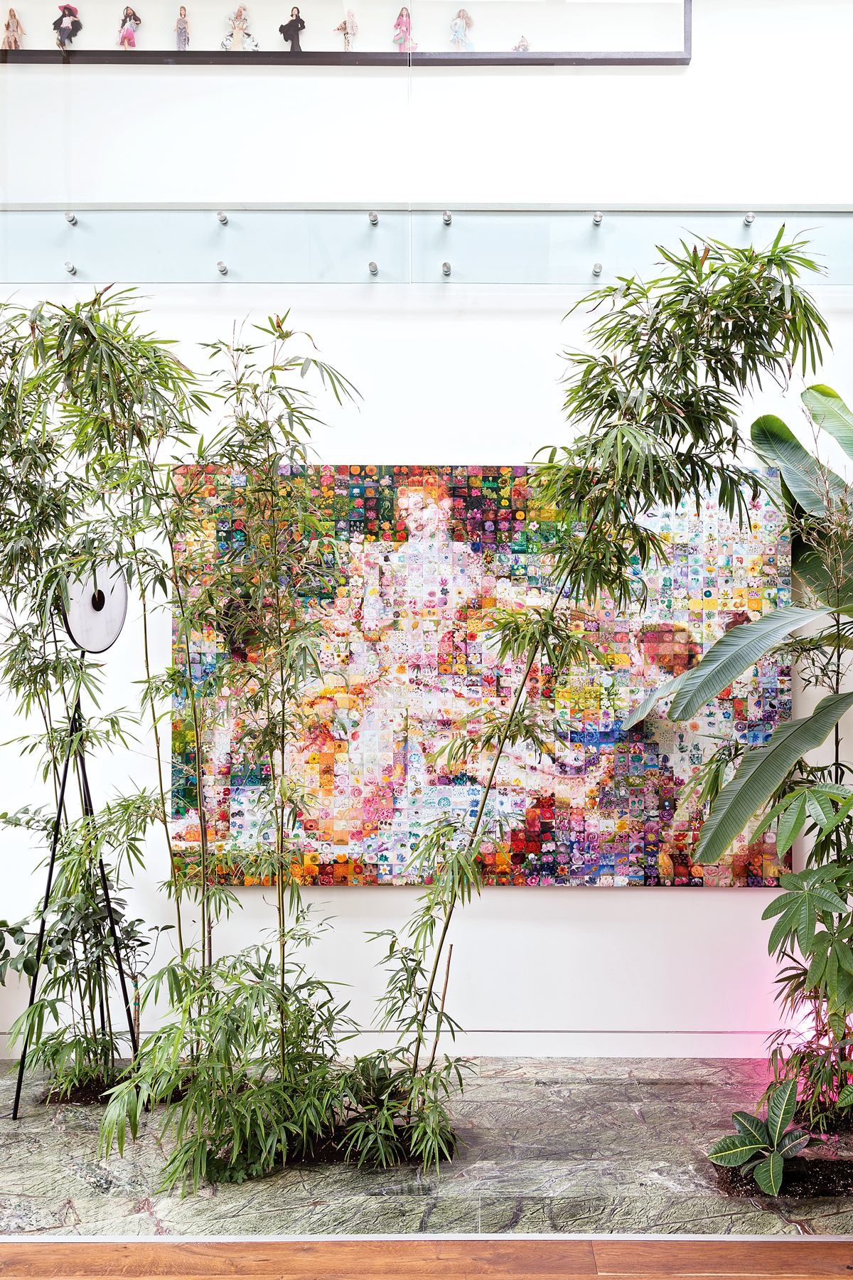
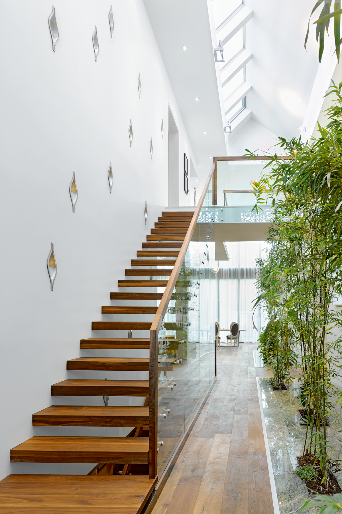
The Toronto setting and the family’s love of nature played a big role in the design. In the heart of the house, a lush indoor garden almost screens a Damien Hirst painting. The bamboo will eventually soar through the double-heightspace.
living area
The house is constructed from three different blocks, each with an exterior cladding that reflects what goes on between its walls – natural wood cladding for the entertaining area; utilitarian white quartz for the garage, laundry and other functional areas
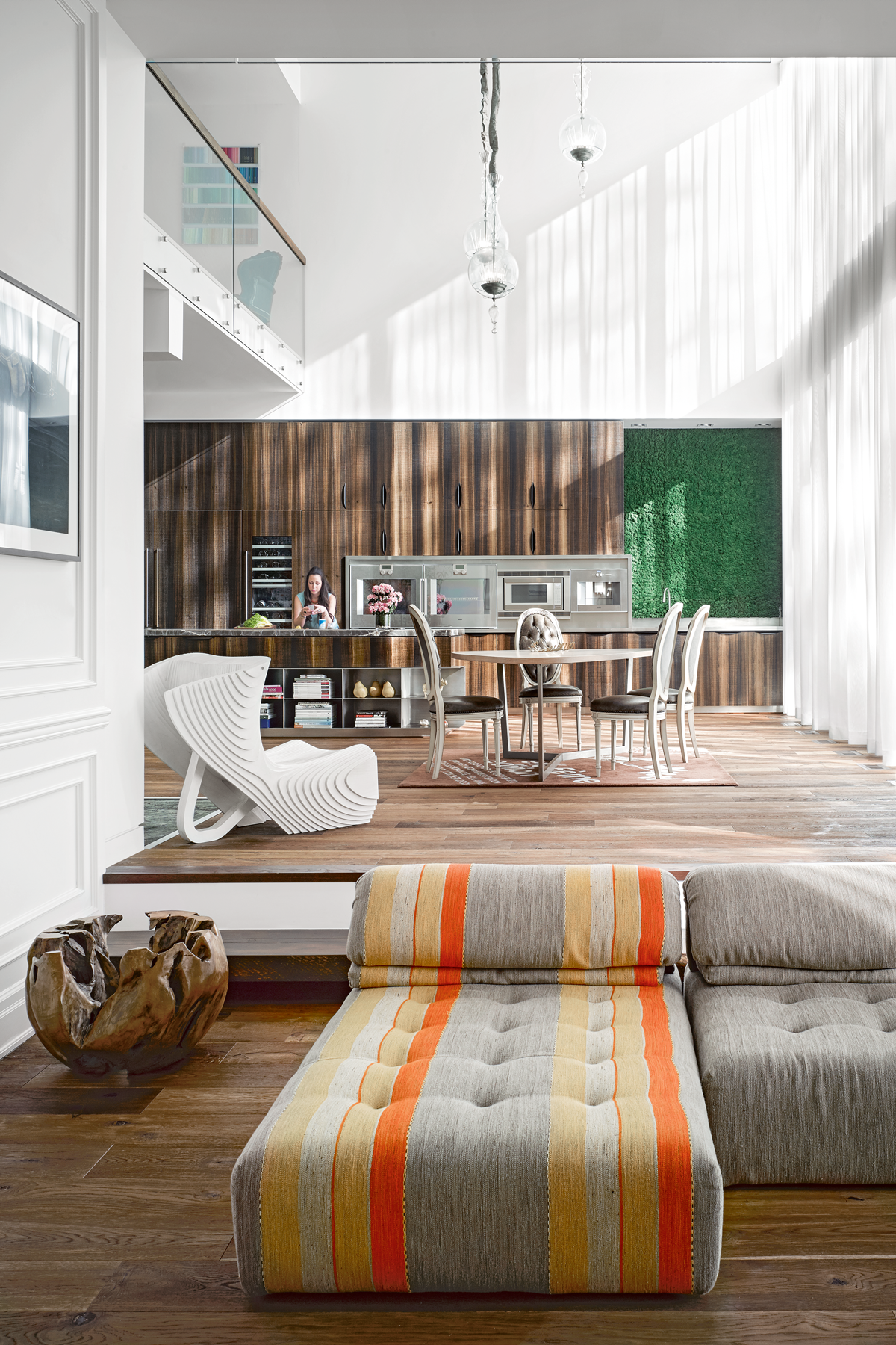
A colourful sofa is the perfect place to watch TV. The wood panelled wall is repeated upstairs in the walk-in dressing room.
Be The First To Know
The Livingetc newsletters are your inside source for what’s shaping interiors now - and what’s next. Discover trend forecasts, smart style ideas, and curated shopping inspiration that brings design to life. Subscribe today and stay ahead of the curve.
The surfaces inside the house are carefully chosen – black onyx to reflect the rugged landscape outside; strong-grained eucalyptus wood in the kitchen to add drama and a touch of the exotic; plus acres of white walls to showcase the owners’ collection of contemporary art. It was important to use natural materials such as wood and stone to connect with the view outside.
See Also: Living room ideas - 24 decorating tricks to inspire
KITCHEN/DINING AREA
Family meals are eaten in the open-plan space above.
KITCHEN
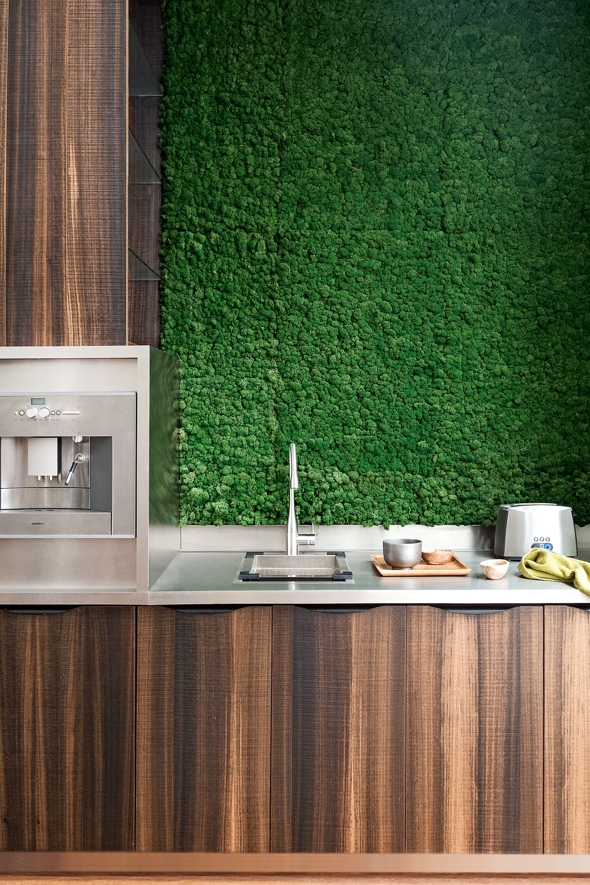
Handleless eucalyptus wood units and a living moss wall bring verdant rainforest styling to the kitchen.
family room
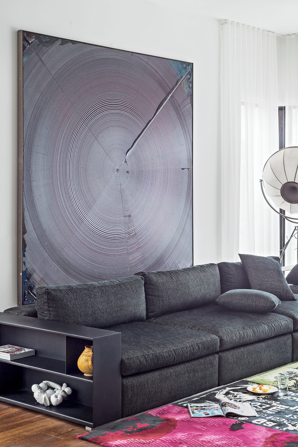
It was important to have big walls for Antonio's art collection. The low-level sofa is chic but comfortable – perfect for a family that loves to have guests over regularly.
first-floor hall
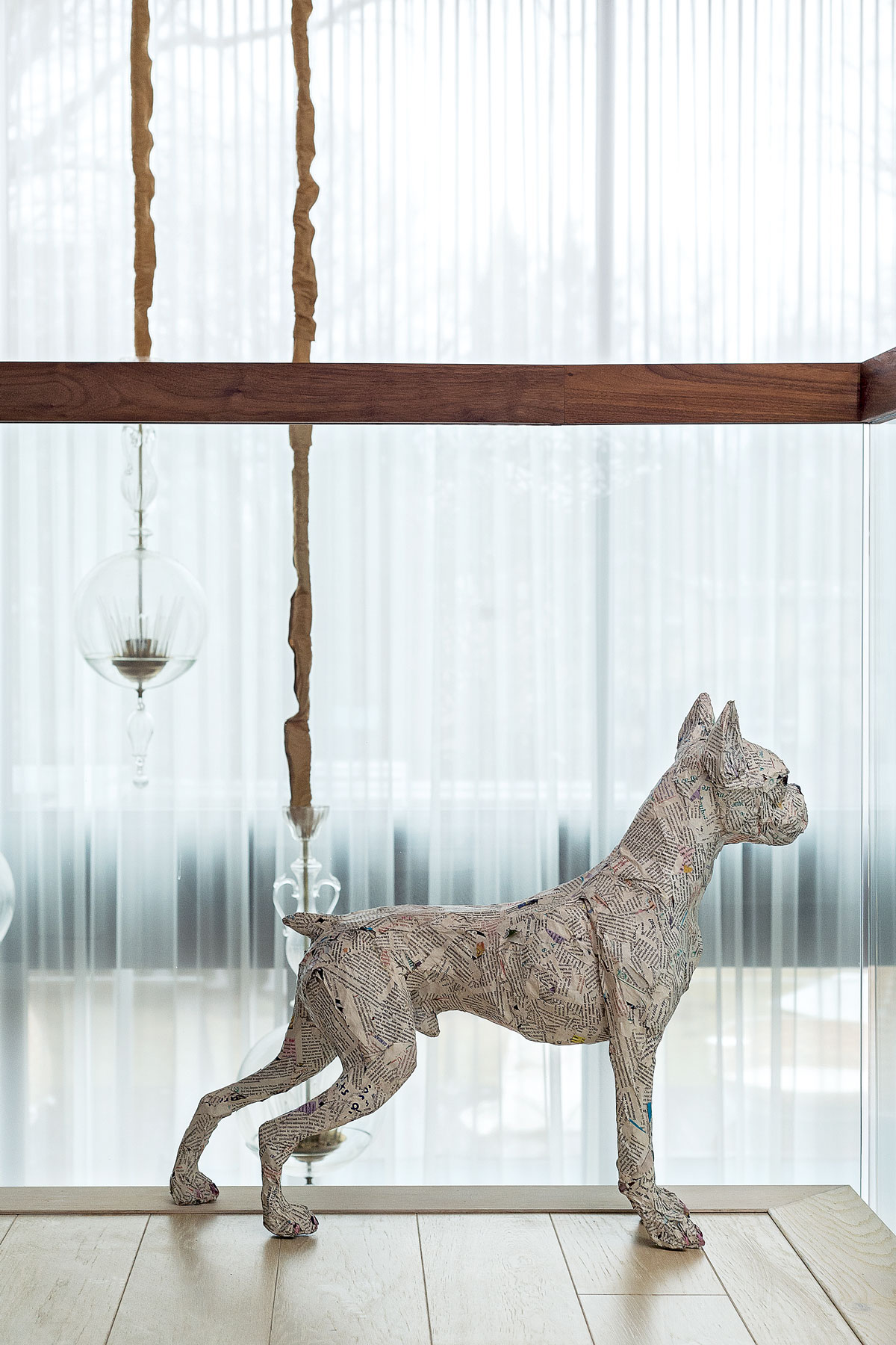
The family home is peppered with quirky artwork.
master Bedroom
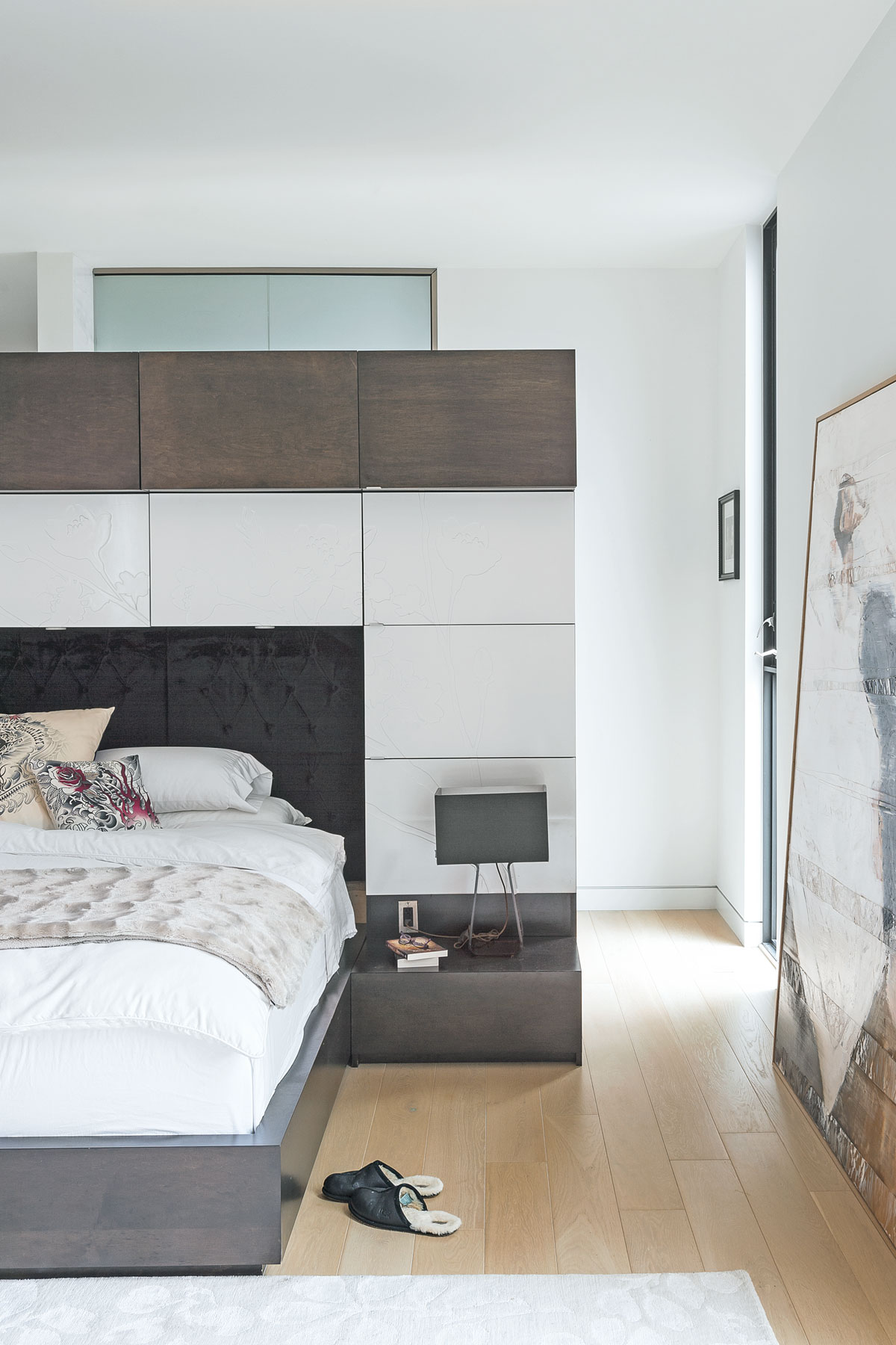
The integrated bed and storage was designed to give a feeling of “his and hers”, with two different colours anda delicate flower motif etched intothe surface. Concealed behind the wall of cupboards is a walk-in wardrobe and dressing room.
sitting area in the master bedroom
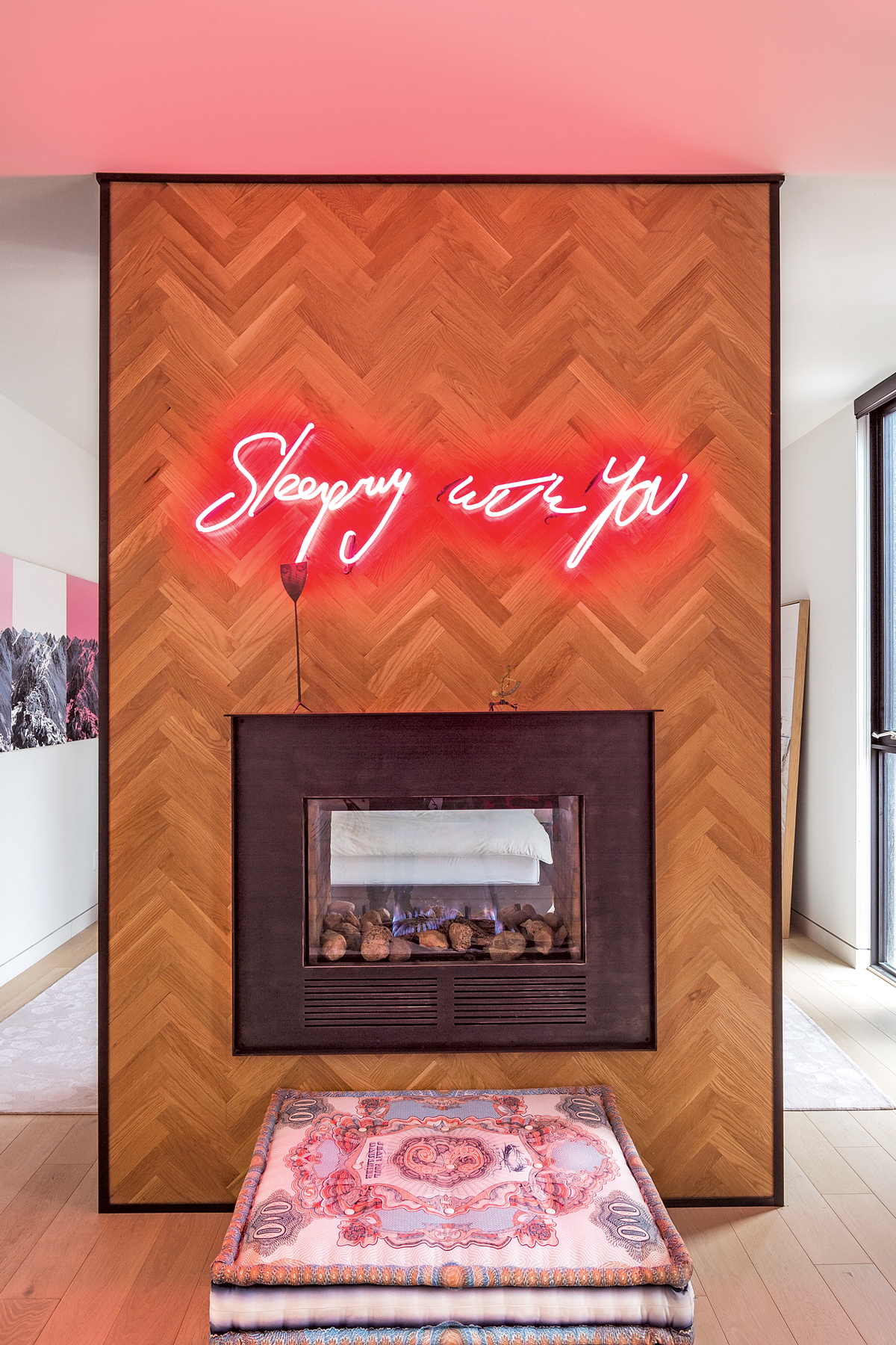
This herringbone wall divides the sitting area from the bedroom beyond. The idea was to make the house feel cosy, yet cool, which is why this double- aspect fireplace works so well.
girl's bedroom
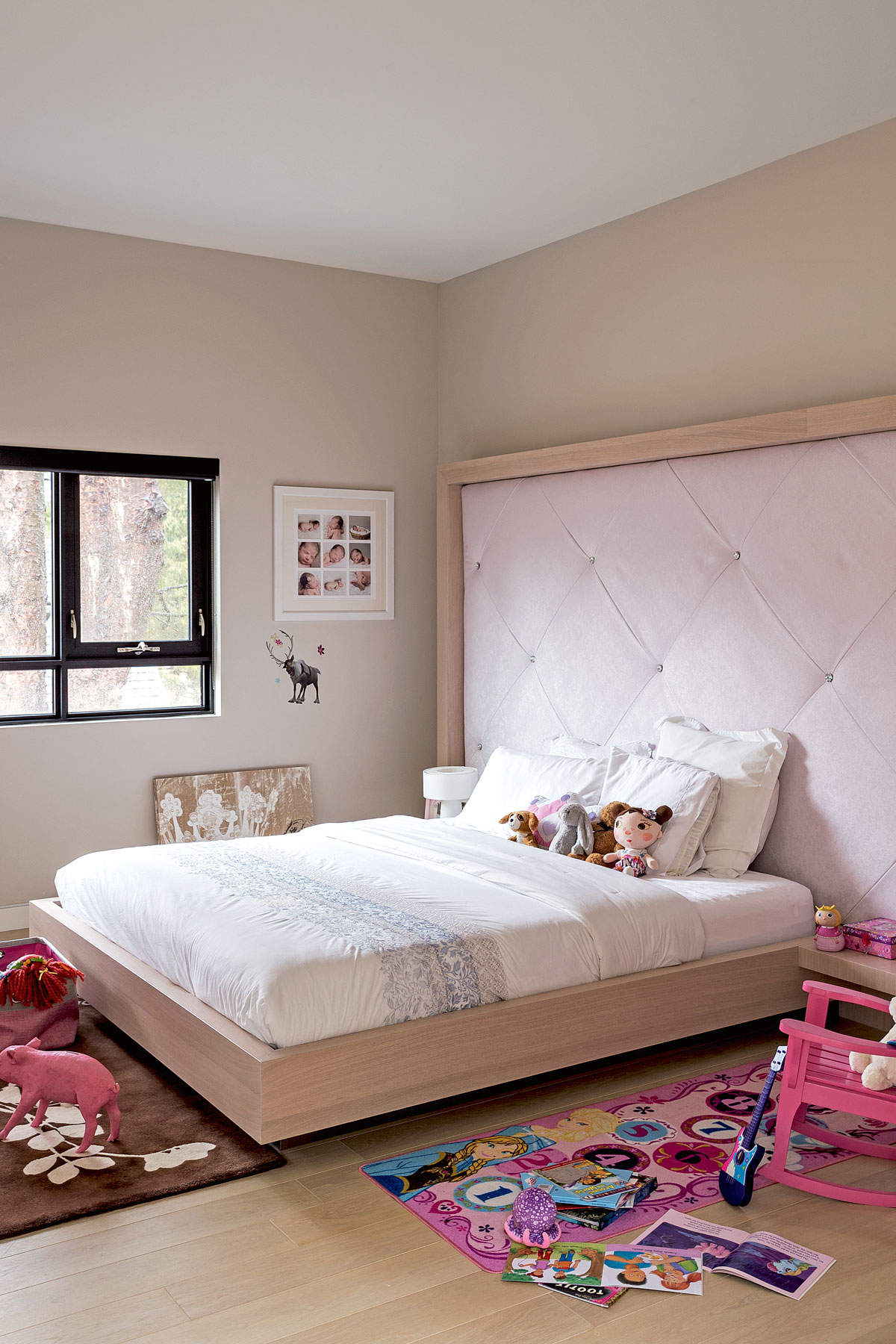
An oversized upholstered headboard creates a feeling of comfort in the room belonging to the family’s youngest member. Each of the girls’ bedrooms is virtually identical, so there are no arguments about who has the biggest.
guest en suite
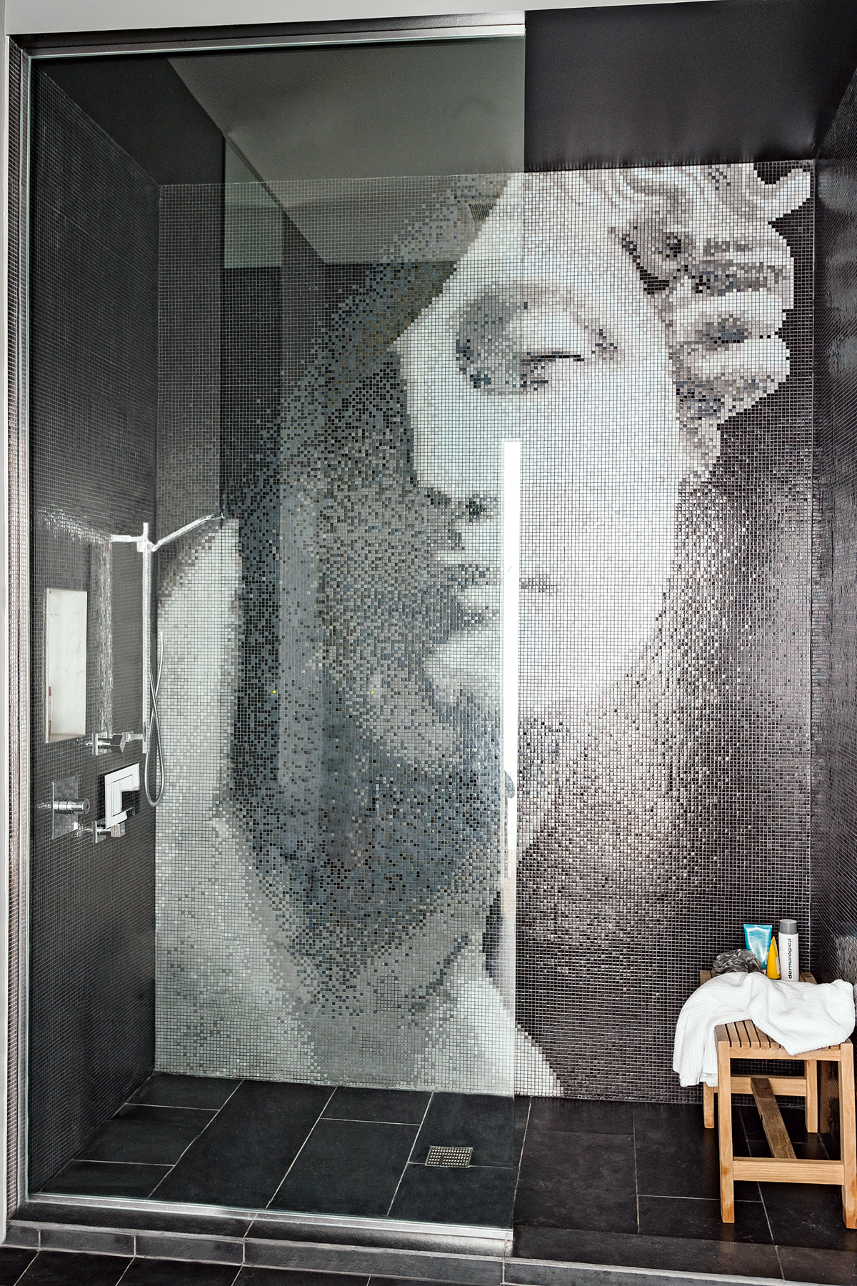
The tiles were originally planned for the main bathroom, but it was decided the owners might get tired of the look too quickly. Instead, they were installed in the guest en suite, so there is a real “wow factor” when they’re seen for the first time.
See more of Brenda’s work at pdlab.ca
Photography / Matthew Williams
See Also: 24 Guest bedroom ideas - Gorgeous guest room schemes to make visitors feel at home
The homes media brand for early adopters, Livingetc shines a spotlight on the now and the next in design, obsessively covering interior trends, color advice, stylish homeware and modern homes. Celebrating the intersection between fashion and interiors. it's the brand that makes and breaks trends and it draws on its network on leading international luminaries to bring you the very best insight and ideas.
-
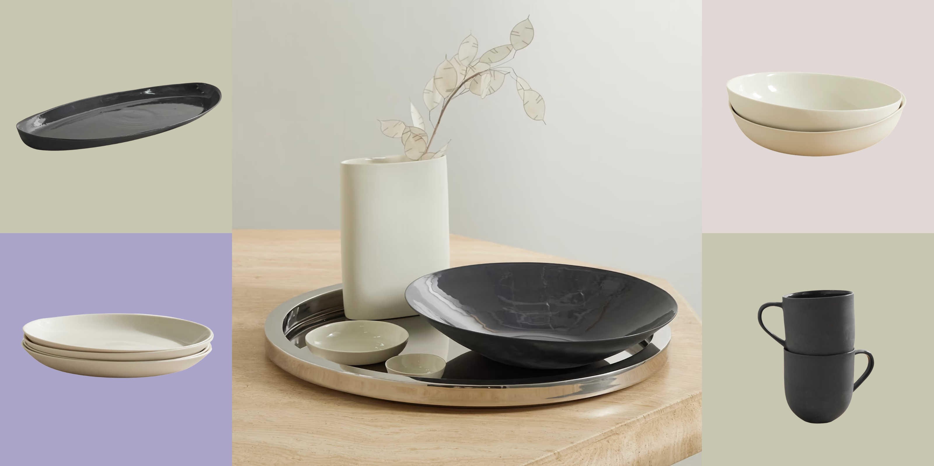 Turns Out, Sustainable Design Can Be Chic, and Net-a-Porter's 'Net Sustain' Curation Is Proof — Here's What I'm Shopping
From the Net Sustain collection, Mud Australia's homeware is not only design-oriented, but eco-focused, too
By Devin Toolen
-
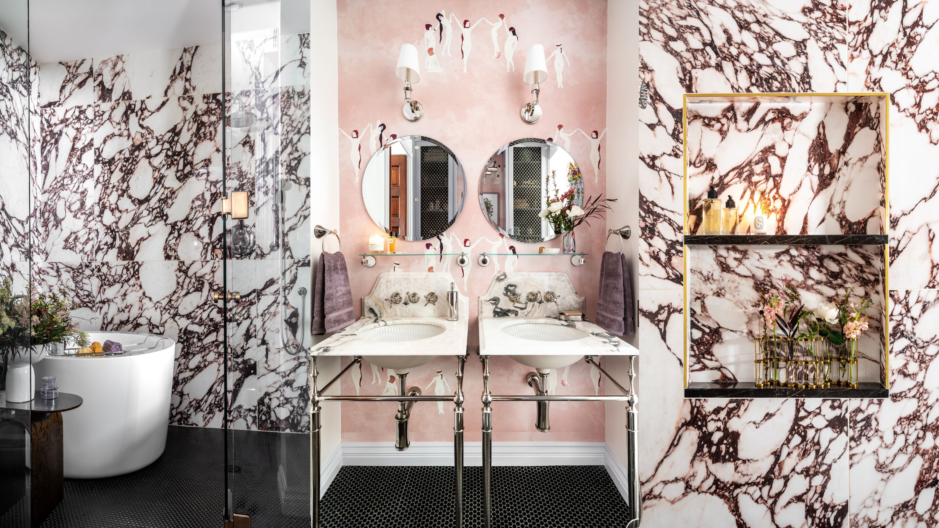 Before and After — How This Jewel-Box Bathroom Made the Most of Its Proportions With Maximalist Design and a 'Soaking Tub'
This design offers a masterclass on creating a luxurious bathroom that is equally playful and elegant.
By Maya Glantz