Quite literally perfect - this house in Utah showcases transitional style and how to get it absolutely right
Designers Light and Dwell have taken the best of transitional style and used it to create a home that is full of personality
We've been writing a lot of warm minimalism here at Livingetc, and the way that paring back what you display to just your very favorite pieces can create a space that feels really personal, welcoming and uplifting. And now we're seeing a modern take on transitional style emerging for 2023. It's a look that is less, well, minimal than minimalism, but no less curated, no less personal, and just as warm and wonderful.
This modern home in Utah encapsulates this take on transitional style perfectly. Designed for a young family with four kids by Light and Dwell, an Oregon-based interior design firm co-founded by CEO Aymee Kuhlman and Principal Designer Molly Kidd, its decor takes the best of vintage of modern and places them artfully together in a way that they blend as one.
Its palette, based around warmer tones of beige and unlacquered brass finishes are typical of this approach, creating a set of contrasts - matt and gleaming - which have the overall effect of a warm that always feels like a candle has just been lit in it. In other words, it couldn't feel more comforting, more special or more right for now.
“This family wanted their home to feel warm, inviting and serene while incorporating some bold and contrasting design details,” Molly says. “It was important for the design to feel like ‘them’ and they really trusted us, which made the job incredibly innovative and collaborative.”
Kitchen
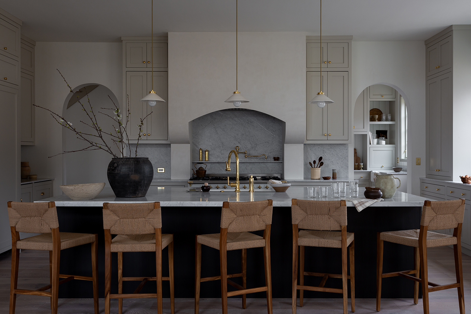
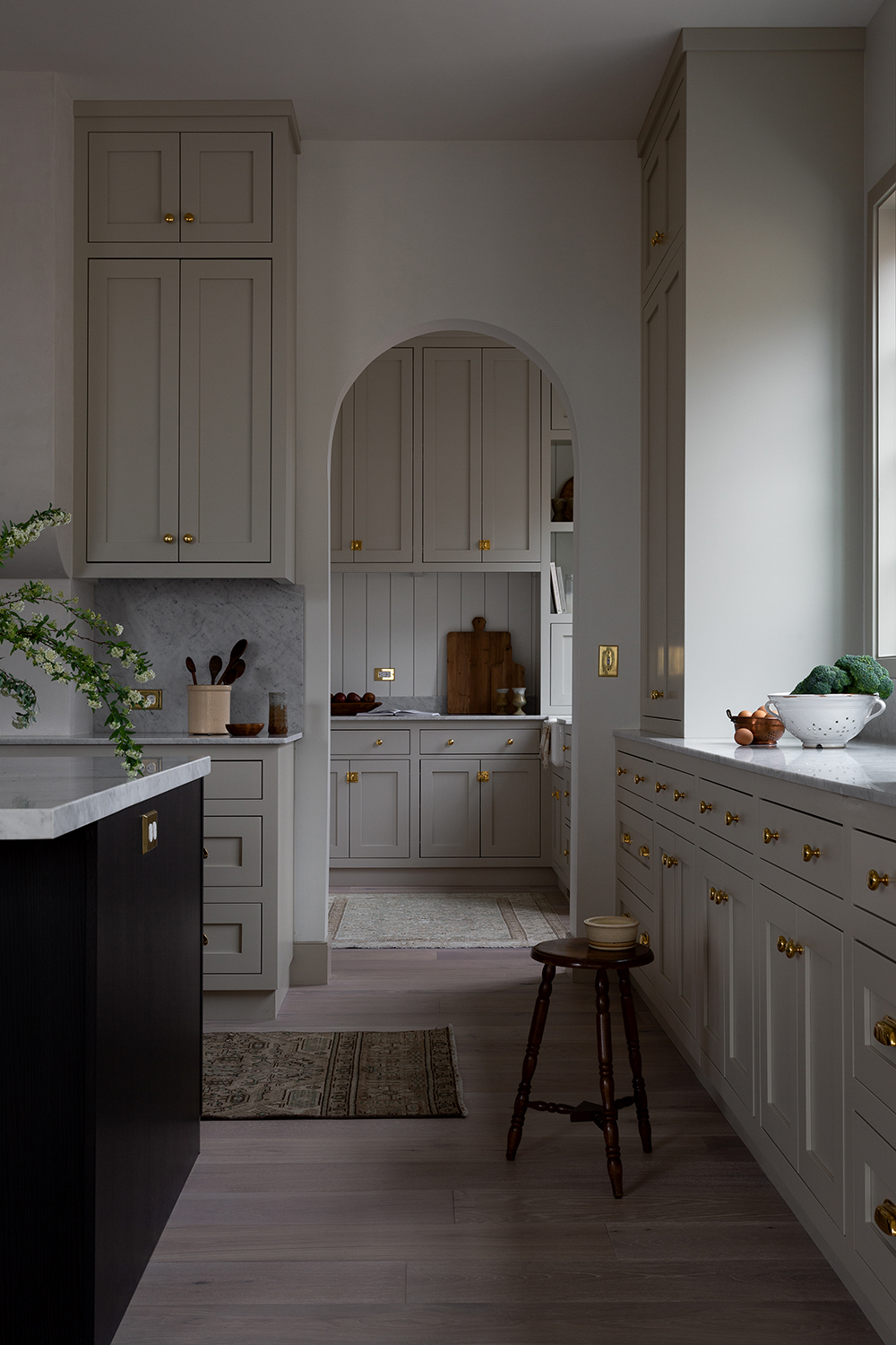
One of the many themes of this European-style home is arches. Used in doorway and recesses, they provide a friendly sense of grandeur - the curves make them splendid without seeming overbearingly regal.
And they're particularly evident in the transitional-style kitchen, with the cooker placed in a central one between two more. The effect is the joy that you feel when in an ornate palazzo, but because of the soft greys used it seems homely too.
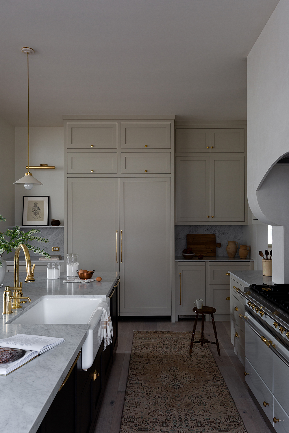
In fact, the spacious modern kitchen provides a great balance between light and dark colors. In the center is a large Carrara Marble Countertop with five high chairs from Kathy Kuo Home surrounding it. Cleverly, the pendants use the same brass color as seen throughout the rest of the kitchen, including the sink and fridge handles.
Be The First To Know
The Livingetc newsletters are your inside source for what’s shaping interiors now - and what’s next. Discover trend forecasts, smart style ideas, and curated shopping inspiration that brings design to life. Subscribe today and stay ahead of the curve.
The back entryway next to the kitchen incorporates details of the same color cabinets, Carrara Marble and brass finishes.
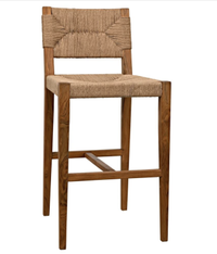
Noir Bran Counter Stool, Kathy Kuo Home
It's the mix of teak frame and woven Danish cord that make these stools ideal for a transitional look. Part mid century, part modern costal, they neatly blend two eras and aesthetics together.
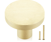
QOGRISUN 10-Pack Solid Brass Cabinet Knobs. $20.99, Amazon
These bevilled cabinet handles are incredibly affordable and will provide an instant update. They feel elegant and elevated, just the right tone of brass to give a little gleam.
Living room

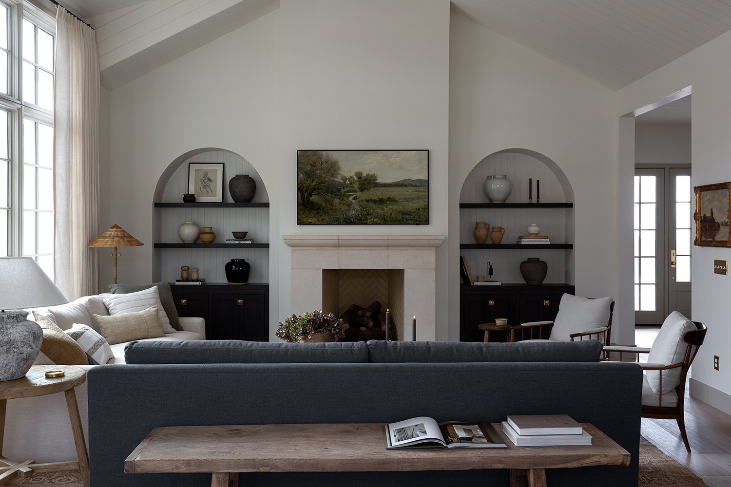
This transitional-style living room features high ceilings, and floor-to-ceiling windows, letting an abundance of natural light through. The living room is filled with a mix of grey, white, black and beige.
"This home was a new build from the ground up," Molly says, explaining how she was able to get some elegantly large proportions into the living space.
Once again, the mix of textures and eras is thought about so that they all work together thanks to their unifying palette.
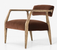
Larabee Accent Chair, Lulu and Georgia
This is just the sort of mid-century meets modern shape that works well in a transitional living room. It has the slim legs of the 1960s but the proportions are very contemporary.
Dining room
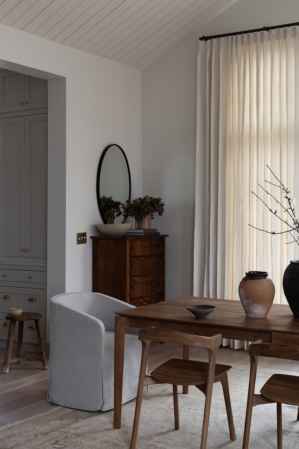
The minimalist dining room is a glowing example of how a pared back approach can create an elegant space.
When taking on this project, Light and Dwell were blessed with big windows...though that's not without its challenges. Too much light can be harsh, especially in a room like this which is meant to be calm. To counteract that, Molly covered the glass in sheer, cream drapery to allow the light to come through without being too overpowering. The light wood table from is surrounded by wooden chairs on either side and light grey upholstered chairs on either end from Restoration Hardware. Molly placed a dresser in the corner of the room, perfect for storing cutlery.
Entryway
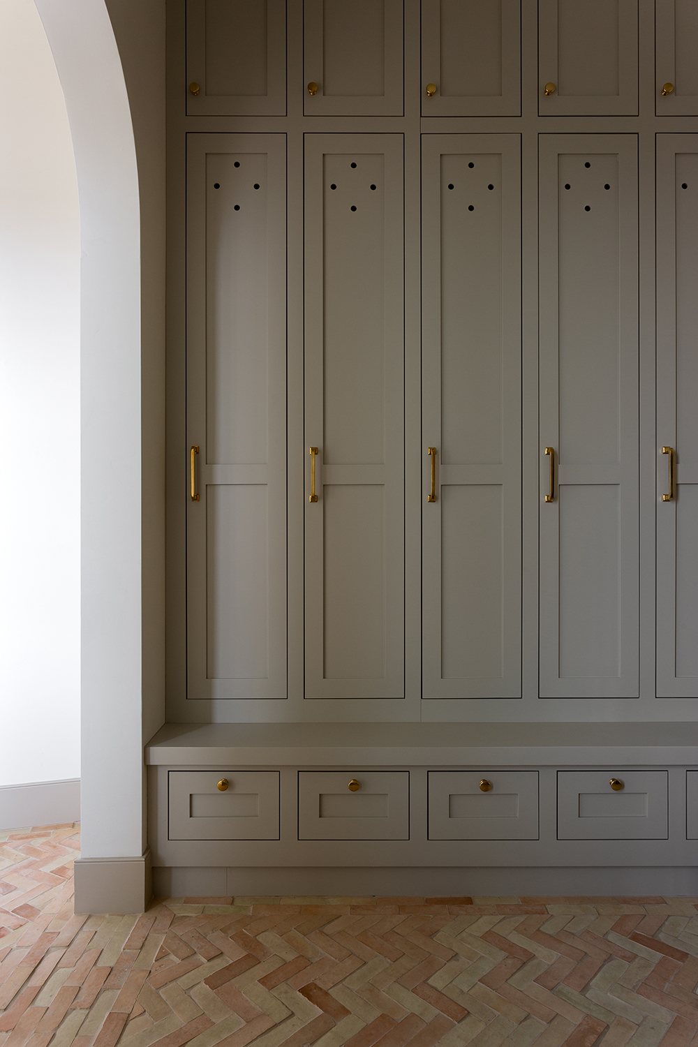
Do entryways come any more ordered, soothing, and charming than this?
The brick flooring from CLE tile is laid in a herringbone pattern, showcasing the detail that is prominent throughout the entire home. Originally, this stone arrived in the color red. The last-minute decision to change to brick ended up being one of Kidd’s favorite features.
Bedroom
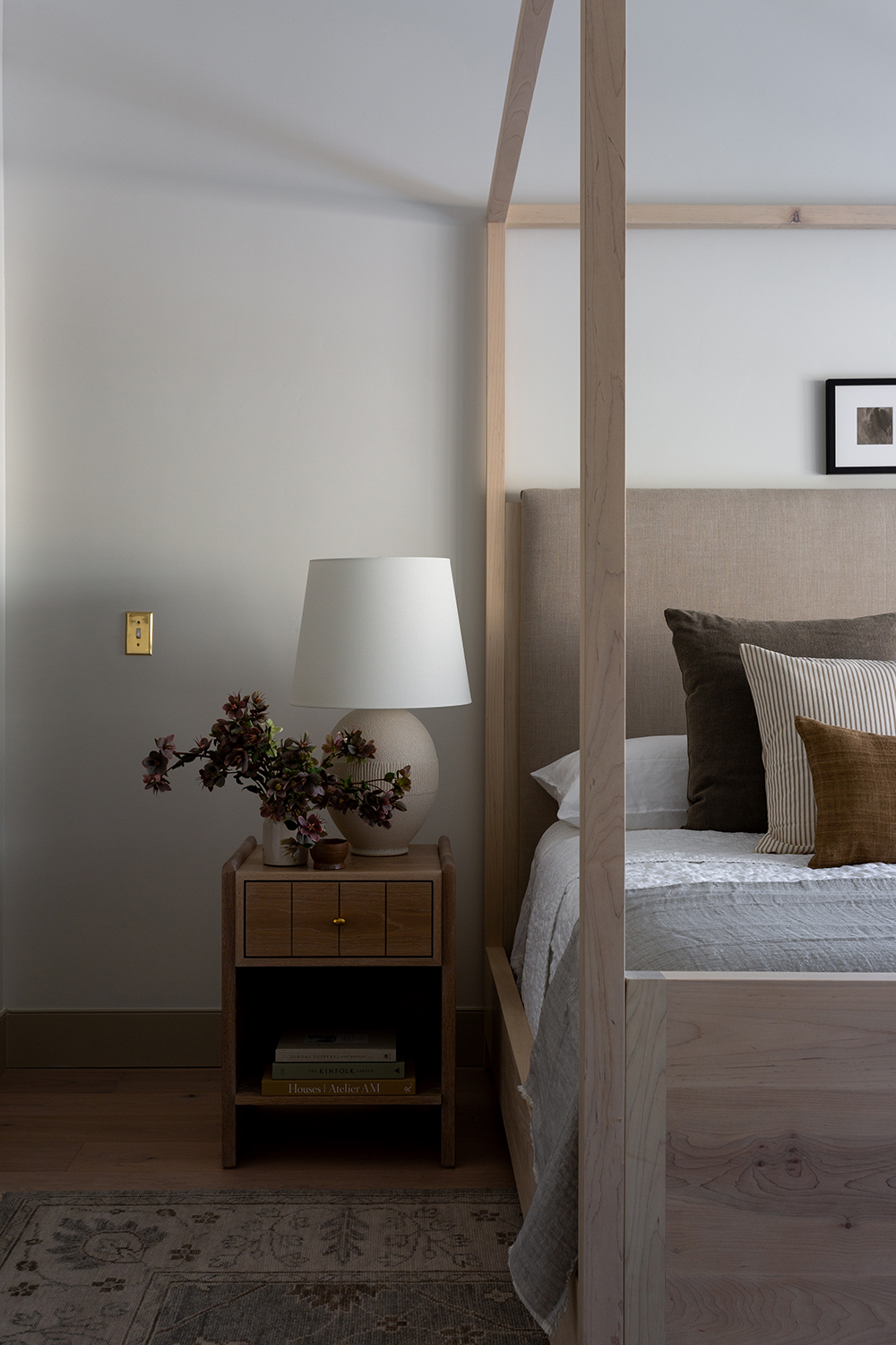
The primary transitional-style bedroom focusses on the same neutral palette seen downstairs. The smooth wood of the canopy bed, the subtle grey of the lamp and the pale walls all come together to create a soothing backdrop.
But because of the different materials - wood, fabric, ceramic - there is enough interest here so that it doesn't look one-note.
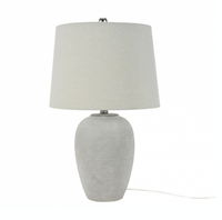
Unglazed Ceramic Urn Table Lamp, Bed, Bath and Beyond
There is just enough subtle texture to this table lamp to give it the look of being handmade, to make it feel interesting. Ideal to lift a neutral room.
Bathroom
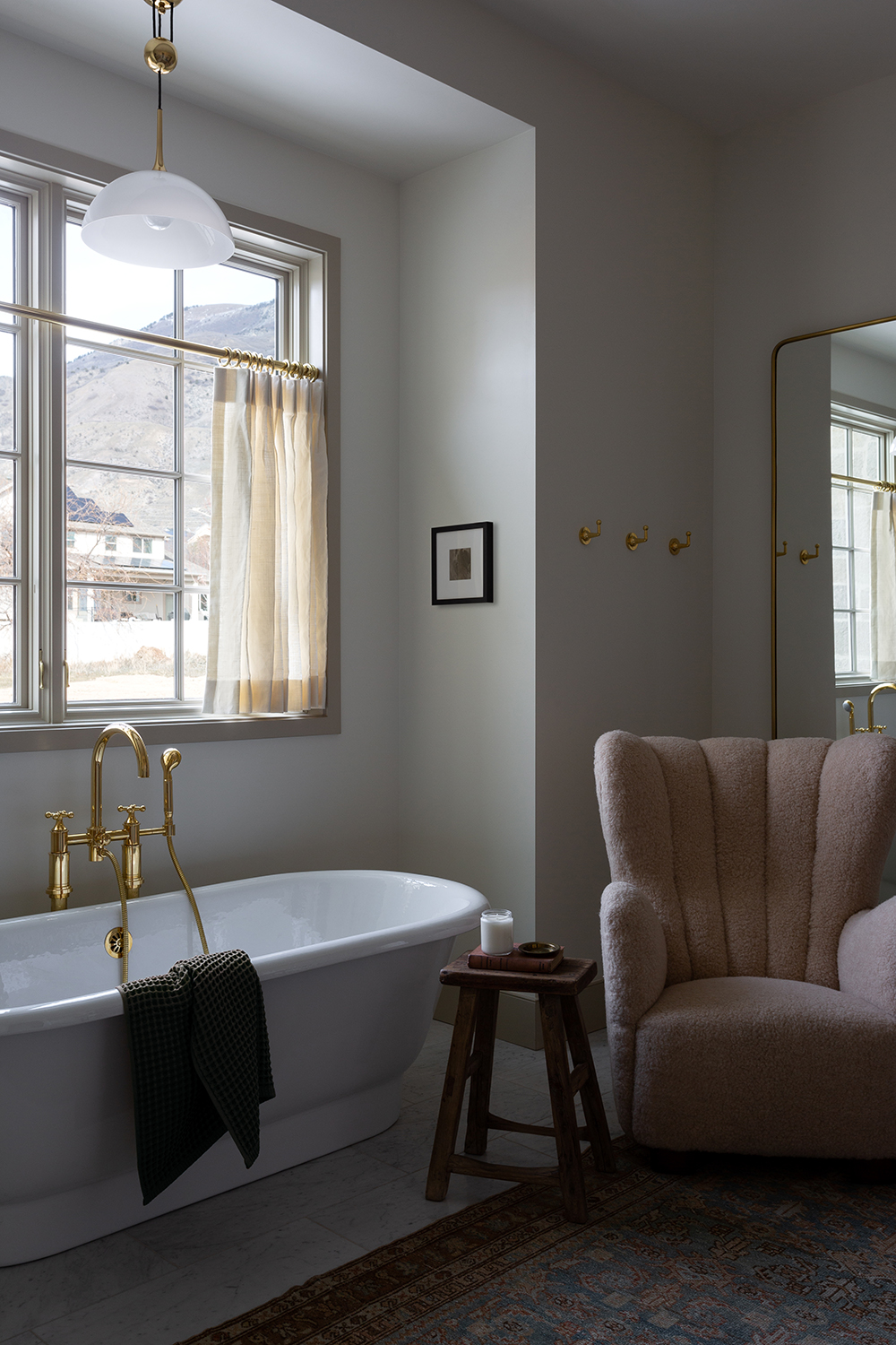
There is almost nothing more luxe in this world than an armchair in the bathroom. Firstly, to have the space for one is a joy. Secondly, to have a place to sit comfortably while the bath is drawn or you wait for a face mask to be ready is pure heaven. So th this is the kind of design trick we can get on board with.
The New Traditional by Barclay Butera, Amazon
If this version of transitional style appeals then Barclay Butera's book will give you an even better sense of how to decorate this way yourself. It features 15 incredible homes and uncountable design tips
The editor of Livingetc, Pip Rich (formerly Pip McCormac) is a lifestyle journalist of almost 20 years experience working for some of the UK's biggest titles. As well as holding staff positions at Sunday Times Style, Red and Grazia he has written for the Guardian, The Telegraph, The Times and ES Magazine. The host of Livingetc's podcast Home Truths, Pip has also published three books - his most recent, A New Leaf, was released in December 2021 and is about the homes of architects who have filled their spaces with houseplants. He has recently moved out of London - and a home that ELLE Decoration called one of the ten best small spaces in the world - to start a new renovation project in Somerset.
-
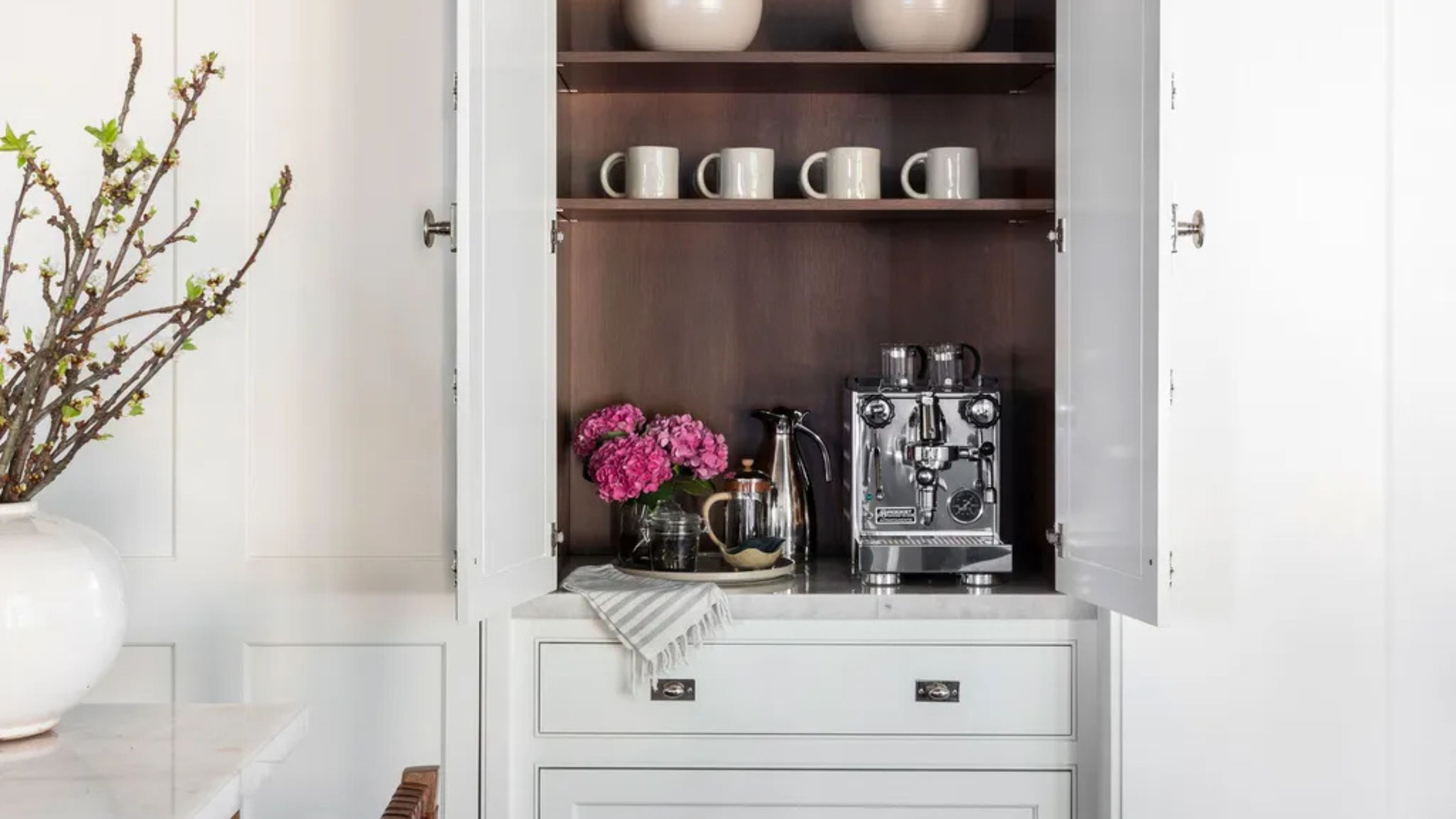 Turns Out the Coolest New Café is Actually In Your Kitchen — Here's How to Steal the Style of TikTok's Latest Trend
Goodbye, over-priced lattes. Hello, home-brewed coffee with friends. TikTok's 'Home Cafe' trend brings stylish cafe culture into the comfort of your own home
By Devin Toolen Published
-
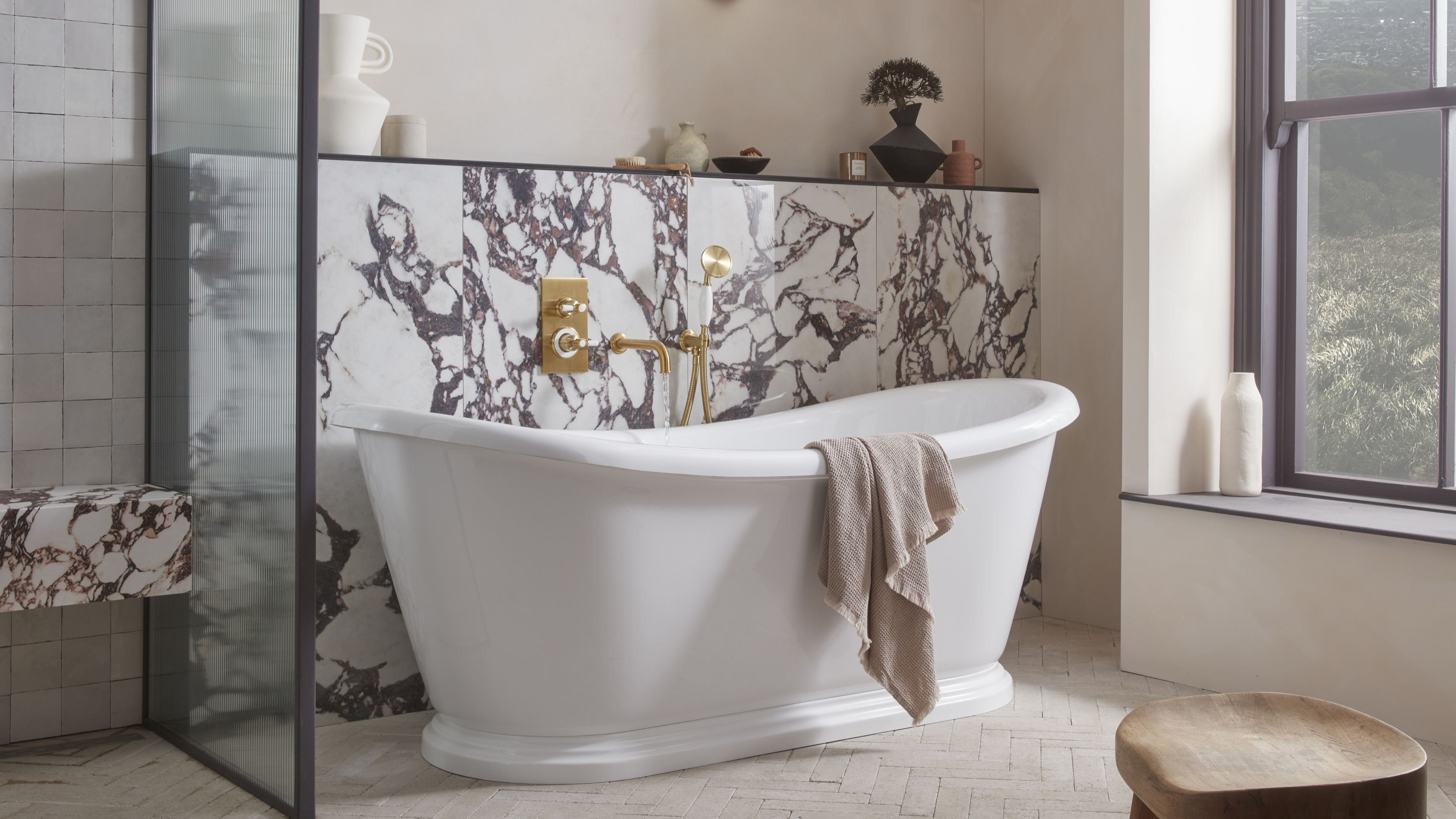 5 Bathroom Layouts That Look Dated in 2025 — Plus the Alternatives Designers Use Instead for a More Contemporary Space
For a bathroom that feels in line with the times, avoid these layouts and be more intentional with the placement and positioning of your features and fixtures
By Lilith Hudson Published
