An intriguing new build that uses a palette of brick, oak, and steel both inside and out
Take a tour of this deliciously confusing home that proves minimalism and industrial can also be warm and welcoming

The Livingetc newsletters are your inside source for what’s shaping interiors now - and what’s next. Discover trend forecasts, smart style ideas, and curated shopping inspiration that brings design to life. Subscribe today and stay ahead of the curve.
You are now subscribed
Your newsletter sign-up was successful
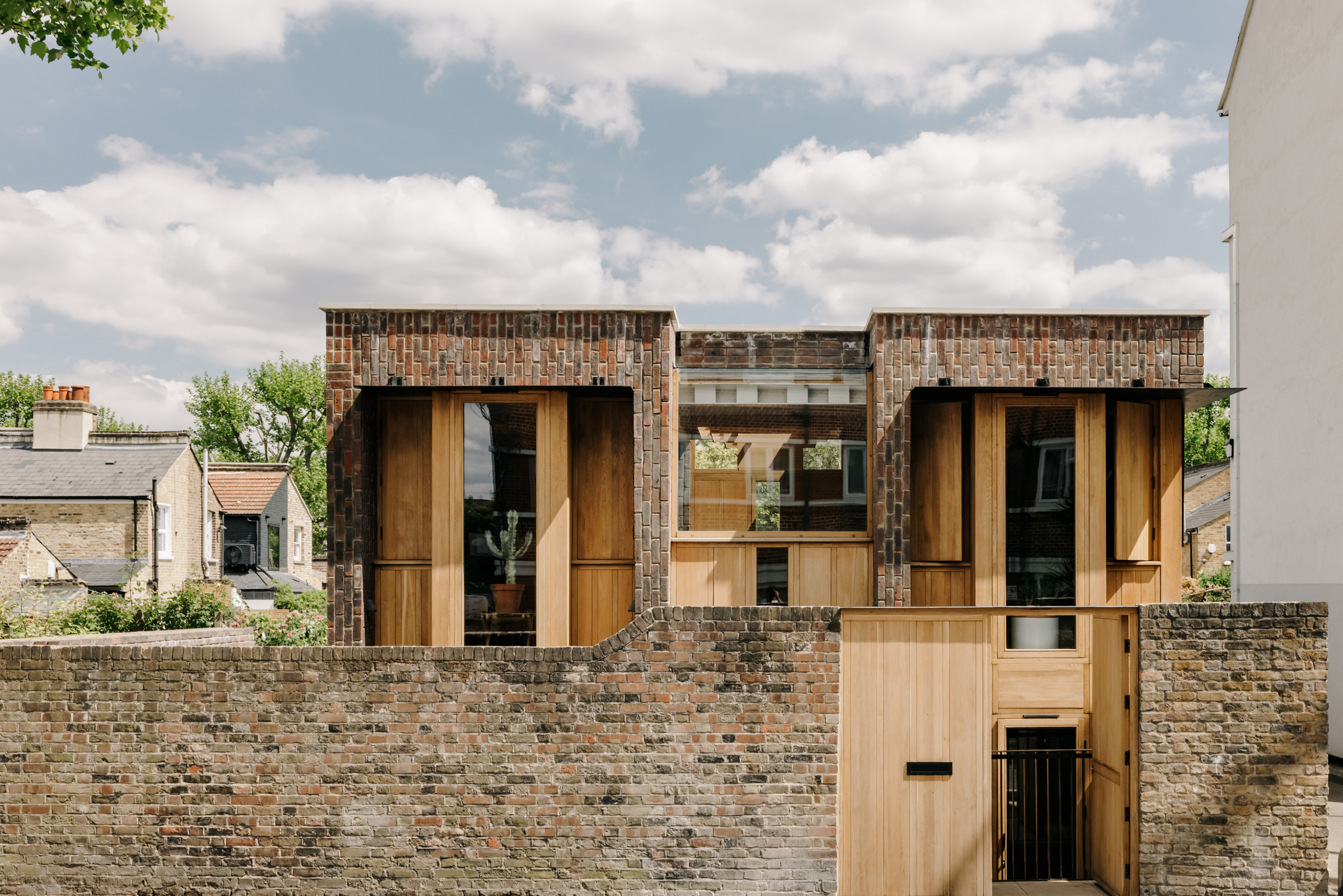
We love a modern house that from the outside gives nothing away. By that we mean you can't tell where each room is and what it would be used for – where would the kitchen be? Is that a living room or a bathroom? How many floors does it even have? And this property is that kind of deliciously confusing.
Designed by Satish Jassal Architects and completed earlier this year, this brick and wooden clad structure is intriguing from the off. Split into two wings, with a span of glazing to in between and two floors below ground level, the interior configuration doesn't become clear until you push open the double oak doors...
Entrance
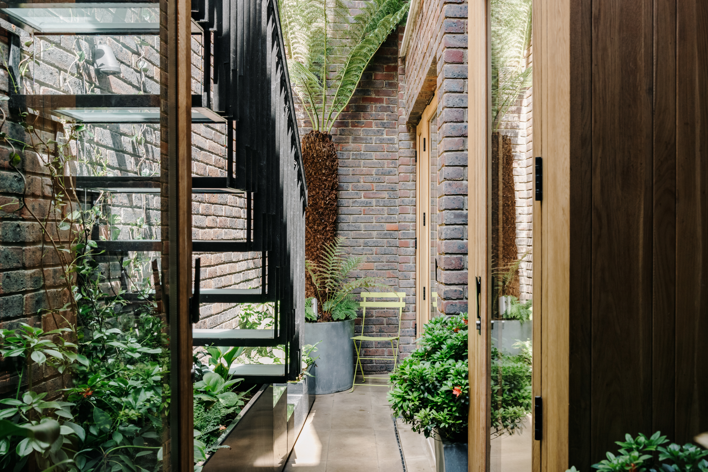
Instead of walking into a hallway, behind the front door lies a steel staircase that takes you directly down to a patio. Brickwork stretches around the secluded outside space and large ferns tower above, giving the entrance an exotic feel that totally matches the usual entrance into the property.
Kitchen
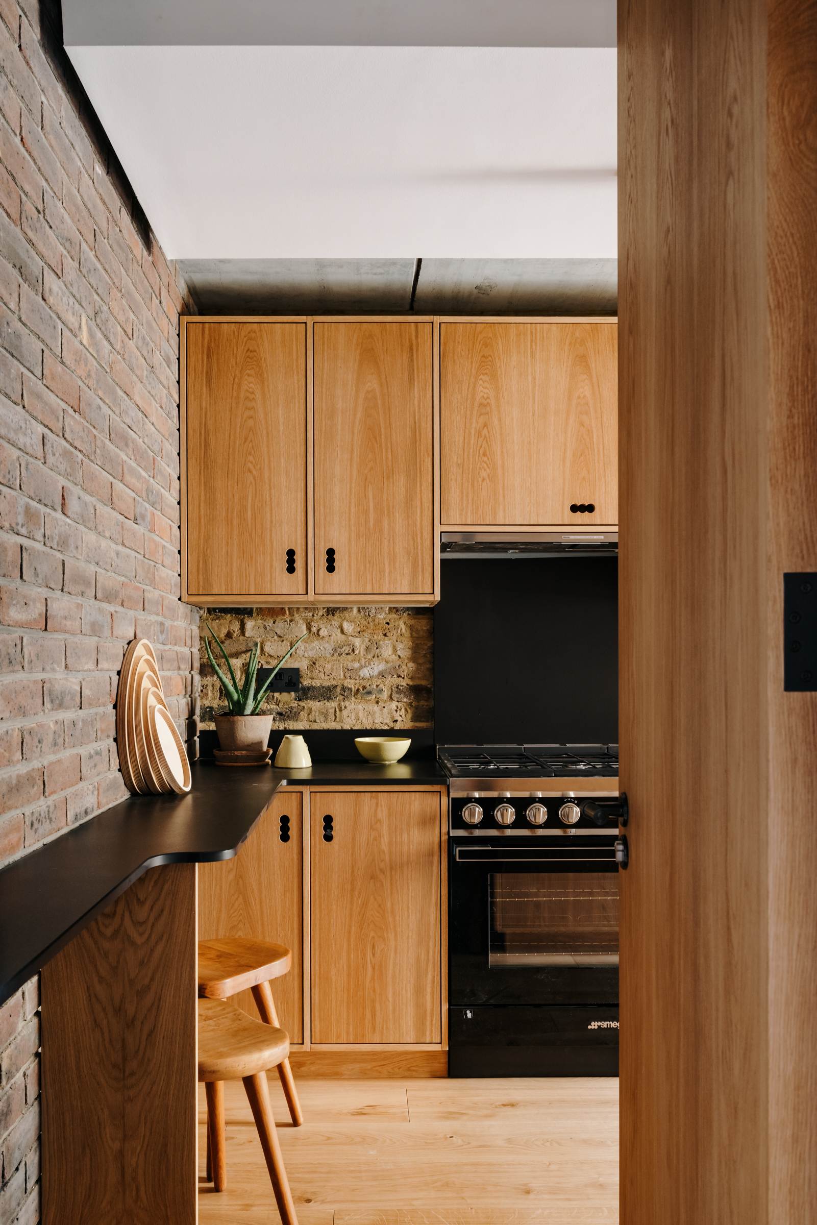
Push open the glass door and you are in the kitchen, a space that's very much in keeping with the oak and brick used on the exterior of the house, so there's already a seamless flow between the outside and in.
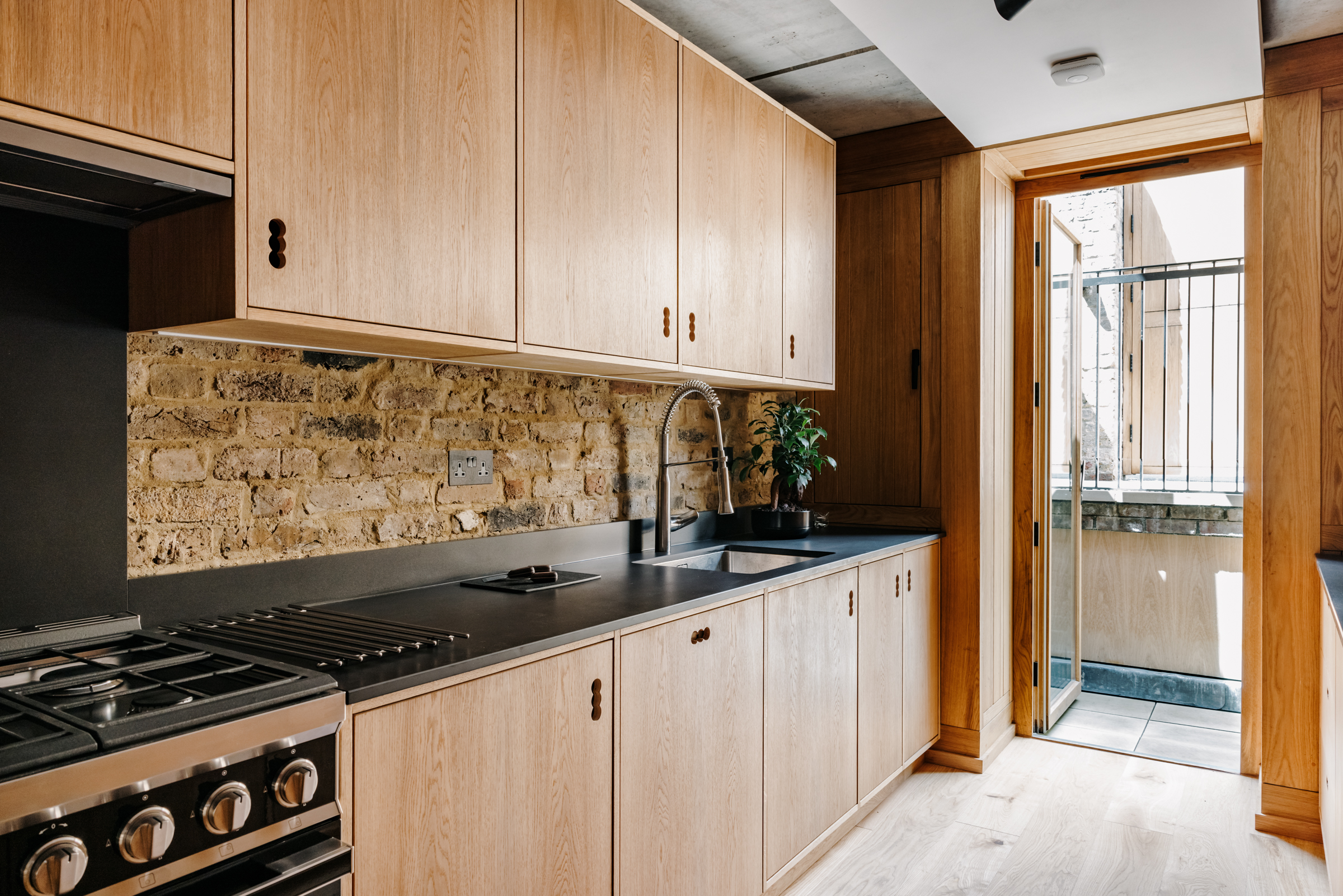
The warmth of the bespoke oak cabinets is broken up with black composite worktops, and even the brick splashback sticks to the industrial palette of brick, wood, steel, and concrete. A breakfast bar sits at one end for informal mealtimes.
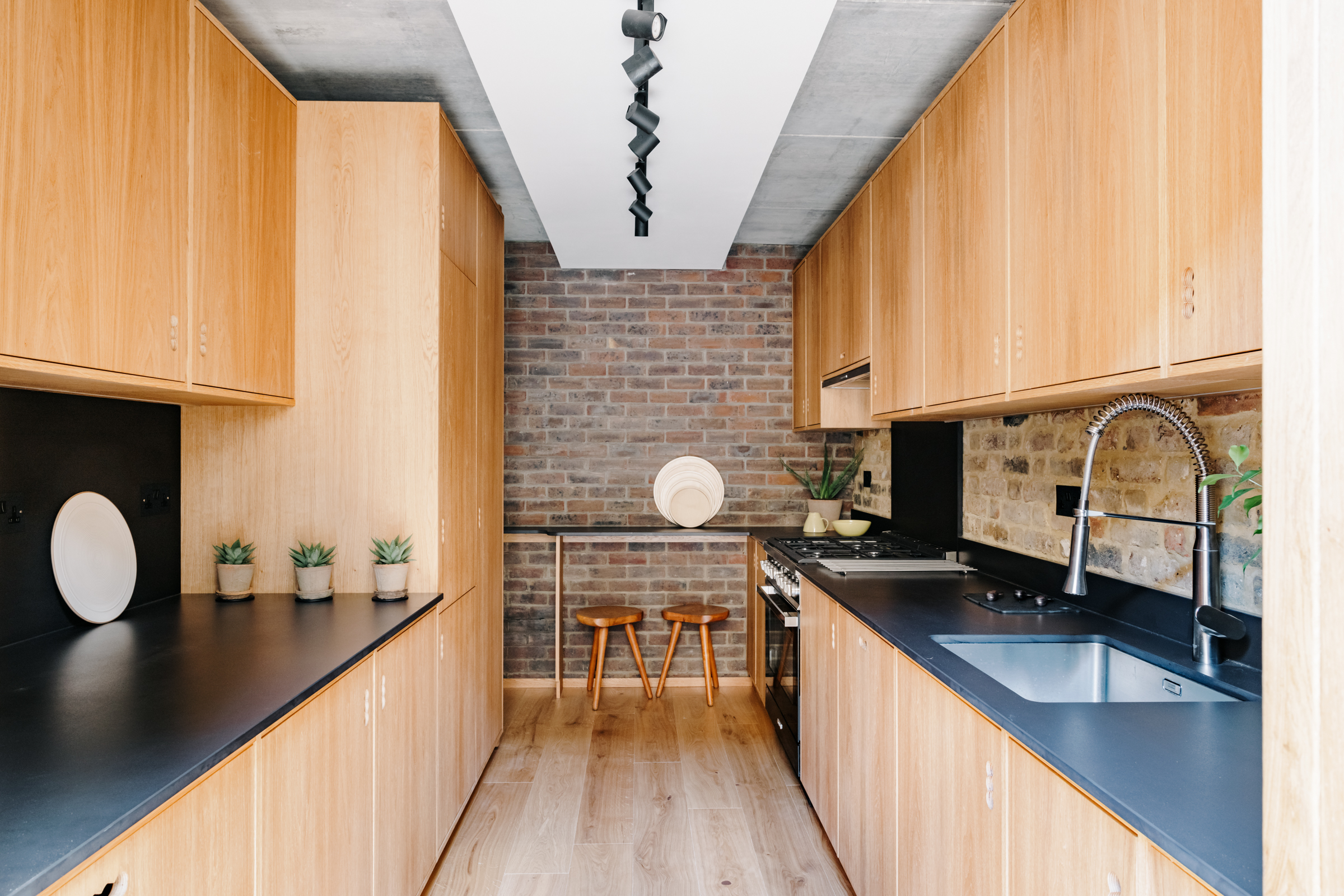
- Find more modern kitchen ideas in our gallery.
Dining room
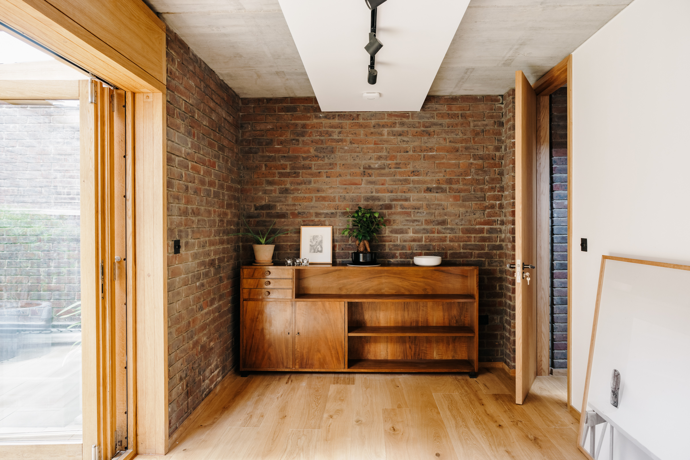
Through the hallway, adjacent to the kitchen is a spacious dining room. Oak bi-fold doors open out onto the patio, bringing in light and again creating that seamless flow between the outside spaces – perfect for a dining room as you can open up the outside space for al fresco diner parties too.
Built-in oak cabinetry can be found in here too, ideal for storing glassware and occasion tableware. Plus it brings in oak tones that can be found in every room of the house.
The Livingetc newsletters are your inside source for what’s shaping interiors now - and what’s next. Discover trend forecasts, smart style ideas, and curated shopping inspiration that brings design to life. Subscribe today and stay ahead of the curve.
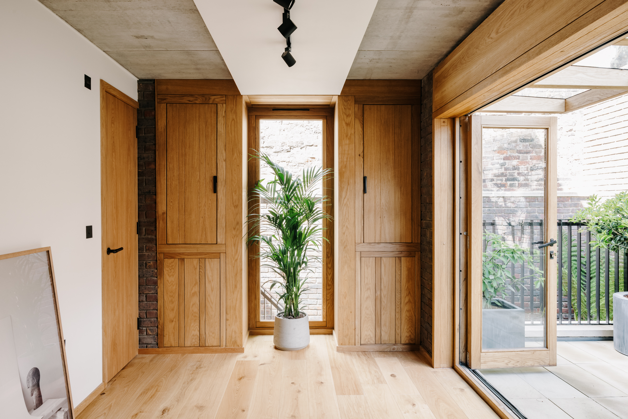
- Be inspired by all our modern dining room ideas.
Terrace
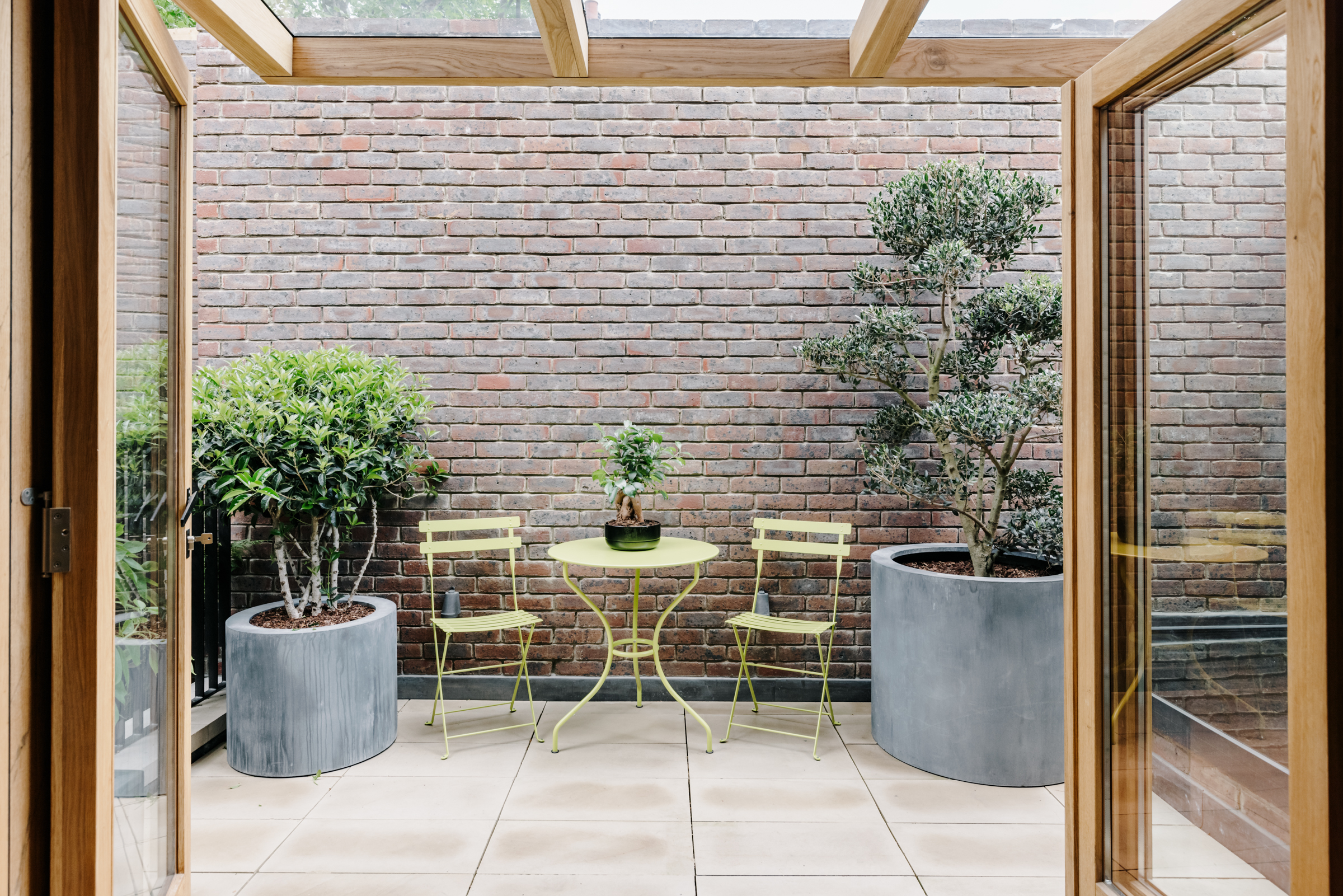
The peaceful terrace is totally private, the towering brick walls (one of which is the original garden wall of the house that would have stood here previously) see to that. Mature potted trees contrast the brickwork and you can see the trees from the entrance patio below growing up between the gap too, adding a softness to the edges.
There's a glazed extension too offering shelter from the weather but still allowing plenty of natural light to flow onto the terrace and the adjoining dining room.
Staircase
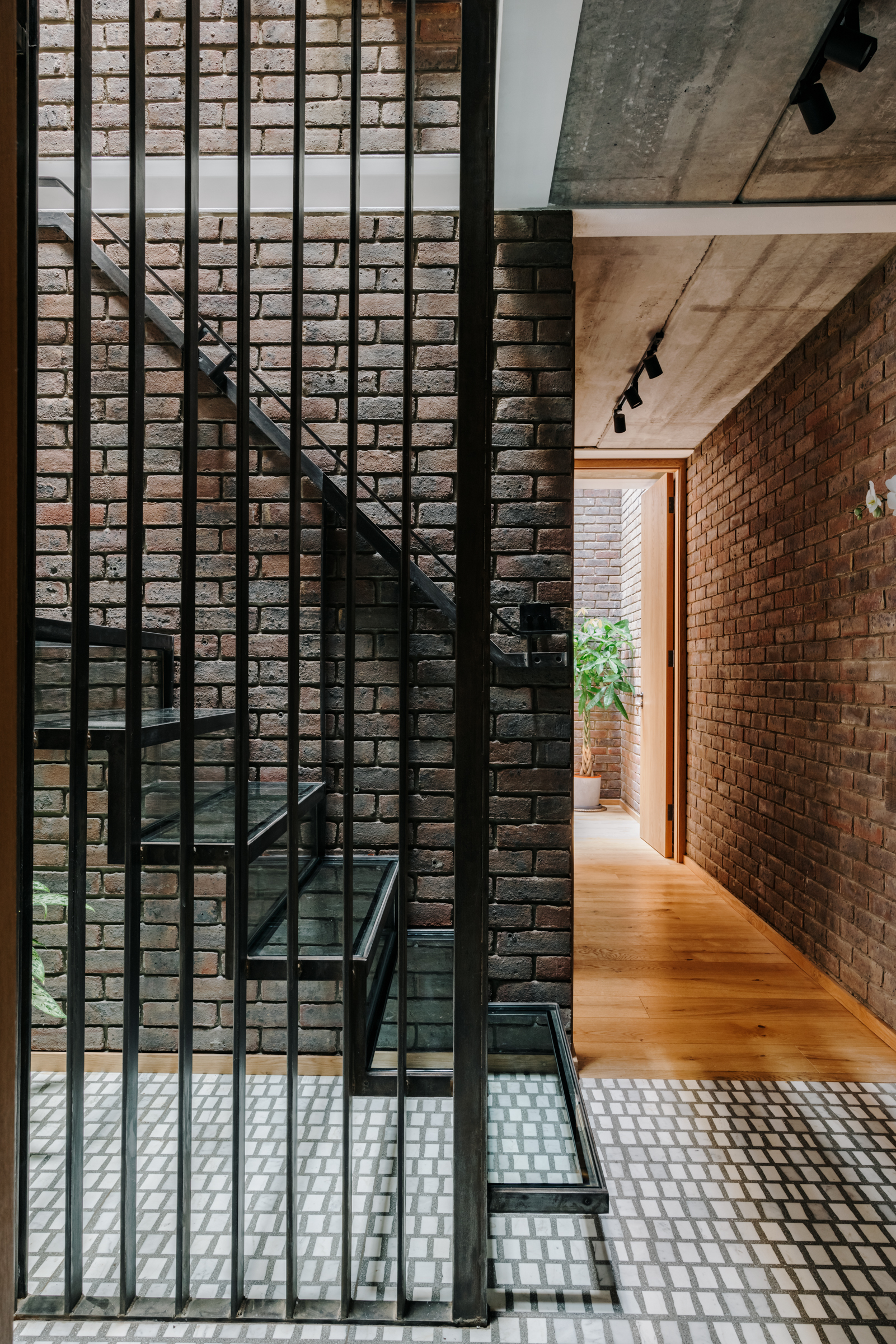
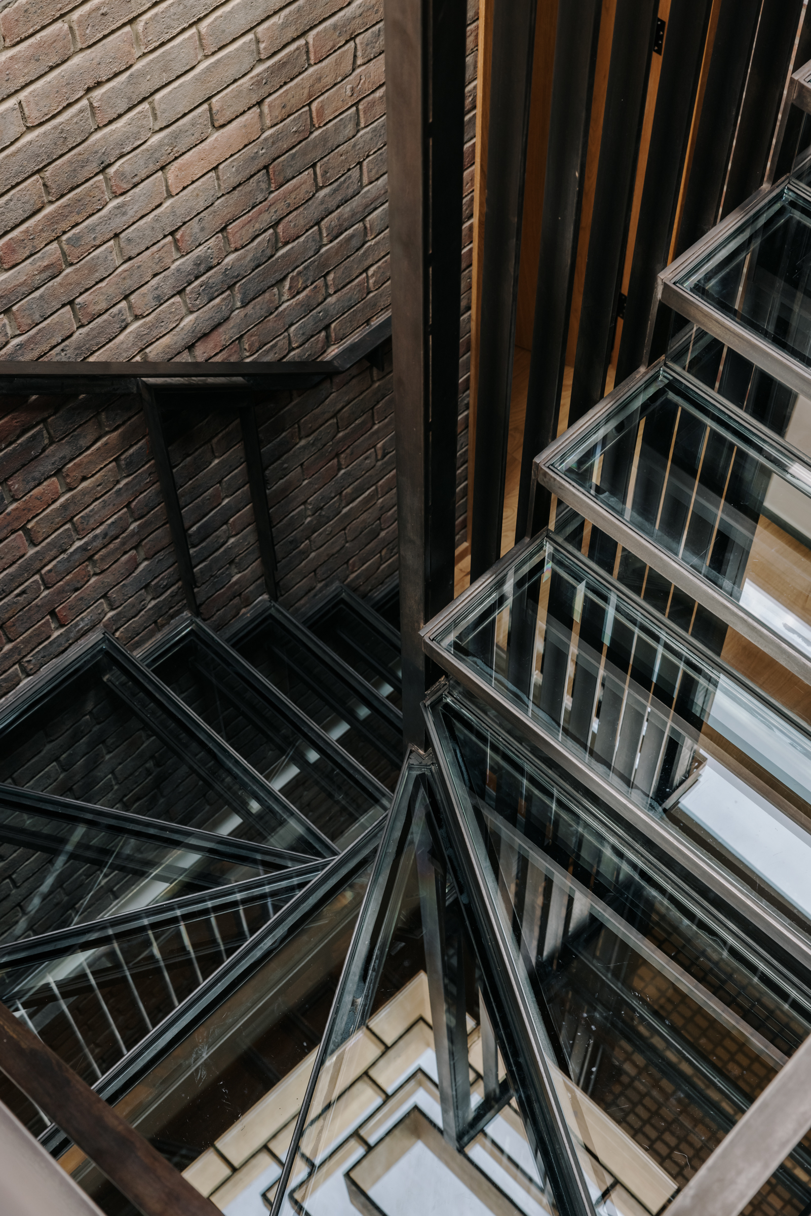
Steel staircases, similar to the one found outside lead from the ground floor level down to the basement where the bedrooms are and up to the top floor which opens out into a spacious light-filled living room – the one floor you can actually see at street level.
The open tread glass steps allow for light to flow right through the center of the house.
- Find more stylish staircase ideas in our gallery.
Bedroom
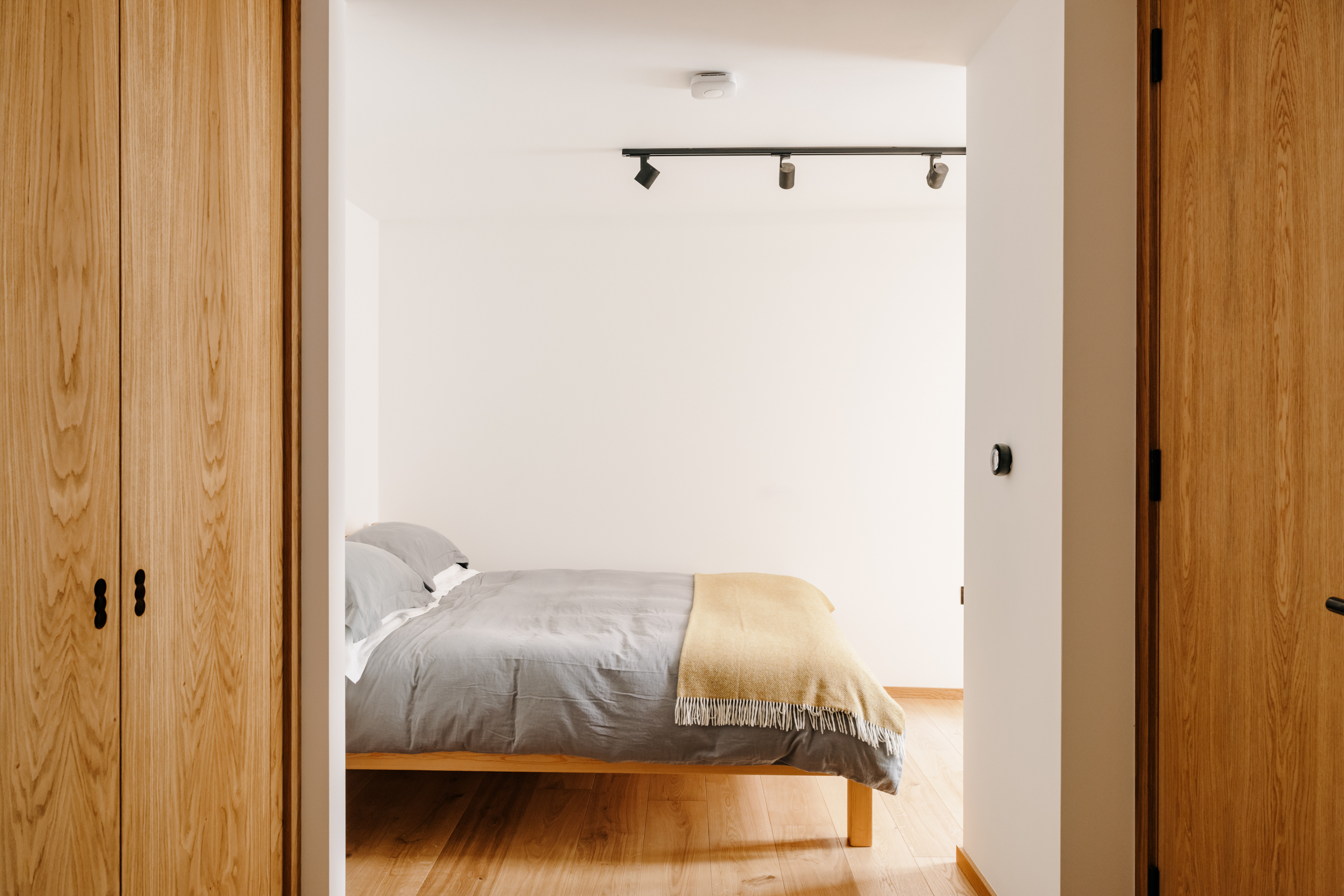
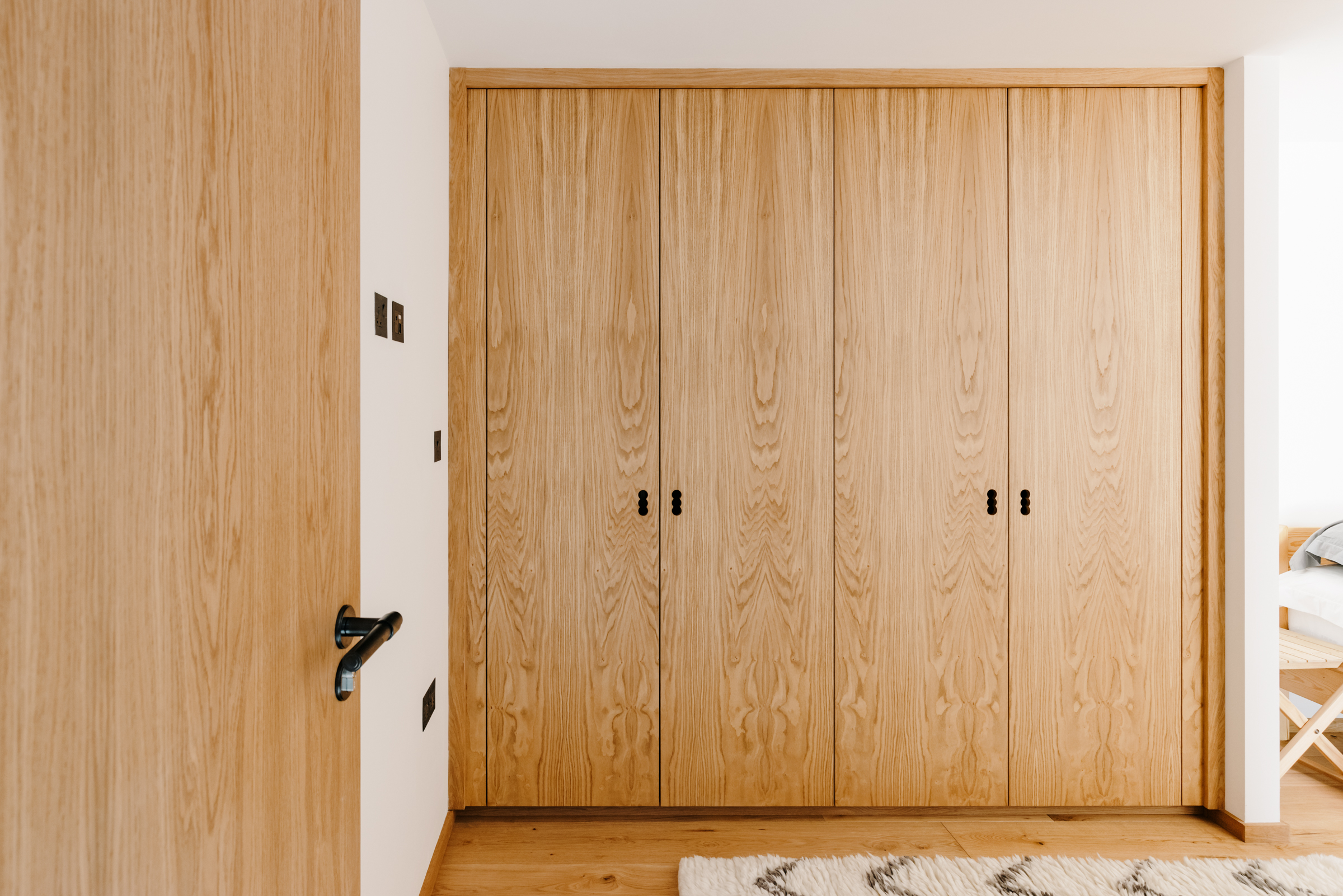
The bedrooms are all in the basement of the property, but each has glazed doors that open onto a small courtyard, so light still easily flows into each room. The master bedroom features large built-in wardrobes, bringing that oak into this space too.
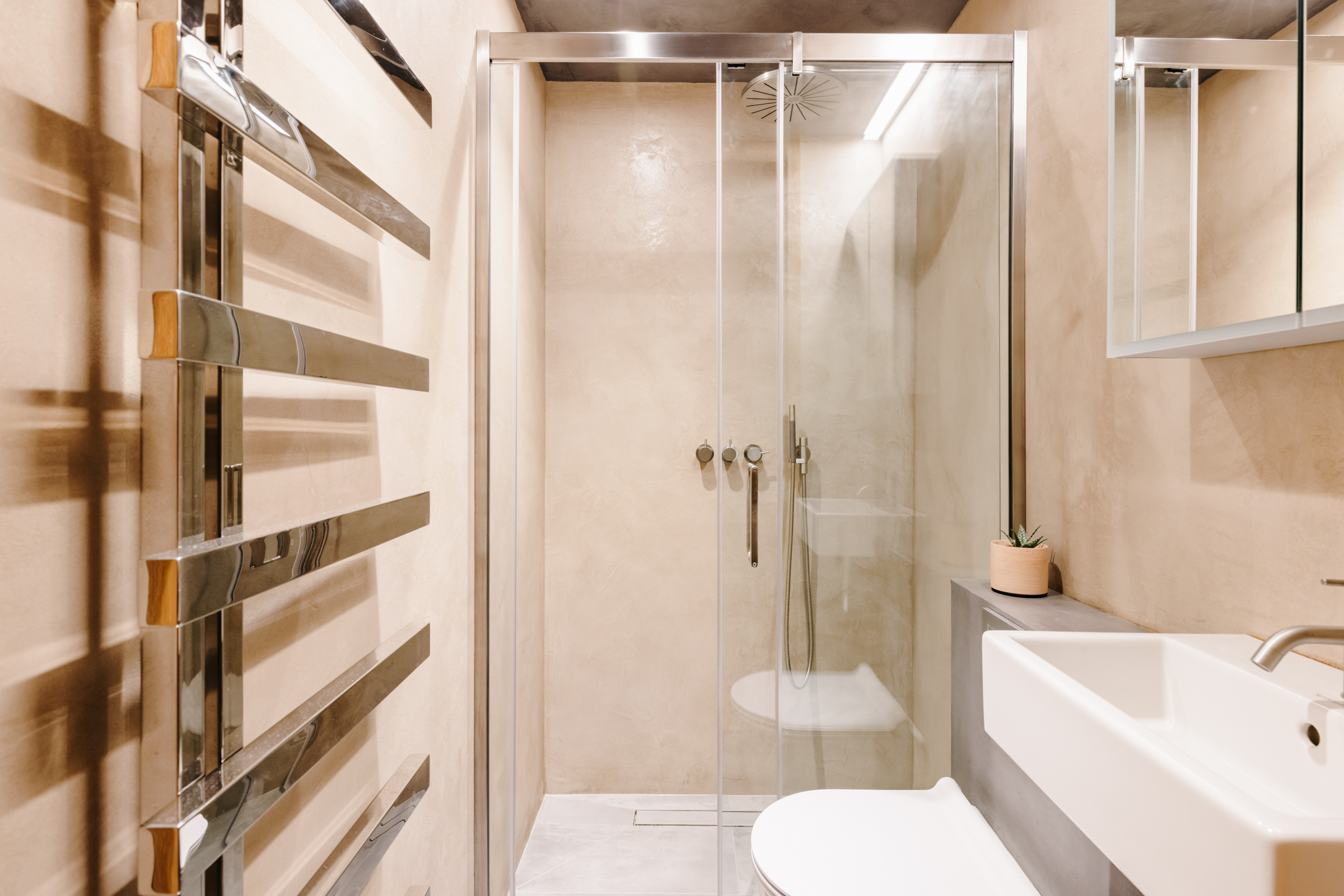
The main bedroom has a beautiful ensuite too. No oak in here, but the micro cement flooring and peachy polished plaster walls still give the same, raw industrial vibe that runs through the property.
Living room
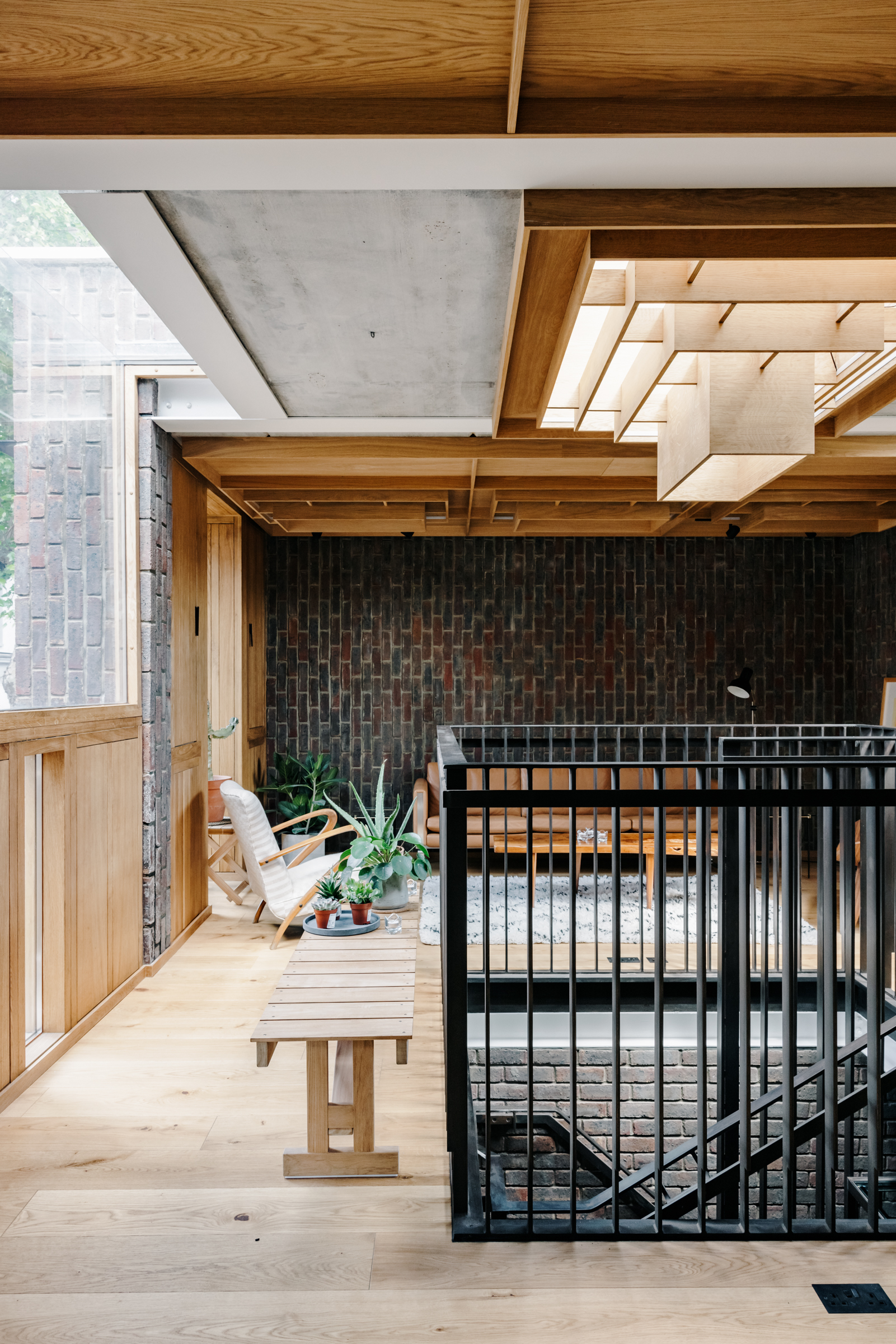
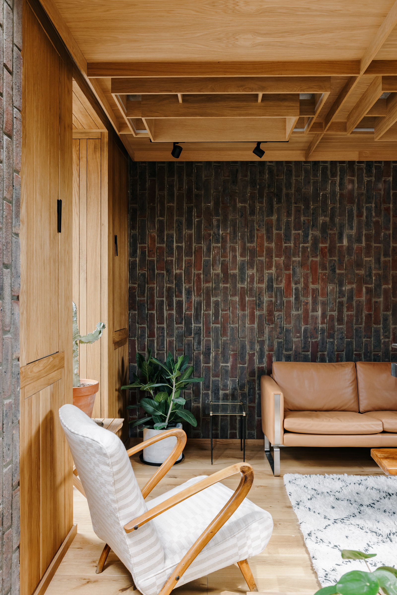
The top floor is arguably the most impressive. It's used as an open plan living room and of course, there's a lot of brick and a lot of oak going on which creates a really cozy, warm, and inviting space.
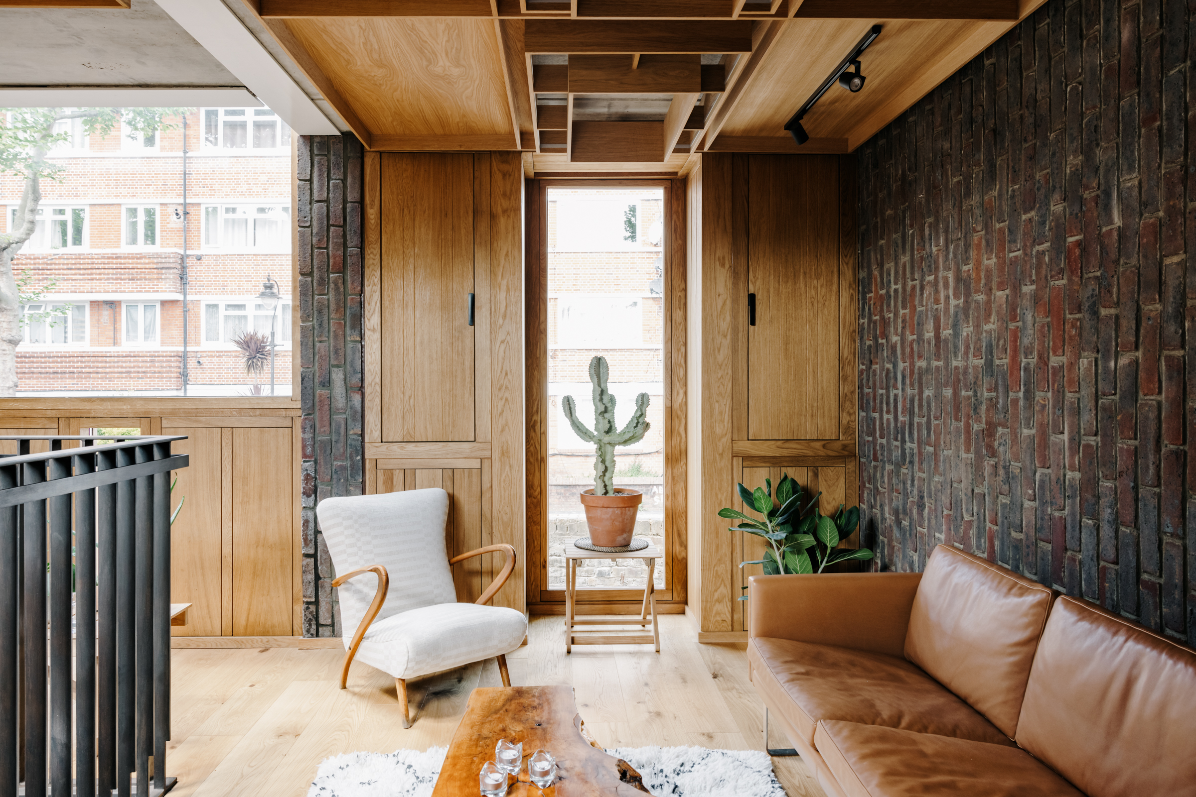
Exposed concrete ceilings are layered with an intricate series of interlocking oak panels that add so much interest and texture to the room, without interrupting the minimalist vibe.
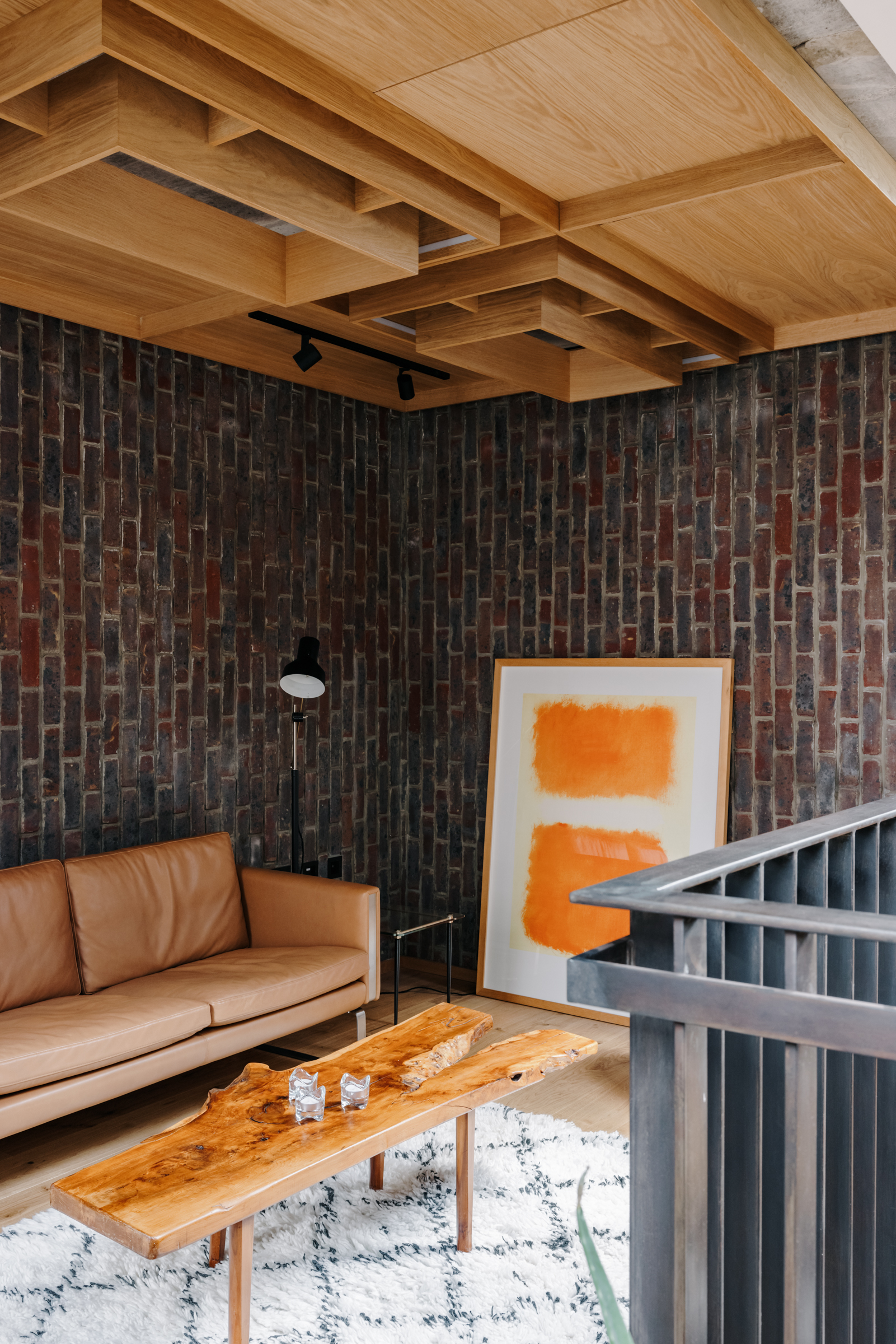
The steel balustrades of the staircase stand in the center to break up the room and allow for it to be configured in a number of ways. On each side sits a cozy living room, and an office space to the back, it still feels very open but there are clear zones going on too.
Like what you see? This property is currently listed with The Modern House.

Formerly the Digital Editor of Livingetc, Hebe is currently the Head of Interiors at sister site Homes & Gardens; she has a background in lifestyle and interior journalism and a passion for renovating small spaces. You'll usually find her attempting DIY, whether it's spray painting her whole kitchen, don't try that at home, or ever-changing the wallpaper in her entryway. She loves being able to help others make decisions when decorating their own homes. A couple of years ago she moved from renting to owning her first teeny tiny Edwardian flat in London with her whippet Willow (who yes she chose to match her interiors...) and is already on the lookout for her next project.