'It swirls like a ballerina en pointe' - a dramatic staircase is just the start of this modern home's elegance
A modern spiral staircase brings a contemporary focal point to a pastoral estate that embraces its heritage
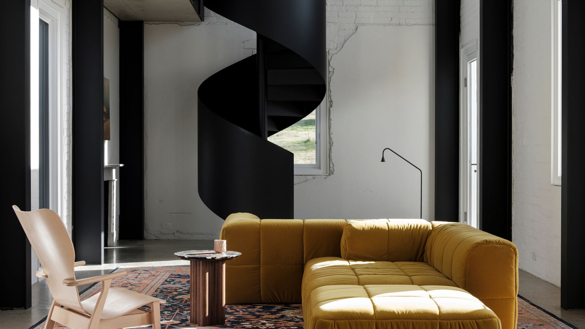

In this rural estate in New South Wales, dreamt up by Luke Moloney Architecture, historical architecture meets modern interiors. At the heart of it all is a statement steel spiral staircase, designed to stand almost independently of the living room, bringing grace and sculpture to the living space.
Not only does it provide a sculptural heart of the home, but it tells the wider story of the client and designers' desire to blend history with contemporary, 'leaving in the wobble', while bringing the home up to date with modern flourishes. 'There’s an easy blend of history and modernity in the house,' says Luke, 'an apparent lightness of touch which belies the substantial overhaul of the place.'
The staircase is just one of the features that make this space such a visually stunning historical yet modern home, alongside the exposed brickwork walls, monochrome color palette and luxurious, sumptuous furnishings. I speak to Luke to find out more about the project.
The staircase
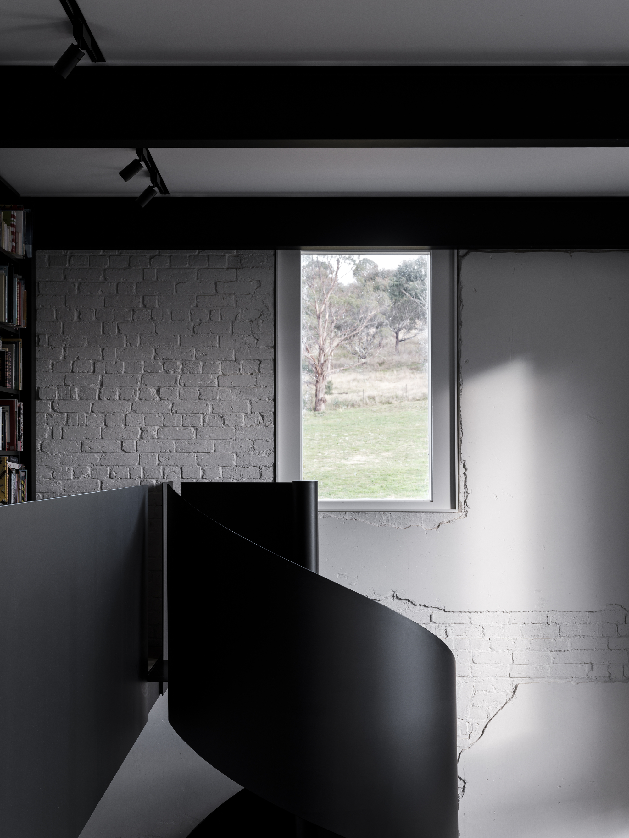
The staircase lends the interiors a dramatic centerpiece to the home. With a closed banister and matte jet black coloring, it drawing the eye upwards, encouraging the visitor to gaze upon the exposed brickwork walls. It's the undeniable centerpiece of the living room.
Made by artisans in the nearby country town, a small model was initially made at one-fifth scale to test compliance and construction, before the final piece was craned in through the roof.
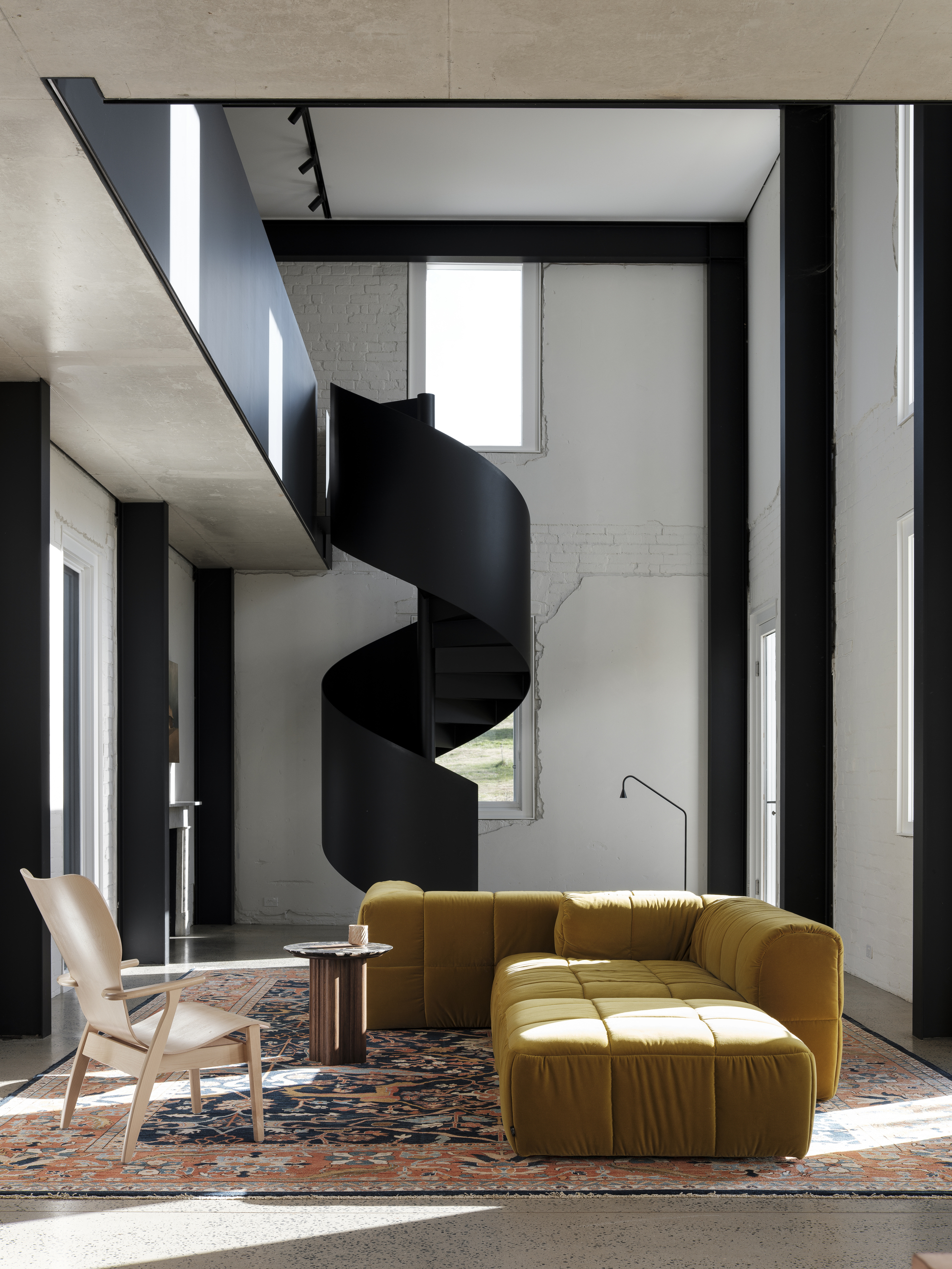
'The staircase stands at the far end and is designed to stand almost independently,' says Luke Moloney of the eponymous architectural practice. 'It is as sculptural as it is useful, and fun for the kids. It is made of steel, painted with satiny protective paint,' explains Luke. 'It was designed as an eye-catcher at the end of the living room. On a practical level, it provides access to the library and study on the upper level.
'It is designed so that it appears to be unsupported - it doesn't look like it touches the upper gallery, and seems to swirl down from above and touch the floor as lightly as a ballerina en pointe.'
Be The First To Know
The Livingetc newsletters are your inside source for what’s shaping interiors now - and what’s next. Discover trend forecasts, smart style ideas, and curated shopping inspiration that brings design to life. Subscribe today and stay ahead of the curve.
To bring the home together, it was furnished by prominent Sydney designers, Arent & Pyke, who were tasked with making the staircase work in the context of the wider living area. 'We wanted to make a play between the rigor and strength of the architecture,' says Sarah-Jane Pyke of Arent & Pyke, 'and the plush golden sofa draws you in from every angle. The space is flexible, comfortable, and inviting, and the rich palette speaks to the surrounding landscape.'
Original features
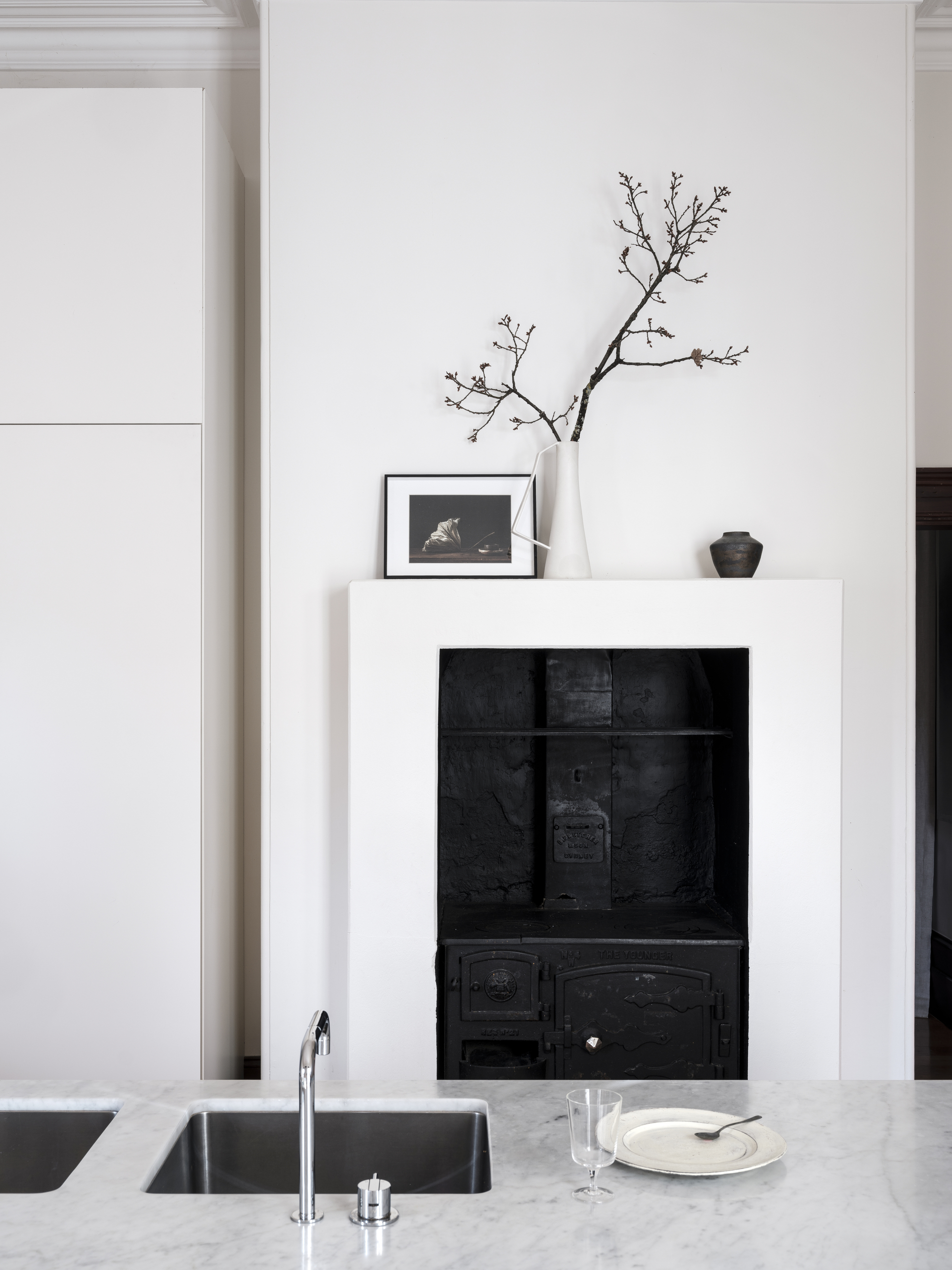
Built in the 1880s for a prominent pastoral family, the house was once the center of a vast working farm and oozes history. It was important for the designers to capture and reflect this heritage. Sitting alongside the great spiral staircase is older architectural features that give other rooms a focal point. But these are older and original, like the ink-black hearth in the kitchen, and fireplaces. 'Fireplaces in each of the rooms are all marble, and original to the homestead,' explains Luke.
In the kitchen, which was combined with three other rooms to form the large new kitchen, sits an old hearth. 'It was left in its position and refurbished by the builder. It doesn't work like it used to but is a handy nook and additional bench space in the kitchen.' It also provides a decorative focal point to the room, much like a fireplace would. The generously proportioned kitchen is also home to a large modern kitchen island that creates a practical workspace that invites people to gather round.
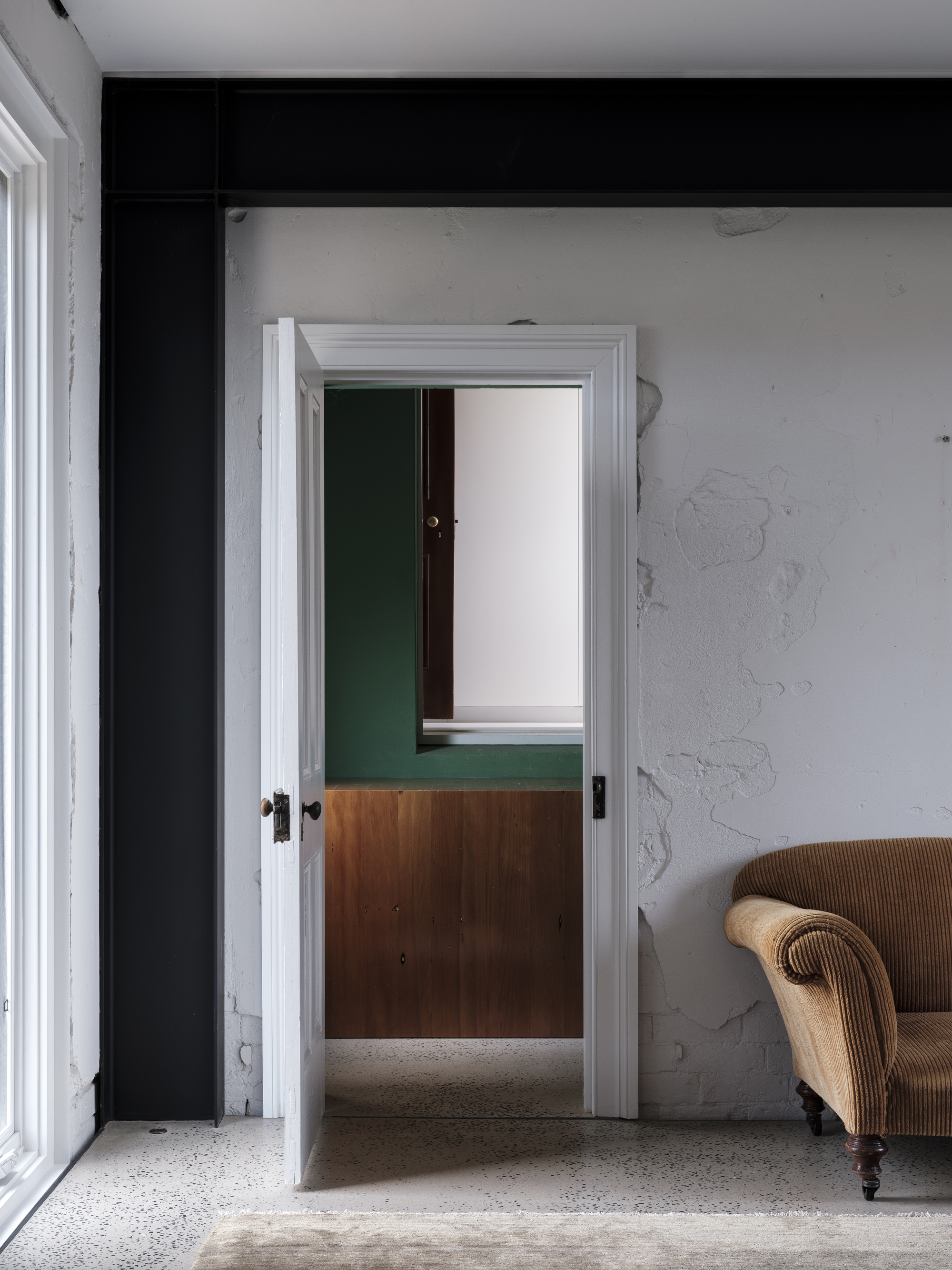
Elsewhere, it's the walls that have been left so you can see the original details and brickwork, painted white but left exposed. 'The old house has lovely dark timber skirting, trim, and architraves which we held onto and refurbished, that provide the elegant contrast to the otherwise muted colors and subdued palette.'
'It was of importance to the owners, builders, and myself that at the end of the job the house wouldn’t feel new – if sunlight scraped the walls of the rooms you’d still see a bit of wobble, and feel like you’re in a lovely old house.
'It’s a testament to the skill of the builders, three generations of the one family, that this has been achieved with a sense of beautifully built quality.'
Furnishings
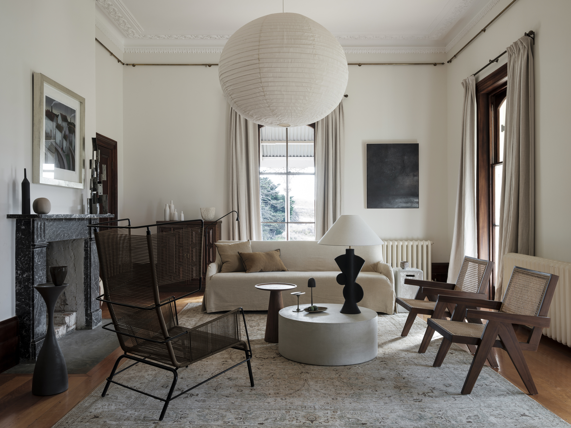
Creating a harmonious blend of old and new, new joinery is pulled in from the edges of rooms and is crisply detailed and modern. New light fittings are contemporary, and selected to work with the older architecture.
'There's still a sense of history in the place.' A mix of modern and antique furniture was also part of the plan to bring a certain mismatched mood to the home.
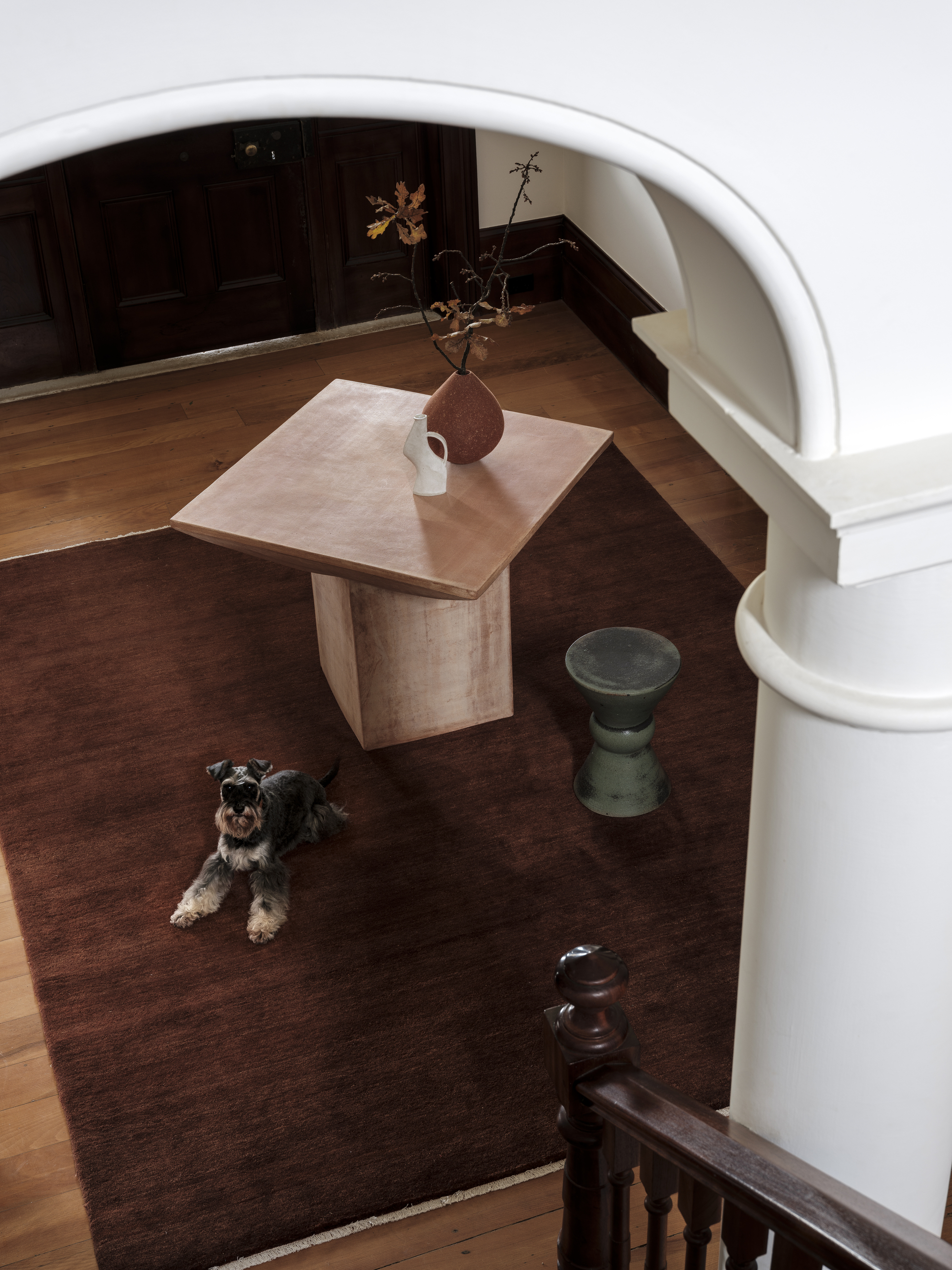
'The terracotta entryway table comes from Artedomus in Sydney. The ambition was that the imposing architecture of the house would be tempered by soft, tactile, pieces that are luxurious to the touch. The dining table was made from the timber of a beautiful cedar that was accidentally felled during construction.'
'Both the owners and I were keen to lend the interiors a serene, almost European quality. Pale walls and luxuriously tactile linens.'
‘New interior elements were to be conspicuously crisp and modern, pulled away from the edges so that the original scale of the old rooms might be read,’ says Luke.

Former content editor at Livingetc.com, Oonagh is an expert at spotting the interior trends that are making waves in the design world. She has written a mix of everything from home tours to news, long-form features to design idea pieces, as well as having frequently been featured in the monthly print magazine. She is the go-to for design advice in the home. Previously, she worked on a London property title, producing long-read interiors features, style pages and conducting interviews with a range of famous faces from the UK interiors scene, from Kit Kemp to Robert Kime. In doing so, she has developed a keen interest in London's historical architecture and the city's distinct tastemakers paving the way in the world of interiors.
-
 Straight from Salone: Five Emerging Trends I Found That'll Shape Interiors For the Year Ahead
From reflective silver to fluidity, here's my perspective on the key themes and new moods coming through from Milan Design Week
By Sarah Spiteri Published
-
 9 Bathroom Storage Mistakes You're Probably Making That Make Using This Space Much Harder — And What to Do Instead
Discover which mistakes are to blame for your overcrowded and cluttered bathroom
By Seraphina Kyprios Published
