Inside an uber-chic Italian designed apartment in London's iconic Television Centre
Mid-century shapes meet super contemporary pieces in this newly refurbished, elegant penthouse apartment

The Livingetc newsletters are your inside source for what’s shaping interiors now - and what’s next. Discover trend forecasts, smart style ideas, and curated shopping inspiration that brings design to life. Subscribe today and stay ahead of the curve.
You are now subscribed
Your newsletter sign-up was successful
The property
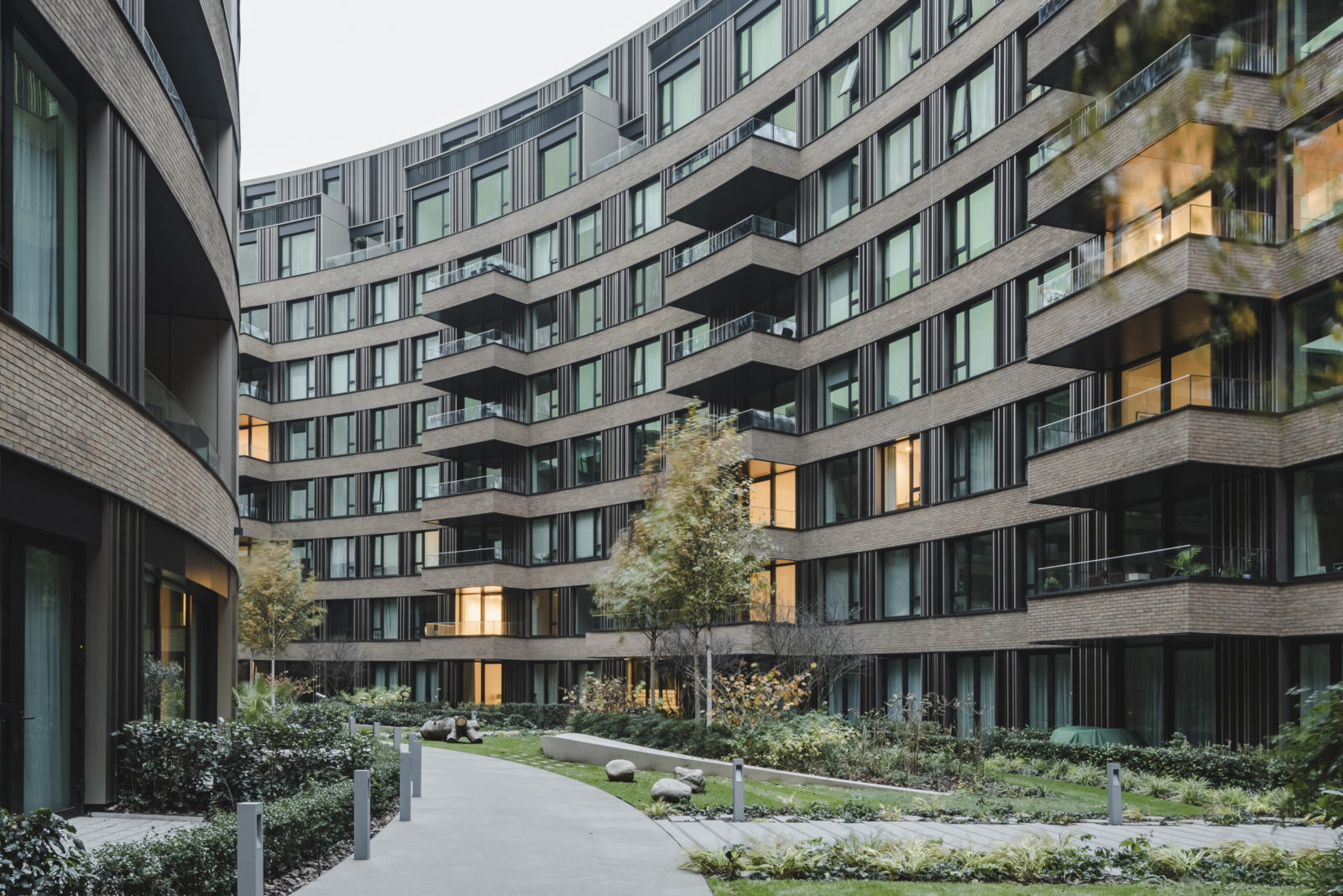
A landmark piece of architecture, the former home of the BBC, London's Television Centre has become somewhat of a homage to iconic style and contemporary design. After its refurbishment and reopening in 2017, this iconic landmark is a smorgasbord of design-led apartments that each have their own identity. We've so far toured Bella Freud's playful 70s contribution, Waldo Works' 60s inspired rooms and now we are taking a glimpse into the three-bed, penthouse apartment designed by Italian furniture company Cassina.
This stunning modern home, is part of the Architects' Series, a collection of homes designed by five British architects, each with very different styles so all the apartments have different vibes. The Cassina apartment, situated on the eight floors of the Television Centre’s Crescent was designed in collaboration with the architects of the building Allford Hall Monaghan Morris (AHMM). Let's take a tour...
Kitchen
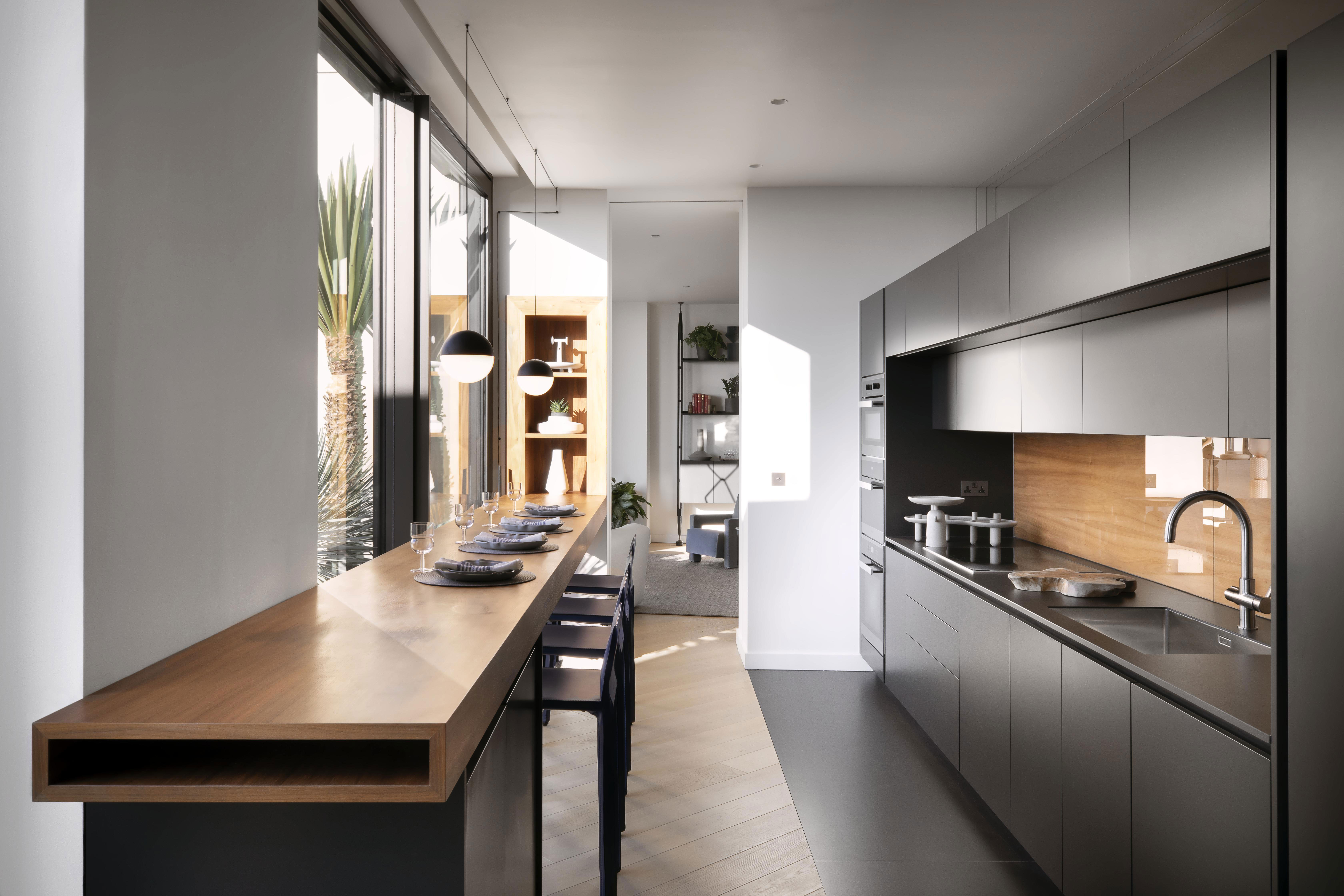
The apartment's layout is broken plan, with a large open plan living area at one end, the three bedrooms at the other a the kitchen running through the center. The kitchen itself is by Molteni C and Dada, very simple, very minimalist will all appliances built-in to keep the cabinetry as seamless as possible.
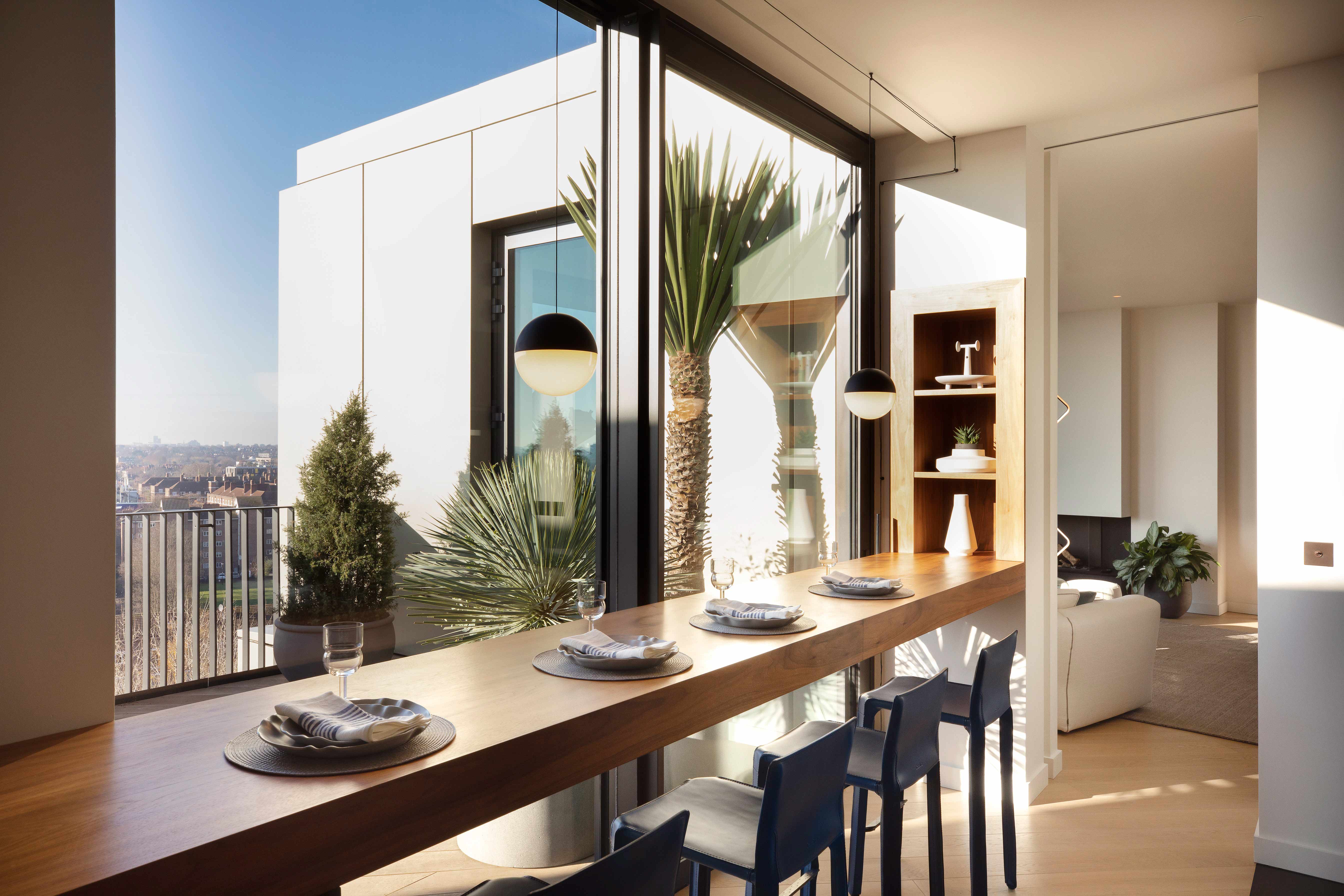
A long walnut breakfast makes the most of views out over the terrace and the city beyond. The floor-to-ceiling windows bring so much light into this relatively narrow space, making it feel so much larger and lighter.
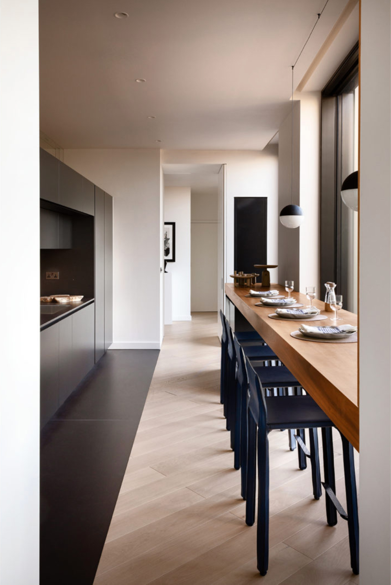
- Be inspired by more modern kitchen ideas in our gallery
Hallway
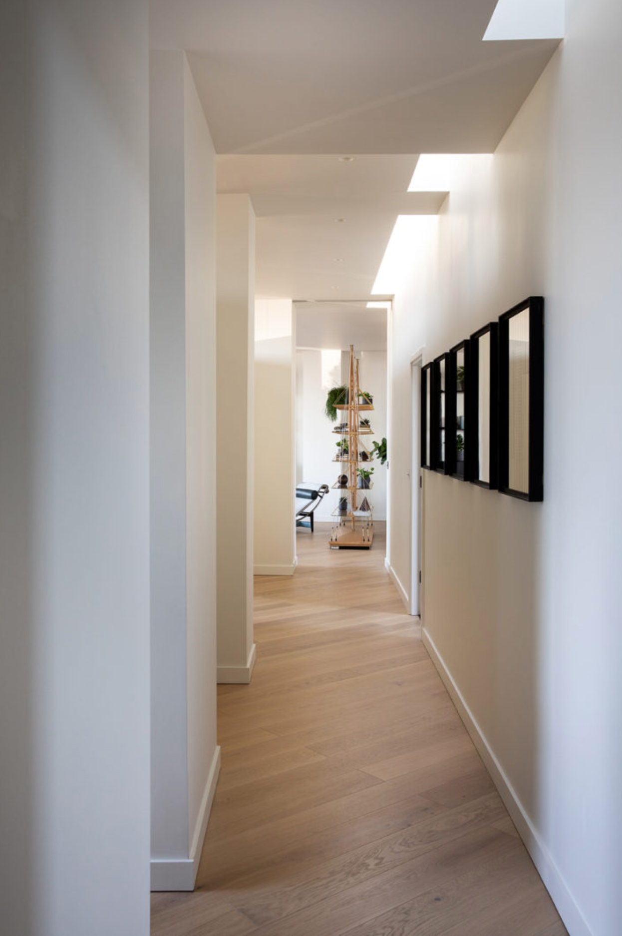
Running adjacent to the kitchen is a long gallery, with crisp white walls that are bathed in light from the series of roof lights. This hallway-like space allows for the kitchen to be closed off when necessary, so all rooms can still be accessed without having to wander through the kitchen to get from one side of the apartment to the other.
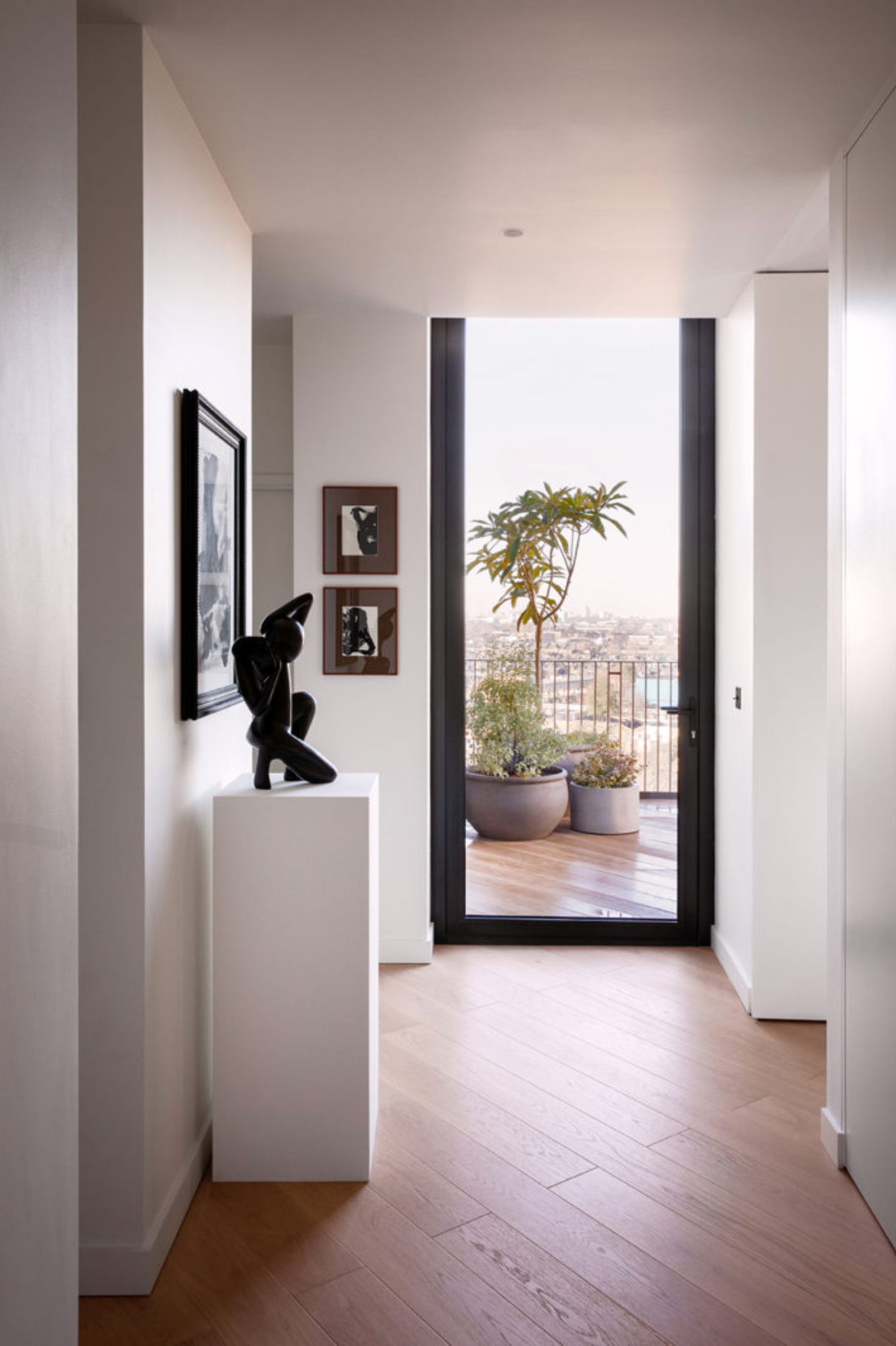
Large doors at one end of the gallery lead out onto a second terrace again filling the narrow space with light and creating a seamless flow between the indoor rooms and outside areas.
Dining room
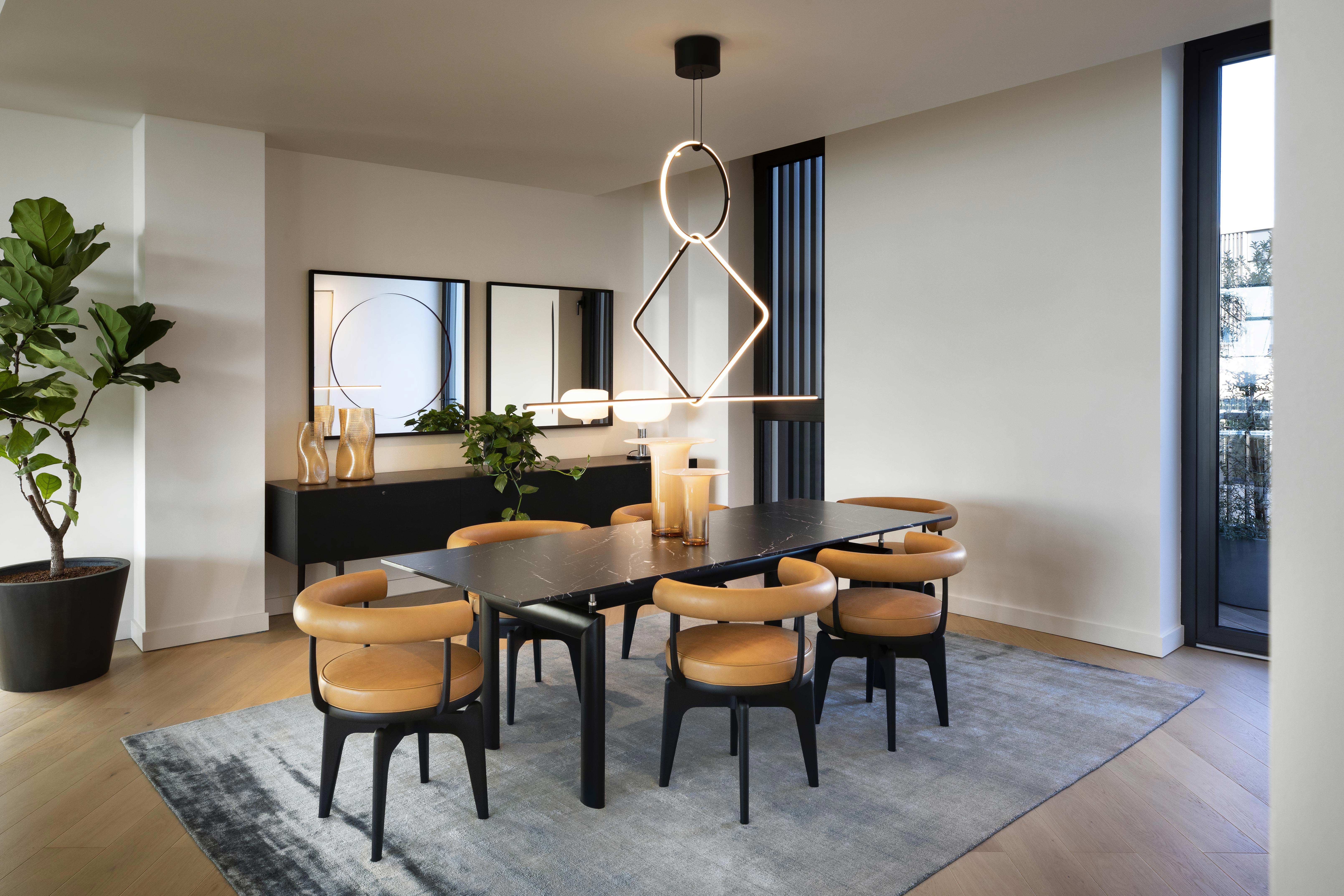
The other end of the gallery leads through a pocket sliding door into the large open planing living area. The dining room sits at one end with the curvaceous Perriand Indochine armchairs and LC6 dining table introduce a retro feel to the minimalist modern space.
The Livingetc newsletters are your inside source for what’s shaping interiors now - and what’s next. Discover trend forecasts, smart style ideas, and curated shopping inspiration that brings design to life. Subscribe today and stay ahead of the curve.
Living room

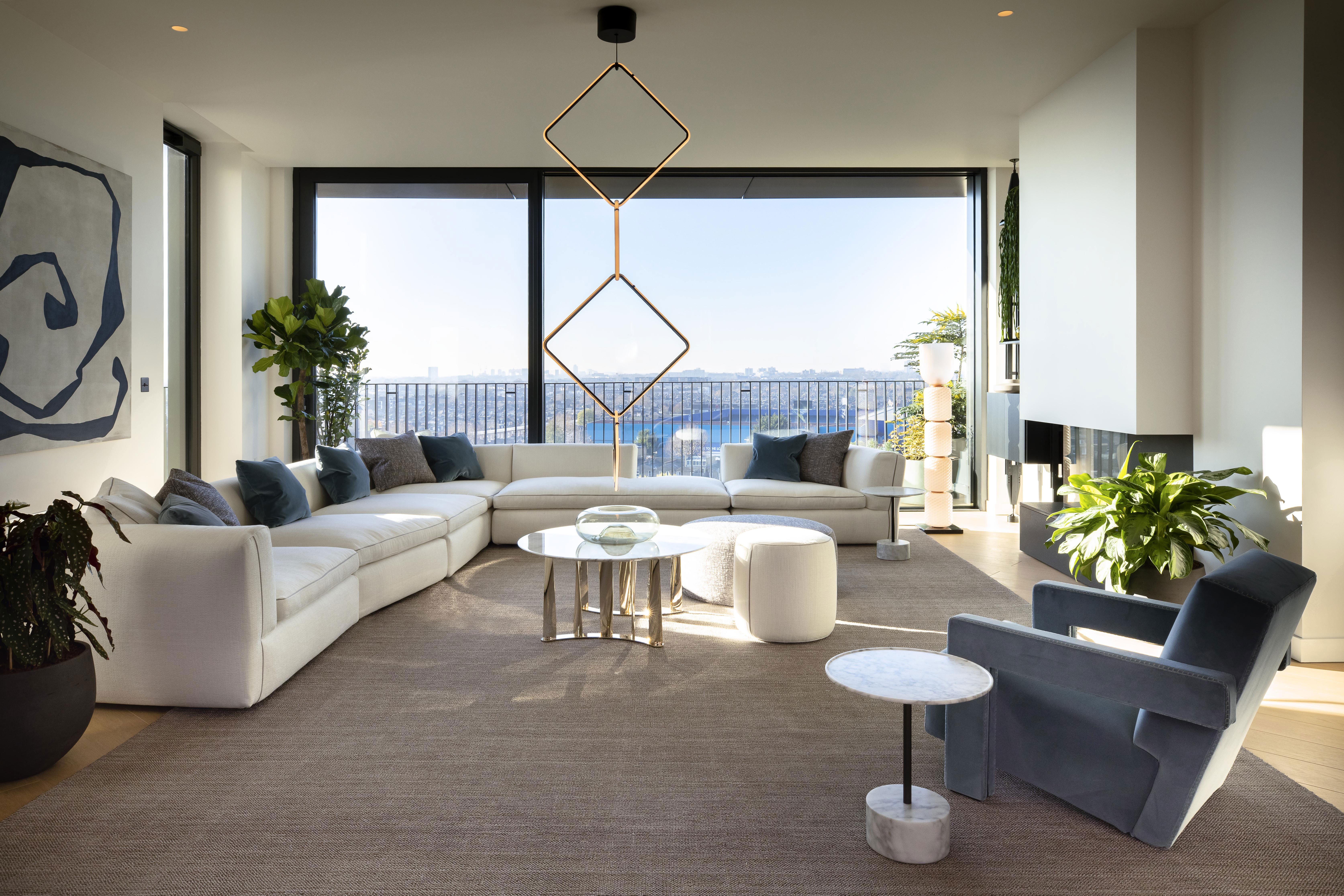
The informal living room is at the opposite end of the space, with stunning views out of over London and Hammersmith park. The minimalist, neutral color palette is punctuated only by the muted blues and greys creating a very serene space that feels fresh, open and airy.
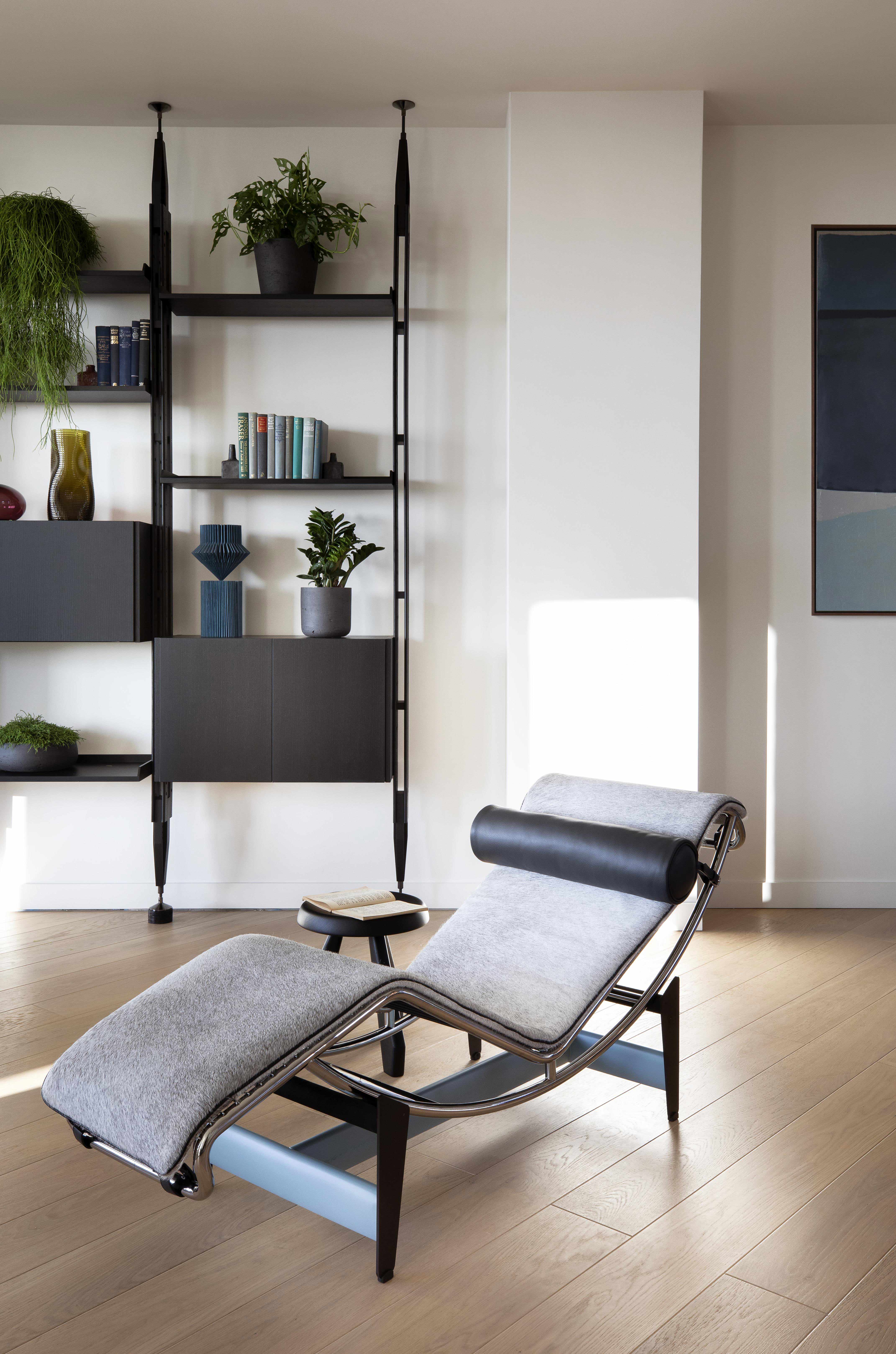
The space is so carefully curated and really reflects Cassina's ability to blend iconic pieces with contemporary style. Many pieces were chosen from the Cassina archives (like this LC4 Villa Church Chaise Longue) and mixed with new innovative pieces to create a space that in some way mirrors the mix of historic and modern that's so much part of the Television Centre heritage.
Master bedroom
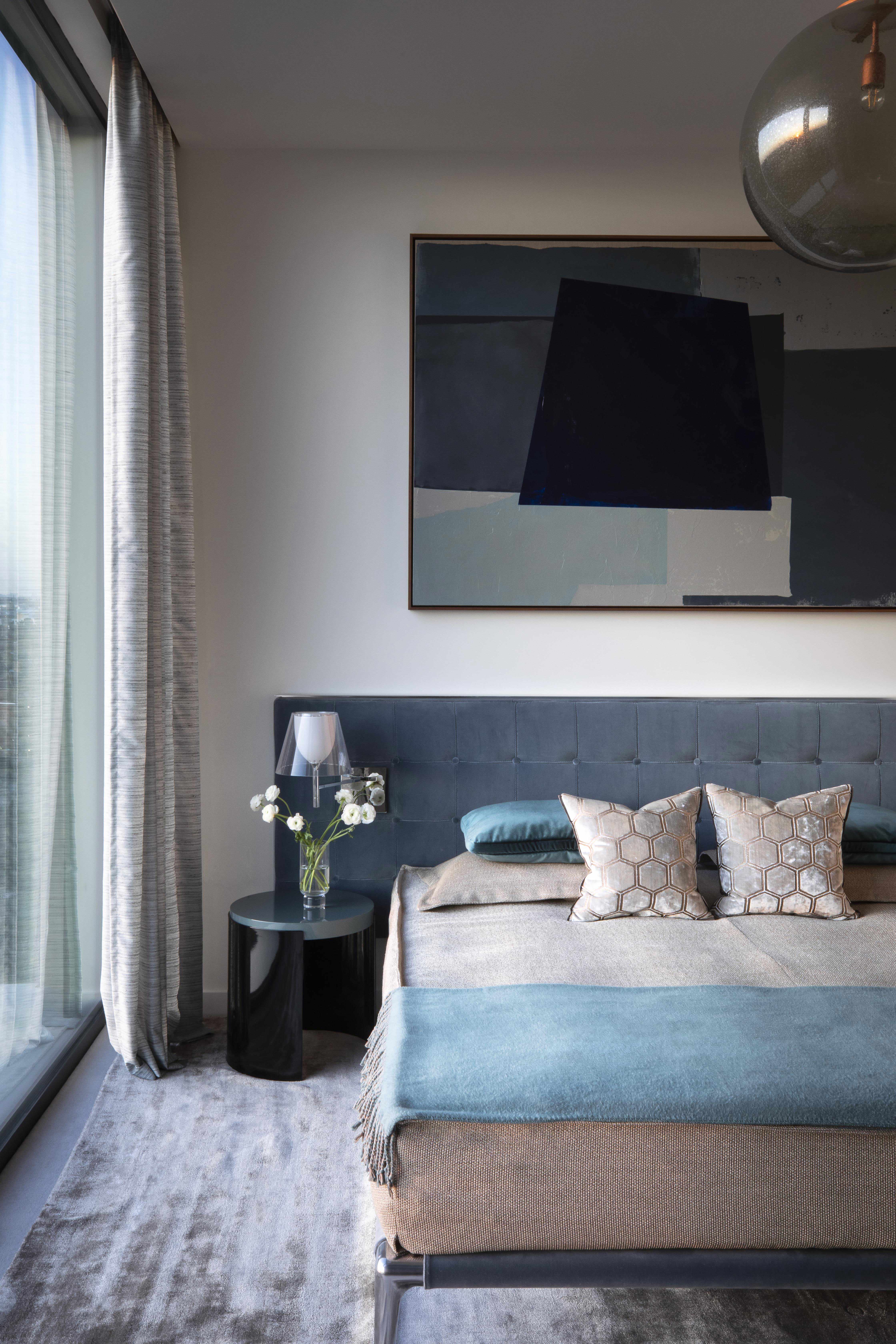
In the master bedroom, the calming blue and neutral color scheme continues with layers of soft sky blue, deep navy and grey-toned beige. The bespoke artwork that hangs above the bed brings all these colors together and gives the room a contemporary edge. An upholstered Philippe Starck bed with build-in lighting adds a luxurious touch.
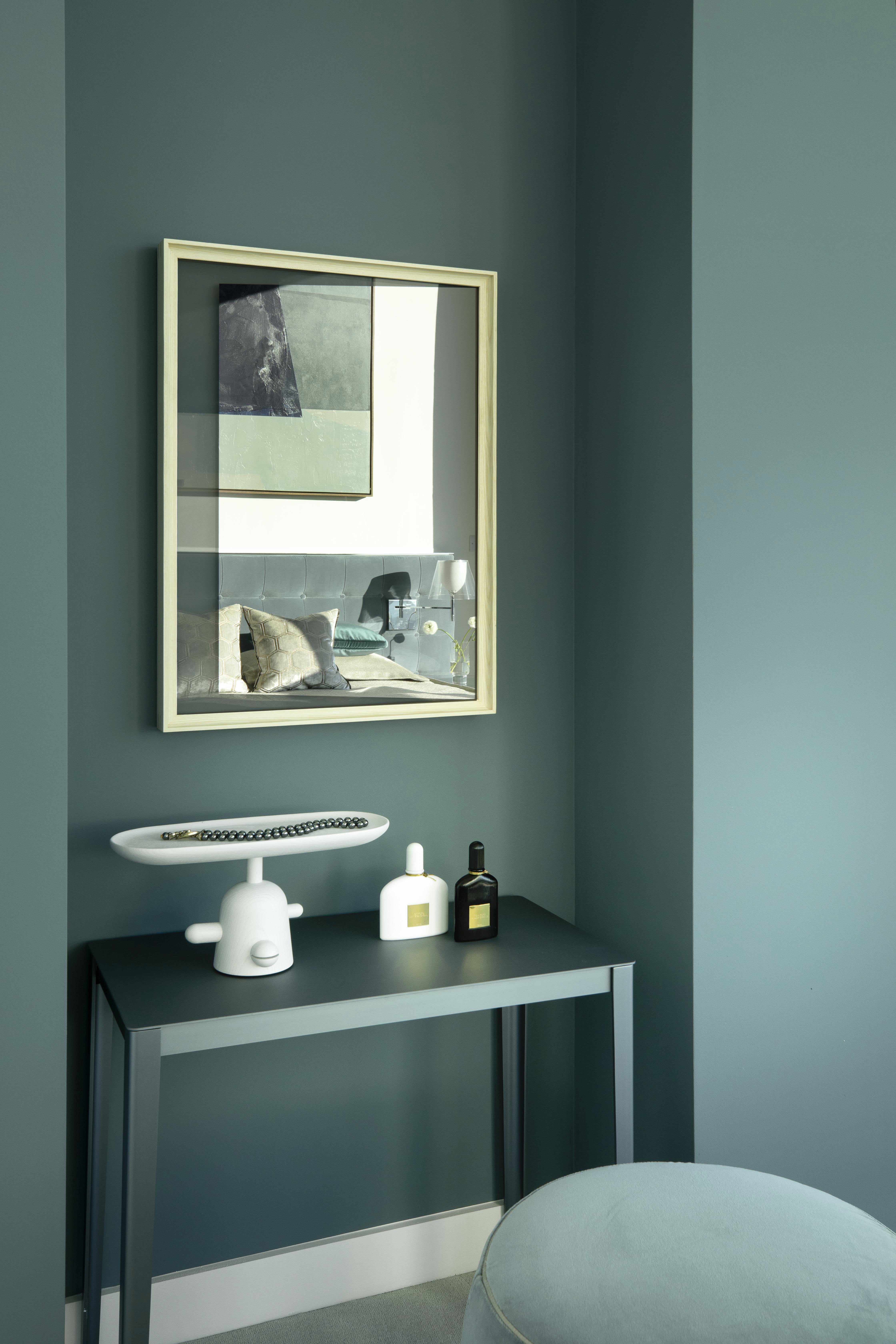
The beige walls meet a bold yet soft teal feature wall, where a compact dressing table fits snuggly into a nook, almost blending into the wall behind.
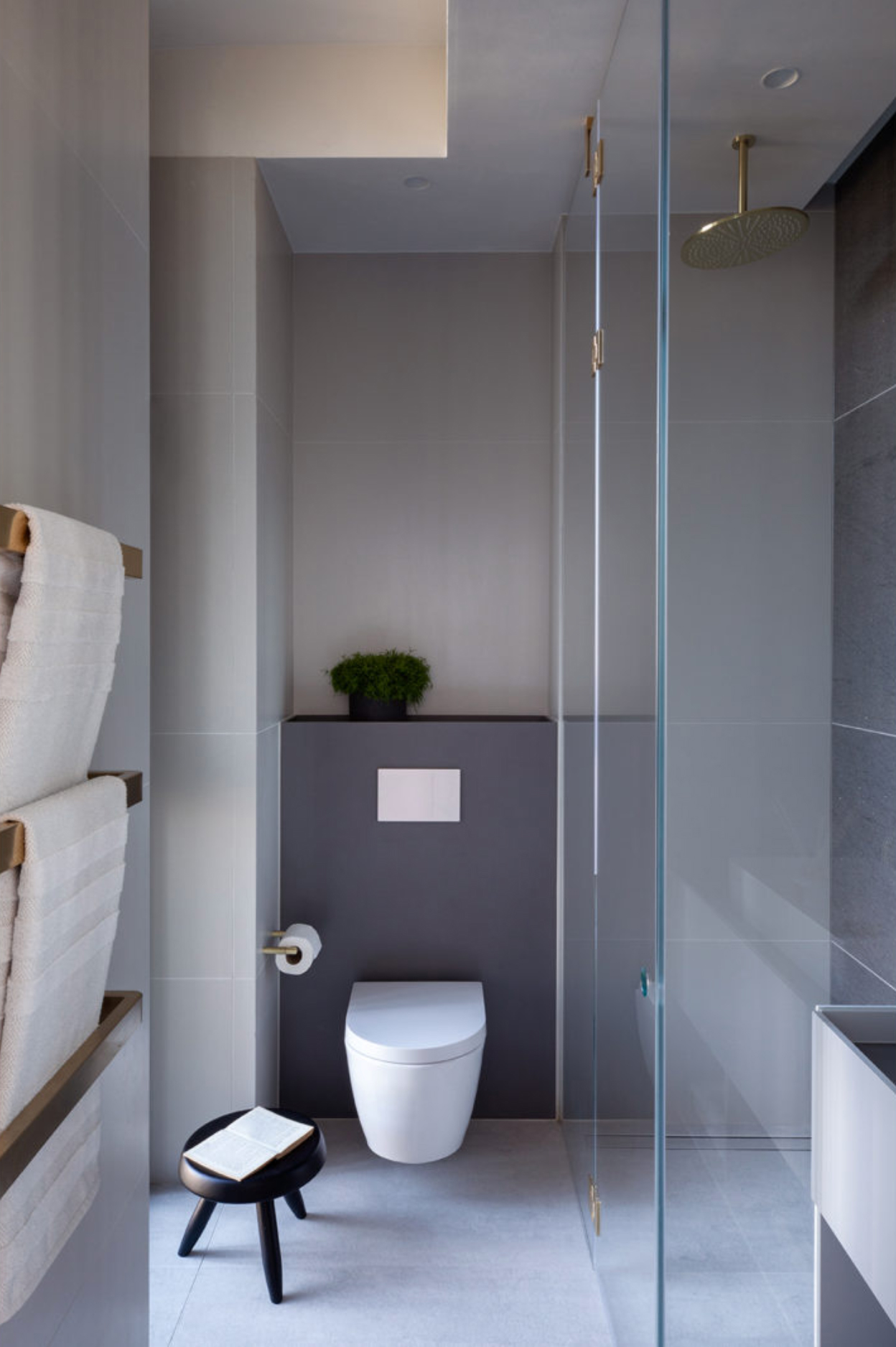
- Find more master bedroom ideas
Guest bedrooms
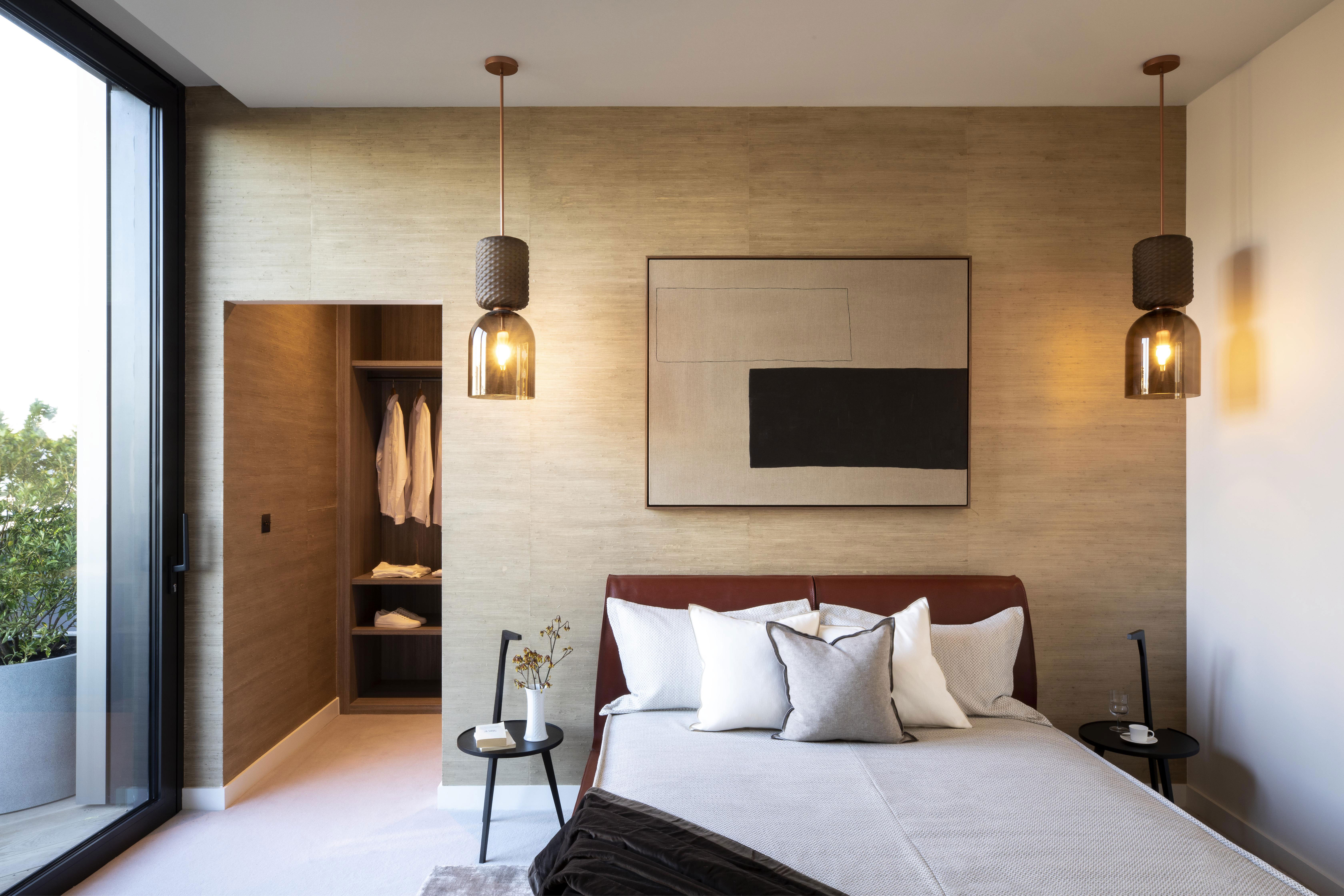
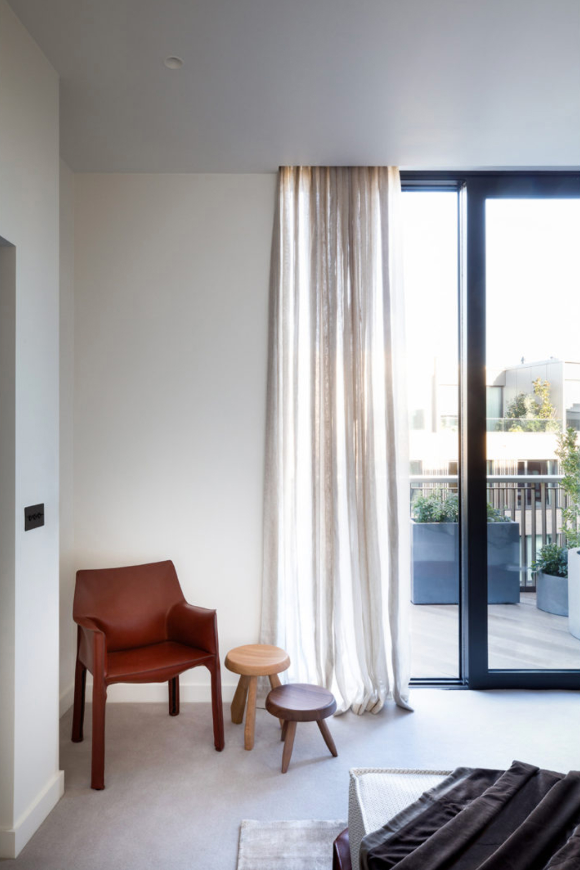
The two guest bedrooms have an equally calming color palette with rich brown leathers and dark woods meeting contemporary shapes of the modern furniture and clean lines in the artwork.
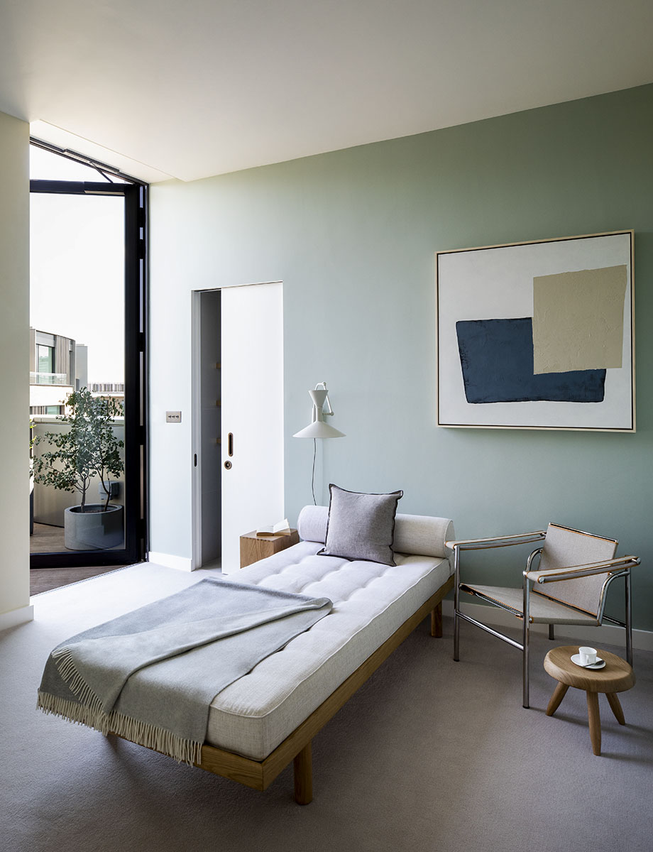
A serene green third bedroom features a single bed, with a floor-to-ceiling door opening out onto the terrace.
- See more guest bedroom ideas in our gallery
Terrace
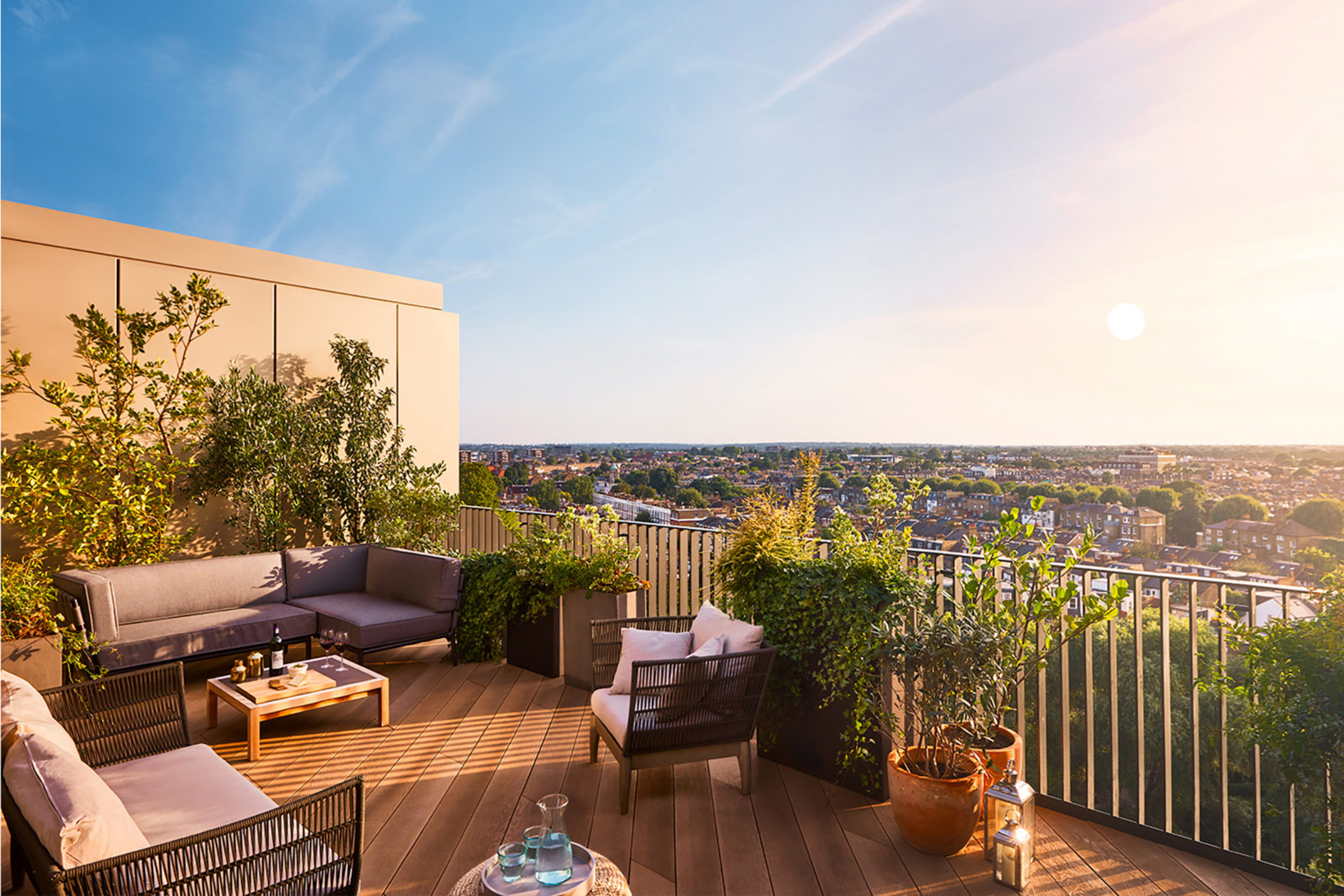
There are actually three terraces in the apartment, the largest one looking inwards, over the mature communal garden that sits in the center of the crescent.
Formerly the Digital Editor of Livingetc, Hebe is currently the Head of Interiors at sister site Homes & Gardens; she has a background in lifestyle and interior journalism and a passion for renovating small spaces. You'll usually find her attempting DIY, whether it's spray painting her whole kitchen, don't try that at home, or ever-changing the wallpaper in her entryway. She loves being able to help others make decisions when decorating their own homes. A couple of years ago she moved from renting to owning her first teeny tiny Edwardian flat in London with her whippet Willow (who yes she chose to match her interiors...) and is already on the lookout for her next project.