"It's a Game Changer" — This Kitchen's Uniquely-Shaped Island Completely Shifts the Space's Feel for the Better
The architect's of this kitchen thought outside of the box when designing the layout of this space - quite literally in the case of the island
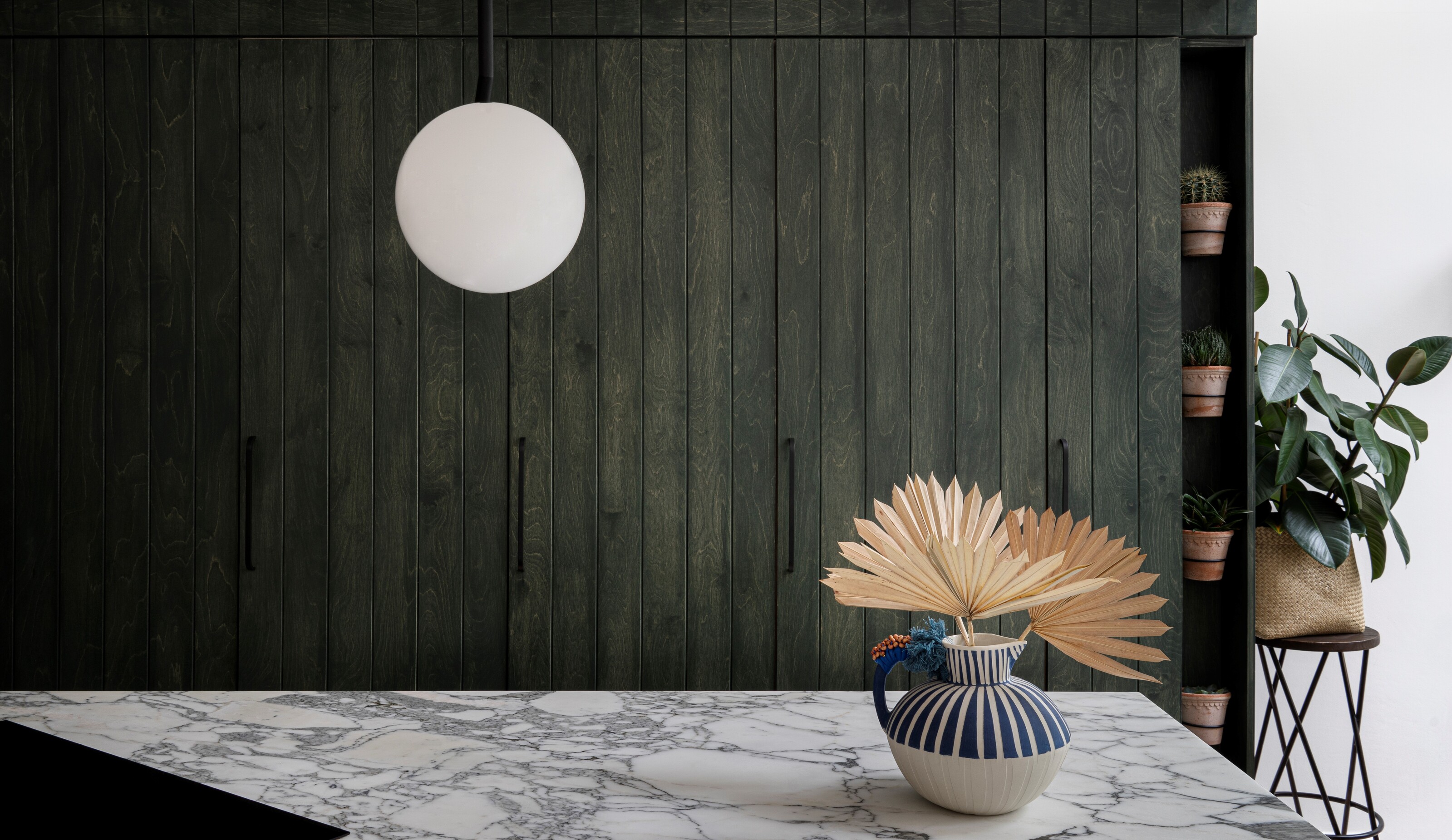

2023 has certainly seen a celebration of curves and arches in the world of interior design. Smooth and shapely, designers have embraced the curvaceous look to help soften spaces - a great tactic for smaller rooms.
But flipping this approach on its head is this kitchen design that shuns arches and round shapes for something altogether more dramatic - statement-making angles, and lots of them at that.
Creating a pathway through the kitchen of this family home, and embracing sharp, harsh edges, with a triangular, 'chopped' kitchen at the center, this kitchen makes the most of a smaller space.
To find out what influenced this modern home's kitchen design, I spoke with the architect, who worked with the young family - who have now themselves to form their own design studio, One Small Studio, to create something special at the heart of their home.
The 'chopped kitchen' look
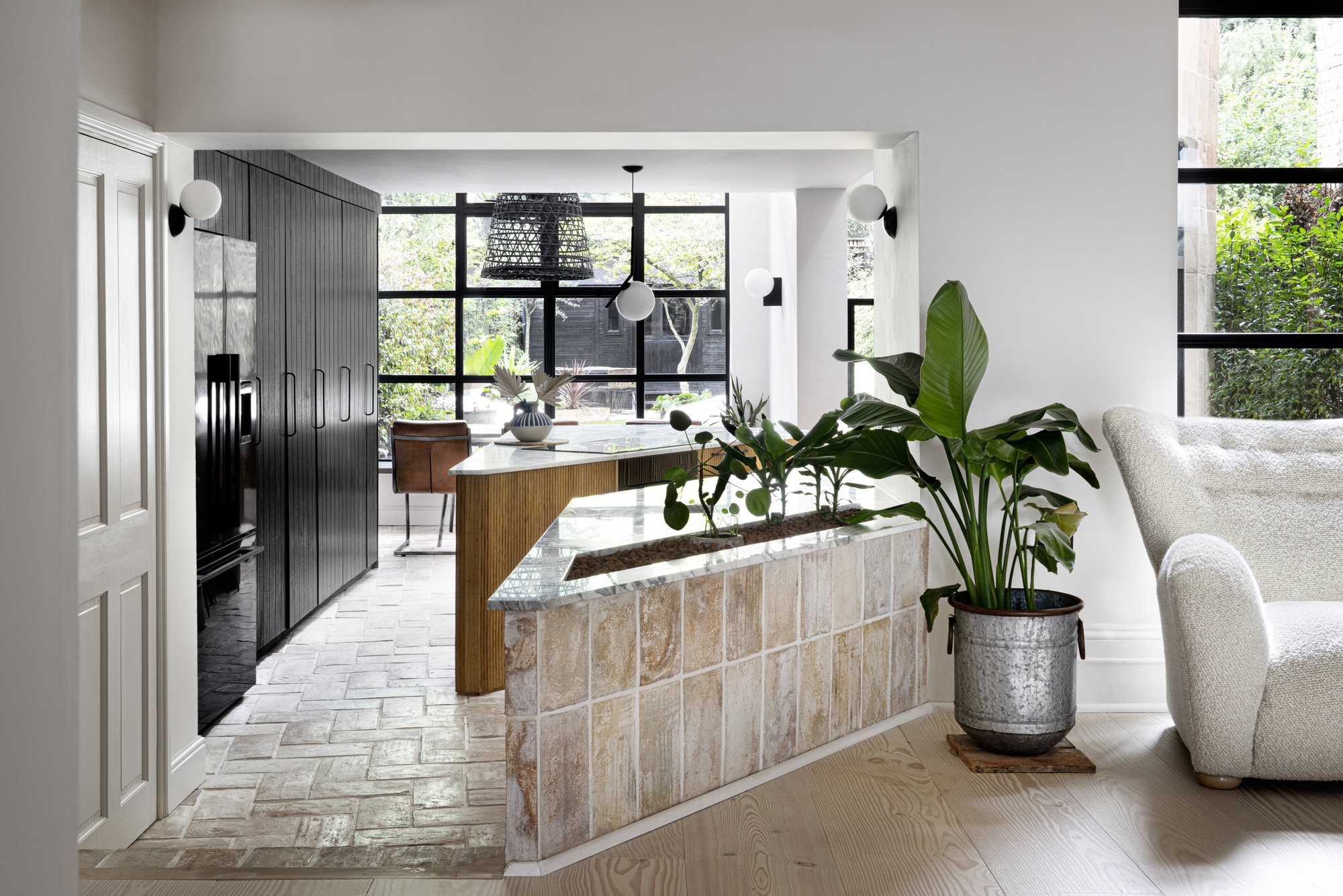
At Livingetc, we've recently started noticing the chopped kitchen island look picking up pace, and it's fair to say that it's the star of the show in this kitchen. So what is it? A 'chopped' kitchen island look is a design where a corner of the island is removed, creating a more interesting, angular shape that works best in a small kitchen, decreasing the size of the footprint while creating a dynamic use of space. What's leftover is typically triangular, giving that island feel but with a more interesting shape.
'I don't think curves are over, but they can be problematic,' says Robert Houmøller, founder of Merrett Houmøller Architects. 'Curves have their place, but can be expensive to construct and can create awkward spaces around them.'
In this home, the triangular shape of the island creates two pathways for the visitor to follow, provides interest, and creates the kitchen island feel we all know and love but in a smaller space.
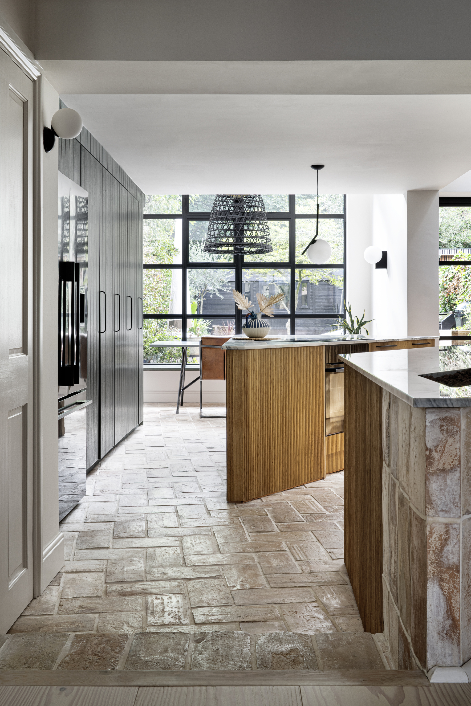
'The form of the kitchen island derives from the form of the extension,' explains Robert. 'The angle was introduced as a way of maximizing the amount of usable space within the kitchen whilst also allowing loads of light and air into the space.
Be The First To Know
The Livingetc newsletters are your inside source for what’s shaping interiors now - and what’s next. Discover trend forecasts, smart style ideas, and curated shopping inspiration that brings design to life. Subscribe today and stay ahead of the curve.
'The result meant a really generous but unusual, dynamic-shaped island, which added a bit of drama to the space.
'Good design should come from some kind of rationale wherever possible and the form of the island meant a generous and usable island as possible whilst maintaining a decent amount of space around it.'
Materials in the kitchen
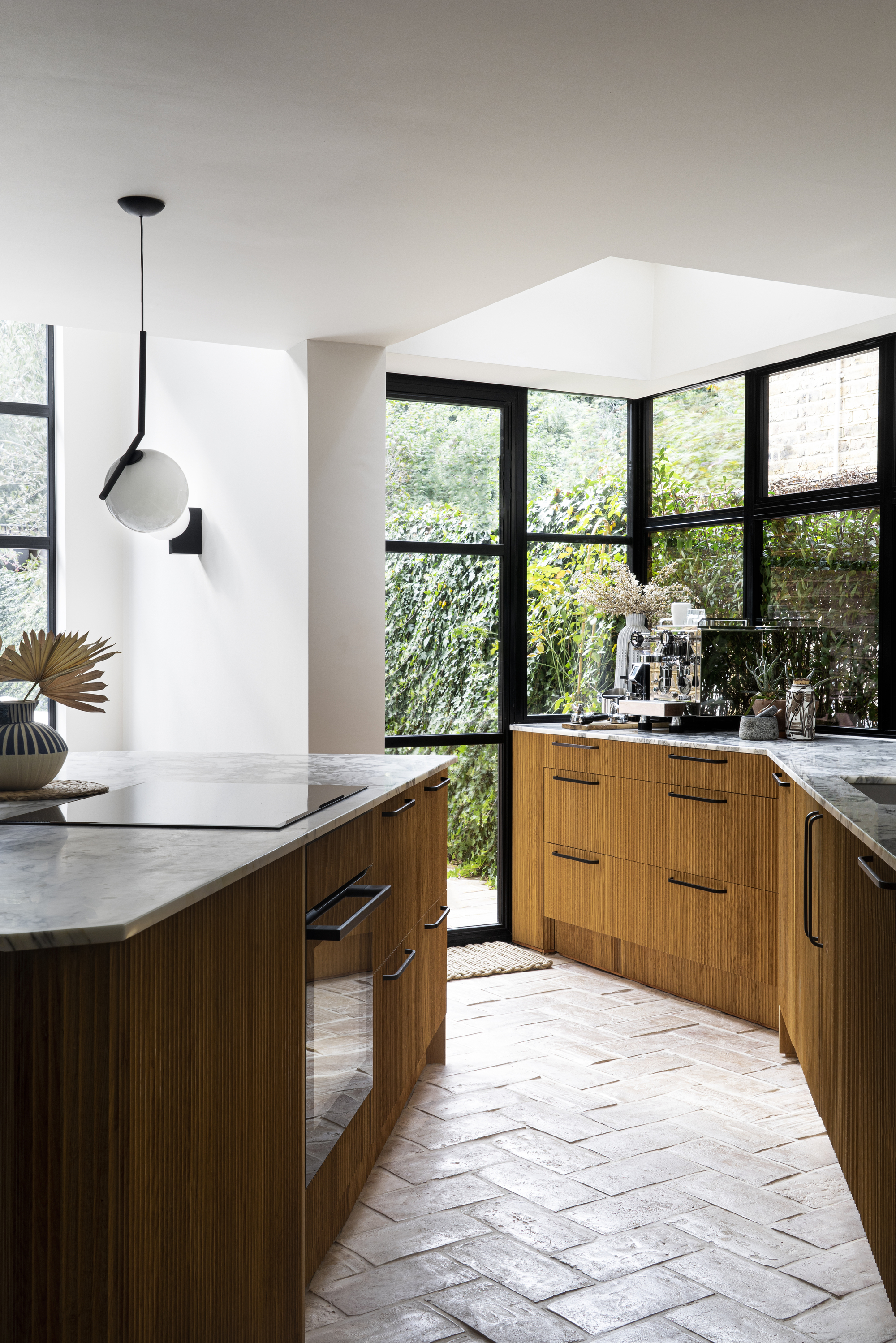
Bringing the space together are natural materials that work in harmony. Where angles and harsh lines might have the potential to foster a sterile feeling, natural materials add that warmth that is so needed in such an angular space.
A standout marble worktop work alongside imperfect reclaimed handmade floor tiles in terracotta from Lubelska, a celebration of natural stone. These tiles are handmade and around 80-100 years old and come from south east Europe. Colors range from creams to ochres to light pink tones. This specific client finished the tiles with a wax to leave a satin finish.
Meanwhile, fluted timber cabinets add to the warmth and texture throughout the space.
'The original house is full of warmth and charm and we were keen not to lose this,' explains Robert. 'We believe that deep within us, there is a need to have a connection with nature and craft, and this influenced the choice of materials.
'The grain of timber, the patterning of the marble worktop and the imperfections in the handmade kitchen flooring reminds us that everything comes from nature and we are inextricably linked to it. Without this, spaces can feel sterile, cold and unfriendly.'
The kitchen color scheme is fairly subtle, with warmth coming from the timber kitchen and reclaimed terracotta floor tiles. 'On the edge of neutral, it means that pretty much any color furnishings or art can work within the space, allowing it to change over the years as fashions change and tastes evolve. Where color is used, texture is always present, and the materiality always expressed.'
For Robert, it's about sustainability too. 'Timber acts as a carbon sink, storing carbon within it - we try to specify timber as much as possible.
'Stone and reclaimed tiles don’t require much in terms of energy, chemicals, and waste in their production (mostly it’s just the energy transporting them). Importantly, at the end of their useful lives, these materials can be reused or recycled and won’t sit in landfill leeching pollutants for years to come.'
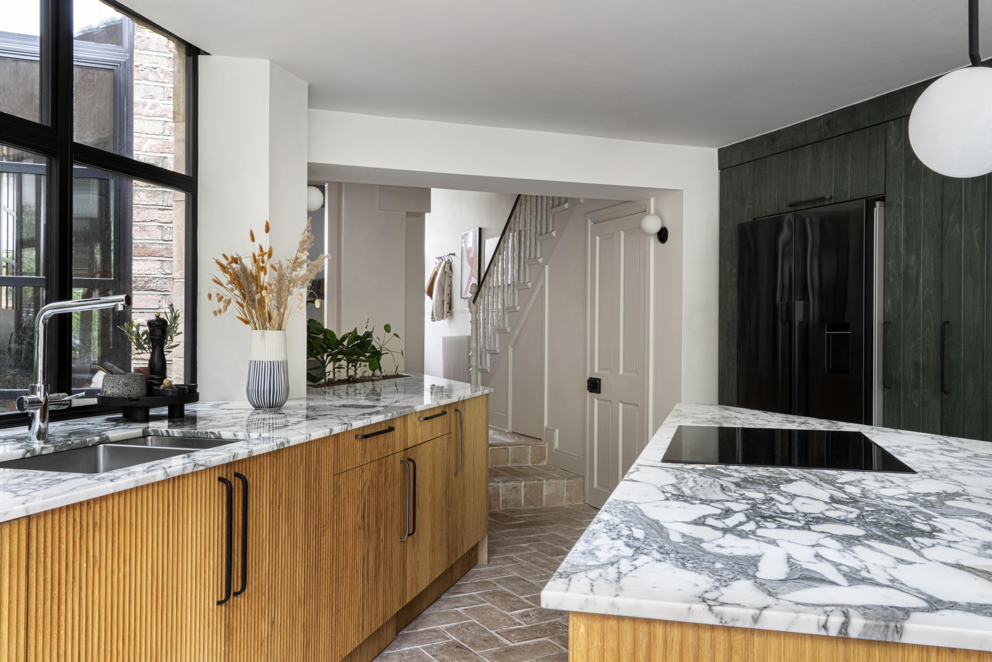
Follow the pathway leading right in the kitchen and you'll find the countertop against the window. Robert and the homeowners decided to forgo the kitchen countertop splashback - a decision that helps to make the space feel more minimalist, seamless and shows off the clean lines of the angular worktop.
'Bringing the cill height down to worktop level results in a much deeper and more generous worktop as the windows are set within the depth of the wall, as well as maximizing the amount of light and views out.
'Not having a splashback means there is one less surface to deal with so helps to reduce the amount of visual clutter.'

Former content editor at Livingetc.com, Oonagh is an expert at spotting the interior trends that are making waves in the design world. She has written a mix of everything from home tours to news, long-form features to design idea pieces, as well as having frequently been featured in the monthly print magazine. She is the go-to for design advice in the home. Previously, she worked on a London property title, producing long-read interiors features, style pages and conducting interviews with a range of famous faces from the UK interiors scene, from Kit Kemp to Robert Kime. In doing so, she has developed a keen interest in London's historical architecture and the city's distinct tastemakers paving the way in the world of interiors.
-
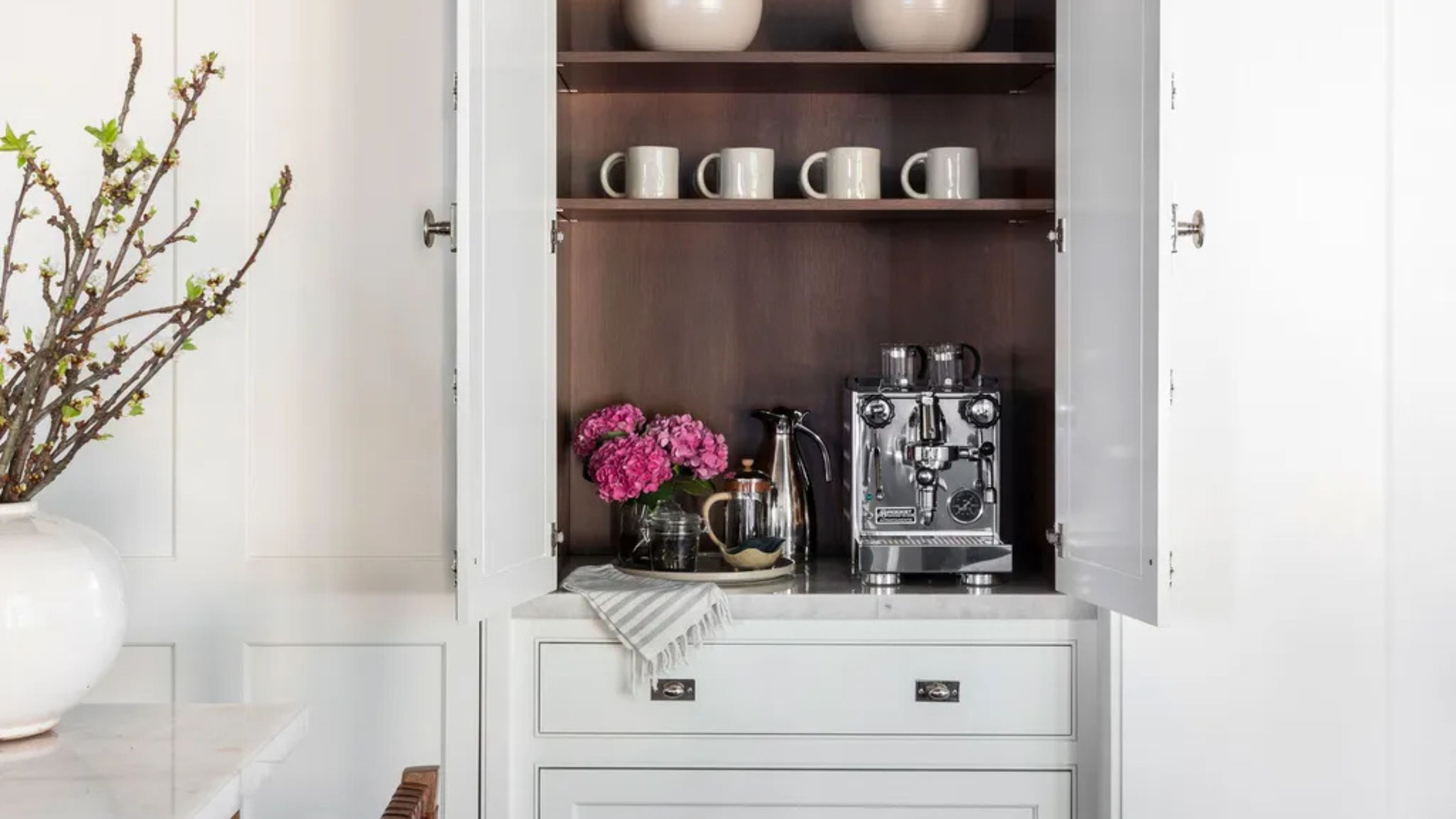 Turns Out the Coolest New Café is Actually In Your Kitchen — Here's How to Steal the Style of TikTok's Latest Trend
Goodbye, over-priced lattes. Hello, home-brewed coffee with friends. TikTok's 'Home Cafe' trend brings stylish cafe culture into the comfort of your own home
By Devin Toolen Published
-
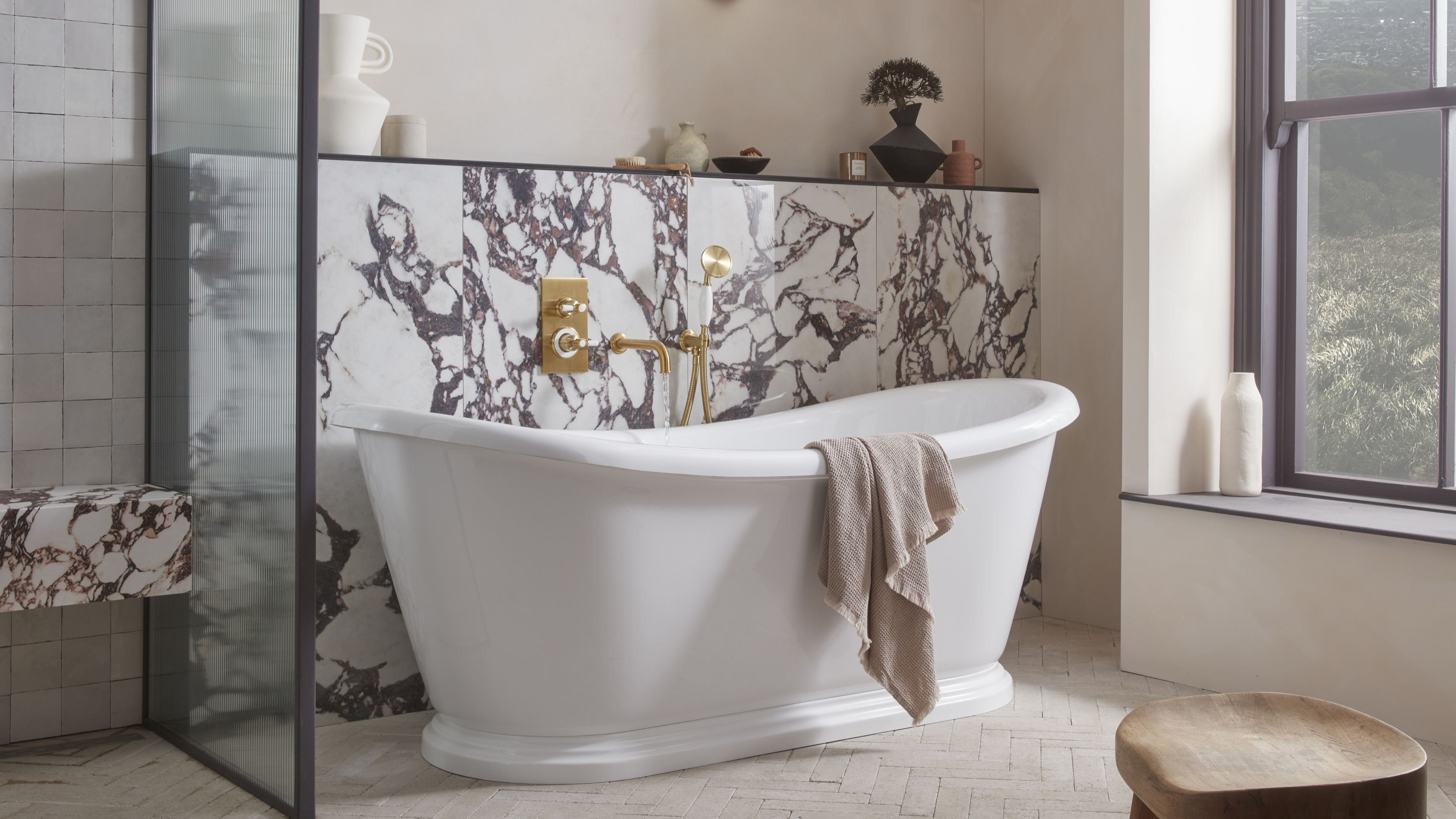 5 Bathroom Layouts That Look Dated in 2025 — Plus the Alternatives Designers Use Instead for a More Contemporary Space
For a bathroom that feels in line with the times, avoid these layouts and be more intentional with the placement and positioning of your features and fixtures
By Lilith Hudson Published