Our editor thinks John Pawson's Neuendorf is the best minimalist house in the world. Take a look inside
Designer John Pawson created this beautiful minimalist home in Spain with a pool terrace that has to be seen to be believed
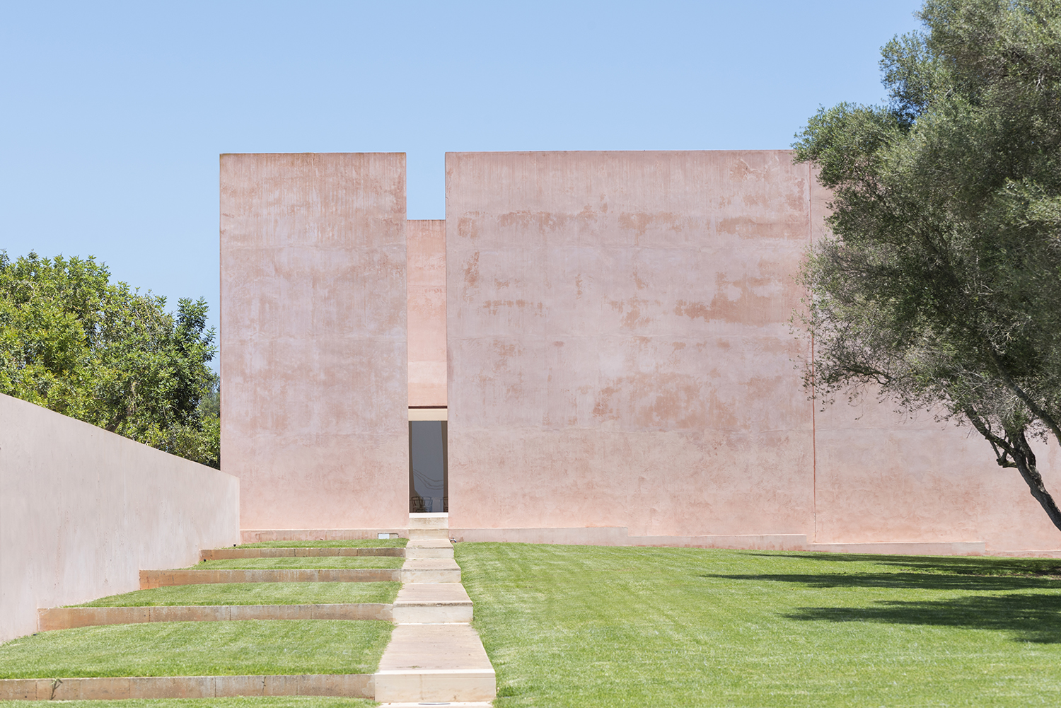
In the rugged red-earth landscape of southern Majorca, a world away from the beaches and bustle of Palma, there stands a pink-tinted building that has become an icon to students of architecture. But back in the late 1980s, this modern home told a different story. ‘Fellow expats used to travel to see our house as a form of entertainment,’ remembers owner Caroline Neuendorf. ‘They would make a day of it, coming to see this crazy house and laughing at how it didn’t even have furniture, blah blah blah…’
But a lot can change in 32 years. Those critics have long since eaten their words, while its architects, John Pawson and Claudio Silvestrin, have become two of the biggest names in contemporary interior design. ‘Back then, minimalism wasn’t part of everyone’s vocabulary,’ says Caroline. ‘But my husband Hans is a very visionary man. He brought Pop Art to Germany and spotted artists such as Cy Twombly and David Hockney early in their careers. He instinctively knows when to take a chance on someone.’
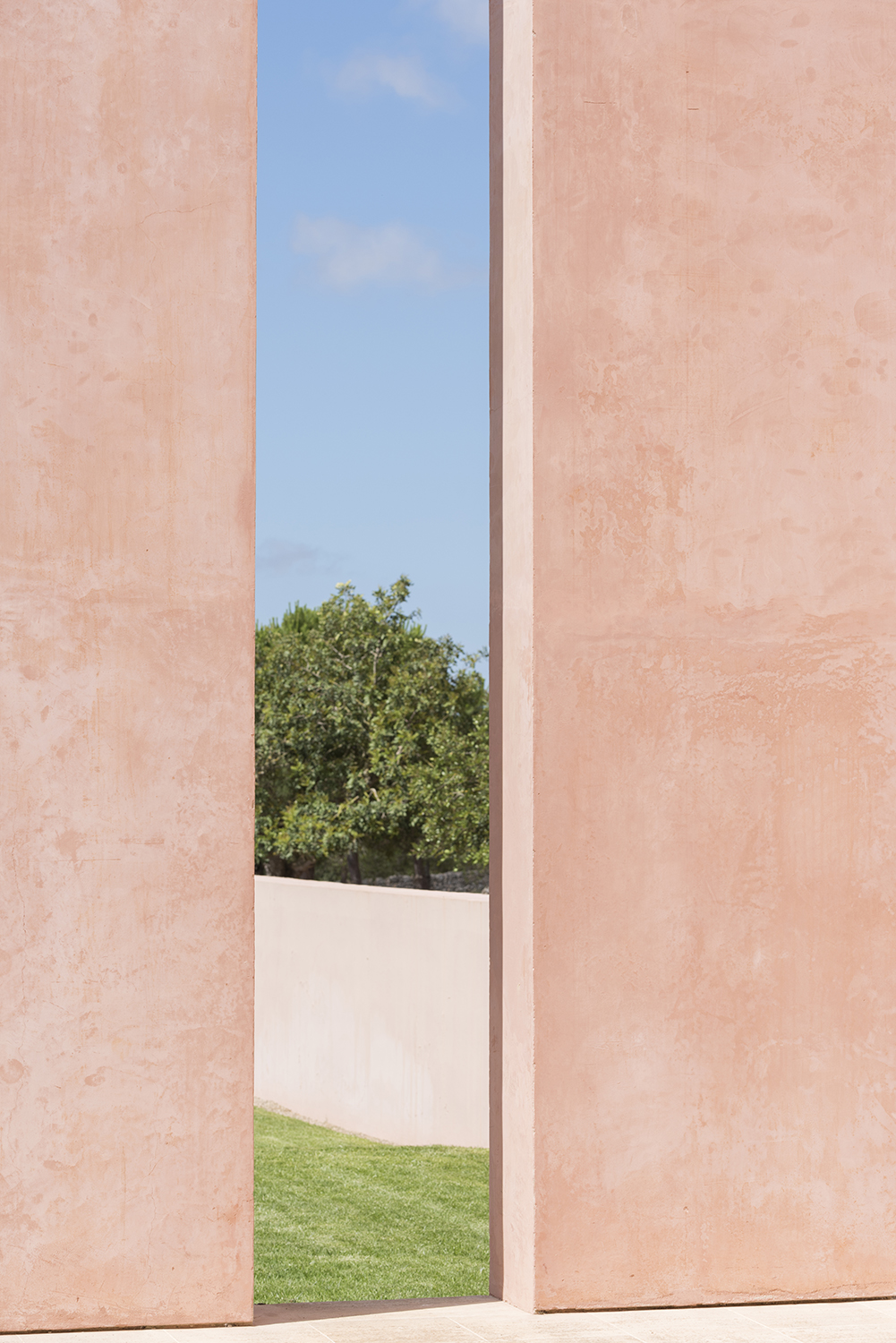
John Pawson is now seen as the master of minimalist interior design, and is very much beloved for it. In fact, our editor, Pip Rich, thinks this is his finest work. 'There is a real sense of peace in the angles of Neuendorf,' Pip says. 'Thanks to the slithers of window, the slim openings onto other spaces and the sharp lines you can't help but be drawn into its monastic architecture. But it's warm. So warm! The pink is so beguiling, and softens those edges perfectly. Minimalist design doesn't come better.'
Despite being big in current architecture trends, minimalism isn't a word John Pawson really uses to describe his own take on design. As he told Livingetc earlier this year, he doesn't believe in not having any things, but in choosing carefully what you do have, and celebrating those pieces by not cluttering your home with too many other distractions. 'I do believe that you don’t need more than is essential, and that is hard to define,' he told Pip. 'We have a set of silver Georgian three-pronged forks that could be considered more than you actually need, but they’re very wonderful. It depends on how you live - you need a certain amount of things for life to go smoothly, though if you have more than you need it gets in the way.'
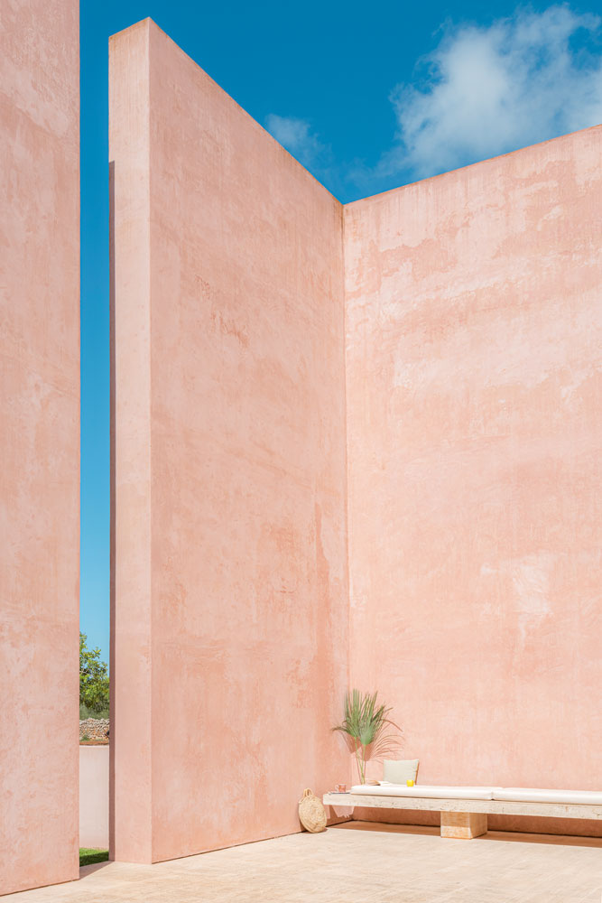
Pool terrace
The couple were introduced to John Pawson in 1983 via mutual friends in the art world and got chatting to him on an Italian beach, of all places. There followed a visit to London, where they saw one of John Pawson’s first projects. ‘It was an amazing apartment with black wooden floors, white walls and almost no furniture. That uncluttered freedom was a revelation.’
Hans and Caroline commissioned him to design their art gallery in Frankfurt, then their own apartment before mentioning they had recently bought some land on Majorca. John and Italian rising star Claudio Silvistrin, who he was collaborating with at the time, came on board. ‘That was the start of an adventure for all of us,’ says Caroline.
The pink is unexpected, given John Pawson’s renowned preference for lighter shades of pale, but Caroline explains that the color and finishing touches show the hand of Claudio Silvistrin. ‘In this part of Majorca, you have the blue of the sky, the cream of the local Piedra de Santanyi limestone and the red, red earth. This house uses materials that are rooted in the landscape,’ she says.
Be The First To Know
The Livingetc newsletters are your inside source for what’s shaping interiors now - and what’s next. Discover trend forecasts, smart style ideas, and curated shopping inspiration that brings design to life. Subscribe today and stay ahead of the curve.
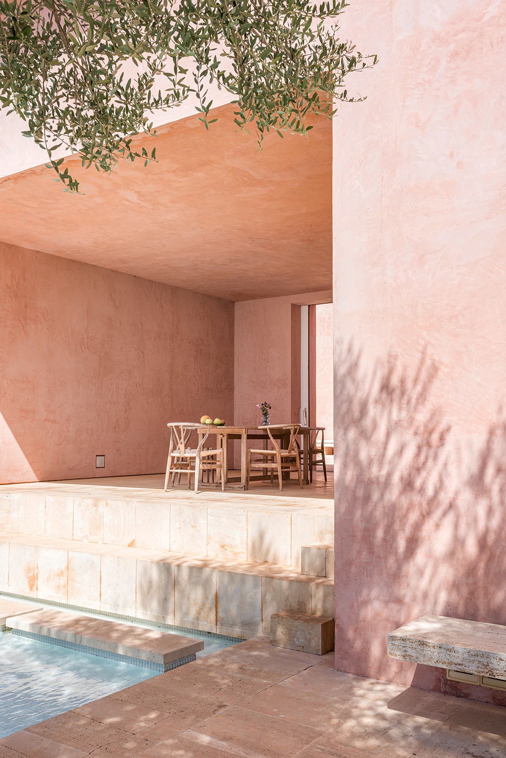
The terrace is a favorite spot for breakfast and lunch, within easy reach of both the pool and the modern kitchen. The house is a place for both relaxation and enlightenment. “If you are open to it, the spirituality is here,’ says Caroline.
Piedra de Santanyi stone bench; table, both by John Pawson and Claudio Silvistrin. CH24 Wishbone chair by Hans J Wegner, available from Lumens.
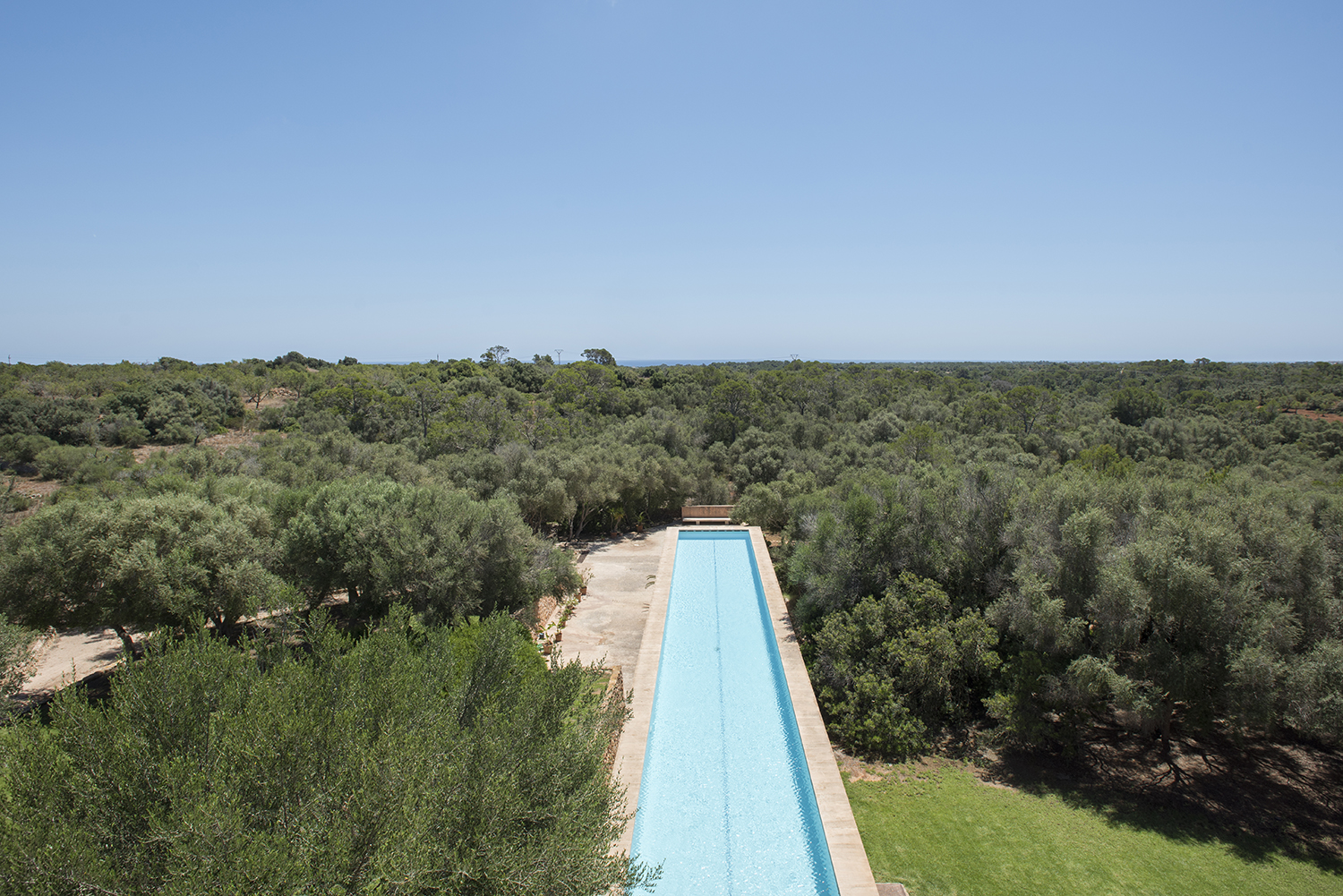
The raised pool extends for 130 feet, through groves of almond trees. ‘When we came here, Mallorca was not at all fashionable,’ remembers Caroline. ‘We were introduced by the artist Peter Phillips and we fell in love with its unspoilt beauty.’
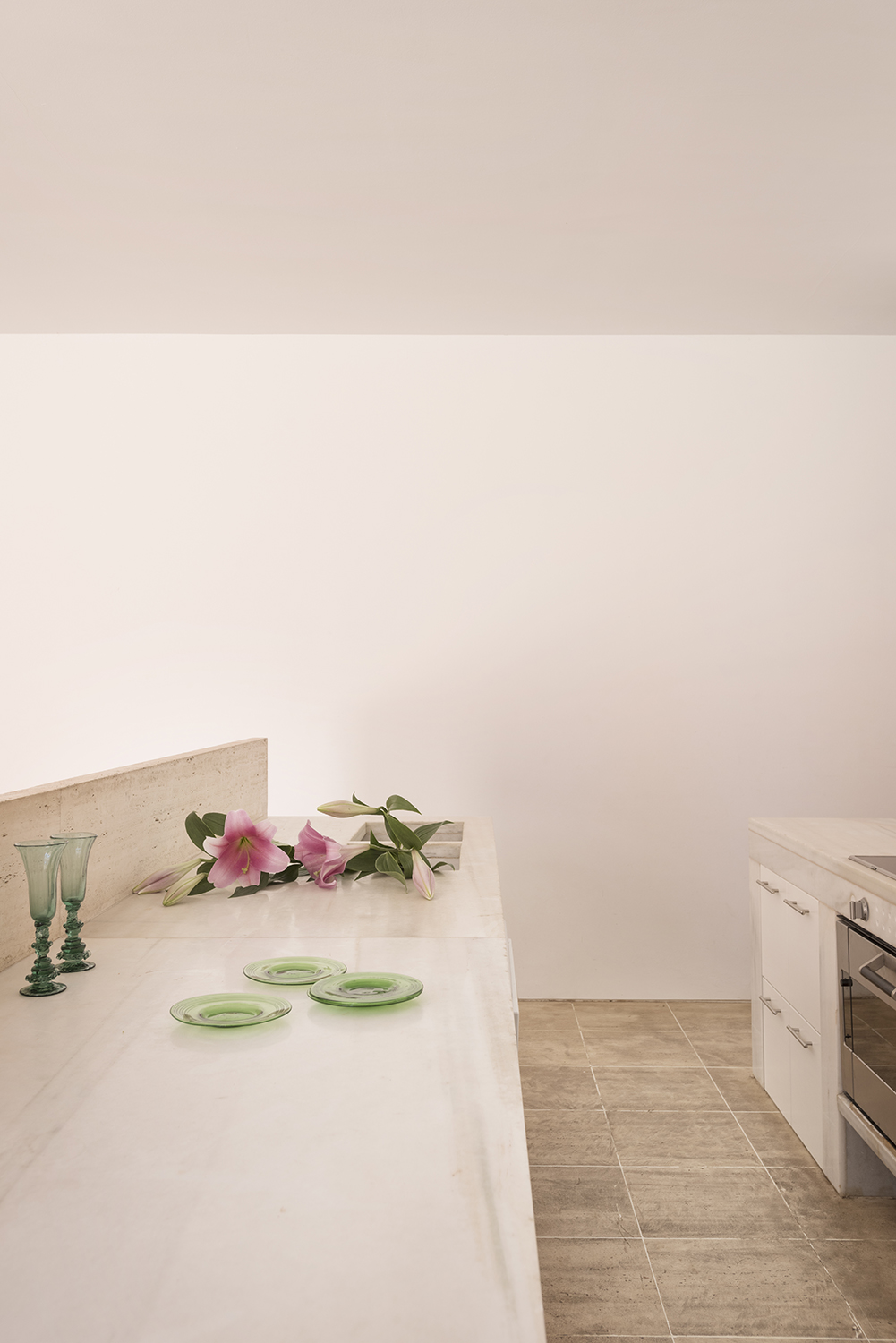
Kitchen
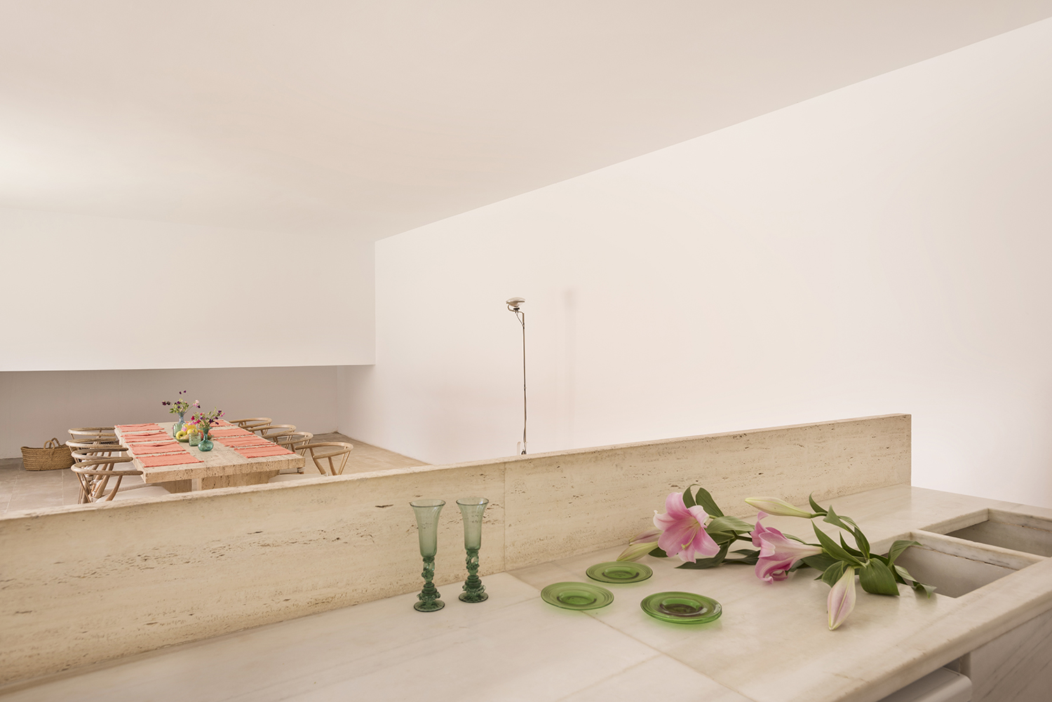
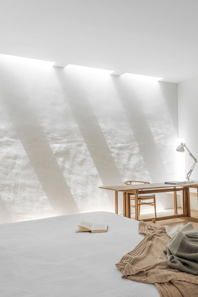
Another surprise is the lack of art on the walls. ‘My life has been art, art, art, but this is such a clean, spiritual space that I just don’t miss it. It acts as a palette cleanser,’ Caroline says, Also, she points out, the house provides its own version of abstract art. ‘It has been designed so there is a constantly changing interplay of light, color and shadows to watch throughout the day.’
Caroline and Hans found the house’s minimalism calming and refreshing, in contrast to the overstuffed interiors of the 1980s. ‘Back then, expat houses on the island were faux fincas stuffed with objects. Their owners suffered from horror vacui – a fear of empty spaces,’ says Caroline
Dining area
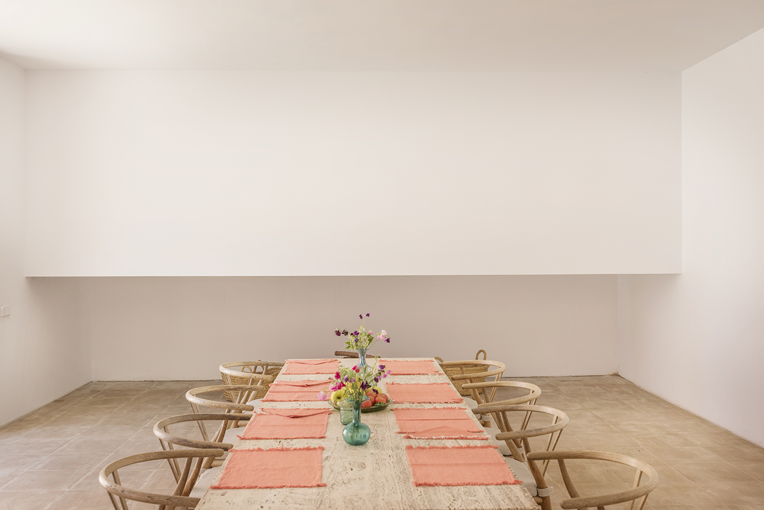
In the open plan dining room, it's hard to deny that the handpicked table and chairs are the true hero of the space. And leaving the rest of the room so sparse allows the air and light that moves around the Wishbone chairs to truly be appreciated.
The furniture was largely designed by the Pawson/Silvistrin duo, with a few extras: ‘They chose everything to suit the house, right down to the Wedgwood china and the cutlery.’
Corridor
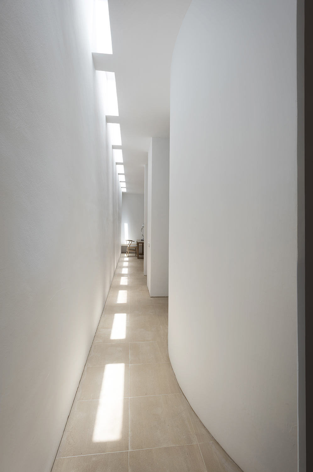
Left unadorned, the gentle curves of the architecture can be really seen, the passage way becoming a space to stop and marvel at in its own right.
A run of vertical skylights brings a wash of sunlight down into this semi-open corridor that runs alongside the master suite. ‘This house was a first for John and Claudio and for us. It was an adventure in every sense,’ reflects Caroline
Bedroom
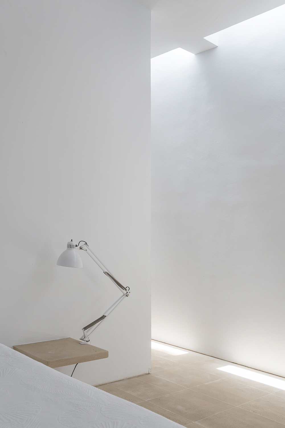
‘It was a revelation to discover that uncluttered minimalism lifts your spirits,’ says Caroline of her very modern bedroom. And there is certainly a joy in a bedside shelf instead of a chest of drawers, a single lamp instead of a pile of old magazines.
Bed, by John Pawson and Claudio Silvistrin. Anglepoise lamp, available at Lumens.
Bathroom
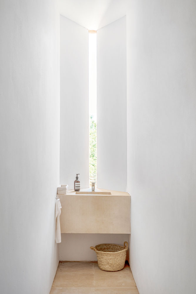
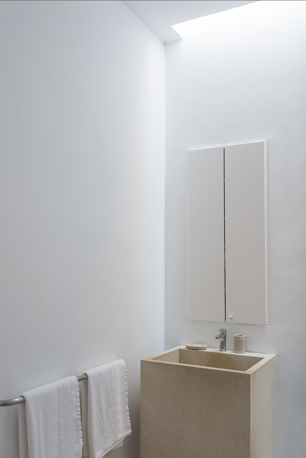
Openings and windows have a near-monastic feel, creating a space in this modern bathroom to soak in the views as you soak in the tub. ‘If you want to find it, there is a spirituality to this house,’ adds Caroline.
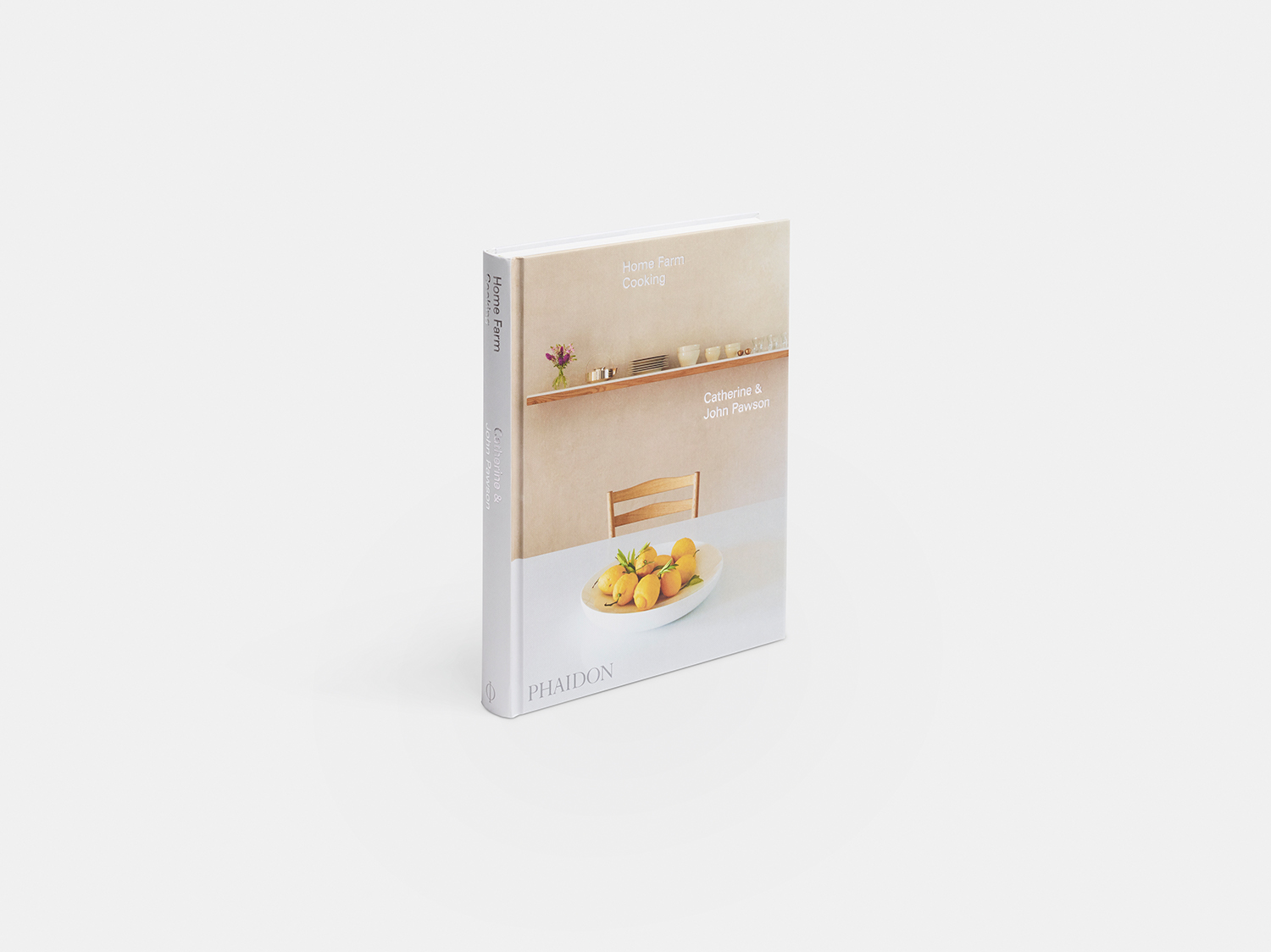
To see more of designer John Pawson's work and incredibly infulential aesthetic, order the beautiful Home Farm Cooking by John and Catherine Pawson from Amazon. It's a mix of recipes, pictures of his own homes, and design philosophies.
Journalist and author Jo Leevers writes about houses for a wealth of national publications such as Livingetc, Homes & Gardens, Observer, The World Of Interiors, Telegraph, Elle Decoration, Country Living, and the Guardian. She also contributes to 25 Beautiful Homes magazine, and the Mail on Sunday's You Magazine.
-
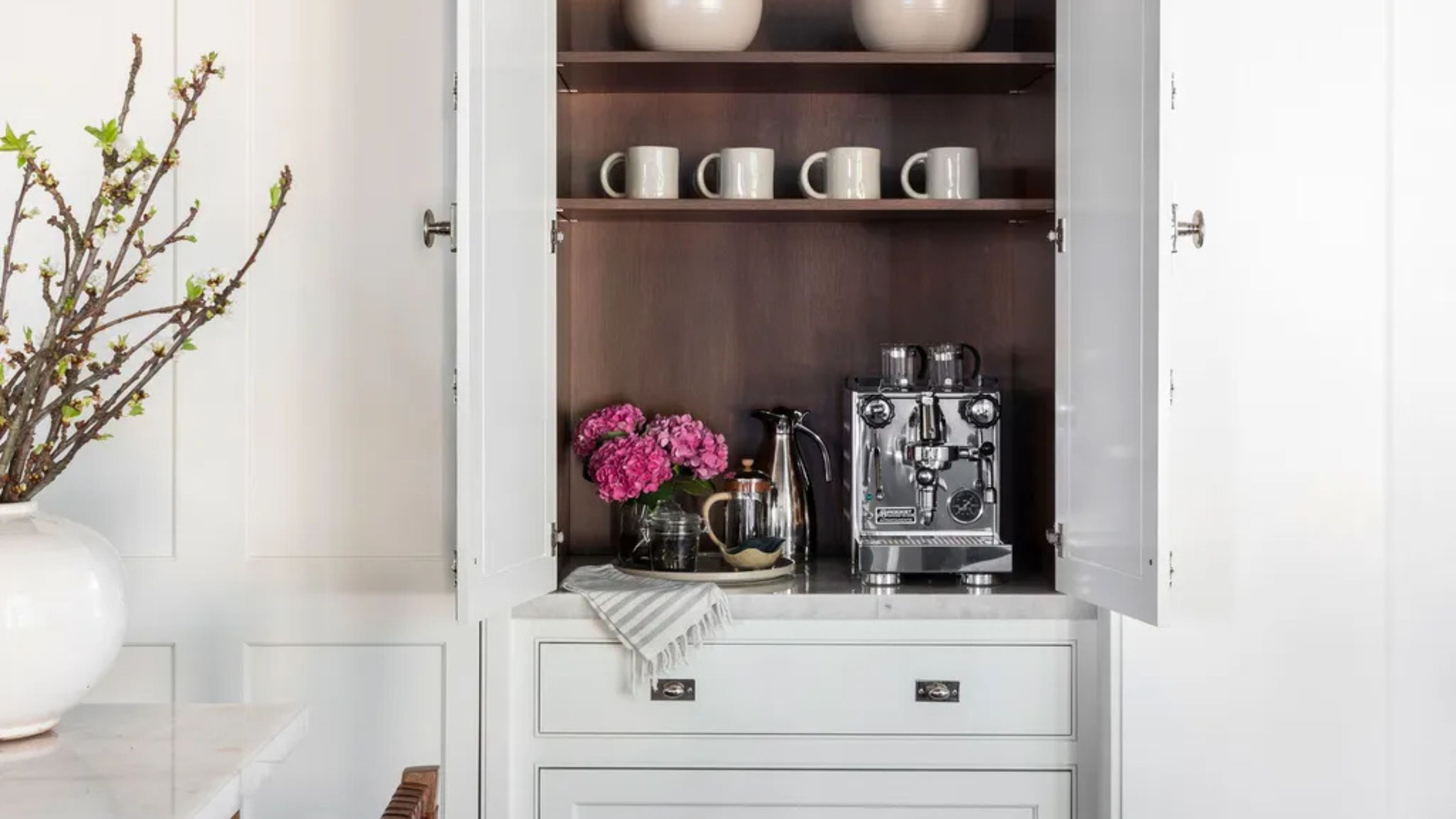 Turns Out the Coolest New Café is Actually In Your Kitchen — Here's How to Steal the Style of TikTok's Latest Trend
Goodbye, over-priced lattes. Hello, home-brewed coffee with friends. TikTok's 'Home Cafe' trend brings stylish cafe culture into the comfort of your own home
By Devin Toolen Published
-
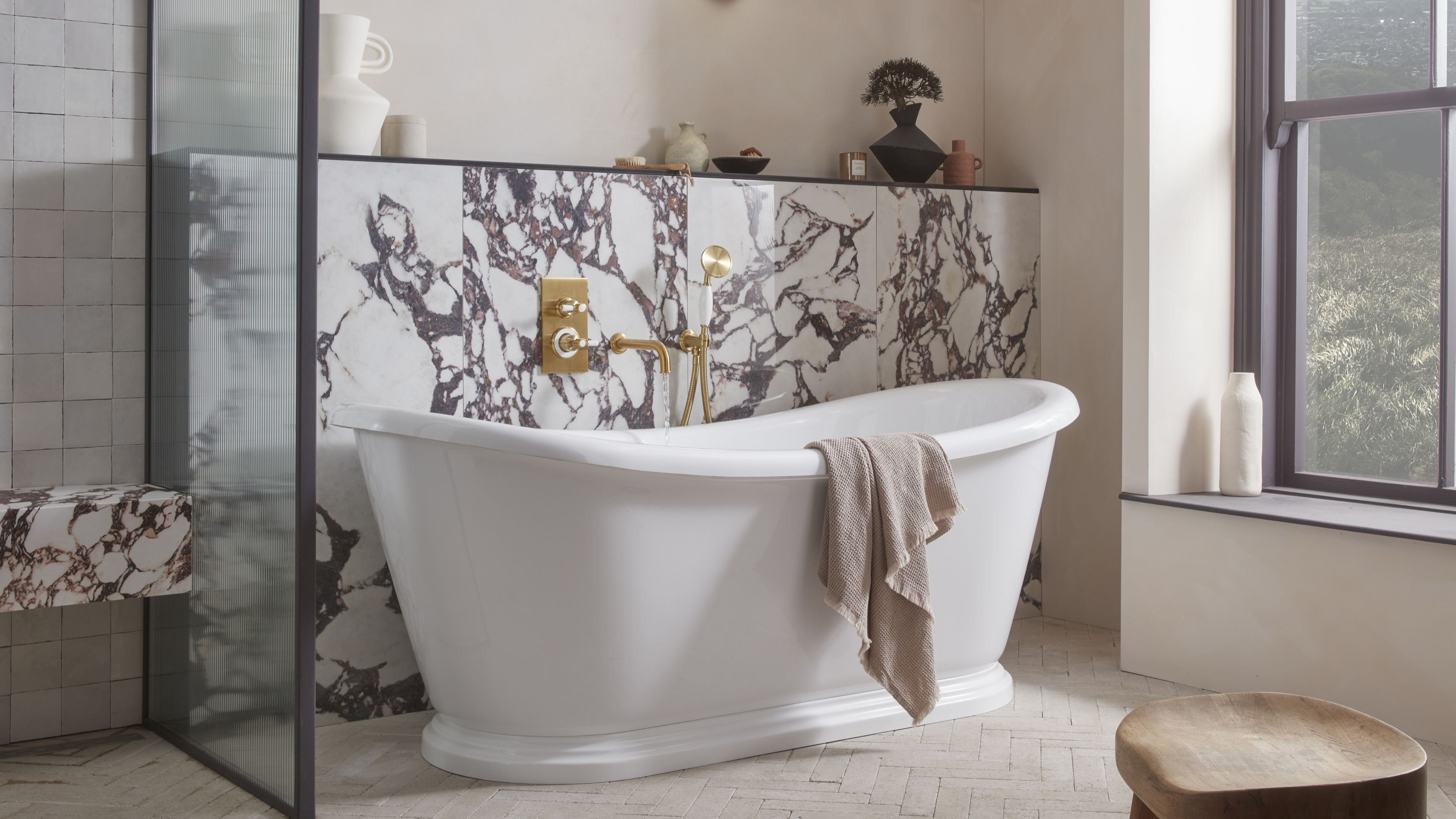 5 Bathroom Layouts That Look Dated in 2025 — Plus the Alternatives Designers Use Instead for a More Contemporary Space
For a bathroom that feels in line with the times, avoid these layouts and be more intentional with the placement and positioning of your features and fixtures
By Lilith Hudson Published