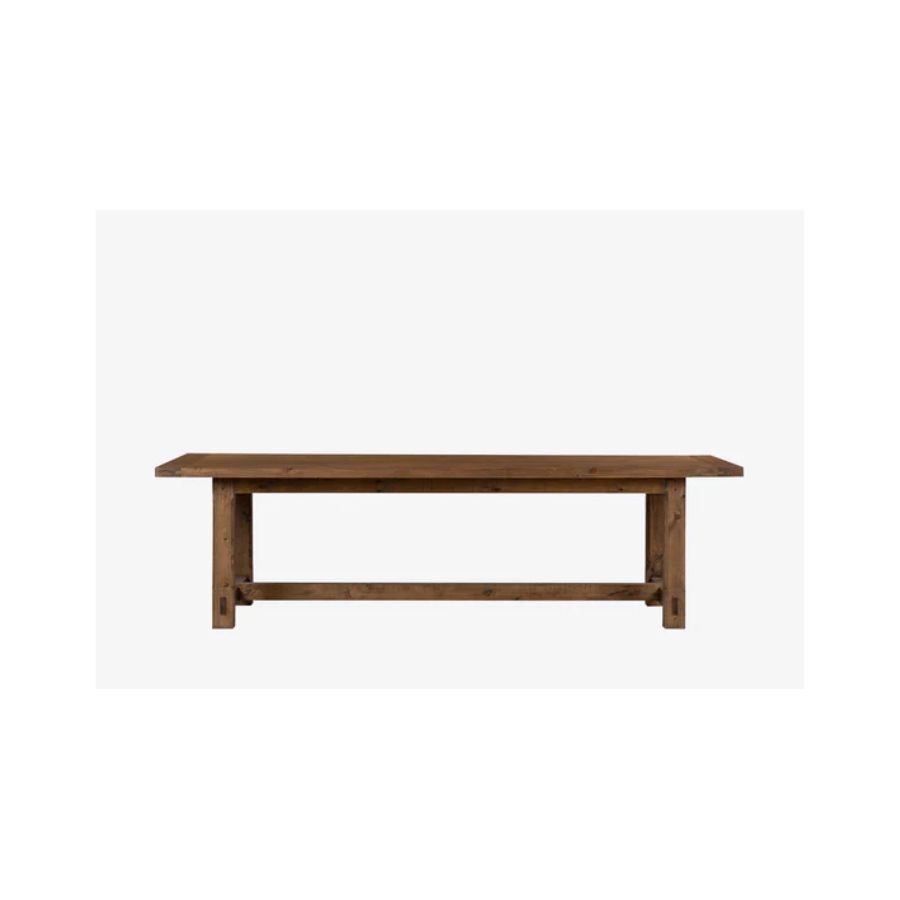
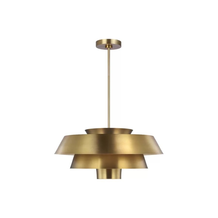
“It’s the jewelry of a room” - This home reno uses the perfect accessory that makes every room look expensive
This home design made the best of one simple accessory to make every single room feel special and luxurious
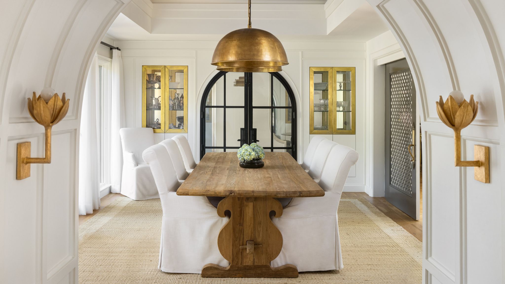
This beautiful family home was filled with character and light, but the dated interior was due for an update to celebrate its traditional Tudor style while refreshing it with a modern feel. For any design lover, a project like this is an absolute dream to work on, where a mix of old and new combine for an eclectic final look.
Inspiration from Persian and European influences was brought in to preserve the home’s character and, at the same time, make the space feel unique and special. There's incredible attention to detail throughout, and all the design elements work in harmony to create a home that tells its own story. For example, beautiful architectural features are embellished with the addition of decorative details like moldings, lights, and natural materials that help to add warmth through texture, but there's one design element that's used to such great effect that I had to look into it further.
To learn more, I spoke to the mastermind behind this modern home to learn how the use of this accessory can be translated into our own projects at home and make our spaces feel much more elevated.
This accessory is the 'jewelry' of every room
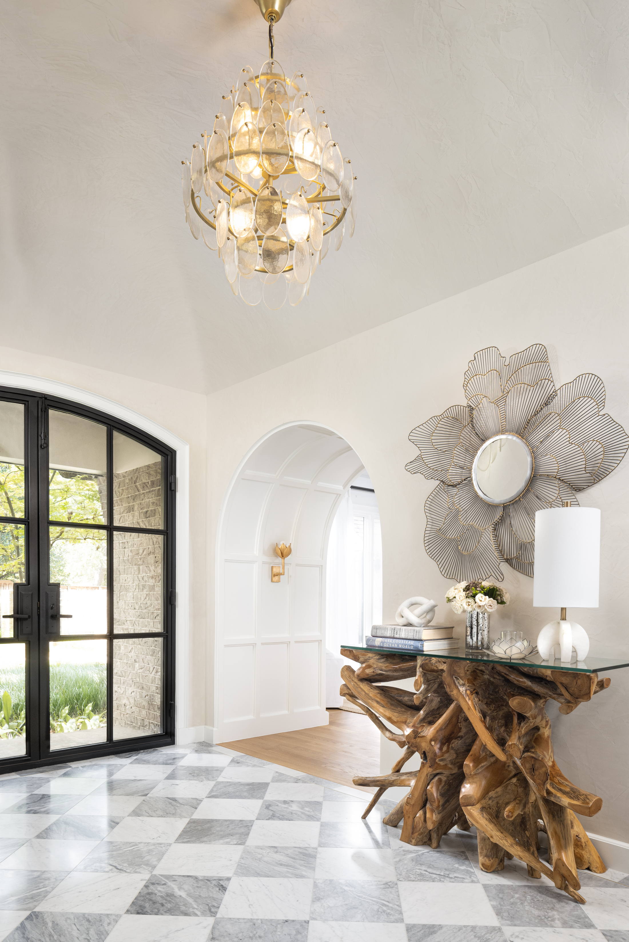
Going through every room of this home, you're greeted by a stately but cozy atmosphere. There is natural light that bounces off a bright color palette, mixed with beautifully warm textures and materials. A mix of old and new creates an eclectic feel, but what you can’t help but notice straight away is how the eye is drawn up to the exquisite lighting fixtures.
Every space of this home features beautiful, statement-making lights that adorn the rooms and stand out on the white canvas of the ceiling. The wall lights have the same effect and you can clearly see the thought and care that went into curating each fixture, perfect for each individual space.
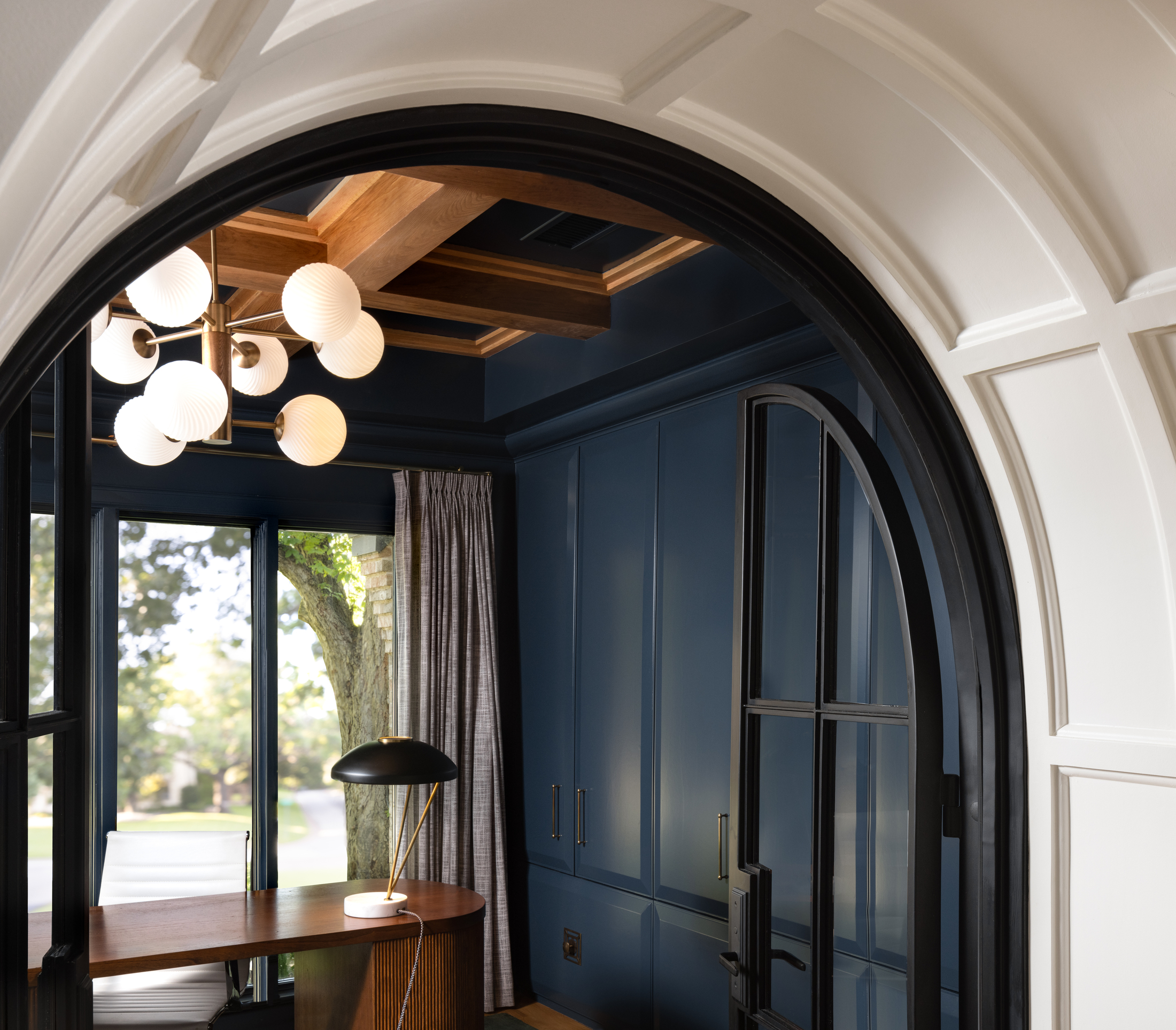
Eddie Maestri, Principal and Creative Director of Maestri Studio, the architecture and interior design practice tasked with breathing new life into this home, tells me the studio tends to avoid can lighting and instead takes an old-school approach of keeping it simple.
‘We use chandeliers, surface mount, and LED in key areas to highlight architectural features,' he tells me. 'We will occasionally use a directional pin light to highlight art, or a key area on an island for example, but we like to keep the ceilings clean and simple, which allows for more statement fixtures such as the pendant lighting and surface mounts.'
Be The First To Know
The Livingetc newsletters are your inside source for what’s shaping interiors now - and what’s next. Discover trend forecasts, smart style ideas, and curated shopping inspiration that brings design to life. Subscribe today and stay ahead of the curve.
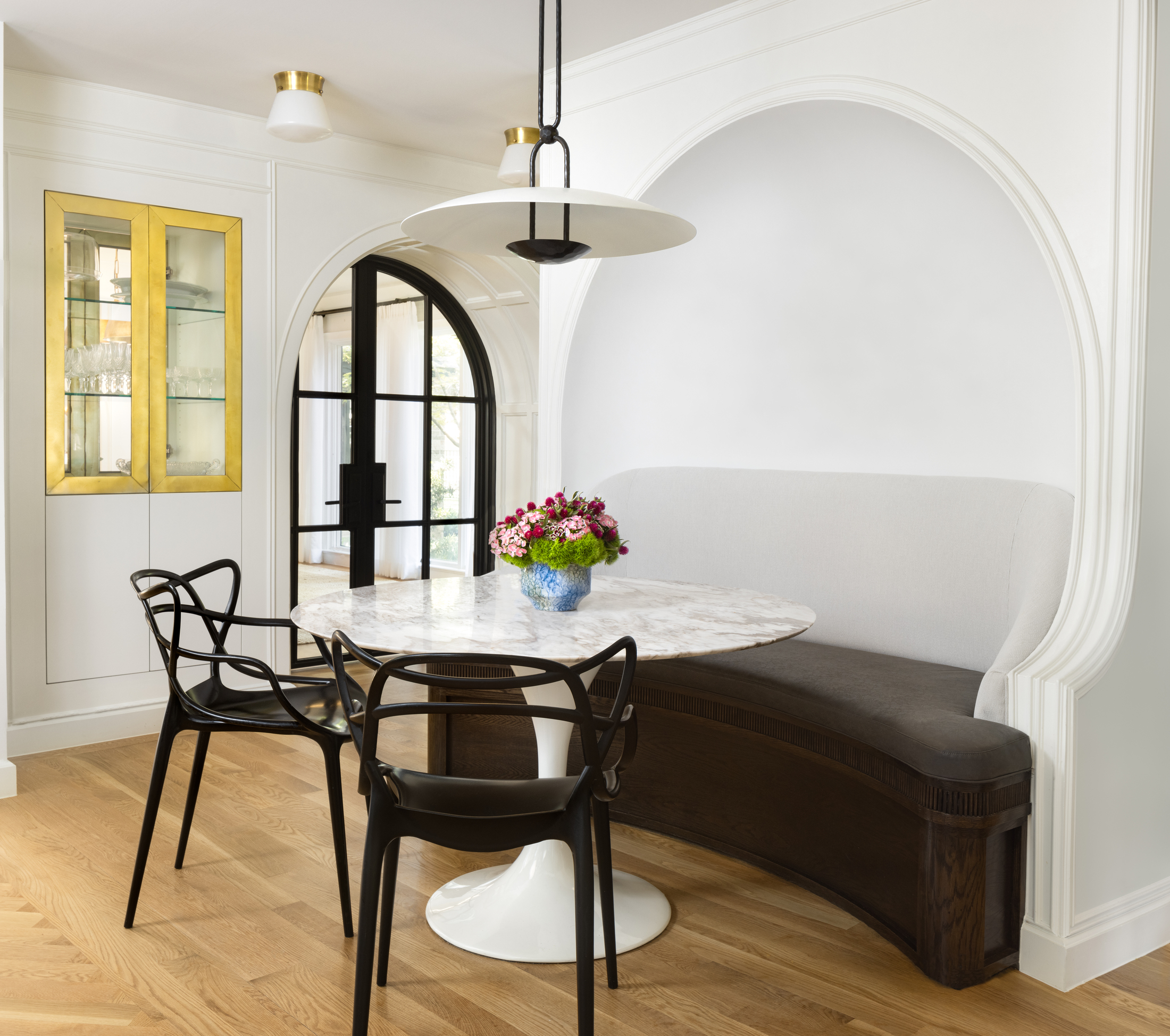
While the lights are outstanding pieces, the key to a successful look is balance. ‘The lighting should complement the space, and not fight or distract from it,' explains Eddie. 'On a clean ceiling, the fixture is the finishing touch, or jewelry of the room.'
There is a very particular choice of lighting in each space, each with a purpose of its own that goes beyond the decorative: brass picture lights, LED cove lights highlighting moldings, surface mount lights, and pendants.
‘We like for the architecture and interior detailing to shine and to not have a busy ceiling full of small cans,' adds Eddie. 'Smaller spaces call for surface mount lights, and larger volume spaces such as the kitchen allowed for oversized statement pieces.' It's a great example of the incredible effect that can be achieved from the thoughtful use of one simple, but well-chosen accessory.
Bright versus moody spaces
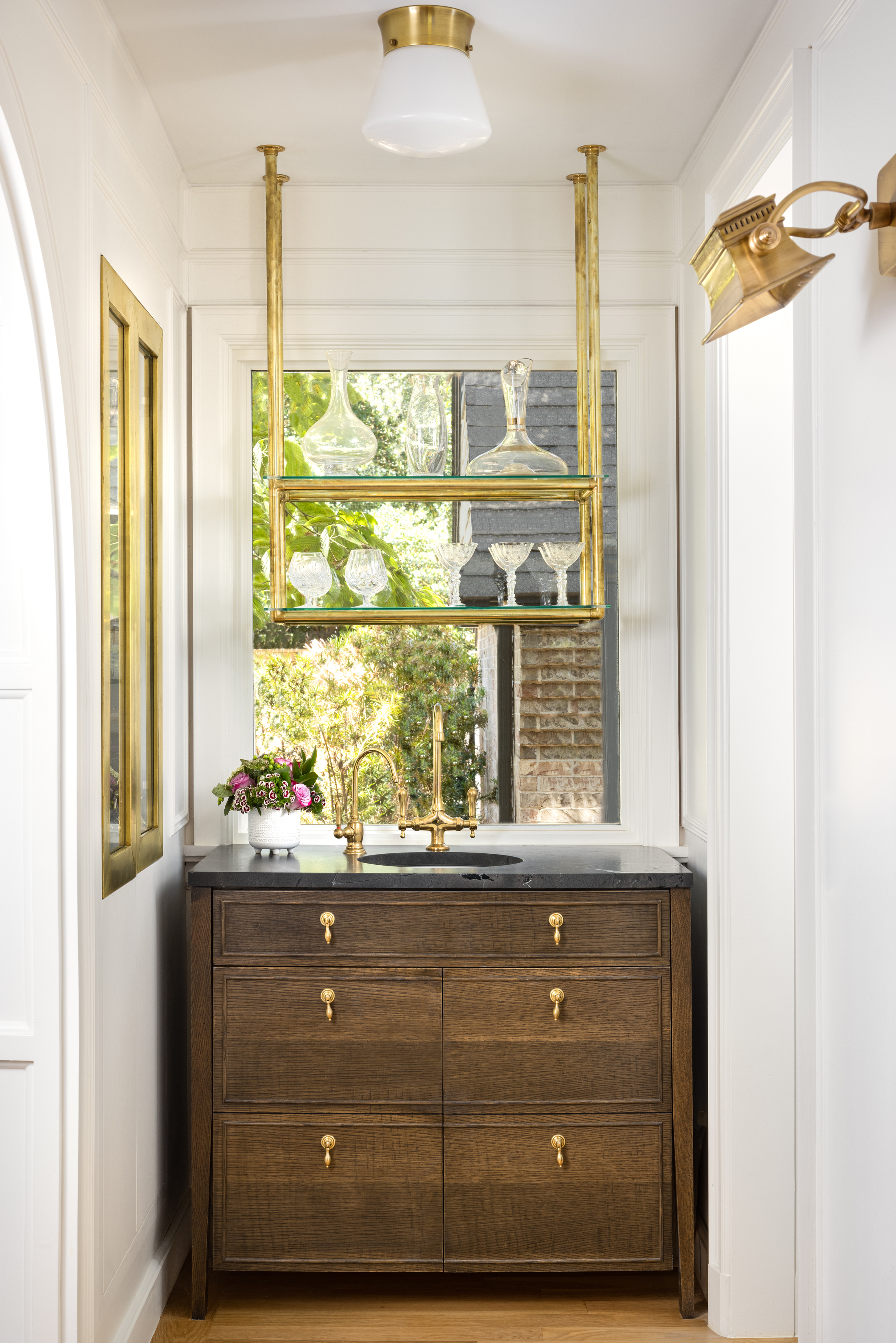
The look of this home is one of overall light and brightness, but there are carefully placed contrasting elements that ground the lighting trends and give the space a moodier feel. ‘We wanted the space to have a good mixture of both light and bright, and dark and moody, to allow for the natural gravitation towards spaces and to give the home a lot of visual interest,’ explains Eddie.
Darker woods and neutral stones balance the lightness of the walls and bring warmth to the space. ‘We used a combination of wood tones, natural stones, and brass accents,' Eddie notes. 'Our goal was to accentuate and “play-up” the historical nod that the original home was going for when it was built, and make the spaces feel timeless.’
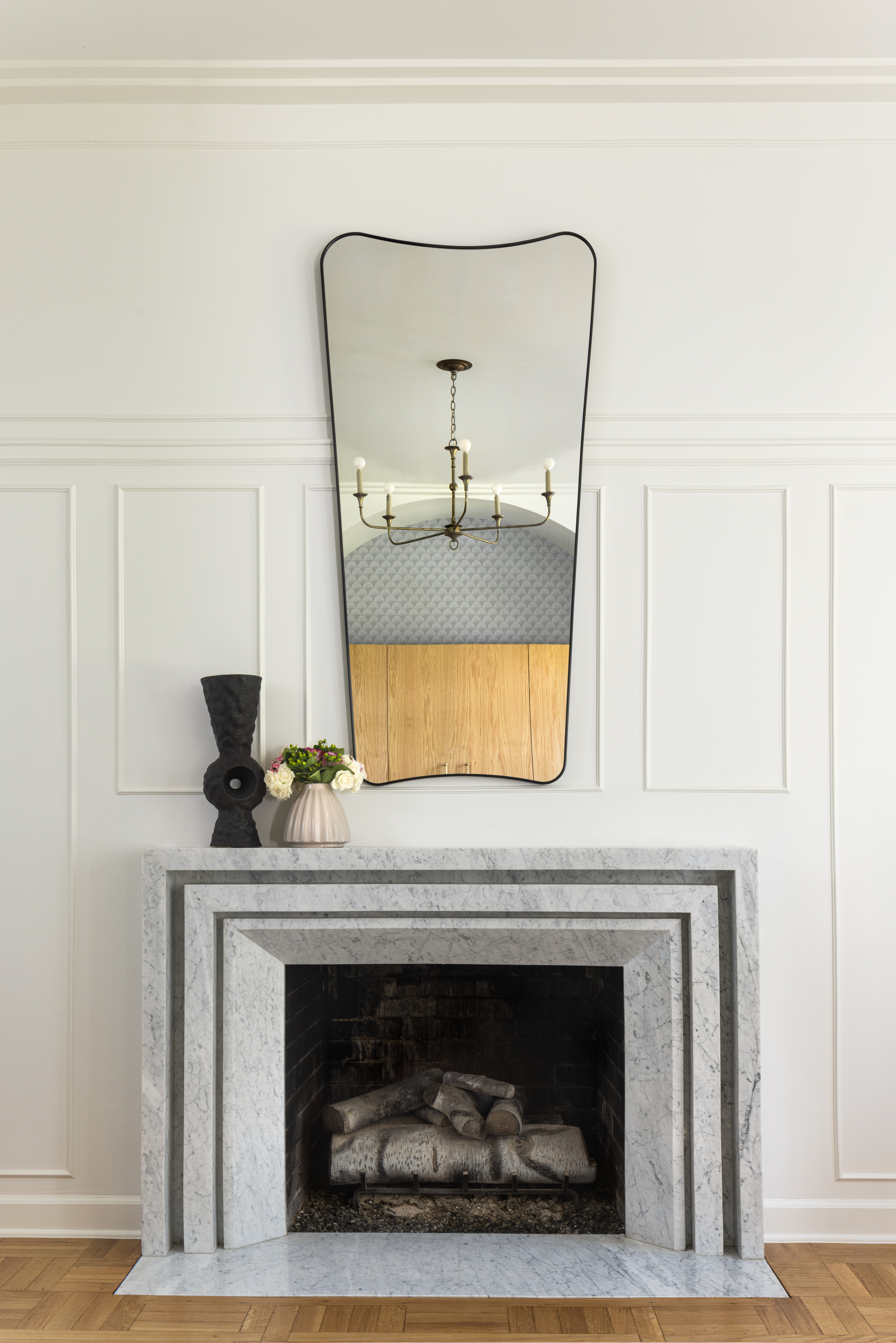
Curated detail is also used in every single room to complement the lighting. The walls and ceilings, originally completely flat, were embellished with beautiful added moldings. However detailed the design is, it is in no way overdone - there’s a real art in mastering the delicate balance between too little and too much, and Maestri Studio shows that they understand it exactly.
‘The Tudor style home is in a stately neighborhood and had some interesting architectural features such as leaded glass windows and the fretted doors in the dining room,' says Eddie. 'We wanted to play up these features and add molding and details that made the house feel as if it could have been from the 1920s, and complement its original architectural intent by adding in even more detail.’
Persian and European influences
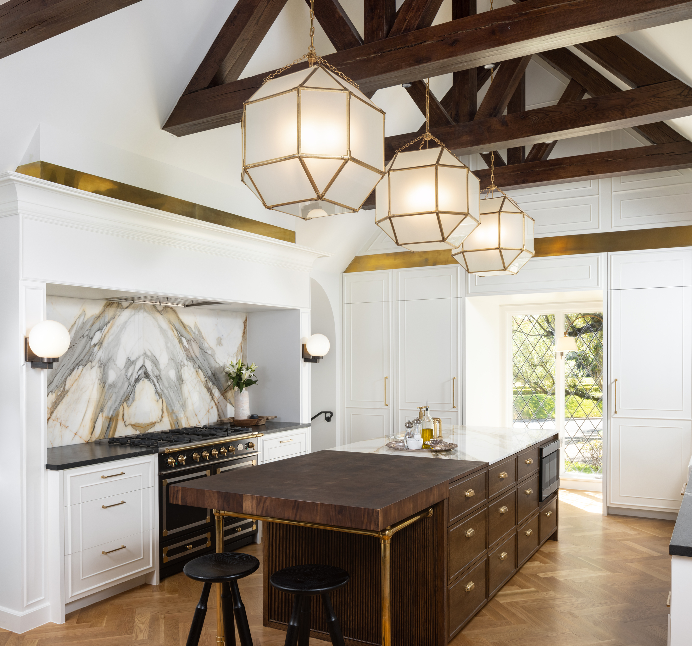
If you look carefully, you'll notice another motif that unfolds in every room - the Persian and European influences that romanticize the space. ‘The original doors in the dining room remind us a lot of Persian design,' Eddie explains. 'Given that Beirut has such a French influence, we loved keeping this original detailing while adding in even more moldings.'
'The panel mold details and soft curves are great examples of French influence, and the kitchen “dropped into a room” is another,' he continues. 'We often see Parisian apartments with kitchen retrofits that are added into beautifully paneled rooms. In this case, the kitchen used to be a living room, and we wanted the paneling and beautiful island to be the key feature. The brass on the island with the butcherblock also reminds us a lot of Paris.’
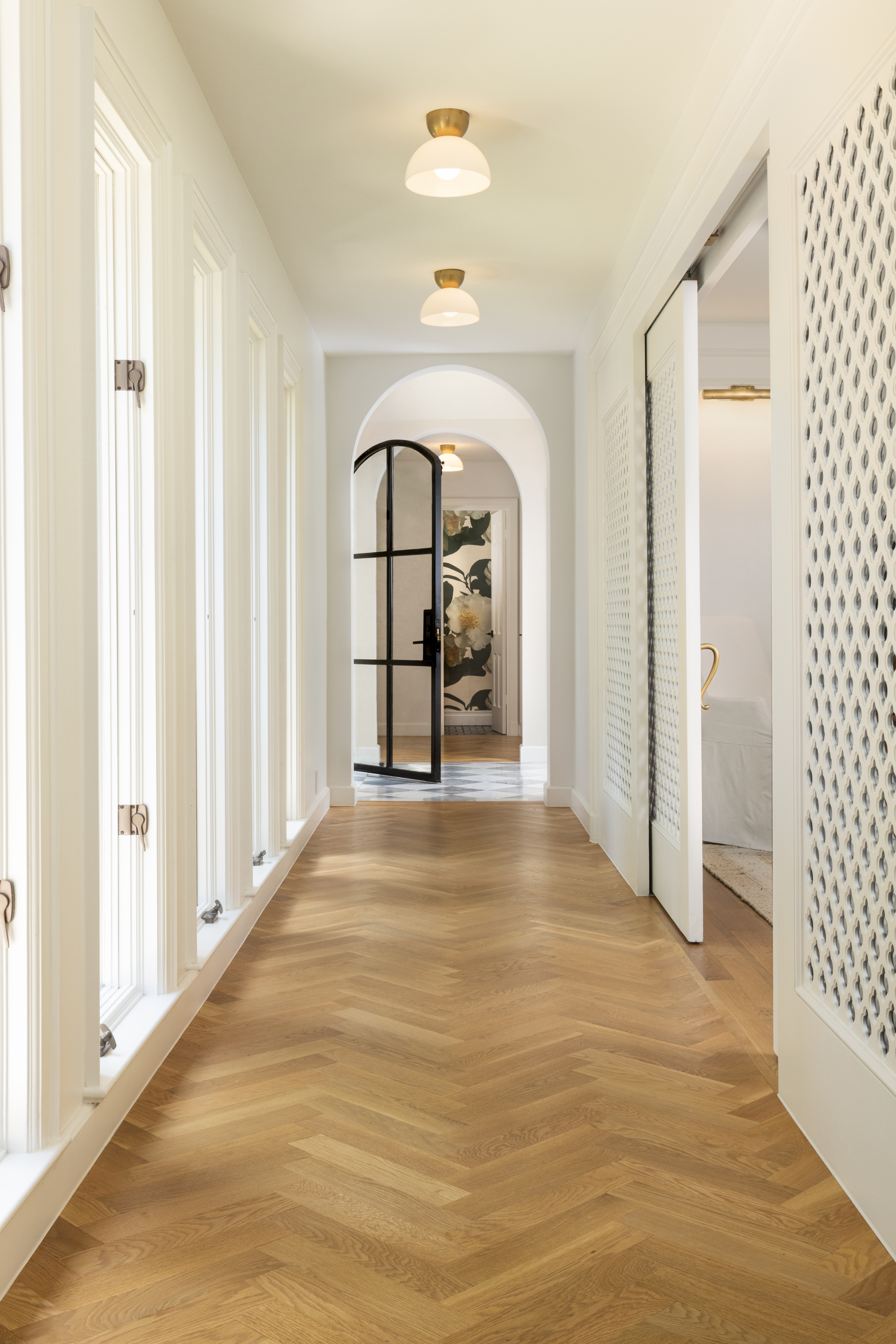
As Eddie notes, the kitchen island is truly unique and stands out amongst the lightness of the surrounding cabinetry. ‘Butcher block, brass, and beautiful marble. The inspiration was French and English countryside kitchens… homely, yet beautifully detailed,’ he explains.
In these last words, Eddie highlights how nothing was left to chance in this beautiful home redesign. It's simultaneously a celebration of tradition and cultural influences, yet also a perfectly suited space for modern living.
Get the look
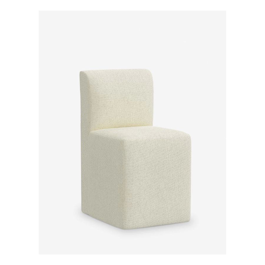
Price: $598
This off-white dining chair brings a very luxurious look in a room while being quite minimalist in shape. It will provide a striking contrast to a solid wood dining table.
Raluca formerly worked at Livingetc.com and is now a contributor with a passion for all things interior and living beautifully. Coming from a background writing and styling shoots for fashion magazines such as Marie Claire Raluca’s love for design started at a very young age when her family’s favourite weekend activity was moving the furniture around the house ‘for fun’. Always happiest in creative environments in her spare time she loves designing mindful spaces and doing colour consultations. She finds the best inspiration in art, nature, and the way we live, and thinks that a home should serve our mental and emotional wellbeing as well as our lifestyle.
-
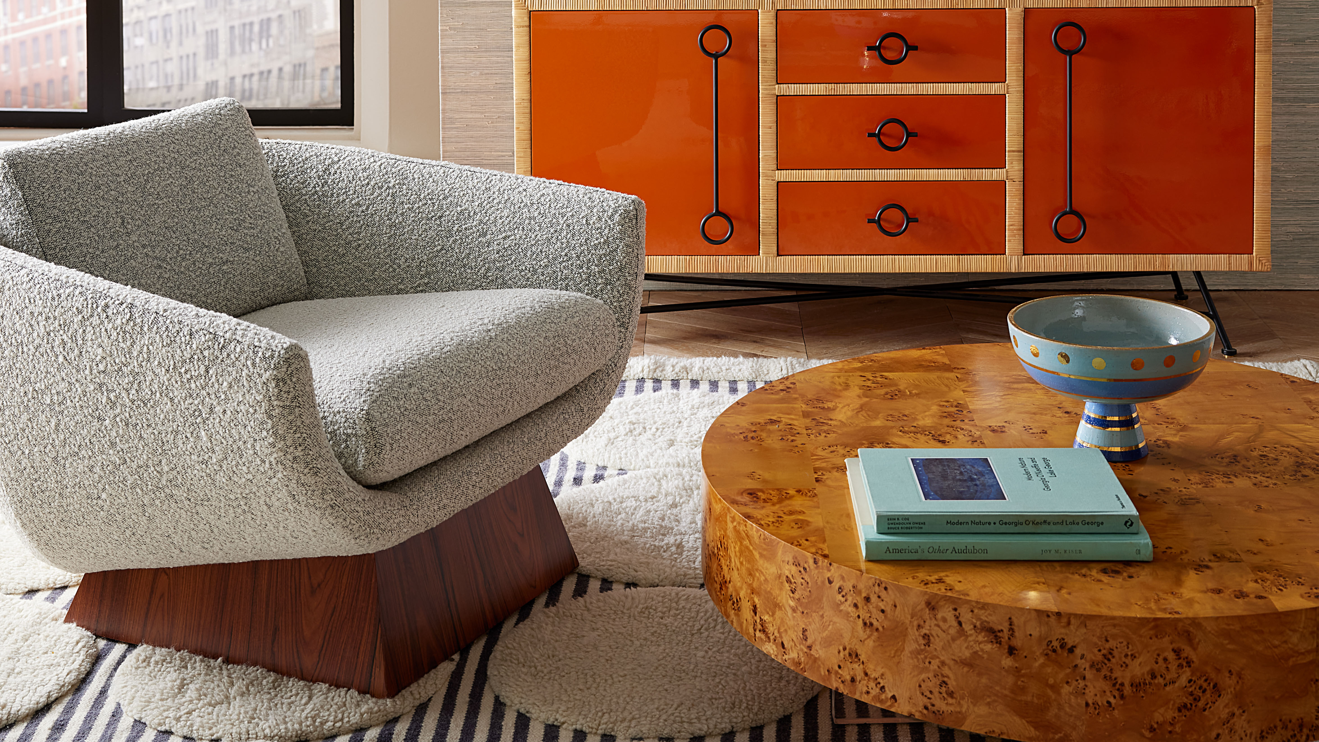 Burl Wood Decor Is 2025’s Most Coveted Comeback — Here’s How to Get the Storied Swirls for Less
Irregularity is the ultimate luxury, but you don’t need an antiques dealer to find it
By Julia Demer Published
-
 5 Garden Features That Instantly Add Value to Your Home — While Making Your Outdoor Space More Practical, too
Get to know all the expert tips and tricks for making your backyard a standout selling point for your home.
By Maya Glantz Published
