8 style lessons in adding flair from designer Lisa Gilmore's boho Florida rental home which work even if you have a landlord to answer to
Interior designer Lisa Gilmore's rental home in St Petersburg, Fl, is a masterclass in how easy decor updates can add personality and flair
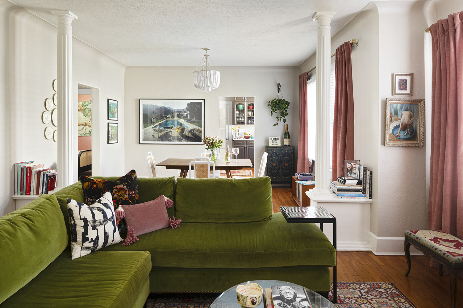
It's not impossible to get personality, even flair, into a rented home. It's harder, sure, to deal with the things you can't change, like the kitchen, or the awkward wall positioning, but as interior designer Lisa Gilmore found, there are plenty of workarounds.
She moved into this 1920s brick house in St Petersburg, Tampa, Florida, and set about making it the modern home of her dreams. Newly divorced, Lisa wanted to be able to stamp her take on design on the space. 'This home was fulfilling a dream,' she says. 'When I was married, I didn't entertain, and I was so excited to have a dining space and have dinner parties with girlfriends, light some candles, play some jazz, create that mood through decor where that can all happen.'
This home was a space for Lisa to build the life she'd been wanting. 'Your home isn't just where you go at the end of the day, but a way to shape your goals and affect how you feel. It's where you can let your personality shine.'
And when it comes to decorating a rental, there are plenty of design tricks you can employ.
1. Use low seating for a sociable space
Design by Lisa Gilmore
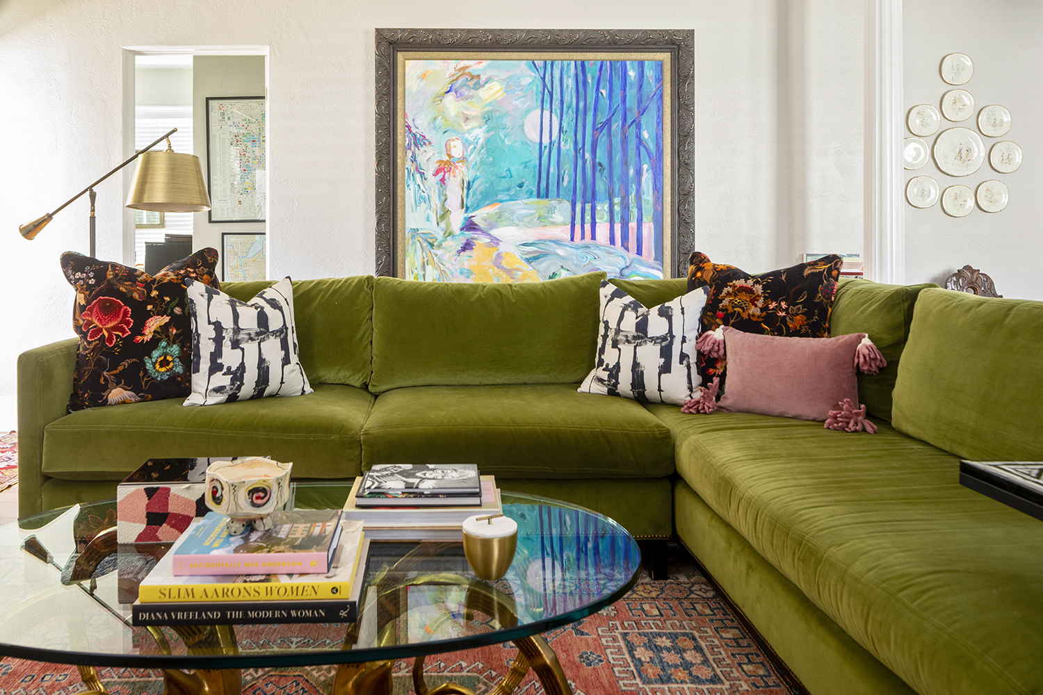
The living room dining room combo was a big selling point for Lisa, who wanted to entertain a lot. For an open plan space like this, which has more than one purpose, Lisa says scale is everything.
'A sectional sofa with a high back would block the flow of the room,' Lisa says. 'I wanted to have good seating, but making sure it had a lower back allows you have a sightline, so both dining and lounging areas feel connected.'
The sofa is from CR Lane, the rug a Parisian antique and coffee table is from Furnish Me Vintage.
Be The First To Know
The Livingetc newsletters are your inside source for what’s shaping interiors now - and what’s next. Discover trend forecasts, smart style ideas, and curated shopping inspiration that brings design to life. Subscribe today and stay ahead of the curve.
2. Display art cleverly when you can't paint the walls
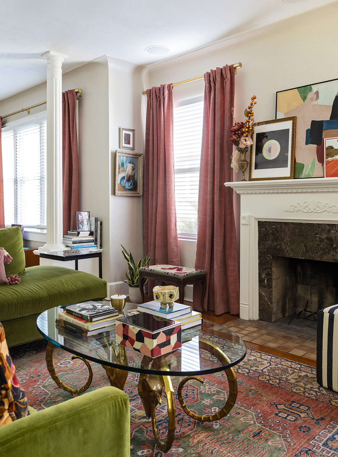
Lisa inherited a beige living room which she didn't feel her landlords were let her paint, so instead she added character with an interesting way of hanging art.
On the awkward slither of wall as the living room curves round, Lisa filled a space that many of us might have left bare. 'I love creating awkward moments with art, a little tension with pieces of different size and style,' she says. 'A pro tip is to hang the larger painting on the bottom, and then the smaller one just perched on top - it creates a fun vignette and fills the space better, adding a quirkiness.
When it comes to gallery walls, Lisa thinks the more mis-matched, the better. 'Art doesn't need to be symmetrical, or matched by size,' she says. 'Breaking that old model feels so much more whimsical.'
3. Create an open library

Lisa learned to love the columns which were original to her house, but she wasn't always sure what to do with them. Jutting out, they were at first a home for a couple of sculptures, but then that didn't feel right.
'I have an embarrassing amount of coffee table books,' Lisa says. 'And not not a lot space for them. And so the pillars just grew into an open library, where I pile the ones I'm reading for easy access. I'm always rearranging them.' This take on having books out - but not in the way - is a wonderful approach to allowing your personality to shine through into the home.
The curtains - a key part of softening this space - are from West Elm.
4. Pick a palette based on a through line
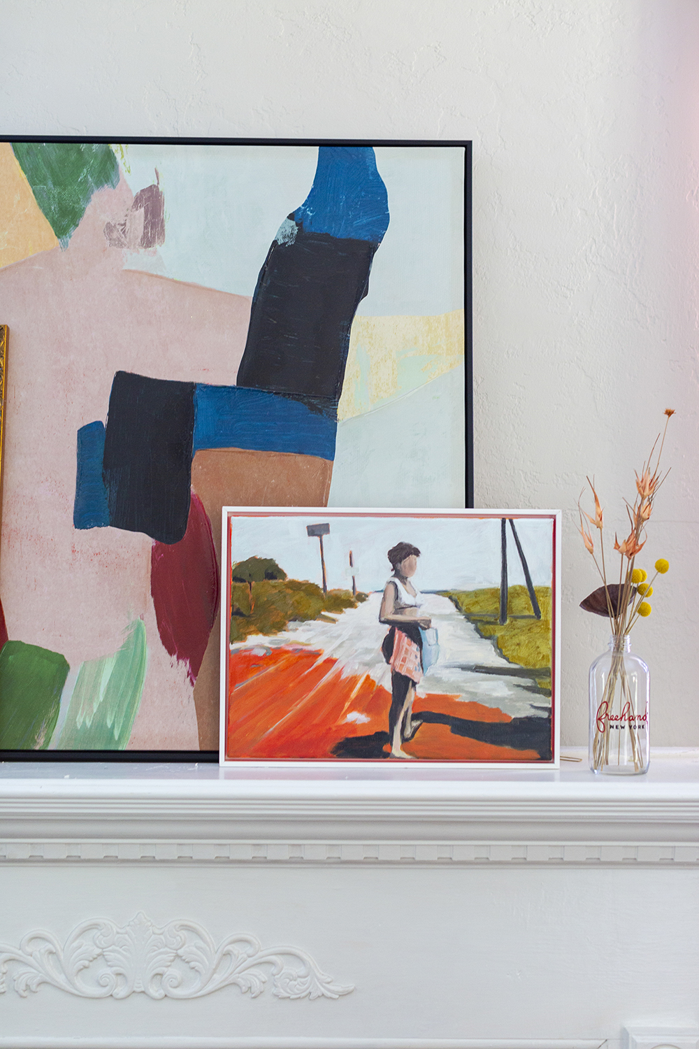
When there are so many personal belongings and objects found on a life-well-lived , it can be hard to make a space feel cohesive.
'I am totally against cookie-cutter design, and a room feeling too matchy-matchy,' Lisa says. 'I love when no color is off limits. However, in order to make a room feel eclectic, and not mis-matched, you have to have rhythm and continuity that pull it all together.'
For Lisa's home, there is her love of green and - one of the best colors that go with green - coral pink. 'Through drapery, pillows, arts and the rug, you can see shots of those colors,' Lisa says. 'It needn't be repetitive, but it is just a small thread to link the decor.'
5. Simply change the light fittings
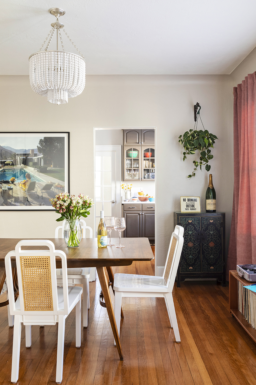
As with most rental properties, Lisa found that many of the fixtures and fittings were a little...standard. But while she couldn't do anything structural, she could easily update the lights.
'I saved the lights that were here when I moved in in a box in my garage,' Lisa says. 'I can re-attach them when I leave. But until then, changing the lights was a small alteration which makes a big difference.
The beaded chandelier in the dining room part of the living space is from Visual Comfort. The chairs are from Selemat and the dining table from Furnish Me Vintage.
6. Update the kitchen with colorful accessories
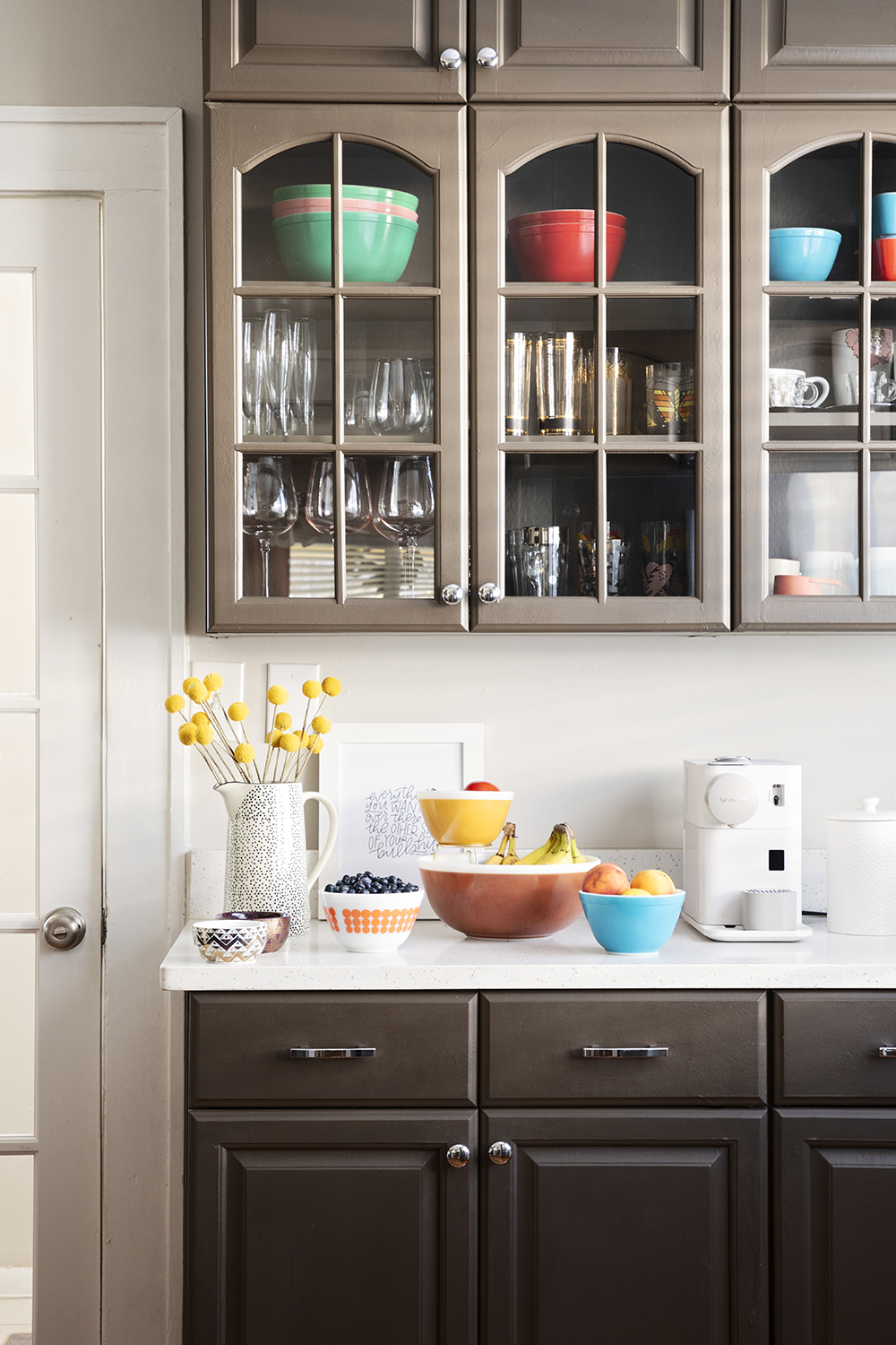
Lisa was never going to put a new kitchen into this rental home, and admits the color of the cabinets wouldn't have been her first choice. Again, there were workarounds, though.
'I would paint it if I could, but the chocolate brown has sort of grown on me,' Lisa says. Instead, she uses pop-bright bowls as a way to introduce a little color and flair, picking up the greens and corals seen elsewhere.
7. Go all out in the bedroom
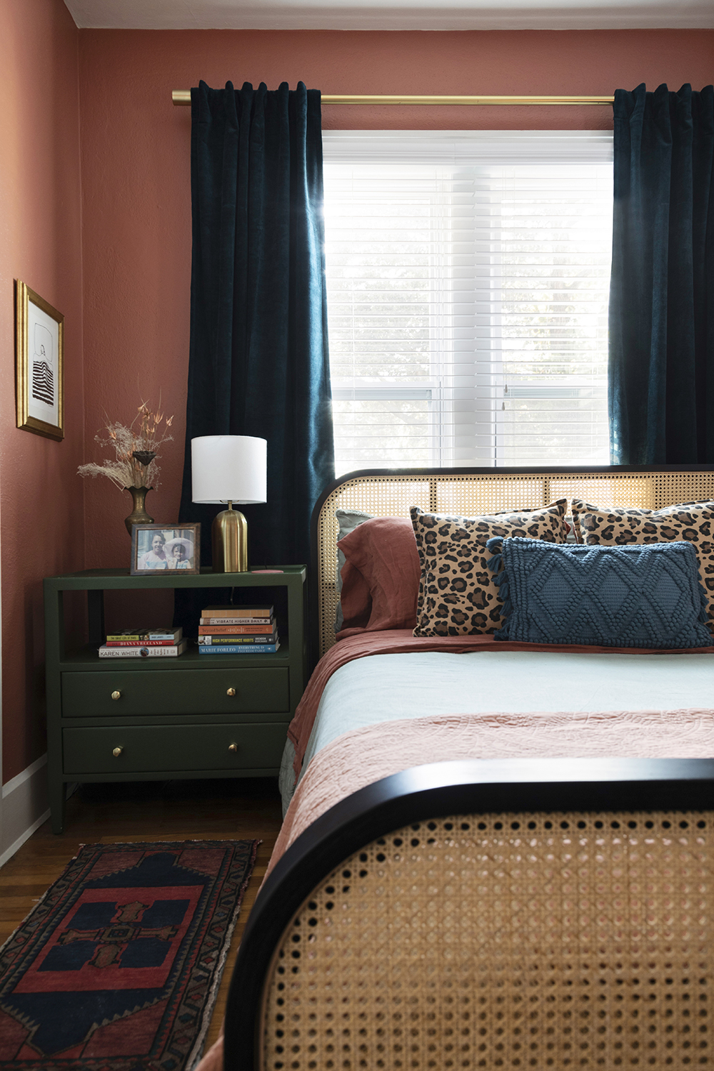
Lisa painted the walls of her bedroom in terracotta not because her landlord said she could, but because she decided she would. 'I thought I'd ask for forgiveness, not permission!'
Thee square footage of this room was relatively small, and the windows were oddly placed, so Lisa decided to embrace its awkwardness. 'It was never going to be a regal and symmetrical room, but it could be a characterful boho one,' she says. 'An upholstered bed would have eaten up the space, so I chose to go smaller scale.'
The bed is from Industry West.
8. Carve out space for a dressing room
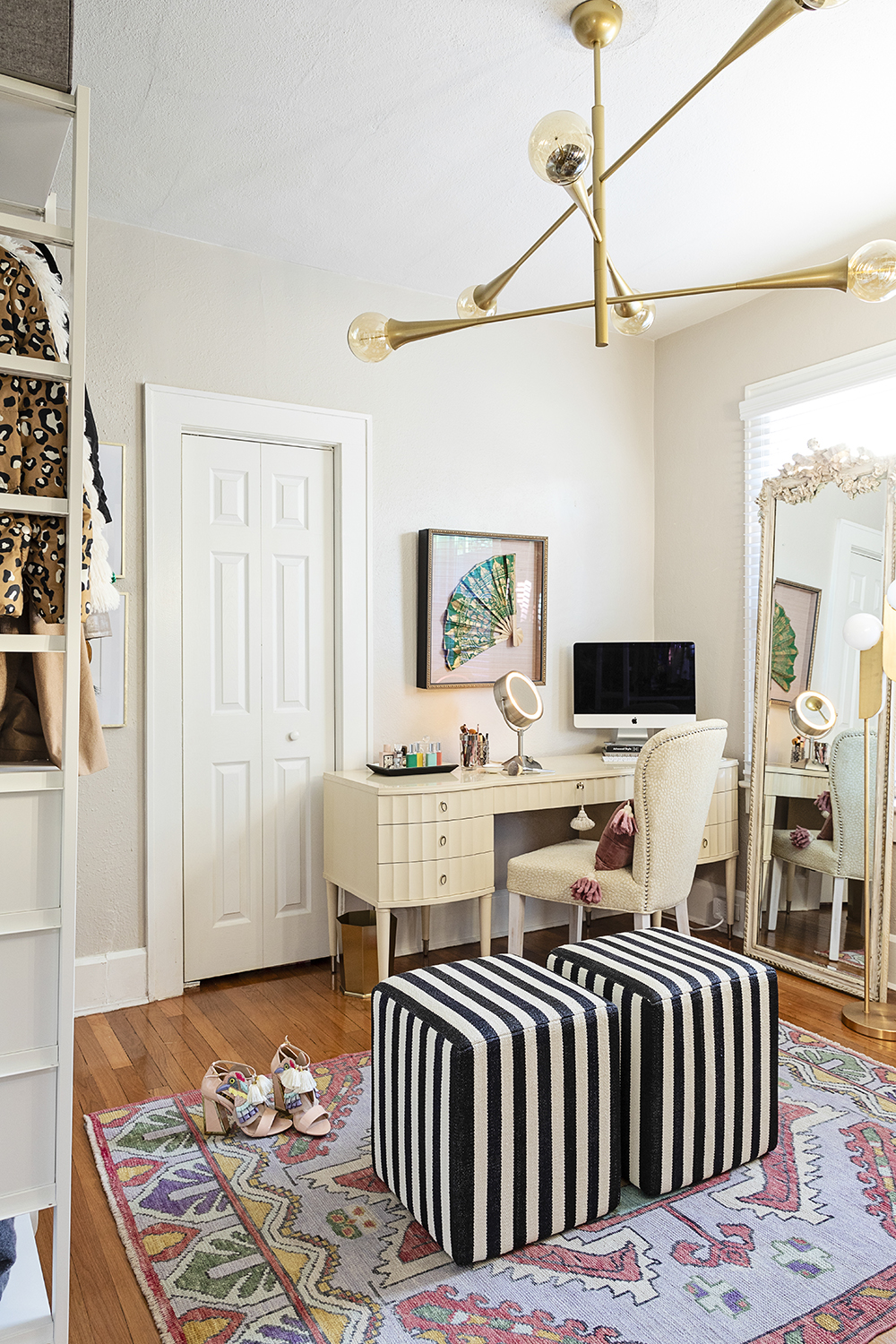
The house is three bedrooms, one bathroom, and Lisa turned one of the bedrooms into a walk in closet - and sometime home office, too.
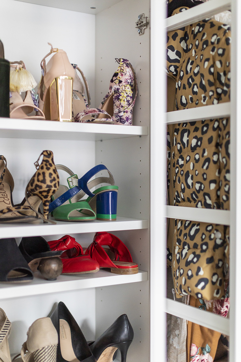
'Having a whole space to walk into and pick out clothes from is a really good start to the day,' Lisa says. 'An act that really sets you up.' Employing a classic IKEA hack, Lisa got Brimnes storage and fashioned into space for shoes and clothes.
'I’m not an organised person, so i wanted everything to have a zone,' Lisa says. Each bit is labelled - I need these things spelled out or I won't stick to them.'
The editor of Livingetc, Pip Rich (formerly Pip McCormac) is a lifestyle journalist of almost 20 years experience working for some of the UK's biggest titles. As well as holding staff positions at Sunday Times Style, Red and Grazia he has written for the Guardian, The Telegraph, The Times and ES Magazine. The host of Livingetc's podcast Home Truths, Pip has also published three books - his most recent, A New Leaf, was released in December 2021 and is about the homes of architects who have filled their spaces with houseplants. He has recently moved out of London - and a home that ELLE Decoration called one of the ten best small spaces in the world - to start a new renovation project in Somerset.
-
 Jeremiah Brent Captures the Grit and Glamour of NYC in His New Loloi Collaboration
The TV-famous interior designer looked out of his own window — and hit the pavement — for a collection that turns city spirit into tactile design
By Julia Demer
-
 This Specific Fabric Print Is Literally Everywhere Right Now — Here's Why
It's whimsical, artistic, and full of character. We've called it already: Dedar's 'Tiger Mountain' is the fabric that will define 2025
By Devin Toolen