This incredible luxe house shows how to be minimalist but still have your favorite things on display
Designer Cherie Lee has curated a wonderful family home in line with minimalist principles that celebrates the items she's chosen to include
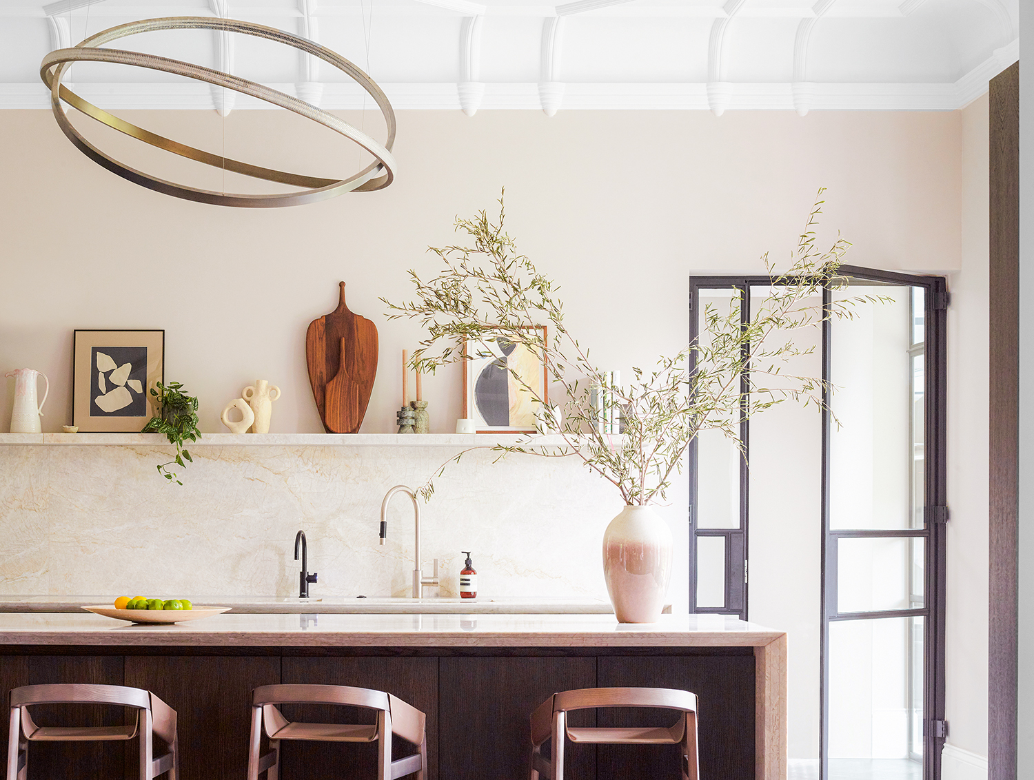
People sometimes assume minimalism means a lack of things. But in fact, it's about choosing wisely, not over-stuffing your home and celebrating the curated items you have gone for.
This handsome historic-meets-contemporary home works new minimalism to perfection. Itlooks like it belongs to a glamorous young couple with a thriving social life, and although that’s an apt description, on the flip side they also have three growing children - and a puppy. That it so successfully combines durability with elegance is down to both the couple’s design aesthetic, and the skill of interior designer Cherie Lee.
‘The couple had already bought two apartments in this large Victorian house in north-west London and converted them into one large lateral modern home,’ says Cherie. ‘But they felt the layout was disjointed and didn’t flow properly.’
When she came onboard it was largely a shell with little furniture, and the kitchen was sited in what is now the tv room. ‘The wife felt shut away from guests when entertaining and from the family on a day to day basis,’ says Cherie. ‘So the priority was to relocate the kitchen to a more prominent position and to create a design for it that blended with the overall aesthetic of the ground floor living space.’
Cherie wanted to create a fresh and cohesive interior design look that functioned for all the family. ‘Comfort was key along with keeping an organic feel to the materials used - natural stones, rich timber and relaxed textiles,’ she says. A sense of understated luxury pervades the space with the combination of the existing dark herringbone floors, moulded ceilings and dramatic lighting.
It was decided that the backdrop would be a warm, neutral palette with dark timber accents. ‘The couple were open to the use of color and playfulness (like the foxed glass cocktail bar and the cloud ceiling in the teenager’s bedroom) if incorporated in the right way,’ says Cherie.
TV room
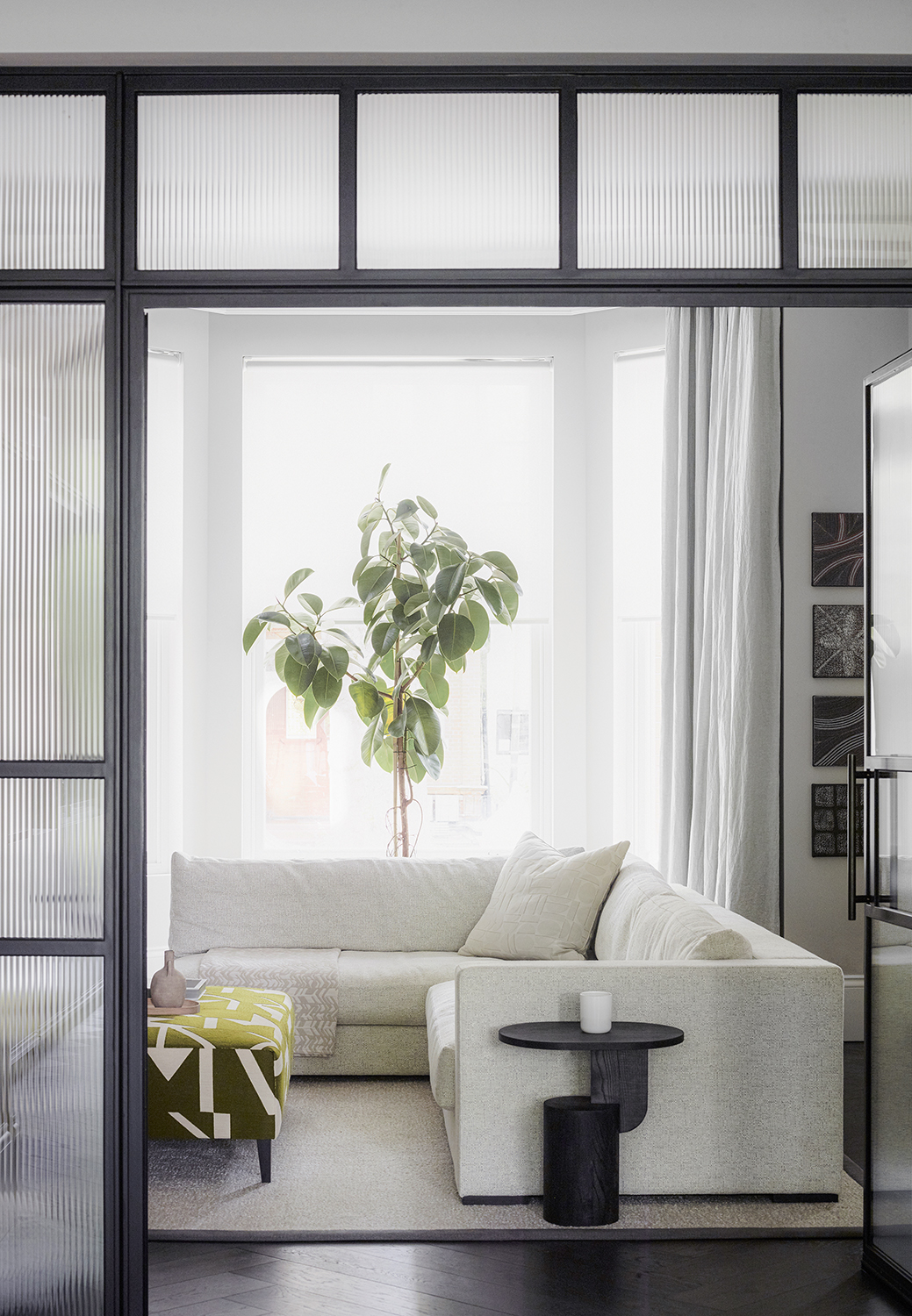
A very elegant space to house the living room TV, comfort was of the essence here with deep, oversized, seating. Metal doors with reeded glass for interest close off the open-plan space if required.
Be The First To Know
The Livingetc newsletters are your inside source for what’s shaping interiors now - and what’s next. Discover trend forecasts, smart style ideas, and curated shopping inspiration that brings design to life. Subscribe today and stay ahead of the curve.
‘There is definitely a formal nature to some areas, inspired by the tall ceilings and original architecture of the home but the clients wanted to avoid it looking too glamorous or showy. The balancing act was essential,’ says Cherie.
The walls are painted in Cornforth White by Farrow & Ball.
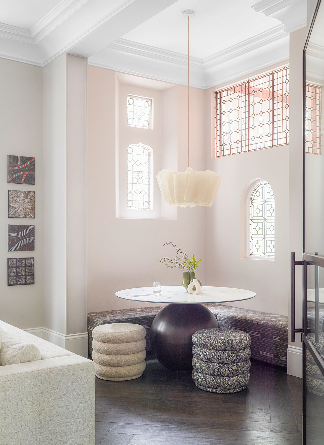
In the corner of the TV room is this beautiful breakfast nook or reading corner or space to entertain. This is a multifunctional space, designed to sit with a coffee, play a family board game, or for the children to do their homework, rather than retreating to separate bedrooms.
The table is by Bonaldo, while the ceiling light is by Pinch Design.
Living room
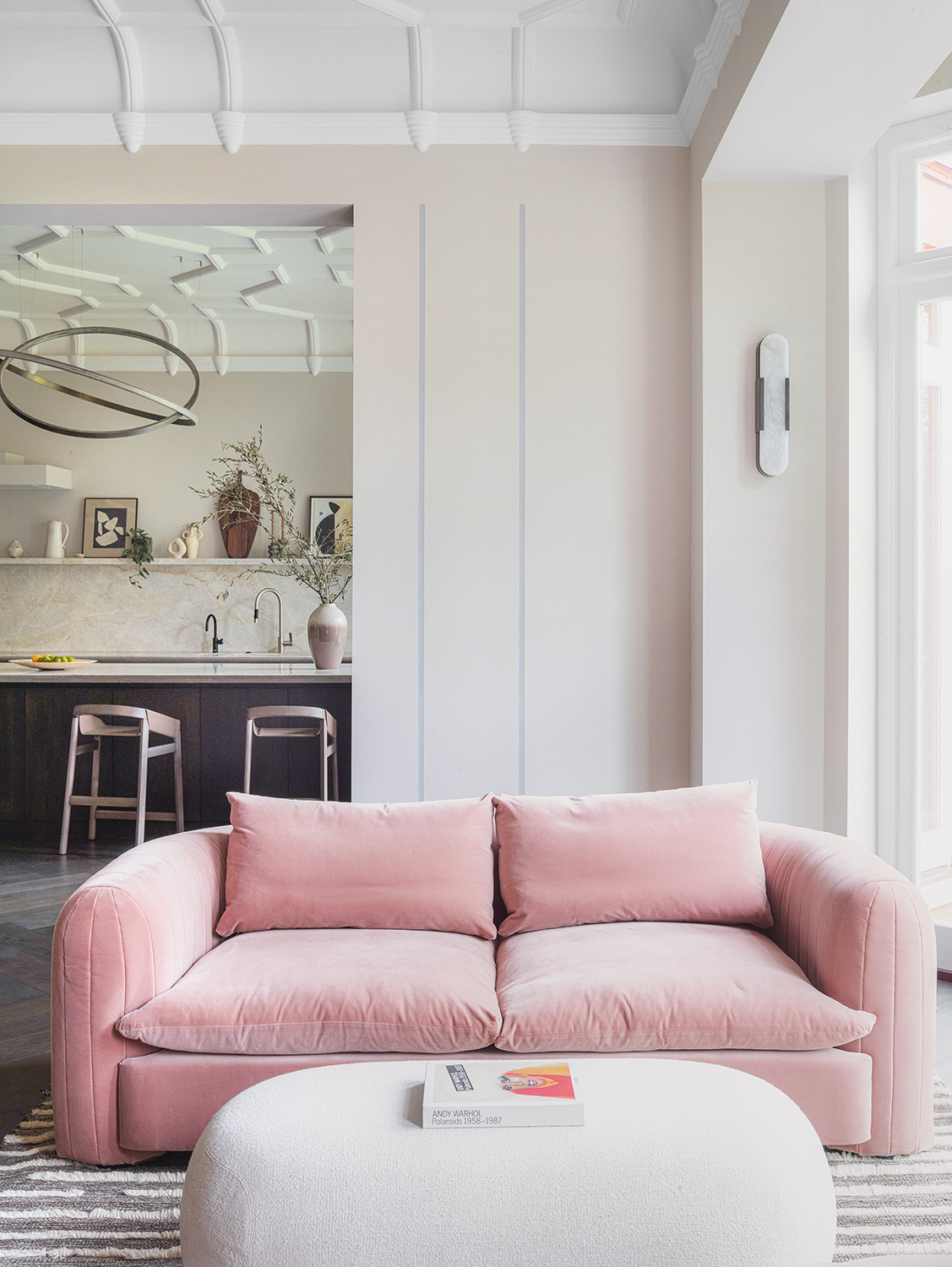
‘The home provides understated, lived in luxury, with a good dose of wow factor,’ says Cherie.
Part of that wow comes from the unexpected choice of the blush pink sofa in an otherwise neutral living room. As as color choice, it doesn't jar with the rest of the soothing scheme but it does provide a little uplifting burst. Only one half of the room had original ceiling mouldings, the other is a perfectly matched copy which makes the space cohesive.
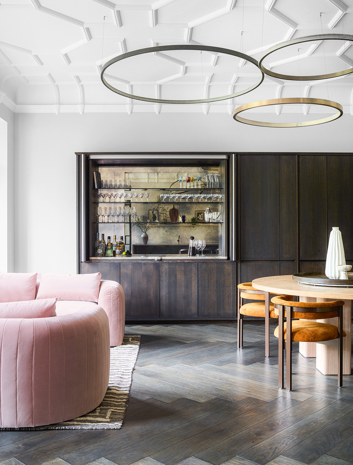
There is a clever hidden door to a cloakroom next to the home bar, which itself can be shut off when the family are not entertaining. The whole unit provides ample storage.
Dining area
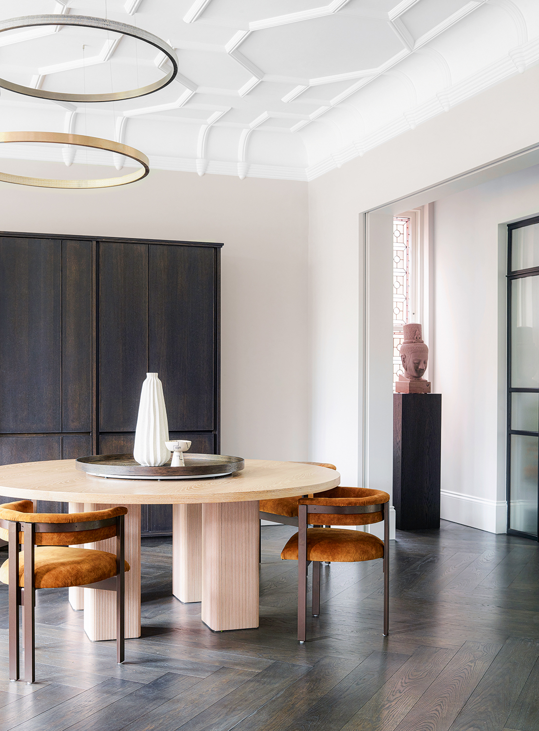
The dining room area is open plan to the living room, and is a purposely simple space. It invokes the principles of minimalism, having few items so as to really be able to see and celebrate the chosen pieces that made the edit.
Beautiful bespoke furniture was worth investing in, say the owners. It caters exactly for their needs and makes the home individual.
The ceiling lights are from Cameron Design, the table is designed by Cherie Lee and made by DOT Bespoke and the hairs, bespoke, are upholstered in Manade Camel, Casamance.
Kitchen
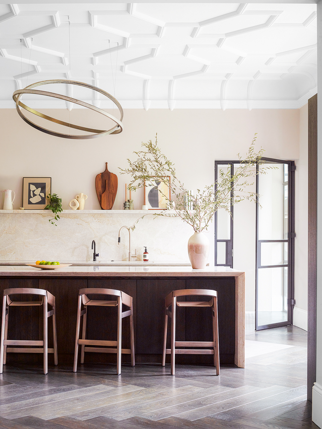
A mix of natural materials was used to ensure that the modern kitchen felt calm and part of the living room, rather than too utilitarian.
Of changing the layout so that the kitchen sat here, Cherie says: ‘The end result is a social and hardworking layout that serves the needs of the whole family.’
The ceiling light is by Cameron design.
Staircase
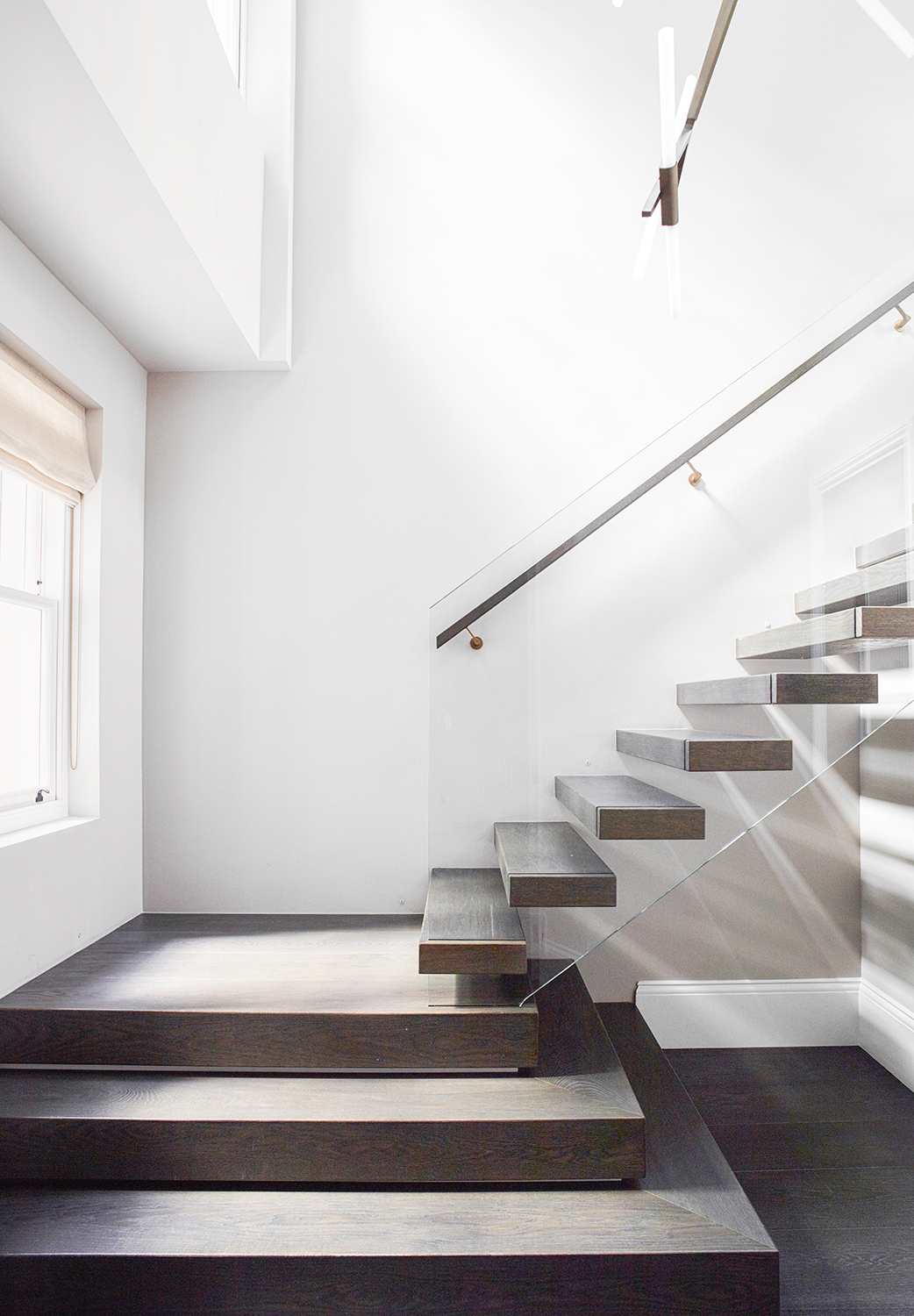
A new staircase to connect the two floors is a statement in itself, in keeping with the home’s inherent grandeur. It is made with concrete and glass, and seems to float as it clings to the wall.
The design is by Bespoke Handrails and Staircases by Anthony Clemens.
Main bedroom
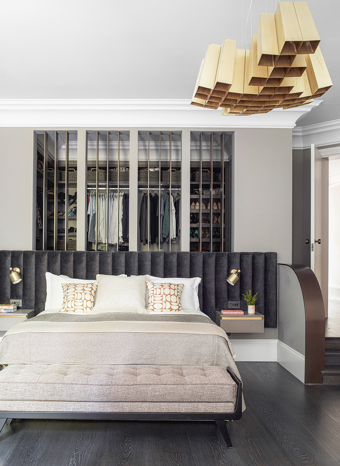
'We wanted to design a headboard that stretched the entire wall and really helped to frame the sleeping area,' Cherie says of this sumptuous modern bedroom. 'The color palette was dark with earthy accents and contrasts with the lightness of the seating area adjacent.'
The walls are painted in Worsted, Farrow & Ball.
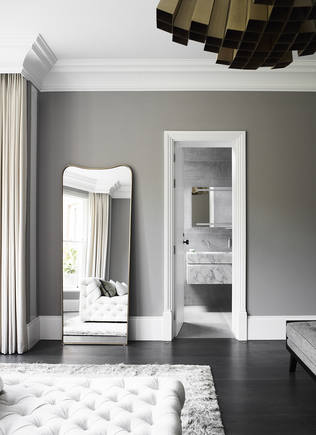
Bathroom
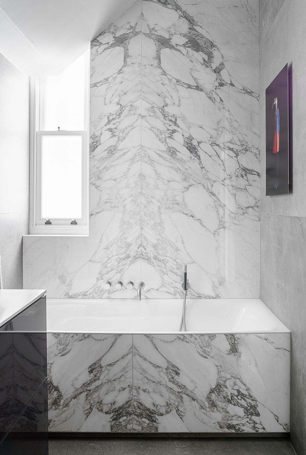
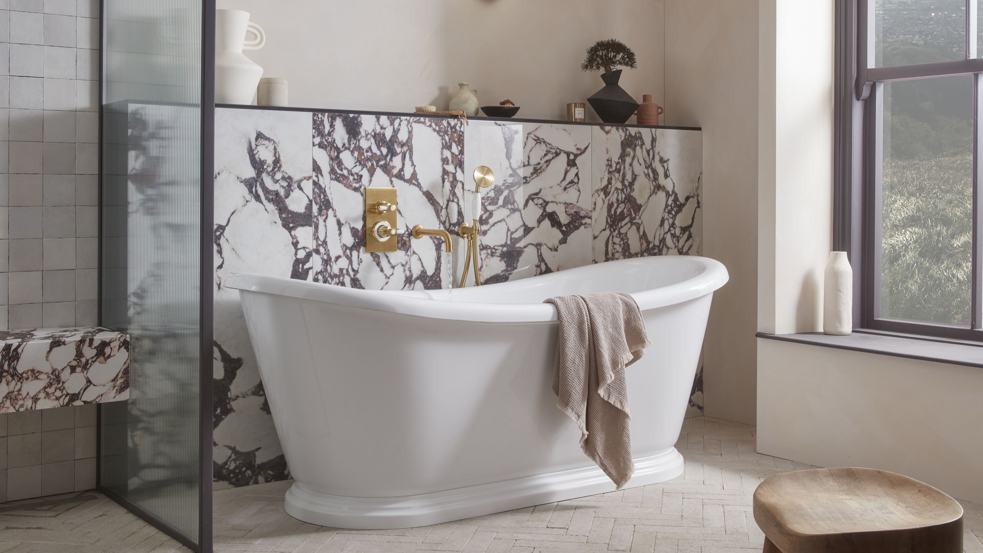
The bedrooms have ensuite shower rooms while this modern bathroom that works for all the family is hard wearing yet dramatic. ‘A sense of individuality with choices makes for the most successful renovations,’ Cherie says.
A legendary houses editor, Mary Weaver held the job of Homes Editor on Livingetc for over a decade. She set the aesthetic for which the brand has become known. She is now a freelance stylist, art director and writer, regularly contributing to Livingetc and overseeing the brand's successful House Tours franchises of live and webinar events.
-
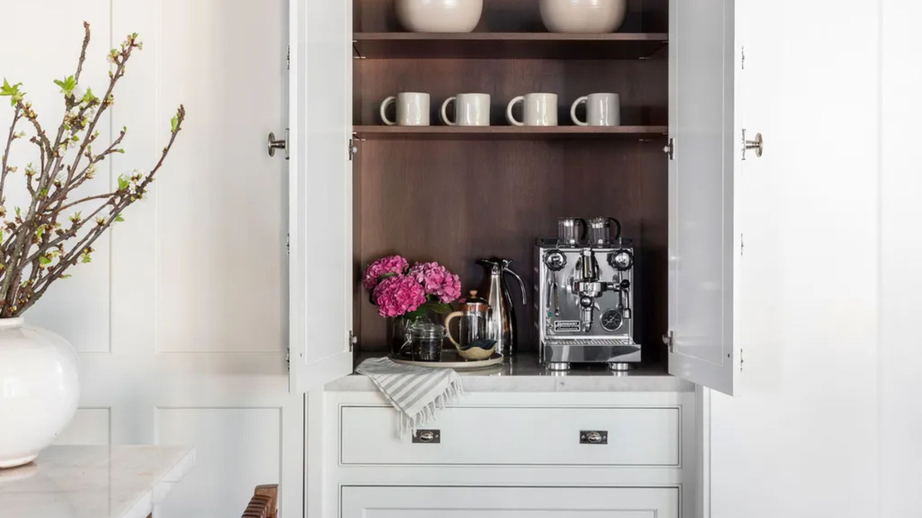 Turns Out the Coolest New Café is Actually In Your Kitchen — Here's How to Steal the Style of TikTok's Latest Trend
Goodbye, over-priced lattes. Hello, home-brewed coffee with friends. TikTok's 'Home Cafe' trend brings stylish cafe culture into the comfort of your own home
By Devin Toolen Published
-
 5 Bathroom Layouts That Look Dated in 2025 — Plus the Alternatives Designers Use Instead for a More Contemporary Space
For a bathroom that feels in line with the times, avoid these layouts and be more intentional with the placement and positioning of your features and fixtures
By Lilith Hudson Published