Bursts of primary color wake up this neutral Madrid apartment
Palm Springs goes Pop in this playful family home by Spanish interior designer Nuria Alía
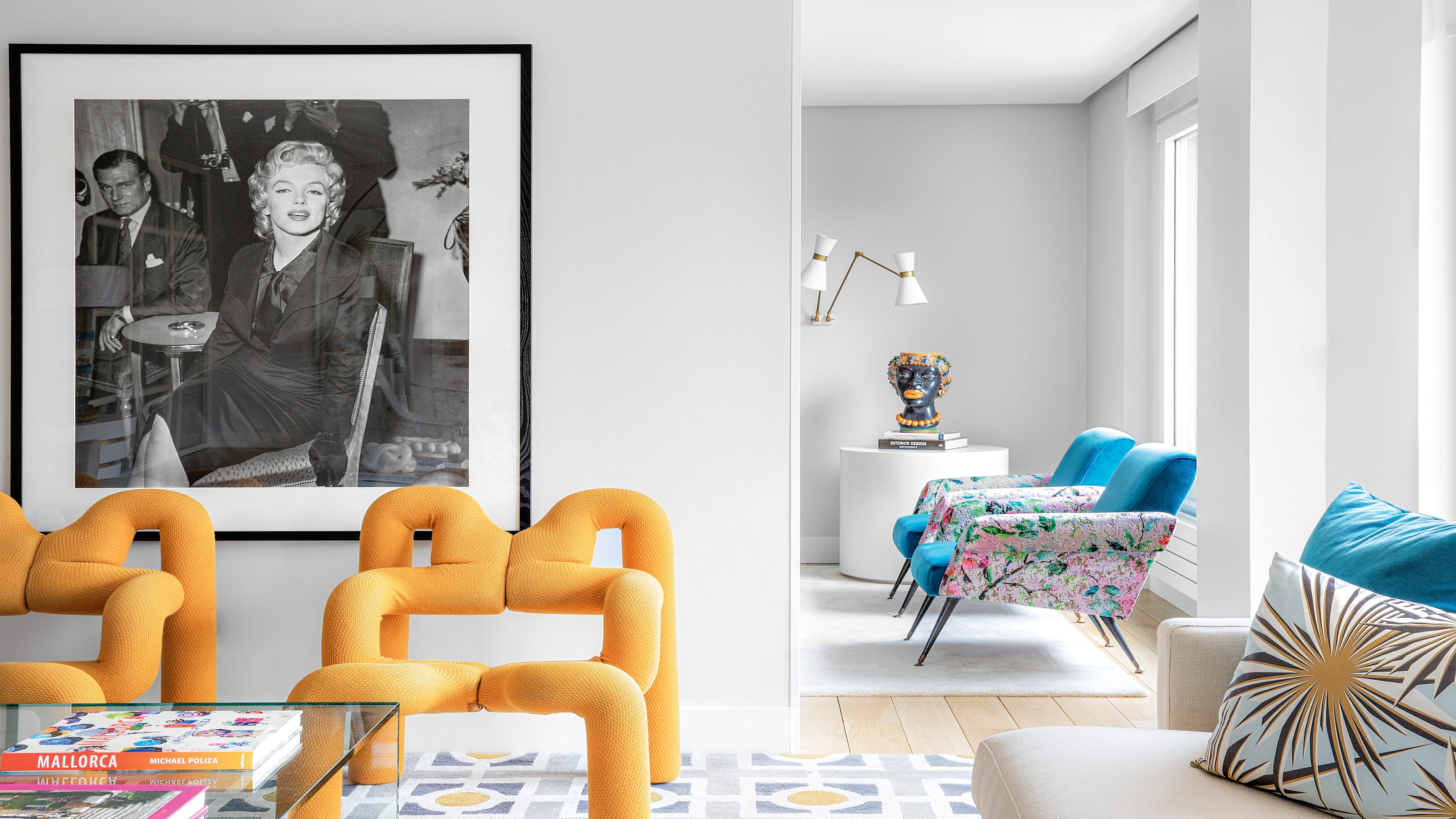
Based in central Madrid, this modern home was reinvented for a couple and their three young children.
If she were on the hunt for a slogan to sum up her style, interior designer Nuria Alía could do a lot worse than, ‘Always look on the bright side of life’. For the classic Monty Python lyric perfectly encapsulates the upbeat vibe, colorful palette and all-round happy chic she brings to her work, whether it’s for a Spanish fashion chain, a hip market eatery or a residential redesign.
Whilst the walls are painted the softest hint of grey and the floors are either pale oak or white porcelain, it is anything but cold and monotone. This is down to Nuria’s skill in introducing pattern and primary hues through her choice of accessories, textiles and furniture.
Situated in an apartment block dating from 1965 and designed by the architect Pedro Casariego Hernández-Vaquero, the flat’s appeal was the fact it overlooked the residential complex’s gardens, with multiple windows offering great views of the greenery and allowing plenty of natural light to flood the flat. Let's look inside...
Living room
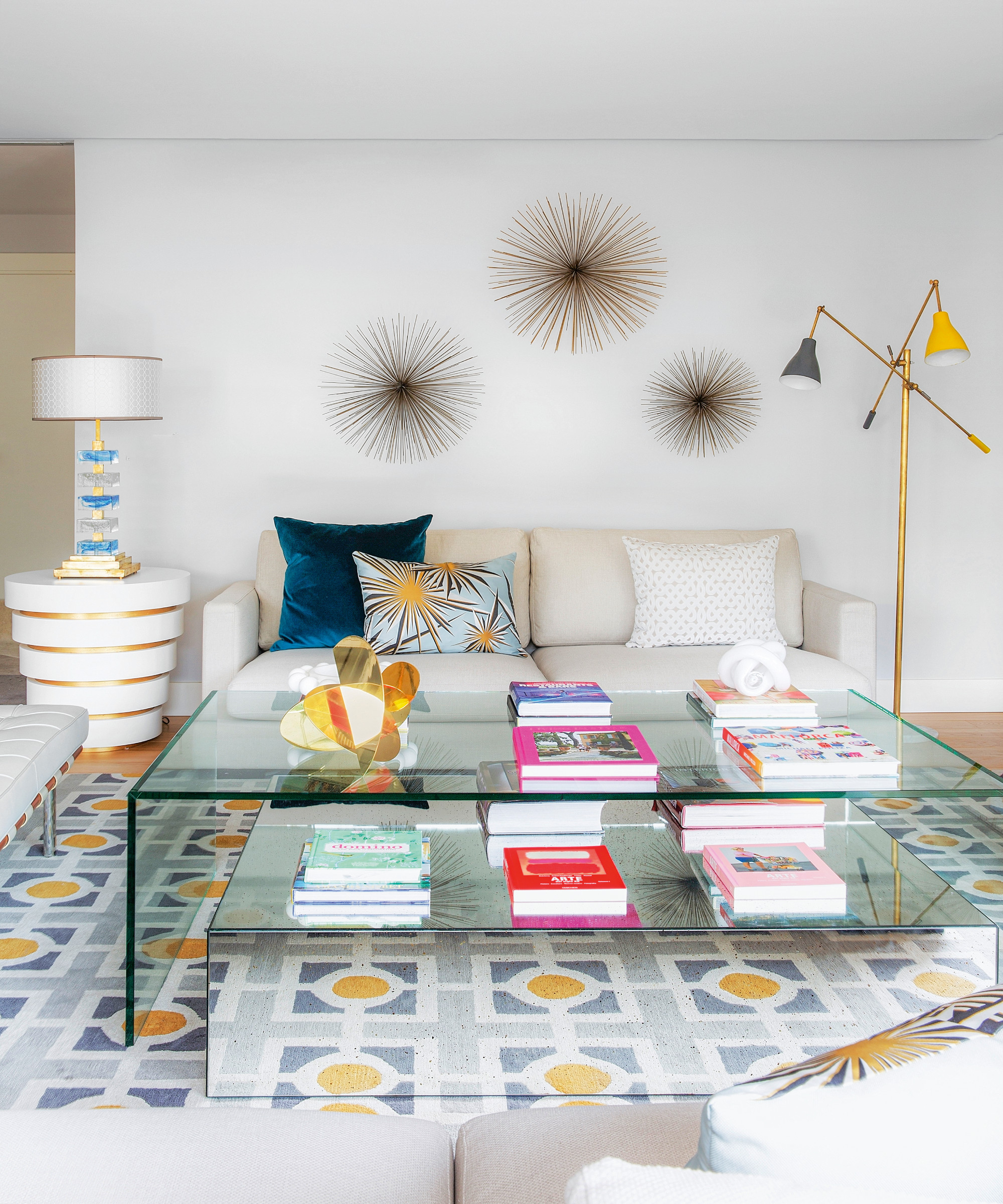
The playfulness seen in Nuria Alía’s work is a distinctive feature of contemporary Spanish design and, as one of its proponents, she’s not afraid to team multiple styles, design periods and colors, setting them against a neutral backdrop that makes them pop all the more. This pick ‘n’ mix approach serves to create vibrant spaces that are a joy to spend time in.

‘I like the idea of “dressing spaces”,’ she says. ‘Using bouclé or velvet, adding rugs to warm the floors and drapes at the windows. I usually choose bright fabrics for armchairs and cushions to bring liveliness and fun to a home.’
And whilst her magpie eye wanders far and wide, Nuria has the design discipline to stop it all becoming a hot mess: ‘The key is to find balance.’
Be The First To Know
The Livingetc newsletters are your inside source for what’s shaping interiors now - and what’s next. Discover trend forecasts, smart style ideas, and curated shopping inspiration that brings design to life. Subscribe today and stay ahead of the curve.
Dining room
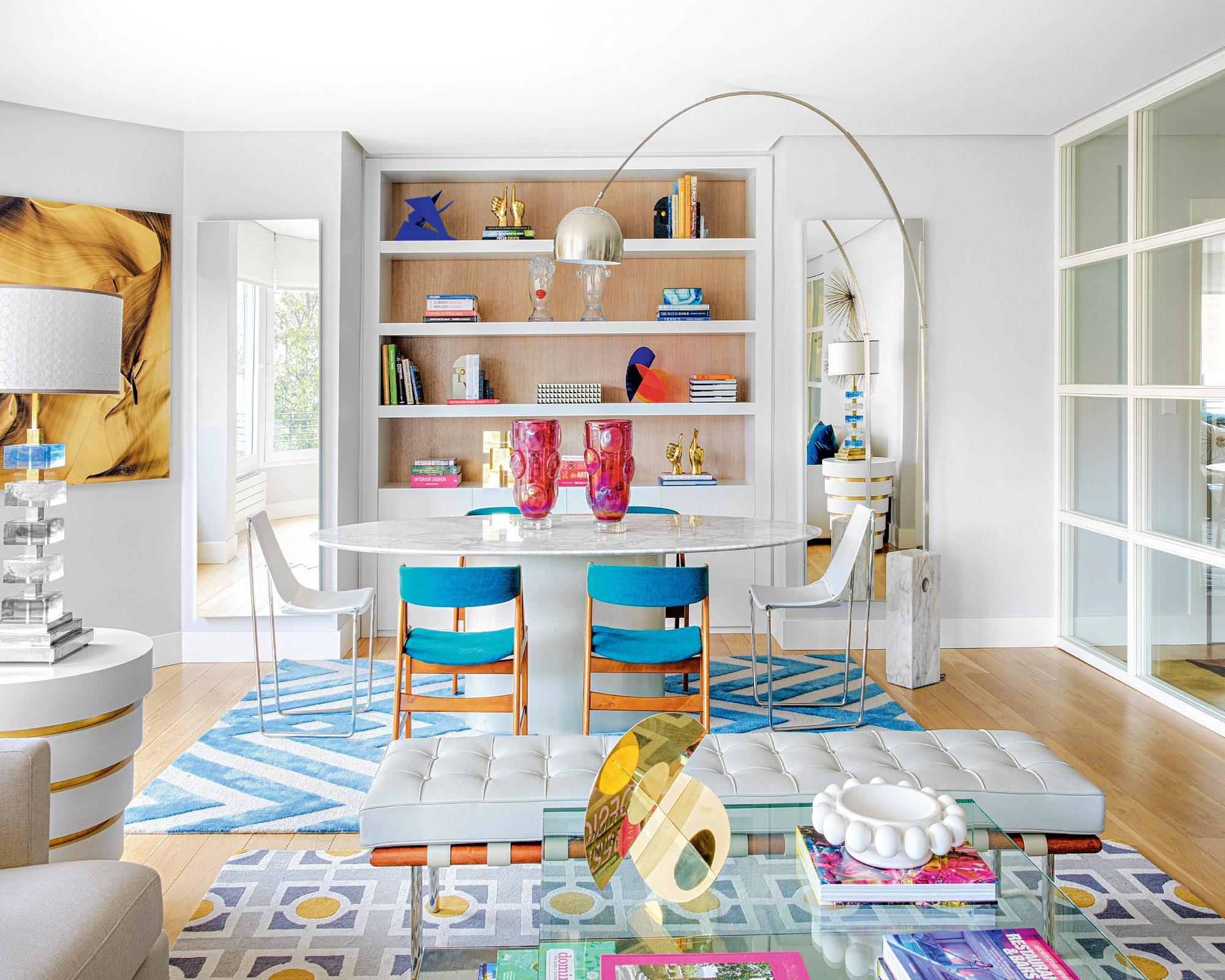
But being a bit tired and outdated, the space needed a rejig to make it function for the young family. Alía took the opportunity to recalibrate the apartment into public and private zones, add more storage and re-orientate the rooms so that the social spaces all took advantage of those windows.
‘The new layout was intended to create different, well-defined areas,’ says Alía. ‘They like to have people over and organise dinners with friends, so it was important to separate the more private bedrooms from the open-plan common spaces.’
Kitchen
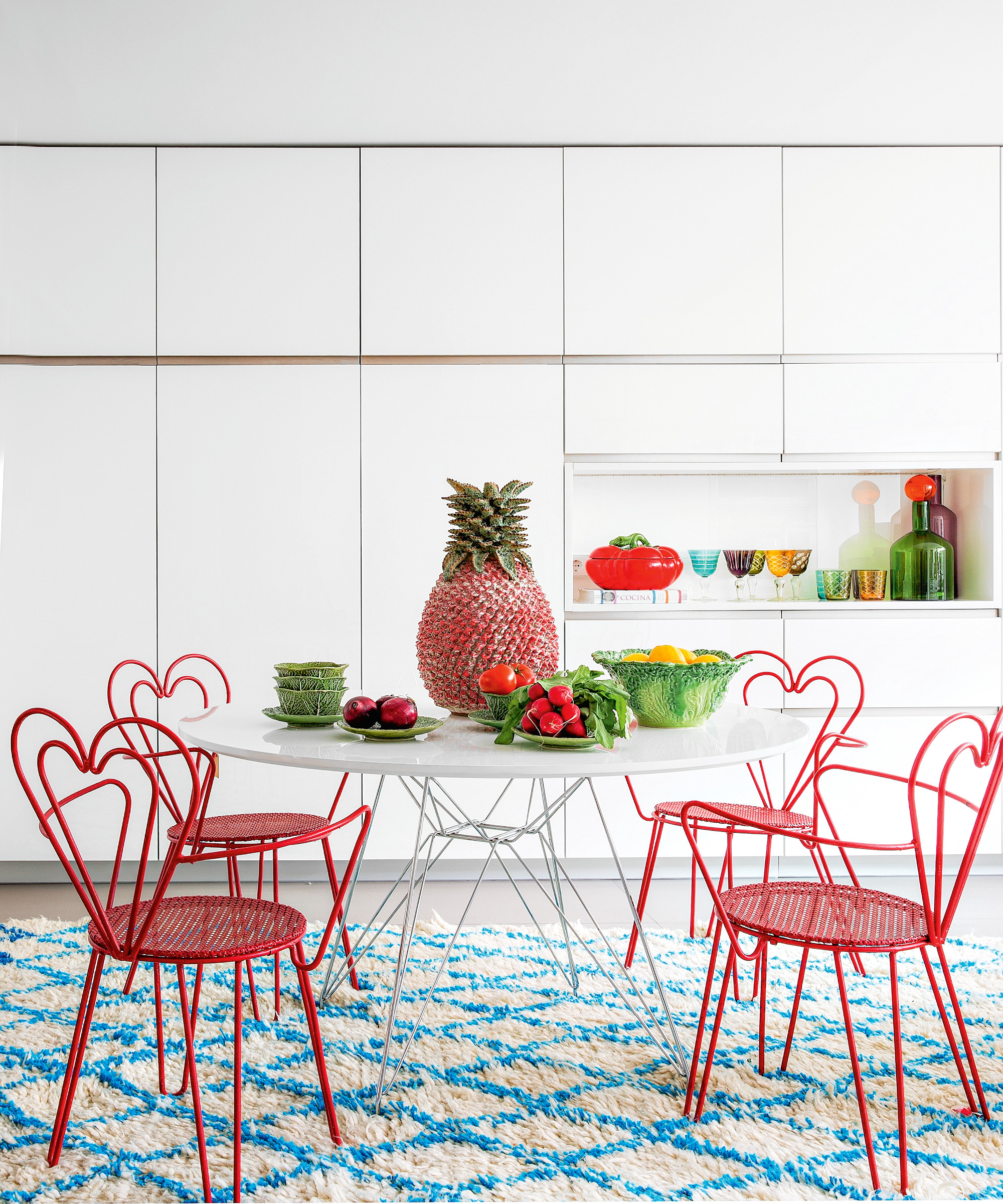
Nuria then set about introducing her signature mix of furnishings into the deliberately timeless, neutral base she had created.
‘In terms of decoration, eclecticism characterises me,’ she explains. ‘I always look for positivity and joy, which is why my predilection is for vibrant colors in all their variants.’
In practice this meant mixing vintage finds with more contemporary pieces, as well as incorporating paintings and travel souvenirs that the couple already owned: ‘This gives a more personal touch to a home.’
Bedroom
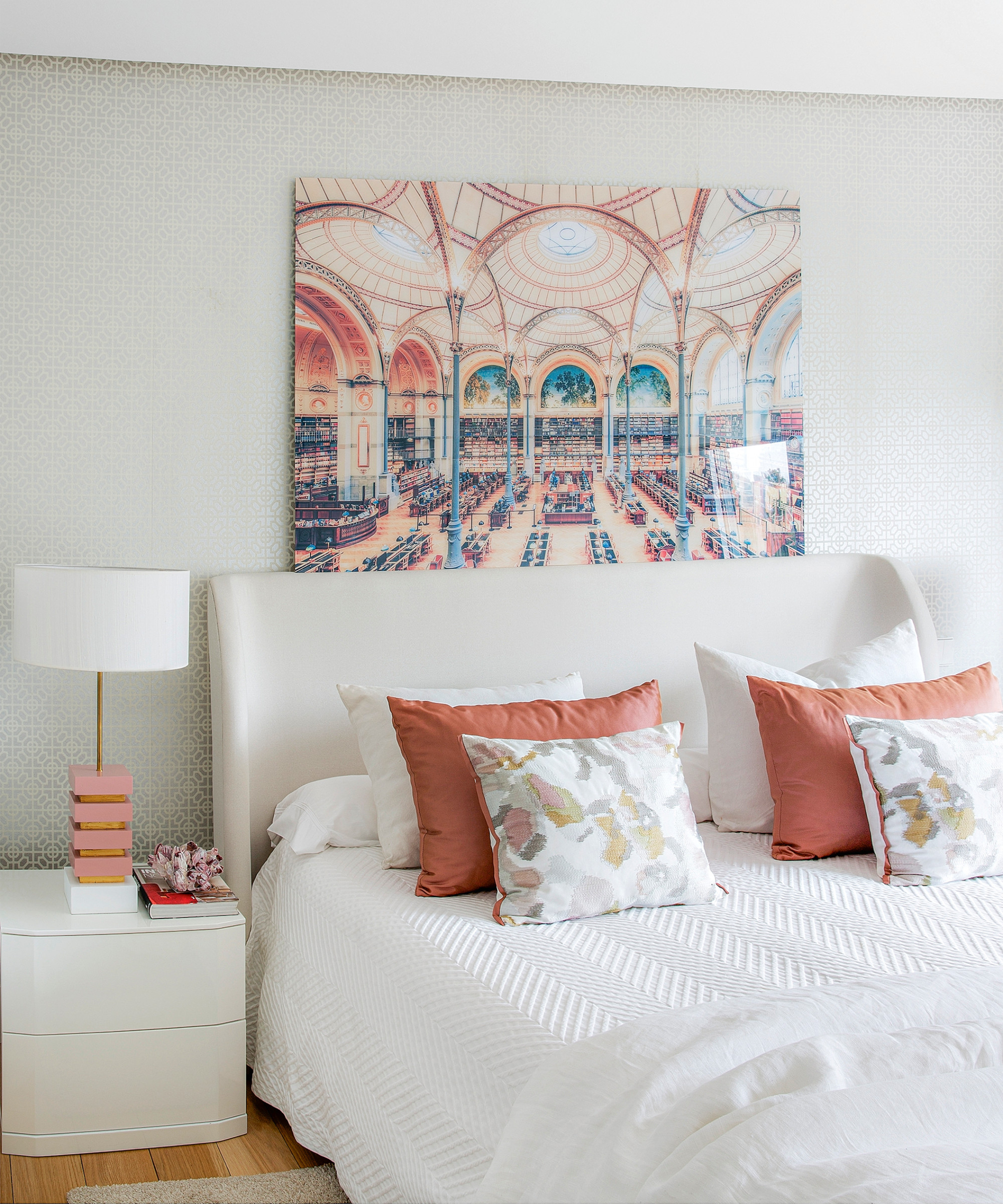
‘The bedrooms and en-suites were located to create a more intimate area for rest and privacy,’ says Alía.
Bathroom
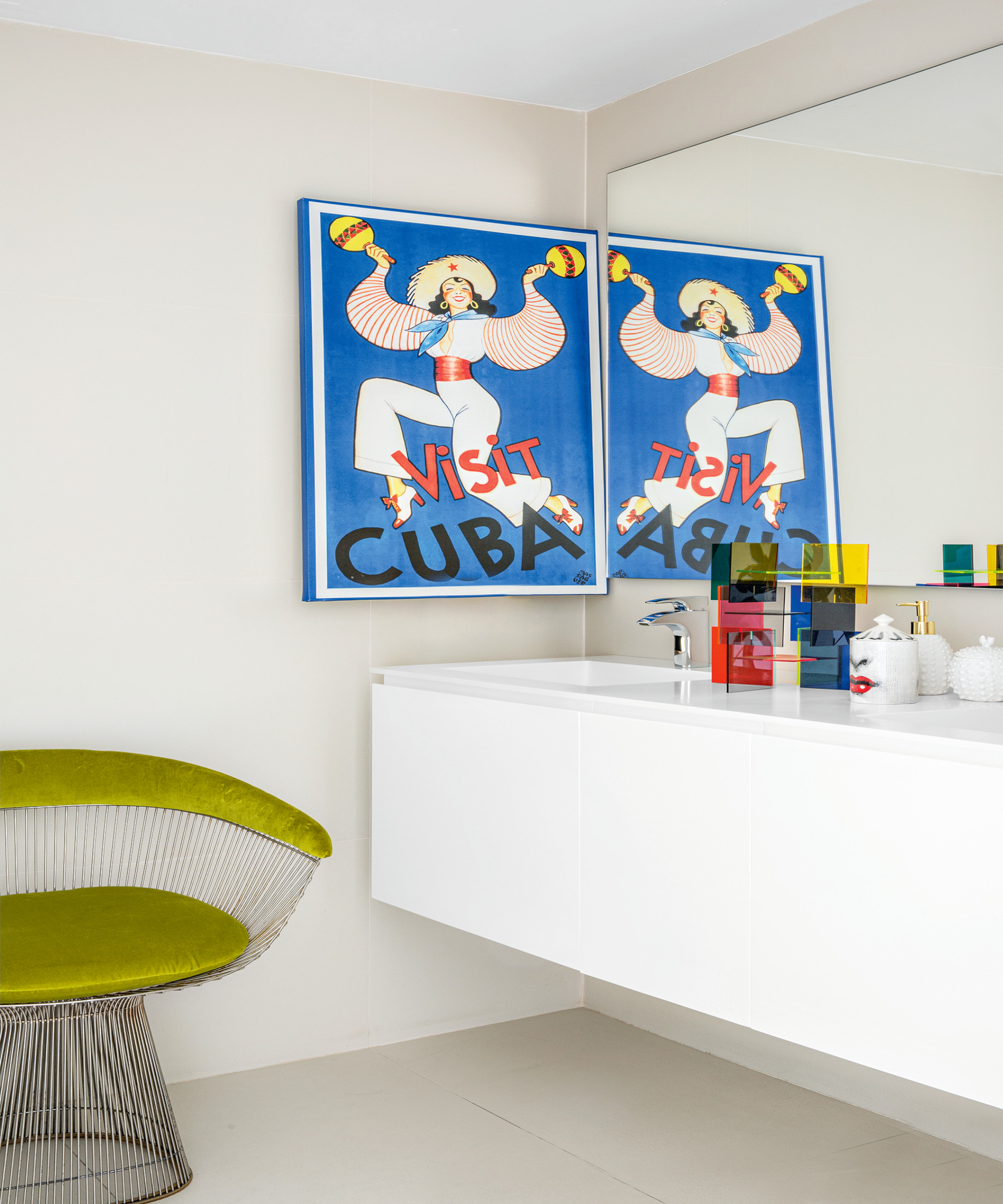
The homeowners have been gifted a versatile home designed to enhance their lives and that can adapt as their growing family’s needs change. A positive space where, to paraphrase a lyric by the late, great Prince, ‘they will get their plus signs every day…’
See more: a 1920s house in Melbourne that unites traditional architecture with modern interiors
As journalist with over 25 years experience, Kara has held staff positions at ELLE Decoration, Sunday Times Style and The Express. She has been a longtime contributor to Livingetc, and also been a regular writer for titles such as House Beautiful. She has always focussed on design and interiors, and her first book, At Home with Plants, was written with florist Ian Drummond and published in 2017.
-
 Straight from Salone: Five Emerging Trends I Found That'll Shape Interiors For the Year Ahead
From reflective silver to fluidity, here's my perspective on the key themes and new moods coming through from Milan Design Week
By Sarah Spiteri Published
-
 9 Bathroom Storage Mistakes You're Probably Making That Make Using This Space Much Harder — And What to Do Instead
Discover which mistakes are to blame for your overcrowded and cluttered bathroom
By Seraphina Kyprios Published