This Mayfair apartment is a lesson in working Art Deco style with a contemporary twist
Take a tour of this elegant London apartment where a 1920s aesthetic has been reimagined with luxe details and a modern treatment

The Livingetc newsletters are your inside source for what’s shaping interiors now - and what’s next. Discover trend forecasts, smart style ideas, and curated shopping inspiration that brings design to life. Subscribe today and stay ahead of the curve.
You are now subscribed
Your newsletter sign-up was successful
On the fourth floor of a handsome 1920s building, this Mayfair apartment had retained plenty of period flourishes, but was hampered by a dated and impractical layout. With a skinny kitchen near the front door, separate living and dining rooms at the other end of the apartment and (most weirdly) a single bathroom leading off the dining room.
Tasked with the re-design, Marie Soliman of Bergman Interiors, came up with a dramatic layout change to create this modern home. This included removing a dividing wall to create an open-plan living space, with windows that look down on the Mayfair setting, as well as reconfiguring the bedroom space to include two luxury en-suites.
But while the layout was the starting point for the re-design, it’s the refined materials, richly-repeated colour palette and considered finishing touches that give this transformation its luxury and longevity.
Article continues belowTaking inspiration from the building’s Art Deco interior design roots, marble features prominently, from slabs made into bespoke basins, to a kitchen island in Dedalus marble. While softer textures have been added to that glossy base layer in the form of woven wallcoverings, velvet, burr wood and brass.
Living room
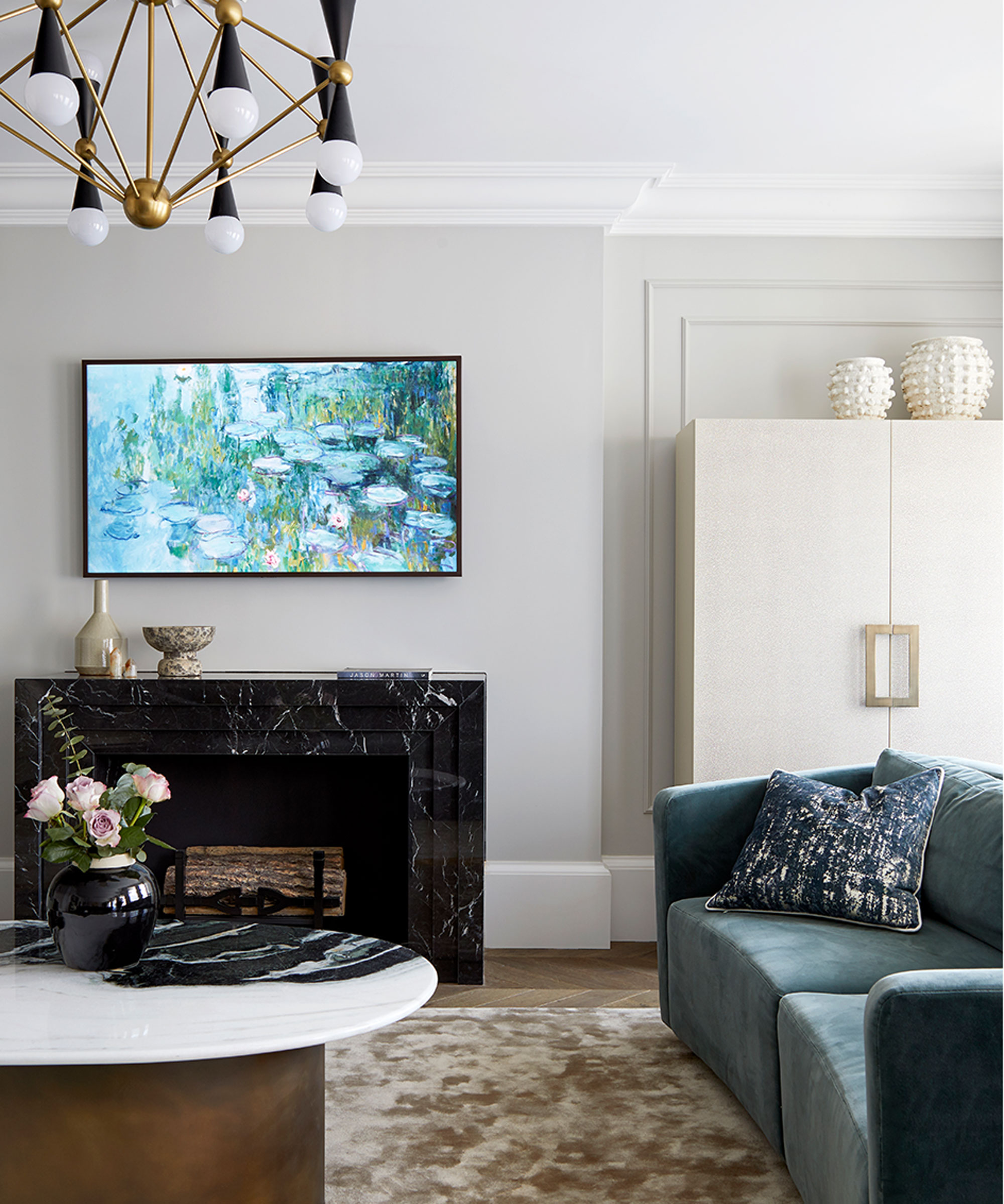
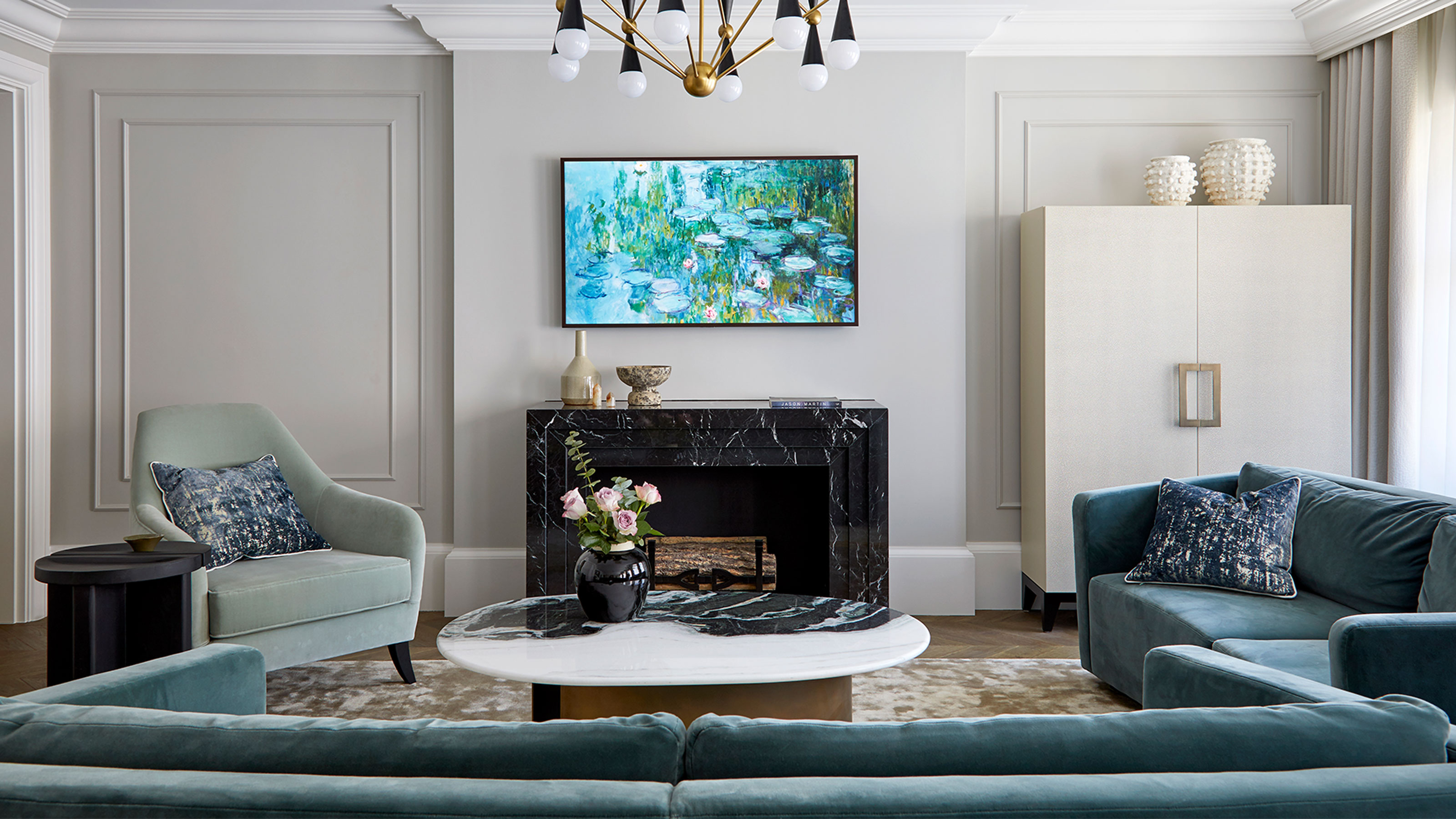
Marble is a design thread that runs throughout the apartment, on surfaces and statement pieces. Rich, muted shades create a sense of calm continuity in this elegant living room scheme.
‘There’s often an assumption that luxurious spaces have to err towards white, ivory and taupe,’ says designer Marie, ‘but I wanted to explore the power of rich, nuanced colours.’
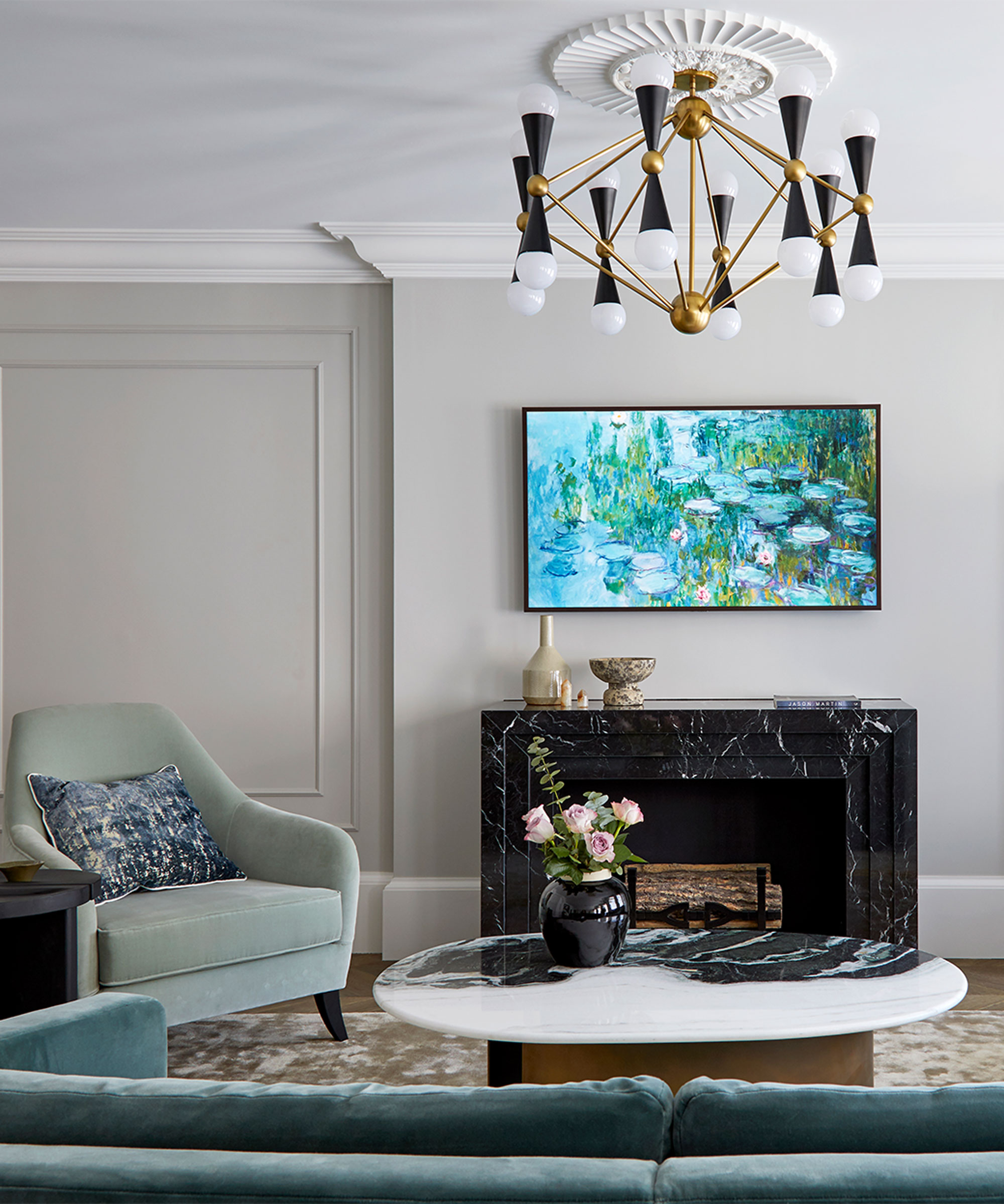
While a more practical layout was the starting point for the redesign, it’s the way that textures and colours are layered, dipped into and then subtly repeated, that makes this home feel truly cohesive.
The Livingetc newsletters are your inside source for what’s shaping interiors now - and what’s next. Discover trend forecasts, smart style ideas, and curated shopping inspiration that brings design to life. Subscribe today and stay ahead of the curve.
Soft shades of sage and jade green on upholstery create with soft oyster-coloured paintwork. A spectacular geometric living room lighting idea contrasts with and elevates the period ceiling rose.
Dining area
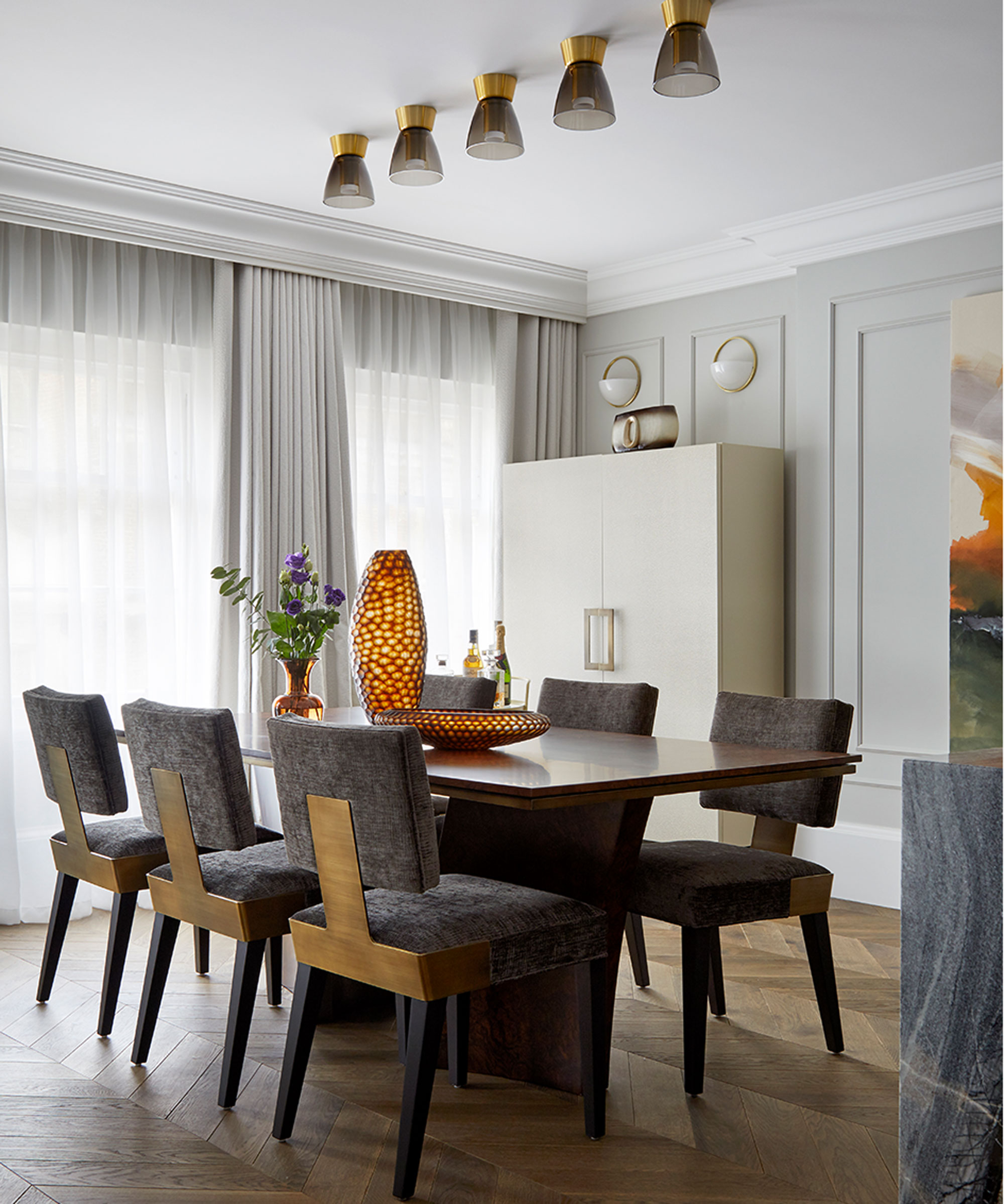
A row of ceiling lights above the dining table is a simple way to make a decor statement. While the burr wood table top and upholstered dining chairs inset with brass reflect the Deco origins of the building in a sophisticated way.
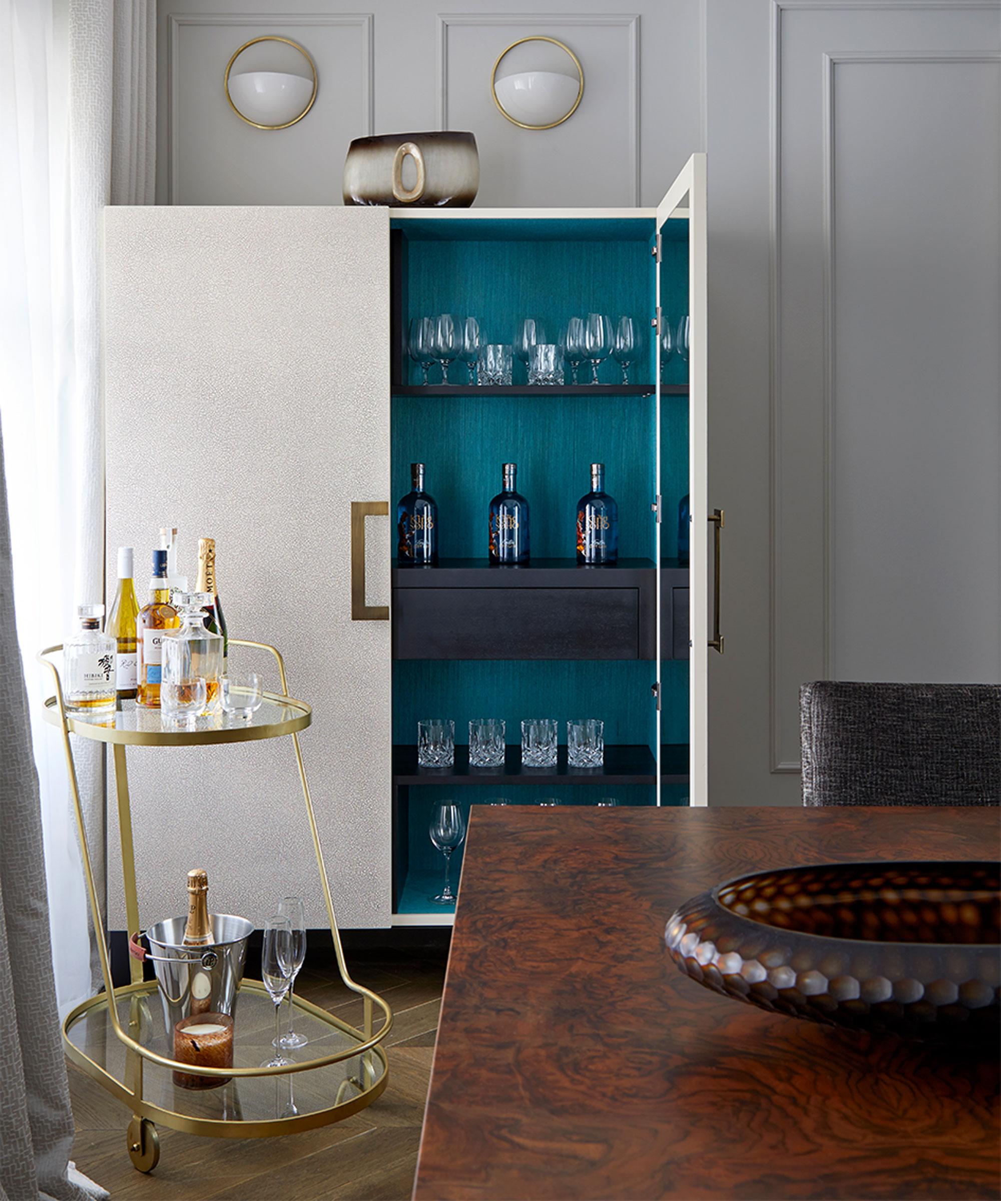
With owners that love to entertain, the cocktail cabinet and drinks trolley in the corner is a must.
The teal interior gives a surprise flash of colour when the cabinet is opened and creates a contrast backdrop for a line-up of sparkling glassware.
Kitchen
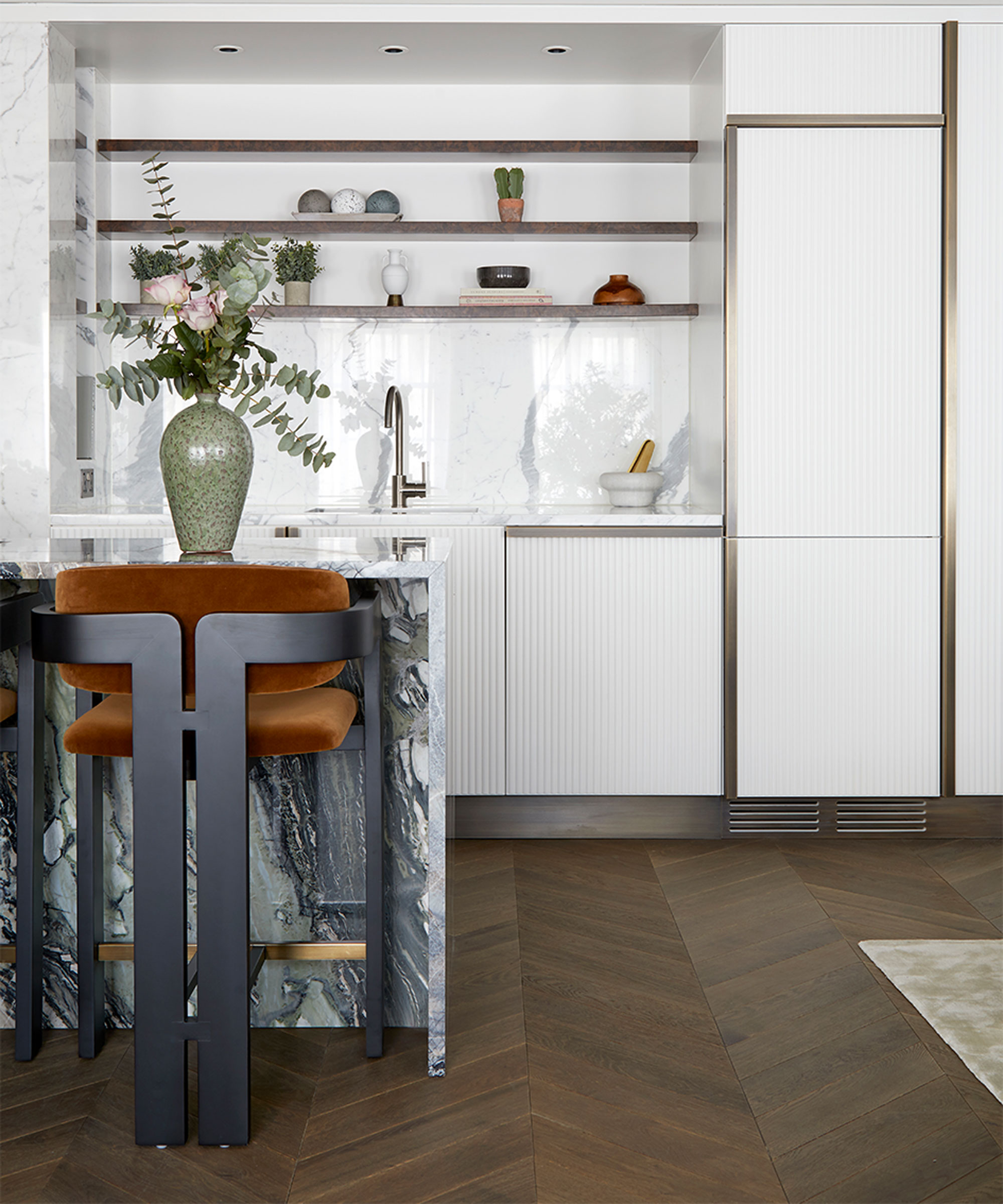
In the kitchen, fluting on the cabinets is reminiscent of hotel design from the 1920s and 30s, with pearl and ivory colouring that was also favoured during that time.
White goods and storage are concealed behind bespoke cabinetry, all trimmed in brass.
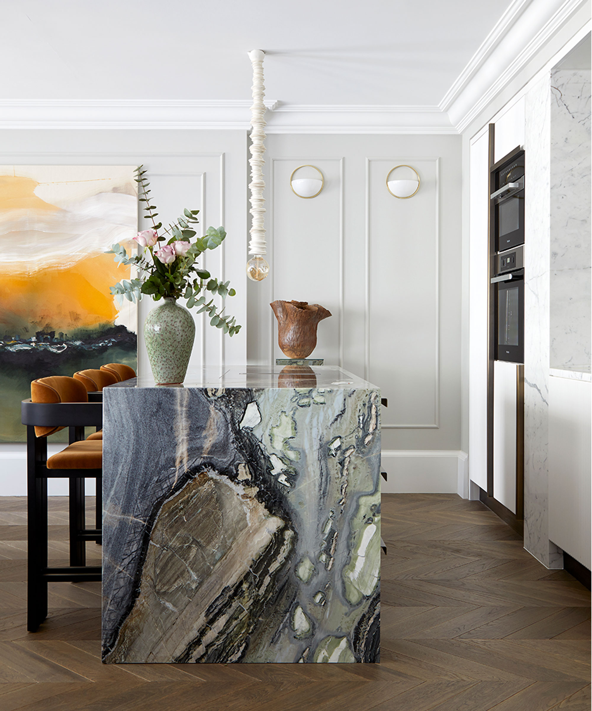
The designer was keen to include work by up-and-coming contemporary artists and ceramicists throughout the apartment. Ula Saniawa’s sculptural light, formed from handmade ceramic discs, makes a statement hung above the island.
Hallway
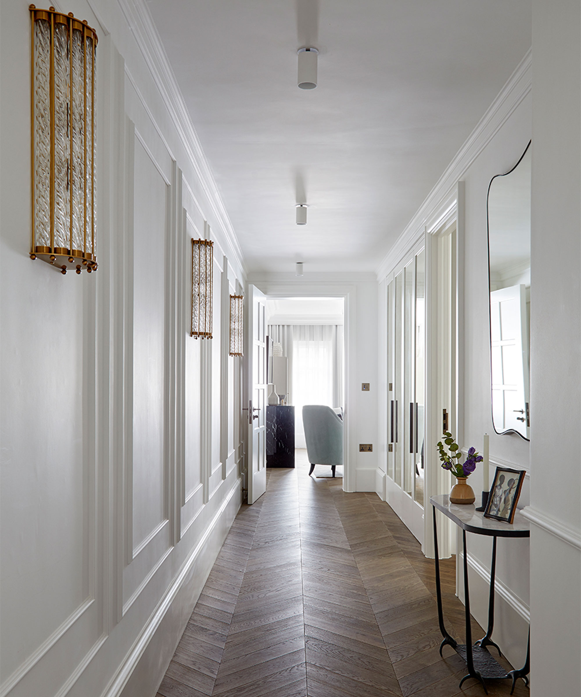
This entrance hall was originally twice the width, but some of the floorspace was reclaimed to accommodate the larger bedrooms and en-suites.
Nevertheless, this white hallway still remains a generous and welcoming space with its richly-grained parquet floor and luxe gilt and glass lighting.
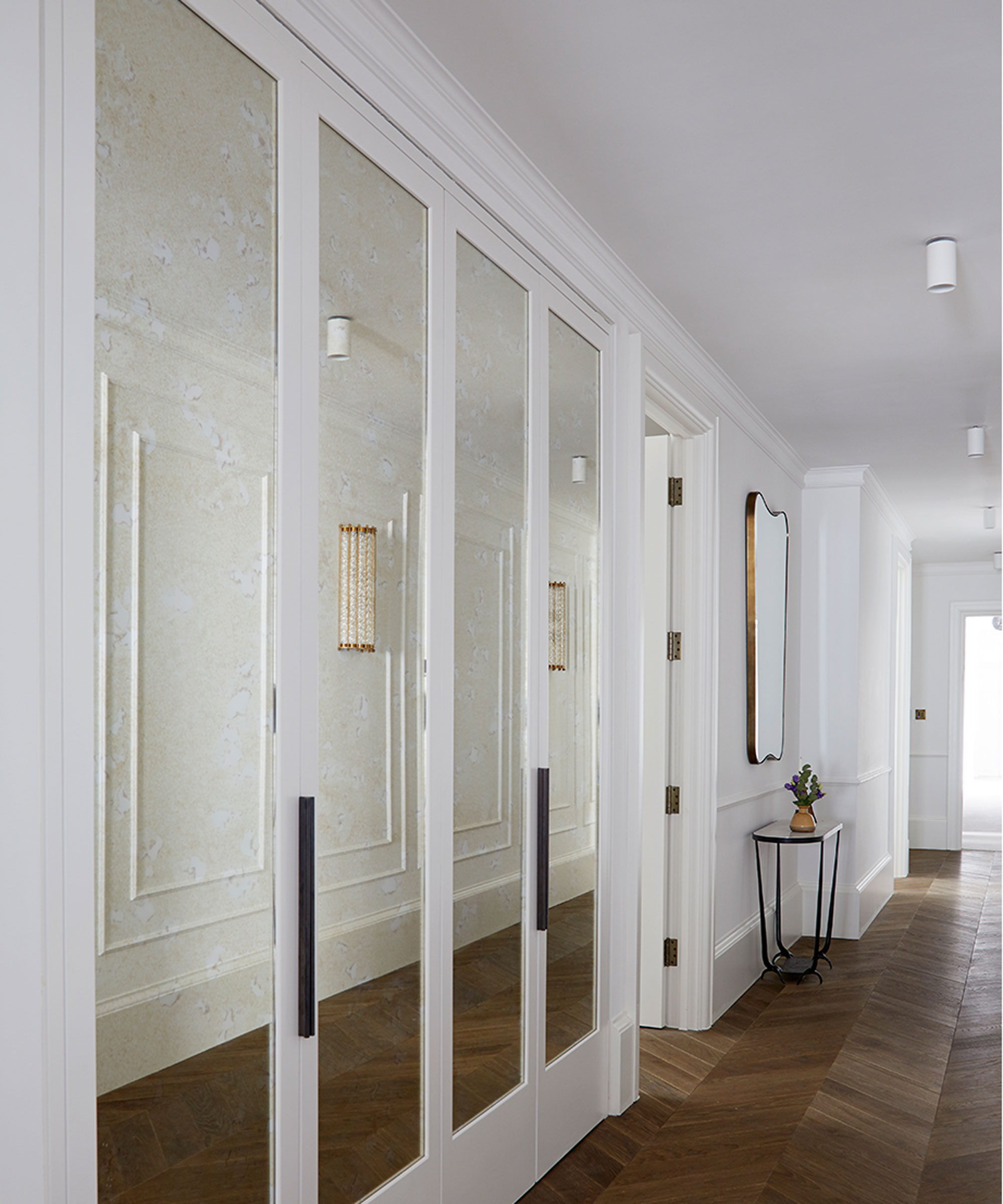
Built-in storage helps keep the entrance area calm and uncluttered, with a row of hidden cupboards behind the antiqued mirror glass panels. Mirrors reflect light and with the pale decor help give the hallway a feeling of spaciousness.
Master bedroom
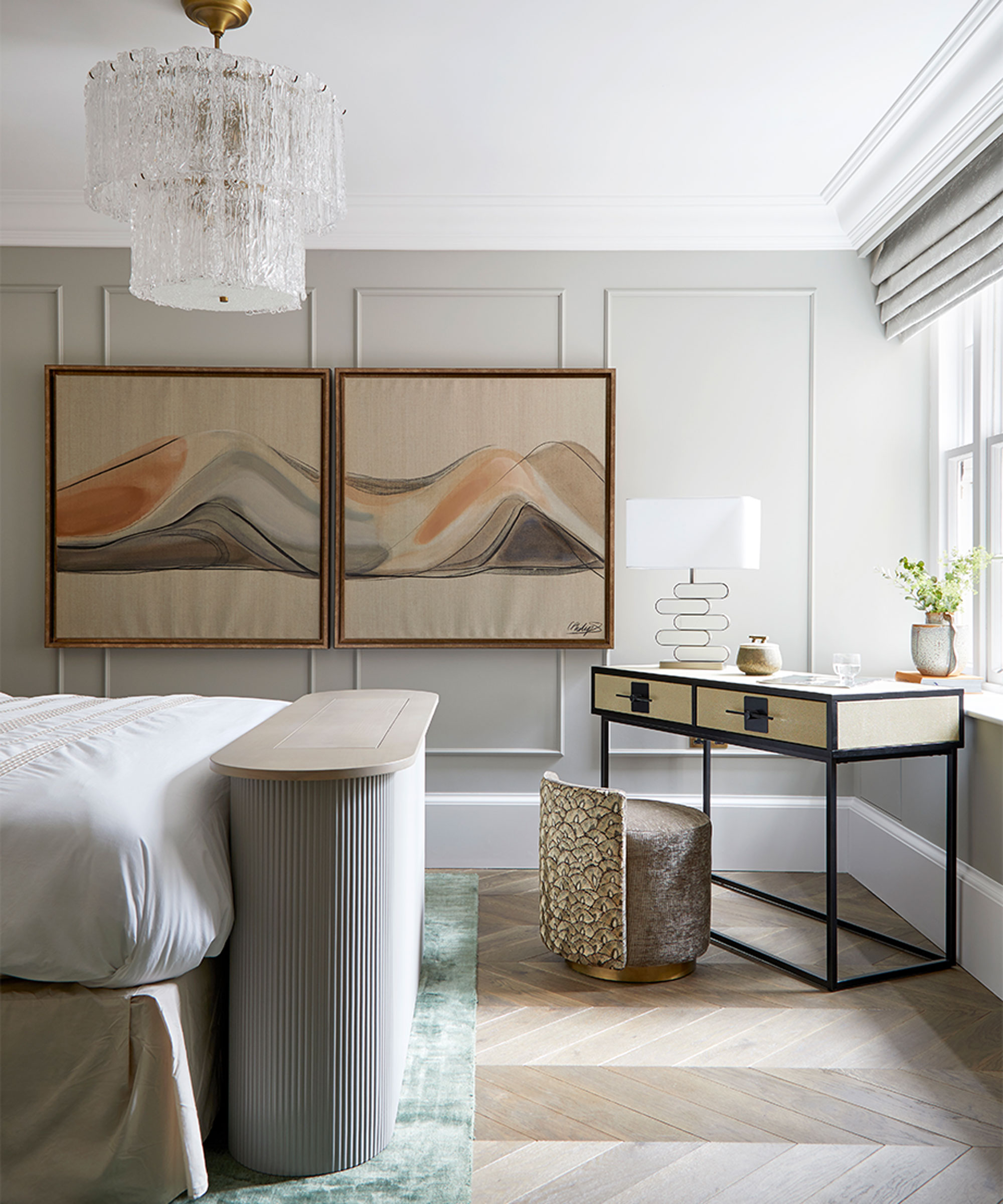
The 1930s was a golden era of lighting - and wall lights, sconces and pendants throughout the apartment riff on designs pioneered by Lalique, Petitot and Sabino.
The centrepiece in the main bedroom is a modern version of an ice glass chandelier that also references high-glam Kalmar designs of the 1960s.
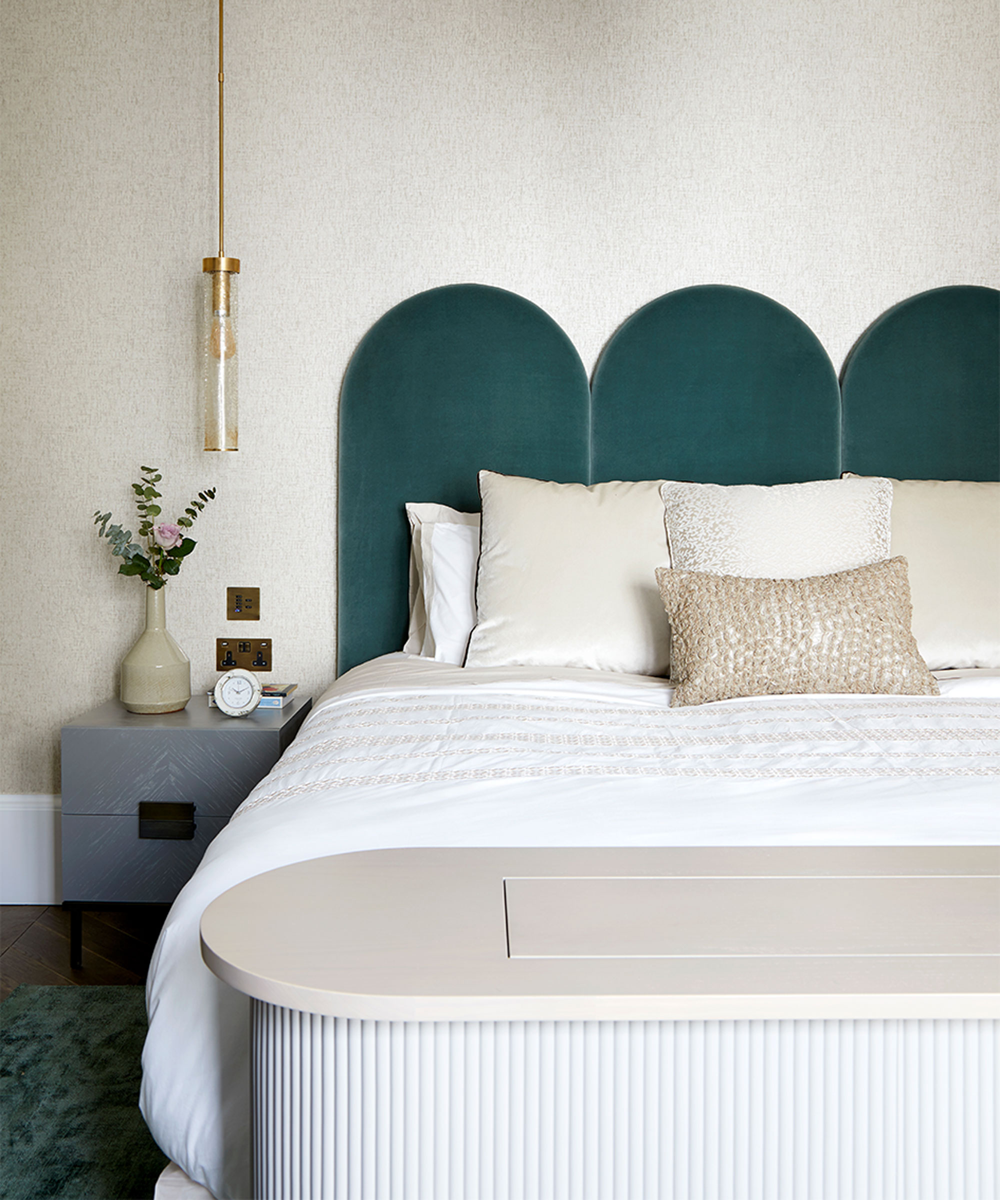
The bedroom re-design gives a nod to the building’s Art Deco history, but with an altogether contemporary twist.
At the foot of the bed, a TV rises out the bespoke unit as required.
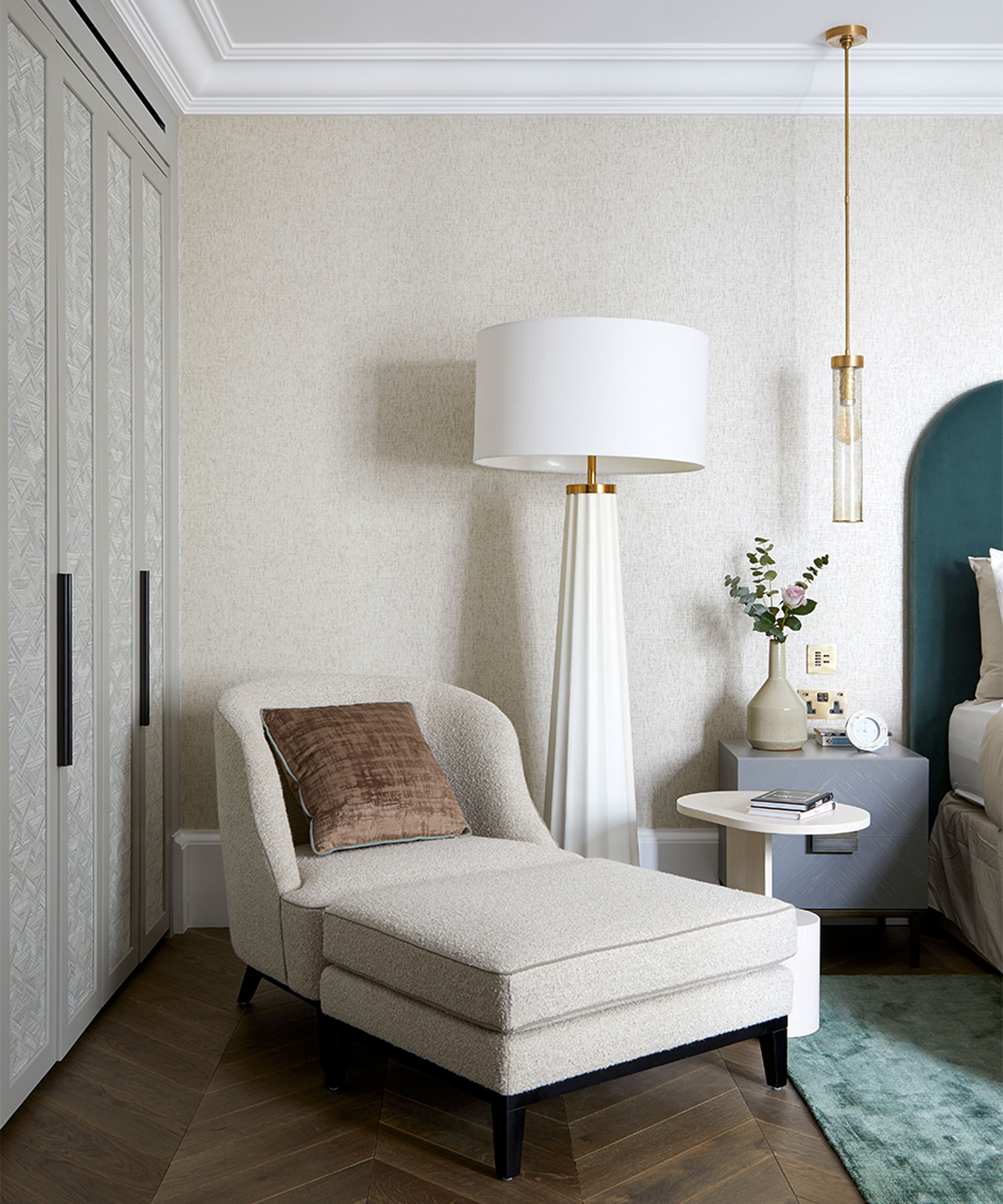
A Kelly Wearstler floor lamp adds a quirky touch and is positioned by an armchair for night time reading. Designer Marie likes consider her bedroom lighting ideas in layers, describing it as ‘jewellery for a room’.
Master en-suite
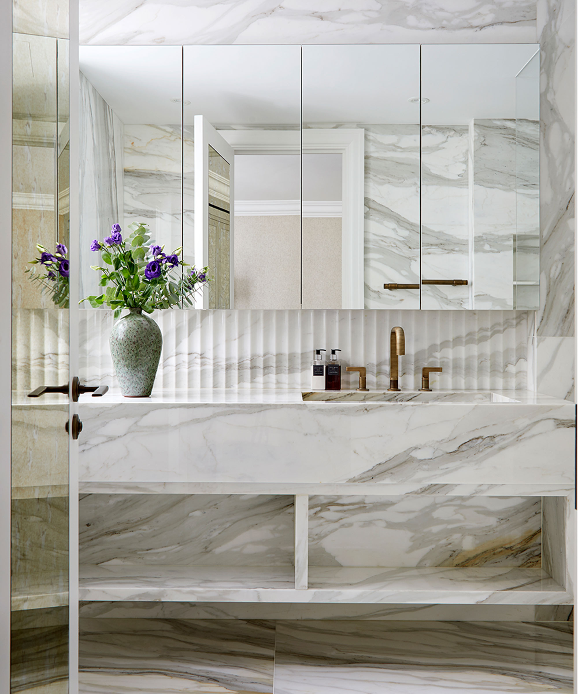
The en-suite door was designed so that it doubles as a full-length mirror. It also conceals the WC as you open it, so it’s not the first thing you see. The splashback is moulded into Deco-style fluting, a witty way to break up the wall-to-wall marble.
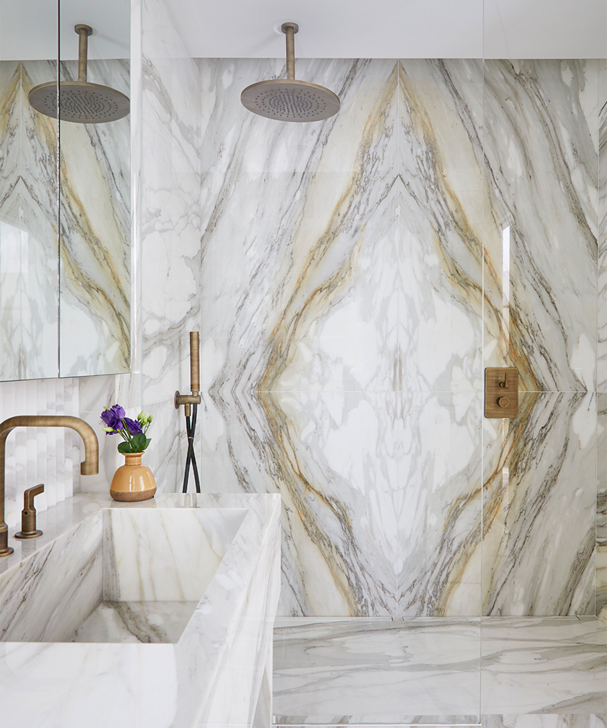
Meticulously bookmatched marble creates a striking focal point in the bathroom. Taps, handles and fittings are in an antiqued bronze with a dulled finish that exudes gleam rather than glare.
Guest bedroom
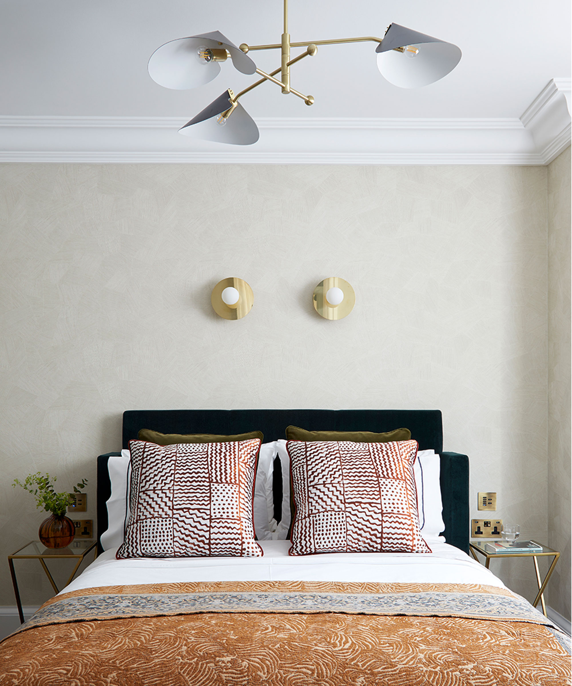
In the guest bedroom, the chandelier combines glam Deco metal and classic mid-century shade shapes.

Bespoke panels on the wardrobe doors add depth and texture, while the wall treatment behind the bed has been applied with textural, sweeping strokes.
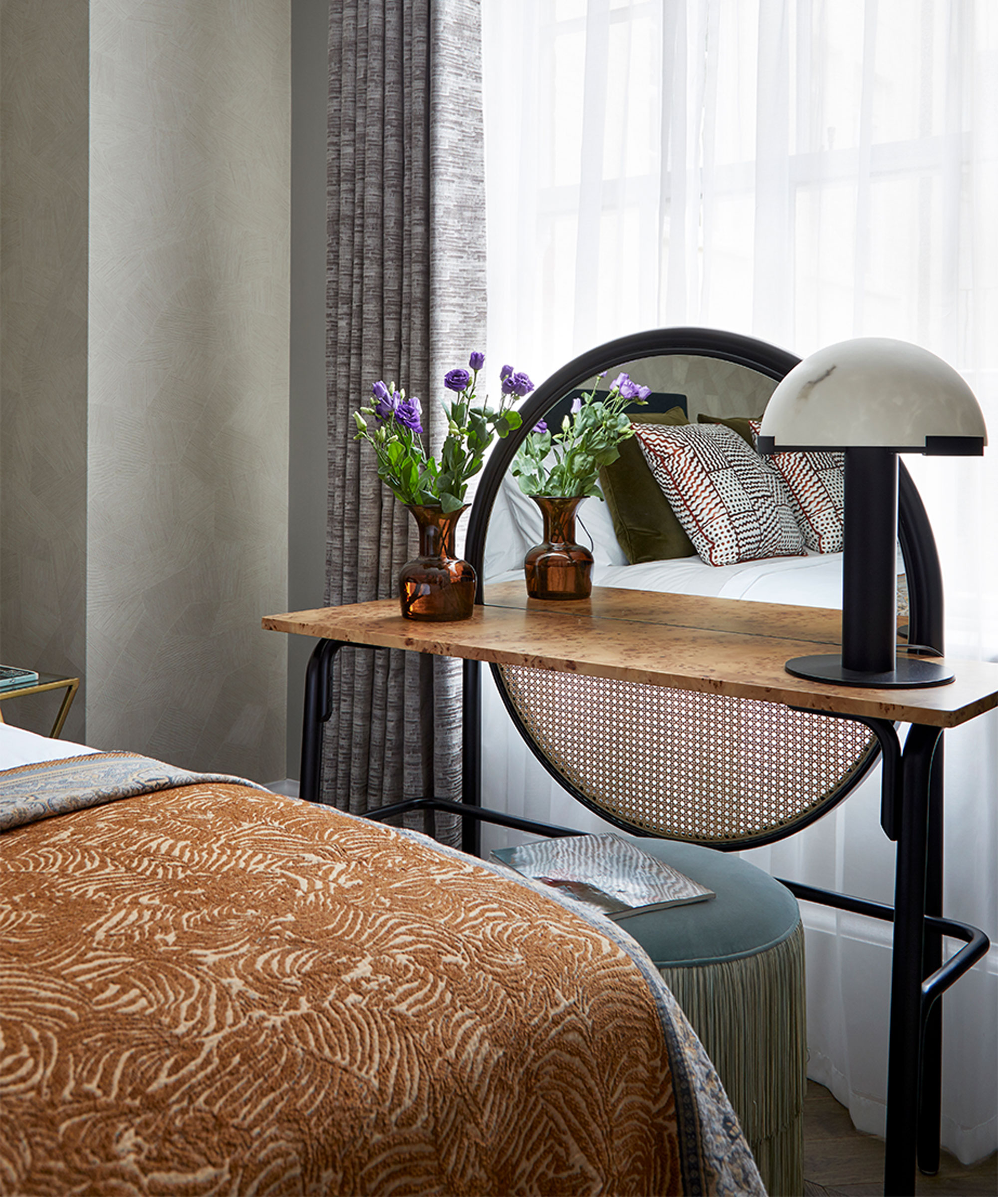
The dressing table top is in burr, typical of Deco style, but with a softer sheen for more modern tastes. Tassels on the stool are a timelessly decadent touch.
Guest en-suite
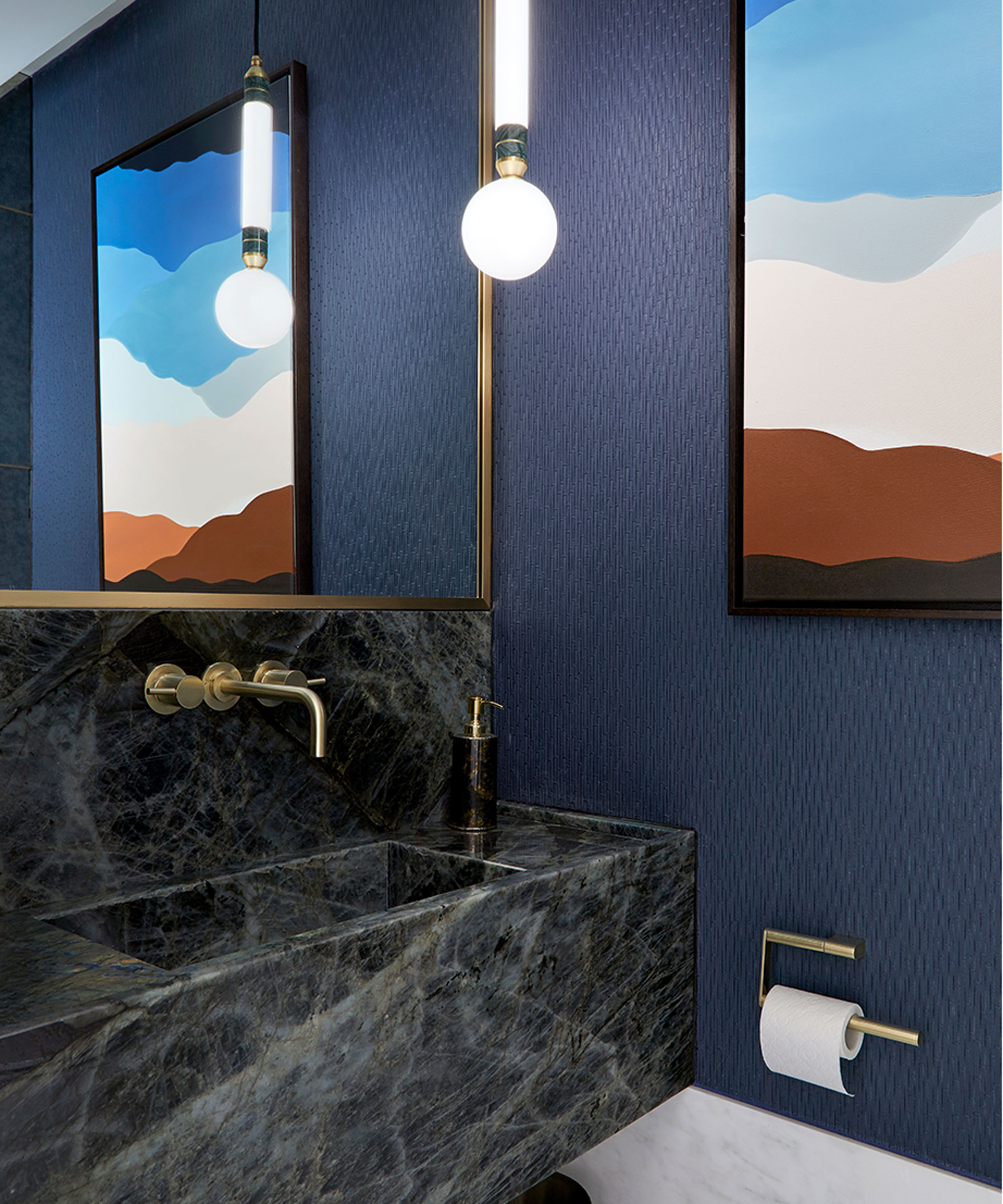
Blue Roma marble is used for the basin, cut so the dramatic striations continue into the interior of the deep and hefty basin.
Bathroom
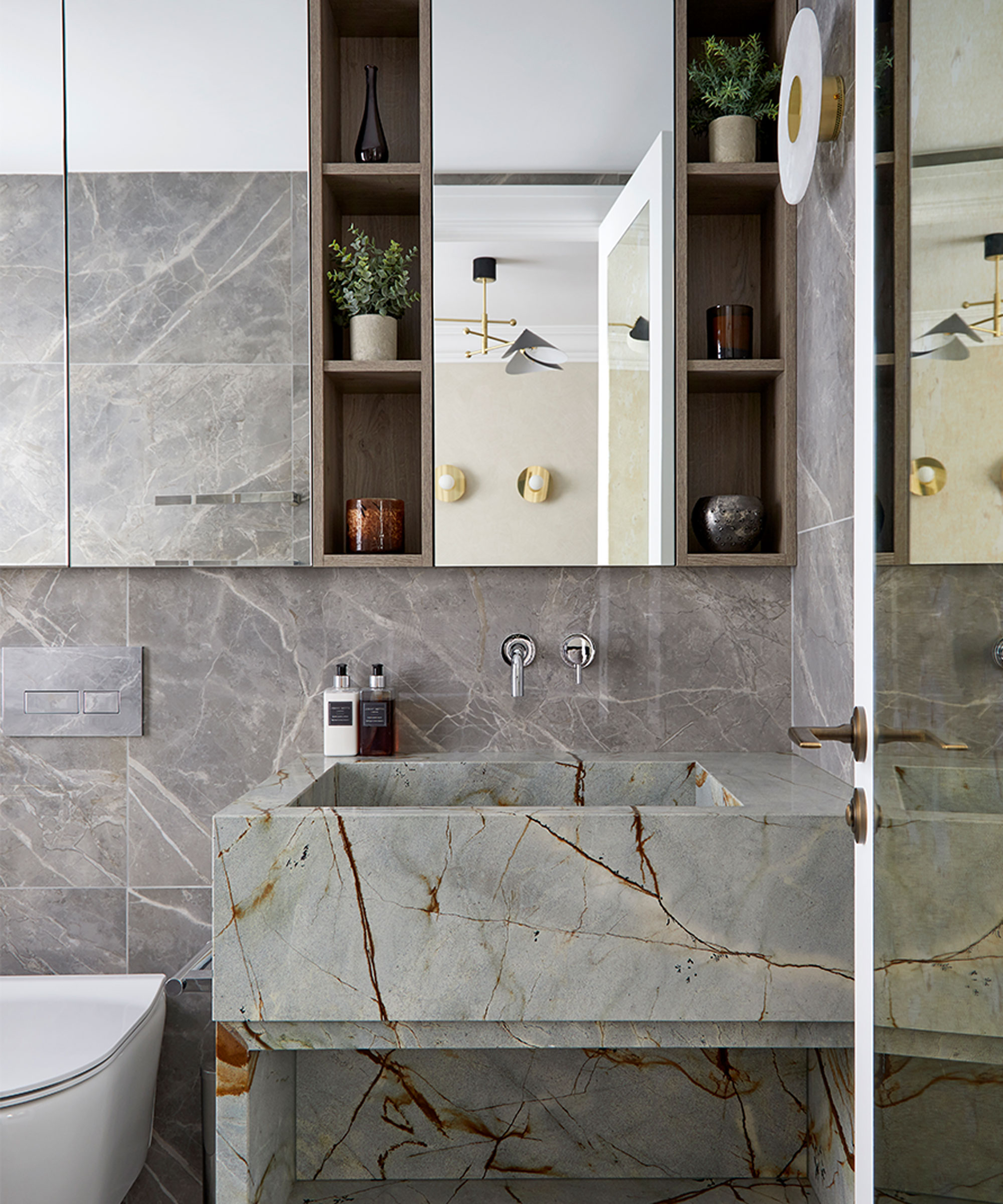
This smallest of spaces is still rich in textures, from the iridescent marble basin to the antiqued mirror glass that makes the room feel twice as large.
Photography / Anna Stathaki
Styling / Mary Weaver
Interior design / Bergmann Interiors

Journalist and author Jo Leevers writes about houses for a wealth of national publications such as Livingetc, Homes & Gardens, The Observer, The World Of Interiors, The Telegraph, Elle Decoration, Country Living, and The Guardian. She also contributes to 25 Beautiful Homes magazine and the Mail on Sunday's You Magazine.