Filled with neutral hues, natural textures and simple designs this London mews house is a minimalist lovers dream
Take a tour of a recently remodeled mews house that's been transformed from a dark, cramped space to an open plan, light-filled home
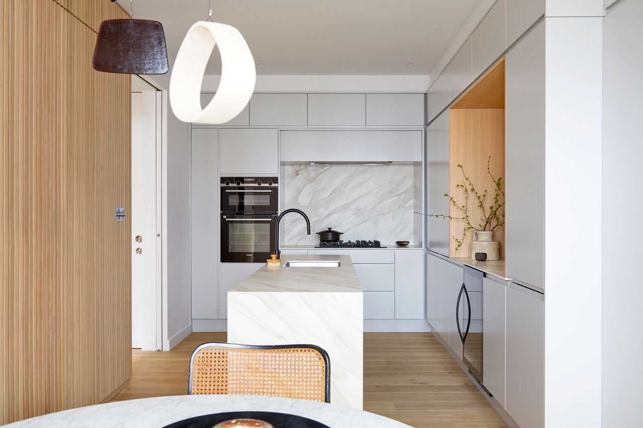

The property
Bright airy spaces, open plan rooms, clean white walls, soft wooden accents, this modern home is a minimalist's dream. The property was recently completely gutted and reconfigured by architect and interior design firm Finkernagel Ross, turning the formerly dark, cramped house into a light-filled elegant space that's filled with clever hidden storage and beautiful joinery.
Contemporary finishes and modern design, plus the very simple neutral color palette give this home a very chic feel, however, the natural material that runs through almost every room add warmth and a rustic texture that both compliment and contrast the sleekness of the spaces.
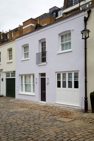
Kitchen
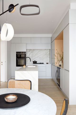
The relatively compact kitchen is given the feeling of a much larger space, with the narrow island and small circular dining table give the space an open plan vibe, with plenty of areas to cook and socialize.
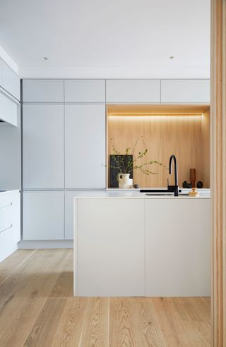
The spacious feel is of course helped by the very minimalist color palette – white cabinets meet pale wood and marble – and the handless cabinetry clears the room of any visual clutter.
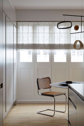
An oak paneled wall adds all the texture this space needs, the perfect contrast to the simple cabinets, adding warmth and making the space feel less stark. The cane dining chair adds to this natural texture too.
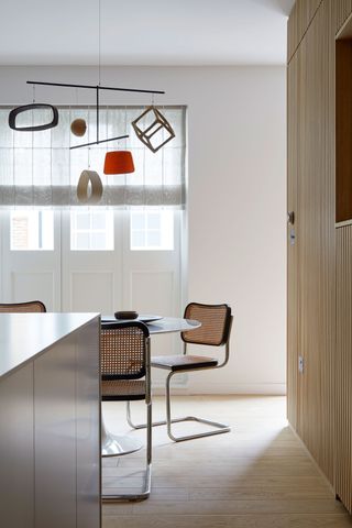
- Find more modern kitchen ideas in our gallery.
Living room
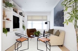
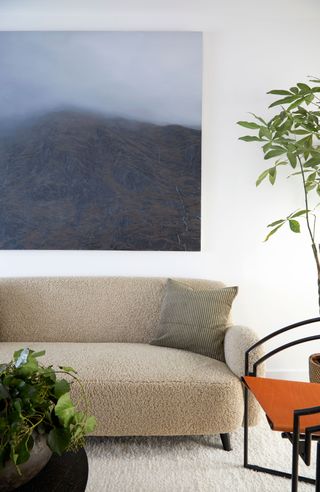
Similarly to the kitchen, the cozy living room feels much larger thanks to the minimalist color scheme. The colors in here are slightly warmer than the kitchen, however, with beige, brown and orange joining the crisp white of the walls.
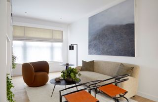
There are a lot of tactile fabrics in here too, bringing in that all-important texture that makes a living room feel inviting.
Be The First To Know
The Livingetc newsletter is your shortcut to the now and the next in home design. Subscribe today to receive a stunning free 200-page book of the best homes from around the world.
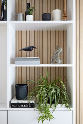
The same wooden cladding used in the kitchen is the backdrop to a built-in storage unit, which is simply decorating with a monochrome scheme.
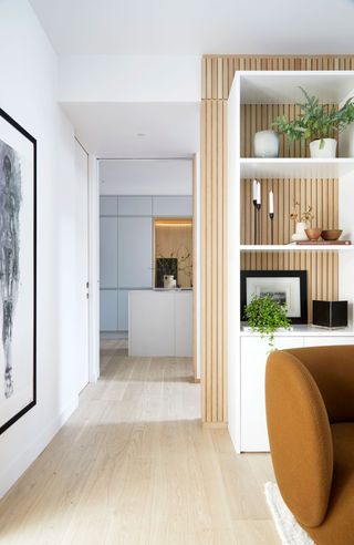
The shelves are just one example of the beautiful joinery throughout the home, that allows the rooms to remain so clutter-free.
- Love this space? Be inspired by more white living room ideas
Staircase
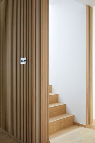
The staircase was moved during the remodel, so it now sits in the center of the home, dividing the living room from the kitchen without totally breaking up the space so there's still an open plan feel. There's also more storage underneath both sides of the staircase.
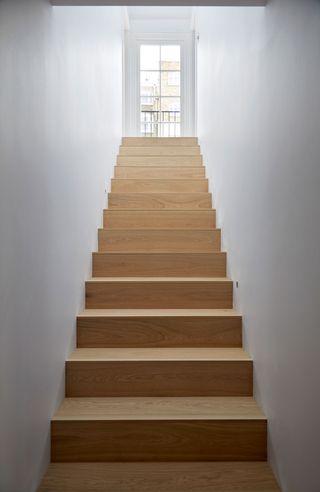
- Find more staircase ideas in our feature
Master bedroom
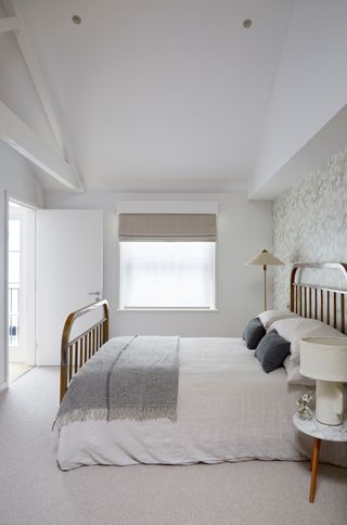
The master bedroom sits at the top of the house. The roof space was opened up to create a light-filled suite, complete with exposed trussets as a lovely rustic touch. The white color scheme only enhances the tall ceilings and open feel.
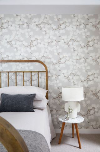
A subtle grey wallpaper makes a feature wall behind the bed and brings together the darker greys and warm woods used in the rest of the room.
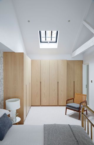
The oak accents that can be found downstairs are brought into the bedroom with the built-in wardrobes. The simple design means they add texture and color to the room but don't overwhelm the space.
Master bathroom
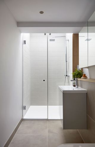
An ensuite bathroom with a spacious walk-in shower is situated on the top floor. Simple and serene, light flows through the skylight installed above the shower.
Family bathroom
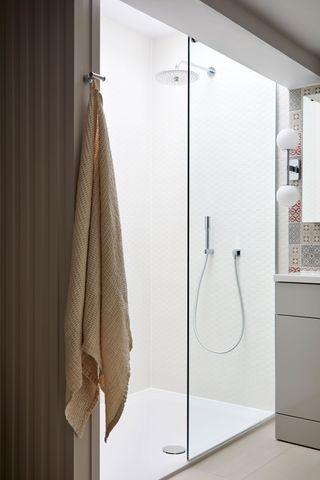
There's a walk-in shower in the family bathroom too, as well as a bath and more handy storage.
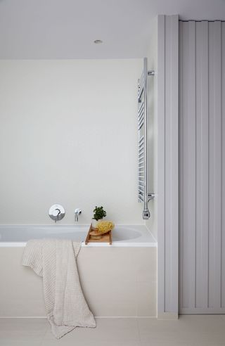
- Discover more bathroom ideas in our feature
Home office
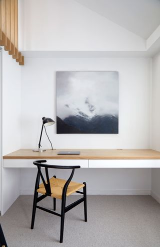
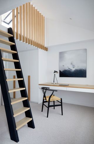
The home office doubles as an extra bedroom, complete with a built-in pulldown bed and a mezzanine sleep space.

Formerly the Digital Editor of Livingetc, Hebe is currently the Head of Interiors at sister site Homes & Gardens; she has a background in lifestyle and interior journalism and a passion for renovating small spaces. You'll usually find her attempting DIY, whether it's spray painting her whole kitchen, don't try that at home, or ever-changing the wallpaper in her entryway. She loves being able to help others make decisions when decorating their own homes. A couple of years ago she moved from renting to owning her first teeny tiny Edwardian flat in London with her whippet Willow (who yes she chose to match her interiors...) and is already on the lookout for her next project.
-
 Japandi Decor Is the Cure to Chaos — 6 Buys That Will Instantly Bring This Style to Life
A fusion of Japanese and Scandinavian sensibilities, this distinct style strips away the noise in more ways than one
By Julia Demer Published
-
 The Zeitgeist Edit — What's Exciting (and Not So Much) a Design and Culture-Obsessed Editor in March
From the new collections inspiring us to what to eat, drink, and read, here's our report on March, straight from the editor's desk
By Hugh Metcalf Published