This London terrace is a lesson in mixing traditional patterns, heritage hues and modern art
An inspired approach to colour and pattern helps lift and communicate a modern art collection in this west London home.
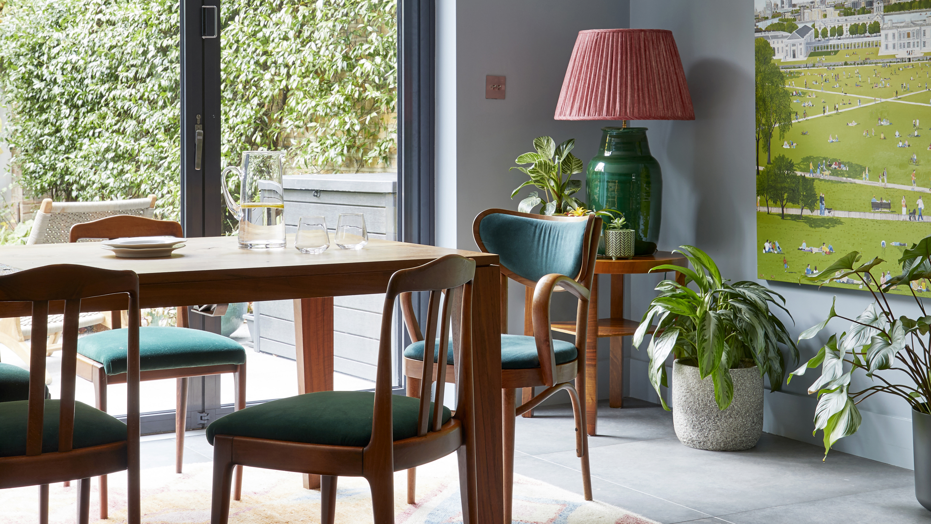
This modern house arranged over three main floors and two half floors that incorporate the bathrooms belongs to Andy French, a financial services professional, and her two daughters, aged ten and eight. The basement kitchen-diner leads out onto the small garden, while the under stairs storage features bespoke cat doors. The ground floor is an open plan room zoned into a formal living room, TV snug and home office, while four bedrooms and two bathrooms are spread over the upper levels.
The first thing Andy French did when she moved into her west London Victorian terrace, even before decorating, was to have her much-loved art collection hung by professional art installers. Rash move? Not for Andy. She wanted to create an instantly friendly and familiar home for her and her two daughters following a recent separation, as well as getting the art off the floor.
‘Surrounding ourselves with familiar pieces meant the girls and I had an instantly happy haven that felt like ours, not to mention more space to move around,’ says Andy, who tasked 01 Art Services with the job of finding the right spots for everything. However, she knew the house's bland grey palette wouldn’t sustain her arts’ vibrant and upbeat melody for long. ‘Although I’d found the right locations for my art, I knew they could look even better with the right backdrop,’ says Andy.
Fortunately for the time-poor professional and busy mum, her friend at the school gates was interior designer and colour connoisseur, Brooke Copp-Barton, whose love of combining period details with a modern palette was just the ticket. ‘I knew Brooke when she embarked on her new career as an interior designer, and admired her confidence in combining colour, pattern and materials,’ says Andy. ‘So, when it came to seeking advice on interesting color combos that would complement my art, I knew she’d nail it.’
Formal living room
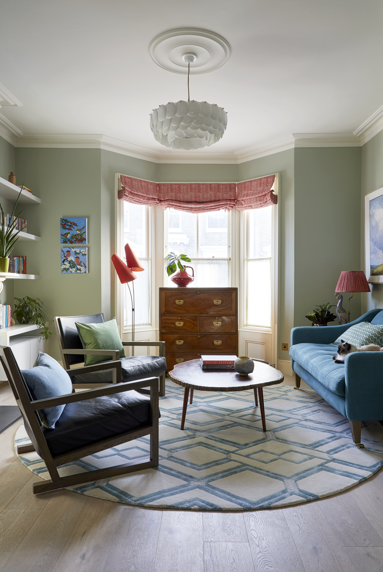
With no structural changes required, Andy’s brief to Brooke was a dream; to work with the existing artwork and bring joy to the house through vibrant hues and playful patterns. ‘Working with Andy was a wonderful collaborative process. She had strong ideas of how she wanted the spaces, so my role was to bring her visions to life,’ recalls Brooke. ‘Her keen eye for beautifully made artisan furniture also delivered a clear style direction to combine old with new, as well as sourcing other unique pieces to add to her existing collection.’
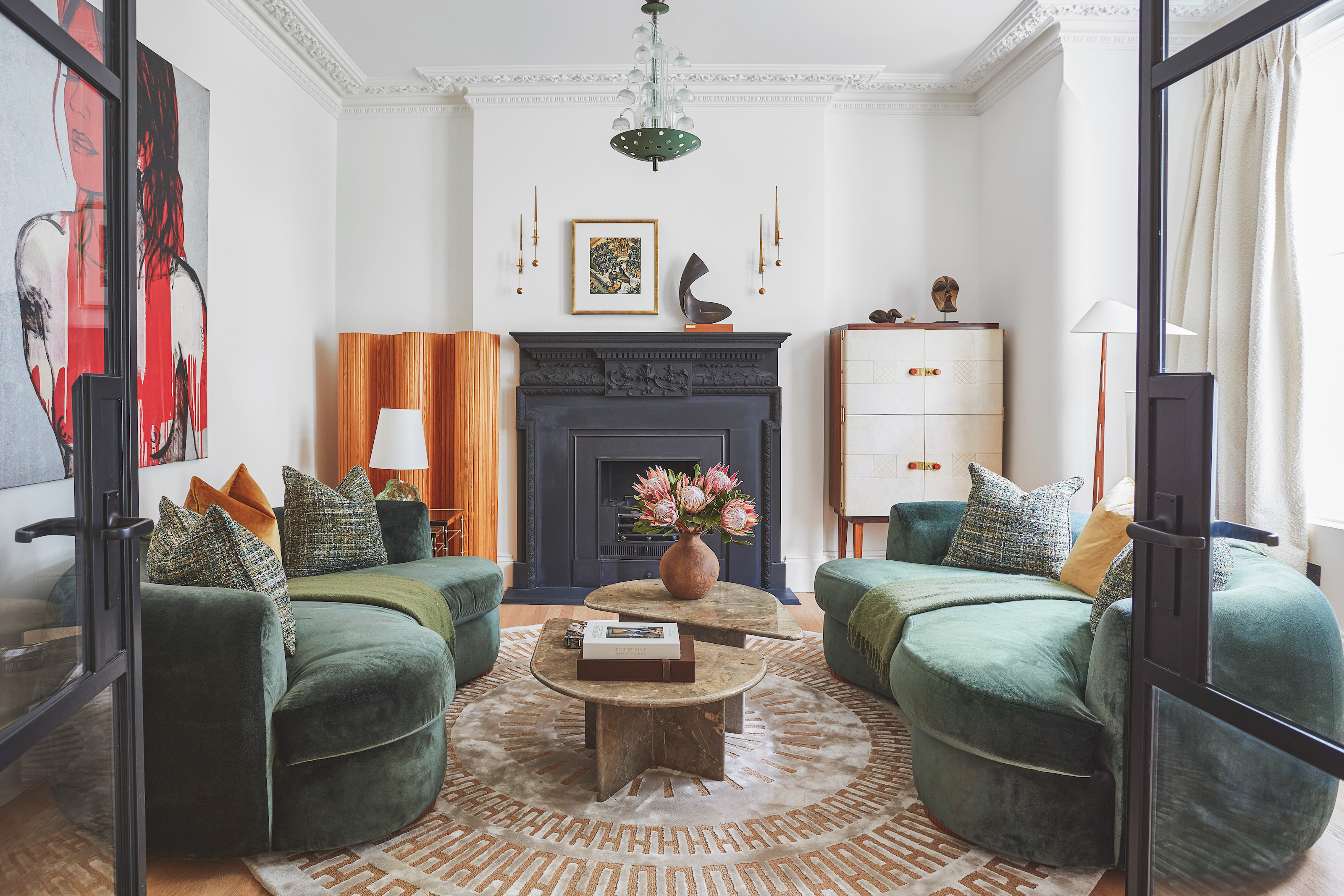
Brooke is an expert in making traditional patterns feel modern. The round Sumal rug from A Rum Fellow was custom colored to work with the scheme and matches a rectangular one at the other end of the room.
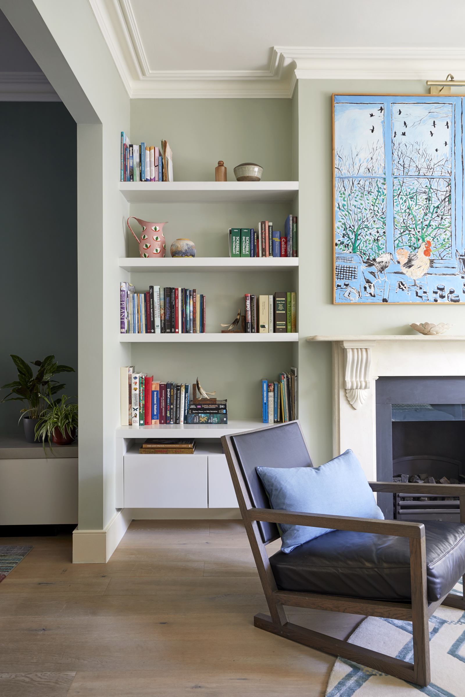
The vibrant cockerel painting brings a dynamic touch to the formal living area, which already had the joinery built into the alcoves.
Be The First To Know
The Livingetc newsletters are your inside source for what’s shaping interiors now - and what’s next. Discover trend forecasts, smart style ideas, and curated shopping inspiration that brings design to life. Subscribe today and stay ahead of the curve.
Snug
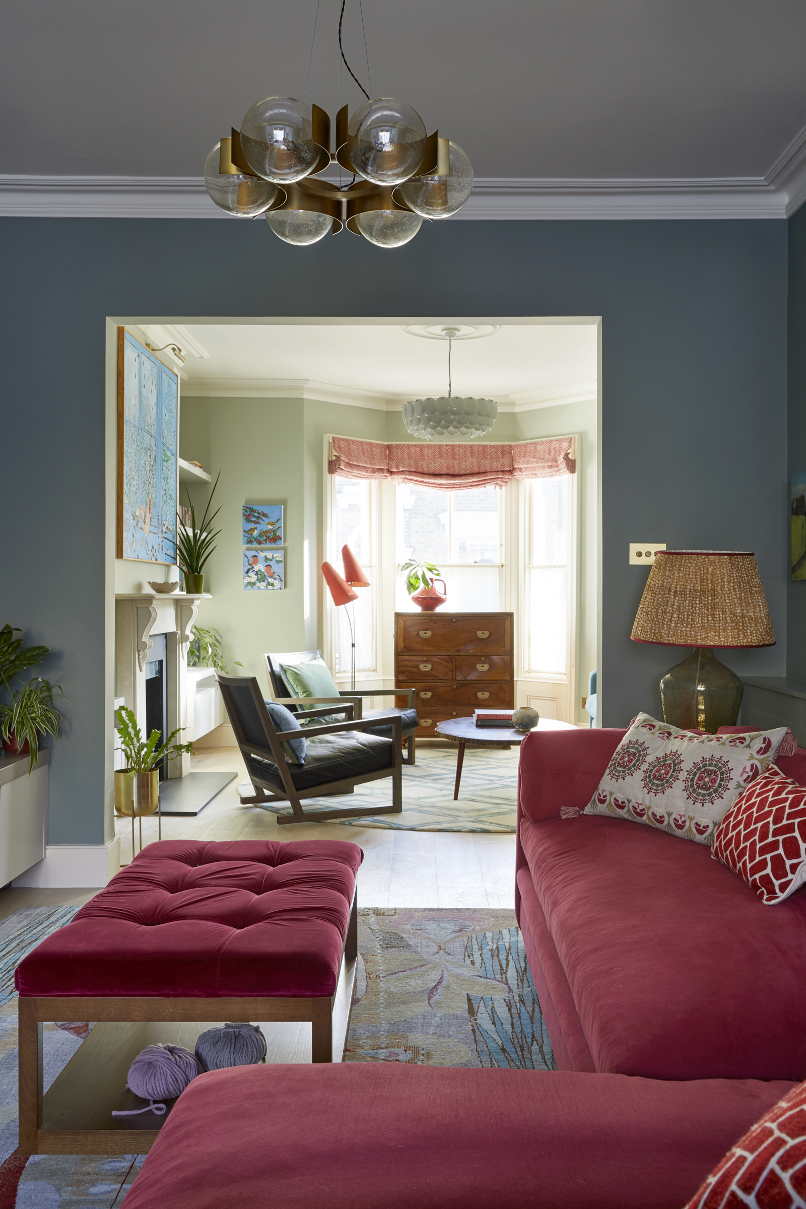
One of the biggest challenges for Brooke was separating the open-plan ground floor into three clearly defined spaces – a living room, TV snug and office - while retaining a sense of flow and connection through the entire room. The answer was to add a low, custom-made corner sofa in the centre to create a comfy kick back spot for the girls without breaking sight lines through the space. Explore the latest sofa trends if you're looking for a new spot to perch.
‘The murky green wall color encloses the space too, adding to the coziness and separation from the office and formal living area,’ says Andy. ‘It’s a happy, social retreat for me and my girls.'
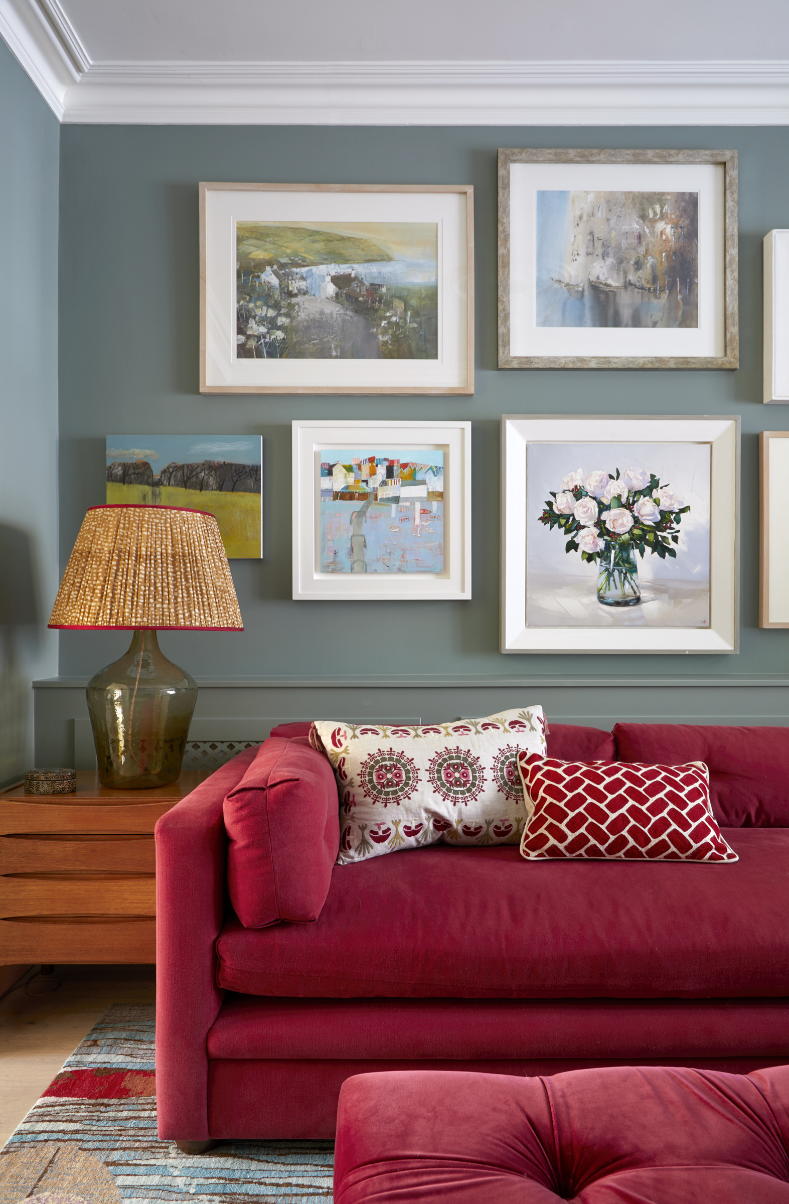
‘We picked a warmer green for this middle zone to make it feel more enveloping, and also elevate the gallery wall behind the sofa,’ says Brooke. If you want to know how to create a gallery wall, it's easy with our latest tips, tricks and advice.
Office
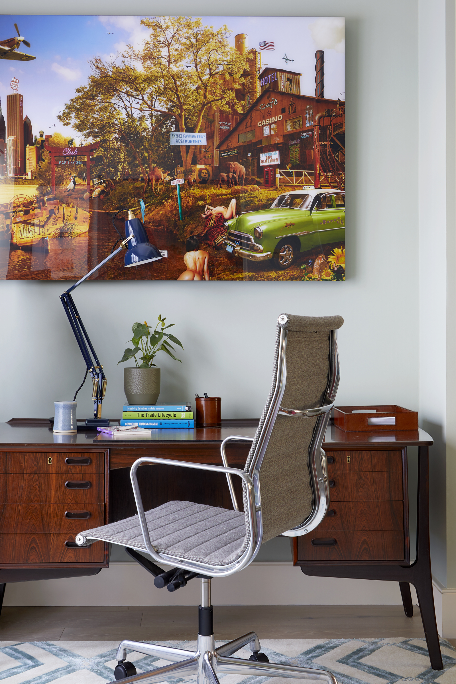
The vivid photo montage by Yves Krief, depicting a fantastical urban landscape, complements the rich tones of the mid-century desk. Interested in affordable art? It's a fantastic way to add color, personality and character to a space.
Kitchen diner
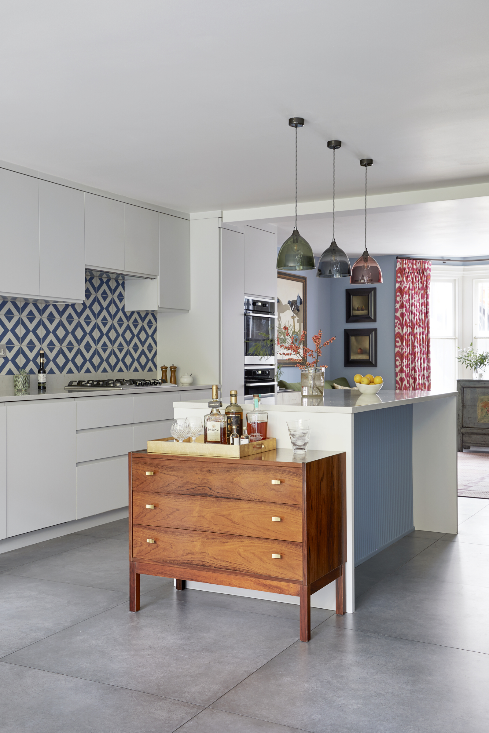
In the kitchen diner on the basement level, the alluring Greenwich Park canvas by Emma Haworth introduces a relaxed, breezy feel to the social space, which Brooke has interpreted with a rich, sky-blue accent. ‘To soften the cool, glossy surfaces of the stark white modern kitchen, we carried the warm blue through to the kitchen backsplash tiles and added a fluted surface to the island for a layer of interest and texture,’ says Brooke.
‘Originally, this room was grey, and it felt cold and uninviting with stark white units. We’ve injected color, pattern and joy with graphic tiles, colored pendants and a fluted panel under the island for extra interest and depth,’ says Brooke.
A chest of drawers – one of Andy’s many Vinterior finds - brings vintage charm to the glossy surfaces and provides a nifty bar area.
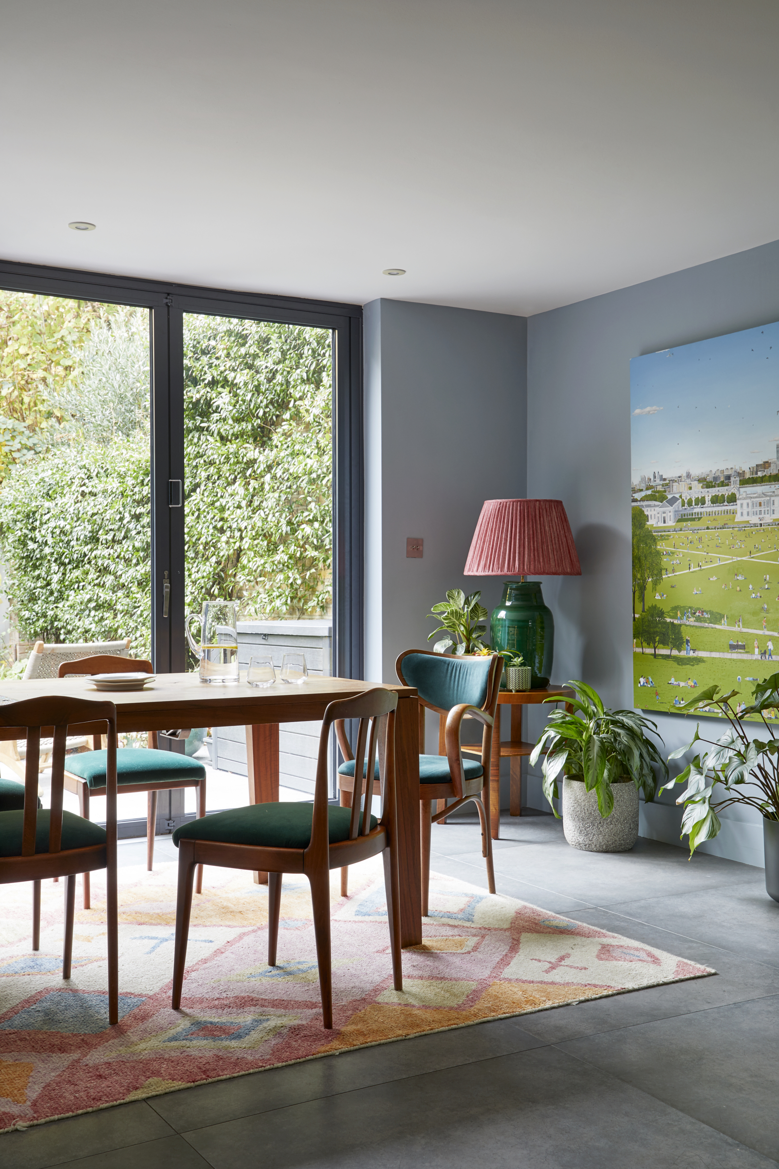
Drawing a connection with the bijou city garden, the walls are painted in a cool sky blue, which are then warmed by the rich wood furniture and elegantly faded rug.
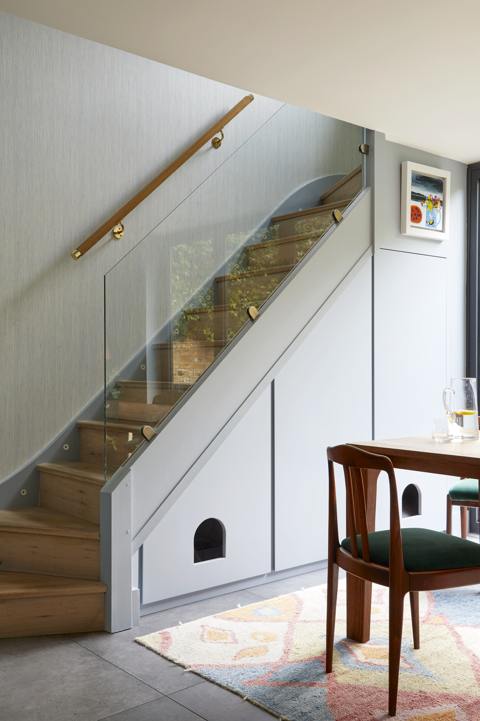
As well as providing much needed under stairs storage, Brooke’s joinery incorporated nifty cat doors to provide an amazing pet home and secluded area away from the dog ‘who likes to steal their food given half a chance.’
Main bedroom
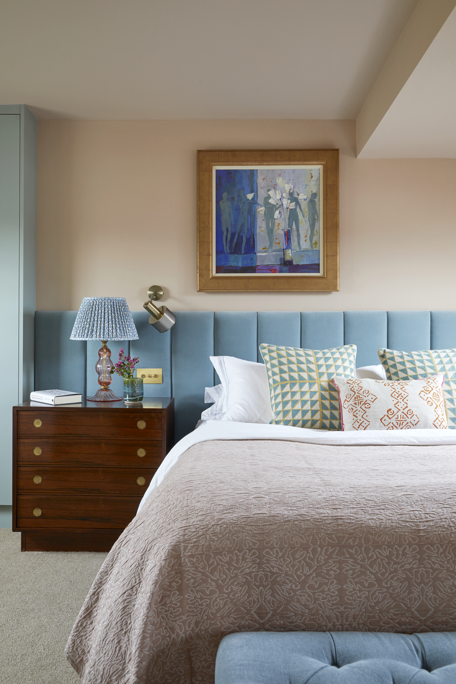
With the artwork in place, Brooke was able to take a lead from each piece and play with color palettes that would make the paintings sing. At the top of the house, the sun-filled gorgeous master bedroom features soft, feminine artwork, so Brooke chose sugary shades and delicate florals to reflect the sanguine vibe. Then, as the floors descend, Brooke introduced richer and earthier tones to the walls and furnishings, mirroring the lowering natural light levels.
On the middle floor, for example, a foil of calming, misty greys and greens balances the high energy of Andy’s favourite piece by Philip Sutton above the fireplace, while also reflecting the stormy skies of the landscape compositions on the opposite wall.
An upholstered headboard, custom-made to Brooke’s design, frames the bed and antique bedside chests, giving the serene setting an uber-luxe touch. ‘I just love the restful tones in here,’ says Andy.
Kids room
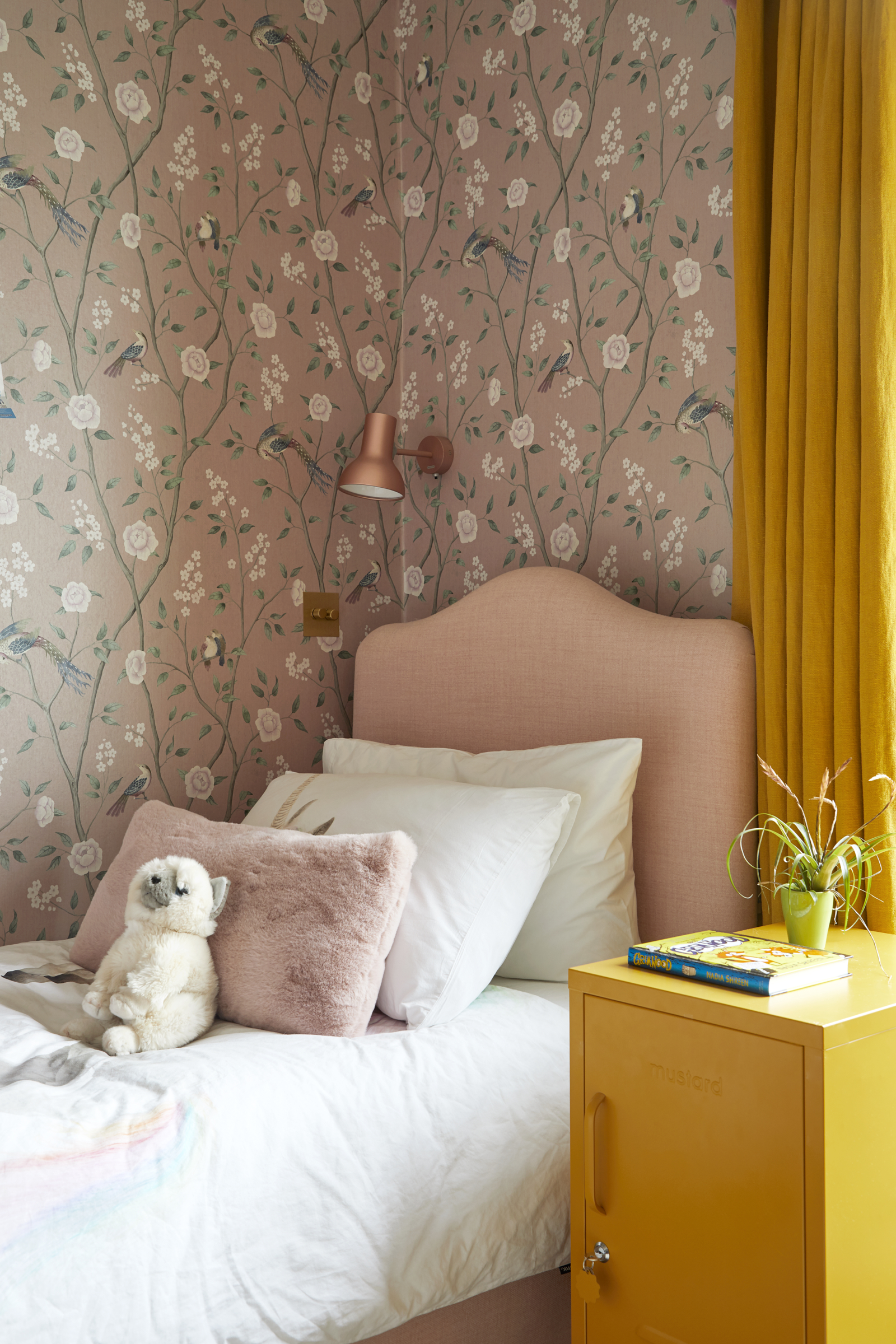
Like all the rooms in the house, both the girls’ bedrooms ideas are a master class in confident color combos. ‘The teal and yellow scheme in my oldest daughter’s room is a versatile pairing that will adapt as she grows,’ says Andy. ‘As will the modern mustard and pink palette in my other daughter’s room.’
Powder room
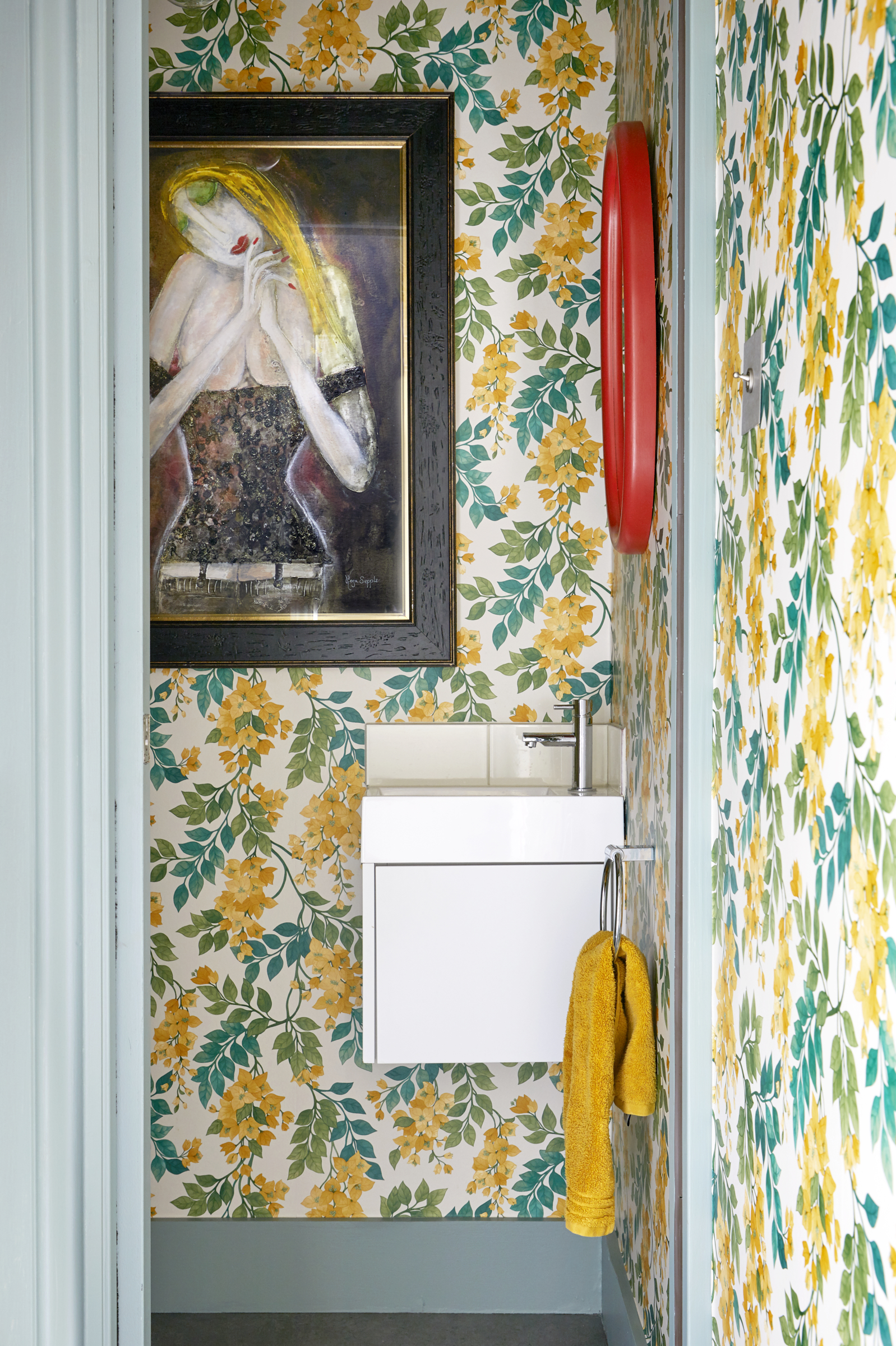
Bold Bougainvillea wallpaper peps up the utility space and downstairs powder room. ‘This is one space you can be brave with pattern and color without worrying if you’ll tire of it,’ says Brooke.
See more: This classic Edwardian home is a lesson in bold color and elegant Christmas styling
Lou O’Bryan has been an interiors journalist and stylist for over 20 years, working across print and digital, and specialising in home tours and renovation projects. As well as holding roles on publications, such as Homes & Antiques and Ideal Home, she has written for many UK and Australian titles, such as House & Garden and Inside Out. She is also the blog editor for luxury travel company, Stayone.com, creating weekly interior and travel articles online.
-
 The 'New British' Style? This Victorian London Home Embraces Its Owners' Global Background
Warm timber details, confident color pops, and an uninterrupted connection to the garden are the hallmarks of this relaxed yet design-forward family home
By Emma J Page
-
 Muji Living Room Ideas — 5 Ways to Harness The Calming Qualities of This Japanese Design Style
Inspired by Japanese "zen" principles, Muji living rooms are all about cultivating a calming, tranquil space that nourishes the soul
By Lilith Hudson