Modern meets country in this beautifully designed and extended cottage in Cambridgeshire
Eager for more space and to be nearer family, the owners of this expertly curated cottage swapped their small London home for village life away from the crowds


So many of us making the move from city to country since Covid-19 became a part of our lives and this modern house is the perfect example of combining city aesthetics with the extra interior and outside space country living offers. With five bedrooms, four en suites and a family bathroom upstairs and a living room, two utility rooms, playroom, kitchen with a snug area, reception room, boot-room and garage downstairs, it's easy to see the appeal of escaping to the country.
Cambridgeshire natives, Nick and Heide Miller always knew they’d probably leave London and settle down nearer their parents on the outskirts of Peterborough. In what would end up being perfect timing, the couple began their move in 2019, just before Covid-19 spread across the country and enticed a whole nation of city dwellers to move out in search of more space and greenery.
‘I’ll always remember the day we went to view this house,’ recalls Nick. ‘Heidi and I had our hearts set on another house in a different village. We looked at this house on Rightmove but we weren’t overly impressed with the pictures. We were even arguing about the other house on the way to this viewing, which we loved but we couldn’t see how we’d make it work. Then we pulled up on the drive here and we both just fell silent. We knew straight away it was the one.’
When the couple got the keys they instructed Studio MCW architecture and design practice and interior designer Rebecca Wakefield, founder and director of London-based Studio Fortnum, who's passionate about creating stylish, calm and unpretentious interiors with an emphasis on textures and materiality. Together, the architects and Rebecca helped to help turn this run-of-the-mill cottage into an expertly extended and beautifully curated family home.
Kitchen
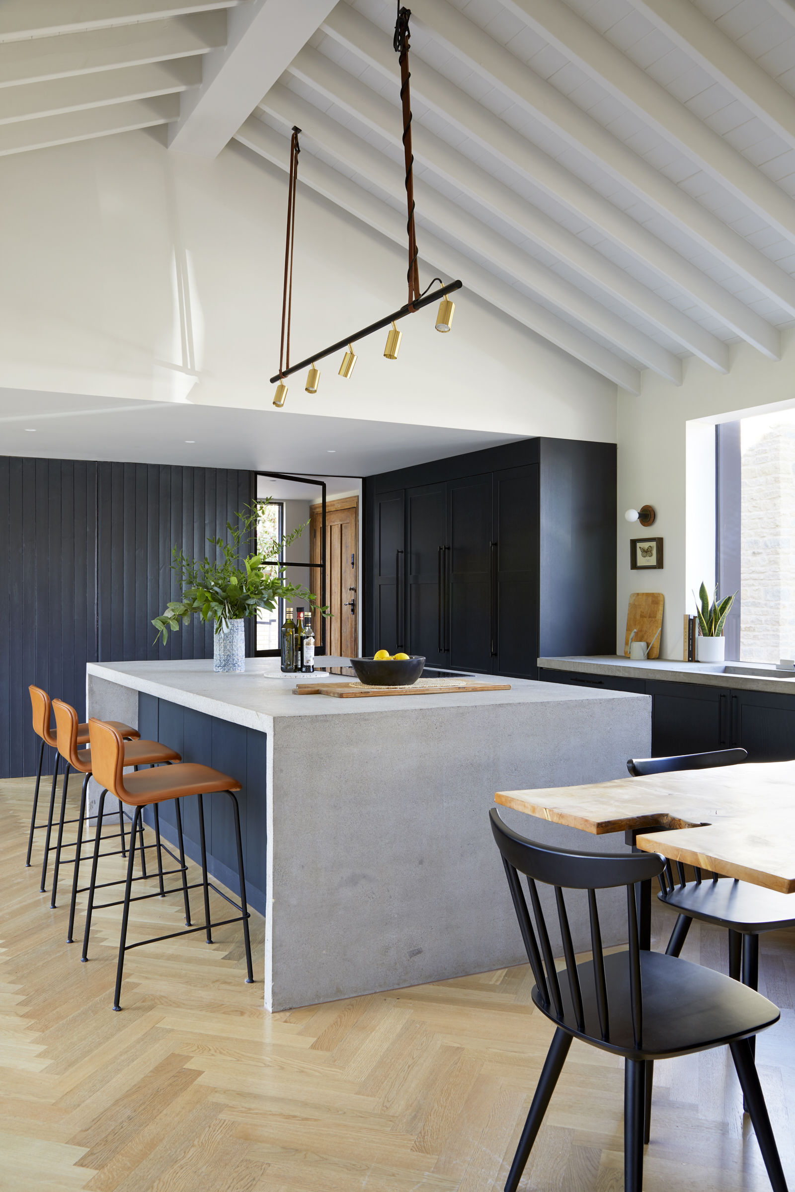
Rebecca wanted the transformation to feel sympathetic to the original stone 18th century building, but add elements of modern living, lots of light and a generous kitchen perfect for entertaining as they have a large extended family. The old stone elements of the external house marry seamlessly with the beautiful new zinc and brick modern home extension idea.
‘I had worked with the project architects, Studio MCW previously, so they mentioned me to the clients,’ says Rebecca. ‘Ironically, the clients already knew me personally as we’d grown up in the same town and hung out as teenagers! It was wonderful to work with people I had known in a previous life as I already had a decent grasp of their personalities and character - really helpful when designing a forever home as the clients are always the number one inspiration.’
‘I love that the clients were open to using concrete for worktops, it could look quite rudimental, but with the oak herringbone floor and slick black kitchen cabinets it’s completely elevated the space while giving an organic and rustic form which contrasts so beautifully,’ says Rebecca. ‘It always makes for a happy project when there are pieces of antique furniture to include in the design, adding layers of history and sweet childhood memories,’ says Rebecca.
Be The First To Know
The Livingetc newsletters are your inside source for what’s shaping interiors now - and what’s next. Discover trend forecasts, smart style ideas, and curated shopping inspiration that brings design to life. Subscribe today and stay ahead of the curve.
Snug
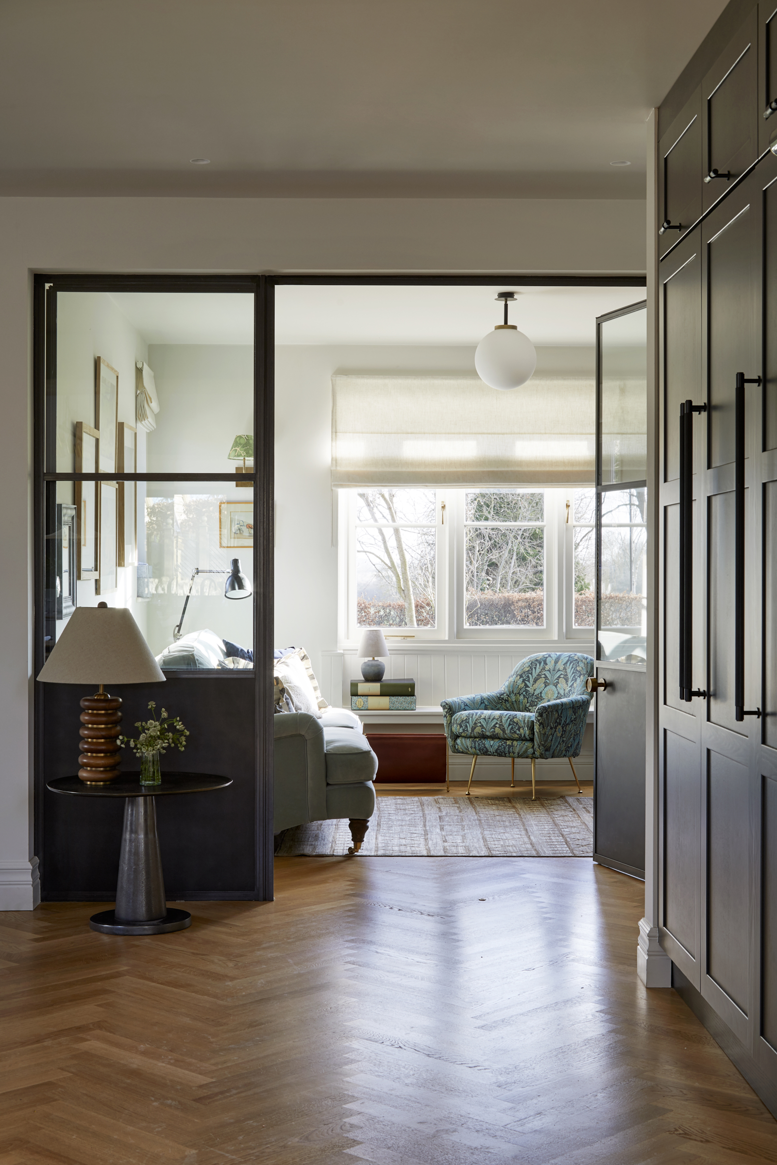
‘I love the break-out spaces that we managed to include; the snug just off the kitchen is divided by crittall doors, which have solid steel panels at the lower half to hide any toys, it also avoids sticky fingerprints on glass which is genius,’ says Rebecca.
‘We wanted a restricted palette to let the architecture and the spaces talk for themselves,’ says Rebecca. ‘The clients are super organized and like storage spaces for everything, with a decent amount of negative, unfurnished areas to create the feeling of generous, airy space. We took inspiration from light and dark, so the house has areas that are quite moody where we used hues of inky blues and blacks to create a more grounding and interesting feel. This, combined with the light, bright elements of the vaulted kitchen and neutral bedrooms, feels like a happy yin and yang balance which is harmonious with the old versus new architecture of the house itself.’
Living room
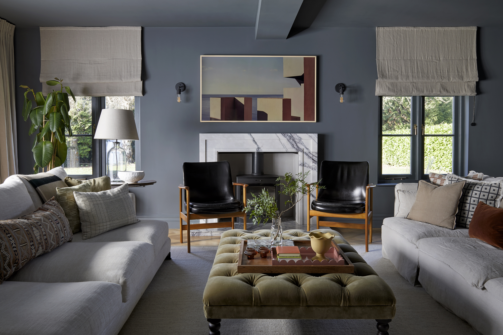
‘Nick was keen on a modern and slick look, whereas Heidi has more traditional taste aesthetic with a strong eye for antiques. Both aesthetics were combined, adding in family heirlooms alongside more contemporary pieces to create a harmonious but interesting layered look throughout. ‘We reused the beautiful original front door idea for the back entrance as a nod to bringing the original and modern elements of the architecture together,’ says Rebecca.
'We painted the formal living room in Farrow & Ball's Downpipe to create a cozy, ambient and intimate feeling which is where they hang with friends,’ she adds.
Powder room
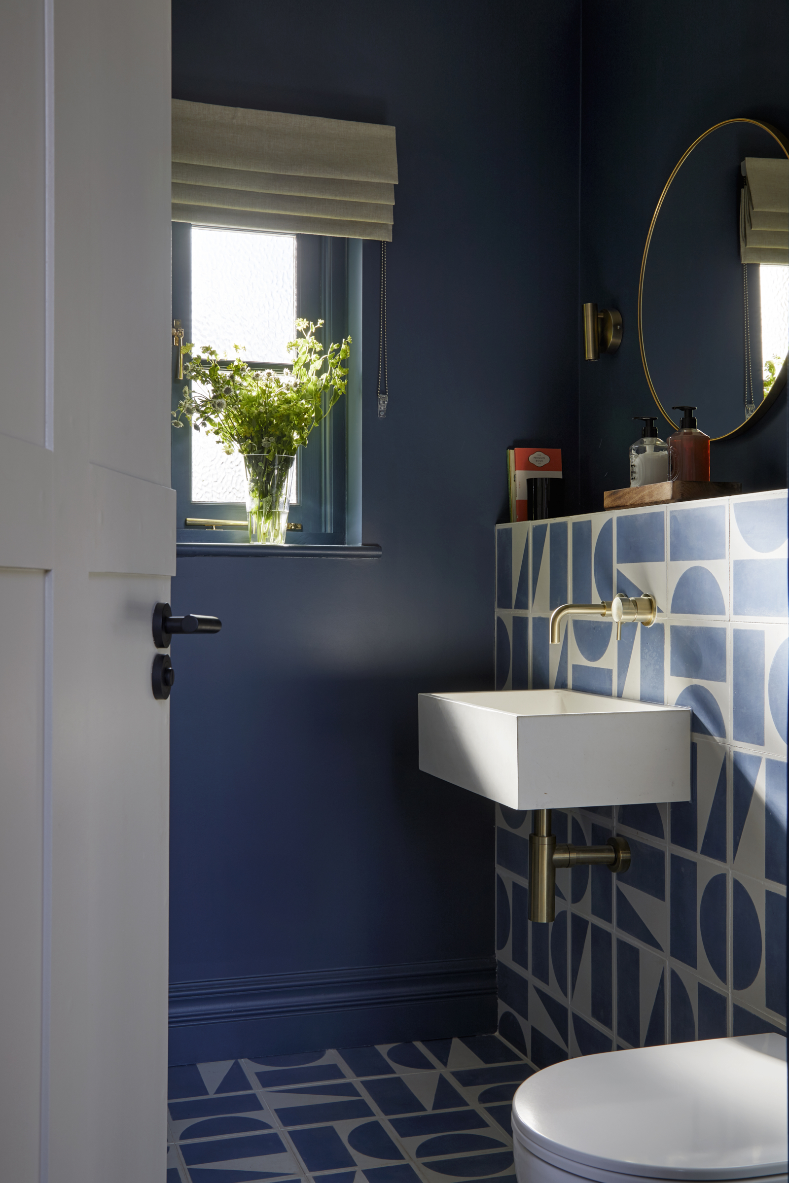
Blue tone and graphic tiles make a punchy statement even in the tiniest room of the house.
Entrance hall
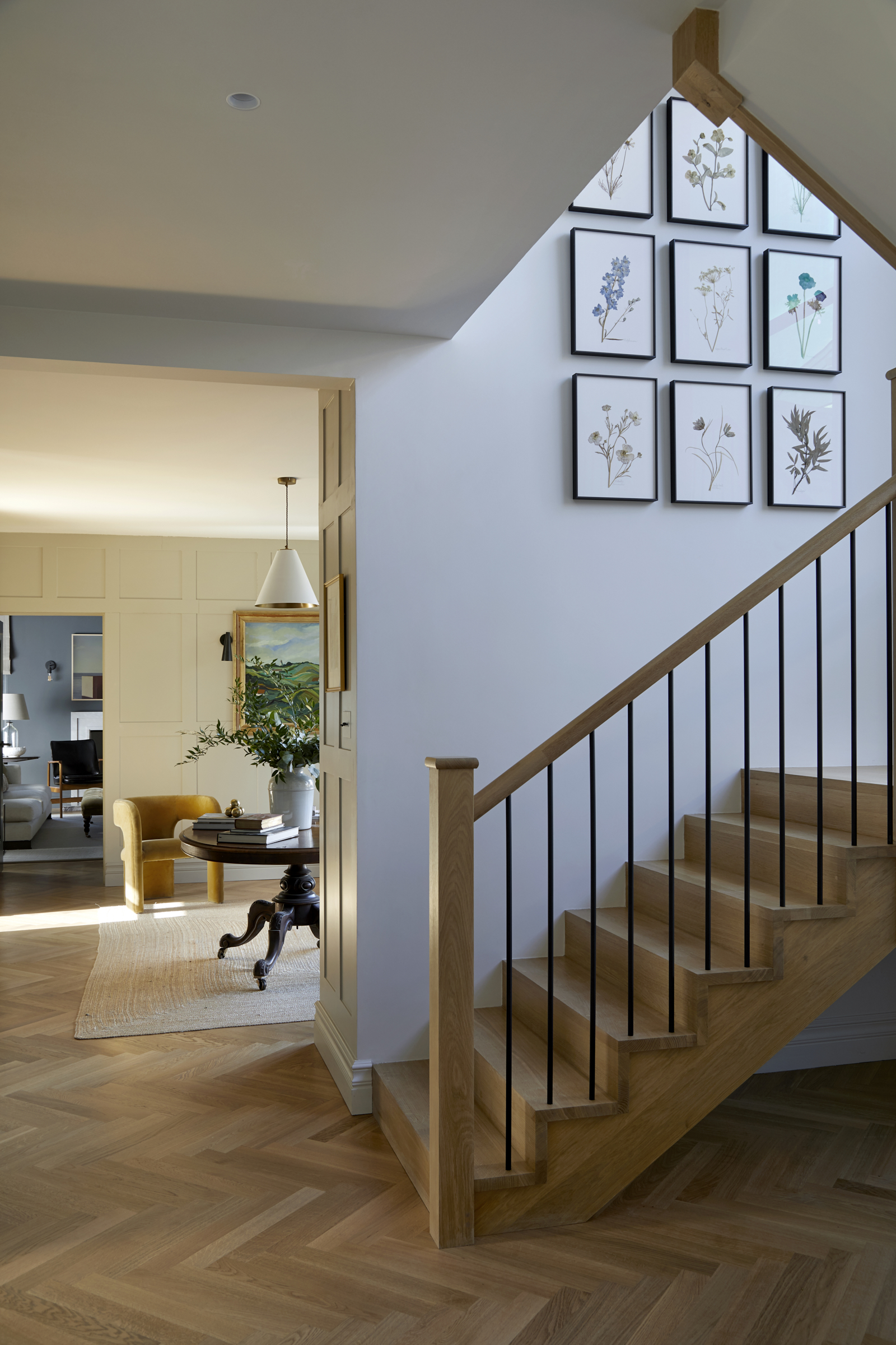
A staircase is often the first thing you see when you walk into a home so if you're considering designing a staircase from scratch, it's worth getting it right to create the most amazing first impression.
‘I really love the stairs - the set of Jam Jar Edits botanical pressings make the most awesome feature, and the huge steel window creates a light filled hallway and stairs which connects the ground floor and first floor so beautifully,’ says Rebecca.
Main bedroom
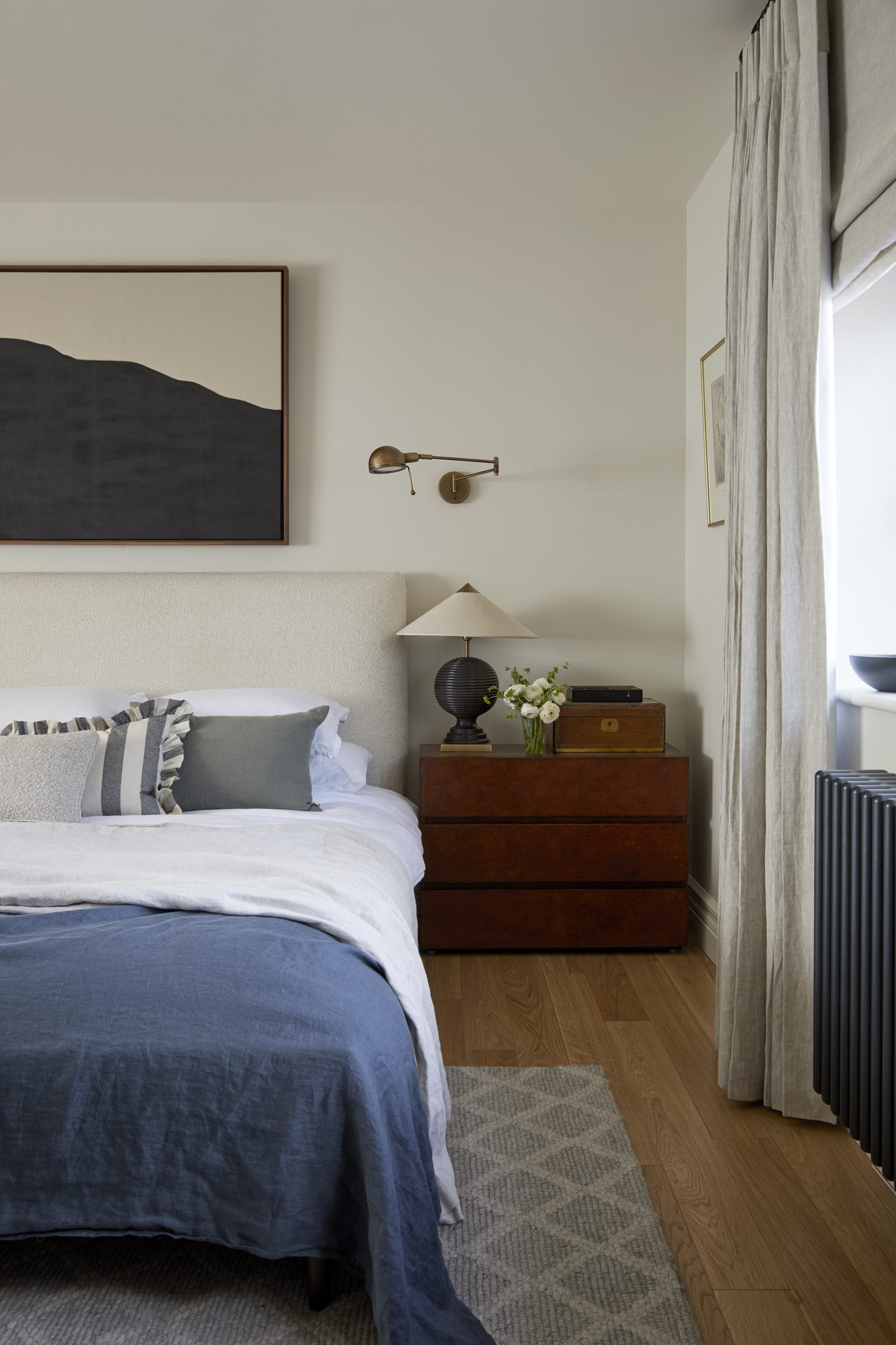
Looking to redo your bedroom? Neutral bedroom ideas are always going to be a winner as they're calm, easy to live with and beautifully contemporary.
‘Scaling furniture is always important in larger houses, so making sure that the rooms have the correct proportion of furniture in them is key,’ says Rebecca. ‘It’s then a case of hunting high and low to find oversized pieces as they don’t tend to be that readily available.’
Nursery
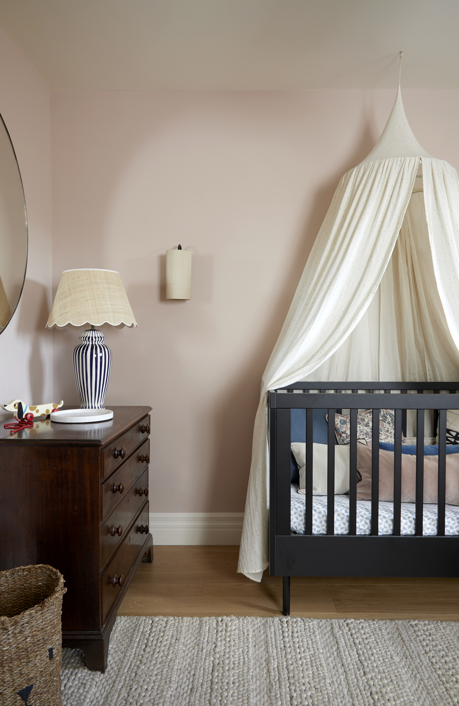
Subtly soft pink and beige tones, vintage furniture and elegant accessories all help contribute to this stylish nursery bedroom idea.
Bathroom
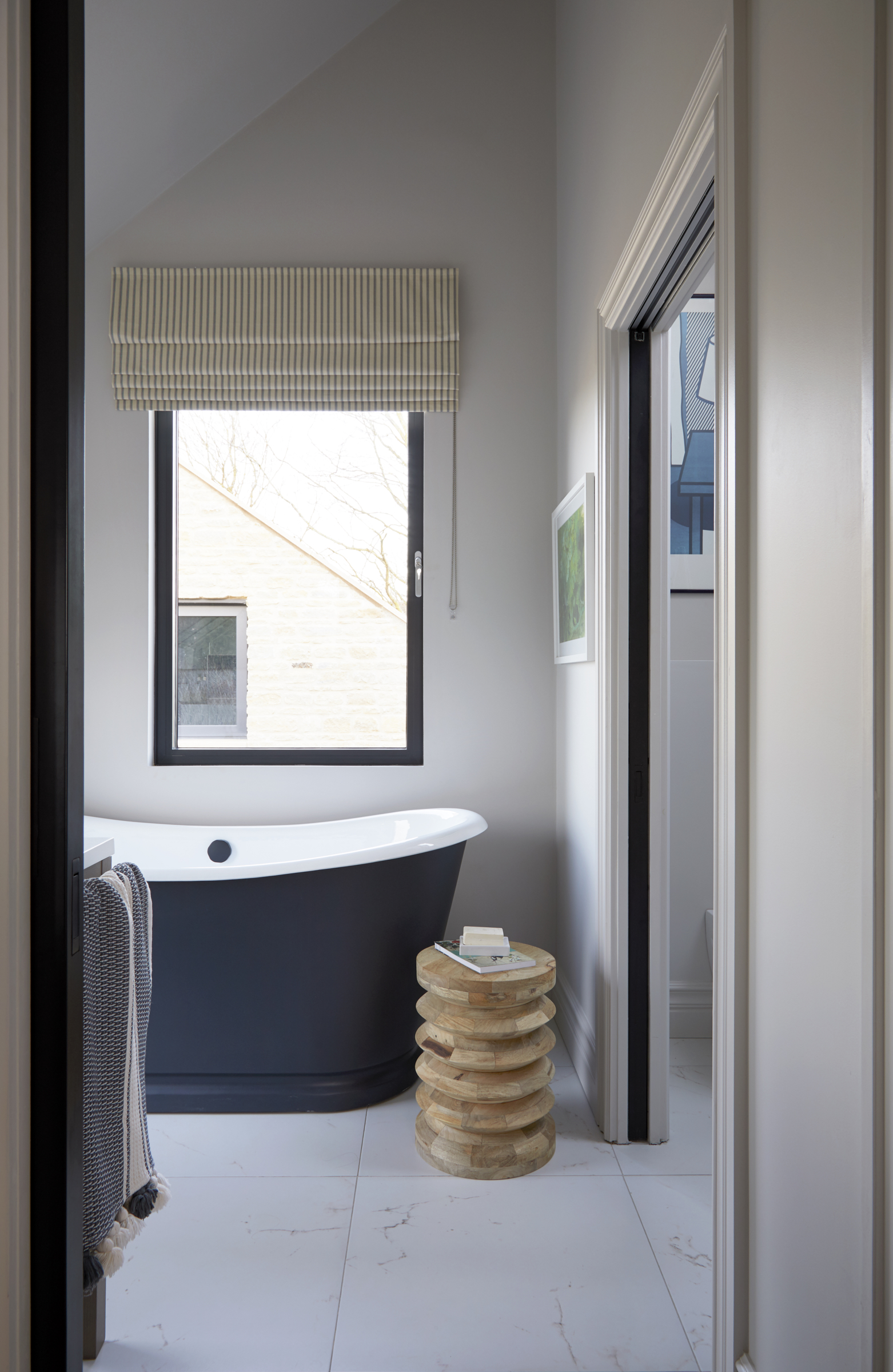
‘We’ve built a house to host in but we’ve not had the opportunity to yet,’ adds Heidi. ‘We love hosting and because of Covid-19 we haven’t managed to. Now that we’re getting our lives back, we’re looking forward to finally using the space and sharing it with family and friends.’
See more: A fabulously functional Scandi-inspired house in south London that's full of clever storage

As the Houses Editor on Livingetc, Rachel has been obsessed with property ever since she was a kid. With a diploma in interior design and more than a decade working on interior magazines under her belt, she feels very at home sourcing the best contemporary houses the world has to offer for Livingetc. It's not just the day job either, she admits she's spent a scary amount of her own time researching schemes for her own renovations - scrolling Instagram, stalking Rightmove and Modern House, flicking through magazines and snooping in other peoples' windows - so she really does live and breathe houses on a daily, if not hourly, basis. Before Livingetc, Rachel had a stint finding homes for Ikea Family magazine where she was lucky enough to gallivant around the world on shoots meeting and interviewing interesting people, all with a very keen eye for blending high-end design with everyday items from Ikea. It inspired her to not be afraid of mixing new and old, expensive and affordable, vintage and modern and so Rachel's current Victorian terrace in north London is very much an updated, contemporary take on a period property; think open-plan modern kitchen with concrete floors, feature fireplaces and her grandmother’s paintings on the walls. Rachel is currently crushing on reeded glass, large gingham prints, squishy curved furniture; like Buchanan Studio’s Studio chair, and vintage wall sconces; she especially adores Retrouvius for sourcing antique finds and feels inspired by Lonika Chande, Beata Heuman and Matilda Goad and already can’t wait to start planning her next home, wherever that might be.
-
 A Digestible Guide to Greenwashing in Interior Design — What It Is, What It's Not, and How to Avoid It
Designers and sustainability experts share their guidance on navigating eco claims and sourcing ethically
By Lauren Jones Published
-
 What Can I Choose Instead of Brass Taps? 4 Finishes That Are Emerging in 2025's Kitchens and Bathrooms
If you want to try something a little different for your kitchen or bathroom finishes, these are the trending styles in taps beyond classic brass
By Seraphina Kyprios Published