This Surprisingly Cozy Minimalist Home Has One of the Best Bathroom Lighting Tricks We’ve Seen — It Has Total Wow-Factor
Playing with the material palette and clever use of light helped this modern minimalist home in Houston, Texas put family and friends first

Minimalism can be a dangerous aesthetic to desire, particularly when it comes to a family home. Done wrong, it can fall flat, feeling empty and lacking. But as those who know, know, minimalism is not merely about an absence of things, but rather a philosophy that sees each piece having intention and purpose.
The design principle has been executed with an air of effortlessness in this sprawling 8,600 square foot family home in Houston, Texas. Interior designer Nina Magon, founder and principal at Nina Magon Studio, described the brief as clear and detailed. 'The goal was to create a tranquil and elegant environment that would serve as a sanctuary for the family,' she explains. 'Inspiration was drawn from contemporary art, sophisticated materials, and the harmonious interplay of colors of textures.'
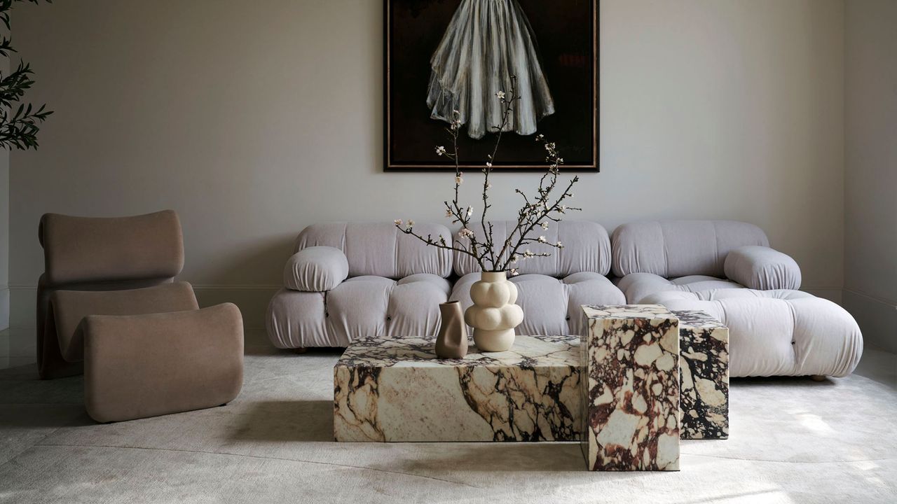
But it also needed to feel warm and welcoming, enhancing the spaces the family spends the most time in, and regularly hosts friends. 'The biggest challenge was creating a neutral space that felt dynamic and engaging rather than bland,' she explains. 'To overcome this, we carefully selected iconic and visually striking furniture pieces, such as the Camaleonda Sofa and the Pigreco Chair by Tobia Scarpa.'
Custom rugs in tonal hues, merlot-stained Calacatta viola marble, sweeping silhouettes and pendant lights that double as sculpture further enhanced the refined aesthetic while adding depth, character and interest — just wait until you see the powder room.
The result can definitely be described as a minimalist and modern home, but it's also surprisingly cozy. There are plenty of spots that invite a moment of pause, but also ones that inspire togetherness — a banquette seat for breakfast, a dining table that seats 10, living spaces soft shapes and rounded edges.
Let's take a tour.
THE ENTRY
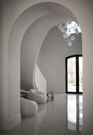
They say an entryway sets the tone for the rest of the house, and that's certainly the case here. A sweeping staircase hugs one of the walls in the double height space, and reaches across to form the arched hallway and thoroughfare.
Be The First To Know
The Livingetc newsletter is your shortcut to the now and the next in home design. Subscribe today to receive a stunning free 200-page book of the best homes from around the world.
Curves are everywhere — in the architecture, the double front doors, the entryway seating choice. And then there is the neutral palette. Rather than creating contrast through the use of color, it's the combination of surfaces and finishes that refract the light, creating texture.
'Lighting played a crucial role in this project, enhancing the architectural features and creating an inviting ambiance,' explains Nina Magon. Indeed the Moderno chandelier from Preciosa, which seem to float like a foam of bubbles in the space, helps to make the vast area feel light and effortless.
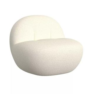
Price: Was $379.99, Now $284.99
Size: 31.3" W x 33.1" D x 26.8" H
THE POWDER ROOM
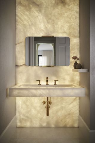
It's often the smaller spaces in our homes where we decide to do something dramatic or opt for something a little bit bolder in design. In the powder room of this home, a wall of onyx has been brilliantly backlit, which 'creates a beautiful glow and adds a touch of luxury to the space,' says Nina.
Indeed, the bathroom lighting idea has some serious wow-factor, while remaining in keeping with the tone and style of the rest of the home.
'To complement this striking feature, we selected a chic wallpaper that enhances the overall elegance and ambiance of the room,' explains Nina. 'The combination of the illuminated onyx and the sophisticated wallpaper creates a refined and inviting atmosphere.'
THE DINING ROOM
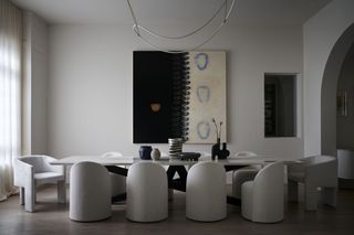
Catering to up to 10 guests, the dining room is just one of the spaces in this home that has been designed to bring people together. Once again, by decorating with neutrals, Nina lets the form of each piece carefully selected for the space, sing.
While it seems to be a formal space at first, details like the lighting choice, a sculptural design called Itaca by Morghen Studio — which appears almost draped above the dining table — helps to make the room feel more relaxed and inviting.
'The strategic placement of lighting elements also helped to highlight key design features and artwork throughout the home,' adds Nina.
THE BREAKFAST AREA
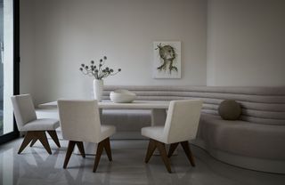
For less formal meals and breakfasts enjoyed as a family, a ribbed banquette seat wrapped around a curved wall offers the perfect perch. Once again the color palette remains neutral, letting the light bouncing off different finishes — in this case glossy floor tiles and linen upholstery — create texture and contrast in the space.
'Balancing a modern minimalist aesthetic with a warm and inviting atmosphere involved careful selection of materials, colors, and textures,' says Nina. 'The use of natural light, soft furnishings, and personalized touches helped create a welcoming environment without compromising the minimalist style.'
THE FORMAL LIVING ROOM
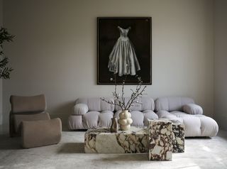
The formal living room, which 'encapsulates the blend of modern design and historical charm,' says Nina, is the homeowner's favorite part of the finish project. It also happens to be where it all began, with the iconic Camaleonda Sofa from B&B Italia being amongst one of the first pieces of furniture selected, serving as a focal point around which the rest of the furniture and decor was curated.
'The design journey for this project began with the selection of key pieces that would anchor the overall aesthetic,' describes Nina. 'This approach ensured that each piece complemented the other, creating a harmonious and cohesive design.'
Together with the custom rug, striking artwork, clean-line Calacatta viola marble coffee tables and the 'Etcetera' lounge chair sourced from FOROM in New York, the space became 'a perfect environment for both relaxation and entertaining friends.'
THE PRIMARY BEDROOM
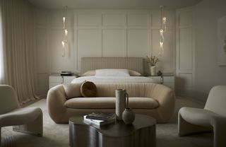
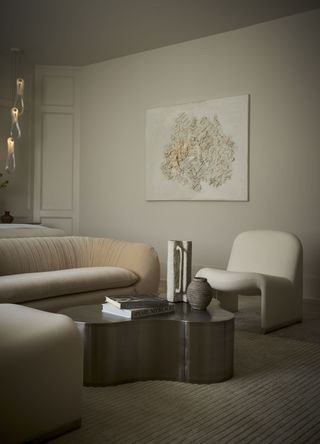
And it all seems to culminate in the primary bedroom suite, which features a much more layered and textural palette than the rest of the home, giving it an almost sultry moodiness and creating a true sense of retreat.
The clean lines of the wall paneling behind the bed, as well as the fluted bedhead and nightstand detailing, are balanced perfectly by the plush velvet 'Cecil' sofa from CB2, the heavily draped curtains and sculptural Bocci 87.3 pendant light fittings.
'The color and material palette was carefully chosen to reflect a modern, elegant aesthetic,' says Nina. And as for the final result? 'A cohesive, modern, and inviting family home.'

Emma is the Interiors Editor at Livingetc. She formerly worked on Homes To Love, one of Australia's leading interiors websites, where she wrote for some of the country's top publications including Australian House & Garden and Belle magazine. Before that she was the Content Producer for luxury linen brand, CULTIVER, where she nurtured a true appreciation for filling your home with high-quality and beautiful things. At Livingetc, she spends her days digging into the big design questions — from styling ideas to color palettes, interior trends and home tours. Outside of work hours, Emma can often be found elbow-deep at an antique store, moving her sofa for the 70th time or mentally renovating every room she walks into. Having just moved to London, she's currently starting from scratch when it comes to styling her home, which, while to many may sound daunting, to her, is just an excuse to switch up her style.
-
 The 'Grown-Up' Way to Decorate With Light Blue — This Shade Shouldn't Just "Be Resigned to the Baby's Room"
We explore how to bring the lighter intonations of blue into your home in a contemporary and thoughtful way
By Amy Moorea Wong Published
-
 For Its Color Blind Owners, the Designer of This Sustainable Melbourne Home Had to Dial Up the Intensity of the Hues Inside
The creative renovation of this period home in Melbourne cleverly references both the Scandi and Middle Eastern roots of its owners
By Keith Flanagan Published
