A modern rustic Sonoma farmhouse that's a lesson in laid back California style
Open airy rooms, light and neutral color palette, rustic touches all come together to create an effortlessly relaxed vibe that's perfect for a home in Cali's wine country

The Livingetc newsletters are your inside source for what’s shaping interiors now - and what’s next. Discover trend forecasts, smart style ideas, and curated shopping inspiration that brings design to life. Subscribe today and stay ahead of the curve.
You are now subscribed
Your newsletter sign-up was successful
There's just something about SoCal style that's irresistible. It's something you can try and replicate elsewhere of course, but the light and the openness mixed with neutral color schemes and rustic textures just feels most at home in California.
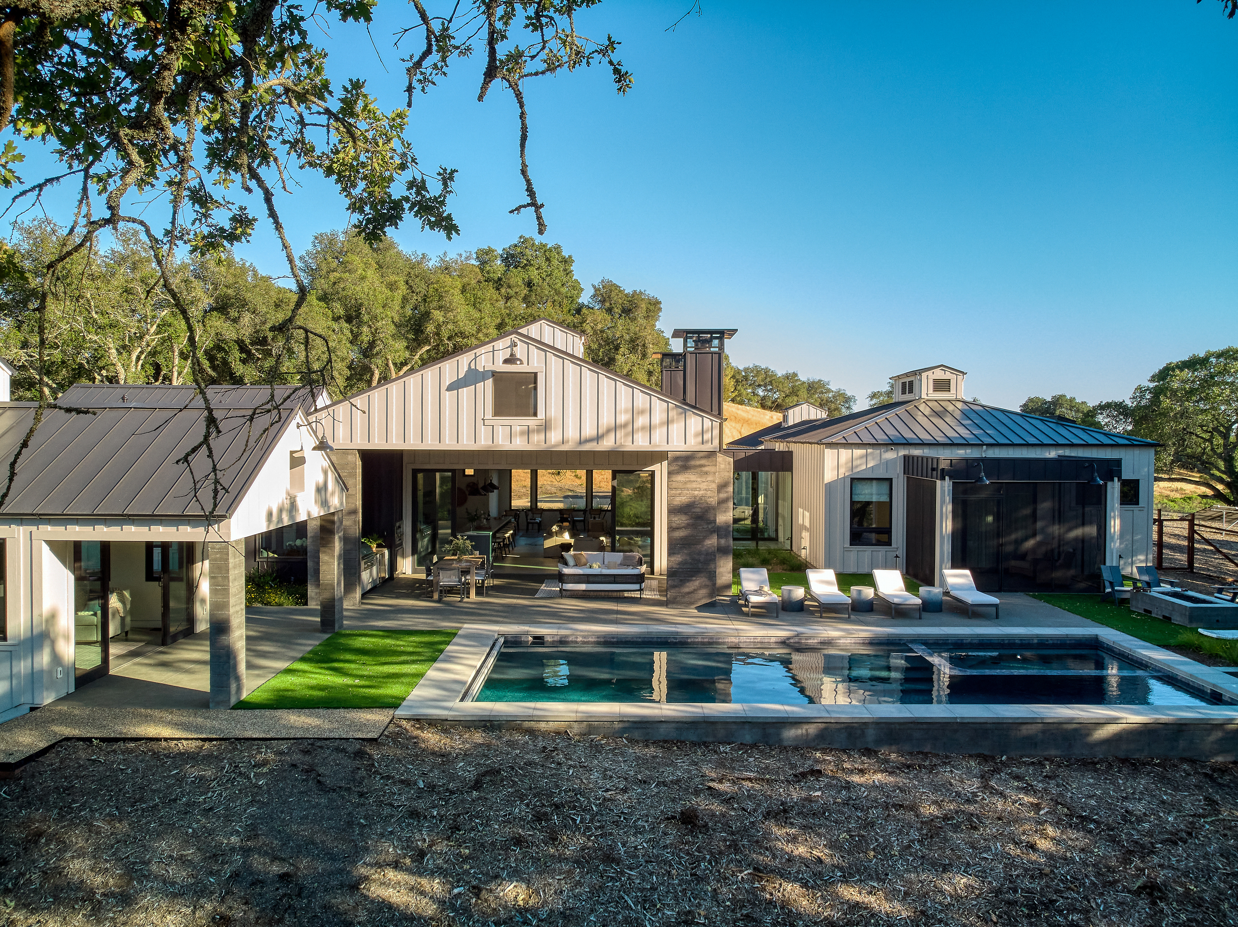
The homeowners of this modern home in Northern California’s wine country, moved from Chicago, deciding after many vacations to retire out west (the dream). They brought on firm James McCalligan Architecture for the build and designer Jolene Lindner for the interiors. During the planning and building process, the positioning of the rooms and windows was a constant consideration, the house is built is make the most of every angle of the iconic rolling hills of Northern California. The idea was that even when inside the property there was always that seamless connection with the country that surrounded it. Hence the huge amount of windows and sliding doors, and distinct lack of walls in the house – it's open plan and then some.
Jolene's brief was similar, make the most of the views and bring to the home a modern farmhouse style, light, bright and airy – essentially the essence of the laidback California lifestyle.
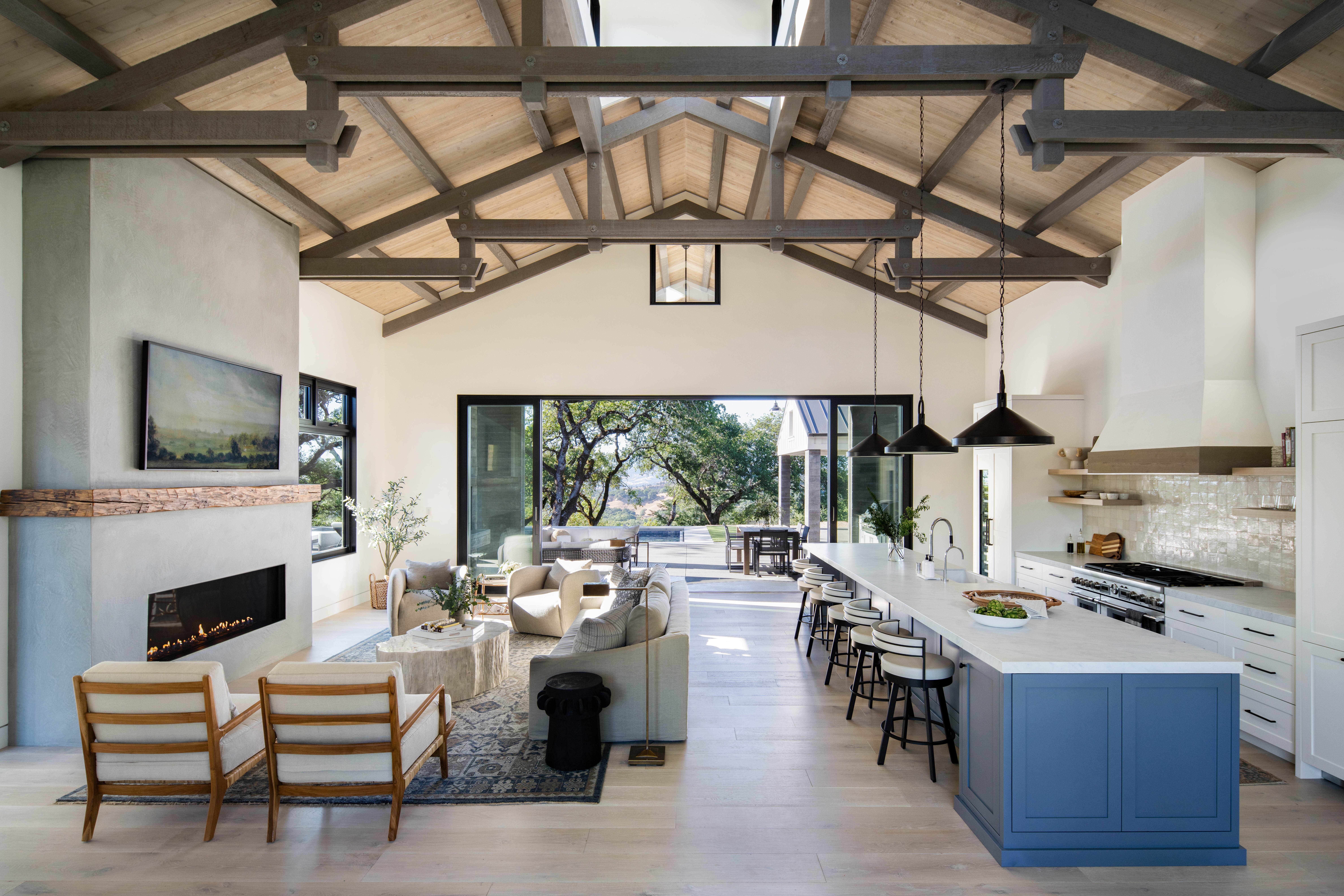
Open plan kitchen and living room
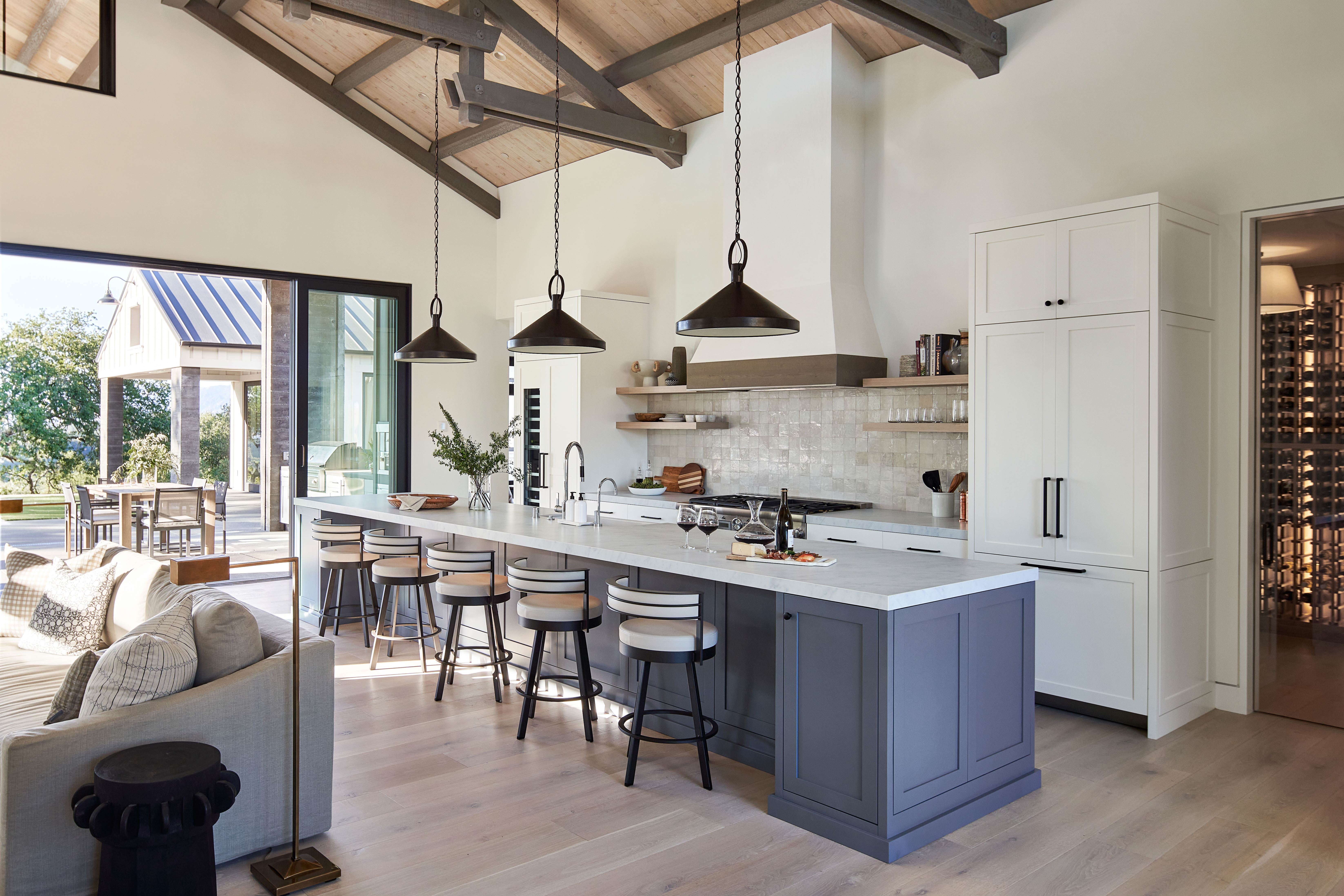
The main living space is the huge open plan kitchen and living room, running the width and depth of this section of the house. Floor to ceiling bi-fold doors sit on one side, opening up onto the pool deck and large windows bring in light from the back of the room.
The wooden beams that tower above space give it an instant farmhouse feel, but there's a contrast here too with the simple clean white walls and contemporary black door and window fittings.
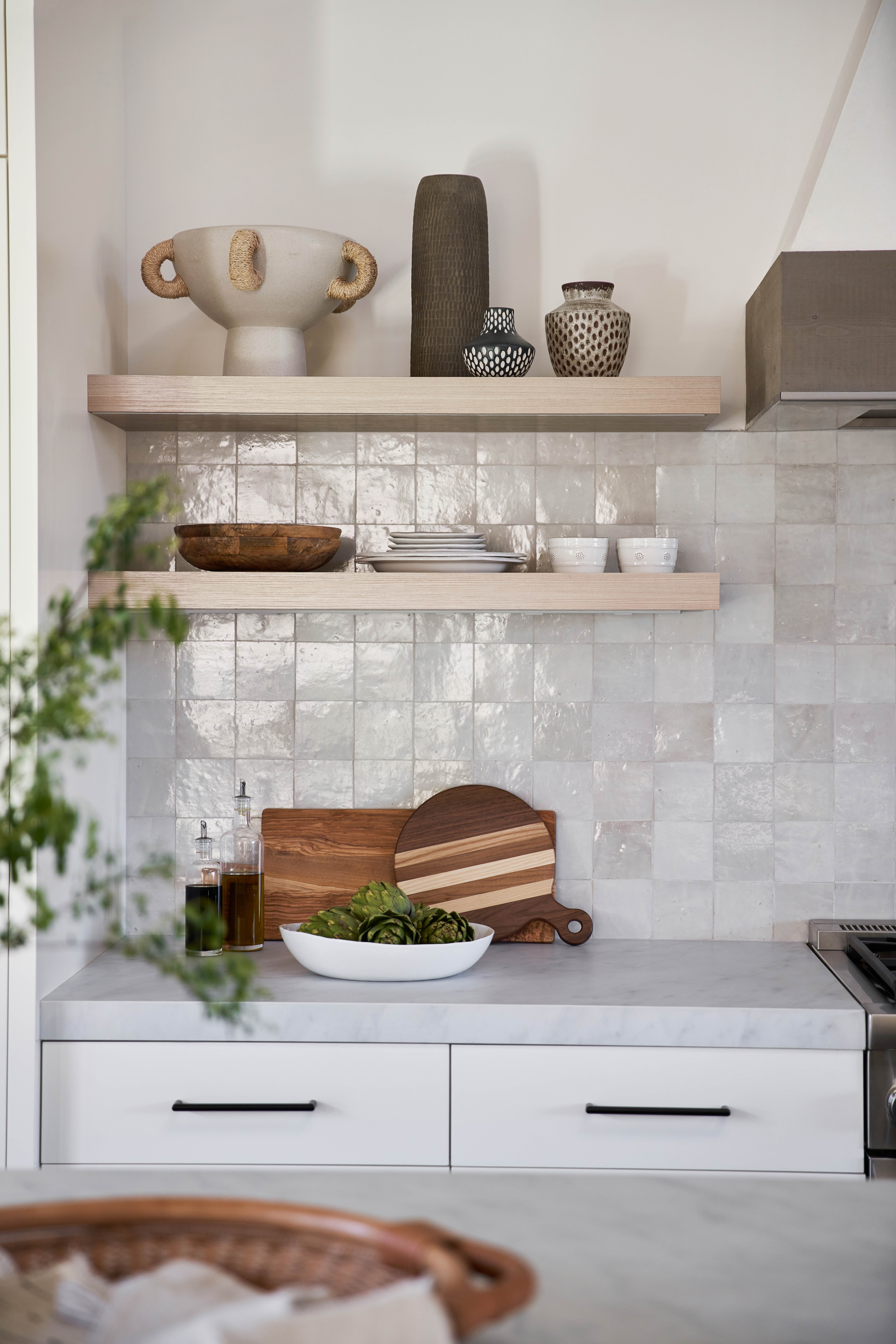
The kitchen itself has a rustic modern vibe that works with the contemporary farmhouse feel the homeowners wanted to achieve. The steely blue gives a modern edge but the classic Shaker cabinets, rustic Zellige tiles, and wooden accents bring in that rustic touch.

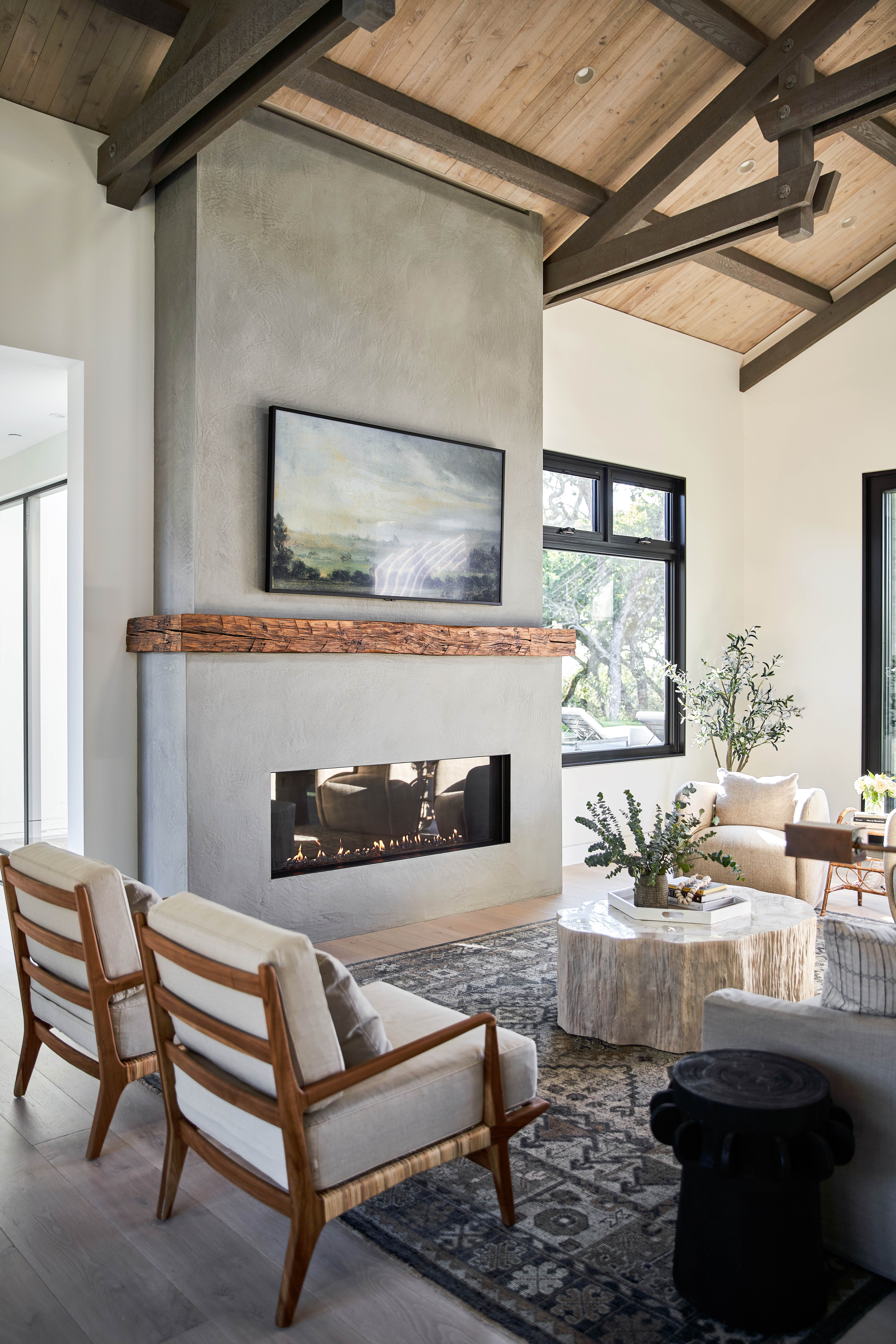
The living room area brings in even more of that rustic texture, layering different wooden tones, soft greys, and subtle patterns. Even the pieces that aren't made of wood are designed to replicate it. The fossilized clam coffee table was made using a mold of a tree trunk, adding more natural textures and giving the space a stylish focal point. Quirky vintage finds can be found in this space too. The side tables that sit on either side of the sofa are repurposed sugar gears.
The Livingetc newsletters are your inside source for what’s shaping interiors now - and what’s next. Discover trend forecasts, smart style ideas, and curated shopping inspiration that brings design to life. Subscribe today and stay ahead of the curve.
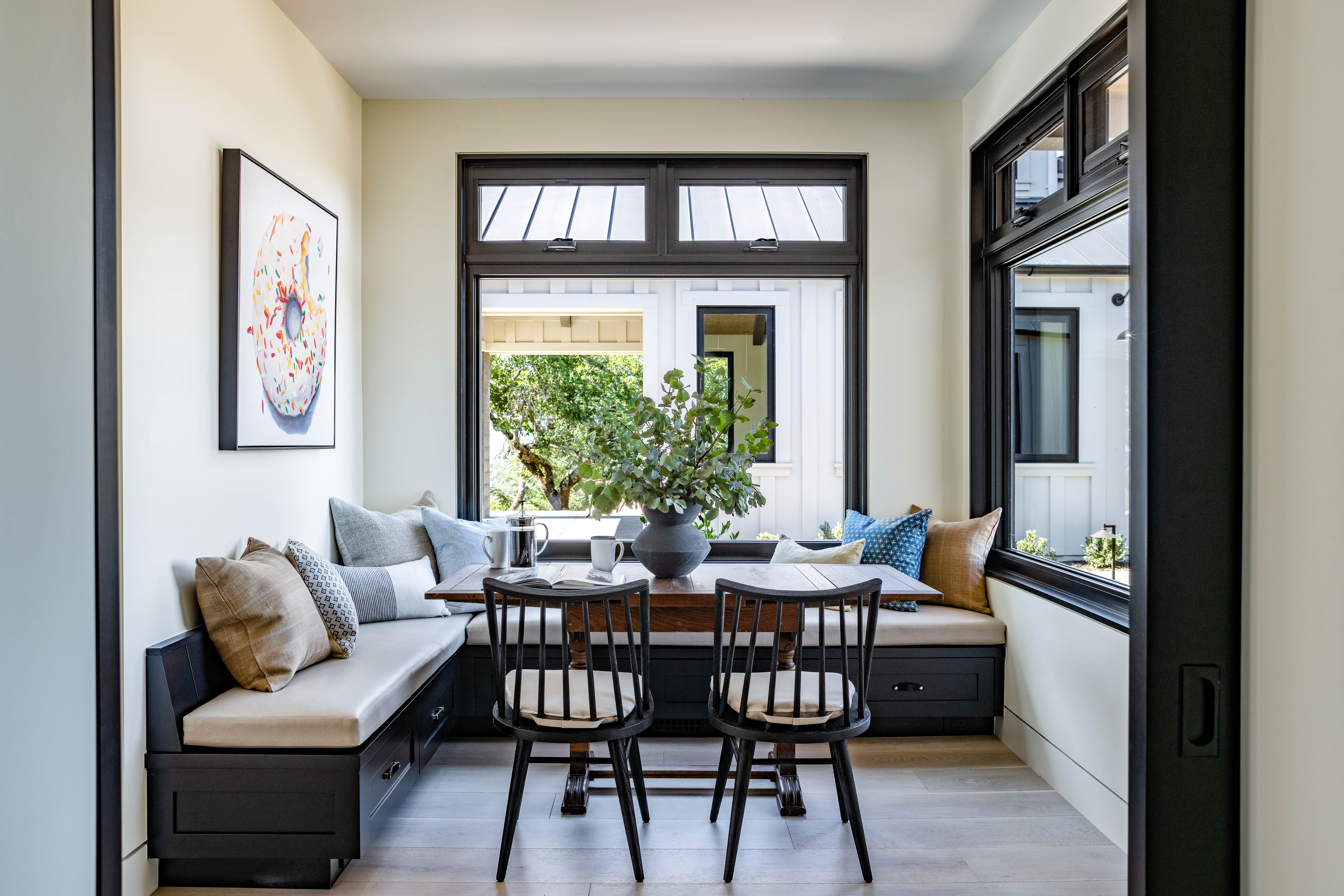
Adjoining the open plan space is a cozy breakfast nook for more informal meals. The table was salvaged from an English pub, and the banquet was a bespoke design built around the dimensions of the vintage find.
- Find more modern living room ideas in our gallery.
Master bedroom
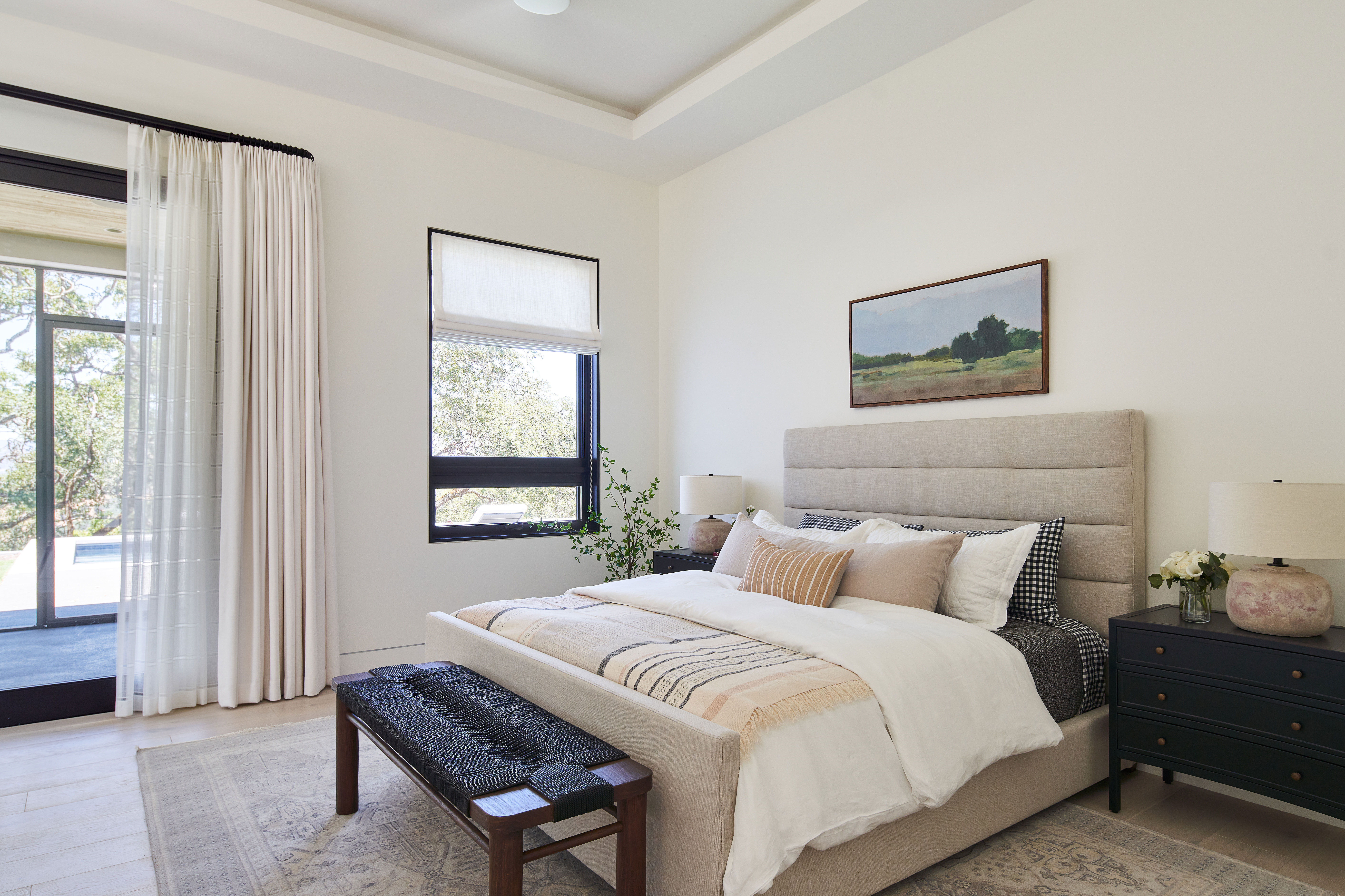
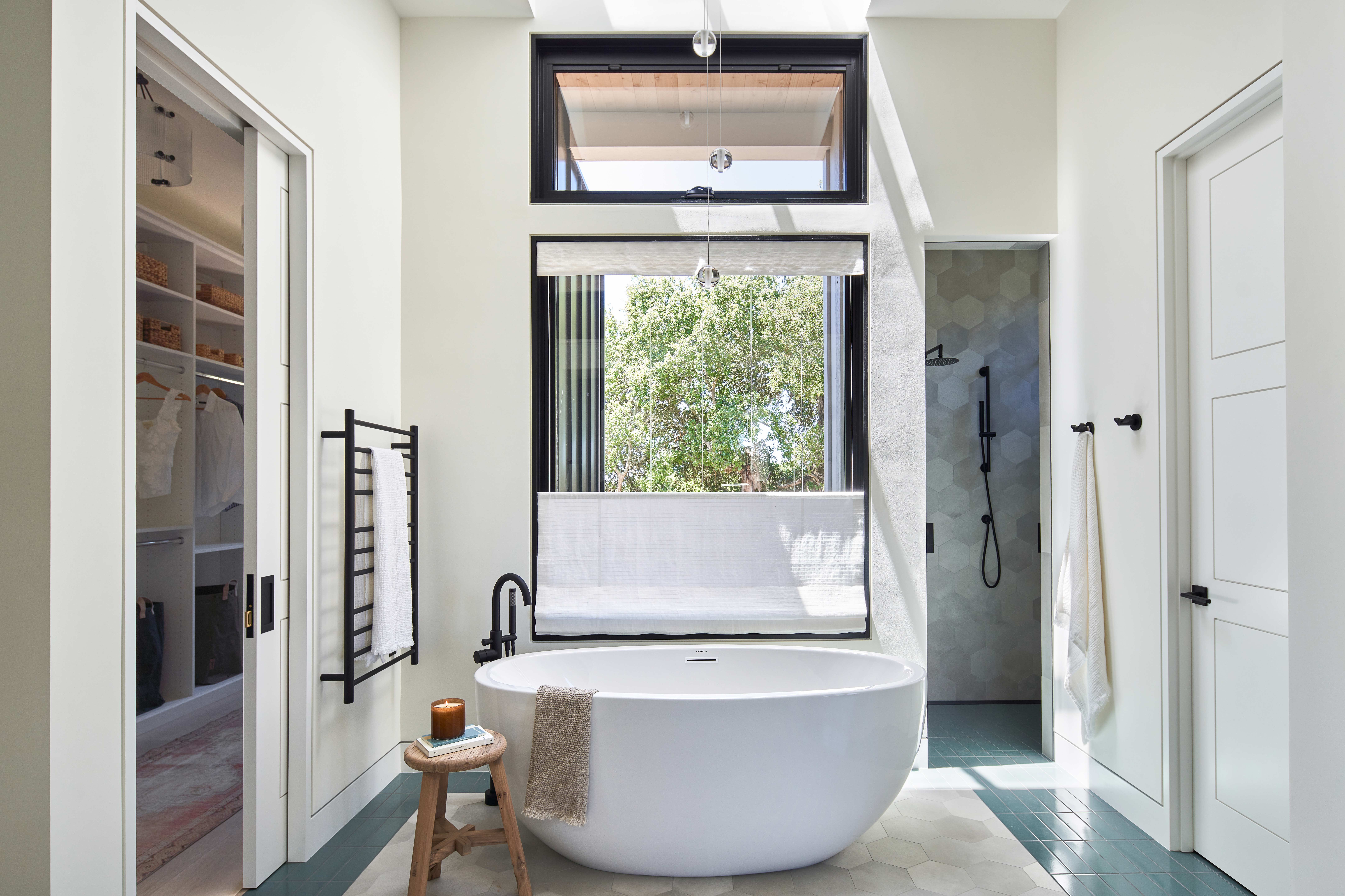
The master bedroom is somewhat open plan too. It's situated in its own wing of the property, adjoined to the living space by a glass box corridor. Rather than having a traditional ensuite, the master bath sits inside the bedroom, separated by a floating dividing wall.
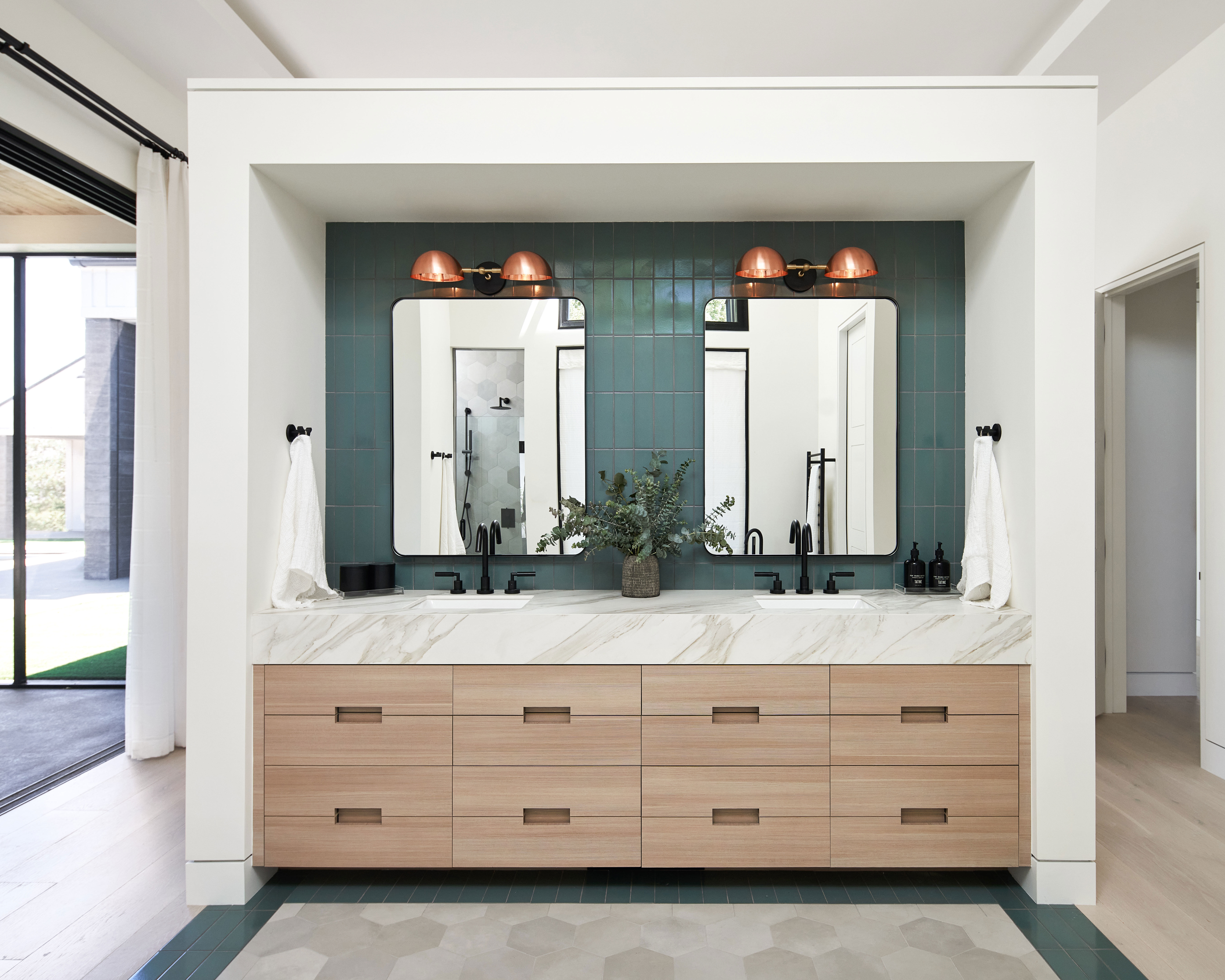
One side of the wall faces into the bedroom, the other is a double sink and vanity area. It's a clever design that allows light to still easily flow around the whole space, keeping the room open and airy, and yet there's still privacy.
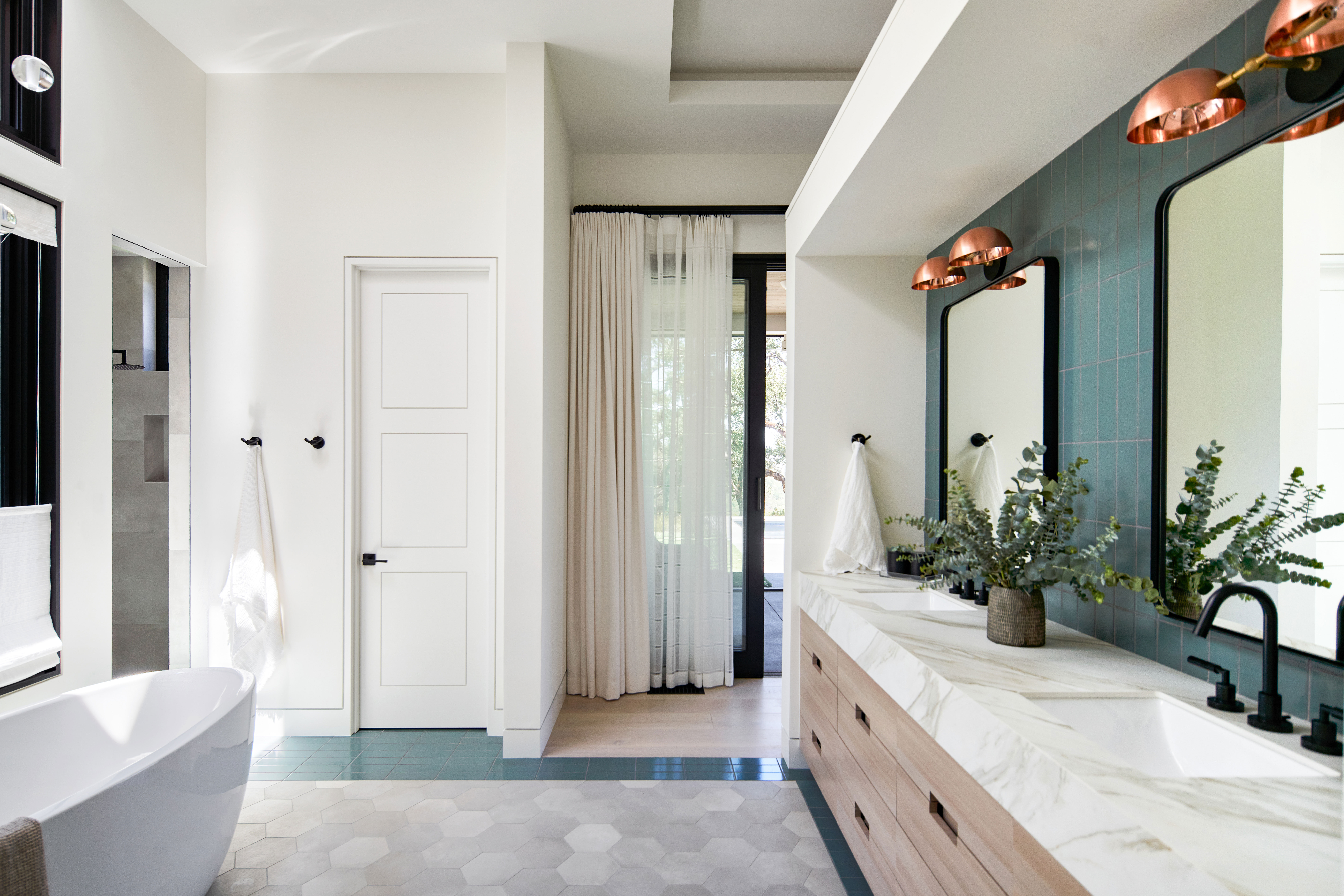
The teal green tiles that can be found above the sinks are continued around the edges of the hexagonal marble tiled floor. Again it makes that distinction between bedroom and bathroom without the need for walls. A WC has been added behind closed doors and a walk-in shower sits just off the main space.
- Be inspired by more modern bathroom ideas.
Guest bedroom
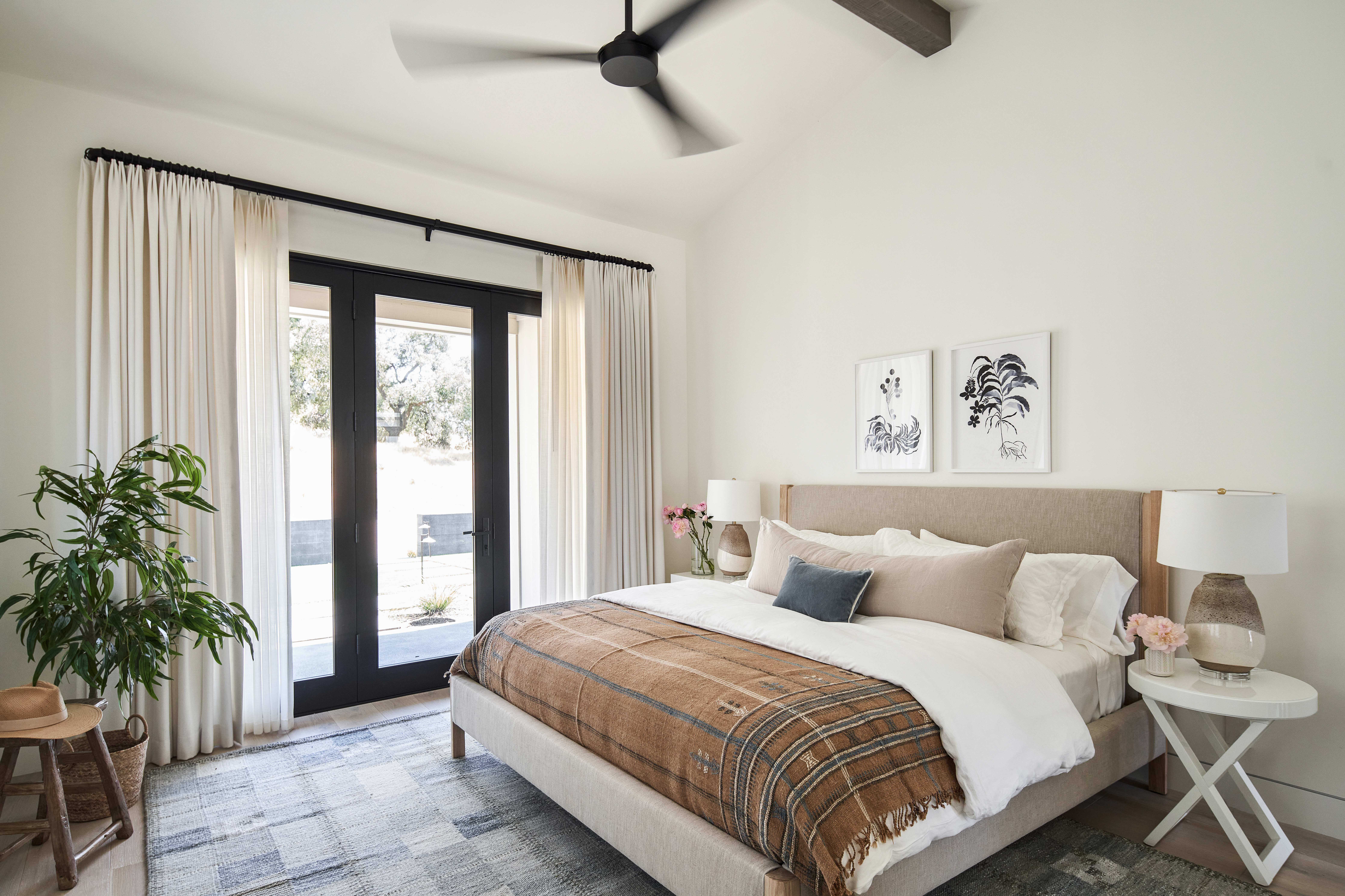
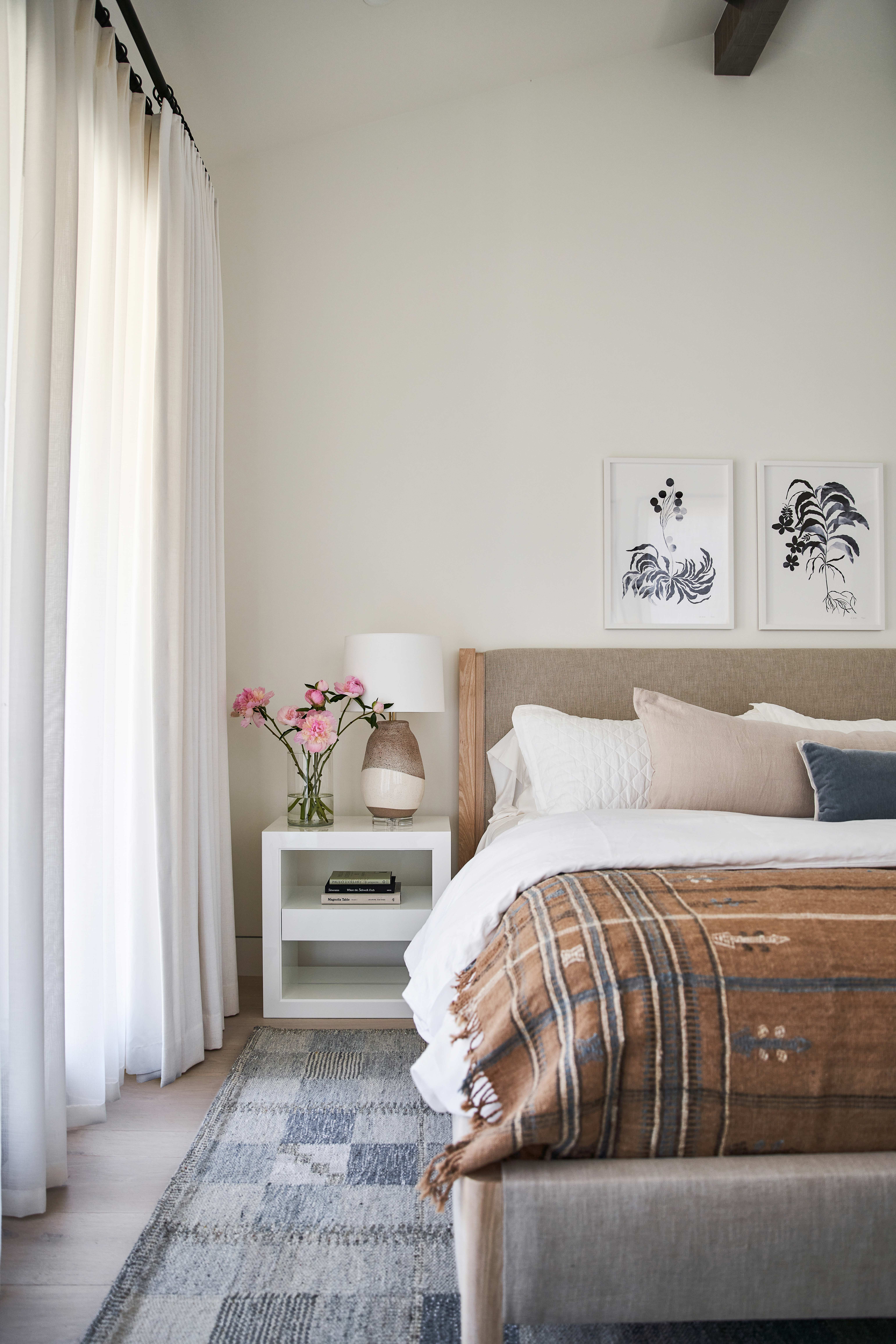
There's a similarly modern rustic vibe in the guest bedroom as can be found in the master bedroom. Warm toasty tones give the space a cozy feel and the neutral color scheme keeps it light and fresh.
- See all our guest bedroom ideas.
Guest bathroom
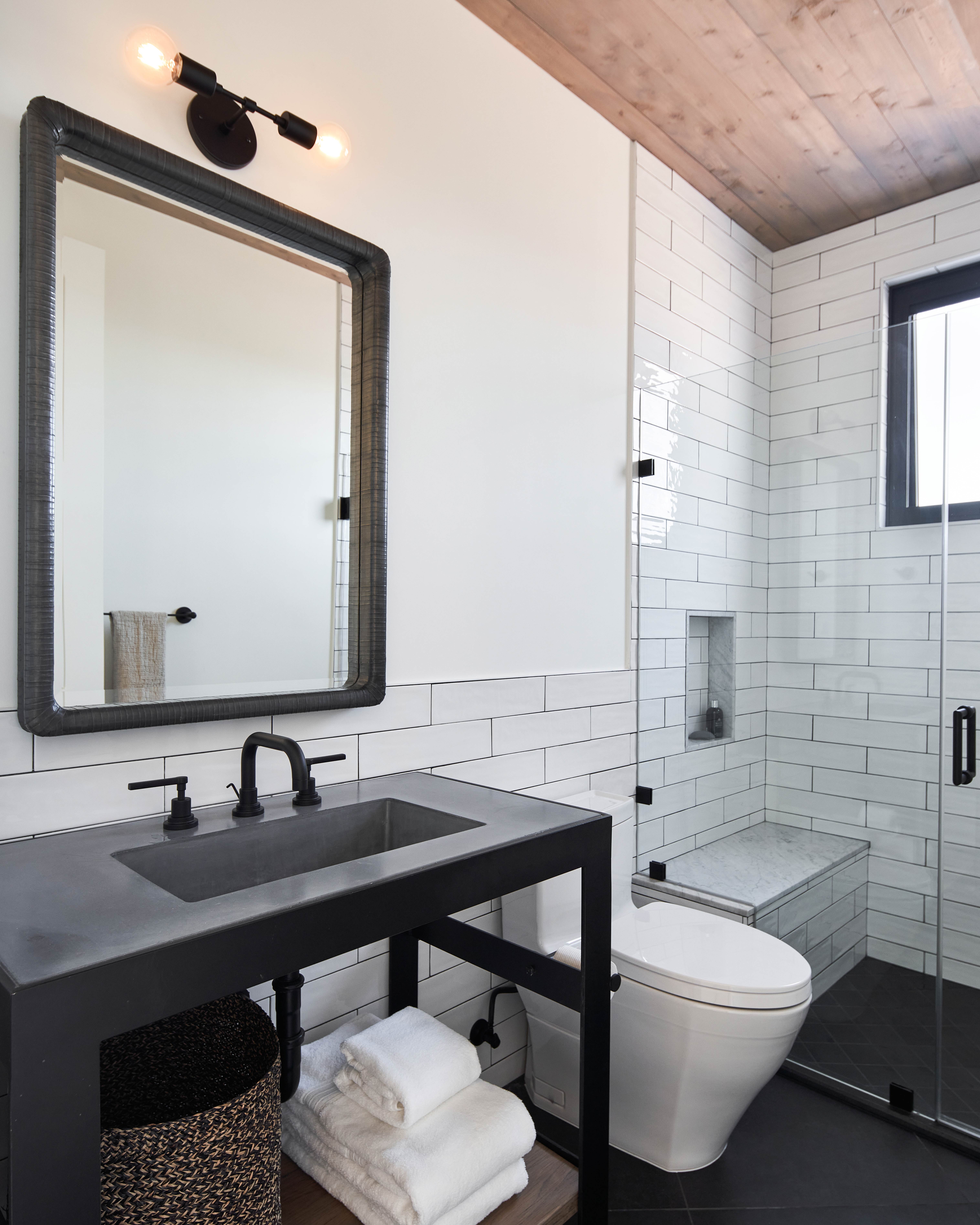
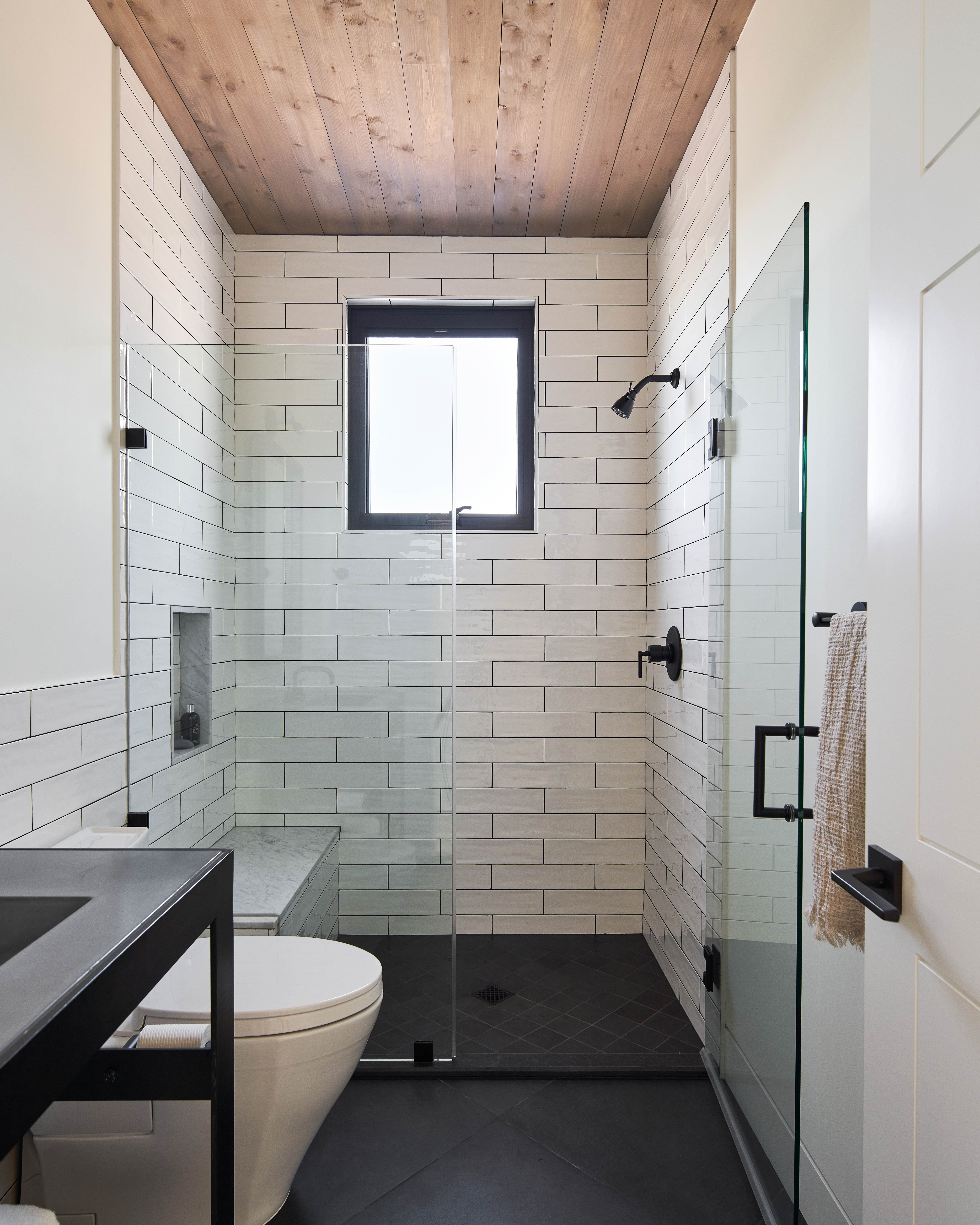
The guest bathroom (this is one of three) combines a contemporary almost industrial look of the striking black steel vanity and light fixtures, with the rustic style found in the other rooms. The wooden paneled ceiling softens the high-contrast black and white color scheme and the uneven surface of the tiles adds texture.
Pool house
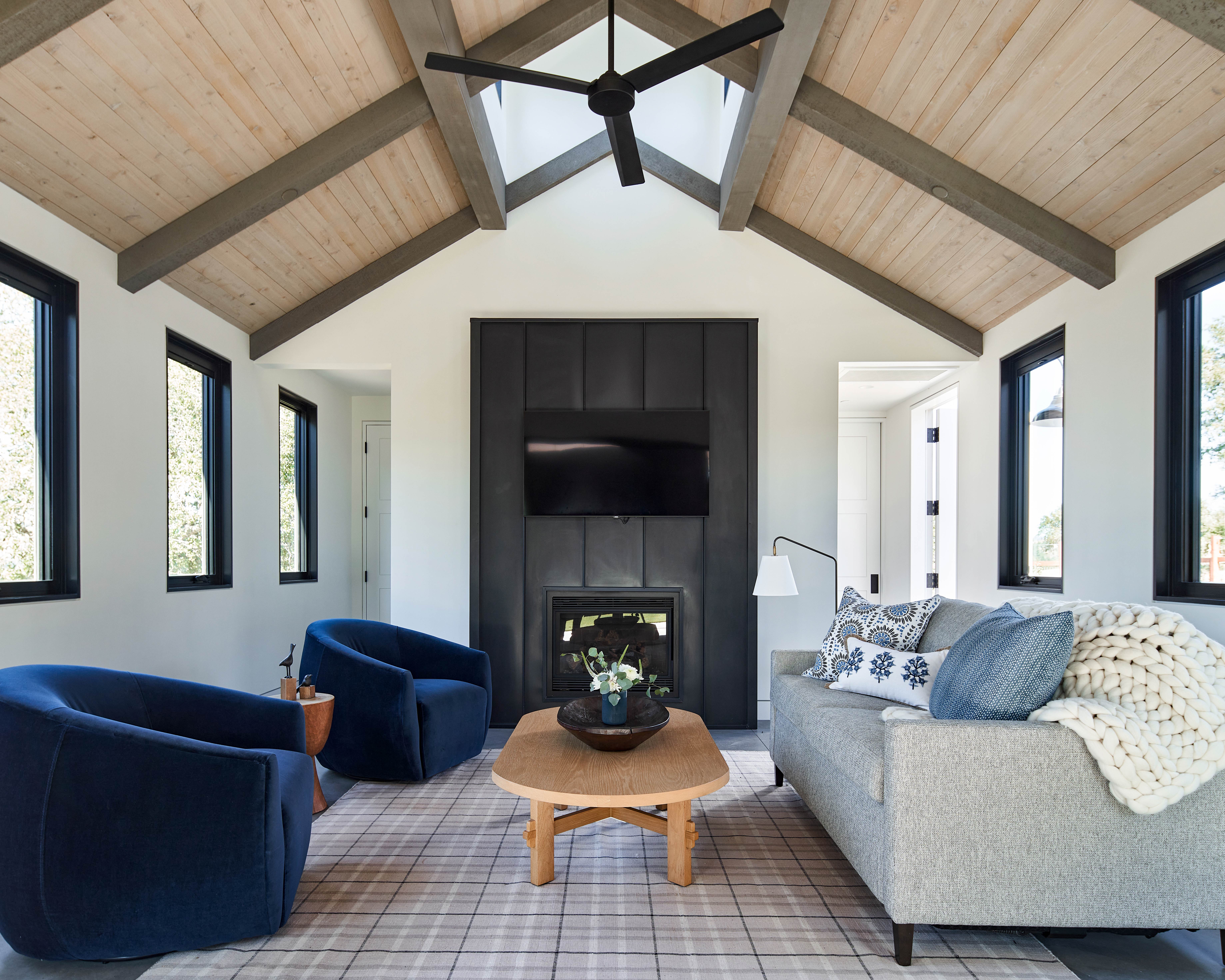
This second living room is separate from the main house, but that effortless flow between inside and out that so part of the home's design means this doesn't feel like a separate space at all. There's also a small second kitchen, shower room, and utility within the pool house.
Outdoor kitchen
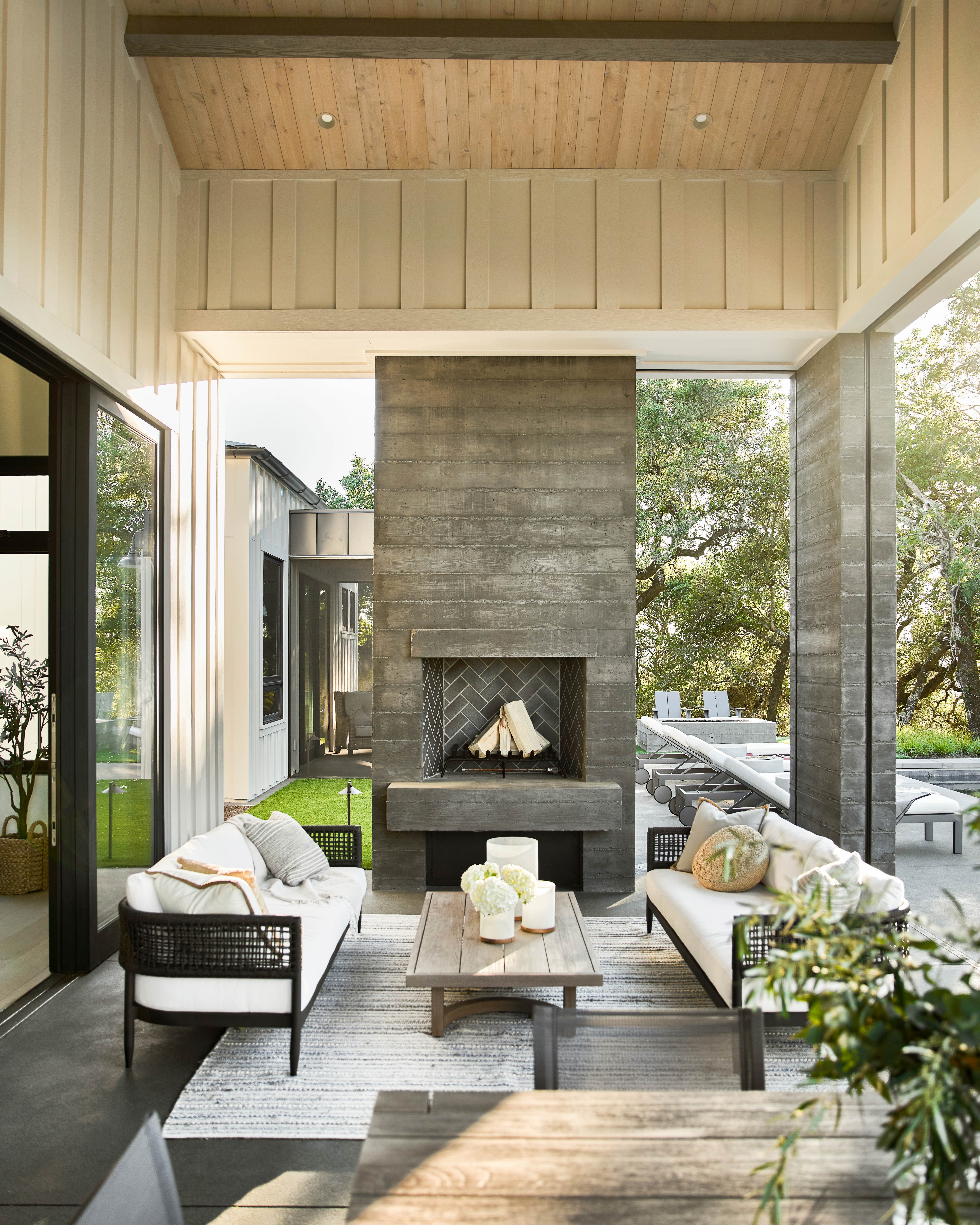
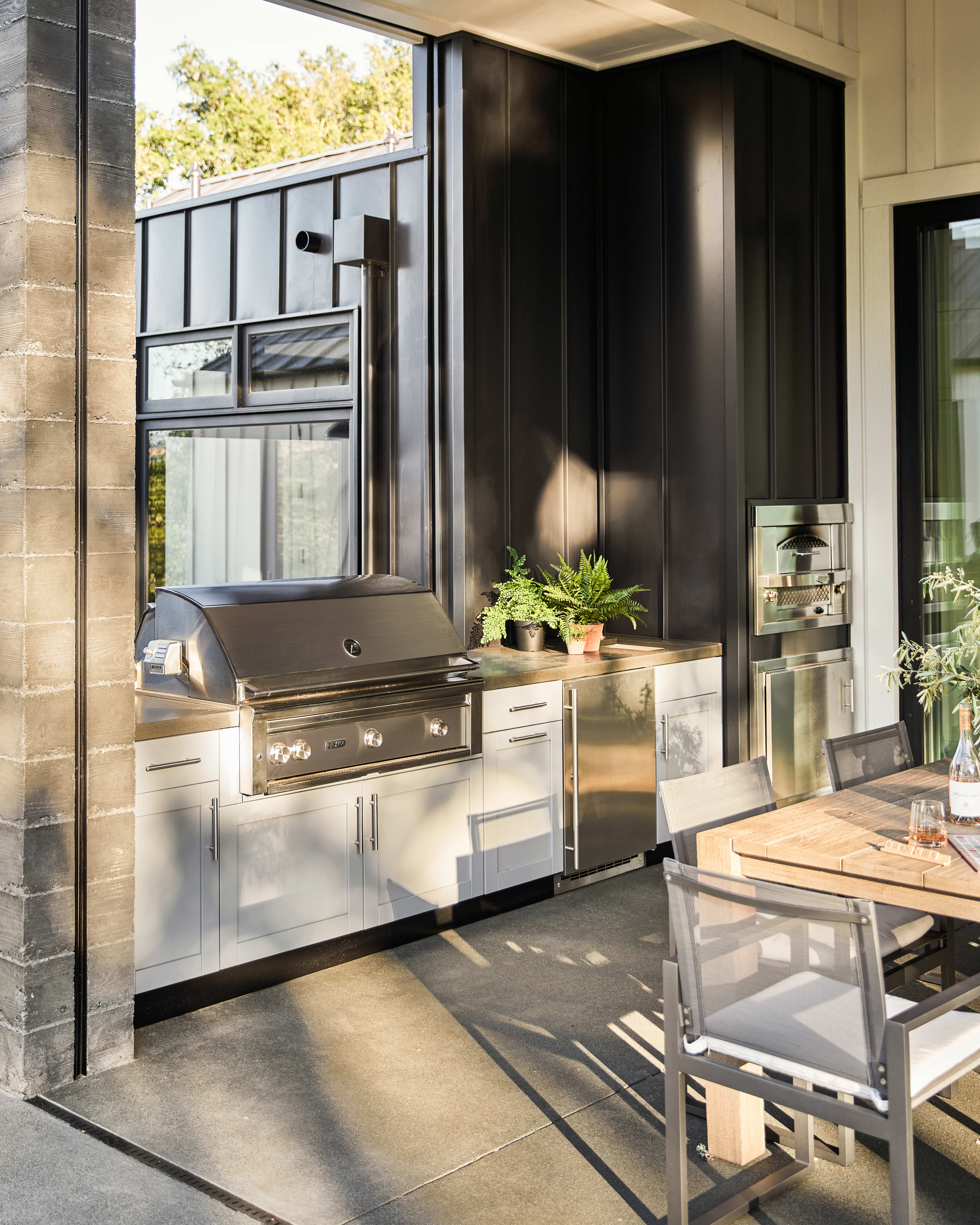
Leading out from the main living room is a spacious outdoor kitchen and living room, complete with a wood-burning fire, gas grill and BBQ, pizza oven, and mini-fridge.
Pool area
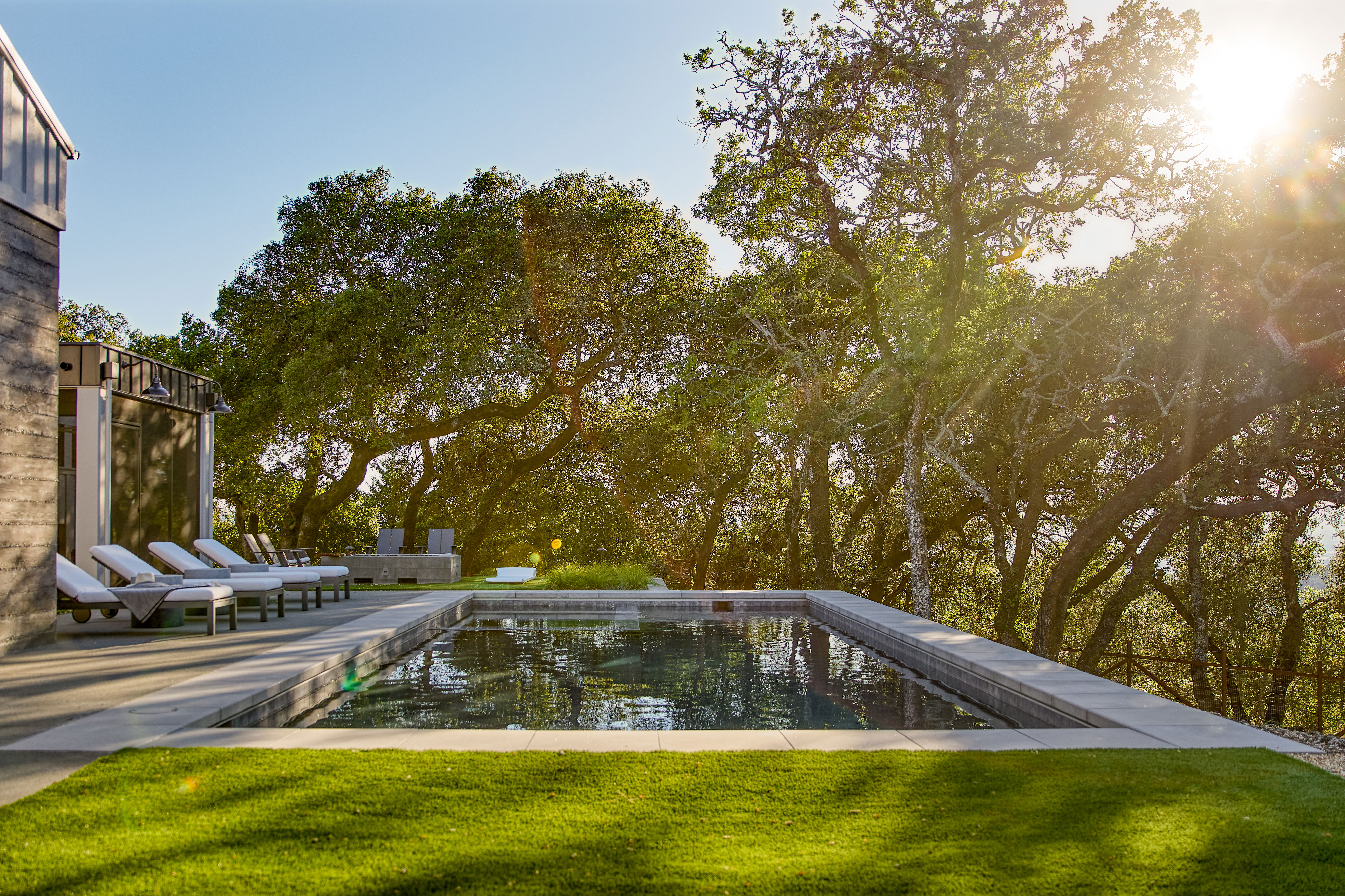
The pool is easily accessed by all the main living rooms and master bedroom. A cozy seating area with classic Adirondack chairs and a contemporary firepit sits behind the pool and deck, overlooking the surrounding country.

Photography by Thomas Kuoh.
Formerly the Digital Editor of Livingetc, Hebe is currently the Head of Interiors at sister site Homes & Gardens; she has a background in lifestyle and interior journalism and a passion for renovating small spaces. You'll usually find her attempting DIY, whether it's spray painting her whole kitchen, don't try that at home, or ever-changing the wallpaper in her entryway. She loves being able to help others make decisions when decorating their own homes. A couple of years ago she moved from renting to owning her first teeny tiny Edwardian flat in London with her whippet Willow (who yes she chose to match her interiors...) and is already on the lookout for her next project.