This busy family home is chic, functional and clutter-free, thanks to clever joinery and striking design ideas
The Victorian property was updated with a broken-plan split-level layout and custom joinery ideas at every turn – from pull-out steps in the kitchen (so the kids can reach the sink) and a hidden desk space in the dining area to a spiral wine cellar with a glass trap door...
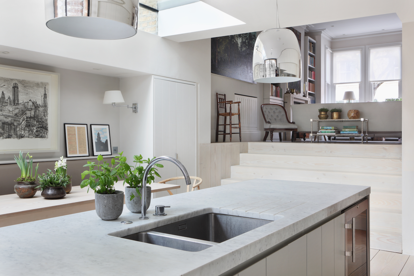

The Property
This stunning family home in London's Hammersmith area is home to a couple and their two young children. While they loved the character of their Victorian property, they wanted a space that was both chic and functional – with generous spaces for entertaining, and with lots of built-in storage and clever joinery so as to give everything a place, and to keep the interiors clutter-free. Most importantly, they wanted design features to allow lots of light into the space.
They brought on architecture studio De Rosee Sa, who worked with them to create the modern home it is now. The Victorian property was partially demolished, the house was extended, a basement was excavated, and the rest of the home was fully refurbished. The architects created a better flow between rooms, installed skylights for maximum light, and designed custom joinery to make the house completely clutter-free. The house is now a chic but functional family home, featuring a broken-plan, split-level layout, with custom joinery ideas at every turn – from pull-out steps in the kitchen (so the kids can reach the sink) and a hidden desk space in the dining area to the spiral wine cellar with a glass trap door. The interiors meanwhile are modern traditional – traditional fabrics, art and antiques are balanced with modern joinery, modern bathrooms and a modern dine-in kitchen.
Library
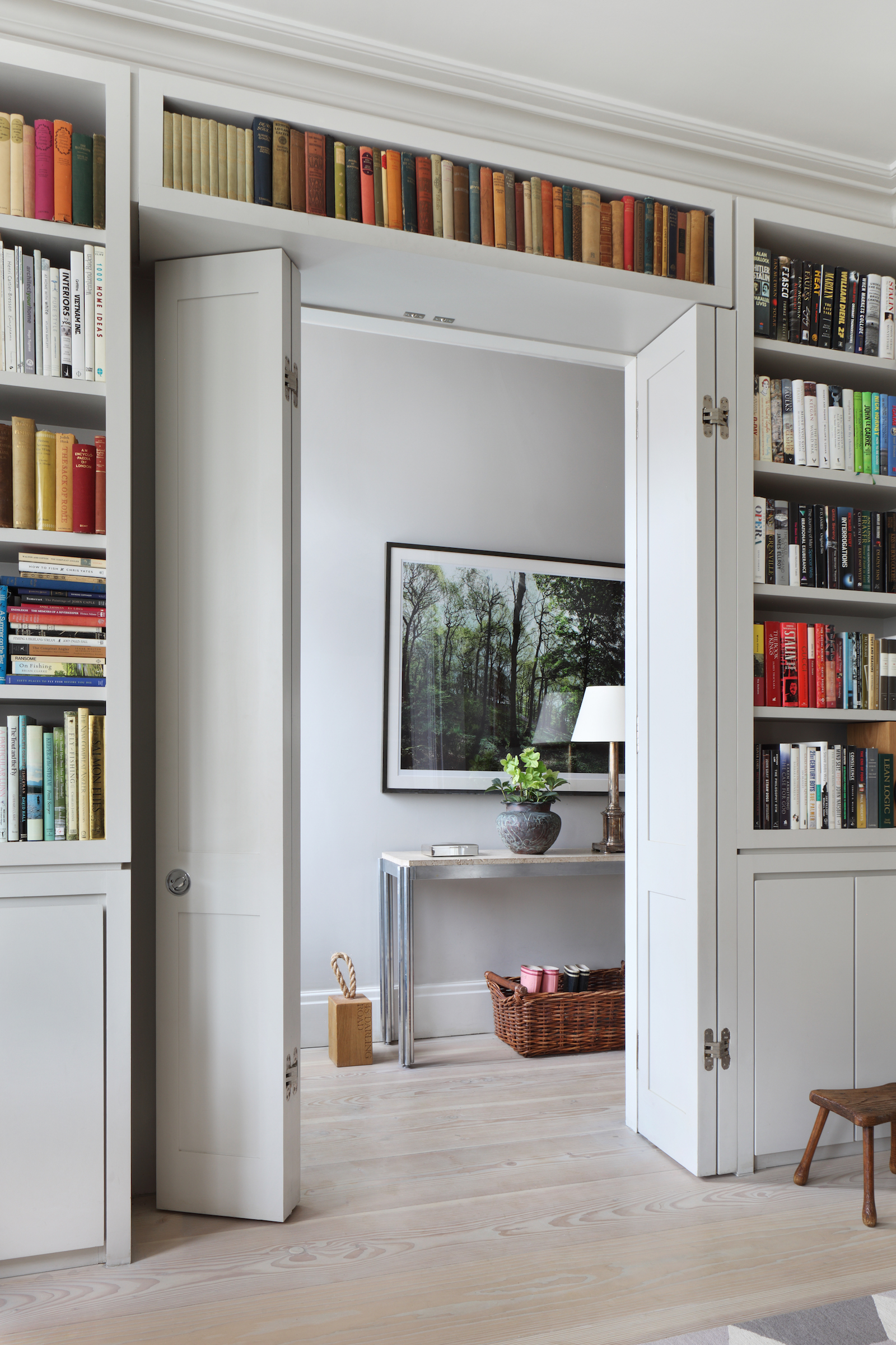
To the right of the hallway are a pair of double doors that open into the living room / home library.
A built-in bookcase frames the doorway. It was specifically designed to fit around the couple's speakers.
See Also: Home library ideas – 20 striking bookcase ideas worth stealing
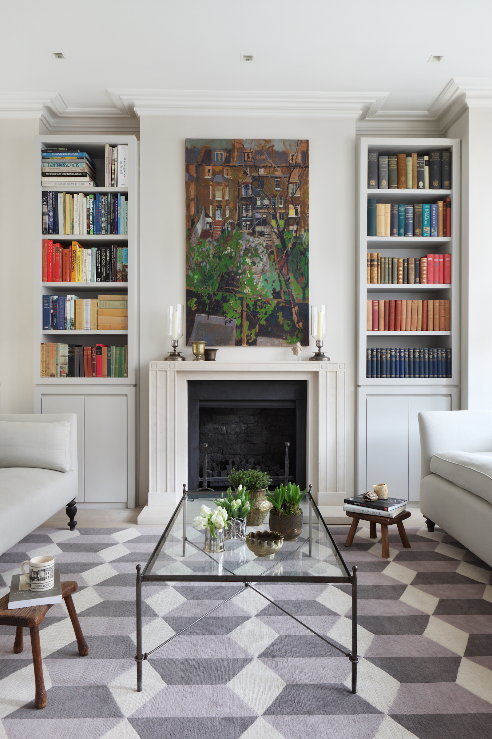
It's a light and elegant white living room – but the highlight in this space is just out of sight... Hidden under a glass trap door (that's flush with the wood flooring), there's a spiral staircase that goes down to a basement wine room which can hold up to 1,000 bottles of wine.
The glass trap door peeks down into the cellar as a little window, but also lets in light from above so this is not a dark cellar space. Watch the video tour of this home to see the cellar in detail.
Be The First To Know
The Livingetc newsletters are your inside source for what’s shaping interiors now - and what’s next. Discover trend forecasts, smart style ideas, and curated shopping inspiration that brings design to life. Subscribe today and stay ahead of the curve.
Kitchen
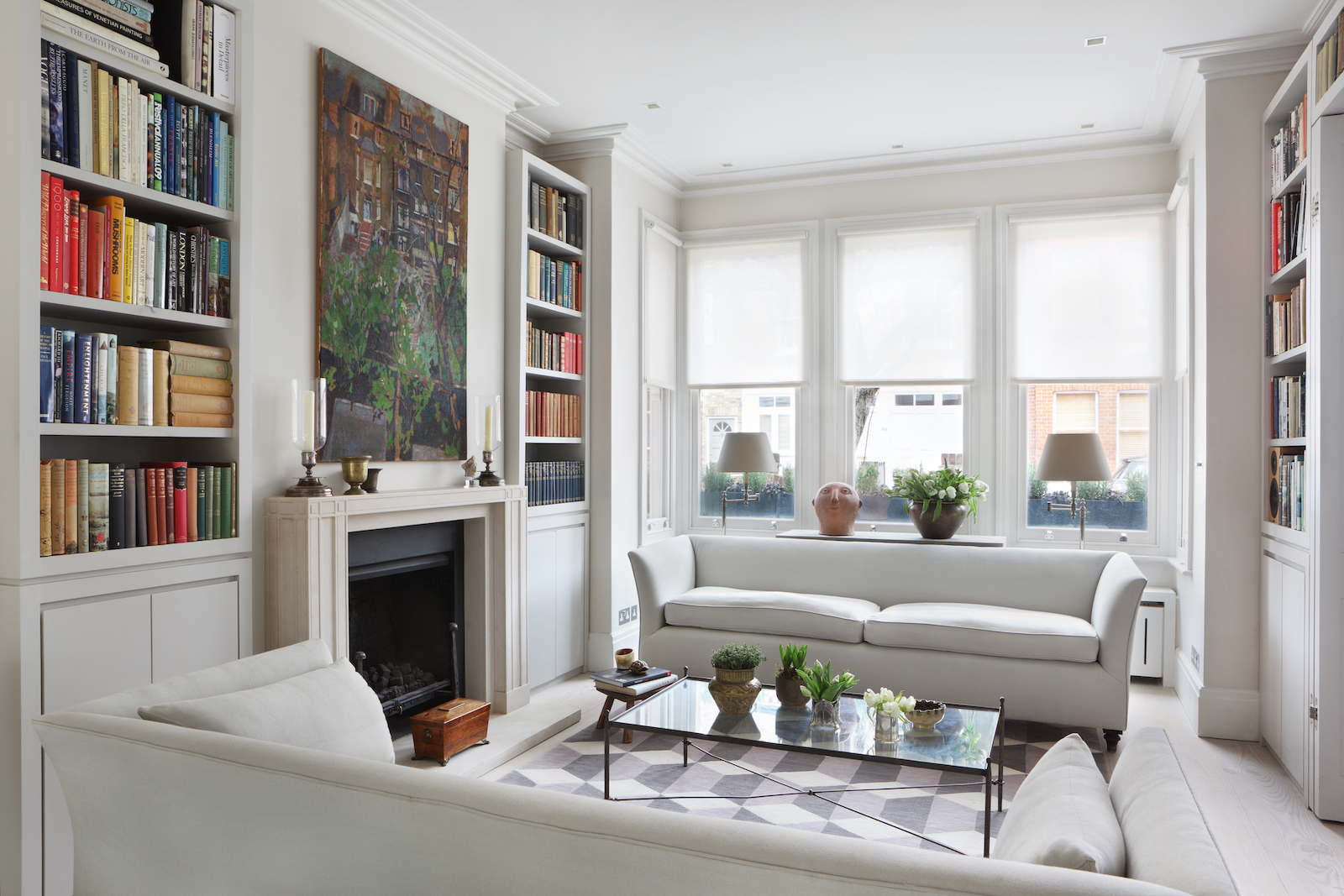
Wide steps lead down from the living room into a wide and spacious modern kitchen.

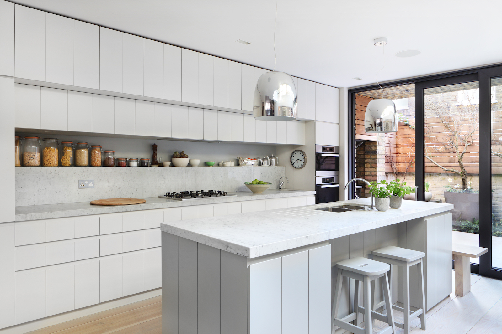
In response to the existing proportions of the house De Rosee Sa architects created a practical and spacious interior, and bespoke joinery for each space, including a banquette bench, dining table and wood bench that slots away underneath.
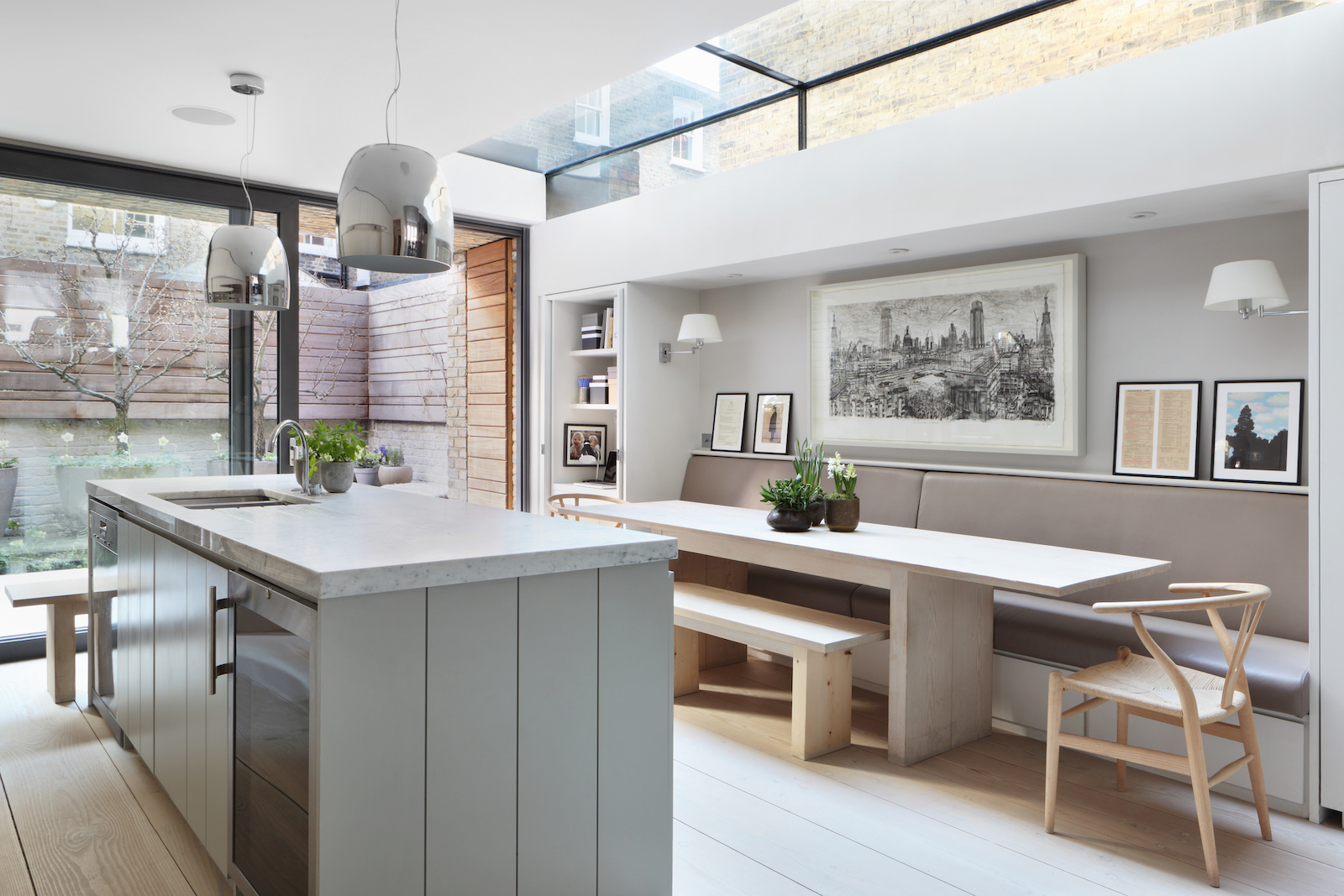
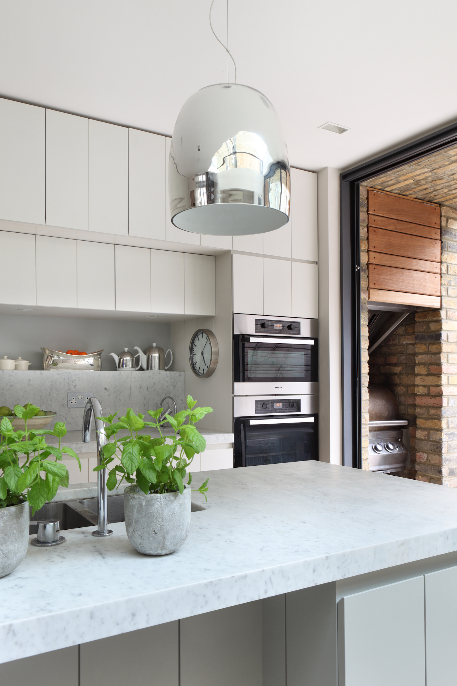
White kitchen cabinets conceal integrated appliances – everything hidden and tucked away, including little steps that pull out so the children can reach the kitchen island sink. Everything has it place.
Meanwhile the ceiling disguises built-in speakers.
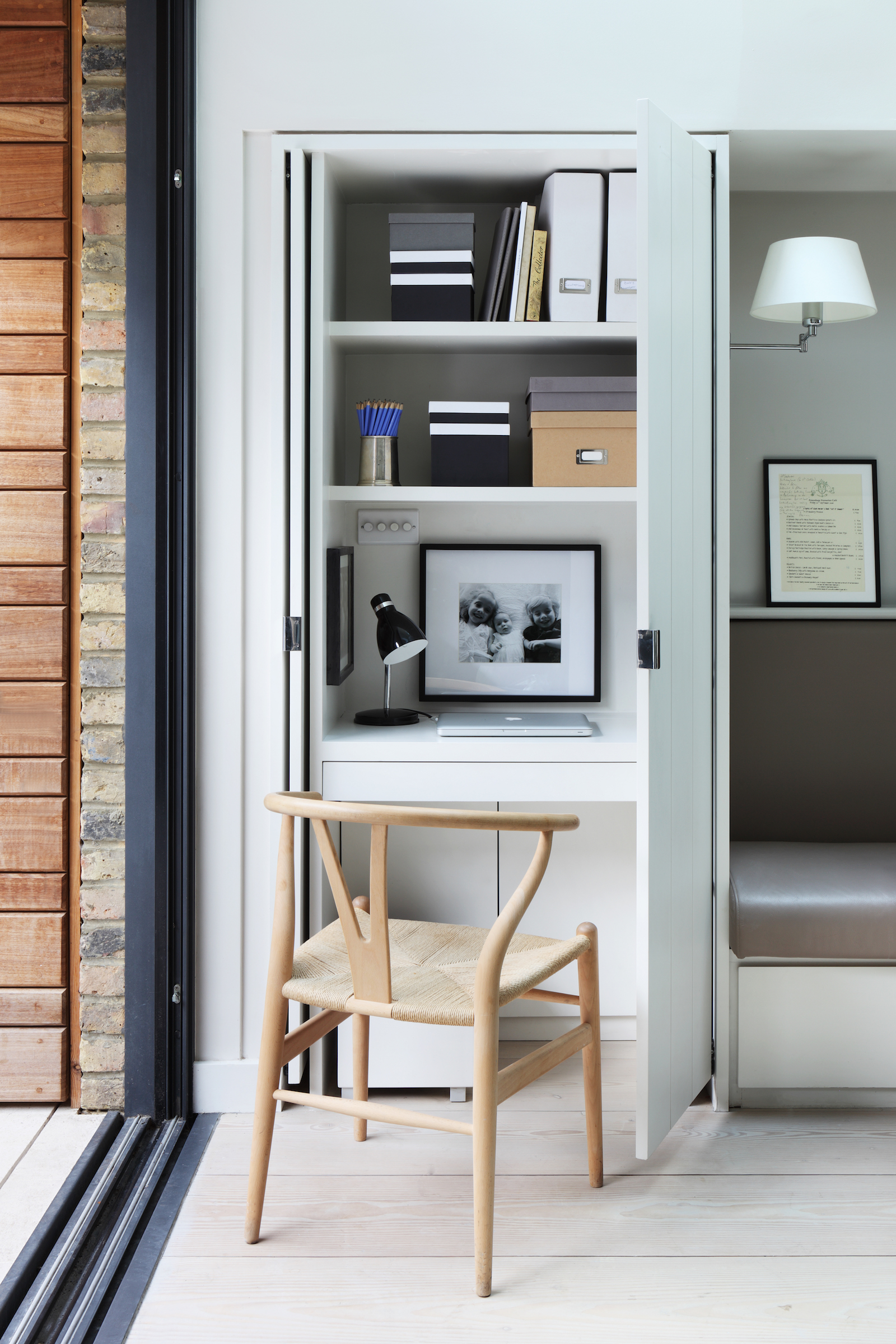
Even cleverer still – and no doubt a life saver during this past pandemic year – there are kids desk spaces hidden behind doors on either side of the dining area.
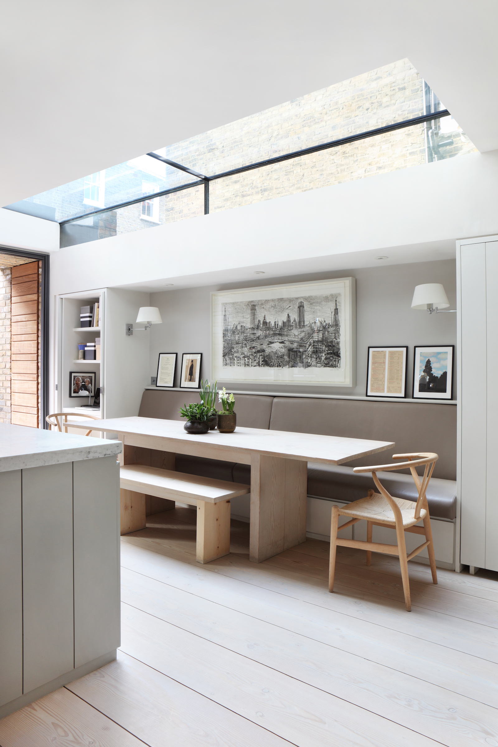
The doors pull open and push back into the wall, revealing compact desk areas – perfect as a kids desk space for doing homework at, or as a nook for working from home (there's a separate home office upstairs).
Just out of sight is an on-trend outdoor kitchen with built in barbecue area – conveniently placed right next to the kitchen.
Laundry room
Materials were selected to create an atmosphere of timelessness, and blur the boundaries between the new and old parts of the house. The result is a contemporary refurbishment that remains sympathetic to its Victorian roots.
The tongue and groove style theme in the kitchen continues into the adjacent laundry room and utility space, adding warmth and charm.
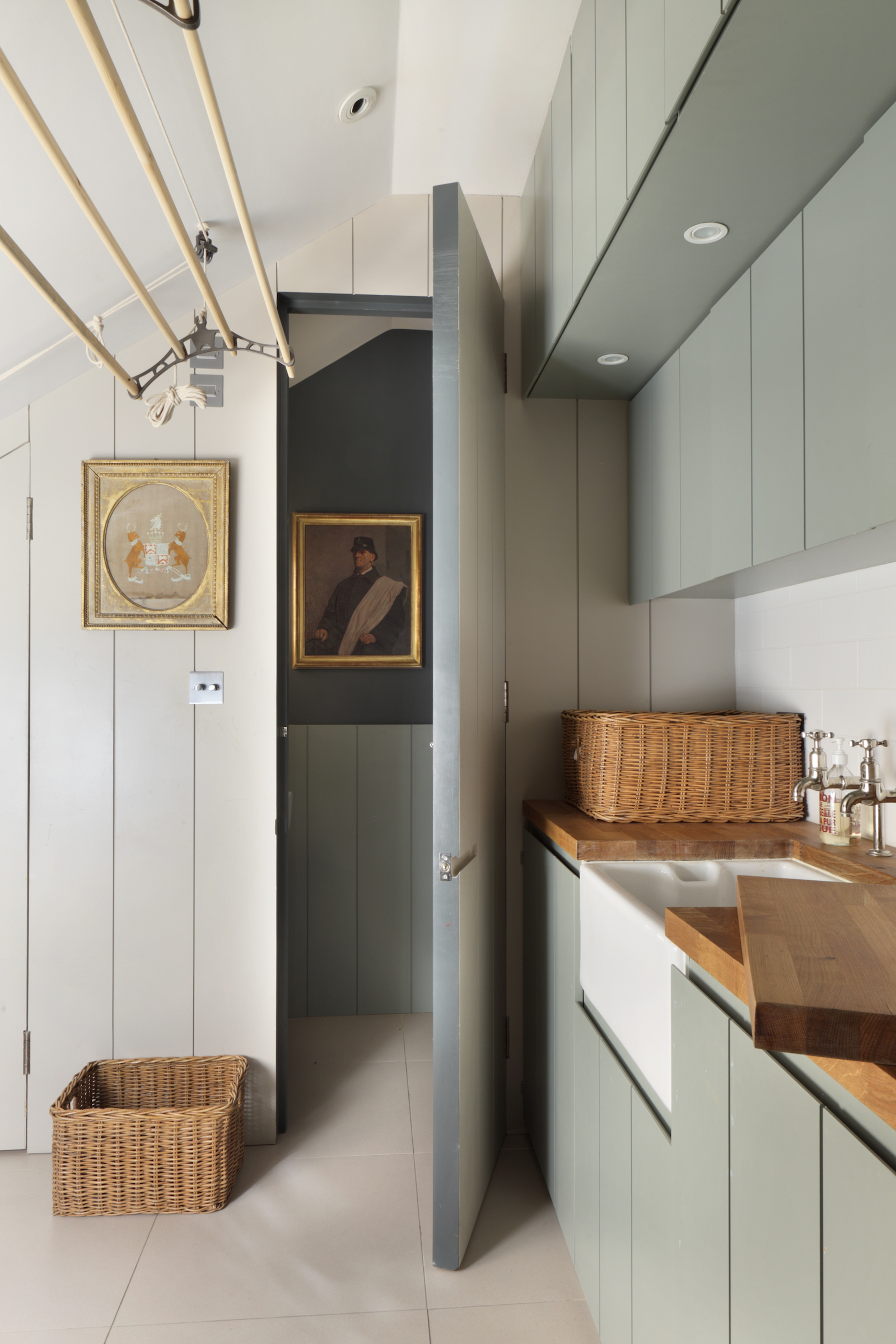
Wood surfaces and a butler sink also lend a more traditional 'country' feel to this space, compared to the Carrara marble in the kitchen.
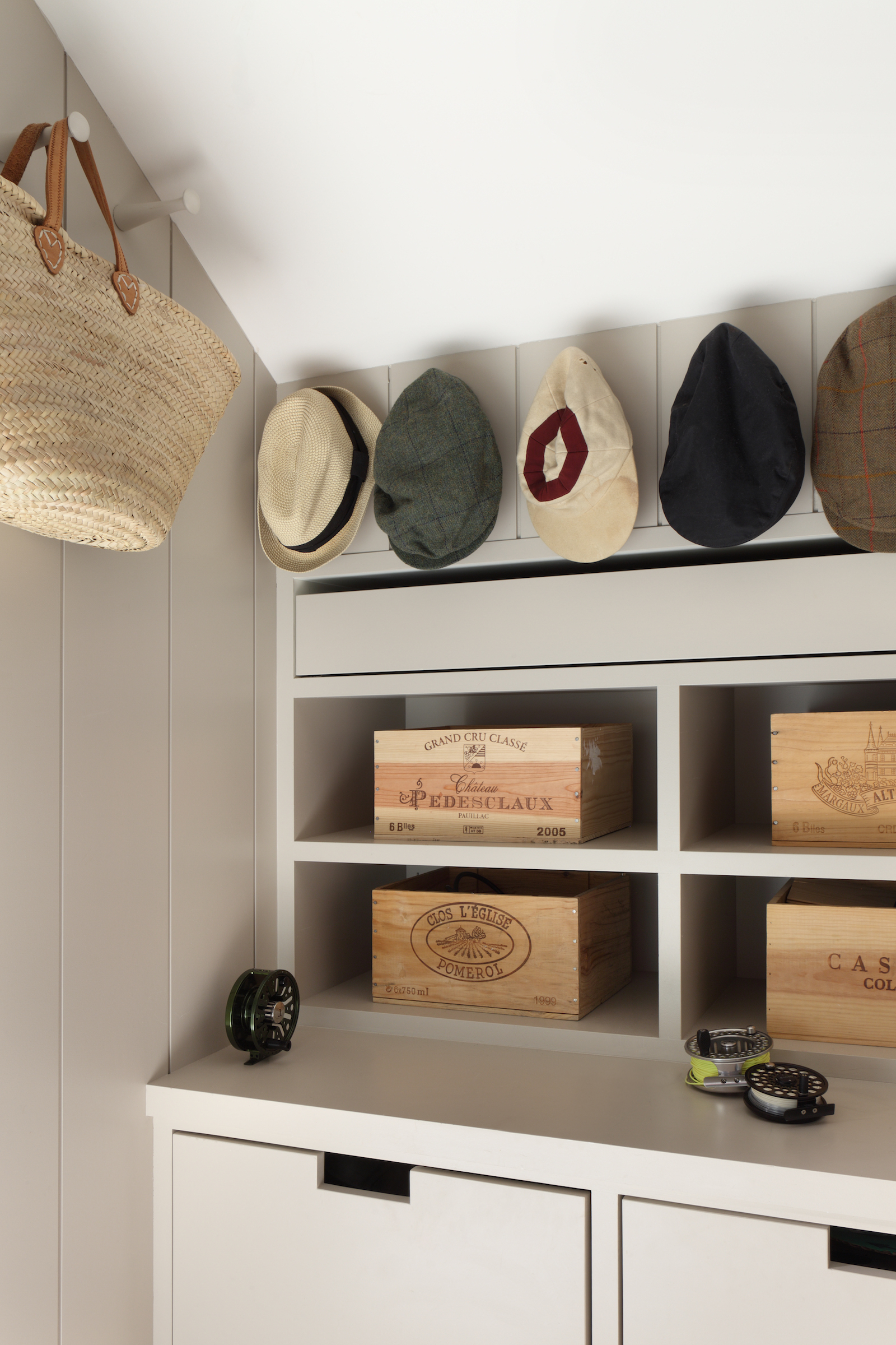
This space also acts as a boot room, where you can remove coats and shoes on entering the home.
TV room
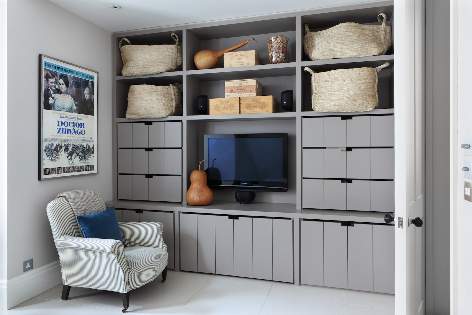
Storage at every turn keeps this family home tidy and organised.
Home office
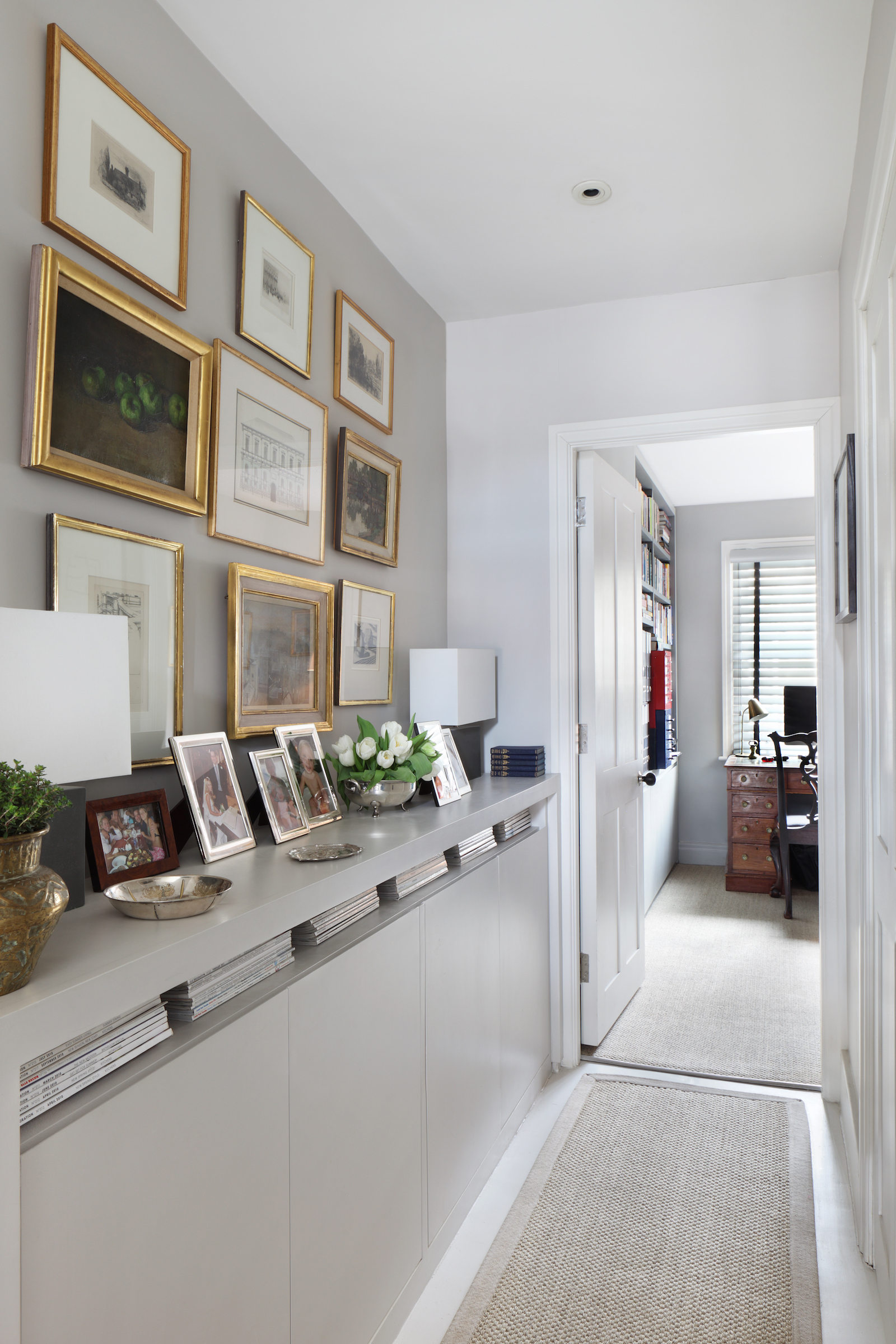
An upstairs corridor (with more built-in storage) leads through to a home office.
Kids room
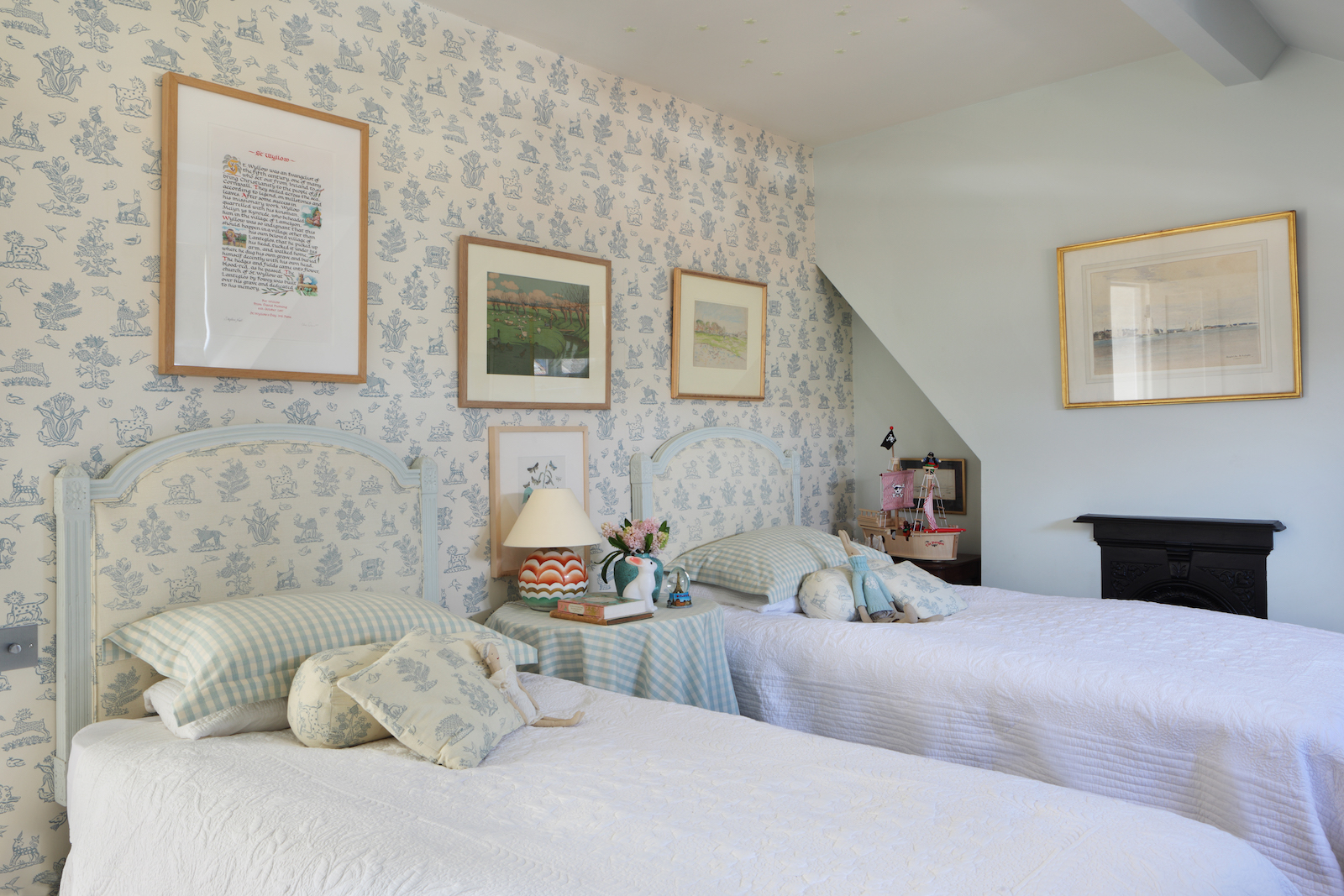
There's a sharing room for the kids, featuring a light blue bedroom colour palette with a vintage-style pattern on the kids wallpaper and matching upholstered headboards.
Kids' bathroom
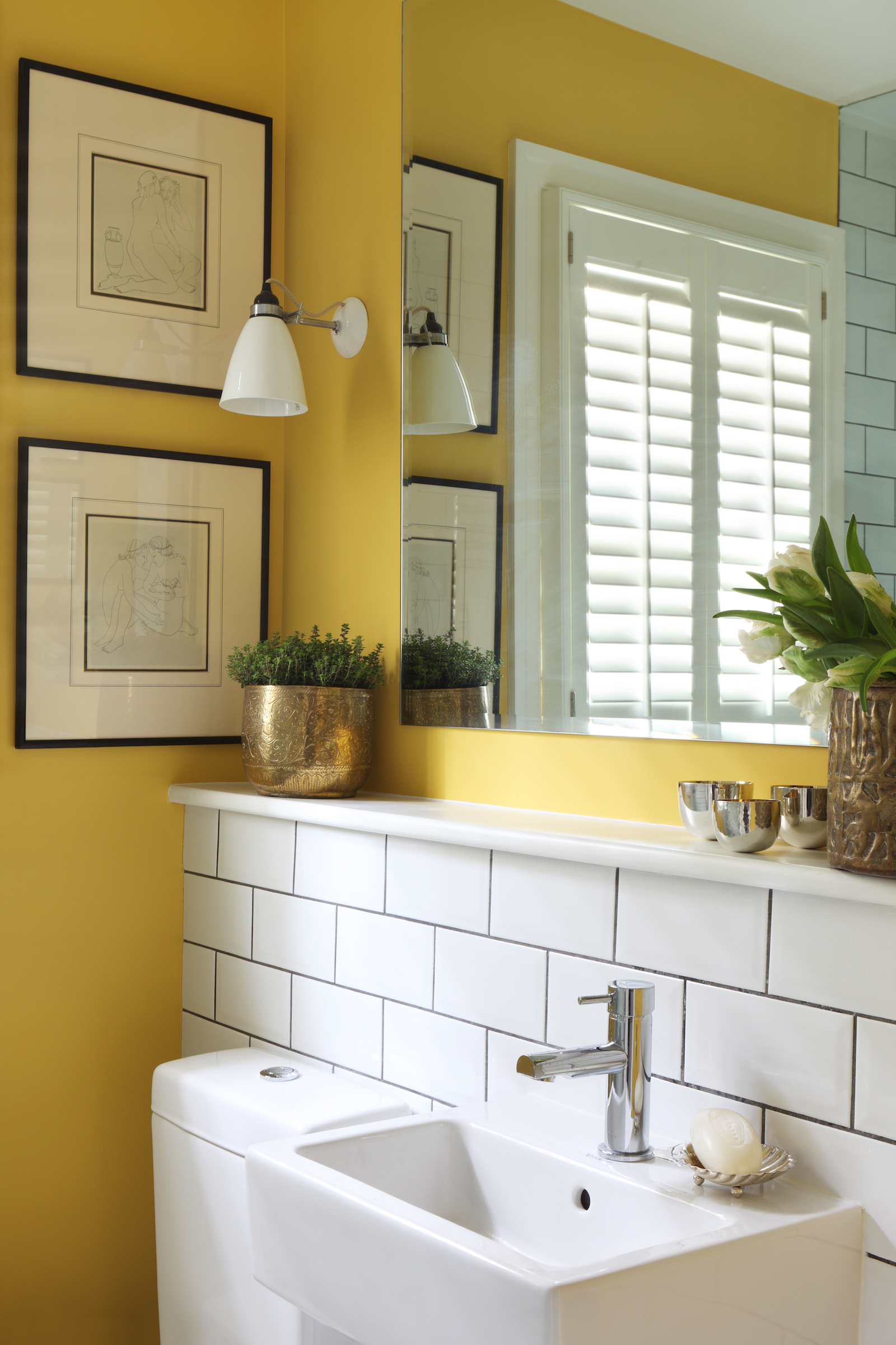
The kids' ensuite bathroom continues the modern traditional theme, with vintage artworks, traditional wall lights and a metro tiled shower area. Warm, saffron yellow is an unexpected bathroom colour choice but feels sunny, happy and friendly.
Master bedroom
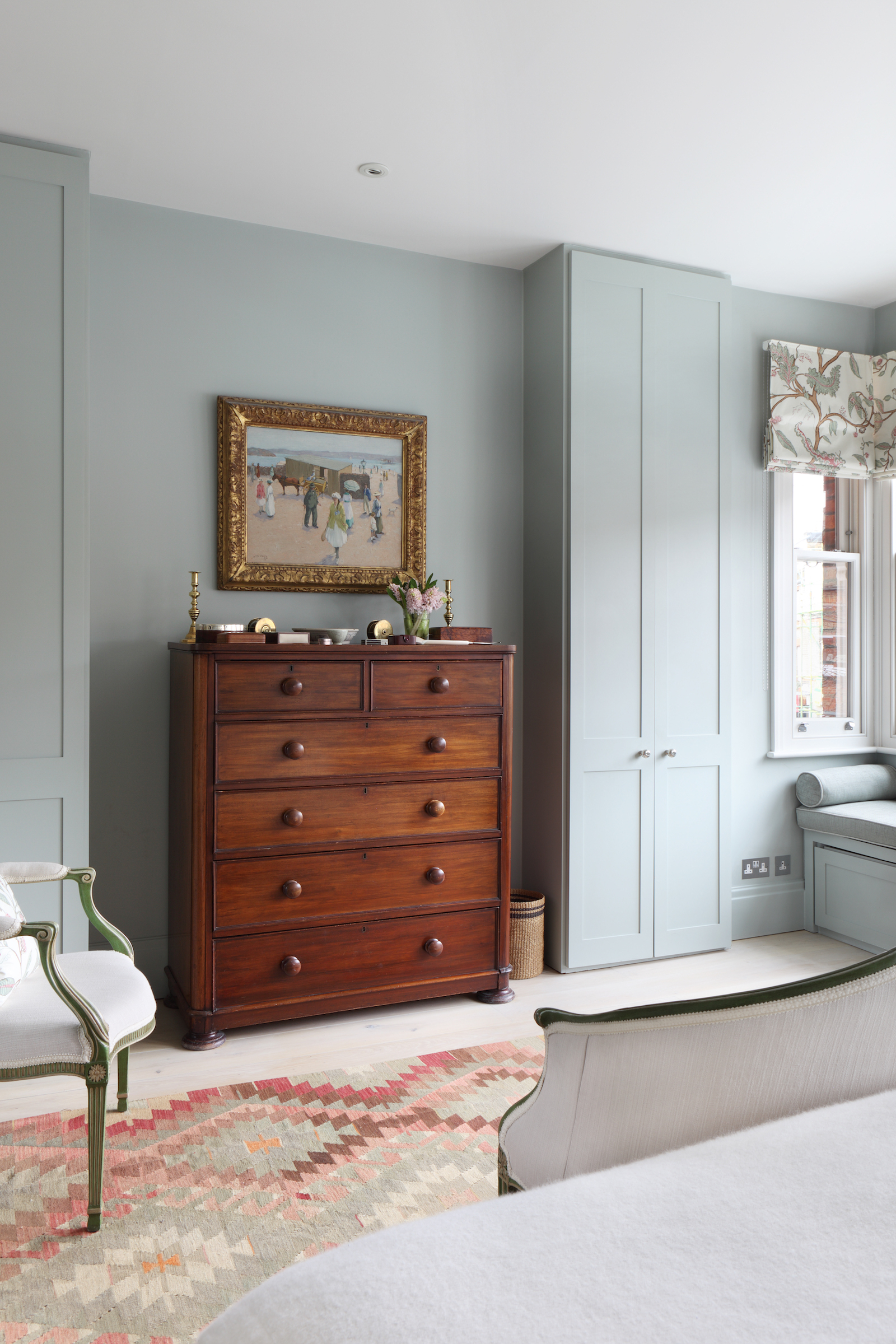
The master bedroom features a calming grey-blue bedroom colour scheme, with built-in bedside drawers to keep things tidy. A ledge above the bed is a creative way to display framed art and photographs (and is easier to switch up than a gallery wall).
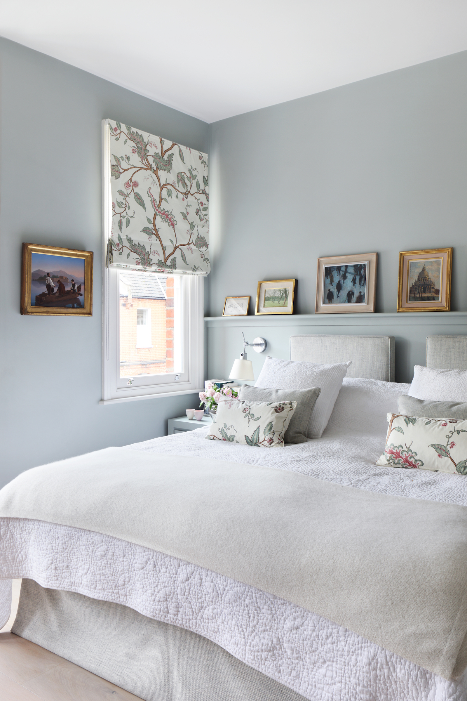
Vintage furniture and classic fabrics pieces lend a classic, period feel, while built-in wardrobes and a built-in window seat with incorporated storage bring the room up to date.
Master bathroom
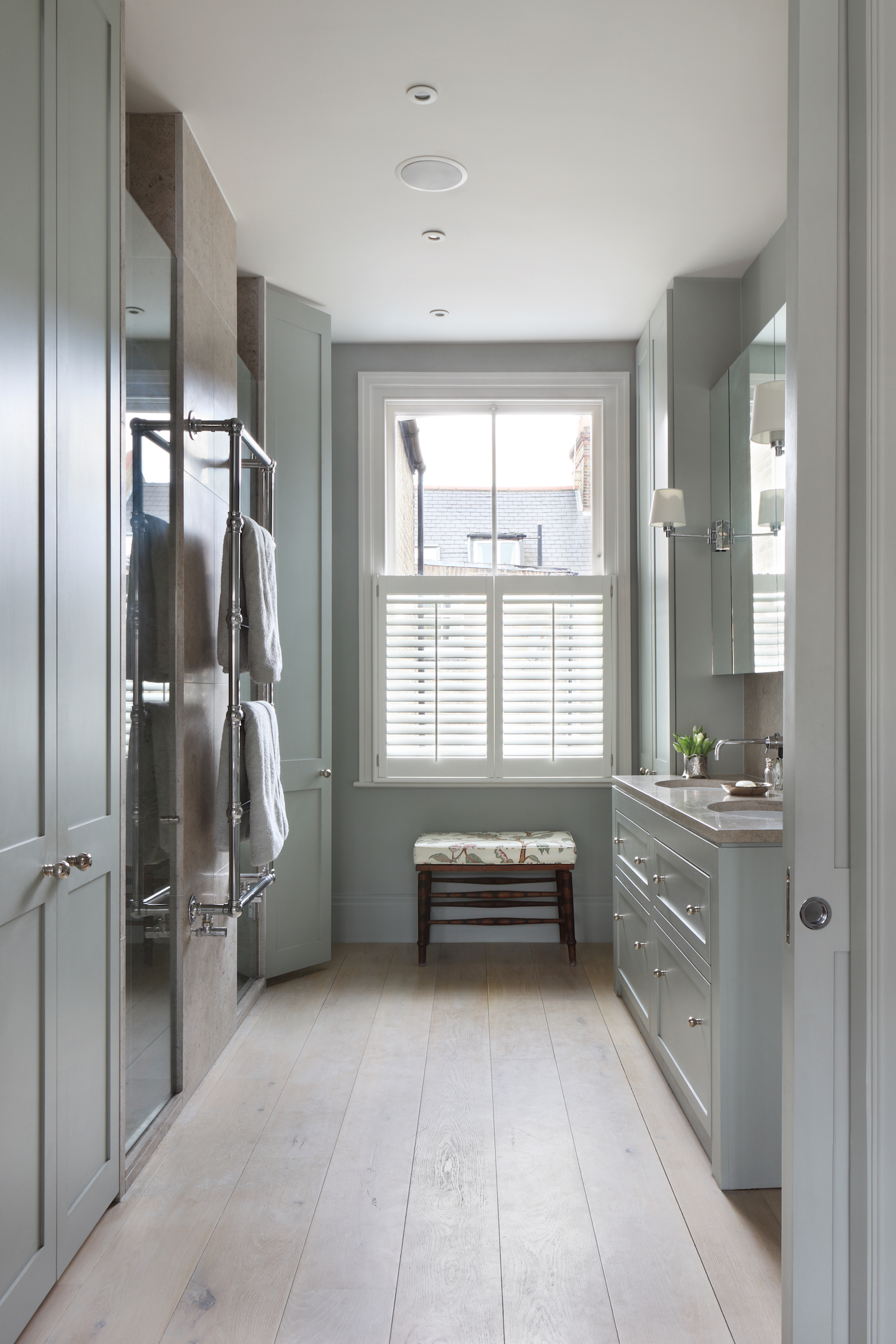
The colour scheme continues into the master bathroom, where there's a generous walk-in shower room and his and hers sinks.

Lotte is the former Digital Editor for Livingetc, having worked on the launch of the website. She has a background in online journalism and writing for SEO, with previous editor roles at Good Living, Good Housekeeping, Country & Townhouse, and BBC Good Food among others, as well as her own successful interiors blog. When she's not busy writing or tracking analytics, she's doing up houses, two of which have features in interior design magazines. She's just finished doing up her house in Wimbledon, and is eyeing up Bath for her next project.
-
 The 'New British' Style? This Victorian London Home Embraces Its Owners' Global Background
Warm timber details, confident color pops, and an uninterrupted connection to the garden are the hallmarks of this relaxed yet design-forward family home
By Emma J Page
-
 Muji Living Room Ideas — 5 Ways to Harness The Calming Qualities of This Japanese Design Style
Inspired by Japanese "zen" principles, Muji living rooms are all about cultivating a calming, tranquil space that nourishes the soul
By Lilith Hudson