This colorful, maximalist home was inspired by the whimsical designs of iconic luxury British hotels
Take a tour of this new-build model home that feels absolutely nothing like a new-build model home
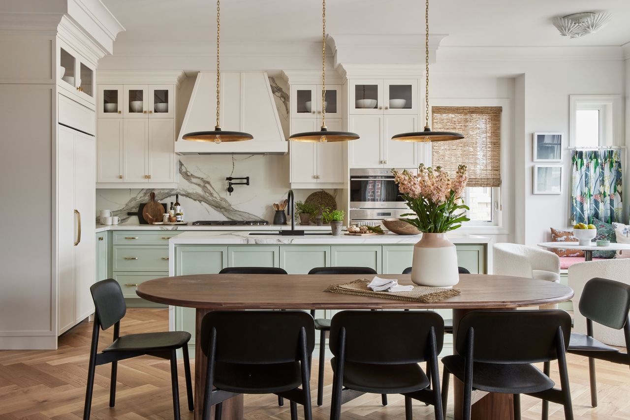

The property
Model homes, while fun to have a look around, play house in, and even get inspiration from, for us always tend to look like model homes. There's just something about them that feels... set up. Which of course they are. But when we came across this gorgeous modern home, we had to admit this feels absolutely nothing like a model house.
Designed by Toronto-based interior designer Sabrina Albanese, the interiors were based on and inspired by the whimsy of iconic British hotels. We're talking deep hues, wall-to-wall wallpaper, sumptuous headboards, and bathrooms that feel like they belong in a manor house. And there's a real mix of styles going on here too, Mid-century modern, country rustic, Art Deco, and a touch of effortless Cali vibes in there aswell. So we are just going to swallow our words and take a tour of this unique and inspiring (unmodel-esque) model home...
Kitchen
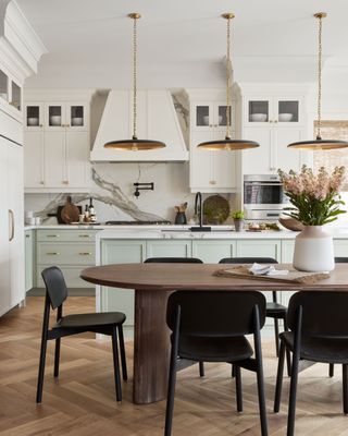
The kitchen feels both contemporary and classic. The Shaker style units and herringbone flooring nod towards the traditional, whereas the mint chosen for the lower units, plus the modern dining set up give the space a modern edge.
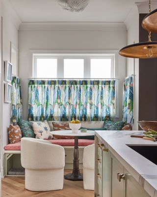
And then you have the fabulous breakfast nook. A great use of space and provides a more casual spot for less formal meal times. The layers of texture are fun and fresh and those cafe curtains add that touch of whimsy that Sabrina brings to every room of this home.
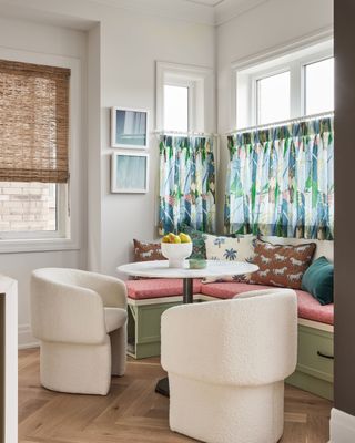
- Find more inspiring kitchen ideas in our gallery.
Family living room
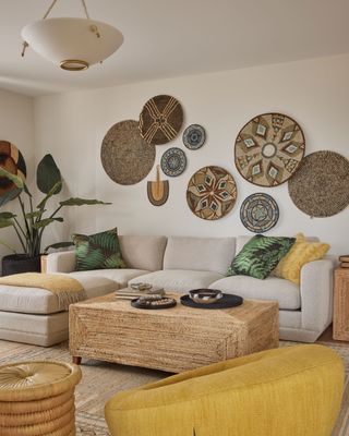
There are two main living rooms, add you'll instantly see each has a very different feel. This small space has a very laid-back, boho feel to it, with a very soft, neutral color scheme and layers of textures.
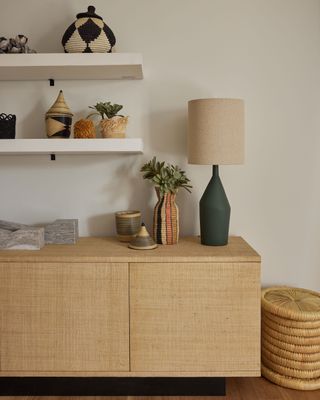
Pops of yellow and green break up all the natural colors, giving the room a fun and vibrant touch.
Sitting room
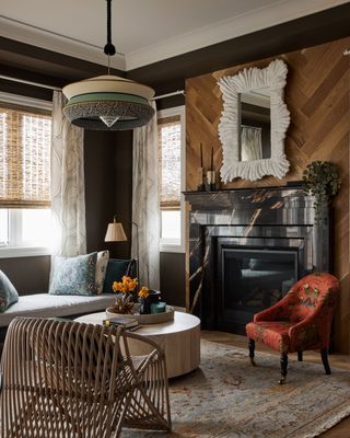
The second sitting room has a much more elegant, grown-up vibe with wood-paneled walls, dark features, and opulent furniture. You can see the British hotel inspiration coming in here with the House of Hackney prints and deep, muted color scheme.
Be The First To Know
The Livingetc newsletter is your shortcut to the now and the next in home design. Subscribe today to receive a stunning free 200-page book of the best homes from around the world.
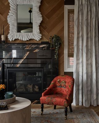
There's an aged look to the room, in total contrast to other sitting room which felt very new and fresh, this room oozes sophistication.
Master bedroom
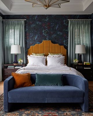
The master bedroom has a similar vibe. The deep blue wallpaper used on all four walls creates an enveloping, cocooning feel and the contrasting mustard yellow headboard adds an extra touch of luxury.
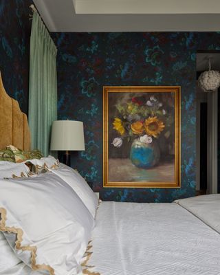
Again, a House of Hackney wallpaper gives it that British, country house feel. Which is only added to with the oil paintings, crisp white bed linen, and traditional decor.
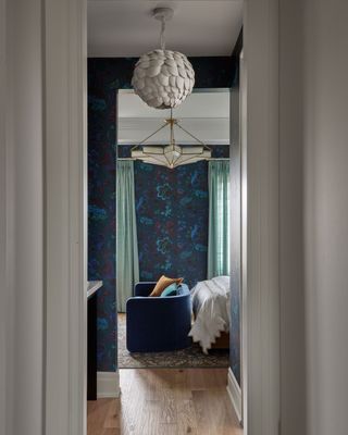
Master bathroom
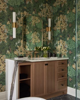
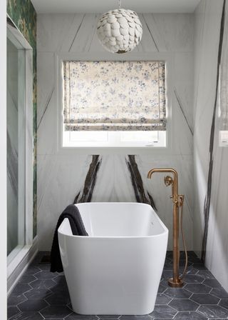
The master bathroom continues that luxury hotel feel, with an eclectic mix of a traditional wallpaper and very modern marble slab fixtures and walls.
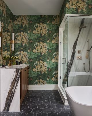
Of course, a freestanding tub is an essential in any hotel bathroom and the simple design is perfect for a space that has so much going on. It just adds to the contemporary twist.
Guest bedrooms
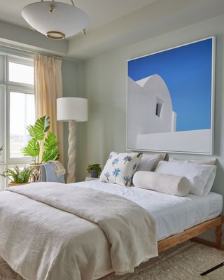
Again, a completely different feel in the guest bedrooms than in the main bedroom. These rooms feel less bougie English hotel and more Palm Beach vacation house. The pale green walls are fresh and calming, the slubby textures of the bedding add a slightly rustic feel, and the print (we are going to assume that it's on a greek island) all come together to create a minimalist, Mediterranean inspired space.
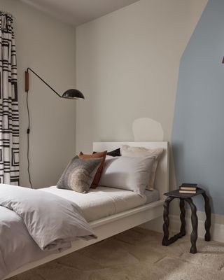
The second guest bedroom, which has been designed with a teenager in mind, has a similarly minimalist design but the colors used here feel cooler and more modern, and the black accents create a clear contrast.
Meditation room
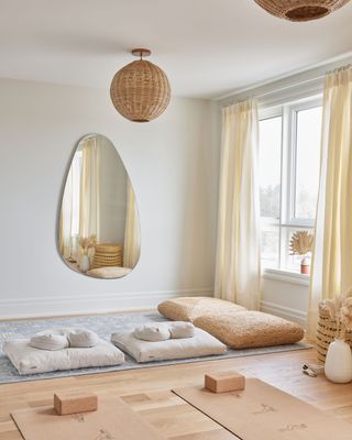
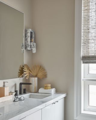
The loft has been converted into a sort of wellness retreat, complete with a Peloton room, meditation room, and an extra spa-like bathroom.
Utility room
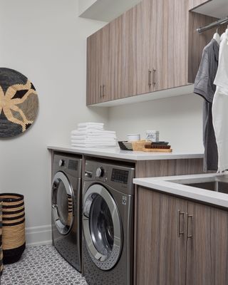
Even the very practical utility room still feels stylish, with cool-toned wooden cabinets, porcelain marble work tops and seagrass decor.

Formerly the Digital Editor of Livingetc, Hebe is currently the Head of Interiors at sister site Homes & Gardens; she has a background in lifestyle and interior journalism and a passion for renovating small spaces. You'll usually find her attempting DIY, whether it's spray painting her whole kitchen, don't try that at home, or ever-changing the wallpaper in her entryway. She loves being able to help others make decisions when decorating their own homes. A couple of years ago she moved from renting to owning her first teeny tiny Edwardian flat in London with her whippet Willow (who yes she chose to match her interiors...) and is already on the lookout for her next project.
-
 These Privacy Screens From QVC Are Just What You Need to Make Any Outdoor Space Feel More Secluded
Your outdoor space should feel like a secluded sanctuary. With privacy screens from QVC, you can make that happen in the most stylish way possible
By Devin Toolen Published
-
 70s Color Palettes That Work for 2025 — 4 Designer-Approved Color 'Recipes' That Feel Modern Enough for Homes Today
It's time to bring out your paisley print and disco shoes — the golden yellows, olive greens, and deep purples of 70s color palettes are making a comeback
By Olivia Wolfe Published