A tall and thin townhouse has been opened up to create an incredible, light-filled modern space
Previously owned by an extreme hoarder in his 80s, this neglected Jersey City townhouse has been transformed into a sleek and minimal family home

The Livingetc newsletters are your inside source for what’s shaping interiors now - and what’s next. Discover trend forecasts, smart style ideas, and curated shopping inspiration that brings design to life. Subscribe today and stay ahead of the curve.
You are now subscribed
Your newsletter sign-up was successful
There’s something special about the city Christa Peters and her husband, Darren call home. Originally from Nova Scotia, Canada, the couple hopped countries teaching English abroad in cities like Seoul and Dubai before settling down in their Jersey City modern home with their two daughters.
‘Jersey City is definitely where we feel at home,’ says Christa. ‘When Darren first suggested it I thought “no way!” because my only reference at the time was Jersey Shore, but I quickly fell in love with the place. It’s much calmer than New York City - which is only a five minute subway ride away - and there’s a real sense of community here.’
Before the pair even found this house they knew they wanted Mowery Marsh Architects on board. ‘I actively wanted something that couldn’t be restored,’ Christa explains, ‘as I didn’t want to feel any guilt about ripping out mouldings, fireplaces or anything that could be repaired.’
Article continues belowChrista wanted modern design ideas; sleek lines, open spaces and practical solutions. The previous owner was an 81-year-old hoarder who bought the house in the 1960s and slowly started filling every floor with his stuff. ‘He was such a sweet guy but he really let the house go. It was like something out of a TV show; a little trail leading through mountains of old boxes up to your waist or higher,’ remembers Christa. ‘The back of the house was like a Dr Seuss construction of balconies and extensions that looked like they’d completely fall off.’ Despite this, Christa was excited and knew it was the one.
Kitchen
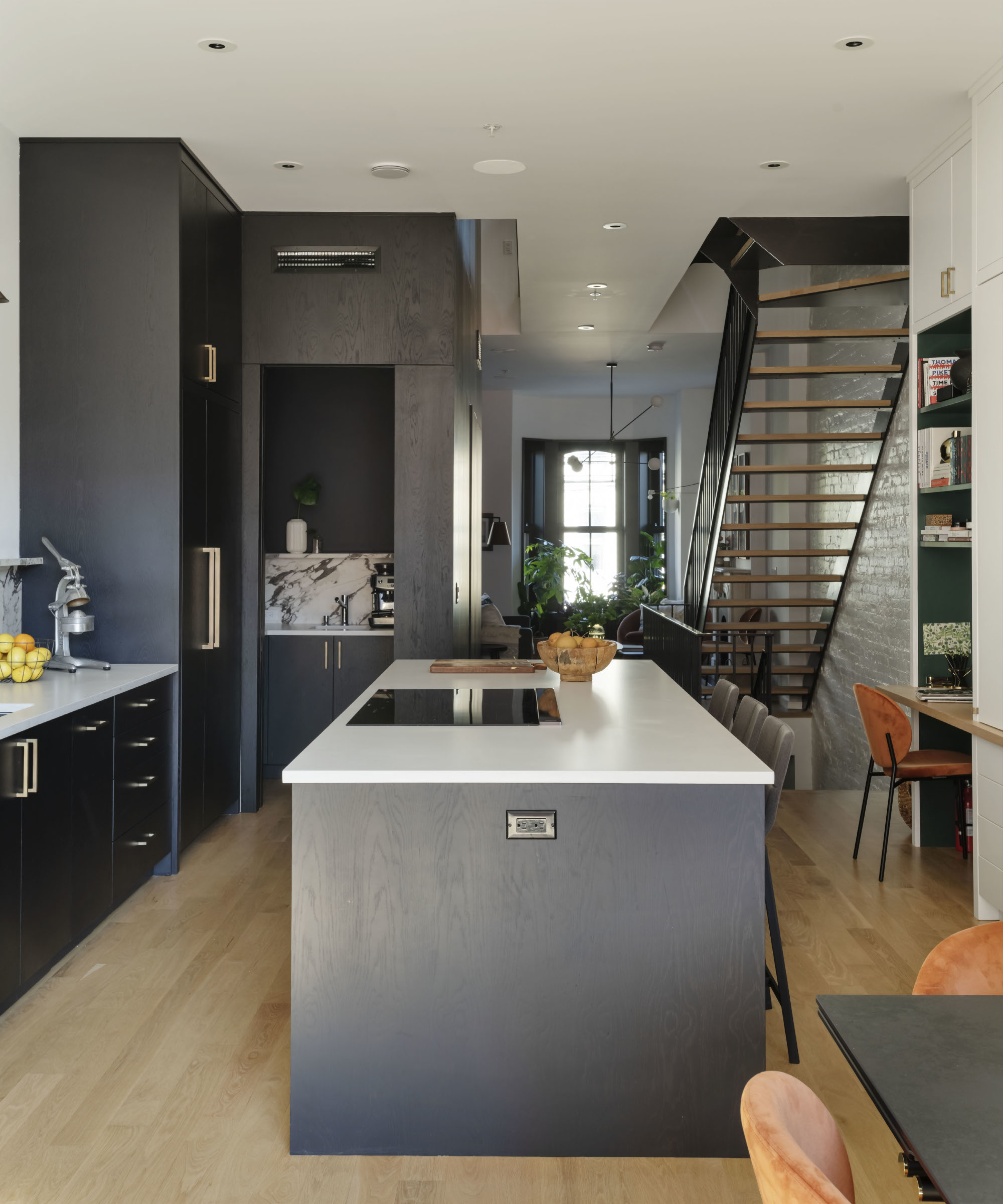
This was a dilapidated house that was ripe for ripping apart and starting over. Christa recalls that even with all the damage and hoarding there was a real sense of the grandeur that the house once had, with its high ceilings, fireplaces and imposing staircase.
The brief was for a home that had a bold design, but also light-filled, unfussy and approachable. Mowery Marsh Architects also took into account the couple’s more pedestrian requests for energy efficiency and concealed storage. ‘Christa and Darren came to us wanting a high contrast aesthetic but to still be warm and inviting,’ says Jennifer of MMA.
‘We love black stained wood because it's dramatic yet has an underlying organic feel given the natural grain, while the white oak floors add warmth that brightens the space and makes it feel more expansive.’
The Livingetc newsletters are your inside source for what’s shaping interiors now - and what’s next. Discover trend forecasts, smart style ideas, and curated shopping inspiration that brings design to life. Subscribe today and stay ahead of the curve.
Reading nook
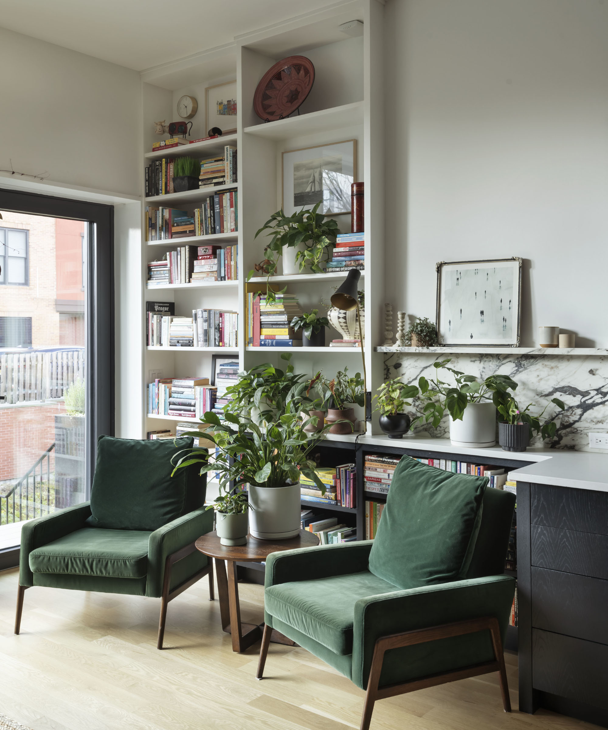
‘The tricky part was getting more light into quite a tall, narrow building,’ explains Jen. Modern design ideas with glass were needed, so floor-to-ceiling glass was chosen in the dining space to help bring sunshine deep into the house and light floods down into the centre of the building via the glass courtyard.
Dining space
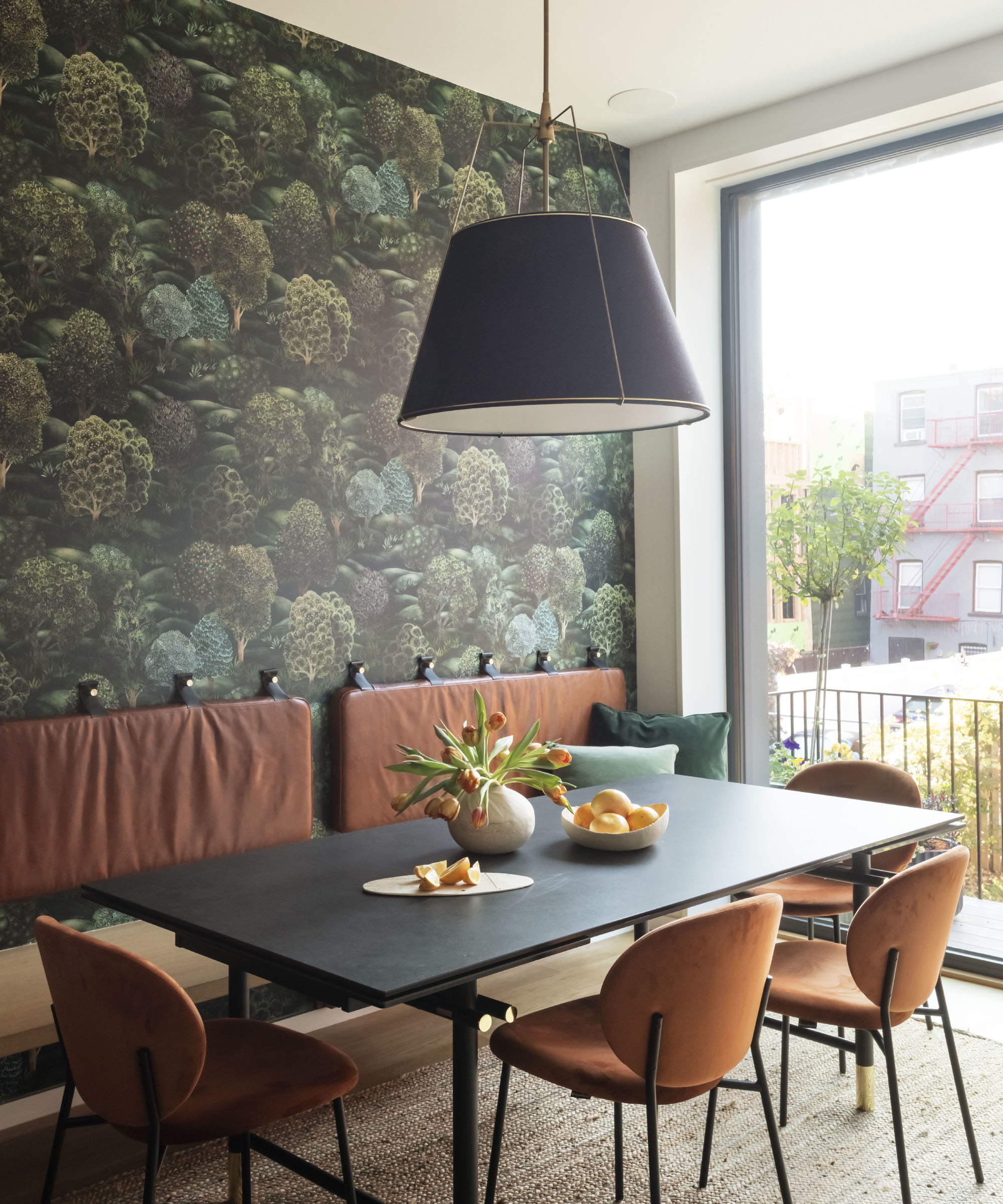
Once the architectural elements were complete, interior designer Elaine Santos came on board. 'The wallpaper in the dining room was a way to symbolically bring the outdoors in and give a little depth and dimension to a space that would otherwise feel very narrow,' she says.
'I was really influenced by the juxtaposition of pieces; zoning a space with very traditional wallpaper and contemporary furniture, because that's what the architecture was doing; it's a traditional home with modern clean lines. I bounced off of that.'
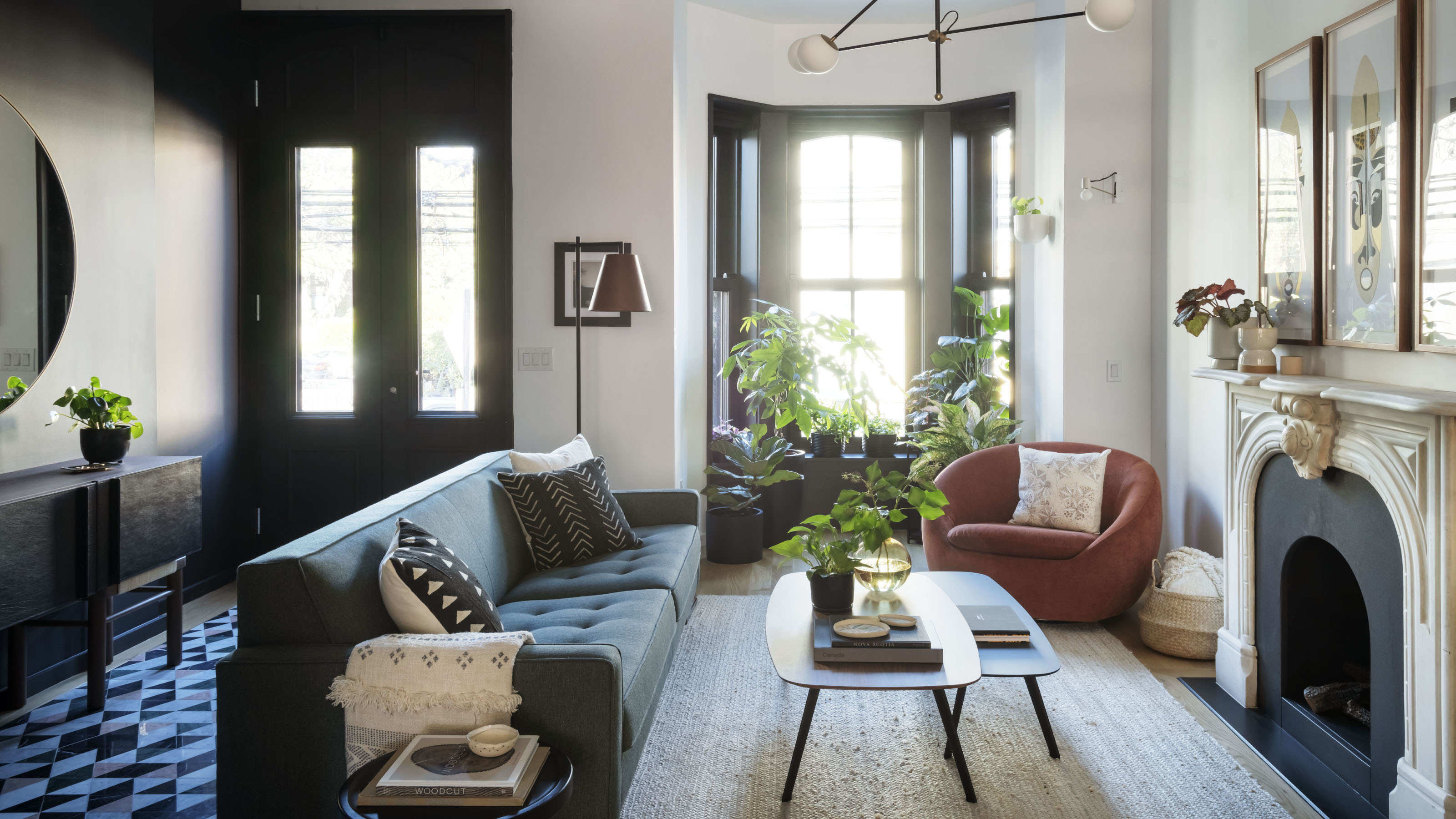
Entrance hall and living room
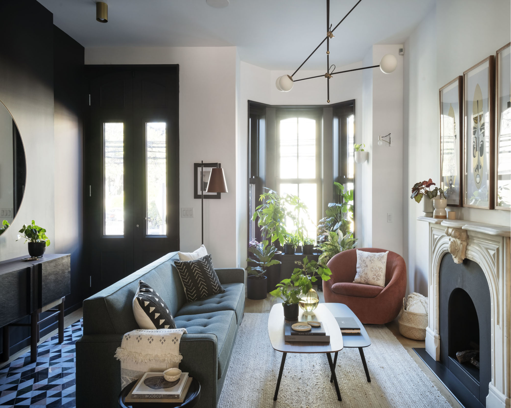
'They’re a young family and Christa didn’t want anything to feel too precious,’ adds Elaine. ‘So we made the ‘formal’ elegant living room less so by making it inviting and family friendly; we used high performance fabrics and integrated natural materials wherever we could via woven rugs and fun wallpapers.’
Powder room
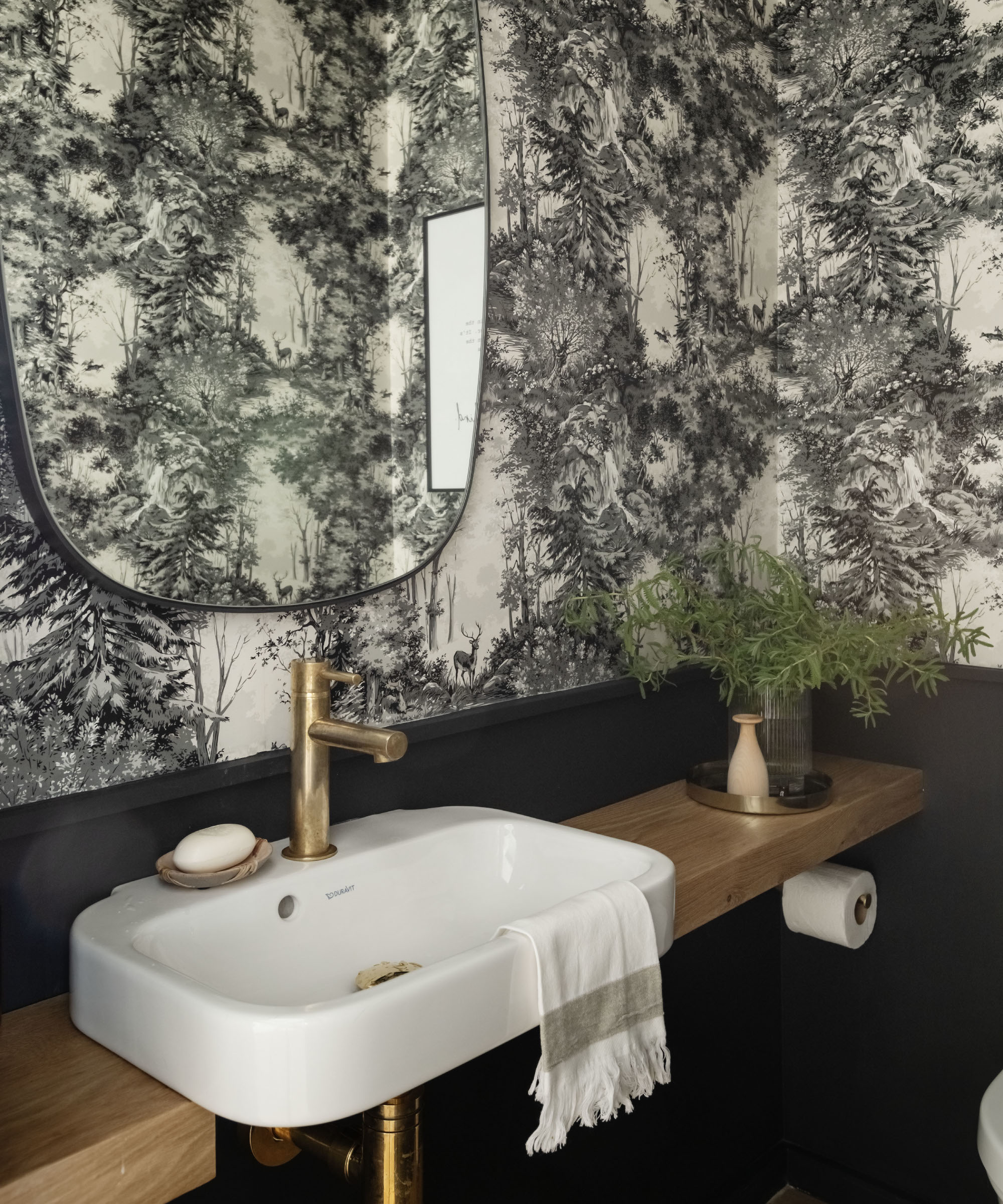
The central core that's clad in black wood provides functional yet tucked away spaces to keep things streamlined; a mudroom, powder room and pantry on the parlour floor and a bathroom and utility on the floor above. It leads all the way up to the top floor where it turns into a glass encased courtyard.
Main bedroom
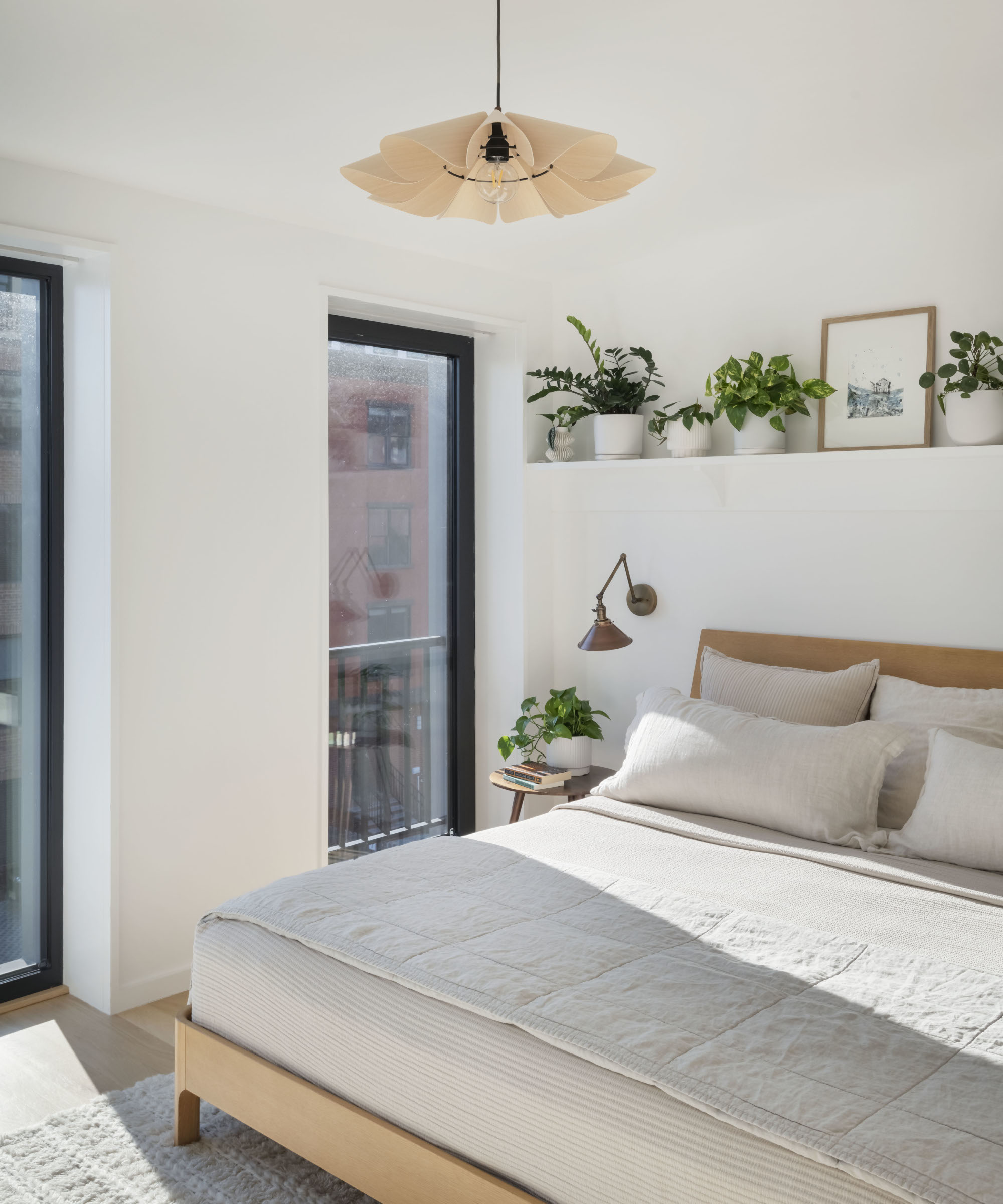
The top floor features the grown up space just for Christa and Darren to enjoy. Included is a pared-back main bedroom, calm spa-like bathroom overlooking a private courtyard as well as another bedroom-cum-office space. Green plants liven up and bring color to this neutral space.
Kids room
The result is a home that’s bespoke to them: ‘the pantry shelves are sized just right for our storage jars, and the cordless vacuum is housed in the cupboard next to the bar, says Christa.
‘Not very sexy, but having a place for everything is what really allows the design to shine and makes the space such a pleasure to live and work in. It’s been a year and the novelty still hasn’t worn off.’

As the Houses Editor on Livingetc, Rachel has been obsessed with property ever since she was a kid. With a diploma in interior design and more than a decade working on interior magazines under her belt, she feels very at home sourcing the best contemporary houses the world has to offer for Livingetc. It's not just the day job either, she admits she's spent a scary amount of her own time researching schemes for her own renovations - scrolling Instagram, stalking Rightmove and Modern House, flicking through magazines and snooping in other peoples' windows - so she really does live and breathe houses on a daily, if not hourly, basis. Before Livingetc, Rachel had a stint finding homes for Ikea Family magazine where she was lucky enough to gallivant around the world on shoots meeting and interviewing interesting people, all with a very keen eye for blending high-end design with everyday items from Ikea. It inspired her to not be afraid of mixing new and old, expensive and affordable, vintage and modern and so Rachel's current Victorian terrace in north London is very much an updated, contemporary take on a period property; think open-plan modern kitchen with concrete floors, feature fireplaces and her grandmother’s paintings on the walls. Rachel is currently crushing on reeded glass, large gingham prints, squishy curved furniture; like Buchanan Studio’s Studio chair, and vintage wall sconces; she especially adores Retrouvius for sourcing antique finds and feels inspired by Lonika Chande, Beata Heuman and Matilda Goad and already can’t wait to start planning her next home, wherever that might be.