Tour an artistic, bright and quirky New York Art Deco apartment
This skyscraper home in a New York Art Deco apartment may be a calm retreat from the bustling New York streets down below, but it’s also full of verve and excitement, thanks to a very quirky take on design ideas
THE PROPERTY
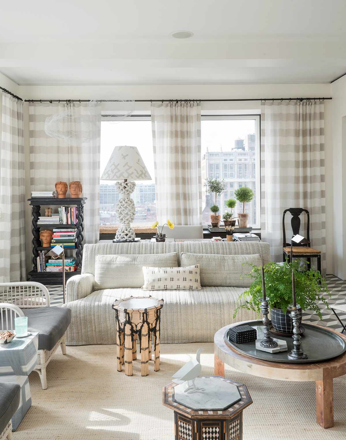
An New York Art Deco apartment in a skyscraper, built in 1926, in Brooklyn Heights, New York. It has a hallway, open-plan kitchen-diner, living room/study area, utility room, master bedroom with en suite and walk-in closet, plus another bathroom.
See: More stunning modern homes for ultimate decor inspiration
LIVING ROOM
New York is a noisy city, but inside this 11th-floor Brooklyn apartment it’s q-u-i-e-t. The sirens and cars below are silenced by the height and the views of Manhattan, New Jersey and the Statue of Liberty are spread in front of this living room like an estate agent’s dream.
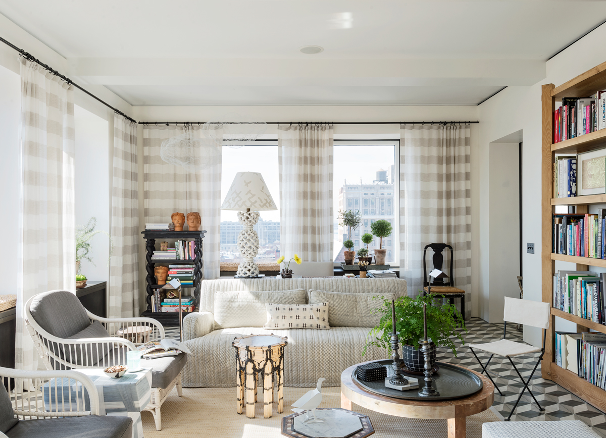
The home is filled with one-off pieces, such as these folding garden chairs (pictured below), which the home owner covered in yarn (each one has enough to stretch 45 miles and took two months to complete), and the steel table with shovels and a fork for legs.
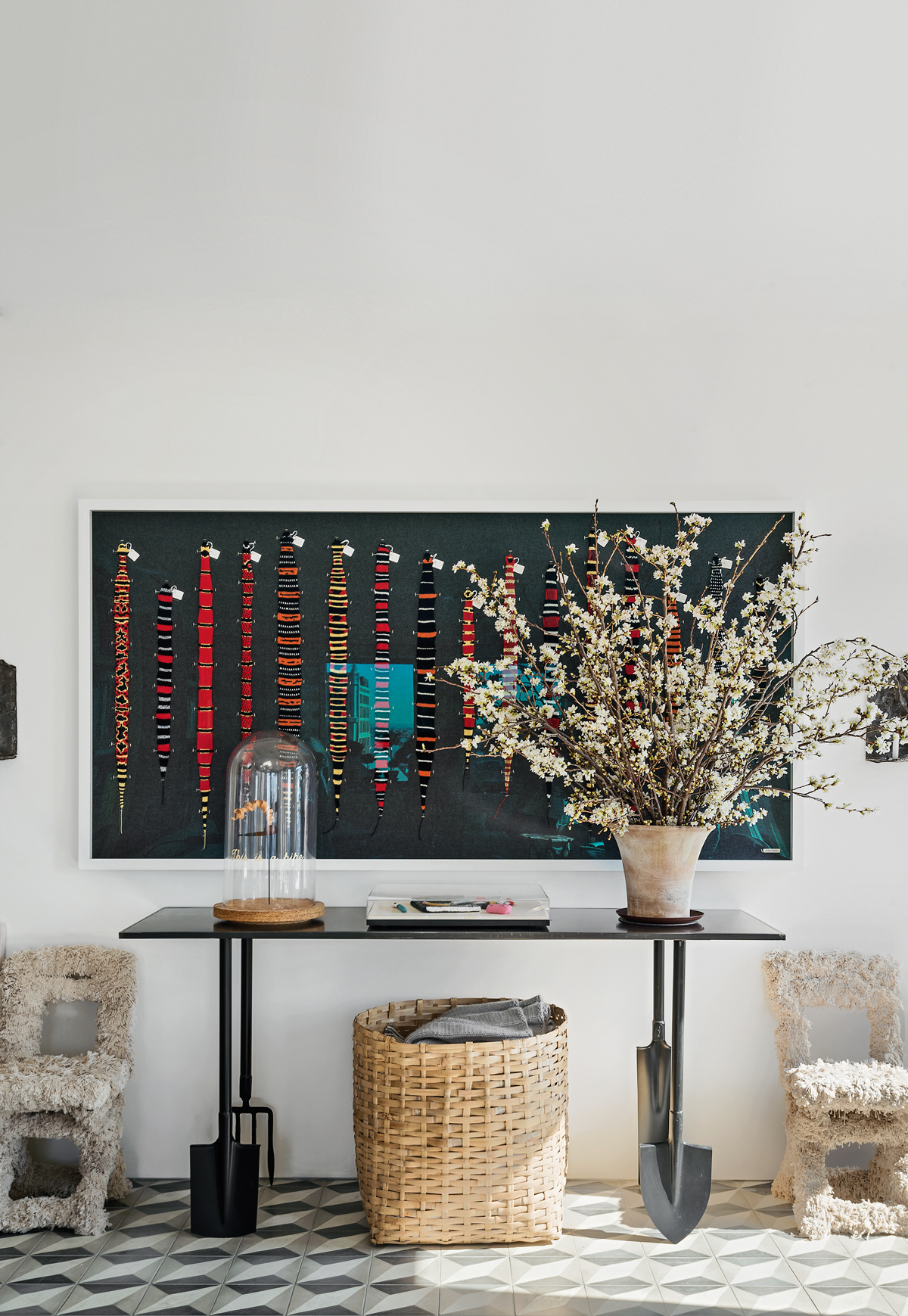
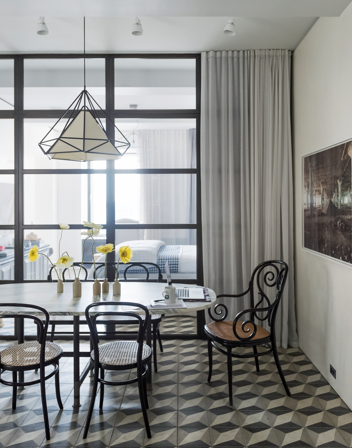
A gem located in an Art Deco tower, the apartment had been converted from offices during the cowboy developing days of the Eighties, when logical layouts were an afterthought.To create a better sense of flow, architects MADE were hired, provided with just two references: a sample of a tessellated tile that was found in Miamiand images of glass walls. The tiles now cover the entire floor of the apartment and a glass wall has been added between the bedroom and dining room to bring in more light.
The interiors were done by Jane Schulak, founder of Culture Lab Detroit – a non-profit organisation that connects international designers with local talent in the city. She was able to help discover a mix of one-off pieces by makers from around the world, such as the console table with spades for legs, made in Paris. Her brief was that every room had to have something salvaged and something new.
It’s this combination of quirky items and meticulous architecture that gives the apartment its sense of character and its sense of solidity. The renovation has given it new bones and a new heart.
Be The First To Know
The Livingetc newsletters are your inside source for what’s shaping interiors now - and what’s next. Discover trend forecasts, smart style ideas, and curated shopping inspiration that brings design to life. Subscribe today and stay ahead of the curve.
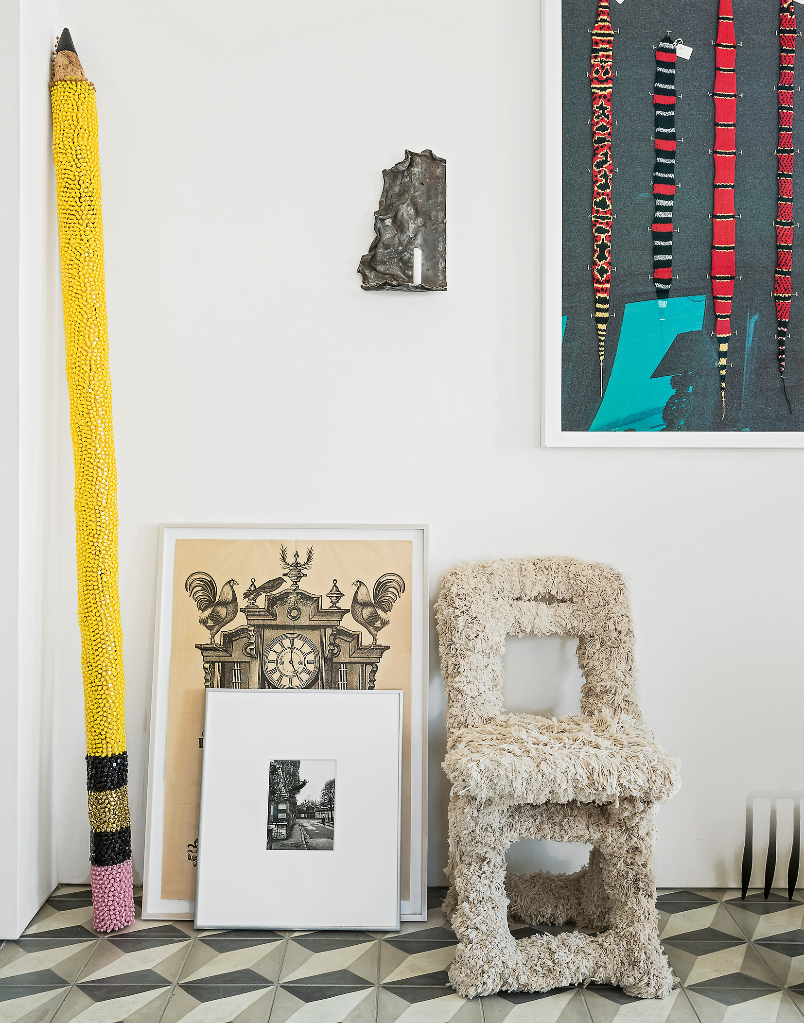
The home owner created the oversized pencil (above) from a wood pole he found in the street and thencovered in 5,000 thumbtacks.
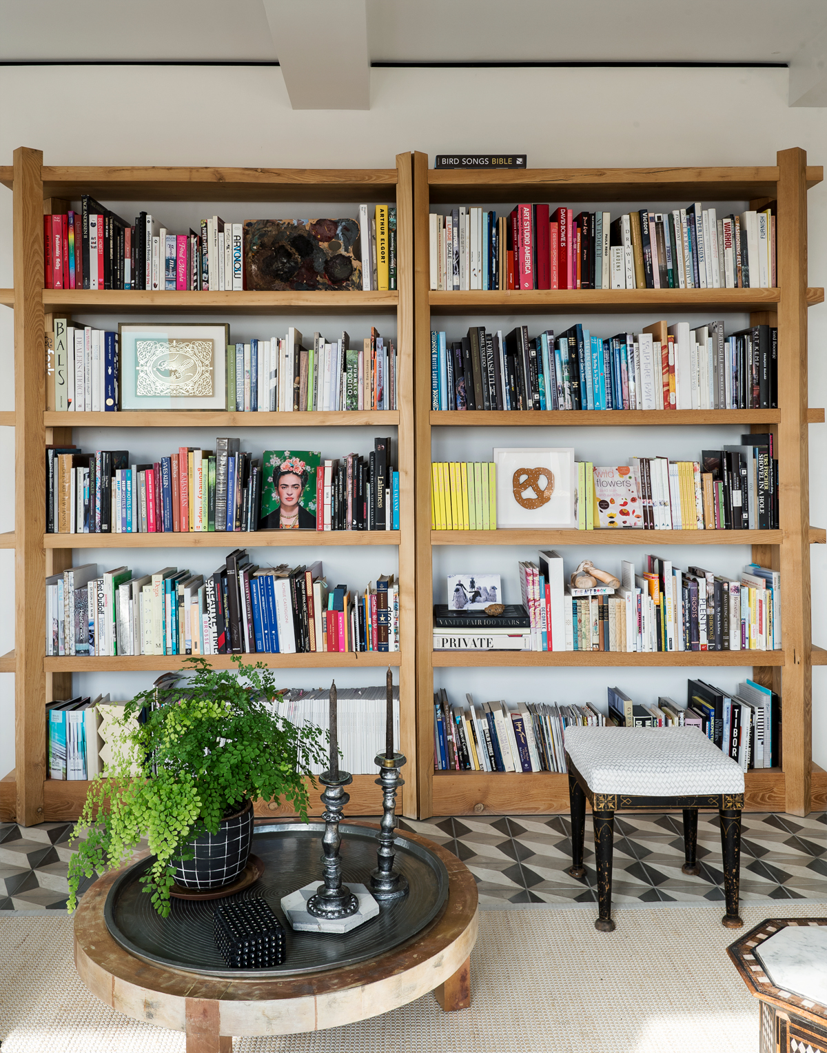
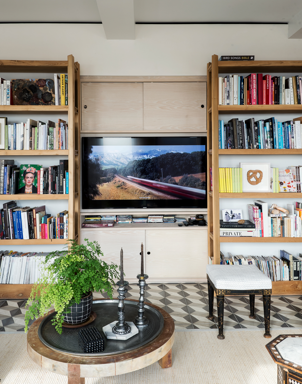
The TV is cleverly hidden inside a sliding bookcase – the bookcases slide away to reveal the wall-mounted TV hidden behind.
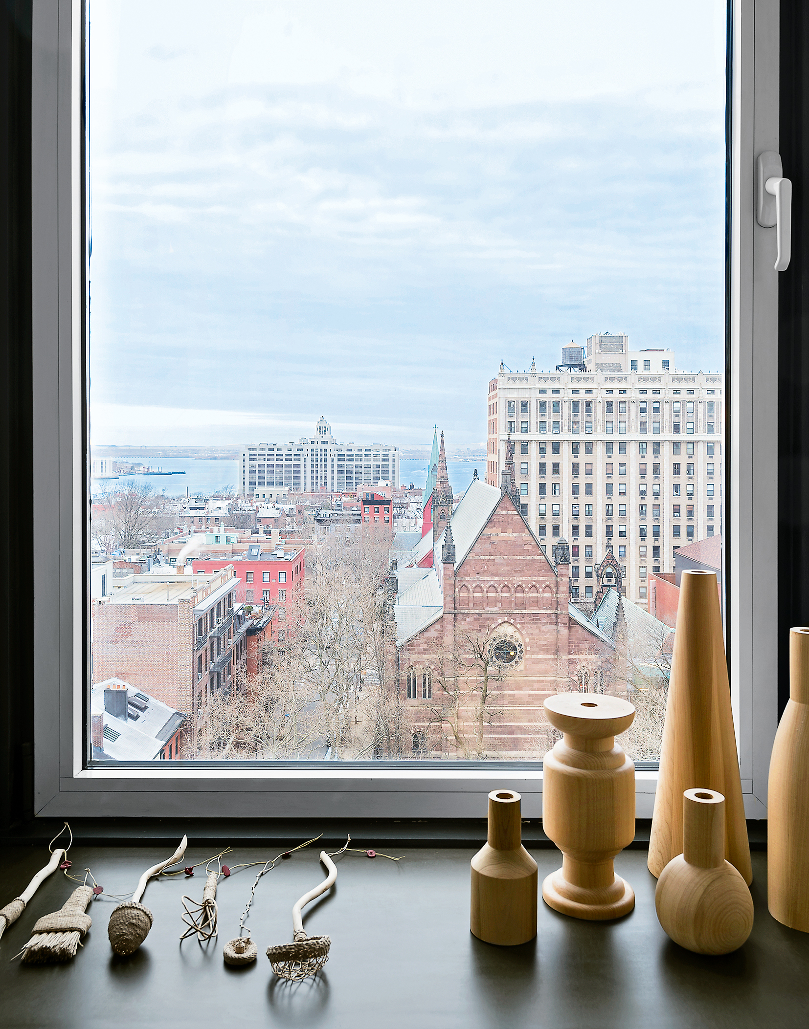
Meanwhile, the walls around the edge of the apartment have been thickened to create deep sills that can be used for display, turning what normally would be empty, unused space into something functional.
STUDY AREA
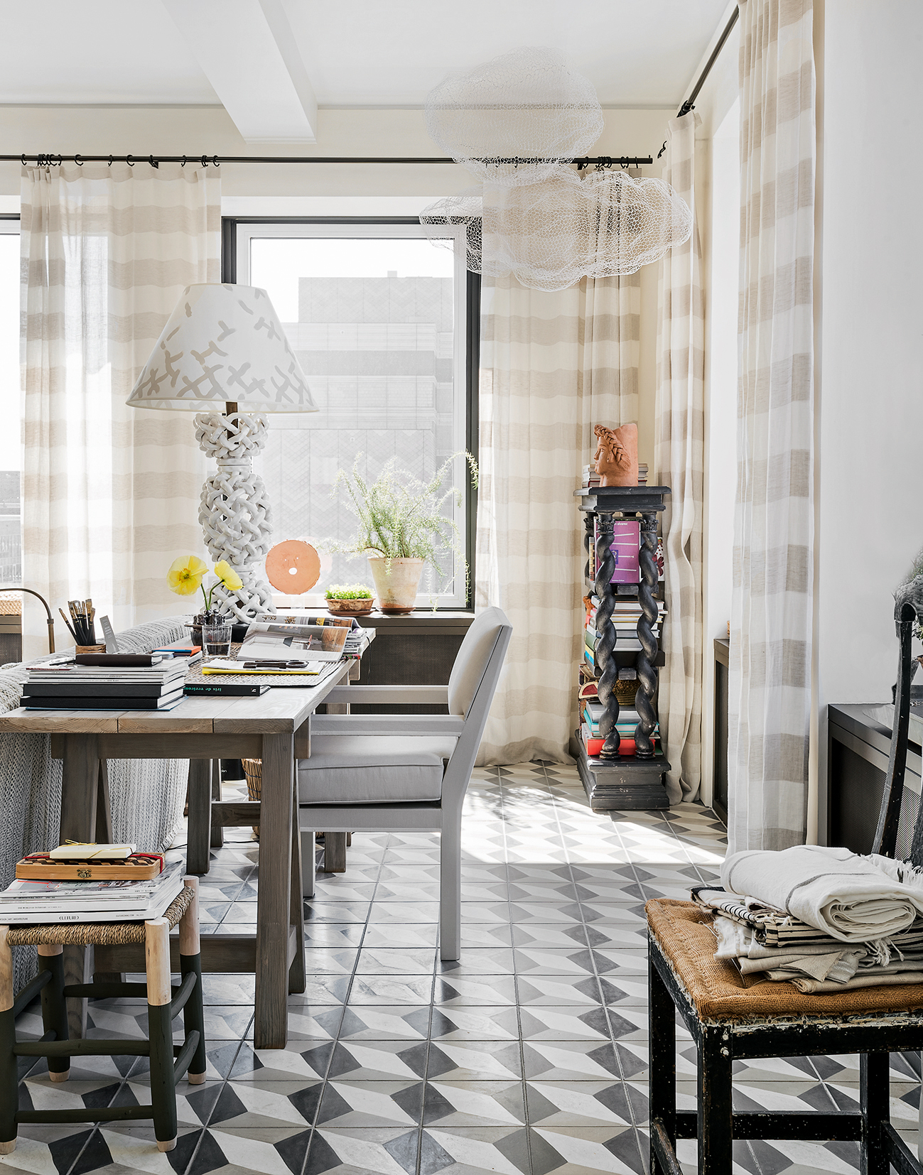
Located at the other end of the living room from the offbeat console table, this space has a bright, sunny aspect, ideal for domestic admin.
See Also: Striking Home Office Ideas
DINING AREA
In the evenings, the sunsets are amazing. A pink haze comes all the way through and casts the whole place in golden light.
KITCHEN
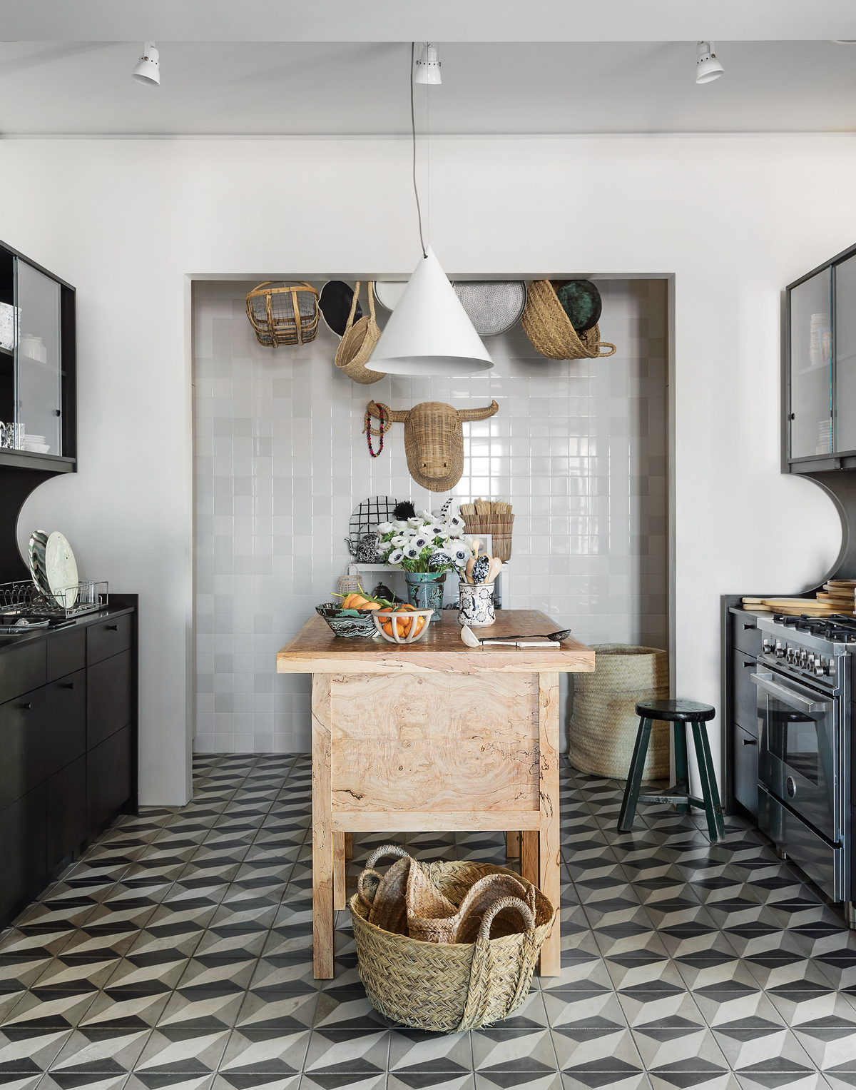
The architects at MADE designed and built the kitchen cabinets and central island unit. The cabinets look like wood, but are, in fact, again made from the Richlite composite. It’s really durable and has a beautiful softness. Black-painted wood just looks like black-painted wood, whereas this has a sense of mystery.
See Also: Modern kitchen cabinet ideas for a contemporary aesthetic
BEDROOM
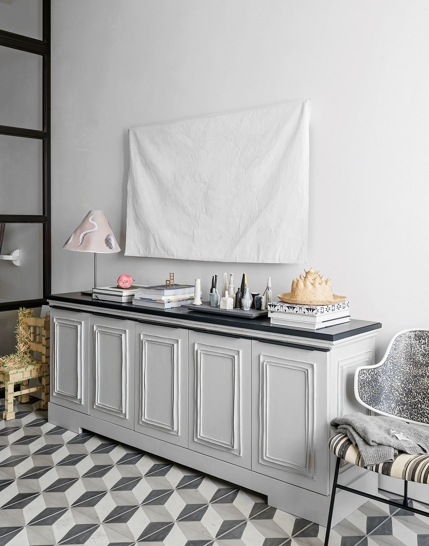
Jane Schulak found French artist Laurent Friesz of Farfelus Farfadets, who created this elegant cabinet using papier-mâché mouldings inspired by 18th-century interiors. The gessoed canvas on the wall is used to conceal the TV.
The Fifties chair in the bedroom came from a hotel in the Catskills.
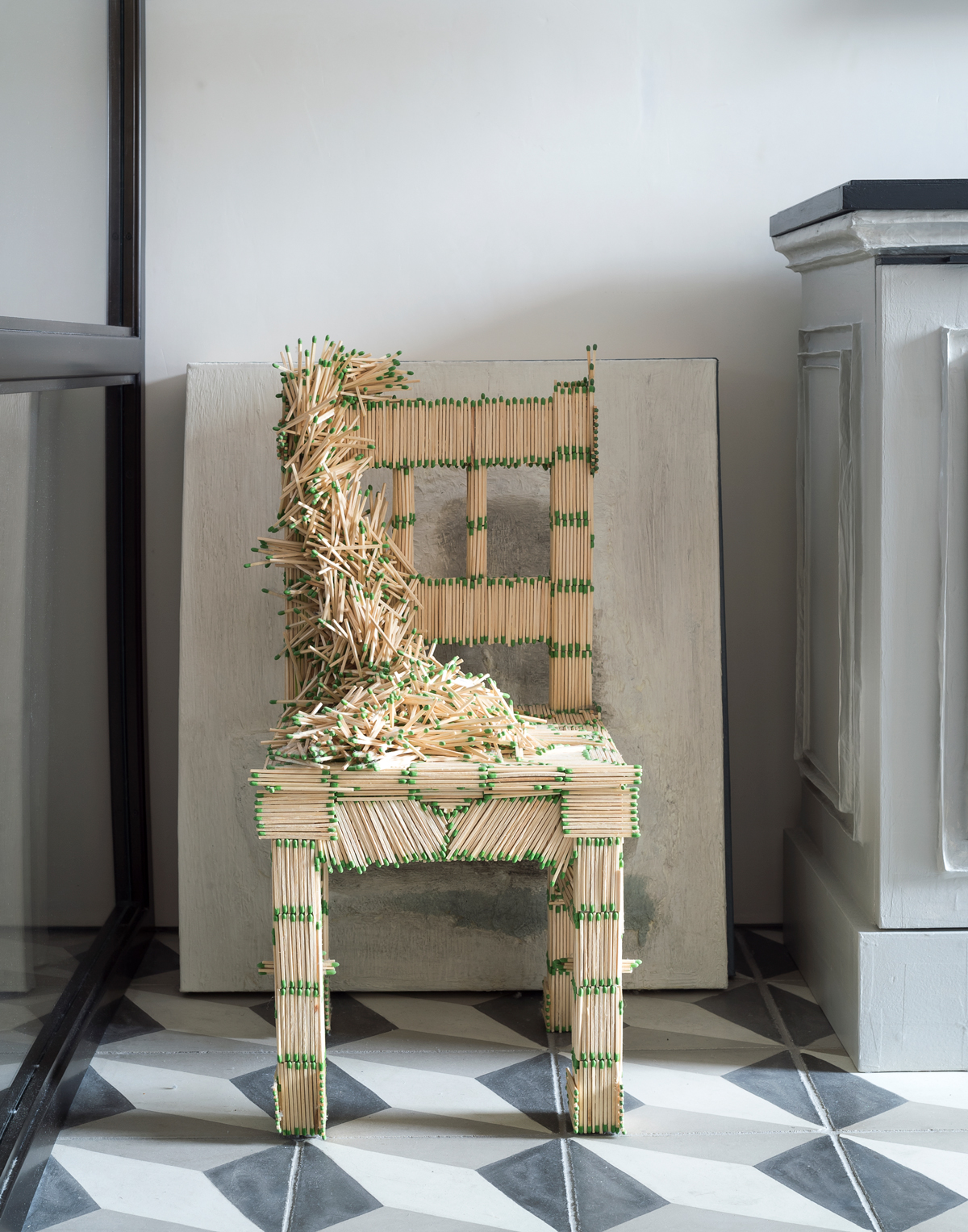
The apartment is like the book in The NeverEnding Story. When you open it up, you discover all these beautiful things, like a fantasy. Some of this home’s most eccentric pieces were created by the home owner, such as the matchstick chairs.
In a clever nod to the area, just beyond the glass partition, the shape of the pendant mirrors the look of the one above the dining table.
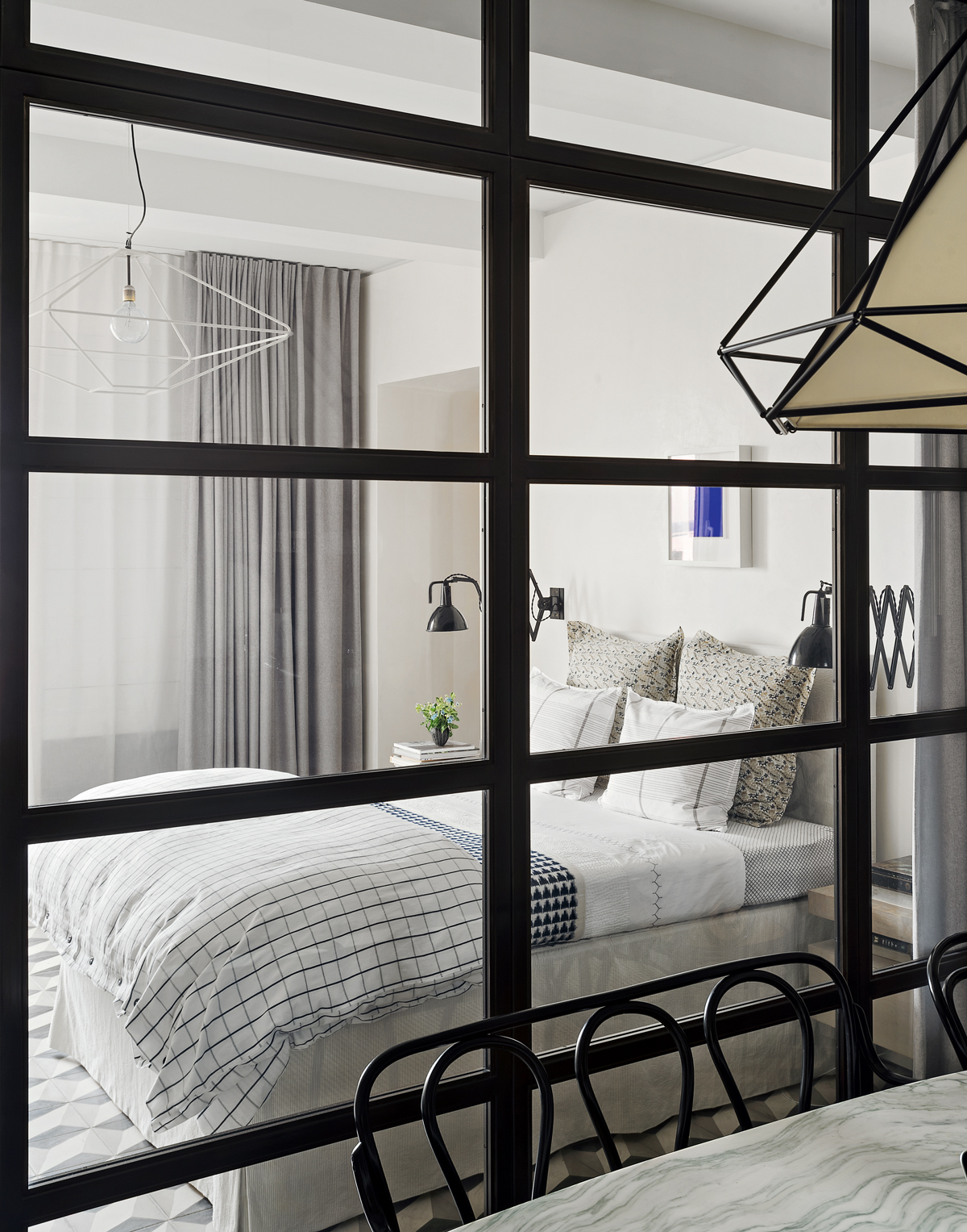
The glazed wall screens off both the en-suite bathroomand a dressing area beyond.
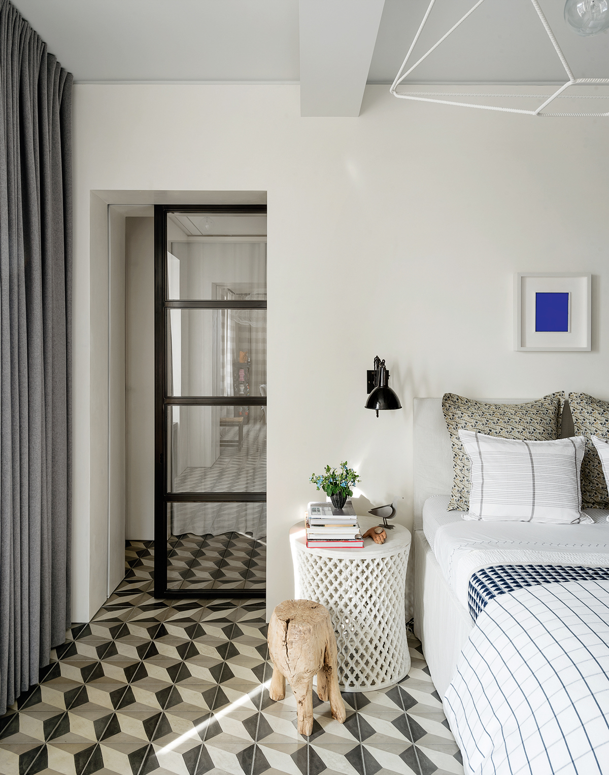
EN SUITE
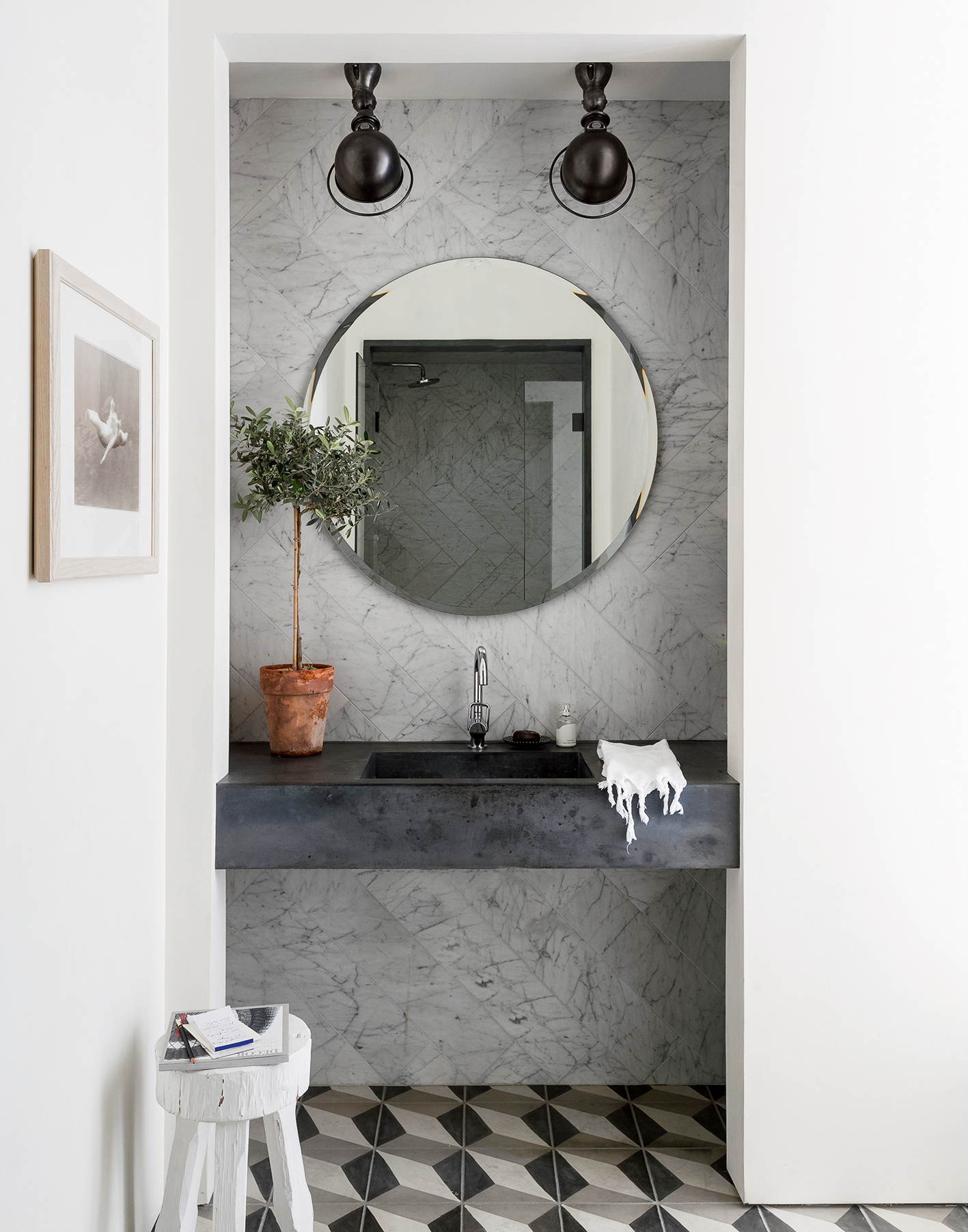
Originally a cavernous room, this space has been transformed into a luxury walk-in bathroom with marble walls and a cast-cement basin.
See Also: Chic Marble Bathroom Ideas
View MADE’s portfolio at made-nyc.com; learn about Jane Schulak’s design-advocacy group at culturelabdetroit.org; discover David’s events company at davidstarkdesign.com; and find Migguel’s artistic itinerary at migguelanggelo.com
Photography ⁄ Matthew Williams
The homes media brand for early adopters, Livingetc shines a spotlight on the now and the next in design, obsessively covering interior trends, color advice, stylish homeware and modern homes. Celebrating the intersection between fashion and interiors. it's the brand that makes and breaks trends and it draws on its network on leading international luminaries to bring you the very best insight and ideas.
-
 Jeremiah Brent Captures the Grit and Glamour of NYC in His New Loloi Collaboration
The TV-famous interior designer looked out of his own window — and hit the pavement — for a collection that turns city spirit into tactile design
By Julia Demer
-
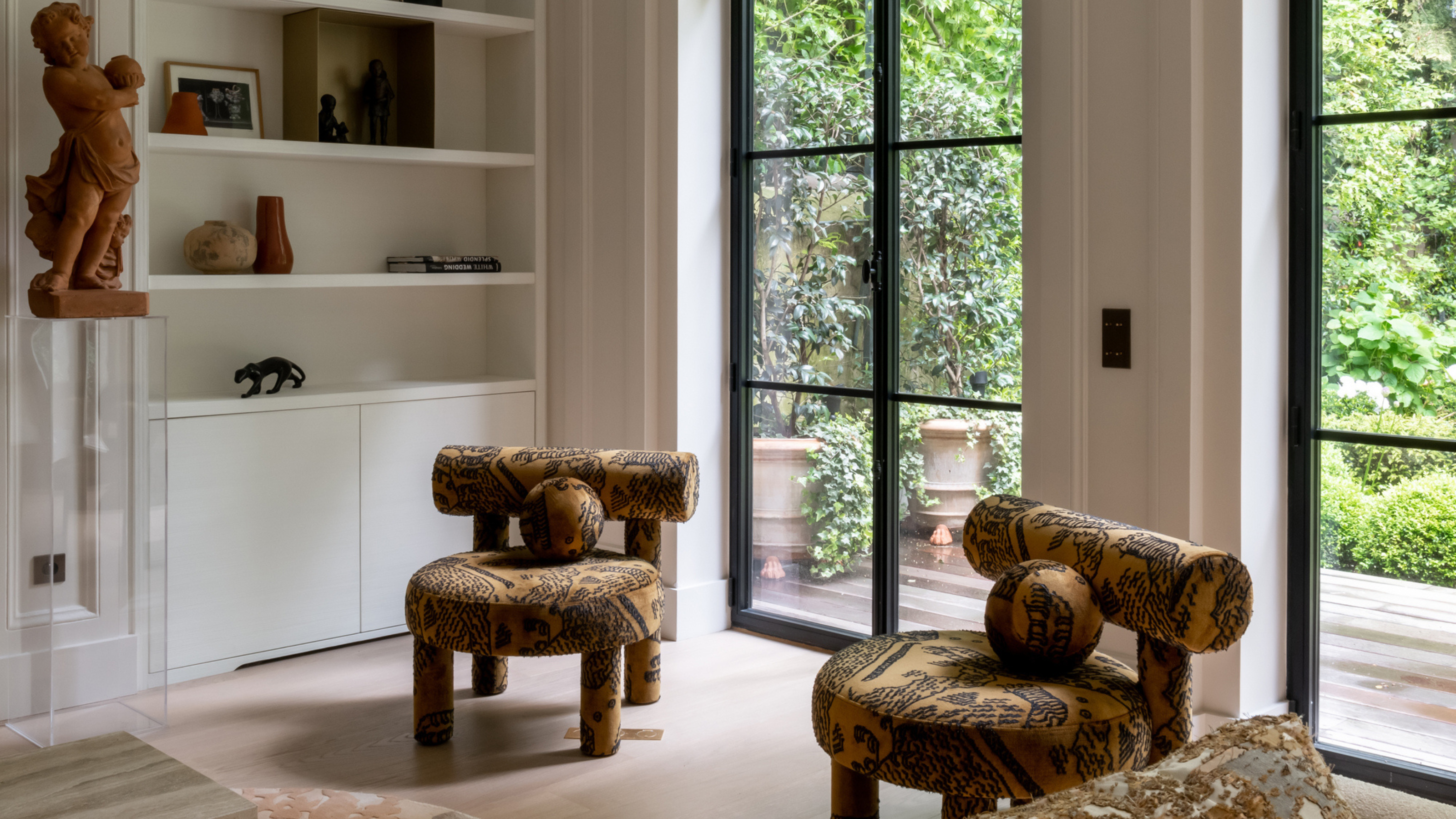 This Specific Fabric Print Is Literally Everywhere Right Now — Here's Why
It's whimsical, artistic, and full of character. We've called it already: Dedar's 'Tiger Mountain' is the fabric that will define 2025
By Devin Toolen