This 19th century apartment is a lesson in combining architectural details with modern design
Unexpected touches of beautiful hues deliver a dreamy quality to this Parisian abode
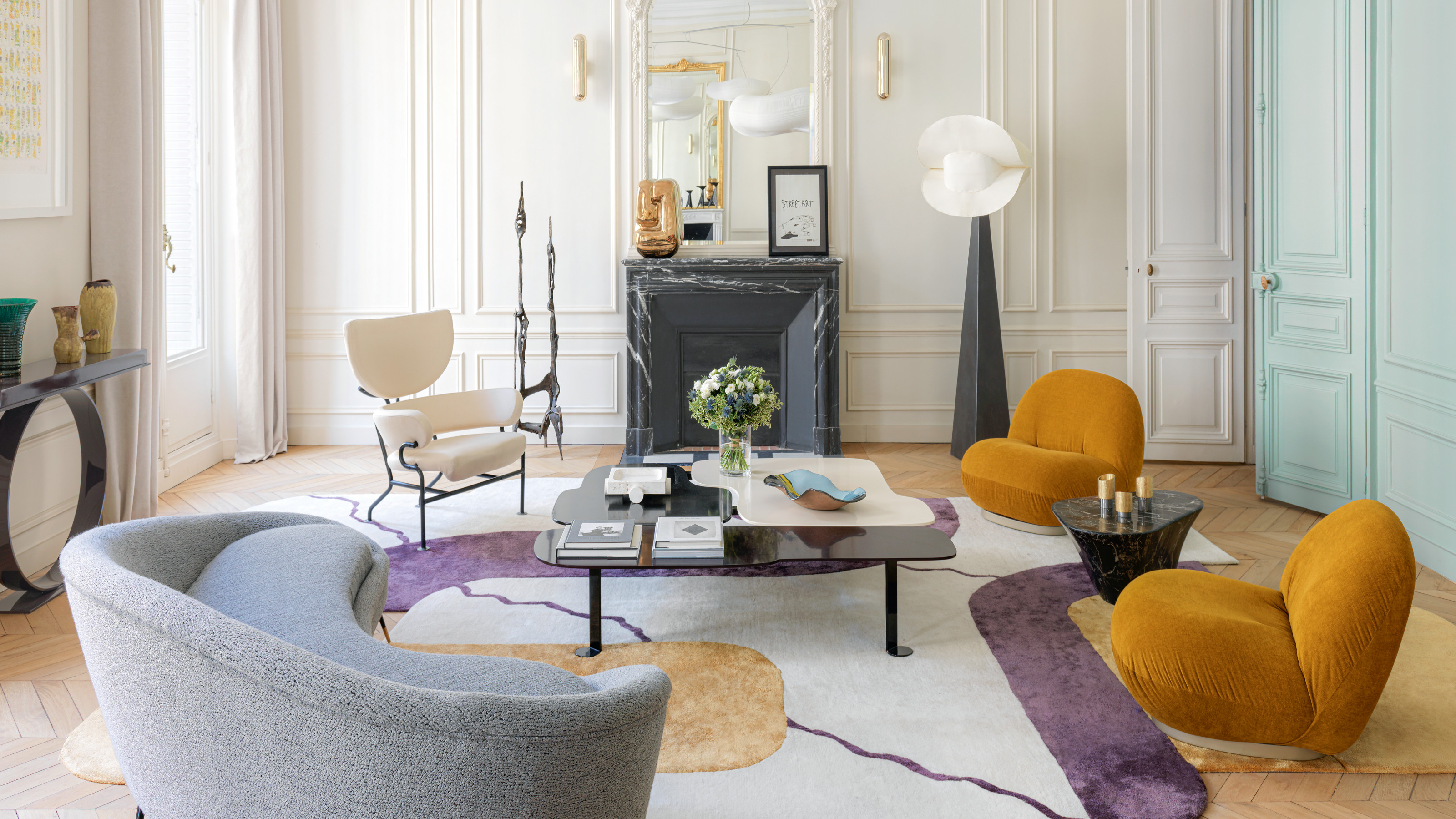
The owners of this modern apartment, Mathieu and Claire, never imagined living in such a strikingly dramatic space. Located in Paris’s sedate 17th arrondissement, their home is at the heart of a property development that consists of three newly renovated, adjacent 19th-century buildings.
They discovered their interior designers, Thomas Vevaud and Raphaël Le Berre, of Le Berre Vevaud, through the show apartment the pair had decorated for the project. It was certainly not bland (it incorporated both a Lindsey Adelman chandelier and a sculptural stainless-steel Ron Arad chair), but it remained more low-key with a neutral colour palette. ‘In a show apartment, you have to have a taste that is accessible for everyone,’ notes Le Berre.
Mathieu and Claire thought they would be getting something similar. The designers, however, had other ideas. ‘They said to us, “our goal is to shock you, so we know just how far we can push things,”’ recalls Mathieu. ‘They proposed lots of things we would never have thought of by ourselves.' Let's see what the duo got up to...
Dining room
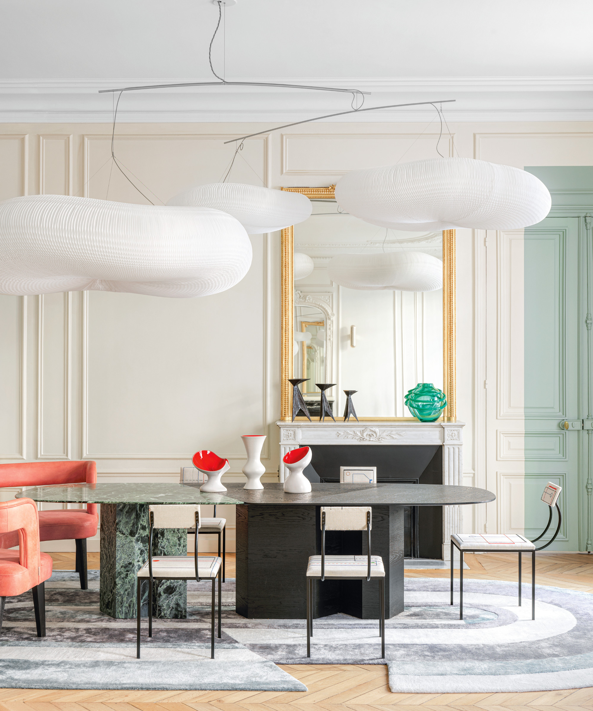
One of the keys to Le Berre Vevaud’s success is their complementarity. Raphaël tends to have a more free-spirited approach, while Thomas brings great precision and rigour. The result is a style characterised by sharp architectural lines, counterbalanced by a smattering of unexpected touches and the more curvaceous forms of their furniture designs. The designers cite among their inspirations the Bauhaus, film and advertising posters and Italian sports cars of the Fifties and Sixties.
For this project, they opted to keep most of the existing architectural details intact. ‘When you have a high-level Haussmannian apartment like this one, you don’t spoil it,’ advises Vevaud. The design duo reduced the size of the entry hall to create space for a guest bedroom and removed several partitions to create a large living room. They also moved the kitchen into an adjacent space at the front of the property.
One of Le Berre Vevaud’s favourite items is the Cloud softlight pendant from Molo, which hangs above the dining table. ‘It’s at once voluminous and very light and delicate,’ notes Vevaud.
Kitchen
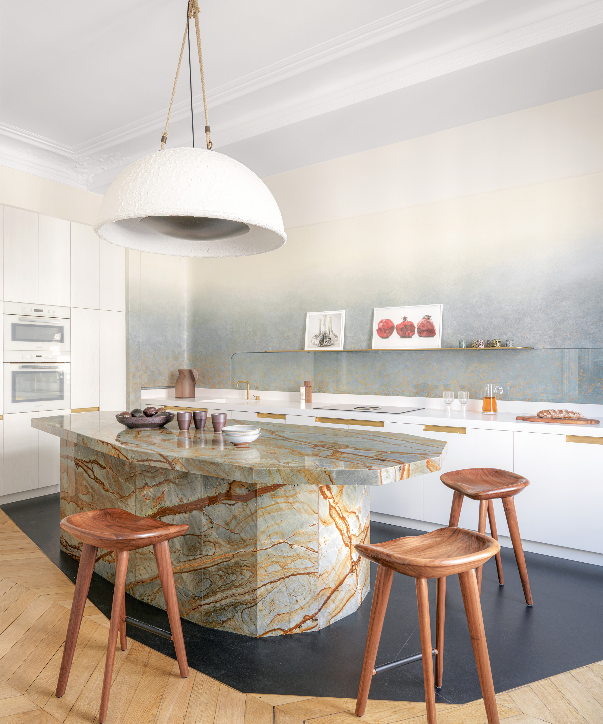
‘Our clients really wanted something very convivial,’ says Vevaud. ‘Having the island in the kitchen visible through the door is like an invitation to have a drink. It allows them to entertain in a more informal fashion.’
Be The First To Know
The Livingetc newsletters are your inside source for what’s shaping interiors now - and what’s next. Discover trend forecasts, smart style ideas, and curated shopping inspiration that brings design to life. Subscribe today and stay ahead of the curve.
Despite the fact that the kitchen is pretty spectacular in its own right. 'We gave it the same level of treatment we would a living room', explains Le Berre. ‘We used luxurious materials so that it became an emblematic room in the apartment.’
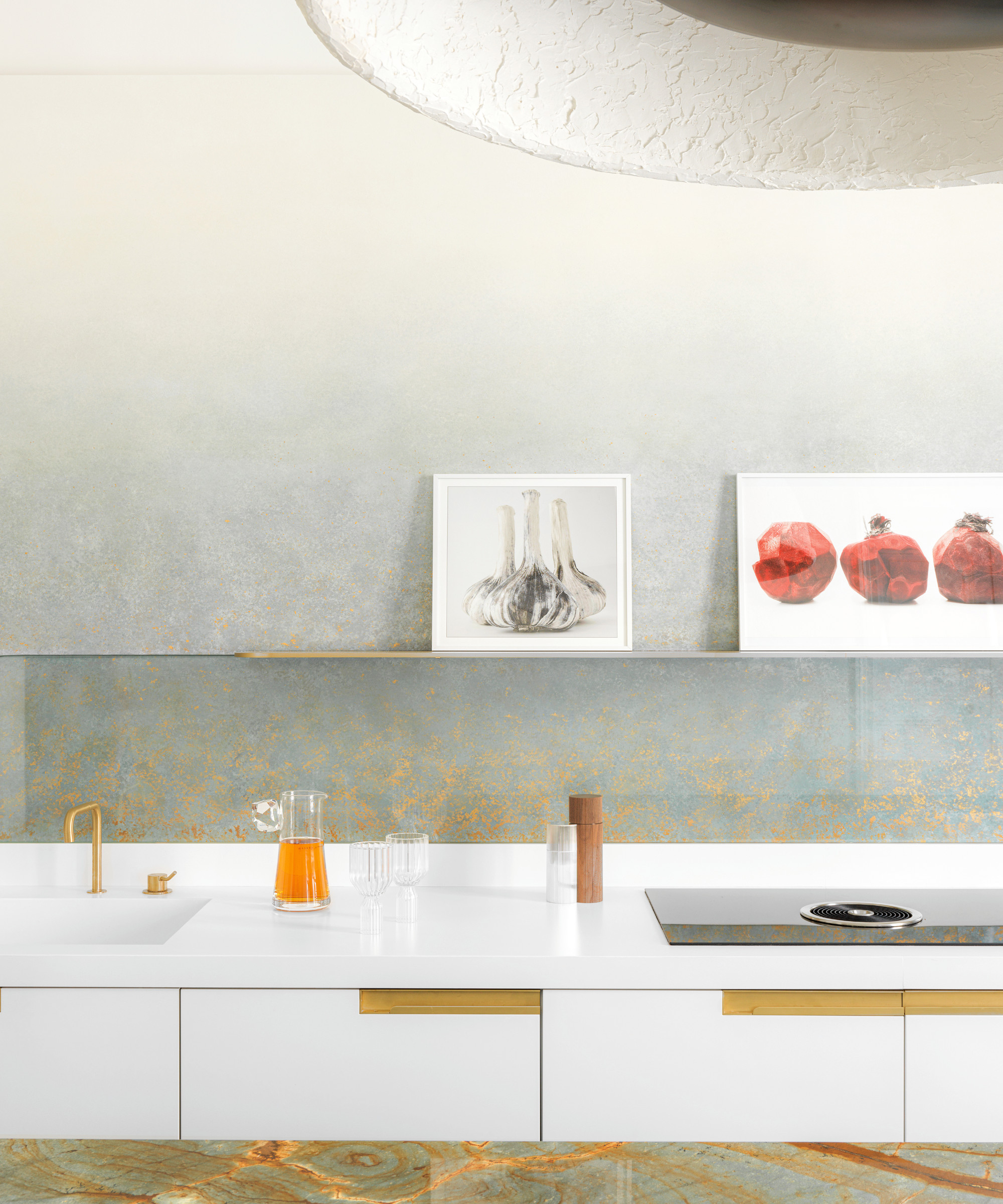
'We used luxury materials, just like we would in a living space,' says Raphael and Thomas.
Living room
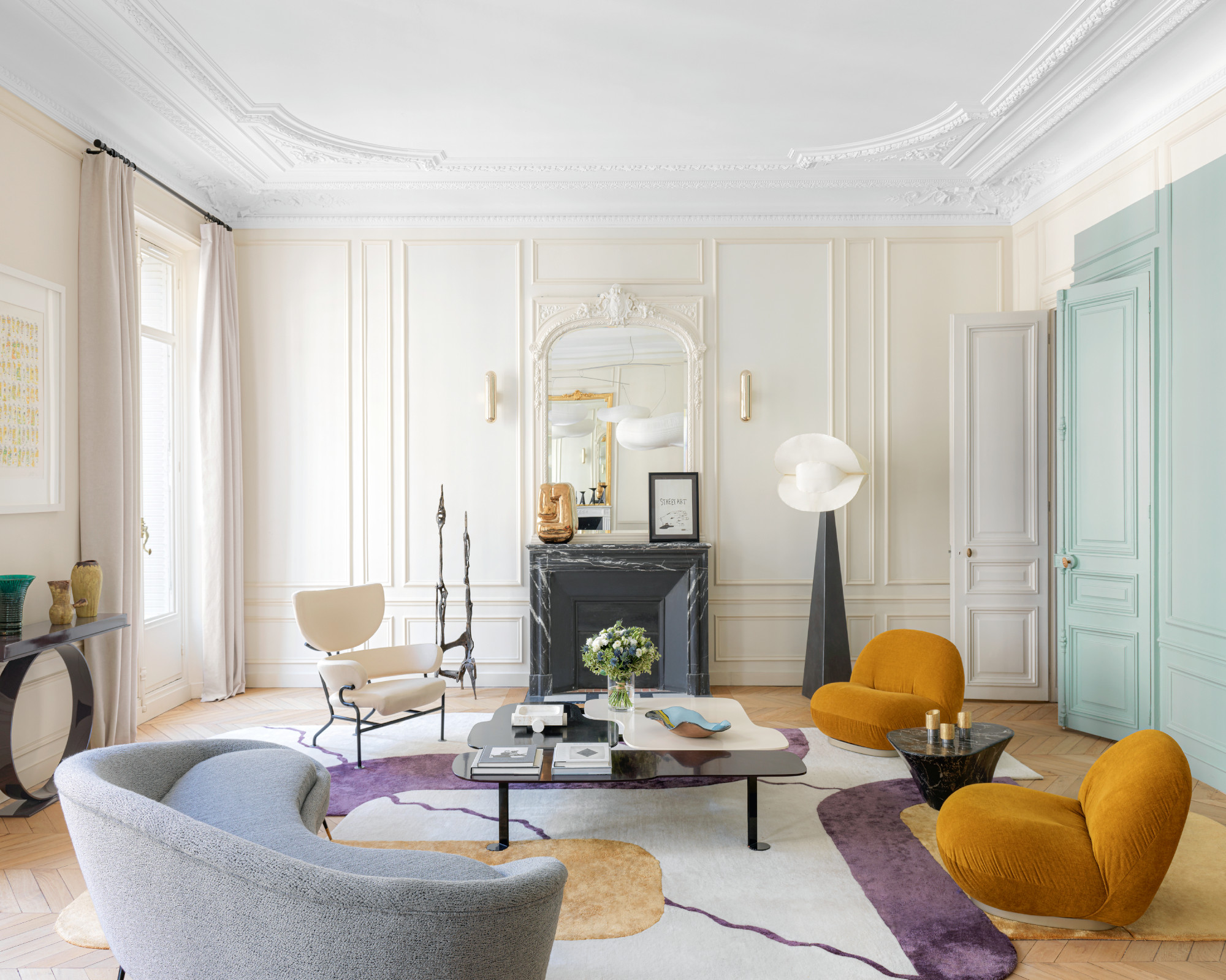
A rectangle of minty green, which deliberately isn't aligned with the wall panelling, is a striking design statement.
Hallway
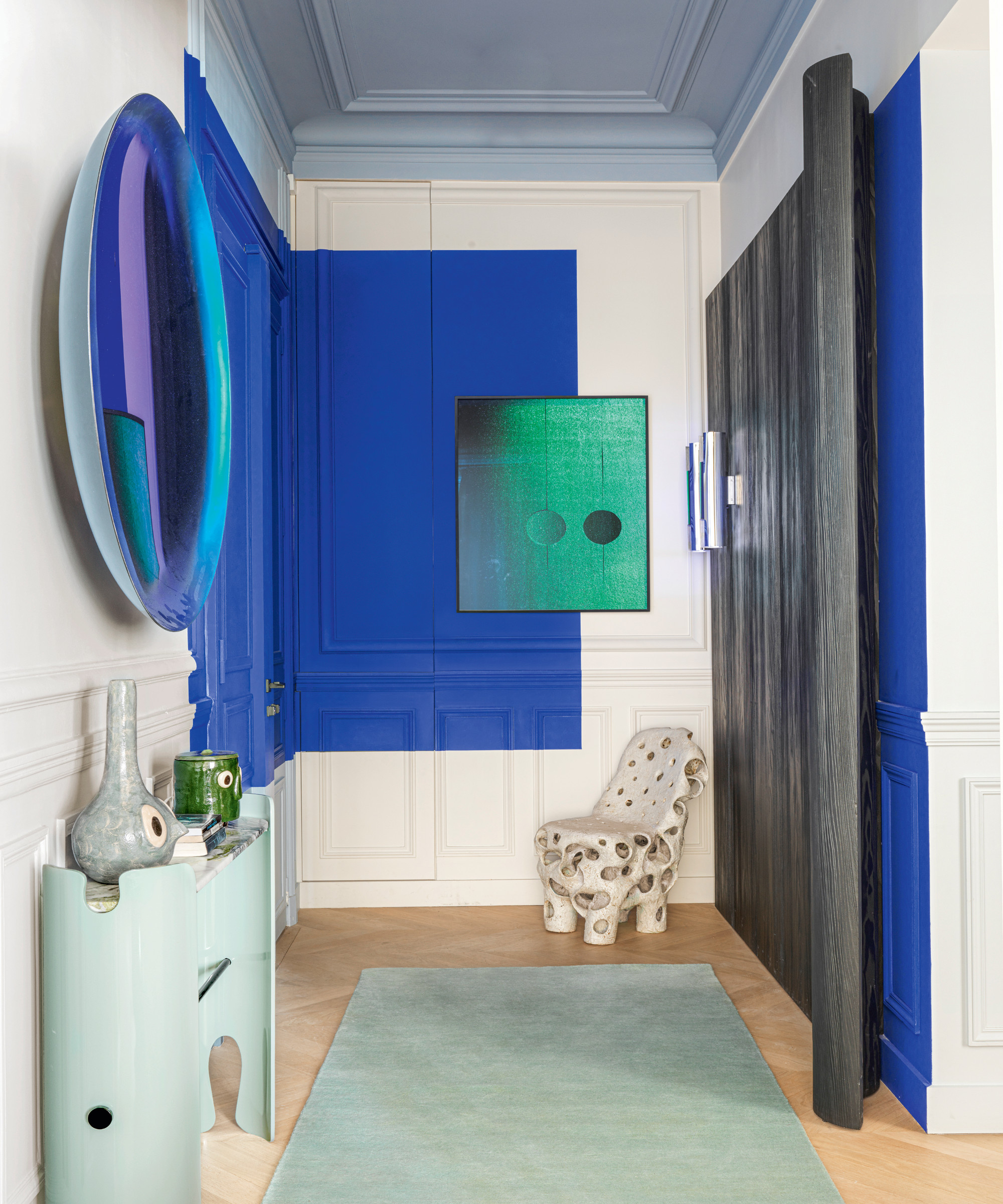
For the duo, each space should have its own distinct personality. ‘It’s like in a play or a film,’ asserts Vevaud. ‘There should be a number of different acts.’
It is with a daring use of bright hues that they really managed to shake things up. In both the entry hall and living room, they have applied large rectangles of color to the walls, which are deliberately not aligned with the wall panelling. Not to be outdone, much of the furniture is enriched with a certain boldness.
Bedroom
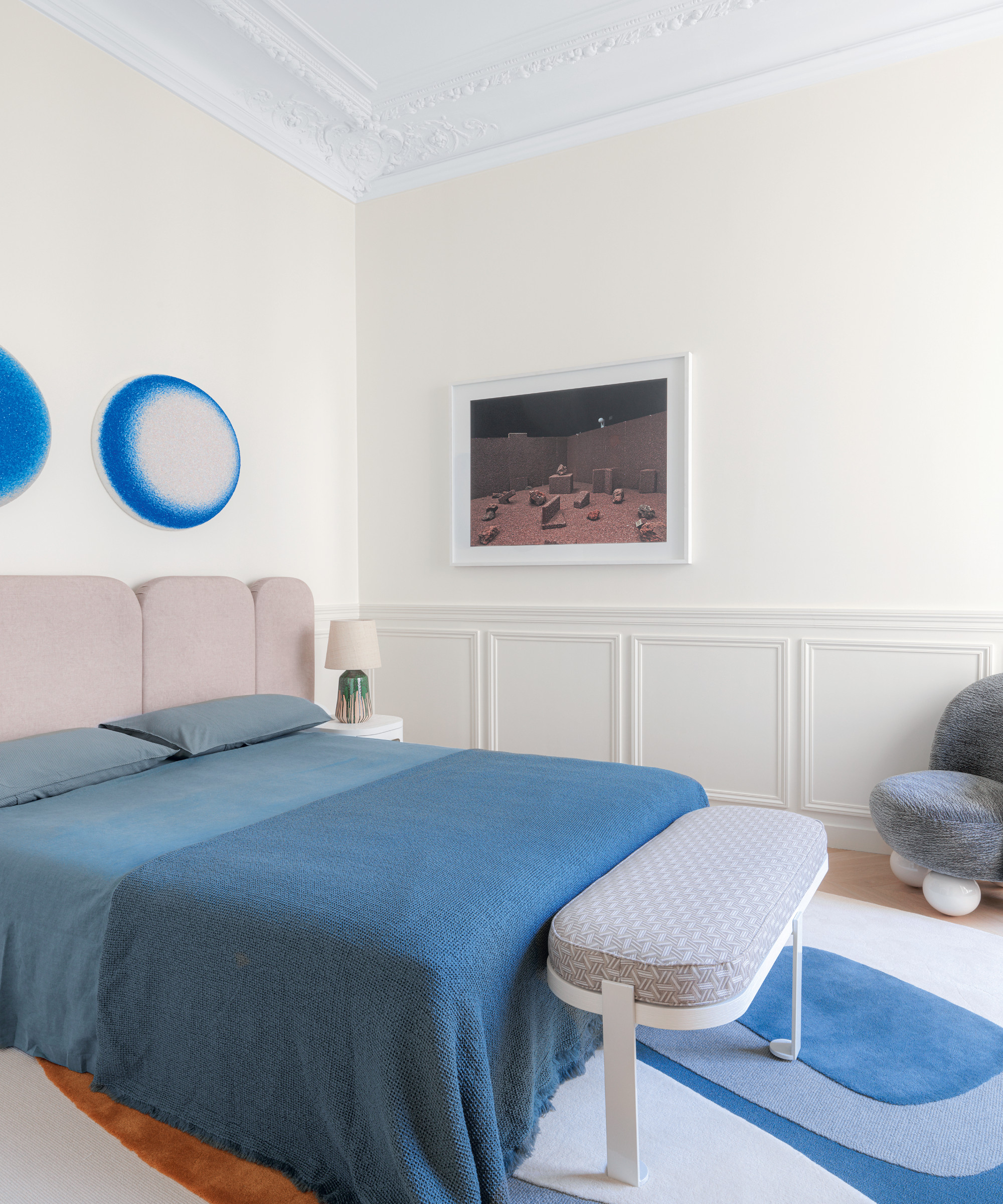
And even though the resulting décor is not at all what Mathieu and Claire had in mind, they now would not have it any other way. ‘Thomas and Raphaël challenge their clients, but in a really mindful fashion,’ enthuses Mathieu. ‘They listen, but when they’re sure something will be beautiful, they know how to push for it. At the beginning, it unsettled me a little, but as things progressed, I really took to it. In the end, it was me who encouraged them to go even further.’
See more: an Australian beachside house where contemporary design meets barefoot luxury
-
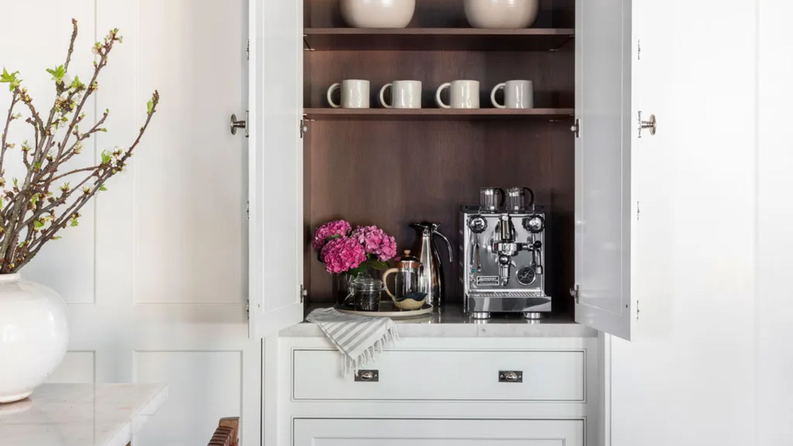 Turns Out the Coolest New Café is Actually In Your Kitchen — Here's How to Steal the Style of TikTok's Latest Trend
Goodbye, over-priced lattes. Hello, home-brewed coffee with friends. TikTok's 'Home Cafe' trend brings stylish cafe culture into the comfort of your own home
By Devin Toolen Published
-
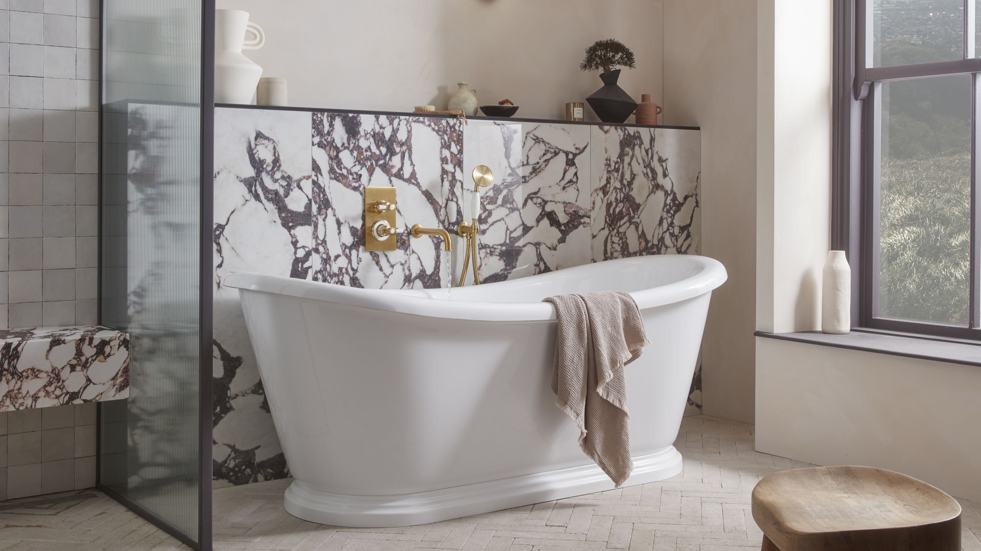 5 Bathroom Layouts That Look Dated in 2025 — Plus the Alternatives Designers Use Instead for a More Contemporary Space
For a bathroom that feels in line with the times, avoid these layouts and be more intentional with the placement and positioning of your features and fixtures
By Lilith Hudson Published