The 8 Secrets of Good Restaurant Design — How Designers Make Dining Out Feel Magical
Aesthetically pleasing spaces might make a good first impression on restaurant-goers, but nailing an eatery's design requires more than striking finishes
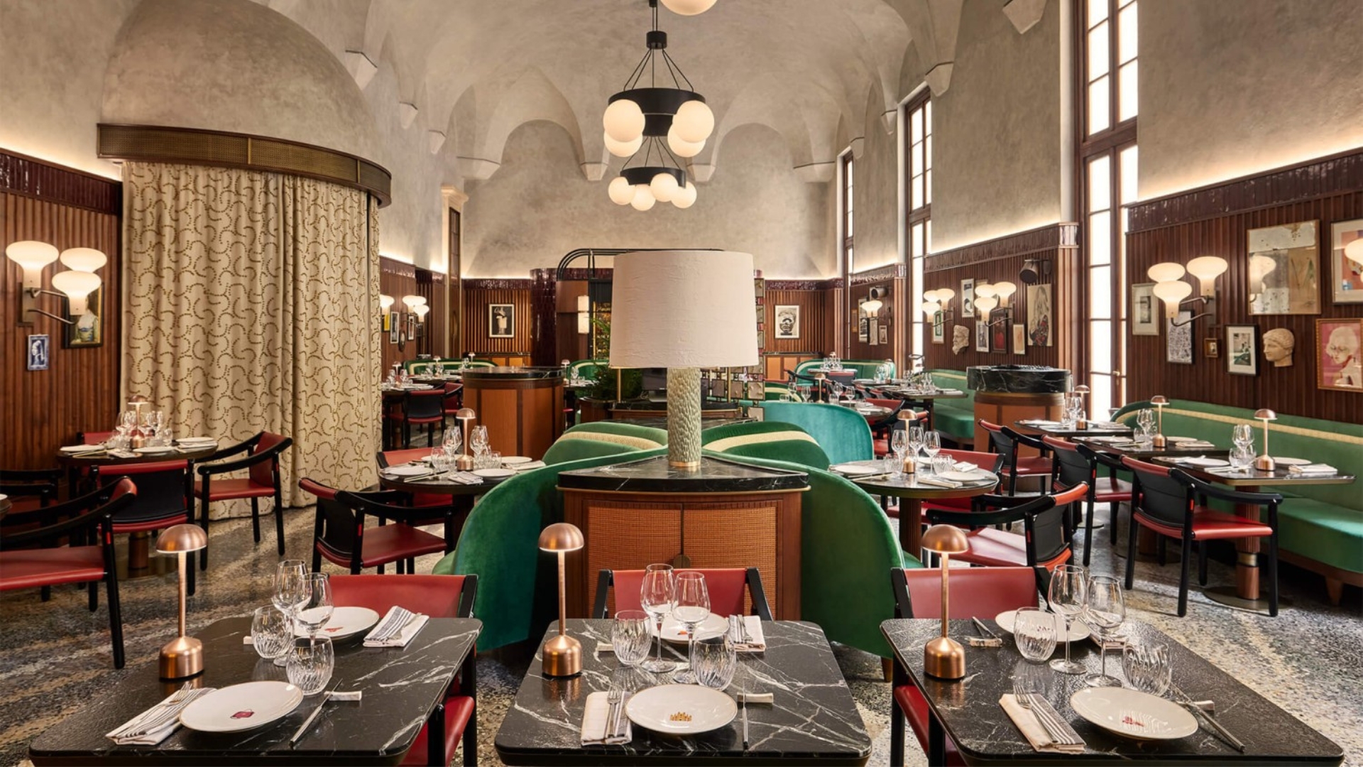

Have you ever wondered what makes a restaurant truly memorable? And no, I am not talking about the food, as we know that plays a crucial part in determining whether or not an eatery is worth the check, let alone returning to. What I mean with "memorable" is the ability of a place to stick with you long after you have stepped out of it, to want to share it.
Think of the sum of elements that comes to define a space — is it naturally lit or dimly illuminated? Does its interior decor lean more towards minimalism or maximalism? Are its seating areas soft and upholstered or boldly brutalist, cut-in-stone? What music is playing in the background? From creating the right ambiance and soundscape to choosing the best materials and acknowledging the community you are serving, everything must be meticulously pondered when aiming to excel in restaurant design.
One way to approach this is by ensuring that the restaurant "is really about the senses," Diana Melichar, president of Melichar Architects, tells me. "Of course, the three ingredients for a great restaurant are good food, good service, and appropriate pricing," she says. "So, if the good food part handles the taste portion of the experience, it comes down to the architectural and interior design of the place to hit the other senses."
But what are the insider secrets and best practices guiding designers in the development of a new restaurant project? Three industry experts weigh in.
1. Know Your Audience
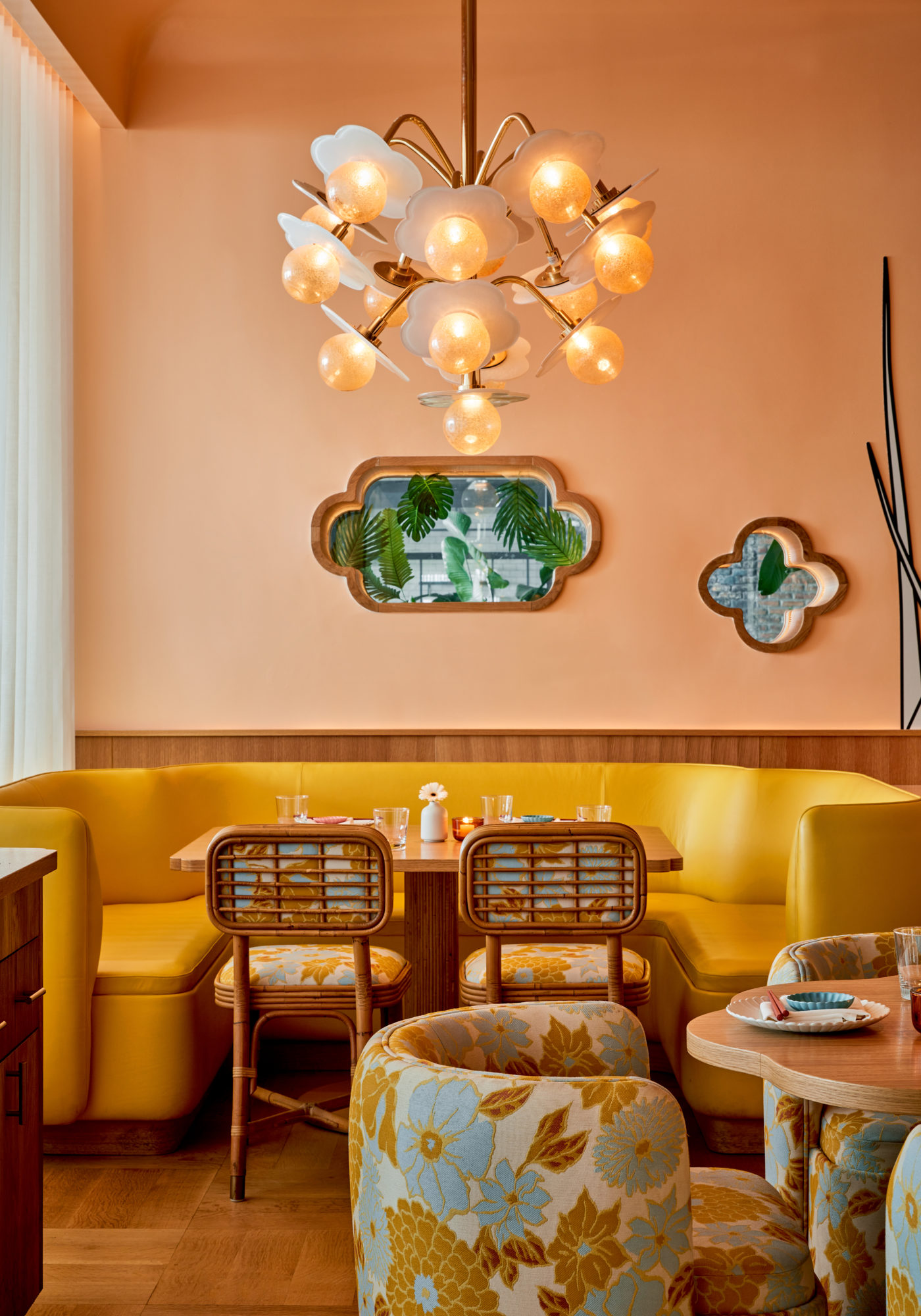
The interiors of Makoto in Miami, designed by India Mahdavi
It might sound self-explanatory, but the first and foremost consideration people should take into account when approaching the making of a new restaurant is the type of audience this will provide for. As Faber and Company's founder and creative director Tony Matters explains, "it all starts with the customer; who are they? What inspires them? And what journey do we want to take them on?" The more you understand the diner, "the more tailored the experience can be." But it doesn't end there.
The introduction of a successful business has the opportunity to create a knock-on effect in the local community, "so it is important to think about the wider public the restaurant will affect," interior designer and content creator Dan Lovatt tells me. For the designer, it is about anticipating the impact you would like to make in that area and understanding how to achieve it. Creating a restaurant "is an opportunity to make a statement about the values your business stands for," he says. "Whether your focus is on the local artists you wish to showcase, the fabulous local produce, or the nightlife you wish to facilitate, the cultural scope of the project is one of the biggest decisions to make at its initial stage — it is so crucial that it should be at the forefront of the design process."
2. Be Thorough
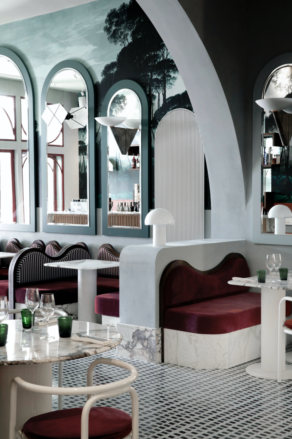
The interiors of ADRIATICA Ristorante in Venice, designed by Dorothée Meilichzon
Impressive interiors might be enough to hook guests in momentarily, but lack of thoroughness and "rushed" details can easily spoil your restaurant's reputation. To safeguard its status, "each touchpoint and experiential element should feel special, with every design contribution given extra consideration for the guest and how this might feel for them," Dan says.
Be The First To Know
The Livingetc newsletters are your inside source for what’s shaping interiors now - and what’s next. Discover trend forecasts, smart style ideas, and curated shopping inspiration that brings design to life. Subscribe today and stay ahead of the curve.
To create a lasting memory on a consumer, "every single detail from the napkins and the light switches to the facilities need to be carefully pondered to make it easy to navigate for the customer," he adds. "The functionality and impact of each space is paramount to the success of the design." While project leaders may want to keep a spend low for an overall better investment, "the selection of materials is fundamental for getting this right, as cheaper fixtures and fittings will wear easily, compromising the overall aesthetic of the place."
3. Predict Staff Needs
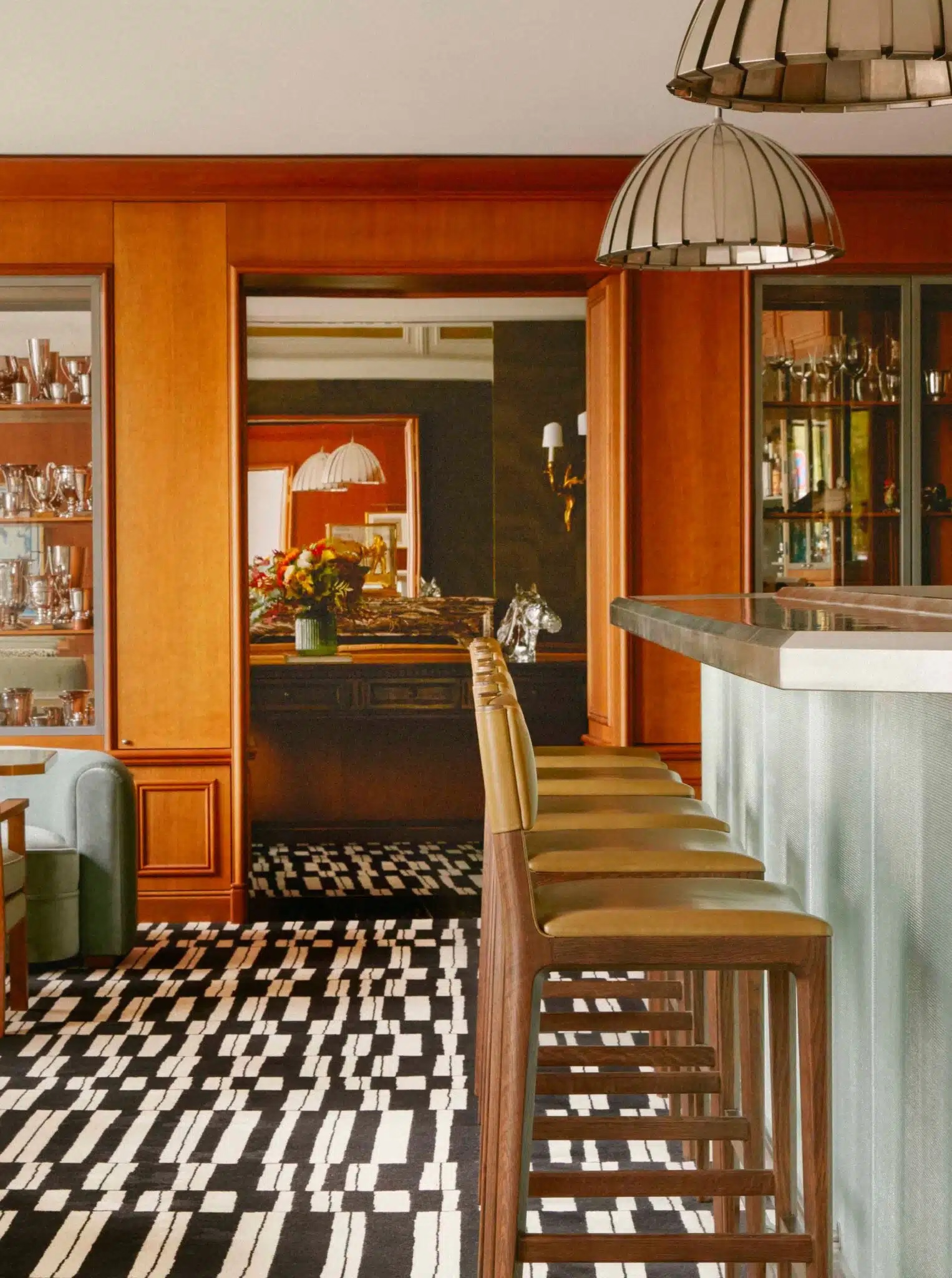
The interiors of La Tour d'Argent in Paris, designed by Franklin Azzi
We have already made a point about aesthetically pleasing design not being enough for a restaurant to pass the test, so what are the overlooked aspects of this specific design field deserving further attention? If it is true that food destinations are meant to accommodate the needs of diners, that is even more necessary when it comes to facilitating those of staff. "Restaurants are one of the most challenging spaces you can design," Tony Matters says. "They need to be highly functional, with huge pressures placed upon them during the busiest periods of service."
Dan Lovatt concurs. According to the interiors influencer, truly great design enhances "the productivity of the space", making it easier for staff to maintain its sanitation, organization, and the overall establishment's running. "With margins getting tighter in the hospitality industry, the headcount is getting lower," he adds. Being a good restaurant designer also means ensuring that anyone from restaurateurs to the last of their staff members is put in the condition to fulfil their jobs in the most efficient way while benefitting from the restaurant's setup in the same way in which guests do.
4. Set the Atmosphere
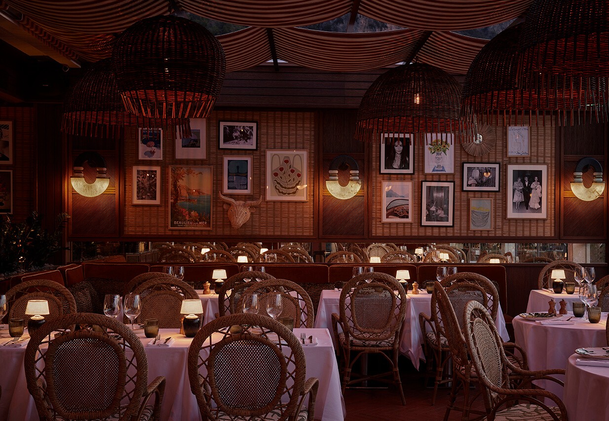
Dining out is as much about getting to test new cuisines as it is about getting away from the ordinary, even if just for a couple of hours, and this shouldn't be ignored by designers. "Restaurant design is, first and foremost, about escapism," Tony says.
"Whether for a spot of brunch or an evening with friends, diners want to feel immersed in an atmosphere." From a design perspective, he continues, "this is key — in such a challenging and competitive industry, diners expect a complete experience, not simply nice food in attractive surroundings." It is a position shared by Dan Lovatt, who thinks that "unleashing a sense of drama within a space is what keeps guests dwelling on what you have to offer", prompting them to indulge in it for a longer period of time.
5. Don't Just Show Off — Tell a Story
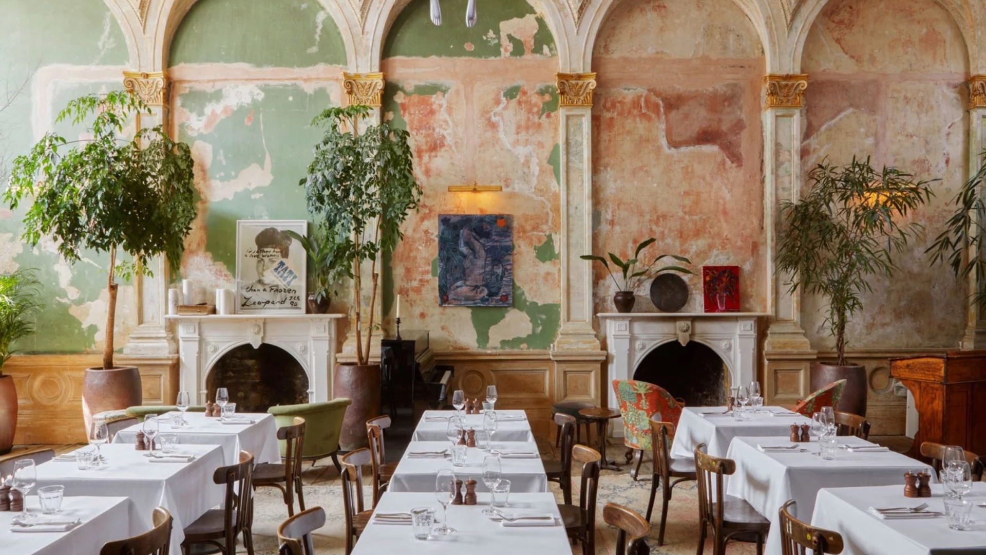
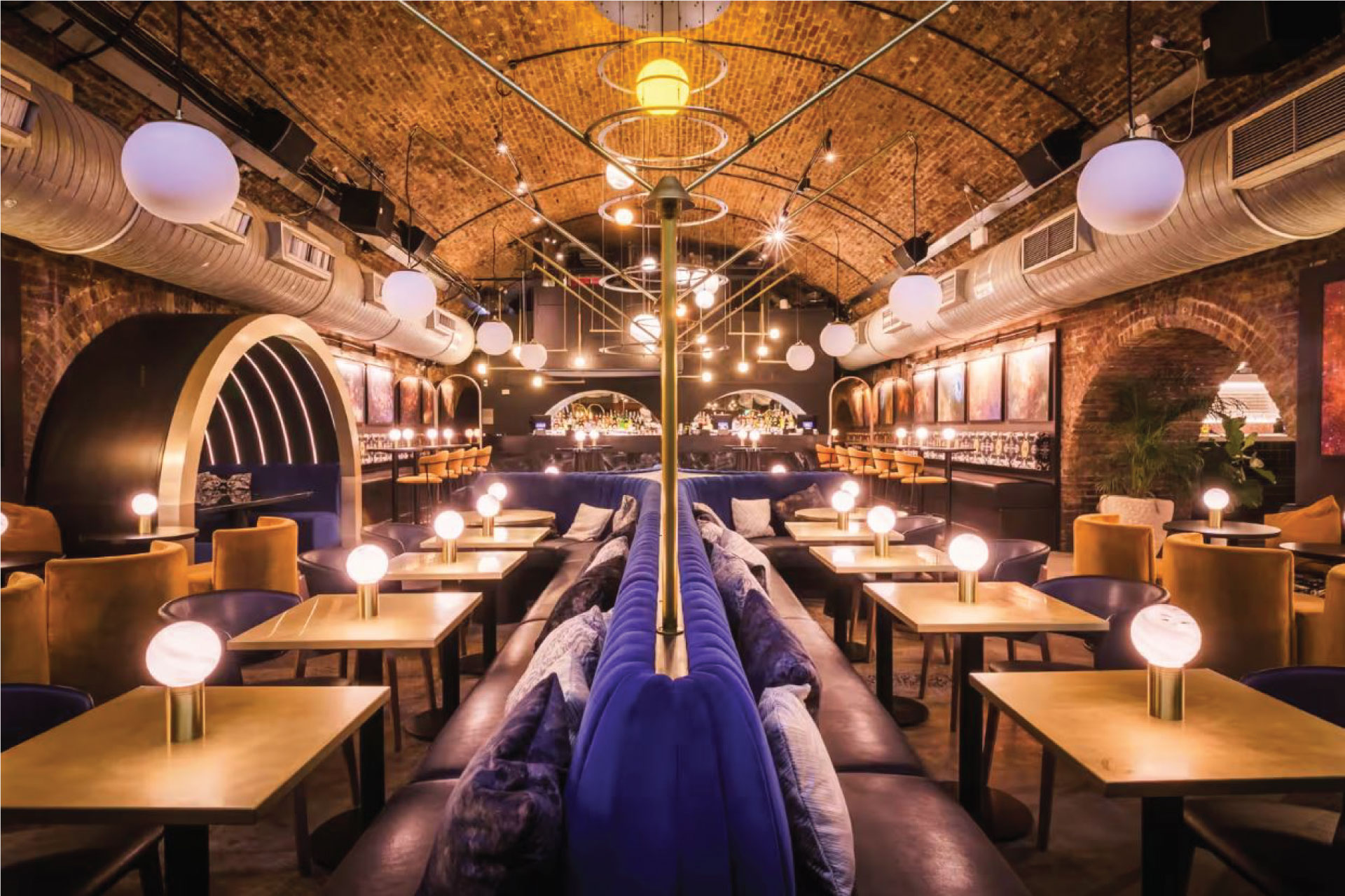
The interiors of Kerb Collective in Shoreditch, London, designed by Faber and Company
Part of a designer's talent lies in their ability to identify and unlock the stories already trapped in a given space, or envision just-as-fascinating new ones. Reflecting on the pivotal role played by storytelling in this kind of projects, Tony explains that "the opportunity to engage with customers on an emotional level is what can turn customers into loyal fans and advocates for the brand."
While identifying a narrative and concept strong enough to add value to your restaurant requires some effort, these factors are "what really helps to build the foundations of this engagement," he adds. "Success comes from crafting a unique experience that is relevant to the target customer."
6. Nail the Mood
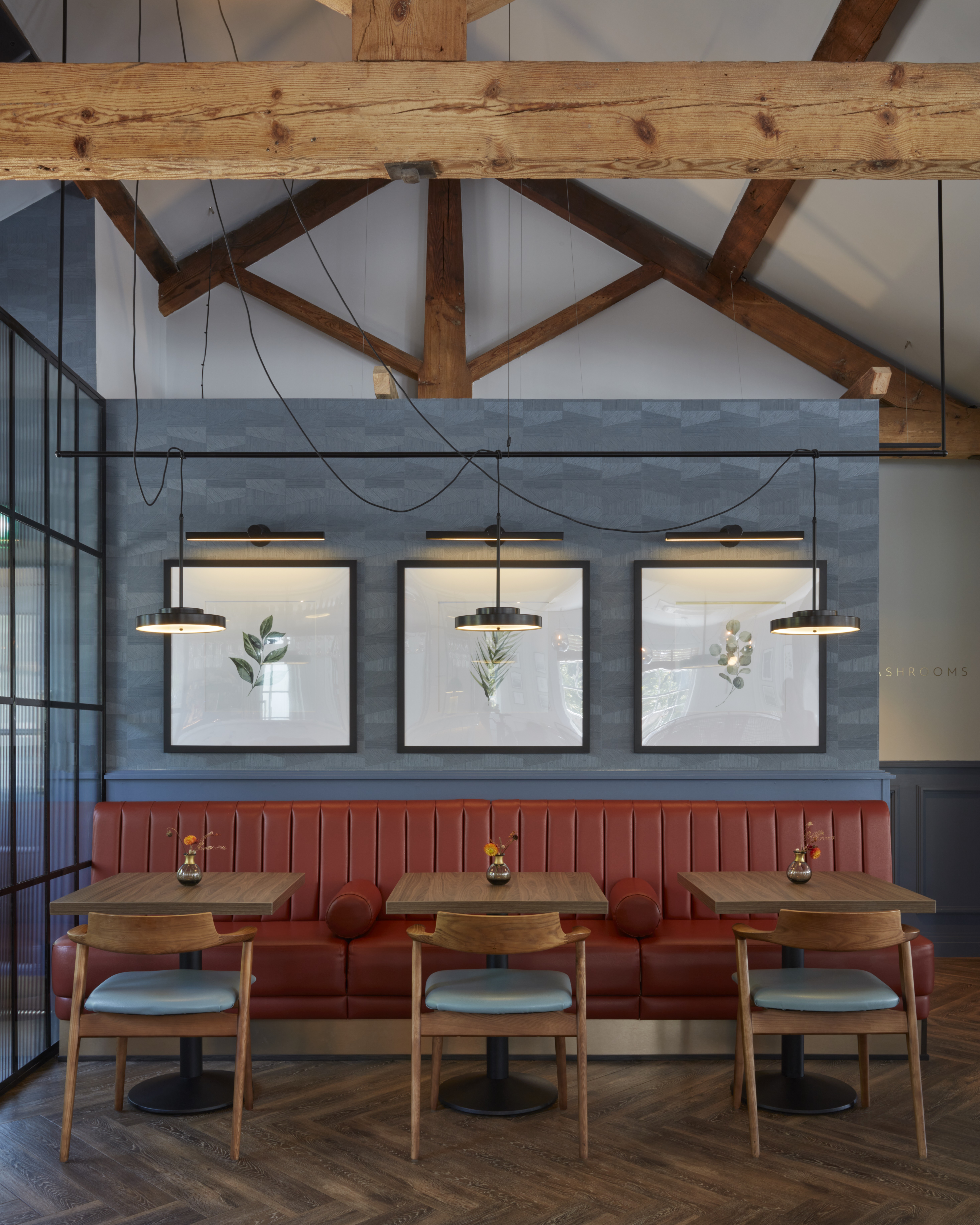
The interiors of Darleys in Derbyshire, designed by Faber and Company
Understanding how to pair the interiors of a restaurant with its menu, identity, and targeted clientele isn't easy, especially when you lack a clear brief, but learning how to amplify the vision at the heart of a food hotspot through the right choice of paint color ideas, forms, and materials is what makes it stand out from the crowd in the long run. "There's a reason why McDonald’s originally used bright yellows and reds in their restaurants — they wanted diners to get in and out of their locations as quickly as possible, and those hues pushed customers out the door," Diana Melichar explains.
But it wasn't all bad. While clearly not for everyone, "those were also festive, child-like shades appropriate for families who wanted to take their kids to a quick meal," she adds. According to the Melichar Architects' president, designers should pick hues that match the dining experience. "Refined projects might include stained wood and majestic royal colors, like purples and teals," she says, while "the interiors of a seafood restaurant might select calming ocean nuances and light, beach wood tones."
7. Please the Senses
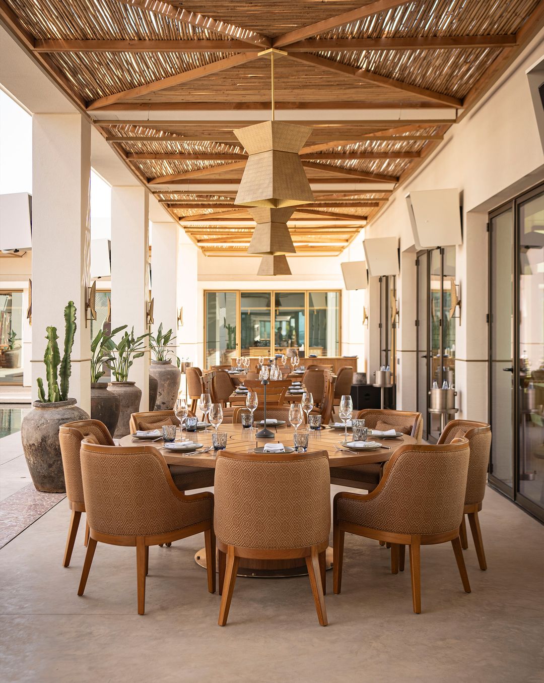
The outdoor dining area of Manko Athens, designed by Bureau Lacroix
There is more than one reason to believe every restaurant should be a feast for the senses, but overstimulation can be as detrimental to a food destination.
DESIGN FOR SIGHT, SOUND, AND SMELL, NOT AGAINST THEM
"Lighting and acoustics are a key pillar of a successful restaurant," Tony Matters says. "They combine to create the atmosphere; light and buzzy, like a brasserie, or quiet and intimate, like a fine dining restaurant. Evoking an atmospheric feel while allowing diners to read a menu and see their food is a science." Plus, adds the Faber and Company's founder and creative director, "there is nothing worse than a restaurant full of hard surfaces where it is so noisy you can barely have a conversation."
Sound control can be achieved thanks to the use of noise-absorbing, soft furnishings including "table cloths, upholstered seating, acoustic drapes, ceiling panels as well as pendants," Diana explains, who recommends covering any parallel walls in flutter-proof materials capable of soundproofing the noise bouncing in between them.
She opts for a similar approach to control odors: with smell being the most primal instinct, "it is incredibly important to guarantee that no smoke, mold, cleaning chemicals or other smells detract from the experience," Diana says. Should you wish to use carpeting in the design to manage smell, this would have to be impeccably cleaned and maintained.
8. Balance Creativity and Simplicity
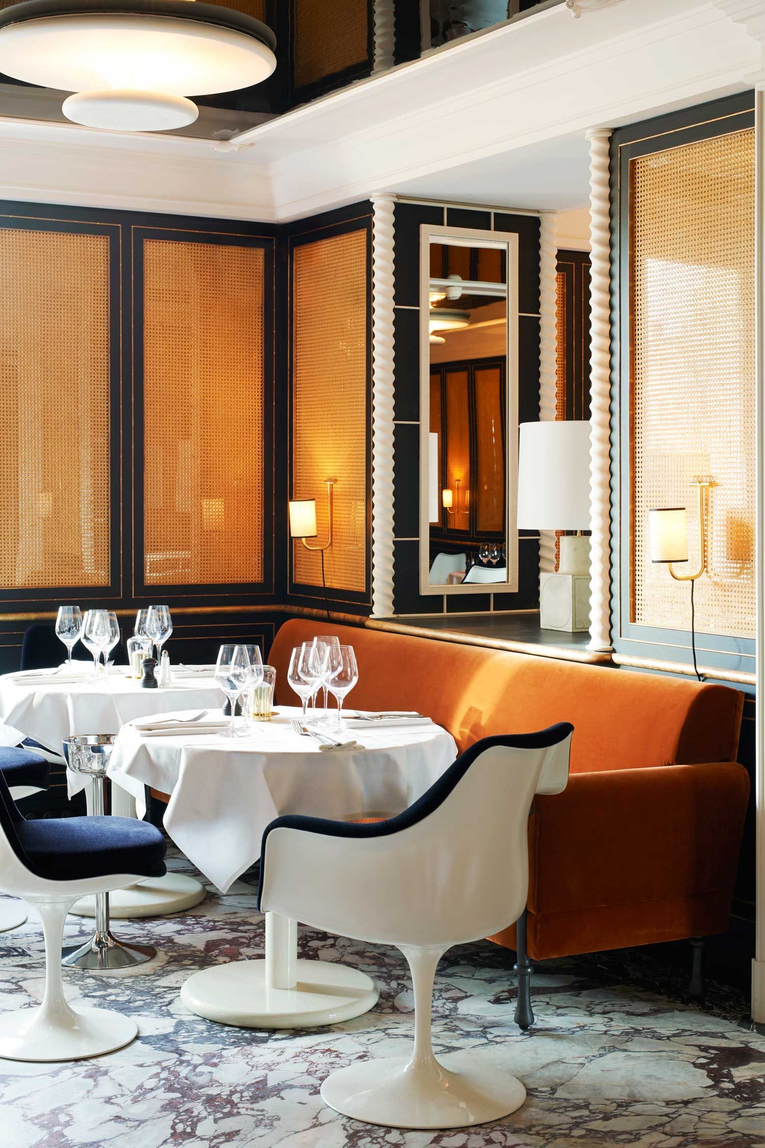
The interiors of Loulou in Paris, designed by Joseph Dirand Architecture
Being a great interior designer also means knowing when to stop and let "quality outweigh quantity", Dan tells me. It will only take up to three seconds for a customer to make up their mind about a specific restaurant, so going for simple, yet timelessly elegant and durable finishes is often preferred over thoughtlessly maximalist alternatives. This doesn't mean you shouldn't be brave in your design choices. "A sense of being bold within the design scheme is always something I gravitate towards," the interior designer says. And that's not daring colors or clashing patterns, "but a careful arrangement of locally sourced artwork or a sense of tension and unexpectedness within the material selection."
Inventiveness sits at the core of Tony Matters' work, too. The goal for him is to conceive "an original and authentic experience: think of the couture fashion created by Alexander McQueen — startling, sometimes shocking, always original," he says.
Rather than relying on any specific story to inform a collection, he embraced a narrative as a means of "generating truly original creativity", concludes Tony — something we hope both restaurant designers and restaurant-goers will continue to aspire to in their lives.

Gilda Bruno is Livingetc's Lifestyle Editor. Before joining the team, she worked as an Editorial Assistant on the print edition of AnOther Magazine and as a freelance Sub-Editor on the Life & Arts desk of the Financial Times. Between 2020 and today, Gilda's arts and culture writing has appeared in a number of books and publications including Apartamento’s Liguria: Recipes & Wanderings Along the Italian Riviera, Sam Wright’s debut monograph The City of the Sun, The British Journal of Photography, DAZED, Document Journal, Elephant, The Face, Family Style, Foam, Il Giornale dell’Arte, HUCK, Hunger, i-D, PAPER, Re-Edition, VICE, Vogue Italia, and WePresent.
-
 Biophilic Decluttering — What to Take Out of Your Home (and What to Put in) for a More Natural Home
Try your hand at biophilic decluttering to ground your interiors, connect to the environment, and cure chronic clutter in one go. Here's how.
By Amiya Baratan
-
 10 Arrestingly Beautiful Milan Restaurants Locals *Actually* Dine at — Selected for Their Interiors
Brought to you by our community of culture insiders, this edit of the best restaurants in Milan sees authentic Italian food and immersive design unite
By Gilda Bruno
-
 10 Arrestingly Beautiful Milan Restaurants Locals *Actually* Dine at — Selected for Their Interiors
Brought to you by our community of culture insiders, this edit of the best restaurants in Milan sees authentic Italian food and immersive design unite
By Gilda Bruno
-
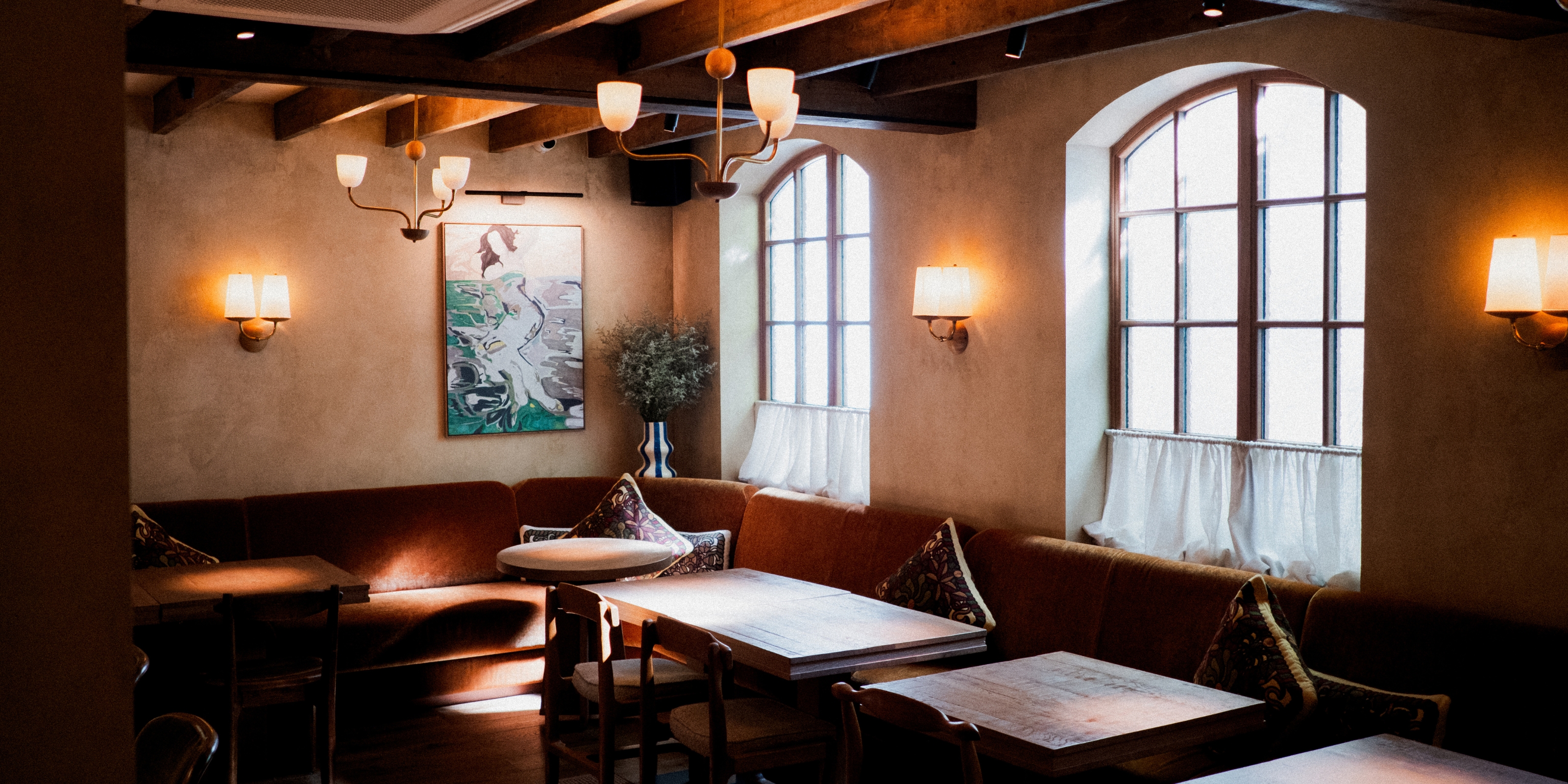 Lita Marylebone Review — Mediterranean Radiance Gets a Tantalizing, Animated West End Makeover
Inspired by Southern Europe's traditional chateaux, the Michelin-starred London restaurant puts conviviality front and center through shareable plates and a dynamic, open-plan setting
By Gilda Bruno
-
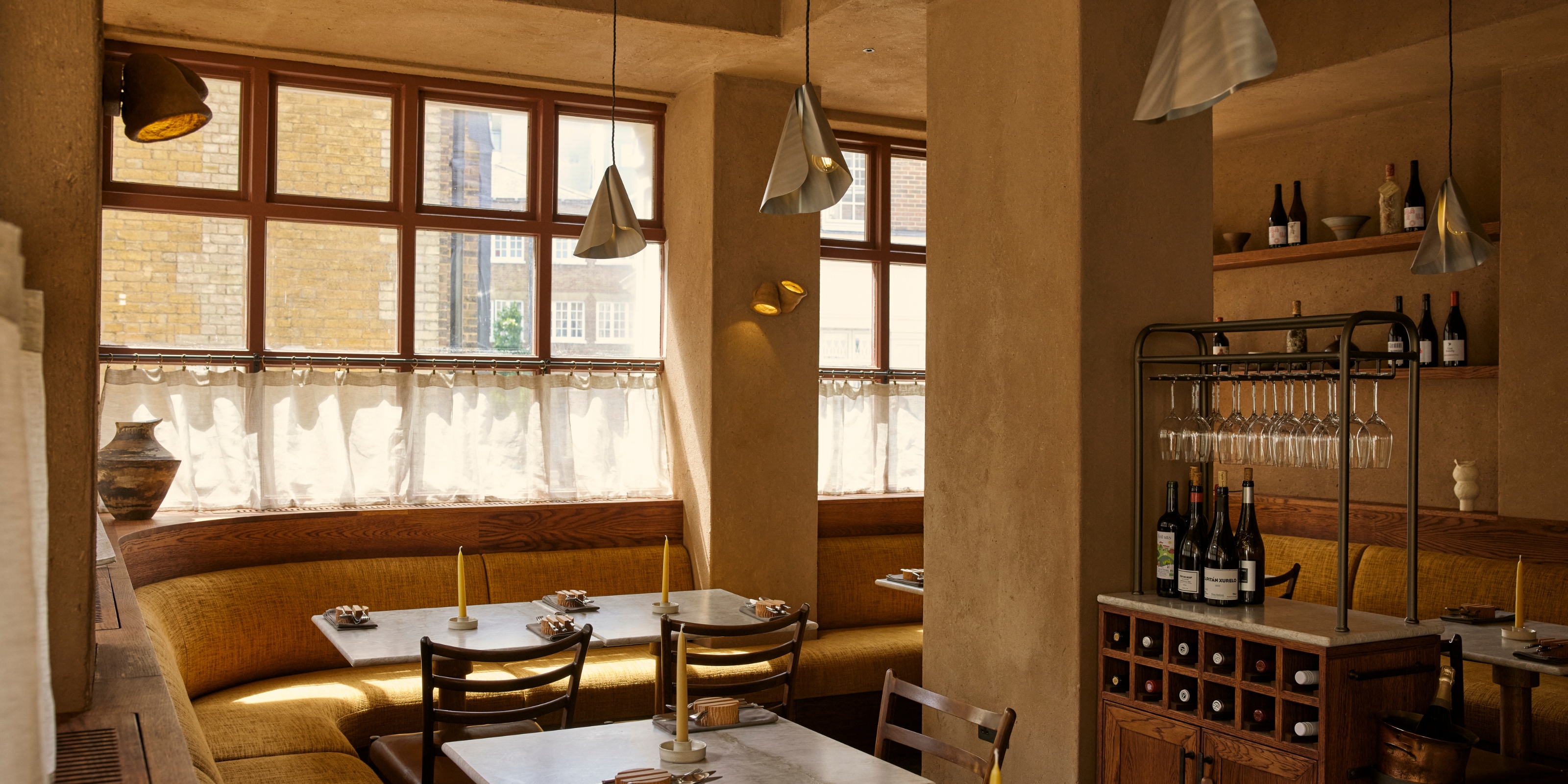 Plates London Review — Nature-Inspired, Earthy Dishes and Interiors Put "Warmth" Back Into Michelin-Star Fine Dining
The first-ever vegan restaurant to win the prestigious accolade in the UK, this intimate eatery wows with its menu, and its design
By Gilda Bruno
-
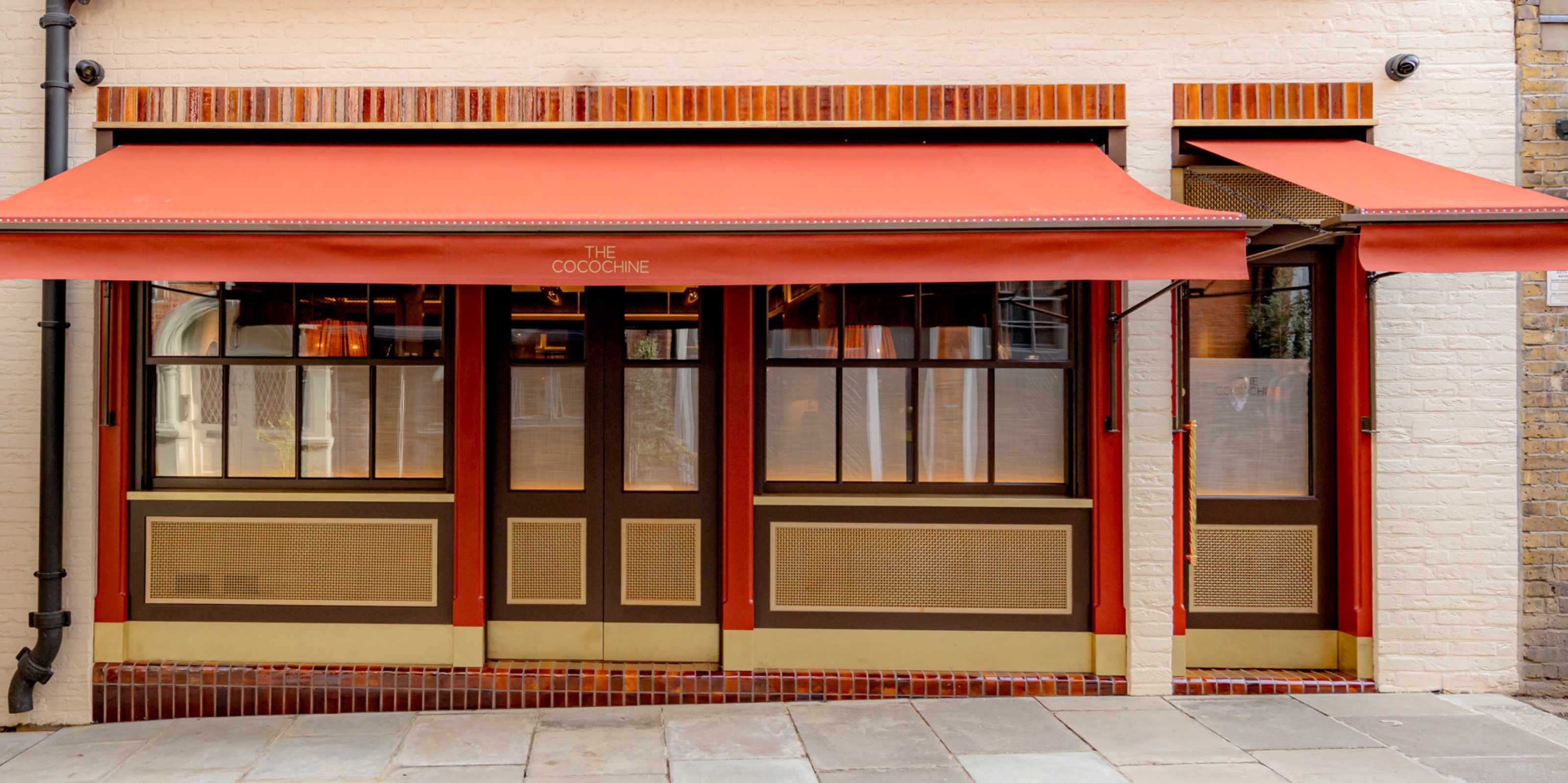 Is Mayfair's The Cocochine the Inspired Restaurant Missing From Your Hotlist?
The brainchild of Hamiltons Gallery owner Tim Jefferies and chef Larry Jayasekara, this hidden-in-plain-sight dining spot elevates gastronomy to an art form — with a little help from its star-studded collection
By Gilda Bruno
-
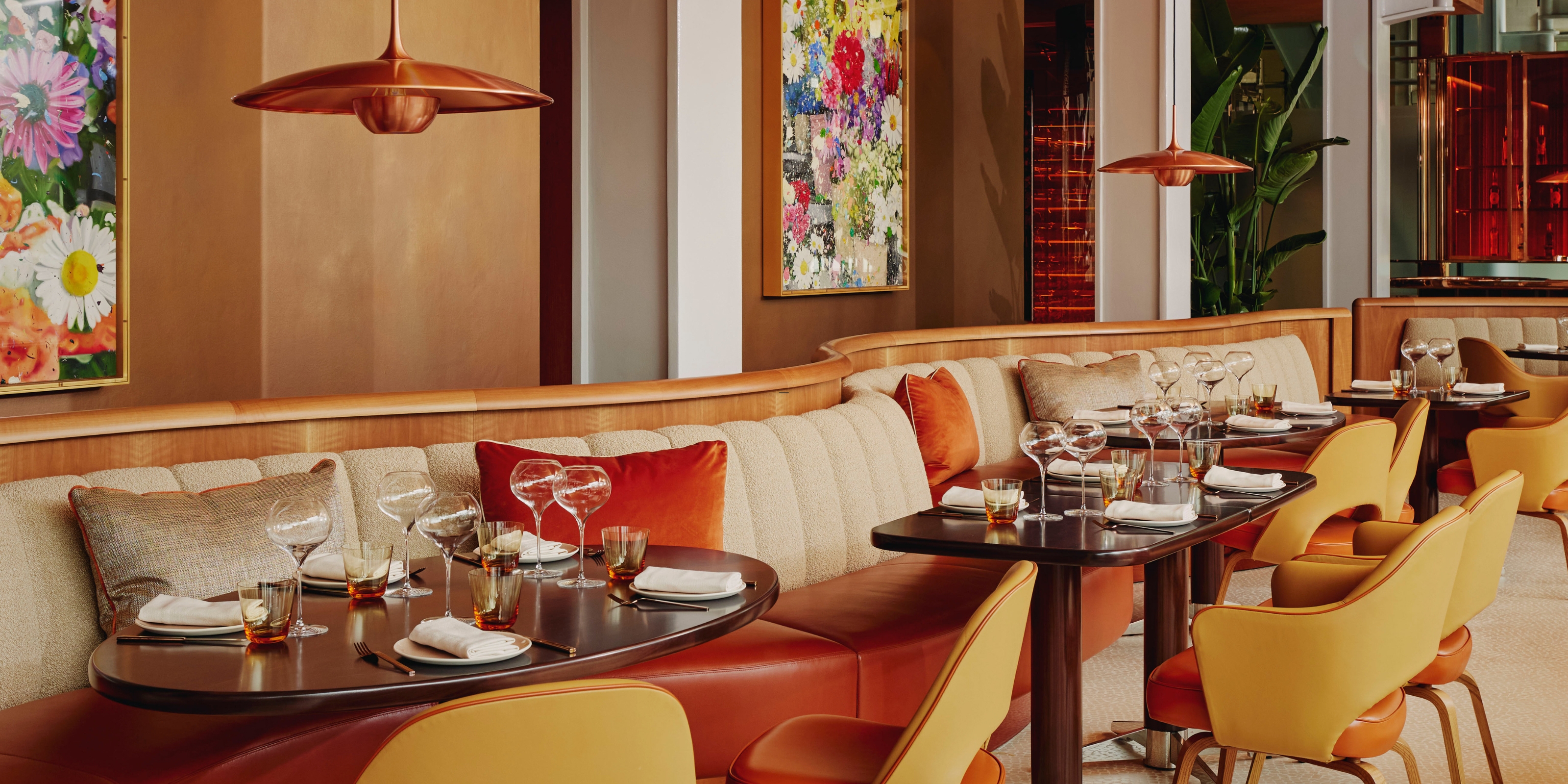 At This Three-in-One, Scenic New London Restaurant, Damien Hirst's Paintings Aren't the Only Masterpieces
Celebrated chef Jean-Georges Vongerichten's experimentation playground at The Emory's abc kitchens brings a slice of New York glamour to the capital and food so beautifully crafted it competes with the artwork
By Gilda Bruno
-
 London's Coolest New Wine Bar Has Got Us Dreaming of Summer — One Scoop (and Sip) at a Time
From the team behind the Goodbye Horses restaurant, The Dreamery is a fantastical ice cream parlor and bar designed to "escape the mundane"
By Gilda Bruno
-
 I'm Livingetc's Italian Lifestyle Editor and These Are the Best Rome Restaurants for Dazzling Interior Design. Buon Appetito!
Spectacular modern glamour design is the cherry on top at these mouth-watering Roman eateries, where the Eternal City's storied past and animated present coexist in an unforgettable dining experience
By Gilda Bruno
-
 The Best Los Angeles Restaurants for a Multisensory Experience — 8 Bookings Every Interior Obsessed Will Regret not Securing This Year
Feast your eyes on the Hollywood-ready interiors of our favorite eateries in town and discover what else is on the menu besides captivating design
By Gilda Bruno