Designer Mark Lewis' Modern Rustic Victorian Home in London is a masterclass in modern rustic
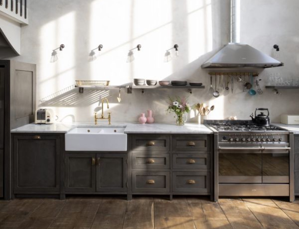
With clever use of space and light, interior designer Mark Lewis has grown his Victorian home in London to become a bigger and better version of itself
THE PROPERTY
Two floors of a Victorian home in London, plus a basement area for utilities. On the ground floor of this modern home is the main living/dining/kitchen area and a pantry, plus the master bedroom and en suite and a WC. On the first floor, there is son James’ bedroom, and daughter Olive’s bedroom, a bathroom and a mezzanine landing area.
All good things come to those who wait. And for this family, who moved into their ground-floor flat nearly 10 years ago, the evolution of their ultimate home had just started. ‘Originally, we’d planned to take on an element of renovation,’ says owner Mark Lewis. ‘We turned a bathroom into a bedroom and later added a small extension to the side yard. But then, after we’d been here five years, the upstairs flat came on the market. We’ve always felt happy in this area and the idea of more space was appealing, so it seemed logical to buy it. The intention was to knock the two properties into one – but that didn’t happen immediately. We had to wait until we had enough cash behind us.’
See Also: See a rustic holiday villa with a strikingly contemporary interior
DINING AREA
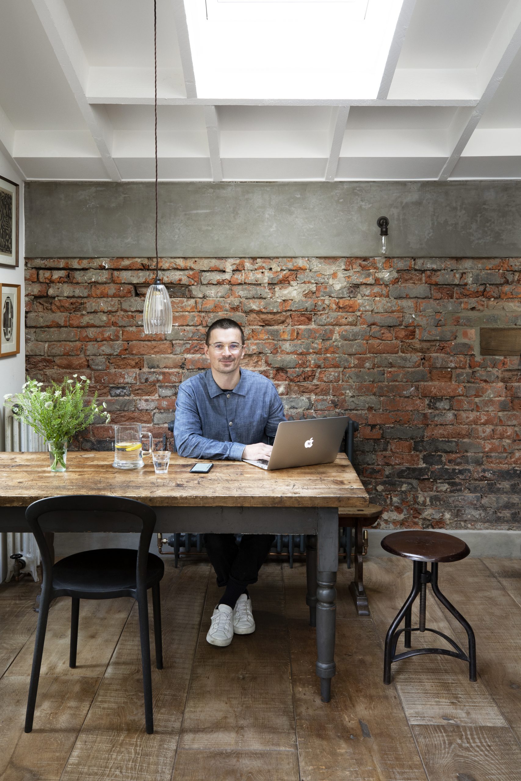
Rustic flooring and raw brickwork complement the vintage-style furnishings. The emphasis here is on an overall lived-in look.Table and stool, both sourced from Kempton Market. Lady P chair, Origlia. Radiator, Salvage Doctor. Upton ribbed glass pendant, Fritz Fryer
So in 2018, the family moved out of the property for eight months while the builders moved in. ‘It’s a disruptive process,’ admits Mark. ‘And, at times, hideous, but you have to go through it to get what you want. It really does help being an interior designer as I’ve got the experience of my day job and I’m fortunate enough to have access to a wide range of inside info. Plus I was able to project-manage the whole thing, which kept the cost down on our very tight budget. I feel we just about ended up with what we wanted.’
LIVING AREA
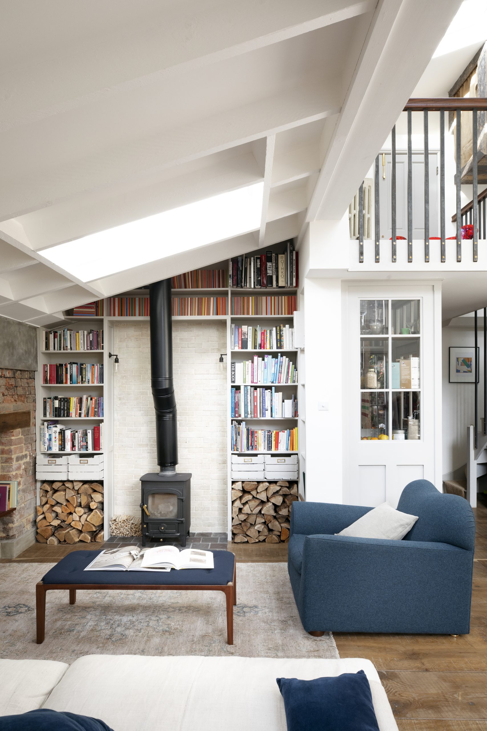
Removing a ceiling allowed for the creation of a mezzanine level that fills the space with light. The cobalt blue of the armchair and footstool adds a grounding touch to the lofty, airy room.
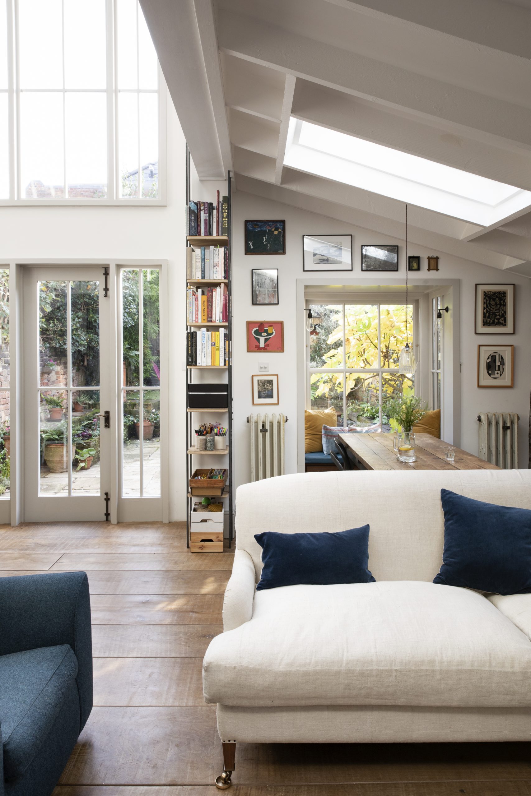
The bespoke sofa, in a white vintage linen, by Cassandra Ellis. Varied width, distressed oak floorboards, Havwoods
See Also: Explore A Historic Farmhouse In Provence With Modern Rustic Interiors
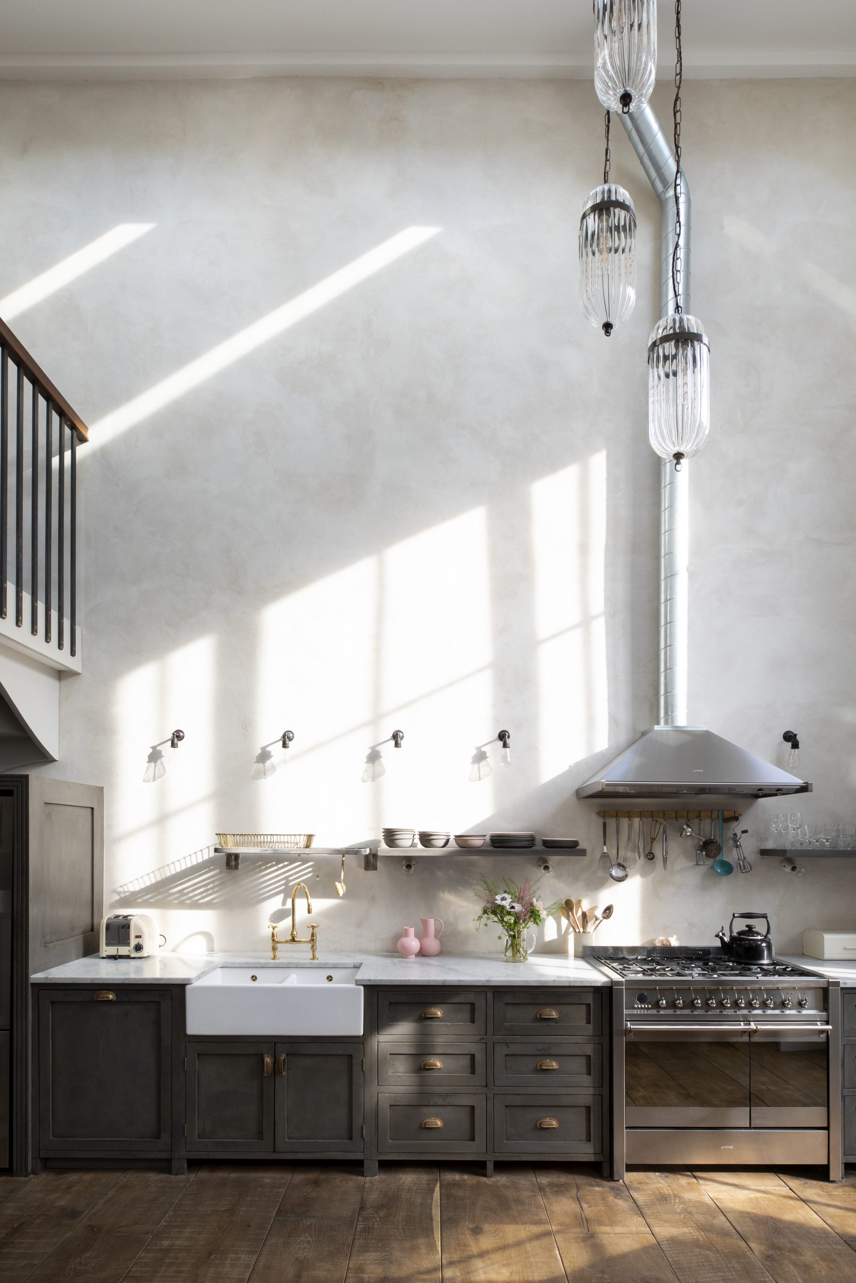
But, like most renovations, an element of compromise comes into the equation. ‘My partner Abi has always been keen on loft living and this is a Victorian building with boxy rooms. We decided to give the house the same sort of open feel with high ceilings and lots of light. So we knocked upwards and sideways, taking out some of the ceilings and walls of our original flat to create the double-height kitchen and the big living space. Unfortunately, that meant we lost a guest bedroom and bathroom, but the dramatic finished result made it worth it.’
Be The First To Know
The Livingetc newsletters are your inside source for what’s shaping interiors now - and what’s next. Discover trend forecasts, smart style ideas, and curated shopping inspiration that brings design to life. Subscribe today and stay ahead of the curve.
PANTRY
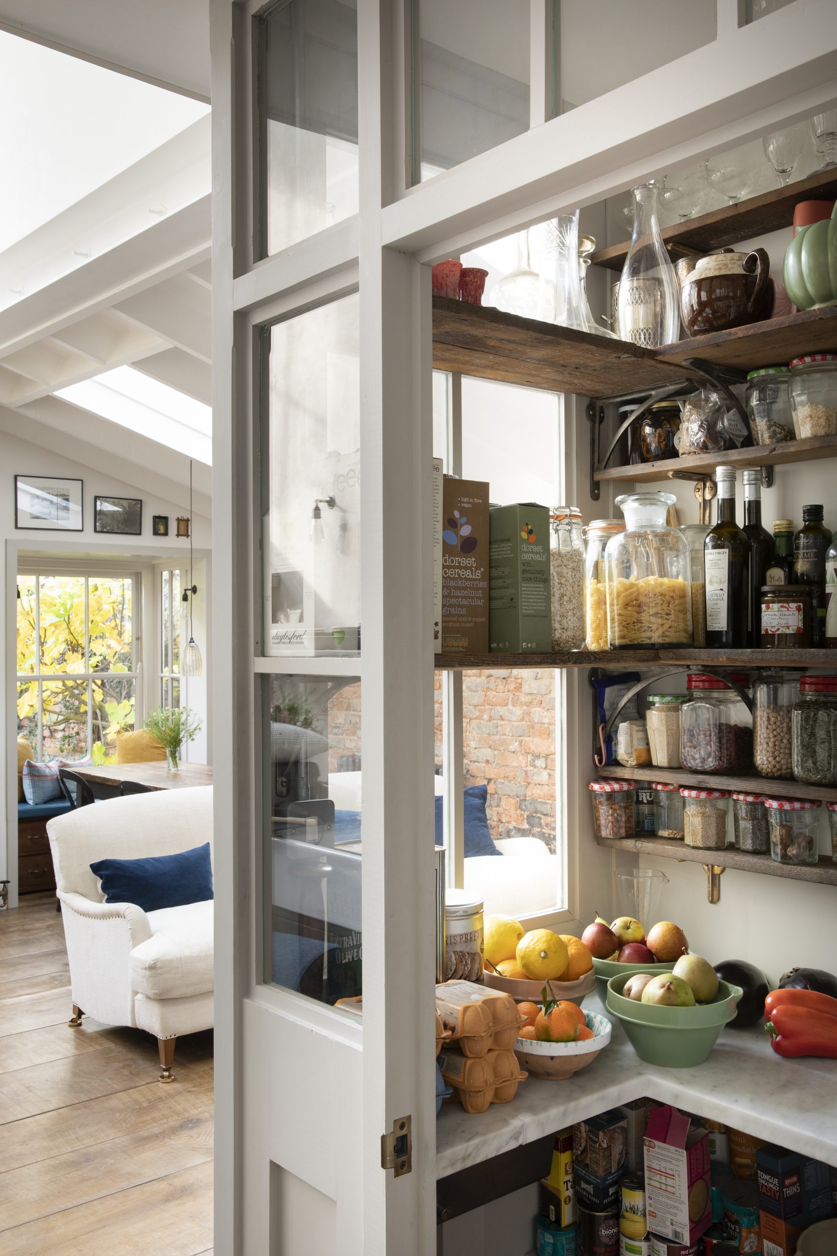
Mark carved out a nook to create a hard-working storage area. It keeps the open-plan kitchen calm and clutter-free.
Mark’s design style means he veers towards a subtle approach, preferring not to end up with something that looks ‘brand spanking new’. In this house, there is a blend of vintage furnishings and gentle hues that create a calming feel. The use of beautifully graphic wallpaper in the bedrooms, delicate greens (Mark often mixes his own colours) and natural flooring add to this easy mix of modern and Victorian. ‘Someone said to me that our daughter Olive’s bedroom looks like a World War II refugee’s bedroom. I took it as a compliment.’
MASTER BEDROOM
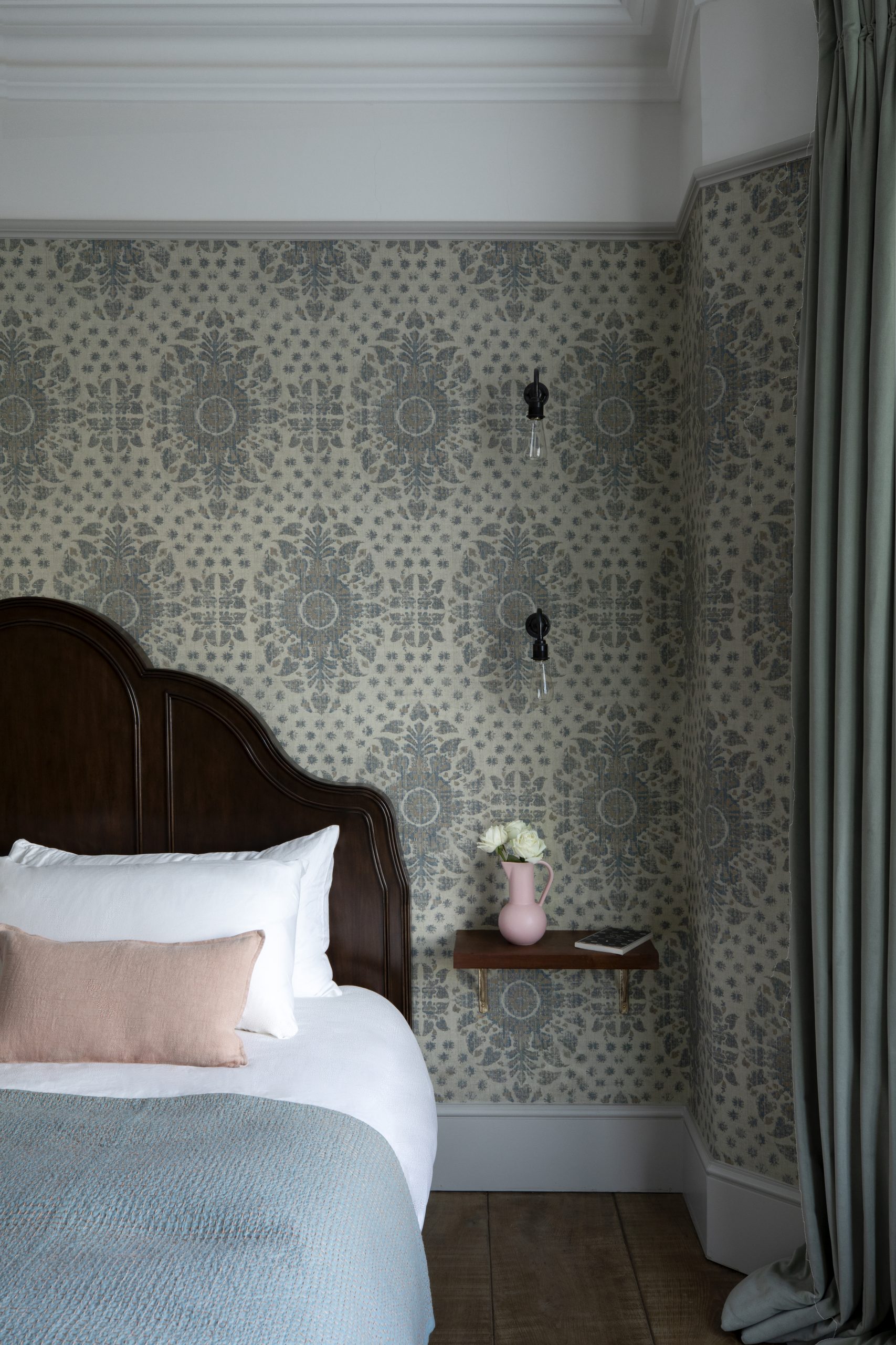
Bed, Soho Home. Karabak Sand wallpaper, Robert Kime. Bedside shelf, from the shop at marklewisinteriordesign.com.
A retro feel has been evoked with the soft hues, graphic wallpaper and pared-back accessories.
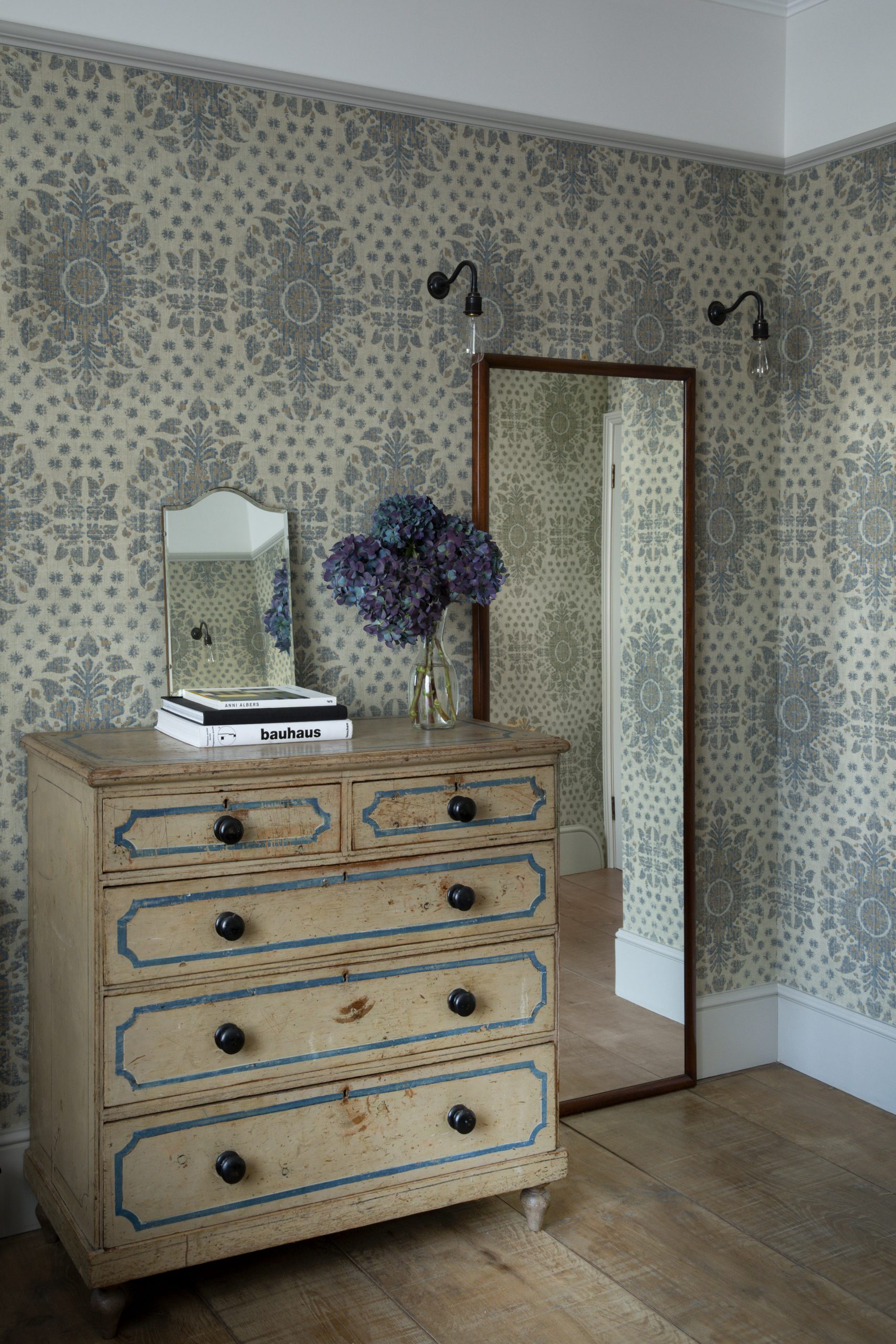
Sand wallpaper, Robert Kime. Chest of drawers sourced from Kempton Market
To get the effects he wants, time and effort go into the process. The kitchen cabinetry was specially built to fit the space, then hand-painted and waxed for an aged look. The walls were stripped back to the original bricks and finished in a lime plaster, which had to be applied in endless coats and hand-sponged. ‘It was a long process and a bit of a headache but we got there in the end,’ he says.
OLIVE’S ROOM
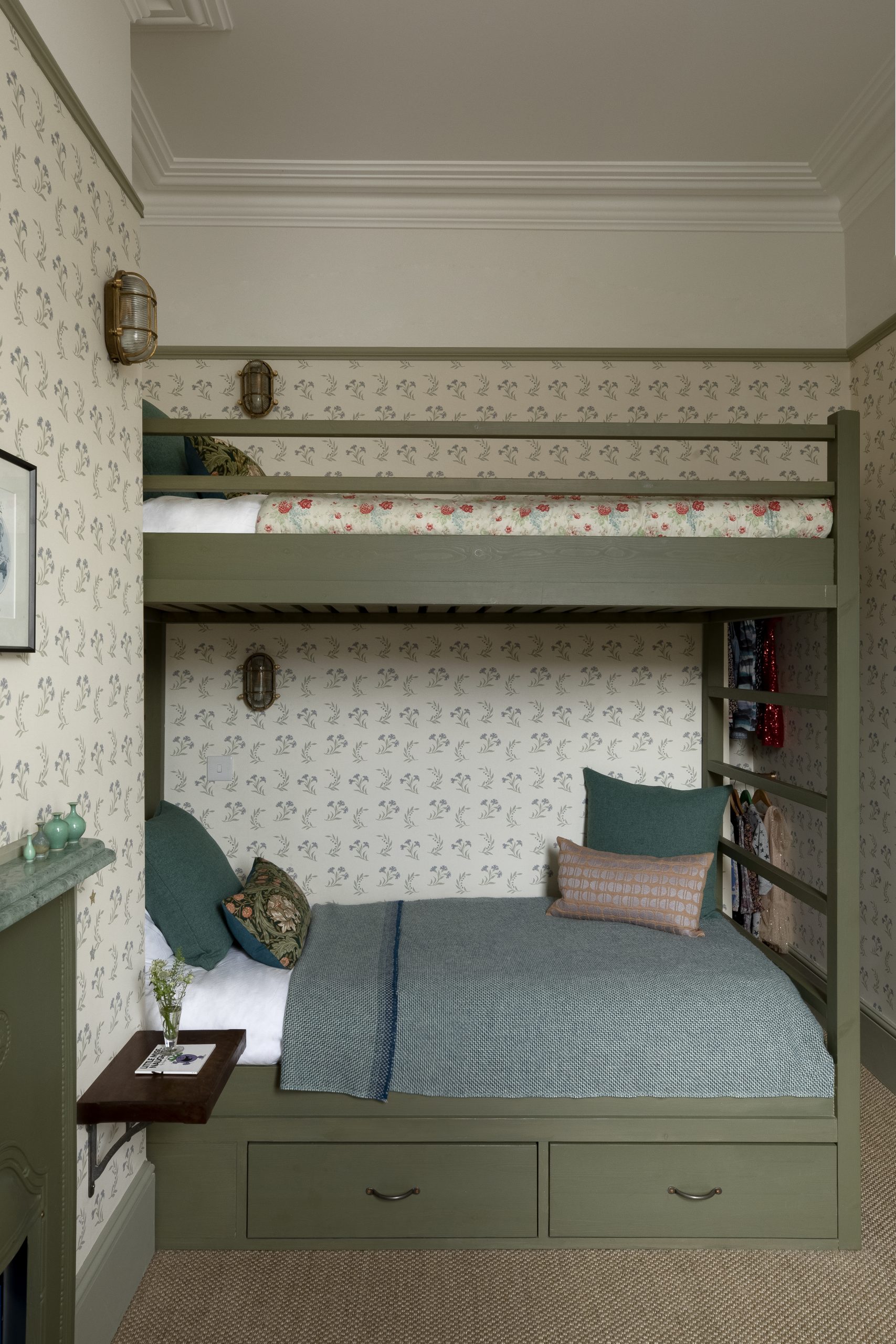
Bespoke bunk beds and painted in Farrow & Ball ‘Lichen’. Gareth Handles in Cast Iron, from the home store at marklewisnteriordesign.com. Wallpaper, ‘Gilly Flower Blue’, Robert Kime. Linen throw on bed, The Conran Shop. Small bedside shelf from the home store at marklewisnteriordesign.com
These built-in bunks mean granny has somewhere to sleep when she comes to stay. ‘They have been designed with adults in mind – there is enough space so you don’t bang your head when getting into bed,’ says Mark.
Another factor Mark feels strongly about is upcycling. As he says: ‘Establishing a home takes years and years, so if you reuse the materials that have already been part of the house, then you are giving it a kick-start.’ Examples of his creativity are everywhere: the downstairs loo which benefits from ‘another life’ trimmings, the brickwork in the dining area, which was once the old garden wall, and the distinctive pieces of handed-down furniture that have all been reupholstered or repainted.
See Also: Small bathroom ideas: 22 super chic ideas for bijou bathrooms
ENSUITE BATHROOM
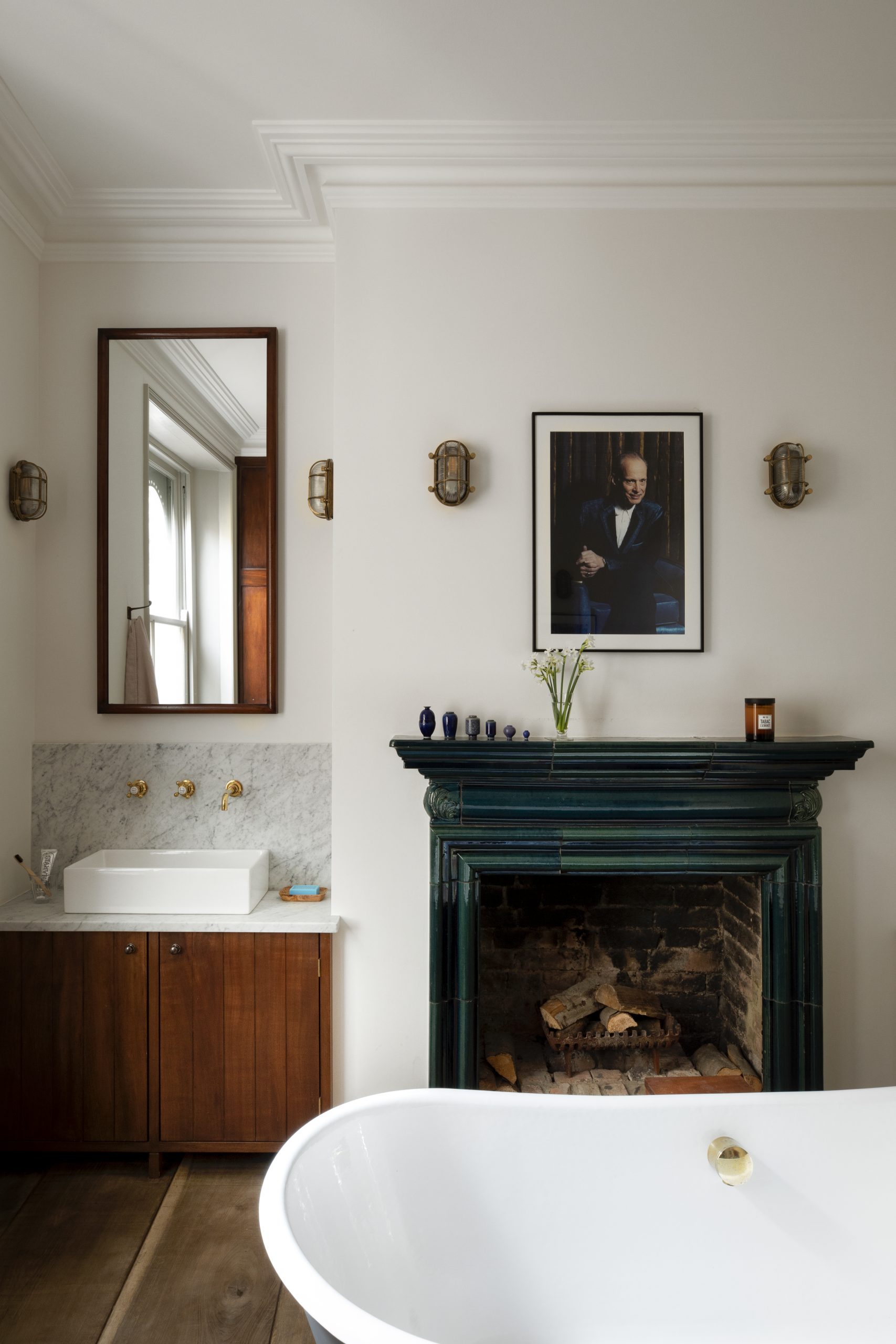
Bath, basin and taps, all Aston Matthews. Bespoke basin unit with Carrara marble surface, Mark Lewis Interior Design. Fireplace, sourced from Retrouvius. Portrait photo by Retts Wood. Wall lights, Urban Cottage Industries.
Mark’s favourite room: ‘A huge bath and a working fireplace… it couldn’t be more calming.’
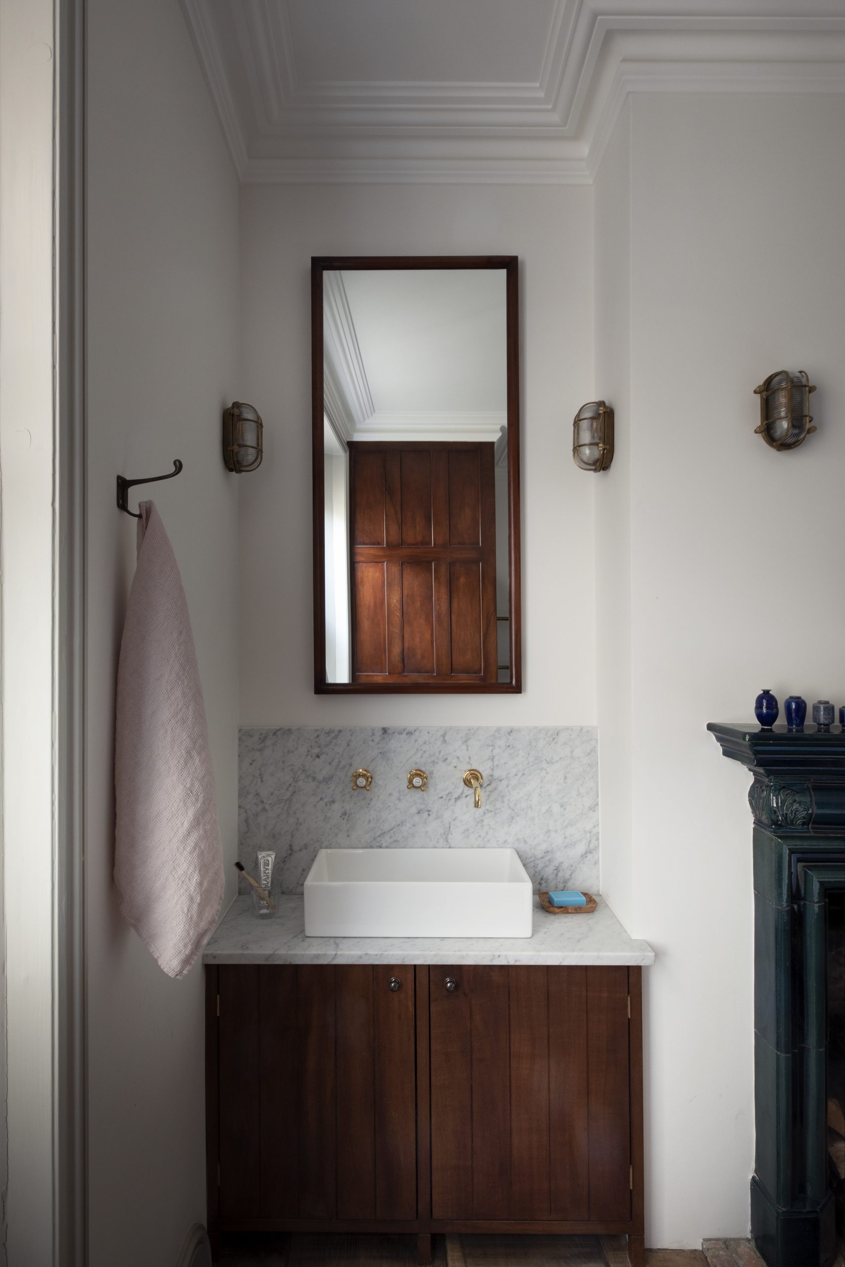
Bath, basin and taps, all Aston Matthews. Bespoke basin unit with Carrara marble surface, Mark Lewis Interior Design.
Mark emphasises the need for his home to be a haven, a secure place for the family to appreciate as they grow older. ‘I moved from pillar to post as a child,’ he says, ‘so I want this house to be an anchor for us. We’re here for the long term.’ Although he is still smarting somewhat from the renovation, there is a glimmer in Mark’s eye when the topic of ‘what’s next?’ comes up. ‘I am hankering after adding an underground yoga studio to the garden. Ridiculous, I know! But if we get planning, it could happen. And there is another flat on the top floor of this building so if that comes up for sale, we might grow even further…’ One thing is for sure – never say never!
See Mark’s work at marklewisinteriordesign.com
Photography Paul Raeside
See Also: Explore a rustic farmhouse with a refreshingly modern take on colour
The homes media brand for early adopters, Livingetc shines a spotlight on the now and the next in design, obsessively covering interior trends, color advice, stylish homeware and modern homes. Celebrating the intersection between fashion and interiors. it's the brand that makes and breaks trends and it draws on its network on leading international luminaries to bring you the very best insight and ideas.
-
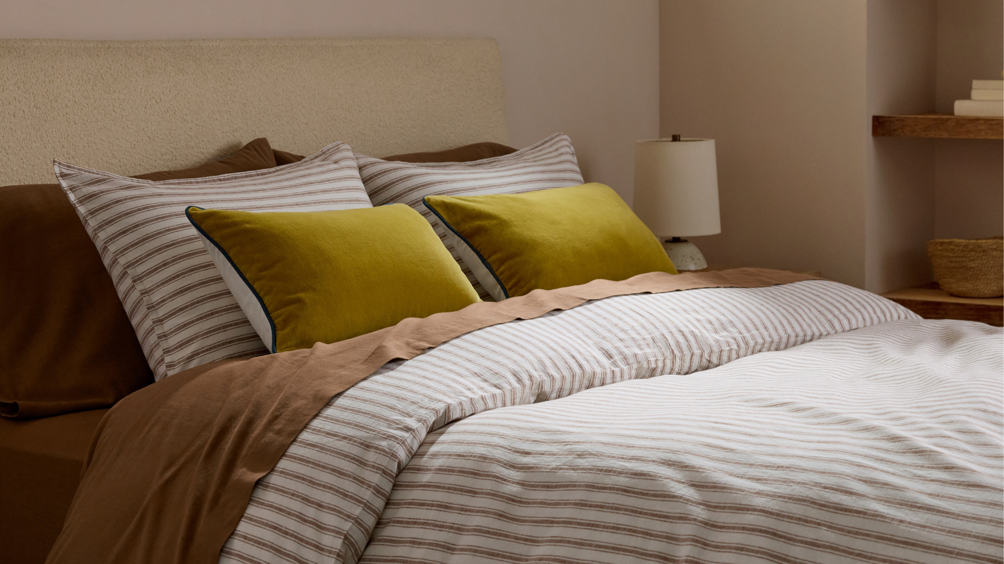 Parachute Just Dropped a Collection at Target and It's A Guaranteed Sell Out
High quality bedding and bath linens just got a lot more accessible. Parachute's signature effortlessly chic style is now available in over 200+ pieces at Target
By Devin Toolen
-
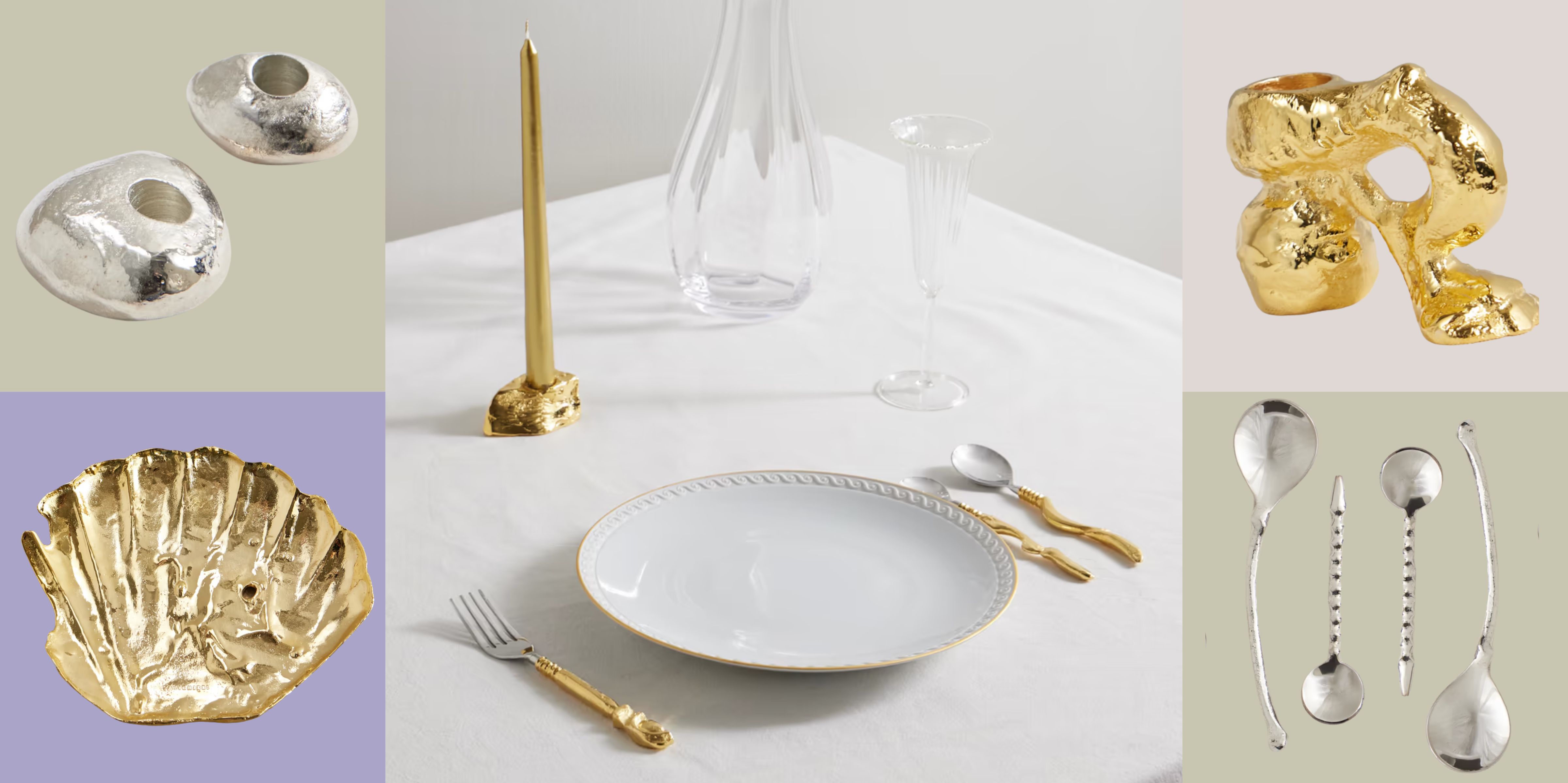 Now Serving: Jewelry for Dinner — Alighieri Brings Its Signature Raw Beauty to the Table
Alighieri CASA is what happens when a jewelry house designs your cutlery — and yes, it’s just as fabulous as it sounds
By Julia Demer