It May Be 10,000 Square Feet, But This San Franciscan Home Is All About "Smaller, More Intimate" Spaces
Each room in this California home is inspired by a travel destination its owners love
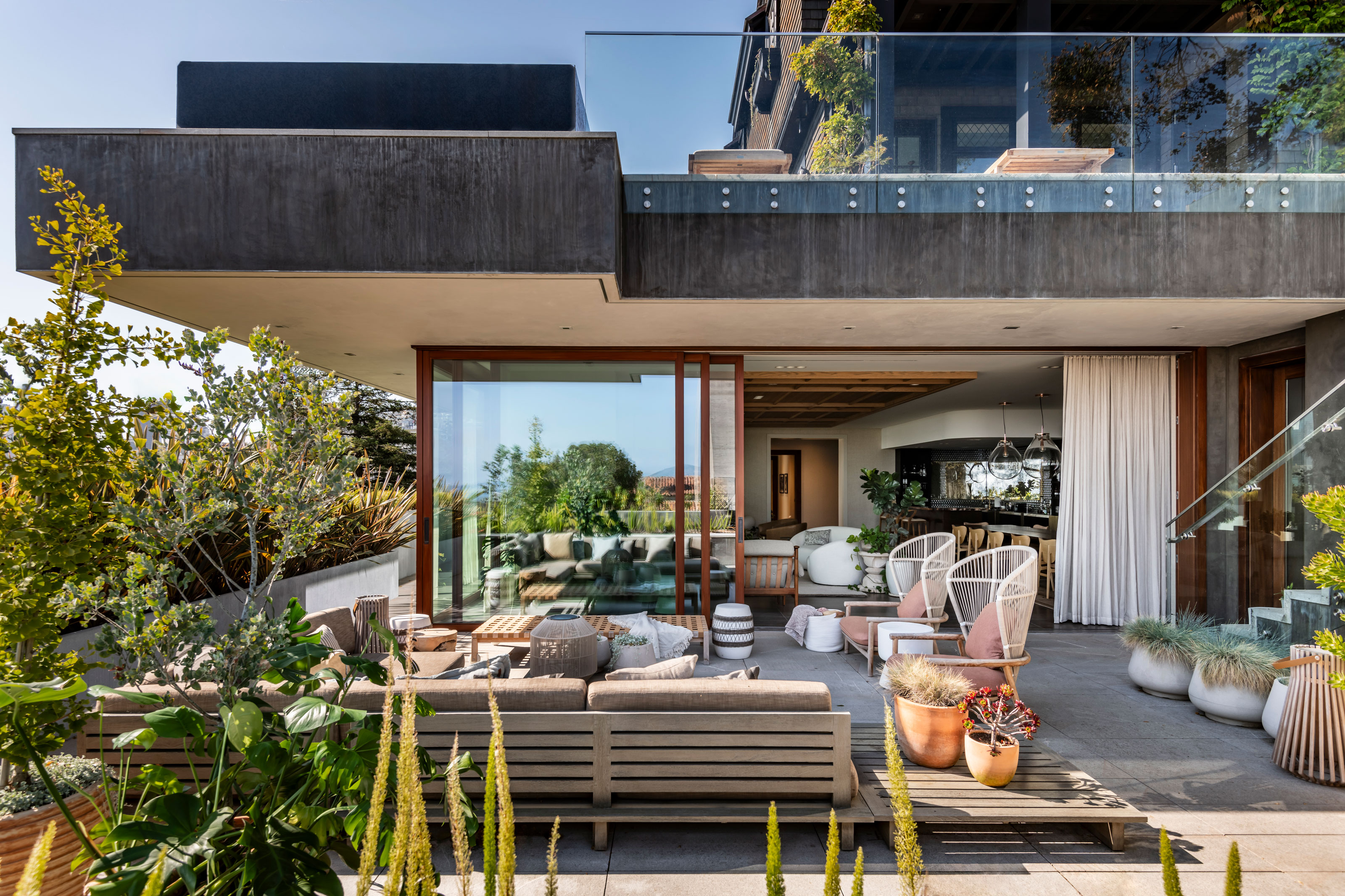

For this home in San Francisco, built in 1907, size isn't an issue. Between the main house and a smaller 'cottage' that makes for an ideal guesthouse, there's some 10,000 square feet of floorplan to play around with.
However, instead of playing into the modern design trope of tearing down walls and creating larger, open-concept spaces, SkB Architects took a more pared-back approach to remodeling the home, without changing any of the internal walls.
"There is no room that is big," says Shannon Gaffney, architect and founding partner of SkB Architects. "All rooms are small and intimate; none of the walls were removed to make one grand room."
This offered an opportunity to get creative with each space, bringing a different sense of character and place as you move throughout the home, while also bringing a homeliness that the property was missing before.
"A home rejuvenation was necessary to infuse new life, as prior renovations aimed for a 'modern' interior, ultimately rendering it sleek yet devoid of soul," Shannon says. "We wanted to bring in an uplifting and light attitude.”
We take a tour of the modern home, below.

The architects selected lighter, sun-kissed hues with an uplifting touch.

The light and bright living space is filled with plants, bringing the outside in.

A generous home bar makes this spot ideal for entertaining, while a lowered portion of roof helps add structure to the space.
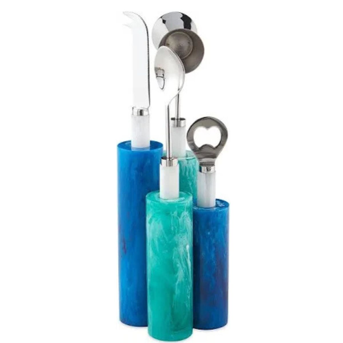
Price: $150
This Jonathan Adler bar set introduces the same color story as the home bar in this living space.
The largest space in the house is the entertaining living room, comprising of a sitting area, a dining table, and a large home bar.
Be The First To Know
The Livingetc newsletters are your inside source for what’s shaping interiors now - and what’s next. Discover trend forecasts, smart style ideas, and curated shopping inspiration that brings design to life. Subscribe today and stay ahead of the curve.
"We kept an existing limestone polished floor but worked to warm it up, boosting and highlighting some of the cool quirks and characteristics of the old home," Shannon Gaffney, of SkB architects, explains. A palette of warm neutrals changes the outlook of the material in the space.
The design of the home, throughout, leans heavily on the natural beauty of wood — "some sunny and refined (in the main house), others more rustic (in the cottage)," Shannon explains. "The main house then becomes more light-hearted, while the cottage is a bit moody."

The kitchen is separate, but well-proportioned with a large kitchen island.

A small garden room neighbors the kitchen. With a coffee bar station, it's the ideal spot for a morning Americano.
"We purposefully chose lighter, sunny, and uplifting tones that were more on the muted side," Shannon adds. "Golden hues that play well with cool and warm-washed wood tones create a stand-out color story that is apparent but not in your face."
There's a beachiness that comes through in these colors. The coastal interior design calls to mind far-flung vacations as well as the California cool vibe of the San Francisco Bay Area.
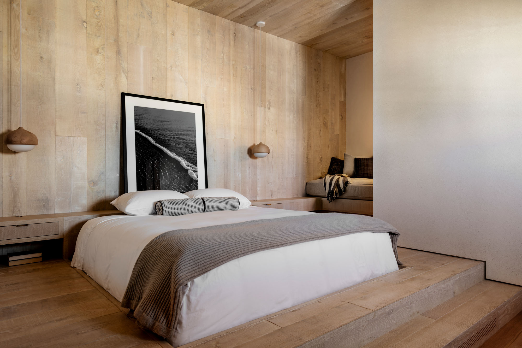
With the walls, floors and ceiling paneled with washed-out wood, this bedroom, with its sunken bed, feels like beach-side escape.
"The client wanted each room to represent a place that they had traveled to, loved, and wanted to remember," Shannon tells us. "The rooms each take on their own theme, but not in a literal sense." Think Bali, Thailand, and even local California influences.
"There are things that run throughout to give each space an eclectic personality with fun opportunities for discovery."
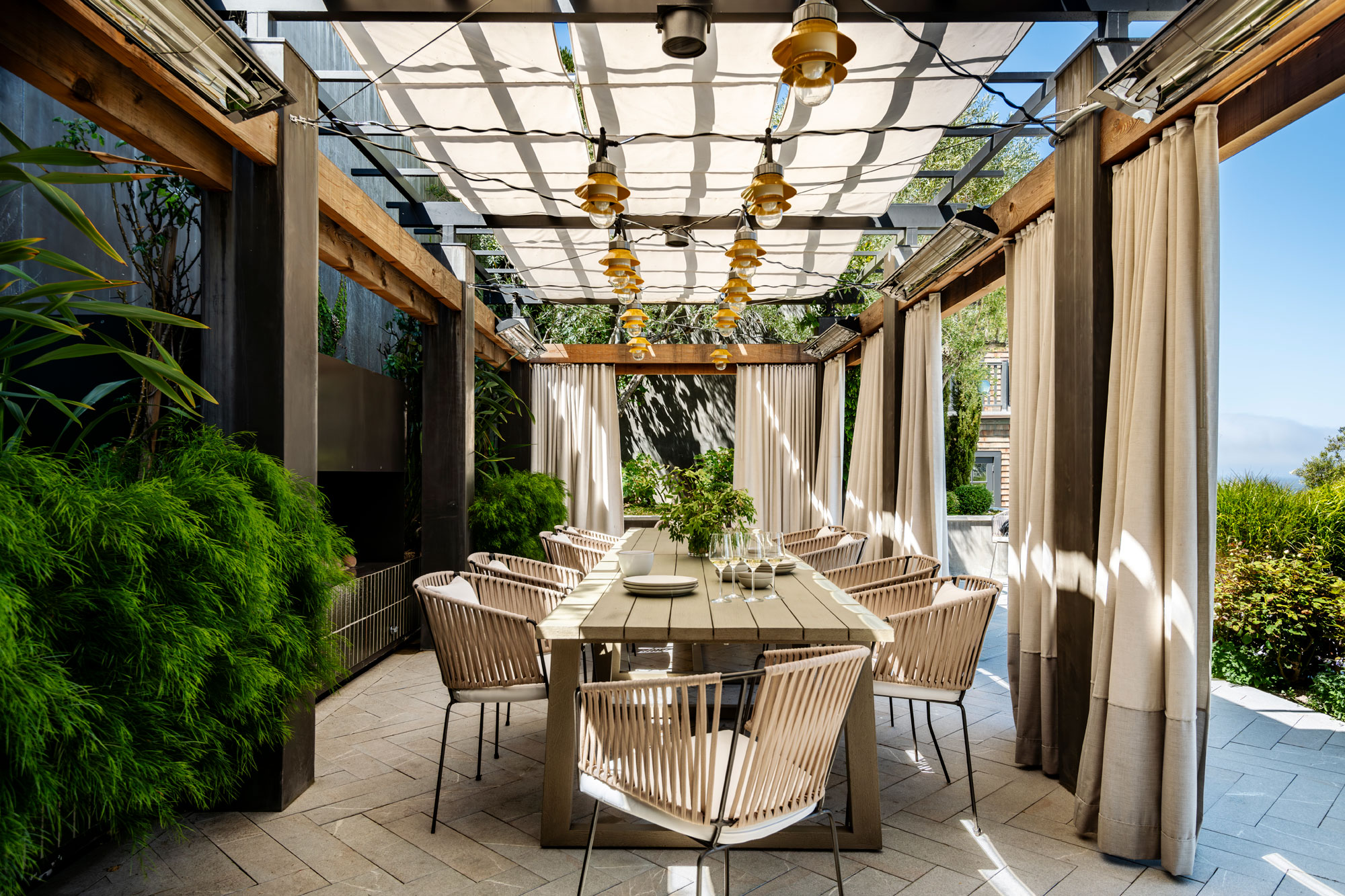
The remodel included some changes to the landscaping. This outdoor dining space, with its clever introduction of curtains and sails for shade, is ideal for the warmer California seasons.
The cottage is a self-contained space that's ideal for hosting guests. Visually, it stands apart from the rest of the property, too. It's drenched in lighter, white-washed timber for an easy, breezy coastal feel.
A small kitchen, living space, and dining area offer all the amenities you'd need to stay in comfort.


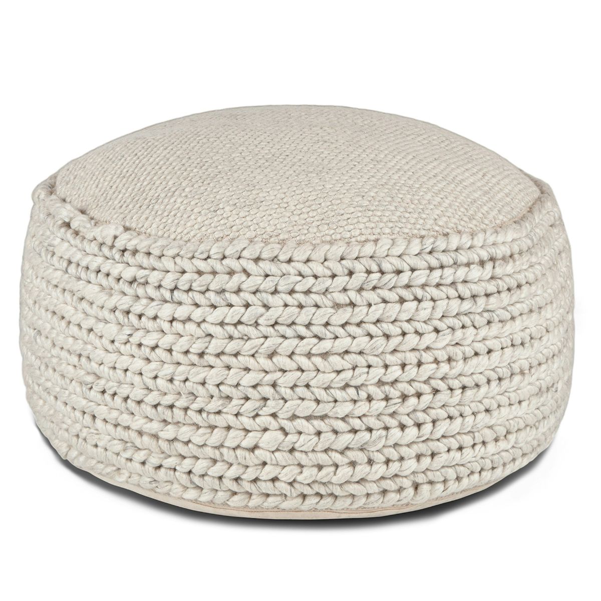
Price: $299
This knitted ottoman from Article delivers on the subtle beachy vibe.
Through this remodel, this home has taken on far more character and a sense of locale. "The location and historical nature of the home were appealing to us from the start," Shannon says. "There was a need to revitalize the space and do something new, as various remodels attempting to capture a modern interior setting had left the space feeling sleek and soulless."
In its new form, the home captures an uplifting and light attitude in a way that feels distinctively Californian.

Hugh is Livingetc.com’s editor. With 8 years in the interiors industry under his belt, he has the nose for what people want to know about re-decorating their homes. He prides himself as an expert trend forecaster, visiting design fairs, showrooms and keeping an eye out for emerging designers to hone his eye. He joined Livingetc back in 2022 as a content editor, as a long-time reader of the print magazine, before becoming its online editor. Hugh has previously spent time as an editor for a kitchen and bathroom magazine, and has written for “hands-on” home brands such as Homebuilding & Renovating and Grand Designs magazine, so his knowledge of what it takes to create a home goes beyond the surface, too. Though not a trained interior designer, Hugh has cut his design teeth by managing several major interior design projects to date, each for private clients. He's also a keen DIYer — he's done everything from laying his own patio and building an integrated cooker hood from scratch, to undertaking plenty of creative IKEA hacks to help achieve the luxurious look he loves in design, when his budget doesn't always stretch that far.
-
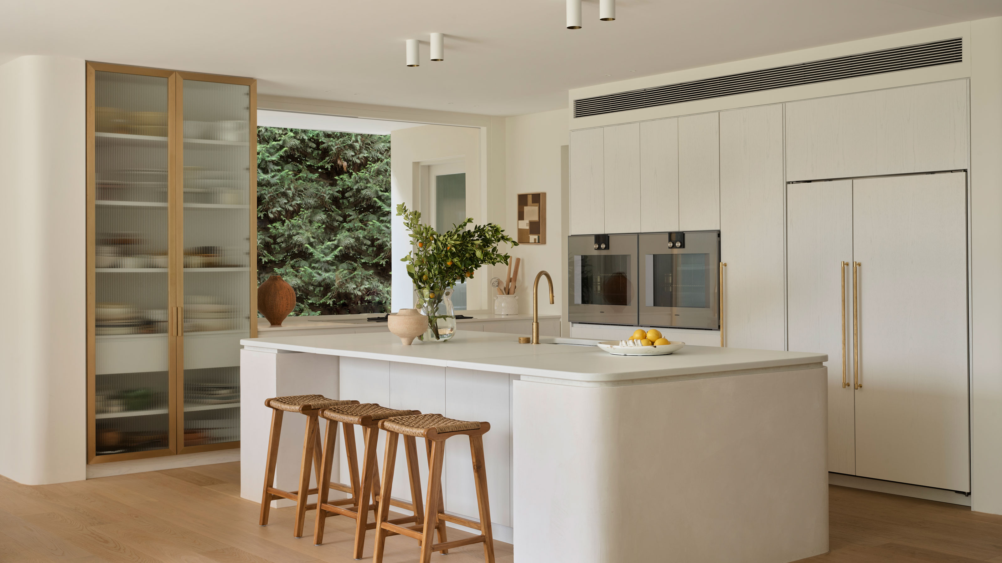 What Can I Choose Instead of Brass Taps? 4 Finishes That Are Emerging in 2025's Kitchens and Bathrooms
If you want to try something a little different for your kitchen or bathroom finishes, these are the trending styles in taps beyond classic brass
By Seraphina Kyprios Published
-
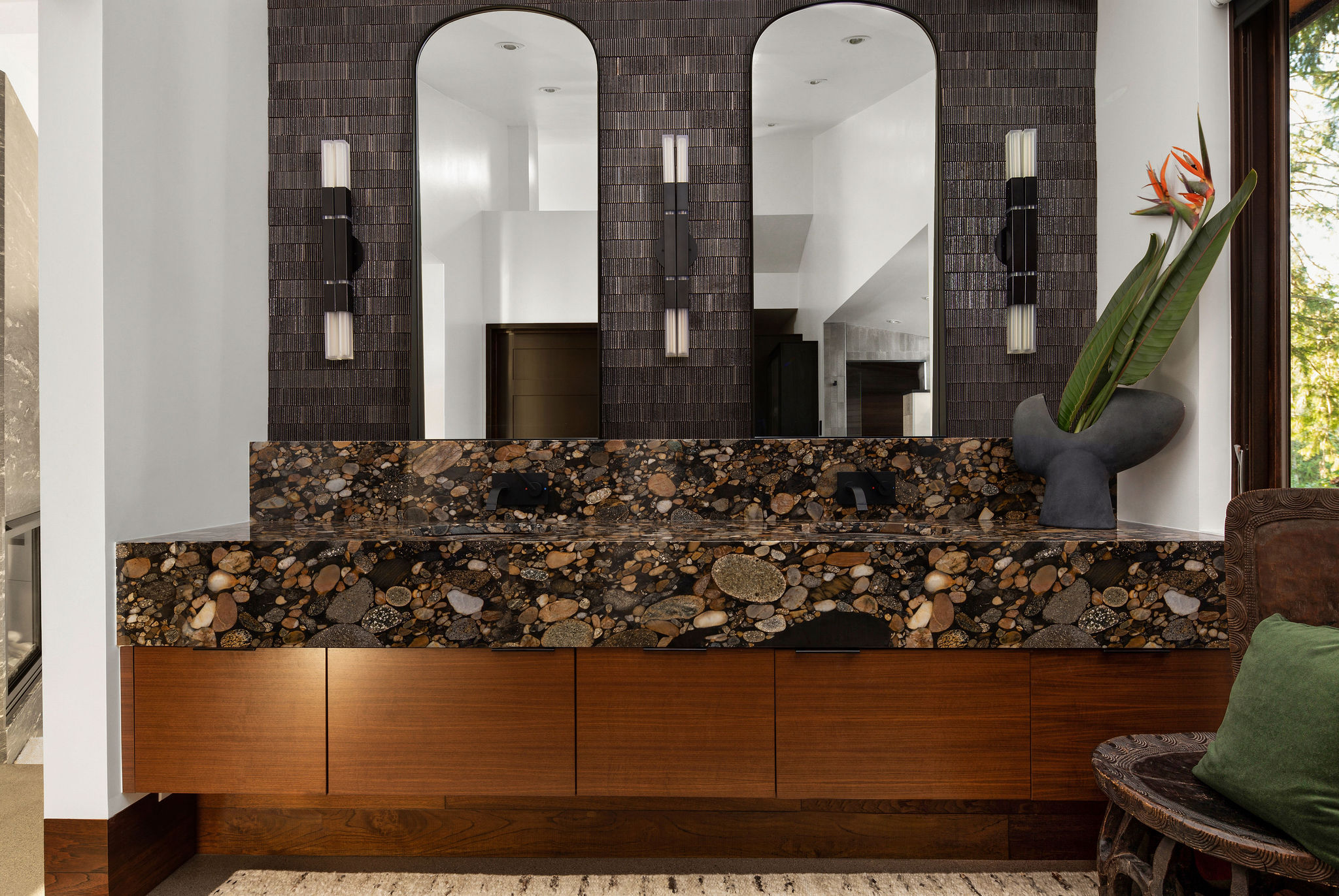 How to Make a Bathroom Look More Expensive — 5 Simple Upgrades That Will Elevate Your Space Instantly
If you're on a mission to create an elevated, luxe-feel bathroom on a budget, our experts are here to help
By Maya Glantz Published