Inside a Victorian house in northwest London where Scandi meets modern
Natural light, luxurious textures and sharply drawn black outlines are the staples of this chic Victorian house in northwest London...
THE PROPERTY
A Victorian house in northwest London. There’s a living area/kitchen-diner on the ground floor of this modern home, plus a family room and WC. The first floor has the children’s bedrooms, a study/guest bedroom suite and, on the half landing, a bathroom. The master suite is on the top floor.
HALLWAY
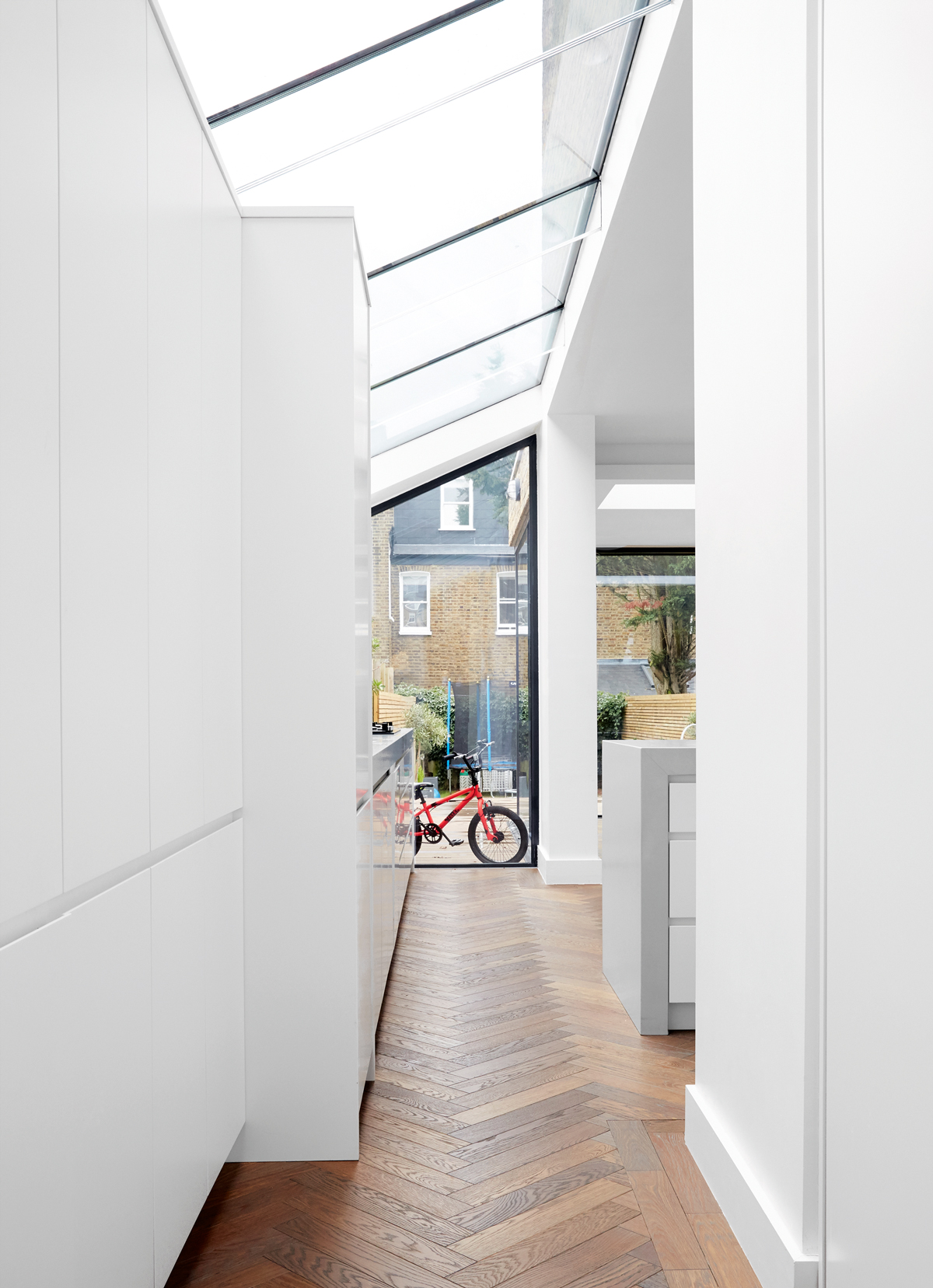
A side return with a pitched glazed roof maximises sunlight (pictured above). As you look through from the family room, all you see ahead of you is space and light.
See more super-stylish modern homes
LIVING AREA
Comfort comes first in this living room.The design feels sophisticated but also robust enough for family life. There are no fragile materials or hard-edges used. Instead the a focus is on simple shapes and super tactile furniture.
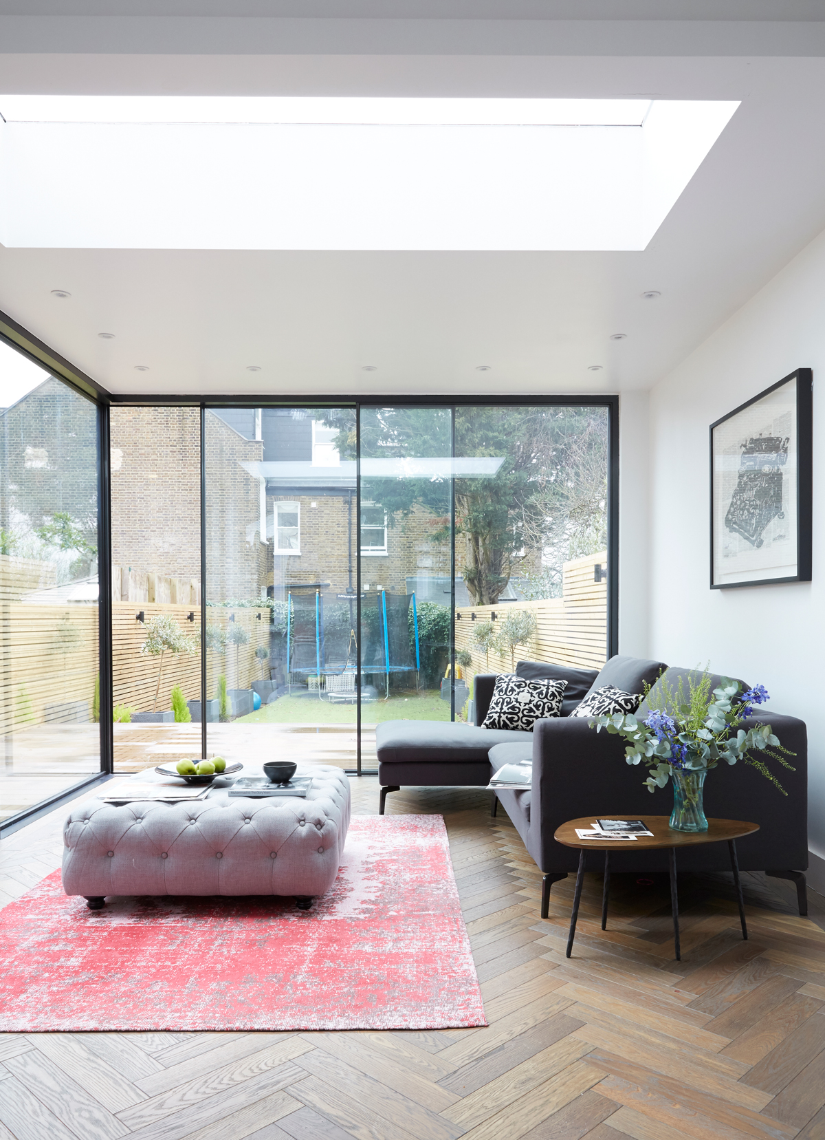
Natural light, luxurious textures and sharp outlines are the staples of this family home.
You often see a beautiful kitchen extension that makes the living room redundant, as everyone loves the new area so much. Not so here. This layout is a perfect division of space. All the spaces effortlessly merge, rather than feeling separate.
FAMILY ROOM
Fine black lines run like a thread through all the rooms, on pendants, picture frames and as the glazing that envelops the extended kitchen area.
Be The First To Know
The Livingetc newsletters are your inside source for what’s shaping interiors now - and what’s next. Discover trend forecasts, smart style ideas, and curated shopping inspiration that brings design to life. Subscribe today and stay ahead of the curve.
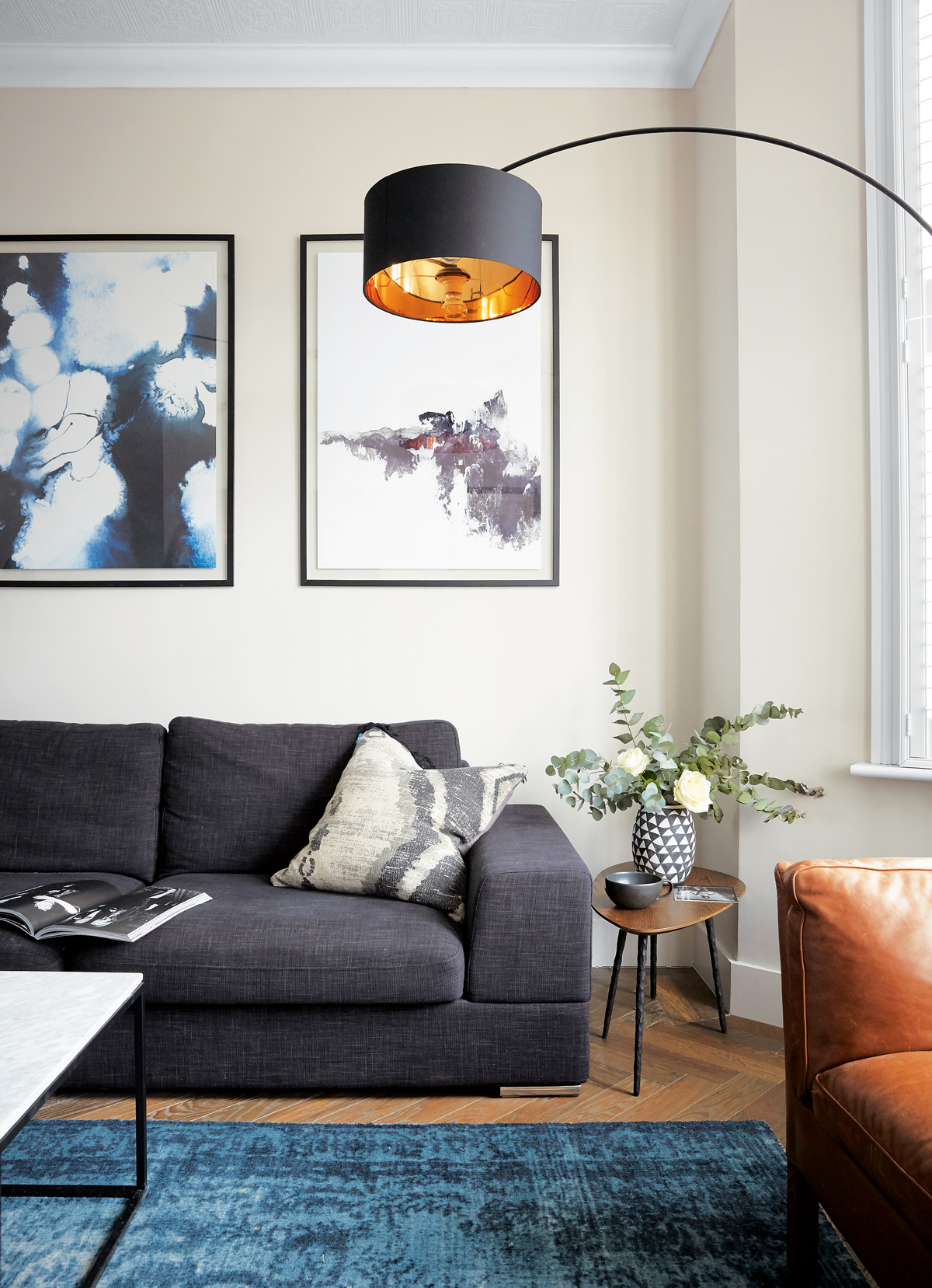
In all the spaces, art adds to the effect – without overwhelming. A mix of modern and collected pieces means none of the art dominates the rest of the décor.
KITCHEN
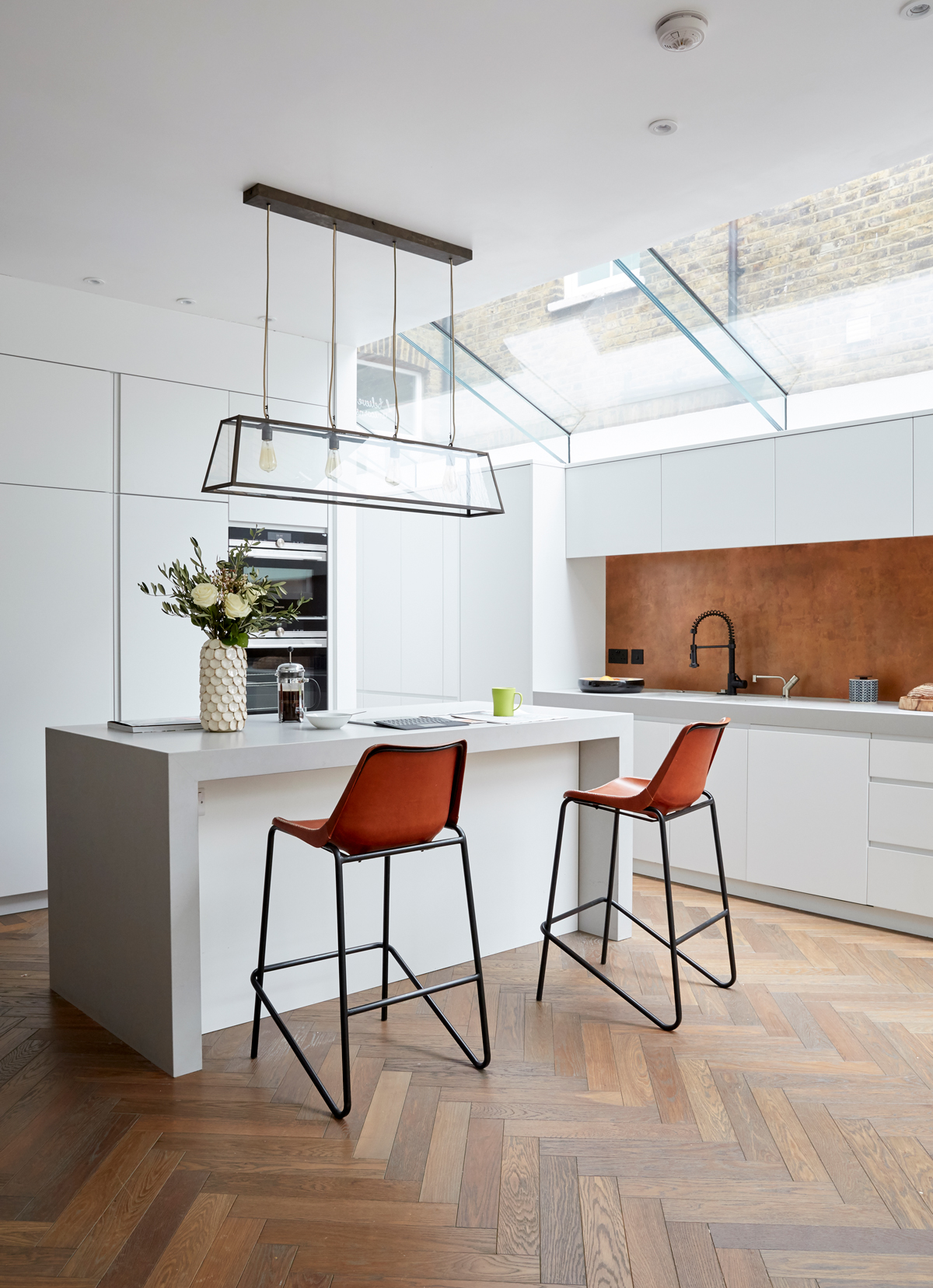
Glazing above and around the kitchen extension makes the most of available light, with the open feel enhanced by clever structural techniques that remove the need for supporting pillars.
The kitchen cabinetry is ice-white and simple, with all the textural impact emanating from a splash back of rich copper and the glass pendant.
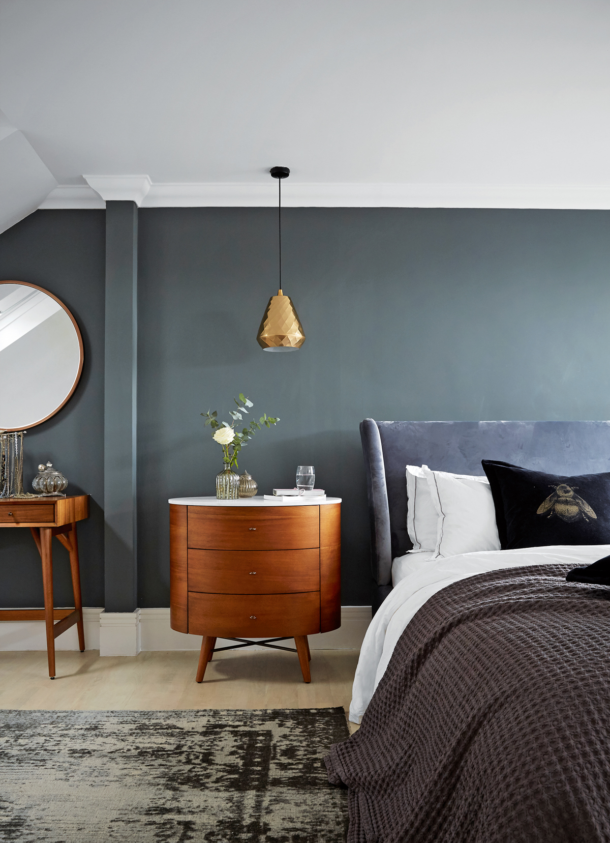
MASTER BEDROOM
On the top floor, the master bedroom is a masterclass in achieving the boutique-hotel vibe at home, with velvet, warm timber tones and lush metallics.
See Also: Master Bedroom Ideas - 31 stunning bedroom schemes
BATHROOM
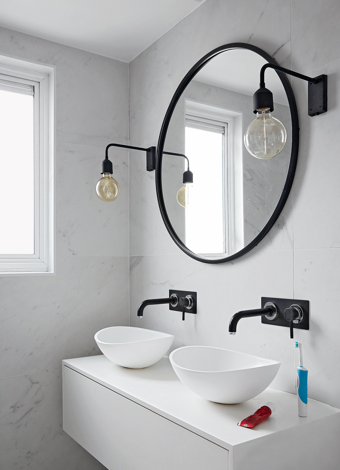
Sleek, smooth tiling and curvaceous modern basins were the starting point for this modern bathroom. Simple and textural.
Matt-black taps were added to the bathroom and to mimic the clean black lines that feature elsewhere.
STUDY
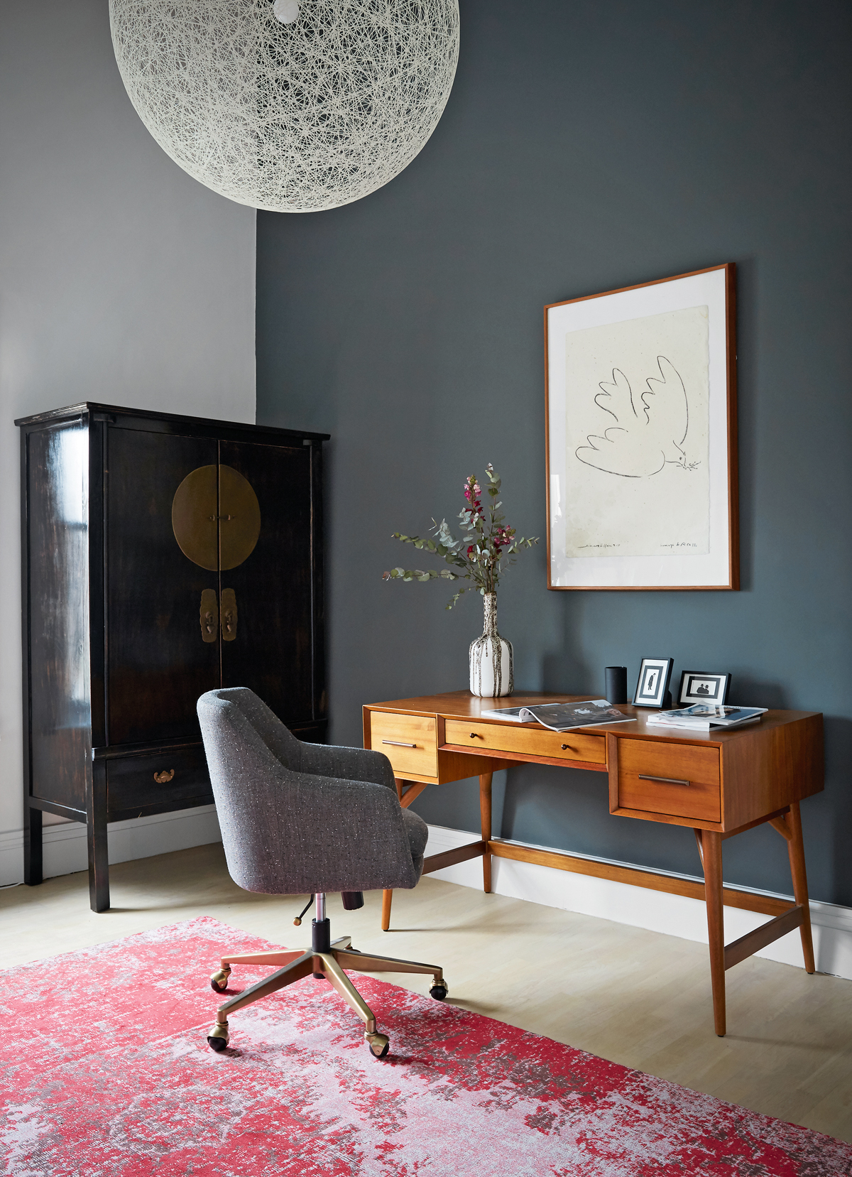
This roomy, first-floor space doubles as a guest bedroom.
CLOAKROOM
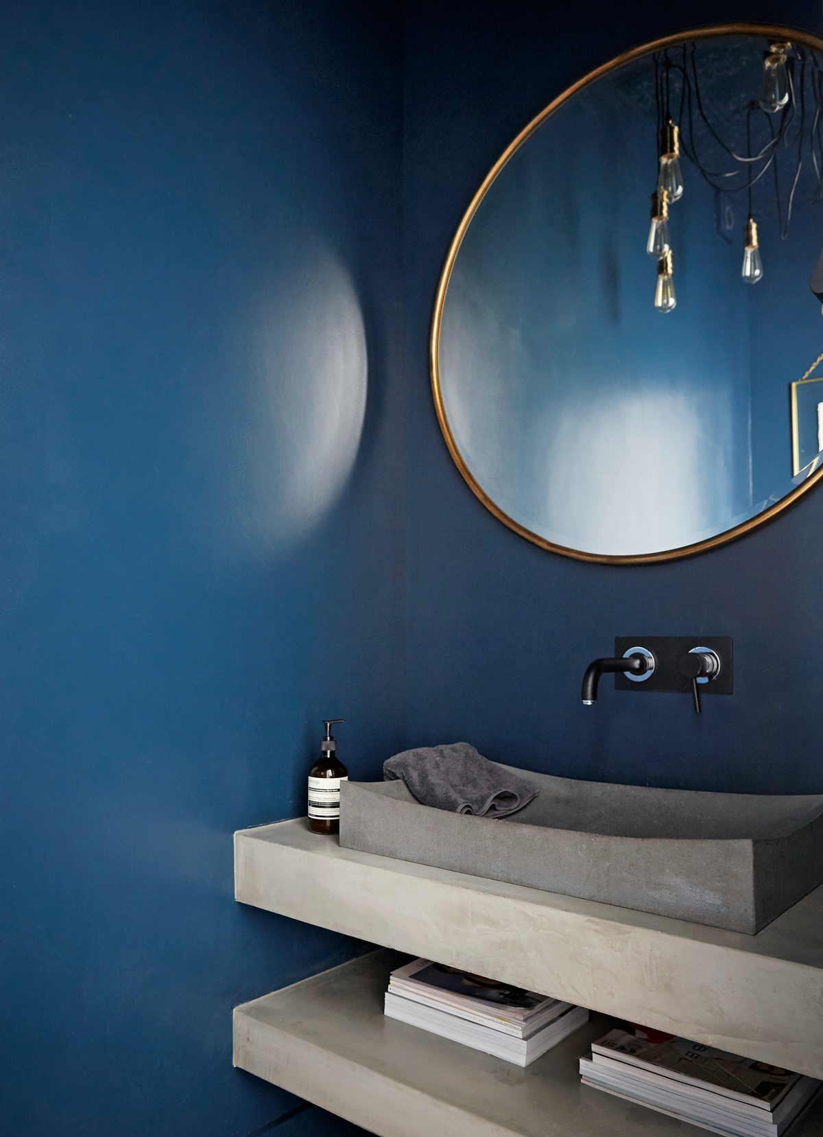
Concrete, brass and deepest blue meet create a glam slam in the smallest room in the house.
See more of this design projects at honeybeeinteriors.co.uk
Photography ⁄ Paul Massey
See Also: Cloakroom and powder room ideas: small spaces, big patterns
The homes media brand for early adopters, Livingetc shines a spotlight on the now and the next in design, obsessively covering interior trends, color advice, stylish homeware and modern homes. Celebrating the intersection between fashion and interiors. it's the brand that makes and breaks trends and it draws on its network on leading international luminaries to bring you the very best insight and ideas.
-
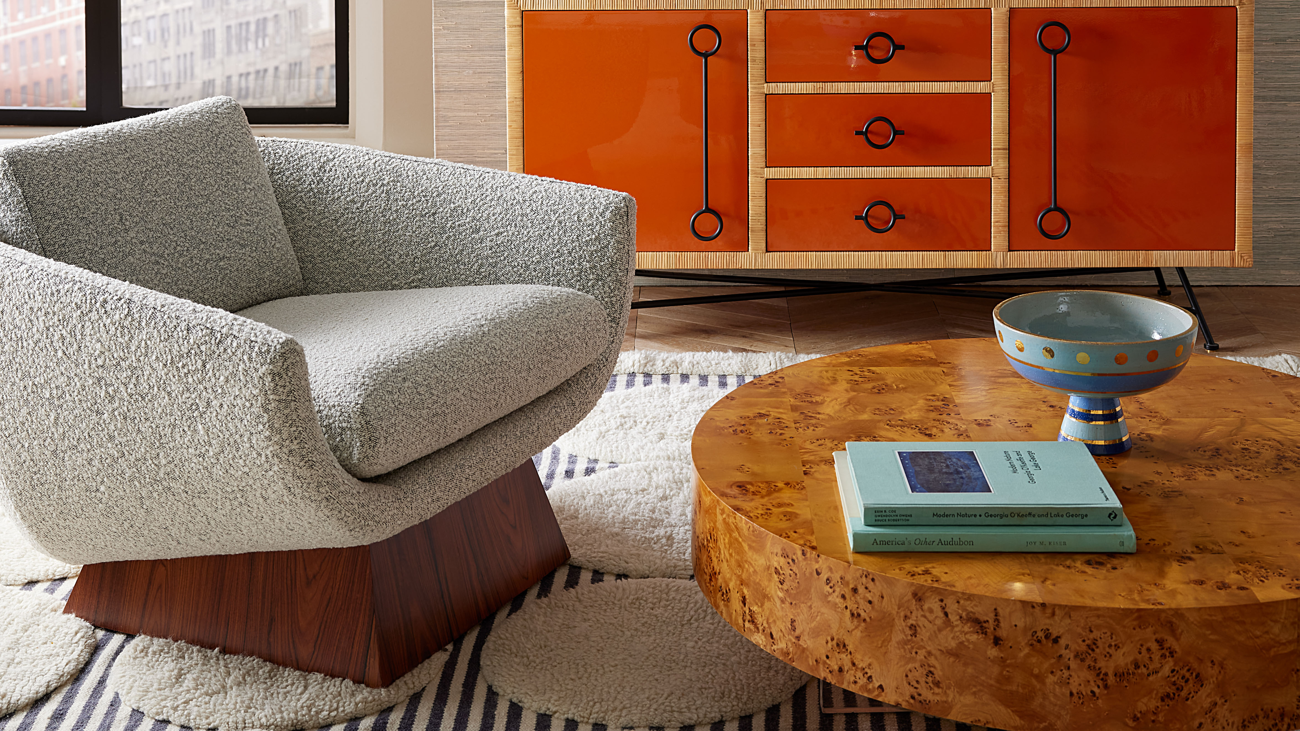 Burl Wood Decor Is 2025’s Most Coveted Comeback — Here’s How to Get the Storied Swirls for Less
Irregularity is the ultimate luxury, but you don’t need an antiques dealer to find it
By Julia Demer Published
-
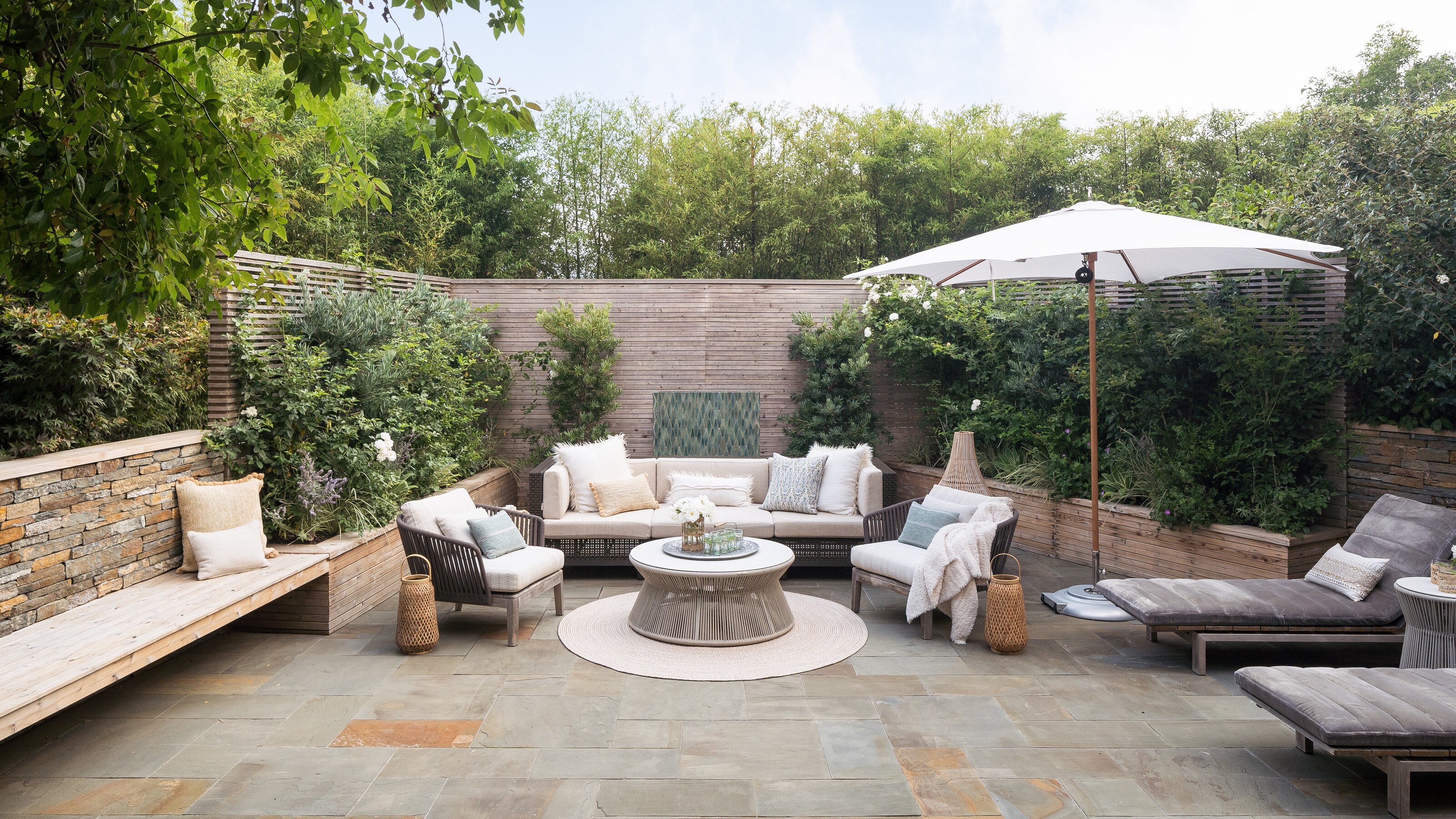 5 Garden Features That Instantly Add Value to Your Home — While Making Your Outdoor Space More Practical, too
Get to know all the expert tips and tricks for making your backyard a standout selling point for your home.
By Maya Glantz Published