A new layout and earthy tones has completely transformed this south London semi
An interior designer has brought the feel-good factor to a family home by using bespoke touches and natural textures
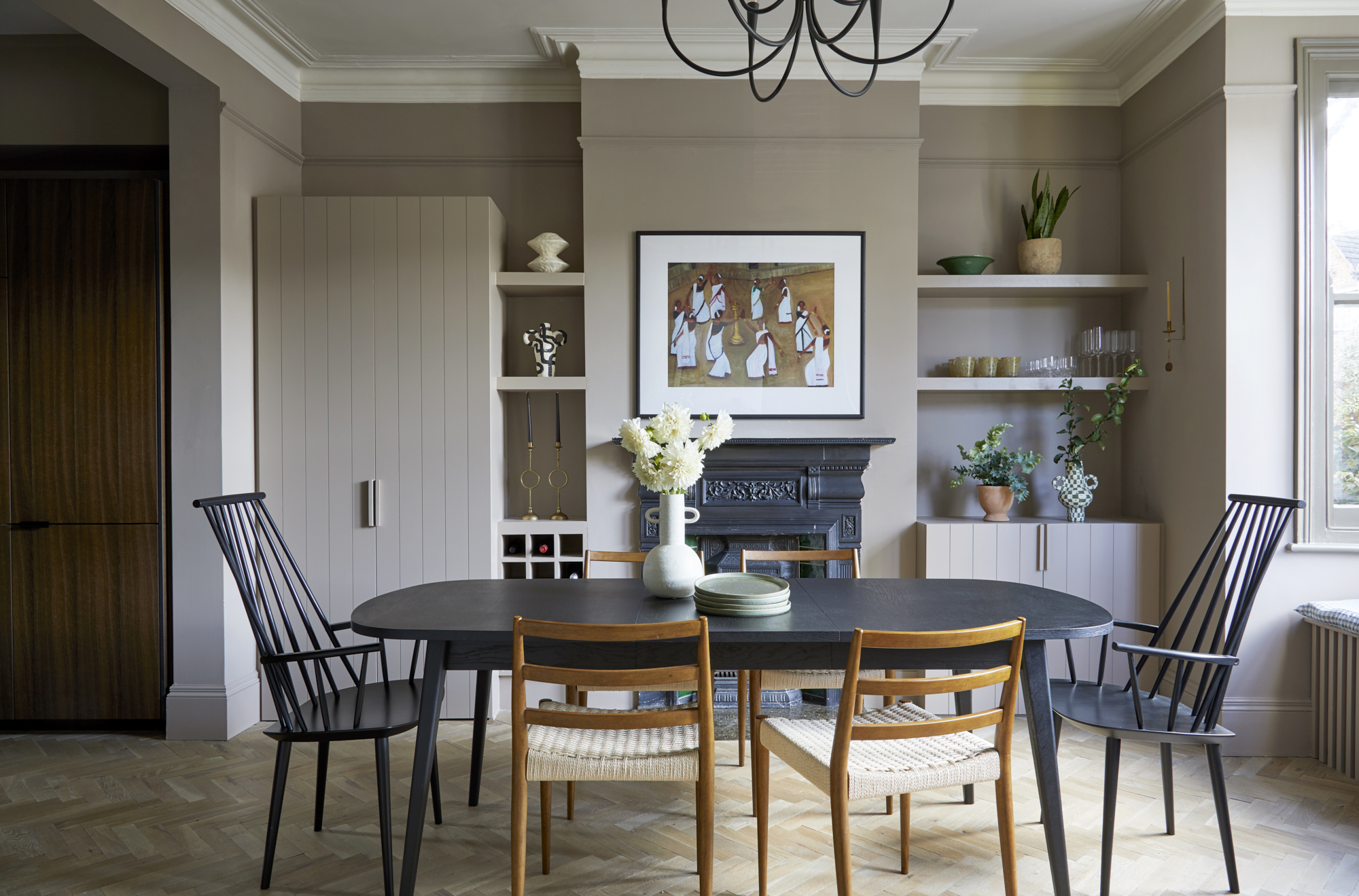
From rustic herringbone flooring to a wall of textured tiles that catches the light in a beguiling way, rich textures were key to creating the natural mood of this modern home in south London.
For its interior designer, Andrew Griffiths, interior designer and founder of design studio A New Day, these were just two of many tactile elements that came together to foster the mood his clients were after.
Let's look around...
Hallway
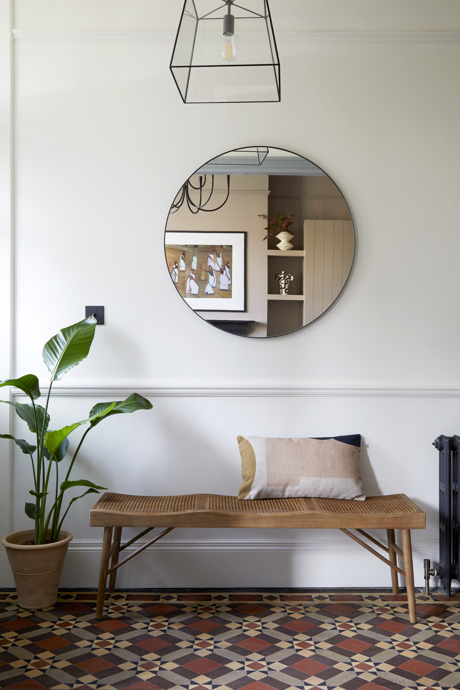
‘I began the design process by asking them how they wanted to feel as they walk in the front door,’ he explains. ‘They wanted a sense of warmth and ease and these textures all help influence how this house is experienced.’
Andrew was hired by Sarah Heritage, a lawyer, and Sid Vijayakumar, who works in tech, who were upgrading from a two-bedroom apartment in Dalston, east London. They had just started a family (son Luc is now two and new baby Elin is nine months old), so this home represented an exciting new stage in their lives. In anticipation, Sarah had gathered together an impressive stash of images she’d saved from Pinterest, Instagram and magazines, so she could show Andrew the styles she loved.
Period patterns feel fresh alongside modern details in this entrance hall idea. ‘Double doors make the hallway feel far more open and connected to the other spaces,’ says Andrew.
Dining room
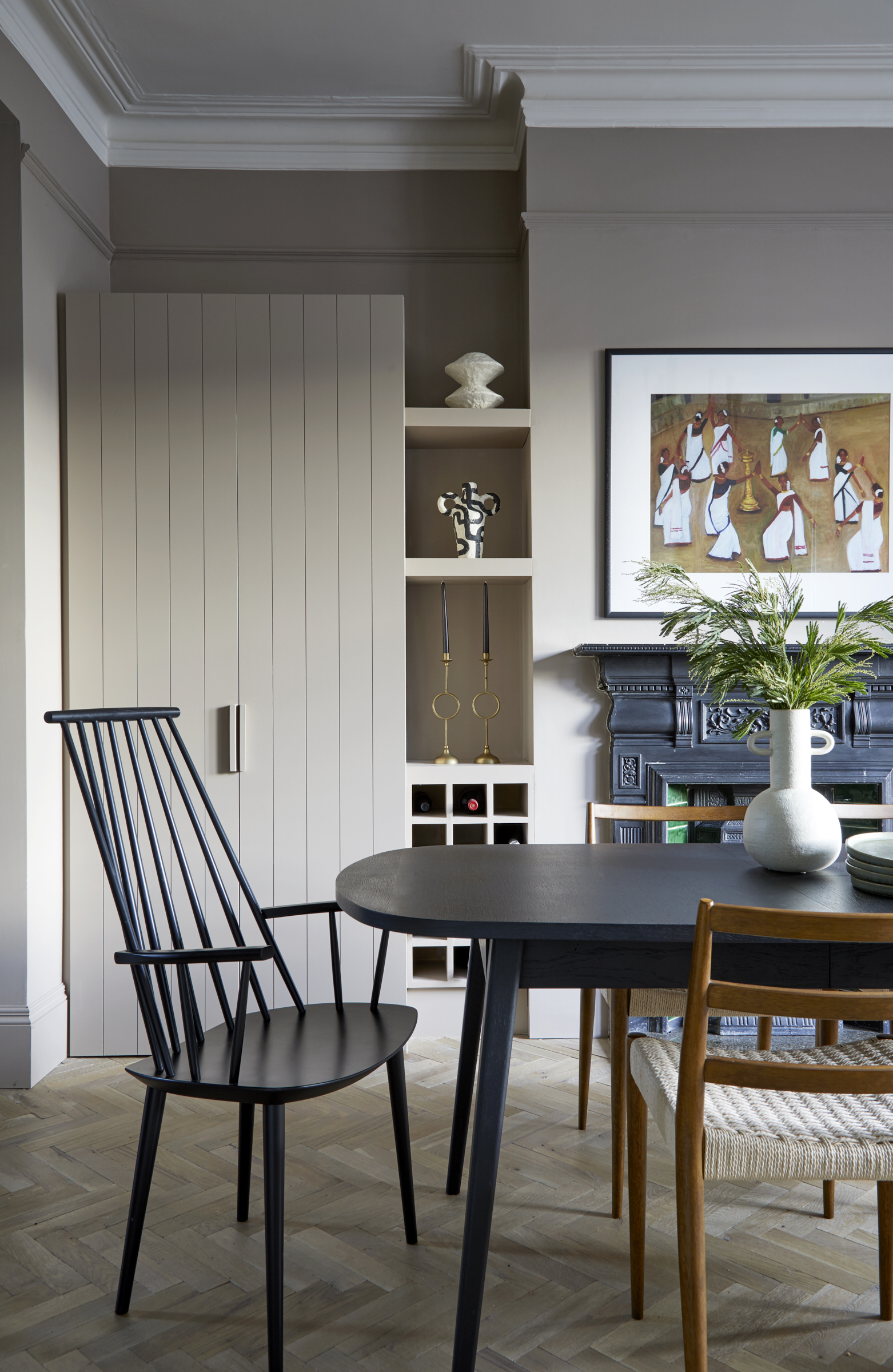
Andrew came on board once Shacklewell Architects had completed the initial drawings, which opened up the ground floor rooms to create three connected spaces. To complement this new flow, Andrew sourced herringbone parquet flooring in a weathered, matt finish. ‘Lots of people think it’s reclaimed blocks. It isn’t, but that’s exactly the feel I wanted,’ he says.
Be The First To Know
The Livingetc newsletters are your inside source for what’s shaping interiors now - and what’s next. Discover trend forecasts, smart style ideas, and curated shopping inspiration that brings design to life. Subscribe today and stay ahead of the curve.
The zigzag motifs of herringbone wooden flooring idea add to the sense of flow from the kitchen into the front dining room. ‘This room rises to the occasion for entertaining but for everyday family life it’s also very relaxed,’ says Andrew.
Kitchen
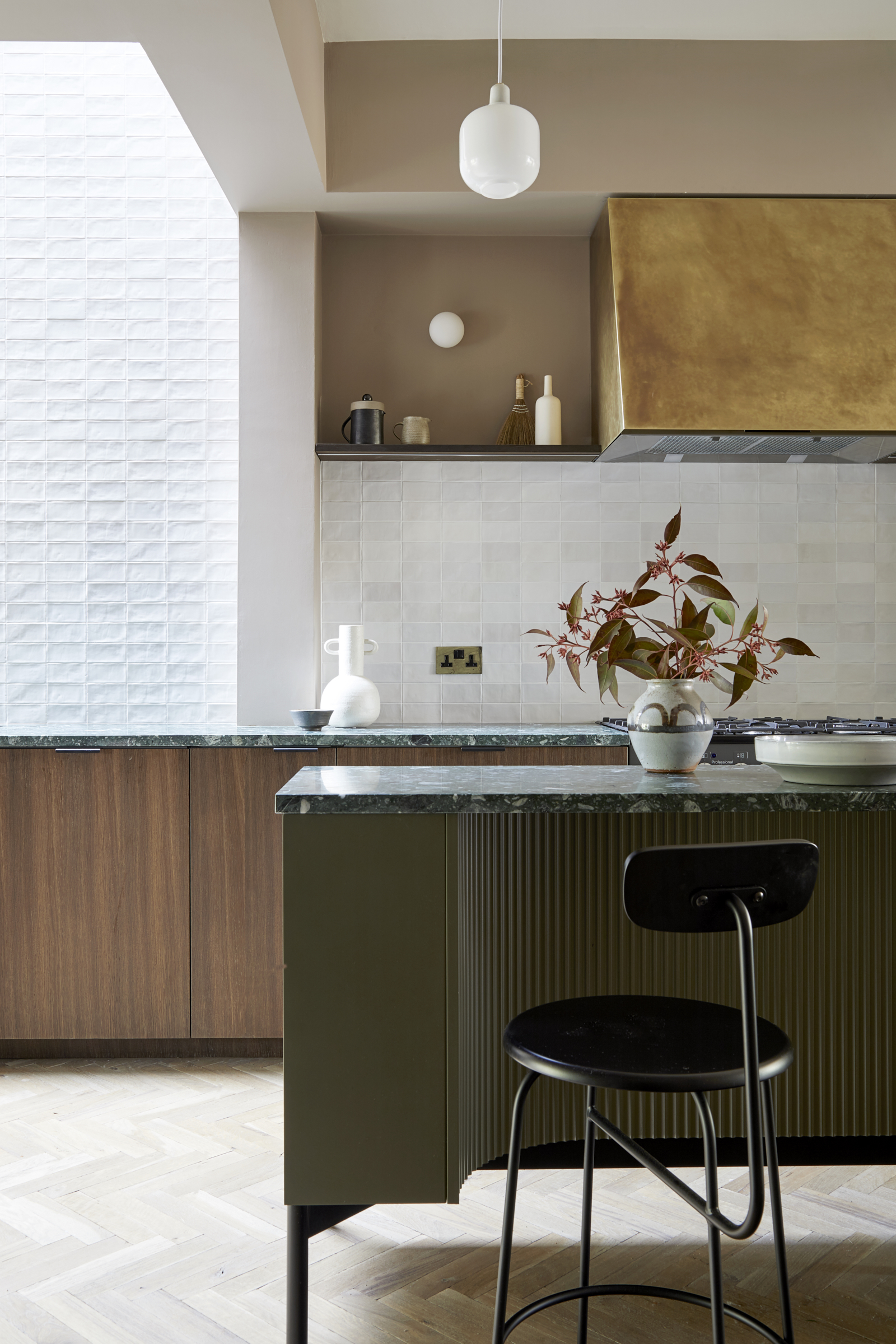
Natural textures continue with handmade tiles with a putty-like finish and a cooker hood clad in antiqued brass in the kitchen. Together with a few choice pieces of vintage furniture, it adds up to the relaxed mood that Sarah and Sid were after.
Andrew’s bespoke touches play to the strengths of this new layout, including a modern kitchen island – although Andrew almost hesitates to use that word to describe it. ‘It’s more narrow than a standard island and quite elegant, with a curved and fluted cut-away section for seating,’ he says.
Textures enhance this practical but indulgent space, from reeded glass to the ripple-riven wall tiles and engineered herringbone flooring. The slimline central unit is deliberately unobtrusive. ‘Islands can be monolithic, but this feels visually light as you can see underneath it and through parts of it,’ says Andrew.
‘As soon as the rooflights were installed above, I knew this area had to be tiled. The tiles have a beautiful unevenness to them, giving an almost dappled effect when the light flows down,’ says Andrew.
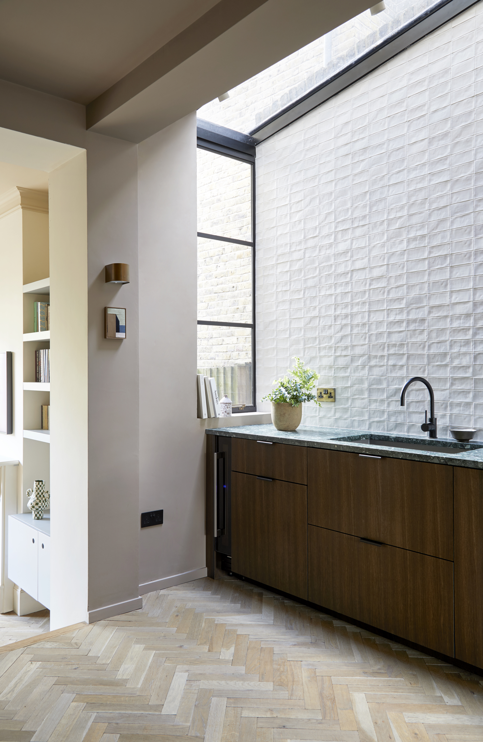
It’s significant that the new layout places the kitchen at the centre of the ground floor: ‘It’s quite literally the heart of the home,’ says Andrew. Unusually, the modern dining room is located the front and the living room is at the back, overlooking the garden.
‘The layout breaks with convention, but it works brilliantly. Everything radiates off the kitchen and the living room feels like a serene space to retreat to at the end of the day,’ he adds.
Living room
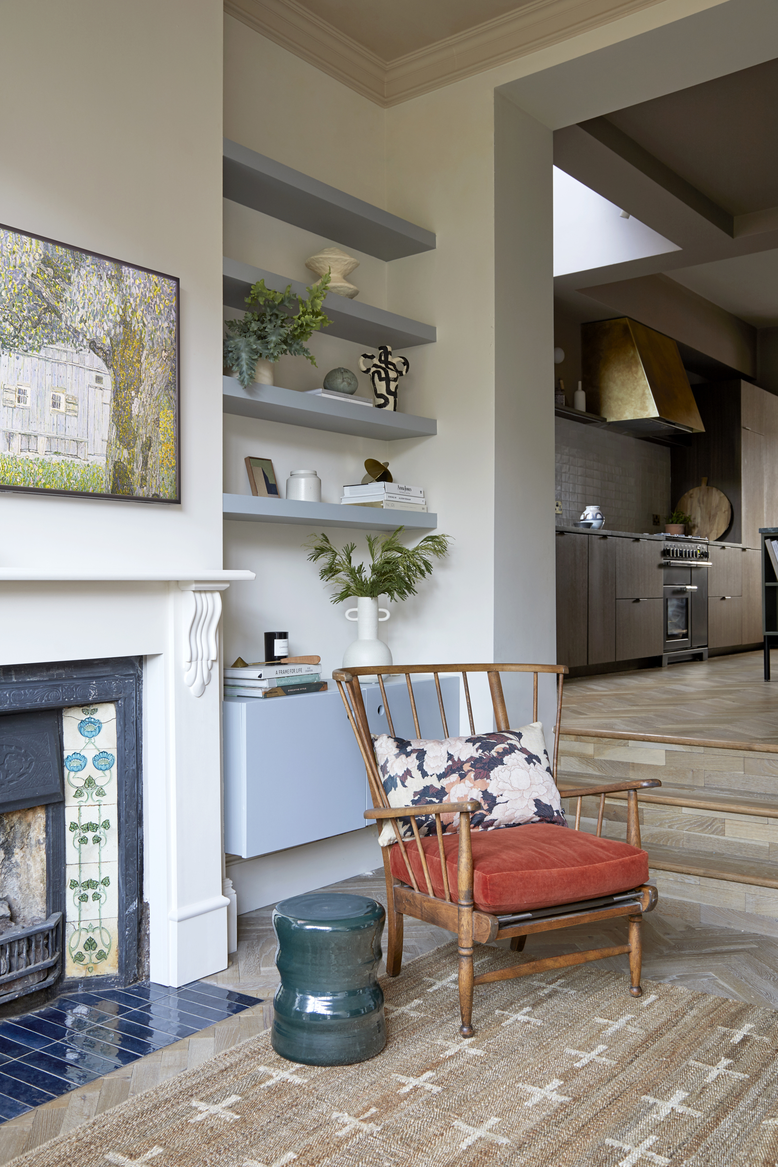
‘Sarah has a wonderful eye, but she was suffering from a common complaint these days – inspiration overload,’ Andrew jokes. This meant that, at first, Andrew acted as an editor as well as an interior designer, whittling down these initial ideas and then creating a fresh and cohesive look that’s all his own. ‘I strived for a style that would suits the bones of the house and work for how Sarah and Sid wanted to use their family-friendly designed home,’ he says.
Vintage chairs add relaxed character to this rear living space. ‘I wanted to honor the history of the house and the eras it has lived through,’ says Andrew.
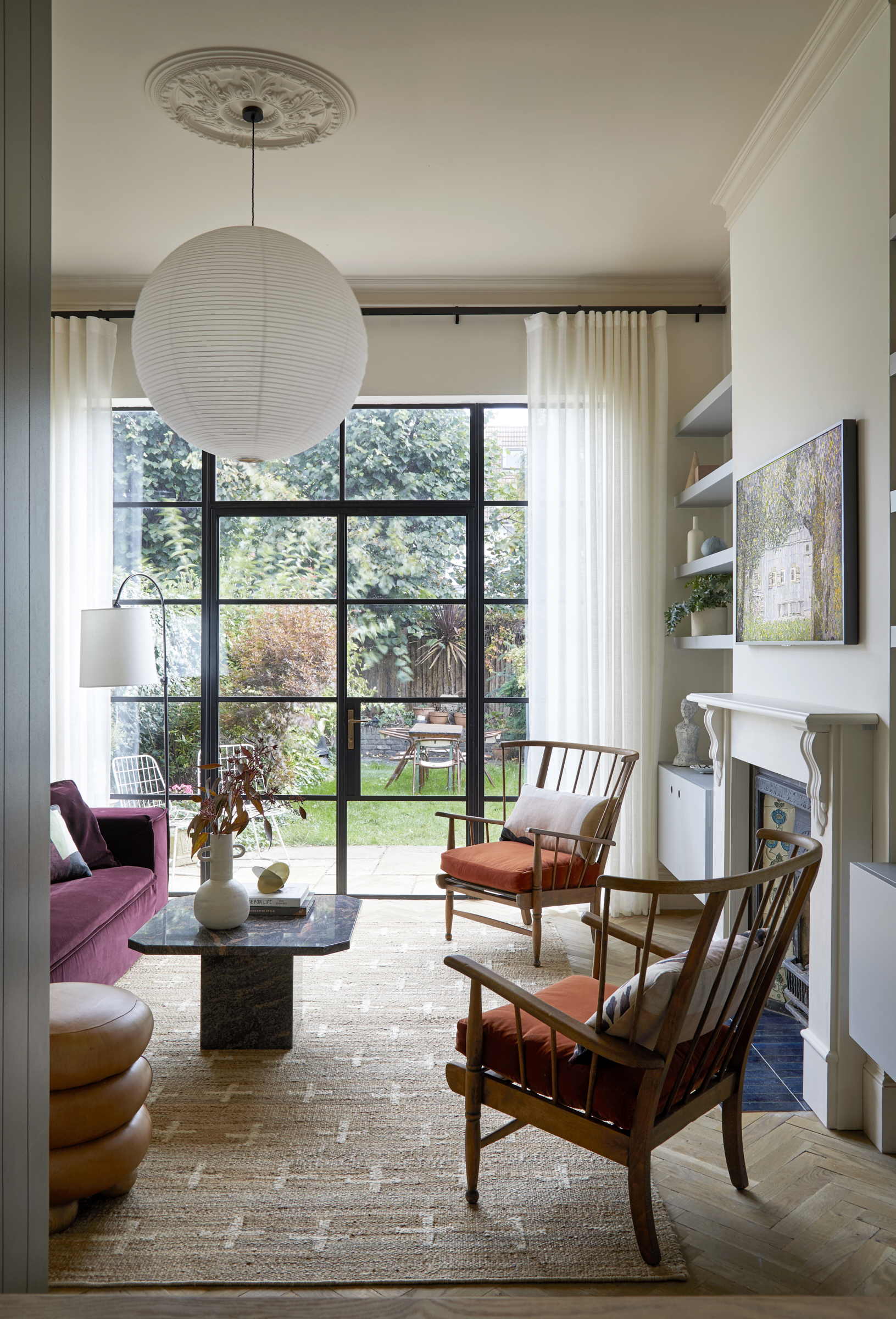
Crittall-style doors transformed the rear of the house, opening onto a garden that feels like a quiet oasis. The deep ruby shade of the sofa is a softer echo of the blush and grey tones of a vintage coffee table.
Main bedroom
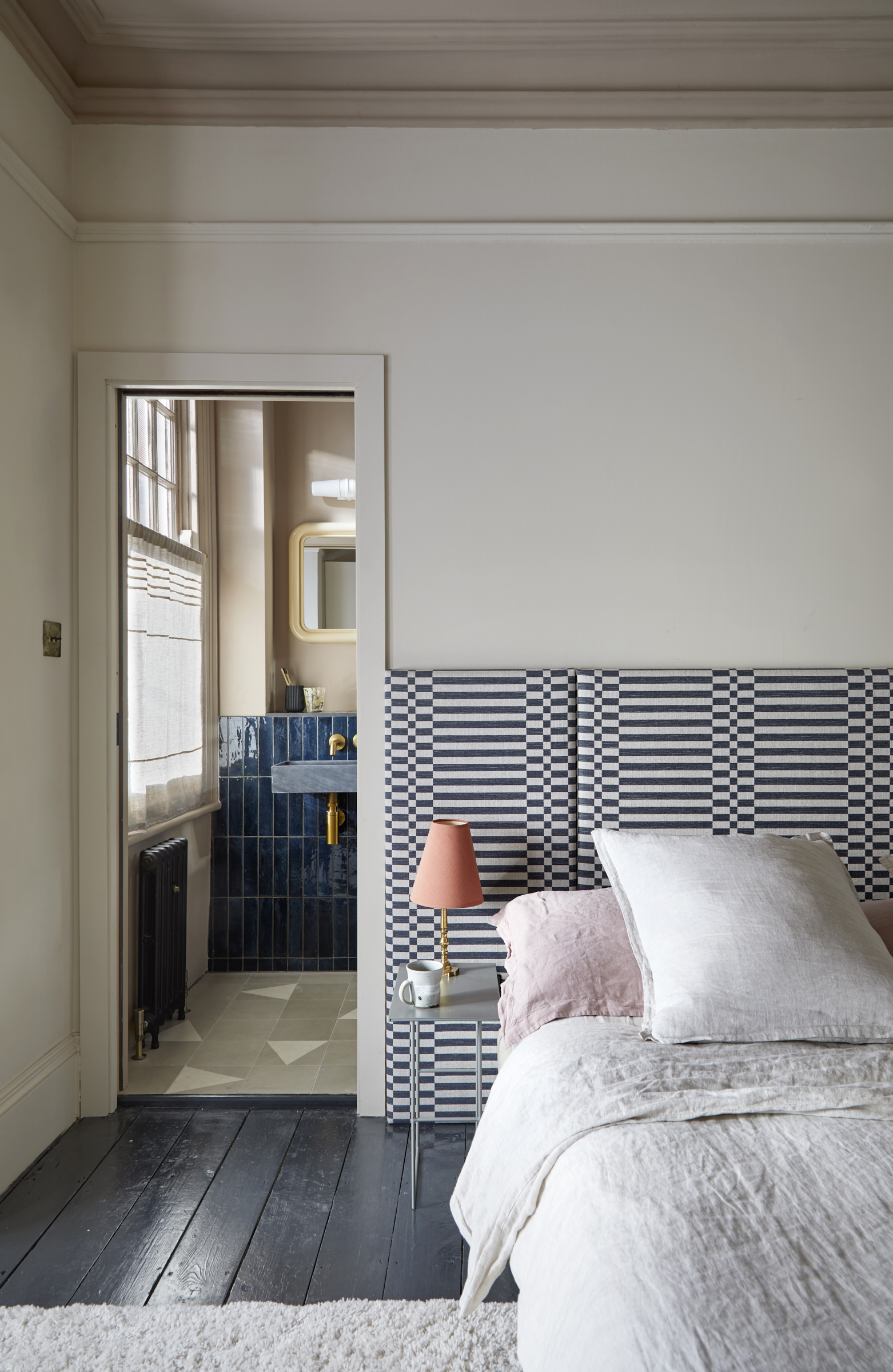
Upstairs, the clever design ideas continue. A supersized headboard makes the main bedroom feel larger, while the adjoining skinny room was turned into an indulgent en suite, with glossy deep blue tiles adding a glam note.
A bespoke oversized statement headboard adds geometric dazzle. ‘Its width tricks the eye so the bed area feels more generous,’ says Andrew. In the en suite, the blue horizontals turn to verticals with the glossy tiles. ‘Warm earth tones mean this room feels warm and cozy in the evenings, but light and fresh in the mornings,’ says Andrew.
Family bathroom
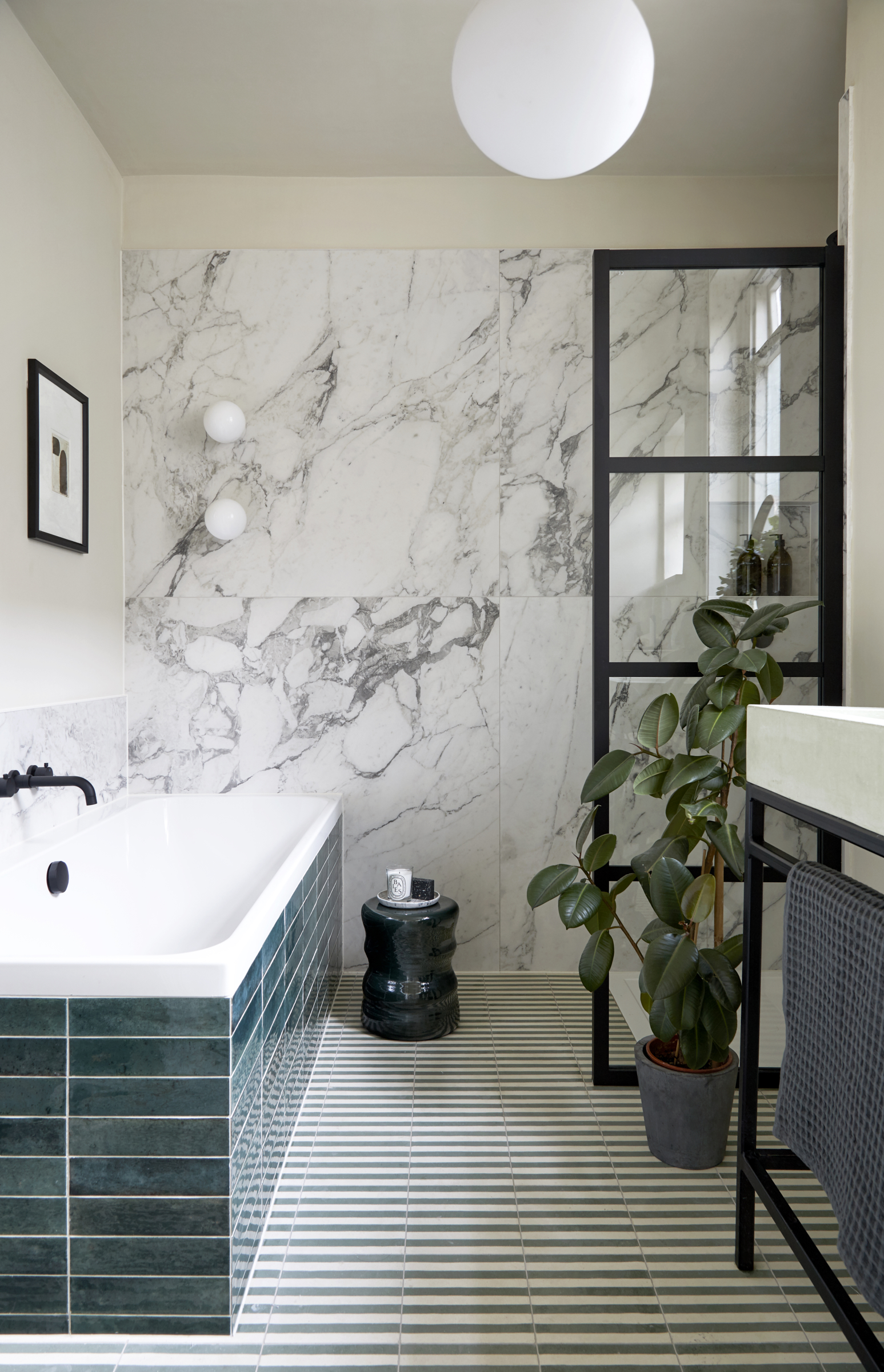
Large format tiles give the impression of wall-to-wall marble. 'We went for strong geometric lines, crisp outlines and free flowing marble patterns,' says Andrew.
Kids room
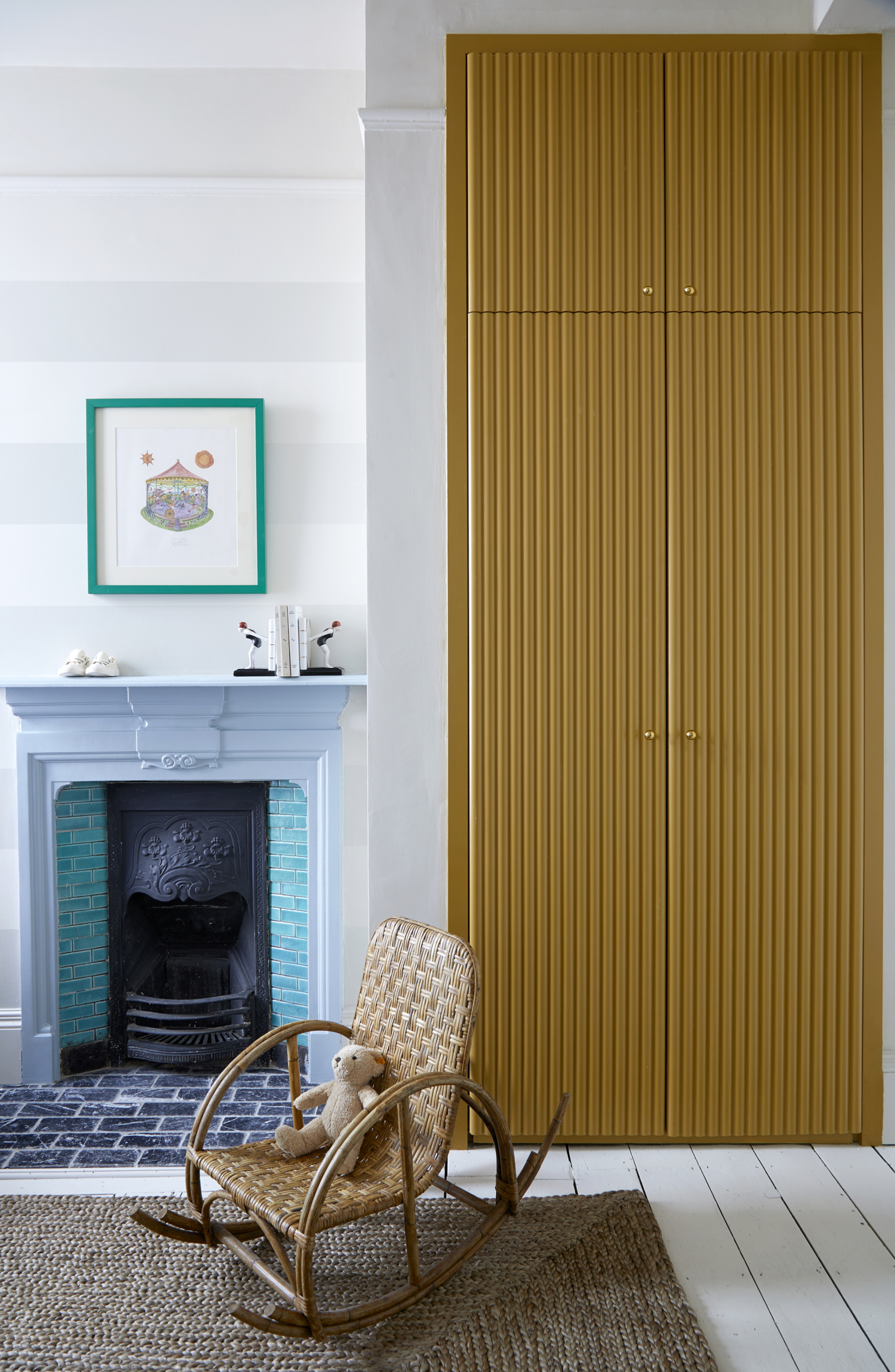
While the palette in the main modern bedroom errs towards cosseting, earthy tones, the children’s rooms dip into dreamy blues and mellow yellows, creating spaces that Luc and Elin won’t outgrow for a long while yet. And throughout the house, Andrew has worked in bespoke hidden storage. ‘I wanted spaces to be beautiful but practical.’ he says. ‘This is a home that can adapt as their family grows.’
Journalist and author Jo Leevers writes about houses for a wealth of national publications such as Livingetc, Homes & Gardens, Observer, The World Of Interiors, Telegraph, Elle Decoration, Country Living, and the Guardian. She also contributes to 25 Beautiful Homes magazine, and the Mail on Sunday's You Magazine.
-
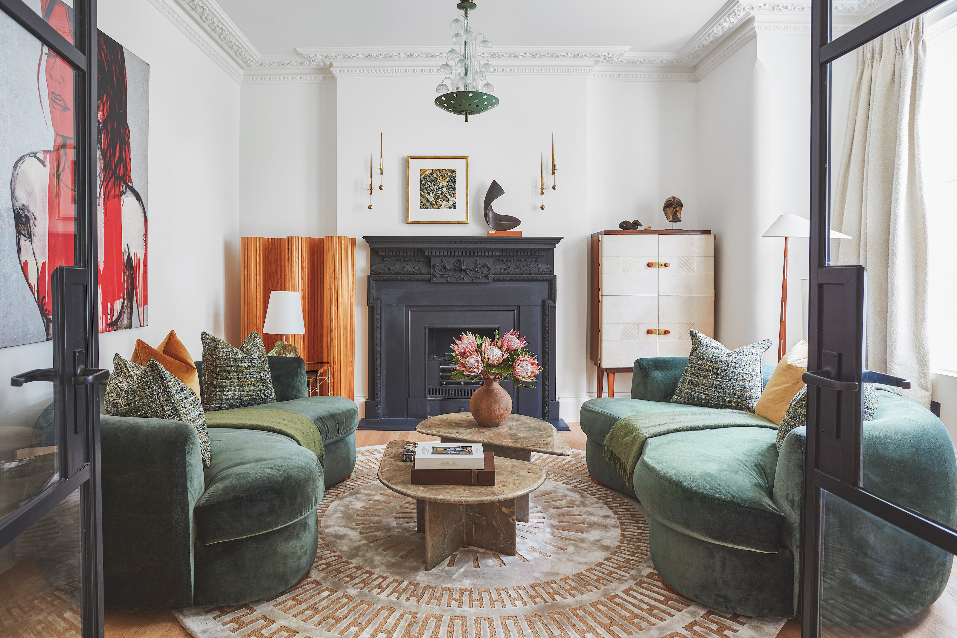 The 'New British' Style? This Victorian London Home Embraces Its Owners' Global Background
Warm timber details, confident color pops, and an uninterrupted connection to the garden are the hallmarks of this relaxed yet design-forward family home
By Emma J Page
-
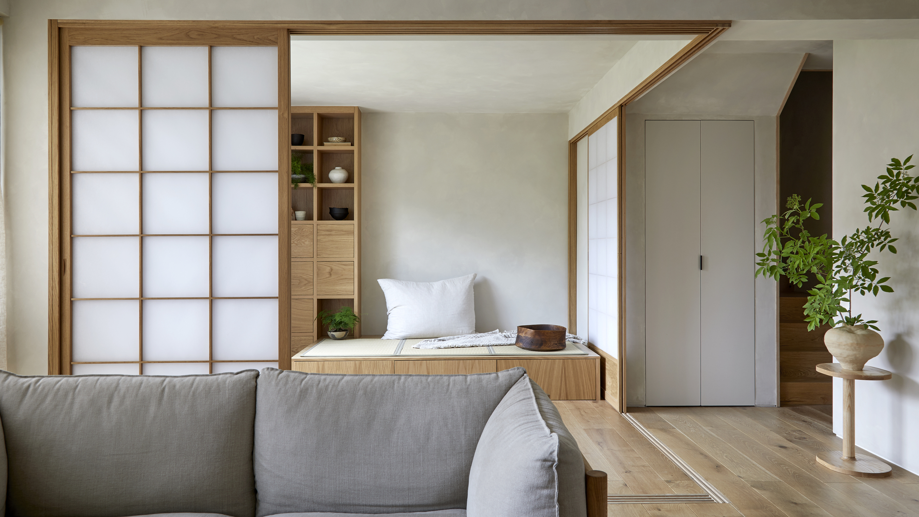 Muji Living Room Ideas — 5 Ways to Harness The Calming Qualities of This Japanese Design Style
Inspired by Japanese "zen" principles, Muji living rooms are all about cultivating a calming, tranquil space that nourishes the soul
By Lilith Hudson