Explore this super-contemporary stone cottage in Ireland
This 18th century stone cottage in Ireland has a modern pared-back extension, designed to draw the outside in – although that doesn’t include the livestock!
THE PROPERTY
An 18th century cottage with a contemporary extension in County Clare, Ireland. The modern home's ground floor has a reception room, boot room, kitchen, dining room, living room and two bedrooms with en-suite bathrooms. Upstairs, there are two more bedrooms and en-suites.
STAIRS
There’s a reason why these cottages (pictured top) in Ireland were built in this way; they fit in the setting and are made with local materials. So when it came to renovating this property, the owners had to stay true to its foundations.
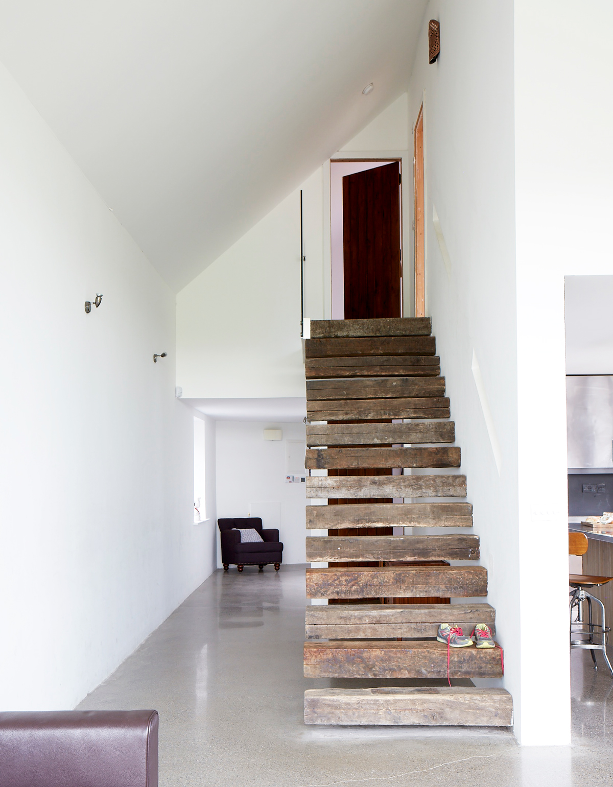
Swiss architect Jean Claude Girard came on board to help restorethe existing 18th century cottage, stayingtrue to the original look for the exterior but making the interior as contemporary as possible.
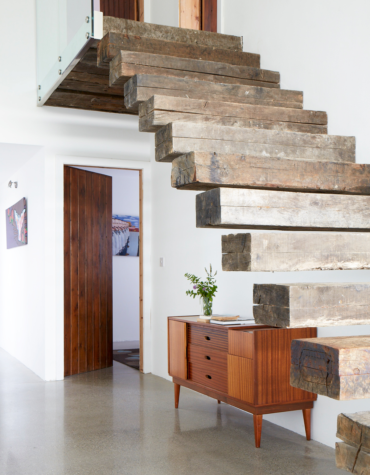
The cantilevered staircase was made from salvaged railways sleepers. They’ve been hollowed out and fitted on to a massive steel frame hidden in the wall and roof that helps support the entire building.
KITCHEN
The house now sits on top of the cottage’s existing footprint, with a new extension taking the place of the property’s old sheds and outbuildings.Now, when you drive up, it looks just the same as it did a century ago. It’s only when you look up that you see the transformation – the cottage is now a double-height space, so the reception room is an amplified version of what was there before.
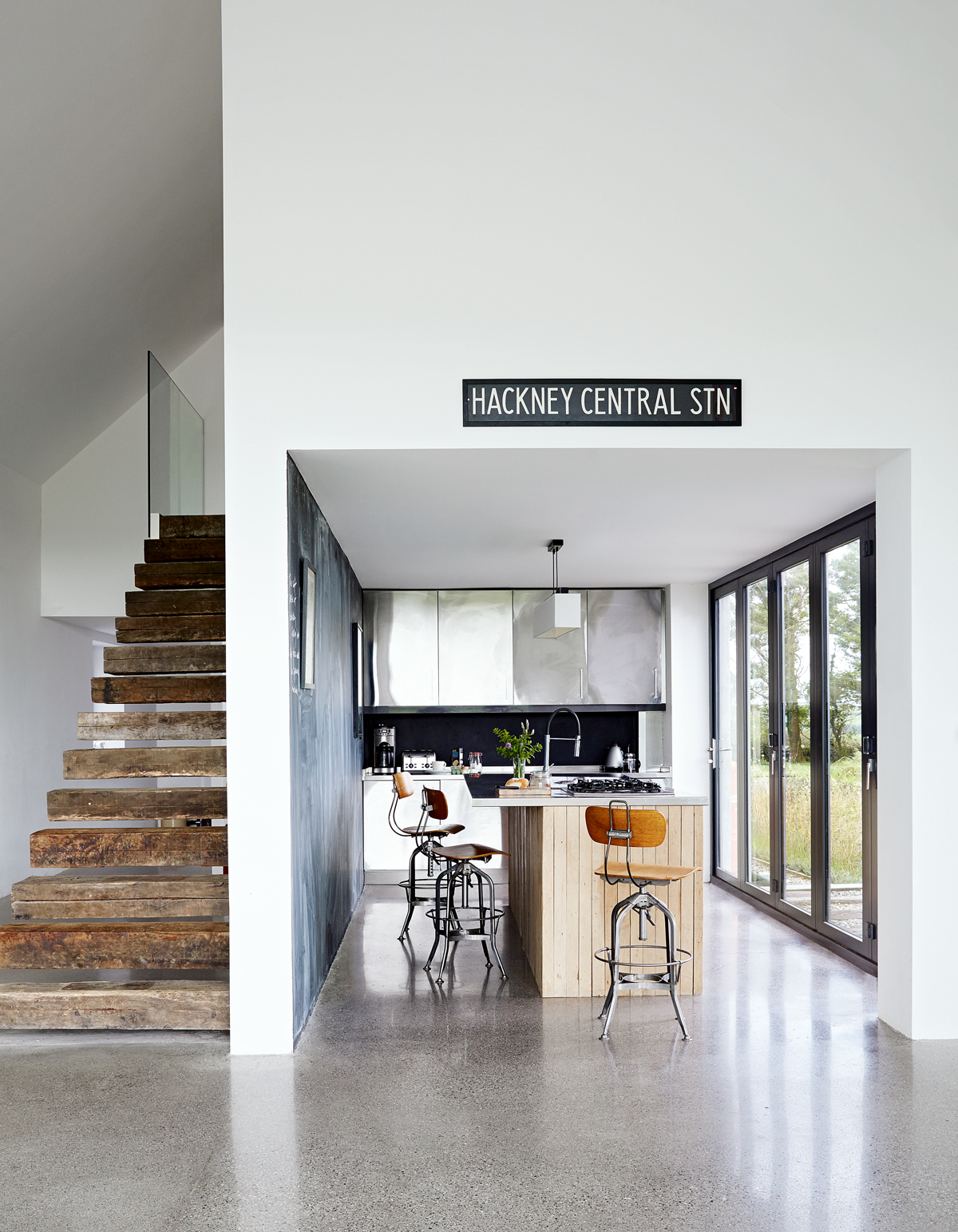
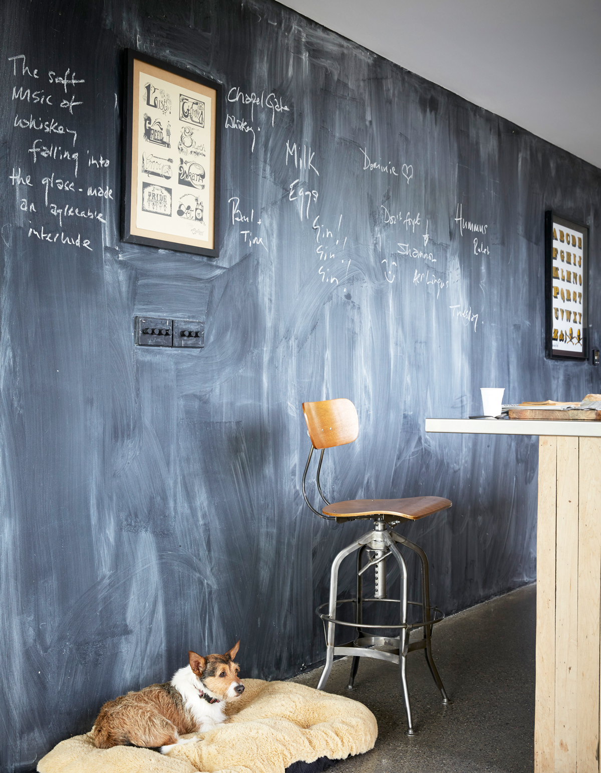
Unlike the airy voids of the main living space, the kitchen, hallways and bedrooms are more intimate and contained, but still steeped in character. The kitchen island, for example, is clad in wood reclaimed from the local parish hall.

In the summer, the glazed doors open up on to the adjacent patio to double the space.
Be The First To Know
The Livingetc newsletters are your inside source for what’s shaping interiors now - and what’s next. Discover trend forecasts, smart style ideas, and curated shopping inspiration that brings design to life. Subscribe today and stay ahead of the curve.
See Also: The 15 best modern kitchen ideas - stylish, smart and chic
DINING AREA
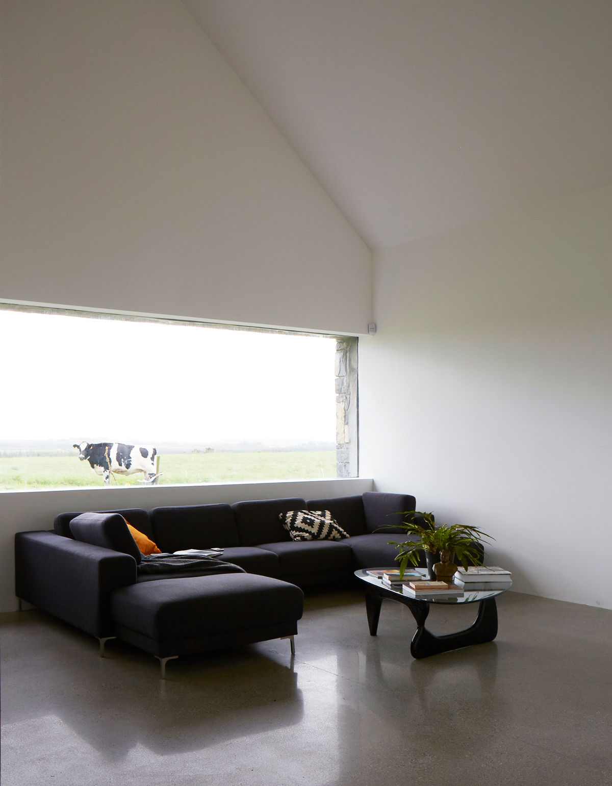
The visual trickery continues with an angled corridor that conceals that immense picture window at the rear of the house. The big reveal comes as you step into the dining area; suddenly, the ever-changing view of the seasons and livestock outside socks you between the eyes.
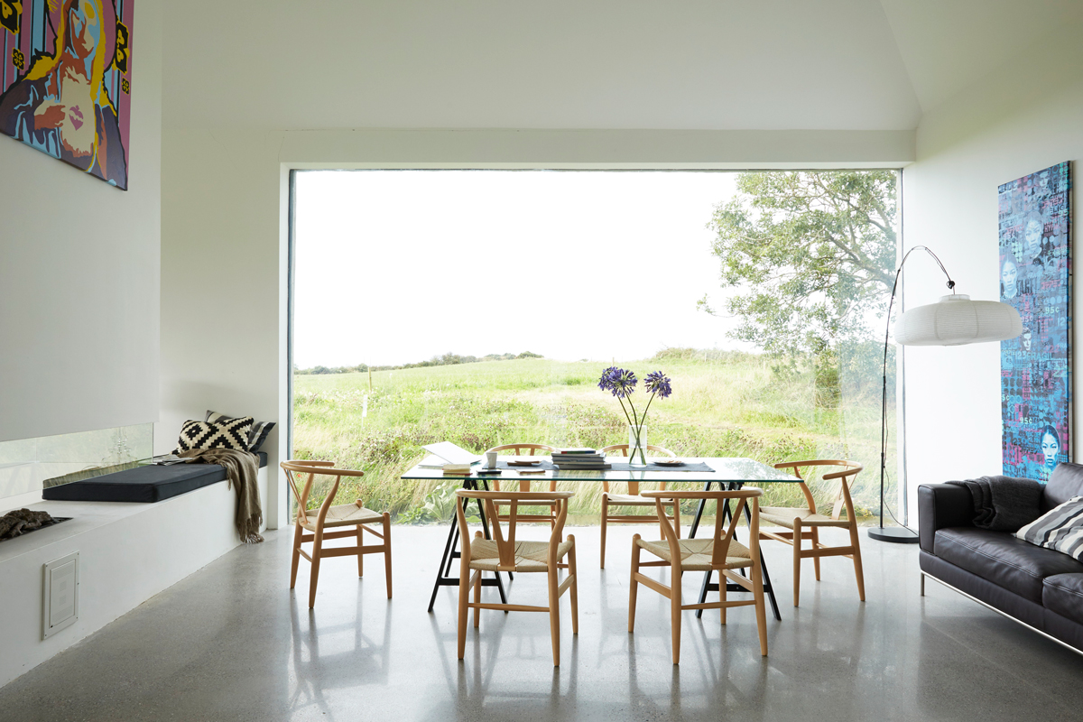
The house is secluded; it's high on a hill with no neighbours, so the owners had the freedom to play with as much glass as they wanted. They also manipulated scale and volume, sacrificing rooms on the first floor to create cathedral-high ceilings above the living and dining areas.
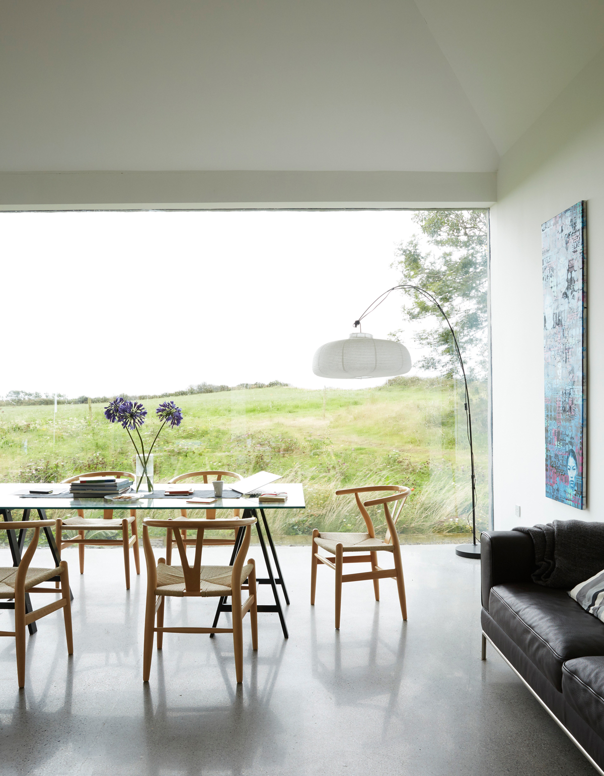
The huge picture window provides an ever-changing view of the farm and its resident dairy cows.
This is a disruptive building because the design is so radical for the area; at the same time, it works perfectly with the landscape.
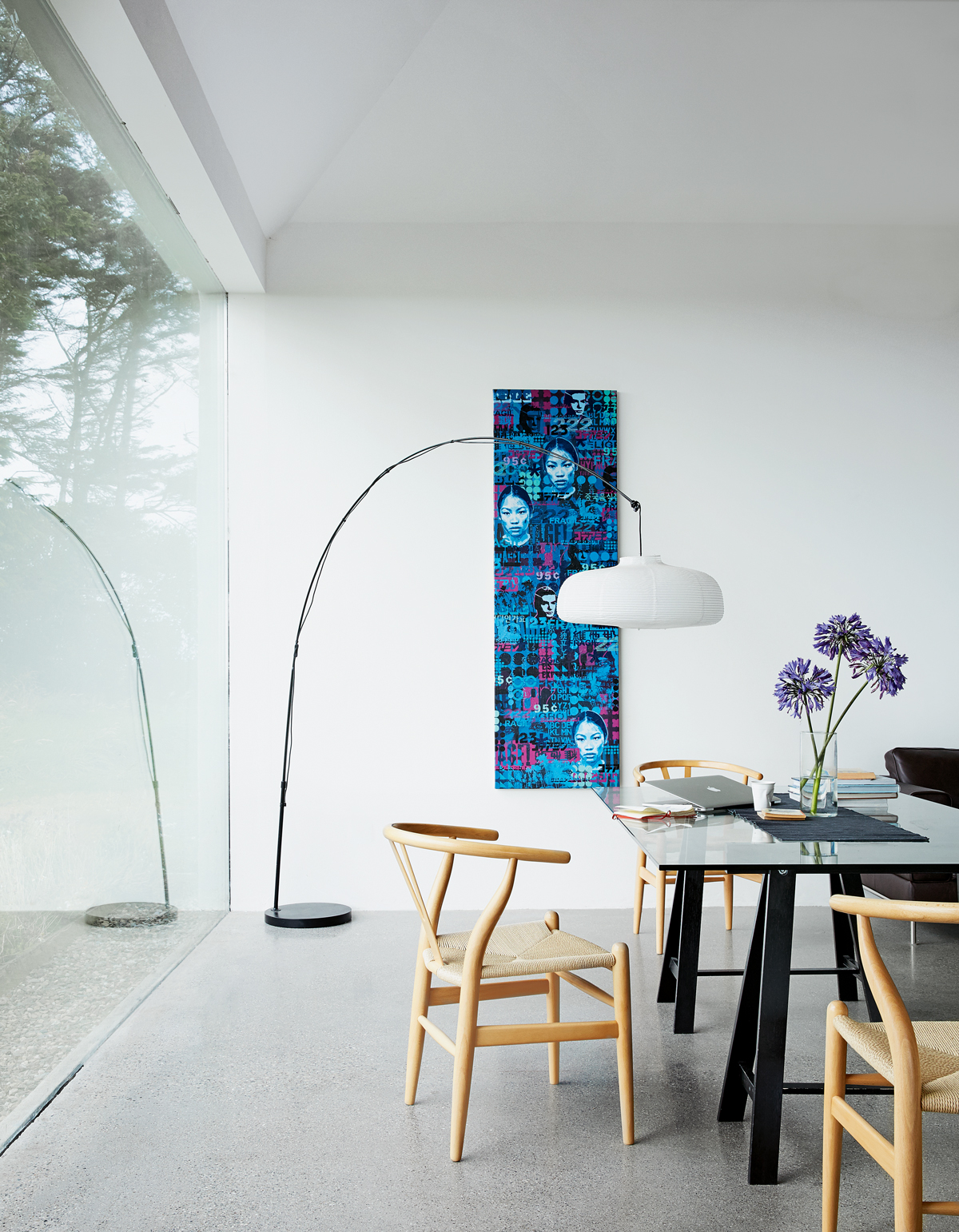
RECEPTION ROOM
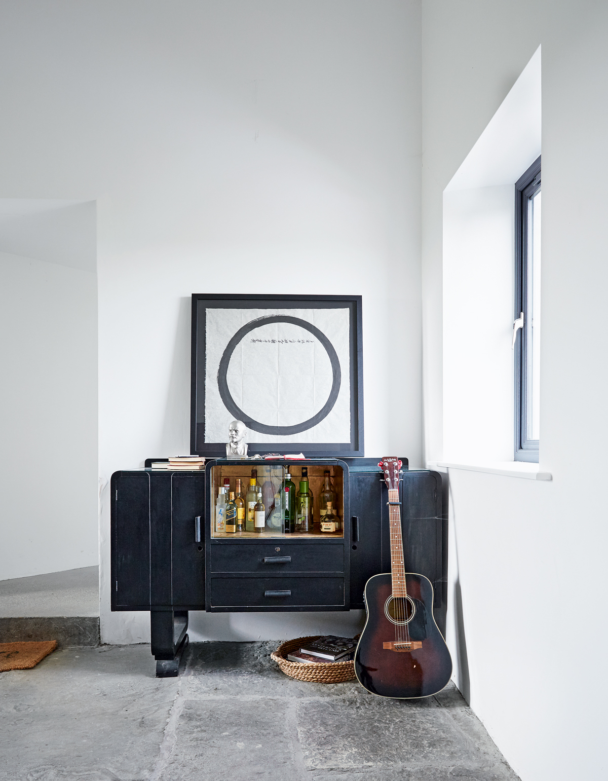
This room is in the 18th century part of the house and was originally the kitchen; the flagstone floor is as old as the building.
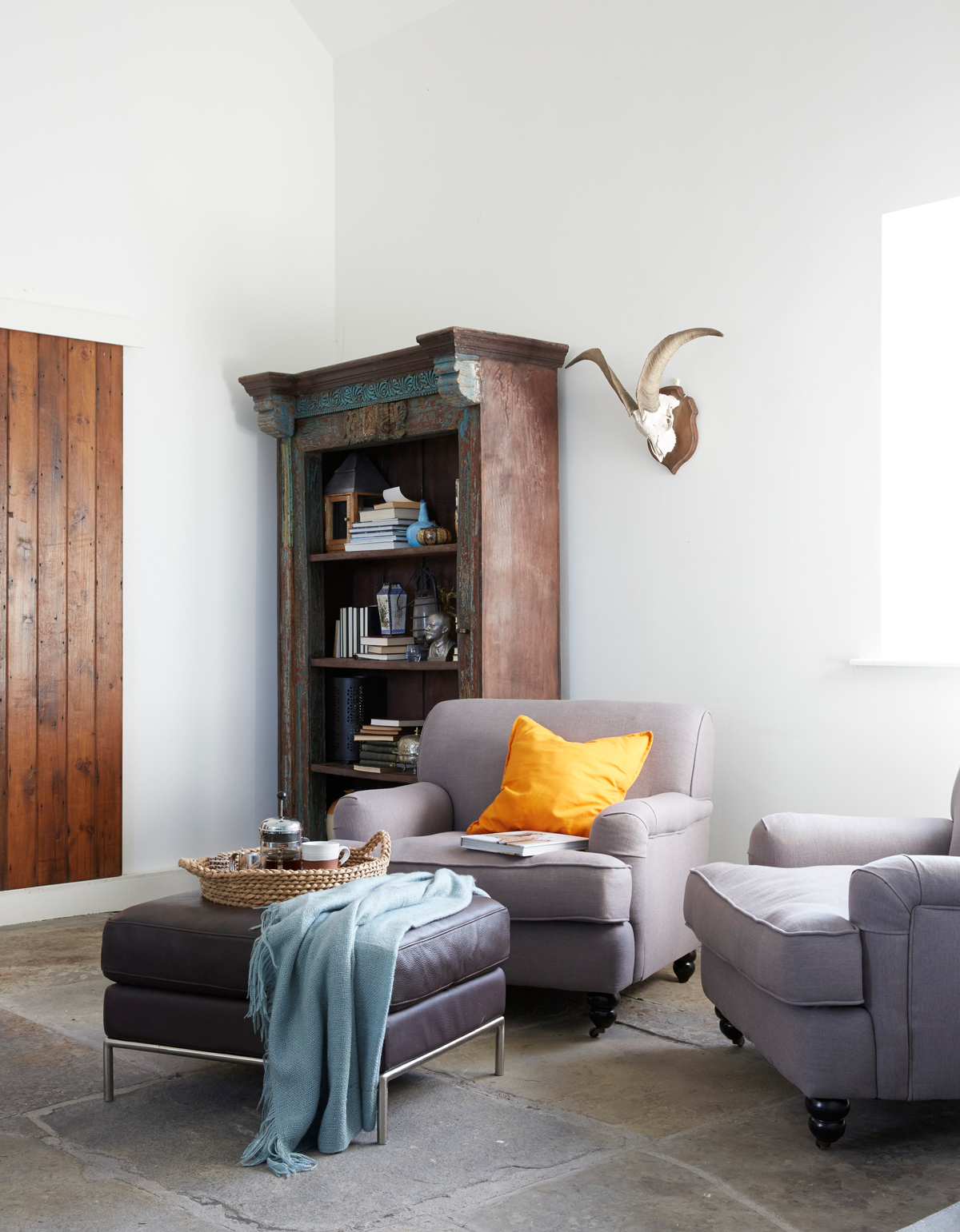
To avoid it becoming a space you just passed through, a bar was added to encourage guests to sit around and linger.
LIVING AREA
The hearth is where a family would have cooked and warmed themselves; it never went out.
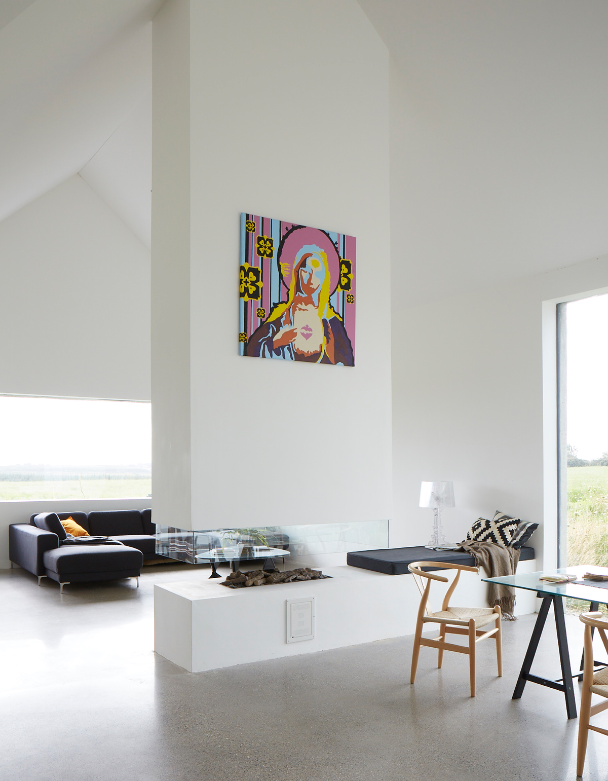
So, the cottage had to have an open fire – it’s just a contemporary version.
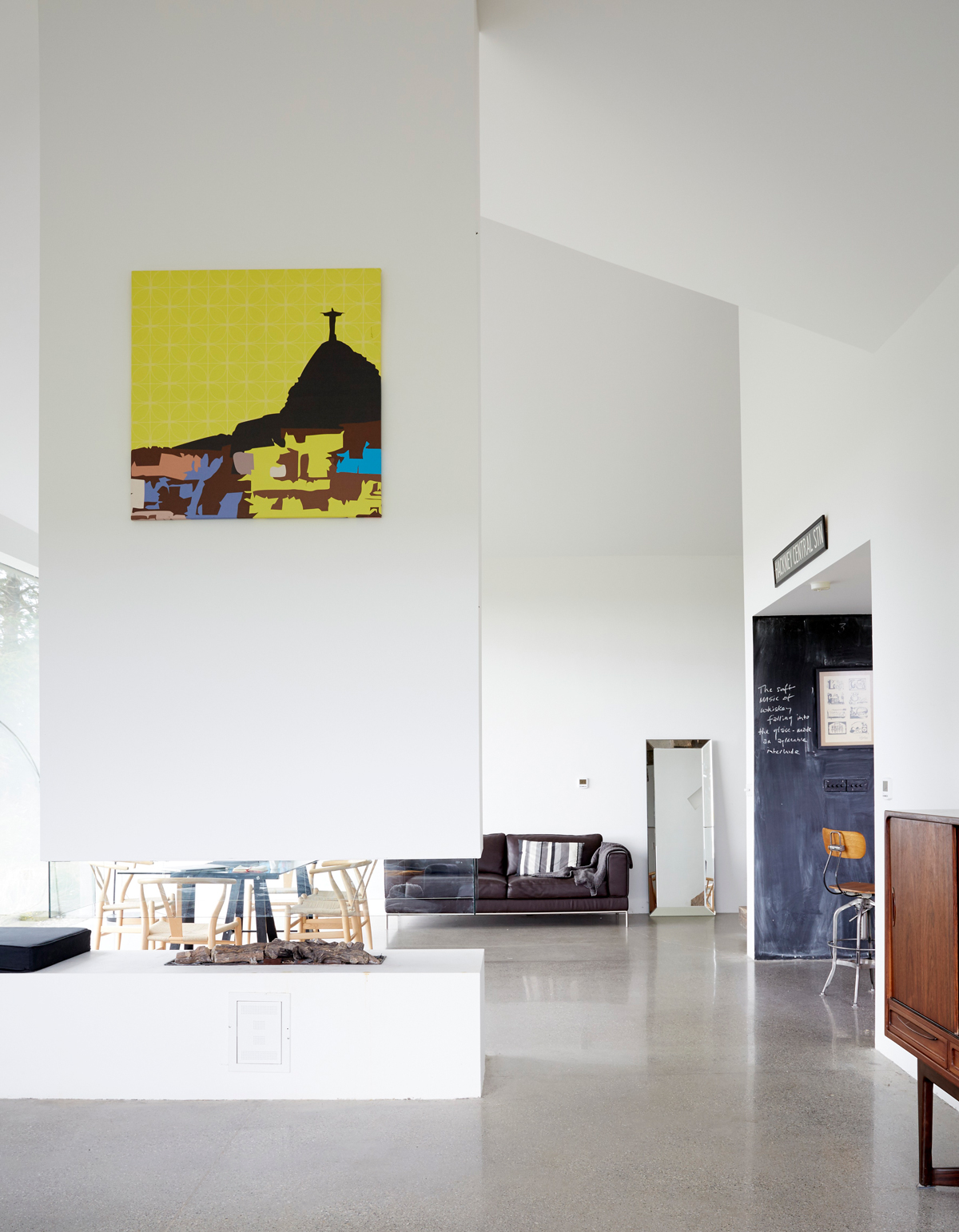
White walls and a vaulted ceiling give a serene quality to the living space.
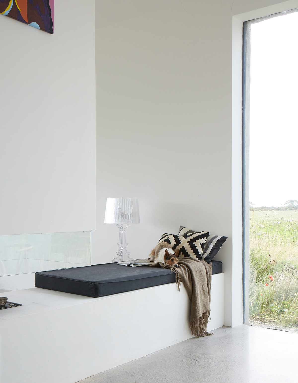
But the real stand-out feature is of course the view.
BOOT ROOM
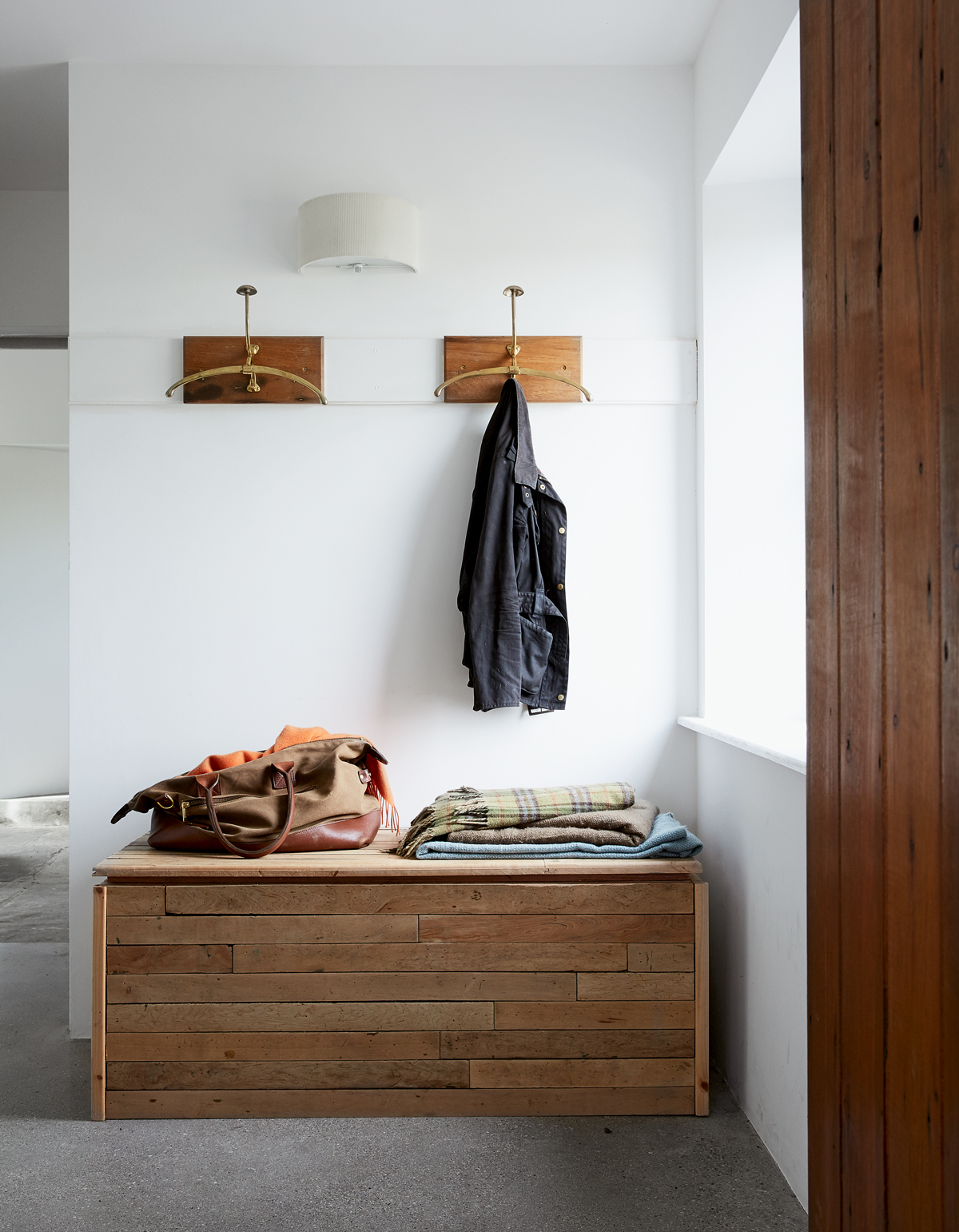
A poured concrete floor covers the entire footprint of the contemporary extension. Wooden furnishings add warmth and a sense of history.
MASTER BEDROOM
The artwork above the bed is a copy of a piece by Chinese artist Yue Minjun.
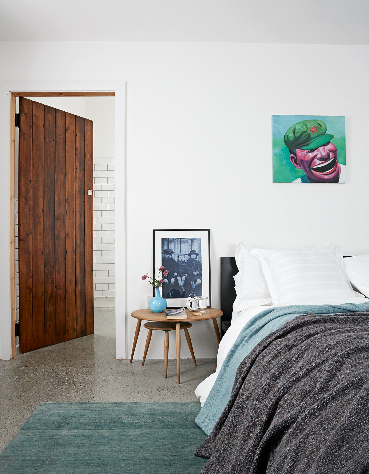
The bluey green tones of the painting were picked out to add a hit of colour to the room.
BATHROOM
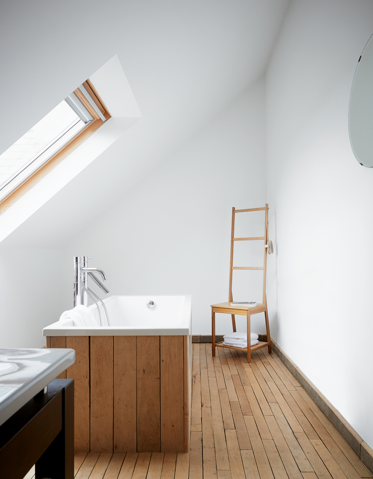
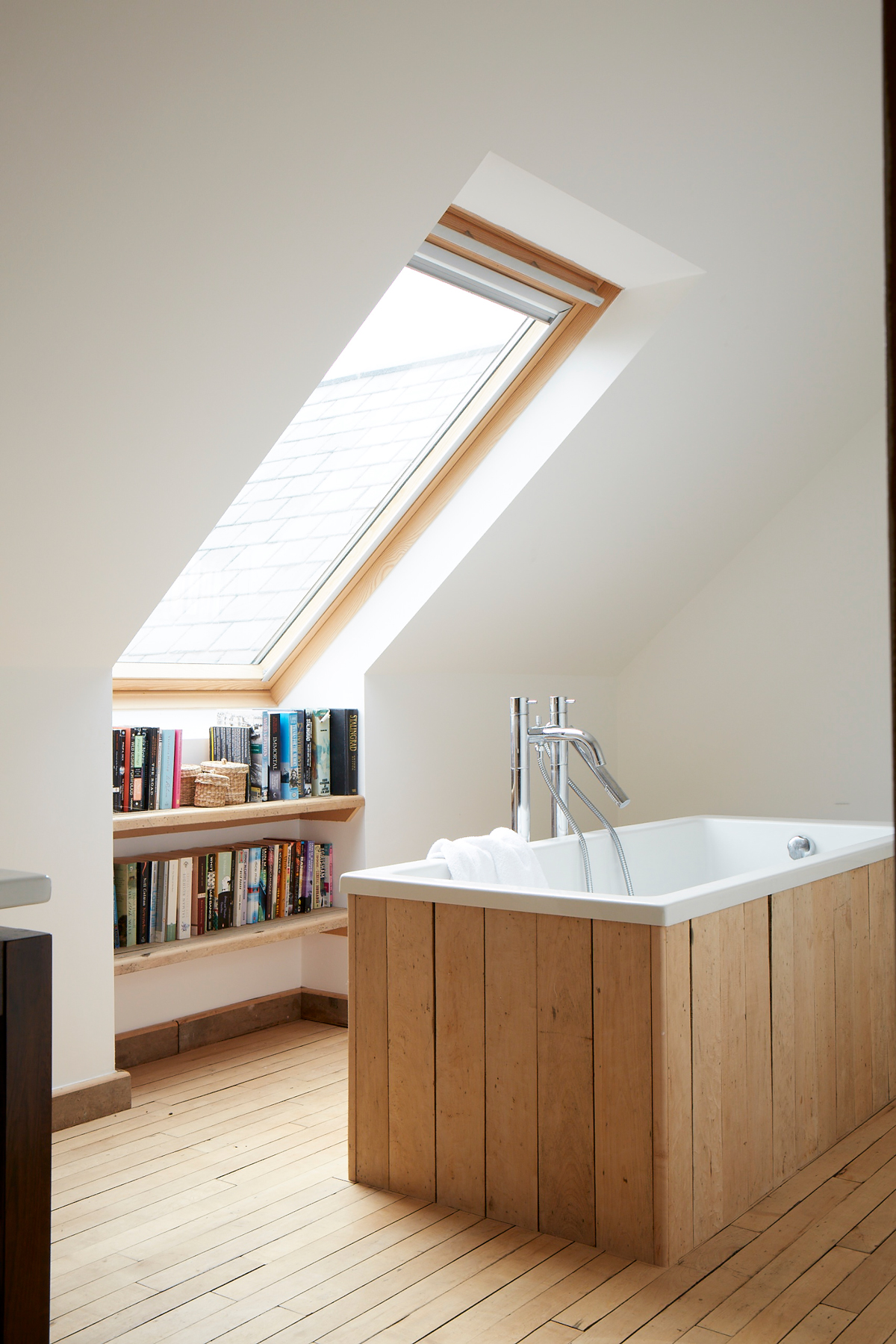
The angled roof and freestanding tub add drama to the simple space.
Dead space under the window was used for fitted shelves.
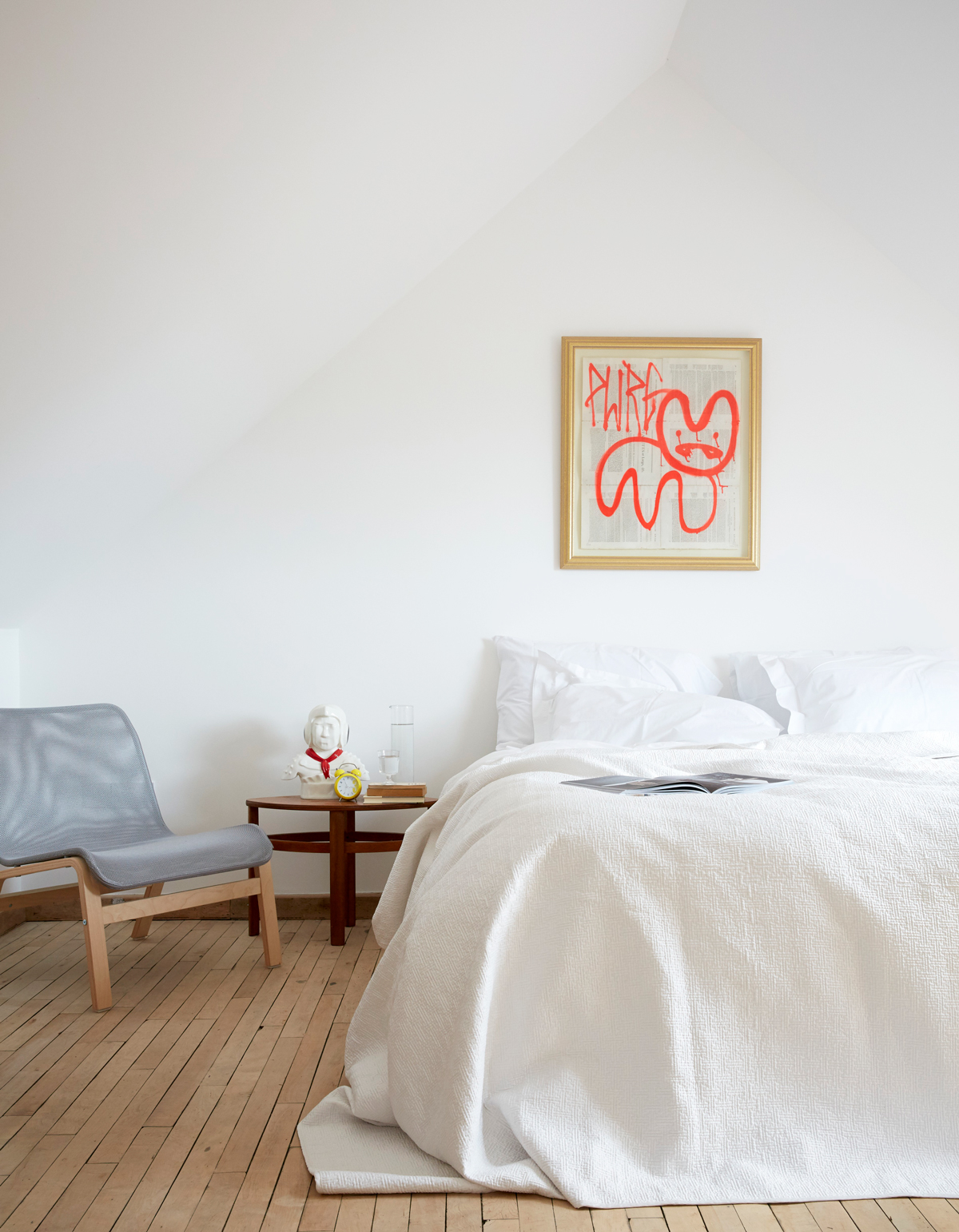
GUEST BEDROOM
There’s more salvaged flooring from the local parish hall in here. The painting above the bed by street artist Pure Evil gives a bit of grit to the white space.
SHOWER ROOM
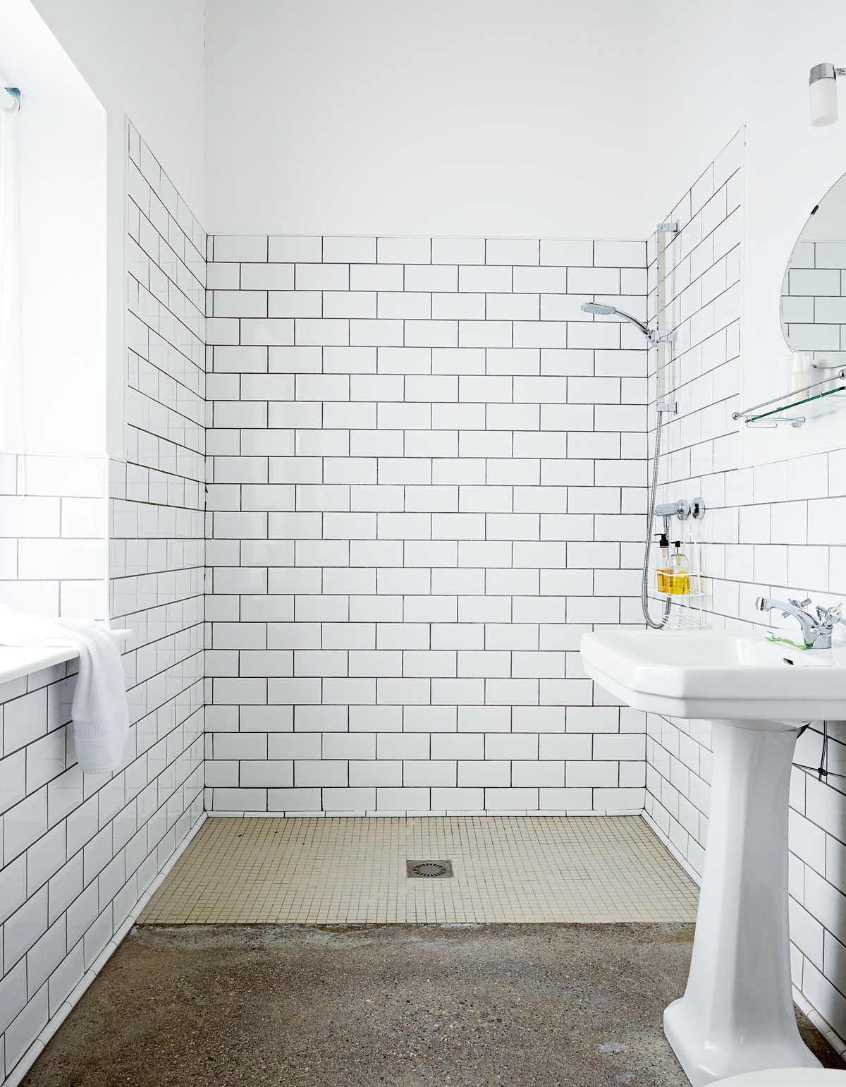
An angled window above the sink provides a view of the countryside below.
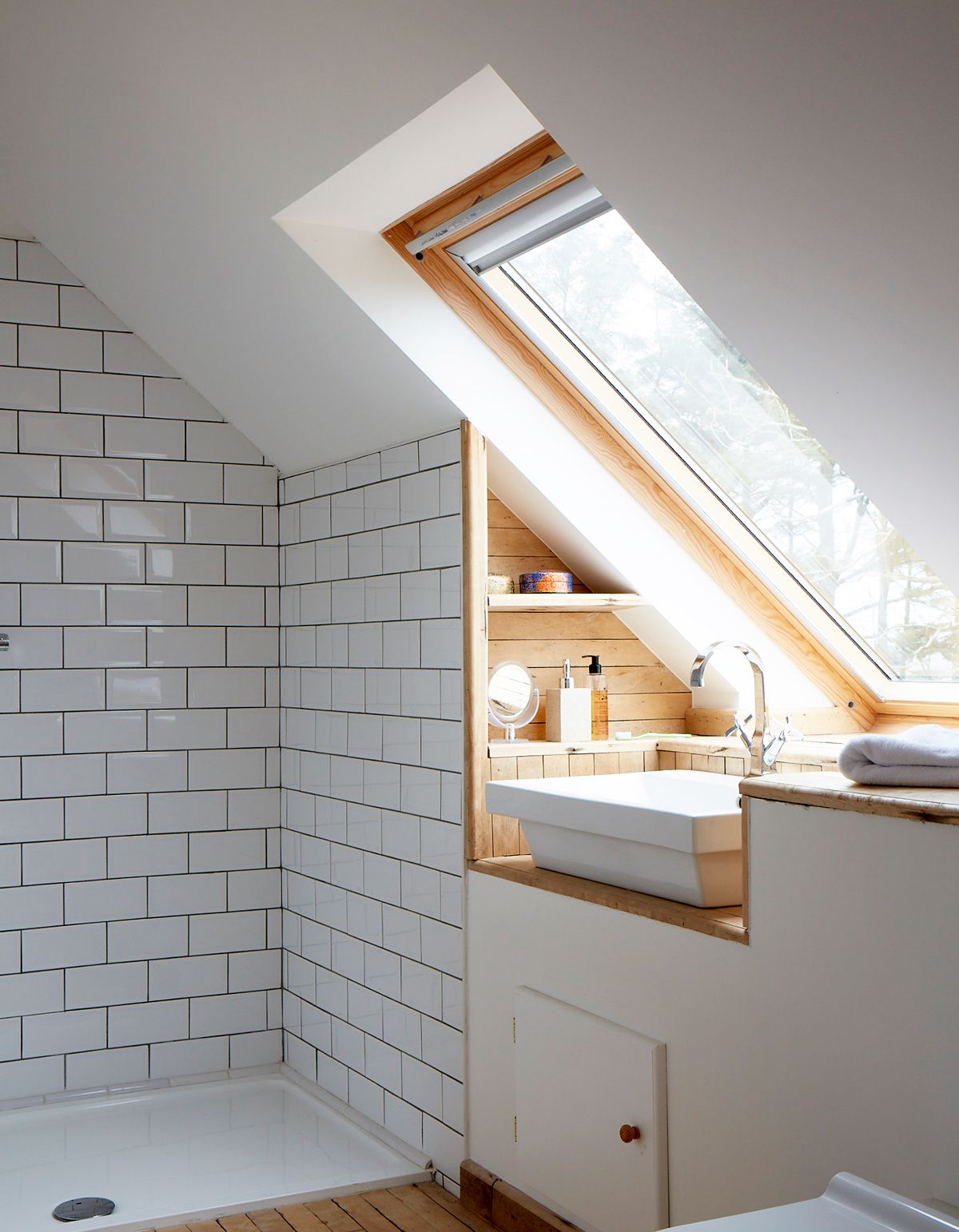
Photography / Paul Massey
See Also: Stunning shower room ideas - drenched with style
The homes media brand for early adopters, Livingetc shines a spotlight on the now and the next in design, obsessively covering interior trends, color advice, stylish homeware and modern homes. Celebrating the intersection between fashion and interiors. it's the brand that makes and breaks trends and it draws on its network on leading international luminaries to bring you the very best insight and ideas.
-
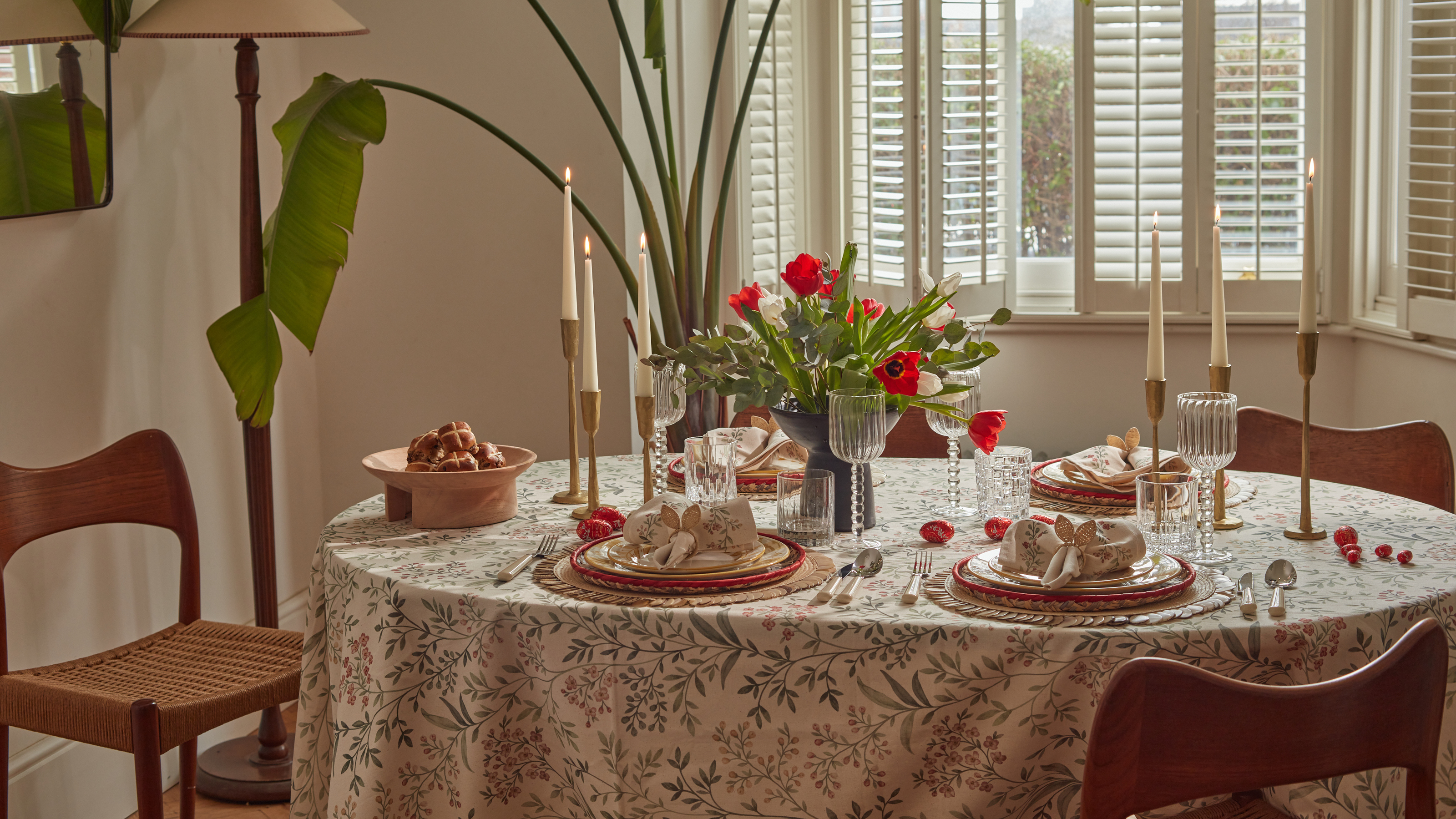 Bunny Ears, Be Gone — 7 Easter Table Styling Mistakes That Will Take Your Setting from Tawdry to Tasteful
From fussy floral displays that disrupt conversation to over-relying on tacky tropes, don't fall victim to these errors when decorating your Easter table
By Lilith Hudson
-
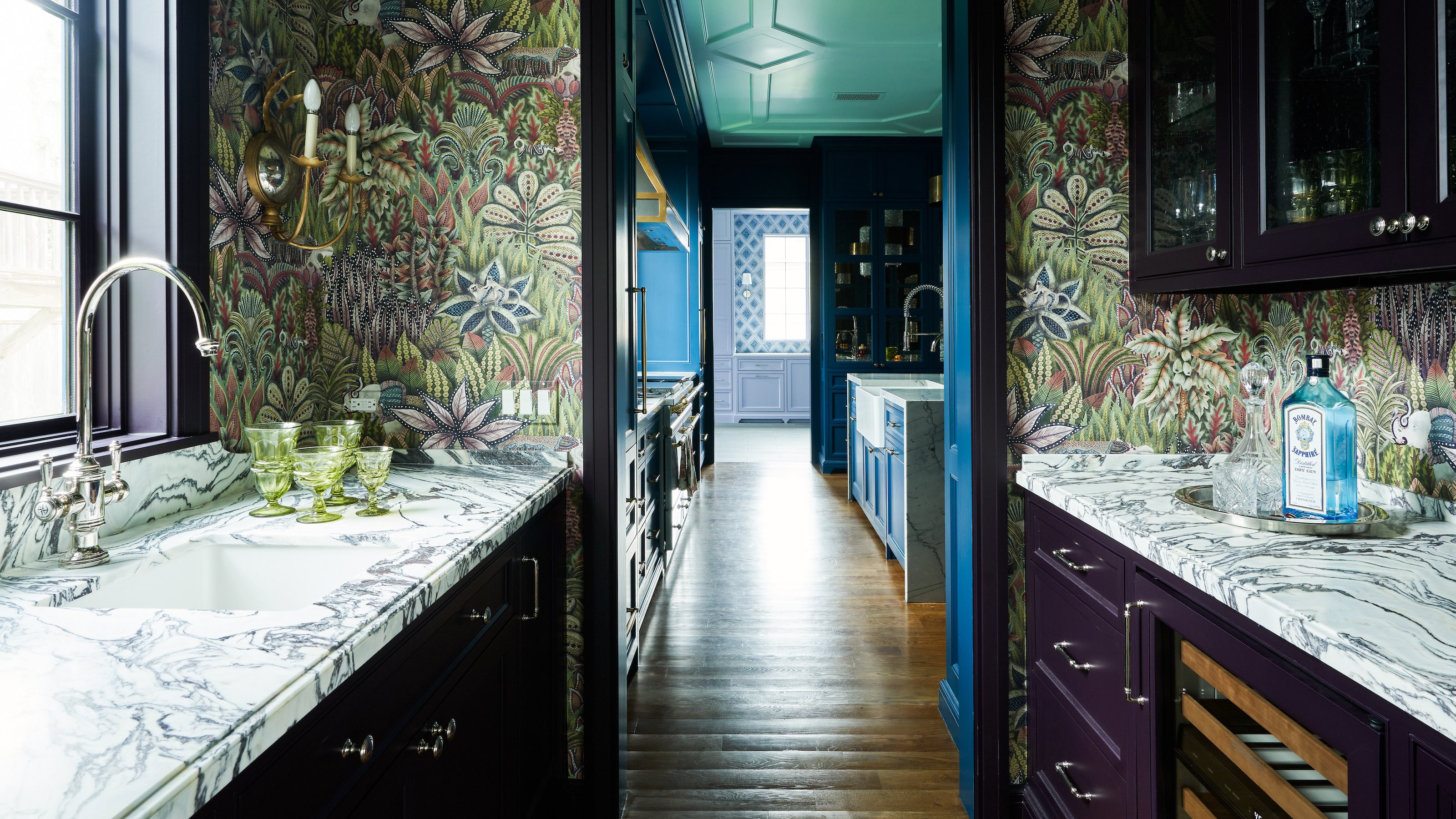 10 Hidden Kitchen Socket Ideas That Disguise Eyesores and Make Backsplashes Look More Minimalist
Discover innovative ways to hide those ugly outlets and claim a sleek, clutter-free space
By Linda Clayton