Explore a compact terraced house in west London transformed into a stylish Scandi haven
A compact terraced house in west London has been reworked into a fabulous family home, eking out every inch of space with a radical eye for design.
THE PROPERTY
A late-19th-century terraced house in west London, comprising a living room, kitchen-diner, utility room and courtyard garden on the ground floor. The modern home has a double-aspect children’s bedroom/playroom and adjoining bathroom on the first floor, and a master suite above, with access to a roof terrace.
Hidden behind its period façade, interlinking rooms dressed in soft tonal palettes, tactile textures and smart mid-century pieces are highly individualistic yet wonderfully complementary, giving this quintessential English setting more than a hint of embracing Scandi hygge.
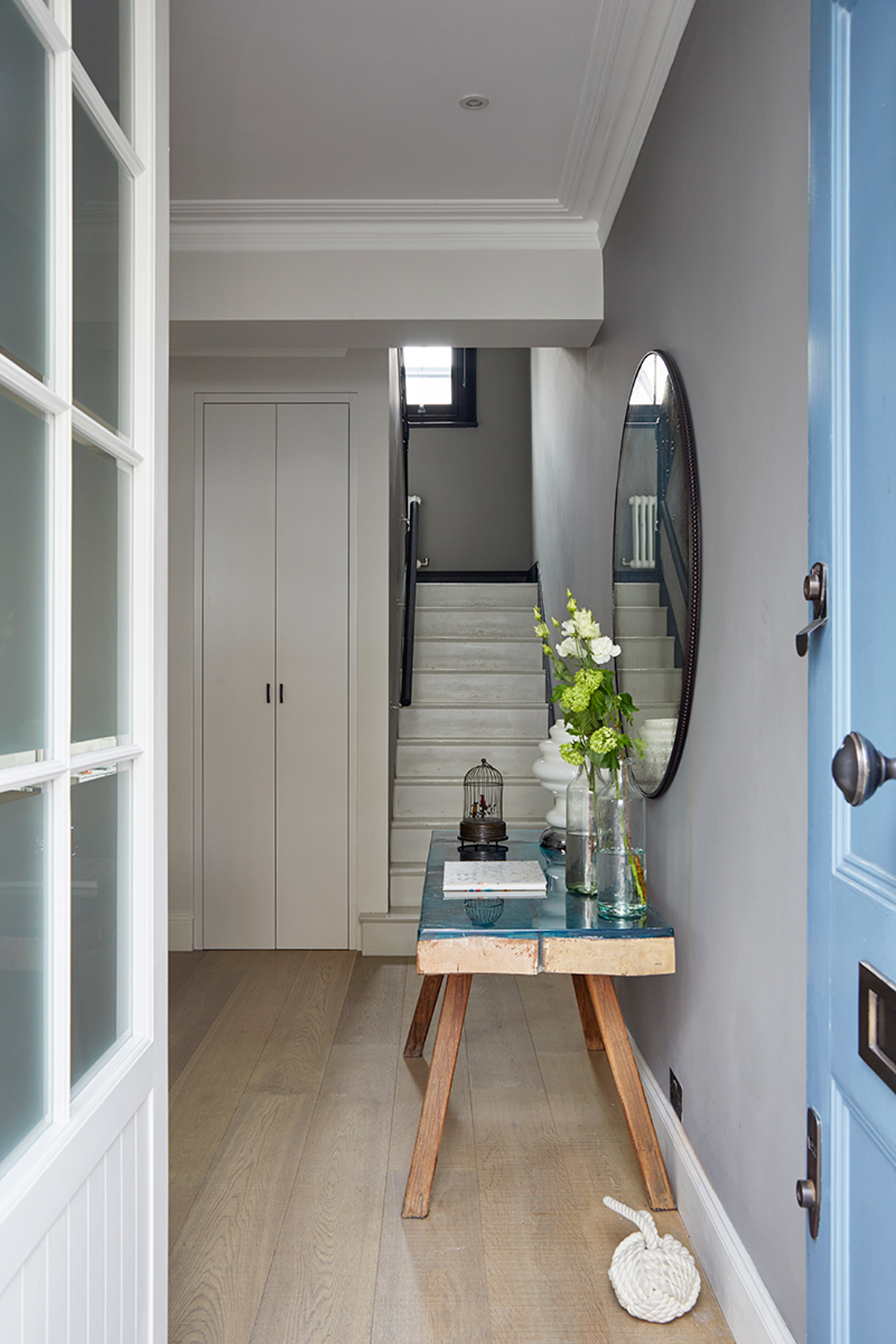
But to achieve it, the couple had to rip the house apart, almost from top to bottom, with only two walls untouched by a hammer. Before, its rooms were pokey, with low ceilings and an unattractive rear extension yet now it's a sweep of open-plan spaces.
LIVING ROOM
The renovations were about making the most of the space and light. In this room, the couple lowered the floor in order to add to the ceiling height.
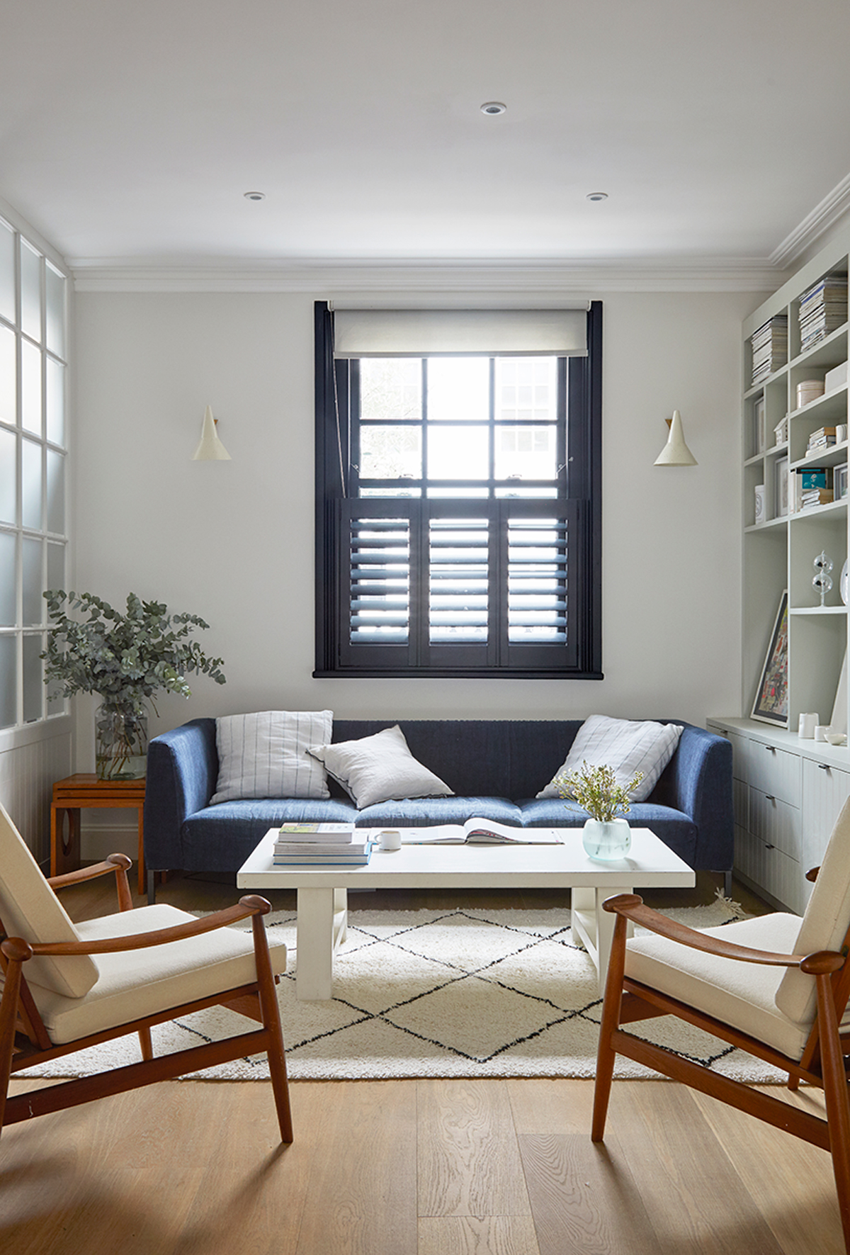
Custom-built to contain collectables, the bookcase exemplifies the owner's eye for detail. It was redrawn several times before she was happy with it and runs a length of seven metres.
The bookcase was designed around objects the couple have collected over the years; some bought in auctions, others found online and many brought back from their travels. There’s a beautiful singing birdcage inherited from a grandmother; the Ettore Sottsass vases; the Tracey Emin Birds poster and surf-inspired collages made by close friend Thibault Sandret.
Be The First To Know
The Livingetc newsletters are your inside source for what’s shaping interiors now - and what’s next. Discover trend forecasts, smart style ideas, and curated shopping inspiration that brings design to life. Subscribe today and stay ahead of the curve.

See Also: Living room ideas - 24 decorating tricks to inspire
KITCHEN-DINER
The kitchen extension was designed and built by the owners' design and build studio Freeman & Whitehouse. Because the neighbouring property overlooks the house, the plans for the kitchen extension had to change quite a few times.
The couple consulted with their architect and structural engineer on the planning and kitchen extension build before designing all of the fitted furniture, from the storage through to the kitchen.
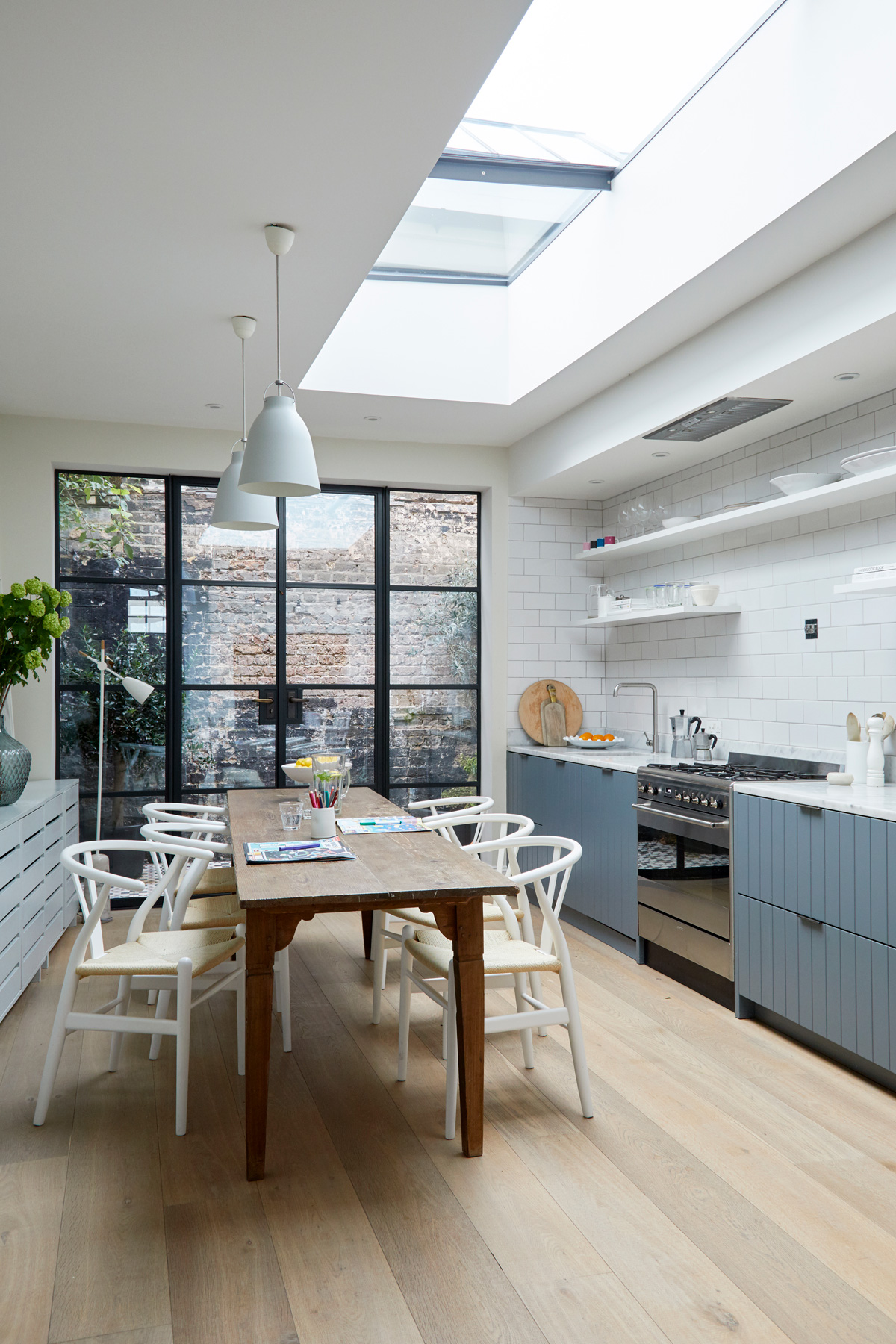
The kitchen floor has bandsaw markings on it, which age really well. As it gets more worn, it becomes more beautiful.
Floating shelves located above the worktop help accentuate the height of the new extension.
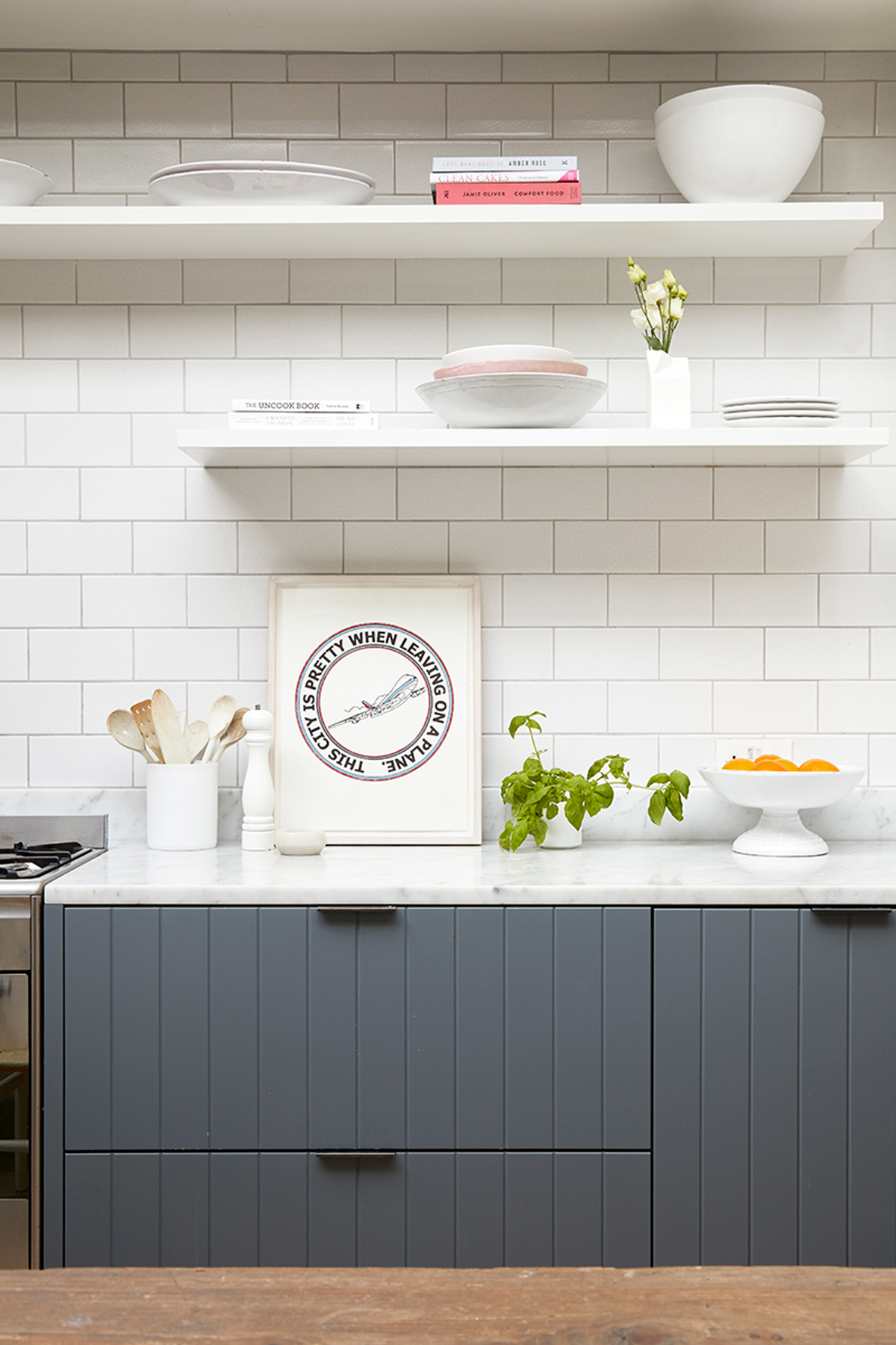
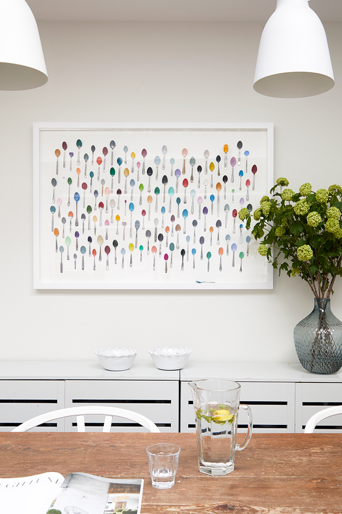
The owners have been collecting the spoons in the frame for 15 years. They've been dipped them in paint – mostly in Farrow & Ball hues.
GARDEN
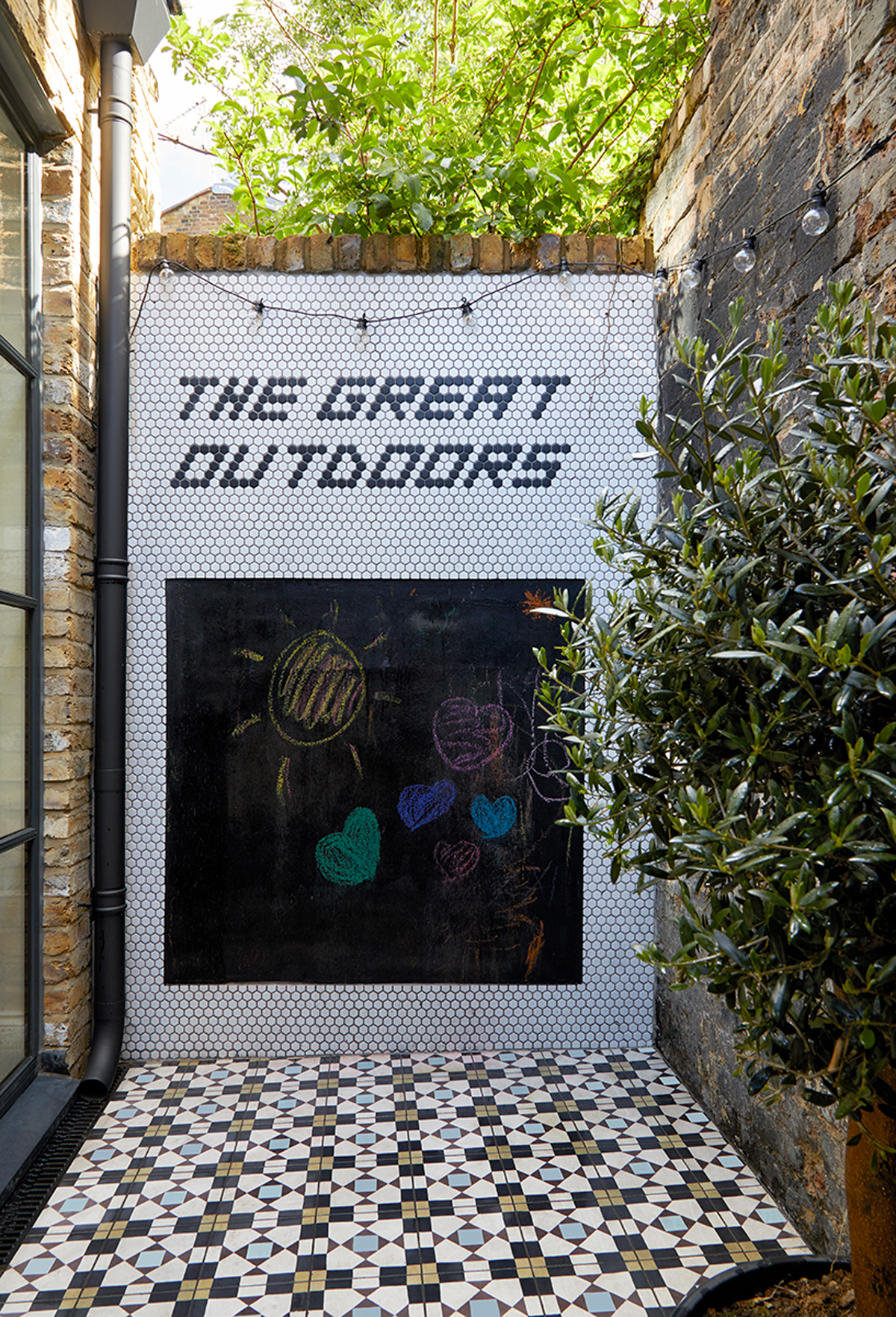
The courtyard was created when the original extension was replaced. It’s only a small space, but the blackboard is fun for the kids and in the summer, the couple hang a hammock here.
Their next project is to install a small kitchen up on the roof terrace, for when they entertain.
MASTER BEDROOM
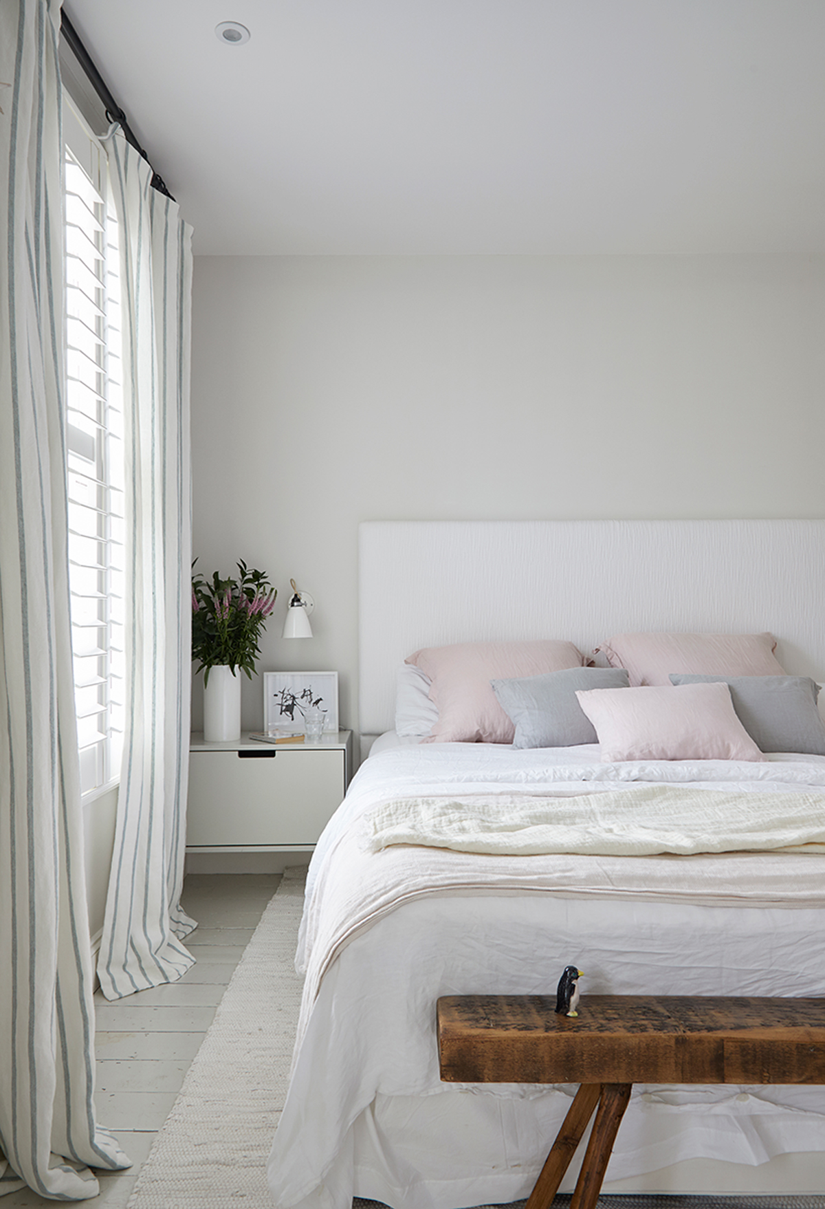
A light, delicate palette is perked up by pretty pastel shades.
MASTER EN SUITE
The master bathroom’s double shower was originally conceived as a wet room but when the kids used it, water ended up everywhere. A shower screen has been added to prevent splashes and slips.
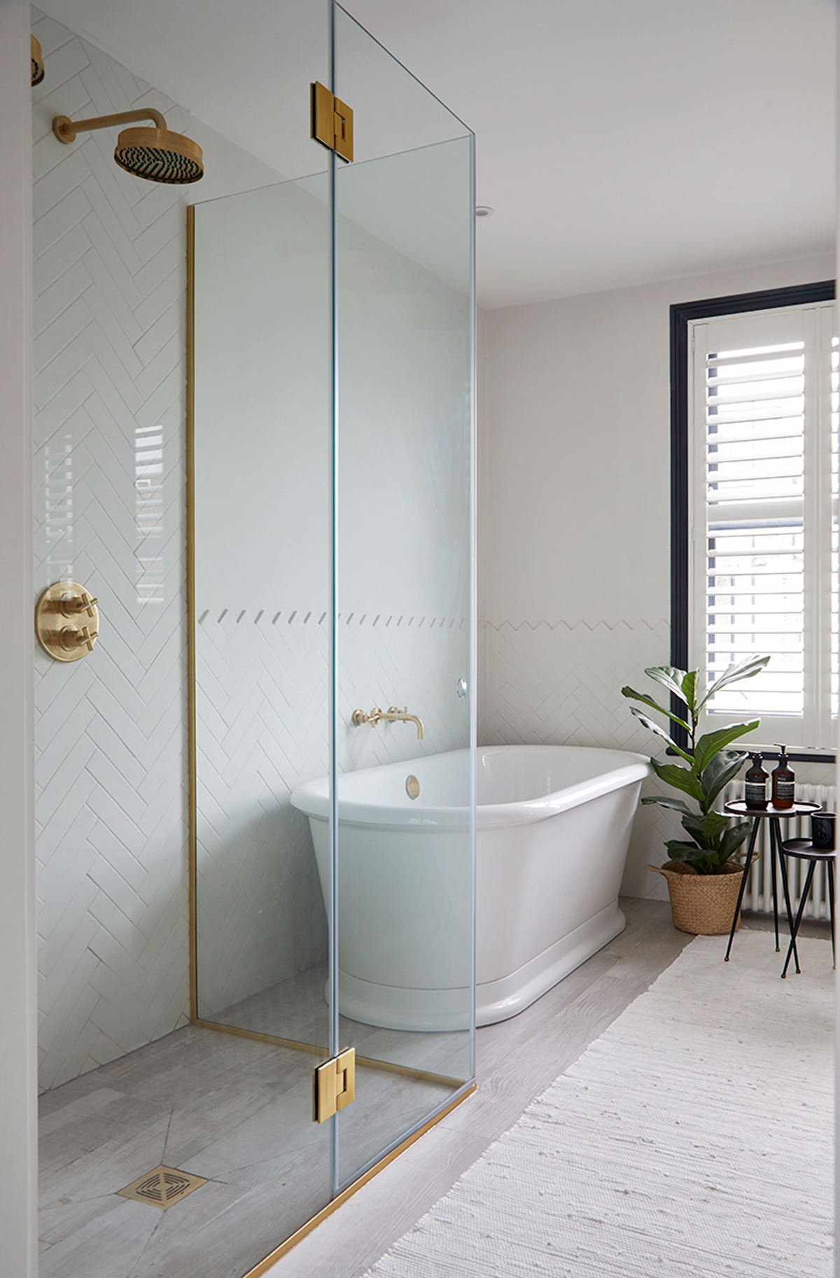
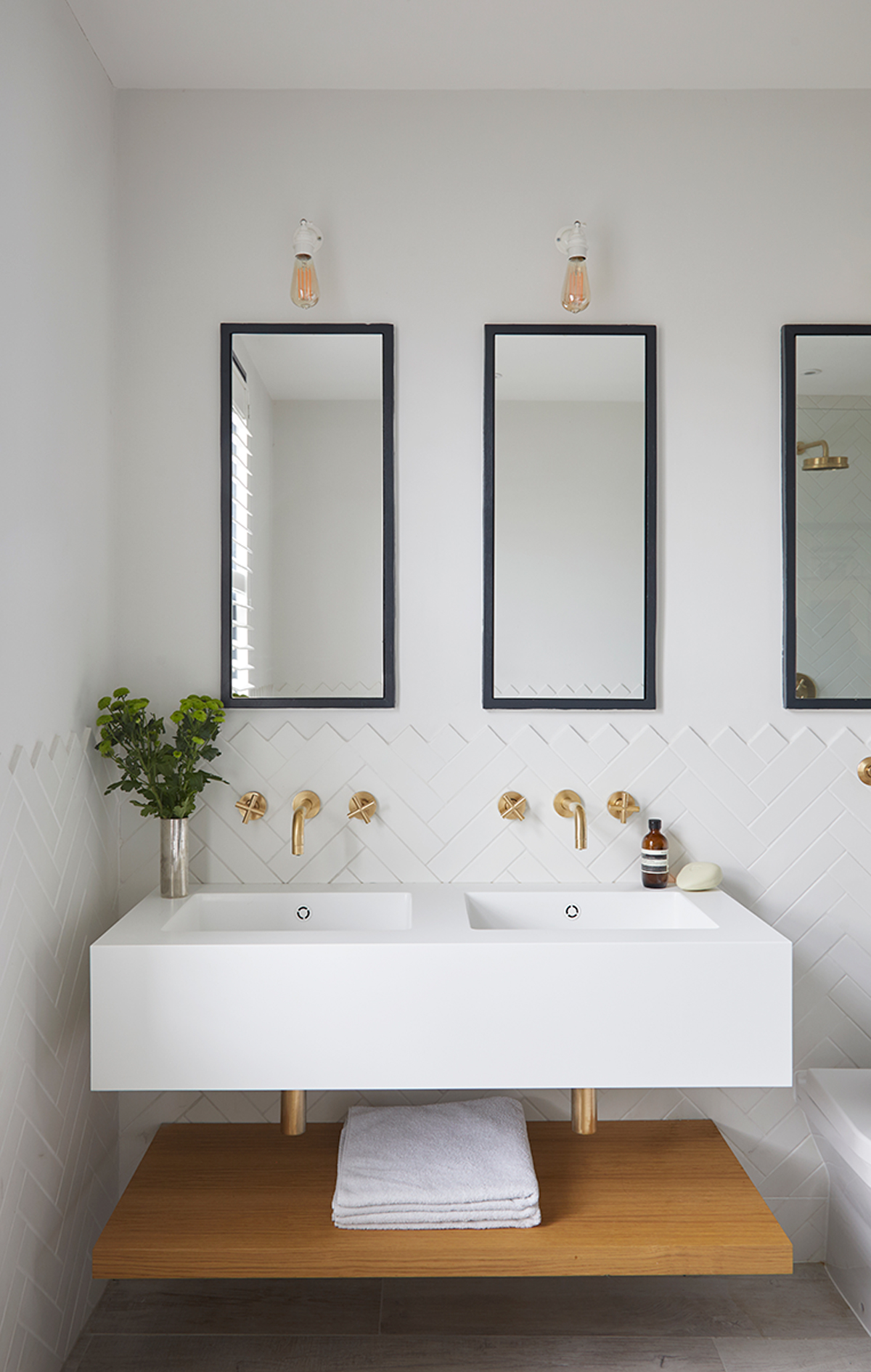
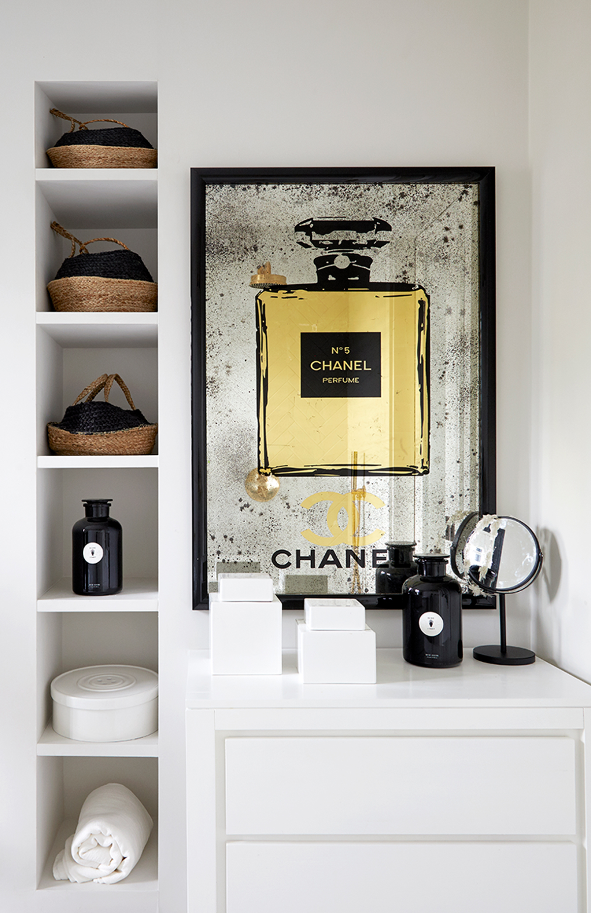
Smart storage and a creative use of space in this modern bathroom are key components of the owners' interior style.
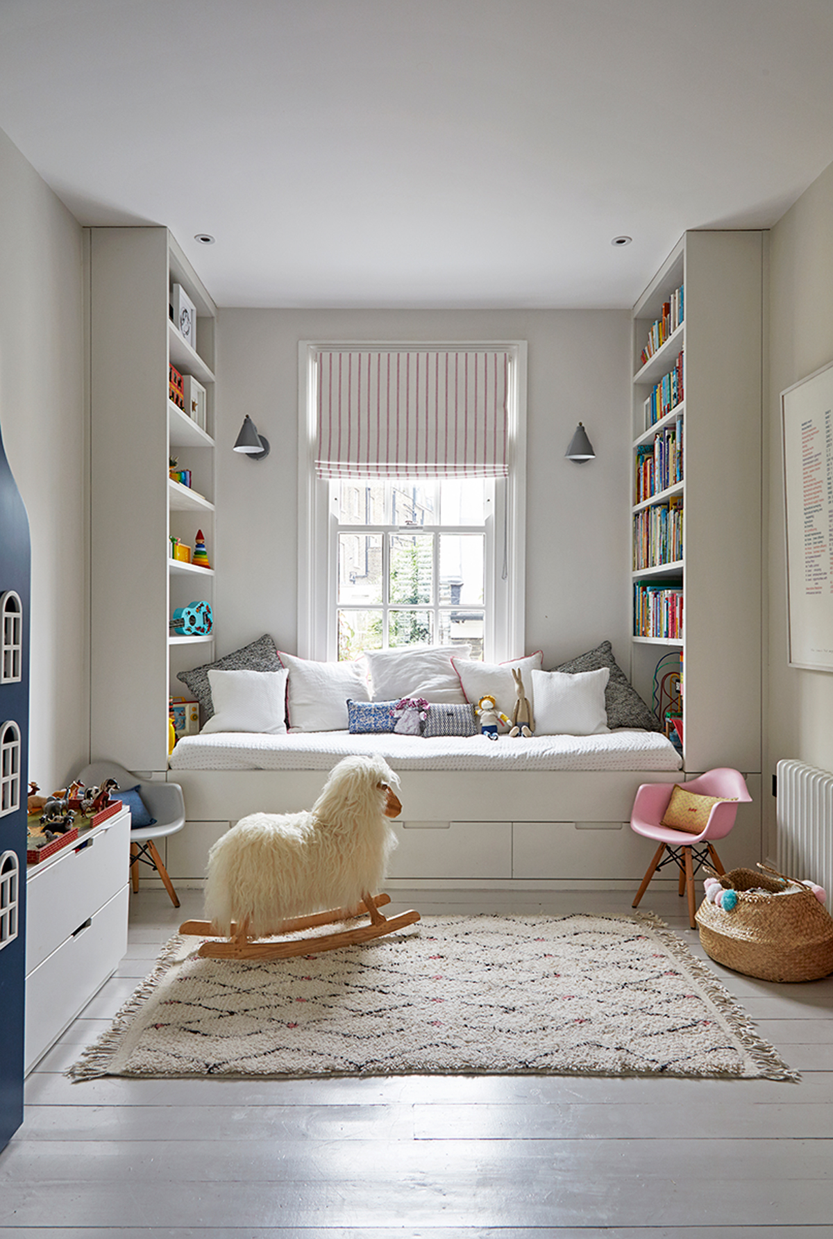
CHILDREN'S BEDROOM
The couple wanted all their children to sleep in one big room, so that they learned to share.
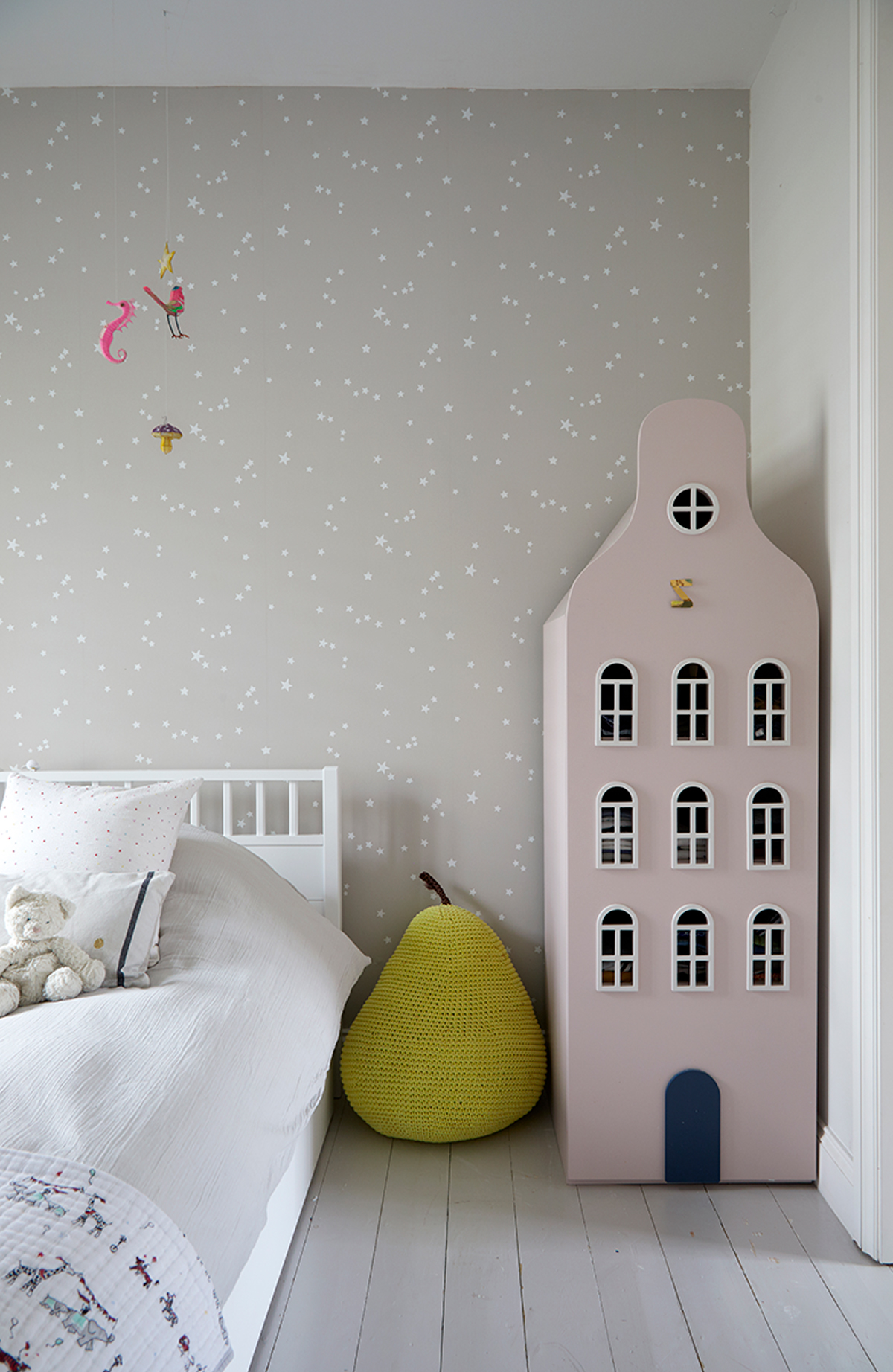
Gable-topped model houses in the children’s bedroom artfully conceal individual wardrobes. The couple plan to have a new one made and painted a soft green for their youngest child.
To see more of Natasha and Keren’s interior design and property development portfolio, visit freemanandwhitehouse.com
Photography /Anna Stathaki
See Also: Kids room ideas - 45 fresh ideas for a modern yet whimsical kids bedroom
The homes media brand for early adopters, Livingetc shines a spotlight on the now and the next in design, obsessively covering interior trends, color advice, stylish homeware and modern homes. Celebrating the intersection between fashion and interiors. it's the brand that makes and breaks trends and it draws on its network on leading international luminaries to bring you the very best insight and ideas.
-
 My 10 Favorite Designs at Milan Design Week 2025 — Out of the Hundreds of Pieces I Saw
There is a new elegance, color, and shape being shown in Milan this week, and these are the pieces that caught my eye
By Pip Rich
-
 Iridescence Is Chrome’s More Playful, Hard-to-Define Cousin — And You're About to See It Everywhere
This kinetic finish signals a broader shift toward surfaces that move, shimmer, and surprise. Here's where to find it now
By Julia Demer