This listed terraced house was given a more useful layout thanks to a side extension that flips the layout upside down
The architects added on a side extension to create a new entrance to the house, moving all living areas to garden level, and freeing up the raised ground floor level for other, more useful purposes. The basement has now become the family centre of the home...

The Property
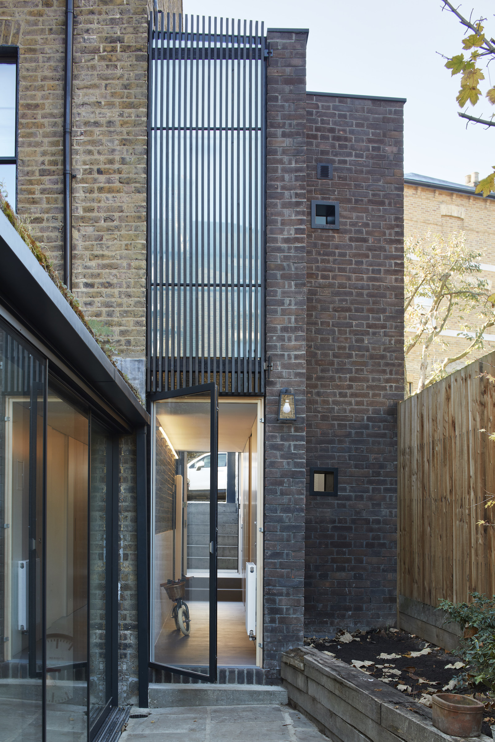
A beautiful, listed, end of terrace house in the Tufnell Park Conservation Area was starting to feel a bit crowded and needed extending. One of the issues was that the main entrance and living rooms were at raised ground floor level, while the kitchen and family room were at garden level. This meant that much of the living room space ended up being unused, and bedrooms upstairs were cramped and crowded.
Having just had their third child, the owners brought on Robert Rhodes Architecture + Interiors to help them re-think and reconfigure the layout, turning it into a more functional modern home. The owners desperately needed more space, and needed to reorganise the space they had in order to suit their growing family.
The solution? The architects added on a side extension to create a new entrance to the house, enabling the architects to arrange all living areas at garden level, thus freeing up the raised ground floor level for other, more useful purposes (like a spacious master bedroom suite plus a home office). By moving the entrance, the architects shifted the circulation and freed up the raised ground floor to provide what was needed most: private space. The basement has now become the family centre of the home.
The innovative design lead it to be a finalist for the Architects’ Journal 2018 Retrofit Awards.
New entrance
Originally the property had too many living rooms – it’s a common problem with terraced houses. With the original entrance on the raised ground floor and the kitchen on the lower ground, it meant that two whole floors were dedicated to living space, most of which didn't get used.
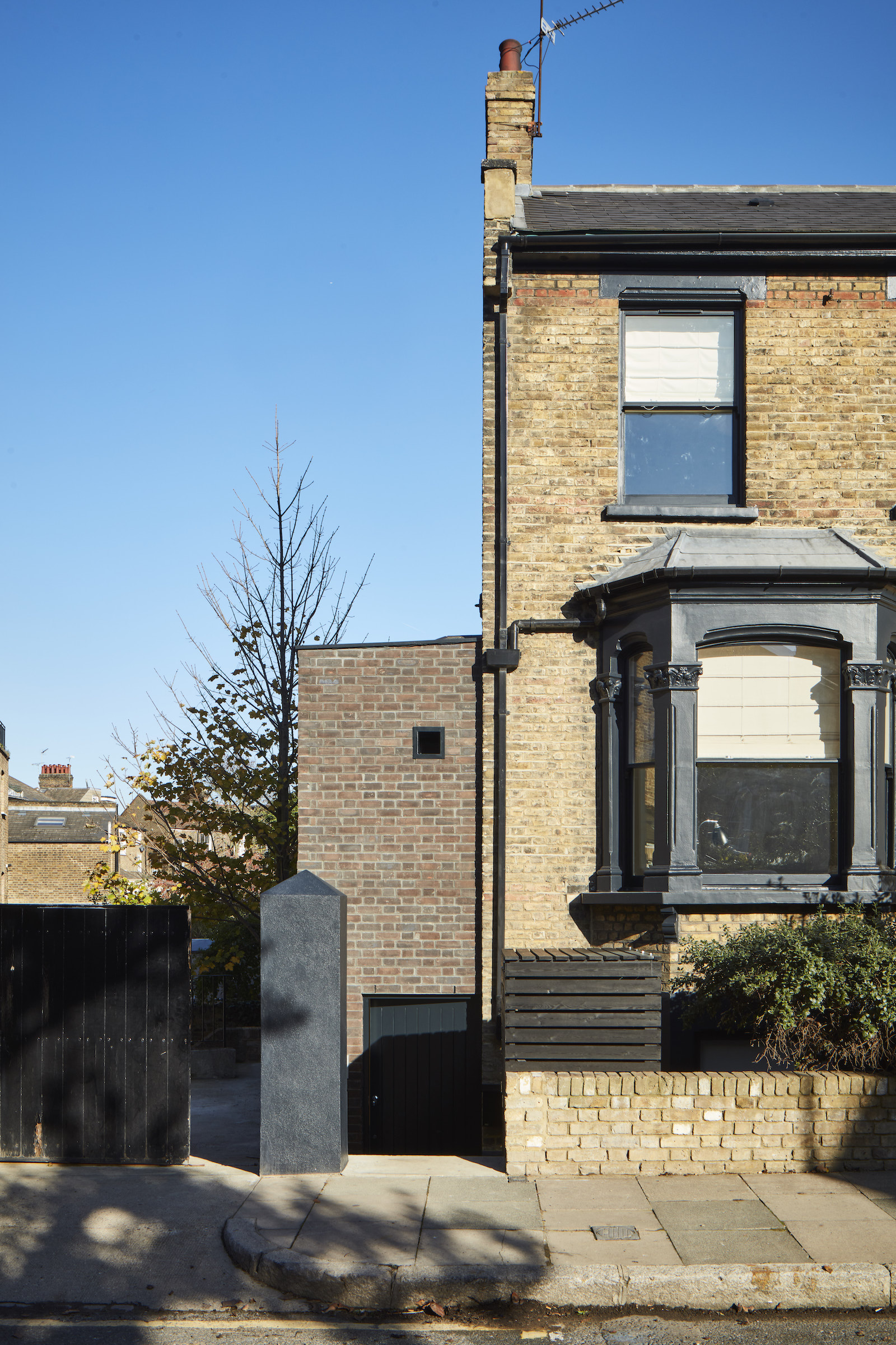
The new side extension provided a brand new entrance to the house. One that brings you right into the middle of the lower ground floor – directly to the kitchen and the family room. That way the upstairs living rooms can become more useful spaces: for example a master bedroom, dressing room, and home office.
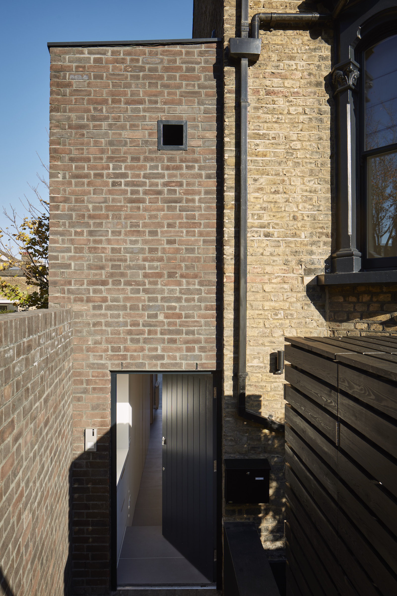
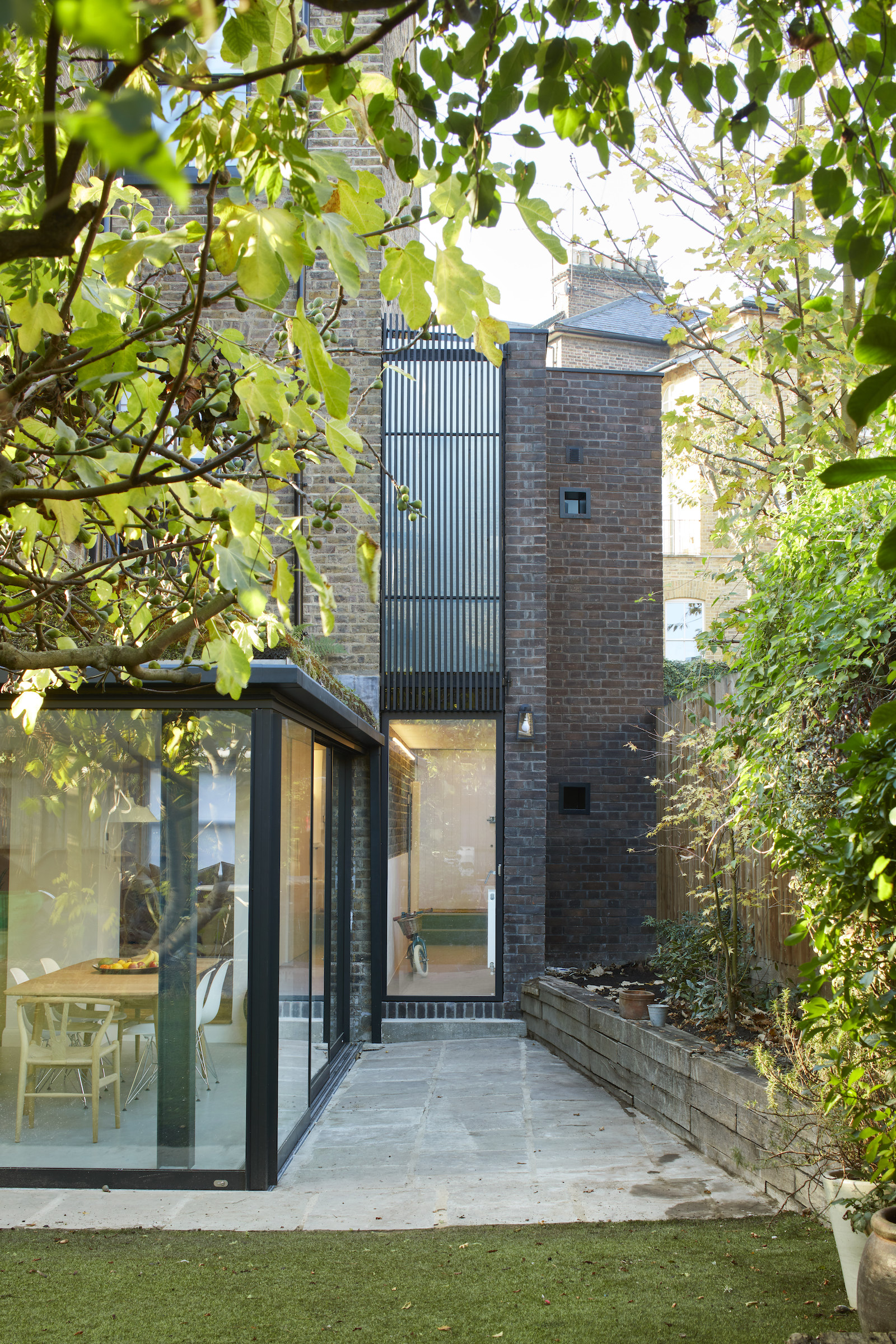
In order to achieve this new entrance and layout, the architects built a new, slender, two storey extension to the side that sits on a thin sliver of land that was once a side passage – to alleviate the pressure on the bottom two floors and allow for a more useful (albeit unconventional) arrangement for the house.
Be The First To Know
The Livingetc newsletters are your inside source for what’s shaping interiors now - and what’s next. Discover trend forecasts, smart style ideas, and curated shopping inspiration that brings design to life. Subscribe today and stay ahead of the curve.
Hallway
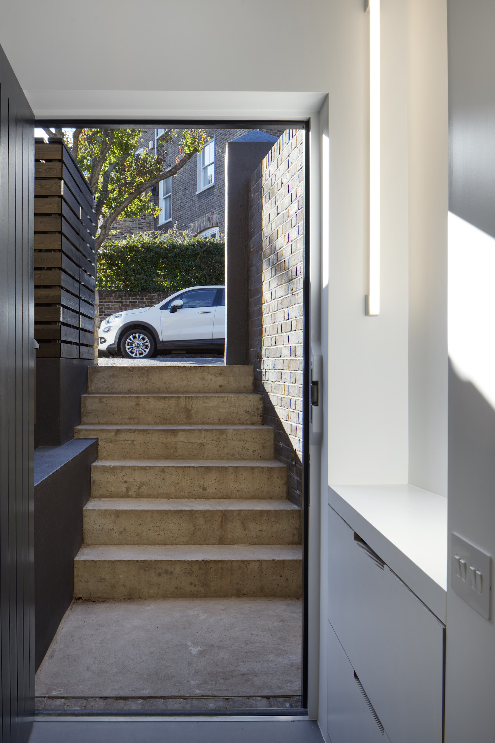
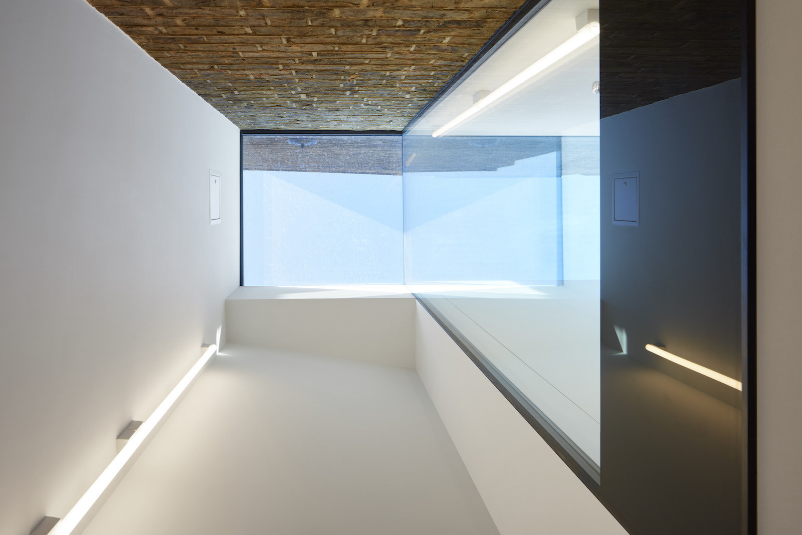
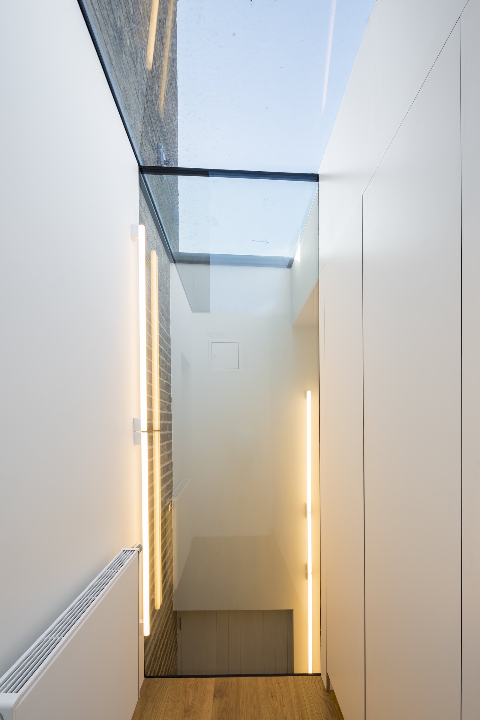
Concrete steps lead down from the street to an unassumingly small façade of properly Flemish bonded, over-fired stocks. Inside the new front door a two-storey entrance hall reveals the intermediate level above and the beginning of a continuous 7 metre glass strip, visually separating the new from the old.
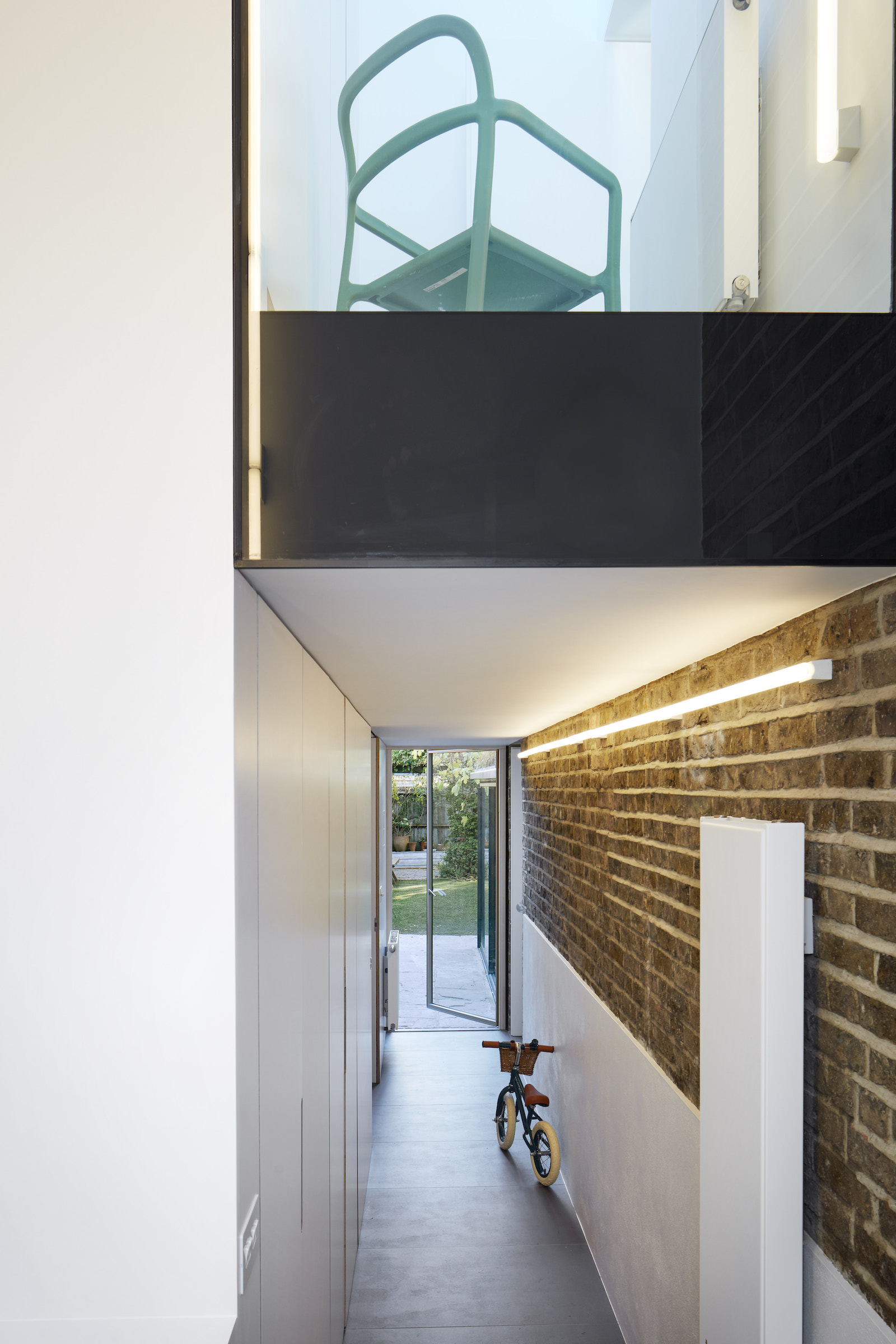
The hallway corridor is lined with bomb proof Formica laminated plywood cupboards, hiding coats and shoes and scooters and skateboards and tennis racquets and all the other paraphernalia of family life.
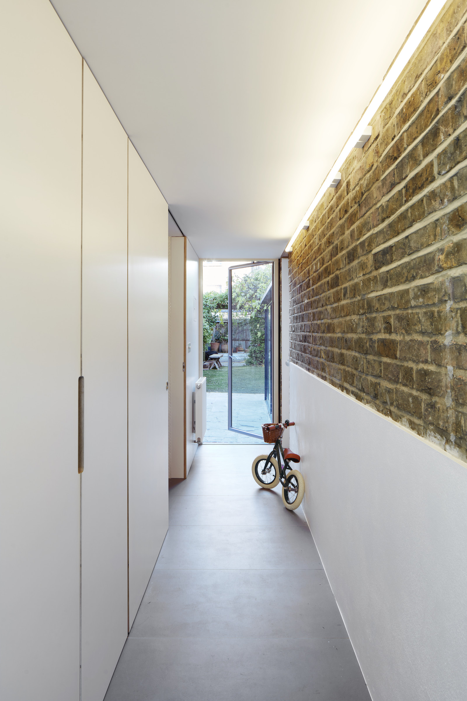
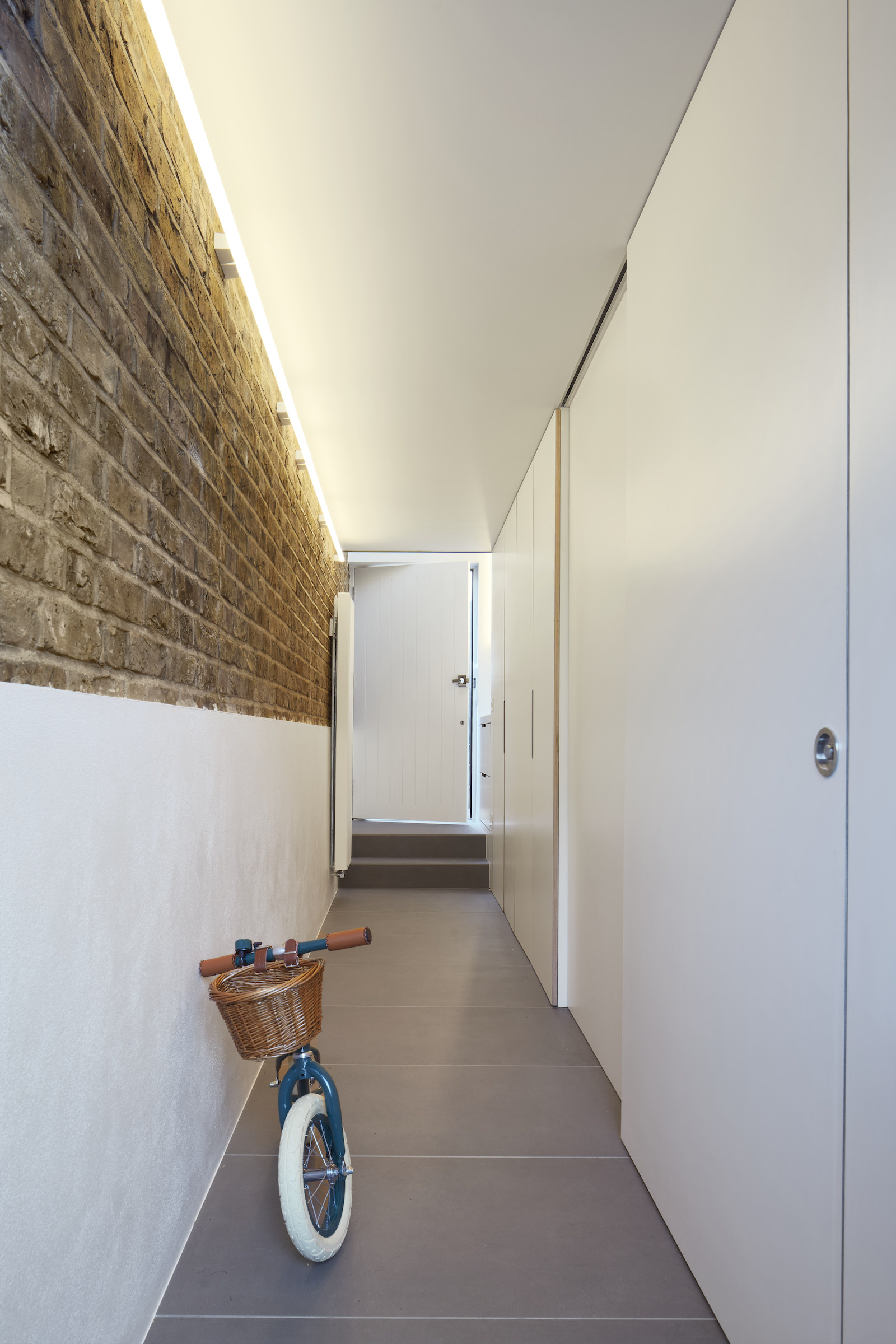
The new extension also allows access directly to the garden from the street, in case you want to go straight from the front to the back without going inside the house. If you had a muddy, wet dog with you for example. Or a bicycle. Or a child. Or multiples of all three.

There is even a hidden downstairs loo, with a sink big enough to bathe the dog, or a small child.
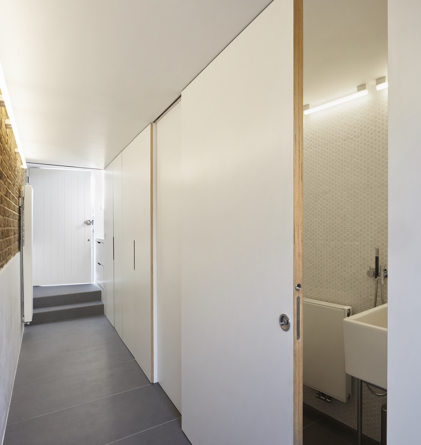
Downstairs living space
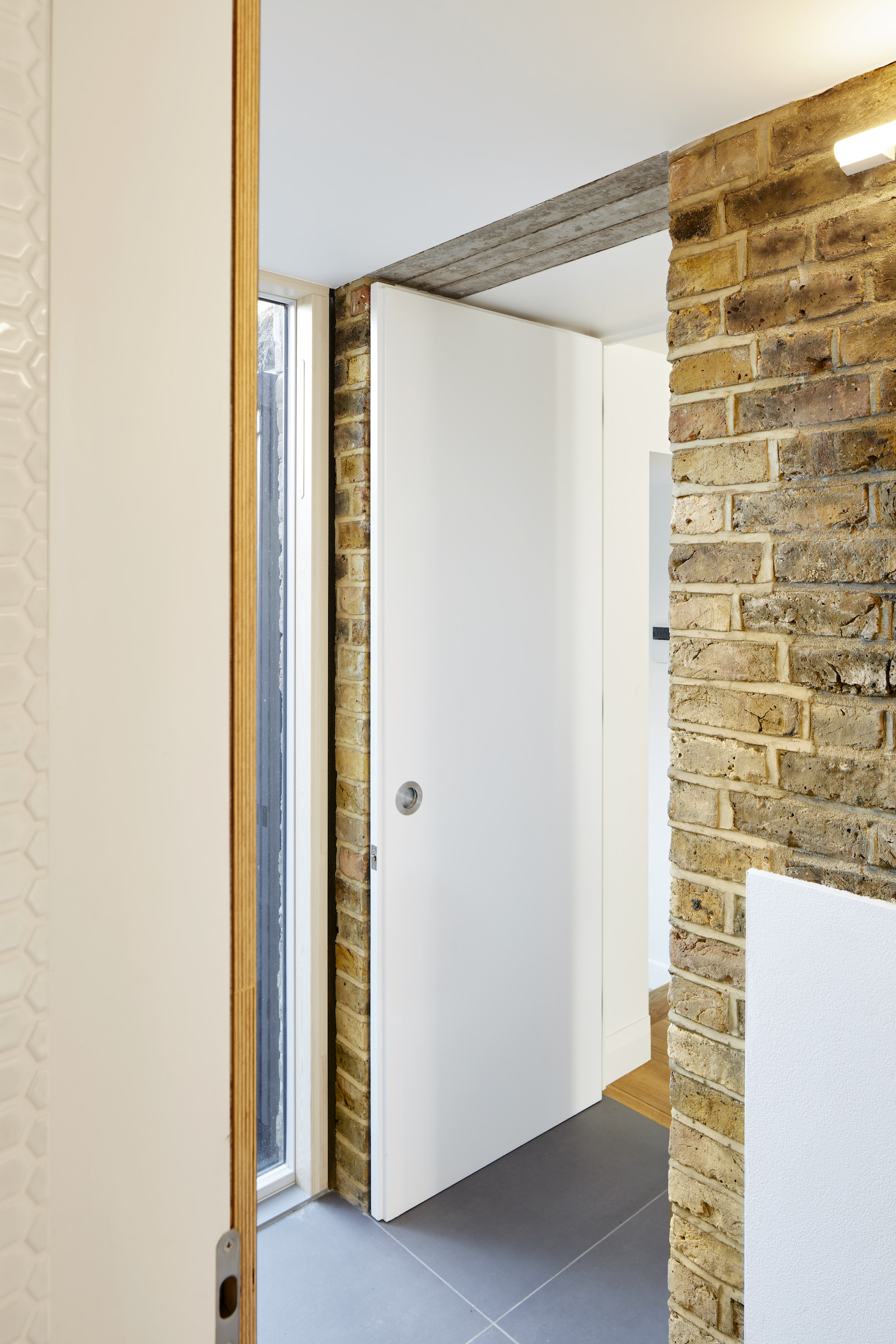
A door in the original exterior brick wall leads through into the main family room.
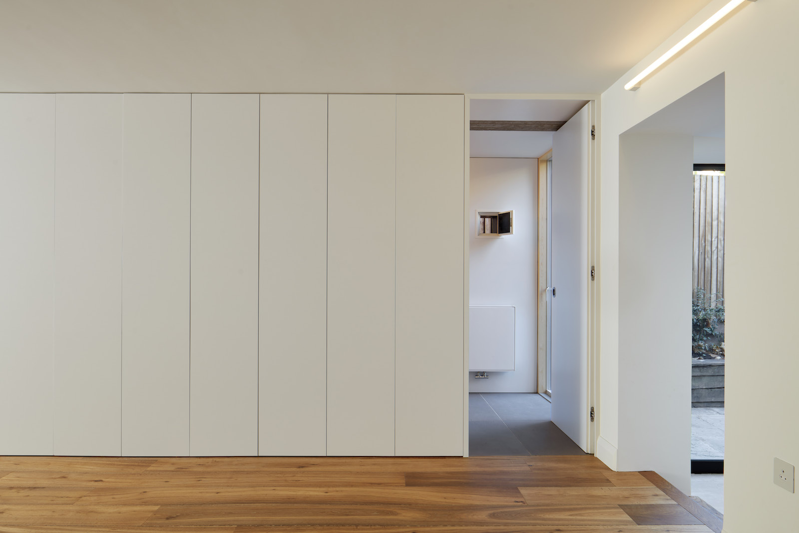
A wall of storage conceals the connection to the new corridor, through what was the exterior wall.
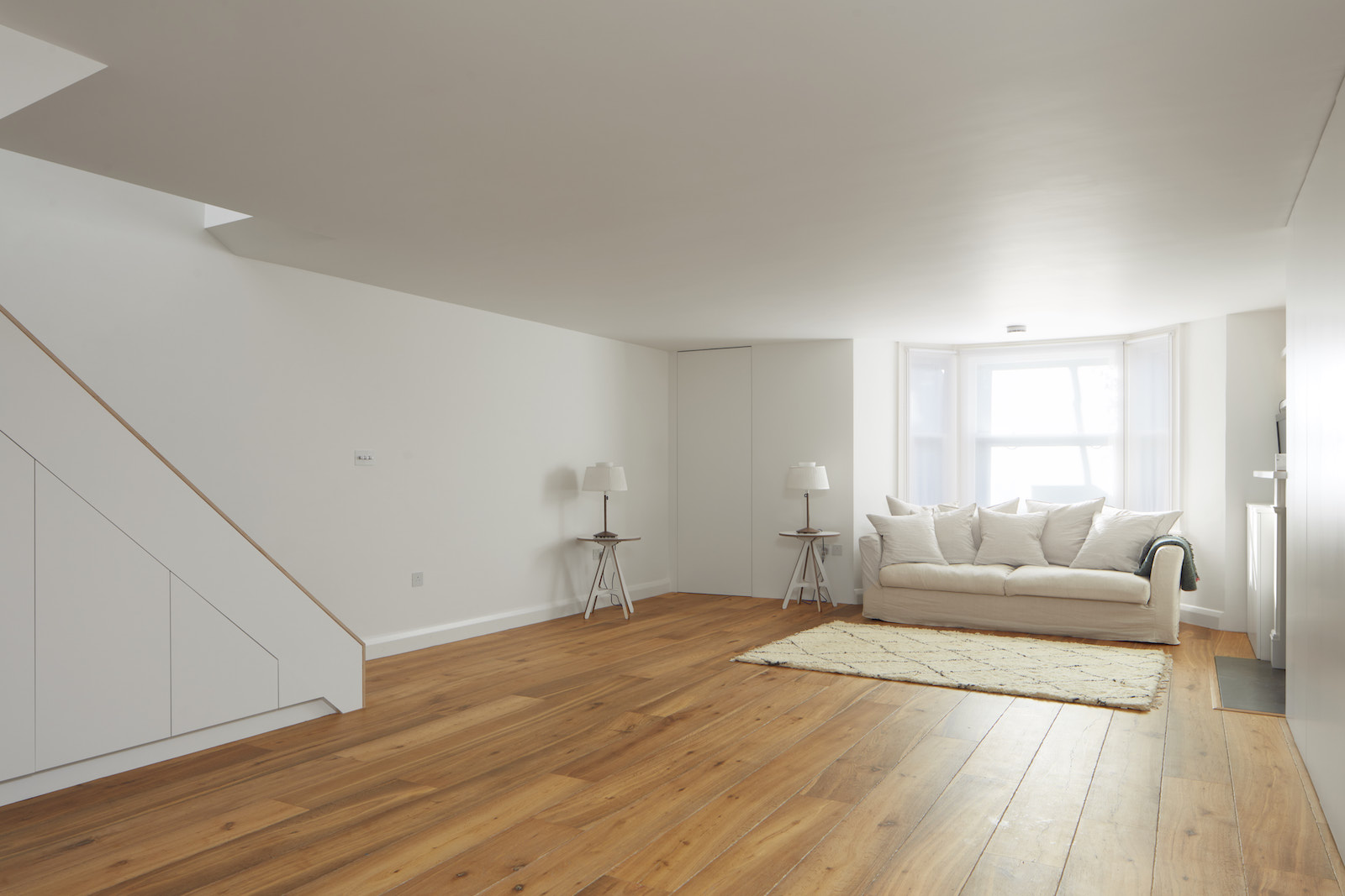
The basement has now become the family centre of the home – encompassing a large, bright, open plan kitchen, a living room and a dining room plus lots of built-in storage.
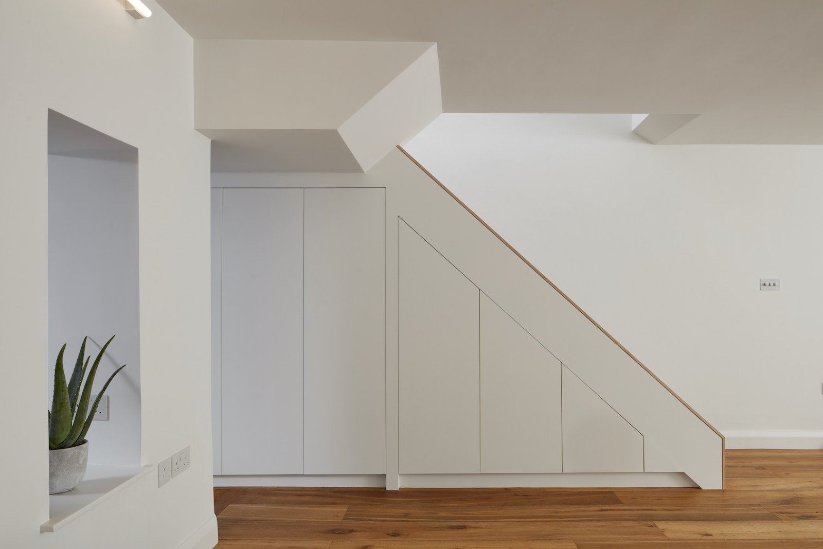
But it's the modern kitchen that's the heart of this home.
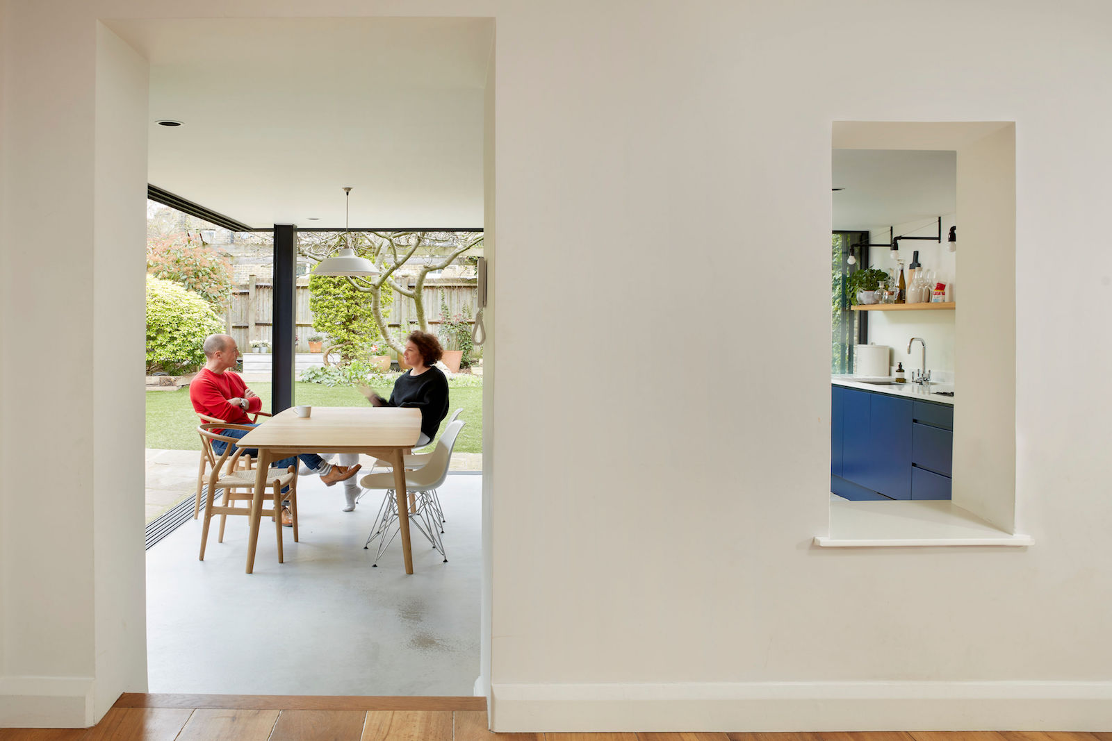
Kitchen
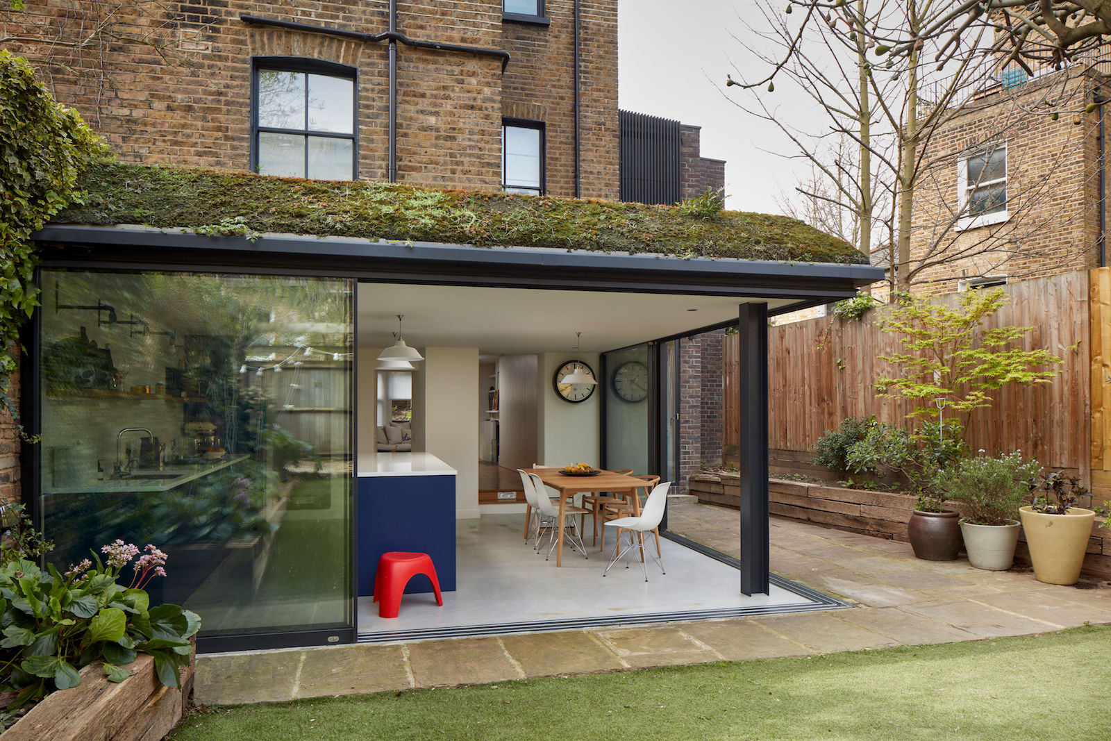
The pre-existing 2003 kitchen extension was stripped back and re-configured.
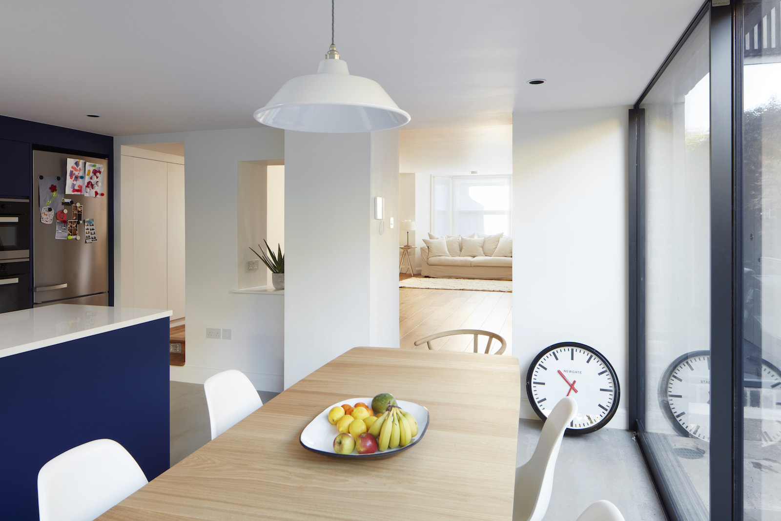
The existing resin floor and green roof were retained and restored, and the architects added a new zinc-clad dormer loft – after successfully overturning a planning refusal under the previous architects.
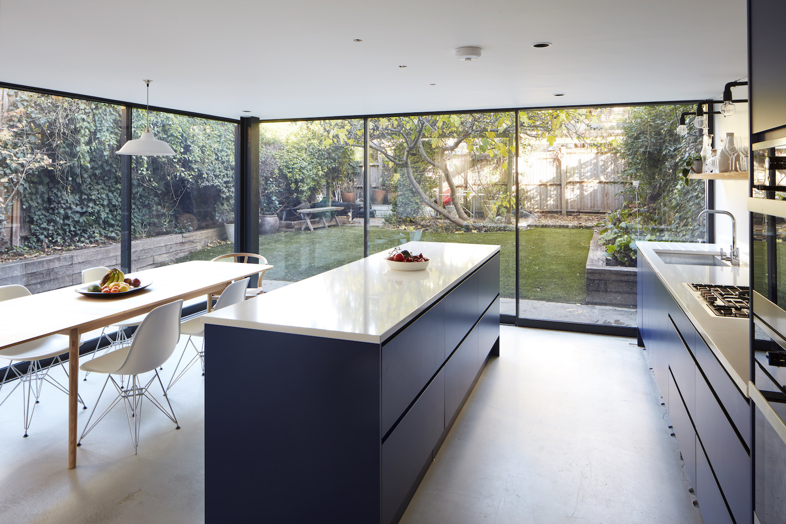
The open-plan kitchen features blue kitchen cabinetry, a dining area and floor-to-ceiling sliding doors that provide 180 degree views of the garden.
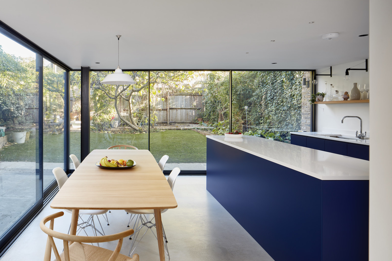
The downstairs spaces are all connected to the garden, making this basement a light, bright space.
Home office
A home office replaced the front living room up on the raised ground floor. It offers views out the front of the house.
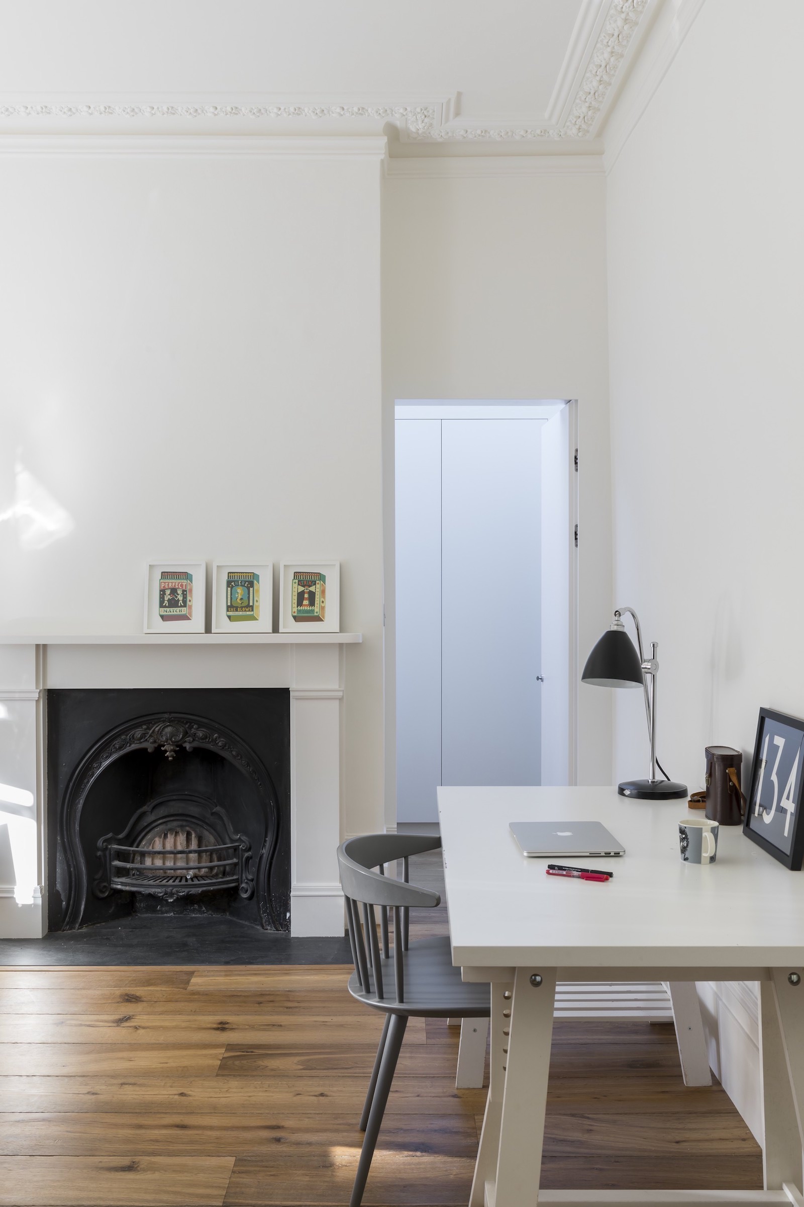
The home office leads through to an ensuite storage room which sits in the new extension and is accessed through a hidden “jib” door.
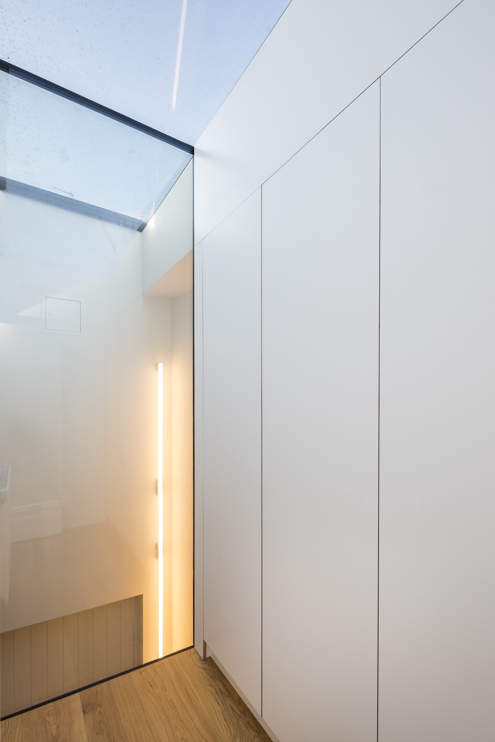
The storage room looks down into the new double-height entrance.
Master bedroom
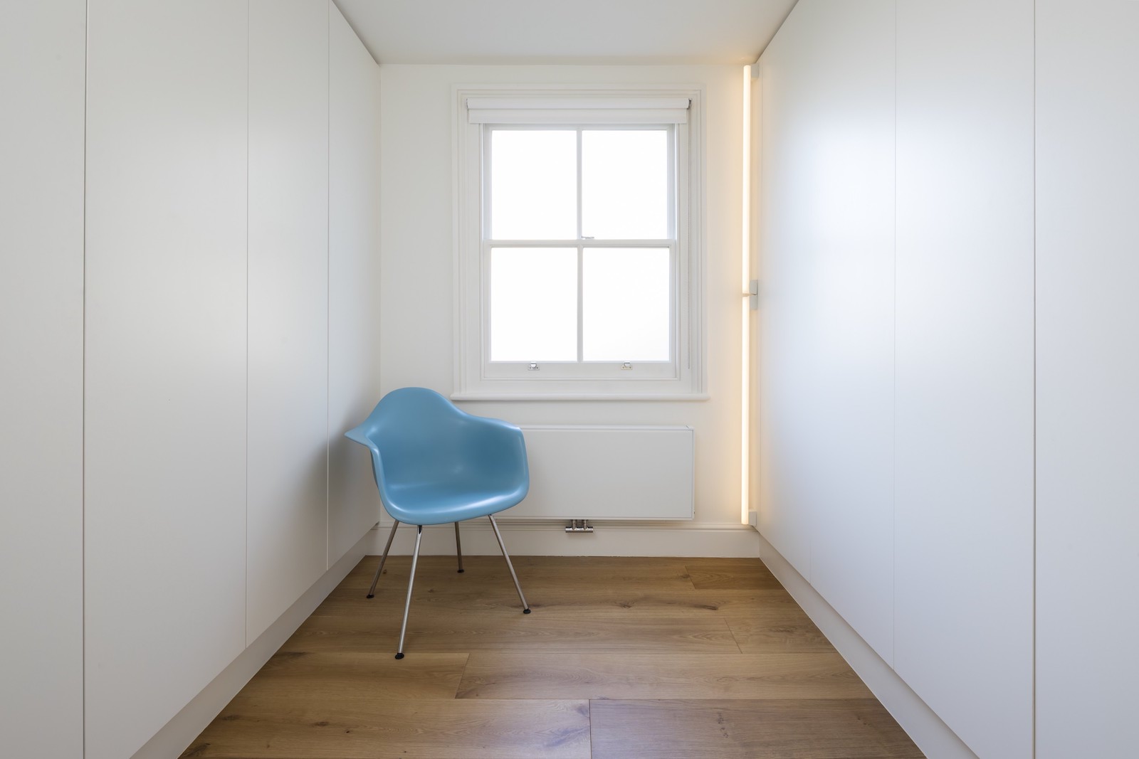
Down the corridor at the back of the house is a walk-in dressing room which leads to the new master bedroom suite.
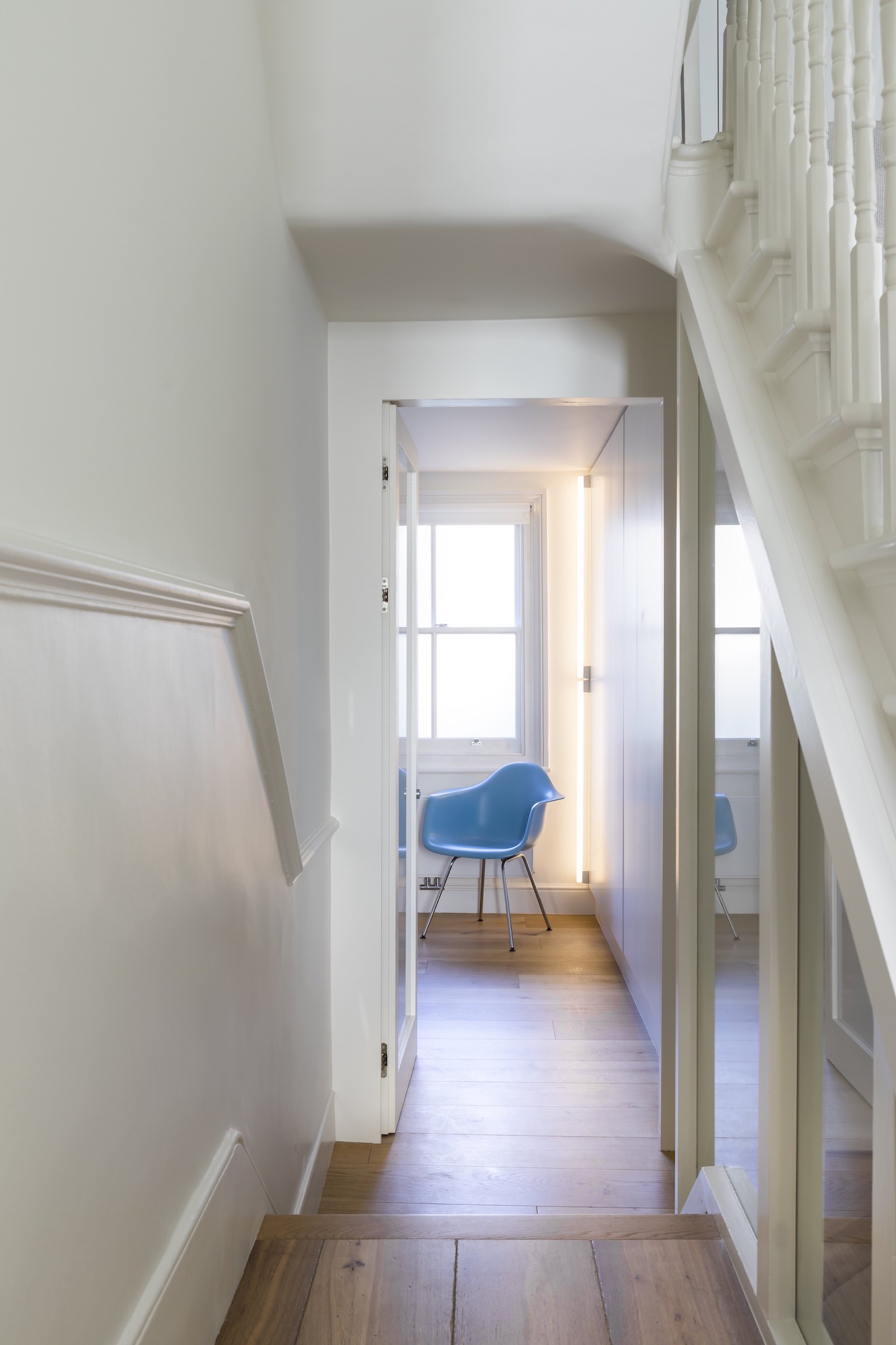
Featuring floor-to-ceiling built-in wardrobes, this space acts as both bedroom storage an entrance to the master bedroom.
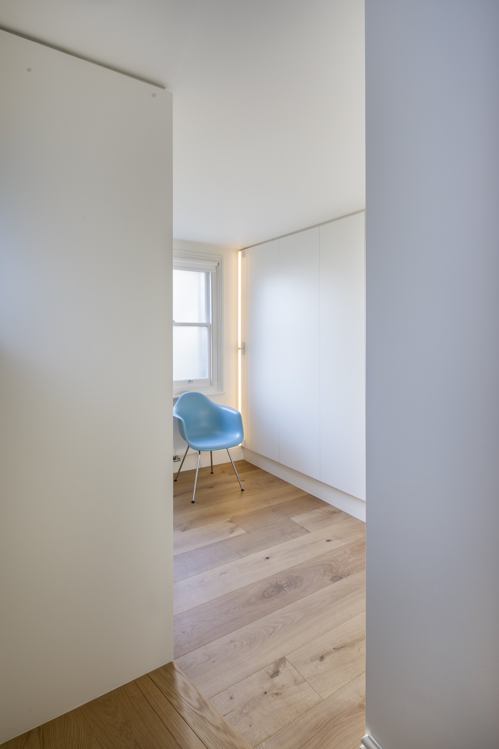
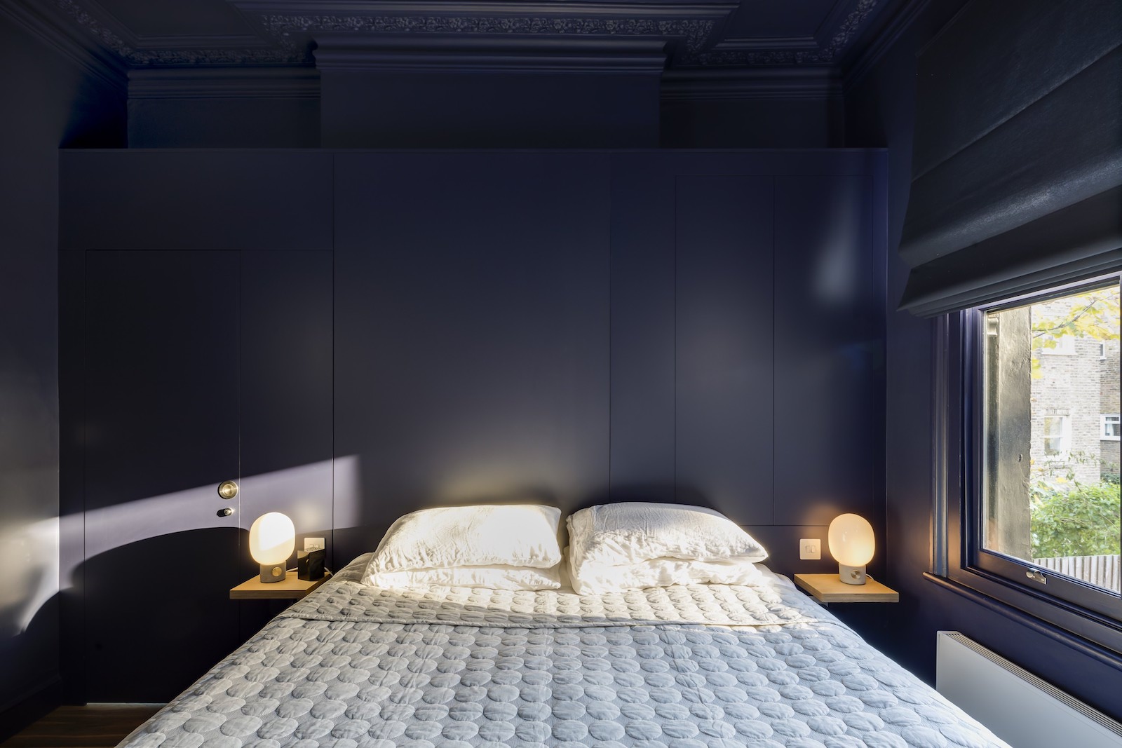
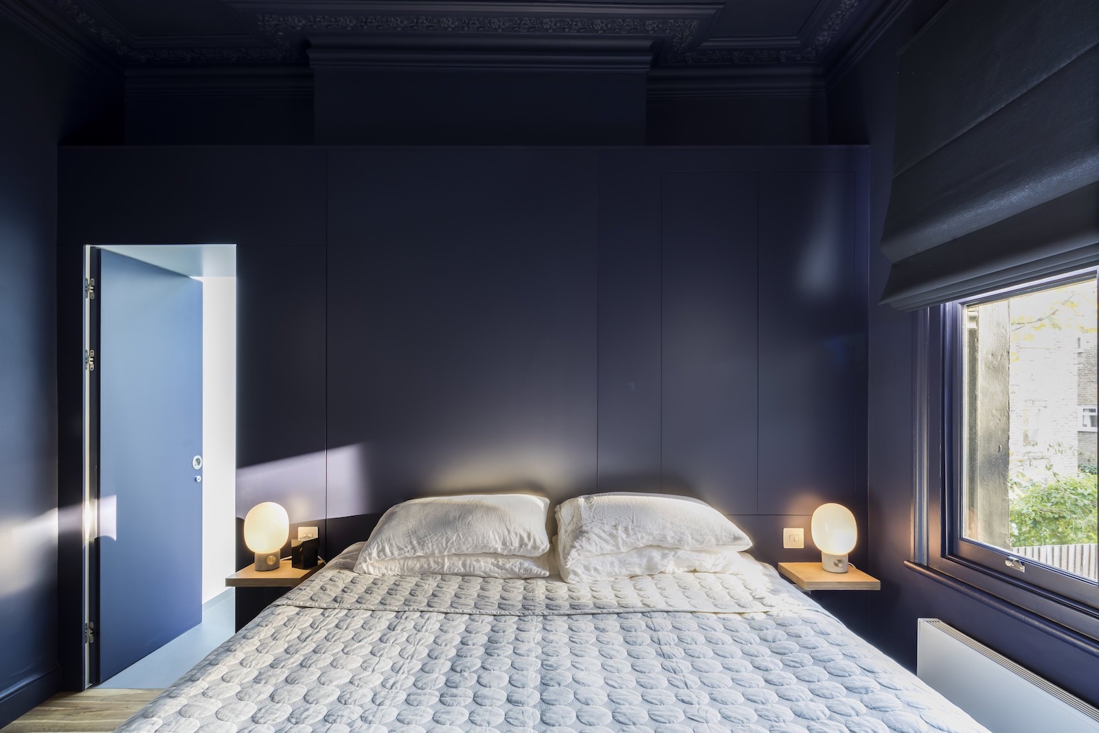
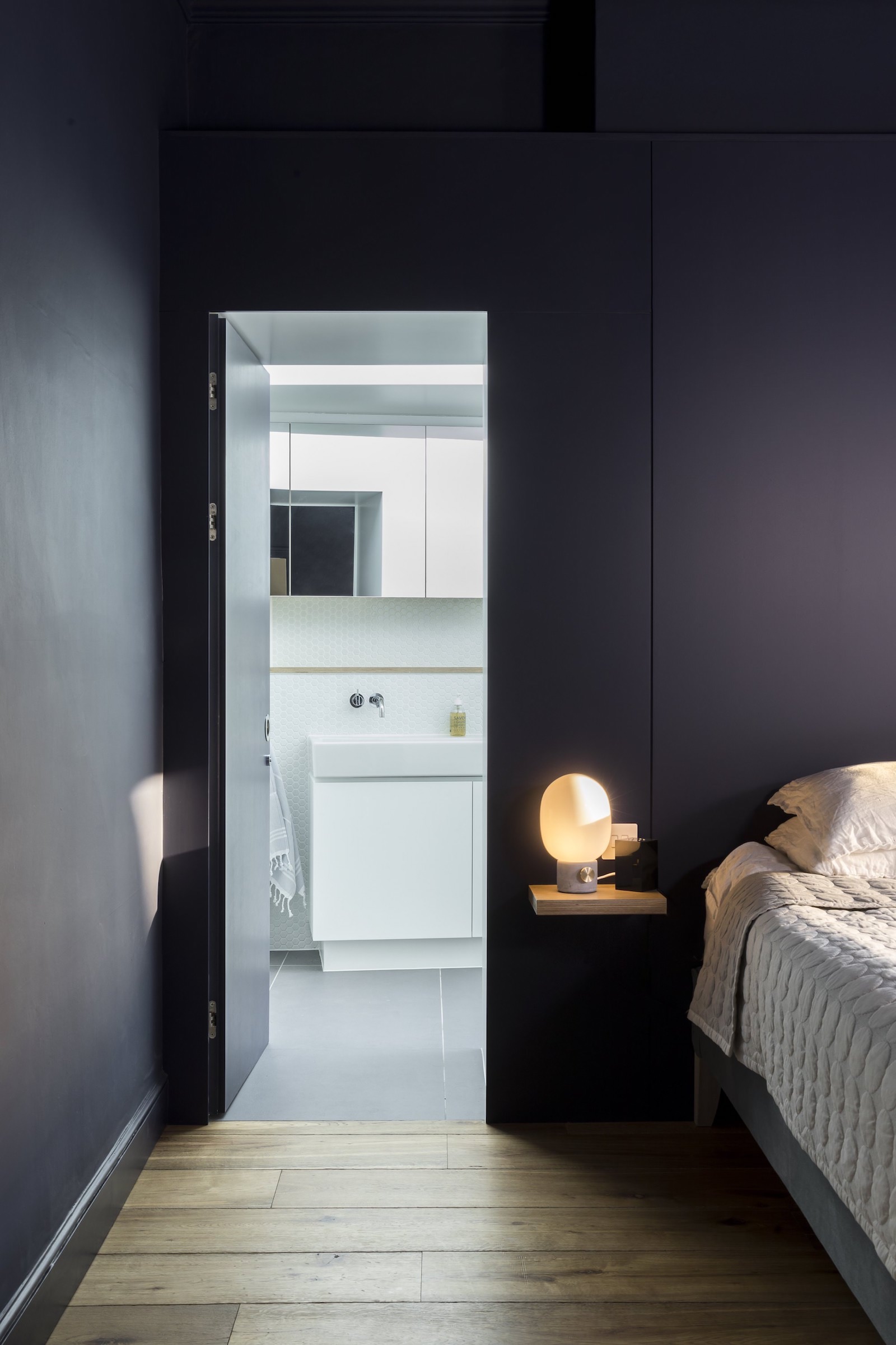
At the back is a dark blue bedroom.
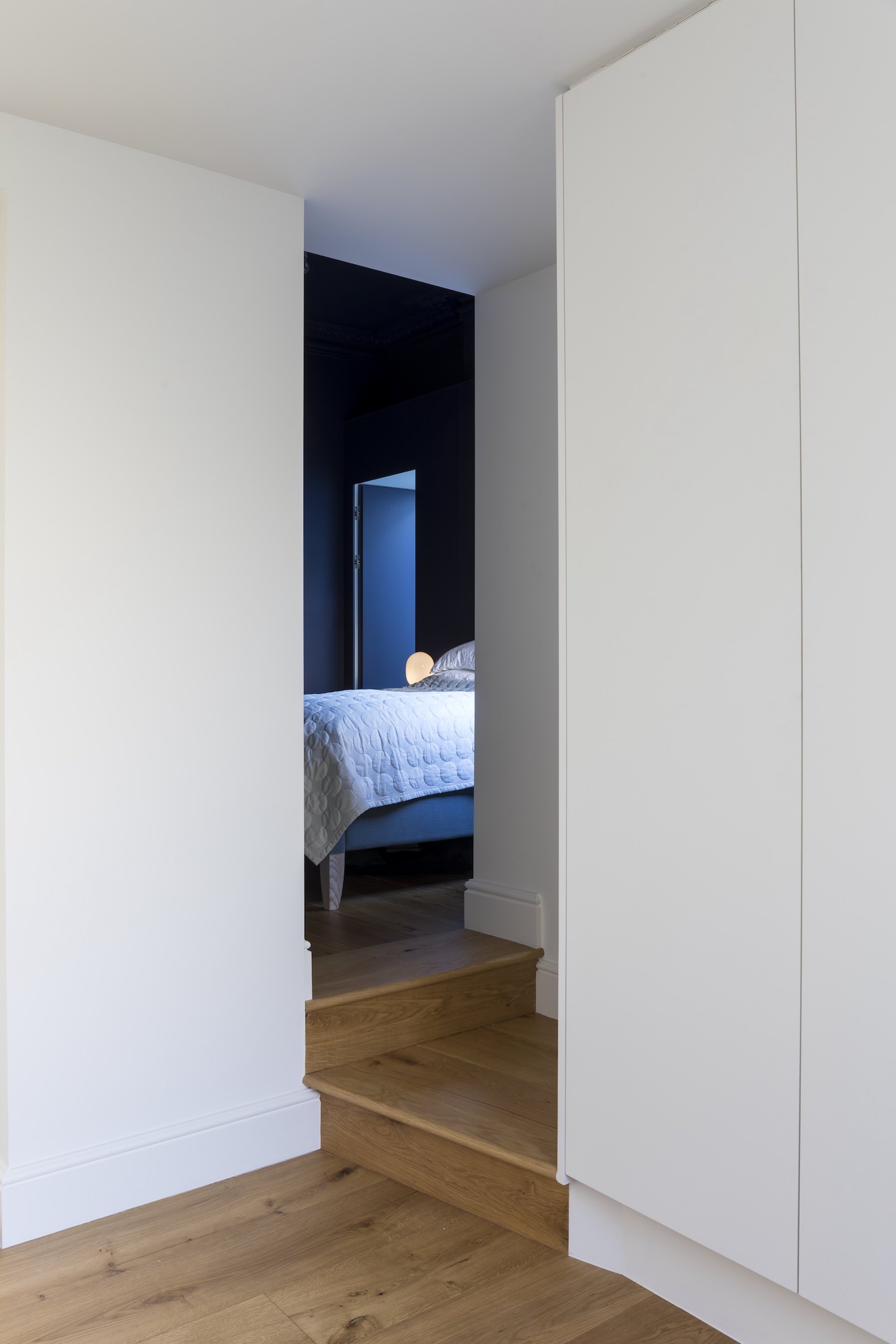
The bedroom colour is dramatic and cosseting.
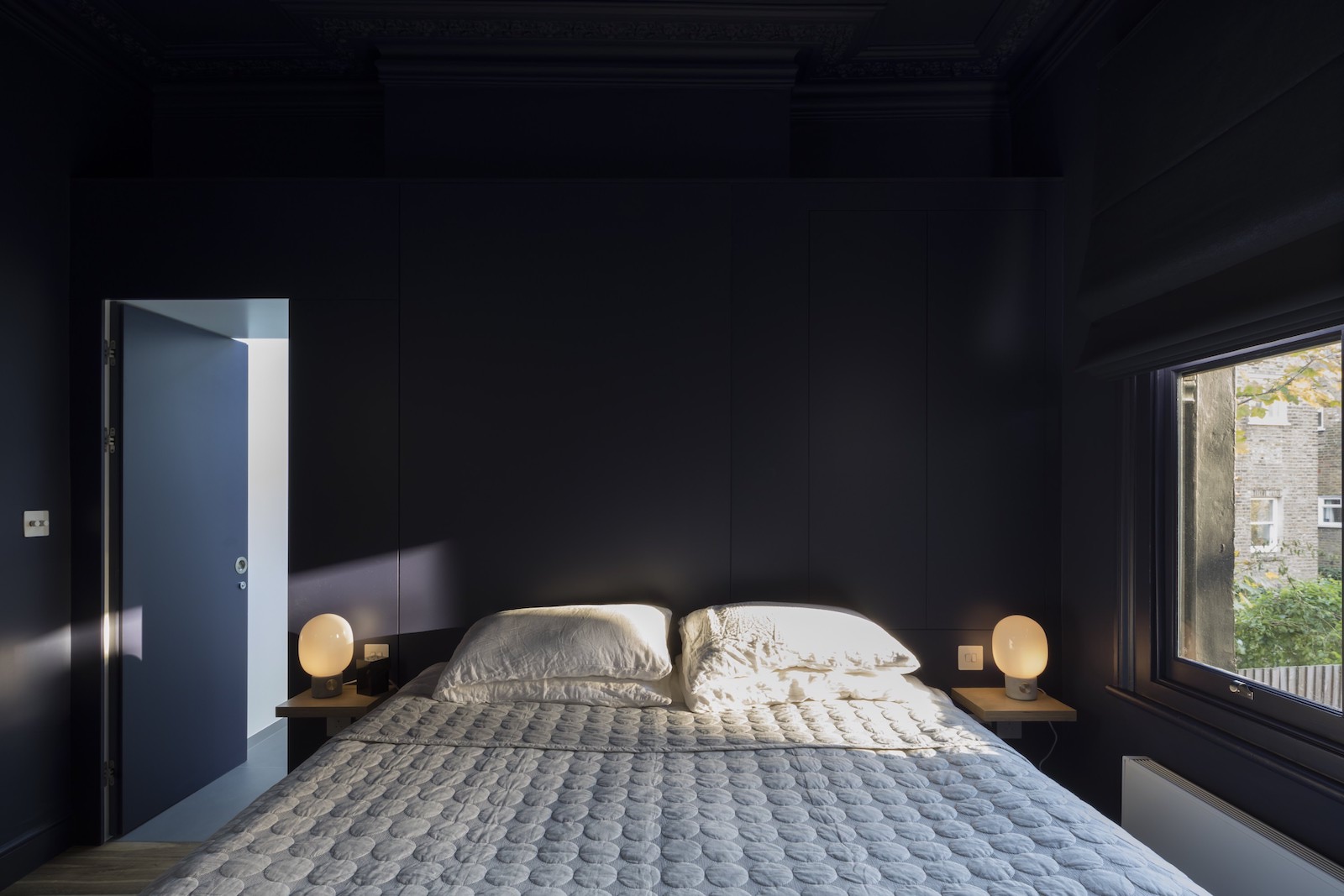
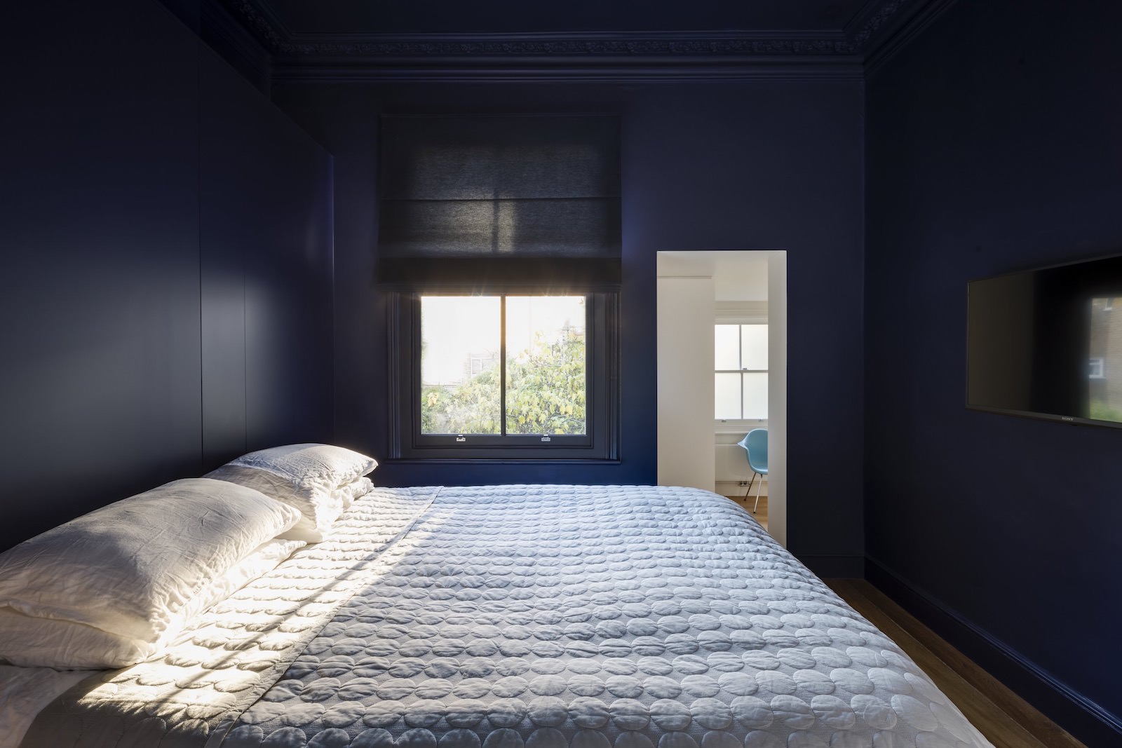
The door to the master bathroom is concealed behind a hidden door.
Master bathroom
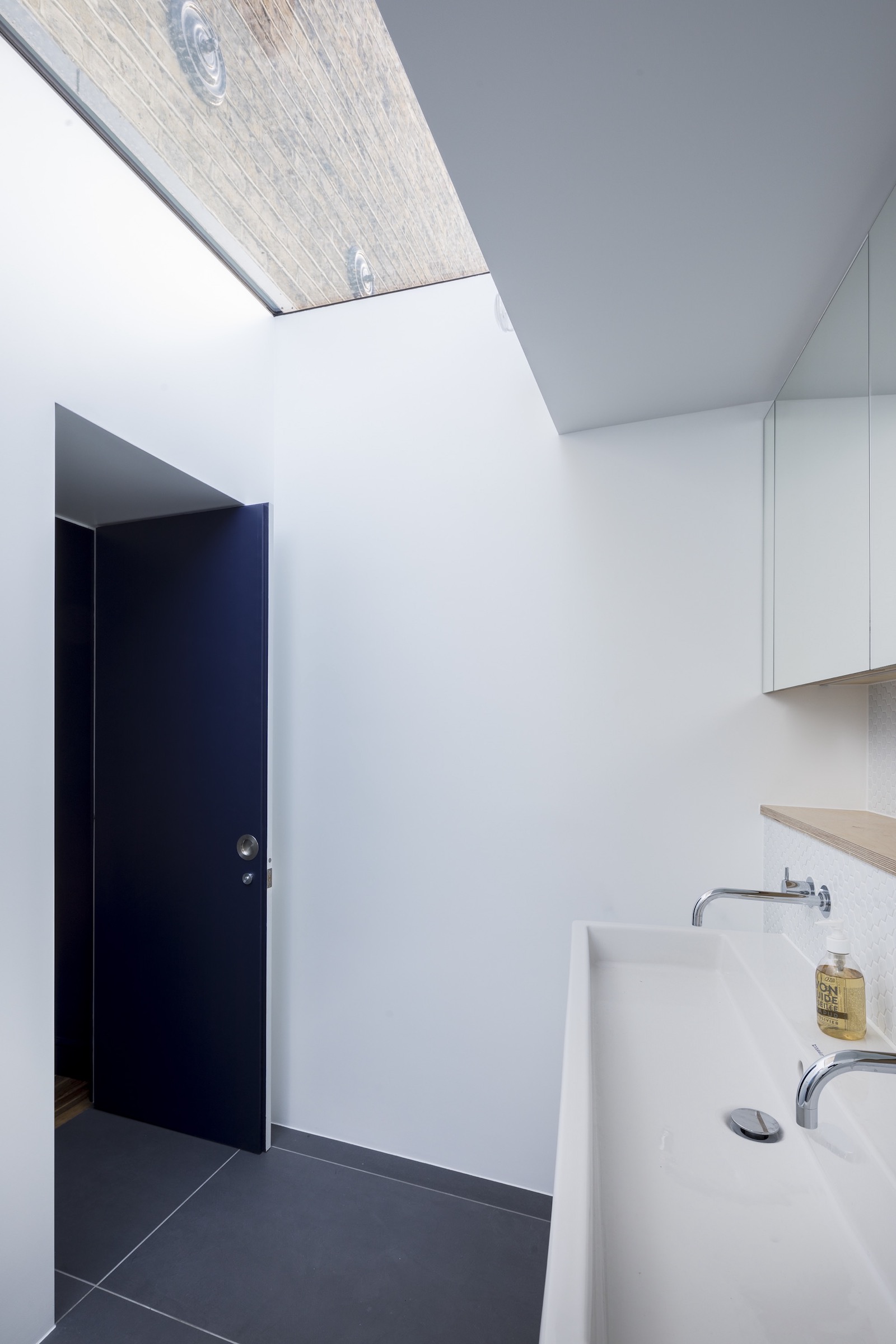
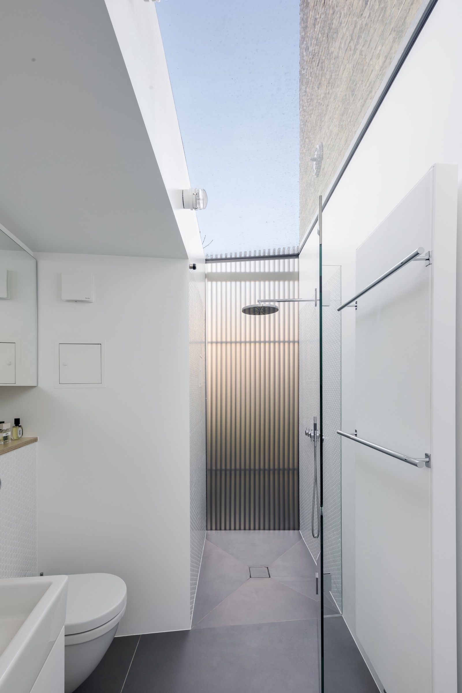
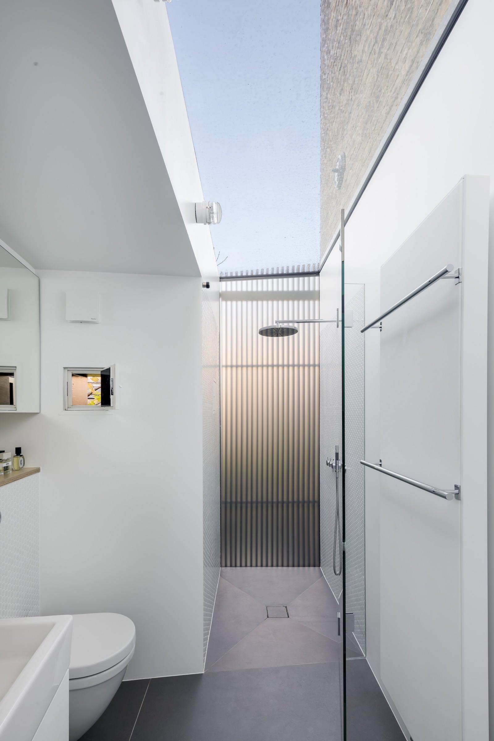
The master bathroom sits within the new side extension, above the entrance corridor. A skylight lets in light, and offers views up to the original brick exterior wall.
A floor to ceiling glass window makes for a very light and airy shower room that feels like it's outdoors. The panel of wooden beams offers complete privacy while still offering glimpses of garden views.
A little peep-hole window is a fun way to let in fresh air (or shout down to rowdy kids in the garden).
Girls' room
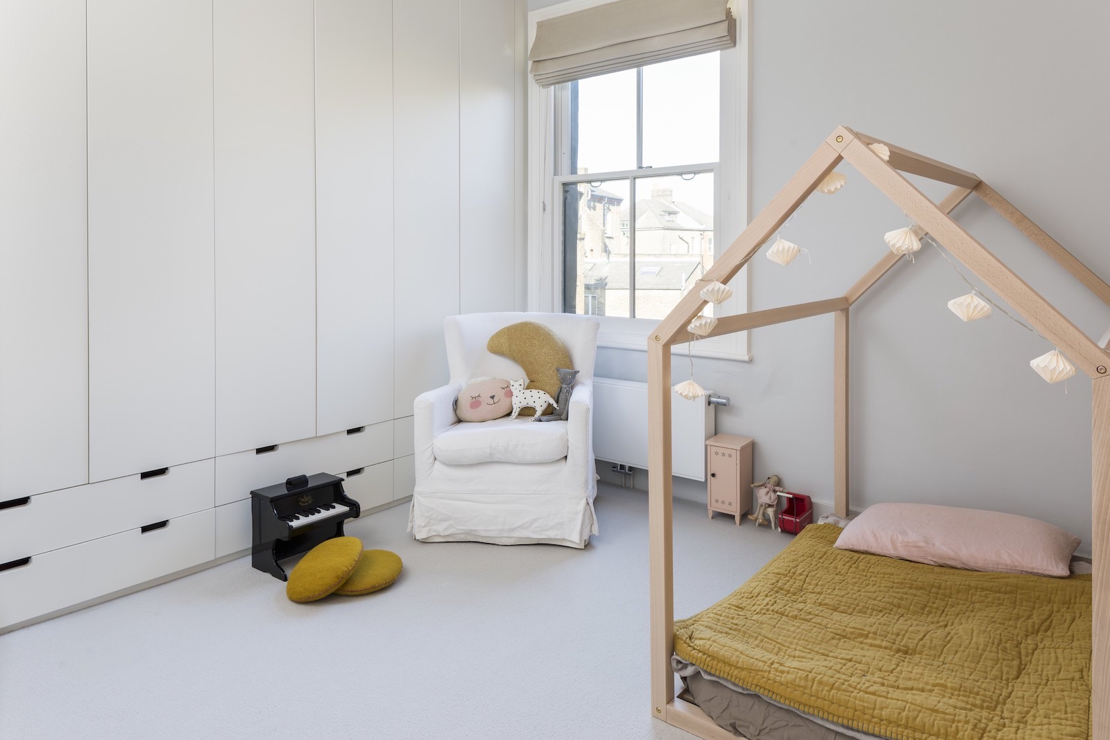
Up a level is a modern girls' bedroom.
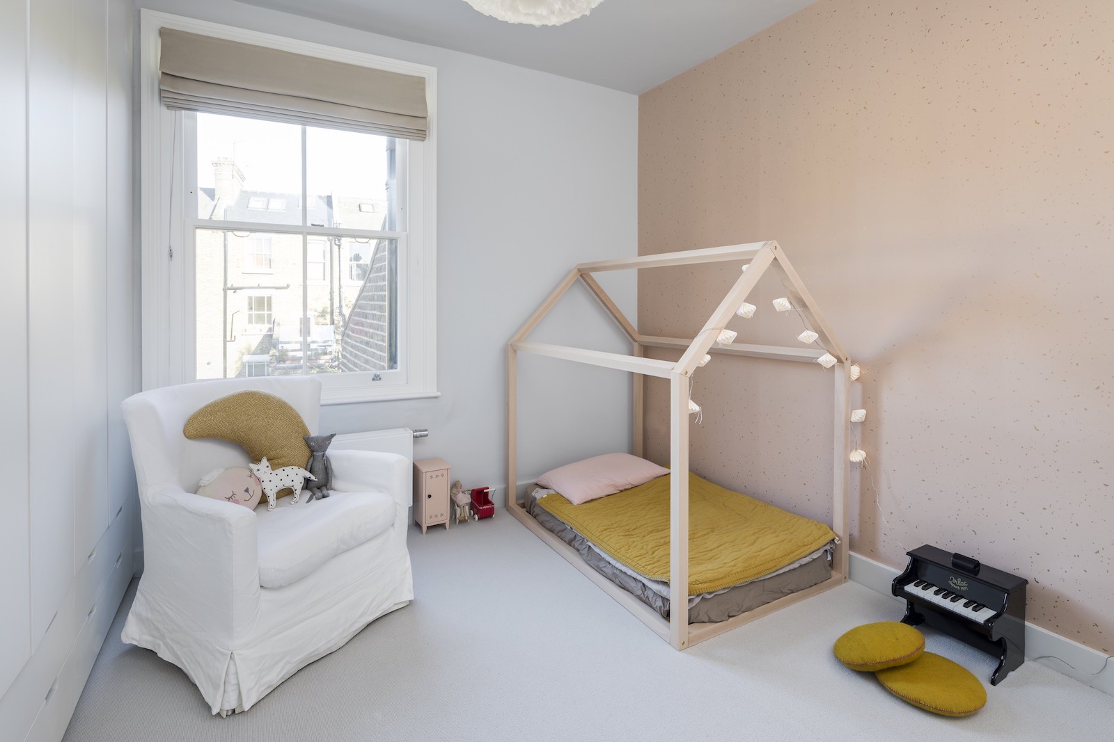
A wall of built-in wardrobes offers plenty of bedroom storage – including toy storage.
Teenage boy room
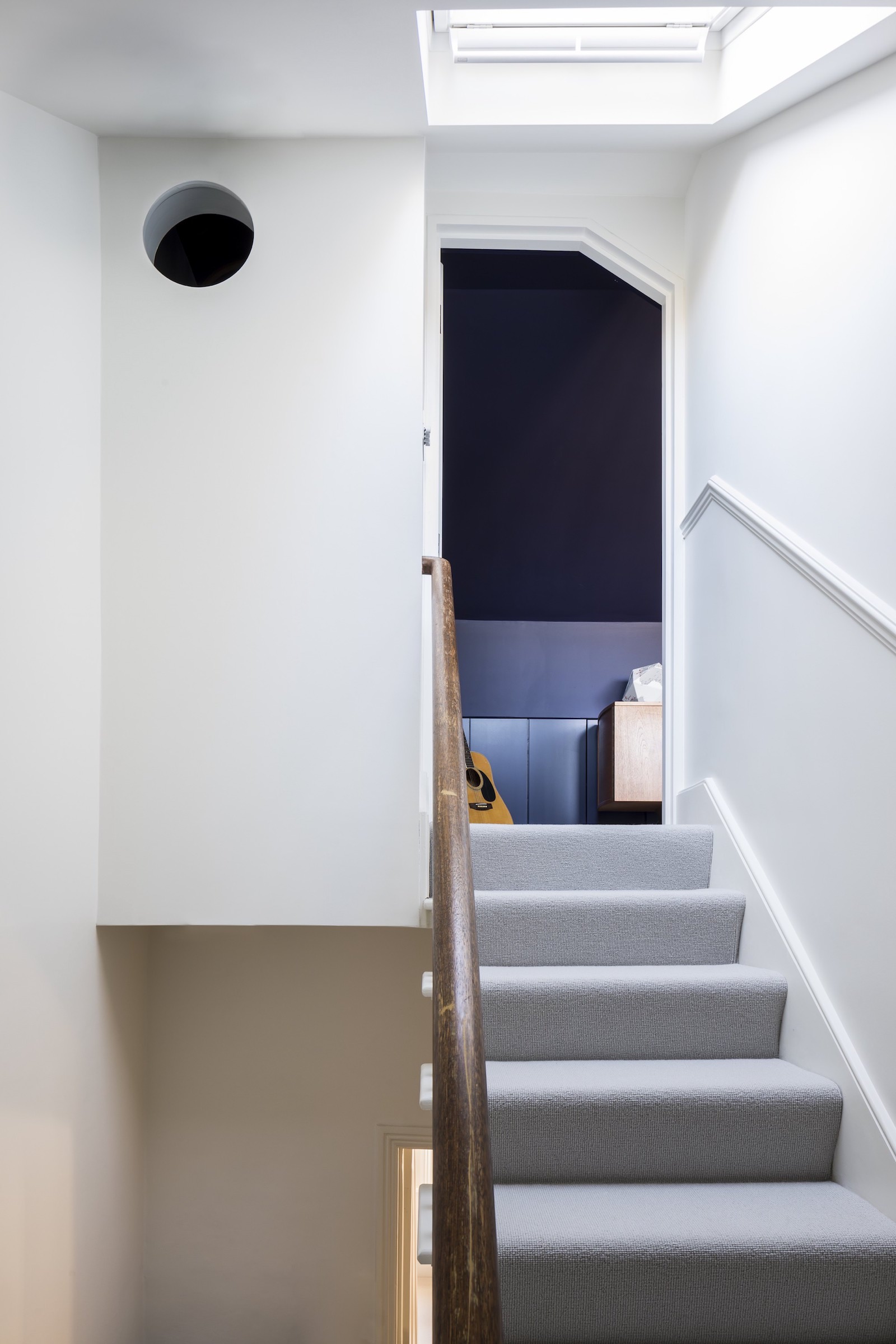
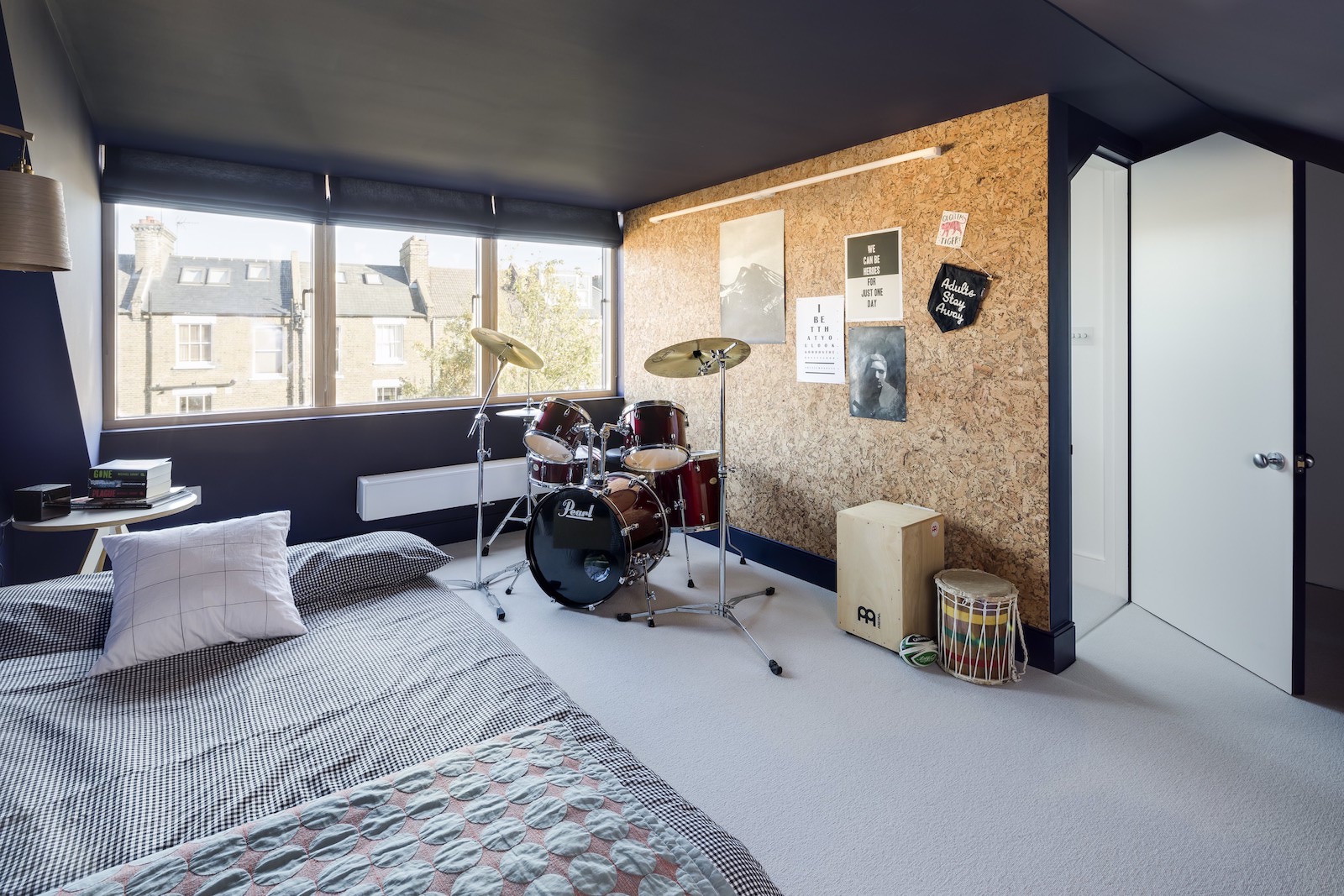
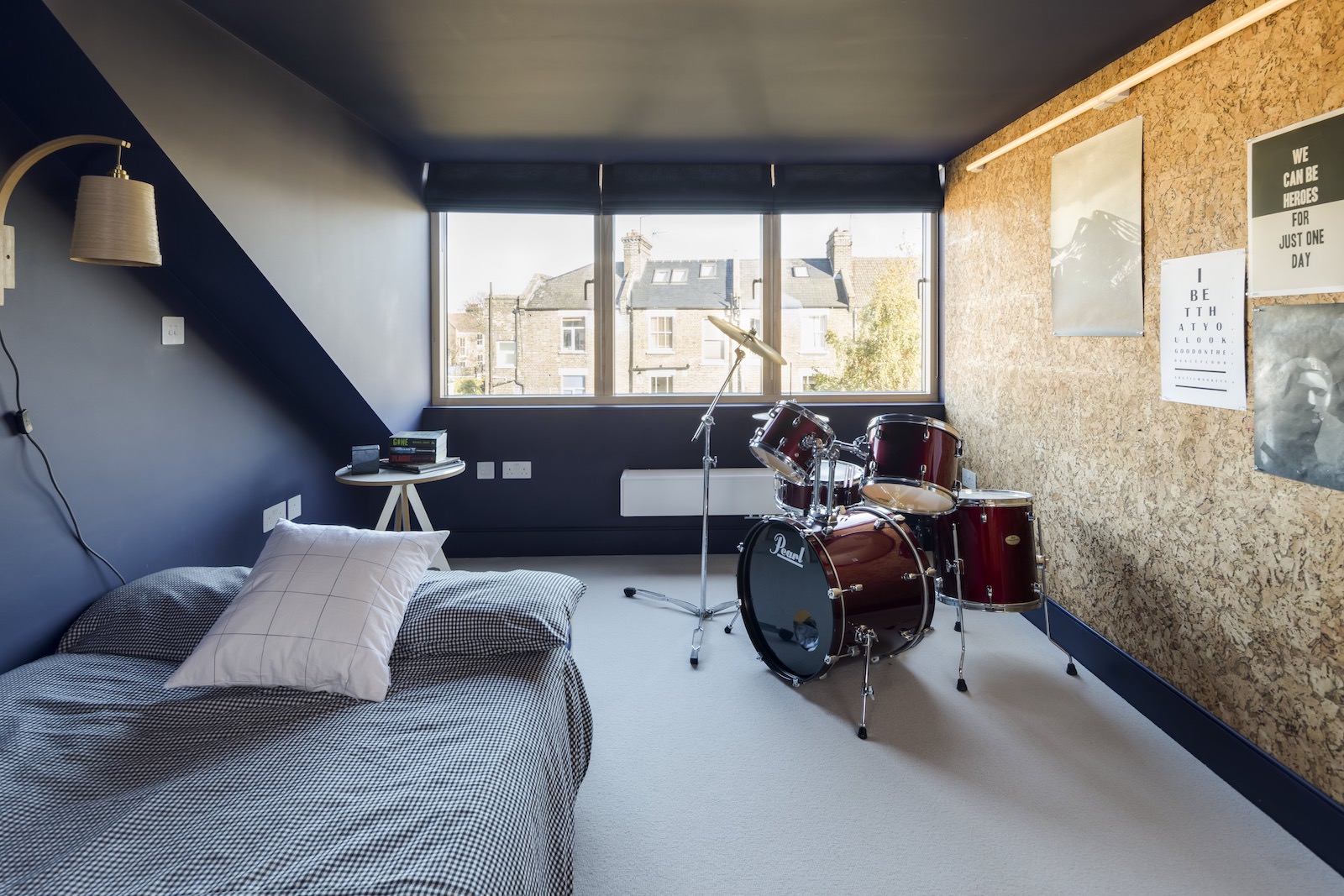
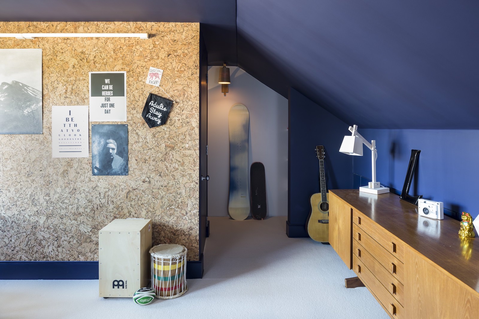
A new loft extension is home to teenage boy bedroom, with a porthole window over the stairwell.
A cork wall offers a canvas for hanging up posters and photographs.
Ensuite bathroom
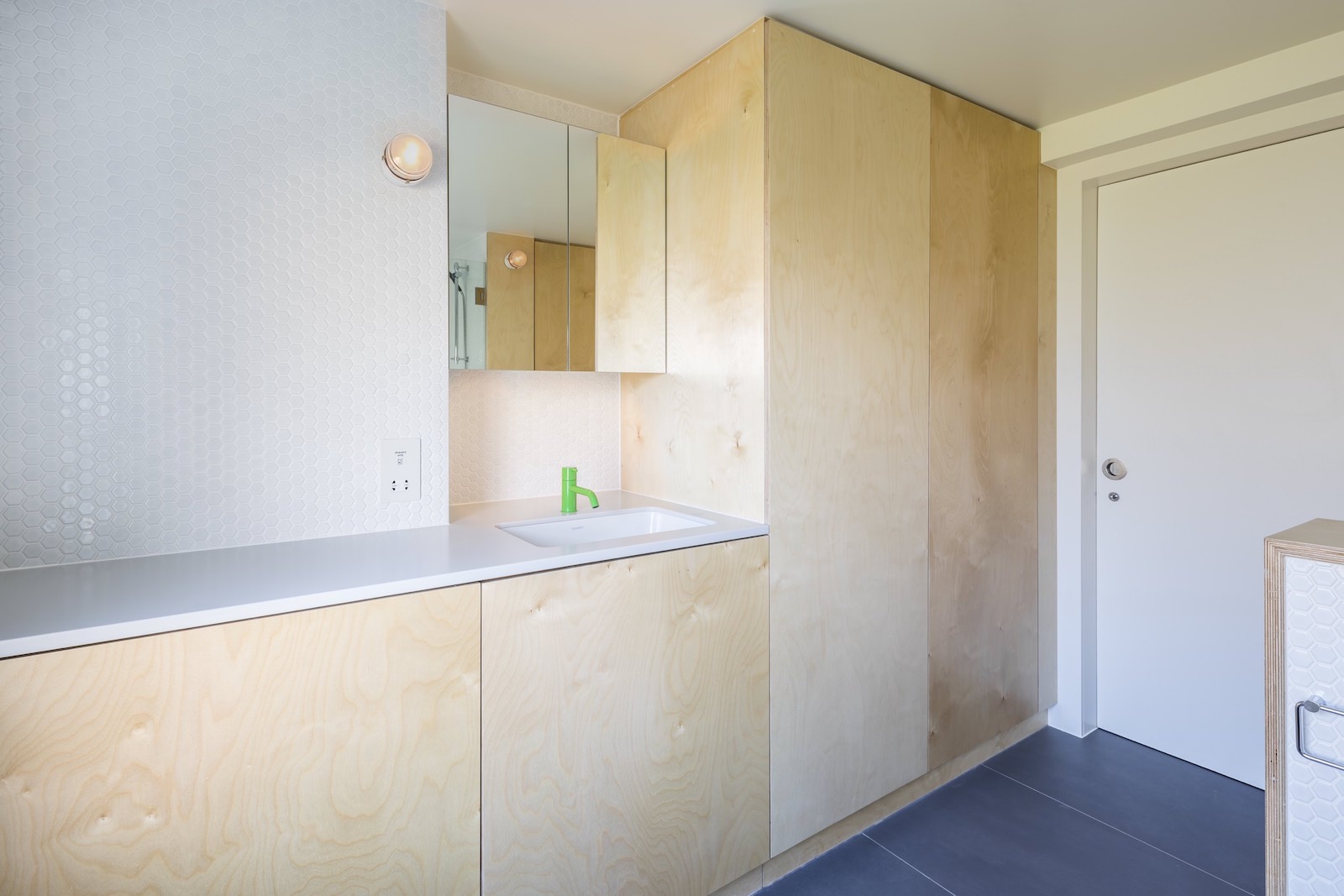
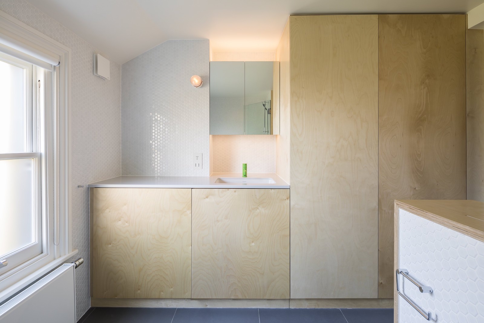
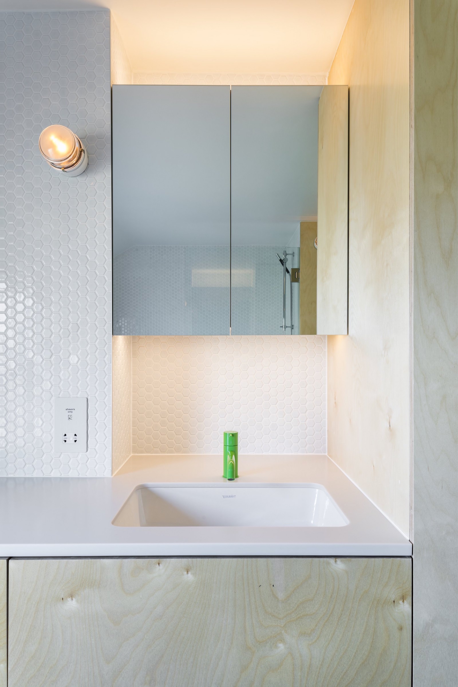
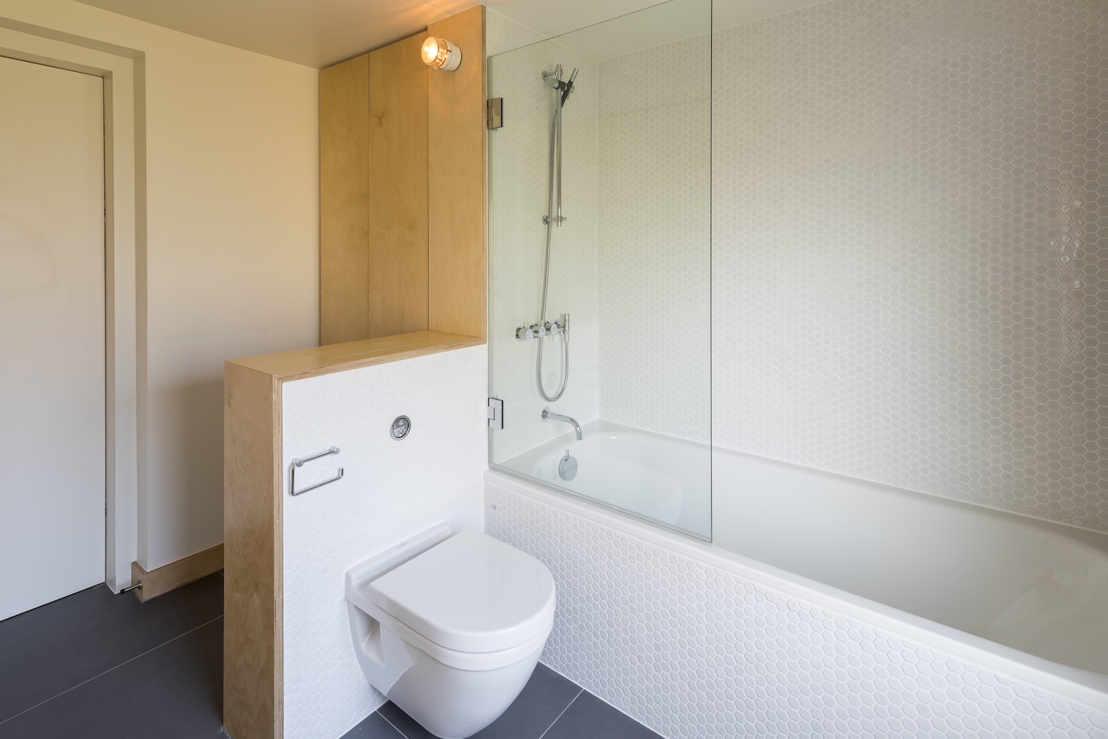
The ensuite bathroom has a distinctly urban and contemporary look to it, with utilitarian plywood cabinetry.
The property was extended once before in 2003 by the same homeowners, working that time with Studio Cullinan and Buck Architects Ltd. Part of Robert Rhodes' brief involved updating the RIBA award-winning work done by SCABAL – most importantly the all-glass kitchen extension with the pioneering green roof. Part of that updating involved going back to the council to ask again for permission for a loft extension which was refused to SCABAL. Robert Rhodes revised the design, honed the argument and were granted permission unconditionally.
The homeowners exclaimed the house's recent renovation is “exactly the game-changer they had hoped it would be.

Lotte is the former Digital Editor for Livingetc, having worked on the launch of the website. She has a background in online journalism and writing for SEO, with previous editor roles at Good Living, Good Housekeeping, Country & Townhouse, and BBC Good Food among others, as well as her own successful interiors blog. When she's not busy writing or tracking analytics, she's doing up houses, two of which have features in interior design magazines. She's just finished doing up her house in Wimbledon, and is eyeing up Bath for her next project.
-
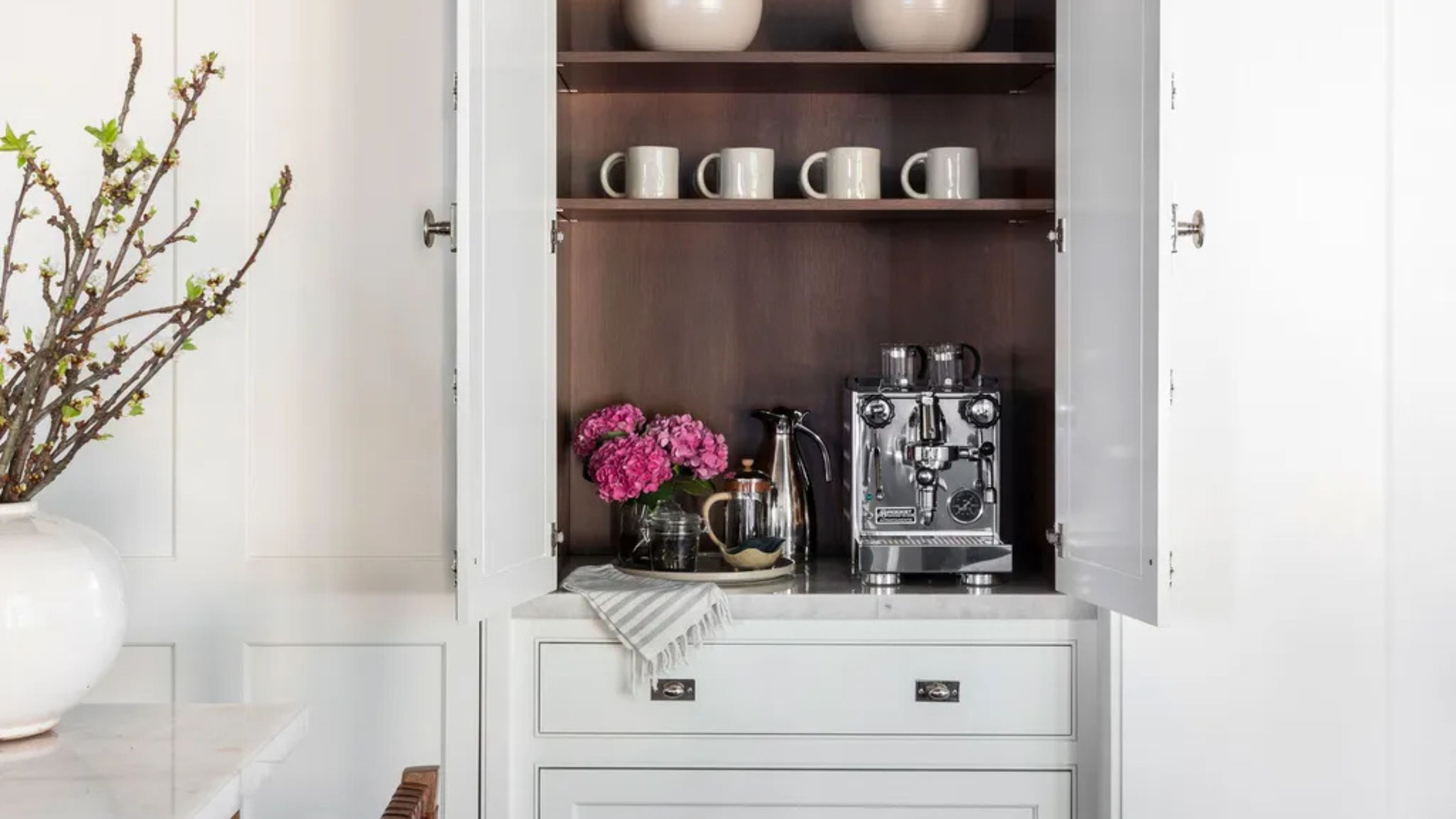 Turns Out the Coolest New Café is Actually In Your Kitchen — Here's How to Steal the Style of TikTok's Latest Trend
Goodbye, over-priced lattes. Hello, home-brewed coffee with friends. TikTok's 'Home Cafe' trend brings stylish cafe culture into the comfort of your own home
By Devin Toolen Published
-
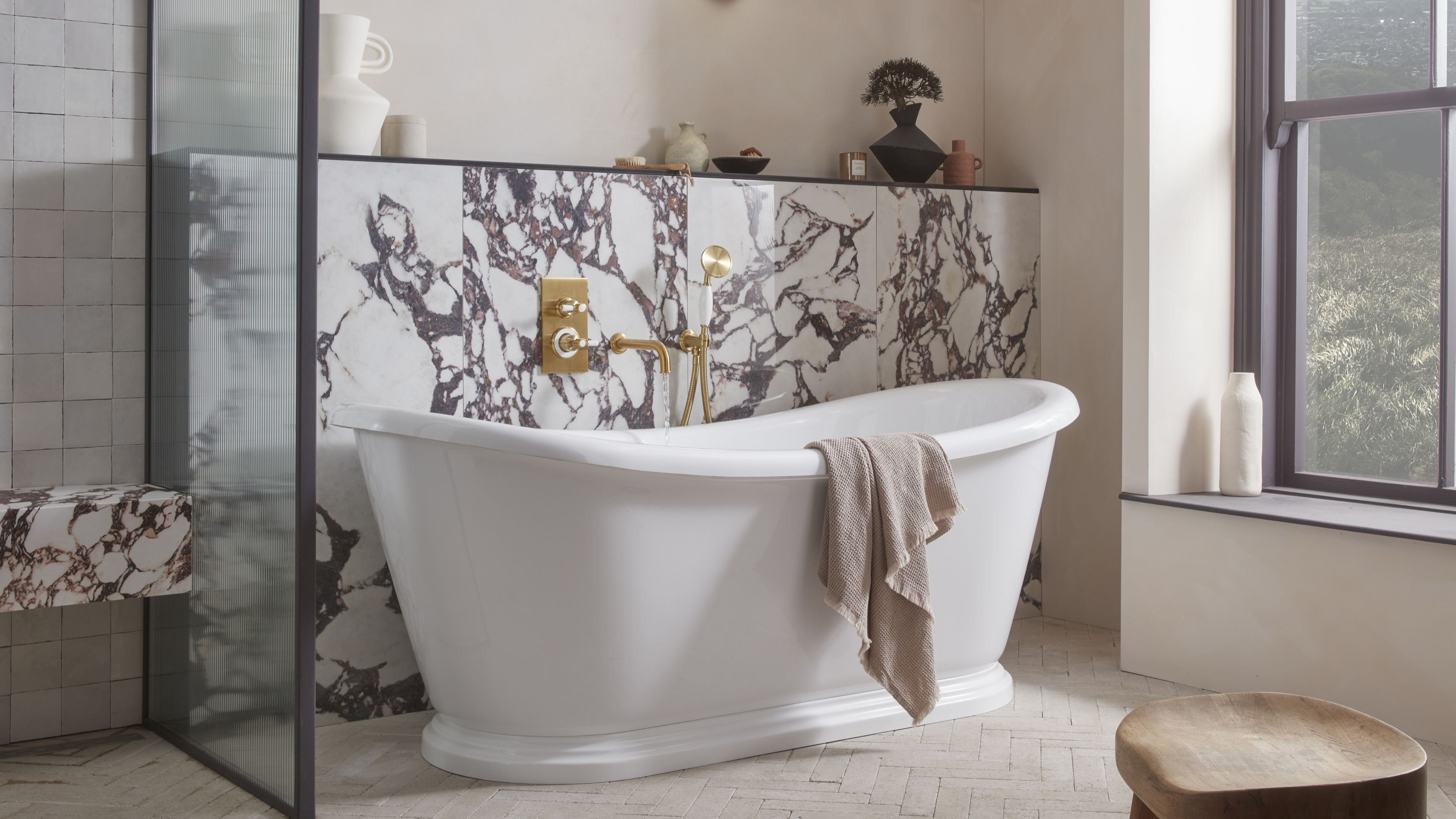 5 Bathroom Layouts That Look Dated in 2025 — Plus the Alternatives Designers Use Instead for a More Contemporary Space
For a bathroom that feels in line with the times, avoid these layouts and be more intentional with the placement and positioning of your features and fixtures
By Lilith Hudson Published