This Characterful Brownstone is a Lesson in How to Enhance Natural Light in Dark Spaces
Floor-to-ceiling statement sliding doors leading out to the Japanese maple tree garden provide ample light in this grand New Jersey property

The homeowners of this turn-of-the-century brownstone located just outside of New York, in New Jersey, were drawn to the idyllic tranquility of this picture-perfect family home, nestled in a lusciously leafy community. Located on a quiet residential street, this house is bathed in dappled light from the trees that line the sidewalk, but as is typical with early 19th-century brownstones, the interiors lacked natural light.
When the homeowners initially set their sights on the property, the couple intended to make a handful of modifications. But their vision evolved into something much more ambitious - they ultimately decided to dive head-first into a full gut renovation to brighten up the space. They enlisted the help of the renowned designers at J. Patryce Design, and we spoke to principal designer Joan Enger to learn more about this modern home's transformation.
Glass floor-to-ceiling sliding doors
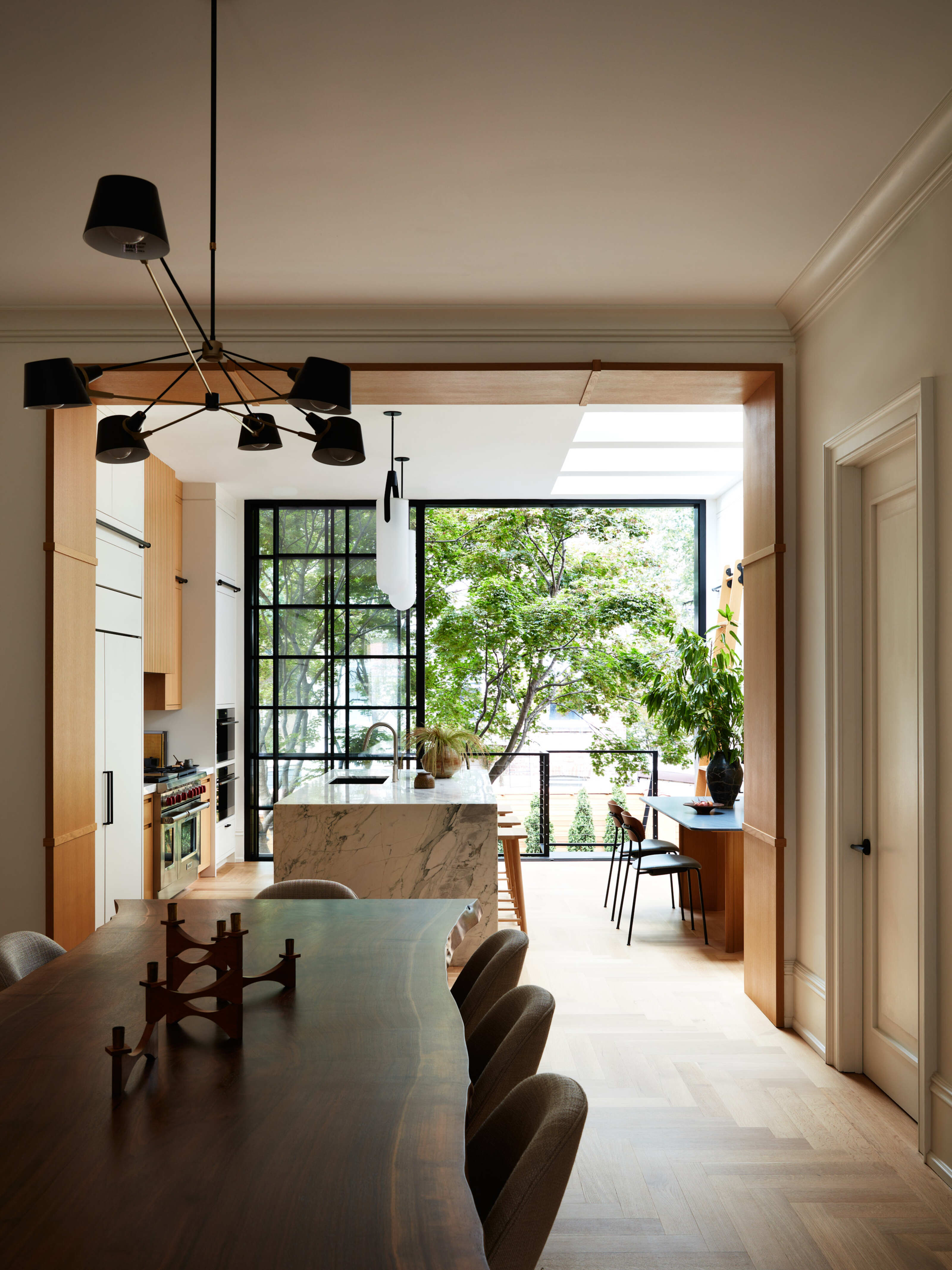
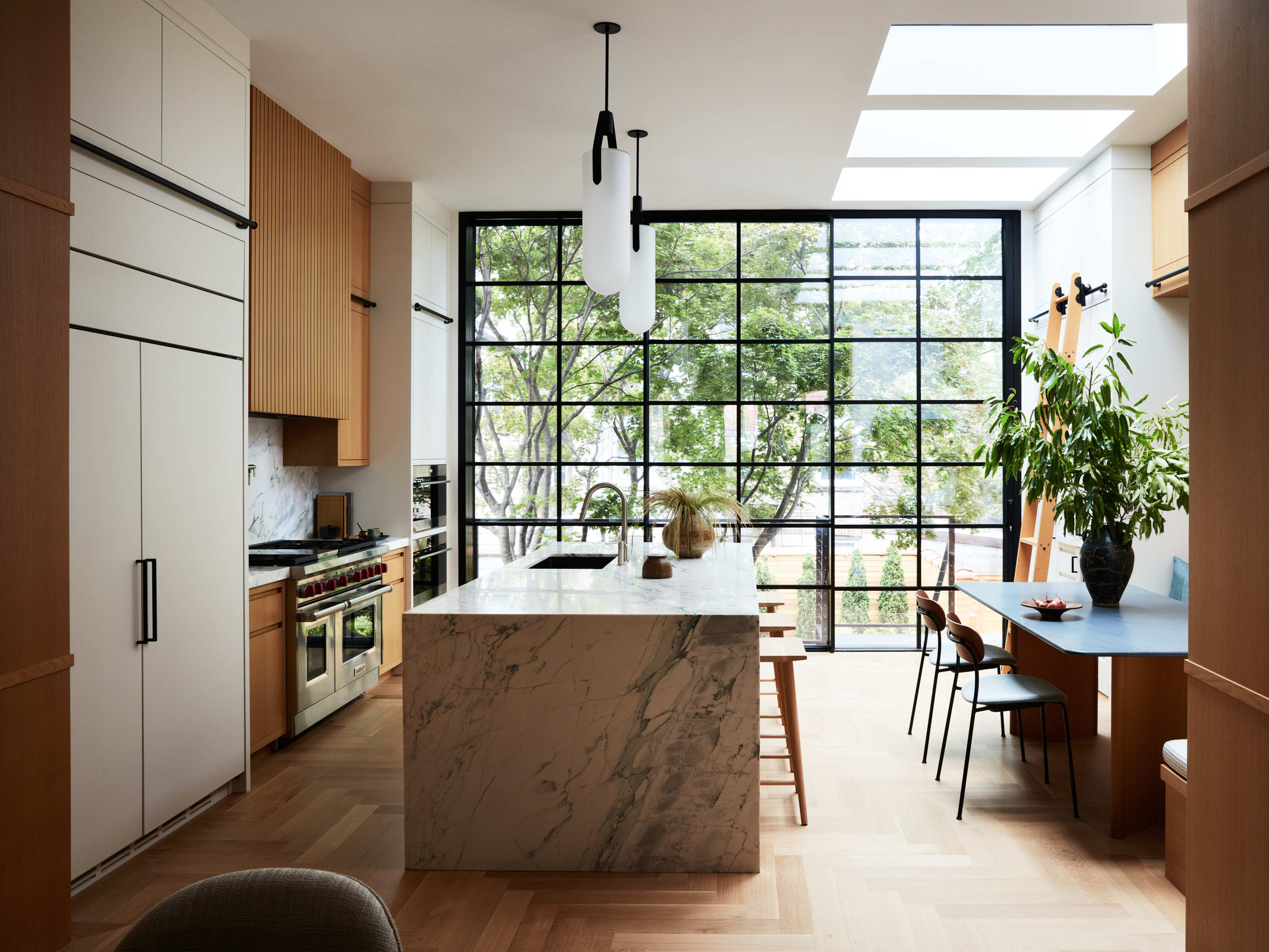
The floor-to-ceiling sliding doors in the open-plan kitchen are the modern showpiece that ushers in light through the back of the property. The sleek, black-framed doors and windows endow the kitchen with a contemporary feel, flooding the room with natural light.
These doors effortlessly immerse you into the zen backyard haven outside, breaking down the boundary between indoors and outdoors. 'We all wanted to find a solution which would provide the maximum amount of natural light and a full view of the mature Japanese maple and backyard,' Joan Enger explains.
Joan describes how Ridge Restoration - the general contractor for the entire project - recommended the perfect solution: The full-height 'oculus' aluminum sliding glass window and door system, which they sourced and installed. 'The sliding system allowed for maximum natural light with a modern aesthetic.'
The glass doors allow you to indulge in a panoramic view of the garden from the kitchen and dining room, something that was important to the client's mom, who is a landscape architect.
Gleaming mixed materials
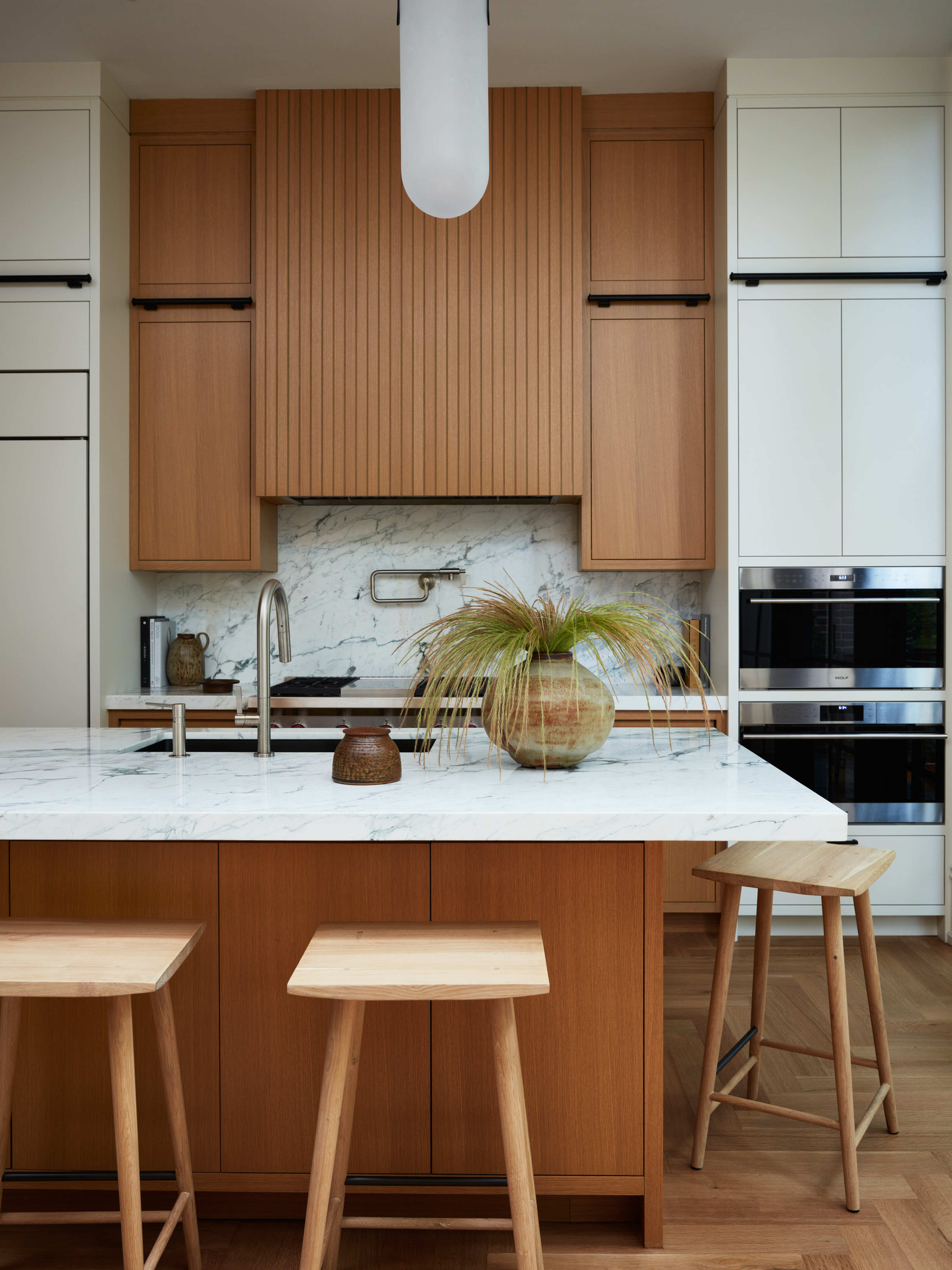
The interplay of wood and off-white matte lacquer adds depth and dimension to the kitchen cabinets. 'The custom cabinetry is a combination of off-white matte lacquer and rift white oak,' Joan explains. 'We opted for a fluting detail on the hood and banquette wall to connect the opposing walls, add visual interest to the millwork and break up the tall expanses.
Be The First To Know
The Livingetc newsletters are your inside source for what’s shaping interiors now - and what’s next. Discover trend forecasts, smart style ideas, and curated shopping inspiration that brings design to life. Subscribe today and stay ahead of the curve.
The Calcutta turquoise counters and backsplash were sourced from artistic tile and stone, and bring vibrancy to the space, bouncing light around the room.
The statement kitchen island looks modern and crisp, in part thanks to its waterfall edge. 'By showcasing the stone as a waterfall, you notice the dramatic veining from a vertical perspective,' says Joan. 'Considering the mostly oak kitchen and large walnut dining table, the stone provides a mix of material visually which we thought was important.'
The addition of wooden stools around the kitchen island infuses the space with a social, warm, and family-friendly feel - which works perfectly for the homeowners, who have two children themselves.
Light enhancing color palette
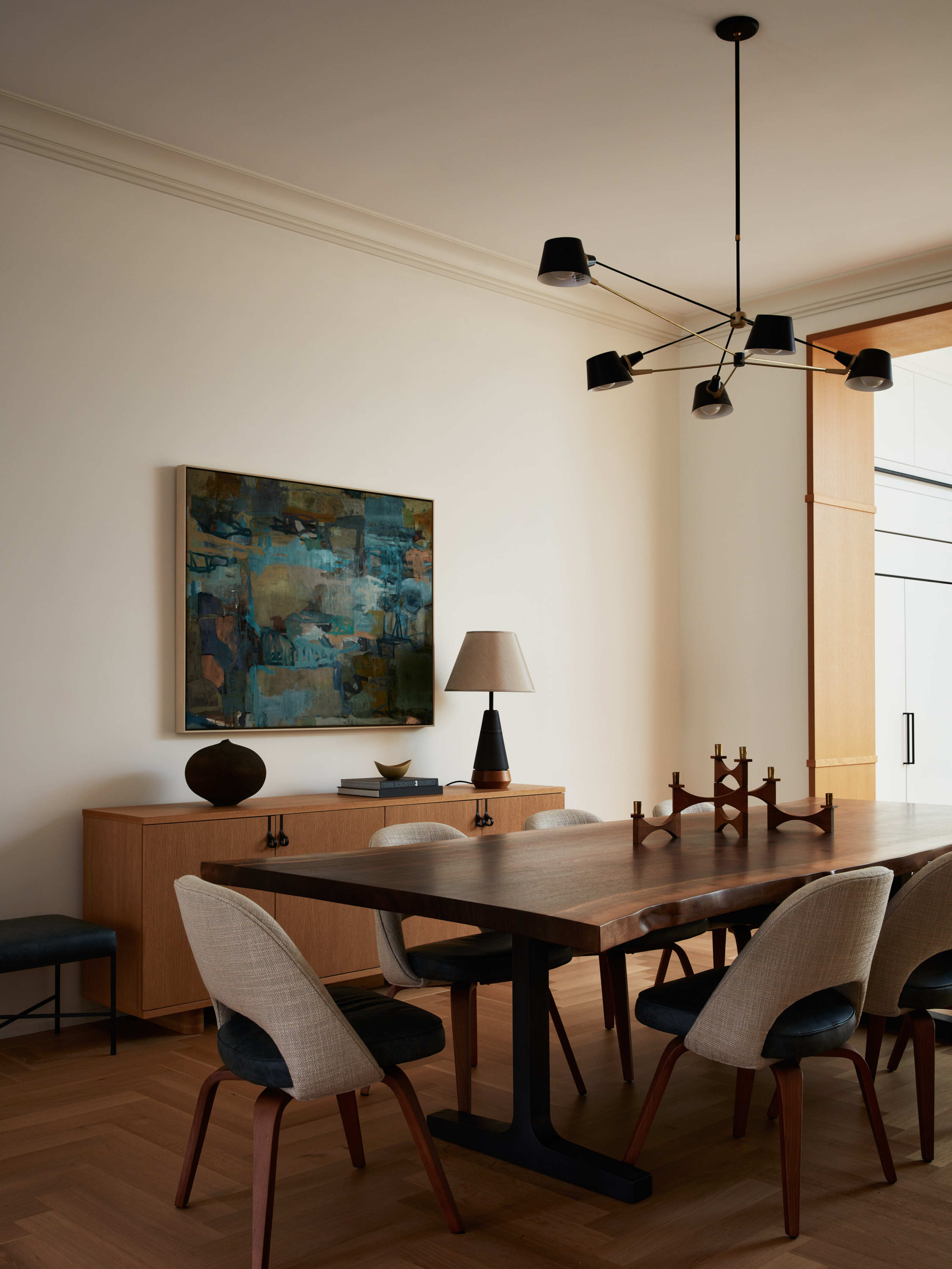
Although the dining room is sandwiched between the kitchen and living room and has no windows, the team at J. Patryce Design has brought plenty of light into this space. 'The dining room borrows light from the expansive oculus sliding window and door and walkable skylights,' says Joan. 'We sourced a light fixture from Brendan Ravenhill with multiple heads and added a table lamp for the custom console to provide plenty of ambient light.'
The custom walnut dining table undoubtedly steals the show in this room - it is a statement piece that imposingly stands centerstage. Joan explains how the 14-inch long slab was custom-made to make sure that it worked with the dimensions of the space. 'Custom steel legs and supports were engineered to hold the weight of the table, which took five men to carry in,' says Joan. 'The table is a show-stopper, and even more beautiful in person.'
The statement dining table does all the talking in this room, which emits a calming aura thanks to the neutral color palette that binds the entire downstairs interior harmoniously together. Neutral color schemes are known to cultivate a bright and spa-like mood. 'Considering the parlor level was an open floor plan, we wanted to carry a cohesive visual thread through the connected spaces,' explains Joan. 'We kept the walls neutral and allowed the millwork, lighting, and custom dining table to be the heroes of the space.'
Joan adds that they incorporated warm touches with the occasional splash of teal to tie it all together. 'We sourced warm organic textiles with plenty of texture and added punches of teal to liven the neutral palette.' The touches of teal green can be found in the veining of the kitchen stone, the leather seats, and the vintage Paulo Buffa lounge chair. The art in the dining room (by James O'Shea and Carrie Haddad Gallery) brings the colors together and introduces additional vibrancy.
Contrasting dark trim
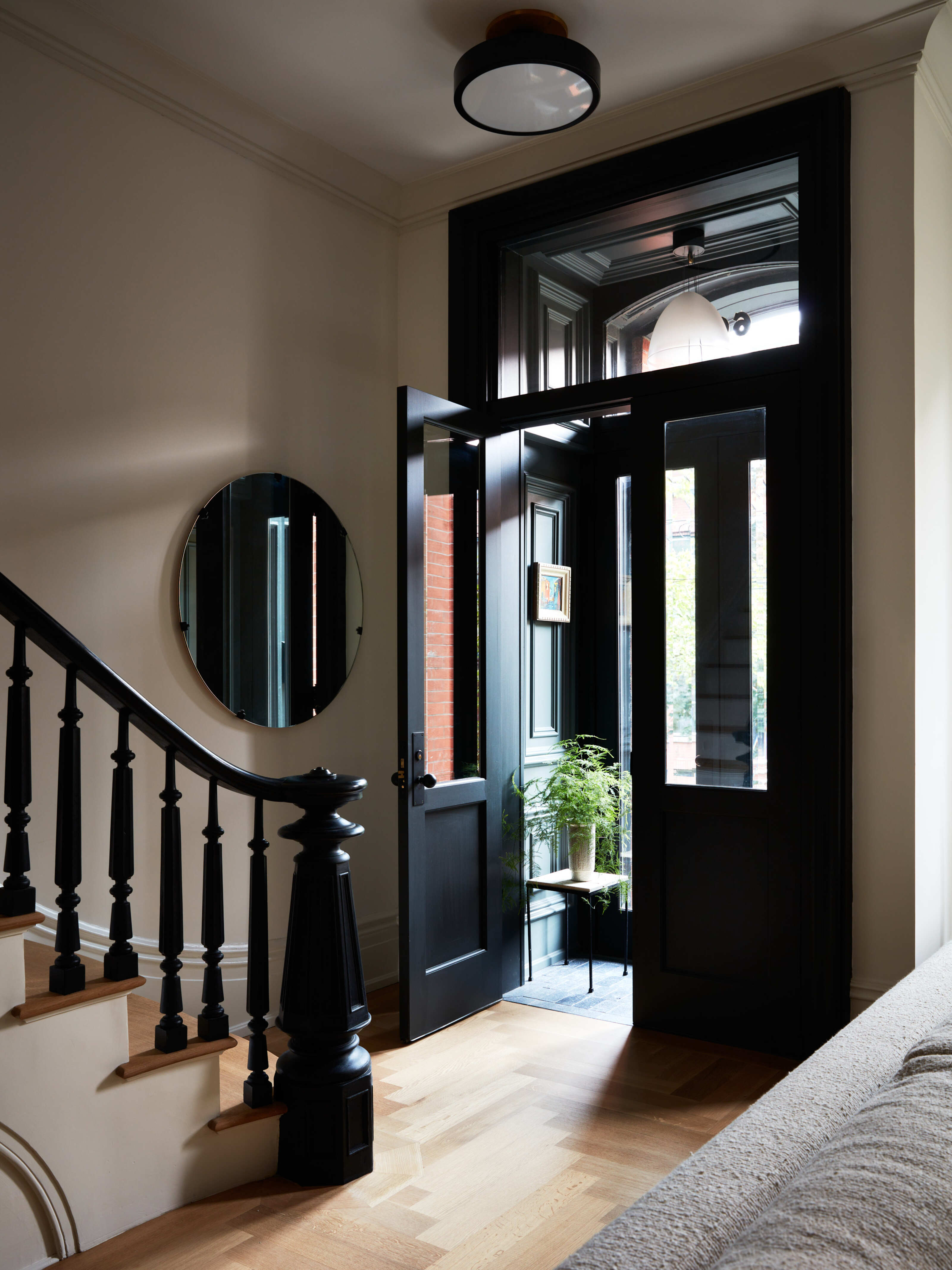
The majestic double-door entryway, which opens up directly onto the living room as is typical of most brownstones, is painted in a dramatically dark shade, which contrasts with the warm and light interiors.
'We covered the small space in shades of off-black and muddy green to provide contrast and mood before walking into the expansive, lighter spaces', Joan explains. This strikingly dark feature magnificently adds drama to the space, and light pours through the windows and contrasts against the darkness of the trim.
Although most of the original details in the property had been removed in a prior renovation, the designers at J. Patryce Designs were committed to spotlighting and honoring the original architectural features that did remain - including a brick wall and the original staircase, seen here.
'The clients originally discussed replacing the original staircase with something more modern,' Joan says. 'But we convinced them to restore the existing one and stabilize the treads and risers. It is one of our favorite features in the house.'
Minimalist textures
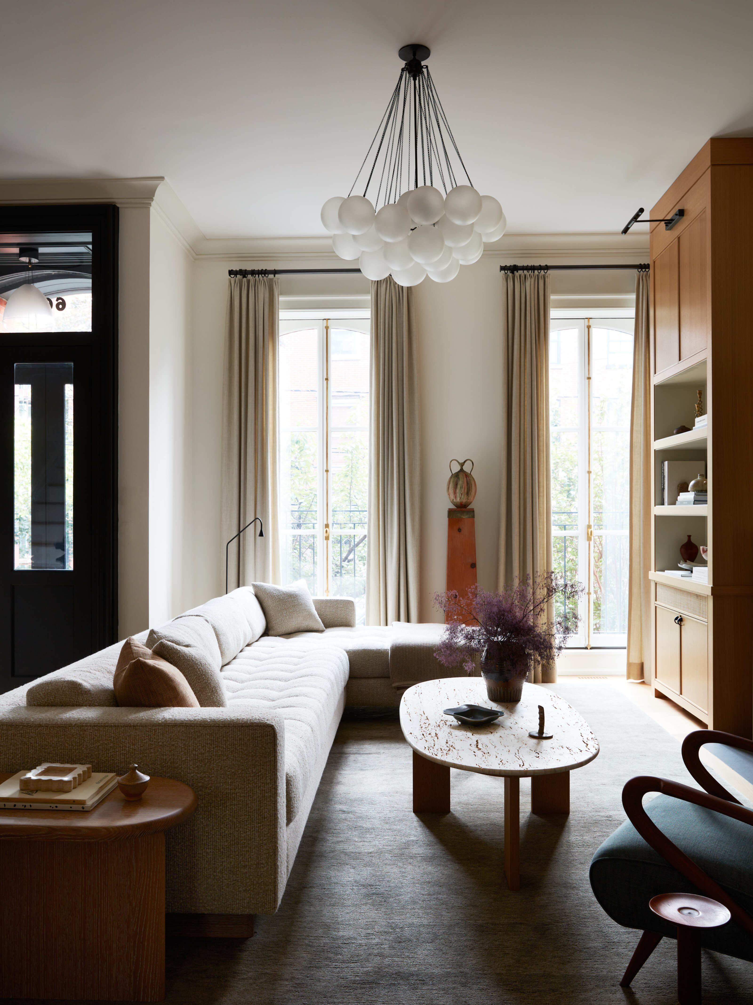
The living room beautifully melds contemporary touches, such as the statement lighting fixture suspended centrally on the ceiling, with more homely, classic elements - such as the welcoming fabric sofa and curtains. The result is a room that feels warm and mellow, yet simultaneously modern and chic. 'The clients wanted something comfortable and roomy for their family and guests,' says Joan. 'The sofa is custom and designed by JPD.'
Although the living room feels quite minimalistic, it maintains a level of warmth due to the layering of fabrics. 'We kept the furnishings spare in the living room due to the shape and size of the room.
We used chunky C&C woven for the sectional, unfilled travertine for the coffee table, a gauzy wool for the ceiling height draperies, and a waved linen for the vintage lounge chair.' The result is a space that feels liveable, yet beautiful - complete with state-of-the-art furnishings that brighten the space.
Get the look with these beautiful buys

Katie is a freelance writer and MA student at City, University of London studying Magazine Journalism. Katie discovered her passion for lifestyle journalism after finishing her BA at The University of Oxford, when she started pitching to major lifestyle publications and covering various topics from popular culture to wellness. She is a regular contributor at Well+Good, where she writes experiment-based beauty and fitness pieces.
-
 The Easiest Way to Turn Your Designer Scarf Into Wall Art — No Frame, No Fuss, No Regrets
Because silk this pretty should never stay in a drawer
By Julia Demer Published
-
 Italian Kitchen Trends — 5 Emerging Ideas From the Chicest Italian Designers That I Predict Will Go Global in 2025
Fresh from Milan Design Week, these are the exciting finishes, styles, and innovative materials I can't wait to see in more kitchens this year
By Faiza Saqib Published
