This Interior Designer's Own Apartment is Elegant and Luxurious — Yet Surprisingly "Life-Proof" Too
How a designer created a home filled with luxurious textiles, but that could also hold up to a miniature schnauzer with a penchant for digging

The Livingetc newsletters are your inside source for what’s shaping interiors now - and what’s next. Discover trend forecasts, smart style ideas, and curated shopping inspiration that brings design to life. Subscribe today and stay ahead of the curve.
You are now subscribed
Your newsletter sign-up was successful
There are some homes that you see that you instantly feel aren't going to be "life-proof". They're filled with finishes that probably need constant cleaning, for example, or fabrics that aren't going to hold up to the rigours of everyday life, especially if you have children or pets.
At a first glance, interior designer Nicholas Kaiko's own apartment feels like this kind of space. Though it might be a colorful space with a great sense of fun about it, it also feels undeniably grown-up, with soft and sumptuous textures. However, Nicholas' experience and expertise in design extends not only to making a space look good, but making it function practically, too. ' I have deep appreciation for textiles, and I understand the importance of choosing fabrics that not only look good but also practical and durable,' the designer tells us.
The designer's modern home is a masterclass in how to strike the balance between good looks and practicality — these are the lessons to take away.
Article continues belowThe Story of the Home
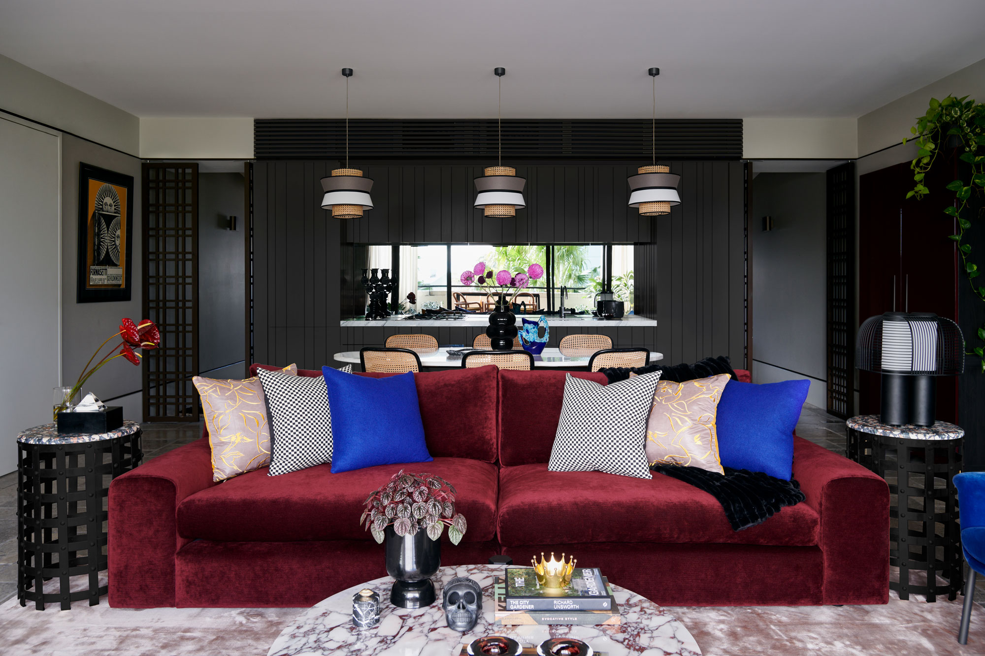
When it comes to an interior designer's own home, you'll often find it's a personal design manifesto, and when it came to decorating the apartment, this space was no exception. 'The design brief for my own home is a true reflection of my design ethos - a strong emphasis on color and texture,' Nicholas tells us. 'My personal aesthetic leans towards a mix of contemporary and vintage elements, underlined by a keen understanding and appreciation of textile construction. This approach was crucial in transforming my home into a space that resonates with my style and professional philosophy.'
The home itself served Nicholas well — an award-winning collaboration from BKH & SJB, which provided both inspiration and framework for his design. 'With its well-considered layout, the apartment's existing plan perfectly catered to our lifestyle needs, separating private spaces to the East and communal areas like the kitchen, living, and dining to the West,' he says. 'This spatial arrangement allowed for a seamless integration of the indoor spaces with the large outdoor terrace, fostering an environment ideal for both living and entertaining.'
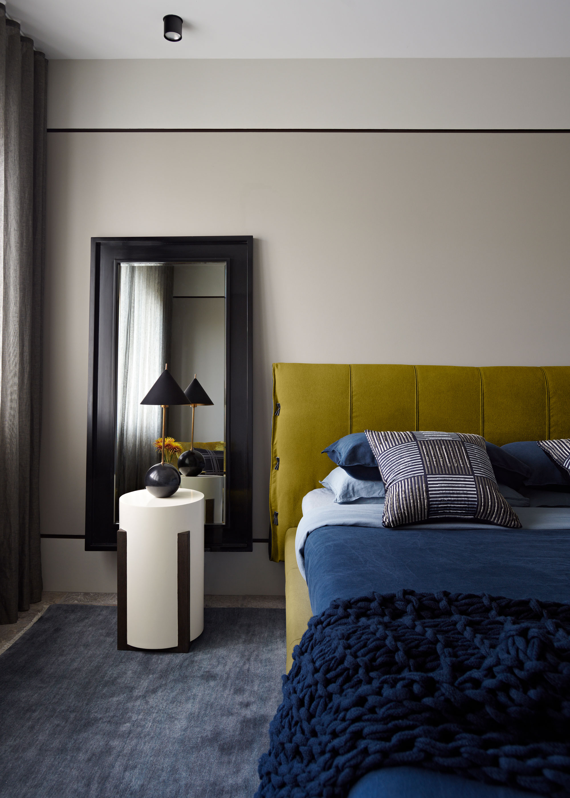
The home was the perfect canvas for the interior designer to put his stamp on, without requiring major renovations. 'Retaining most of the hard finishes, which have stood the test of time both in quality and aesthetics, I focused on enhancing these spaces through the application of color and material mix,' Nicholas says. 'The quality finishes are a testament to the value of getting it right from the start, and my design layer sought to complement these elements.'
Creating with Color
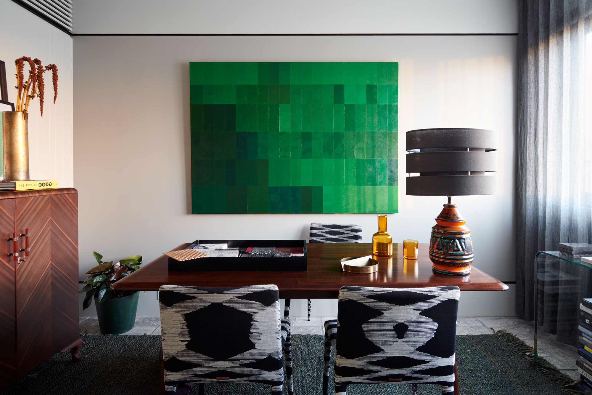
Nicholas' approach to color feels clean, modern and still surprisingly minimalist, in spite of the bolder palettes that make up the rooms. 'I have a fascination with color, so a key theme in both my home and professional portfolio is color blocking,' Nicholas says. 'My home is a curation of objects and elements amassed over time and from travels, alongside new pieces chosen specifically for this space.'
The Livingetc newsletters are your inside source for what’s shaping interiors now - and what’s next. Discover trend forecasts, smart style ideas, and curated shopping inspiration that brings design to life. Subscribe today and stay ahead of the curve.
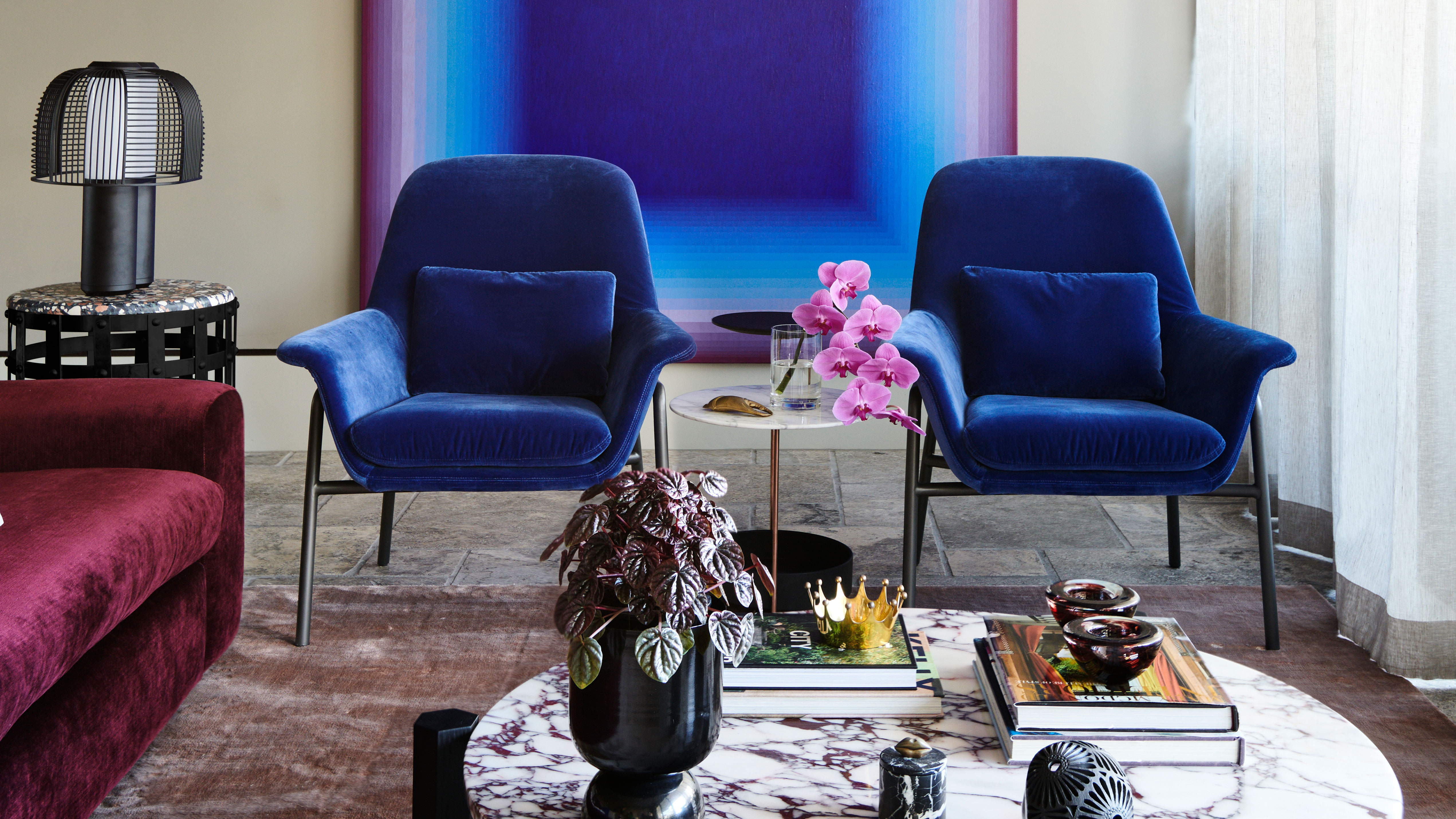
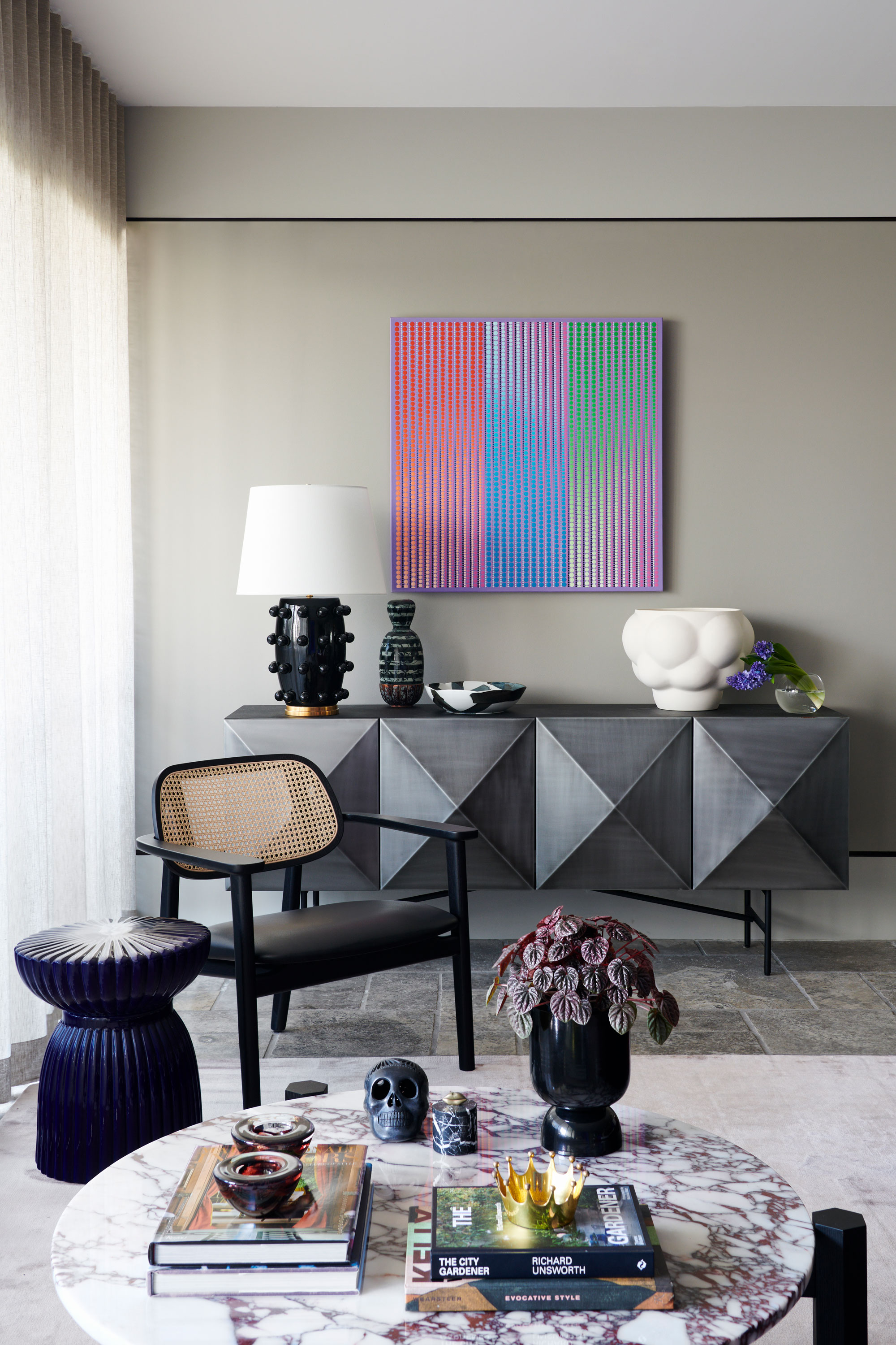
For a starting point for the open plan living room and kitchen, he looked to an artwork that now hangs on the walls — it's one of the defining design "moments" of the space. 'The color palette was inspired by an oversized artwork by Andy Harwood, one of my favourite Australian contemporary artists,' Nicholas tells us.
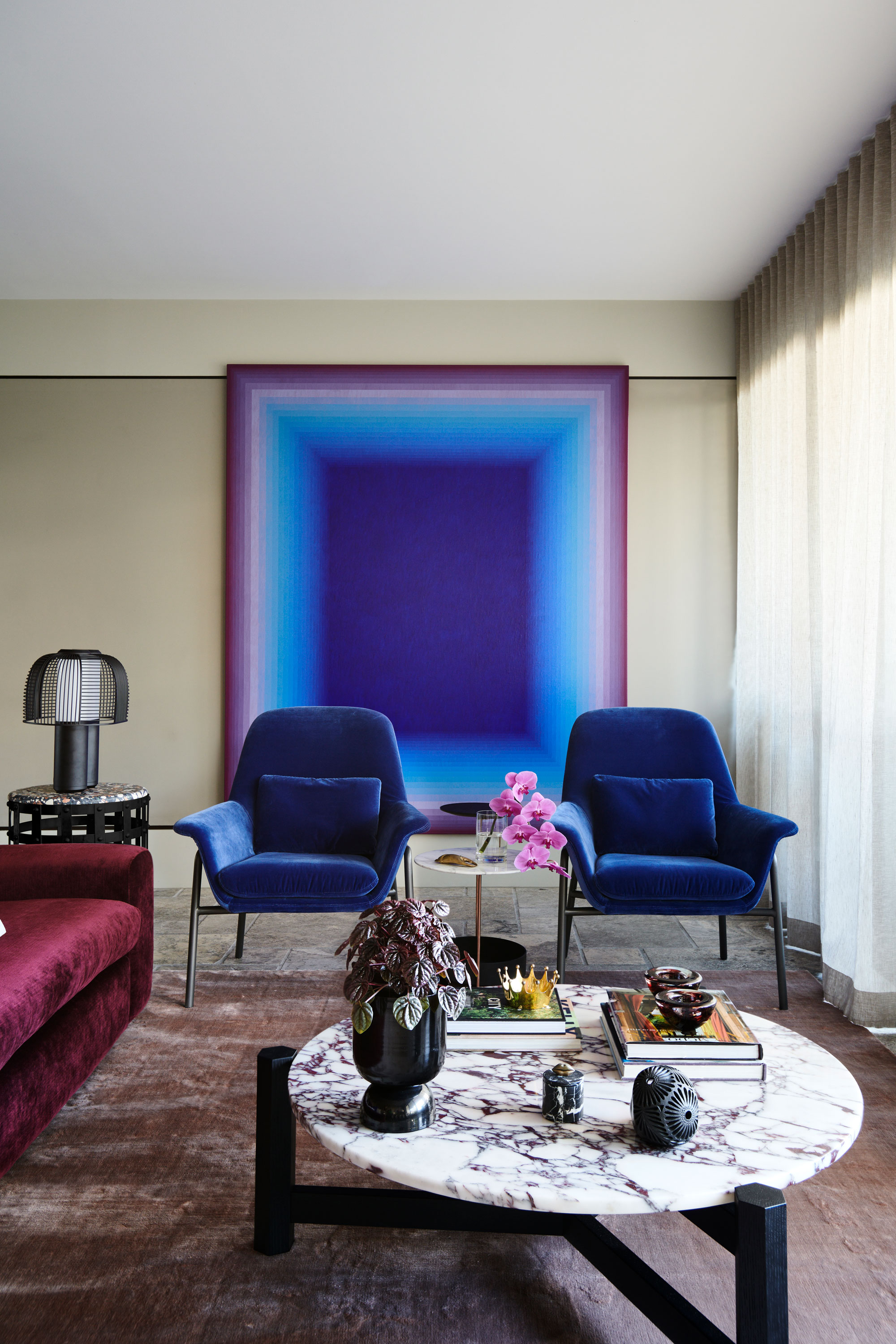
'His work, rich in cobalt and magenta, set the tone for the room. These colors are echoed throughout the space, notably in the saturated burgundy chenille fabric of the sofa and the burgundy hues in the Calacatta Viola marble of the coffee table. I am obsessed with cobalt and I think using it, sparingly, is incredibly luxurious.'
'The artwork anchors the space, providing a backdrop that enhances the deep tones of the furniture and accessories,' Nicholas adds. 'With its fluid transition of color, adds depth and dimension to the room, contributing to the overall sense of luxury and design coherence.'
Making it Practical
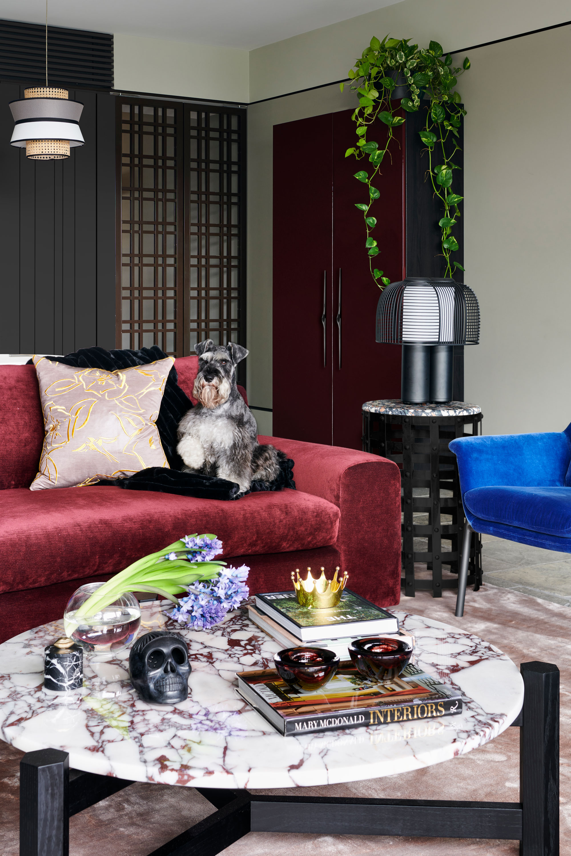
His home is full of spaces that have that sense of luxuriousness to them that don't often go hand in hand with hardiness and practicality, but with one of the residents of his apartment also a miniature schnauzer called Harvey, this was a key consideration of the design.
'The luxuriousness of the apartment living room is a result of careful selection and blending of materials, colors, and design elements,' Nicholas says. 'Central to this luxurious feel is the deliberate mixing of textiles - velvet, chenille, silk-like fabrics, and felt.'
'In adapting our home to be more functional for our lifestyle, which includes living with our mini schnauzer Harvey, a key focus was on selecting the right textiles.'
One of Harvey's favorite pastimes is digging, so it meant choosing upholstery fabrics that were robust. 'I chose materials with a high polyester content and low viscose, coupled with high rub counts,' the designer says. 'These fabrics are resilient enough to withstand Harvey's activities without sacrificing style or comfort. It was essential for me to create a home where we didn't have to be overly cautious about the furniture, ensuring that Harvey is as much a part of our family space as anyone else.'
The large comfortable living room sofa was a must, given Nicholas' penchant for entertaining. He opted for a custom version of the Miles sofa from the Australian manufacturer Arthur G. 'Given the challenges of apartment living, especially in terms of access, the sofa was designed in two pieces to facilitate easy transportation via the elevator,' he explains.
Keeping the quality
The apartment kitchen, while retaining its original layout, needed a little refresh. 'The key change was the shift to black, accompanied by the removal of handles, which has given the kitchen a sleeker, more contemporary look,' Nicholas says. 'This modest update highlights the excellence of the original architectural design. Good planning stands the test of time.'
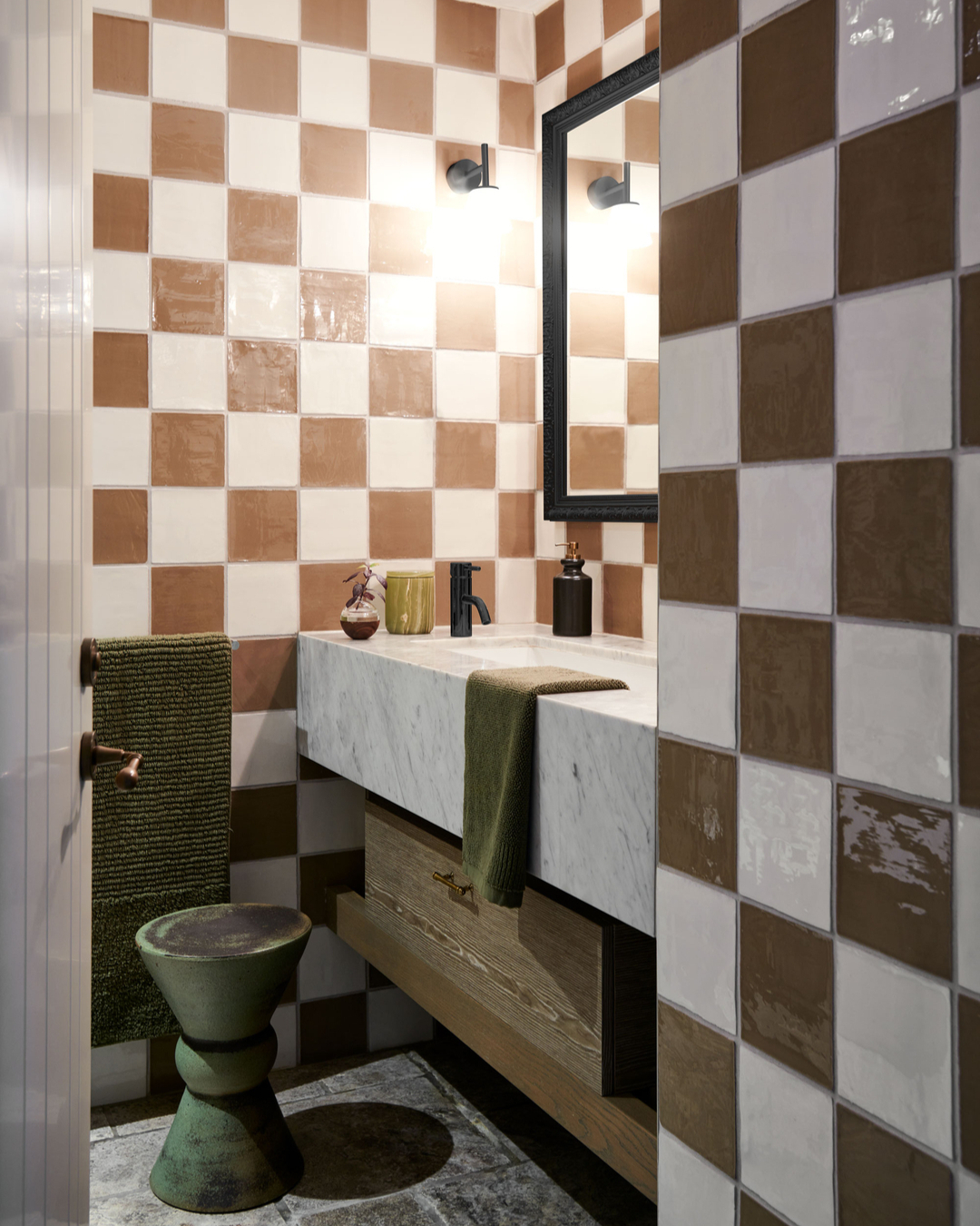
His bathroom is also a good example of how he embraced the existing space. 'I kept the original tiles because they were still in great shape and had a lot of character,' Nicholas says. 'The update was more about bringing in new fixtures, lighting, and accessories to freshen things up. The green and brown color scheme is something you might not expect for a bathroom, and that's exactly why I love it. These colors make the space feel warm and earthy. It’s a little oasis.'

Hugh is Livingetc.com’s editor. With 8 years in the interiors industry under his belt, he has the nose for what people want to know about re-decorating their homes. He prides himself as an expert trend forecaster, visiting design fairs, showrooms and keeping an eye out for emerging designers to hone his eye. He joined Livingetc back in 2022 as a content editor, as a long-time reader of the print magazine, before becoming its online editor. Hugh has previously spent time as an editor for a kitchen and bathroom magazine, and has written for “hands-on” home brands such as Homebuilding & Renovating and Grand Designs magazine, so his knowledge of what it takes to create a home goes beyond the surface, too. Though not a trained interior designer, Hugh has cut his design teeth by managing several major interior design projects to date, each for private clients. He's also a keen DIYer — he's done everything from laying his own patio and building an integrated cooker hood from scratch, to undertaking plenty of creative IKEA hacks to help achieve the luxurious look he loves in design, when his budget doesn't always stretch that far.
