Three Apartments Were Merged Into One to Create This Calming Family Retreat in the Middle of Manhattan
Every square inch counts in NYC, so when this family got the chance to triple the size of their new home, they asked interior designer Annie Leslau to help them make the most of it

The Livingetc newsletters are your inside source for what’s shaping interiors now - and what’s next. Discover trend forecasts, smart style ideas, and curated shopping inspiration that brings design to life. Subscribe today and stay ahead of the curve.
You are now subscribed
Your newsletter sign-up was successful
Finding a home big enough for a family of five in the middle of Manhattan can be a big ask. For this growing family, it meant merging three apartments into one; designing a dynamic space that could just as seamlessly cater to their countless dinner parties as it could provide a calming and kid-friendly hideway from the city that never sleeps.
'There is a saying that every inch in New York City counts,' says interior designer Annie Leslau, who was brought on to help redesign the new space. 'As a family of five, we knew that we needed to use every possible nook and crannie of the home.'
As such, when decorating this apartment, storage has been discreetly slipped into every corner; a custom dining table can be extended at the touch of a button; and every surface pulls its weight in the overall interior scheme — even the bedroom ceilings.
Article continues below'When out of New York City, the clients spend a lot of time near the water — either the lake or ocean — so it was important that their home feel zen and connected with different colors and elements of nature,' Annie adds.
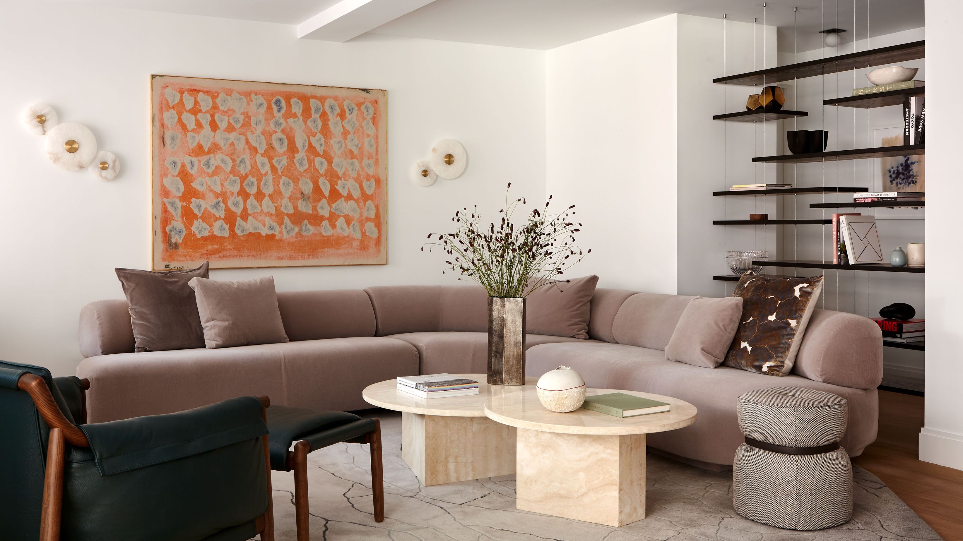
The material palette, made up of marble, alabaster, cement tiles, metal cabinetry and live-edge wood, is sturdy enough to hold up to the realities of life with young children, but remains subtle enough to still feel enveloping and elevated, with inspiration drawn from mid-century Italian furniture.
There are so many thoughtful design tricks incorporated to help maximize the available space without compromising on style. To get a better idea of how it all fits in, we asked interior designer Annie Leslau to talk us through the modern home in a little more detail.
The Entry
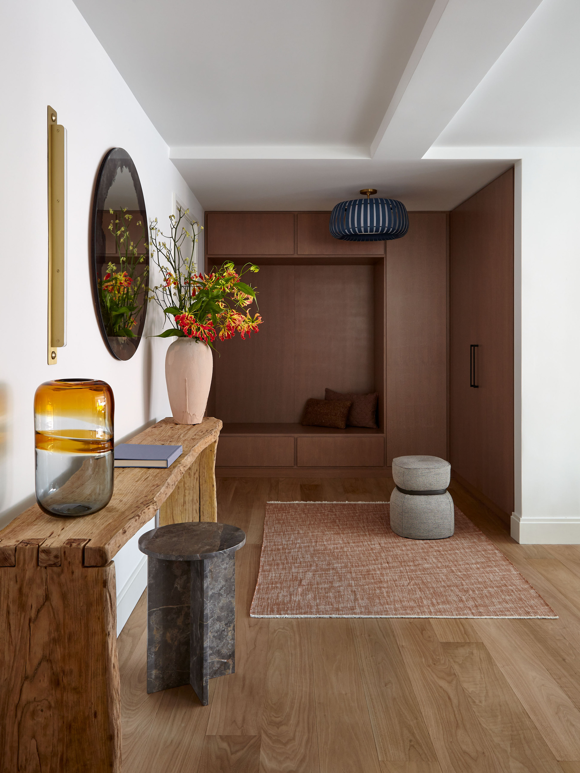
The entry hallway always has a lot to say about a home. In this one, with its bespoke timber cabinets fitted with a built-in storage with bench seat and enough capacity to hide away the kid's countless extra-curricular activities, says 'chic yet well considered.'
The Livingetc newsletters are your inside source for what’s shaping interiors now - and what’s next. Discover trend forecasts, smart style ideas, and curated shopping inspiration that brings design to life. Subscribe today and stay ahead of the curve.
Annie says customized storage solutions were paramount in every space, and seamlessly incorporated to make the best use of every corner in the new apartment layout. Having existing structural beams that awkwardly broke up the space to contend with, she says: 'We had to be creative so we decided to design custom millwork in order to separate the space instead of building walls that would block off the room.'
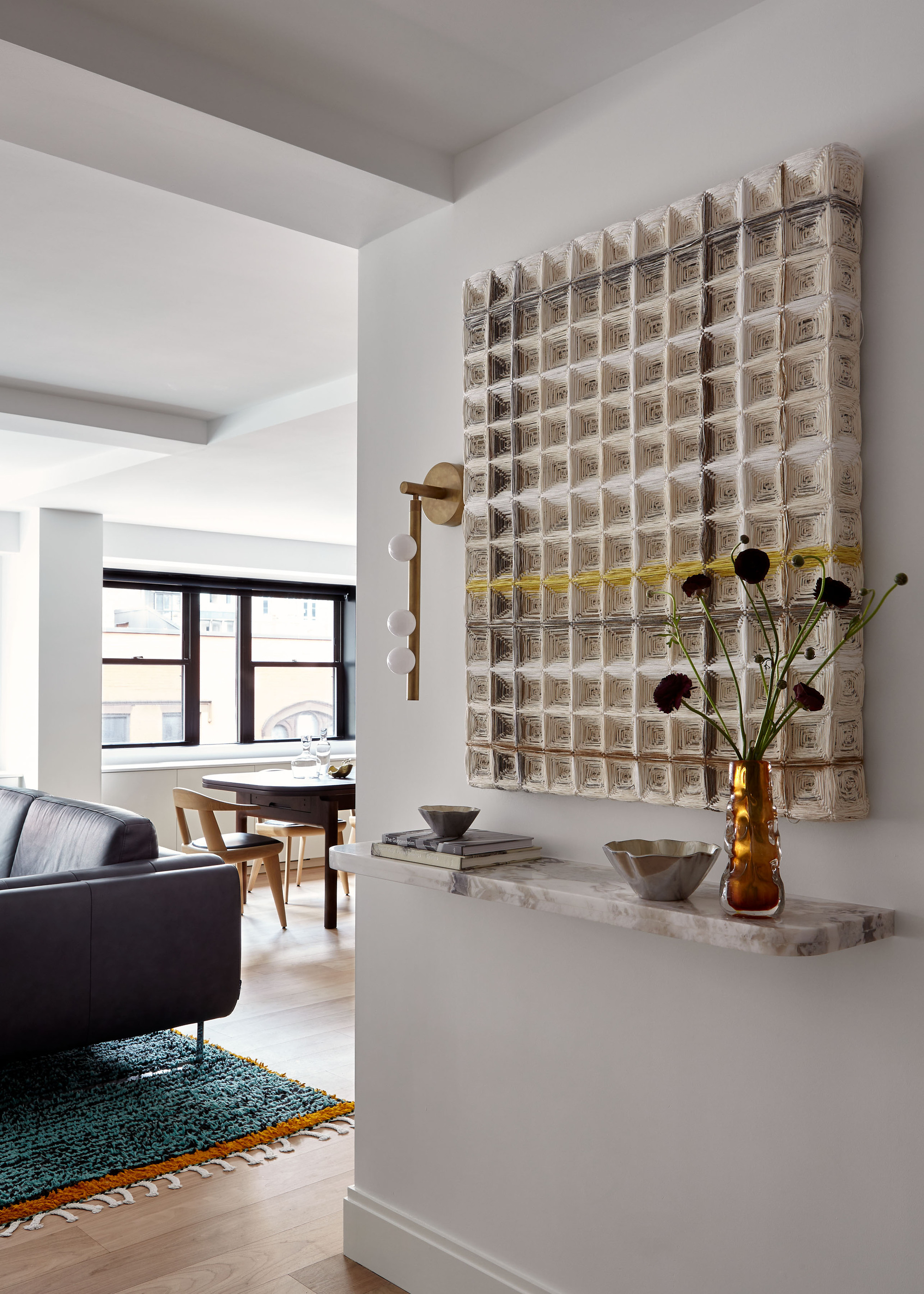
Trusting your team's eye for design is an important aspect of any successful interior project, and Annie says her clients gave her 'carte blanche' when it came to selecting art for around the home. As such, she commissioned a sculptural piece by New York-based textile artist Hiroko Takeda for a statement in the formal entryway foyer.
As a decorative entryway idea, it sets the tone for the apartment, and now sits comfortably above a custom marble shelf and framed by a Lindsey Adelman sconce. Its unique three-dimensional quality beckons you forward for closer inspection, giving the space a welcoming flow while setting the scene for what is still yet to come.
The Kitchen
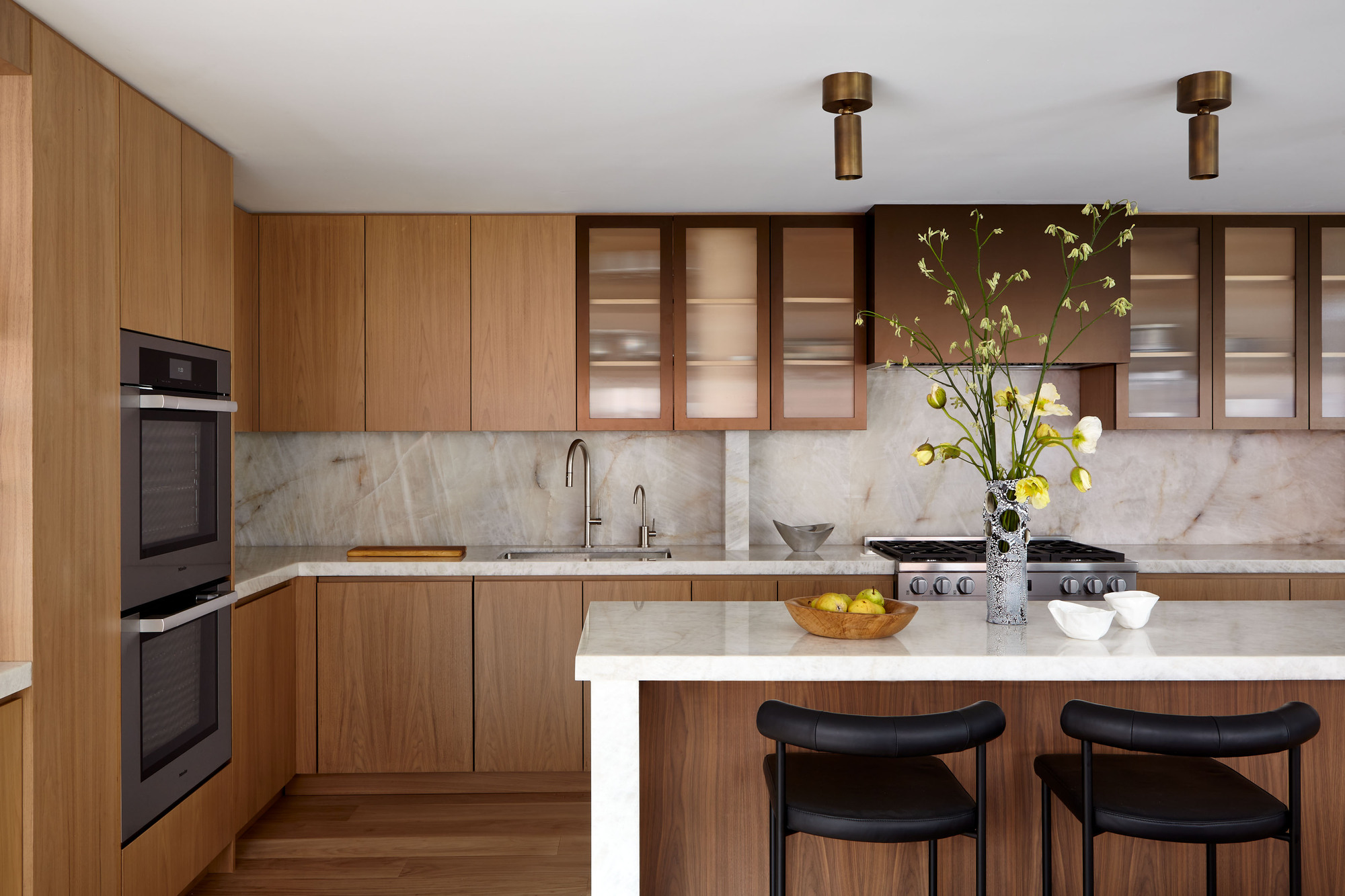
'The kitchen is my favorite part of the home,' muses Annie. 'I was delighted when the clients agreed to incorporate metal upper cabinetry with fluted glass because not all people are interested in using a variety of materials in their kitchen cabinetry.'
The surprising copper-colored feature feels cohesive with the rest of the scheme, picking up on the warm tones of the wooden kitchen cabinets and White Diamond quartzite counter with its subtle streaks of honey and gray.
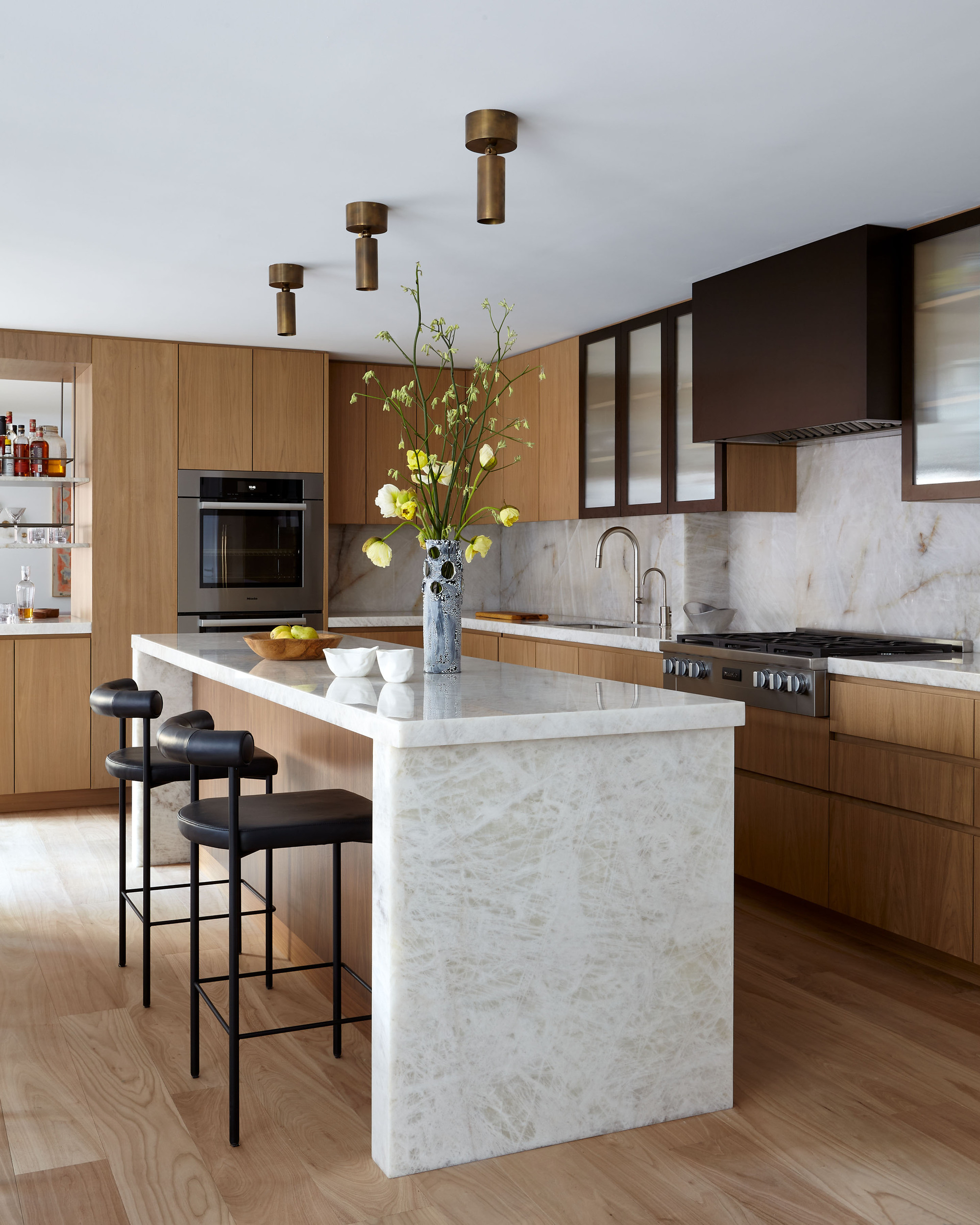
As fervent entertainers, the kitchen was a crucial aspect of the overall design. 'The formal living room is on one side of the kitchen while the family room and den is on the other, so the kitchen acts as the hub of the apartment,' says Annie.
Now taking center stage in the apartment layout, the kitchen design sits comfortably with the ethos of the rest of the home — that is 'Spaces that are visually stunning yet functional areas.' The island stone is durable yet still has a depth of beauty and sense of timelessness; custom-designed furniture, including an integrated living room bar, helps the spaces work harder, while lighting plays a pivotal role in enhancing architectural features.
The Dining Room
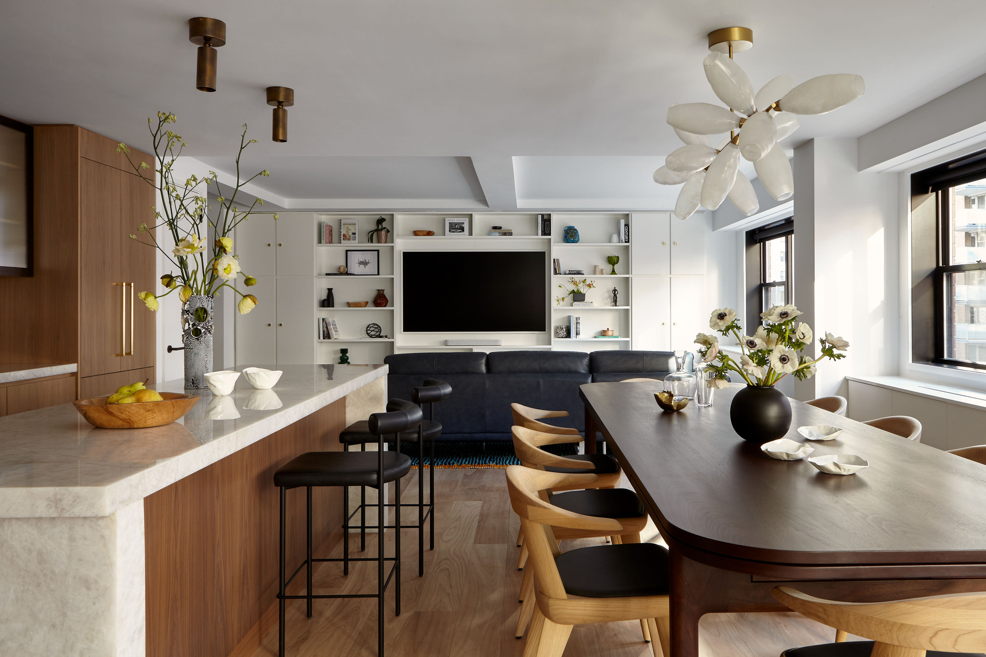
Flowing on from the kitchen and other prime entertaining spaces, the apartment's dining room ideas are heavily considered to make the most of the floorplan. The dining table itself was conceived by Annie's team, and made specifically with this space in mind.
'We designed the solid walnut dining table that stands at 12' long daily with the option to extend to 14' and 16' with the push of a button,' she explains. 'The table took us weeks to design and many more meetings with the millworkers to perfect.'
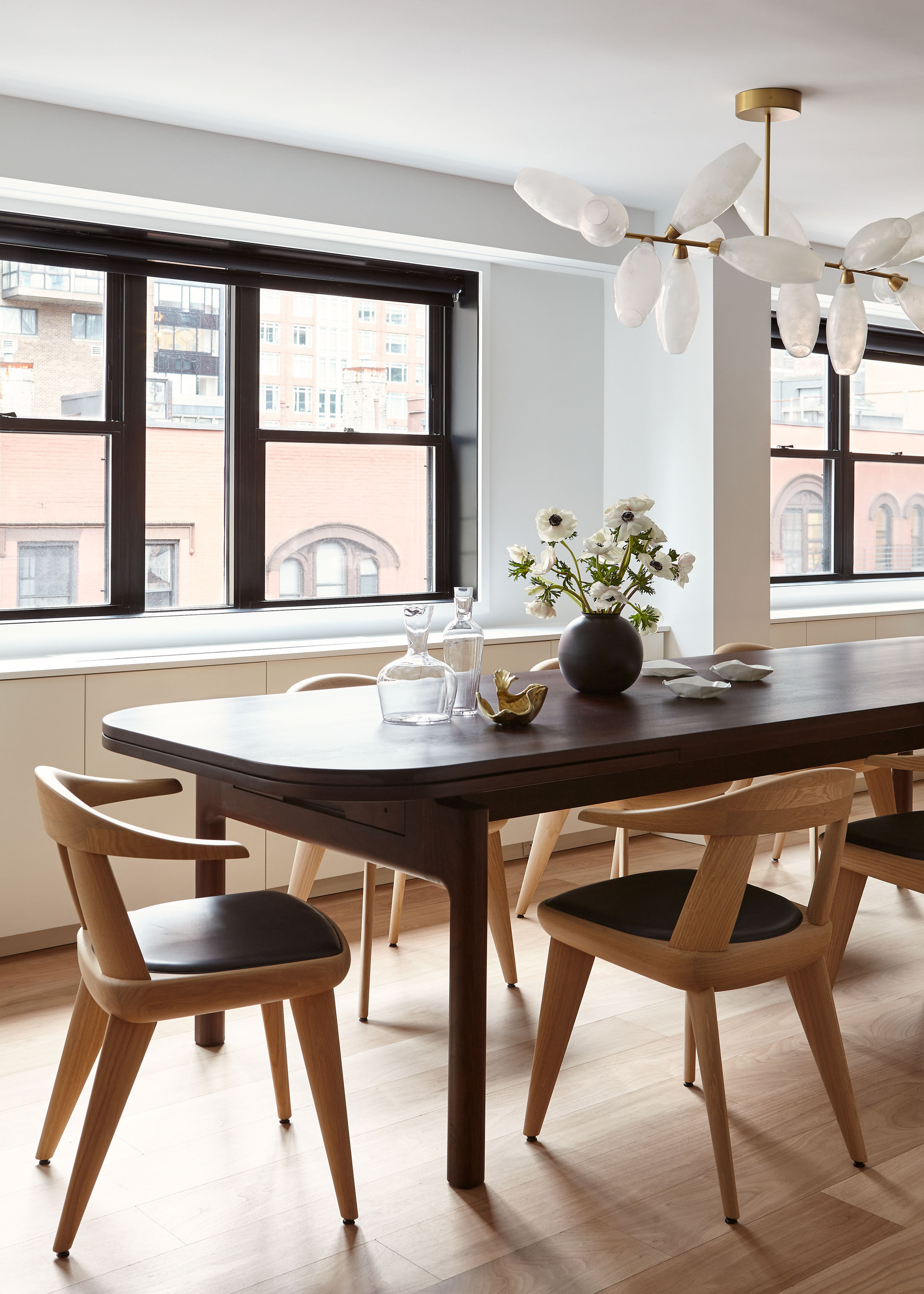
As is also often the way with original New York City apartments, it required assembly once it was on site due to the tiny service elevator in the apartment building.
The Guest Bedroom
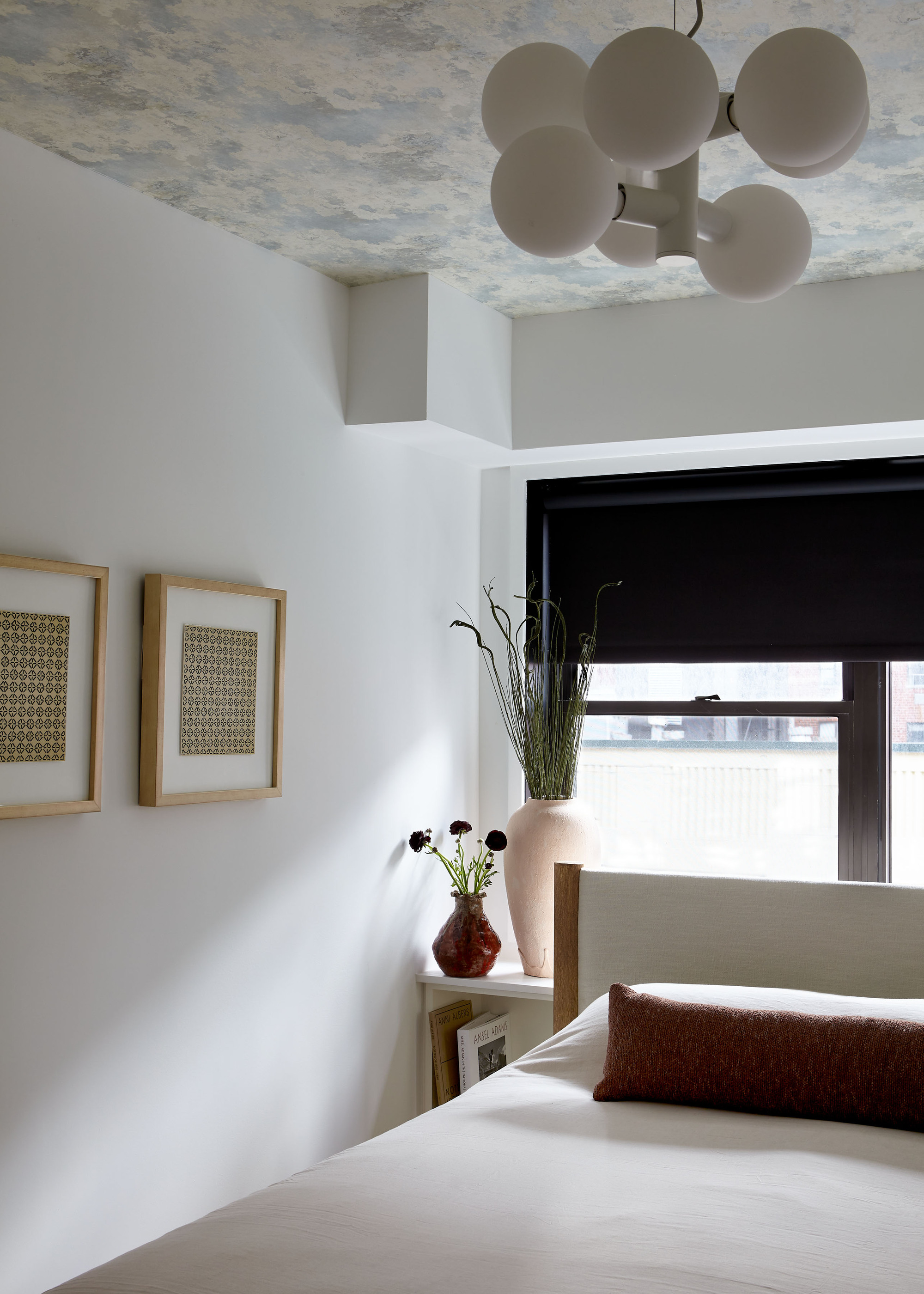
Echoing that desire to create a scheme that felt zen and connected with nature, the material and color palettes in the bedrooms are significantly softer than in the rest of the home.
Custom millwork discretely adds storage behind the guest bed, while a clever ceiling wallpaper idea makes the room feel taller and more interesting. 'My client was interested in wallpapering one wall in the guest bedroom and ultimately we thought it would be fun to do the ceiling since it would be the most impactful one "wall",' says Annie.
The Kids' Rooms
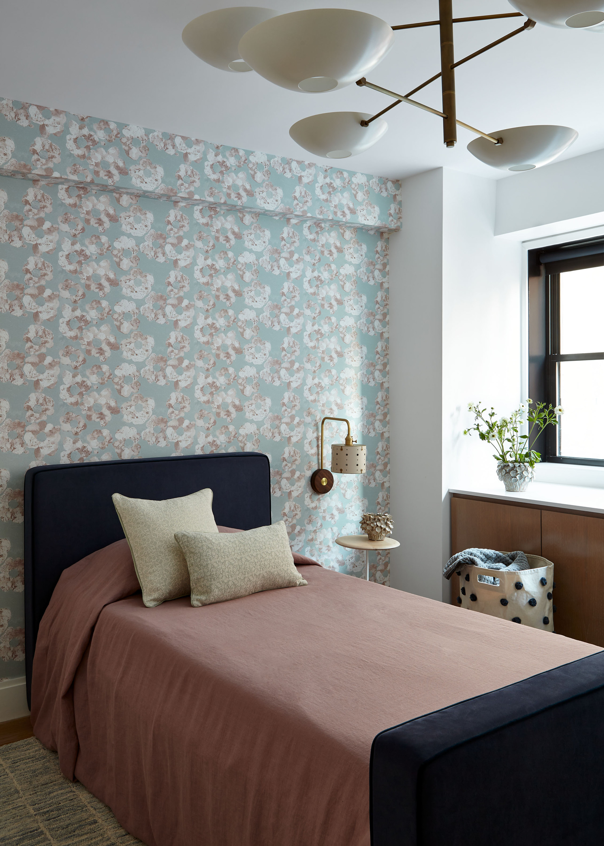
When it came to the kids' rooms, Annie similarly decided to keep the material palettes neutral but wanted to inject a bit of fun through color and pattern in the upholstery choices, ensuring the design of the room had longevity and could easily mature as they did.
Light blue was a recurring choice throughout the sleep spaces — seen in the choice of floral wallpaper in this bedroom. 'Light blue is a soothing color and goes well with every other color,' she says, describing how to achieved a sense of peace and relaxation in these rooms.
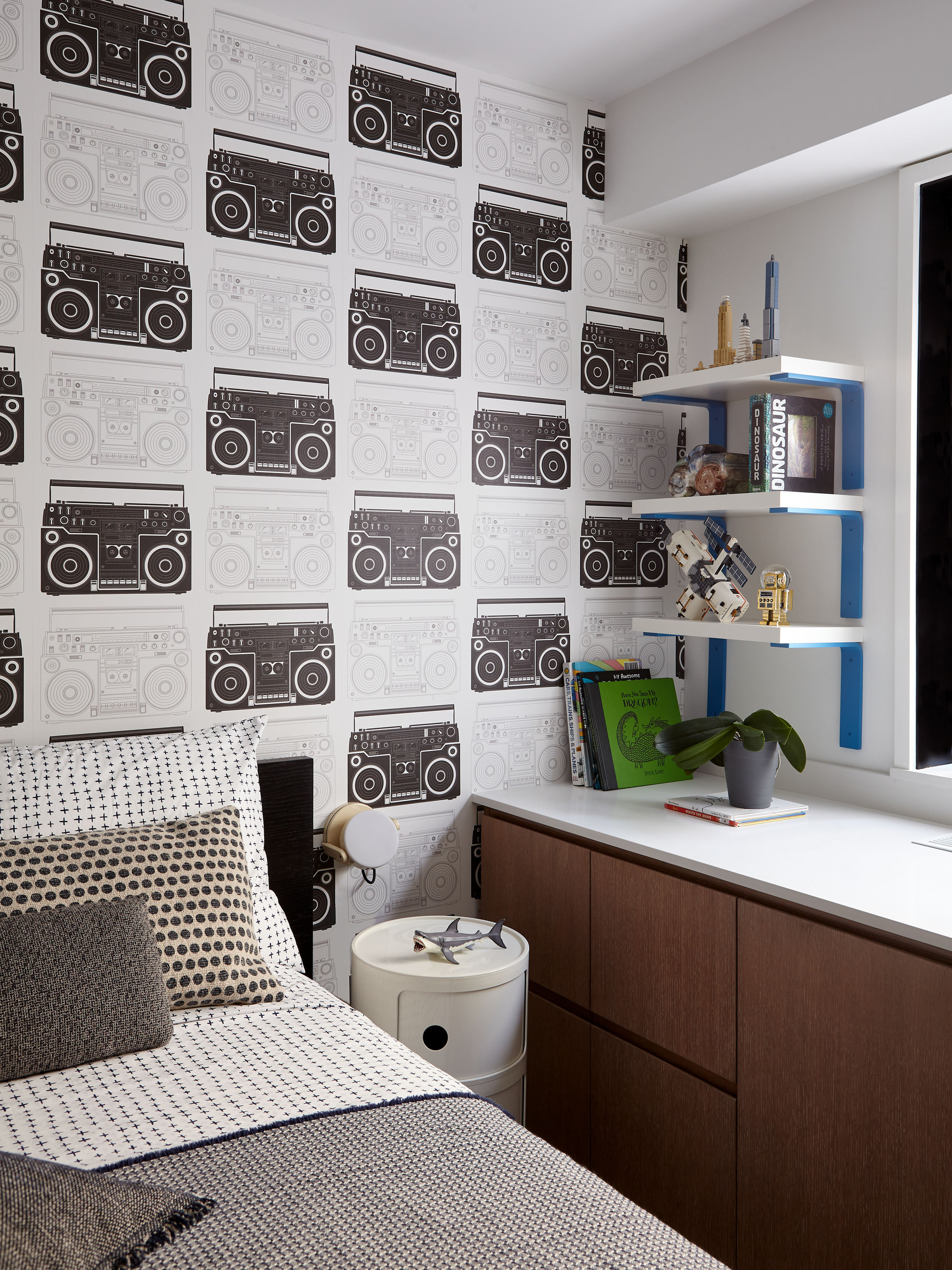
In one of the other kids rooms, a graphic black and white wallpaper print clashes aesthetically with the monochrome bedding. Once again, storage was a priority in these spaces — perhaps more than elsewhere in the home. With a focus on functionality and family living, custom oak millwork built around the windows provided added storage, while a built-in desk idea provides space for the kids to do homework.
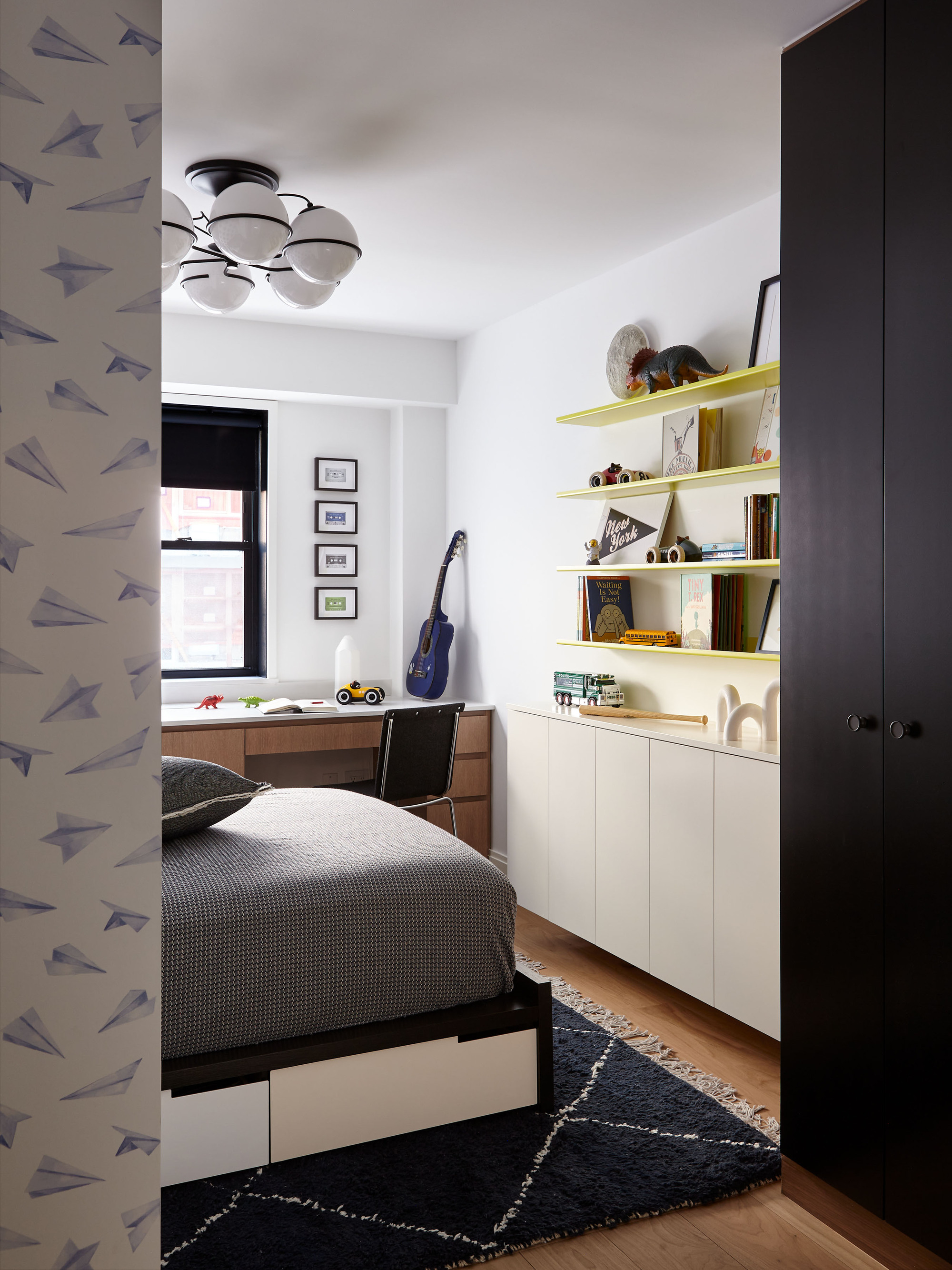
Even the location of the children's bedrooms was carefully considered, cleverly setting them back in their own 'wing' of the new apartment layout so their sleep wouldn't be interrupted should their parents wish to continue entertaining in the main hub of the home.
And why shouldn't they — with a new home that fosters a sense of connectivity just as much as it does a calming retreat, it's an oasis in the middle of Manhattan's Upper East Side.

Emma is the Interiors Editor at Livingetc. She formerly worked on Homes To Love, writing about all things design for some of Australia’s top interior publications, including Australian House & Garden and Belle. Before that, she produced content for CULTIVER, where she found an appreciation for filling your home with high-quality, beautiful things. At Livingetc, Emma explores the big design questions — from styling to colors, interior trends, and home tours. She’s travelled to Copenhagen for 3daysofdesign, to Paris for Déco Off and Maison&Objet, and has attended design events in London, including WOW!house and Clerkenwell Design Week. Outside of work, you’ll find her elbow-deep at an antique store, moving her sofa for the 70th time, or mentally renovating every room she walks into.
