See how a tiny holiday home in Holland was made to work for a family of four
This tiny holiday home sits on an island and is surrounded by waterways and nature. It makes the most of just 592 square feet, squeezing in a living, dining and kitchen area as well as as three bedrooms, a bathroom and two loos. It's a welcoming retreat for a family of four who love being out on the water

The Property
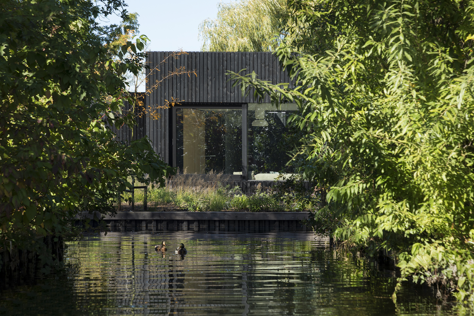
Surrounded by waterways and nature at the Vinkeveense plassen in Holland is this tiny holiday home.
The tiny modern home sits on an island, with views out over the water. Measuring just 592 square feet (55 m2), the property was built for a family of four, and manages to comfortably fit a living room, a kitchen/dining room, a patio, three bedrooms, one bathroom and two toilets.
Designed by i29 interior architects and Chris Collaris, the layout was developed from the inside-out, maximising every square inch of space. Despite its size, the home has a luxurious interior, plus 360 degree views of the surrounding nature.
Exterior
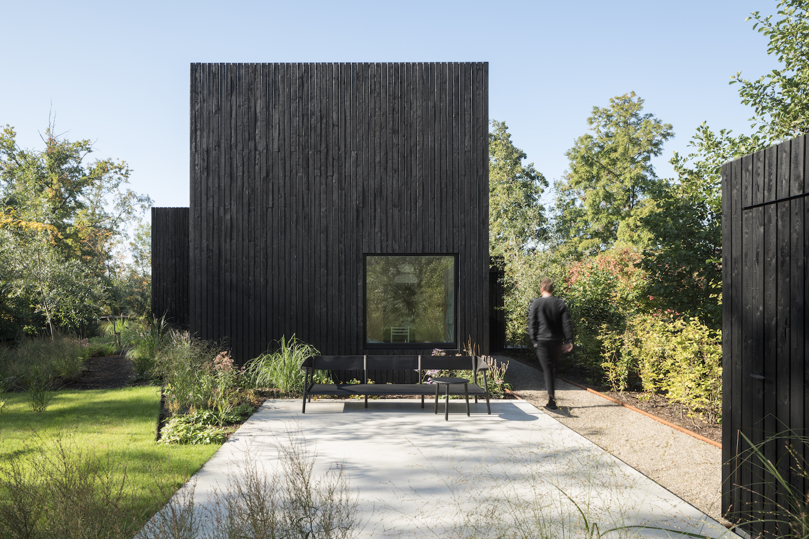
The tiny house sits right on the water's edge, bringing in the soothing sounds of sloshing water and ducks.
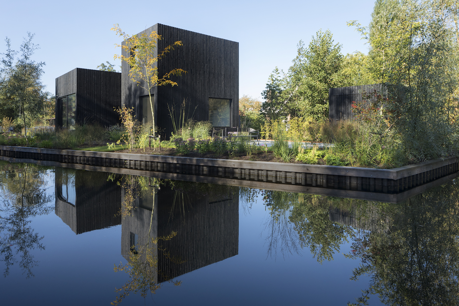
The shape of the house was determined by the orientation of the sun, letting in light from different angles throughout the day.
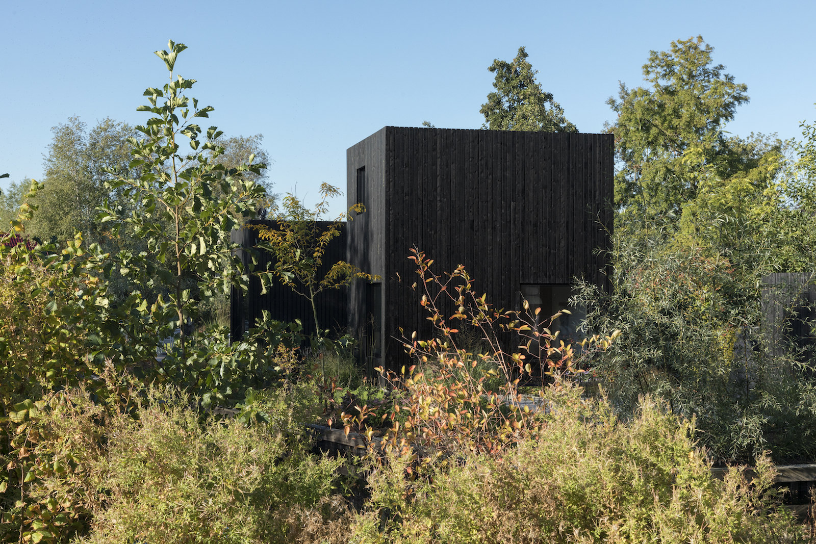
The structure takes on a different shape and view from every angle, like a piece of sculpture.
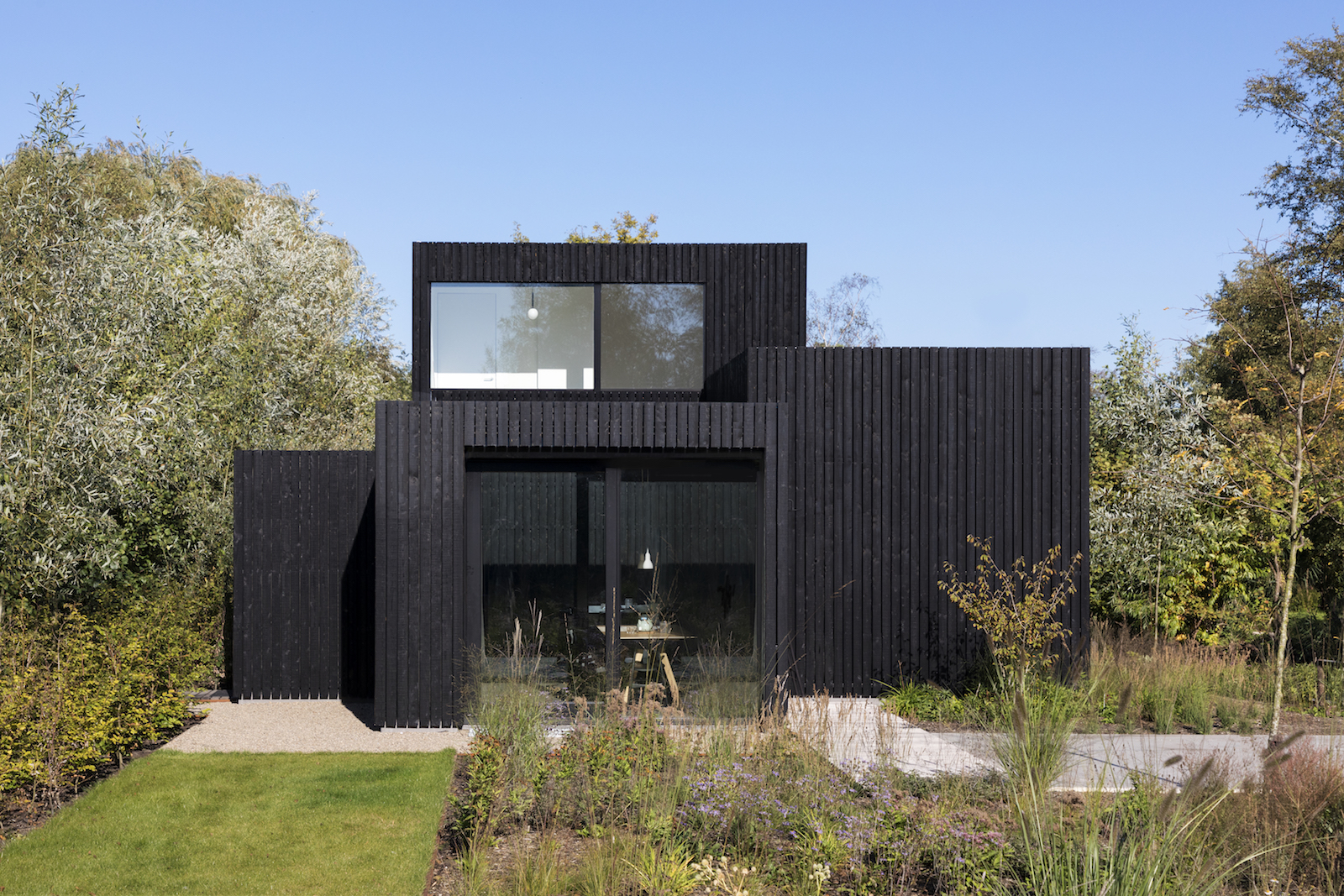
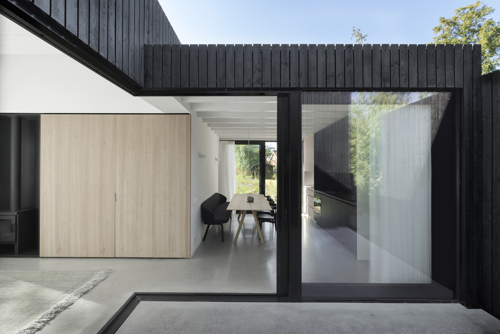
The facade has a minimalist design, with window frames embedded within the wood facade.
Be The First To Know
The Livingetc newsletters are your inside source for what’s shaping interiors now - and what’s next. Discover trend forecasts, smart style ideas, and curated shopping inspiration that brings design to life. Subscribe today and stay ahead of the curve.
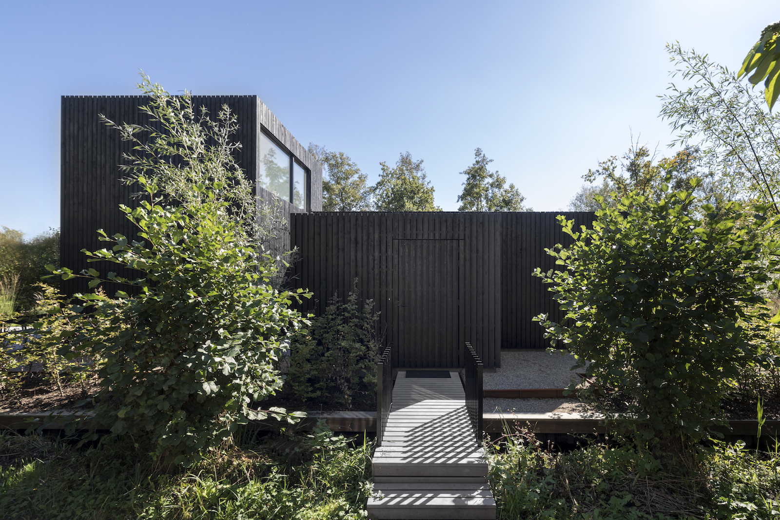
A bridge crosses the water and leads straight to the front door, which is concealed with the same wood cladding as the rest of the home.
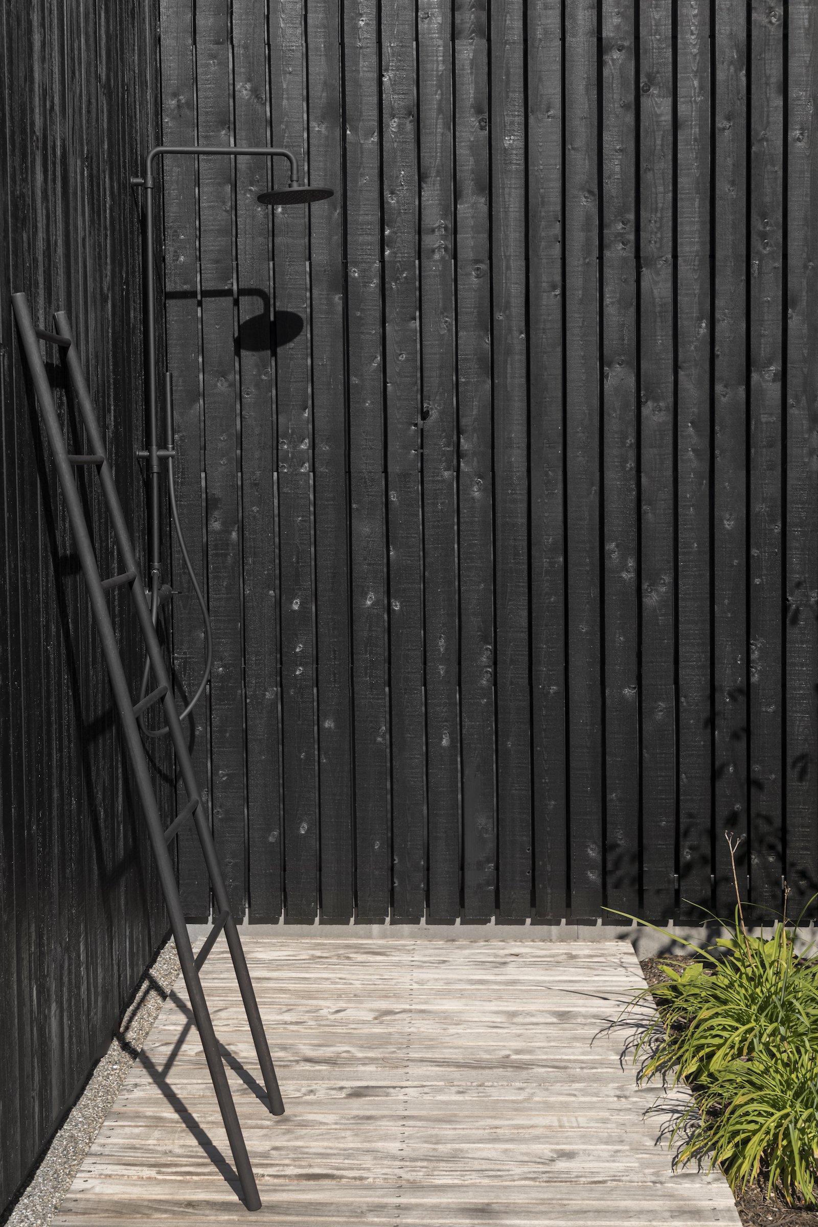
There's an outdoor shower area for rinsing off after a swim.
See Also: Tiny houses – stunning small modern homes that inspire
Open-plan living space, kitchen and dining area
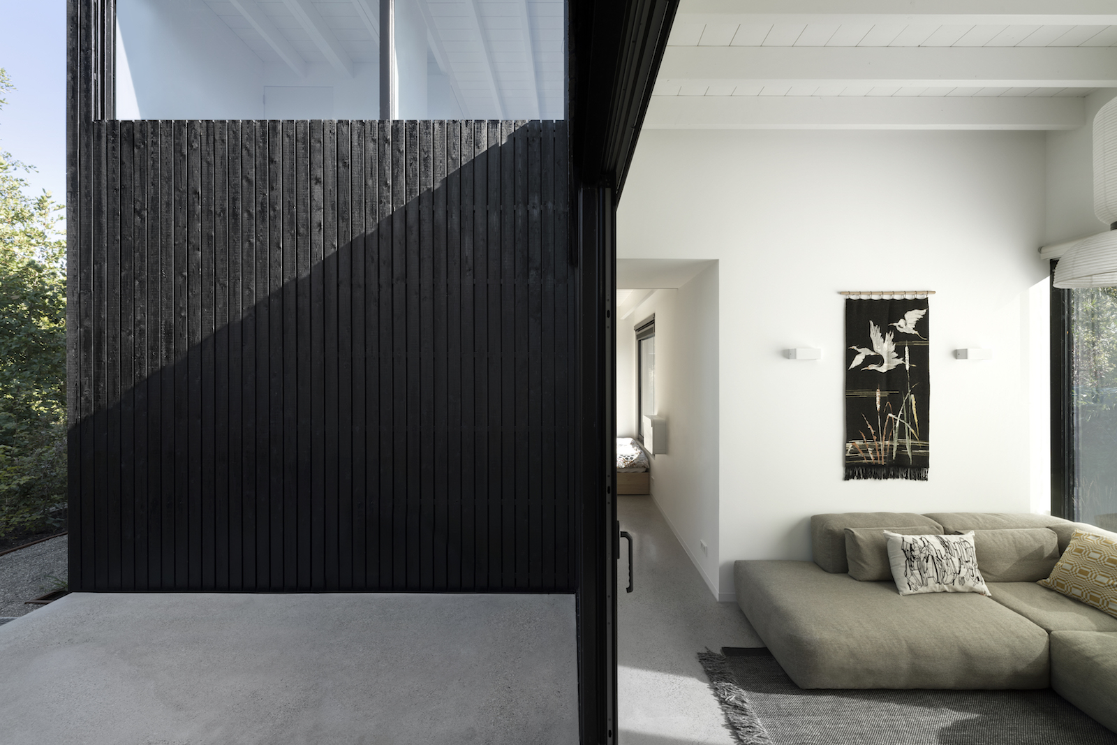
Once inside, the open-plan layout feels surprisingly light and spacious, owed to the light colour palette and change in ceiling heights.
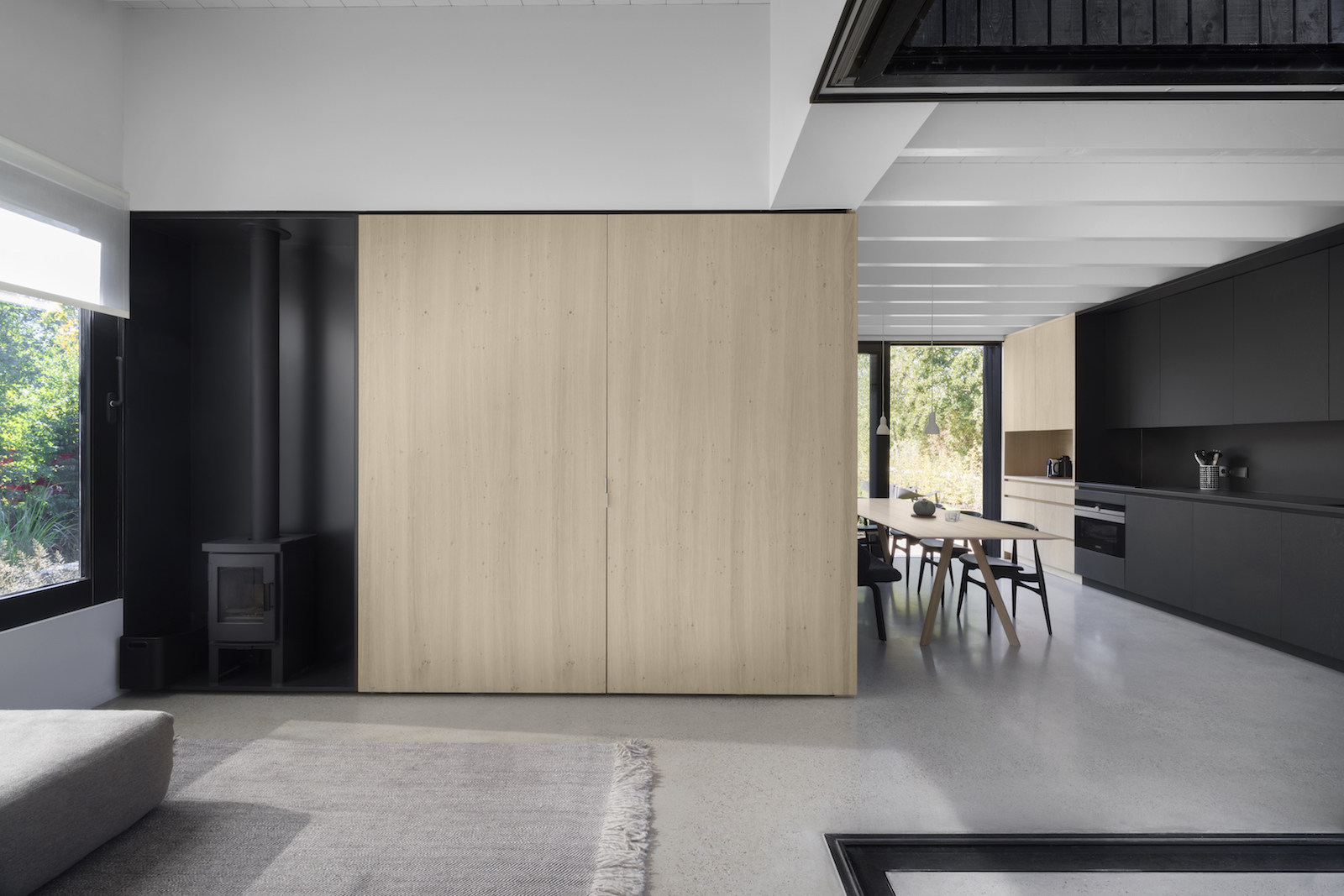
Custom furniture and integrated cabinets make the best use of space and provide ample storage. Cupboard doors slide open neatly to the side (rather than swinging open, infringing into the space), and conceal a TV.
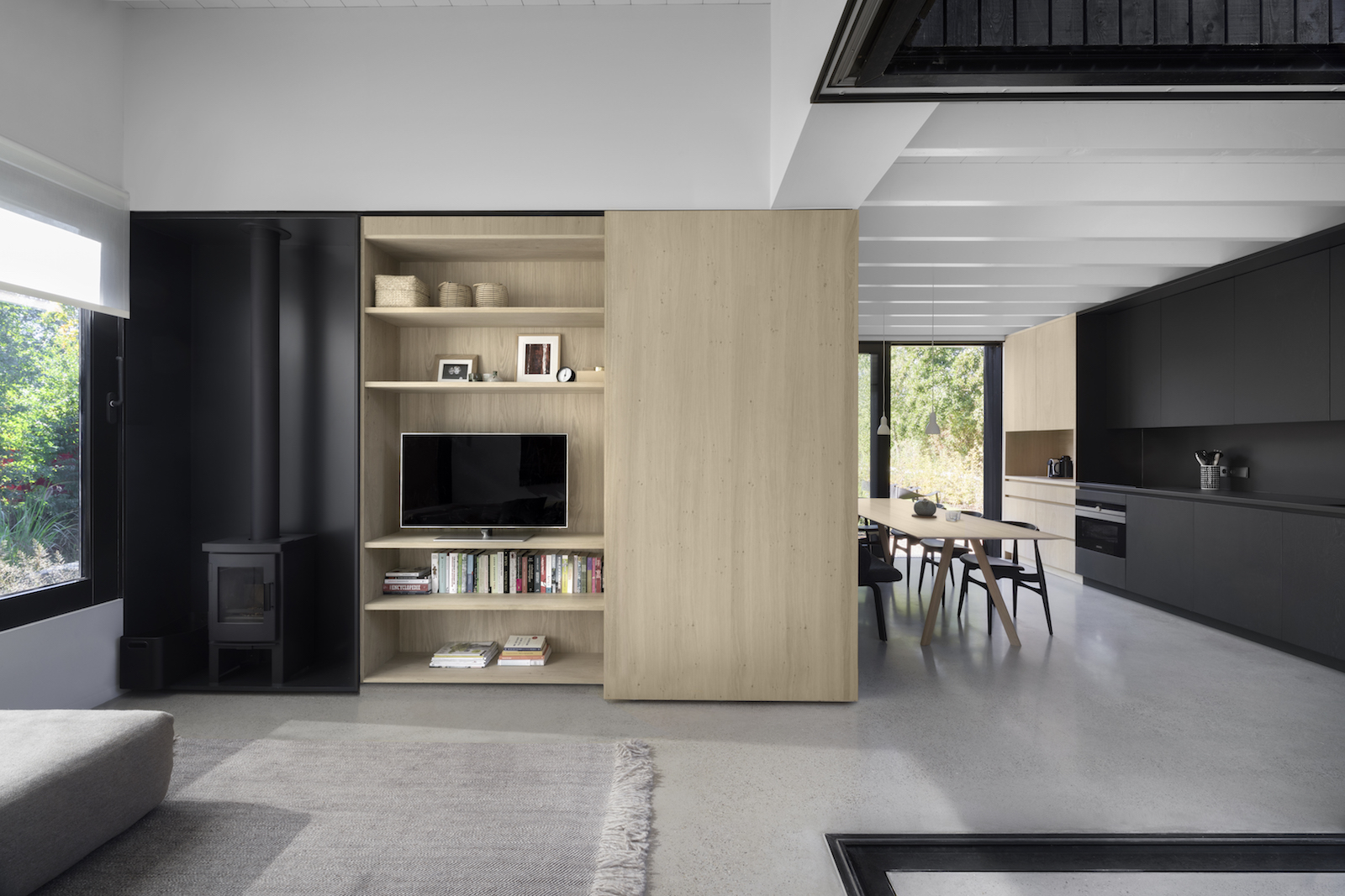
Simple materials like natural oak wooden panels or black stained wood complement the rough pinewood facade. A polished concrete floor adds to the contemporary feel.
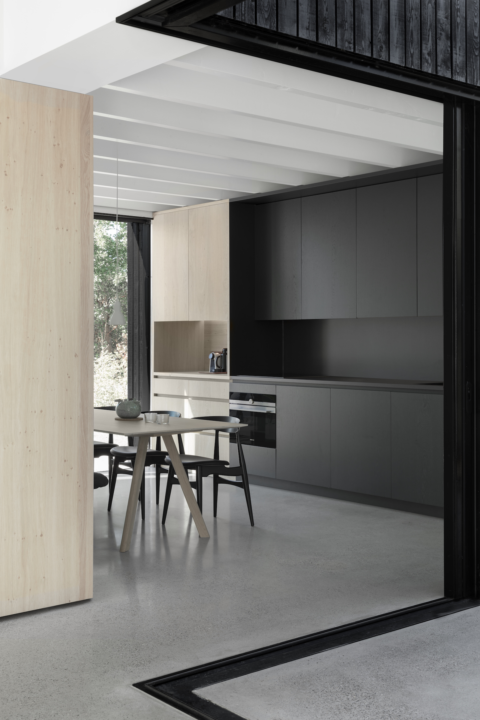
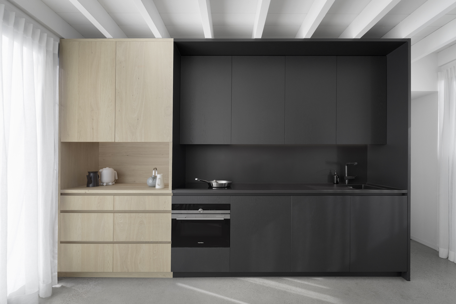
Each area benefits from big windows or sliding doors which can be opened completely to fully merge the inside with the outside.
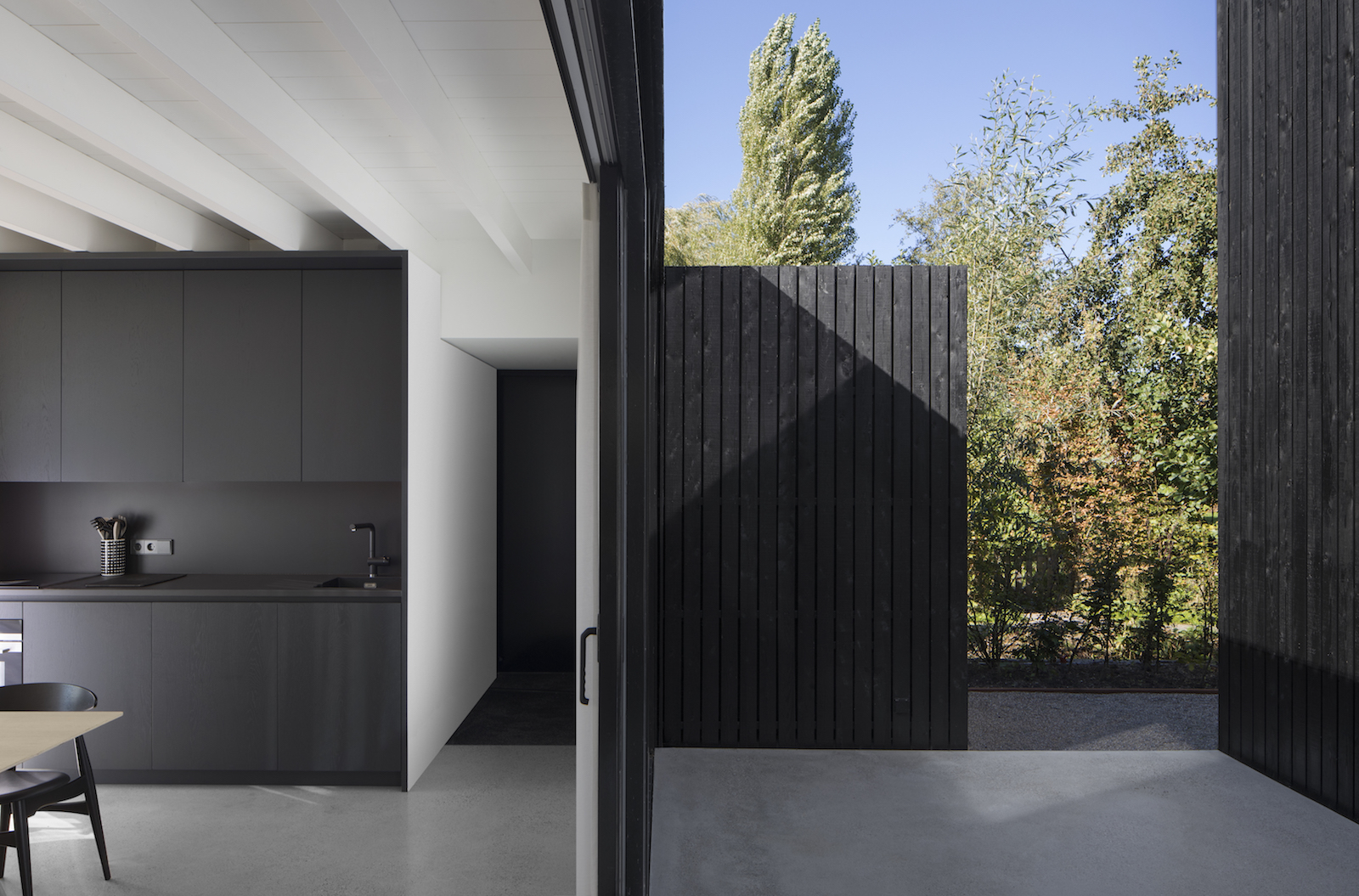
Long sight-lines crossing the outside patio provide a visual connection to the garden and surrounding waterways. By opening up large sliding doors of the patio the volumes of the kitchen and living are physically connected to nature.
See Also: This Tiny House In Melbourne Hides A Chic Interior
Bedrooms
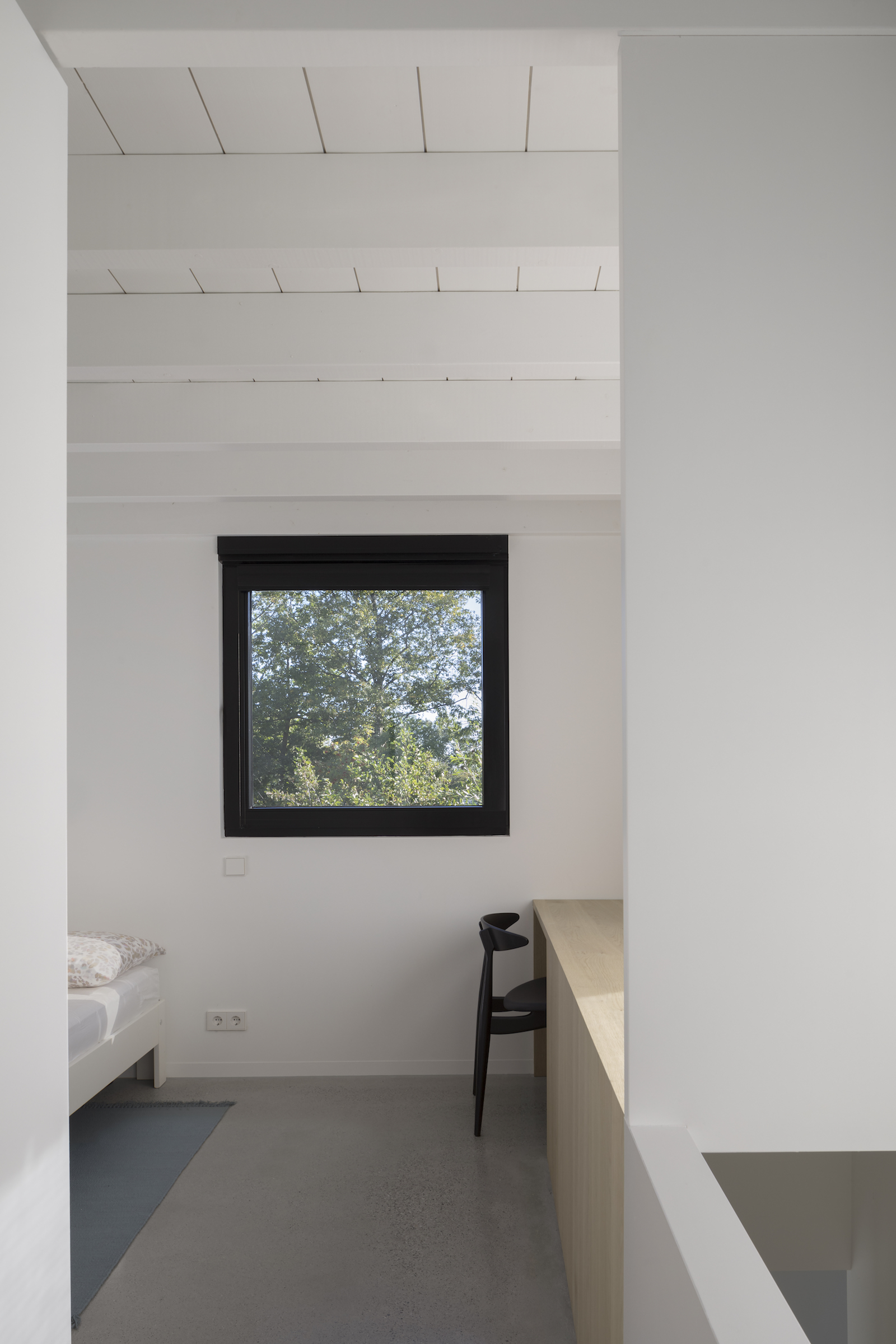
Walls, ceilings and exposed beams are all painted in gloss white to make the house feel more light and spacious. Light woods complement the light colour scheme.
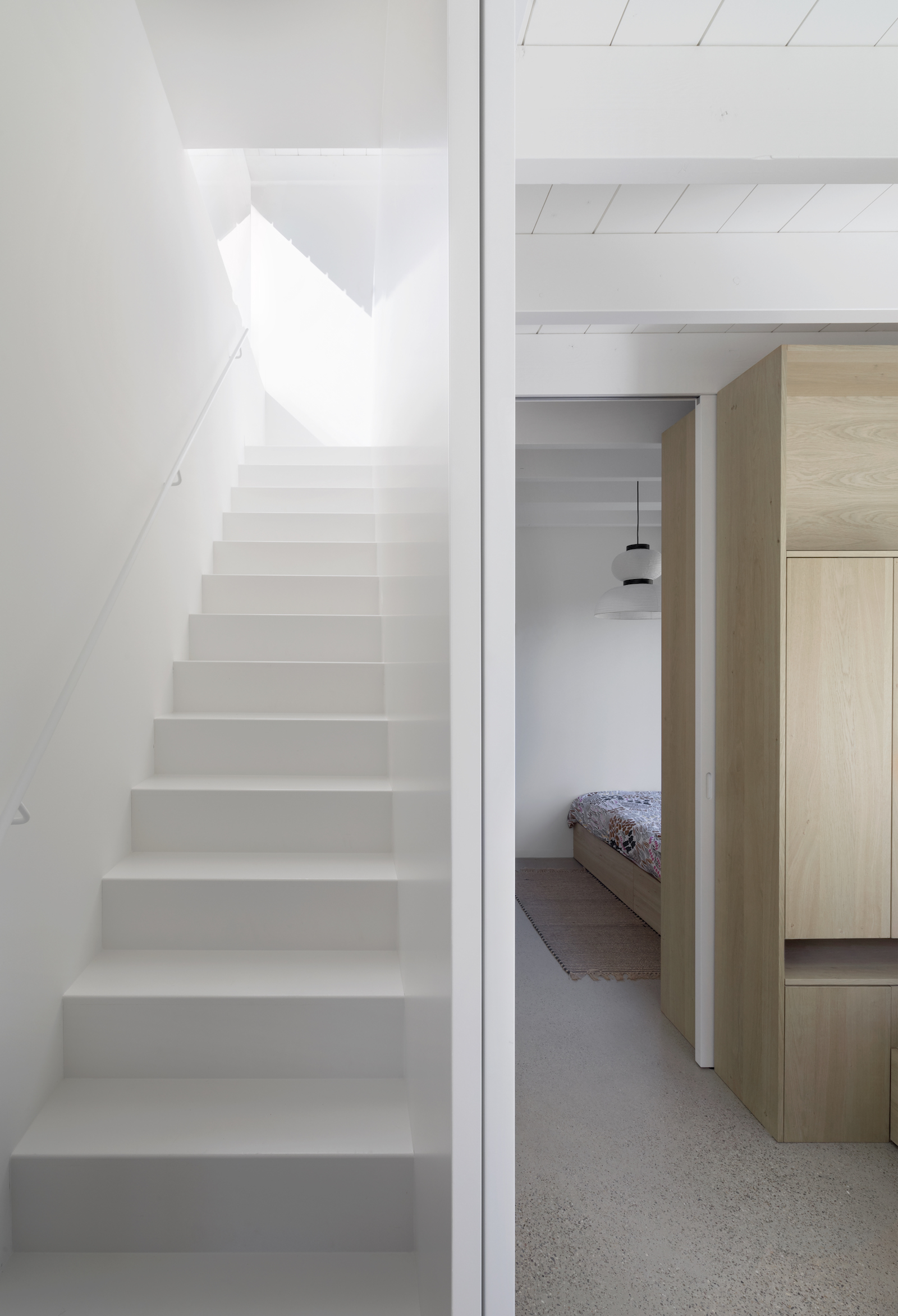
Bedrooms feature clever, space-saving design tricks, like using bedroom storage to create a partition wall to divide up two separate sleeping areas, which feels more spacious than having two separate cramped bedrooms.
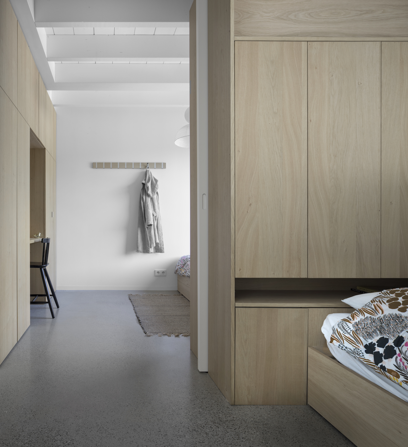
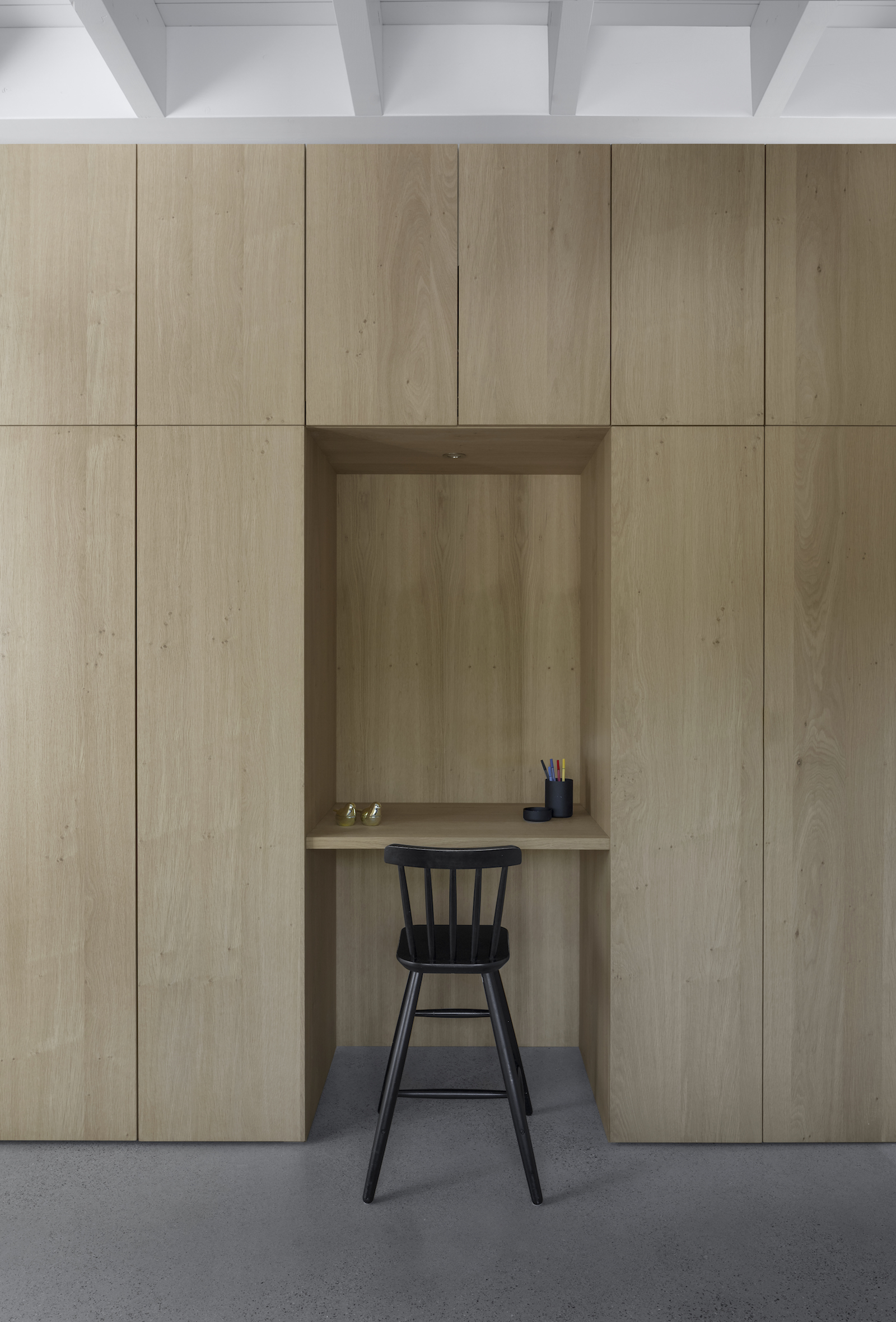
Floor to ceiling storage provides plenty of space for this family of four, and built-in wardrobes make way for a kids desk area too.
Stairs lead up to a third level with a further bedroom.
See Also: This modern attic re-design is full of stylish space saving ideas
Design: i29 interior architects & Chris Collaris
Construction: Hagoort Bouw & Simon Sintenie
Photography: Ewout Huibers

Lotte is the former Digital Editor for Livingetc, having worked on the launch of the website. She has a background in online journalism and writing for SEO, with previous editor roles at Good Living, Good Housekeeping, Country & Townhouse, and BBC Good Food among others, as well as her own successful interiors blog. When she's not busy writing or tracking analytics, she's doing up houses, two of which have features in interior design magazines. She's just finished doing up her house in Wimbledon, and is eyeing up Bath for her next project.
-
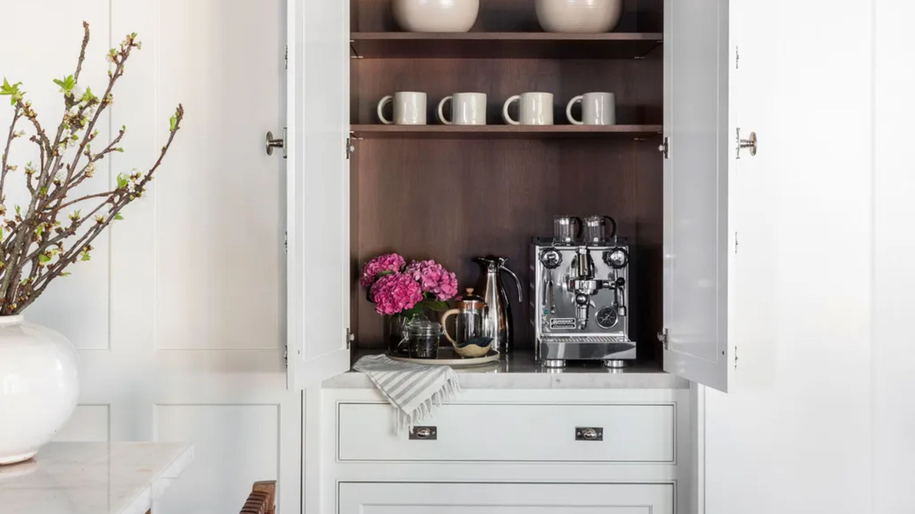 Turns Out the Coolest New Café is Actually In Your Kitchen — Here's How to Steal the Style of TikTok's Latest Trend
Goodbye, over-priced lattes. Hello, home-brewed coffee with friends. TikTok's 'Home Cafe' trend brings stylish cafe culture into the comfort of your own home
By Devin Toolen Published
-
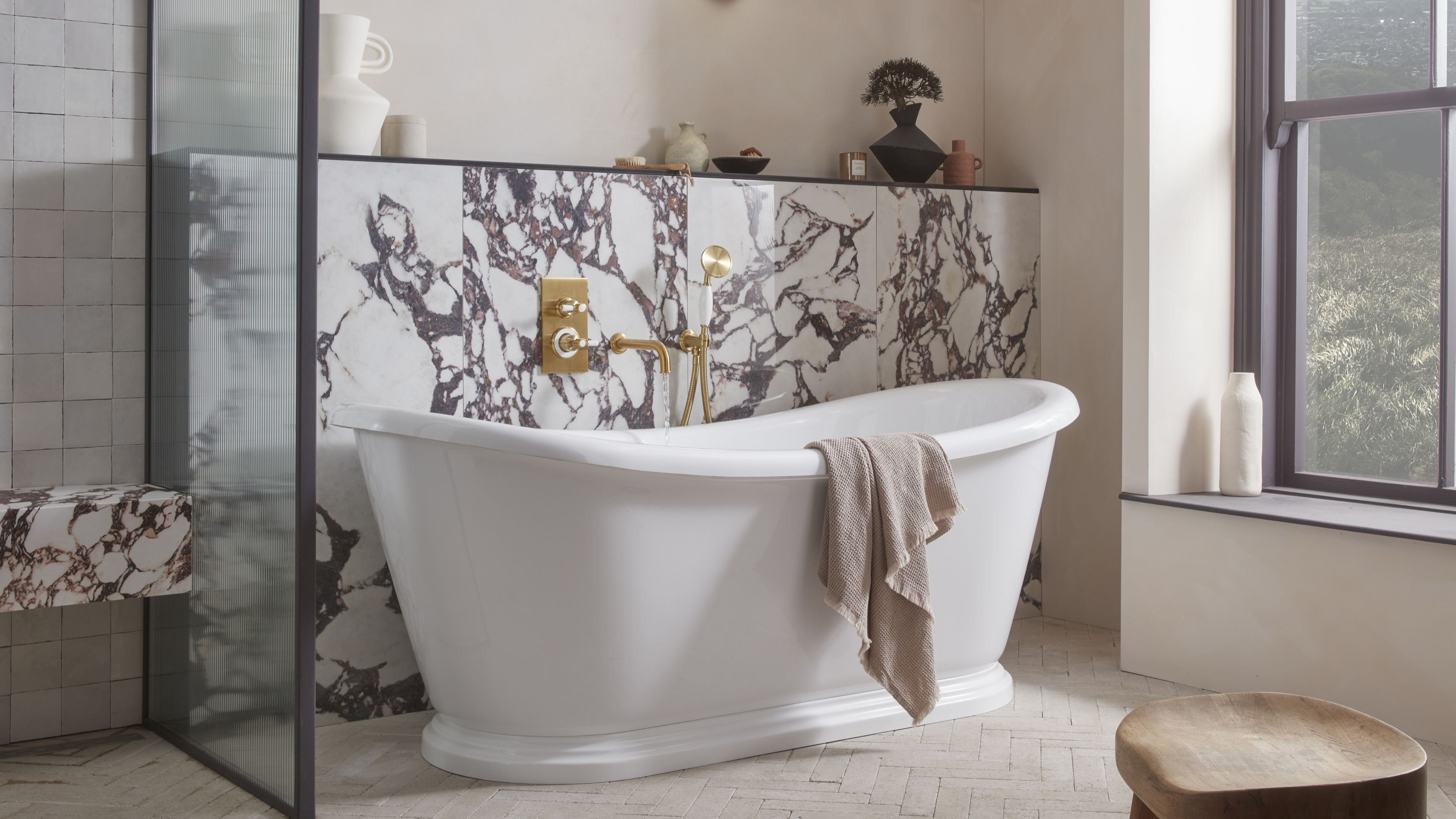 5 Bathroom Layouts That Look Dated in 2025 — Plus the Alternatives Designers Use Instead for a More Contemporary Space
For a bathroom that feels in line with the times, avoid these layouts and be more intentional with the placement and positioning of your features and fixtures
By Lilith Hudson Published