How to Achieve Transitional Style — 14 Designer Tips to Capture the Trend Taking Over Interiors
Transitional design seamlessly blends contemporary and classic interiors through furniture and décor. Experts share key techniques to achieve this balance
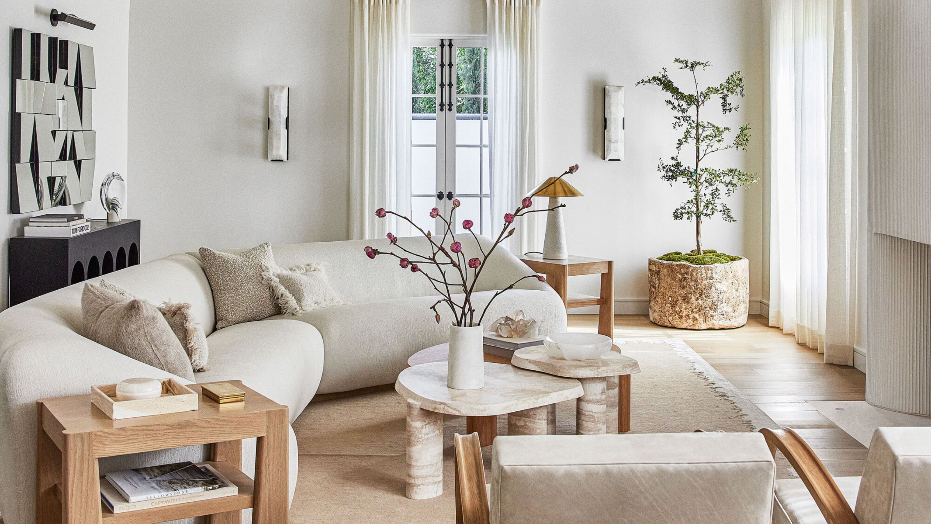
- 1. Embrace a neutral color scheme
- 2. Create visual interest with mixed textures
- 3. Use lines to bridge modern and traditional elements
- 4. Incorporate color strategically to bridge traditional and modern design
- 5. Pair two different styles of furniture together
- 6. Play with lines and silhouettes
- 7. Add a modern touch to millwork and wainscoting
- 8. Less is definitely more
- 9. A solid rug creates a soft and balanced base
- 10. Create balance with neutral classics
- 11. Let a contemporary fixture light the way
- 12. Think about your architecture, too
- 13. Pick muted and subdued hues
- 14. Avoid pieces that are too classic or contemporary, period
- FAQs
Lola Houlton
If you love the mix of classic charm and contemporary flair, you’re likely already drawn to transitional interior style without even knowing it.
One of today’s most popular interior design trends, transitional style blends timeless elements from both traditional and modern eras, creating a balanced, harmonious look. This style allows you to avoid the two extremes of antiquated traditional design and the often cold, impersonal feel of an ultra-modern home, creating a space that is warm and homely.
It’s all about layering elements that feel dynamic and fresh while respecting the roots of classic design. We spoke to top interior designers to uncover how you can master transitional design in your home, whether you’re designing a transitional-style living room or any other space.
What is transitional style?
You may be wondering: what is transitional interior design?
“Transitional design is about blending a traditional aesthetic with modernist sensibilities,” says Los Angeles interior designer Stefani Stein. “Allowing the two styles to combine effortlessly is about balance.”
Effortless is the operative word: transitional spaces prioritize comfort, often featuring neutral, light palettes without the tension of contrasting styles. Alana Marie notes that traditional interior design elements like neutral colors, mixed textures, curved furnishings, and modern touches such as clean lines and right angles coexist seamlessly, creating a harmonious blend of the best of both worlds. "For example, pairing a sleek, modern sofa with a stunning vintage wood coffee table creates the perfect balance of old and new," says Alana.
As far as styles go, transitional interior style is more relaxed than rigorous. “So many of our clients are drawn to this aesthetic because, when it’s done well, it is comfortable, approachable, easily edited, and updated over time,” says Joe McGuier, a principal at Brooklyn’s JAM.
Be The First To Know
The Livingetc newsletters are your inside source for what’s shaping interiors now - and what’s next. Discover trend forecasts, smart style ideas, and curated shopping inspiration that brings design to life. Subscribe today and stay ahead of the curve.
By following these guiding principles, you can embrace this layered aesthetic and truly make it your own.
1. Embrace a neutral color scheme
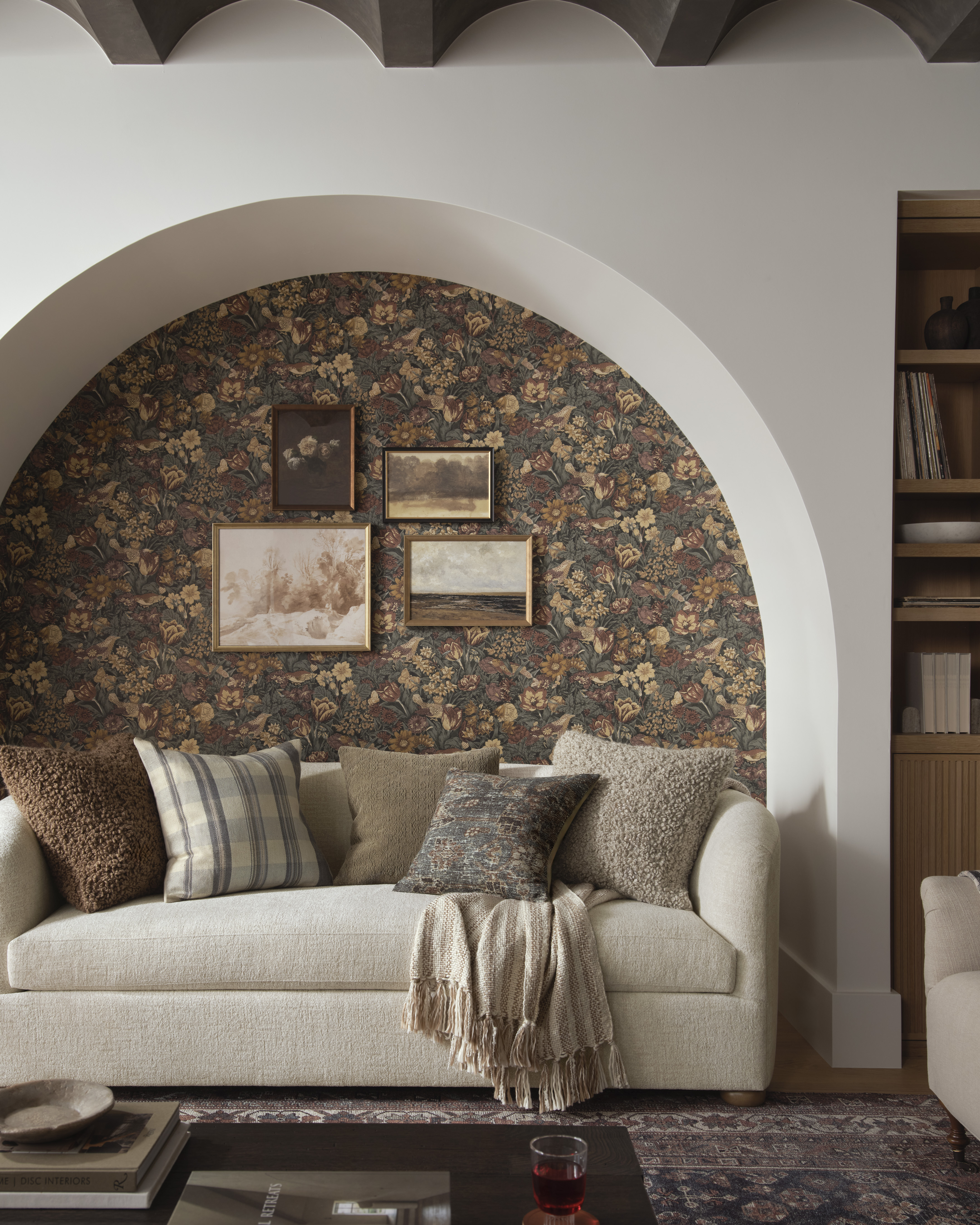
Don’t expect any jolts of color — the perfect color palettes for transitional styles are rooted in neutral color schemes. Softer hues like creams, whites, beiges, and taupes are applied across furniture and décor to create clean, calm, and collected environments. This is where the approach is similar to minimalist interior design.
“Keeping a neutral base lends to a softer feel and allows easy layers to be mixed in throughout,” says Marianne Brown, owner and principal designer of Salt Lake City’s W Design Collective. “We often find a lot of organic textures and mix them with both modern and traditional elements to create a cohesive, welcoming space.”
2. Create visual interest with mixed textures
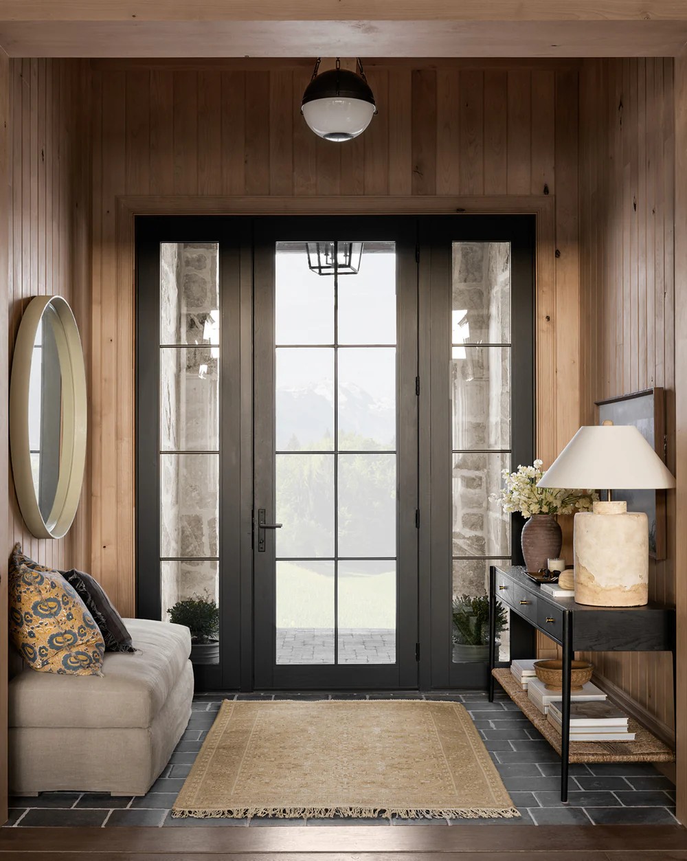
Given the emphasis on light and neutral palettes, it’s natural to worry about ending up with a flat, uninspired space. However, one way to add visual interest while decorating with neutrals is to incorporate an array of textures. Consider using tactile materials in solid colors, such as bouclé upholstery, linen drapes, or soft accents such as a knitted throw or velvet pillows, to bring depth to the space.
“Texture plays a huge role in the overall style of a room," says interior design expert Danielle Castagna. She advises: "To help achieve a transitional aesthetic, you can blend the warmth of traditional textures like wood furniture and soft furnishings with more sleek, modern touches like minimalistic and metallic elements."
Christine Jahan, principal interior designer at Christine Jahan Designs adds, "Don’t be afraid to inject a little texture Casework like bookshelves and tables should be made of wood, preferably allowing the natural grain to show itself. Whether the casework is modern or traditional is up to you. That’s the beauty of transitional spaces; anything goes. Just make sure your colors and sizes are appropriately paired for the space you’re designing."
As for finishes, variety is key. “Where materiality is concerned, mix in different textures,” says Stefani Stein. “I gravitate towards woods in natural finishes, such as oak or walnut. Try mixing these materials with marble and linen. Avoid using the same finish throughout; it can feel a bit one note.”
3. Use lines to bridge modern and traditional elements
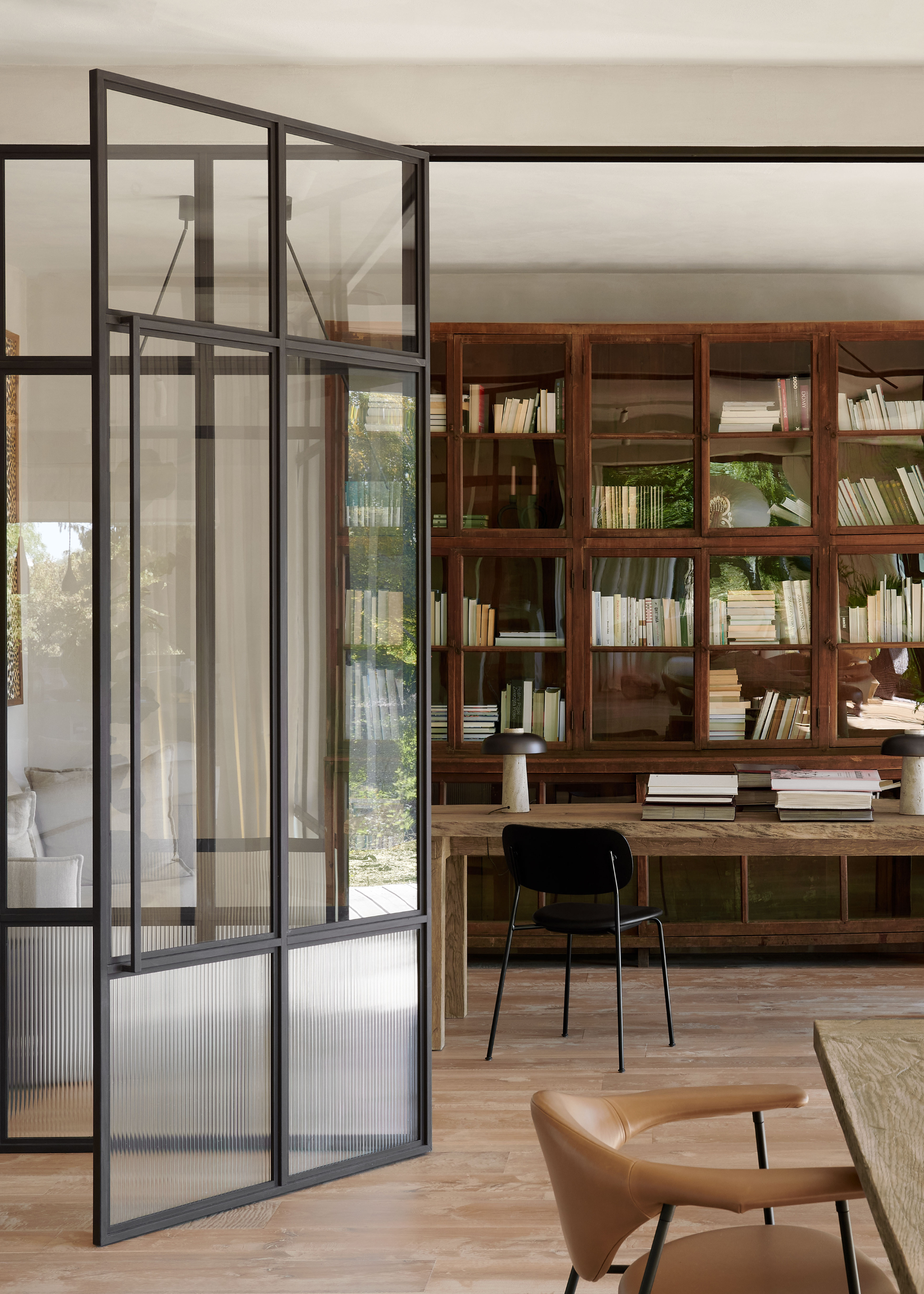
If you're looking to connect modern and traditional styles in a transitional space, one trick is to use lines to bridge the gap between the two. The repetition of linear elements creates a sense of unity, allowing contemporary and traditional pieces to coexist seamlessly.
For example, incorporating a sleek, modern glass room divider with lines that echo the design of traditional wooden furniture can establish a harmonious flow between contrasting styles. In the space above, the minimalist black metal lines of the glass room divider are complemented by the warm, classic wood of the traditional shelves, creating a balance of form and texture.
The key to transitional interior style is to ensure that the lines of both elements speak to one another in a way that feels cohesive, even if the materials are distinct. This interplay of lines connects the transition between styles and ensures the space feels carefully curated rather than disjointed.
4. Incorporate color strategically to bridge traditional and modern design
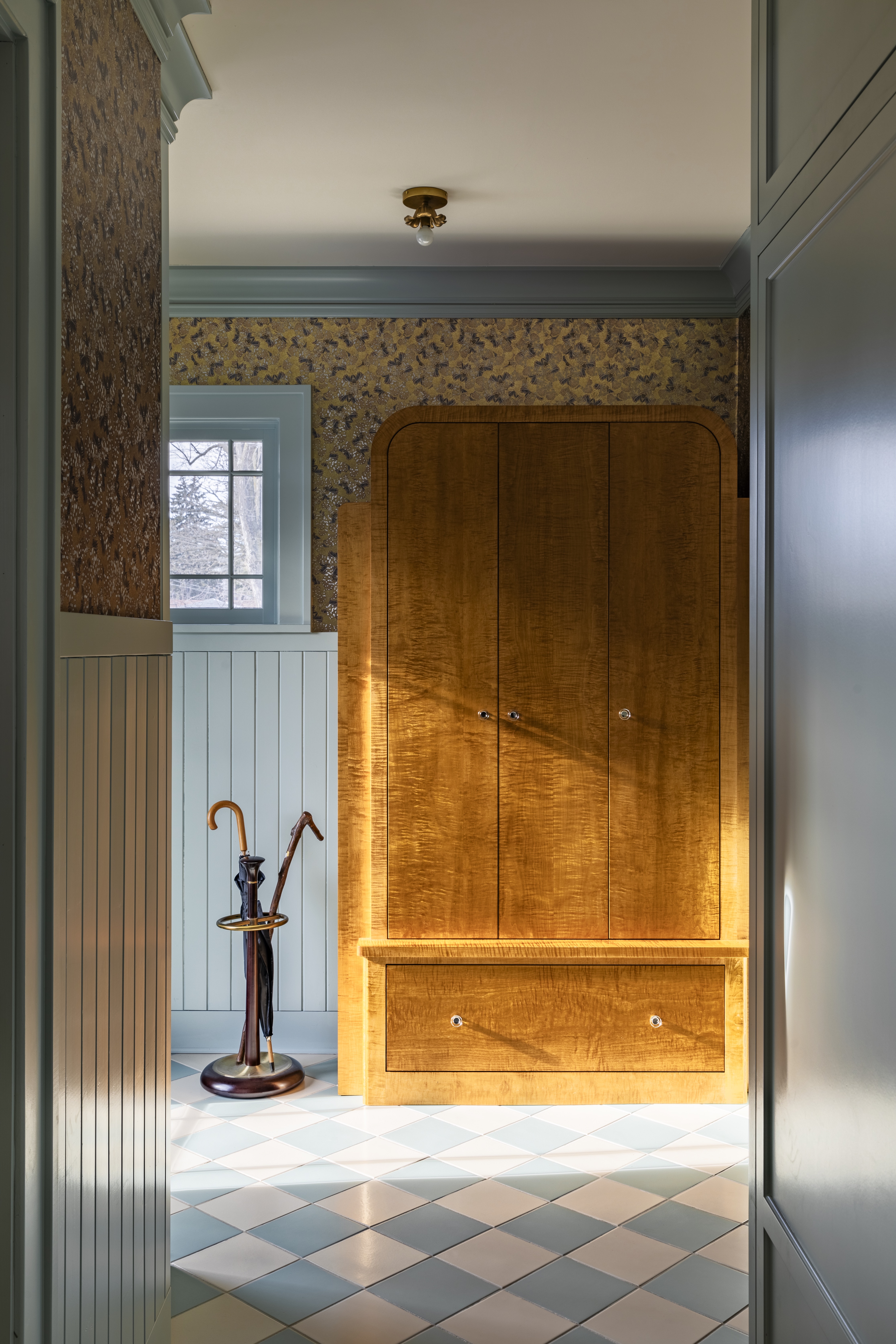
Danielle Castagna, says: "Rather than incorporating solely traditional or modern elements within the room, the key to creating a truly transitional style lies in carefully curating a balance within key pieces of furniture and décor." This balance can be achieved not just through the style of furniture but also through the thoughtful use of color to connect traditional and modern elements.
While transitional interior style typically leans on pared-back, neutral tones, incorporating subtly modern, muted colors can play an important role in modernizing traditional spaces. The light blue and white color palette in the entryway above designed by Prospect Refuge Studio updates the otherwise traditional room while blending seamlessly with the traditional elements. The varnished wooden cabinet, with its classic and timeless appeal, is beautifully offset by the soft, contemporary hues of the light blue paneling and checkerboard tiled floor. These lighter tones make the space feel airy, updating the traditional wood and floral wallpaper without overpowering them.
Stefani Stein recommends sticking to subtle colors inspired by nature, like the ‘blue-gray’ of a foggy sky, or the ‘dusty green’ of garden herbs. “Using color in balance is also important,” adds Stein. “Ground any colored moments with natural woods, and earthy neutrals like oatmeal, camel, or tan.”
This thoughtful use of color allows the space to feel both current and classic, creating a cohesive, transitional entryway that feels timeless yet fresh.
5. Pair two different styles of furniture together
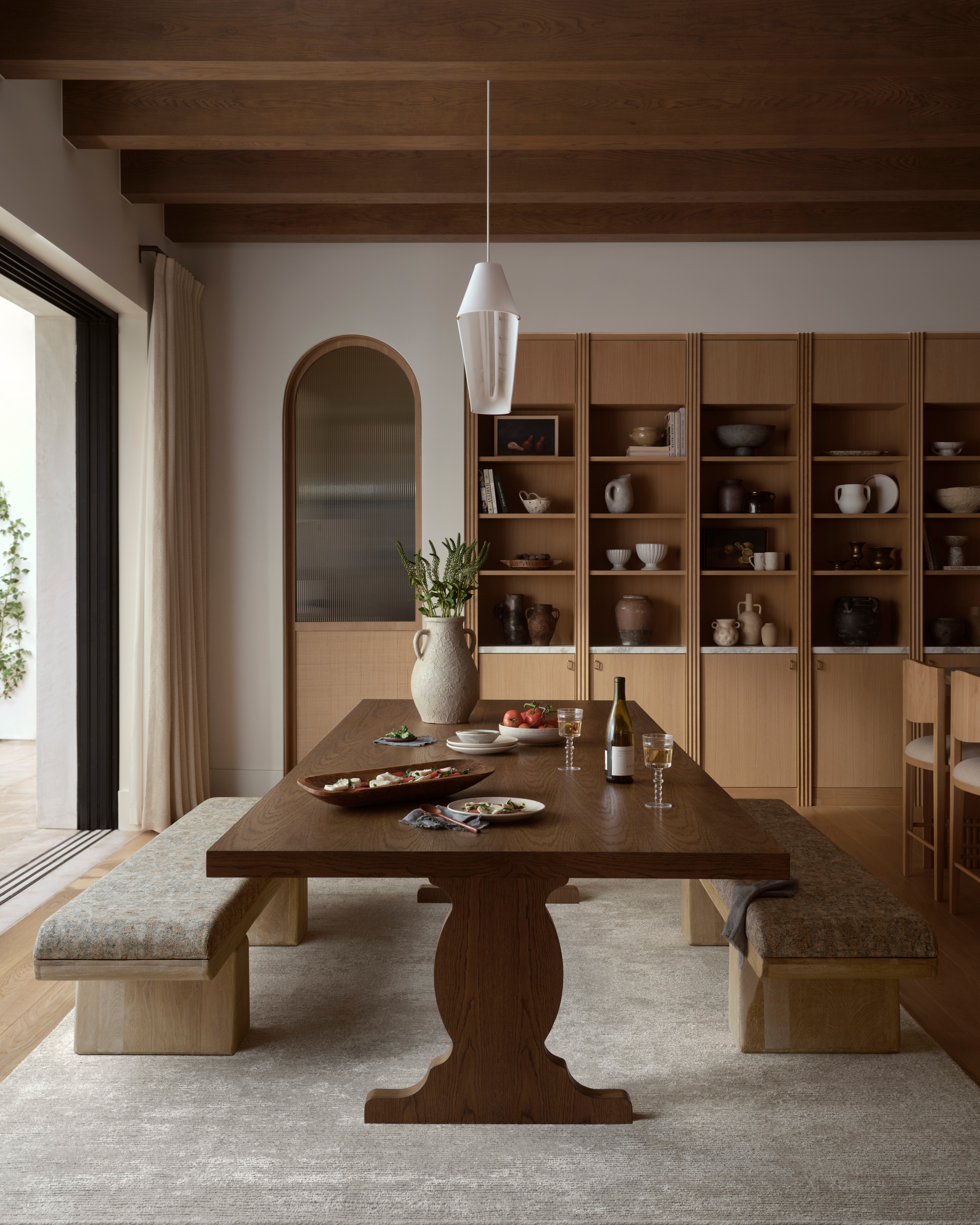
The most basic way to achieve a transitional aesthetic is to combine furniture from two different eras. “If you purchase a table that feels more traditional, find items with cleaner or more simplistic lines to pair with it,” says Marianne Brown of Salt Lake City’s W Design Collective. “If you find a table that is all wood, find painted or upholstered dining chairs to pair with it.”
In the home above, the modern dining benches create a beautiful contrast, complementing the mid-century wooden table with its traditional curved legs. It's a perfect transitional-style dining room. It's here you can see the similarities with the disciplines of the modern farmhouse movement. “Mixing contrasting pieces, traditional/vintage feel with modern/clean lines, helped us achieve that balance without the space feeling too traditional on the one hand, or too modern on the other,” adds Brown.
The result is sophisticated and fresh — an old soul with a youthful spine — and notably relaxed.
6. Play with lines and silhouettes
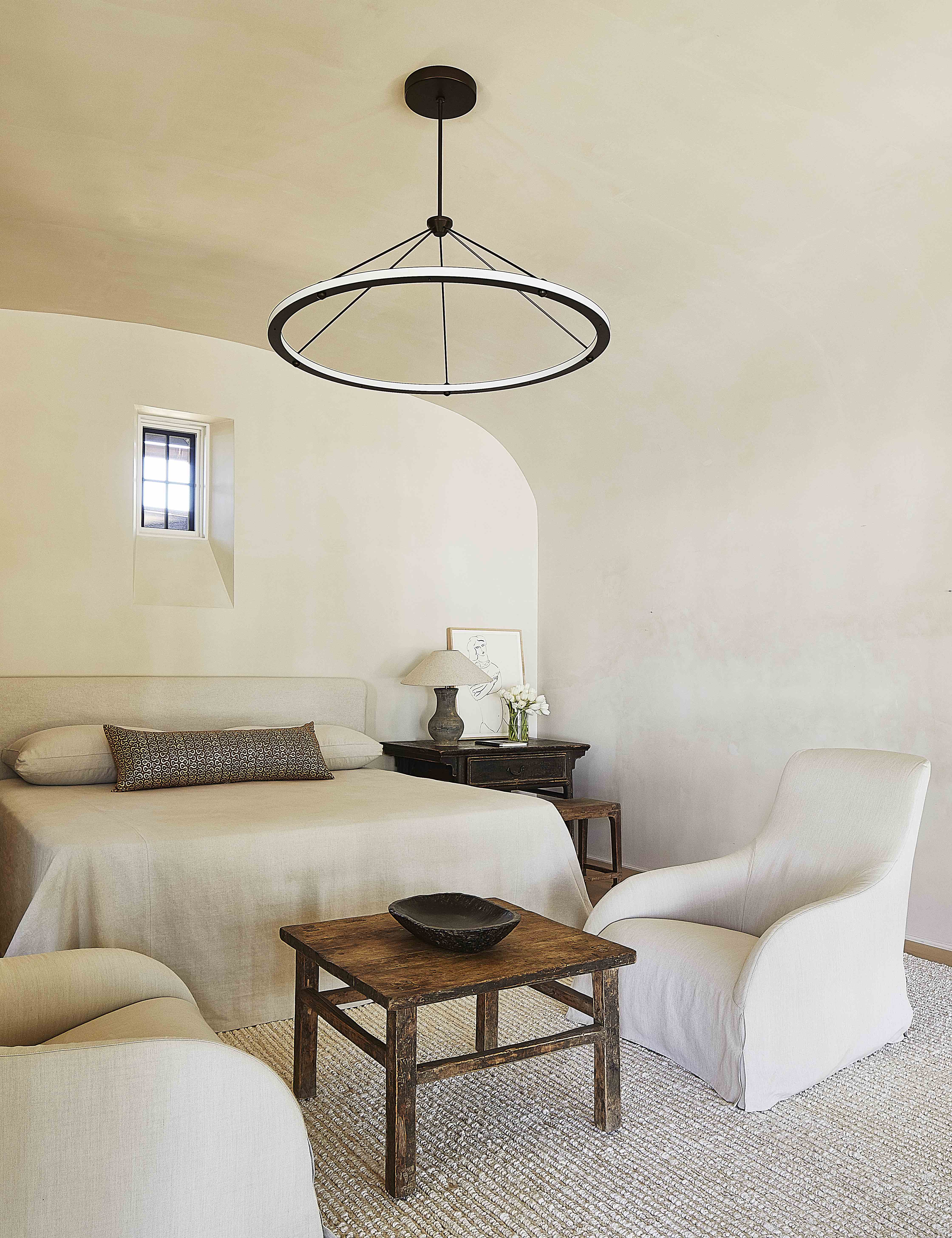
Room by Betsy Brown Interior Design
As with rhythm in interior design, to find the right synergy between disparate styles, pay attention to lines and silhouettes. “Transitional design is all about the seamless balance between the traditional and the modern,” says interior designer Alicia Murphy, noting that ornate detailing found in classic design is usually "cleaned up" in transitional interiors.
This is especially evident in furnishings, as rounder shapes and silhouettes found in traditional design — such as turned legs and arched backs — are paired with the clean lines of modern furniture design — such as crisp edges and simple shapes. Together, they soften and straighten each other out, creating a warm and timeless look. Striking the right balance between these two styles is key to creating a seamless connection, resulting in a relaxed yet sophisticated blend. This approach offers a calm, refined take on eclectic style, as seen here in this transitional-style bedroom.
7. Add a modern touch to millwork and wainscoting
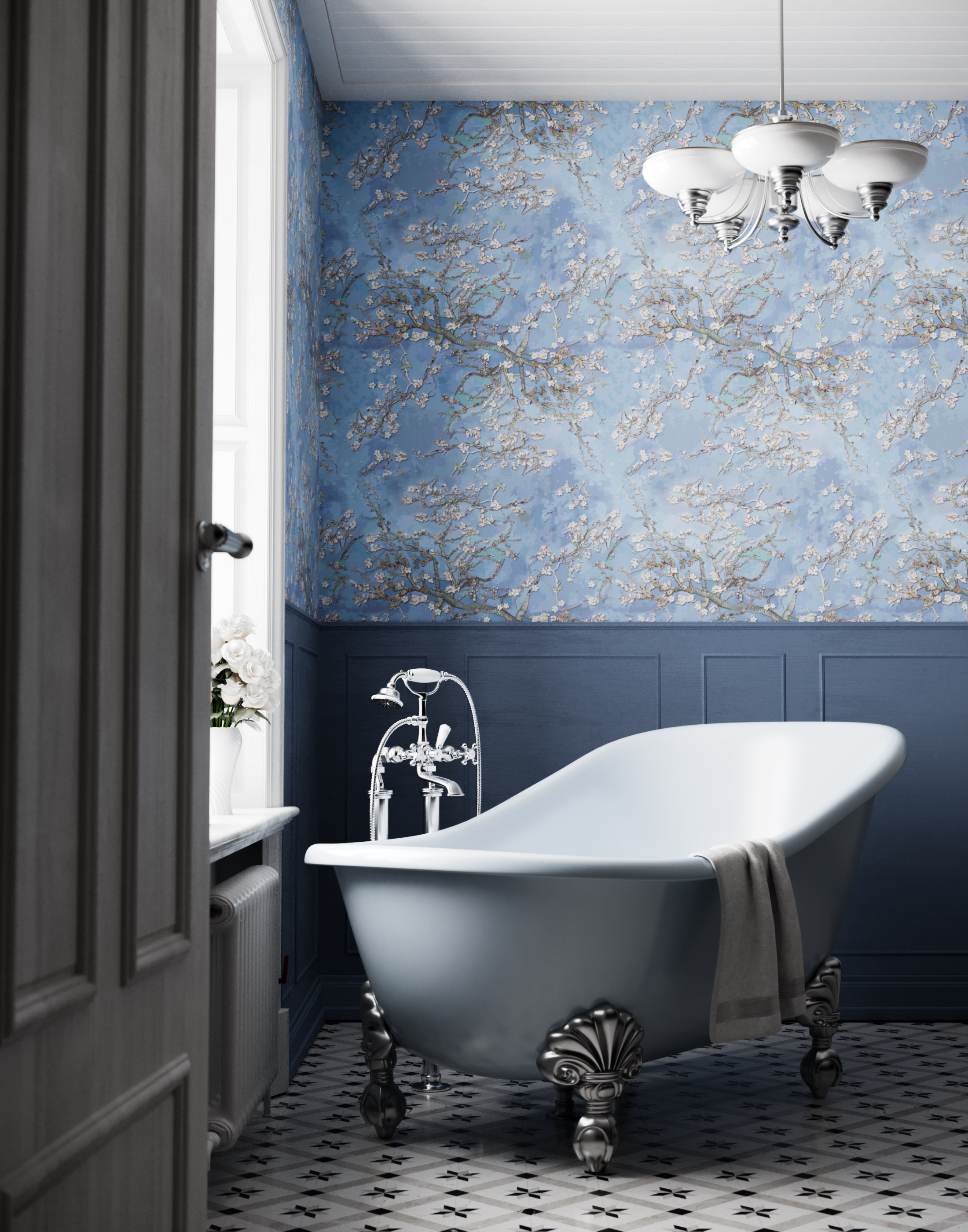
Transitional style breathes fresh life into traditional designs, creating a harmonious balance between timeless elegance and contemporary trends. One of the simplest ways to achieve this is by reimagining classic structural elements.
"Painting the traditionally white millwork transcends the home into a more dynamic rendition of itself, adding a ton of fresh personality," says Raili Clasen, founder and creative director at Raili CA Design. Using a bold or unexpected color can transform it from predictable to vibrant, making your space feel both modern and grounded.
Raili Clasen adds: "Similarly, adding a printed wallpaper on the wall or above wainscotting or in paneling creates a modern version of this traditional style." These touches offer a modern interpretation of traditional motifs.
8. Less is definitely more
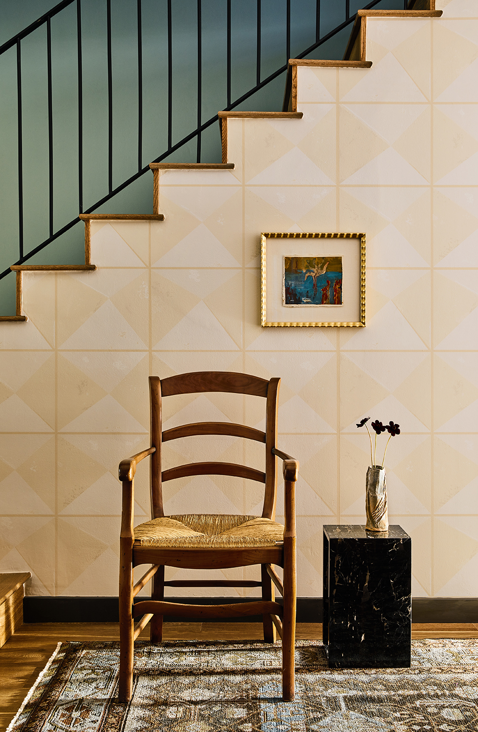
We know what you’re thinking: combining several interior styles in one space sounds an awful lot like eclectic style. But if there’s one trick that keeps transitional spaces in check, maintaining a certain level of minimalism offers the right balance. Think Scandinavian design as you keep your décor spare offers a clean slate as you bridge the gap between old and new styles.
“It is important not to over-accessorize with this look,” says interior designer Stefani Stein. “Thoughtful layers and a less-is-more approach is best when thinking about pillows and accessories.”
9. A solid rug creates a soft and balanced base
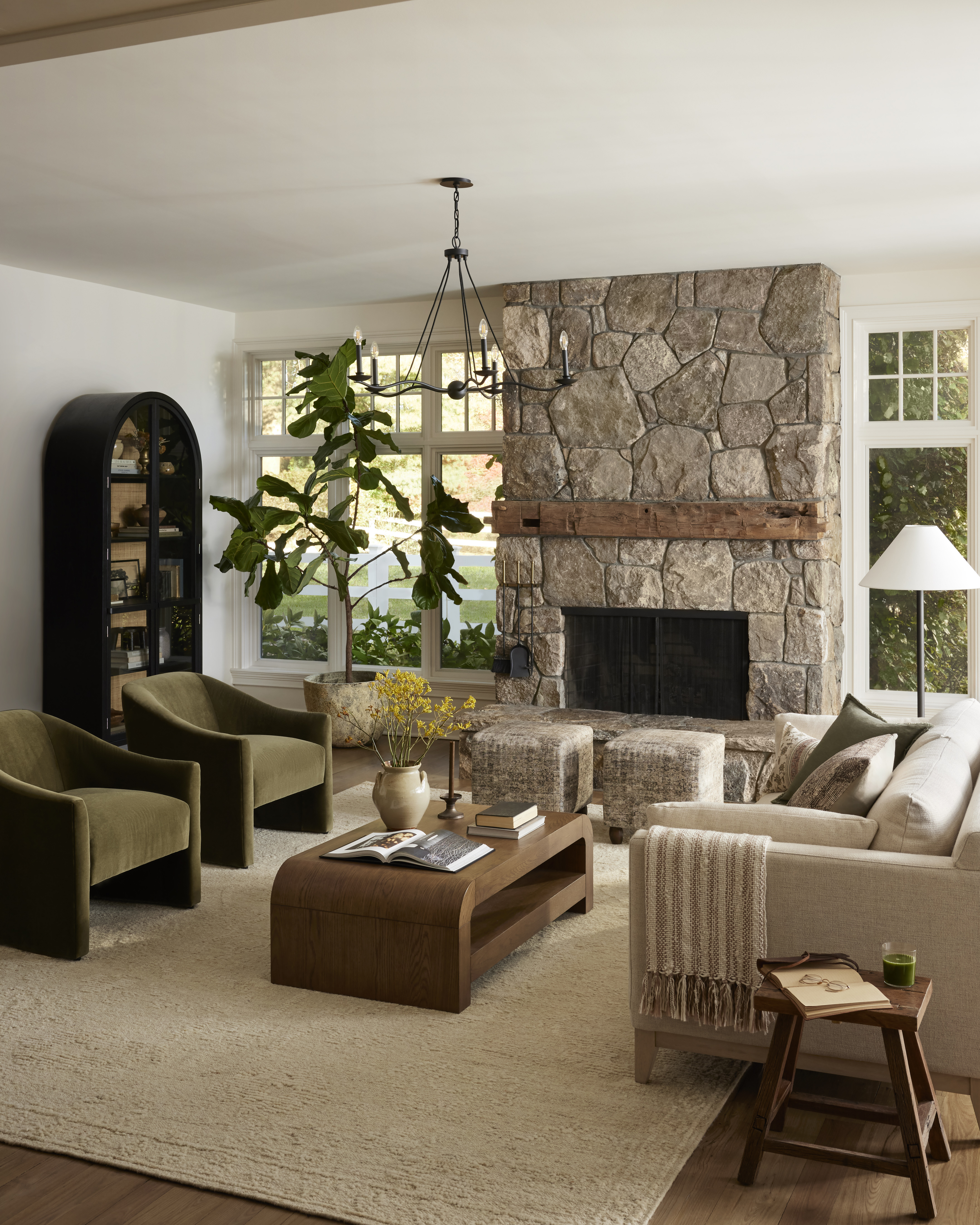
An easy way to anchor your space in a simple, solid palette is to zero in on items with the most surface area — and there’s likely no bigger item in your space than an area rug. “A darker, solid colored rug always creates a great foundation,” says Houston-based interior designer Meg Lonergan.
Covering your floor with a monochrome rug, or even a rug with a more subtle pattern or texture, will give you a clean canvas for other items.
10. Create balance with neutral classics
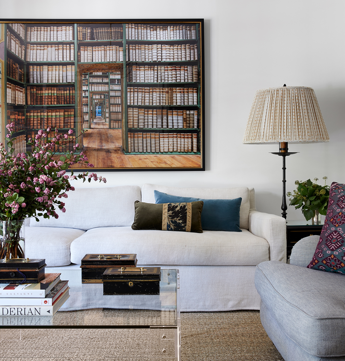
While you can pair accent pieces from different design eras, you can also reimagine timeless pieces with modern (read: neutral!) upholstery and finishes. “Classic pieces in neutrals are a great foundation for transitional design” says Meg Lonergan. In this way, neutral finishes can simplify traditional details and silhouettes that otherwise might stick out.
In the above living room, neutral classics work together to form a subtle palette. “The flax linen slipcovered sofa with clean straight lines and the lucite and glass simple coffee table are classics that will never date or go out of style,” says Lonergan. “It's easy to layer with color and pattern on simple larger pieces. Pillows, lampshades, art and accessories are easy ways to change the look of a space. Invest in classics is the most important lesson!”
11. Let a contemporary fixture light the way
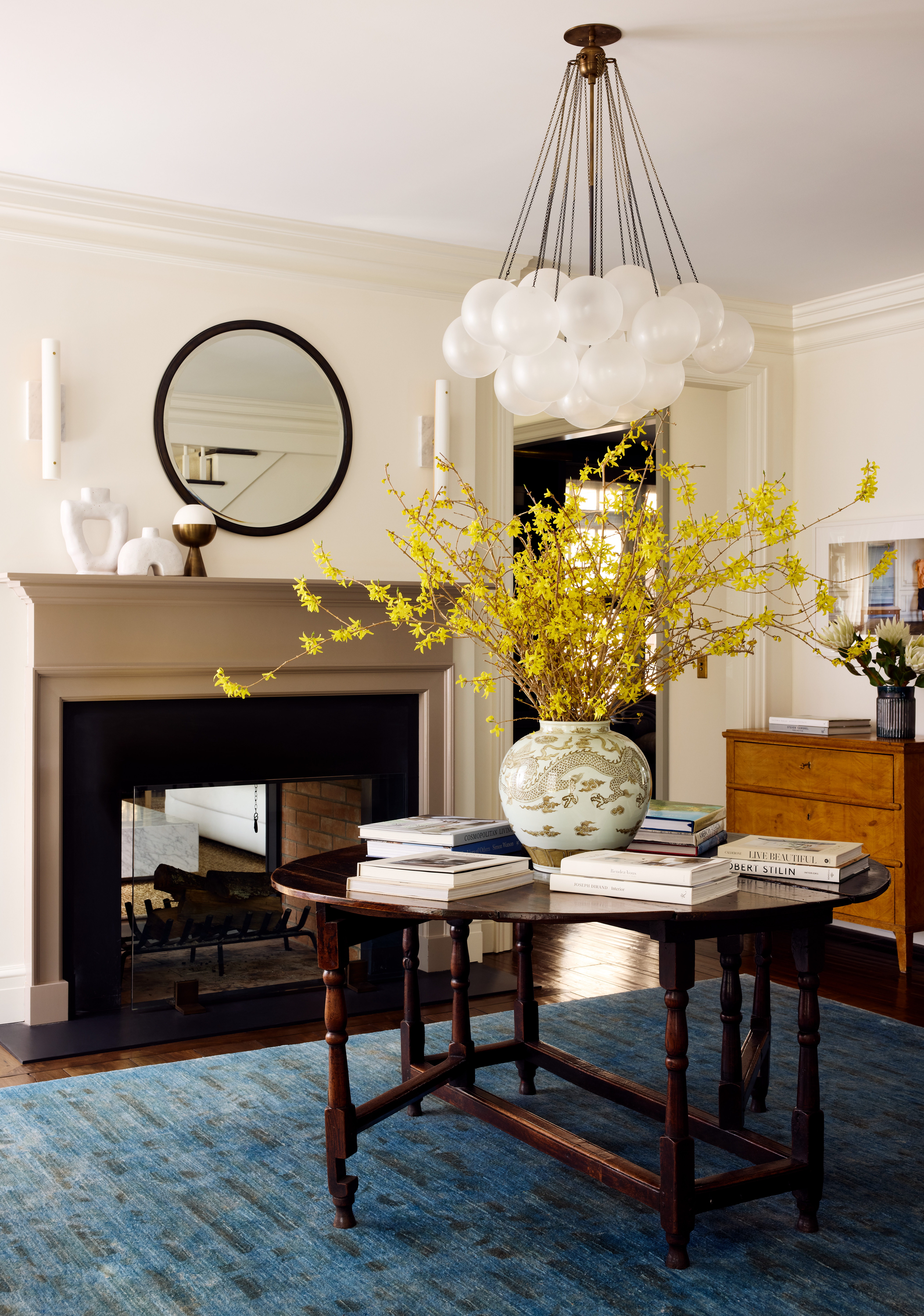
Design by Alicia Murphy
Especially when designing a space with historic architectural features, like an original fireplace, you can look to contemporary fixtures to lighten the mood and décor.
In the interior above, Amagansett-based interior designer Alicia Murphy balanced out a Federal-style mantel and table with a modern chandelier made by Apparatus. “I think this balance is best achieved when the lights have modern forms but traditional materials — think clean-lined sconces in Antiqued brass,” says Murphy. “I always think to myself — what would have been in this house historically and then how do I take that item and make it have clean lines.”
12. Think about your architecture, too
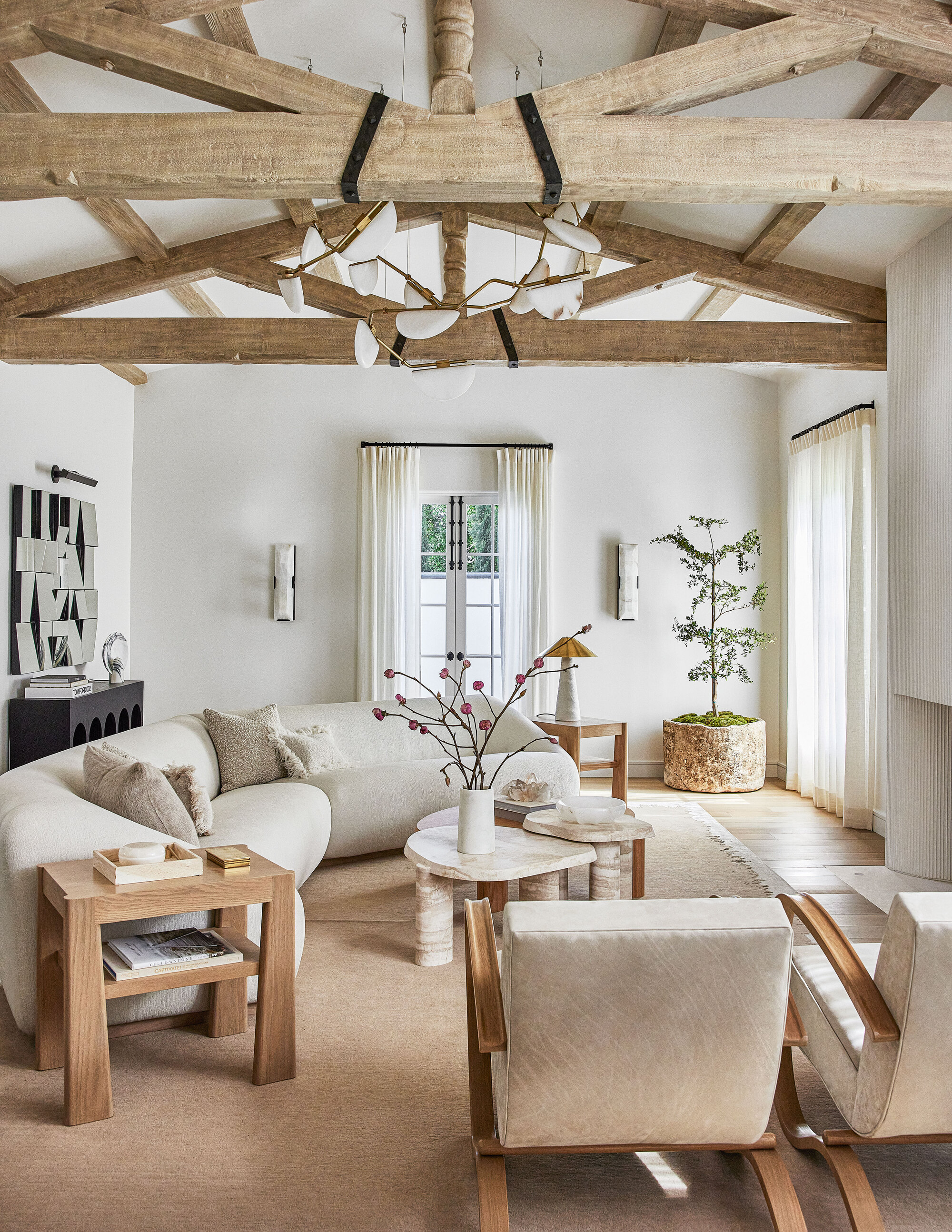
If your home’s base layer leans classic (from exposed beams to traditional wood floors and crown molding) you have plenty of latitude to incorporate clean, modern detailing.
“We always start with proportions and materials that are rooted in traditional design and then layer in modern detailing with a restrained approach,” says Joe McGuier. “We used richly textured hand-hewn beams, stone, and chevron floors in a traditional way, which allowed us to make the cabinetry and detailing of the overall room crisp and minimal.”
"If your starting point is an architecturally traditional space, you’ll want to look for chunky, modular furniture," recommends interior designer Christine Jahan. The above living room, located within a reimagined farmhouse, uses modern furniture to balance out the home’s historic bones in a true transitional style.
13. Pick muted and subdued hues
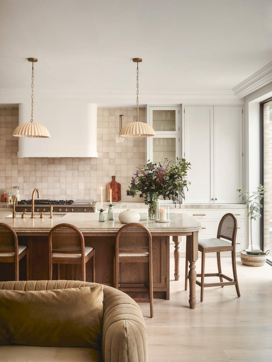
While we often see transitional style interiors in neutral palettes, a gentle use of color goes a long way. “Colors can work nicely with transitional design — it isn’t just about neutrals,” says Stefani Stein. “However, the color palette should be tonal, muted, or more subdued; avoid bright pops or overly cheerful hues.”
In this transitional-style kitchen, the balance of different woods and muted tones create a blend of modern and traditional elements. The modern wooden floor complements the darker wood of the island and chairs, while the muted green-brown hues of the couch and oven add earthy tones. The more traditional gold accents and beige-brown backsplash tiles enhance the warmth, tying in with the lighter floor. This careful selection of subdued colors and natural materials ensures the kitchen feels cohesive, timeless, and welcoming — perfectly capturing the essence of transitional design.
14. Avoid pieces that are too classic or contemporary, period

Of course, while you can balance two pieces of décor from extreme ends of the spectrum, it’s best to pick items with more common ground. "I would steer clear of anything that leans so strongly into a specific style that it looks out of place paired with pieces from other periods,” says interior designer Martha Mulholland. “A heavily carved and gilded rococo console may only mix well with a brightly colored Memphis Milano lamp at the hands of a seasoned decorator with an adept ability to juxtapose periods.”
In the collected, relaxed living room above, designed by Stefani Stein, a range of styles share the same space without getting singled out. Stefani mixed traditional furniture with sleek, clean-lined transitional pieces, achieving a balanced aesthetic that prevents the space from leaning too far in either direction.
FAQs
What's the difference between modern farmhouse and transitional style?
Alana Marie distinguishes between the modern farmhouse look and transitional style: "Modern Farmhouse leans more rustic and cozy, with woods and shiplap walls — it evokes a warm, inviting feel. It tends to be a bit more casual and often uses earthy tones.
"Transitional style is more refined and polished. It avoids overly rustic elements, leaning more towards a clean, neutral palette. You might see streamlined furniture with classic touches, like tufted upholstery or refined wood finishes."
Whatever décor inspires you, the key to achieving transitional style lies in finding the perfect blend: maintaining the comfort and familiarity of traditional design while embracing the creativity and boldness of contemporary updates.
One final tip when designing a transitional space is to use furniture that features both classic and contemporary design elements, such as a traditional wooden armchair with a modern upholstered cushion. This subtle fusion can bring cohesion to the space, making the transition between old and new feel organic and effortless.
Keith Flanagan is a New York based journalist specialising in design, food and travel. He has been an editor at Time Out New York, and has written for such publications as Architectural Digest, Conde Nast Traveller, Food 52 and USA Today. He regularly contributes to Livingetc, reporting on design trends and offering insight from the biggest names in the US. His intelligent approach to interiors also sees him as an expert in explaining the different disciplines in design.
- Lola HoultonNews writer
-
 Burl Wood Decor Is 2025’s Most Coveted Comeback — Here’s How to Get the Storied Swirls for Less
Irregularity is the ultimate luxury, but you don’t need an antiques dealer to find it
By Julia Demer Published
-
 5 Garden Features That Instantly Add Value to Your Home — While Making Your Outdoor Space More Practical, too
Get to know all the expert tips and tricks for making your backyard a standout selling point for your home.
By Maya Glantz Published
-
 This 400-Year-Old Pattern Is the Emerging Trend That Designers Are Using to Bring 'Rhythm' to Their Projects
Whether you'd describe yourself as a maximalist or someone who loves a traditional interior, this centuries-old fabric is making an undeniable style revival
By Olivia Wolfe Published
-
 "It's Time to Make Yourself a Bedwomb," a Design Expert Tells Me — Why the Smallest Bedroom Is Best and How It Can Improve Your Sleep
The cozier the space, the better your sleep will be according to this design professional. From canopies to warm colors; here is how to create a bedwomb
By Olivia Wolfe Published
-
 5 Colors Interior Designers Warn Will Date Faster in 2025 Than Paint Can Dry
We're here for the fashionable but not the transient: these are the colors that won't hang around long enough this year for you to invest in them
By Olivia Wolfe Published
-
 Extended Headboards Are Going to Be Big in 2025 — 5 Reasons Why They Make Every Bedroom Look Bigger, Better and More Expensive
A headboard that stretches beyond just the length of the bed is the little something extra your space needs
By Olivia Wolfe Published
-
 Is 'Dusty Pink' the Most Exciting New Neutral for Kitchen Cabinets? Here's Why Designers Champion This "Warm, and Space-Expanding" Shade
Everything you need to know to give your kitchen cabinets the refresh they deserve
By Olivia Wolfe Published
-
 A Designer and Trend Forecaster Shares Her Style Predictions for Kitchens in 2025 — They're Easy Updates to Copy
Some new ideas and some reimagined classics; these unique ideas are perfect for anyone wanting to make a statement in their kitchen
By Olivia Wolfe Published
-
 Who Said Decorating With Green Needs to Be Boring? This Bold, Chic, and Gorgeous Hue Is Set to Make a Statement
Designers share their secrets and set to inspire with this stunning tone that you'll soon want in your home
By Faaizah Shah Published
-
 A complete guide to Mid-century modern furniture – how to source the best pieces to nail the trend
Stylish, versatile and adored by many, we take you through everything you need to know about Mid-century modern furniture
By lauriedavidson Published