A quirky upside down London townhouse that's a wonderful amalgamation of ornate original details and statement modern furniture
Behind its neat facade lies something unexpected...
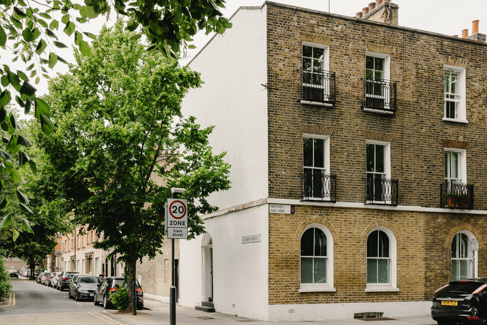
Something synonymous with so many London townhouses is their symmetry, their neatness, it's a facade that suggests order and uncomplicated layouts. But in this modern home, it's just that – a facade. Behind the perfectly proportioned sash windows lies an upside-down home, where nothing is where you expect it, and yet it also makes complete sense.
The house is situated in the heart of Whitechapel’s conservation area, in one of East London's most historic garden squares (it was the site of The Siege of Sidney Street in 1911). That history can still be felt when you step up the stone steps and walk into this home. It's still filled with all the original quirks, they've just had an equally quirky modern update...
Hallway
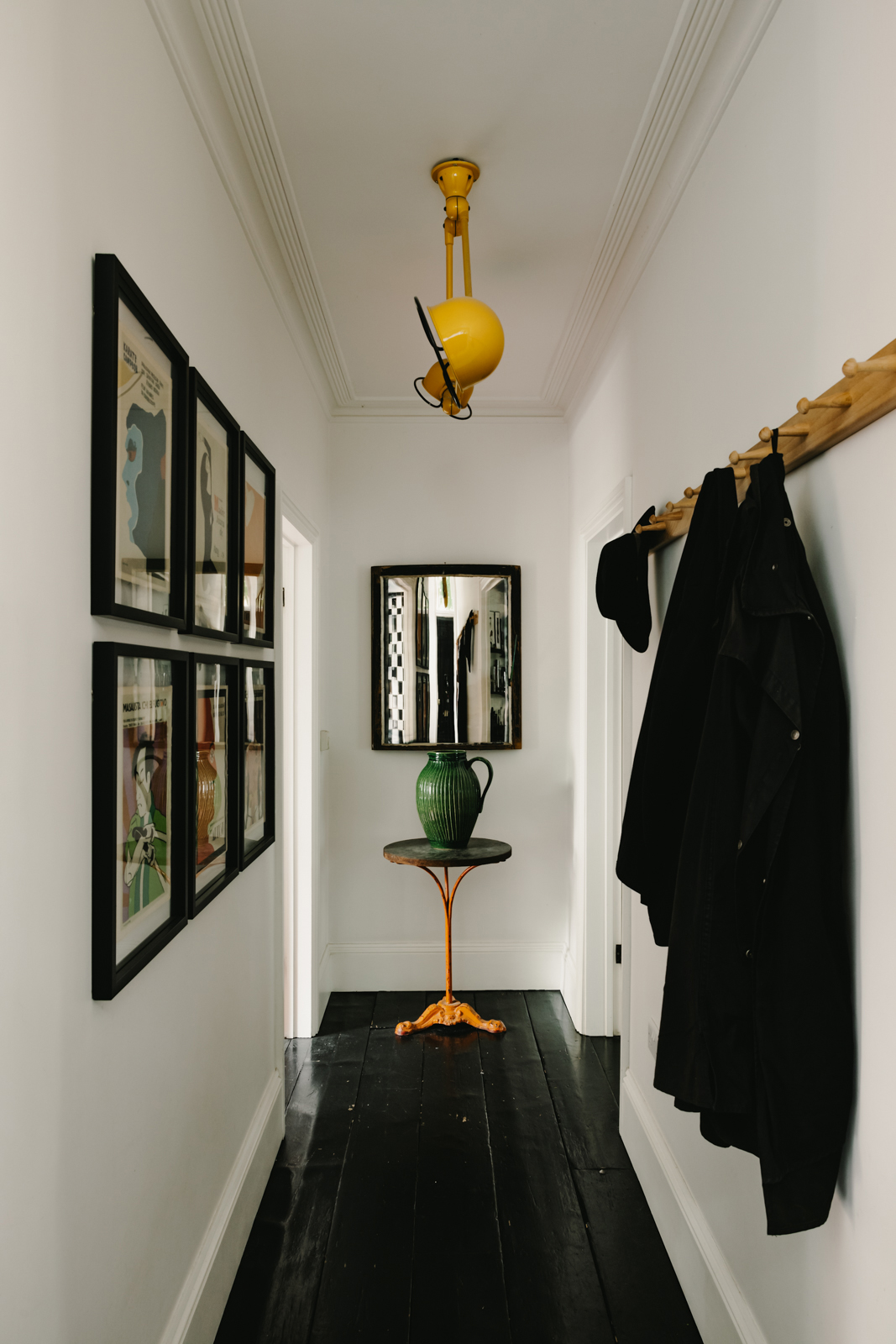
Push open the gloss black front door and you are in the elegant narrow hallway where the same gloss black painted floorboards lead you into the interesting layout of the ground floor. No kitchen or living room here, in fact, there is a studio that doubles as a guest bedroom and a large family bathroom.
Studio
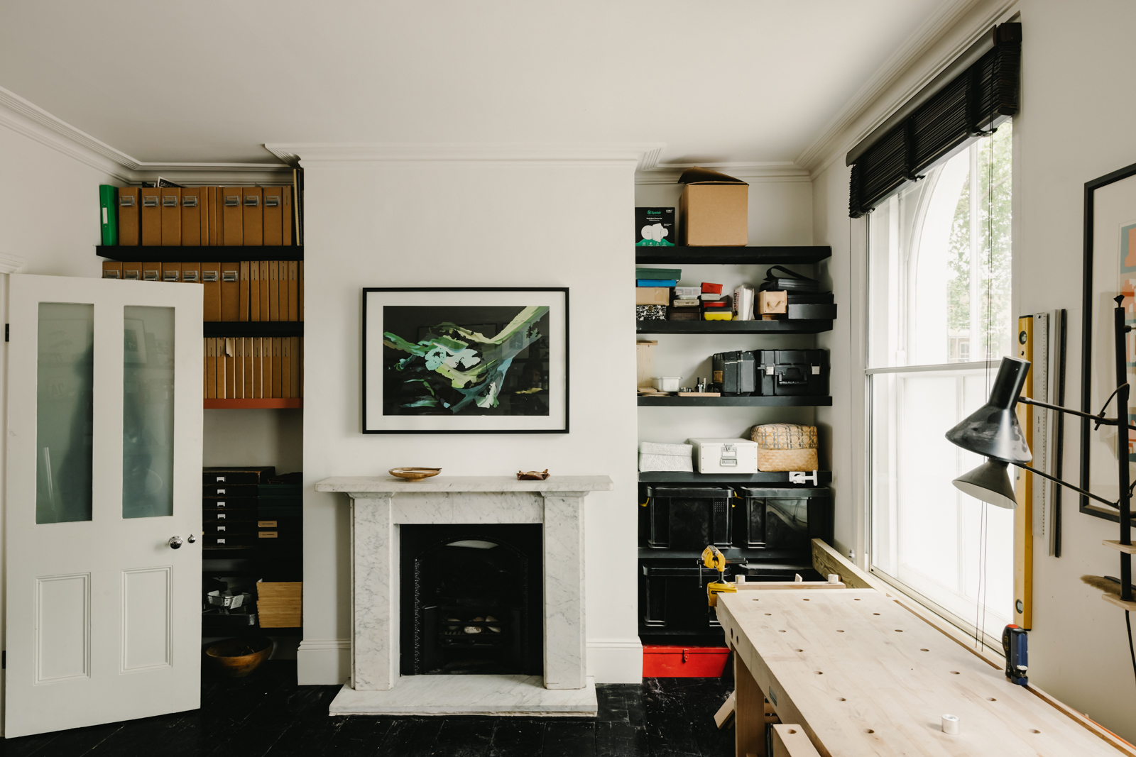
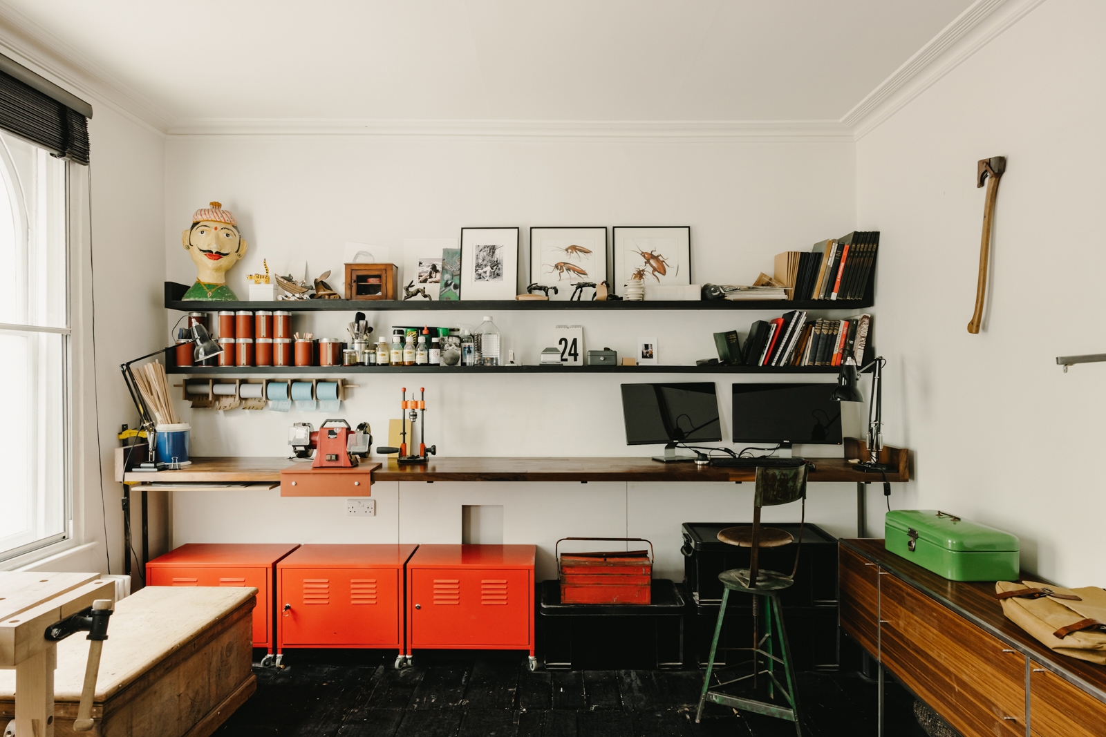
The black floorboards continue into the bedroom/studio which boasts all the original features – delicate original plasterwork, beautiful marble chimneypiece, and ornate cast-iron gate. They create a wonderful clash with the industrial vibe going on in the rest of the space and the interesting collection of knick-knacks.
Ground floor bathroom
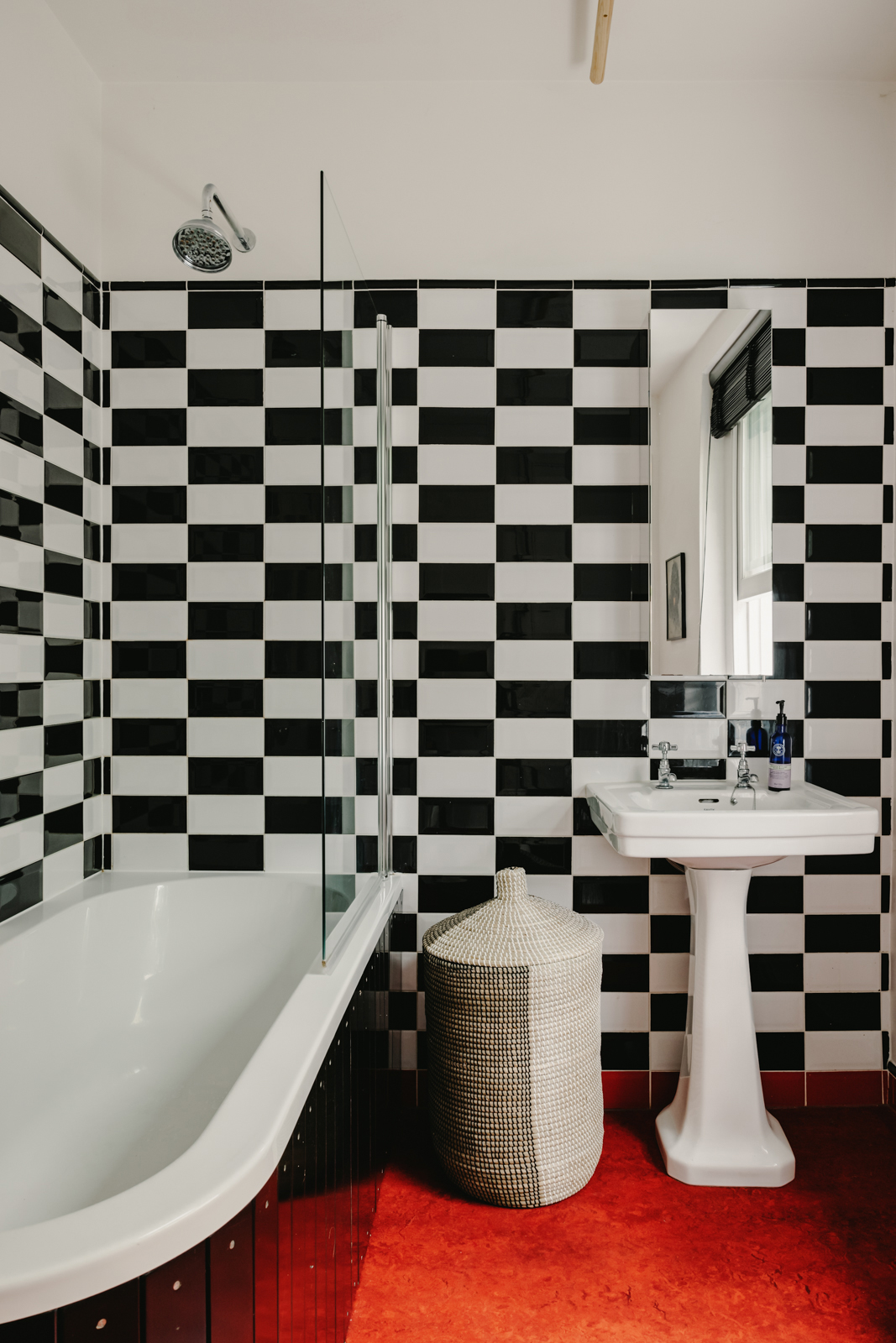
And in keeping with the unexpected nature of this home, the family bathroom is also on this floor. The bold black and white metro tiles give the room a retro feel and the red lino floor definitely has a 70s vibe, but it's no bad thing. In fact, it really works, creating a striking space that feels out of place in a very stylish way in this Grade II listed building.
- Find more modern bathroom ideas and inspiration in our gallery.
Kitchen
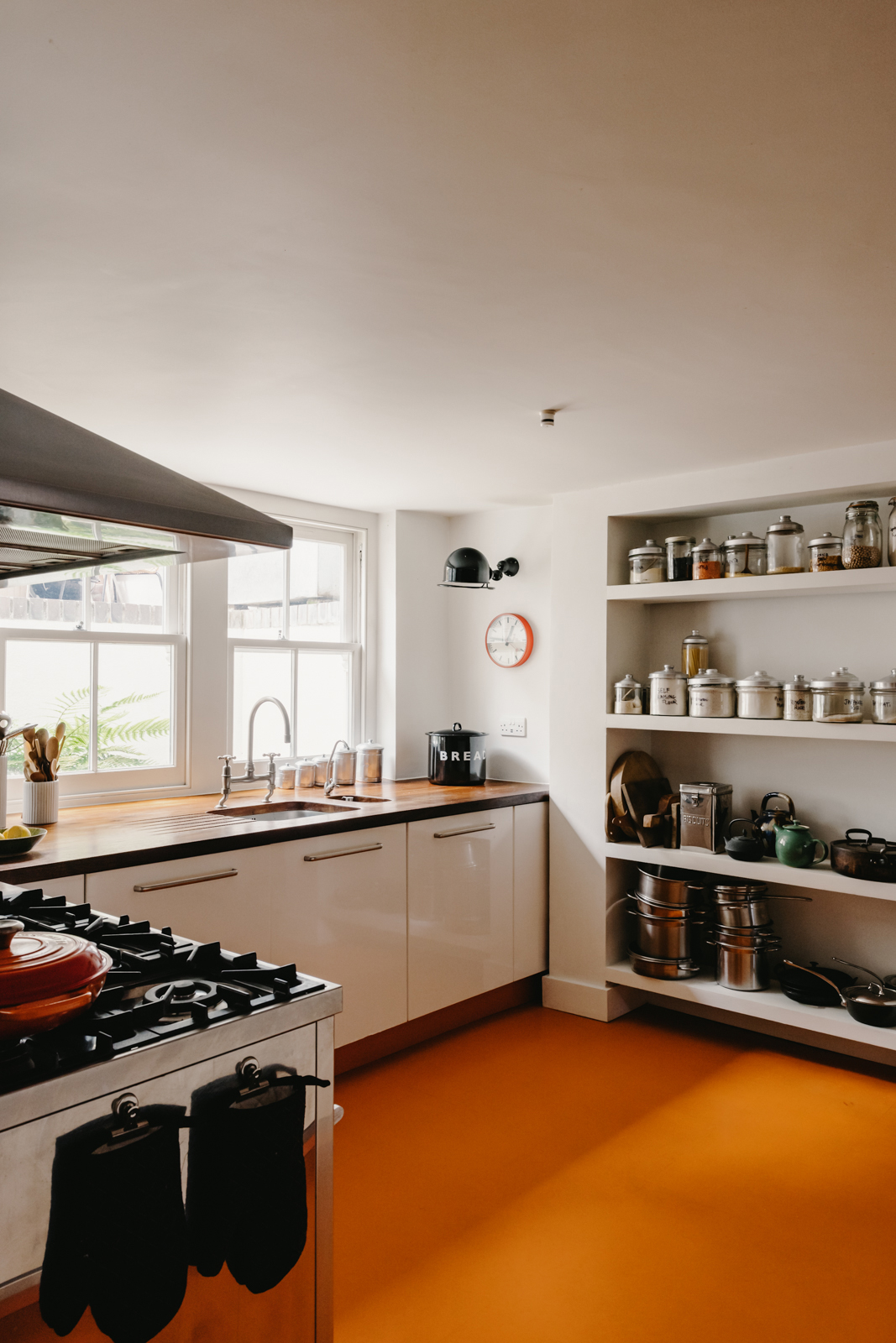
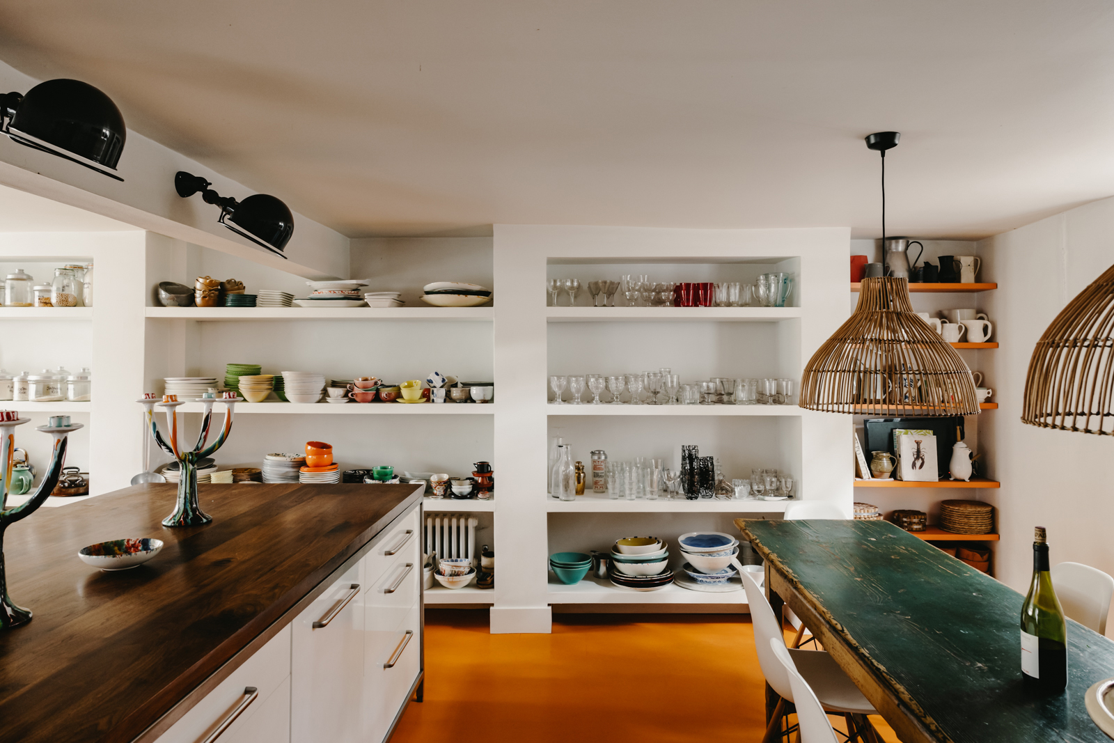
The open plan kitchen is on the lower ground floor, where the separate service rooms would once have been. Now the room runs almost from the front to the back of the property, with the exception of a small pantry. Despite being at basement level the space is still filled with light, both natural and plenty of well-planned artificial sources too.
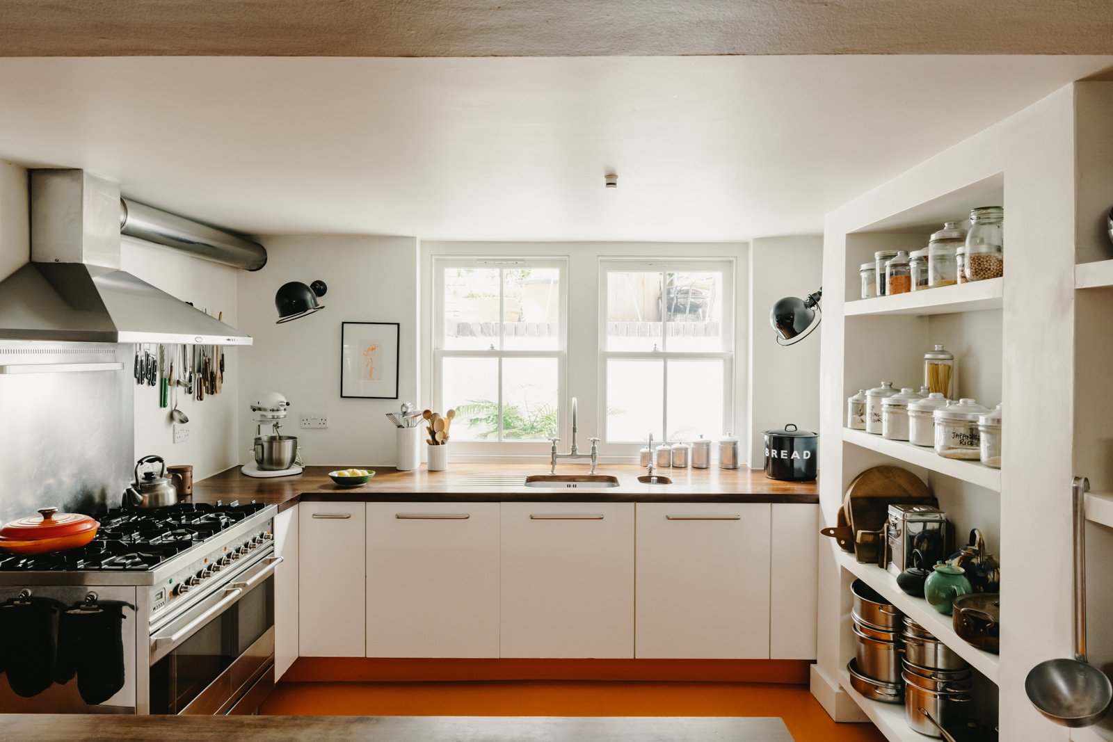
Smart walnut work surfaces sit atop simple cream cabinetry, giving a modern feel to the space, but all the eclectic decor – the open shelves crammed with beautiful crockery and glassware, the second-hand finds, and stacks of books and prints – make the space feel so rustic and lived in. The mix of these styles gives the room so much personality and the minimal style of the kitchen itself really allows for the eccentricities to be the focus.
Be The First To Know
The Livingetc newsletters are your inside source for what’s shaping interiors now - and what’s next. Discover trend forecasts, smart style ideas, and curated shopping inspiration that brings design to life. Subscribe today and stay ahead of the curve.
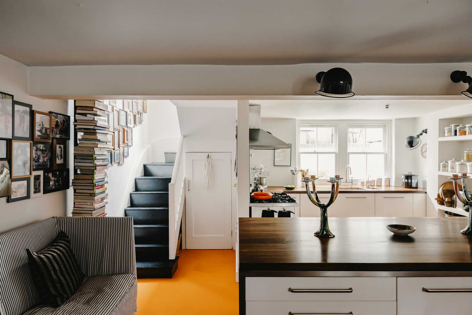
A large island sits in the center of the space, separating the kitchen from the dining space. There's a mix of old and new in the dining room too with the iconic Eames chair sitting around a rustic farmhouse table.
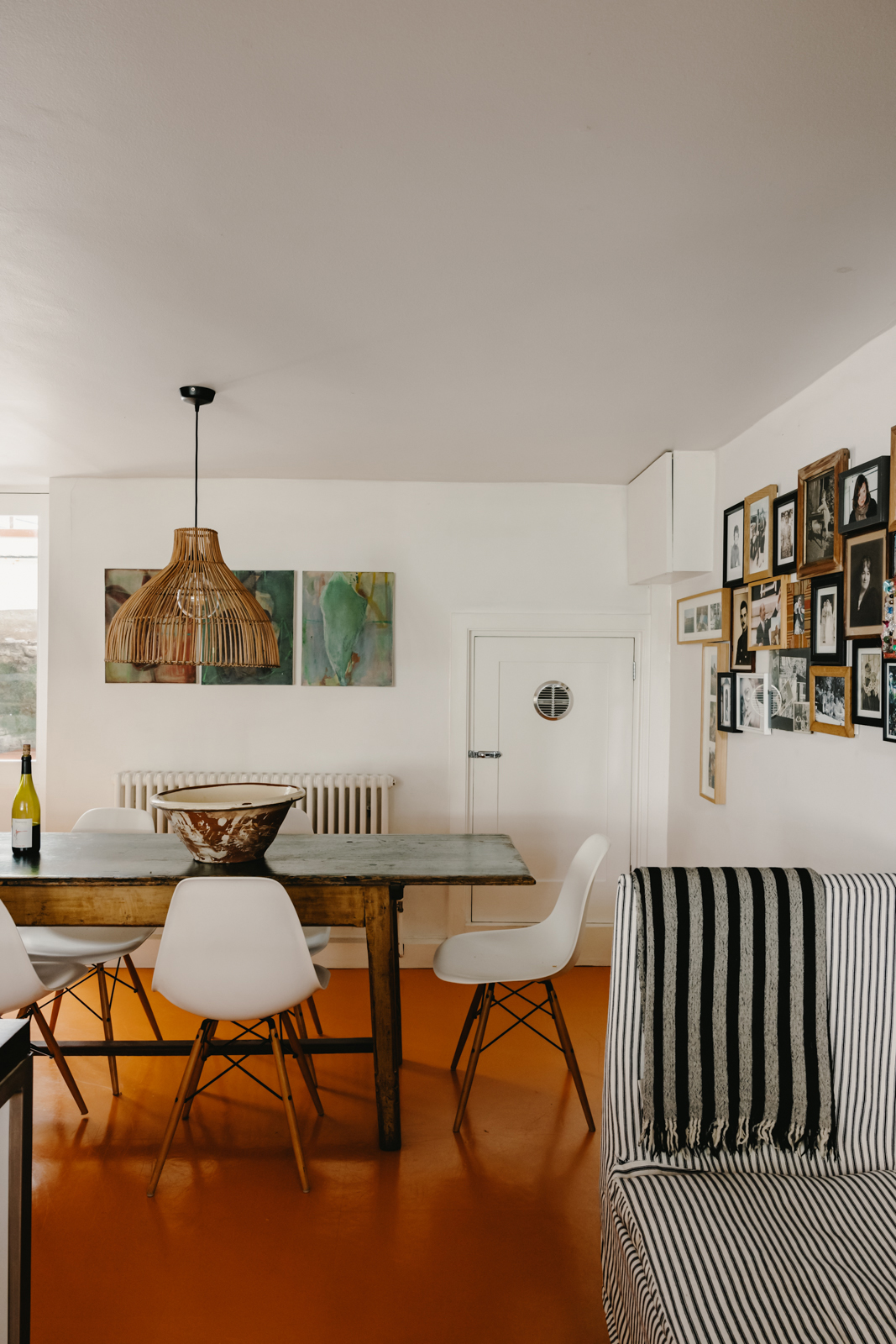
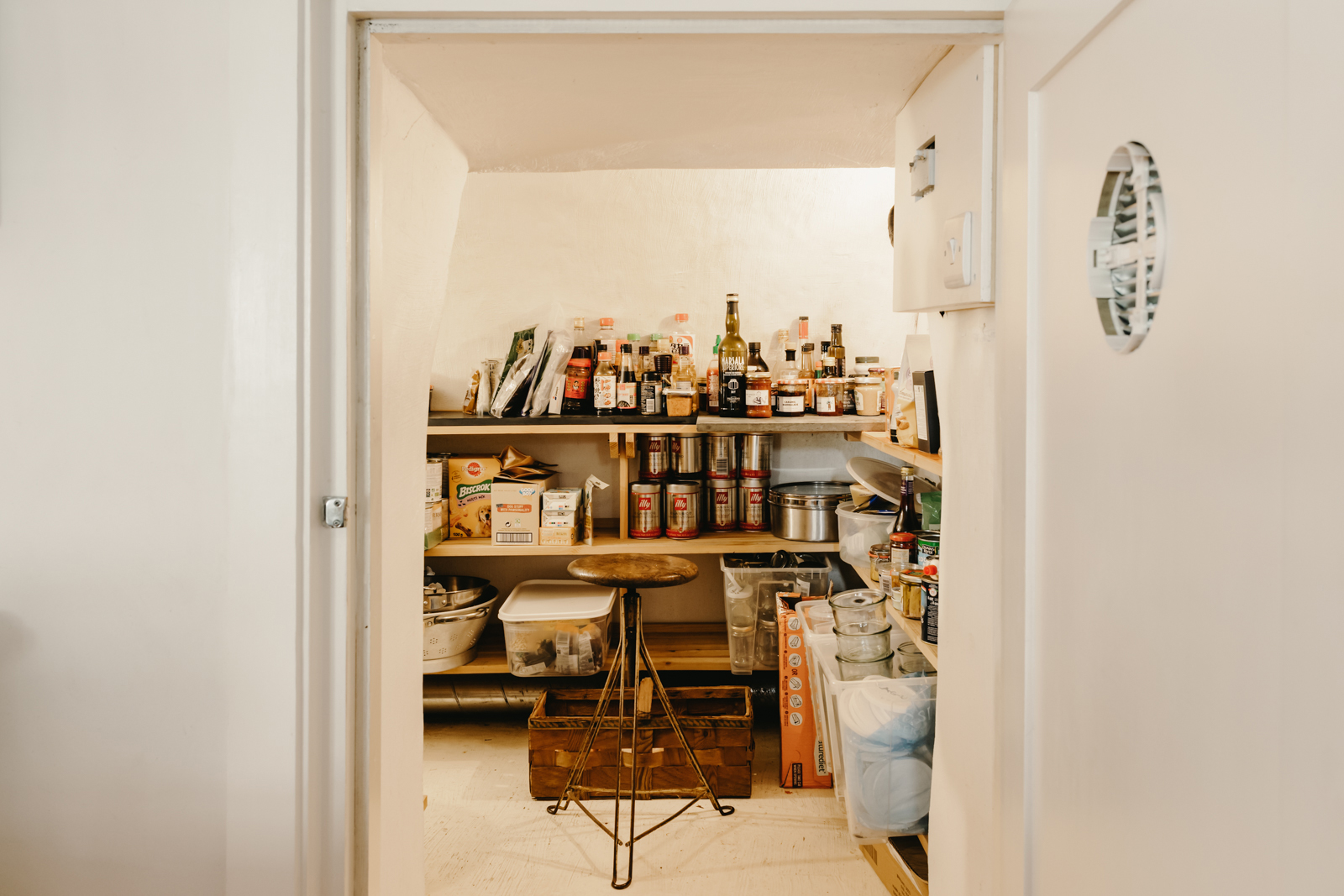
The spacious pantry is built into what was once the building's vault, only adding to the copious amount of open storage this kitchen already has. Plus, it adds to that country rustic style in the adjoining room.
- Explore more modern kitchen ideas.
Living room
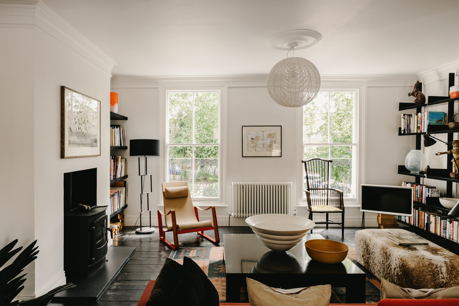
Skip up a floor to the first floor when the living room is situated. Like the kitchen, this is an open-plan space taking up the whole floor so it feels really light and airy thanks to the four full-height windows. Again, there are beautiful original details in this room too, the plaster cornicing and ornate decorative corbels under the central supporting beam, plus a large wood-burning stove.
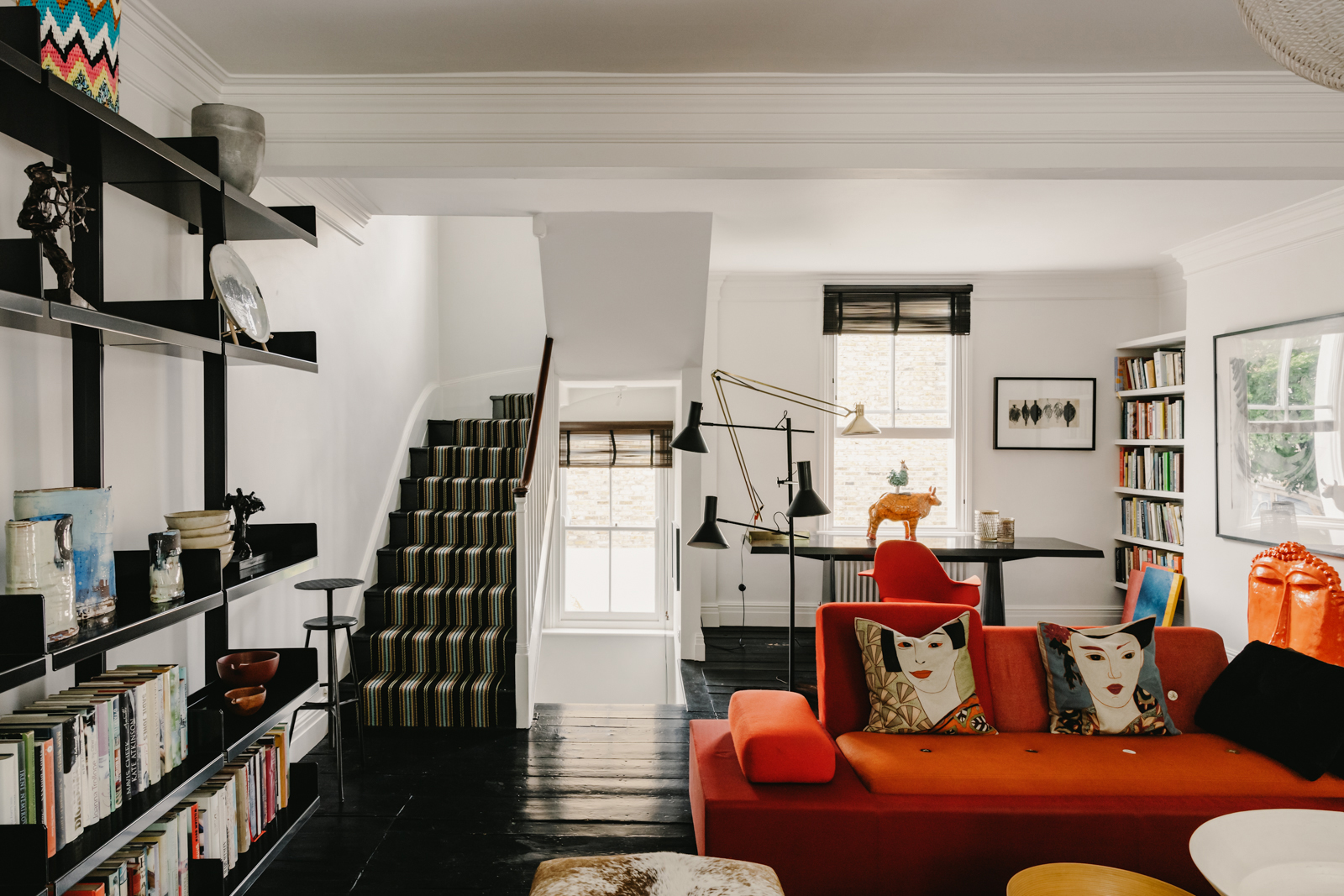
The quirky contemporary furniture juxtaposes the ornate original details with a mix of furniture styles, ranging from instantly recognizable Mid-century modern furniture shapes to more traditional pieces. The wall-to-wall open shelving allows for more space to display intriguing artwork and ceramics.
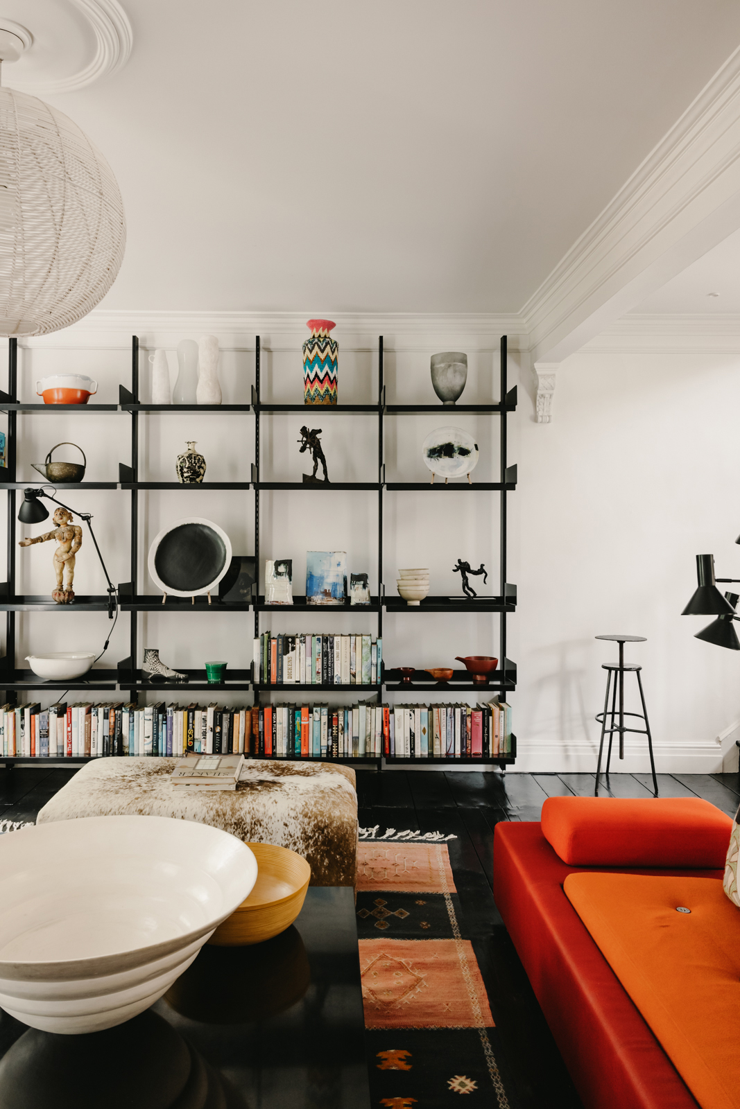
- See all our living room ideas for more inspiration.
Master bedroom
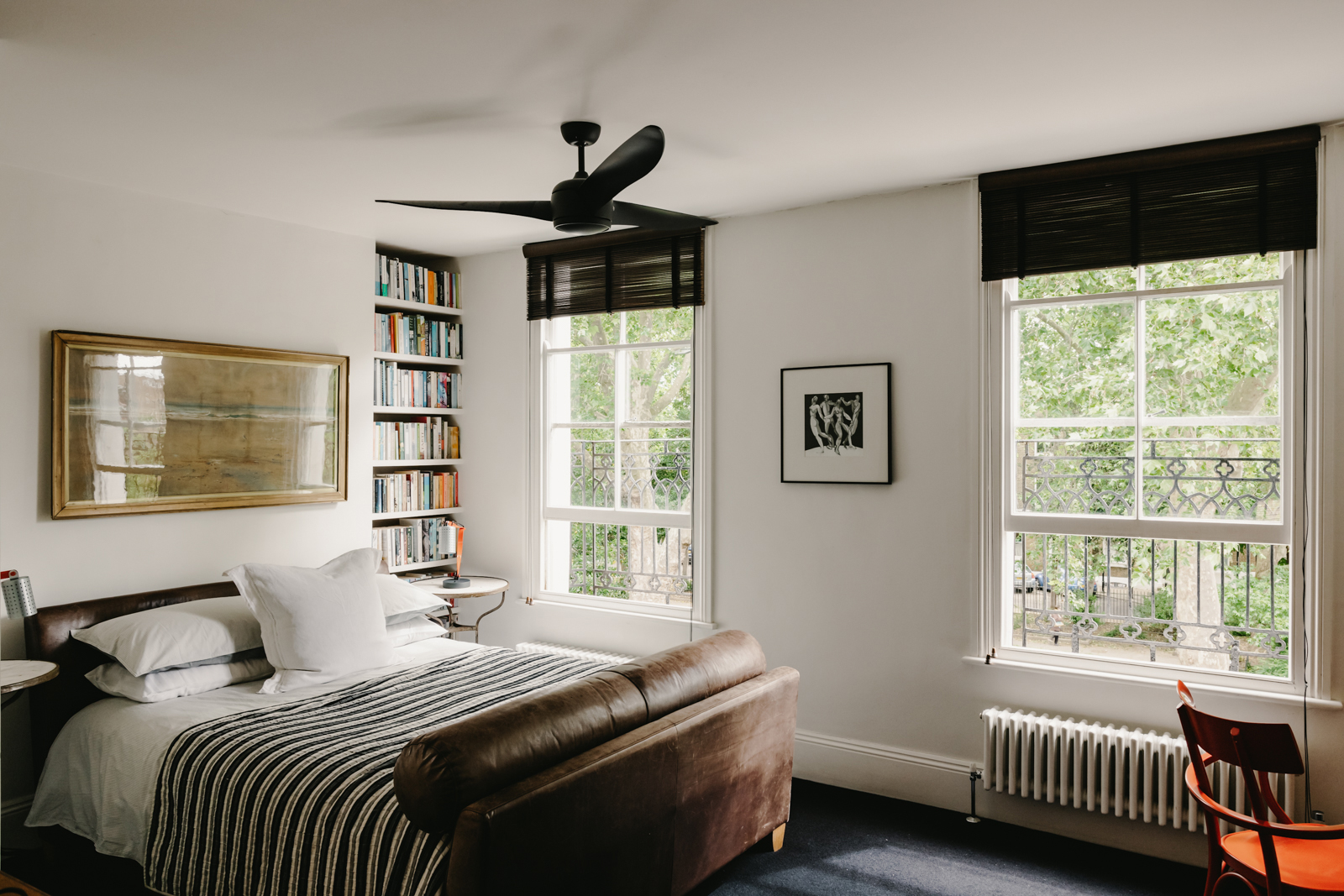
Both bedrooms are situated on the top floor with a dramatic black carpet running across the entire floor, which actually makes this small space feel larger as it doesn't appear so broken up. The bedrooms also share a Jack and Jill ensuite – the lack of square footage up here has not limited the clever layout at all.
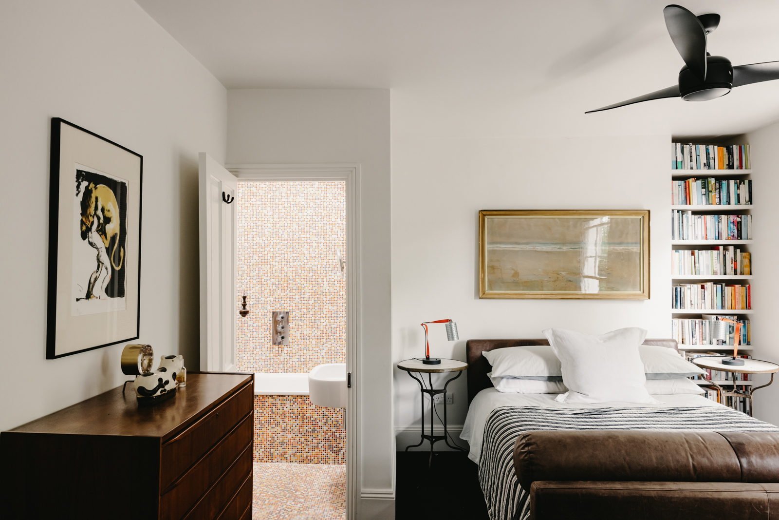
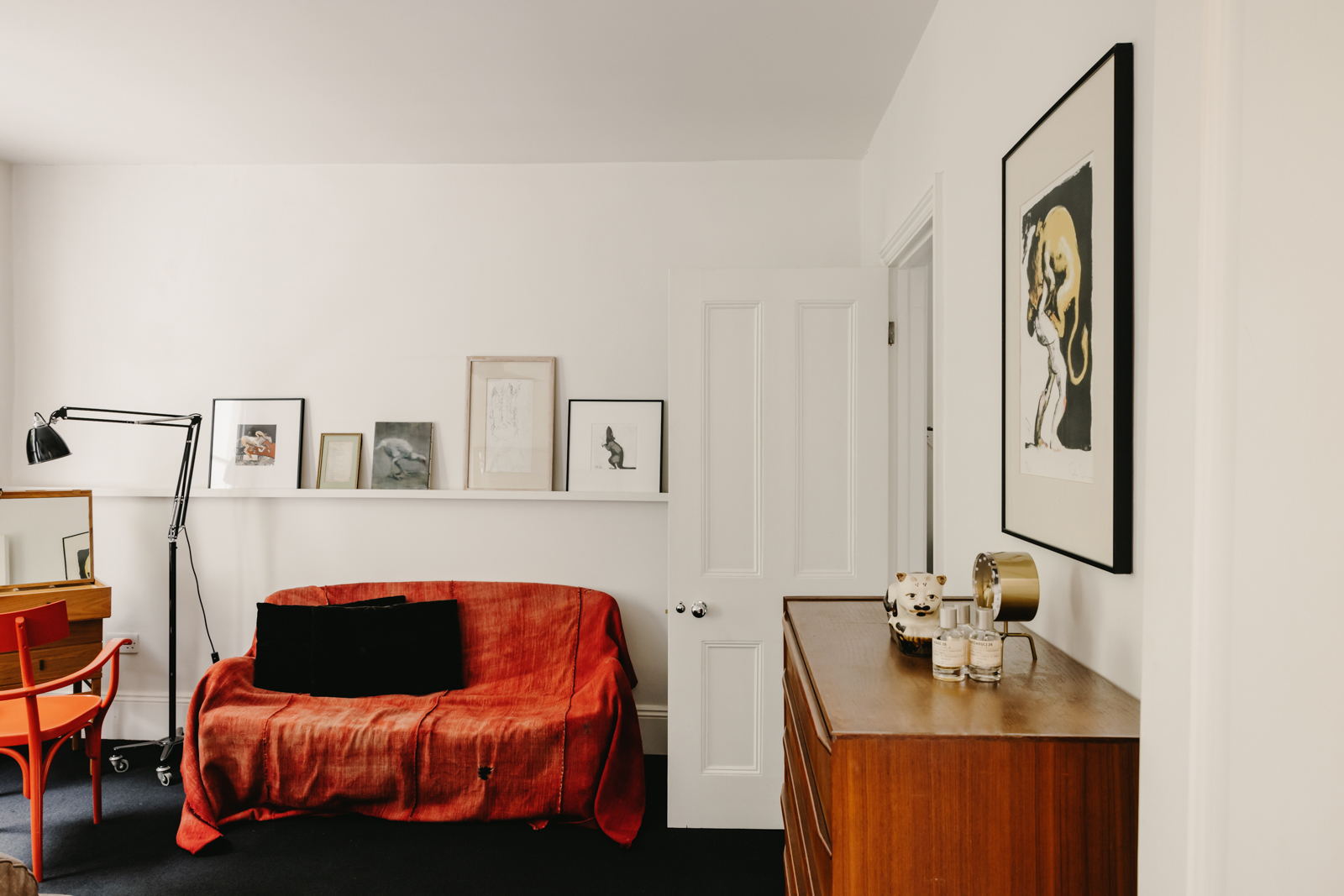
The larger of the bedrooms is kept simple, clean white walls and low slung furniture keep it feeling light and open. The bed is tucked into the recessed nook and opposite is a very compact dressing table with a bold orange chair and equally bold orange sofa. A picture rail provides plenty of space for adding prints without overcrowding the wall.
Guest bedroom
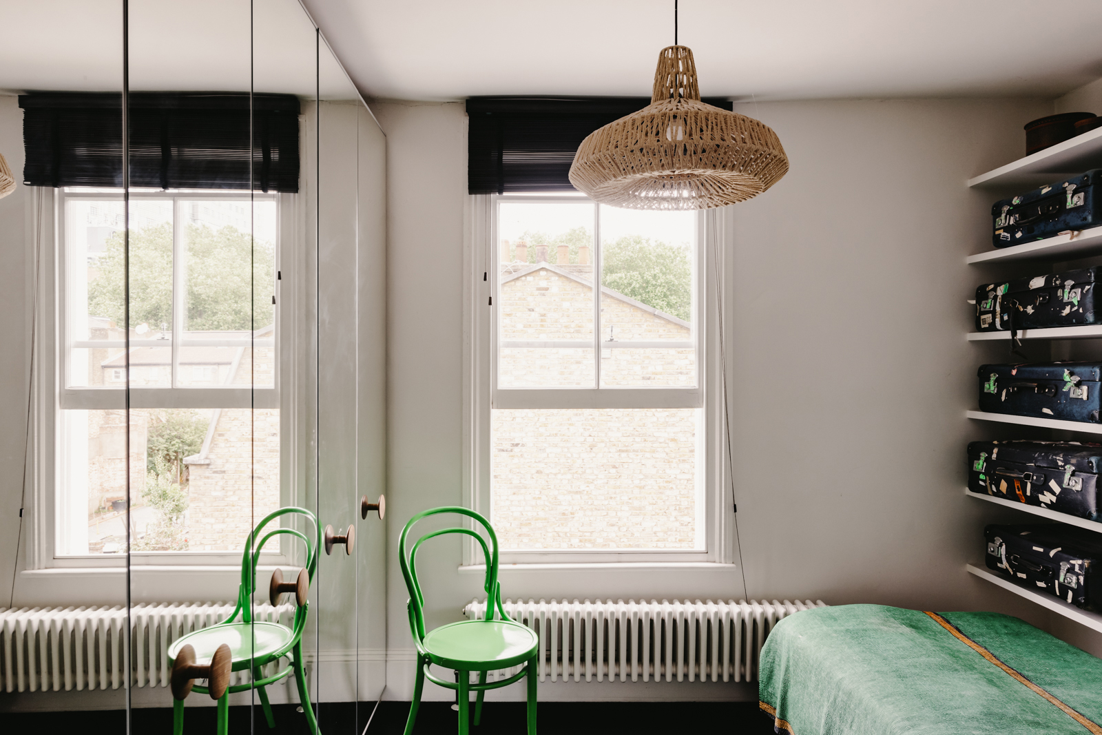
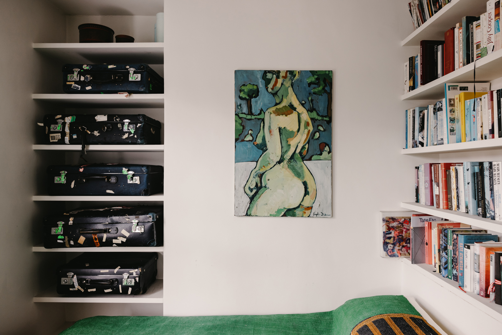
The second bedroom really is a lesson in small space design, a wall of mirrored floor to ceiling cabinetry 'double' the space and all the shelving keeps everything off the floor and doubles as a way of adding color and personality (note the vintage suitcases, slid perfectly into the alcove shelving).
- Find more small bedroom ideas in our feature.
Bathroom
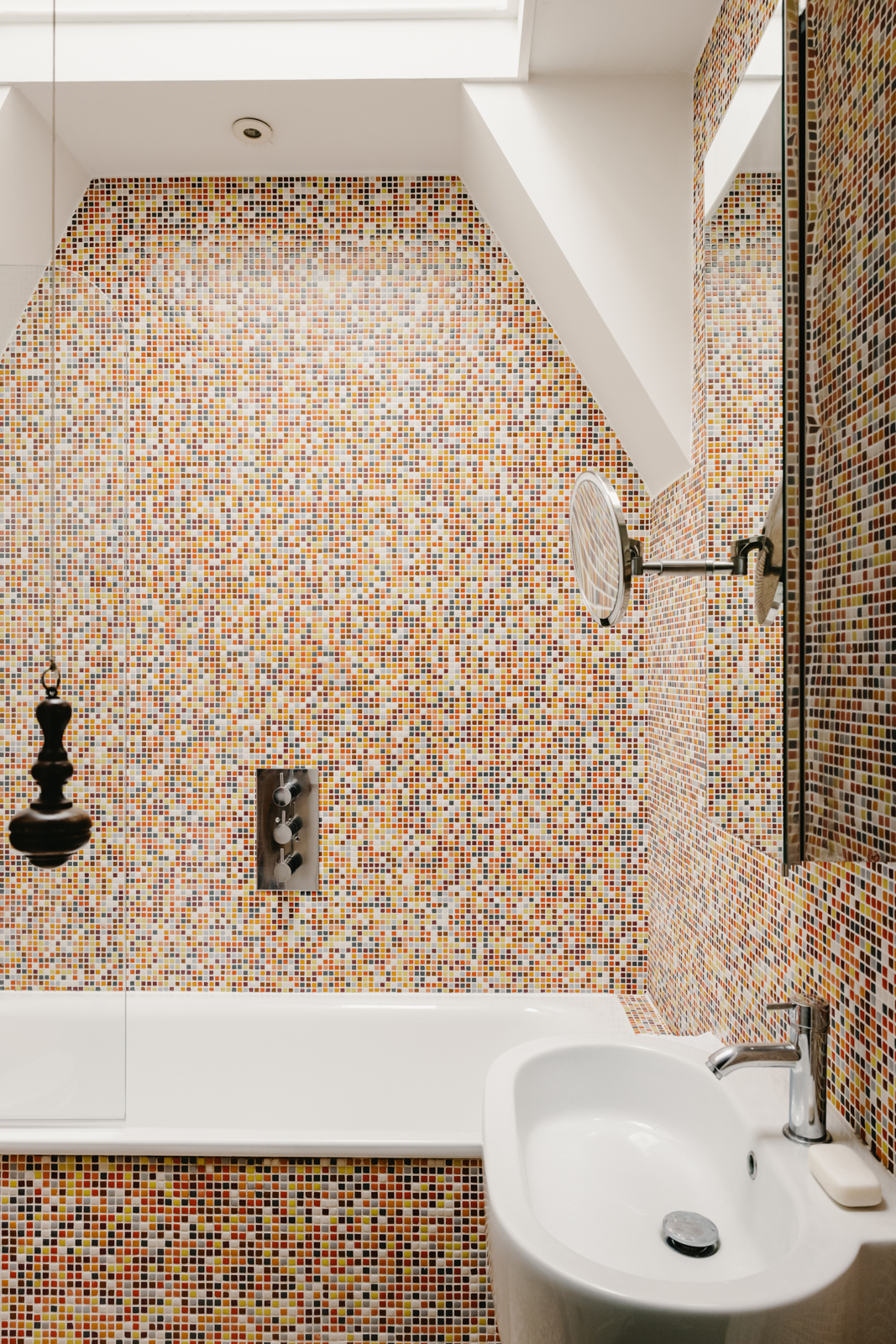
The bathroom on this floor can be accessed by both bedrooms. The walls and floors are encased in boldly colored Bisazza mosaic tiles which really work to blur the boundaries of the room and trick the eye into thinking it's larger. The huge skylight helps too, bringing in loads of light and makes for a magical space for stargazing from the well-placed tub.
Terrace
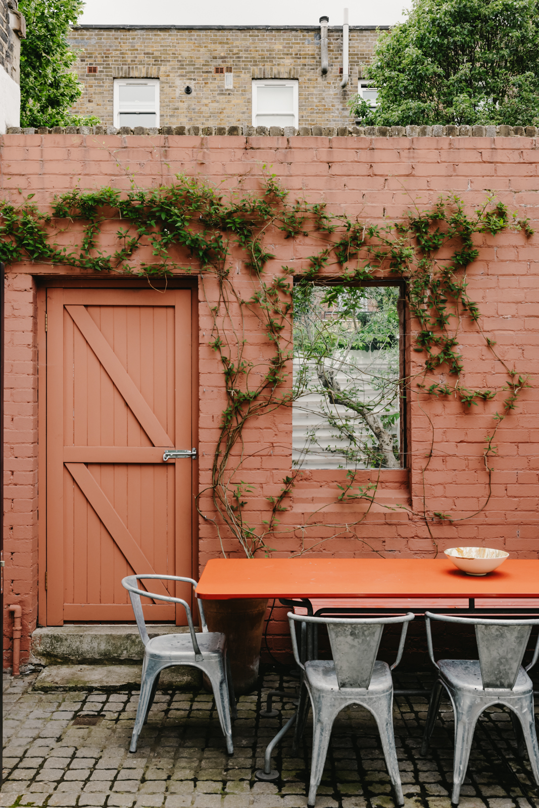
The terrace is accessed down a couple of stairs in the living room on the first floor. This west-facing walled courtyard garden, offers complete privacy, the perfect sun trap for a morning coffee or a late-night tipple. The potted plants add all the greenery you need, adding a bit of a Med-vibe to the space, and the rusty orange wall adds plenty of warmth no matter what the season.
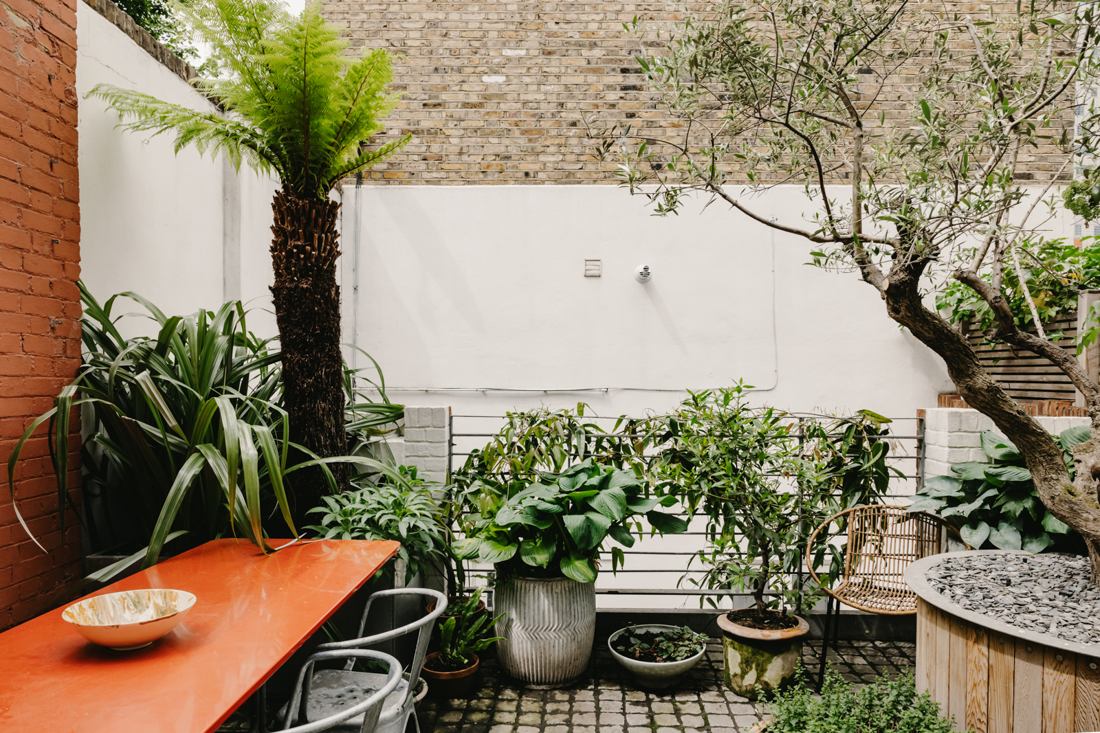
Sidney Square is currently listed for sale with Inigo.

Formerly the Digital Editor of Livingetc, Hebe is currently the Head of Interiors at sister site Homes & Gardens; she has a background in lifestyle and interior journalism and a passion for renovating small spaces. You'll usually find her attempting DIY, whether it's spray painting her whole kitchen, don't try that at home, or ever-changing the wallpaper in her entryway. She loves being able to help others make decisions when decorating their own homes. A couple of years ago she moved from renting to owning her first teeny tiny Edwardian flat in London with her whippet Willow (who yes she chose to match her interiors...) and is already on the lookout for her next project.
-
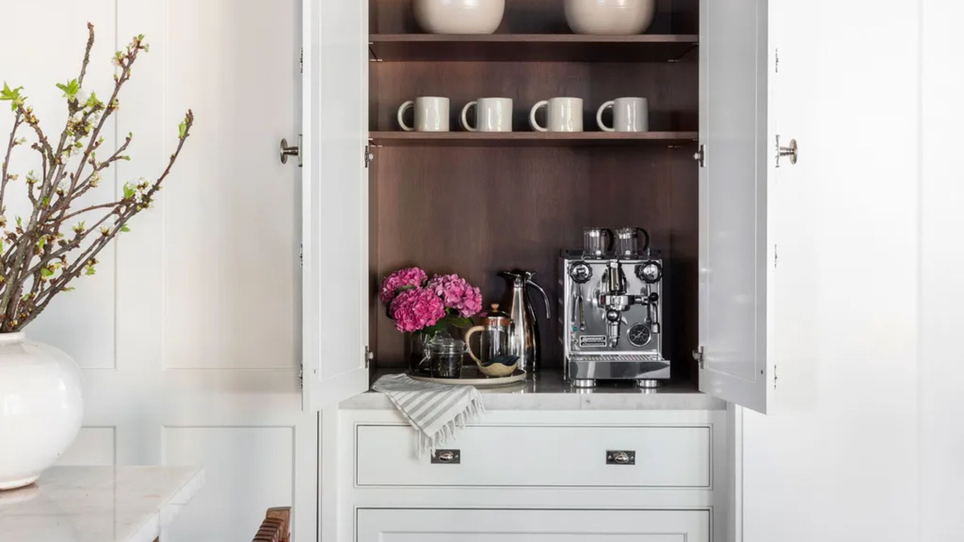 Turns Out the Coolest New Café is Actually In Your Kitchen — Here's How to Steal the Style of TikTok's Latest Trend
Goodbye, over-priced lattes. Hello, home-brewed coffee with friends. TikTok's 'Home Cafe' trend brings stylish cafe culture into the comfort of your own home
By Devin Toolen Published
-
 5 Bathroom Layouts That Look Dated in 2025 — Plus the Alternatives Designers Use Instead for a More Contemporary Space
For a bathroom that feels in line with the times, avoid these layouts and be more intentional with the placement and positioning of your features and fixtures
By Lilith Hudson Published