This dated Edwardian home has been cleverly transformed into a vibrant and practical living space
The owner architect has brought her playful touch to this formerly traditional Edwardian home, filling it with color and joy
Unrecognisable from when they bought it, the owners of this Edwardian terrace house in Wanstead completely transformed it into the modern home they enjoy as a young family today.
The ground floor has a hallway, WC, bike cupboard and formal sitting room. At the rear is a large kitchen, sitting and dining space with hidden bar. On the first floor is the main bedroom and bathroom along with a guest bedroom and en-suite. The second floor is the loft extension where both the owners have studies along with a gym room and bathroom.
Kate Clare founded Loud Architects, a creative architecture and interior design studio based in East London, in 2017 and bought this home with her partner, Gavin. ‘I always knew I wanted to buy somewhere we could renovate from top to bottom and, as a creative designer and architect, it was important that I’d be able to put my own stamp on it,’ Kate explains.
Entrance hall
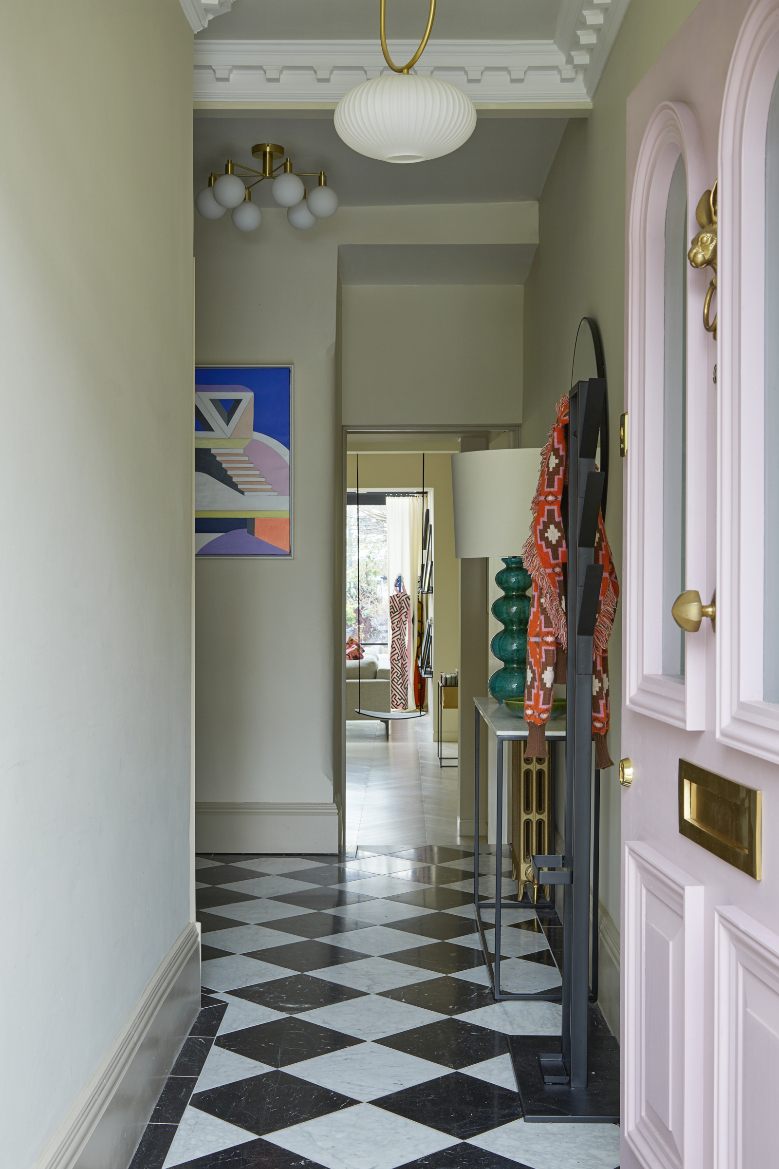
The emotive pull of Kate and Gavin's new home kicked in before the pair had even got inside. ‘I loved the Edwardian arch over the front door. We’d seen a few other potential projects, but that’s what really sold it for me,’ Kate recalls.
Such was the beauty of this curve of brickwork that she decided to use it as a motif throughout the home as she and Gavin made plans to renovate.
Kate took out a side panel to make the room for this statement pink door which stretches the width of the entrance.
Powder room
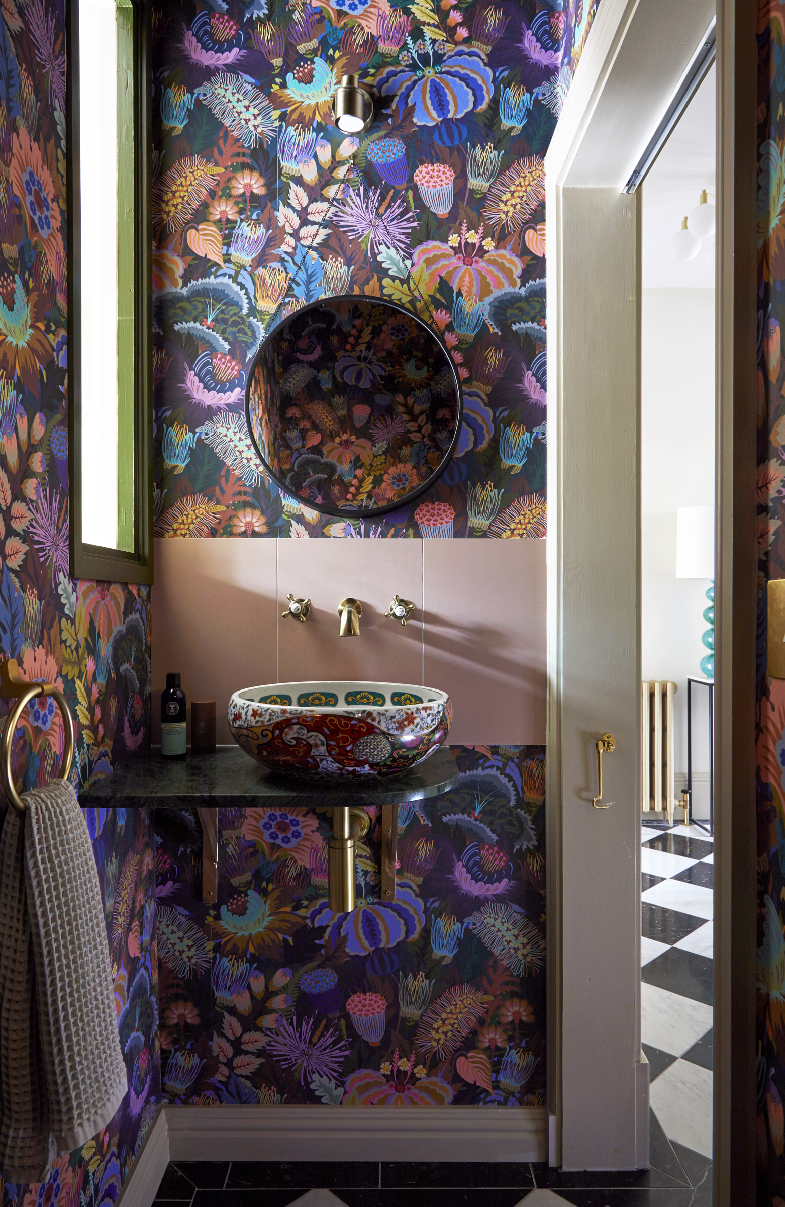
An internal window allows natural light to filter into this gorgeous powder room idea. The curve of the basin is followed in the marble shelve to ensure no hips are bumped coming in.
Be The First To Know
The Livingetc newsletters are your inside source for what’s shaping interiors now - and what’s next. Discover trend forecasts, smart style ideas, and curated shopping inspiration that brings design to life. Subscribe today and stay ahead of the curve.
Formal living room
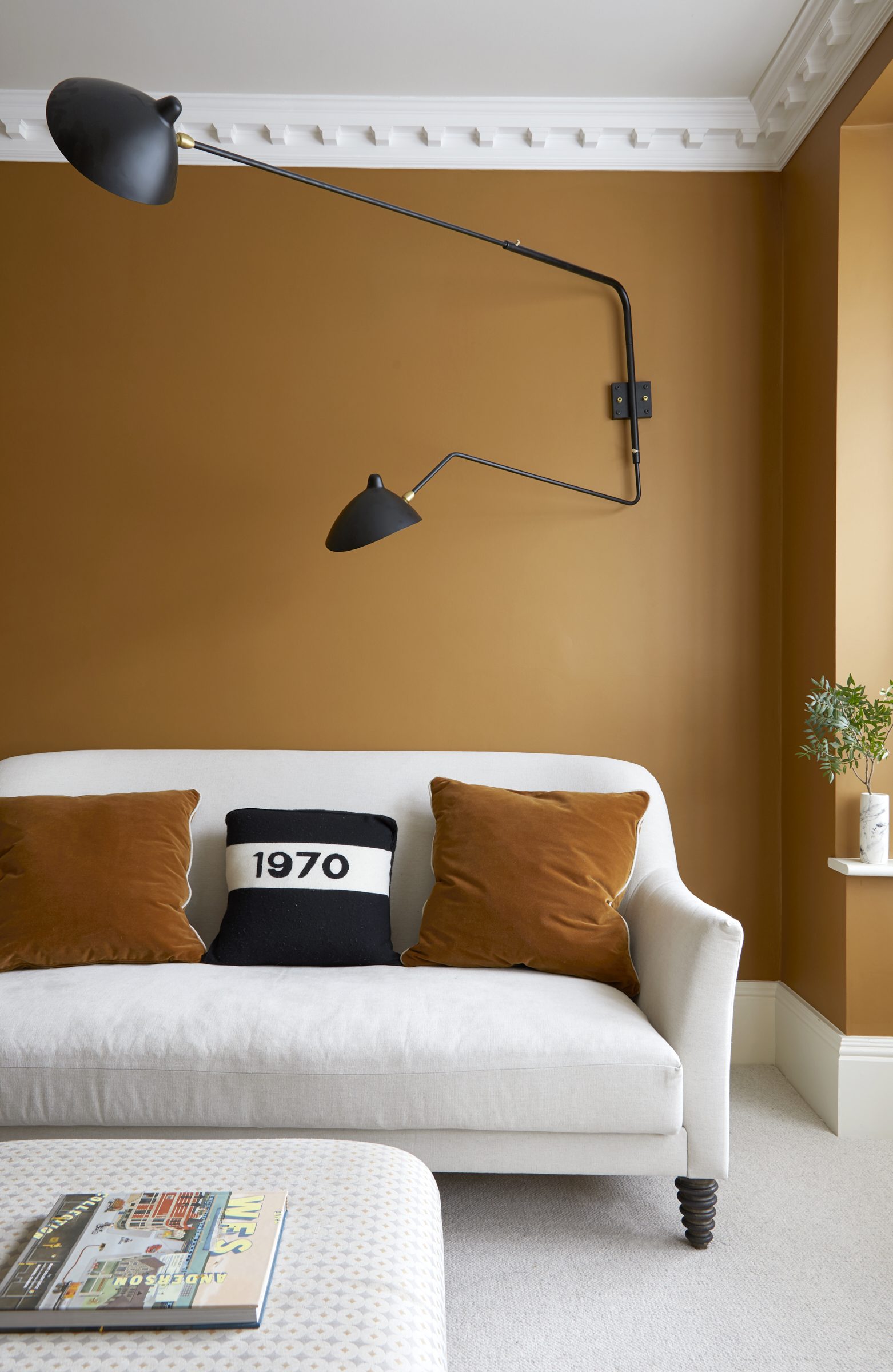
This dramatic burnt caramel shade is shown to its best advantage next to the window in this striking living room idea. The wall lamp makes a strong focal point.
Secret bar
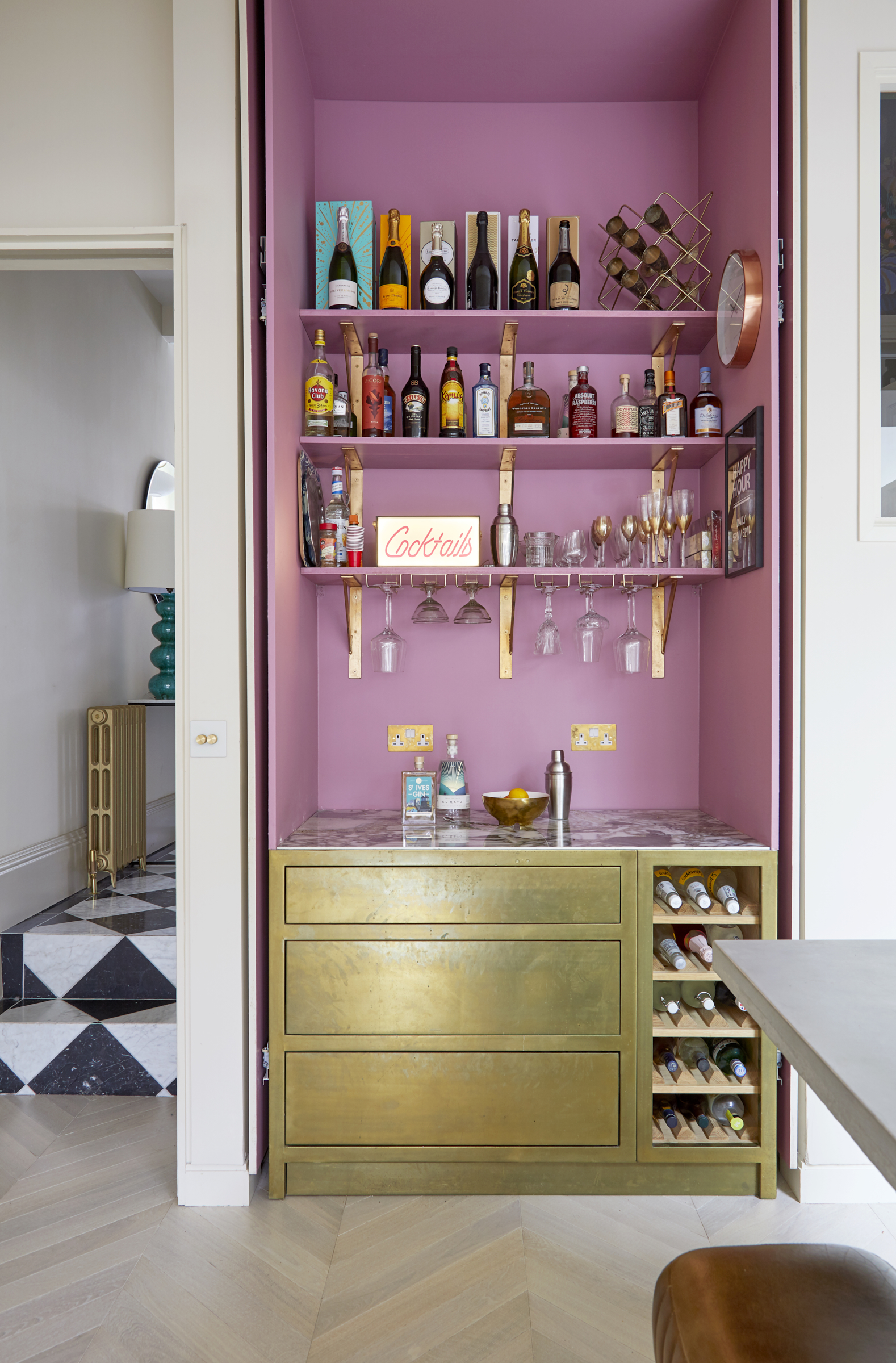
The couple created a nook for their laundry later realising that a more fun option would be to use the space for a hidden home bar idea. With a pink interior and seams of warm light under the shelves the feature sets a jaunty tone for entertaining. The gold metallic paint applied to the drawers has been adopted from shipbuilding and it brings a warm, glamorous and unusual finish.
‘This probably won’t be our house forever so I wanted to be careful with color choices. The pink can all be painted over so for example if you opted for black you would really change the look of the room,’ Kate explains.
Sliding doors hide into recesses ensuring they don’t hinder the visual impact of this alluring and fun feature.
Kitchen
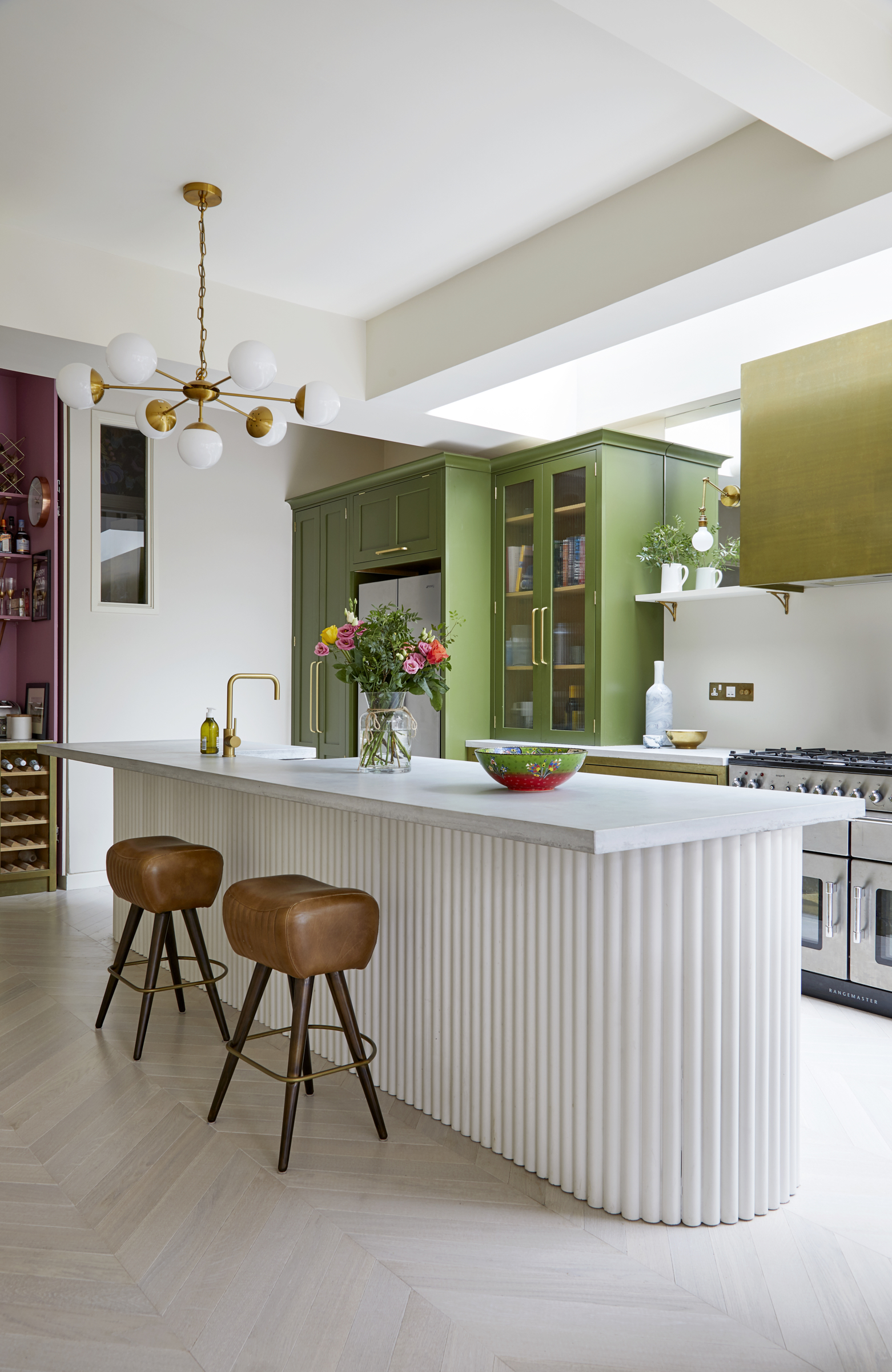
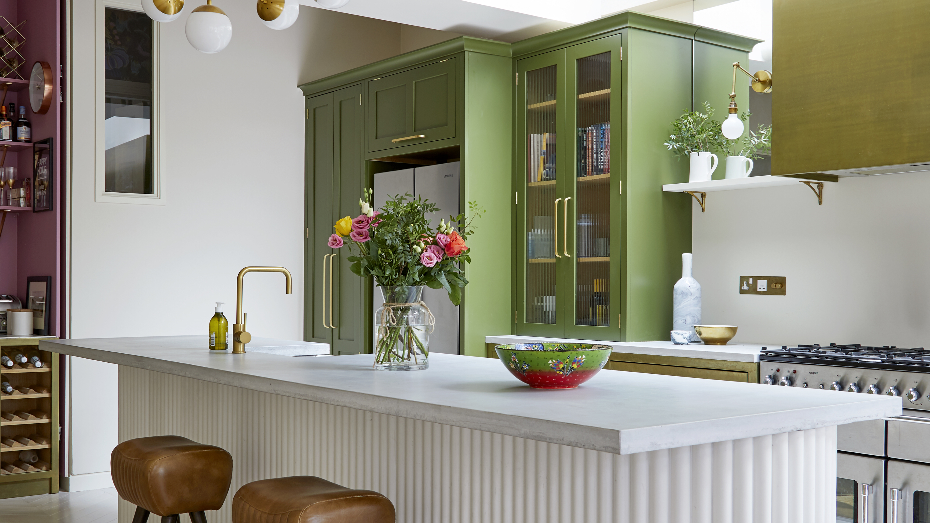
The curved edges of the 4.2 metre fluted kitchen island and its crisp linear concrete columns also trace back to the arch front door.
A combination of fluted glass and brass strike a note of muted Mid-Century glamor. While the mirror next to the extractor hood rebounds light from the window above.
Kitchen-diner
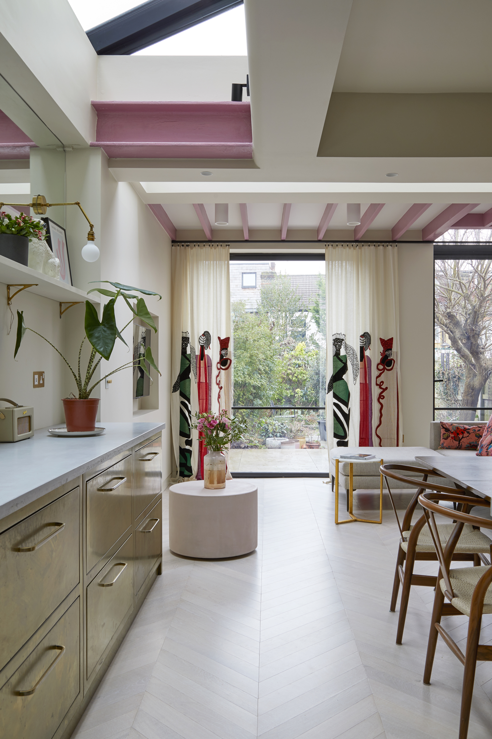
Lowering the floor to gain more head height, removing structural walls and building out to the extent of the footprint, Kate and Gavin created a vast kitchen-living space.
A huge pivot door provides an uninterrupted view of the garden whilst another reciprocal garden door is topped by a pink barrel-vaulted ceiling that corresponds to the brick arch at the front.
Always eager to put her individual spin on an interior, Kate’s silhouette curtains by Pierre Frey were the starting point for the kitchen scheme. ‘Modern home extension ideas often have a lot of glass at the end but they can be dressed and made more interesting. Here the use of linen and embroidery makes the space more homey and the fabric was one of the first things I bought.’
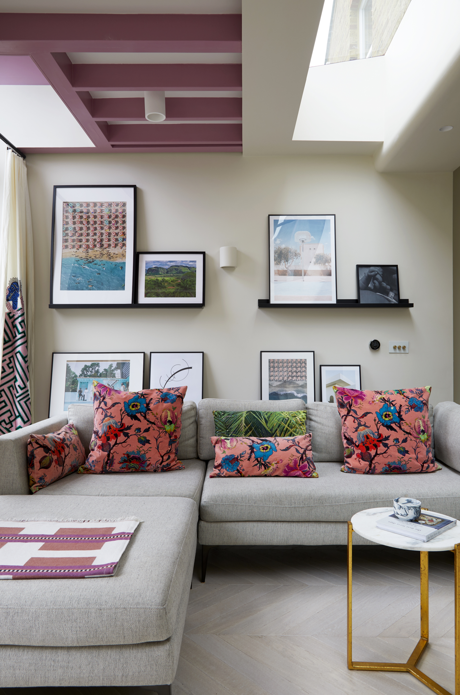
Whilst the architectural pull was strong, Kate had identified further merits that would contribute scope to her plans and design ideas. ‘It wasn’t in a conservation area which was important to me so that I could add cladding, but the plastic lean-to conservatory extension was also a big factor in our decision because, having been built over five years ago, it meant we would have a strong case for permission to build in its footprint. There was so much scope at the back,’ she explains.
Kate wanted to expose the structure of the extension. Cushions and pictures on rails can easily be changed to switch the look up. The floor chevrons give a dynamism that leads through the space towards the garden.
Main bedroom
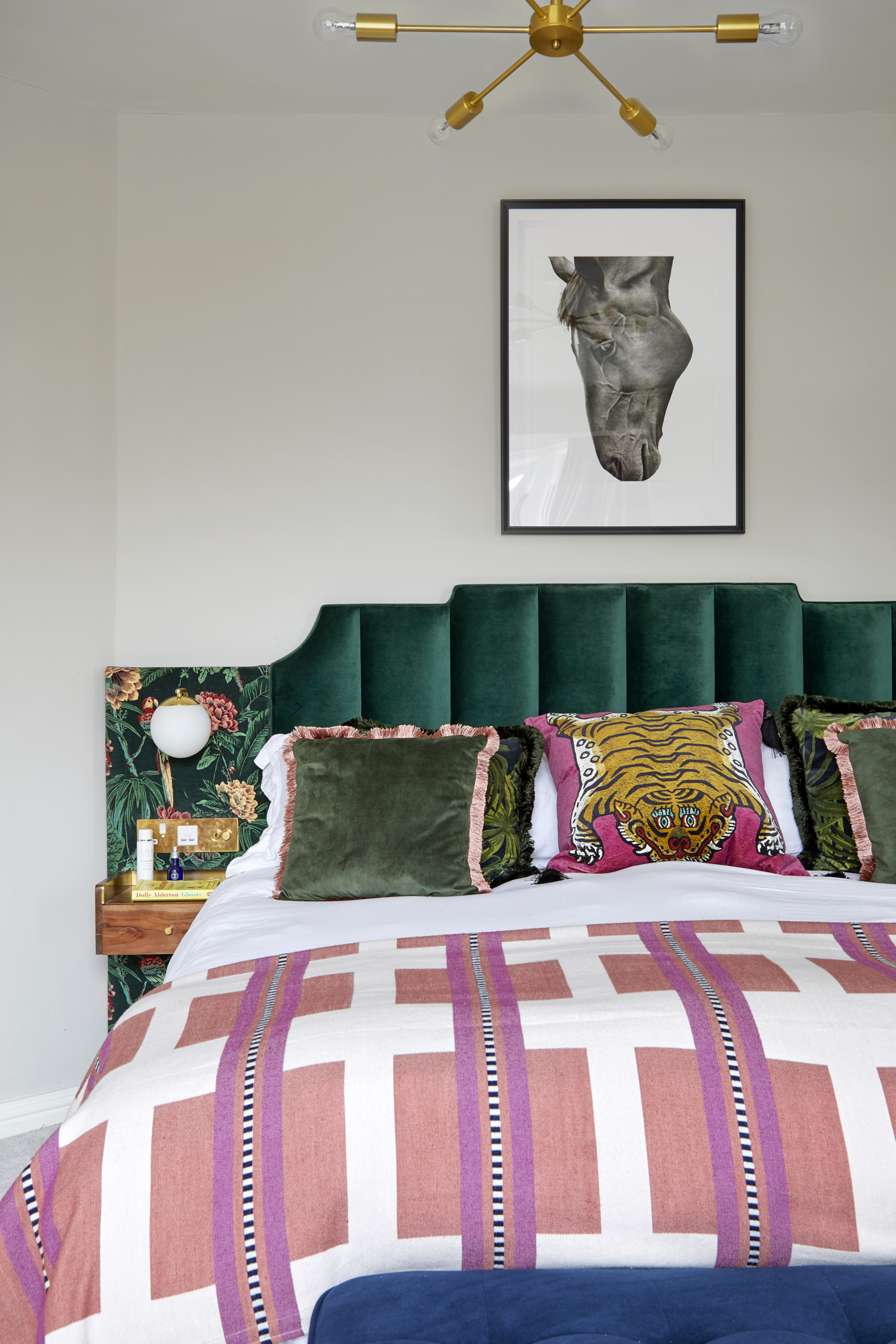
Kate designed this hotel style upholstered headboard with lighting and panels built in to save space on the bedside table.
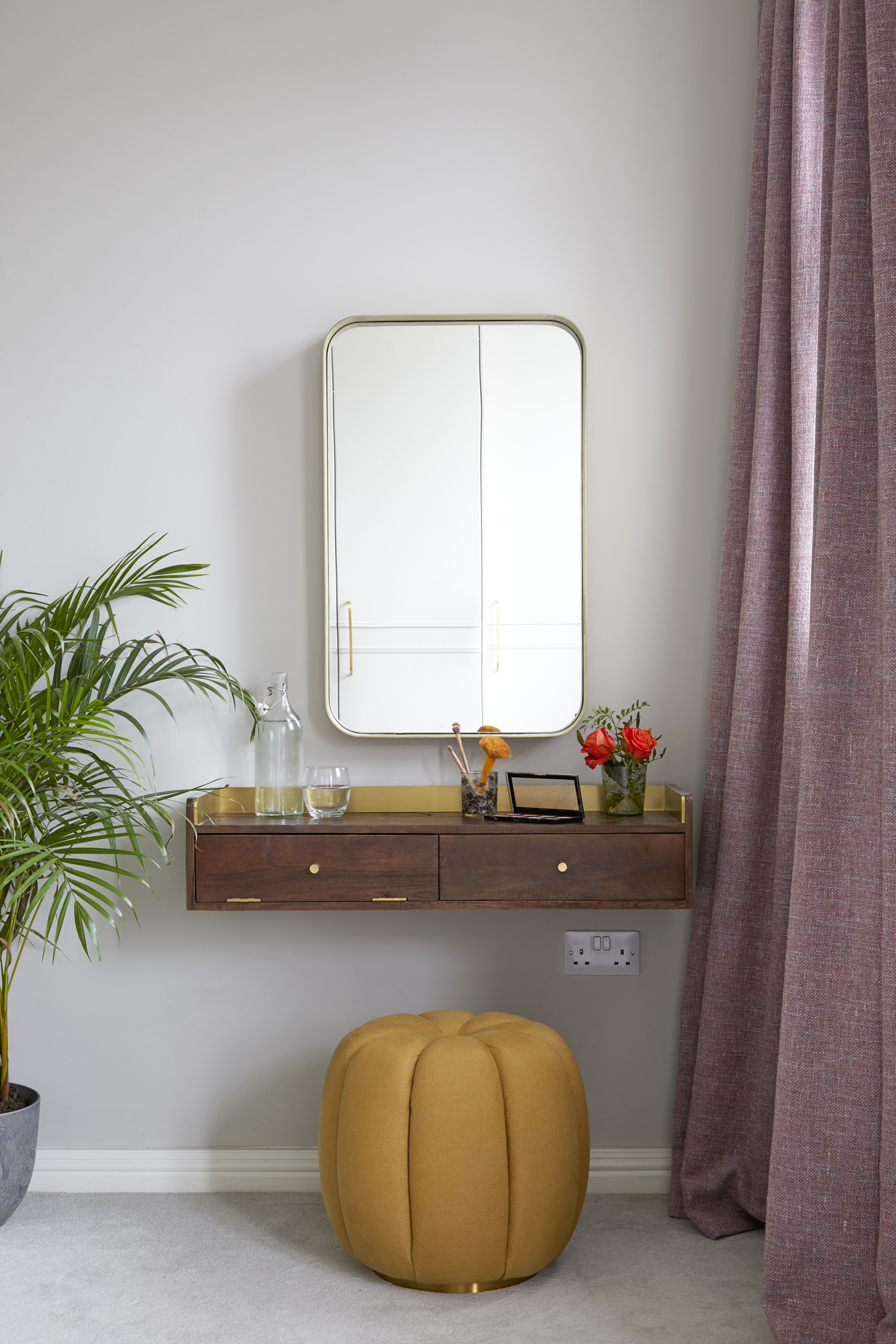
If you're after best dressing table ideas, one trick is that a floating shelf is a great space saving alternative to a dressing table if you lack space. Heavy weight linen curtains offer a good blackout.
Main bathroom
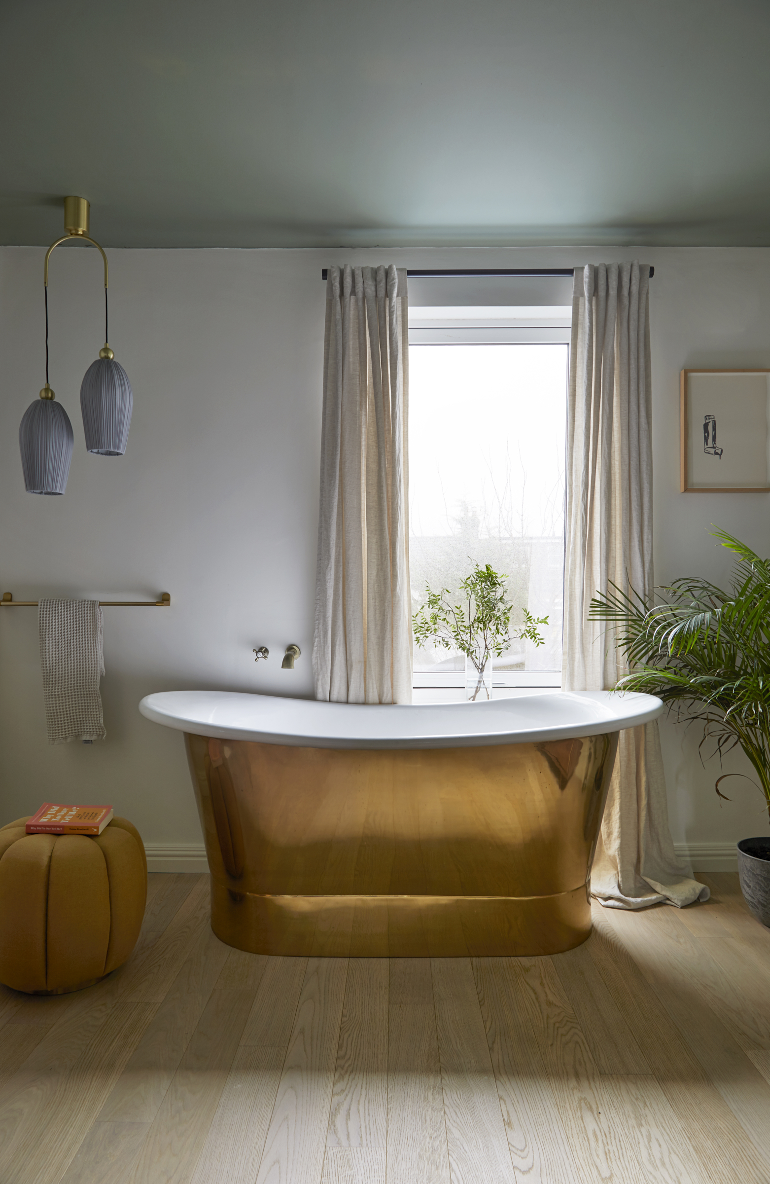
On the first floor an ensuite has been created for the guest bedroom idea whilst another bedroom has been sacrificed to become a stunning bathroom for Kate and Gavin.
‘You step down into the shower which means there’s never any water on the floor so I could use wood to make the space cosier,’ Kate says. The floor had to be re-built as the huge inviting bronze tub was so heavy – a worthy investment for this luxe setting.
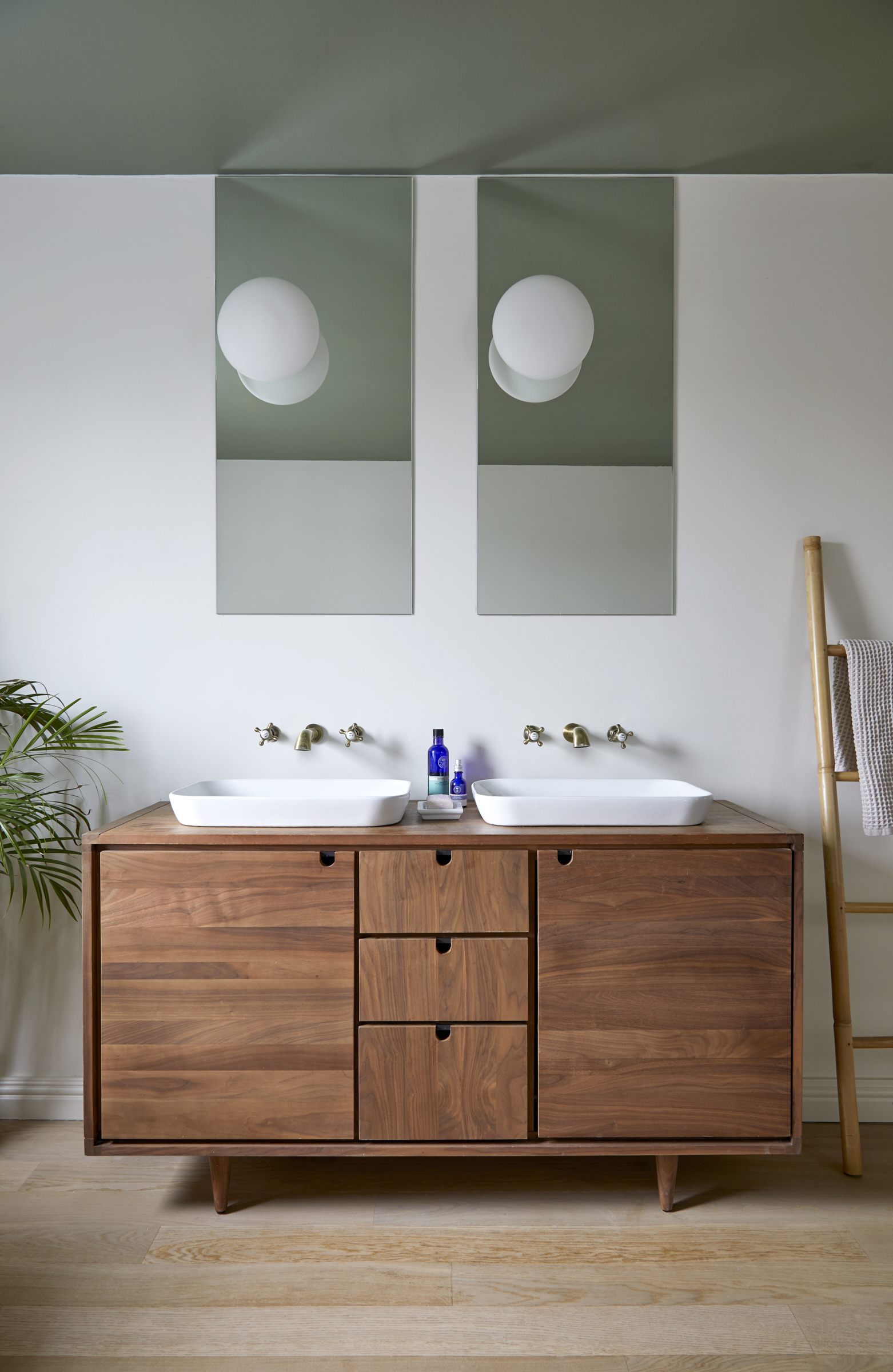
This walnut vanity offers plenty of storage and the self-contained shower ensures it won’t suffer from water damage.
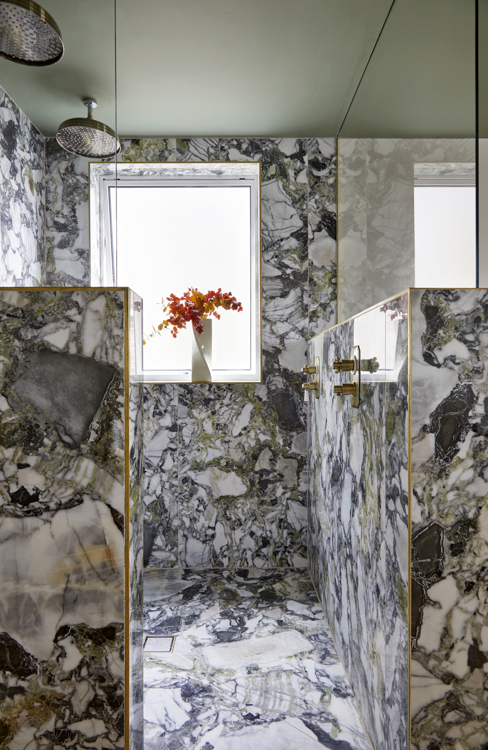
We love a marble bathroom idea. Brass seams in the marble give a luxurious finish to this self-contained shower which is a step lower than the rest of the bathroom.
Office
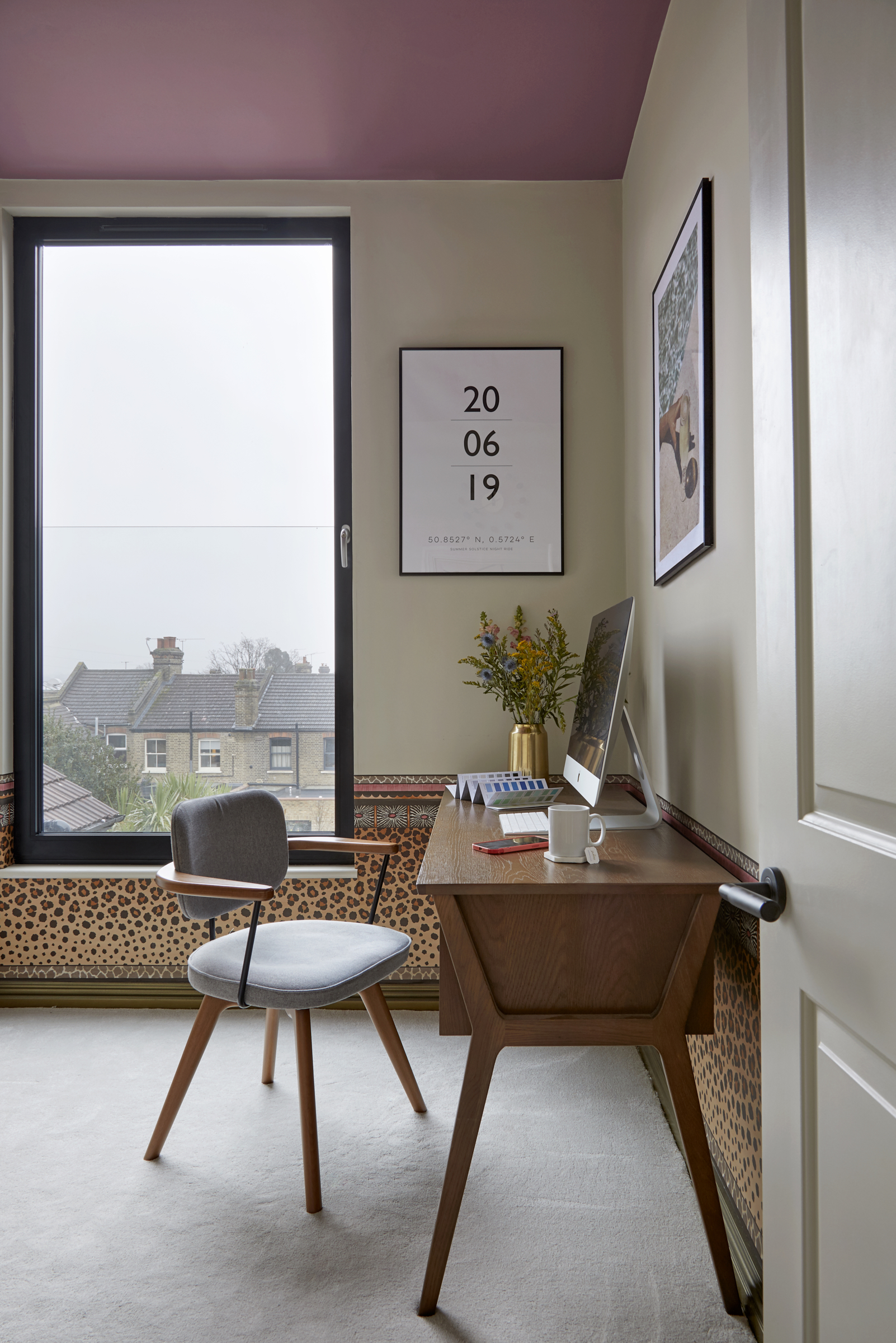
The layout of the loft conversion idea makes brilliant use of space including two studies, a gym and bathroom. Unrecognisable from when it was sold to them, Kate and Gavin have triumphed in creating a multi-facetted and spacious new home and a fabulous base for work and play.
A glass balustrade allows the entire window to be opened safely without obstructing the view. The pink ceiling and wallpaper balance the space.
Interiors and architecture writer Juliet Benning regularly writes for Livingetc and Homes and Gardens, as well as Grand Designs and Country Homes and Interiors. She was once the features editor of Homes and Gardens, and also contributes to 25 Beautiful Homes magazine.
-
 Straight from Salone: Five Emerging Trends I Found That'll Shape Interiors For the Year Ahead
From reflective silver to fluidity, here's my perspective on the key themes and new moods coming through from Milan Design Week
By Sarah Spiteri Published
-
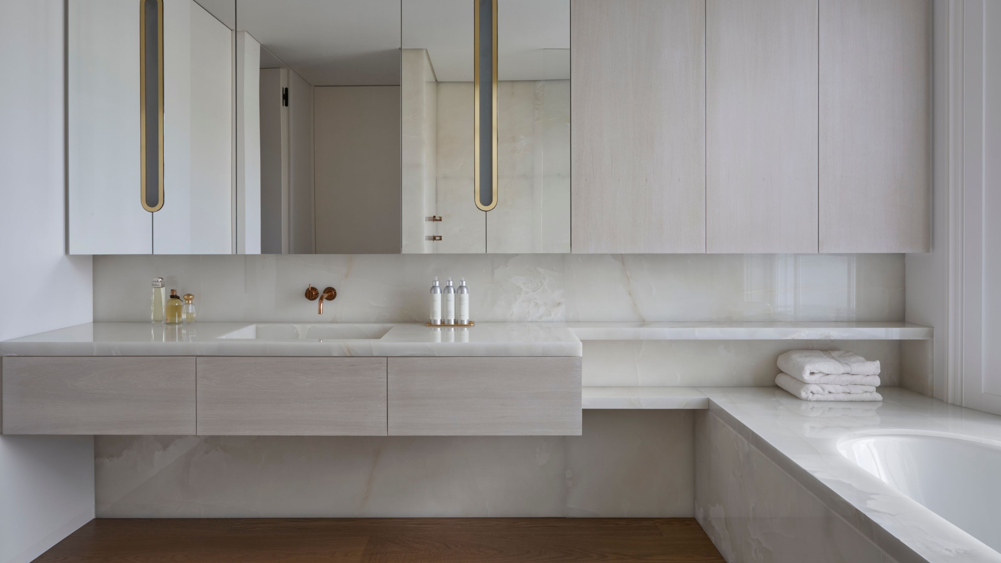 9 Bathroom Storage Mistakes You're Probably Making That Make Using This Space Much Harder — And What to Do Instead
Discover which mistakes are to blame for your overcrowded and cluttered bathroom
By Seraphina Kyprios Published