Inside a Victorian house in southwest London with some serious Miami style
Designer butterflies and hot pops of Miami-style colour transport this Victorian house in southwest London from city to summer all year round..
THE PROPERTY
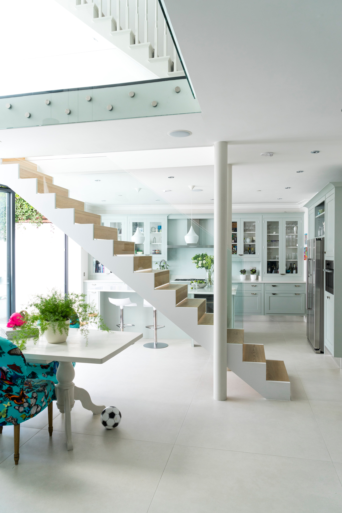
A double-fronted Victorian house in southwest London. The ground floor of this modern home has a living room and playroom, with a glass-sided walkway and stairs down to the open-plan family room and kitchen-diner (plus utility room and WC). There are three bedrooms (one en suite), a family bathroom and study on the first floor, with the master suite on the top floor.
See Also: Tour a sleek, ultra-modern Victorian terrace townhouse in west London
KITCHEN
The masterstroke in the re-design of this home was the owner's decision to slice through its traditional core, inserting sections of glass and crisp lines, so that the once buttoned-up 19th-century space now flows with renewed energy.
Slender gaps in the wood risers (shown above) let slivers of sunlight shine through the suspended glass-clad staircase, adding to the feeling of lightness and space. The marble kitchen island in the centre of the classic Smallbone kitchen was made so that each long side is parallel with its exterior wall – making a subtler mini trapezium.
DINING AREA
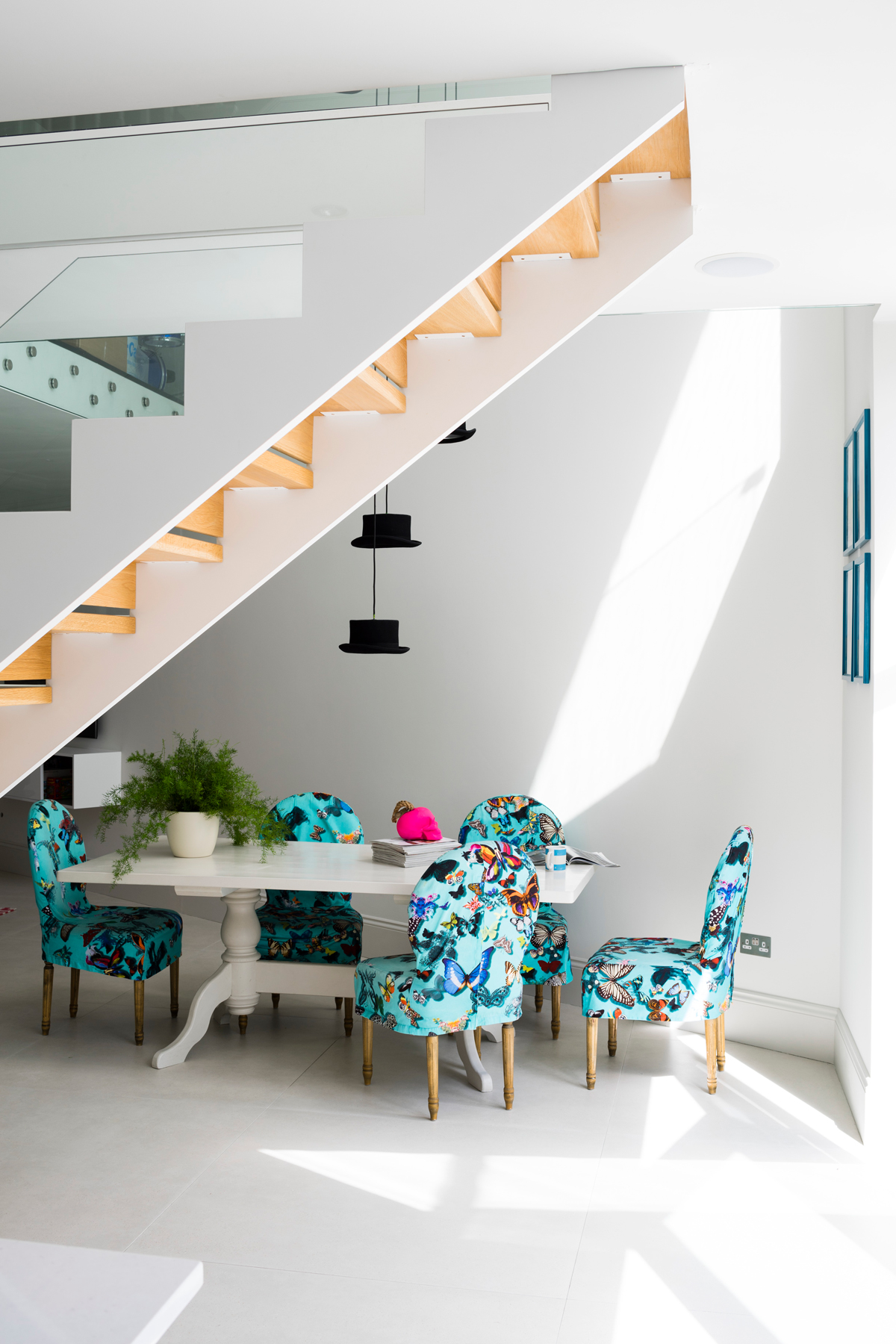
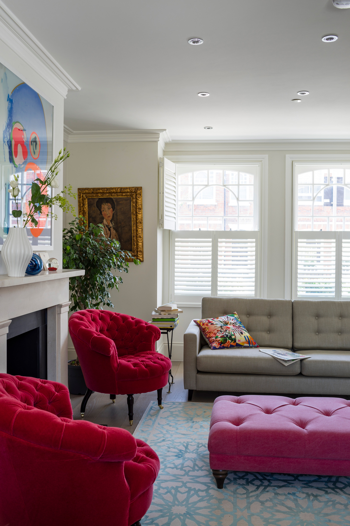
Today, the house is anything but predictable; much of its dynamism stemming from contrasts, whether brights against pale shades or traditional vs modern materials. The couple who live here admit to quite different tastes. One loves artist, Modigliani – very measured and classically composed. The other, Jackson Pollock paint splatters, Damien Hurst skulls – anything that challenges rather than soothes.
See Also: Bright ideas - exploring colour in the dining room
GARDEN
But it’s the contrasting styles of architecture that pack the biggest punch – and succeed in solving an architectural puzzle that has lain at the heart of this London home since it was built. It’s not obvious at first, but the floor plan of this handsome double-fronted house is more trapezium than rectangle – probably the result of bickering Victorian builders when the land was divvied up. The result is that the house’s two exterior side walls gently angle inwards, finally meeting in a point at the end of the cake-slice of garden.
Be The First To Know
The Livingetc newsletters are your inside source for what’s shaping interiors now - and what’s next. Discover trend forecasts, smart style ideas, and curated shopping inspiration that brings design to life. Subscribe today and stay ahead of the curve.
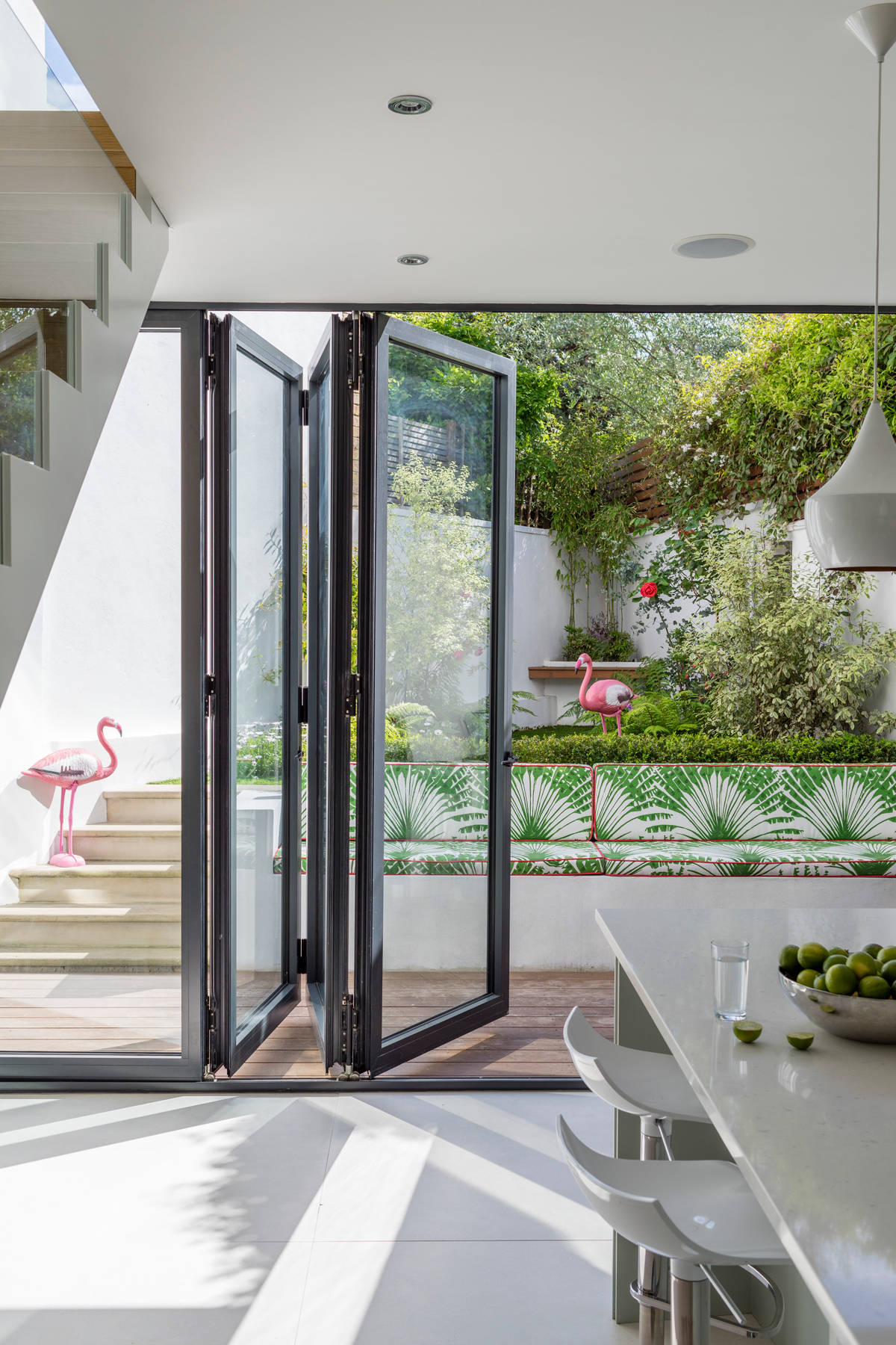
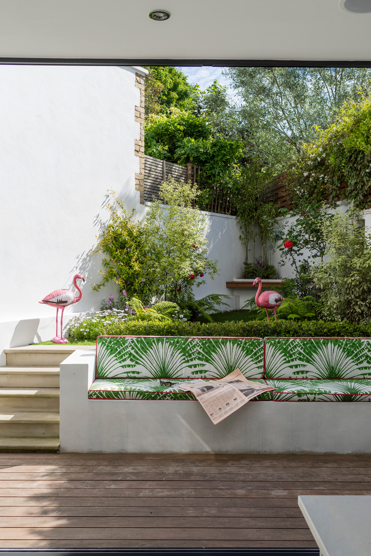
The slice of garden is cleverly designed in receding sections – decking, seating, hedge, lawn and a raised bed – which creates the illusion of depth, as if it fades into the distance. The white concrete retaining wall has been customised into a tropical bench.
HALLWAY
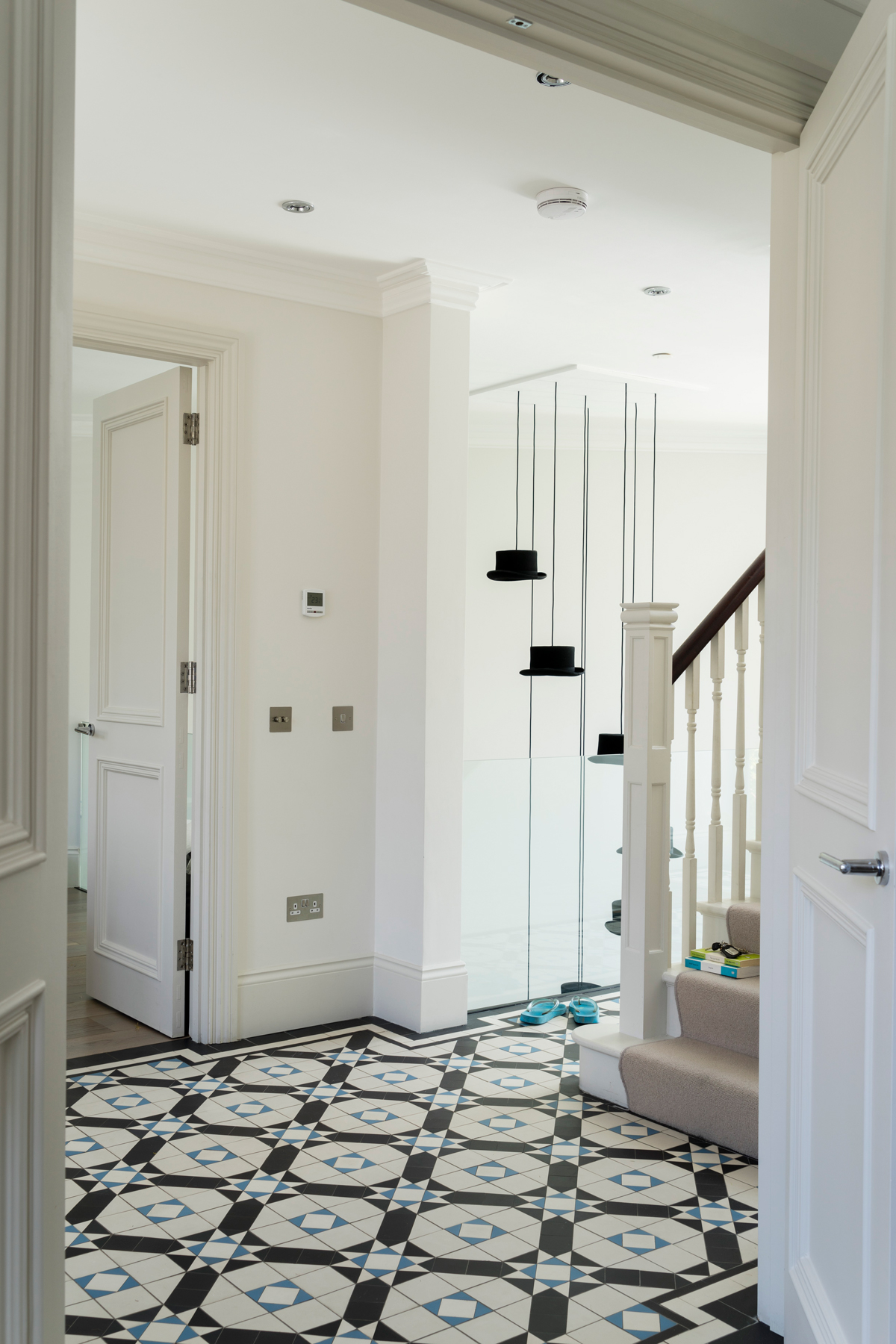
The tapered, almost triangular floor spaces seemed to be crying out for a new central staircase. Which, in turn, naturally divided the lower-ground floor into two zones – kitchen-diner and family room.
The central hallway was widened and the couple laid floor tiles that are part-modern, part-Victorian. The pattern harks back to the house’s roots, but the shades are crisper. Walls and a section of floor were removed to create a double-height atrium, emphasised by the cluster of pendants.
FAMILY ROOM
The couple try to keep this as a grown-up space for chats and late-night cognacs. It also shows their different tastes in art.
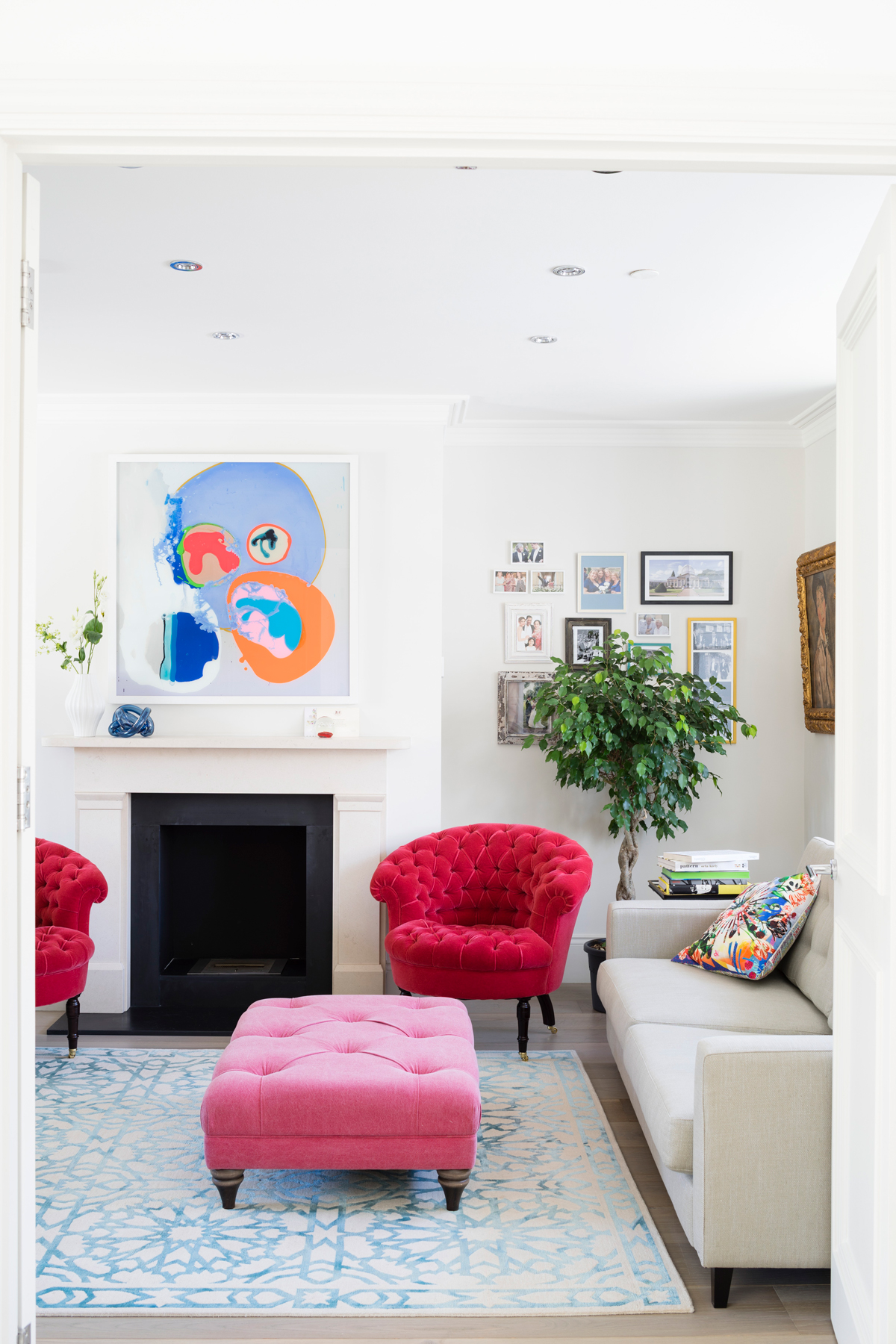
Bold colours pull the look together.
STUDY
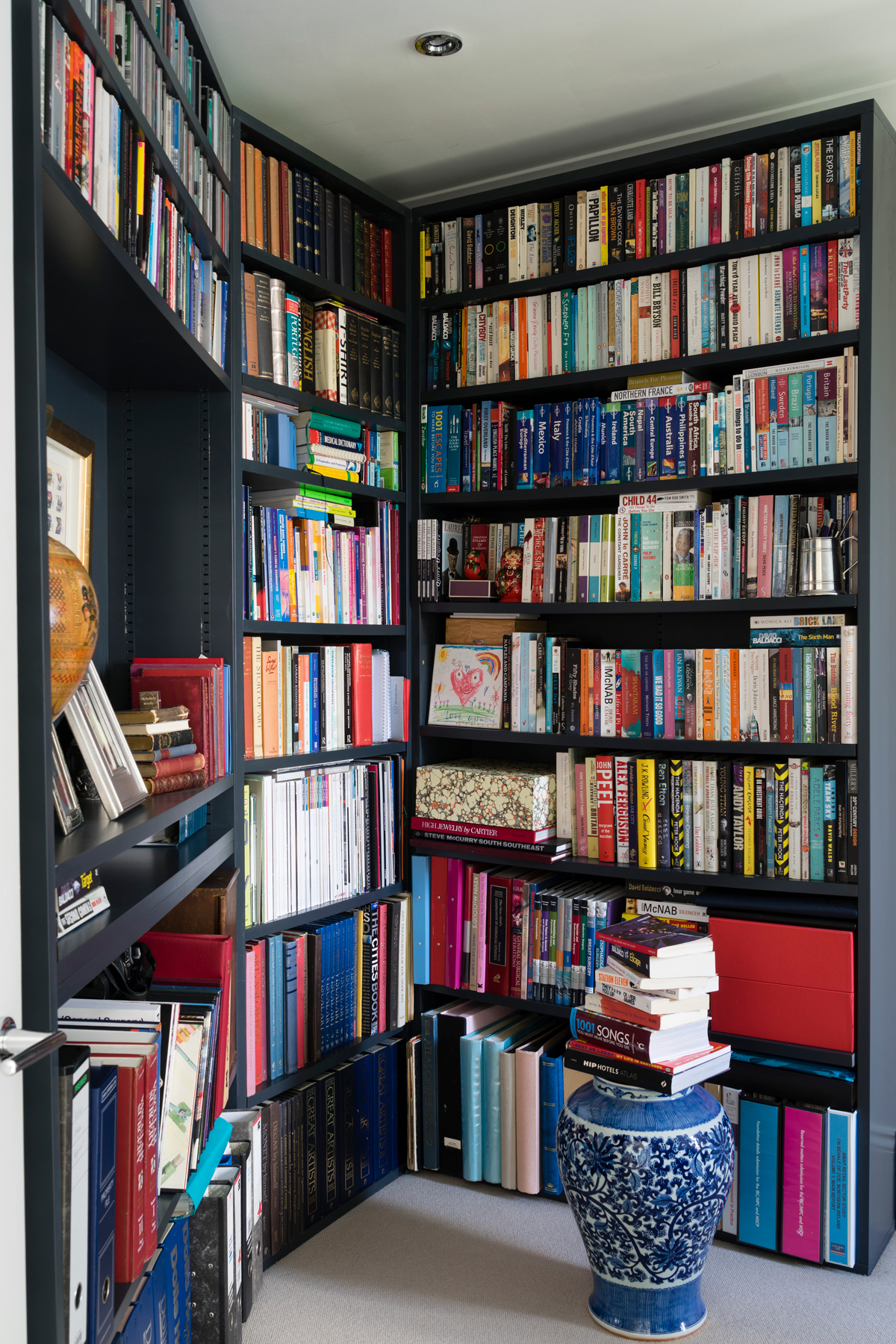
Bespoke shelving makesa feature of the unusual angles at play in the study.
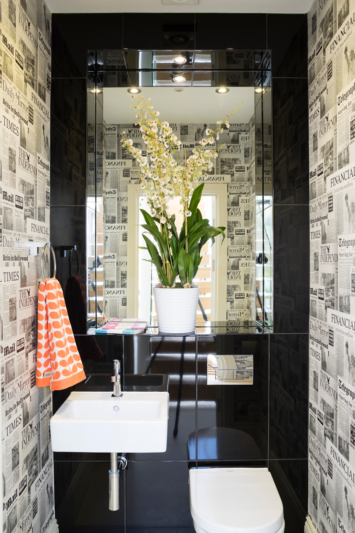
DOWNSTAIRS WC
The owners wanted every space to have a bit of light-hearted humour – even the smallest ones.
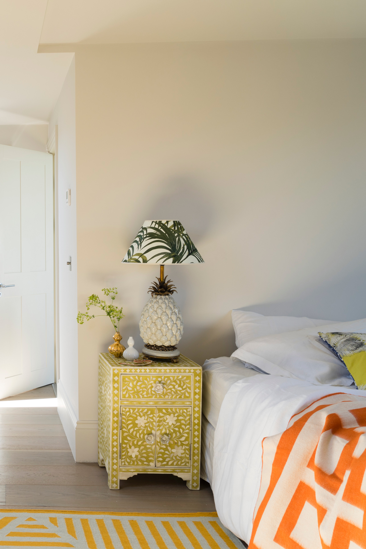
MASTER BEDROOM
Colour pops lift this loft conversion master bedroom into a sophisticated but fun space.
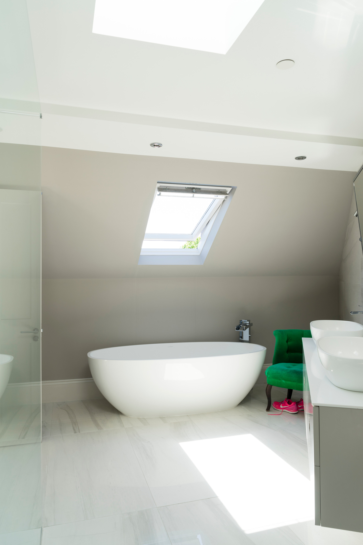
MASTER ENSUITE
The organic curves of this bath are a calm contrast to all the straight lines and angles in the house. It's placed under the window so you can lie back and stargaze.
See more Smallbone kitchens in this style at smallbone.co.uk
Photography / James Merrell
See Also: Explore this architectural masterpiece in Miami with spectacular views
The homes media brand for early adopters, Livingetc shines a spotlight on the now and the next in design, obsessively covering interior trends, color advice, stylish homeware and modern homes. Celebrating the intersection between fashion and interiors. it's the brand that makes and breaks trends and it draws on its network on leading international luminaries to bring you the very best insight and ideas.
-
 My 10 Favorite Designs at Milan Design Week 2025 — Out of the Hundreds of Pieces I Saw
There is a new elegance, color, and shape being shown in Milan this week, and these are the pieces that caught my eye
By Pip Rich
-
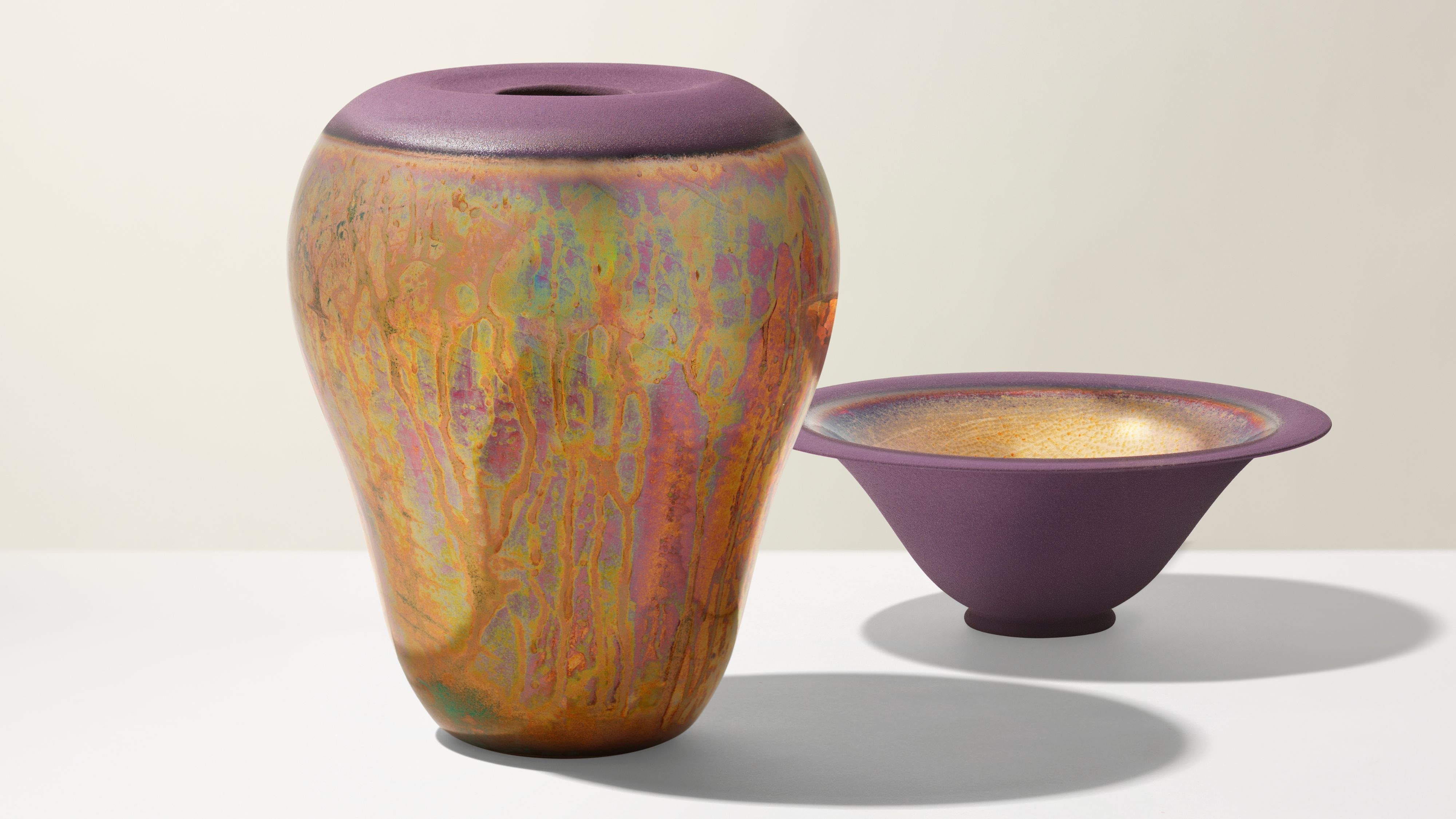 Iridescence Is Chrome’s More Playful, Hard-to-Define Cousin — And You're About to See It Everywhere
This kinetic finish signals a broader shift toward surfaces that move, shimmer, and surprise. Here's where to find it now
By Julia Demer