This west London terrace is a lesson in the elegant use of colour
No wonder friends and neighbours love to visit this west London terrace – it’s made for entertaining...
The property
A west London terrace, built in 1840. On the lower-ground floor of the modern home is a kitchen/diner and utility room. The ground floor has an open-plan living room/study and there’s a master bedroom suite on the first floor. The children’s bedrooms and bathroom are on the second floor.
See more modern homes, from London to LA
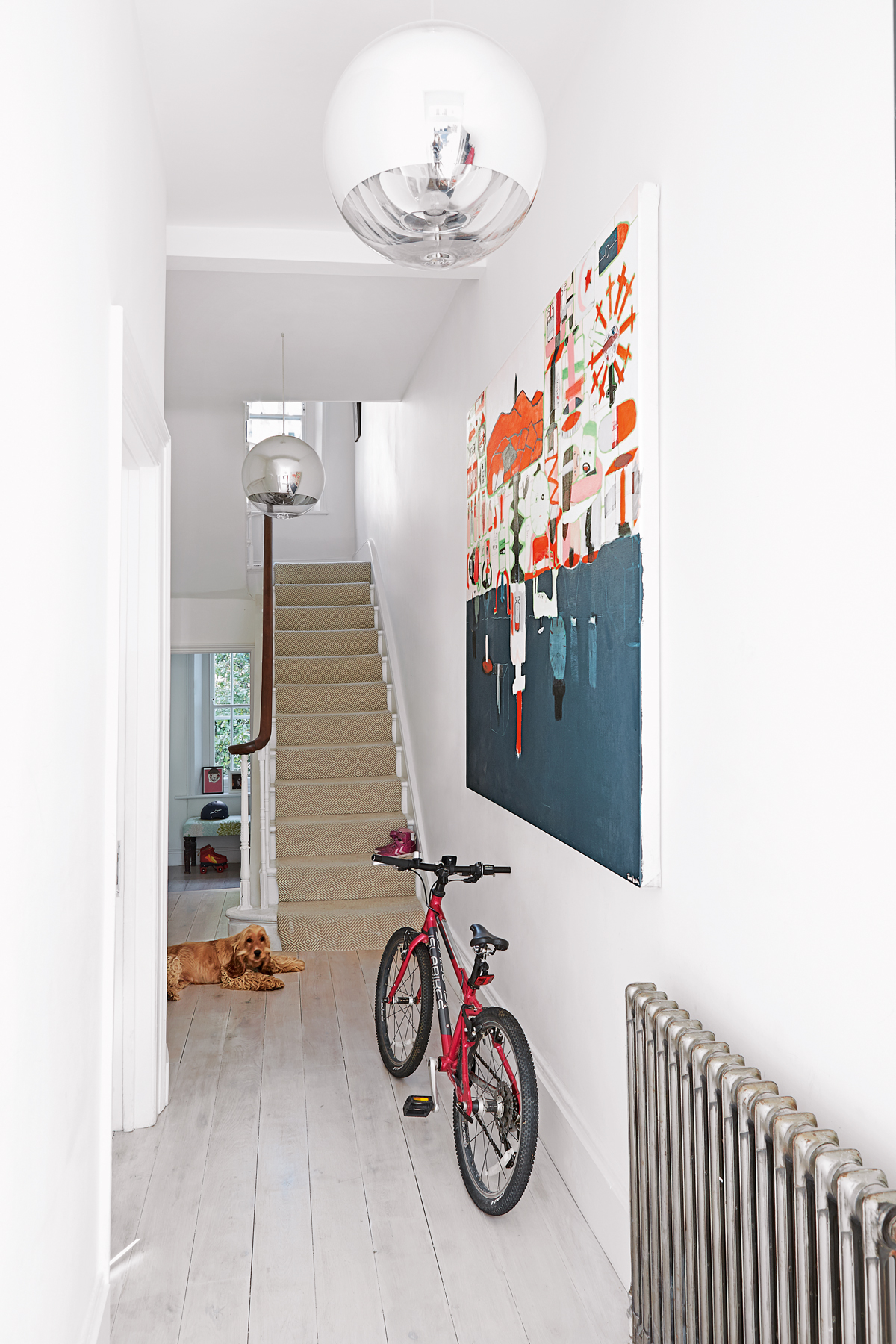
hallway
Nothing’s too formal in this elegant period terrace, transformed by a former fashion stylist and her husband. Together they’ve created a family home that can cope with the scuffs and scrapes of life with two youngsters and a puppy.
Fortunately, the previous owners had done much of the structural work before the couple bought the place eight years ago - and had turned itback into a single house after it had been converted into flats, knocking through the walls of each floor to open it all out.
living room
Once the family moved in, their main objective was to lighten the overall mood – sanding the floors to brighten the oak floorboards that had darkened over the years and painting throughout in a clean, classic Dulux white paint, appropriately named Timeless.
This is where the family watch TV, so it’s not so precious that they can’t lounge around – sometimes there’ll be eight kids on the sofa and if one of them drops some ice cream, it’s not the end of the world.
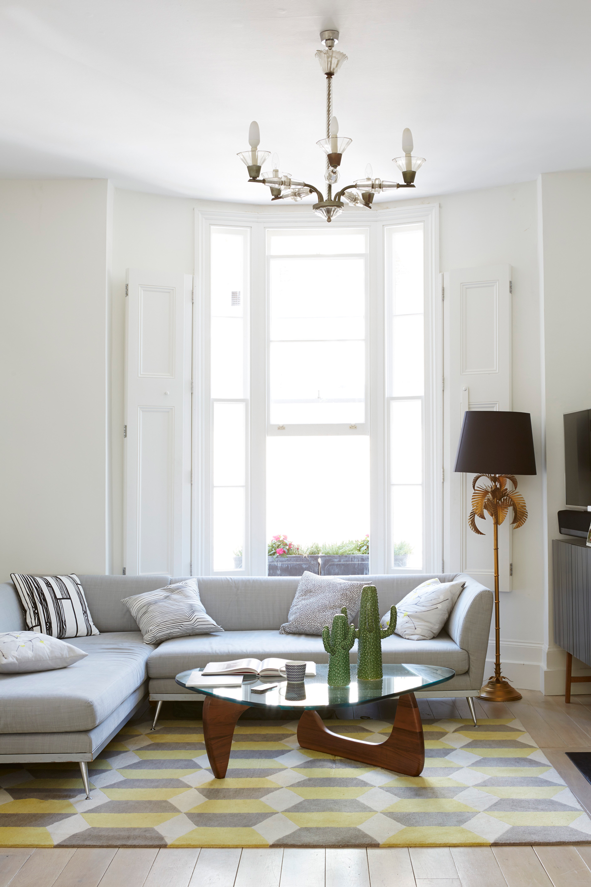
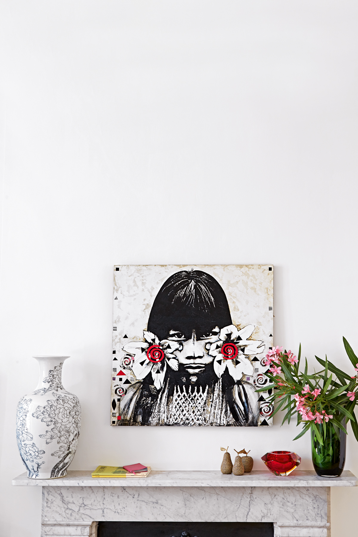
As a self-confessed neutralist the female half of the couple opted for a muted, Deco-inspired palette of black, white and steel greys. The couple’s curios and artwork is displayed in a carefully curated arrangement.
Be The First To Know
The Livingetc newsletters are your inside source for what’s shaping interiors now - and what’s next. Discover trend forecasts, smart style ideas, and curated shopping inspiration that brings design to life. Subscribe today and stay ahead of the curve.
kitchen
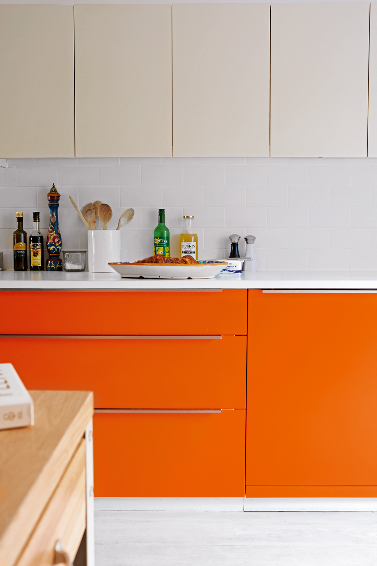
The couple acknowledge the irony of the orange door fronts in the kitchen and say it was the husband's idea as it’s his favourite shade.
Recently, they reconfigured the kitchen layout to accommodate a kitchen island. It has space for cookbooks, pots and pans and breakfast cereals, so the children can help themselves.
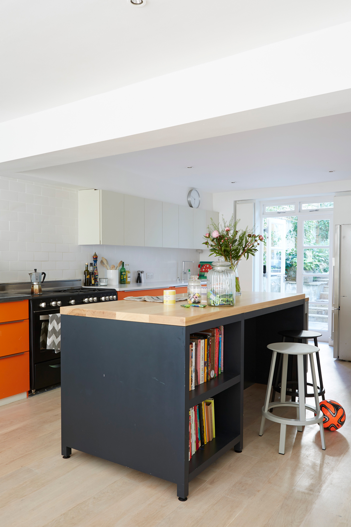
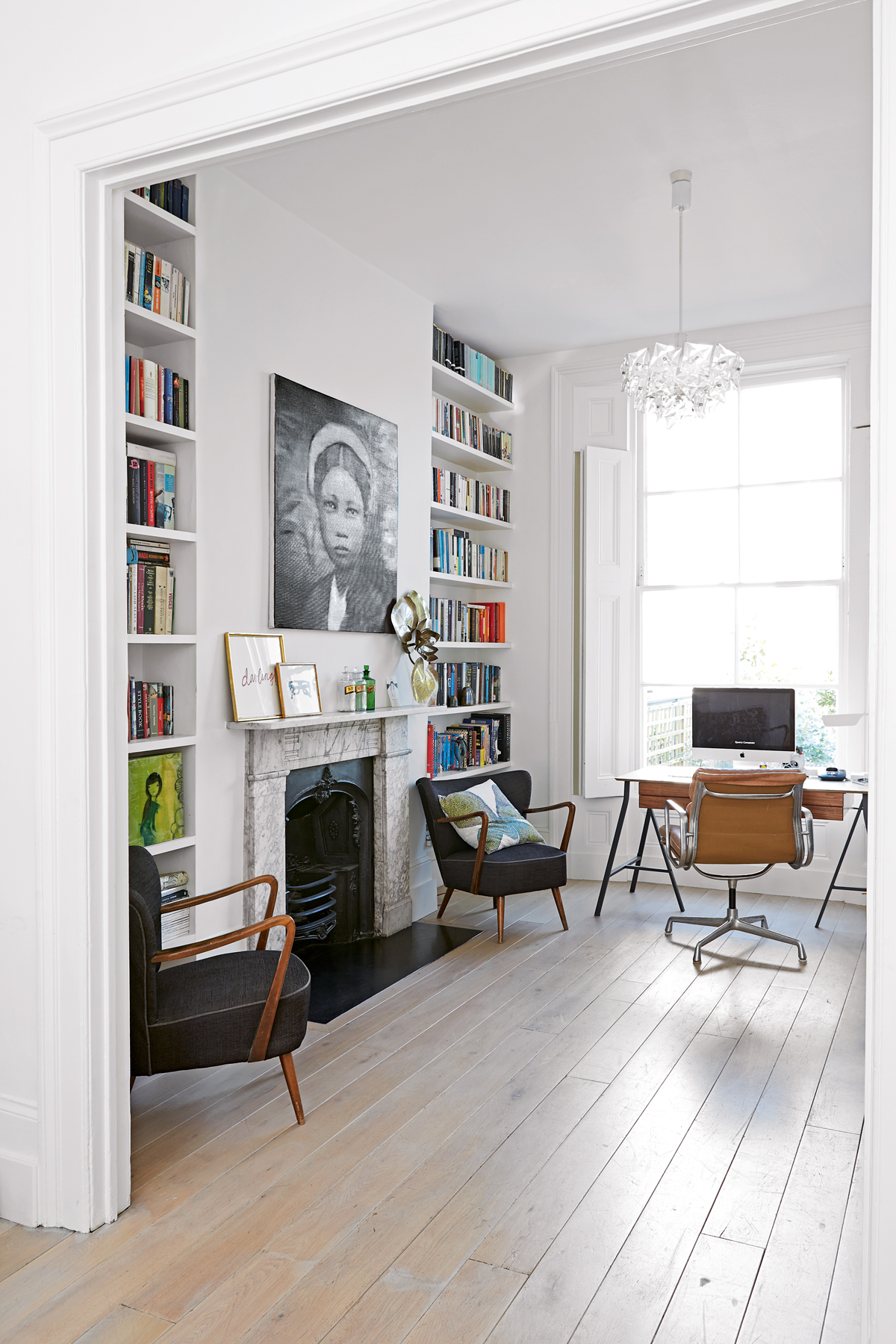
With the help of Jonathan Beckwith, ‘an amazing carpenter,’ the couple designed not only the island, but also the kitchen cupboards and the bookshelves in the living room and study, which Jonathan built too. The run of sleek, handleless wall cabinets add to the scheme’s streamlined look.
See Also: Painted Kitchens - Kitchen Colour Ideas
dining area
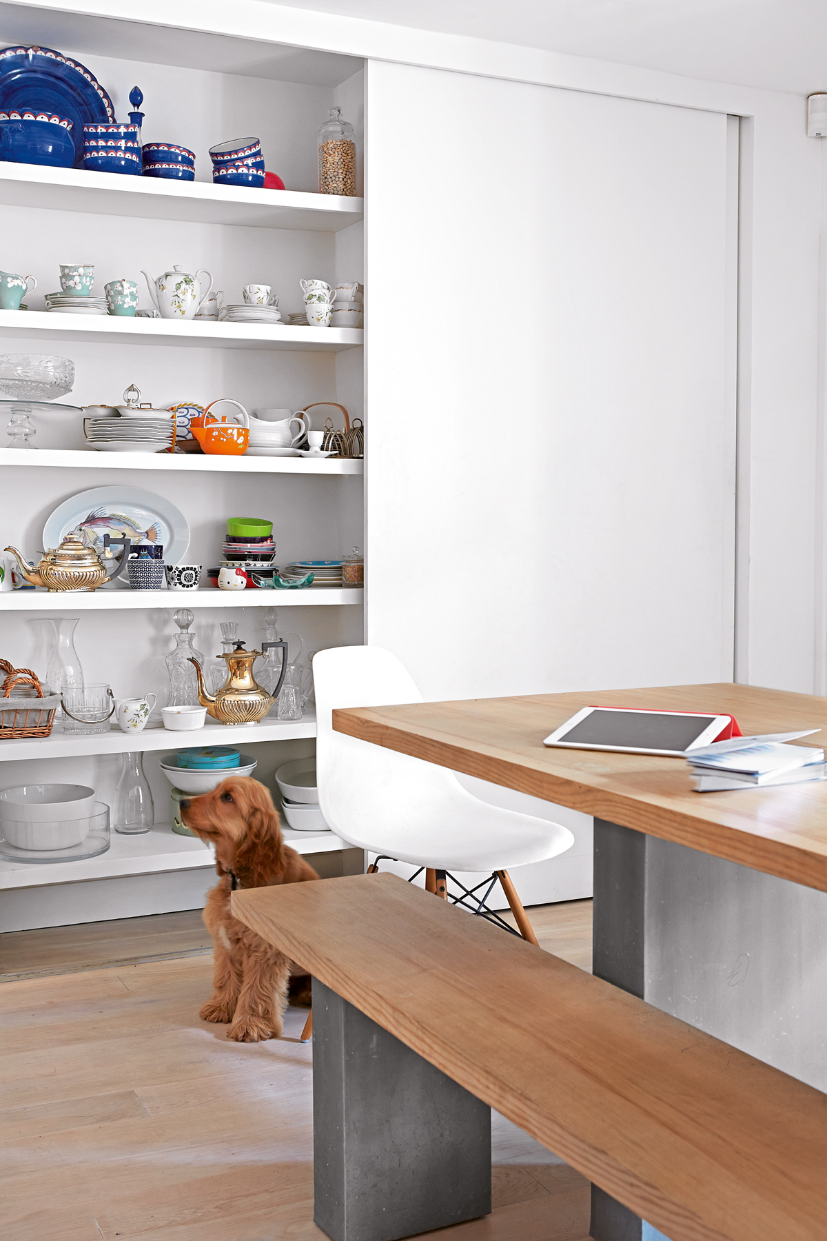
Behind the sliding door is a vast collection of formal china.
study
Overlooking the garden, this space benefits from plenty of light streaming into the house.
master en suite
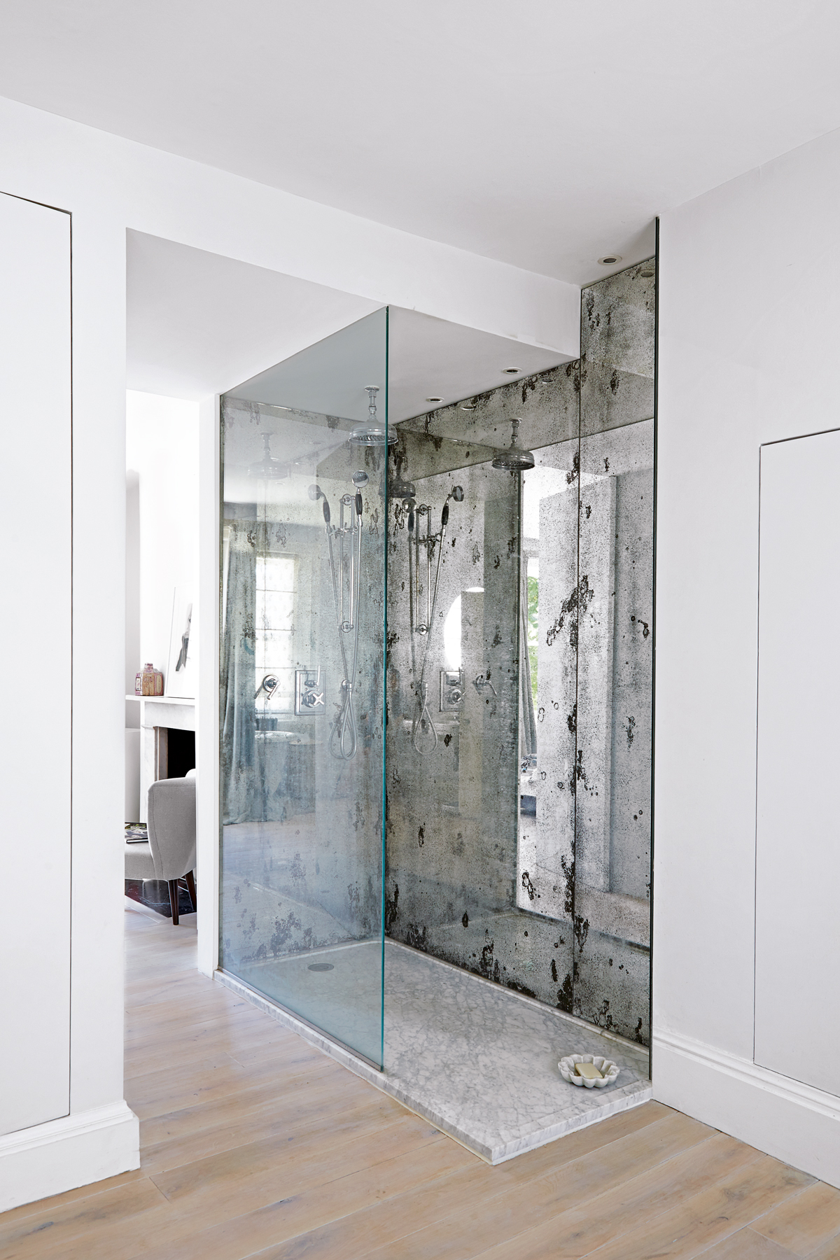
The couple gave up a fourth bedroom to create a master suite that takes up a whole floor.
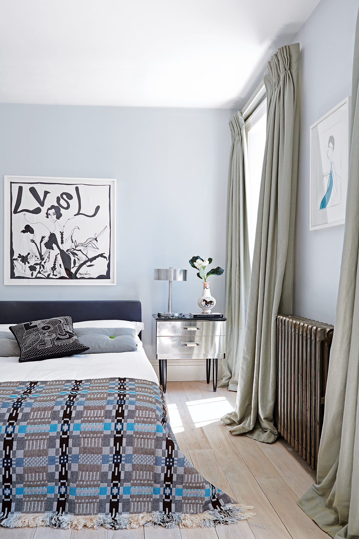
master bedroom
With so much natural light flooding in here, it’s the perfect spot to while away a Sunday morning.
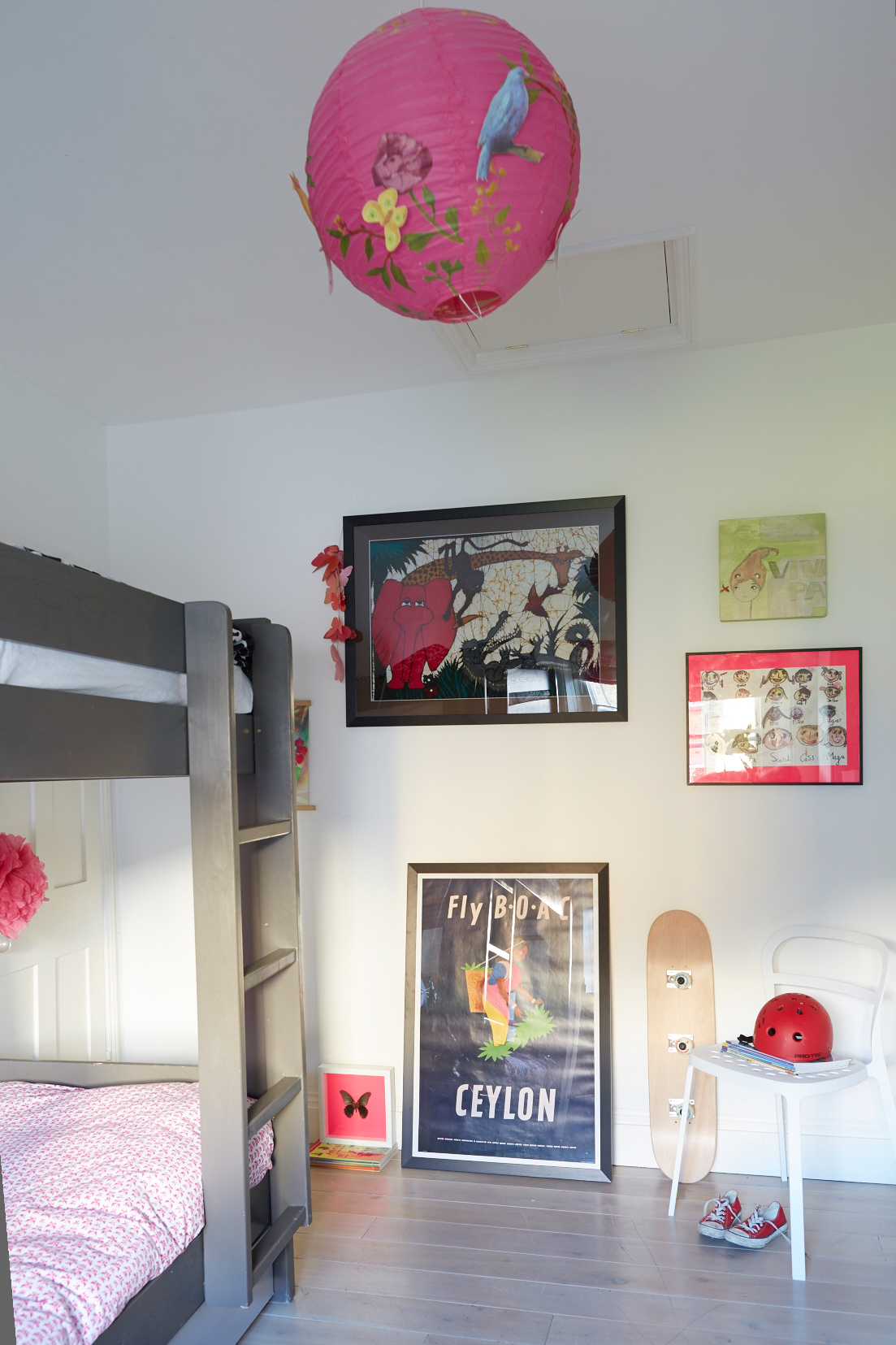
kids' bedroom
The shot of fuchsia pink lends a slightly girlie touch against the grey.
Photography / Kate Martin
See Also: Kids room ideas - 45 fresh ideas for a modern yet whimsical kids bedroom
The homes media brand for early adopters, Livingetc shines a spotlight on the now and the next in design, obsessively covering interior trends, color advice, stylish homeware and modern homes. Celebrating the intersection between fashion and interiors. it's the brand that makes and breaks trends and it draws on its network on leading international luminaries to bring you the very best insight and ideas.
-
 Slub Weaves and Silver Sardines — H&M Home Makes a Case for a Summer Edit That Doesn’t Take Itself Too Seriously
Somehow, they’re both having a moment — and H&M Home knows exactly what to do
By Julia Demer
-
 10 Ladder Kitchen Cabinet Ideas That Make the Most of High Storage and Make Your Scheme Feel Classy
Rail ladders in a kitchen have a sort of elegance to them that's hard to ignore, but they're also practical for storage, too
By Linda Clayton