The Livingetc newsletters are your inside source for what’s shaping interiors now - and what’s next. Discover trend forecasts, smart style ideas, and curated shopping inspiration that brings design to life. Subscribe today and stay ahead of the curve.
You are now subscribed
Your newsletter sign-up was successful
THE PROPERTY
A four-storey townhouse in west London. The ground floor of this modern home has a lobby, dining room and open-plan kitchen/living area. Upstairs there’s a study and living room, with the master suite, dressing room and home gym on the top floor. The lower-ground floor has two guest suites, a WC and a laundry room.
HALLWAY
A mischievous sense of humour has been given free rein in this expansive west London property. Step over the threshold of this formal redbrick and you enter a world of playful contrasts. A world where art becomes animated and model installations whirr and tinkle.
All internal doors in this property have been removed, offering tantalising glimpses of the next space and creating an unfettered sightline through the ground floor – a view peppered with thought-provoking objets and art.
Article continues below 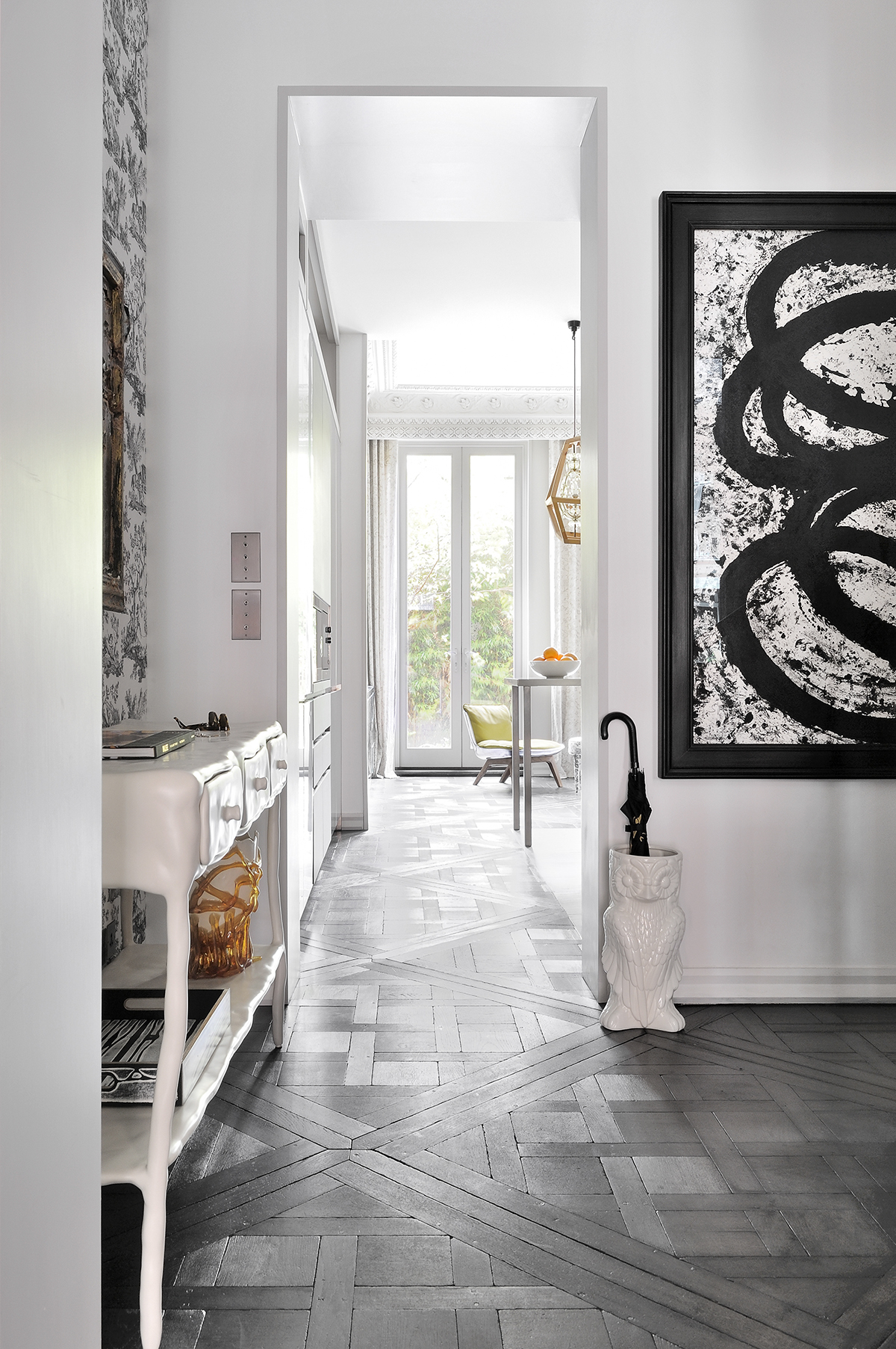
One unifying element throughout is the salvaged Versailles parquet flooring, shipped over from Paris to be reassembled, a bit like a big jigsaw, complete with original wooden peg nails.
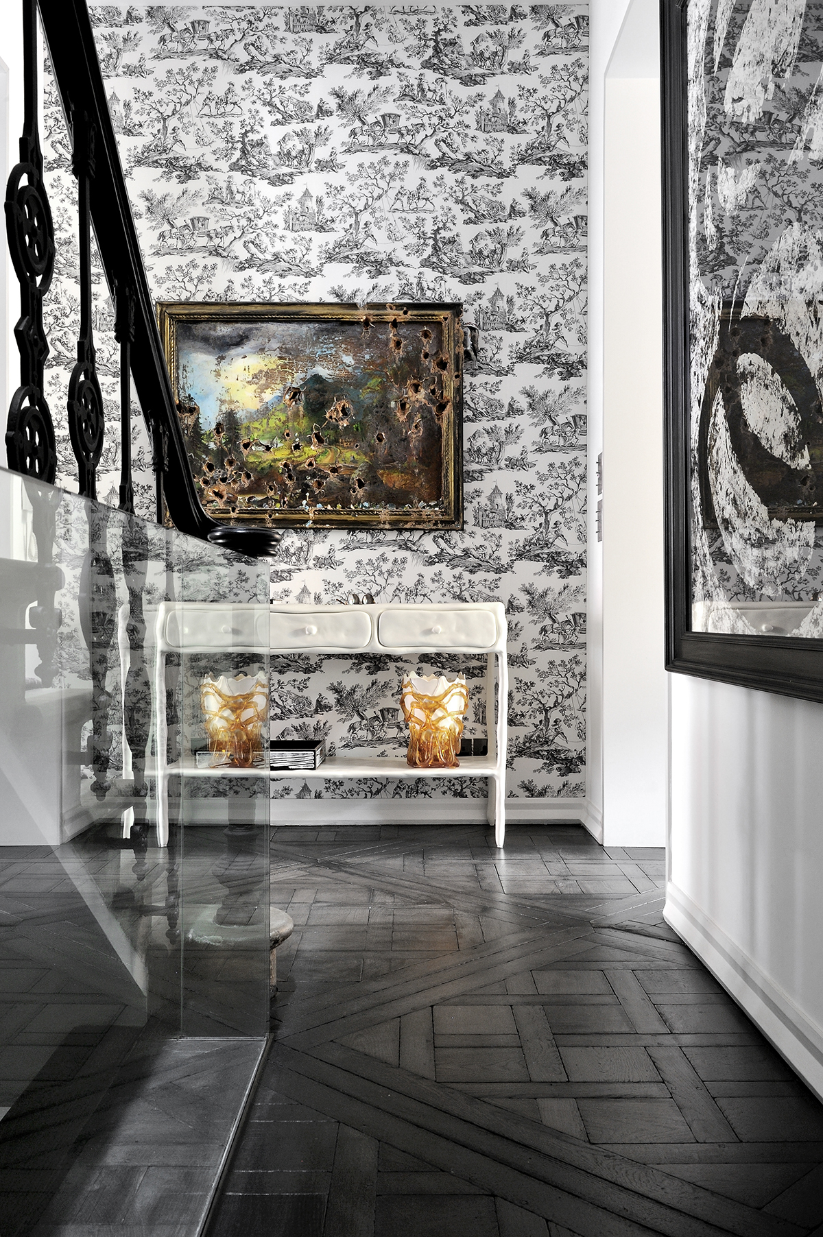
Contrasting styles intersect in the hall and a playful artwork greets visitors. At first glance, the artwork in the lobby looks like an old painting that’s been given a serious hammering. Is someone taking ‘vintage find’ to a new extreme? Perched on the side of the deliberately deconstructed painting is a tiny sculpted woodpecker, the “culprit” behind the artistic destruction. This home is full of little jokes like that.
LIVING ROOM
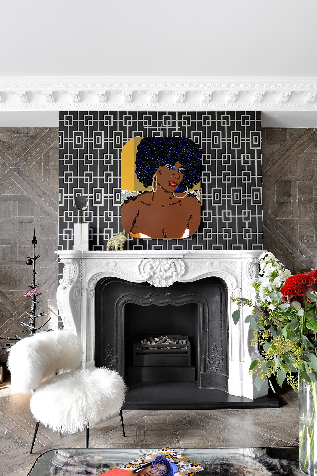
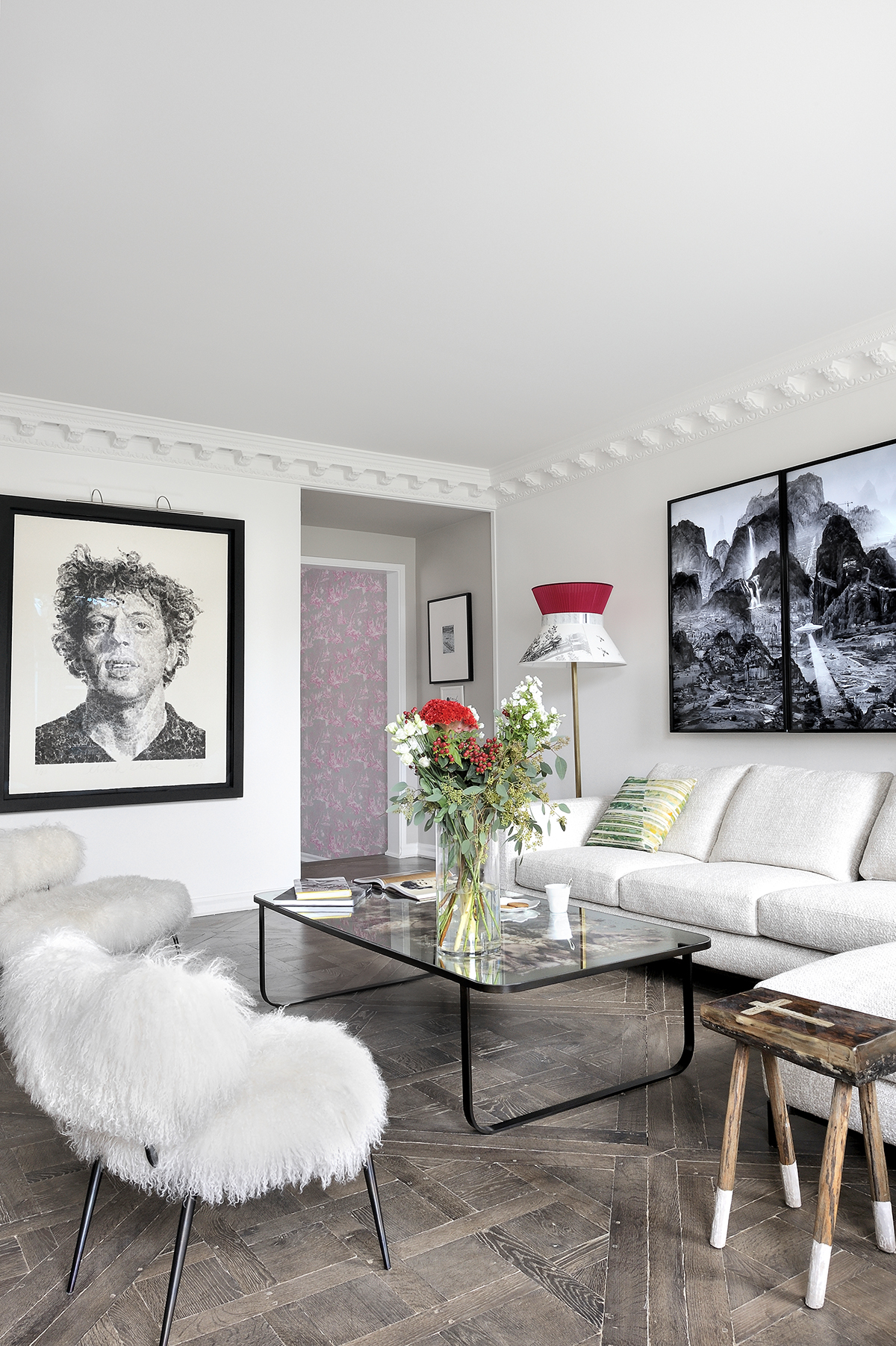
Seventies disco diva meets Louis XV in a storm of pattern above the fireplace (pictured in the first image). The artist behind the painting likes to use patterned backgrounds in her collages, so the wallpaper was chosen to display the piece in the same spirit.
Surfaces have also been arranged so that they contrast, intersect and spark off each other, creating a dynamism that spills into each space. Even some of the furniture, as created by Maarten Baas, is moulded in wobbly, unpredictable shapes – like the oversized floor lamp, pictured below. Baas’s designs appeal to this property's sensual side – and sense of humour.Their texture is like chewing gum – like something you find stuck under a school desk.
The Livingetc newsletters are your inside source for what’s shaping interiors now - and what’s next. Discover trend forecasts, smart style ideas, and curated shopping inspiration that brings design to life. Subscribe today and stay ahead of the curve.
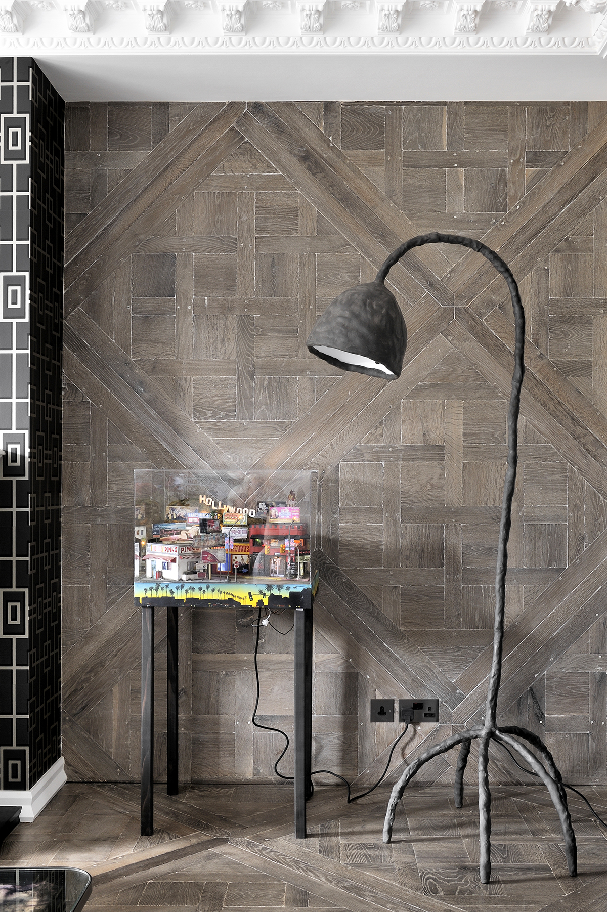
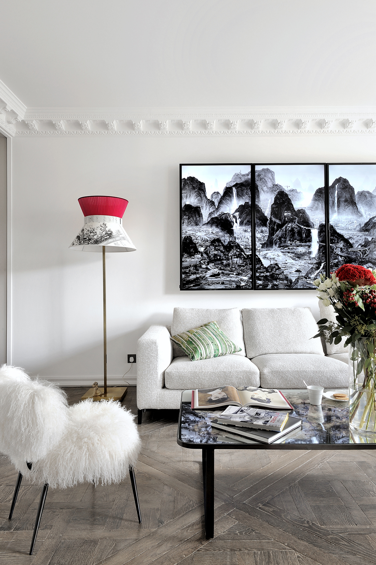
A video installation (pictured above) evokes LA in the Eighties. Videos play, music tinkles and fog can billow from underneath – it’s like a jukebox. It just carries on playing inits own little world while you chat.
Meanwhile, the typically French flooring sets a motif for the house, and even zips up the alcove walls in the living room.
The living area overlooks the garden at the back of the building and is filled with sunlight and pops of colour.
An animated video artwork (pictured below), The Night of Perpetual Day, hangs over the sofa. It’s a rework of ancient Chinese landscapes – you can peer at it and see a different tiny event unfolding each time.
A portrait of Philip Glass takes over the wall next to it.
KITCHEN
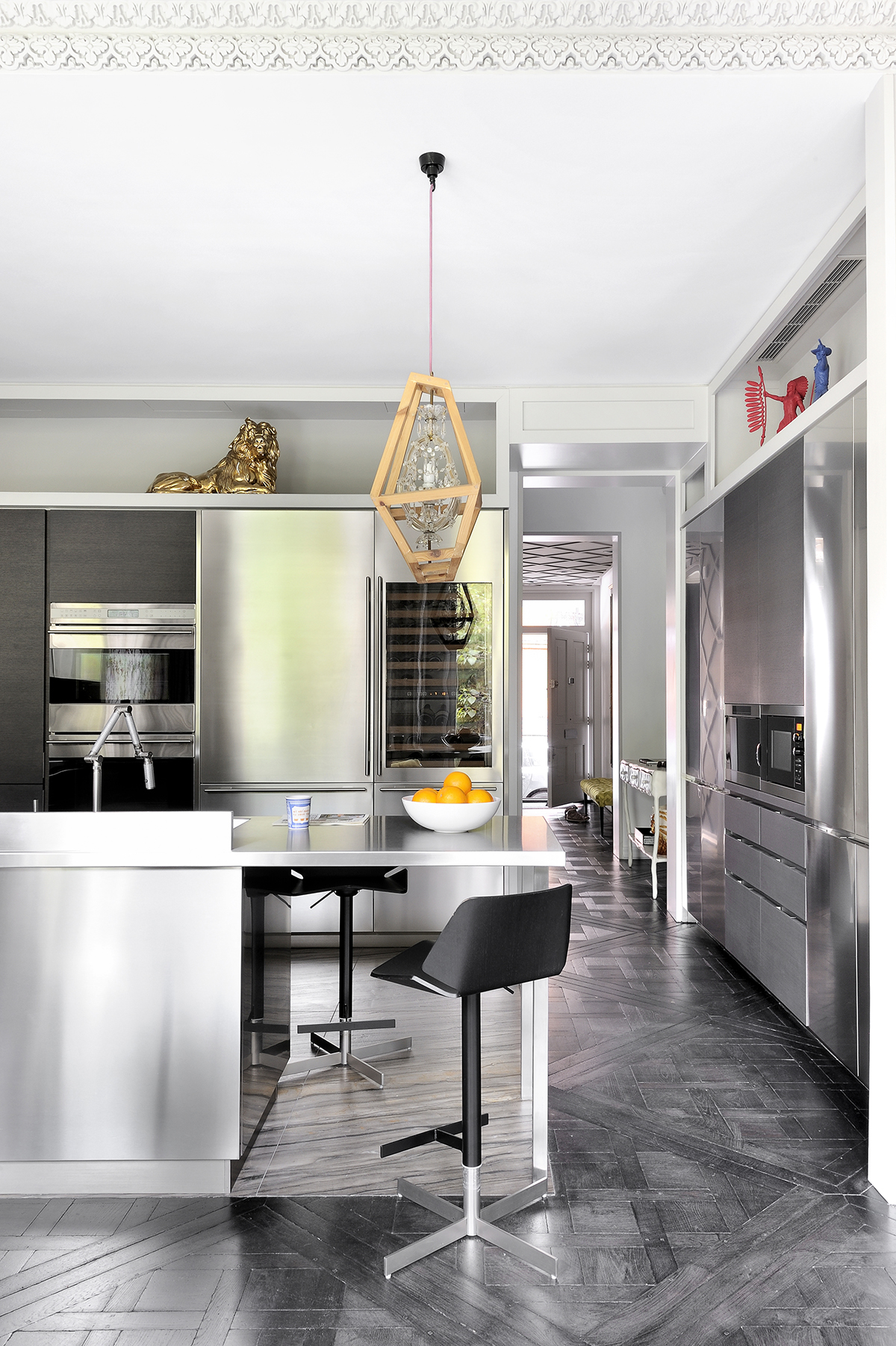
In the kitchen, the scheme is a professional run of stainless steel, but its no-nonsense approach gets a twist with some oversized toy figures and a playful light.
The pendant is both delicate and decorative combined with harder contemporary lines.
DINING ROOM
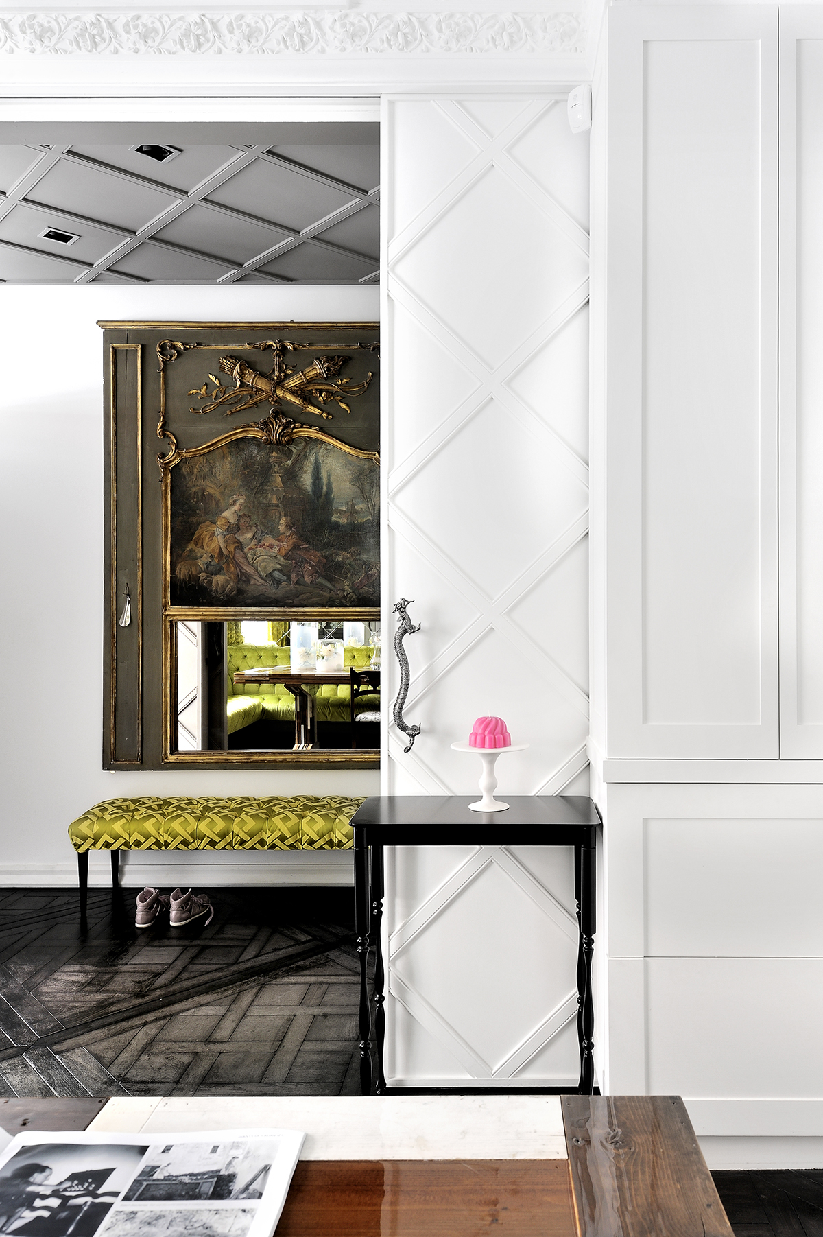
The Versailles parquet floors pattern is subtly echoed in a wall of mirrors sliced into diamonds and reflected in shiny tin ceiling tiles in the dining room.
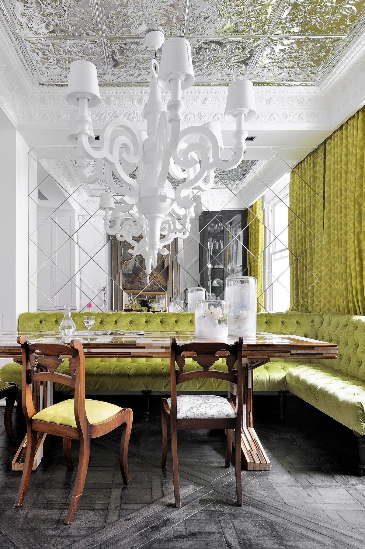
The space is a nod to the opulence of Paris, but in an English setting.
Diamonds are forever, with the sliding door and ceiling – both also taking their cue from the Versailles parquet. The antique wall panel was found in the Marché aux Puces de Saint-Ouen in Paris, but this context makes it feel more modernand interesting.
STUDY
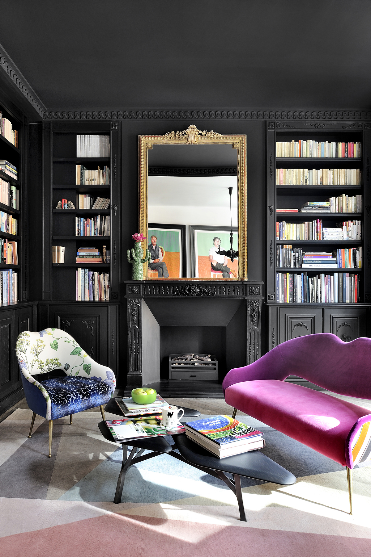
The bespoke library shelving is tongue-in-cheek. The detailing starts plain on the left, then picks up decoration as it wraps around, like a story that gathers momentum.
MASTER BEDROOM
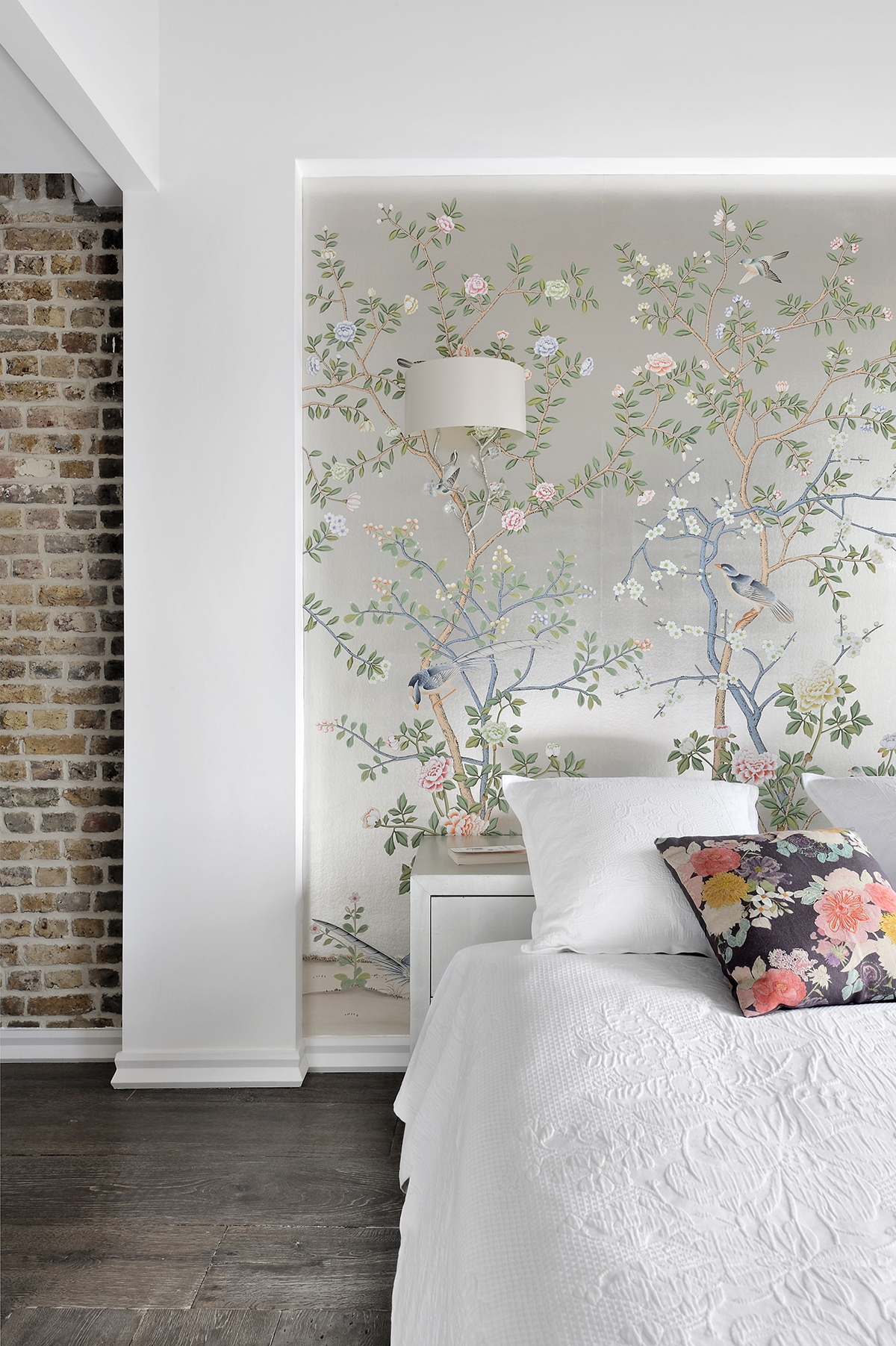
On the top floor, there's one bare brick wall and roof rafters exposed, as a reminder of this chapter in its (property) transformation.The roughness of the exposed brick is highlighted by the decorative wallpaper.
Design / Olivier Gay
Photography ⁄ Frenchie Cristogatin
The homes media brand for early adopters, Livingetc shines a spotlight on the now and the next in design, obsessively covering interior trends, color advice, stylish homeware and modern homes. Celebrating the intersection between fashion and interiors. it's the brand that makes and breaks trends and it draws on its network on leading international luminaries to bring you the very best insight and ideas.