Interior designer Yinka Ilori explains the secrets to using bold colors in relaxing decor schemes
Designer Yinka Ilori tells our editor Pip Rich how to use vibrant colors in ways that makes the home feel calm and soothing
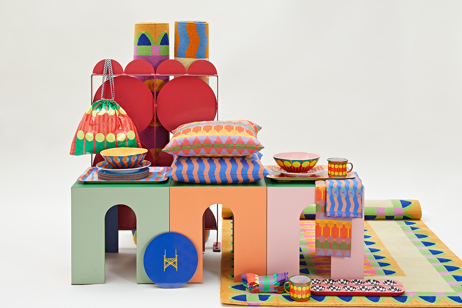
If there's one person we turn to for color advice here on Livingetc, it's Yinka Ilori. The British designer is known for vibrant yellows, burnt oranges, hot pinks and deep blues.
But that's not to say he's into maximalism for sake of it, and actually his take on interior design is about the push and the pull, finding subtleties to use against stronger shades. Which is what makes it all so interesting and rich and layered.
Yinka is now an award winning designer , but he began his career making over chairs he found in skips ten years ago. He has gone on to create some of the biggest installations and brightest products of his generation. This month sees the launch of a major show of his work at the Design Museum, as part of London Design Festival.
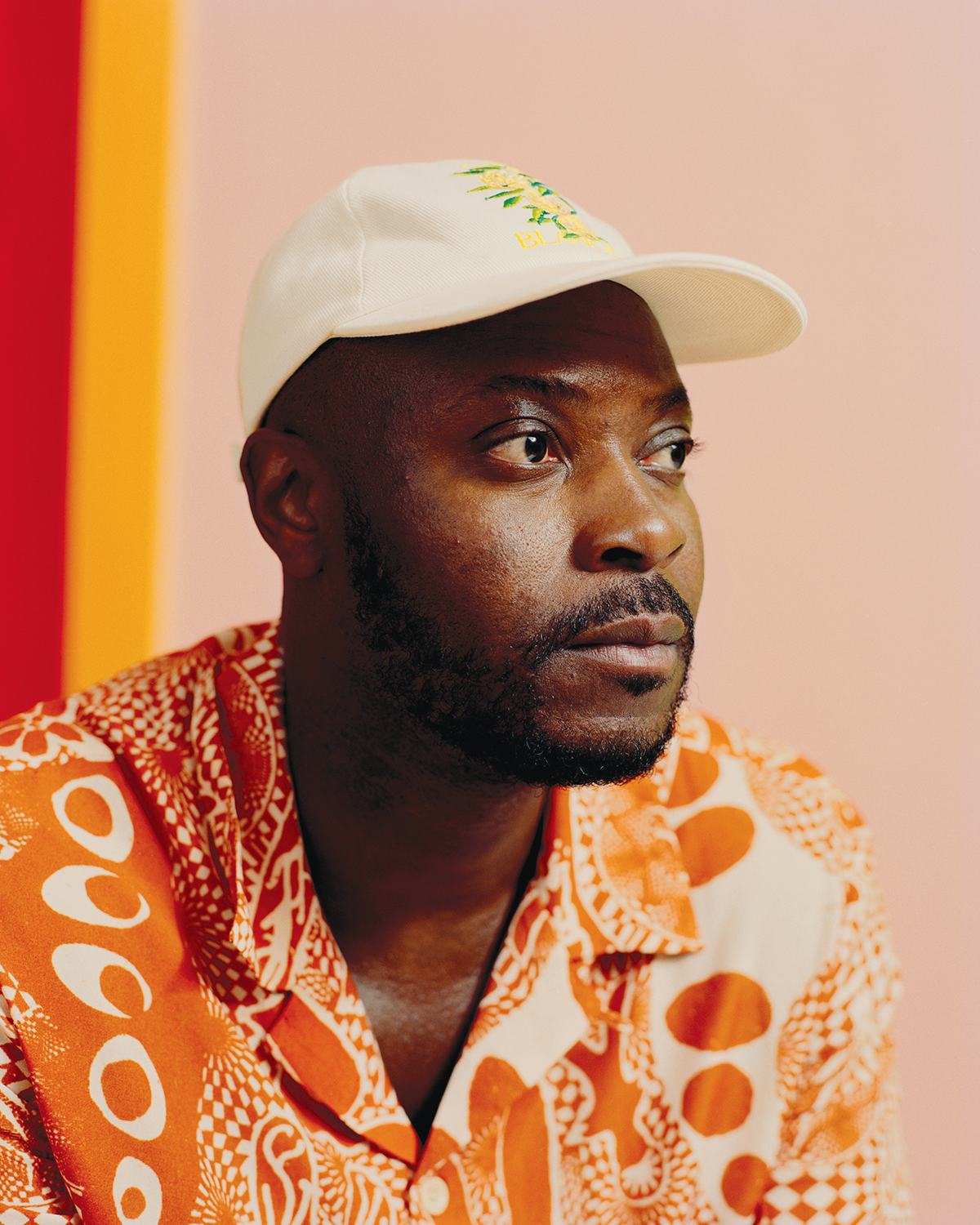
Soft colors are the key. You have to use them to separate the bolder ones to let them breathe. I love orange and pink together but they’d make a lot of noise if that was all you used!
Yinka Ilori
On using color in design to bring people together
Pip Rich: Since we last spoke, it seems like you’ve gone stratospheric! Only last month you met the then Prince Charles. What is it about your use of color that you feel people are connecting too right now?
Yinka Ilori: Lockdown put us in a dark, stressful and confused place, and now I think people have got a new lease of life. They want to create new experiences, to feel hope and empowerment, and that’s what my work is all about. Using bright colors speaks of joy and love, and is so uplifting. It promotes people coming together.
PR: I see a real desire for design to help us forge connections right now, but my take on it is very literal - placement of seating that aids conversation, for example. How do you think color does this?
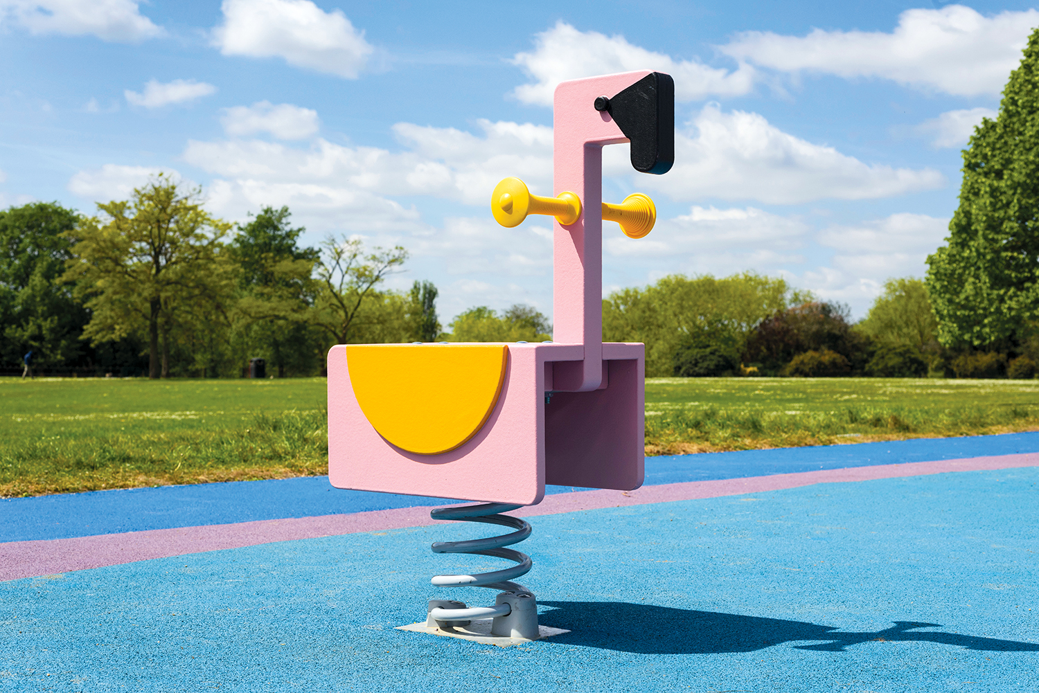
YI: There’s an element of humor in the way I design. From the flamingos I used in the design of the public playground I created in Dagenham to the typography and sunshine brights I use in my products, getting people to smile helps them make memories, which live on in their hearts. Memories made with others is the best way to get bonds to form.
Be The First To Know
The Livingetc newsletters are your inside source for what’s shaping interiors now - and what’s next. Discover trend forecasts, smart style ideas, and curated shopping inspiration that brings design to life. Subscribe today and stay ahead of the curve.
On how to create key visual moments
PR: The designer Brigette Romanek told me her theory is that people don’t remember each piece in a room, but they do remember how it made them feel, so the mood of a decor is more important than the furniture you’ve used.
YI: Yes - when you’re decorating a room your starting point should be ‘what is the takeaway going to be?’ It could be a color, a texture, a word - or a flamingo! - , but knowing what the key moment will be allows you to create a real design story.
PR: While your style is associated with a liberal use of bright shades, it’s actually the neutrals that stand out to me - the lavender stripe next to the orange and pink is the quiet hero that allows the stronger hues to shout.
YI: Soft colors are the key! You have to use them to separate the bolder ones to let them breathe. I love orange and pink together but they’d make a lot of noise if that was all you used!
On the calmest bright color palettes to use at home
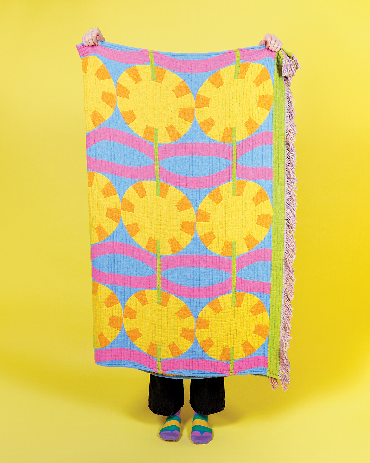
The Orun throw by Yinka Ilori
PR: Your own home is quite calm, and I like the color theory you've applied to it. What palettes are you into for very relaxed, soothing, livable spaces?
YI: Yes, I suppose it is quite calm in places. I’m obsessed with green, yellow and lilac, and I’ve got a chair in the corner of the living room that is my current favourite spot. I've covered it in the Orun throw which looks like the sun, but it’s next to white walls and a green Monstera. I’ll sit here and read and contemplate and relax. That’s the thing about bright colours - people think they’re energising but actually can be very relaxing, if they evoke memories of holidays in the sun on the beach when you felt at peace.
PR: Are there any colors you wouldn’t use in a home?
YI: I grew up in a housing estate in north London and there wasn’t much color around. I tend to stay away from browns and greys and instead look to anything that can provide a moment of escapism. I would definitely say red is one of the colors to avoid in a bedroom - it can be quite harsh to wake up to. I would go for some sort of soft yellow or orange - opening your eyes to them in the morning gives you the same feeling as opening the window and letting the sun pour in. Instant joy.
PR: Is joy the theme of what you’re doing for London Design Festival this month?
YI: I guess so - I’m doing a look back on my design process over the past ten years at the Design Museum. It’s not a retrospective but it’s been wild looking at how much I’ve grown. I started off just making chairs and now I’m getting to interact with people globally. What I hope for anyone who comes is that they leave with new ideas for using colour, with a smile on their faces, and with new memories having been made.
The editor of Livingetc, Pip Rich (formerly Pip McCormac) is a lifestyle journalist of almost 20 years experience working for some of the UK's biggest titles. As well as holding staff positions at Sunday Times Style, Red and Grazia he has written for the Guardian, The Telegraph, The Times and ES Magazine. The host of Livingetc's podcast Home Truths, Pip has also published three books - his most recent, A New Leaf, was released in December 2021 and is about the homes of architects who have filled their spaces with houseplants. He has recently moved out of London - and a home that ELLE Decoration called one of the ten best small spaces in the world - to start a new renovation project in Somerset.
-
 Before and After — How This Jewel-Box Bathroom Made the Most of Its Proportions With Maximalist Design and a 'Soaking Tub'
This design offers a masterclass on creating a luxurious bathroom that is equally playful and elegant.
By Maya Glantz
-
 10 Stylish Spring Centerpiece Ideas That Feel "Modern, a Bit Eccentric, and Perfectly Unfussy," Says a Table Stylist
From vases of seasonal blooms to simple candle arrangements, these centerpieces add height and interest to your table for an arresting focal point
By Lilith Hudson