How to choose cool colour combinations for your home
The right colour combinations will look good throughout your home. Dagny Thurmann-Moe of Koi Colour Studio shares the no-go palette pairings and power hues

Colour combinations are important - and when it comes to home decor ideas, we know that Livingetc readers are no strangers to colour.
Whether it's yellow living room ideas or blue kitchens you embrace new shades and hot hues wholeheartedly.
But whatever the home decor colour trends dictate, colour isn't used in isolation. So it's important to know how to make colour combinations and colour intensity work - not just in the living room or kitchen, but throughout the home.
For an interior scheme to look good, it has to be cohesive and flow visually from room to room. You might fancy a pink bathroom but how will it look next to a green bedroom?
One person who knows how to get the best from colour is Dagny Thurmann-Moe of Koi Colour Studio in Norway. Here she shares her tips.
POWER HUES
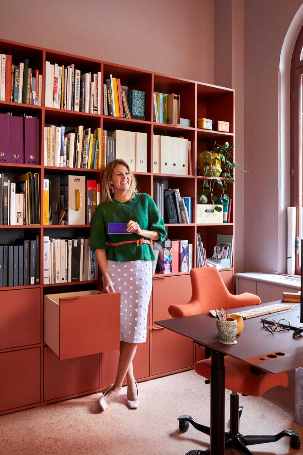
I'm a really calm person so I need an energetic atmosphere. In my home I’ve used red – often several shades in colour combinations. I avoid the brighter ones because I don’t like intense rooms, but if a shade is warm and a bit bold I think it communicates strength. It also adds personality and atmosphere.
NO-GO PALETTE PAIRINGS
While I love a warm red, I rarely use it on walls and prefer it on furniture – like my sofa – and textiles. The beauty is that it works well with practically any colour apart from bright yellow (because it creates a fast-food restaurant vibe). I have a few rules like this in the studio. For example, I never use blue with yellow because it reminds me of the Swedish flag. And you can’t use red and green because it looks like Christmas.
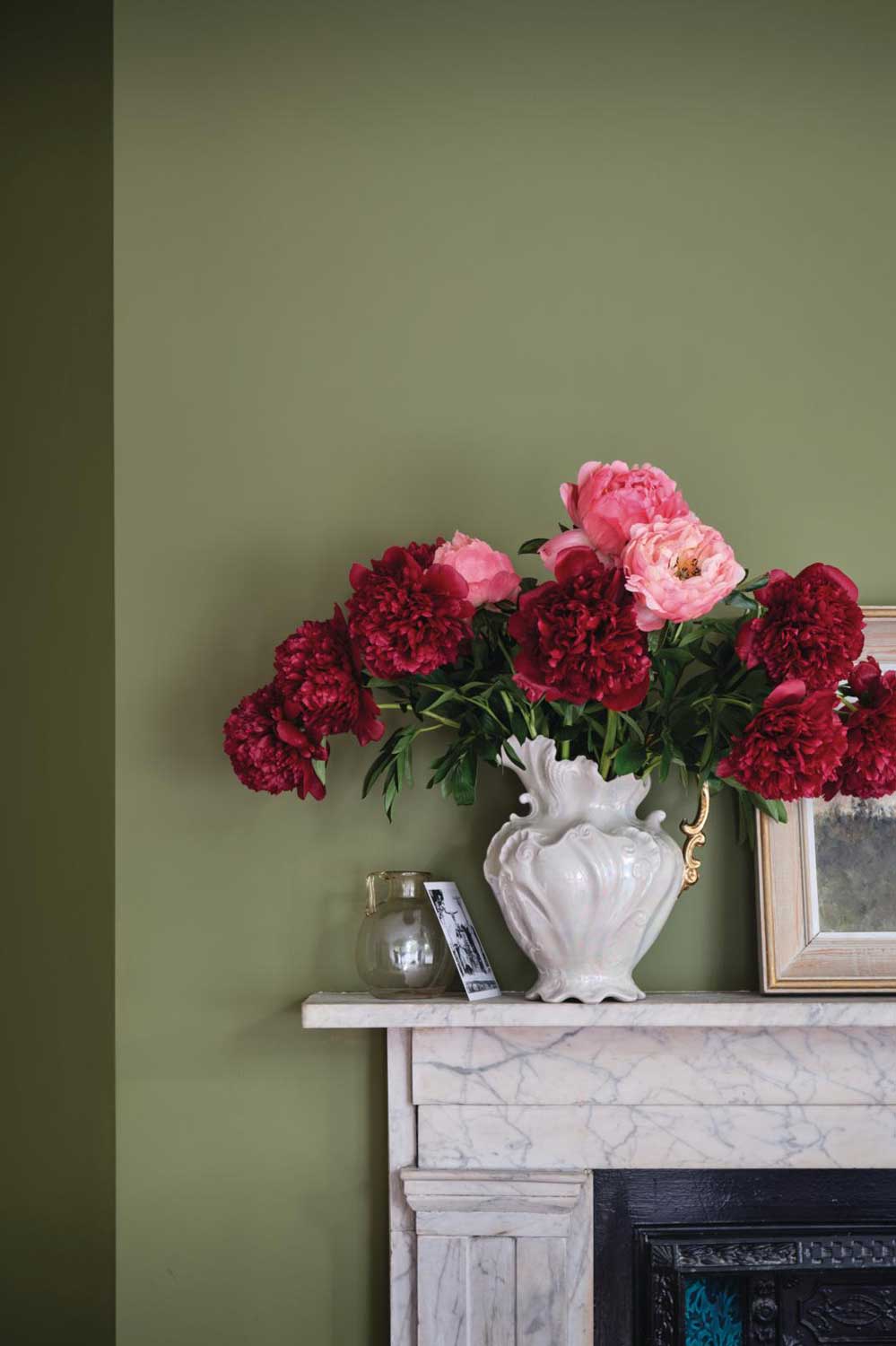
Farrow & Ball, Sap Green
LIGHTEN UP
I’m currently renovating our new home and combining dusty and light colours. The dusty colours I have used in my home are Pure & Original’s Lagoon Water, Jade and Olive Drab, which are toned down and not too intense. They have a certain percentage of black in them, but not too much. I prefer to combine hues with different lightness levels – it results in an all over more interesting look.
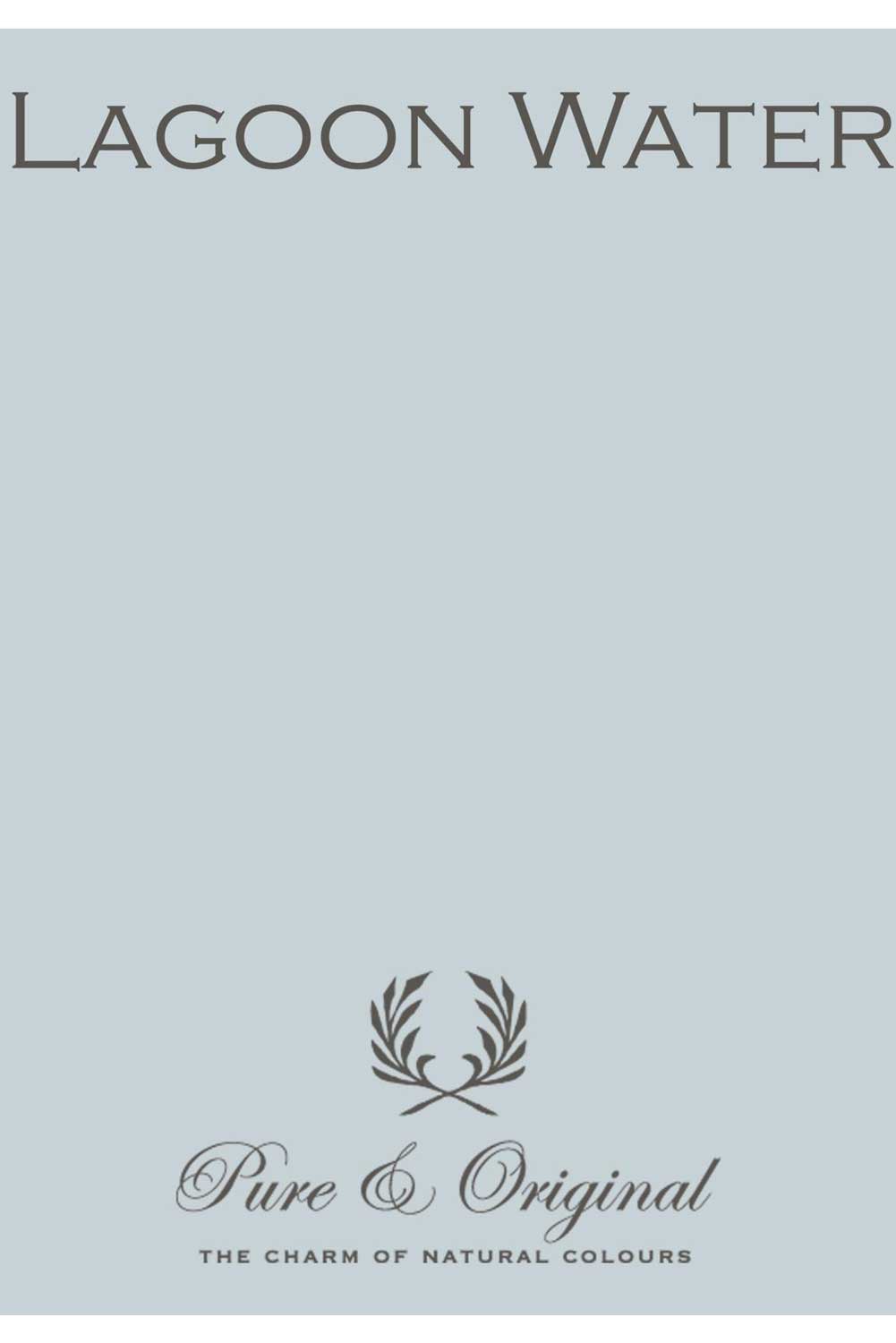
Lagoon Water classico chalk based paint, £78 for 2.5ltr, Pure & Original
COLOUR COHESION
I avoid using greyscale shades, not only in my own home but also in the homes of my clients. The problem with grey is that it’s not a part of the colour wheel, it is not a colourway. So when you try to combine it with the colour wheel you create visual chaos. For example, if you have white walls and you buy yourself a red sofa, all you’re going to see in that room is the red sofa because the contrast between the two is so high.
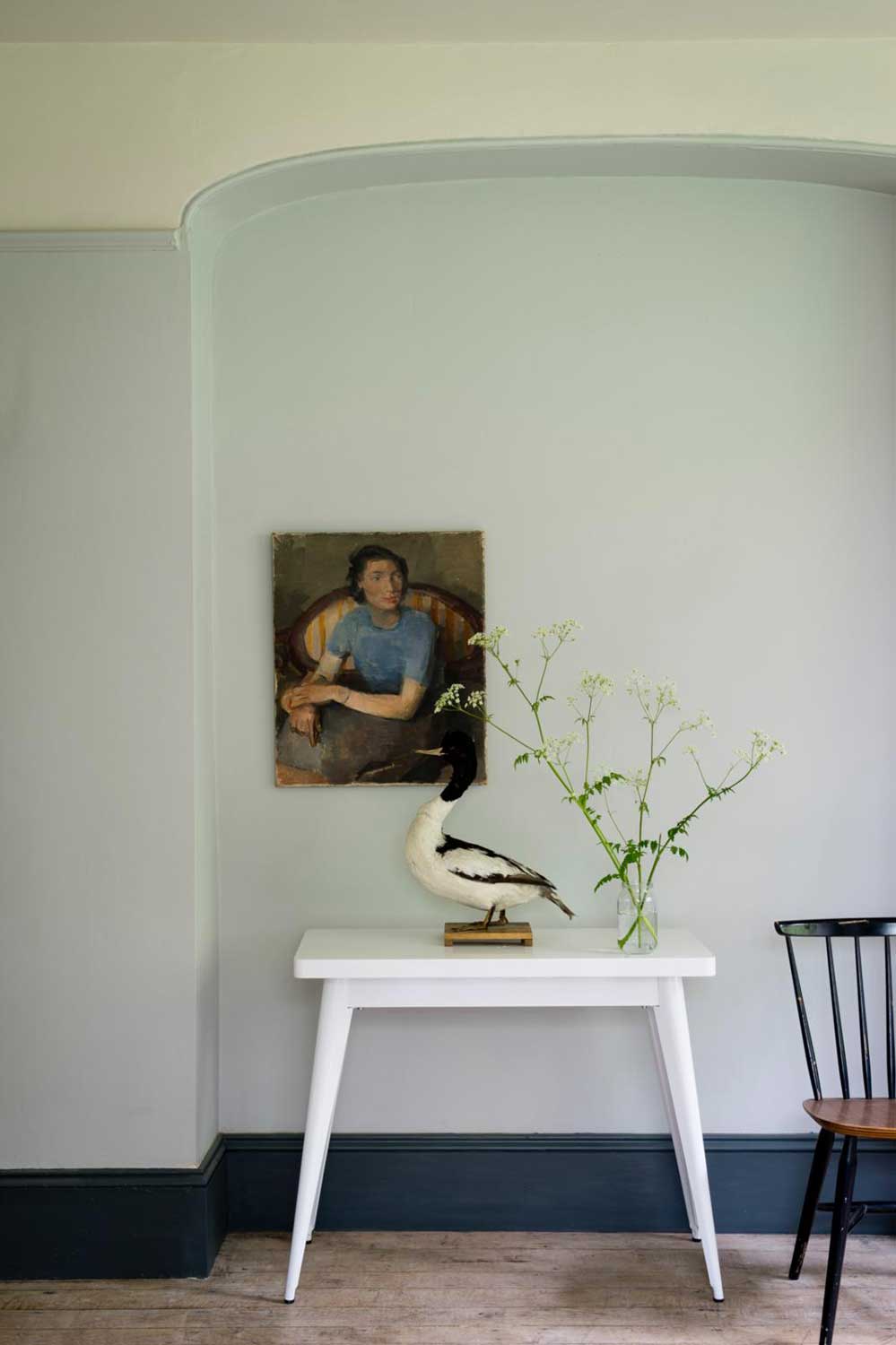
Farrow & Ball, Borrowed Light
BACK TO BLACK
The only greyscale colour I can live with is black, but it has to work with the architecture – specifically modernist architecture from the 1930s with its black window frames and black doors. But even in these cases, we usually soften the black with a little bit of blue, red or green.
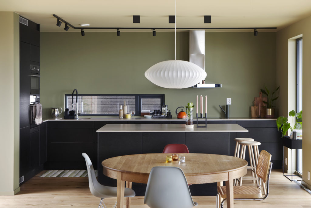
NATURAL PIGMENTS
It’s very important that I work with colours that have natural colour pigments in them – Farrow & Ball, for example, and Pure & Original. A paint with plastic pigments makes a wall look a little flat, while natural pigments add more depth and also transport more light into the room.
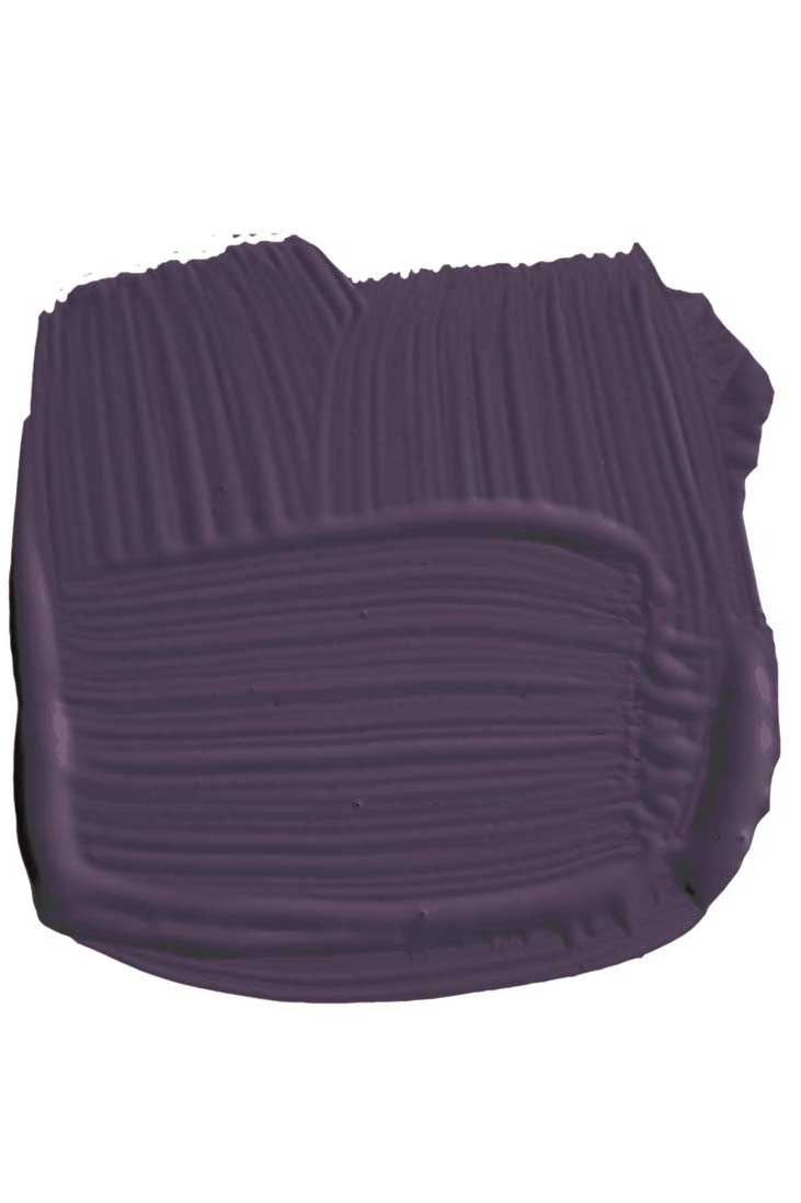
Pelt estate emulsion, £47.95 for 2.5ltr, Farrow & Ball
LINSEED (SOLVENT-FREE) OIL PAINT
I’d recommend using linseed oil paint. It used to be a bit difficult to work with – you had to have it at a certain temperature or it would take forever to dry. However, it’s now much easier to use: it dries quickly and produces more consistent results.

Jubilee linseed oil emulsion, £36 for 2.5ltr, The Traditional Paint Company
NATURAL PAINT
Using natural paints is a bit different from rolling on other paint. You need quite a bit of paint on your roller or brush, but generally you’ll only have to apply two coats, unless it’s a really special colour, such as Pure & Original’s Old Ocre, which is almost made up of more pigment than paint.
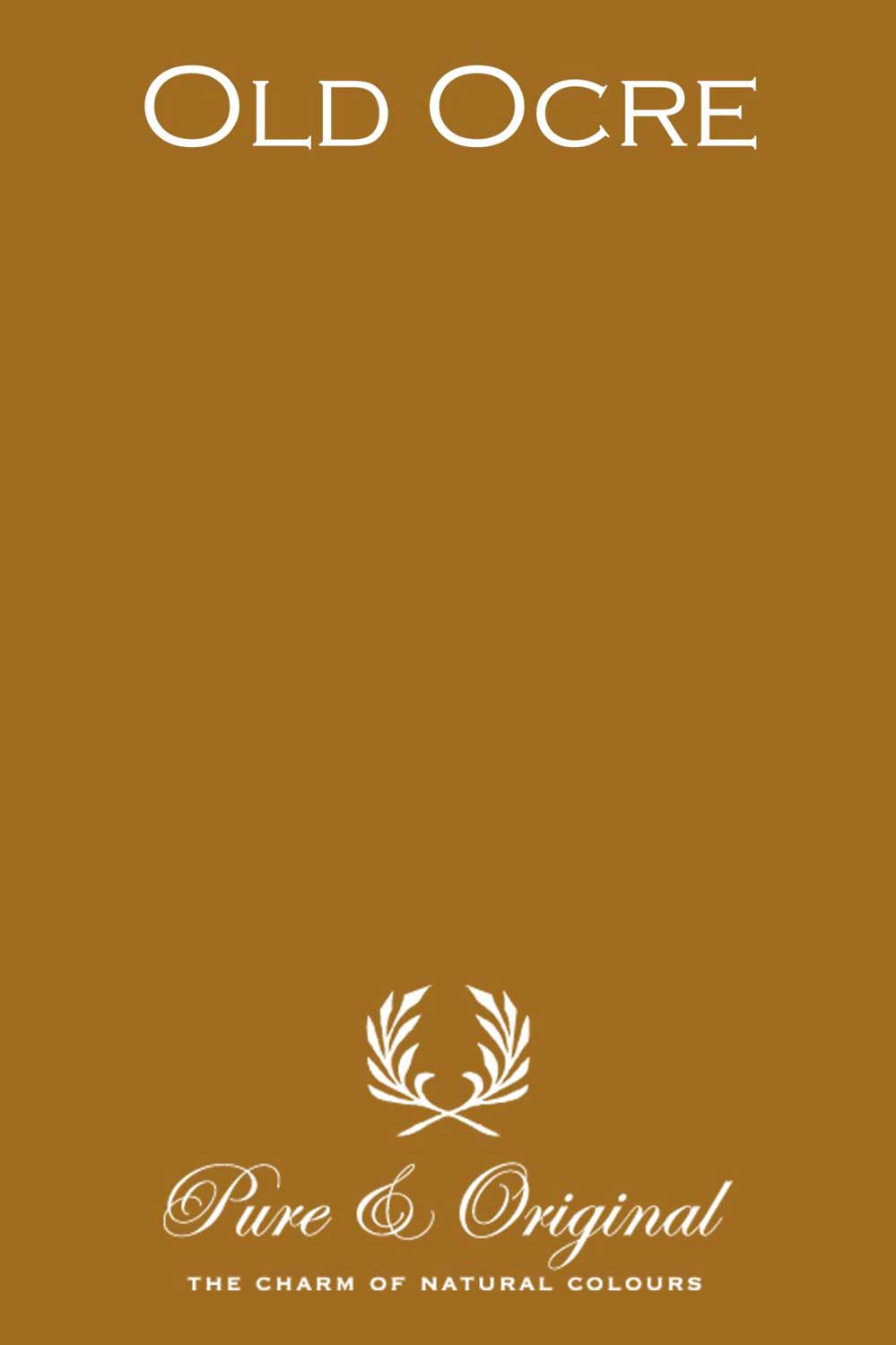
Old Ocre Classico chalk based paint, £78 for 2.5ltr, Pure & Original
See more inspiring paint colours
Be The First To Know
The Livingetc newsletters are your inside source for what’s shaping interiors now - and what’s next. Discover trend forecasts, smart style ideas, and curated shopping inspiration that brings design to life. Subscribe today and stay ahead of the curve.
The homes media brand for early adopters, Livingetc shines a spotlight on the now and the next in design, obsessively covering interior trends, color advice, stylish homeware and modern homes. Celebrating the intersection between fashion and interiors. it's the brand that makes and breaks trends and it draws on its network on leading international luminaries to bring you the very best insight and ideas.
-
 The Easiest Way to Turn Your Designer Scarf Into Wall Art — No Frame, No Fuss, No Regrets
Because silk this pretty should never stay in a drawer
By Julia Demer Published
-
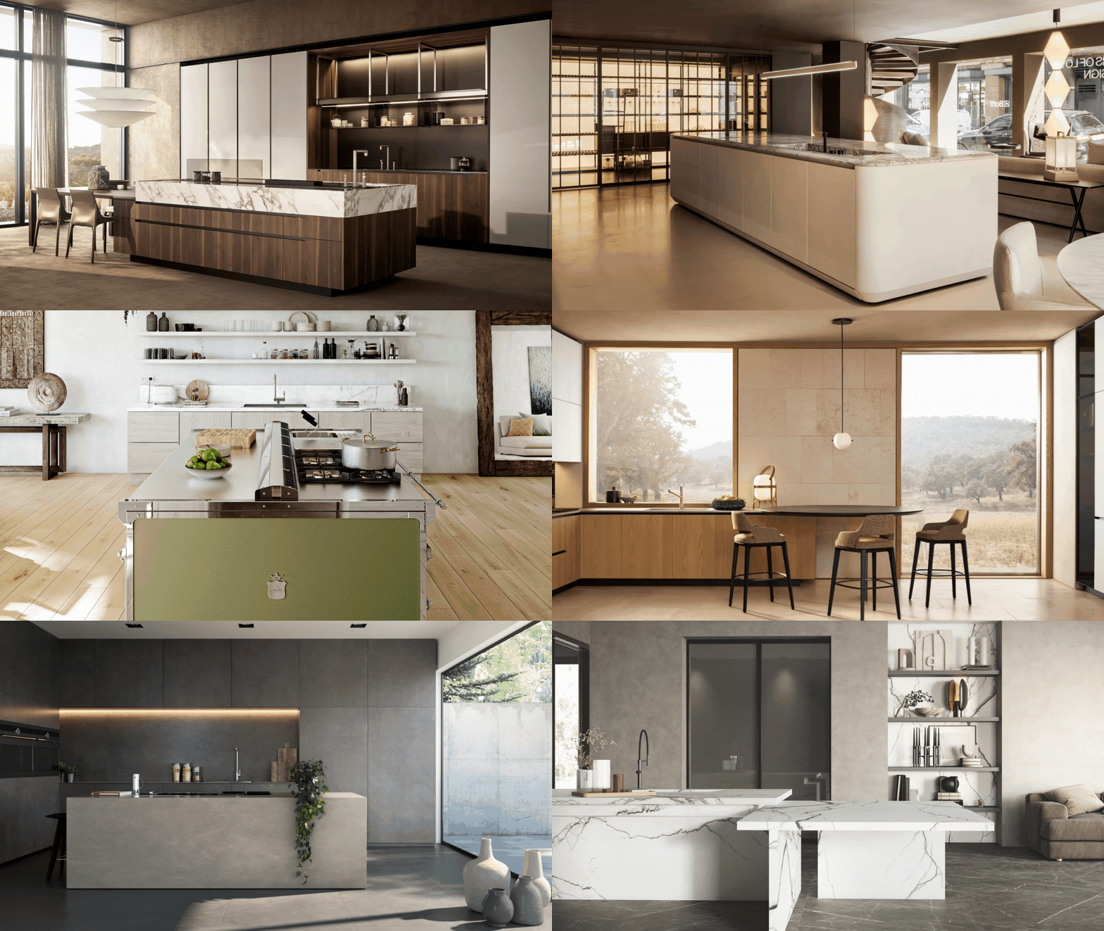 Italian Kitchen Trends — 5 Emerging Ideas From the Chicest Italian Designers That I Predict Will Go Global in 2025
Fresh from Milan Design Week, these are the exciting finishes, styles, and innovative materials I can't wait to see in more kitchens this year
By Faiza Saqib Published
-
 Florist Angela Maynard on how to care for dried flowers and how to style them in a modern home
Knowing how to care for dried flowers means you can have stylish arrangements that last for years. Author and florist Angela Maynard shares her tips
By Angela Maynard Last updated
-
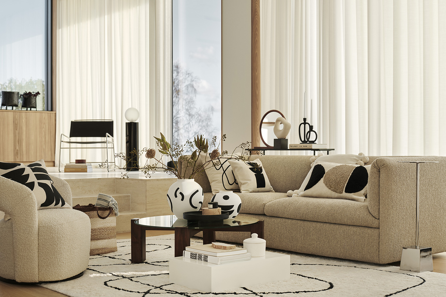 11 beige living room ideas that prove beige can be far from boring
Beige living room ideas might sound not sound like the boldest of color schemes but this pared-back palette can be just as striking a brights
By Amy Moorea Wong Last updated
-
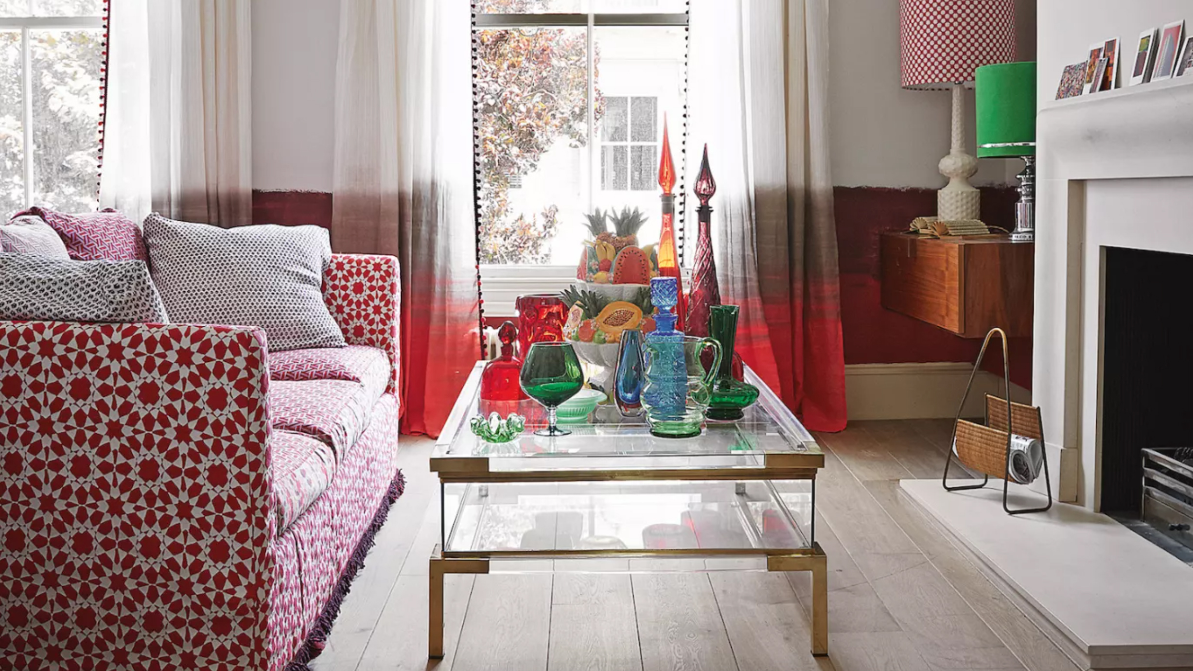 How to use color in small living rooms – expert tips for getting the perfect scheme
Bringing color into small living rooms can be tricky, but with the right hues and our top tips, you can make the space look brighter, bigger and just better
By katesleeman Published
-
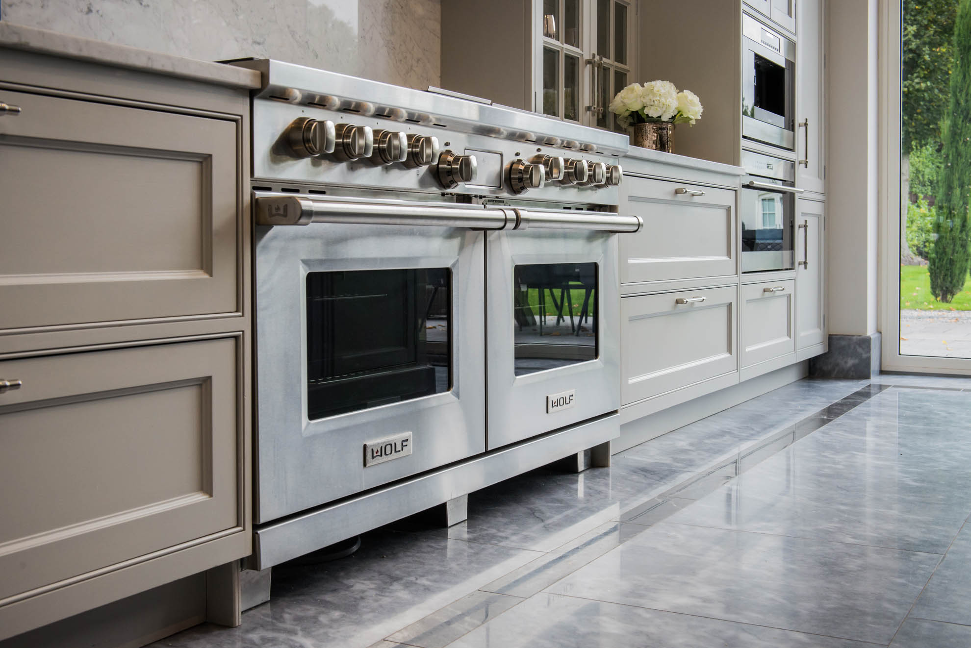 Buying a used kitchen could be your savviest design idea - here's what you need to know
Buying an ex-display used kitchen is a way to a high-end home at High Street prices
By Jacky Parker Published
-
 Home decorating: Tricia Guild's guide to a confident scheme
Home decorating advice from legendary designer Tricia Guild OBE
By Livingetc Published
-
 How to achieve beautiful paint finishes according to interior designer, Nicola Harding
Beautiful paint finishes transform a room and are easier than you think
By Livingetc Last updated
-
 The meaning of style, by interior designer Russell Sage
Acclaimed interior designer Russell Sage talks broken rules, secret ingredients and looking good in any light
By Russell Sage Published
-
 Meet Linda Boronkay, Livingetc's brand new columnist
The designer Linda Boronkay in conversation with our editor, Pip McCormac
By Pip Rich Published