5 things I learned decorating with this new kind of minimalism – it turns out it's the trick to more comforting spaces
Combining warm, cozy textures with a less-strict minimalist outlook, I took inspiration from the minimaluxe trend to create an elegant new look for my working studio
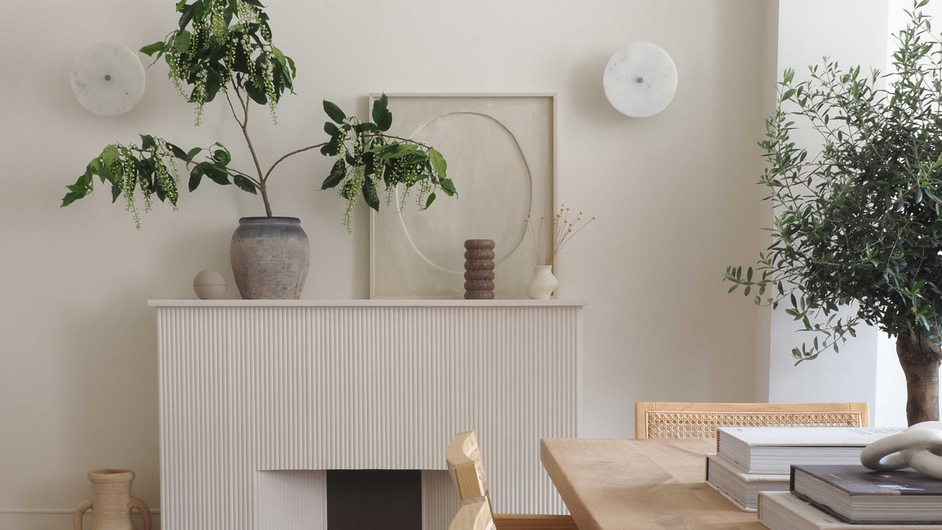

I've always found it difficult to put into words exactly what my taste in interiors is. I'm drawn to neutrals, the textures of wood and stone, and keeping spaces light and bright, but in reality, I'm not a minimalist. I love to fill open shelving with beautiful objets, have coffee table books stacked high - these are not spaces free from clutter by any means.
The term that probably best encapsulates all the facets I love about design is a relatively new one to me: "minimaluxe". It's an idea that seems to be defined by a softer, less-structured approach to minimalist interior design, and one that embraces those textures and shapes which I most love.
Minimaluxe is something that I discovered during a recent makeover of my workspace - a studio in an old Victorian house with beautifully lofty proportions - and considered its guiding principles as I pieced together the decor as part of a collaboration with home decor brand Wayfair.
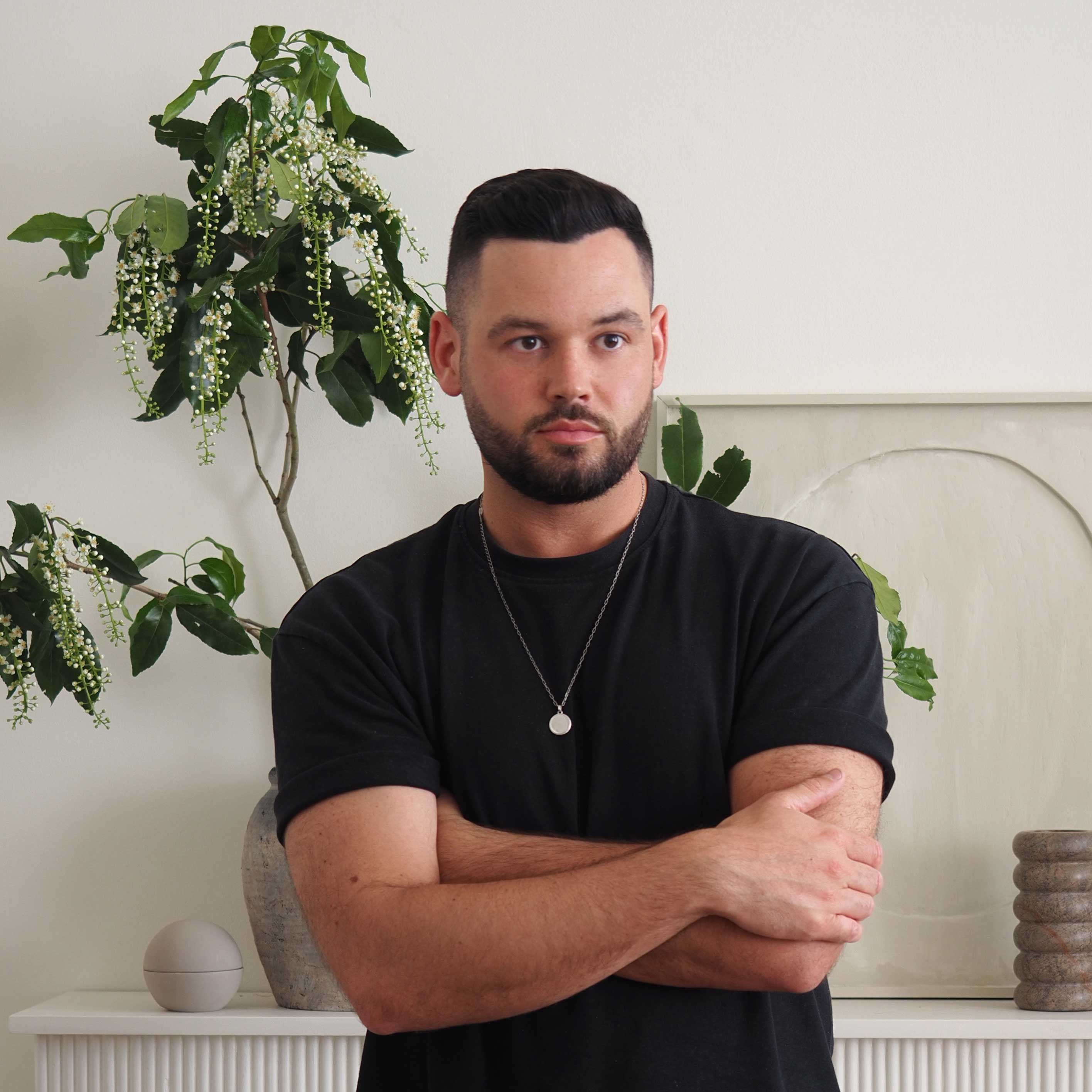
Luke is an interiors stylist, writer and award-winnning blogger, who specializes in luxury design with an accessible twist. Here, he gives us a tour of his studio space, designed with Livingetc's minimaluxe principles in mind.
Wayfair has got an incredible breadth of decor to explore, whatever your style is, so it wasn't hard to find pieces that echoed the ideas of minimaluxe in an elevated way.
This is how I interpreted the minimaluxe trend for this studio design, and what I learned about this warm minimalism in the process.
1. It's about subtlety in contrast

The secret to a good minimaluxe scheme lies in contrasting textures that help your design feel richer and more layered, without having to introduce stark shifts in color. In my design, this manifested itself in ideas like layering a beige travertine stone against a near perfect match wall color, for example, or choosing rattan chairs from Wayfair that sit a few tones off from the wood of the central table, rather than going for something like black for a more defined contrast.
It's a relatively monochromatic color scheme, but it stays engaging and interesting through the use of textures, even within this limited palette.
2. There's beauty in the imperfect
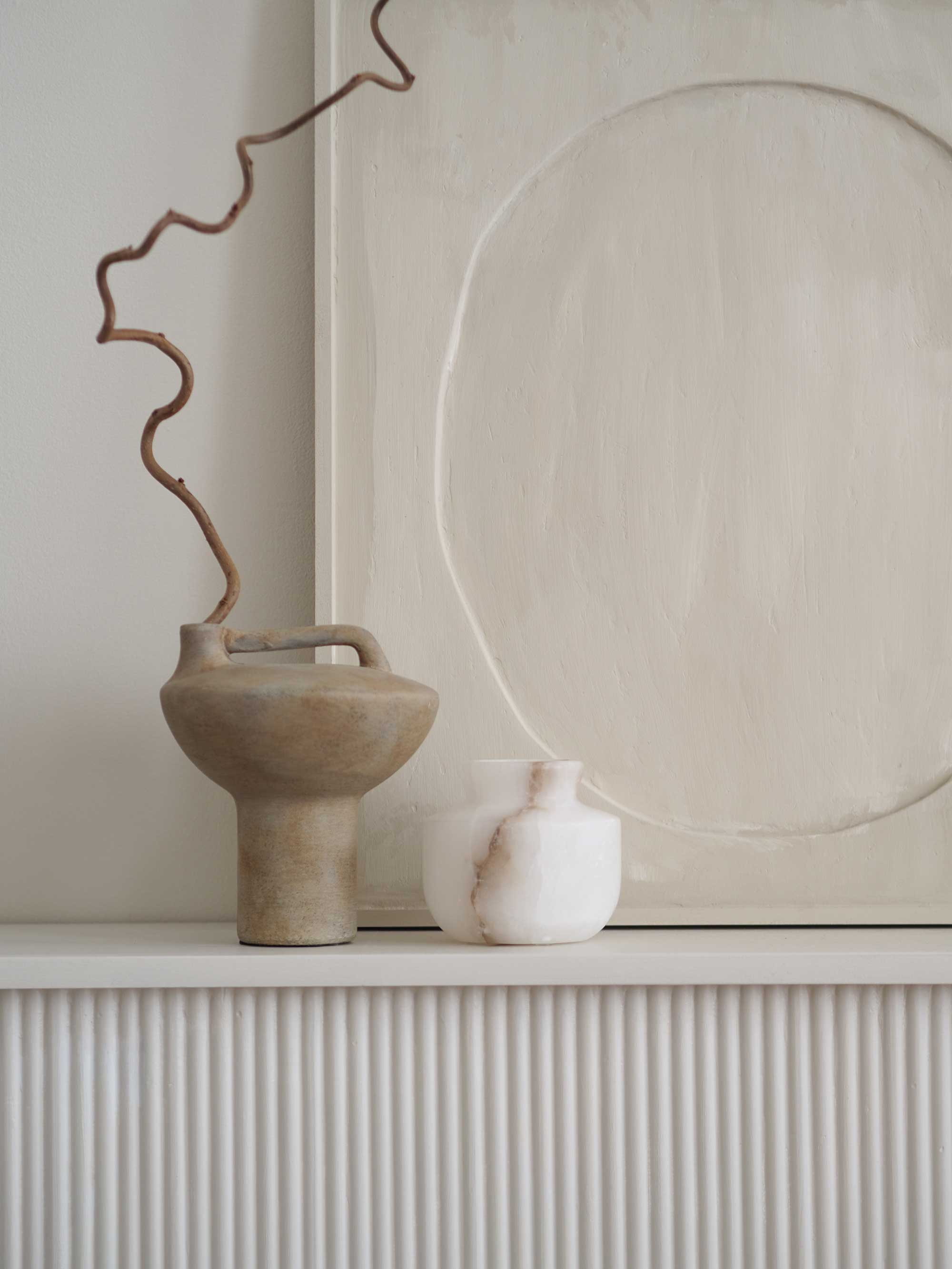
The Japanese philosophy of Wabi-Sabi is based on the idea that there's beauty to be found in the imperfect, and it's something that feeds into this type of minimalism. It's something that can be introduced through carefully curated decor - earthenware with irregular surfaces or unfinished or distressed ceramics are my go-tos.
It's the same for the furniture, too. The large oak solid wood table from Wayfair has characterful wood grain, and it's a table that will develop and patina with use.
I also found a new texture to introduce for a uniquely minimaluxe decorating scheme when browsing Wayfair – papier mache. Handmade vases and bowls have the appearance of ceramics, but have a rougher, more textural appearance than clay pots and vases, embodying the irregular and the imperfect that I love so much about Wabi-Sabi.
3. It's not just about decluttering
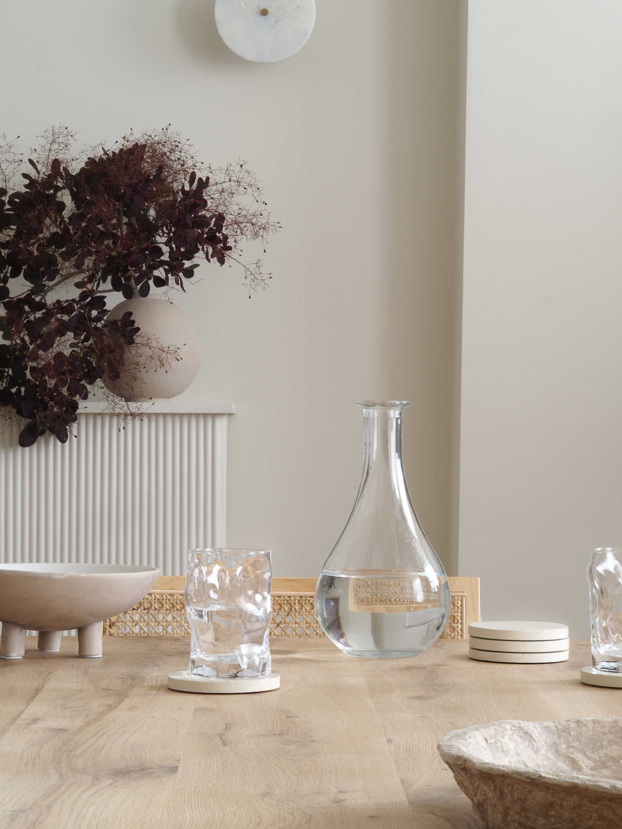
The traditional idea of minimalism may be about paring back the design, but while it's a scheme that's never going to venture into maximalism, it's a little more forgiving in what it allows.
Instead, it's a philosophy of being able to display your favorite things, while editing and curating around them. The centerpiece of the table is a line-up of some of my favorite interior books right now, for example, while I opted for glass-fronted cabinets to display my favorite objects - a space that can be changed and evolve the feel of the room. It still takes a little decluttering (and you should see how much stuff I have that didn't make the cut), but it's far less severe.
4. These minimalist spaces should be comfortable
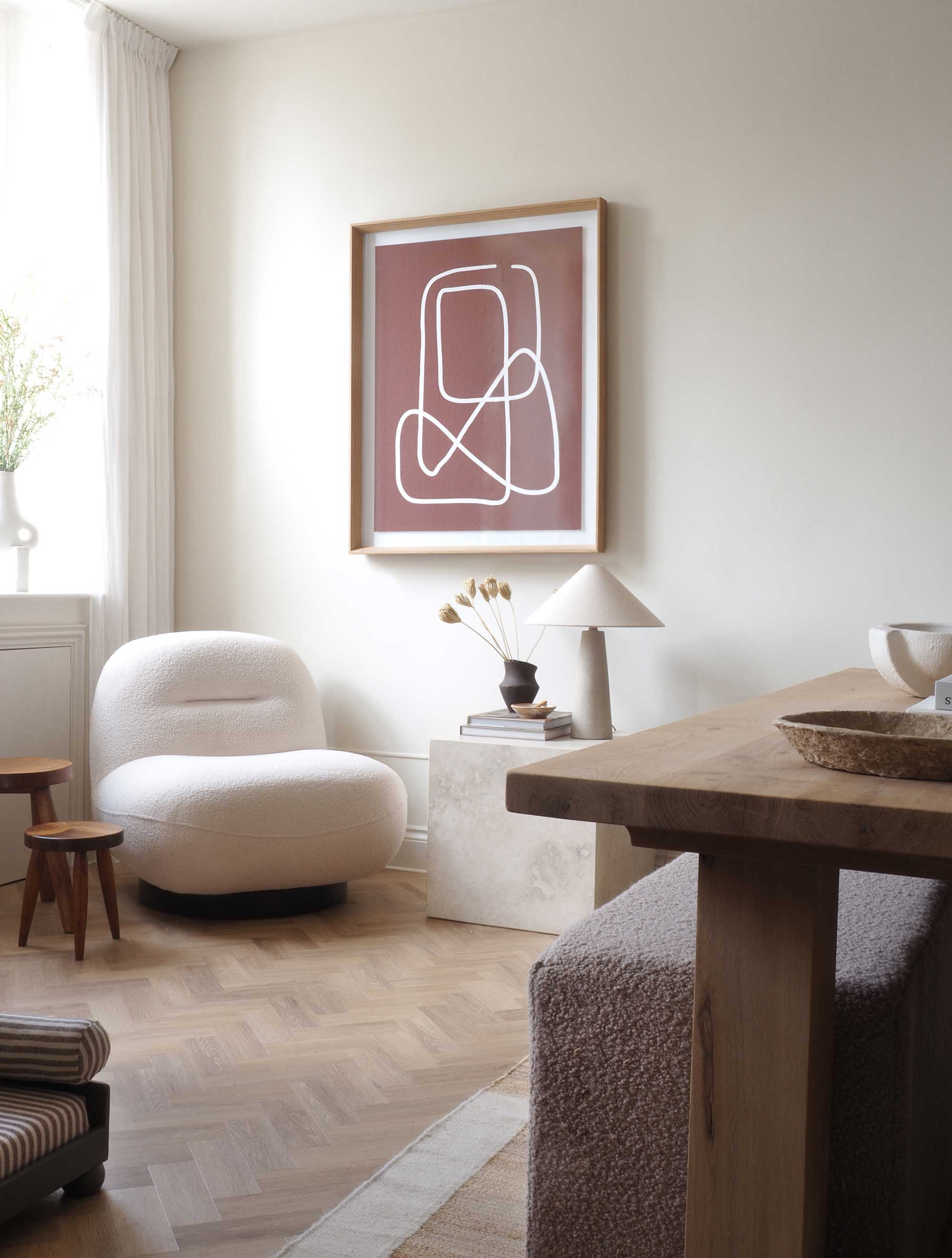
Designing a minimaluxe space is the perfect exercise in designing for the senses. Incorporating materials that feel luxe, yet cozy, while adding plumpness in contrast to the usually austere aesthetic of minimalism is what sets this decorating idea apart.
Boucle still stands as an interior design trend in this minimaluxe vision, for example, complementing one side of the table, otherwise decked out with rattan chairs, for a softer approach, while a simple, unobtrusive dressing of the windows in lightweight sheers really helps to soften the windows, without feeling over-dressed and blocking out valuable light.
5. Organic forms work brilliantly for it
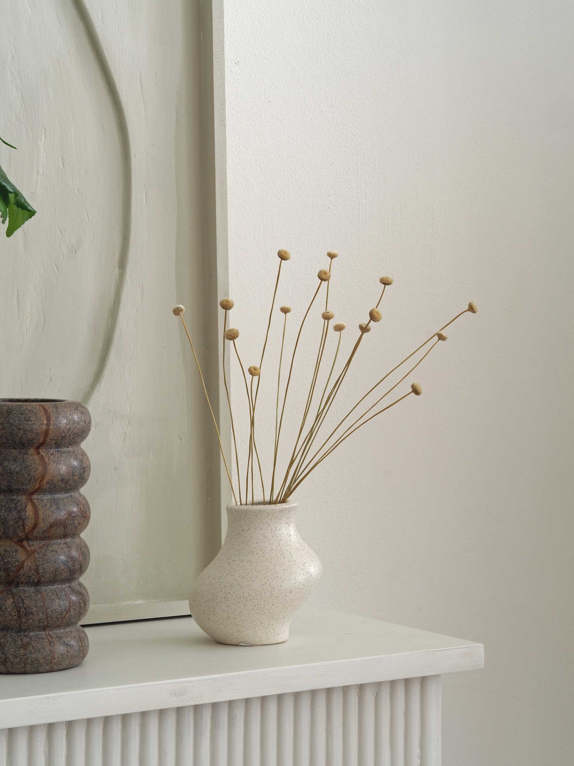
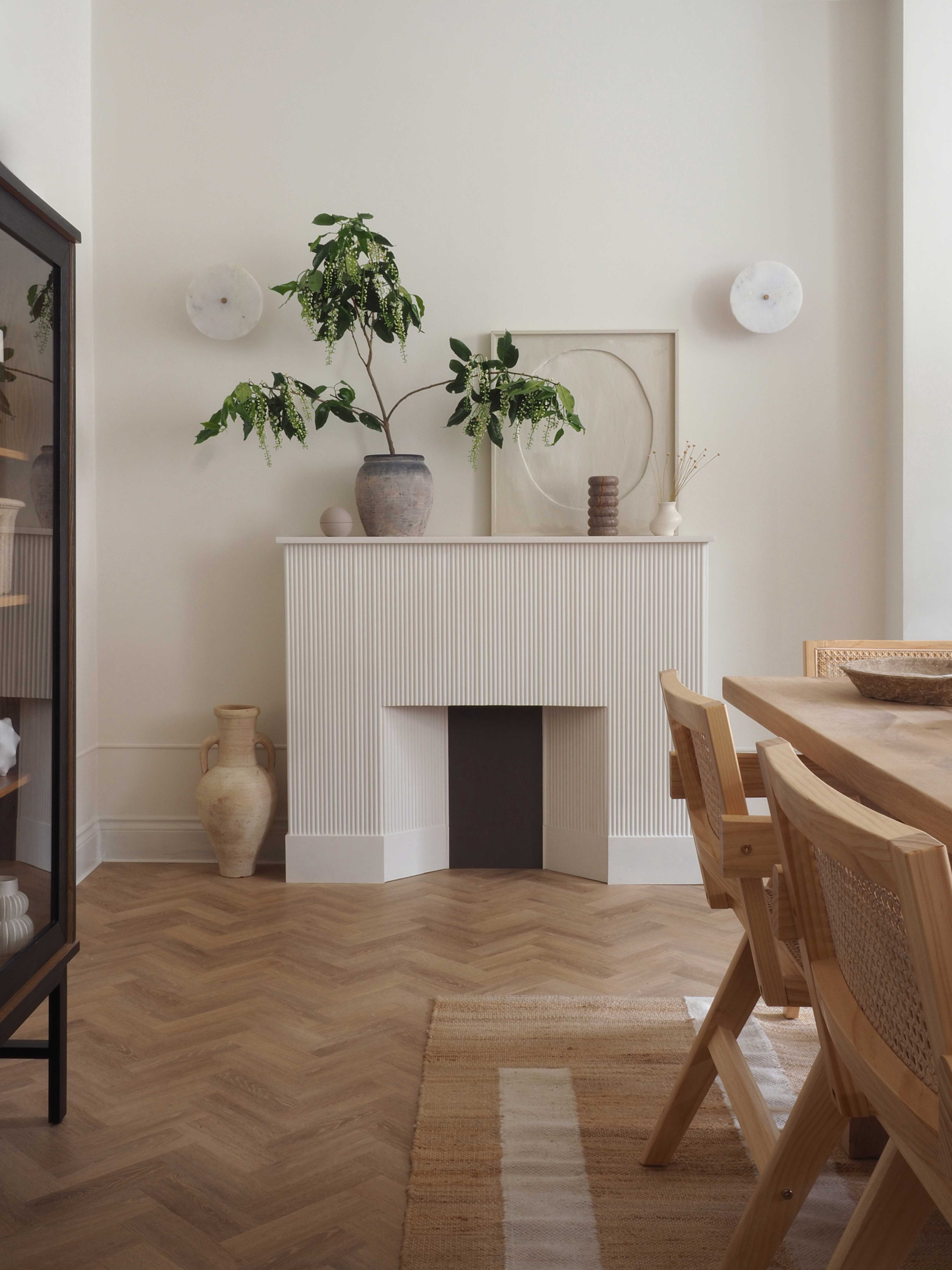
There's a psychology to the shape of things that sees curves and soft lines more welcoming, relaxing and creating more of a sense of ease than hard-lined counterparts. That's why the interior trends for sinuous forms I've been enjoying in recent years still has a place in this minimaluxe design.
This room itself doesn't have any amazing architectural features other than tall ceilings, so these smaller organic forms introduce a way to break up the linear nature of the space.
Be The First To Know
The Livingetc newsletters are your inside source for what’s shaping interiors now - and what’s next. Discover trend forecasts, smart style ideas, and curated shopping inspiration that brings design to life. Subscribe today and stay ahead of the curve.

Luke Arthur Wells is a freelance design writer, award-winning interiors blogger and stylist, known for neutral, textural spaces with a luxury twist. He's worked with some of the UK's top design brands, counting the likes of Tom Dixon Studio as regular collaborators and his work has been featured in print and online in publications ranging from Domino Magazine to The Sunday Times. He's a hands-on type of interiors expert too, contributing practical renovation advice and DIY tutorials to a number of magazines, as well as to his own readers and followers via his blog and social media. He might currently be renovating a small Victorian house in England, but he dreams of light, spacious, neutral homes on the West Coast.
-
 Iridescence Is Chrome’s More Playful, Hard-to-Define Cousin — And You're About to See It Everywhere
This kinetic finish signals a broader shift toward surfaces that move, shimmer, and surprise. Here's where to find it now
By Julia Demer
-
 Biophilic Decluttering — What to Take Out of Your Home (and What to Put in) for a More Natural Home
Try your hand at biophilic decluttering to ground your interiors, connect to the environment, and cure chronic clutter in one go. Here's how.
By Amiya Baratan