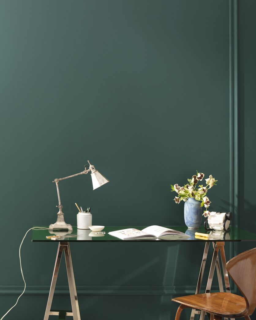
10 Paint Colors Interior Designers Picked for Their Own Homes — Exact Shades the Pros Love to use
Ever wondered how designers decorate their own personal spaces? Spoiler: it's often with a joyful celebration of color

There's something a little bit special about designers revealing the way they actually decorate – not in their clients' projects but behind the scenes in their own homes. From the furniture stores they source from to the big-box stores they swear by for certain accessories (H&M does great towels, for example), it feels like you're being given a look behind the curtain.
Designers give out plenty of advice about color trends and how to use them, but we wanted to find out the exact paints they use in their own interior schemes – right down to the specific shade of white they favor. So, of course, we asked them. Below are 10 of the hues they picked – you might well want to try some of them for yourself.
1. Navy blue
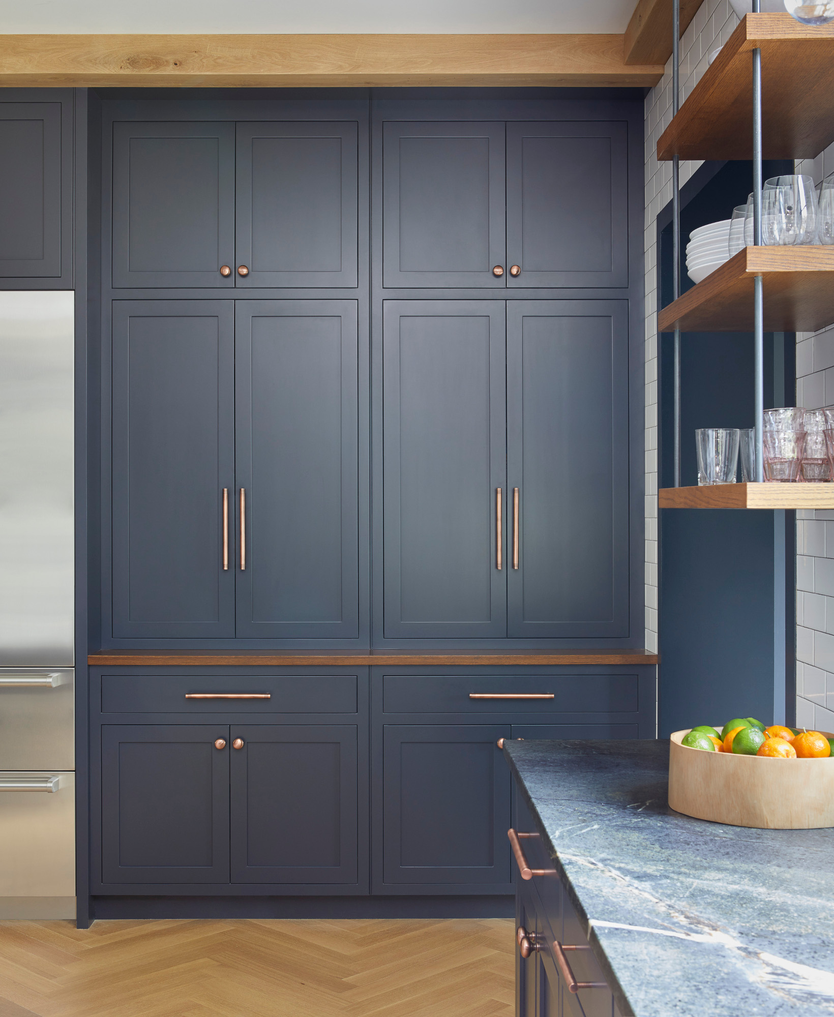
It came as no surprise to use to see Farrow & Ball’s Railings mentioned amongst designers – this classic blue-black is the most timeless kind of navy. Pittsburgh, PA-based designer Colleen Simonds used it in her own home as a kitchen color idea, pairing painted Shaker-style cabinetry with beautiful blue-toned marble countertops. ‘I love this dark navy,’ Colleen says. ‘It's a color, but also a neutral, and it’s very easy to live with – not trendy but not boring.’
2. Deep mauve
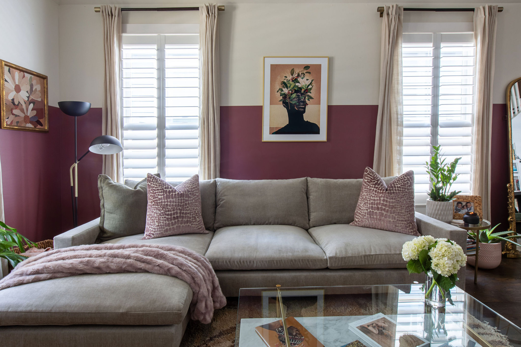
We've recently reported on the surprise rosy mauve shade that interior designers have declared their favorite color for 2024 – but for Amber Guyton, Atlanta-based interior designer and founder of Blessed Little Bungalow, the perfect shade for her lounge was a little richer. ‘My living room is painted about five inches up the walls in Benjamin Moore's Love Affair,’ she says. ‘The color is a moody, mauvy merlot that is inviting for guests and sets a relaxing mood for me in the room.’
3. Black
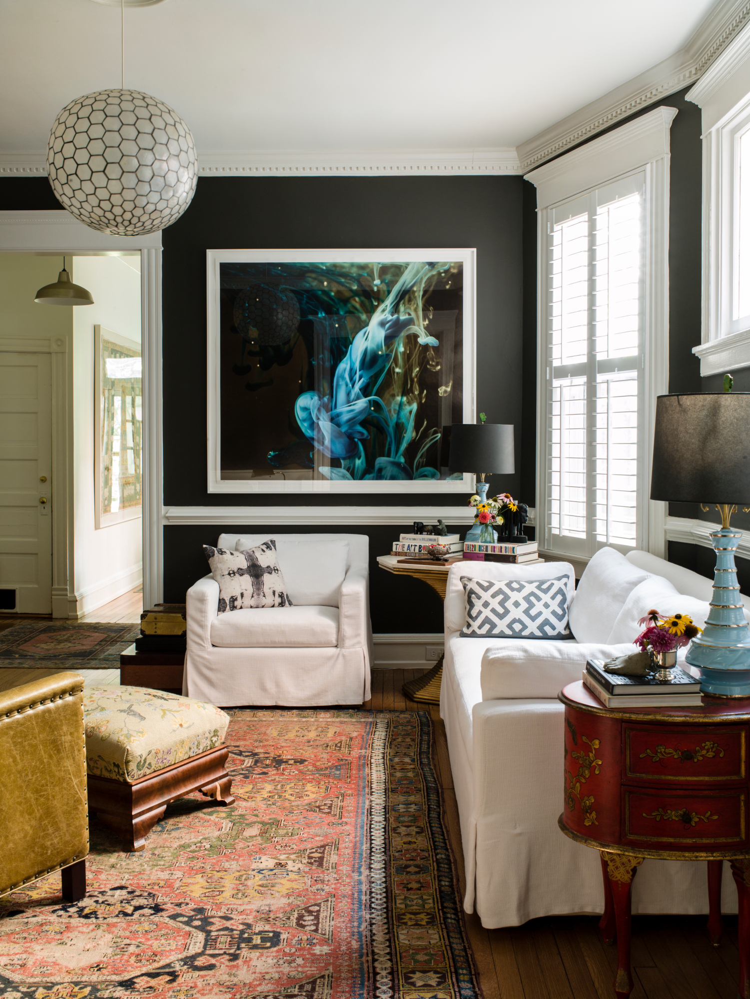
It might be controversial – and a little daunting – but black and dark gray were mentioned by several designers. For Anne Hulcher Tollett's black living room (pictured above), the owner and principal designer of Richmond, Virginia-based interior design studio Hanover Avenue opted for Benjamin Moore's Willow with a white trim. ‘This is the room my family and I hang out in the most so I wanted it to feel comfortable, warm, and inviting,' Anne explains. 'Nearly black walls might seem like an odd choice to evoke those feelings, but when paired with white trim, light sofas, and lots of antique and unique furniture, Willow is a great color choice to make the space feel elevated and casual at the same time!’
4. Blush pink
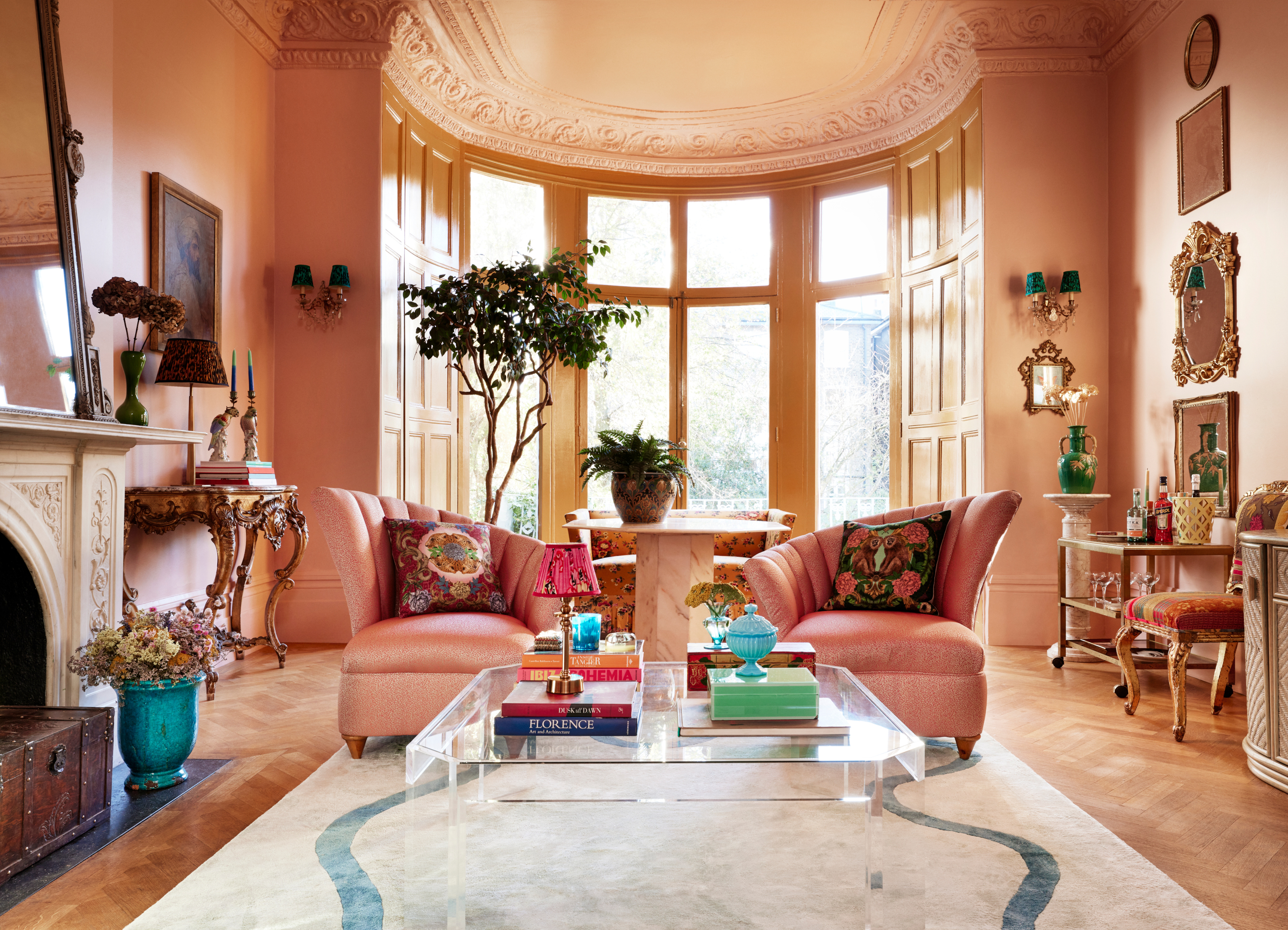
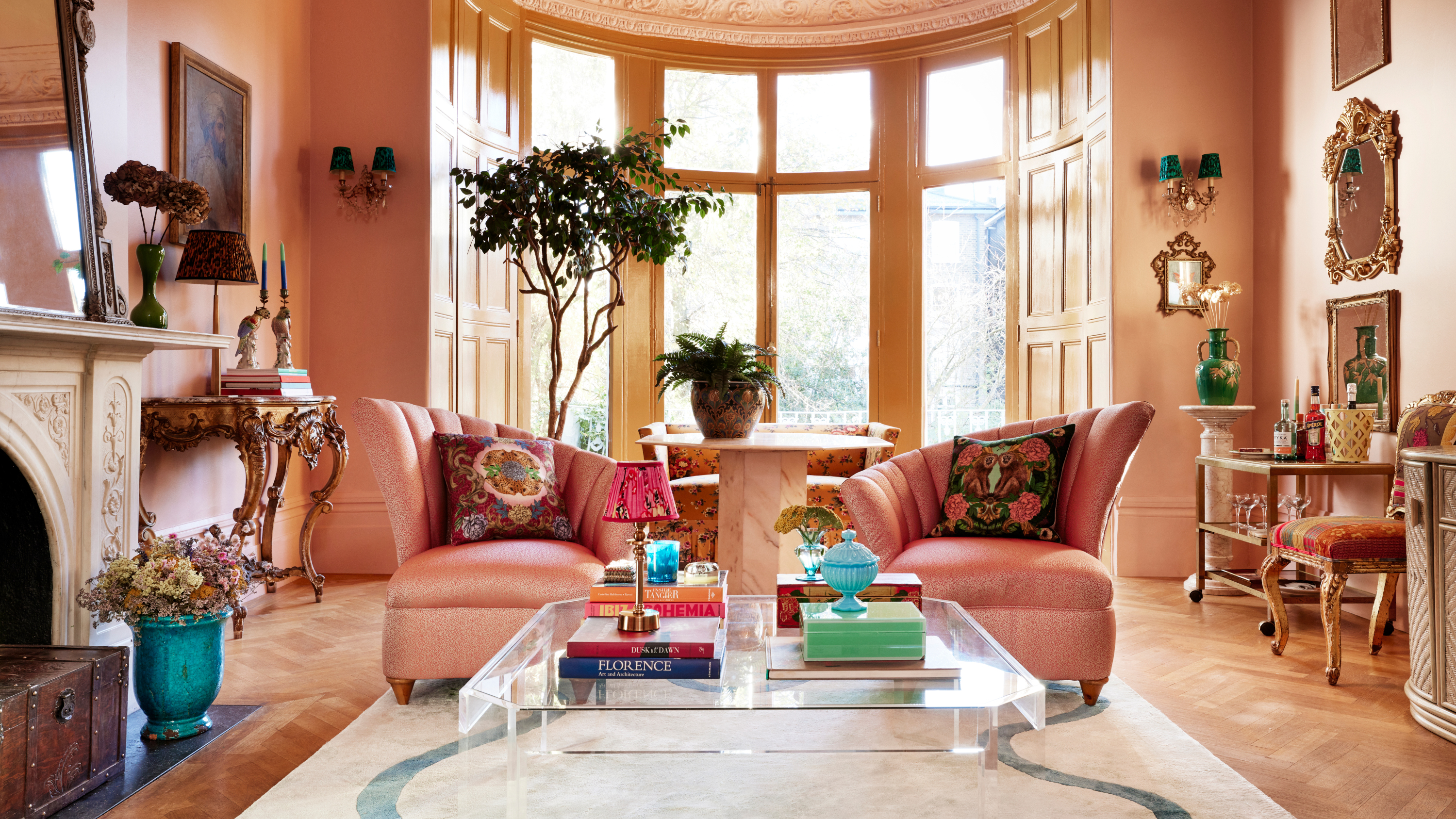
For the walls of the living room in his London home, British interior designer Matthew Williamson picked Lido Pink from The Pickleson Paint Company. ‘It contrasts beautifully with the brilliant white ceiling and creates an unexpected, joyful combination with the color of my window frames and woodwork – Hackney Gold, another color by The Pickleson Paint Co.,' he says. 'Blush or plaster pink is my go-to neutral, and Lido Pink was just what I was looking for. It’s kinder and more forgiving than white, more fun than beige and warmer than gray.’
5. Verdant green
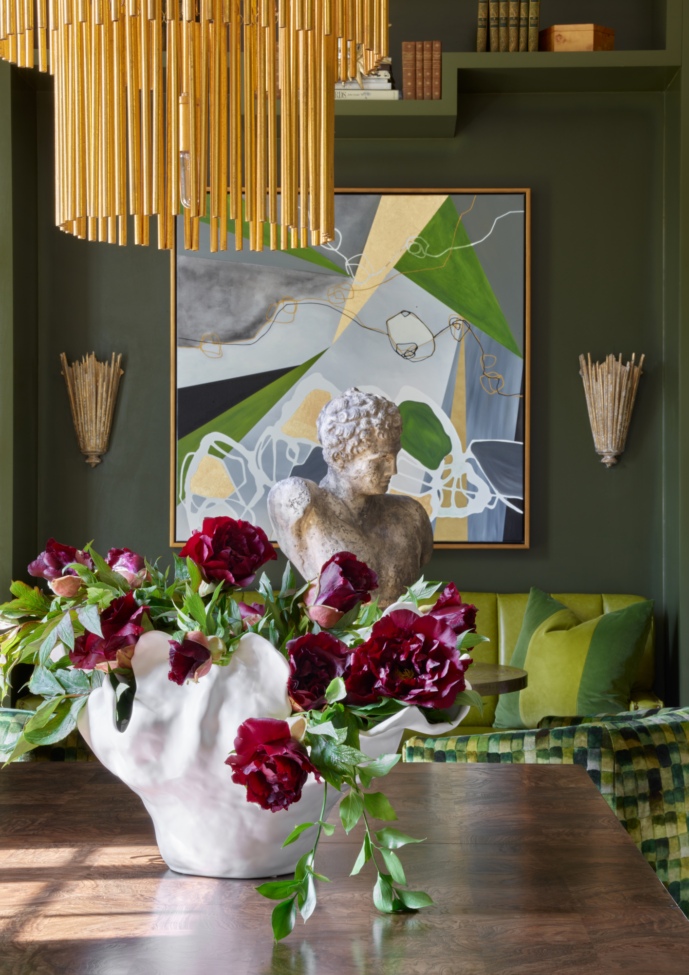
‘Besides blue, green is the only color in nature we can live comfortably with in large amounts,’ says Connie Vernich, of Nashville, Tennessee's Vernich Interiors. ‘I've been using every shade of green in my home for years.’ (Blue is a popular color that goes with green for this reason.) She used PPG Paints' Grape Leaves in the snug area next to her dining room, drenching walls and shelves in the deep green hue. ‘The colors vary from warm to cool.'
Thea Ingram, founder of London studio Stanza Interior Design, likes Farrow and Ball’s Green Smoke – she used it internally and externally for her extension. ‘We originally painted the back of the house in Paint and Paper Library Slate II, which was a perfect pale gray to go with the wall of olive trees. As the house is south facing we soon realized that the terrace was a sun trap and the bright color was accentuating that, so we chose a lovely green that works well with the mature gardens, ours and our neighbours, and the cedar garden room.’
6. Simple white
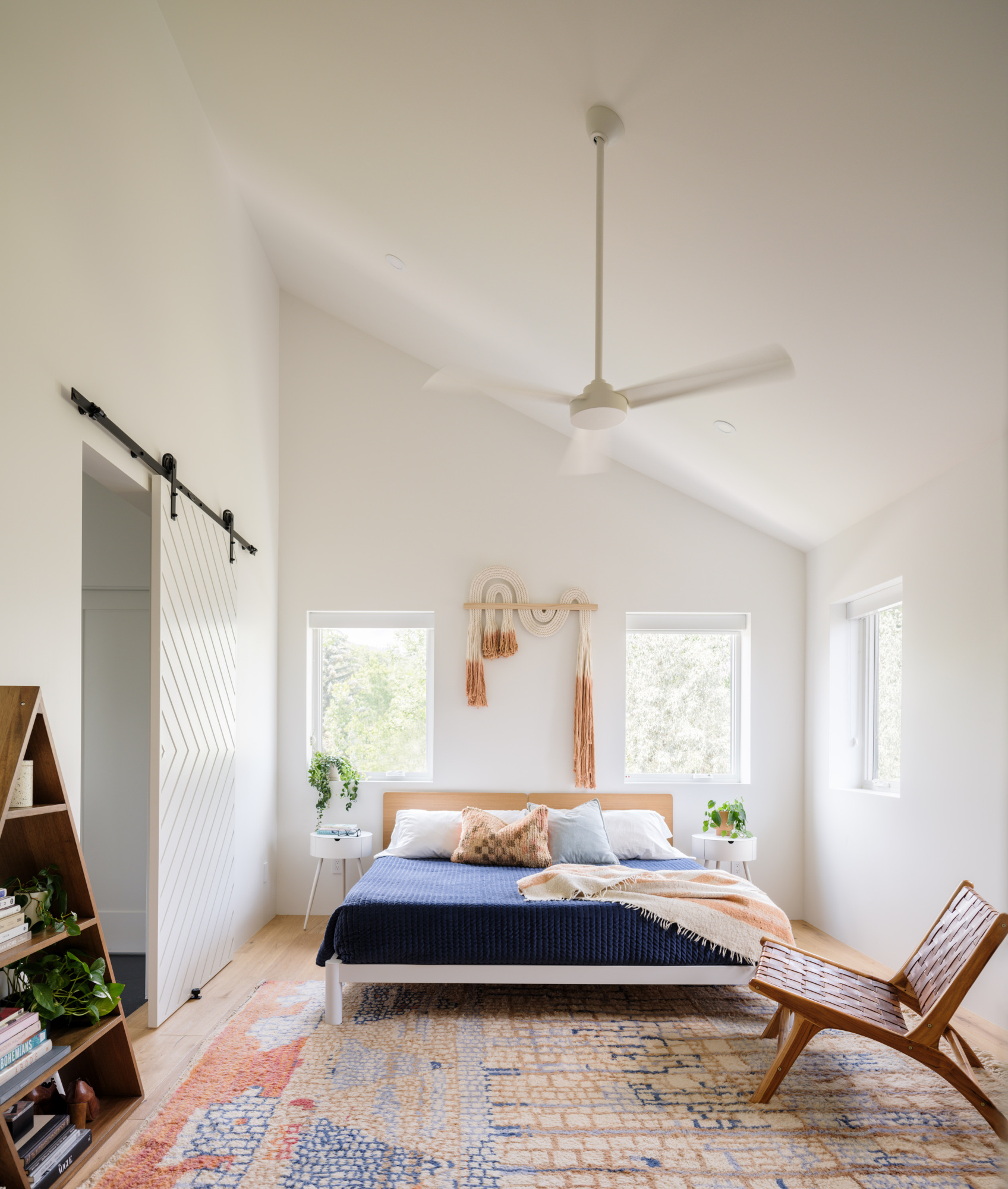
Anyone who’s tried to pick a white paint knows it’s a complicated business, but designers named a few of their favorites. 'In my personal remodels I always default to Sherwin Williams 7005 Pure White,' says Los Angeles interior designer Amy Pigliacampo. 'It's never let me down: it's the perfect neutral white that blends well with many other materials and it always delivers a clean, bright – but never cold – airy looking vibe.'
Thea Ingram likes Farrow & Ball’s Wevet as a neutral for her own home. ‘The house is larger on the bottom than the top, and is like an iceberg,’ she explains. ‘The white color was best to keep the space feel open and there is lots of natural light coming down from the loft into the staircase. This is my favourite white as it is warm and a hint of gray. This was the perfect backdrop for all our colorful artwork, including three Slim Aarons Prints.’
‘One of my favorite colors for my homes has been Chantilly Lace OC-65 by Benjamin Moore,’ says Nureed Saeed, owner of Berkeley, CA-based Nu Interiors. ‘I use this for walls, trim and ceilings to give the space a cohesive feel. I have used this color in both my home in New Jersey and California for main spaces, kitchen, bathrooms and bedrooms and love how it reads bright, yet warm.’
7. Burgundy
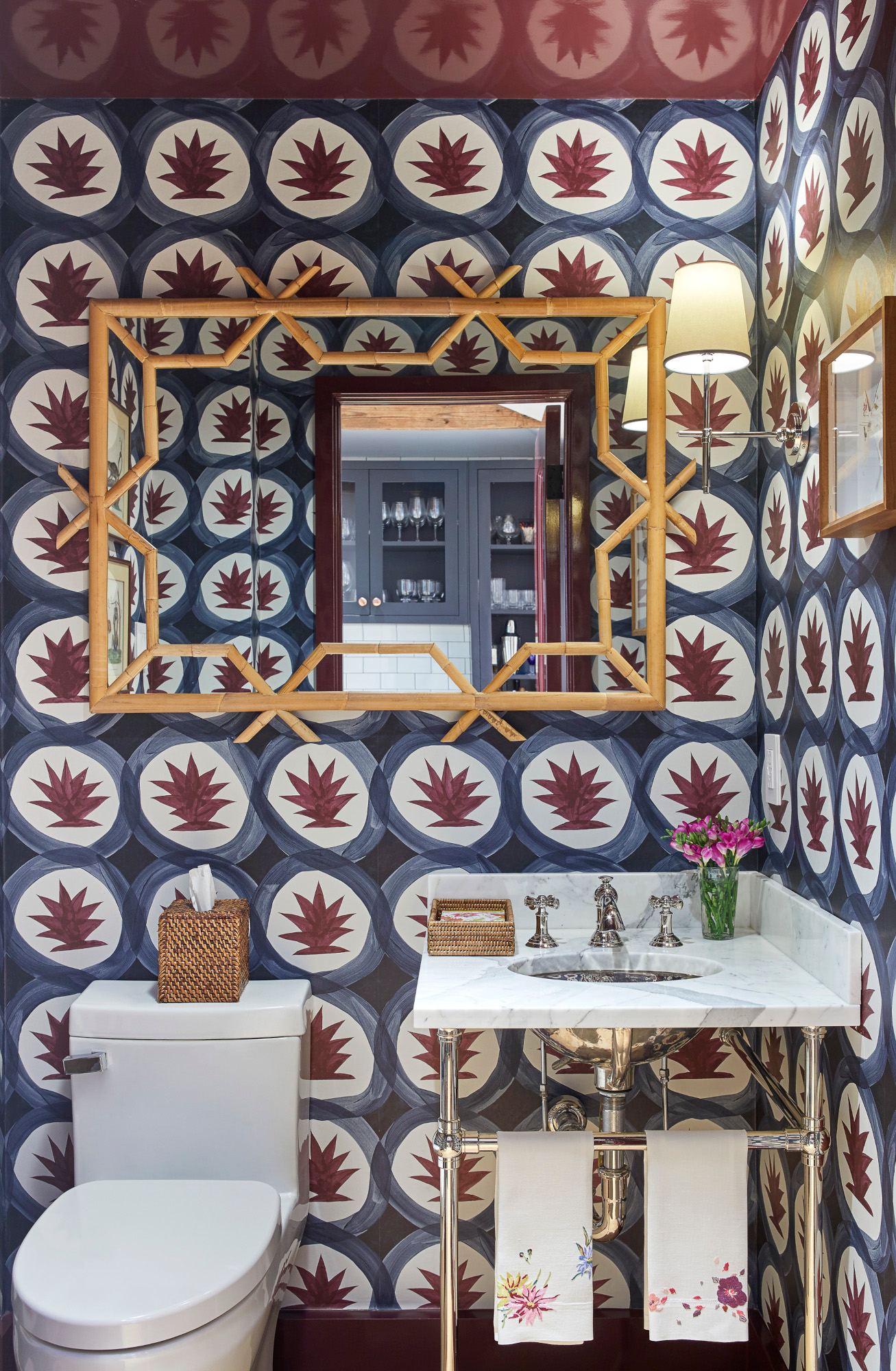
Considering burgundy is one of 2024’s biggest paint trends, it’s not surprising that it’s found its way into designers’ own homes. Colleen Simonds went small-scale but big-impact with her use of Farrow & Ball’s Brinjal for her powder room ceiling. ‘I love dark purple, which is also surprisingly versatile, as long as it's dark enough,’ she says. ‘I chose the full gloss finish here to reflect as much light as possible in a tiny room and create a little drama and fun.’
8. Mid-tone mint
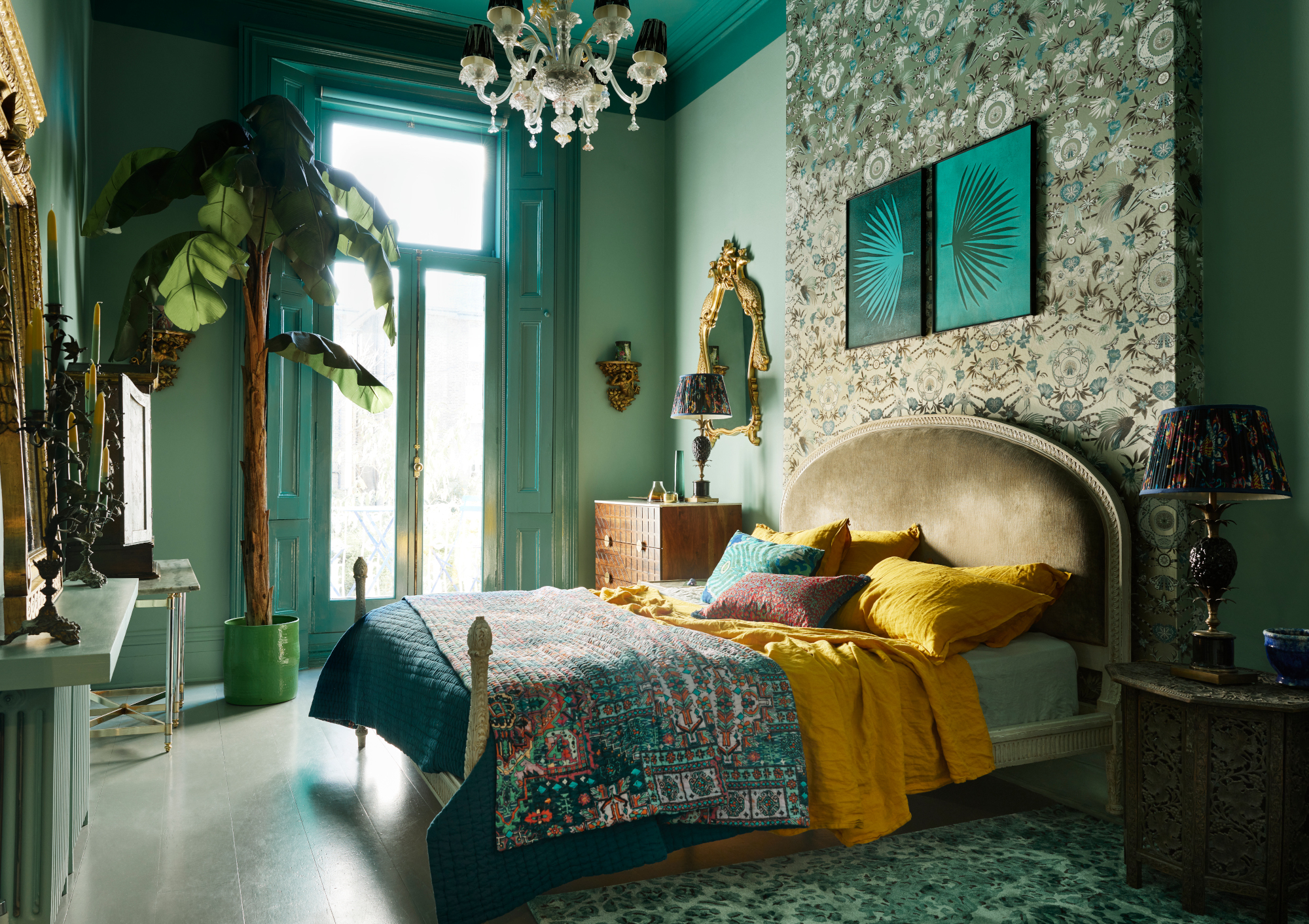
Matthew Williamson's mint green bedroom is the perfect example of how restful this hue can be. ‘My bedroom walls are painted in Tequila Green, with the ceiling, shutters and skirting board in a darker gloss – Basilica Green by The Pickleson Paint Co,’ says Matthew Williamson. ‘An eclectic mix of rugs, artworks, bed linens and plants all work together, connected by the color green. Wherever I live, I use green liberally, as I know my sense of well-being will be all the better for it. Tequila Green is a mid-tone of mint that is at once crisp and striking, yet evokes a feeling of calm – perfect for the bedroom.’
9. Neutral lavender
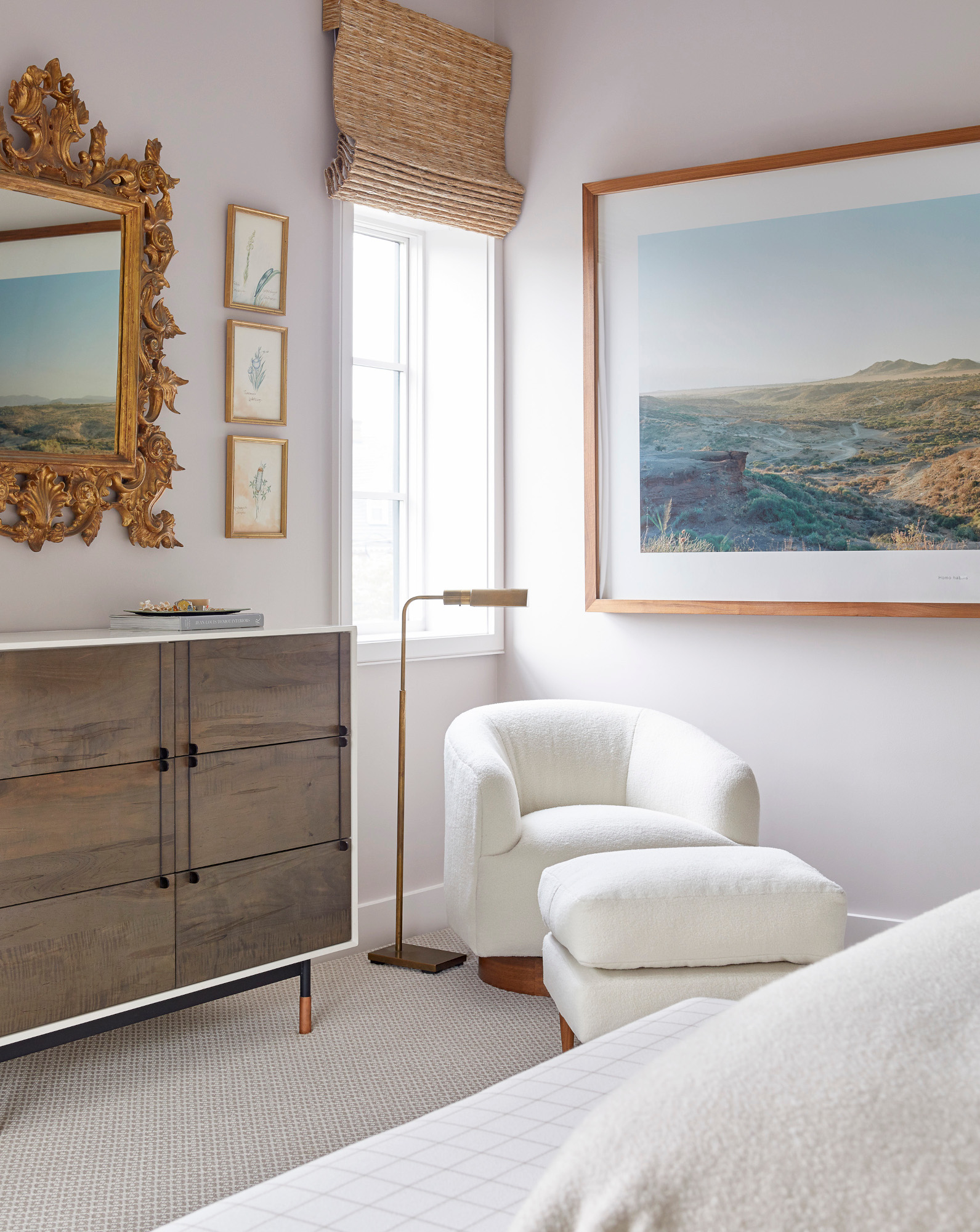
Whites with subtle undertones were popular amongst the designers we spoke to. In Colleen Simonds’ bedroom, she opted for Farrow & Ball’s Peignoir. ‘This is a very soft, warm, neutral paint that just has hints of lavender and pale pink – but not in a juvenile way,’ she explains. ‘It's a soothing color and works with everything.’
Another bluer-toned white favored by designers is Benjamin Moore’s Gray Sky. ‘I love this color because although it has gray undertones, it actually comes across as a very sophisticated pale blue in areas with natural light,’ says Palm Beach-based interior designer Shani Core. ‘Unlike other gray paints, blue isn't even mentioned in the name, which may be wise as there is not even a hint of baby blue in this beautiful color.’
10. Emerald green
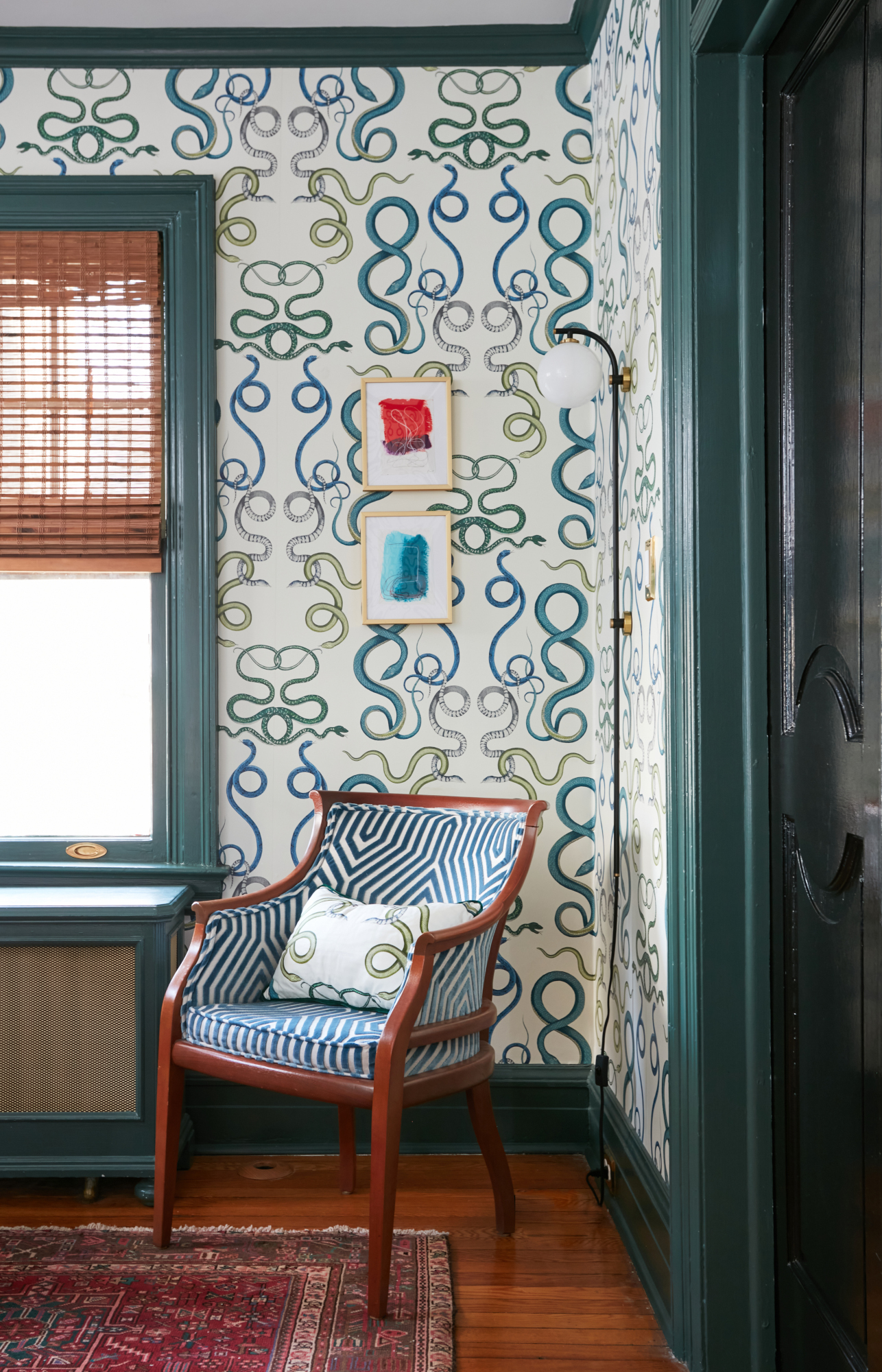
Rich, intense greens and teals were another common theme amongst designers. ‘I love Tarrytown Green from Benjamin Moore,’ says Maplewood, NJ-based designer Sarah Storms. ‘Jewel tones are a personal favorite because they have the ability to add so much richness and personality. What I love about this color is there is depth without being dark. The contrast against the wallpaper allows for a finished and polished space.’
‘In our downstairs WC, we have used Little Greene's Tea With Florence,’ says London-based interior designer Emma Deterding, founder and creative director of Kelling Designs. ‘It's a rich blue-green shade and it has worked with great effect in the WC. We’ve used it on the walls and woodwork, and it really packs a punch and gives the space a dramatic feel. Although it's a bold color, it again is really versatile and can pair well with most.’
Be The First To Know
The Livingetc newsletters are your inside source for what’s shaping interiors now - and what’s next. Discover trend forecasts, smart style ideas, and curated shopping inspiration that brings design to life. Subscribe today and stay ahead of the curve.

Ellen is deputy editor of Livingetc magazine. She works with our fabulous art and production teams to publish the monthly print title, which features the most inspiring homes around the globe, interviews with leading designers, reporting on the hottest trends, and shopping edits of the best new pieces to refresh your space. Before Livingetc she was deputy editor at Real Homes, and has also written for titles including Homes & Gardens and Gardeningetc. Being surrounded by so much inspiration makes it tricky to decide what to do first in her own flat – a pretty nice problem to have, really. In her spare time, Ellen can be found pottering around in her balcony garden, reading her way through her overstacked bookshelf or planning her next holiday.
-
 My 10 Favorite Designs at Milan Design Week 2025 — Out of the Hundreds of Pieces I Saw
There is a new elegance, color, and shape being shown in Milan this week, and these are the pieces that caught my eye
By Pip Rich
-
 Iridescence Is Chrome’s More Playful, Hard-to-Define Cousin — And You're About to See It Everywhere
This kinetic finish signals a broader shift toward surfaces that move, shimmer, and surprise. Here's where to find it now
By Julia Demer
