10 genius ways to use "decorative trims" that will instantly elevate any room in the house
From fringing and piping to wallpaper and tile borders, decorative trimmings are the interior designer’s secret weapon

It really is all about the detail when it comes to successful interior design. The smallest things – a beautifully patinaed kitchen tap, the tapered leg of a sofa, a perfectly-placed piece of art – can upgrade a scheme to something special. So we knew we needed to investigate further when we noticed how many designers are using decorative trimmings in their schemes right now.
Trimmings are an interior design detail that's often missed out when we plan a scheme – it often takes a designer's eye to see when some contrasting piping on a sofa or some fringing on a lamp might take a look to the next level. But when you start using them, you'll notice just how easy it is to make a beautiful and truly personal space with embellishments like these.
Below, we've gathered some of our favorite ways designers are using decorative trimmings right now to add an extra something to their schemes – and spoke to them about how to nail this finishing touch.
1. Finish curtains and blinds with a flourish
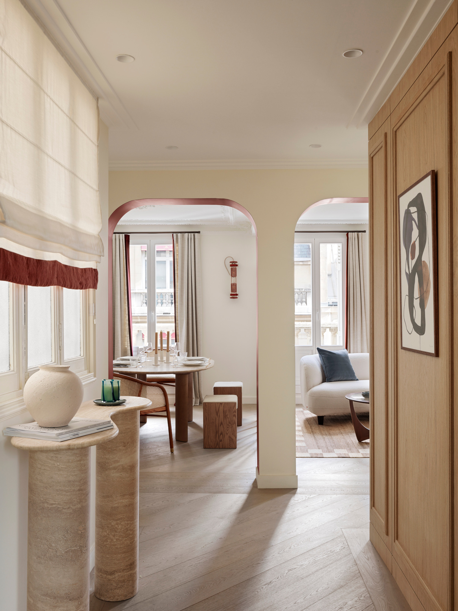
As a modern window treatment idea, edging your drapes or blinds with a contrasting or patterned trimming is a small detail that doesn’t go unnoticed; as with the curtains and Roman blind in this Parisian pied a terre by French design practice ICONIQUE Studio, it can help draw attention to the flowing movement of a curtain and is a clever way to bring in an accent color – or perhaps even a poison color – when you’re creating a new scheme. Patterned fabrics benefit from being edged with a block contrasting color – or for the committed maximalist, try finishing off with a clashing pattern.
2. Set your stair runner off with a contrasting trim
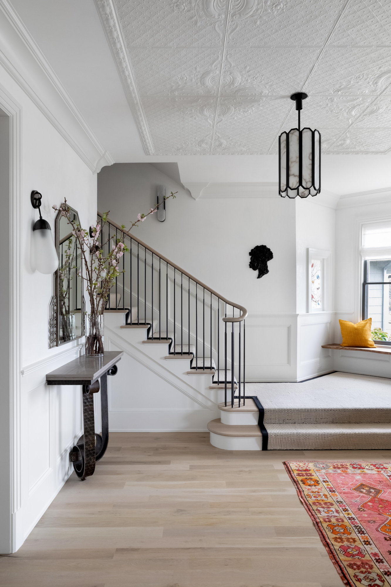
For this project by NYC-based studio Chango & Co., a black trim contrasts the neutral colorway of the stair runner and helps define the staircase’s architectural lines – as well as picking out other black detailing in the scheme. ‘This stair runner is handwoven in a jute thread with the edges bound in black leather,’ explains creative director Susana Simonpietri. ‘The color of the carpet was chosen to match the finish of the floors so that the dark leather binding would stand out against the soft neutral wood, and match the metal of the balusters and light fixture.’
3. Add piping to enhance the shape of your sofa

Even the subtlest of piping, like the soft dark beige piping on this neutral oatmeal sofa – the Kaiman model from Workshop/APD’s new collection – can elevate this living room staple, helping to define the lines of the piece. It’s something to consider if you particularly like the shape of your sofa and want to draw attention to it – and, like the trim of a curtain, is a great way to introduce a second or third color into a scheme.
4. Personalize throw pillows with decorative embellishments
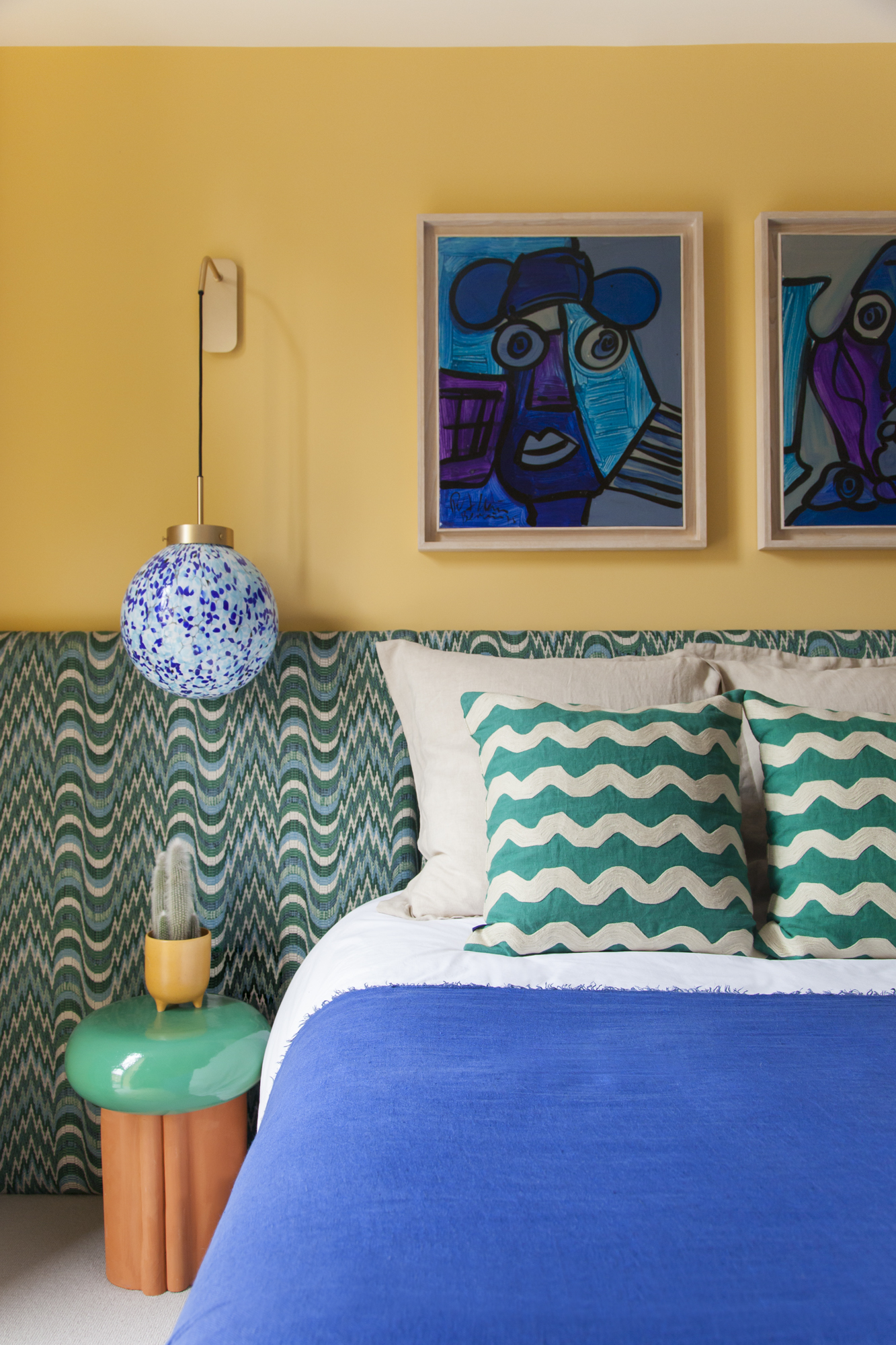
If you want to experiment with decorative trimmings on a smaller scale before committing to something less easily changeable, soft furnishing accessories are the way to go. ‘I'm not much for fussy details, but I do like a strongly colored contrast welt on a cushion,’ says Louisville, Kentucky interior designer Bethany Adams. ‘It serves to outline the pillow on whatever piece of furniture you've placed it on and is a fantastic way to pull in a larger color field from across the room, connecting the overall scheme.’
This colorful bedroom by London design studio Cúpla makes the case for throw cushions with playful detailing. ‘Both sets of cushions are from the Conran Shop, and the green have lovely crewel embroidery details offset with a tropical green linen base, which complements the headboard fabric perfectly,’ says founder and creative director Gemma McCloskey. ‘The large beige linen cushions give a moment of calm between the headboard and wiggle cushions, balancing it all out perfectly.’
5. Add fringing to furniture for a retro throwback
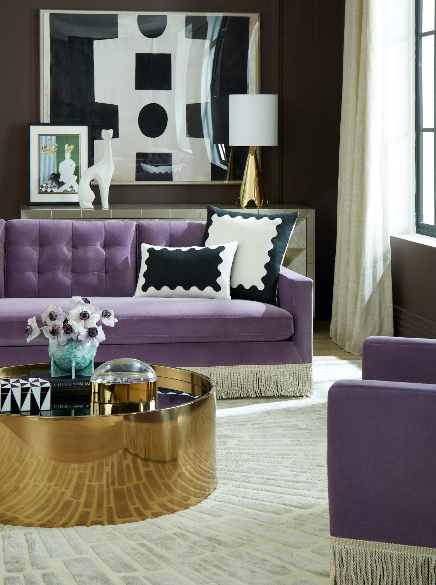
Fringing is back: we’ve seen it on everything from lampshades to sofas and armchairs. It’s a throwback to traditional pieces of furniture used as far back as the Victorian era – but this new iteration is far more playful, opting for contrasting colorways and even ombre finishes to set contemporary fringing apart. Try fringes and tassels on a stool first for a low-level commitment to this trend – you might end up wanting more.
6. Adorn doors and ceilings with decorative detail
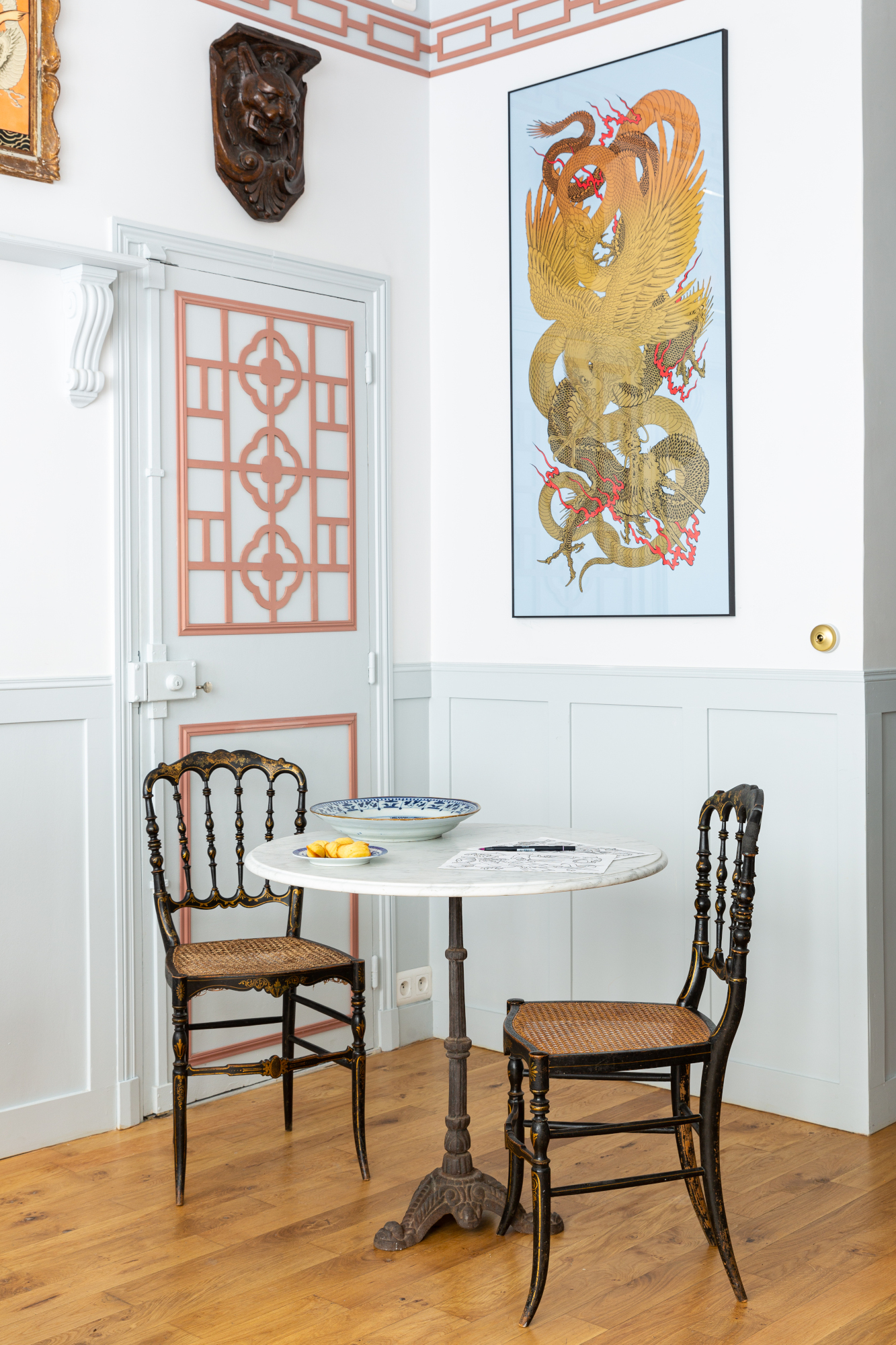
More an embellishment than a trim, this decorative addition by Parisian interior designer Marianne Evennou nevertheless has a similar effect, adding a delightful playful touch to otherwise plain finishes and helping to define the room’s architecture. ‘The decor on the door and the frieze on the top of the wall have been cut and glued/nailed for the pleasure of the eyes,’ she explains. ‘The inspiration is Asia, as the tattoo studio, called Dragon Rouge, is run by a Franco-Taîwanese couple.’
7. Enhance architecture with wallpaper borders
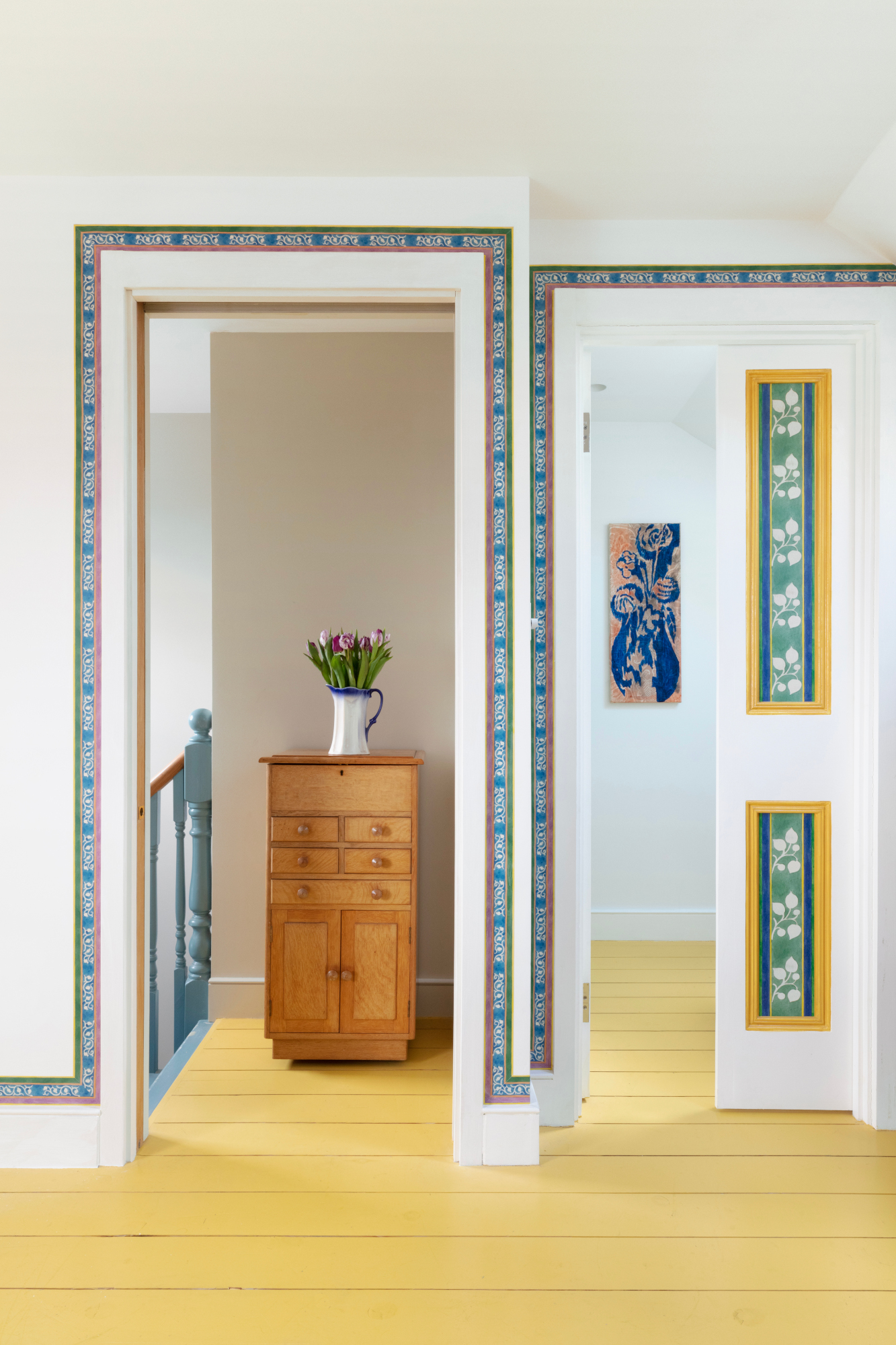
As a clever wallpaper idea, a border offers myriad opportunities to bring character to your walls: place it in a repeat pattern to replicate panelling, create a clash with an existing patterned wallcovering, or use as is done here, with borders based on a heritage design by English textile designer C.F.A. Boysey for wallpaper makers CommonRoom, and trace doorways for a simple shape-enhancing addition.
8. Use stone to frame special details
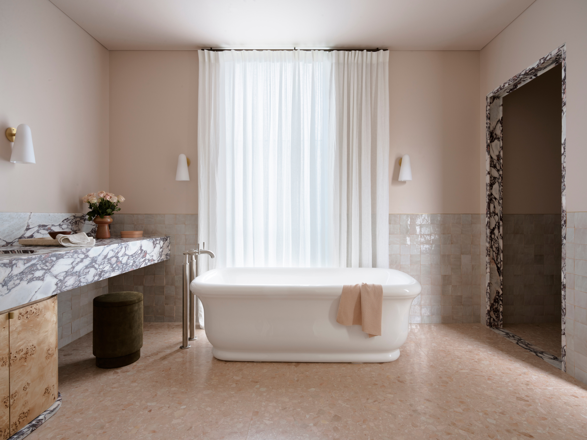
Starting a project from scratch gives you ample opportunity to experiment with more architectural approaches to decorative trims – including the use of stone to outline room borders, entryways and special features. The marble decorating ideas in this bathroom by Sydney-based studio Arent&Pyke use Calacatta Viola marble as the scheme’s foundational material. ‘Expressive selections added the personality our clients craved, whilst also granting a durable sense of permanency to the home,’ the studio explains. ‘Within the primary ensuite, we created a grand gesture and sense of stature through materials rather than ornamental embellishments.’
9. Add a trim to your headboard for a bedroom centerpiece
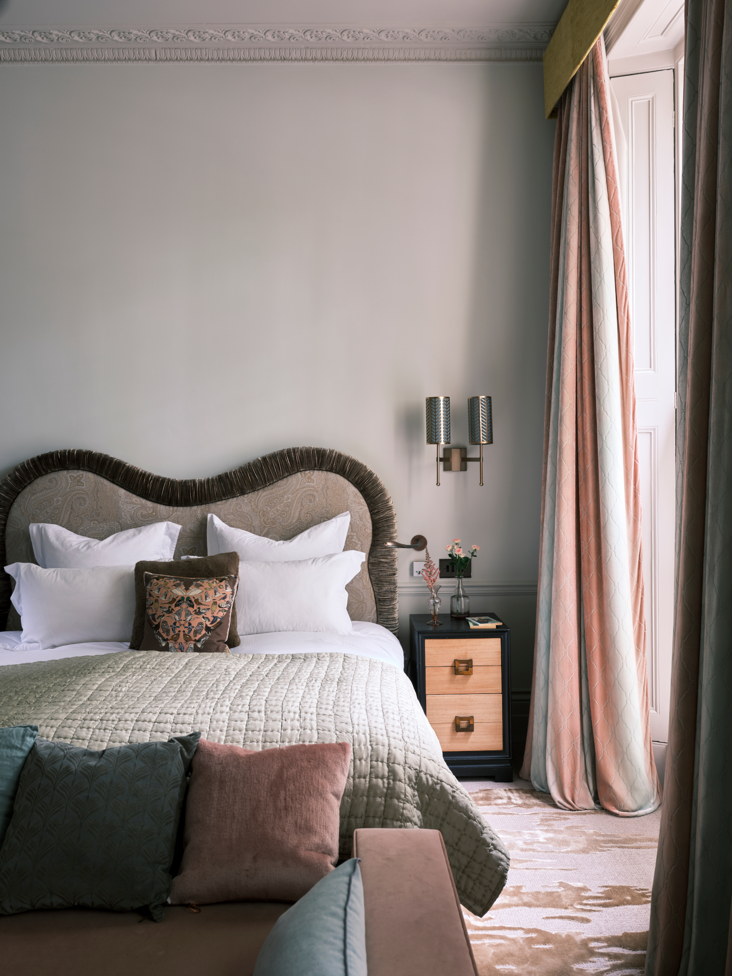
Like sofa piping and fringing, a decorative headboard trim can help outline an interesting shape, or help bring interest to an otherwise plain design. While this bedroom idea is best suited to upholstered headboards, you can play around with the details by opting for plain, contrasting piping, playful bobbles or retro fringing to add character.
10. Use a tile border to add interest to a bathroom
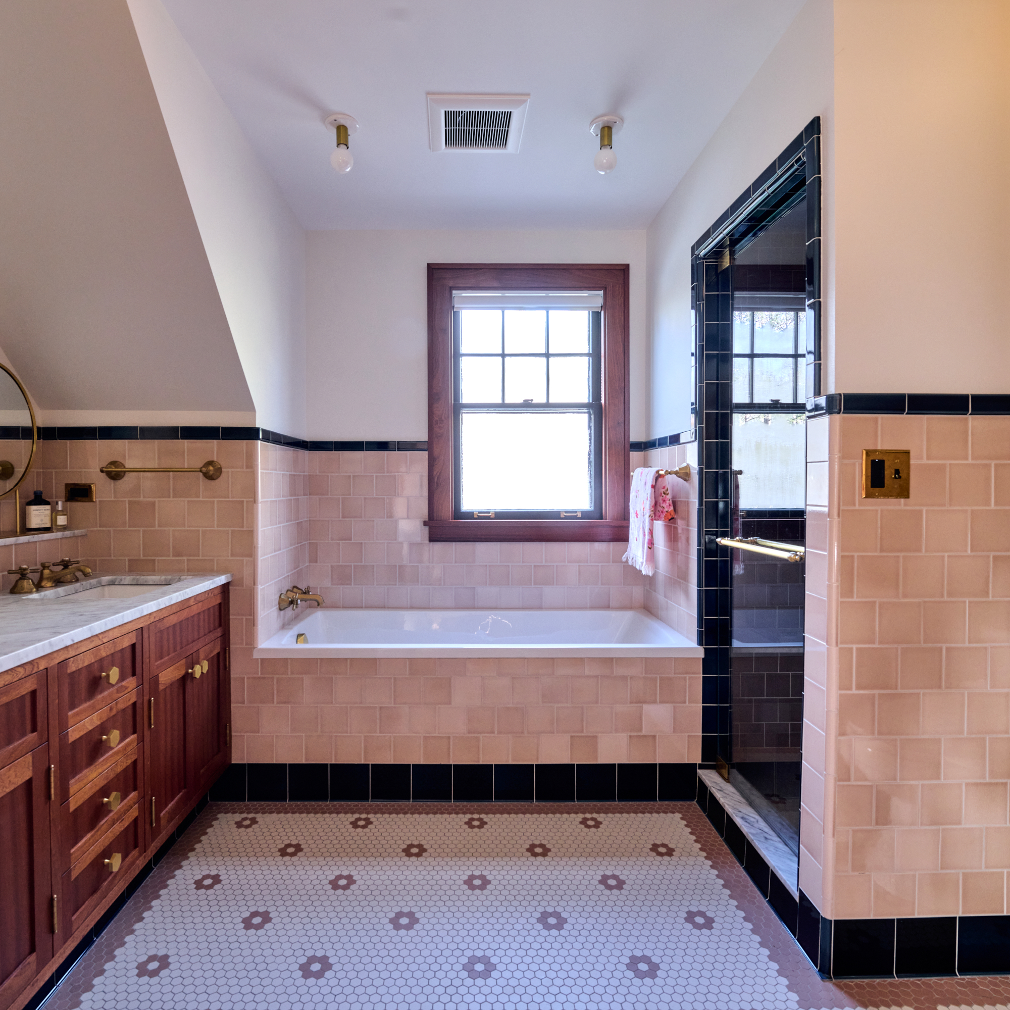
Tile borders – used along the base of walls and furniture, as a trim above your main wall tiles, and around features like the entrance to a walk-in shower – are a bathroom tile idea that can help add decoration to a famously tricky space without feeling overly decorative. In this scheme, a joint project between Hudson Valley design-build company Quatrefoil and architect Kathryn Whitman, black provides a sharp graphic accent against the earthy pink.
‘To preserve the historic character of this late, 1920s craftsman style bungalow, we referenced American bathrooms of the 1930s, which often included contrasting tile borders - typically, black borders with white or pastel field tiles,’ explains Kathryn Whitman. ‘We played off the reference by pairing unexpected colors, contrasting, with a bit of modern whimsy. These idiosyncratic choices reflect the style and spontaneity of the current owners, a young family, as well as the spirit of the previous owner, an artist who left behind vibrant murals of animals and mythical characters. In her honor, and to the current owner's delight, we kept the renovation historically appropriate, using profiles and materials of the period, imbued with playful patterns and a light-hearted palette.’
Be The First To Know
The Livingetc newsletters are your inside source for what’s shaping interiors now - and what’s next. Discover trend forecasts, smart style ideas, and curated shopping inspiration that brings design to life. Subscribe today and stay ahead of the curve.

Ellen is deputy editor of Livingetc magazine. She works with our fabulous art and production teams to publish the monthly print title, which features the most inspiring homes around the globe, interviews with leading designers, reporting on the hottest trends, and shopping edits of the best new pieces to refresh your space. Before Livingetc she was deputy editor at Real Homes, and has also written for titles including Homes & Gardens and Gardeningetc. Being surrounded by so much inspiration makes it tricky to decide what to do first in her own flat – a pretty nice problem to have, really. In her spare time, Ellen can be found pottering around in her balcony garden, reading her way through her overstacked bookshelf or planning her next holiday.
-
 The Weighted Blanket That Doesn’t Make You Sweat (and the Eye Mask to Match)
Luxury has weight. And apparently, volcanic minerals
By Julia Demer
-
 What Is Biophilic Interior Design? I'm an Actual Biophilic Designer, and This Is How to Apply It to Your Home
A biophilic designer explains the core principles of this practice, and the easy ways you can apply it to your home's design
By Marianna Popejoy
