

Color is one of the more fickle areas of interior design. One minute, a color can be universally adored, while the next, people are sick of seeing them.
While some colors undoubtedly have staying power, there are also some less-timeless color trends that aren't in favor with interior designers right now, and choosing them for your home's palette might be making it feel a little dated.
So what color trends now seem a little old-fashioned? And what should we be doing instead. These interior designers have the answers.
1. Cool grey
Is there any color trend that's had a more spectacular fall from grace than grey? 'About five years ago everybody wanted their walls in a cool grey,' says interior designer Charles Cohen, founder of Charles Cohen Designs, 'but the greys that were being used were very dull and didn't add character to a space.'
Grey was an interior design trend we saw in all kinds of homes, from super modern spaces to traditional designs, but it's fallen out of favor in both nowadays. Instead, you're more likely to find cool greys used in "neutral" new builds, and it's become a color that Gen Z have come to refer to as 'Millennial grey' - and they don't talk about it complimentarily.

What to choose instead: So what color is replacing grey? Grey, by all means, hasn't been wholly outlawed in interior design, but we're seeing a different take on this neutral that's warmer, more textural and organic. 'Since then, taupes and more earthy grey tones have replaced the trend, adding warmth, sophistication and a foundation to layer a room with more depth,' Charles agrees.

Price: $990
Material: Wool-jacquard
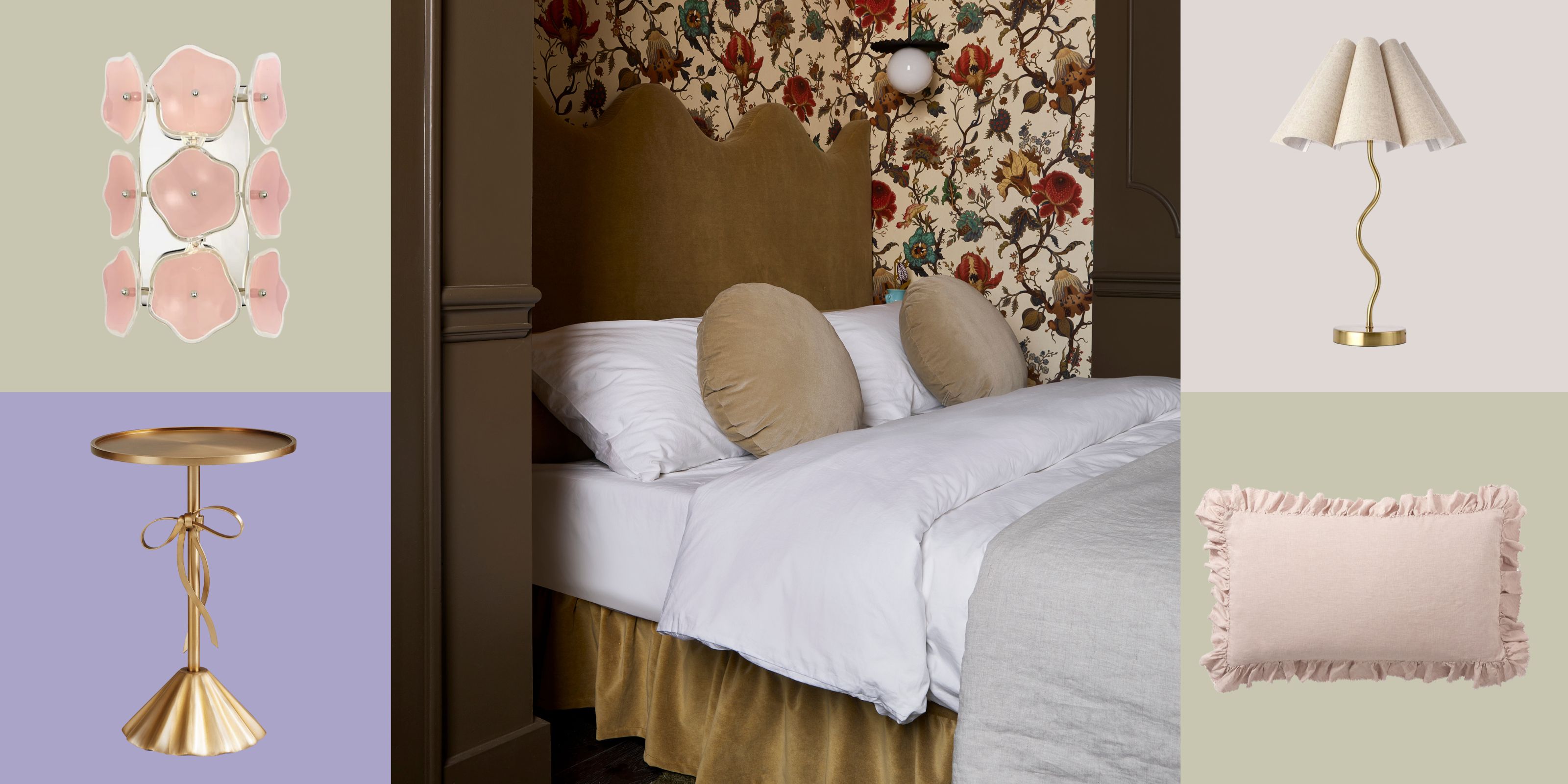
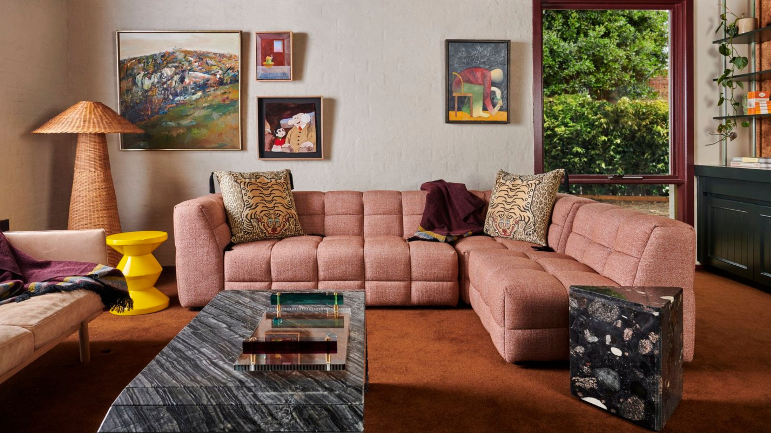
2. Millennial pink
Pink may be having a moment right now, but as it turns out, interior designers are generally over the millennial pink that had a hold on interior schemes a little while back. 'While millennial pink had its moment of popularity, it may not have long-lasting appeal,' says interior designer Sara Malek Barney of BANDD/DESIGN. 'This particular shade of pink, often described as a pale, muted pink with a hint of peach, became ubiquitous in recent years.'
'I’m very much OK not seeing another millennial pink space ever again,' echoes Brooke Spreckman, Los-Angeles based founder and principal designer of Design Hutch.

What to do instead: There are a couple of colors that have filled the gap this color trend has left, and we think both lavender and peach are colors that are replacing millennial pink. But there's a world of other, less-played-out pinks to choose from, too. 'To create a more modern or timeless space, consider opting for classic shades of pink, such as blush or dusty rose, or explore other versatile neutrals,' Sara suggests.

Price: $5.99
Color: Persimmon
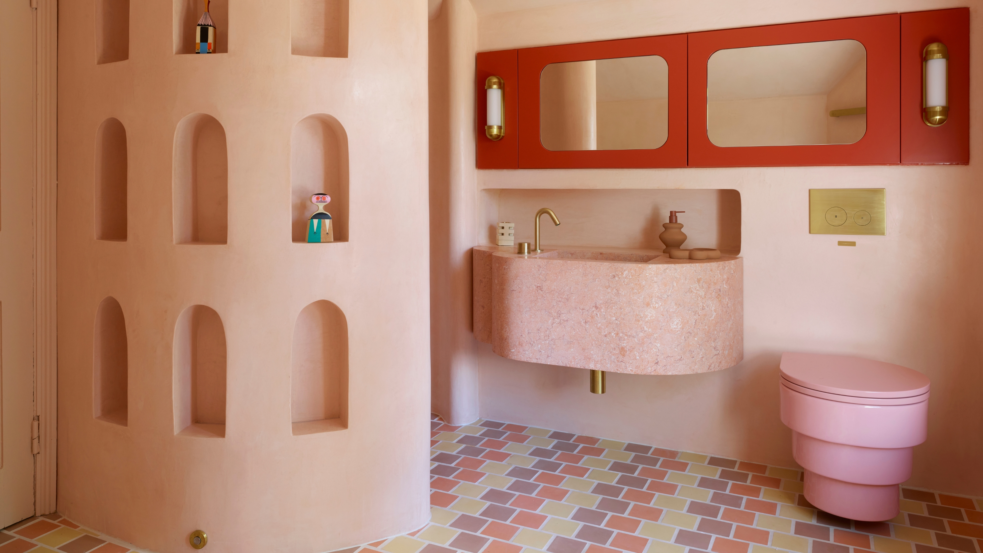
3. Other pastels
When it comes to decorating with pastels, there's some nuance in shades that separates a design that designers love, and that they've seen enough of. 'I have really never been a fan of some of the colors that come along with your classic mid-century modern design,' says designer Brooke Speckman. 'The trend of a baby pink kitchen, or a seafoam green bathroom vanity drives me a little crazy... I’m just not a fan of soft teals and baby pinks.'

What to do instead: Pastels are a trend that we're still seeing designers using, but they're looking towards subtler and less expected shades over more cliched pastel palettes. 'Instead of opting for overly trendy pastel shades, consider softer and more subtle pastels,' echoes Sara Malek Barney. 'These can include gentle blues, serene greens, or delicate lavender. Soft pastels can bring a sense of tranquility and elegance to a space without feeling overly trendy.'
4. Bright accents
The accent wall is a paint trend that fell out of favor over a decade ago that's never really had a revival. When they were popular, they were often played out in bold colors, creating a eye-popping contrast to the rest of the room.
However, this is a color trend designers are glad is in the rearview mirror. 'Vibrant, eye-catching accent colors were often used to make a bold statement in interiors,' says Sara, 'however, these super bright shades may feel overpowering or dated over time.'
The same goes for 'color pop' pillows on sofas, and other accent ideas that are too high-contrast against the overall palette.

What to do instead: With the color drenching trend leading the way, we're seeing tighter color palettes in design become more popular, even interesting monochromatic color schemes.
If you want to still do an accent, there are ways that modern designers approach it, however. 'Instead, consider incorporating accents in more muted or sophisticated tones,' says Sara. 'For example, choose deeper jewel tones or opt for earthy hues that create a sense of warmth and coziness.'
5. Dark blue
Dark blue was a huge color trend in interior design for a while, with the likes of Farrow & Ball's Hague Blue becoming one of the most sought-after paint colors for a number of years, especially for those looking to achieve a darker, moodier scheme.
While this color isn't one that interior designers feel makes a room feel as dated as something like cool grey, it just simple gave way for alternative ideas for dark color schemes that means you see it far less often in 2025.

What to do instead: So what color is replacing dark blue? Interior designers are turning to colors like rich, chocolate brown over this once popular shade. 'Browns are a naturally rich color or tone,' interior designer Christina Rottman told us. 'It is less contrived than a primary or secondary color like a dark green or a dark blue which feels dated in comparison.'

Price: From $45
Finish: Modern Emulsion
What colors are timeless for the home?
if you're worried about falling victim to outdated color trends, there are some safe, "timeless" colors that interior designers always bet on, according to designer Sara Malek Barney.
'Classic neutrals like shades of white, beige, and grey never really go out of style,' she says. 'These hues provide a clean and versatile backdrop that allows other elements in the space to shine. You can also experiment with warm or cool undertones to create the desired ambiance.'
'Incorporating earthy tones like warm browns, soft greens, or muted terracotta can add depth and a sense of connection with nature,' she adds. 'These colors evoke a calming and timeless feel, creating a cozy atmosphere in any space.'

-
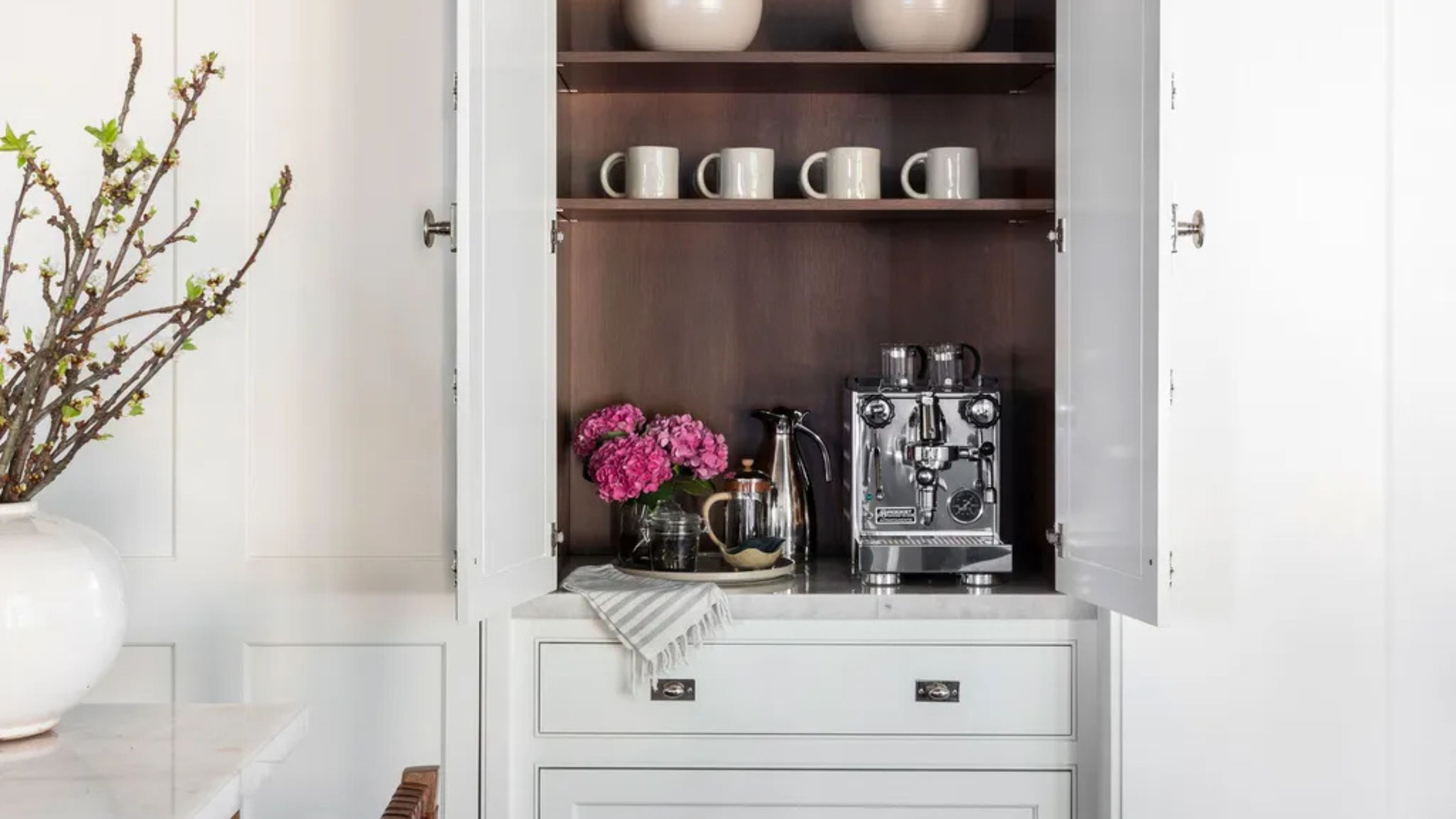 Turns Out the Coolest New Café is Actually In Your Kitchen — Here's How to Steal the Style of TikTok's Latest Trend
Goodbye, over-priced lattes. Hello, home-brewed coffee with friends. TikTok's 'Home Cafe' trend brings stylish cafe culture into the comfort of your own home
-
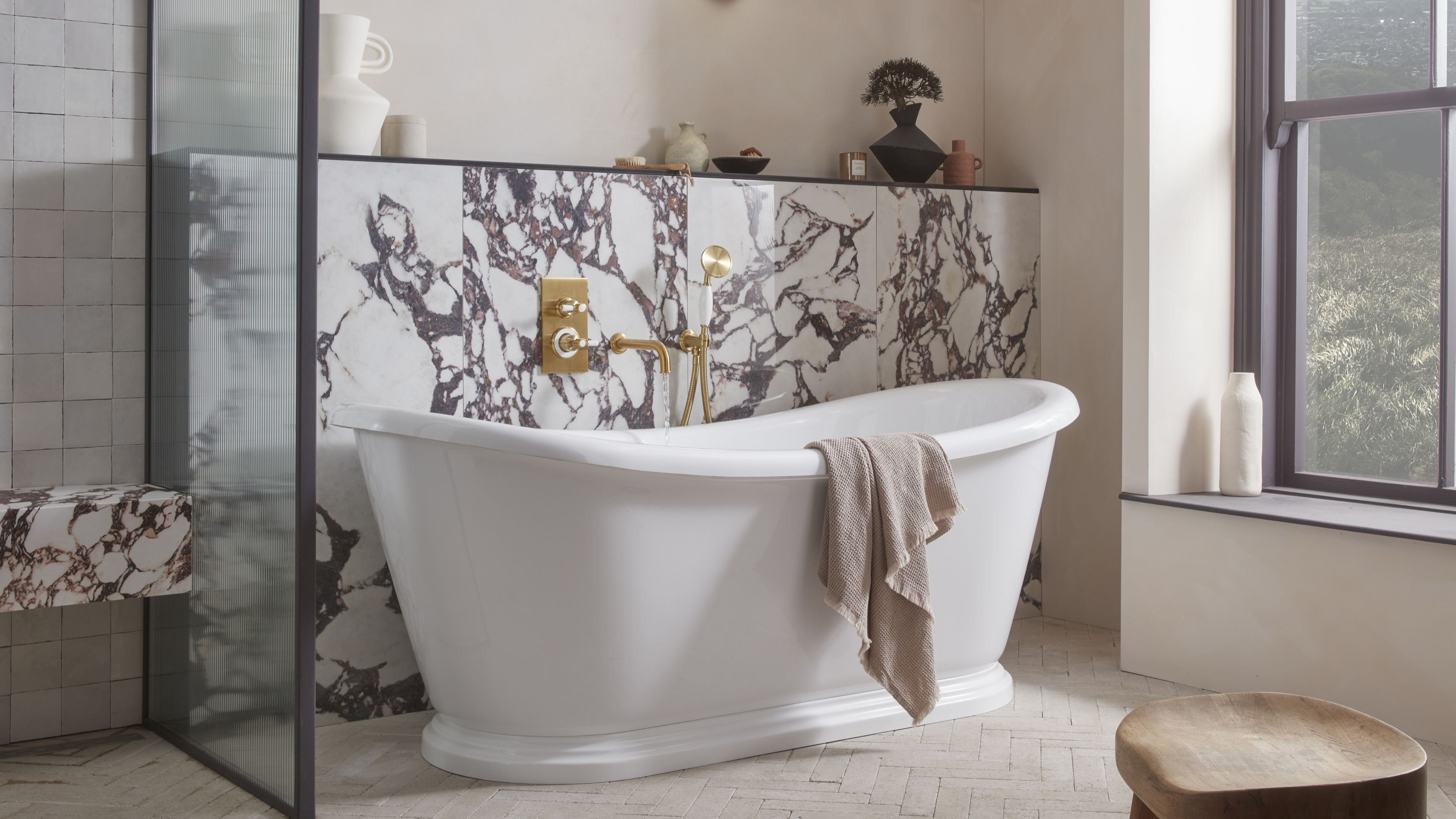 5 Bathroom Layouts That Look Dated in 2025 — Plus the Alternatives Designers Use Instead for a More Contemporary Space
For a bathroom that feels in line with the times, avoid these layouts and be more intentional with the placement and positioning of your features and fixtures


-
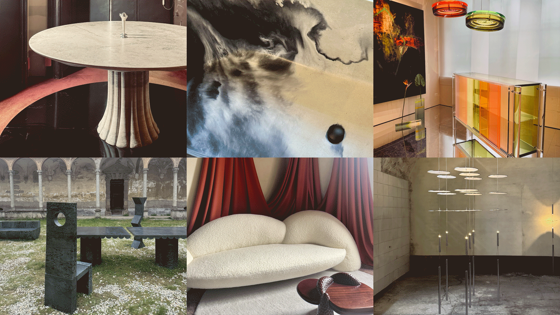 Straight from Salone: 5 Emerging Trends I Found in Milan That'll Shape Interiors for the Year Ahead
From reflective silver to fluidity, here's my perspective on the key themes and new moods coming through from Milan Design Week
-
 The 'Red Table Trick' Is the Easiest and Most Expensive-Looking Trend to Hit 2025 So Far
A red dining table makes a seriously stylish statement; the beloved pop of red trend just got an bold and expensive-looking upgrade
-
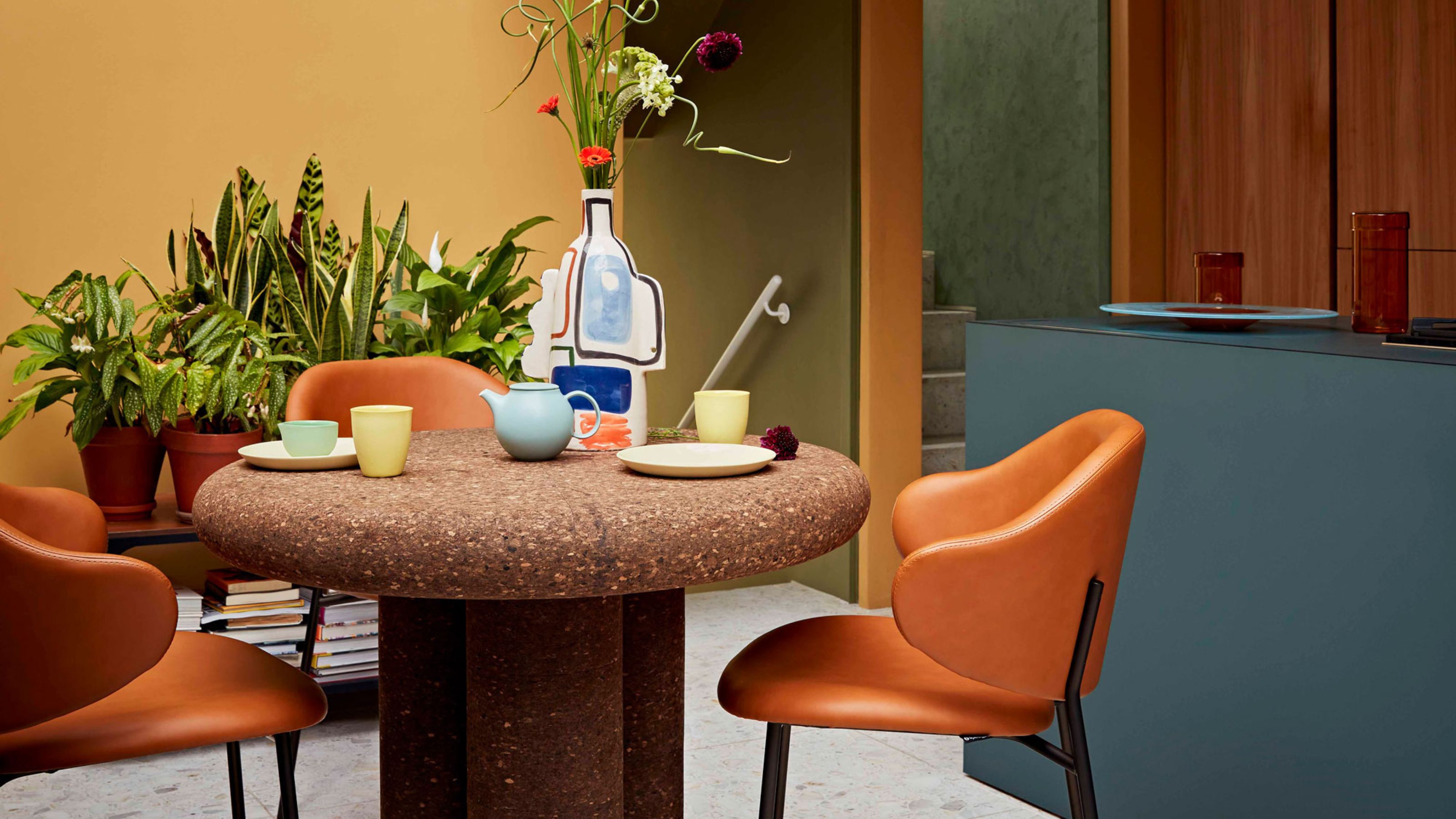 Cork Is the Cool, Sustainable, and Surprisingly Chic Material We Can't Stop Furnishing With Right Now
In honor of Earth Month, we’re toasting to cork... furniture, that is
-
 The Coquette Aesthetic Is Still Going Strong in Homes in 2025 — But Now It's Charming, Whimsical, and Has Modern Flair
A designer weighs in on how you can make the classic coquette trend feel modern while still retaining its whimsical elegance
-
 Spotted in the Coolest Bathrooms of the Moment — This Colorful-but-Divisive Trend Is the Idea You'll Either Love or Hate
See you later, sterile white. This playful plumbing trend is bringing color back to our bathrooms in an utterly unexpected way
-
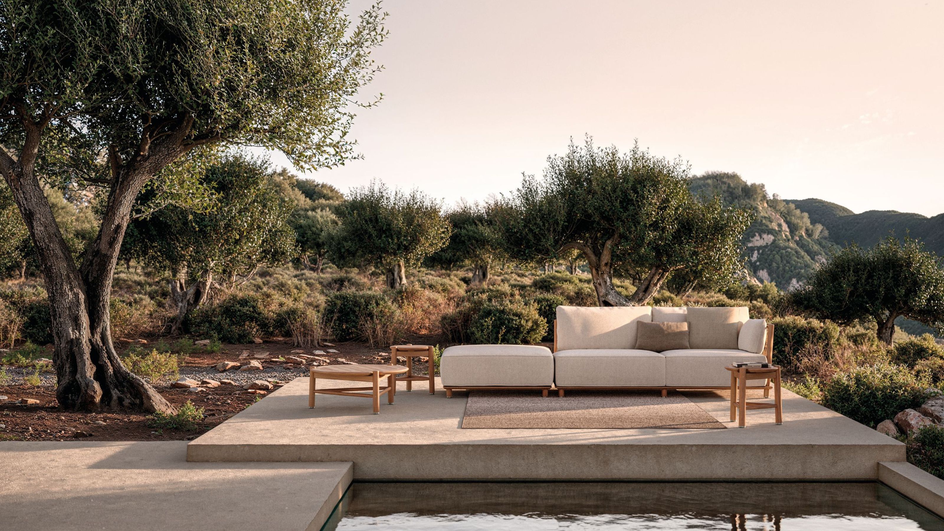 The Biggest Outdoor Furniture Trends for 2025 Embrace the Natural World, White Lotus, and a Touch of Whimsy
Sofas as plush as your living room’s, tables fit for a five-star resort, and materials straight from nature — here’s how outdoor living is evolving this year
-
 The "One Amazing Thing" Theory Could Just Be the Secret to Making Your Decorating Budget Go Further (While Making More Impact)
What if we told you designers had found a way to control a project's spend even while elevating the final result? This new trend does just that
-
 Carpets Used to Give Me the Ick, but This Bold New Style Makes Me Think They're the Next 70s Design Detail Due for a Revival
I've always had visions of ripping up wall-to-wall carpets, but now I'm thinking about actually installing them — what gives?


