5 Vibrant Color Palettes Designers Are Using to Add Energy and Excitement to Decor
Vibrant color palettes are often best left to the experts so as to stop them overpowering. But with a little designer insight, you can feel confident to use these tones yourself
Vibrant color palettes are a key part of the design trends for 2023. Designers are being bolder, old rules are being abandoned, and homes are being filled with a sense of ebullience that can't help but lift your spirits.
'Why not live in a room which is a specific color that speaks to you?' asks Lucas Golbach of the studio En Masse Architecture and Design. 'Customized and personal spaces are the true mark of luxury. Drenching a room in varying shades can make the space one of a kind and show a personality or design sensibility.'
But of course, in order to make a home liveable, there are some considerations to take into account when creating a color palette consisting of vibrant colors, and these are the ones designers are turning to now.
1. Yellow and pink
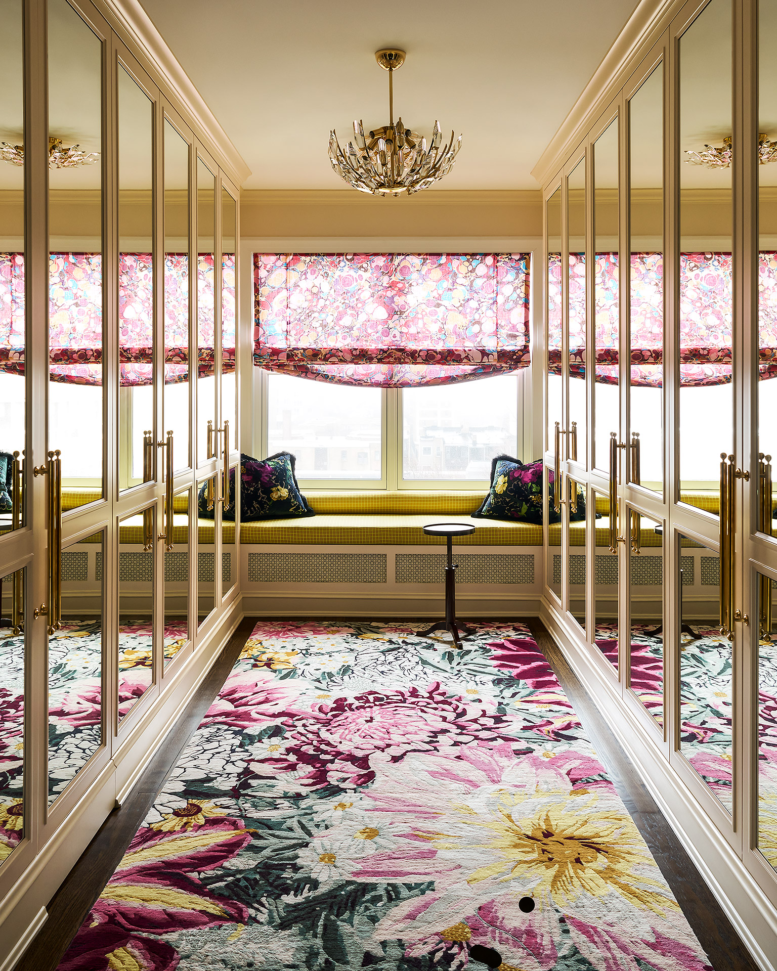
Starting off with a gentle toe-dip into the world of vibrant color palettes, as yellow and pink is supremely easy to live with. This duo is set to be a big color trend for the year ahead. It helps when the pink errs toward softer tones, and the yellows are more primrose than egg yolk, as seen in this dressing room by En Masse Architecture and Design.
'We love to saturate a room to a consistent level where a mix of patterns and colors start to meld together,' says Mike Shively, the studio's founding partner. 'Rather than being jarring off of one another.'
2. Green, blue and red

This entryway could easily have become just a transient space to pass through, barely pausing to catch breath. But thanks to the vibrant color palette added by the designer Amy Kartheiser - and the wonders of color theory - it becomes a joy to traverse across, the uplifting tones raising an unexpected smile.
But this was a very considered collection of colors. 'When it comes to mixing vibrant colors, it’s important to ensure they all have the same undertones,' Amy says. 'That is the differentiator between a bold and colorful palette that feels harmonious and intentional, versus one that can feel a bit overwhelming. In this entryway, the cool tones of the blue and green are paired with a red that also has cool undertones, making it feel sophisticated and evocative.'
3. Red and blue
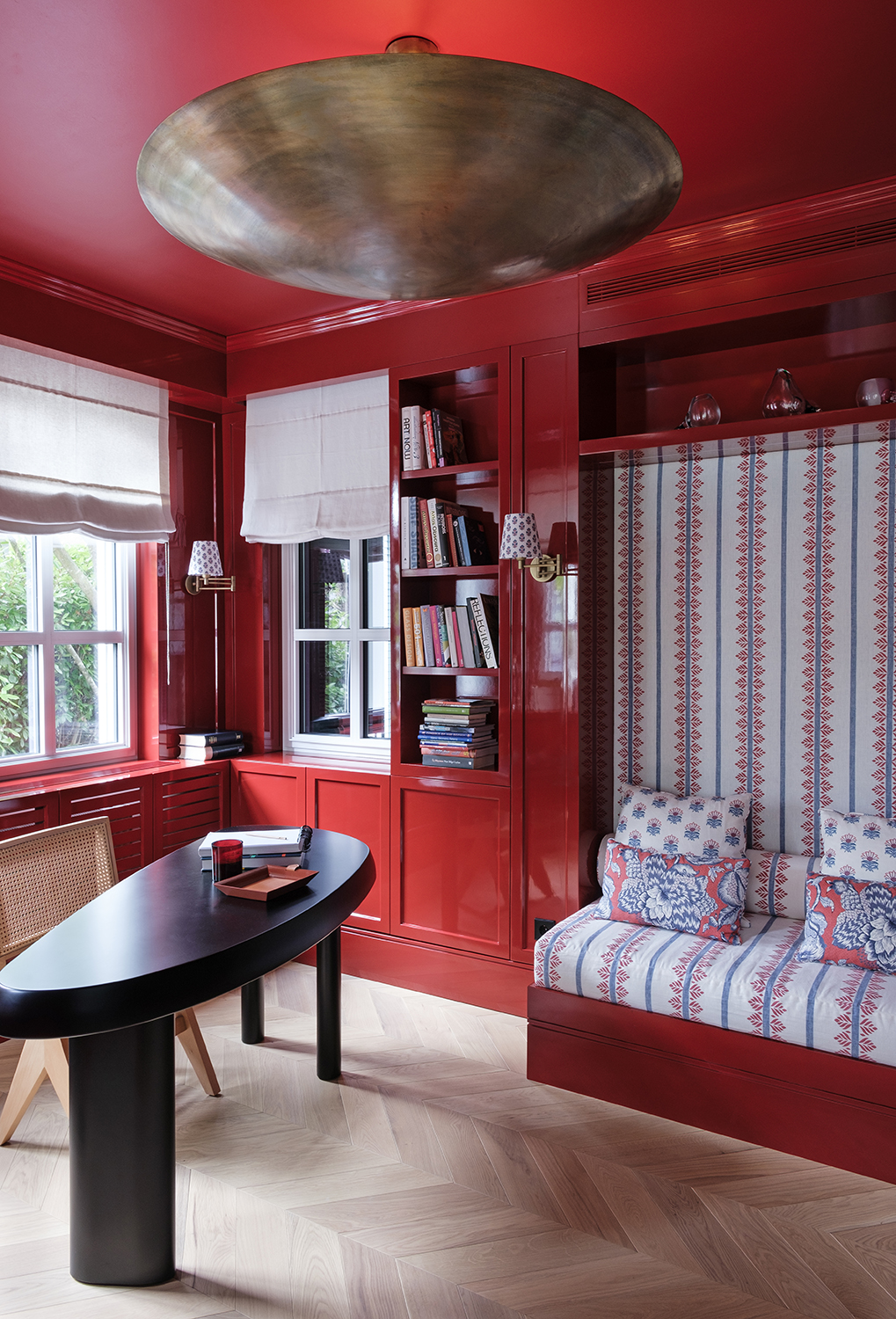
This reading room by Sanayi313 stretches the unexpected red theory to its limits, washing almost the entire space in a glossy red lacquer paint. It works for two reasons. Firstly, thanks to the gloss quality of the paint its able to reflect light and bounce it around the space - a matte paint would feel too heavy and light absorbing when used in this way.
And secondly, the subtle use of a cornflower blue in the fabric choice helps to break up the impact of the red, a soft contrast to the powerful walls. And that's a good trick to remember with a vibrant palette, to introduce notes of soothing calm to help detract from the overall color potency.
4. Black and hot pink
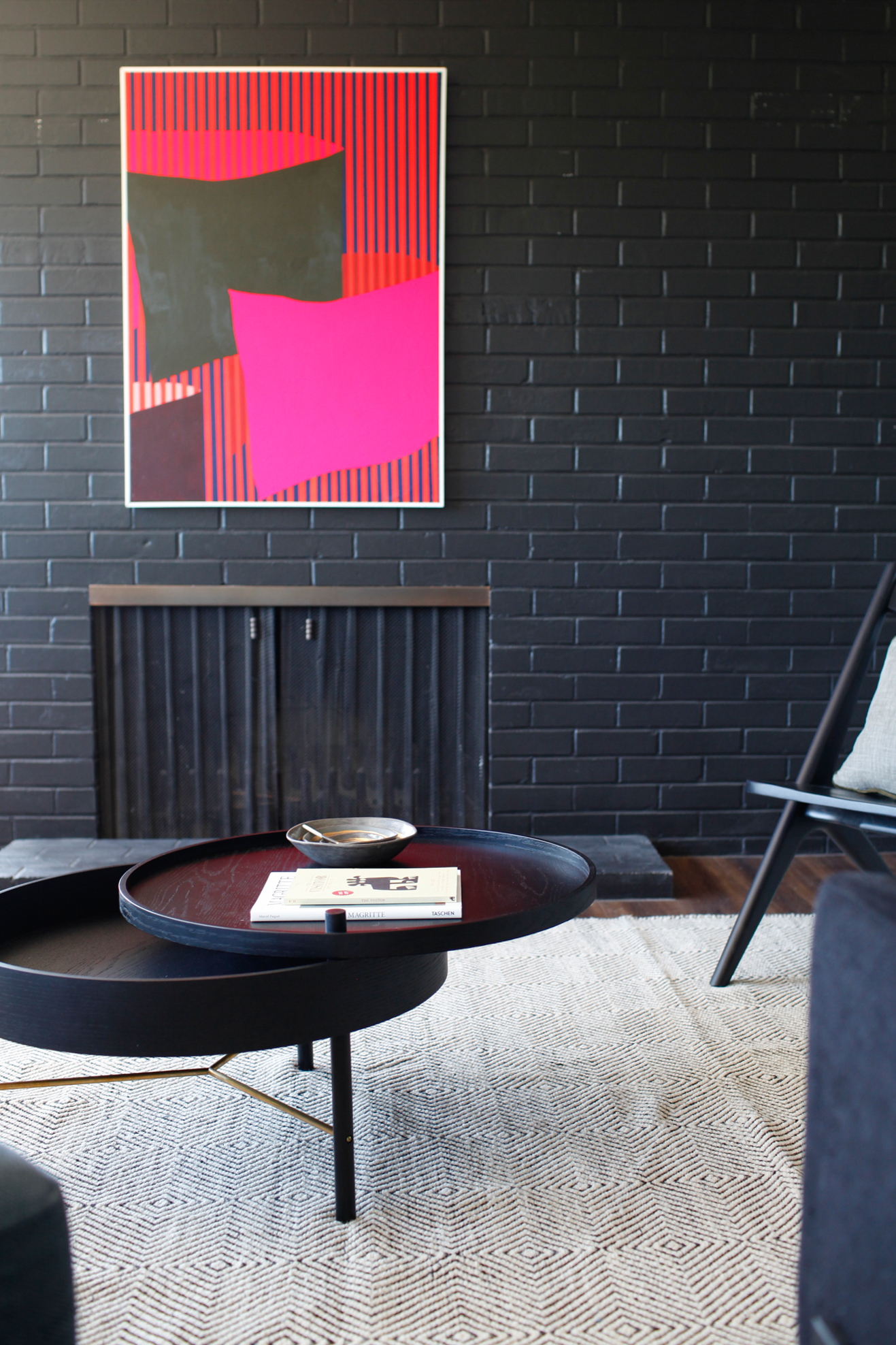
Including black in a round up of vibrant color palettes might seem counter-intuitive but in fact it's the perfect base on which to layer more striking shades. Everything looks more expensive when placed against a dark background, and hot pink looks more luxe and considered when in this way for this living room by the design studio Le Whit.
'The black painted brick fireplace provides a striking contrast to the graphic art by Brian Sanchez, and allows for the shades of pink to really pop,' says Corey Kingston, the design studio's principal.
5. Yellow, blue, pink and green
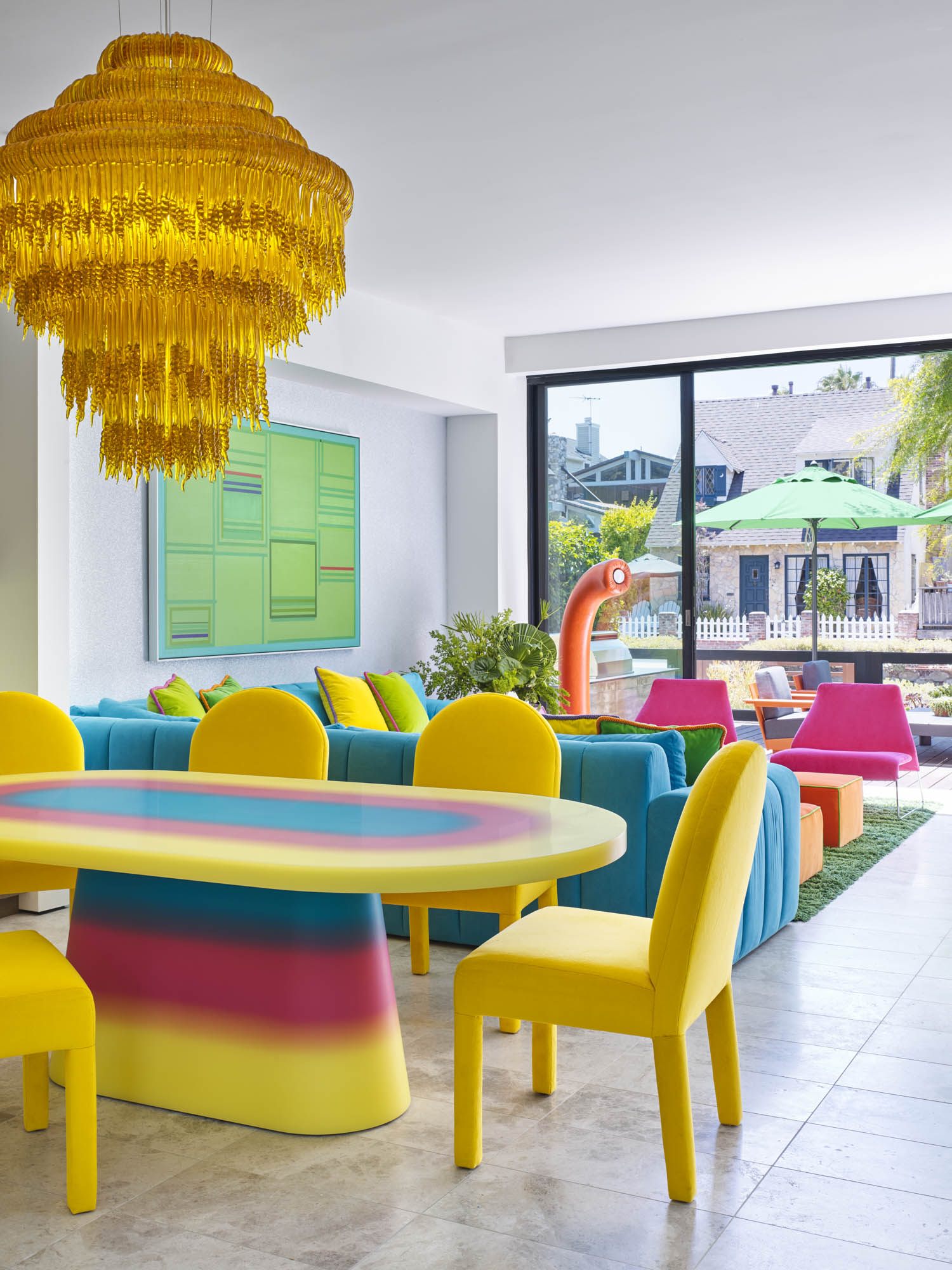
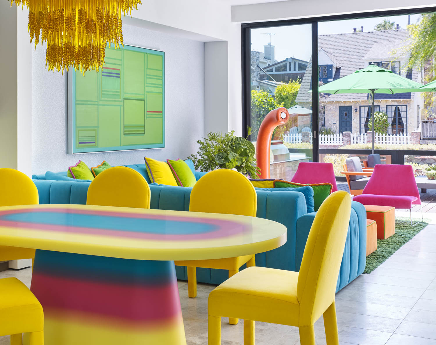
All the most vibrant shades come together in this open plan living room by the interior designer Jessica Ayromloo. But punchy as they are, they still manage to look peppy rather than overpowering, a feat which is down to more than just the neutral base palette of gray on the walls. It's a great example of how you can pair vibrant shades to get relaxing schemes.
'My client wanted saturated pops of pure color, so we chose yellows, blues and greens,' Jessica says. 'But I wanted to to soften the use of primary colors, so we added hot pink, which still has the vibrancy and energy of the other colors, but at the same time softens the palette.'
Be The First To Know
The Livingetc newsletters are your inside source for what’s shaping interiors now - and what’s next. Discover trend forecasts, smart style ideas, and curated shopping inspiration that brings design to life. Subscribe today and stay ahead of the curve.
The editor of Livingetc, Pip Rich (formerly Pip McCormac) is a lifestyle journalist of almost 20 years experience working for some of the UK's biggest titles. As well as holding staff positions at Sunday Times Style, Red and Grazia he has written for the Guardian, The Telegraph, The Times and ES Magazine. The host of Livingetc's podcast Home Truths, Pip has also published three books - his most recent, A New Leaf, was released in December 2021 and is about the homes of architects who have filled their spaces with houseplants. He has recently moved out of London - and a home that ELLE Decoration called one of the ten best small spaces in the world - to start a new renovation project in Somerset.
-
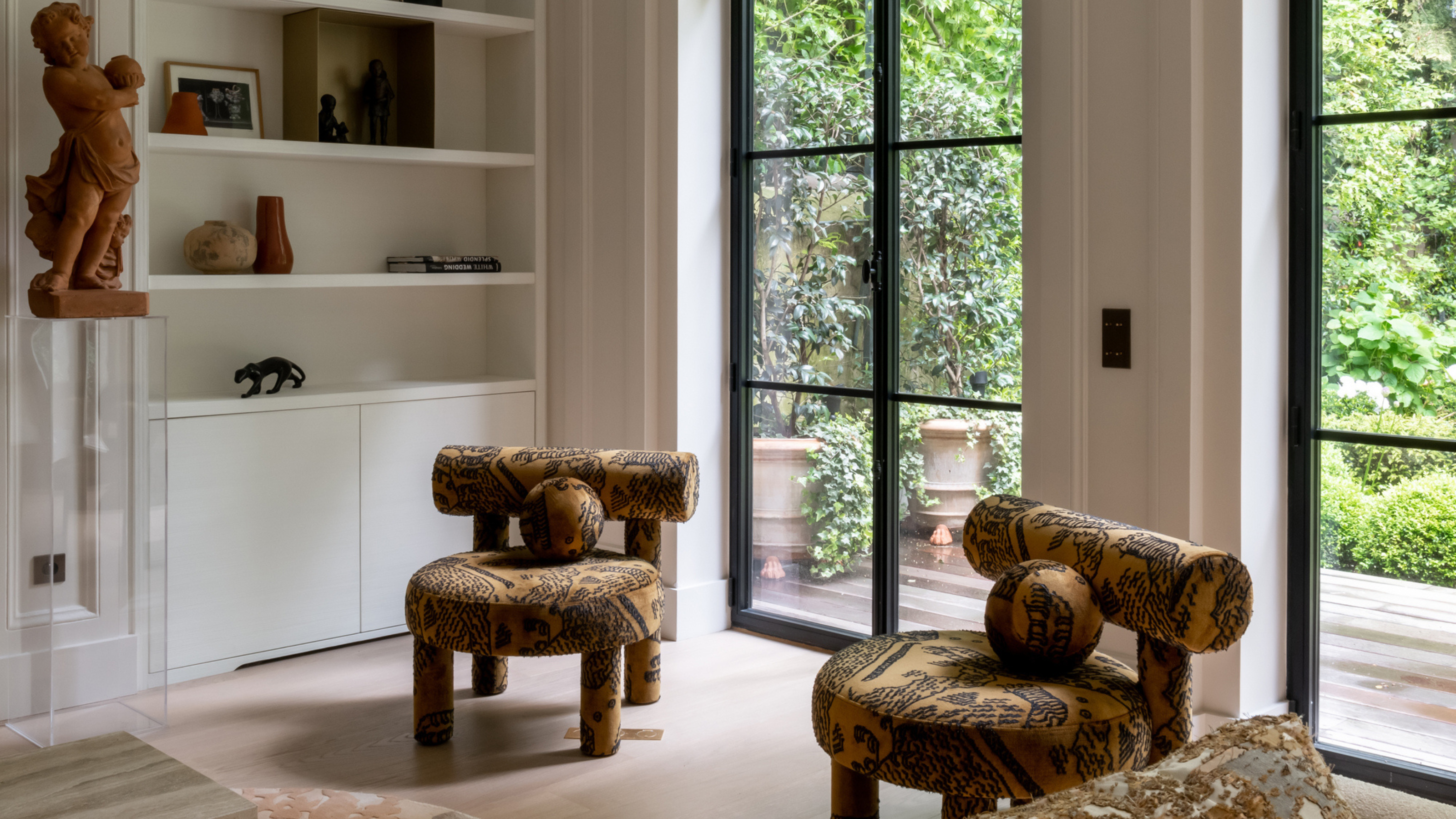 This Specific Fabric Print Is Literally Everywhere Right Now — Here's Why
It's whimsical, artistic, and full of character. We've called it already: Dedar's 'Tiger Mountain' is the fabric that will define 2025
By Devin Toolen
-
 These Are the Dos and Don'ts of Bamboo Plant Placement — Follow This to Avoid Bad Feng Shui
By following the experts' guidance on where to place this houseplant you can usher luck, wealth, and prosperity into your home
By Lilith Hudson
