A decorator's guide to the 60-30-10 rule and how to use it to create your color scheme
We look at the ins and outs of the 60-30-10 rule – how to use it in different ways and the best colors to experiment with

You might have heard of the 60-30-10 rule – the decorator's go-to code for proportioning color in interiors, but what does it mean and how do you go about using it in different ways in your own home? Without realising, interior design conforms to this golden rule more often than you might think, and you might have been subconsciously loving a scheme and the use of color, without realizing that it all comes down to following this golden rule of thumb.
So what is the 60-30-10 rule? Ultimately, the rule is that 60 percent of the scheme should be one color, 30 percent should be a second accented color, displayed on chairs, rugs, sofas, and 10 percent should be a third color dotted around the room in the form of artwork, small touches and accessories. ‘Applied to interior design the golden rule can be a great tool to use in creating a cohesive and comforting living area,' says Martin Waller of Andrew Martin.
Read on to discover how to adopt the rule in your own interiors, and for some beautiful schemes that will inspire you to work color cleverly into your own interior design.
How to use the 60-30-10 rule
The 60-30-10 rule mainly applies to color theory and within this, there are many ways you can work the rule into your interior design. You might want to take graduated tones of the same color to achieve a monochromatic look. You might be after a neutral scheme, in which case you can use three earthy tones to create a balanced interior. Alternatively, you can go all out with bold primary pops. You can also use the rule with furniture, using the largest piece of furniture for the 60 percent, a middling-sized piece of furniture in a differing color for the 30 percent, and the 10 percent an accent cushion.
While the 60-30-10 rule applies mostly to color theory, there are other ways that you can explore this golden rule of interiors. Think outside the box and apply the rule to texture to create another look altogether. Read on for our favorite ways to try this rule for yourself at home.
1. Create a natural look with earthy tones
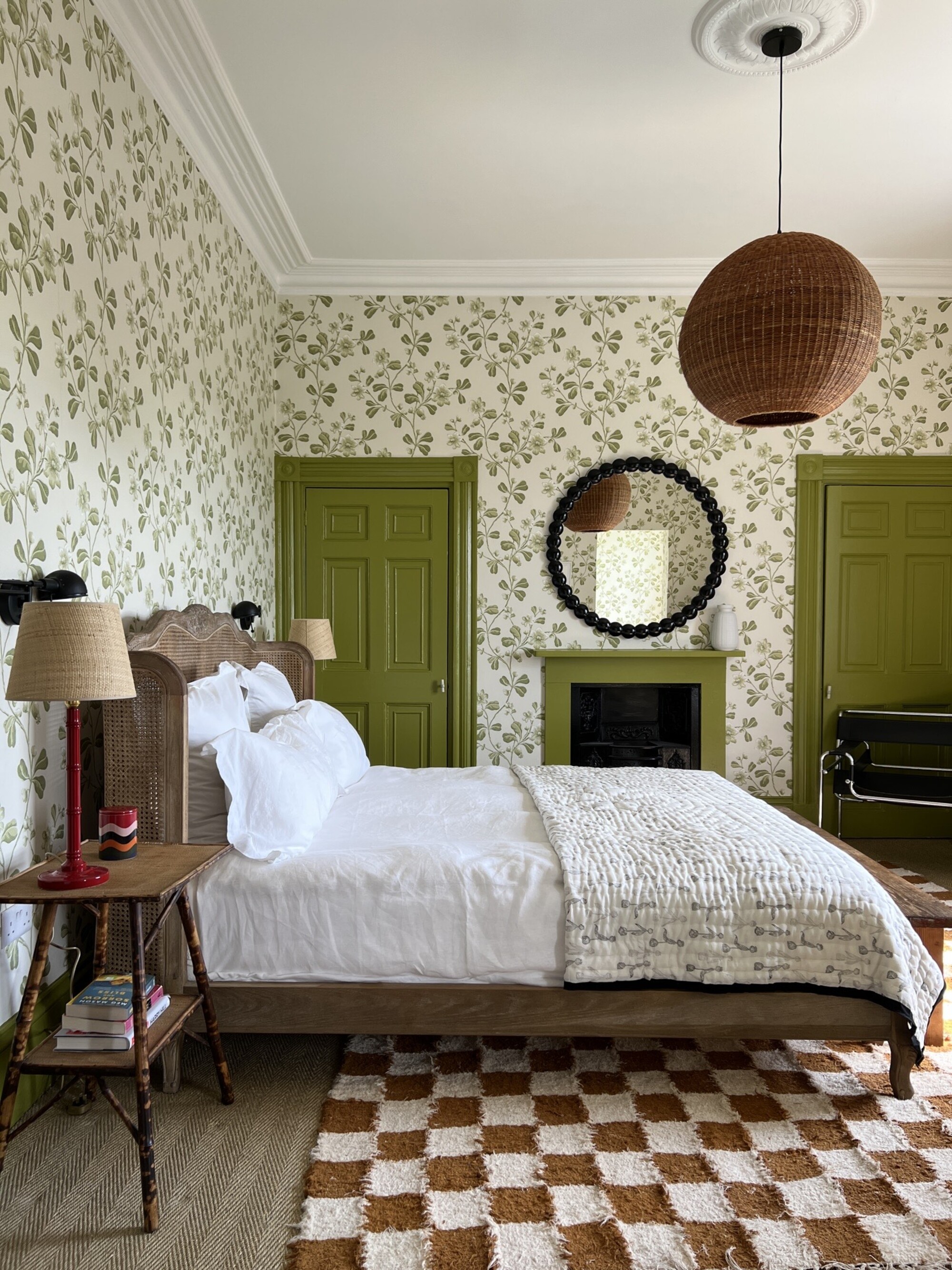
Pick three earthy, botanical tones that mimic colors seen in nature and apply to the 60-30-10 rule and the result will be a calming, peaceful space, as seen here by stylist Lisa Dawson. Here, a chocolate brown, light olive green and creamy white were combined. Green takes the majority color, used on the doors and cornicing, brown takes the secondary color, and there are glimmers of red accessories throughout for the accent pieces.
'I chose the palette of this room very carefully,' says Lisa. 'I aware that I was using a highly patterned paper and that whatever I teamed it with needed to work without tipping the space into overload. I started with green as my base, using Broadwick Street paper and Citrine as the paintwork, both from Little Greene,' she says.
'I used checkerboard for the rug, matching the tones to the curtains which were already there - Zoffany Curzon in Antelope, and adding texture with a similarly toned rattan light shade from HK Living and vintage plant stands as bedside tables.
'I picked the accent color, red out in the bedside lighting and accessories.'
2. Use color pops on a stark white background
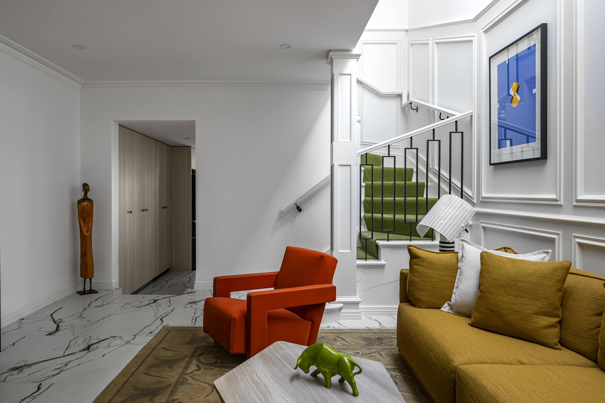
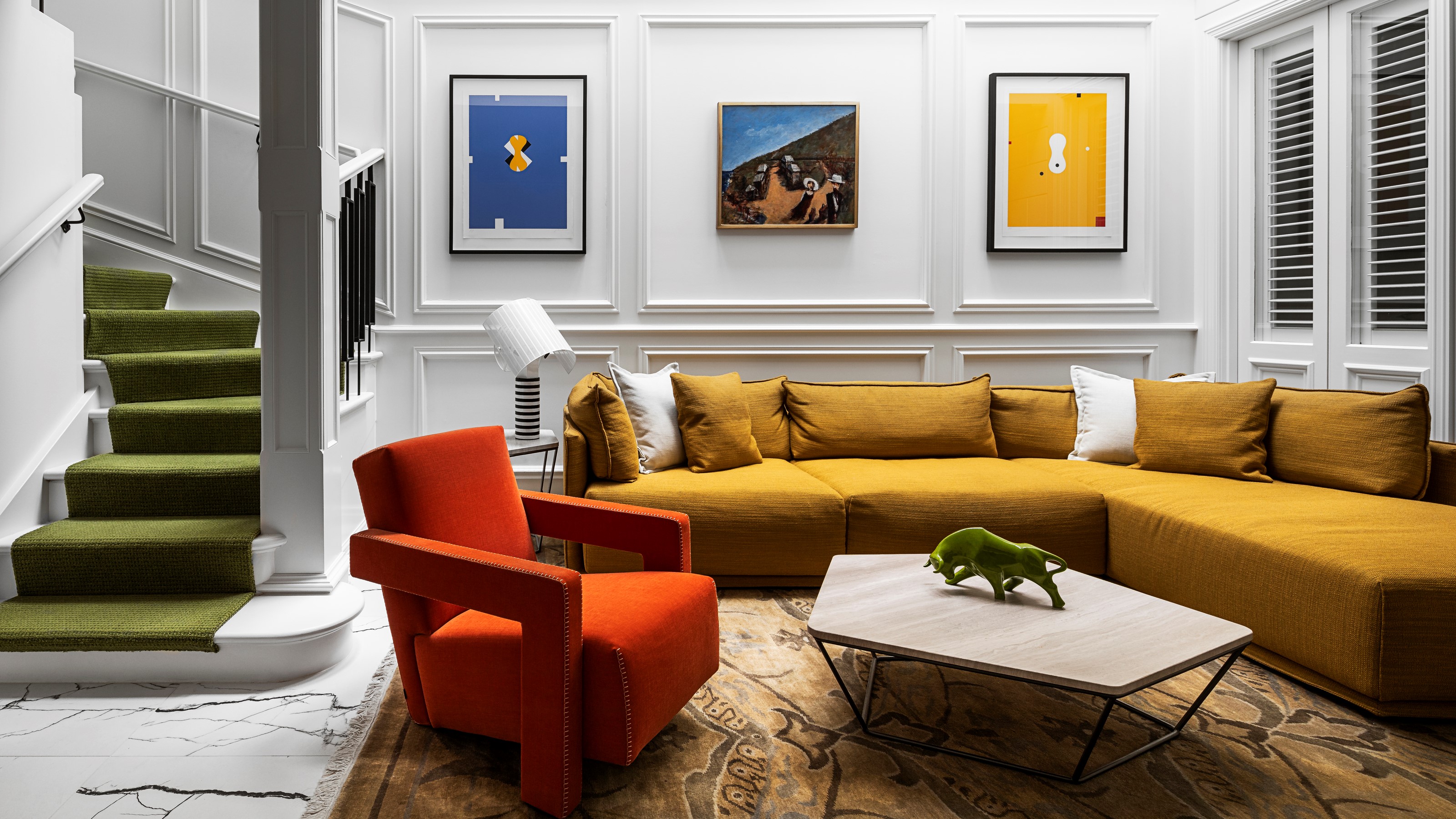
If you want to go all out with a bold and primary color kick, think about balancing it with a stark white background to help it really stand out. Your 60-30-10 rule needn't apply to the walls, and by pairing it back and going for a bright white, you give space for your three colors of choice to really pop. Here, the designer, SG2 design went bold with a golden yellow sofa taking up the majority of the color in the room, followed by the secondary green cascading down the stairs in the form of a runner, and the bright red accent chair. The impact is dramatic and colorful living room.
3. Evoke a feeling of calm with coastal colors
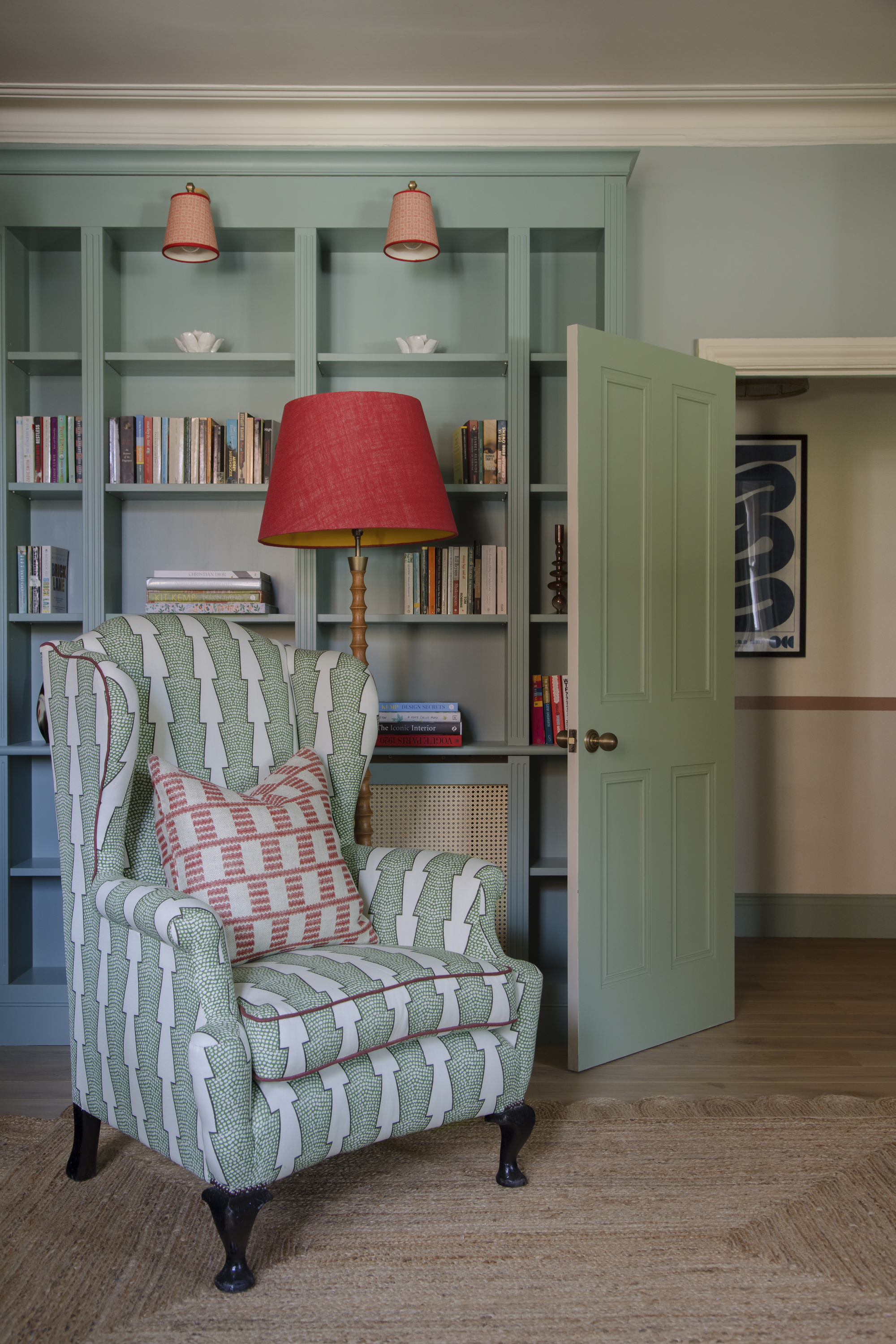
Sometimes, your selected three colors can really capture the essence of a place or a moment. In this scheme from Brooke Copp Barton, the designer used a tasteful trio of seaside colors and applied color theory.
'With the walls a sea blue/green, we chose a joinery colour to tone with this to help create a calming backdrop and cocooning space,' explains Brooke. 'The fresh green of the Spot and Arrow fabric on the chair make this the hero piece, with contrasting accent pops of red, adding vibrancy.
'Personally I particularly love the red trim on the chair and wall lights - sometimes it can be the smallest of details that really make the difference!'
4. Play with materials as well as color
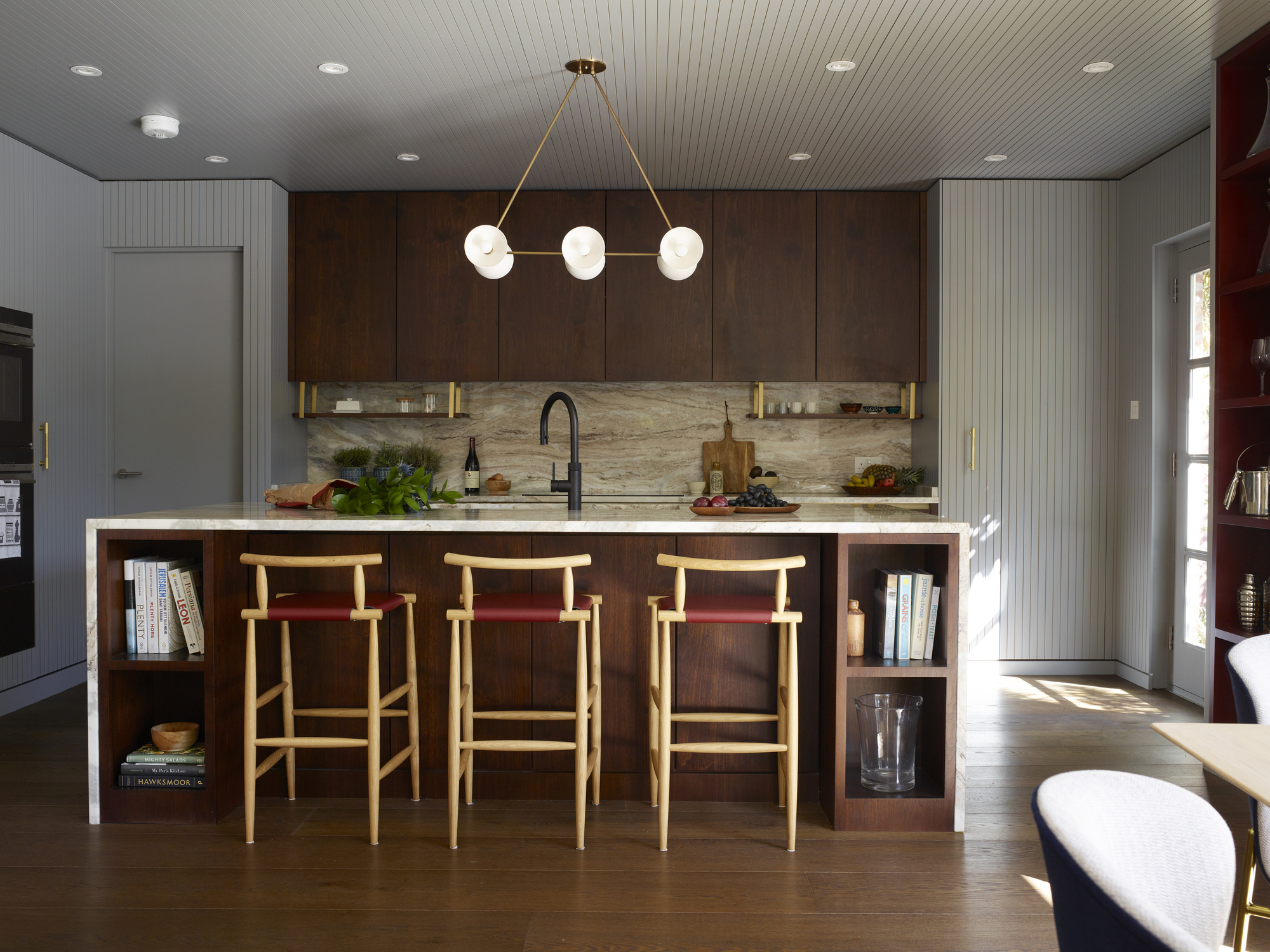
While using the 60-30-10 decorating rule with color creates immediate and obvious impact, in other spaces, you can get clever with the theory and adopt the rule for material instead.
'We do use the 60-30-10 rule, but I think we have been doing this unconsciously! It's a great method for balancing the room, yet keeping it tied in together and adding some interest into the space,' says Catherine Dal of Cat Dal Interiors.
'Our '10' rule would not necessarily be a color, but something unexpected, or playful to create a little tension in the space.
'We apply this to kitchens in terms of materiality, as we find with more and more family homes adopt a open plan living/kitchen layout, we find there is often a need to zone areas of the room, so they don't all blend into one lost space, particularly for lots of built in joinery/storage. So for large kitchens we apply this rule.'
In this modern kitchen, the cladding in light grey represents 60, walnut insert of kitchen counts for 30, and burgundy is the accent color, seen on the bar chairs and open bookshelf.
6. Highlight architectural features by playing with contrast
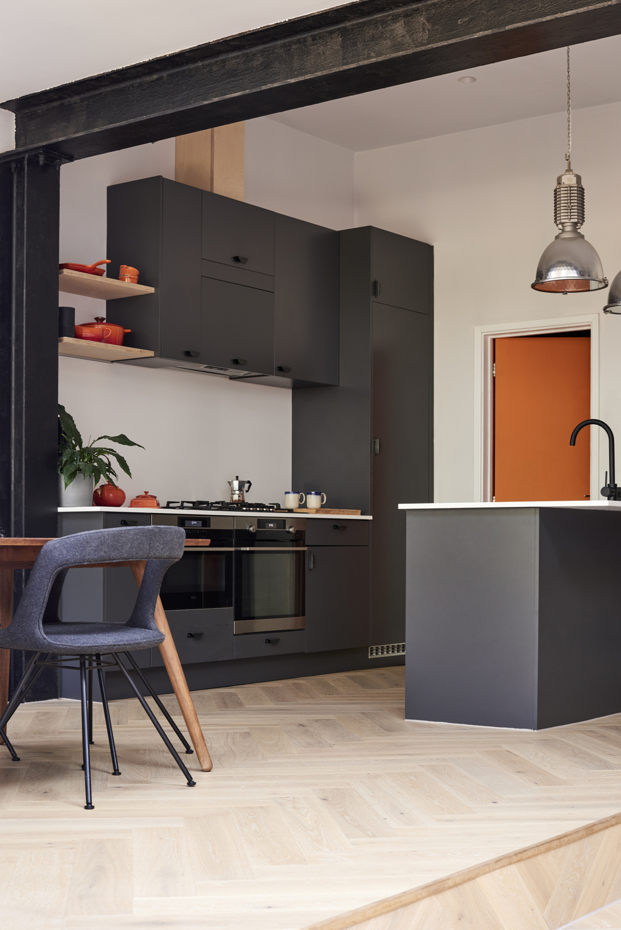
Dividing your use of color up according to the decorating rule can be a great way to create a real dynamic contrast in your interiors. In this example from Mitchell + Corti Architects, the idea was to highlight architecture with a strong contrast and a dramatic black. 'This makes up the 30 percent, says Ester Corti. 'The orange and red accent color was chosen as it was present in the original front door stained glass windows, so we thought it appropriate to use it elsewhere. Orange works well against a black and white palette, bringing saturation and brightness into the equation.'
'We tend to work around 60 percent being a neutral base, typically muted colors to reflect more light, the 30 percent tends to be a darker color to bring some contrast and definition to the space and distinction between surfaces, and the 10 percent is the fun wild card, one that is usually less dominant and that can be easily changed over time to offer a fresh feel to a room.'
7. Play around with warm and cold colors
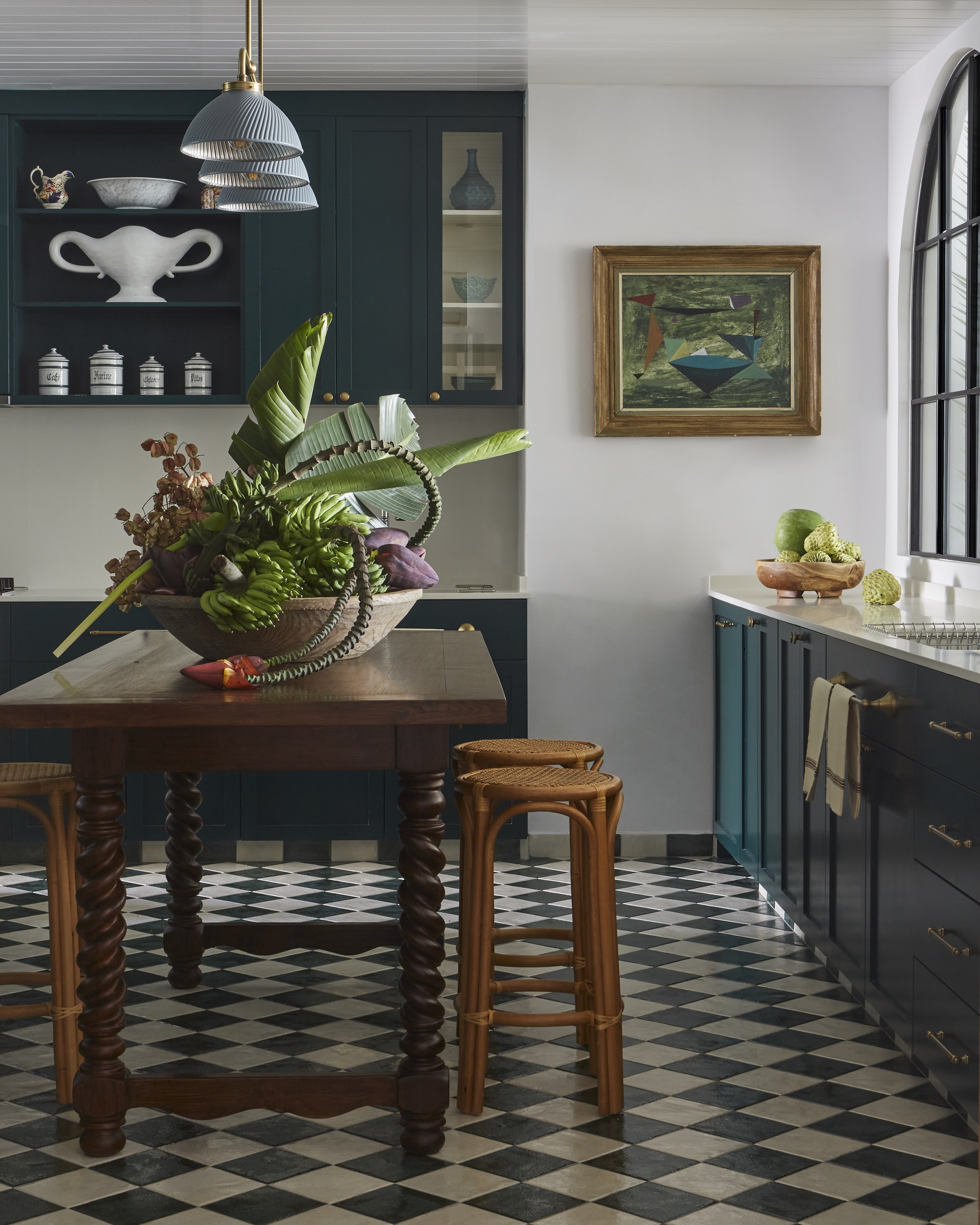
Adopt the rule to really make your interiors stand out by giving more weight to your cool colors, bringing a subtle amount of warmth in an accent, or vice versa. This kitchen from Elizabeth Hay Design does just that and the impact is timeless and beautiful.
'I love the freshness of the white against the deep green. When using darker colors I like to mix it with a fresher lighter color or a fresh white like I have done here so that the interiors don’t feel too dark and heavy.
'Adding the wood and teak adds warmth to the room which could feel cold without the natural materials.'
Interior design is all about the balance and this room is a good example of this with the star cool dark green at around 60 percent, the bright white at about 30 percent to add the freshness and then about 10 percent warmth with the wood and cane.
8. Use the rule to go all neutral
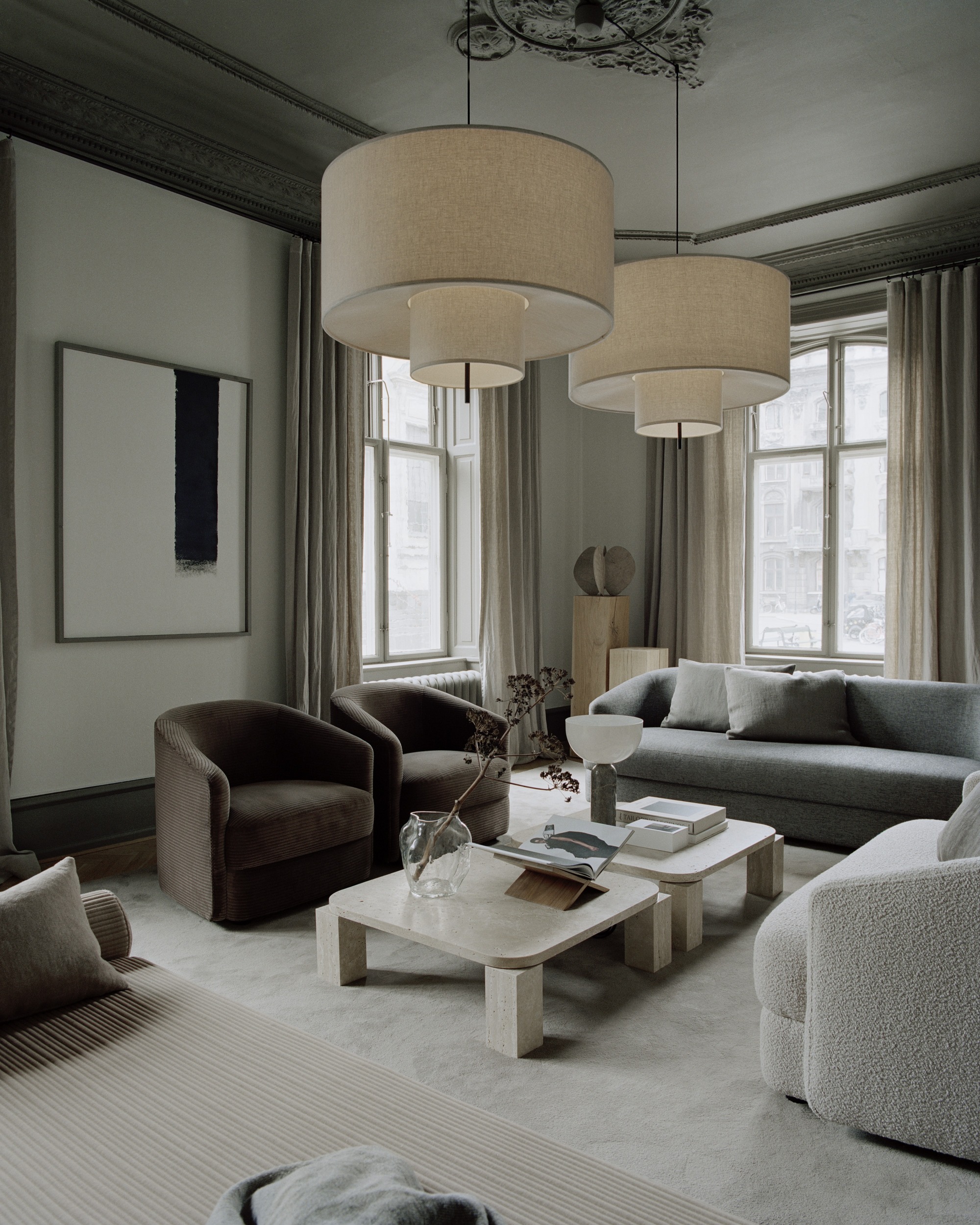
Create a neutral color scheme using the 60-30-10 rule with a trio of subdued hues, like greys, creams, browns. The overall look will transform your room into a serene and peaceful space, as seen in this room designed by New Works.
'A subdued color palette is synonymous with the New Works brand, reflected in our collection of furniture, lighting and sculptural objects, as well as in the settings we create,' says creative director of New Works, Knut Bendik Humlevik.
'Muted tones are mixed with soft creamy shades, while more vivid colors, such as amber yellow, earth red or a rich green, are used sparsely as accents. The goal is to create environments that embrace harmony and warmth, which feels effortless and intriguing, and most importantly, environments where you would want to live.'
What types of color scheme are there?
Color theory is a great way to apply logic and science to the art of interior design, using the wheel and a color's locations on the wheel to create a scheme that works. The five main color schemes include a monochromatic color scheme - which is when a room is painted all over in one color or various hues of the same color. Analogous is another color theory decorating rule where three colors are used that are next to each other on the color wheel, creating a look that is similar to the monochromatic scheme.
A complementary color scheme is all about using colors that are opposite each other on the color wheel, while a triadic color scheme divides the wheel up with three colors that are equal distance away from each other. Finally, a square color scheme is made up of a base color and three other colors that are on a 90 degrees angle away from the base color.
Be The First To Know
The Livingetc newsletters are your inside source for what’s shaping interiors now - and what’s next. Discover trend forecasts, smart style ideas, and curated shopping inspiration that brings design to life. Subscribe today and stay ahead of the curve.

Former content editor at Livingetc.com, Oonagh is an expert at spotting the interior trends that are making waves in the design world. She has written a mix of everything from home tours to news, long-form features to design idea pieces, as well as having frequently been featured in the monthly print magazine. She is the go-to for design advice in the home. Previously, she worked on a London property title, producing long-read interiors features, style pages and conducting interviews with a range of famous faces from the UK interiors scene, from Kit Kemp to Robert Kime. In doing so, she has developed a keen interest in London's historical architecture and the city's distinct tastemakers paving the way in the world of interiors.
-
 The Easiest Way to Turn Your Designer Scarf Into Wall Art — No Frame, No Fuss, No Regrets
Because silk this pretty should never stay in a drawer
By Julia Demer Published
-
 Italian Kitchen Trends — 5 Emerging Ideas From the Chicest Italian Designers That I Predict Will Go Global in 2025
Fresh from Milan Design Week, these are the exciting finishes, styles, and innovative materials I can't wait to see in more kitchens this year
By Faiza Saqib Published