8 of the Best Neutral Kitchen Cabinet Colors – Real Spaces That Prove These Shades are Timeless
Discover our favorite ways to use neutral tones to transform the most-used room in the house
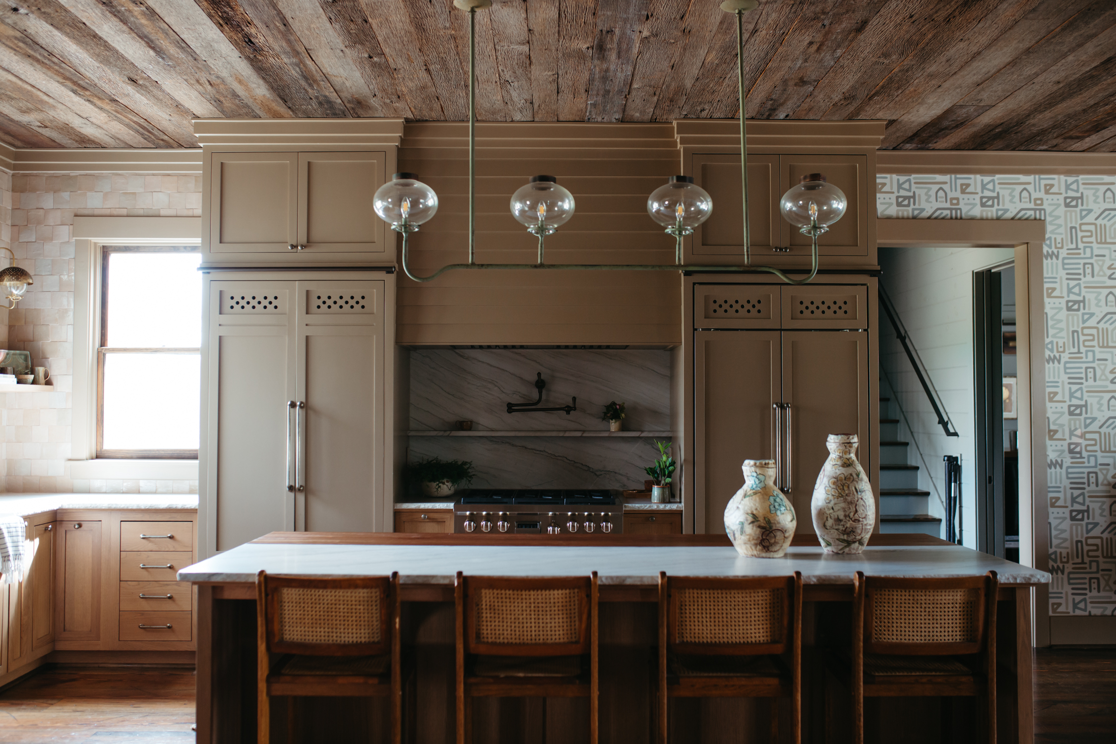
It feels like strong, saturated palettes are everywhere at the moment, with ever-braver color combinations permeating every space in the house. If you feel more at home decorating with neutrals, then current color trends might have you questioning your preference for these stalwart shades.
But, whether pale and peaceful or in earthier tones, neutral colors have a timeless appeal that makes them an ideal choice for spaces that you spend a lot of time in. They're also a smart pick for areas that can be costly to redecorate, such as kitchens and bathrooms.
If you're embarking on a refresh or remodel and deliberating over what kitchen colors to choose, then it's certainly worth exploring the breadth and variety of the neutral spectrum. You could opt for something classic, such as a white-and-wood scheme; alternatively, look to desaturated versions of stronger colors, like a creamy beige with mustard undertones, or a grey that's tinged with the subtlest hint of green.
Versatile and multi-faceted, neutrals can be as transformative as bold color, just in a more understated and livable way. Lighter shades work well in bright, lofty spaces such as the Plain English kitchen featured above, while dark browns, charcoal, khaki and off-black can help to create atmosphere in smaller, cozier homes, as well as in kitchens that are lacking in natural light. In search of more inspiration? We've compiled 8 of our favorite neutral kitchen ideas below.
1. DARK KHAKI
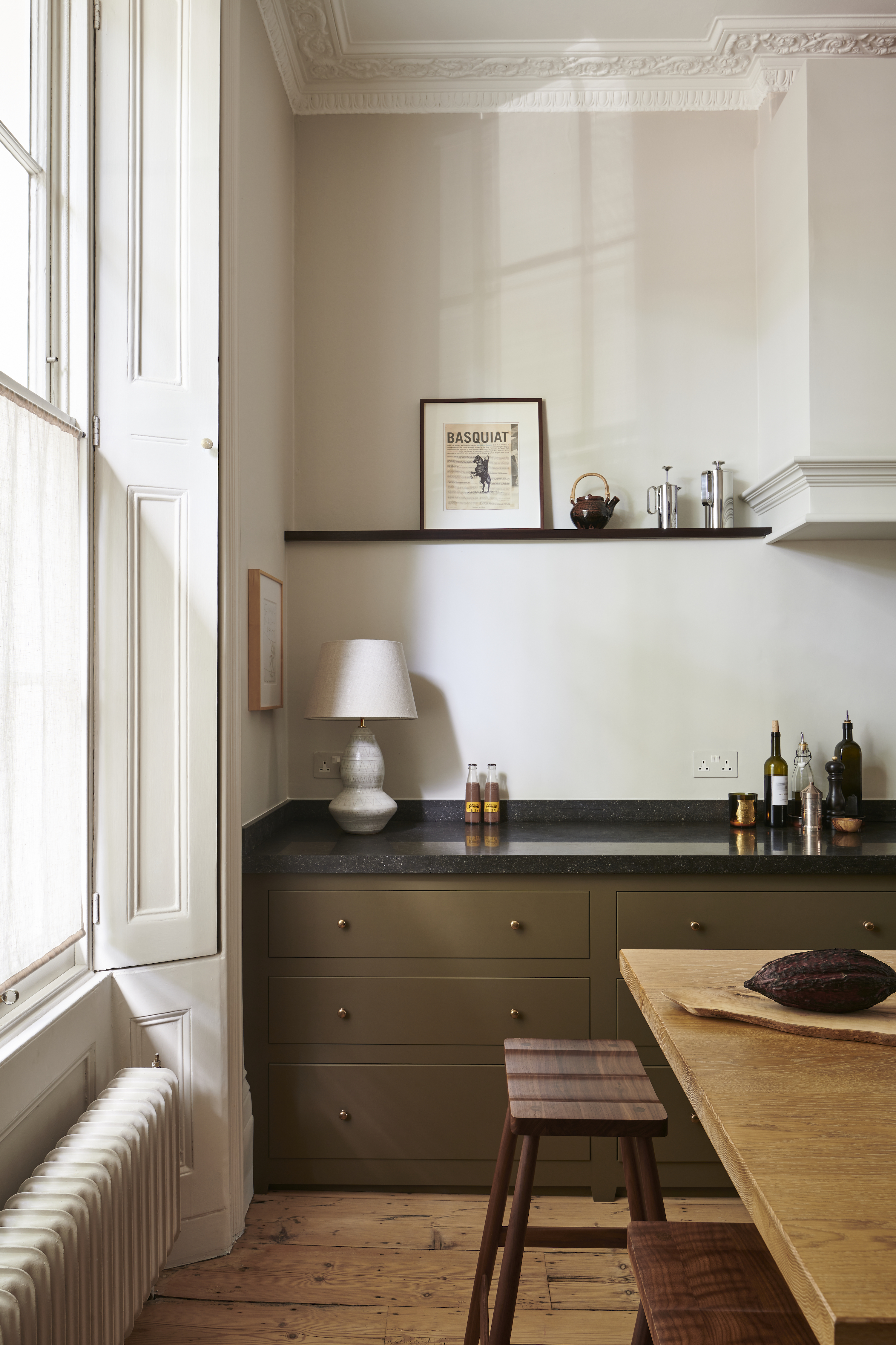
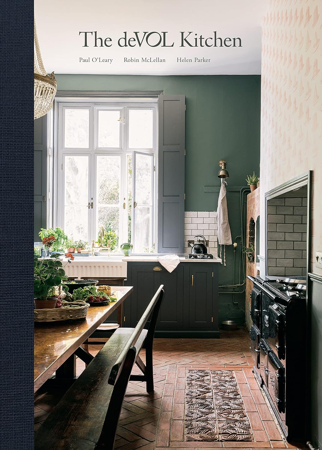
Neutral paint colors for kitchens don't have to be pale or washed out: this deVOL kitchen features a deep shade of khaki on the base units, which provides a visual bridge between darker elements – such as the worktop – and the off-white used on the walls. This strong neutral complements the warmth of the wooden floors and furniture perfectly.
'Muddy greenish-brown is a color that has come to our attention recently, it works really nicely with soft-white walls, says Helen Parker, creative director at deVOL. 'The overall effect creates a brighter interior than it would if you choose darker colors for the cupboards and walls.’
2. CLEAN WHITE
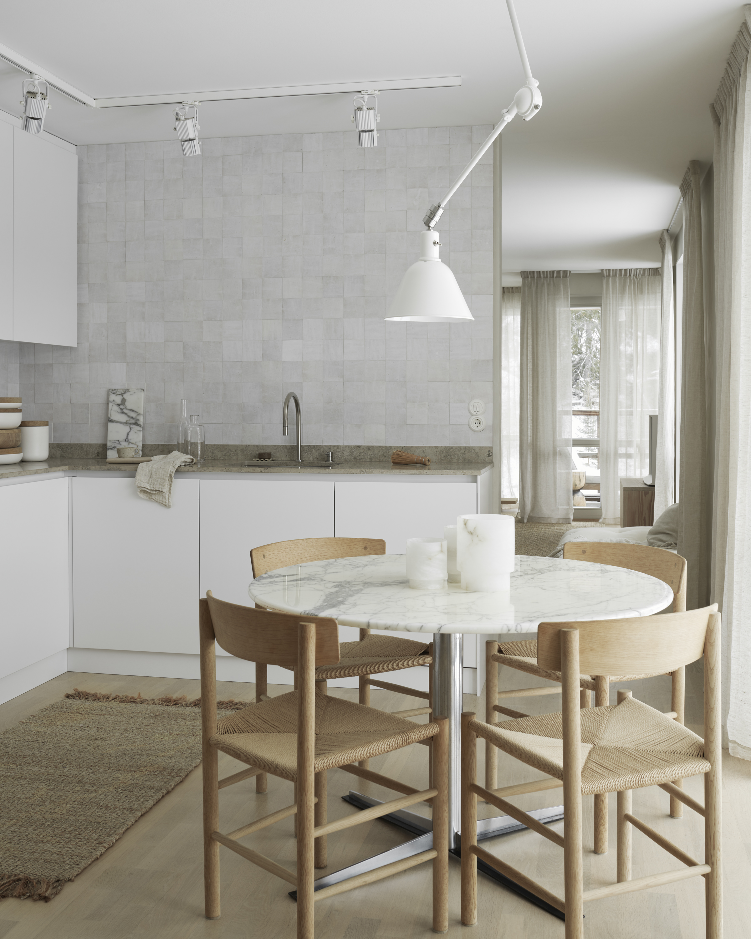
When Pella Hedeby redesigned the kitchen of her apartment, she chose a serene scheme with subtle texture for a modern yet timeless take on a classic white kitchen. The interior designer and stylist worked with Swedish brand Nordiska Kök on the design.
'Pella's version of Scandinavian minimalism is warm and inviting. It's a style that can also be found in the kitchen we created for her,' shares Johan Lundkvist, the company's creative director and founder. 'The white, minimalist doors create a calm and harmonious feel, particularly as the upper cabinets are all the same width. Their sleek design works well with the handmade Zellige tiles from Stiltje, and the textural limestone worktop.'
3. EARTHY TAUPE
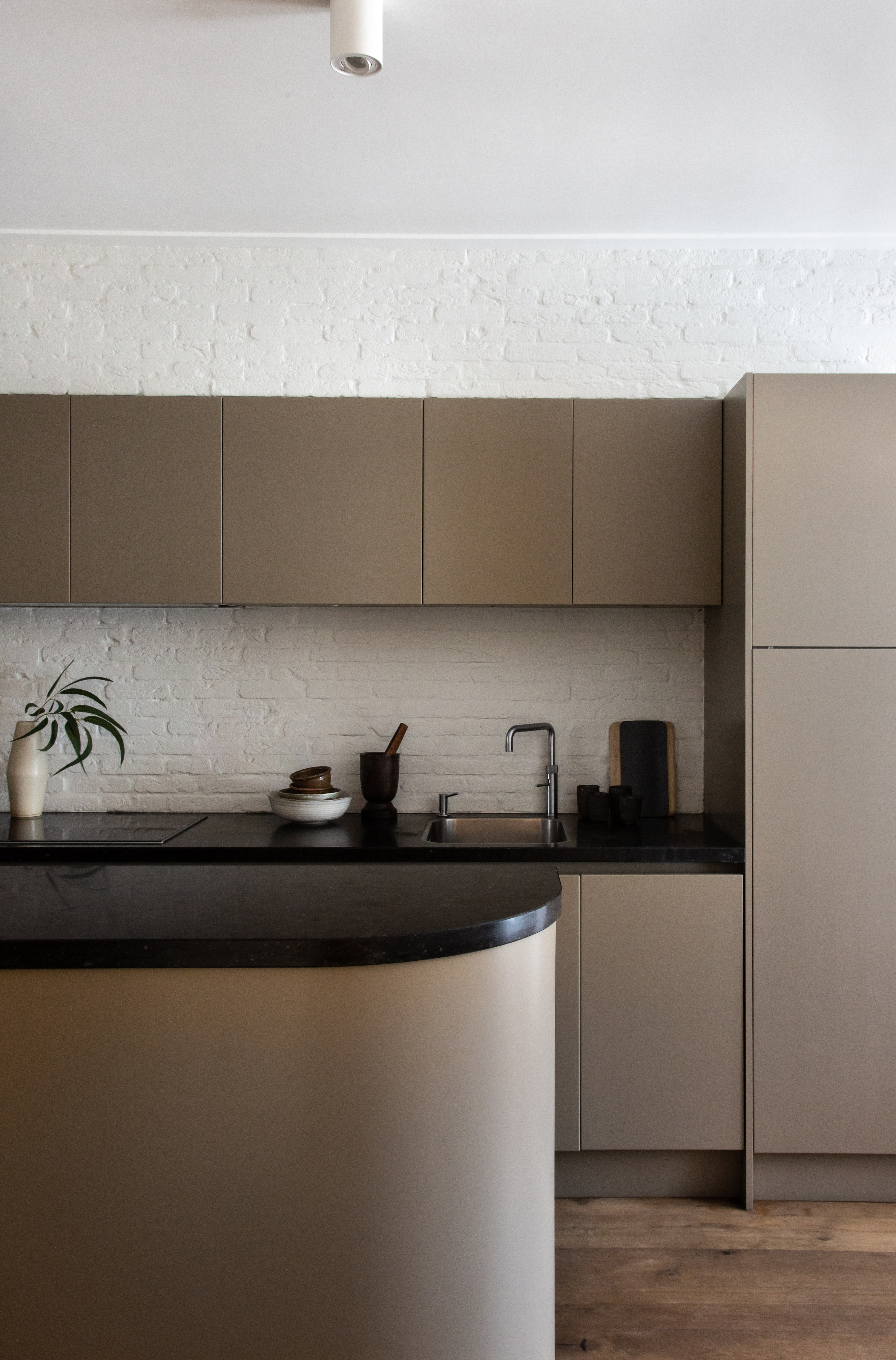
We love the rich tones of this modern kitchen, which was refreshed with a new paint scheme by Avenue Design Studio. The waterfront home had been stripped and renovated for the rental market before the studio was enlisted to inject some soul back into the property for its new owners.
'What was needed was a delicate reintroduction of the character that was lost along the way,' explains the studio's principal Holly Marder. 'Now, lime-plaster walls and applied exposed brick form a textural foundation, while a fresh color scheme has reinvigorated the existing kitchen. We went with Mouse’s Back by Farrow and Ball for this space: our favorite dark neutral.'
4. PALE GREY
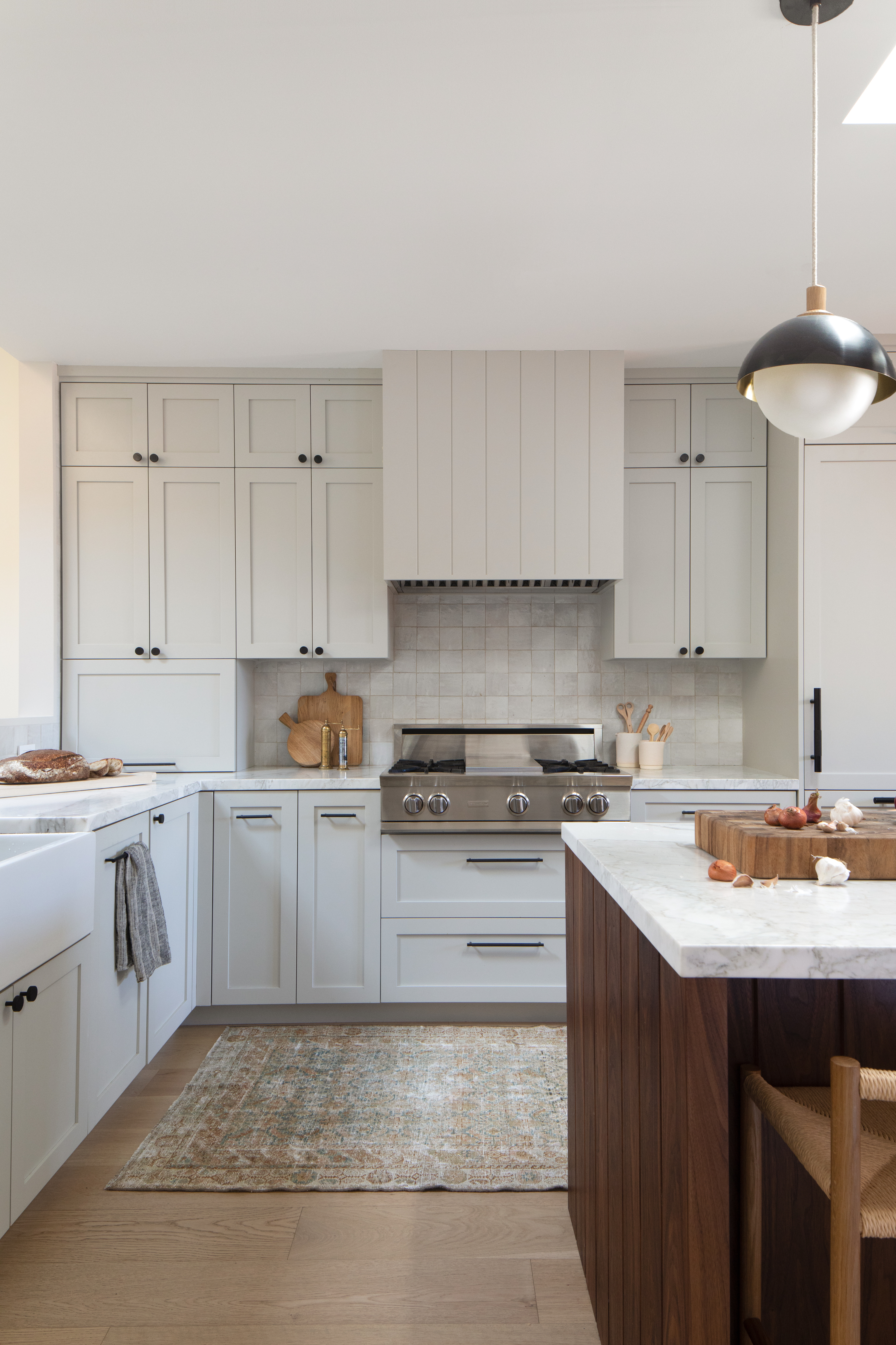
If white feels too harsh for your kitchen interior, but you love the idea of a bright, airy space, then a restful shade of light grey could be the solution. In this 1930s San Francisco home, Californian interior designer Katie Monkhouse combined powdery grey kitchen cabinets with warm, dark wood for contrast.
'We wanted to do a play on the classic white-and-wood kitchen,' Katie states. 'The clients had the idea for the walnut island, which we elevated to form the centerpiece of the open-plan home. We went with a pale grey on the cabinets to bridge the gap between the white walls and the dark timber.'
5. COMFORTING CREAM
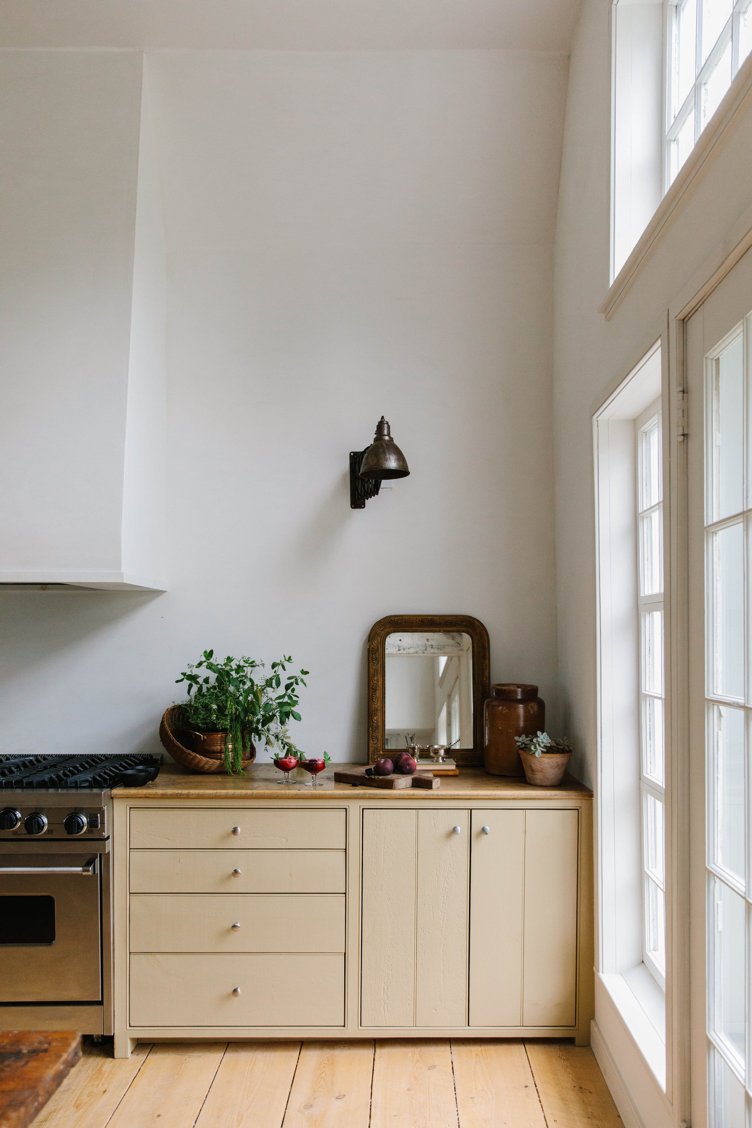
This painstakingly restored 1760s captain's cottage in Cutler, Maine, is an ode to the dramatic coastline it sits upon. The house has been in interior designer Blair Moore's family for over 30 years, and has recently undergone a full-scale renovation project that honors its history while imparting a more contemporary air.
'The original kitchen in this cottage was painted a cheery mustard color that's not dissimilar to Nankeen by Sherwin Williams,' Blair recalls. 'When we were pulling the colors for the rest of the cottage, we decided on a slightly less saturated version of the shade,' she says, referencing the custom hue that offers a richer and more original take on a classic cream kitchen.
6. TIMELESS PUTTY
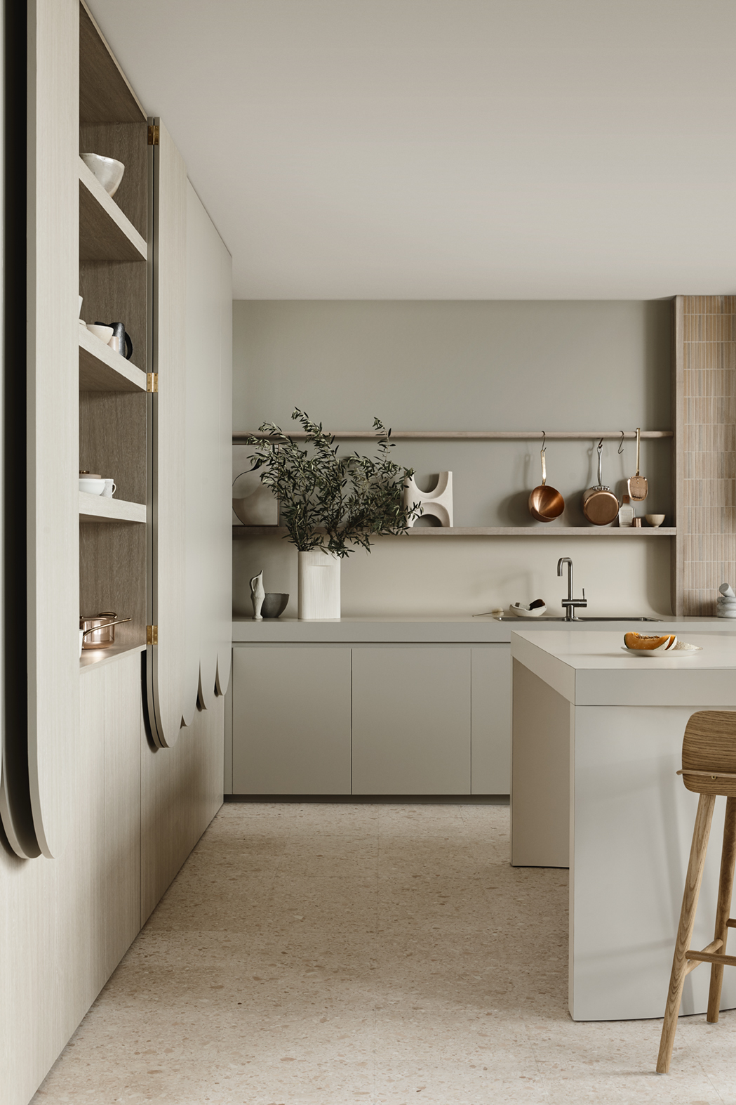
This collaboration between Kennedy Nolan and Australian laminate brand Laminex is an exemplary demonstration of how to combine neutral shades. 'We wanted to be able to show the product in ways that it’s not typically used. And then we came back to the colors that look great together,' says Rachel Nolan, principal at Kennedy Nolan.
The firm selected Paper Bark for much of the kitchen, a mid-grey in a putty-like shade that pairs well with the warmer, paler French Cream. The scheme feels both nostalgic yet different, with curved forms that are inherently welcoming. 'We don’t do kitchens that are like each other,' says Rachel. 'We’re more interested in how we can get a little bit of magic, or some kind of sculptural element, out of something that’s a necessity.'
7. SOFT BLACK
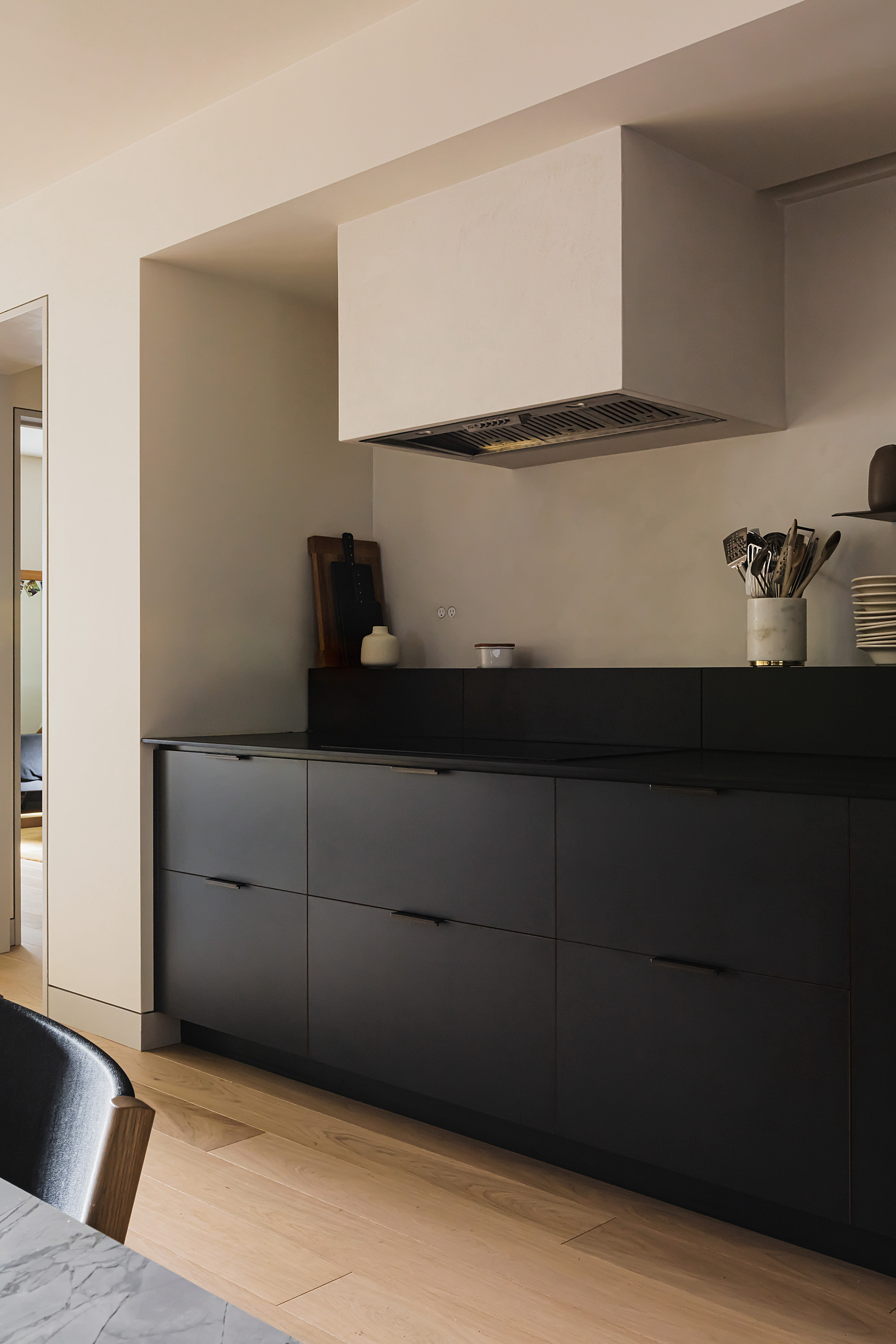
'Our client wanted the apartment to have a clean, modern design without looking too sleek. It was important for the space to feel comfortable and livable,' says Andrea Fisk of Shapeless Studio, the firm behind the interior of this New York apartment. 'We wanted the kitchen to be an impactful statement, without being too obvious. The dark blue-black kitchen cabinets work really well here.'
'The kitchen is quite far from the windows, and we often recommend using dark paint tones in areas of the home that are naturally darker, so the shadows in the corners are less obvious,' she shares. 'There are no upper cabinets on that wall, so the dark cabinets really ground the kitchen, and the workspace feels light and uncluttered.'
8. GREENISH GREY
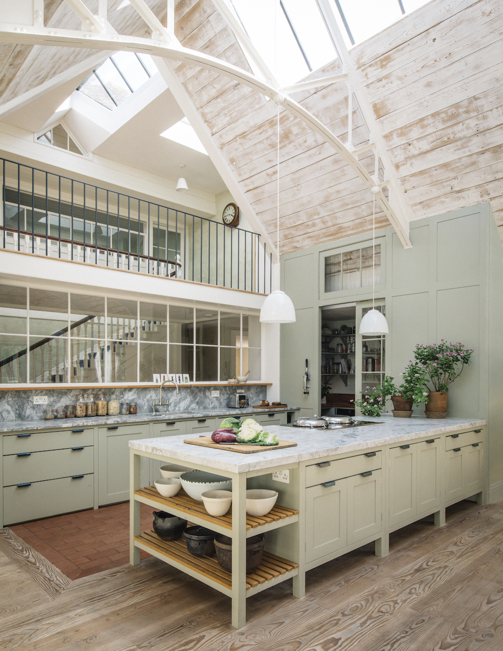
A new addition to a Victorian salt shed houses an impressive, double-height kitchen in this coastal home. New internal structures and wall paneling were designed to enhance the effect of the lofty, top-lit space, while a glazed screen allows light to flow into into the rear of the existing building.
The kitchen features the Osea and Longhouse ranges by Plain English, alongside simple paneled doors and iron handles. 'Joinery in French Gray by Farrow & Ball complements the faded tones of the reclaimed timber and fittings used for much of the project' says Katie Fontana, creative director at Plain English.
Be The First To Know
The Livingetc newsletters are your inside source for what’s shaping interiors now - and what’s next. Discover trend forecasts, smart style ideas, and curated shopping inspiration that brings design to life. Subscribe today and stay ahead of the curve.
Tessa Pearson is an interiors and architecture journalist, formerly Homes Director at ELLE Decoration and Editor of ELLE Decoration Country. When she's not covering design and decorative trends for Livingetc, Tessa contributes to publications such as The Observer and Table Magazine, and has recently written a book on forest architecture. Based in Sussex, Tessa has a keen interest in rural and coastal life, and spends as much time as possible by the sea.
-
 Straight from Salone: Five Emerging Trends I Found That'll Shape Interiors For the Year Ahead
From reflective silver to fluidity, here's my perspective on the key themes and new moods coming through from Milan Design Week
By Sarah Spiteri Published
-
 9 Bathroom Storage Mistakes You're Probably Making That Make Using This Space Much Harder — And What to Do Instead
Discover which mistakes are to blame for your overcrowded and cluttered bathroom
By Seraphina Kyprios Published
