Alcove shelving ideas – the most stylish ways to make use of an awkward space
The best alcove shelving ideas can transform an unused space into the focal point of your room..
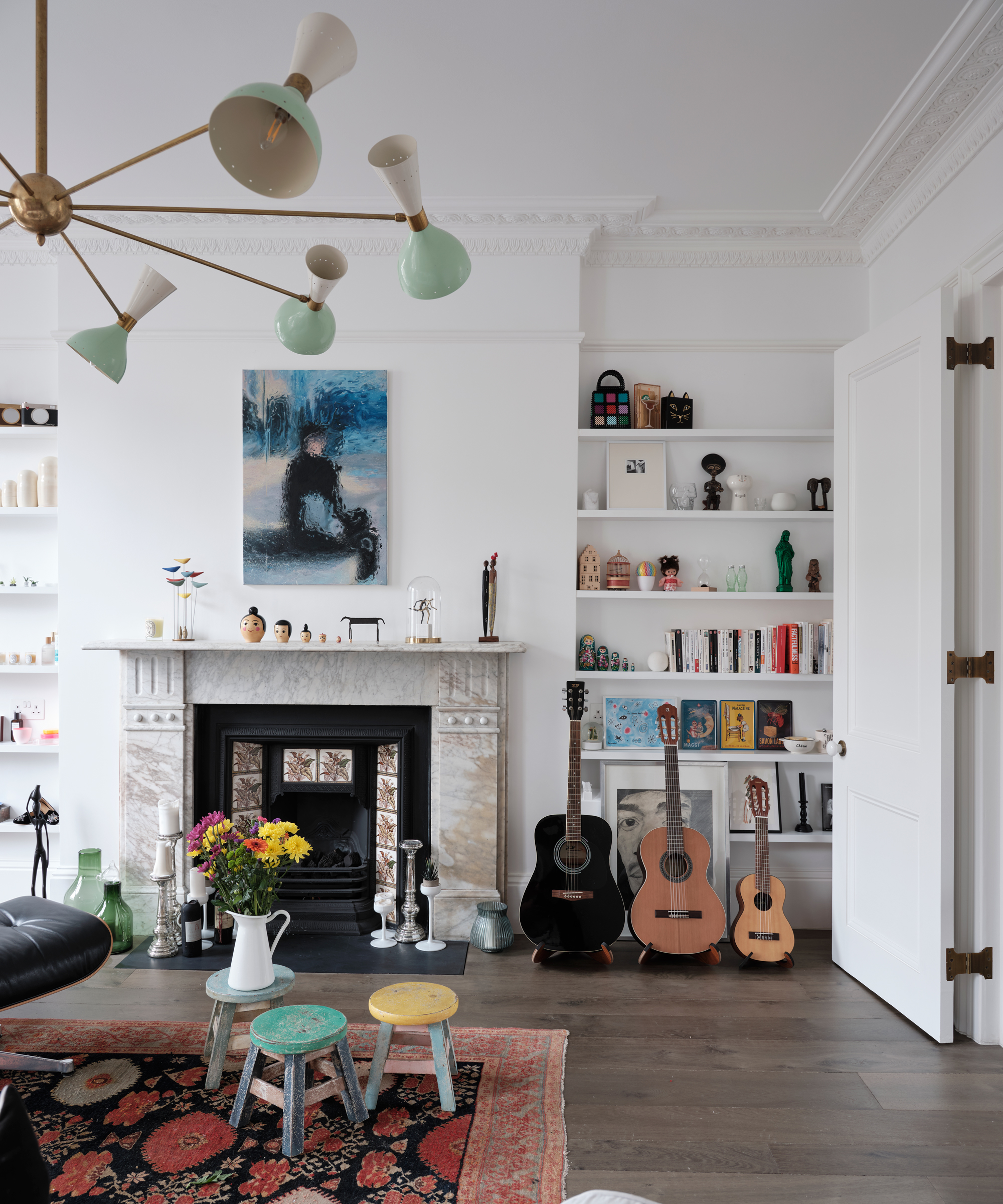

Alcoves can be both a blessing and a curse. Sometimes they lend themselves perfectly to becoming a built-in bookcase, or a study space, but more often than not to they are tricky, dead spaces and it can be hard to know how to use them effectively. Alcove shelving ideas are the easiest answer to your awkward nook woes, fill an alcove with shelving and immediately you have a practical, useable space that provides a spot for storage and decor.
But while putting up shelves is a straightforward solution, when it comes to choosing the shapes, sizes, and styles, plus what you want to display, the options feel almost endless. There's a skill to getting your shelving ideas right, creating displays that feel curated, but not overly so, practical, but not purely so, and personal, but not to the point where they feel cluttered.
So we've asked the experts for all their alcove shelving advice, from what shapes and colors work best to how to create displays that are eye-catching and filled with character.
1. Make your alcove shelving multipurpose
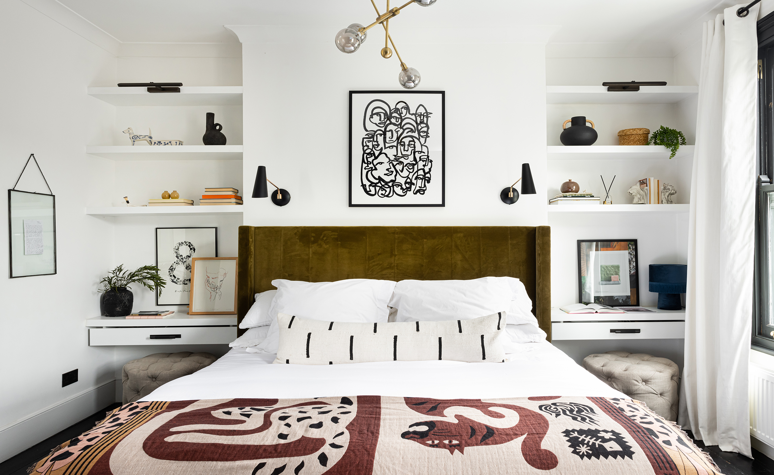
When used to their full potential, alcoves can be such an asset to a room, especially when space is tight as they really allow to maximize on that vertical space. 'Some people struggle with awkward alcoves, but we see them as a bonus - there’s so much potential in these areas! They do not only give you extra storage space, but an opportunity to showcase your personality in your home.' says Jen from Interior Fox.
'In this master bedroom, we added built-in shelving that feels as if they have always been there. Since they're painted the same color as the walls, your eyes are automatically drawn to the details that add real personality to the room. You can also stack your books in various ways for added interest: pile up some horizontal and some vertical, or even put some fun covers facing forward to create a mini focal point on your shelves.'
Also, see how in this small bedroom, rather than awkwardly floating bedside tables next to the bed where they'd just add visual bulk and get in the way, the bottom shelves in the alcoves double up as bedside tables. Not only that by sliding a small ottoman under each they can be used as a workspace or dressing table. Very clever!
2. Consider the shapes of your shelving
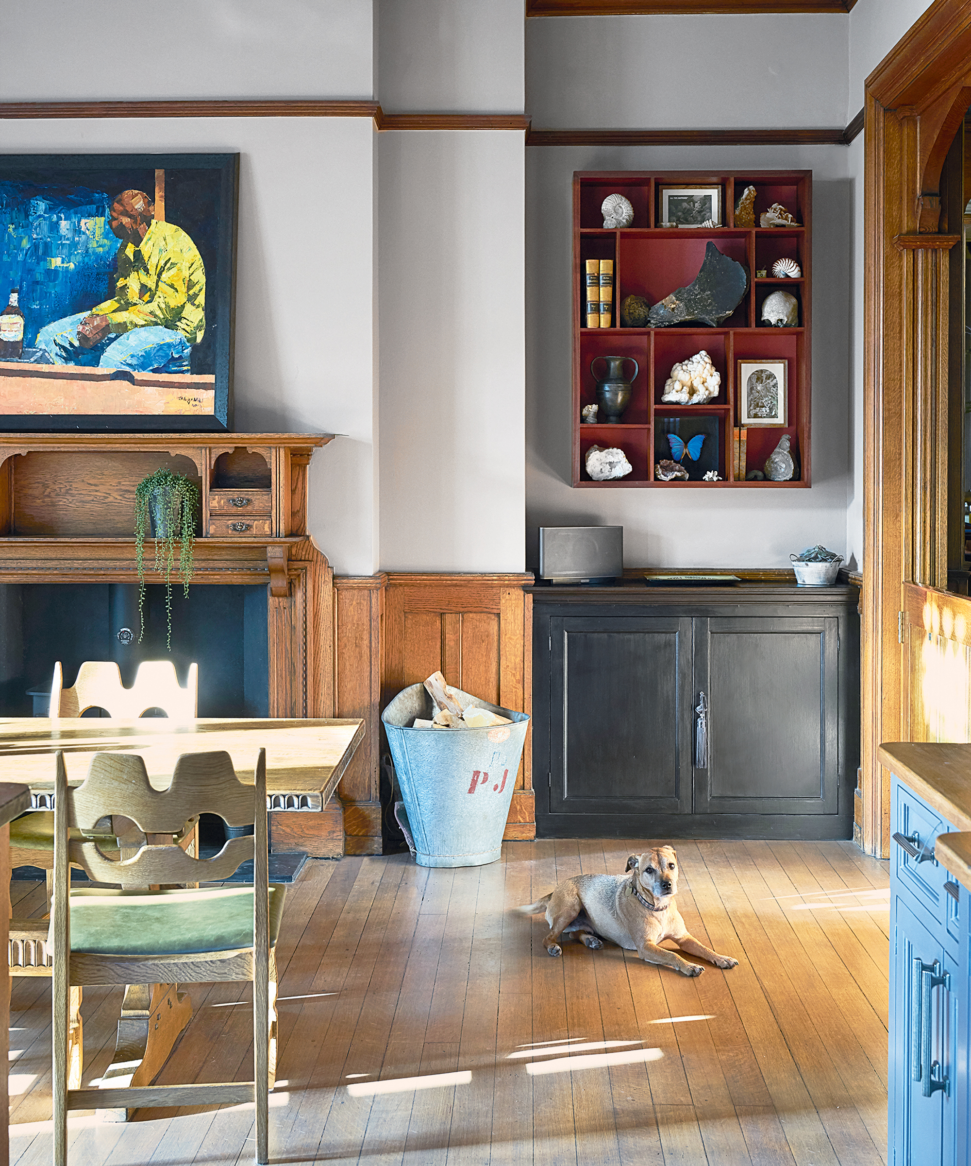
In most alcoves, the go-to shelving is floating shelves that run across the entire space, and while this is a really easy look that suits so many rooms and styles it's not the only option. The shelves you choose and how you hang them can add interest before you've even started filling them.
Instead of filling an alcove with shelving, you could layer shorter shelves that just protrude out from one side, or fill the space with different sized cubby holes, or instead of shelves, be inspired by this dining room idea and opt for a wall-mounted unit that can float in the center of the alcove, adding more shape and interest than the classic floating shelves.
3. Play with heights and scale
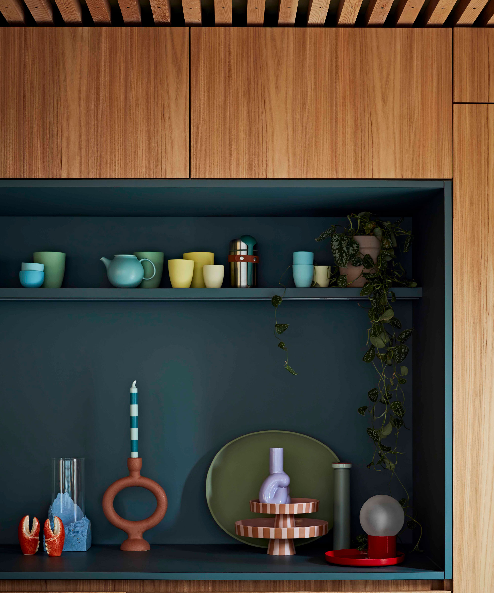
When it comes to styling your alcove shelving, no matter what room it's in, the key to creating a design that's eye-catching and memorable is variation. As you are styling just keep stepping back and looking at how the lines look, ideally, there shouldn't be any clean lines, your eye shouldn't be settling on anything, more moving around the display.
'This is one of the most important styling tips when creating the perfect shelfie and while it may be simple trick, the impact created by varying the heights and sizes of your display can not be underestimated.' Jane Rockett, Co-founder of Rockett St George.
'Candlesticks are a great way to achieve this, so try propping up a candlestick holder on a stack of coffee table books or magazines to add extra height. Varying your candles with a combination of tealights, pillar candles and candlesticks can also create the same, stylish effect.'
'House plants are also genius for creating impact with different scales so try filling vases and plant pots with different sized plants, dried grasses and florals to create contrast between both the textures and sizes. If you’re someone that struggles to keep your plants alive then don’t panic – there are so many life-like faux plant options out there that it can be hard to tell the difference!'
4. Fill a narrow alcove with picture ledges
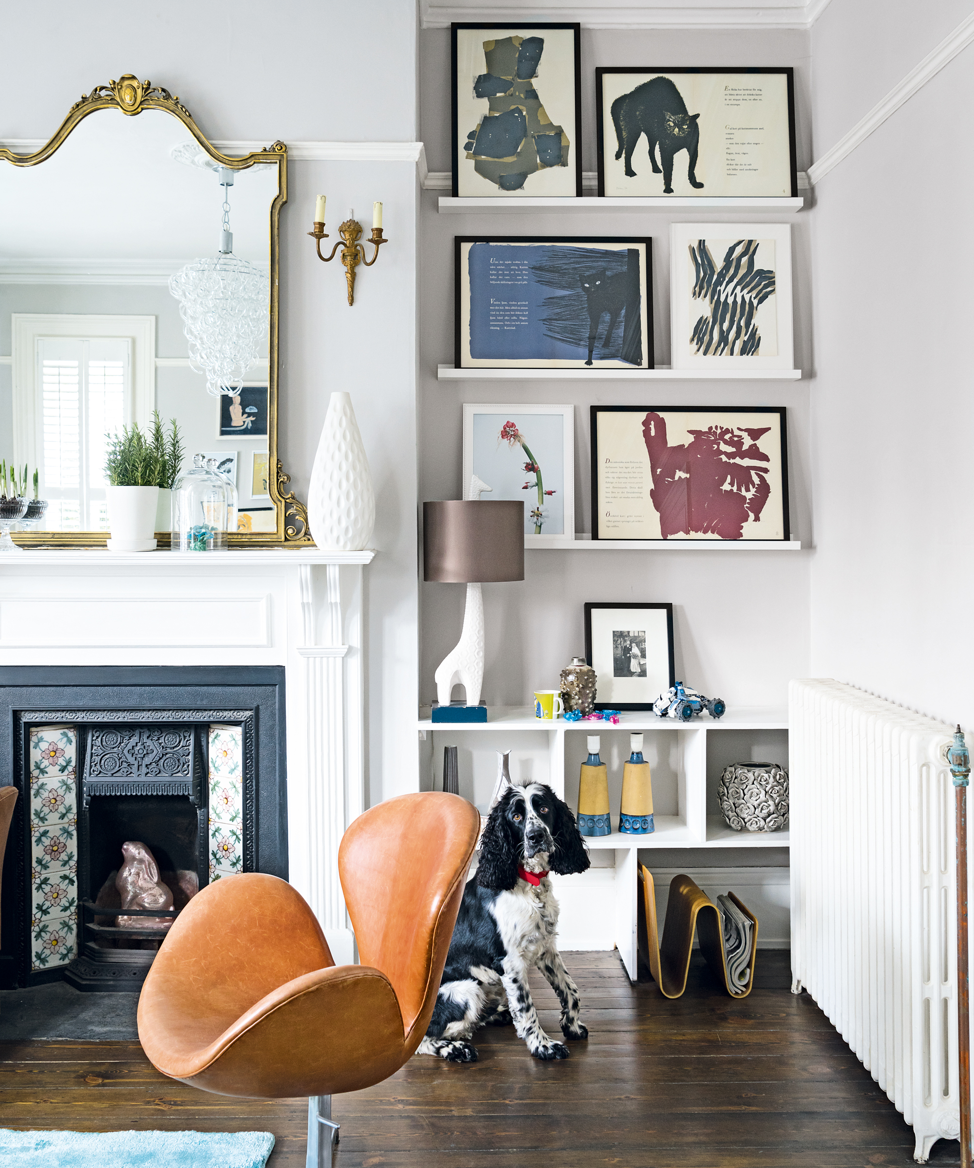
Narrow alcoves can be tricky to decorate, they aren't deep enough to be used for any substantial storage, so instead, fill them with picture ledges and display a collection of prints. Again, that same variation in height applies here too you want to avoid arranging your frames so they all sit on the same level. Try layering them to add even more interest, and for a more eclectic look mix and match the frames too.
If you want to take a more minimalist approach, pick a selection of larger prints to fill the space, rather than lots of small ones that can make a room feel cluttered. And take them all the way to the top – don't just float prints in the middle of the wall, continue them to the ceiling for a more elegant look that's going to add height to your room.
5. Add alcove shelving to a cozy reading nook
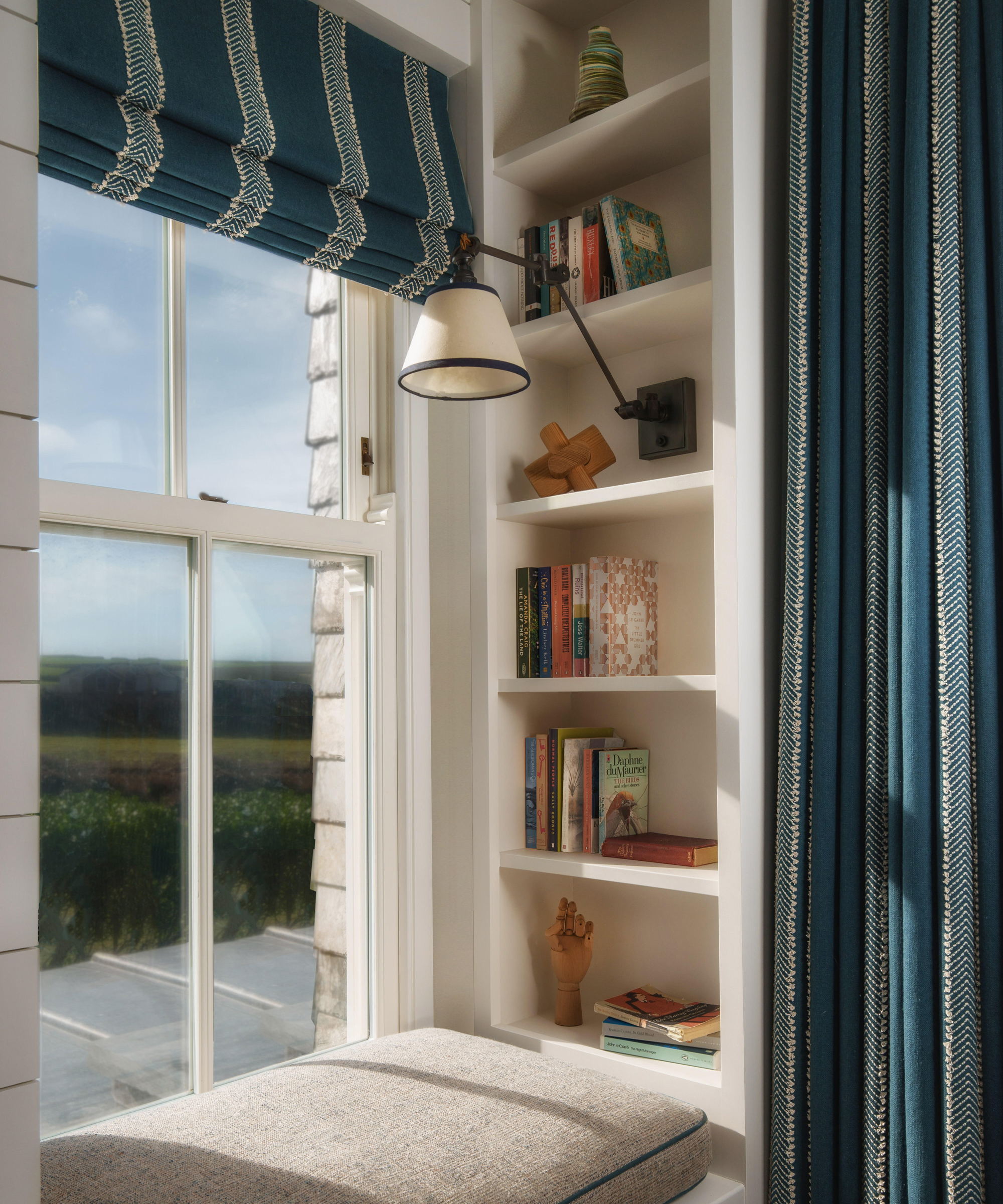
How lovely is this use of alcove shelving? Adding a mini home library to a cozy window seat. Not only does it look stylish, but it's also a practical use of what would otherwise be a dead space. ' Shelving is practical and pretty and provides great space to display a curated selection of personal items to great effect. There are so many ways it can be used to provide useful storage space in the home.' explains Saskia Howard, Creative Director of Howark Designs.
'In a small study or seating area, creating a reading area with fitted bookshelves always makes the room feel cosy. In a project we did in Cornwall, we created a built in window seat with bookshelves next to a window looking out to sea. It ended up being the perfect spot for curling up with a book.'
6. Create the allusion of depth with mirrors
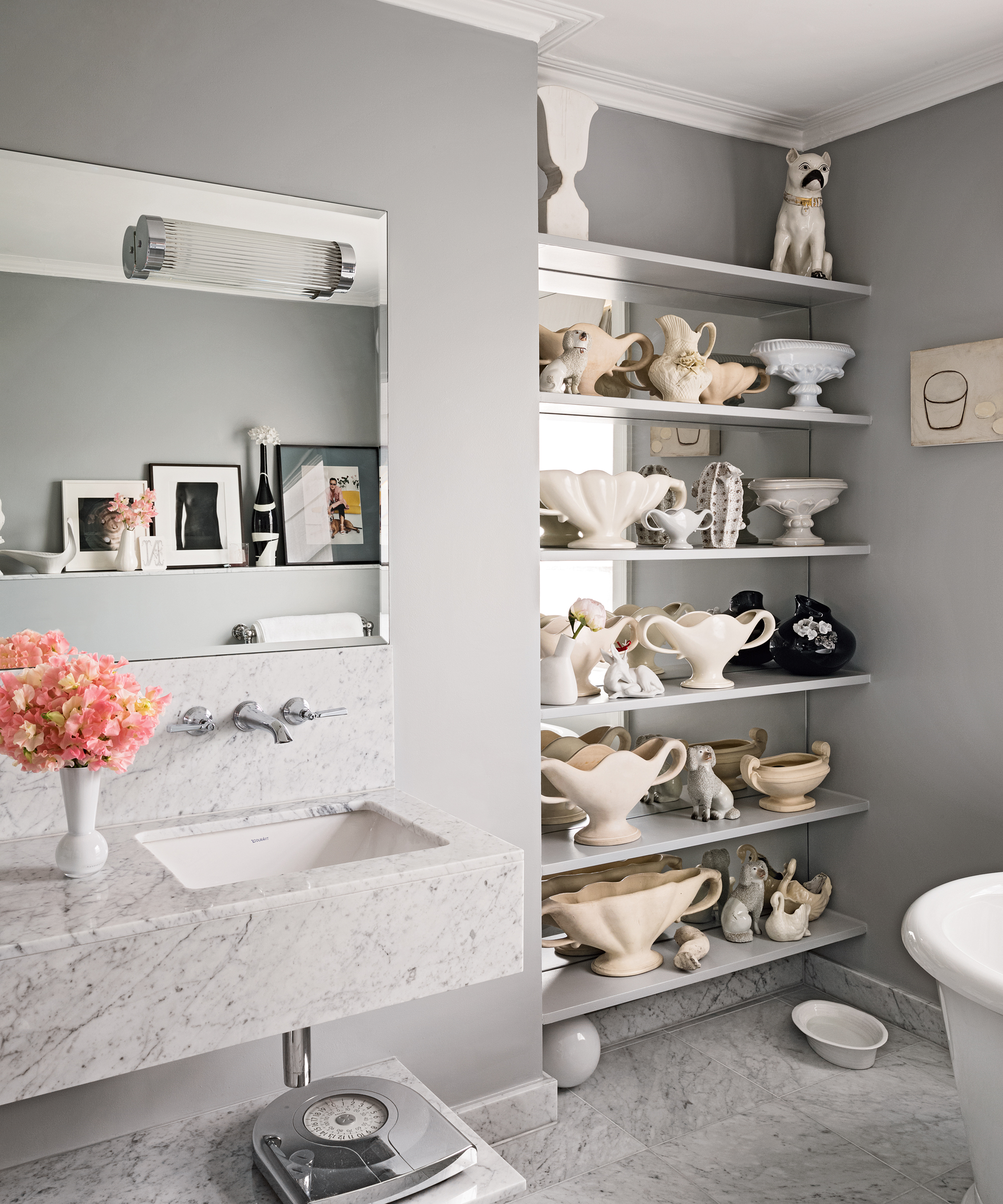
Using mirrors to 'expand' space is the oldest interior design trick in the book, but they can also work well in alcoves not only to make the room feel larger but to add depth to the shelving too. We love the display of ceramics in this grey bathroom, they feel so wonderfully out of place, so unexpected and yet it works to add texture to a room that can be so hard to bring in any real character due to their very practical nature.
The mirror behind the shelving creates the effect there is double the amount of decor, adding even more depth and texture. 'No shelf style spot is complete without a mix of textures.' says Jane Rockett. 'These add depth and interest to your display and are perfect for establishing your color palette. From ribbed vases to bobble jugs, faux coral ornaments, and stone effect display pieces, embracing contrasting textures helps draw the eye to your shelf styling.'
'Glass is a must for me as it reflects light and simply glistens on your shelf. When it comes to styling your shelf, glass decanters, vases, or candle holders all look gorgeous, whether you opt for classic clear glass or bolder designs of on-trend colored glass in amber, smoke grey, or pink tones.'
7. Blend alcove shelving into the walls
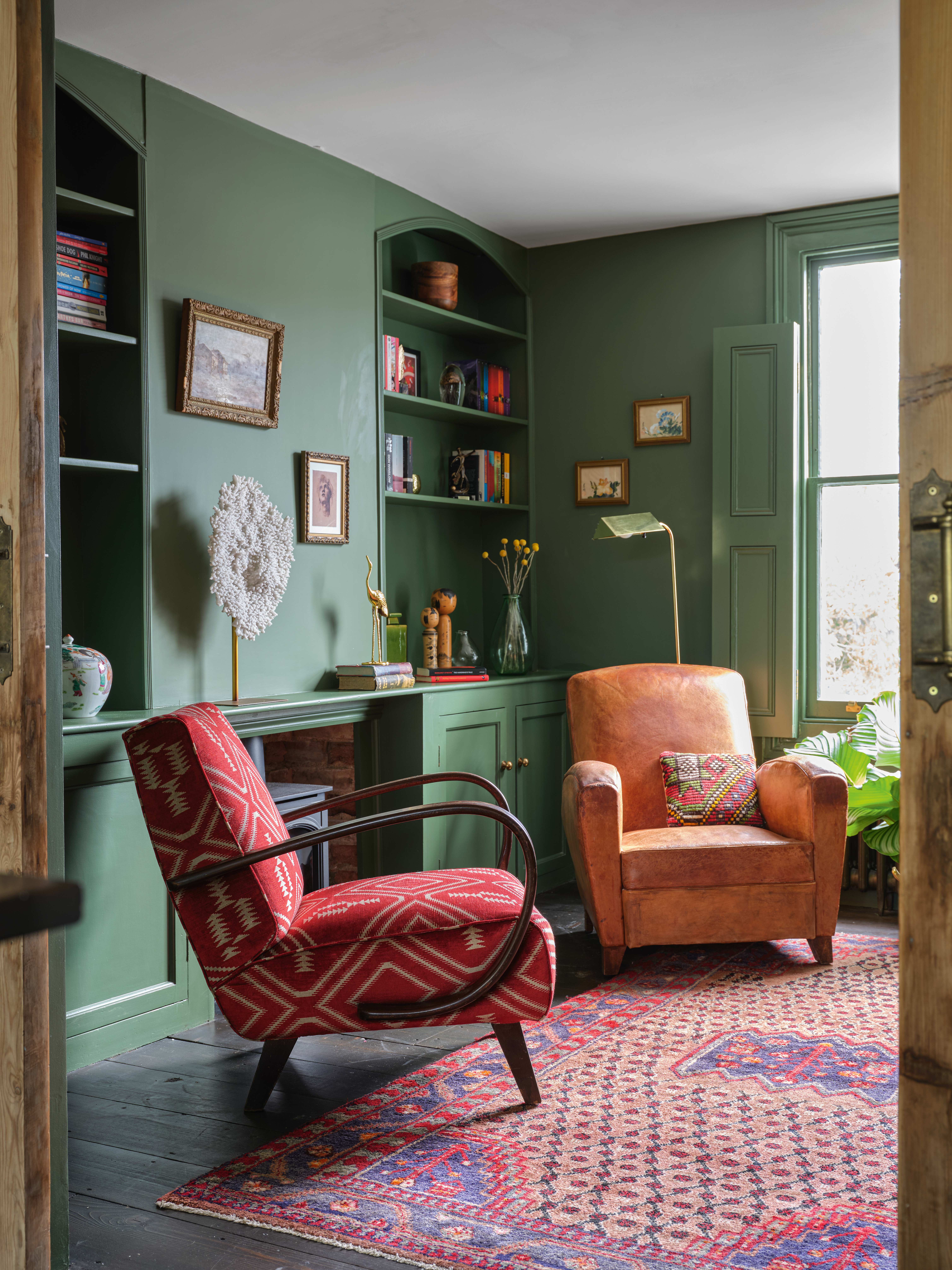
In rooms where space is tight, like in this small living room, alcoves can often work best when they blend into the room. Painting your alcoves and shelving the same color as the walls stops the space from feeling broken up, there's a cohesive flow that distracts from the dimensions of the room making it feel bigger.
You can then add pops of brighter hues that stand out against that solid block of color to give the eye focus. There are no hard and fast rules when it comes to picking a color scheme for your alcove shelving, but designer Sabrina Albanese does suggest 'Replicate pops of color throughout the shelving. For example, if you are putting a colorful abstract art on one shelf, pick up a color from that art work and place another similarly-colored item on the other shelf so the eye naturally moves from item to item.'
8. Make alcove shelving a feature with contrasting colors
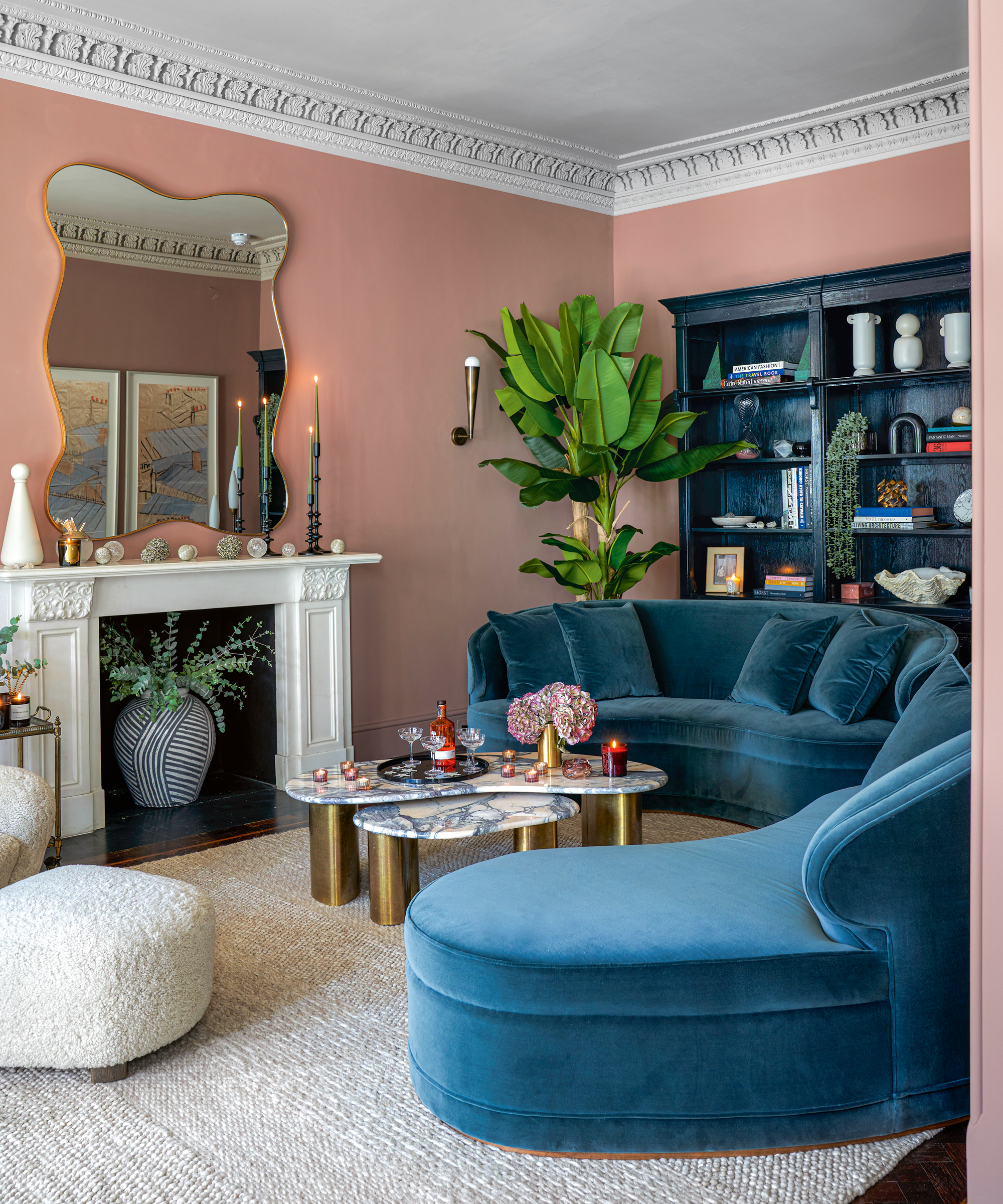
Or if you want your alcoves to in fact stand out in the room and be more of a focal point, instead of matching them to the walls, paint them in a contrasting shade. We love the combination of blush pink and deep navy, they balance each other so well. And in general dark colors are great for alcoves as they really make colors pop, for more than a neutral backdrop would do.
Take home tip: see how on these alcove shelves everything is grouped in odd numbers. It's a design trick as old a time, but the rule of three approach works as it takes the brain longer to register odd numbers, so you spend longer focusing on the display.
9. Disguise a TV with alcove shelving
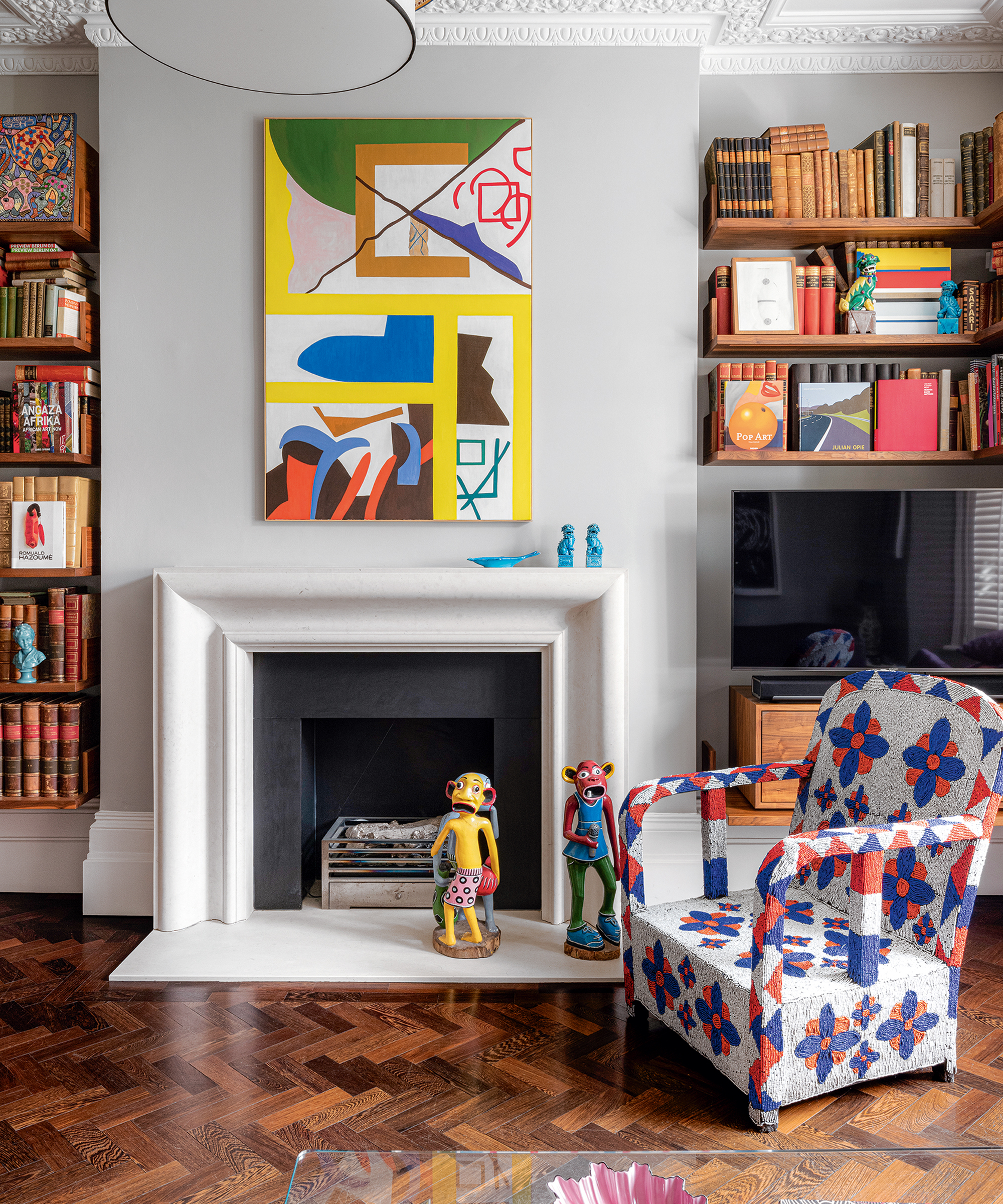
Alcoves in living rooms were made for TVs, they might be features in period properties, but it's like they were designed to house this bulky piece of tech. When it comes to disguising a TV alcove shelving is perfect for distracting from the screen and making it less of a focal point in your space.
See in this living room, your eyes don't immediately fall on the black hole in the corner, you're drawn into the colorful books and quirky prints. Taking the shelving all the way down to just above the TV is a great tip, you want to fill the space around the screen as much as possible.
Now how can you style books so they look so effortlessly arranged? Holly Gannon, of Milc Interiors suggests 'When it comes to shelf styling, choose a variety of books in different sizes for a layered look. Position a few books in an upright position with some stacked in a pile to create depth and interest. Experiment with decorative ornaments in a variety of finishes to add texture to the space. Don’t be afraid to add these on top of book stacks to draw the eye in.'
10. Turn your alcove into a home bar
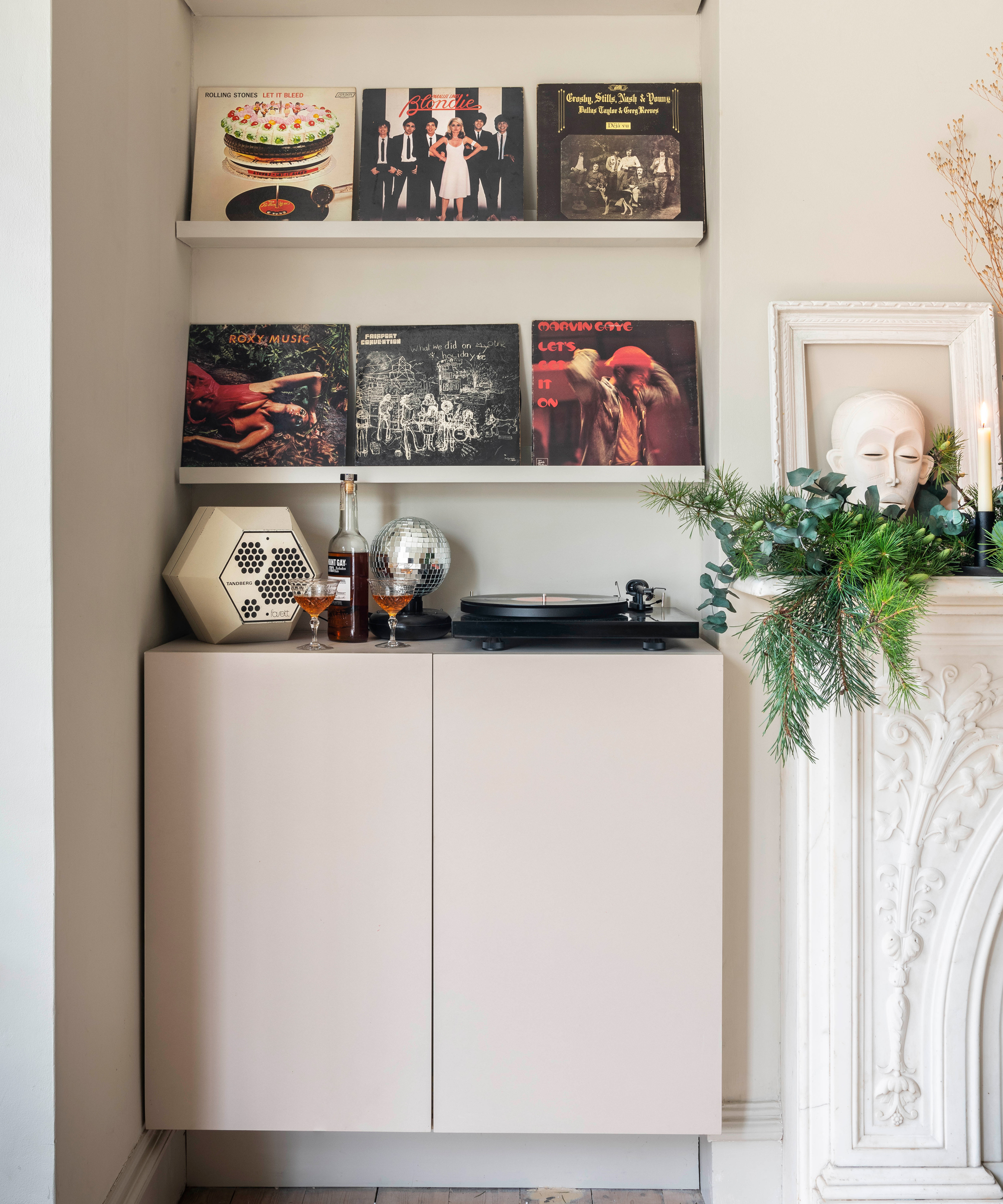
Because alcove shelving can be so much more than just extra storage or a pretty display, use that space to create a home bar. You could pinch this idea and do bar/music set up, with your drinks cabinet being home to your speakers or record players. Or simply fill up your shelves with beautiful bottles and pop a drinks trolley underneath for your bar accessories.
Sabrina Albanese's top tip is to 'make sure there are different levels of shelving for different bottle sizes and have whatever is necessary to making drinks on hand - all your tools for mixing drinks.' Plus turn your bottles and glasses into a display 'buy glassware with various colored glass, interesting textured crystal, unusually shaped wine decanters, to keep it interesting.'
11. Or make it a space for working from home
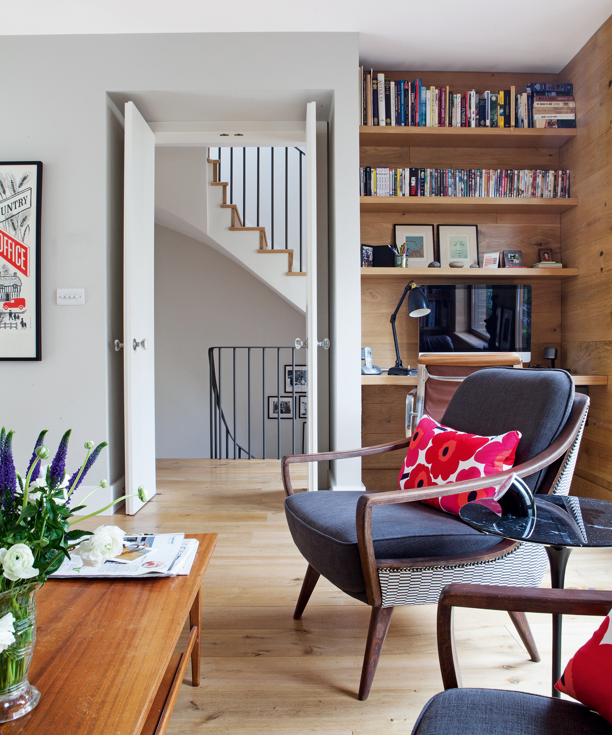
This is such a clever alcove shelving idea, we could all do with the extra space to work from home, and for so many of us, a dedicated home office is a luxury. So instead make your alcoves work extra hard and turn them into a work spot. Use shelving to display and store any home office essentials and decor so the space reflects your style and then use the bottom shelf (you might want to do slightly wider than the others) as your desk.
How do you add shelves to an alcove?
This will depend on what kind of shelves you want to add, if you simply want to add floating shelves into the space, this is a simple DIY job and you can just follow the steps that come with your shelf. If you want something more complex or built-in you would be best getting a joiner to help design and create something bespoke to your space.

What looks good in an alcove?
Really anything can look good in an alcove, a display of crockery, a curation of house plants, a collection of all your favorite books, or a mix of all those things and more. The key to a good alcove is to create a display that has variation, texture, and character.
'One of our ultimate style secrets for curating a beautiful shelfie is the use of odd numbers when curating your display. Think in ones, threes, and fives when grouping together treasured objects and ornaments.' explains Jane Rockett. 'Whilst a uniformed and symmetrical display with matching numbers looks pleasing to the eye, it can make your home feel too perfect – like a show room or hotel.'
'A successfully styled shelf is filled with personality too. So mix up your display ornaments in odd numbers to keep things interesting and don’t be too precious about what makes it into the final display. Sentimental pieces, well-loved books, and quirky ornaments that make you smile, all add character to your shelves and are therefore essential for creating a show-stopping display that is unique to you and your home.'
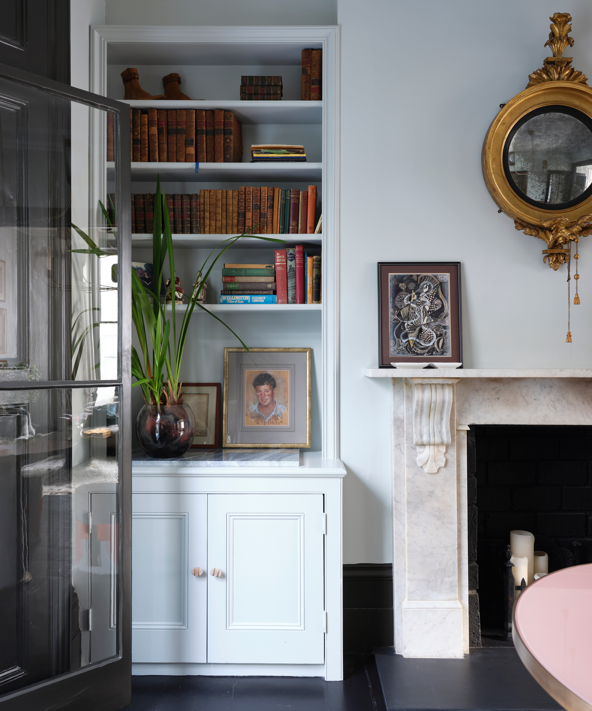
'Keeping your color scheme tonal is a great way to ensure that your shelves are balanced and blend seamlessly with the rest of your home. Tonal doesn’t mean you have to limit yourself to one color but instead, encourages pairing complementary colors together. Neutrals are a great example as this can include everything from black and grey to warm browns, beautiful beige tones, metallics, and white. Keeping the color palette tonal, whether soft and neutral or bold and bright, has a positive effect on your mood and helps promote feelings of calm and relaxation in the home, with all your treasures styled together in harmony.'
Be The First To Know
The Livingetc newsletters are your inside source for what’s shaping interiors now - and what’s next. Discover trend forecasts, smart style ideas, and curated shopping inspiration that brings design to life. Subscribe today and stay ahead of the curve.

Formerly the Digital Editor of Livingetc, Hebe is currently the Head of Interiors at sister site Homes & Gardens; she has a background in lifestyle and interior journalism and a passion for renovating small spaces. You'll usually find her attempting DIY, whether it's spray painting her whole kitchen, don't try that at home, or ever-changing the wallpaper in her entryway. She loves being able to help others make decisions when decorating their own homes. A couple of years ago she moved from renting to owning her first teeny tiny Edwardian flat in London with her whippet Willow (who yes she chose to match her interiors...) and is already on the lookout for her next project.
-
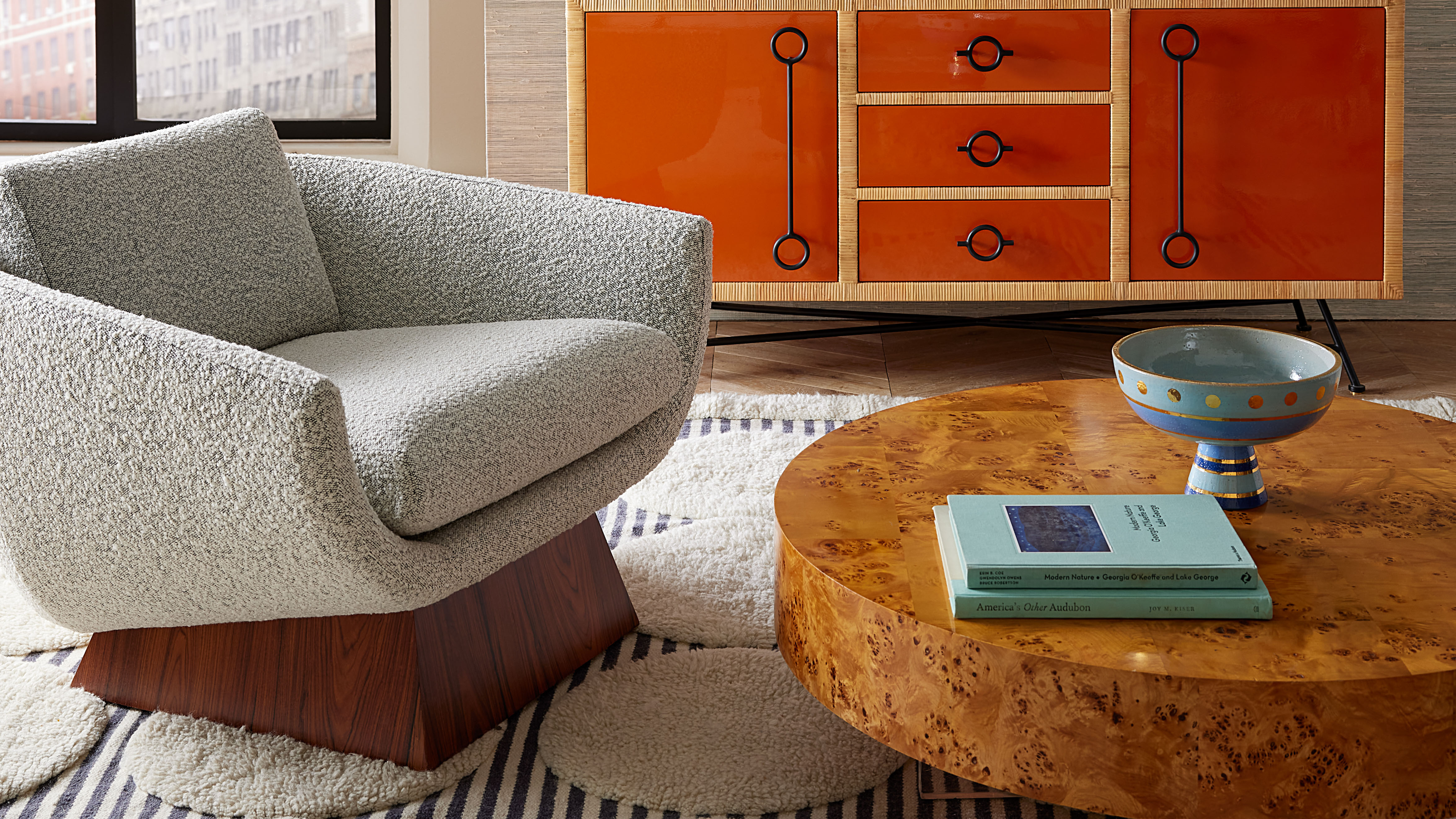 Burl Wood Decor Is 2025’s Most Coveted Comeback — Here’s How to Get the Storied Swirls for Less
Irregularity is the ultimate luxury, but you don’t need an antiques dealer to find it
By Julia Demer Published
-
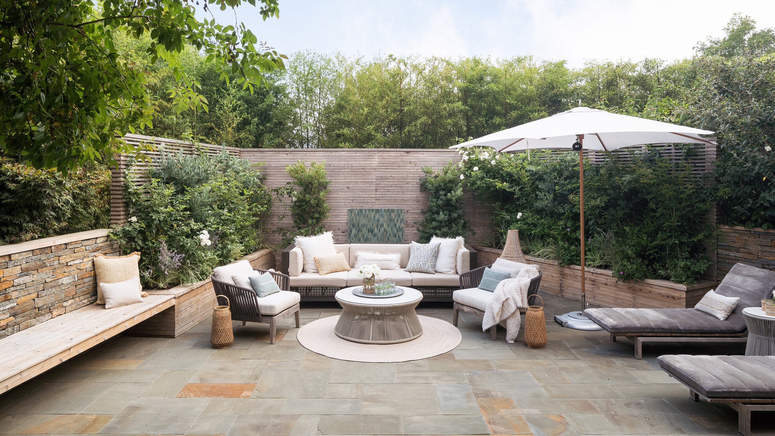 5 Garden Features That Instantly Add Value to Your Home — While Making Your Outdoor Space More Practical, too
Get to know all the expert tips and tricks for making your backyard a standout selling point for your home.
By Maya Glantz Published